What is Qajar Persia?
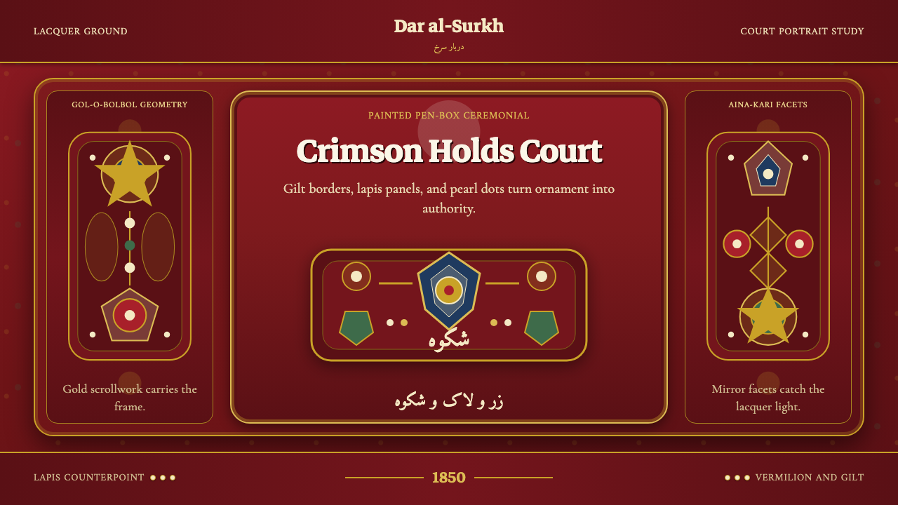
Qajar Persia renders the grand royal portraiture of Fath-Ali Shah's court as an interface — dense gold ornament, jeweled robes, and mirror-mosaic sheen treated as authority made visible.
Qajar Persia in brief
Qajar Persia takes as its subject the state portraiture produced at the Persian royal court in the early to mid-nineteenth century, most famously the many formal portraits commissioned by Fath-Ali Shah — frontal, hieratic figures rendered in jewel-toned robes against a deep lacquer-red ground crowded with gold floral ornament. This is not a restrained or minimal aesthetic; it is decoration deployed as a declaration of authority, dense and symmetrical by design.
The palette leans on vermilion and gilt as its dominant register, with arabesque scrollwork and cusped, flower-petal-shaped cartouche frames doing the structural work that a grid might do in a more austere system. Mirror-mosaic facets, pearl detailing, and the lacquer sheen of a painted pen-box all lend the system a reflective, jeweled richness — nothing here is muted, and nothing is apologetic about its own opulence.
Figures and focal elements are rendered frontally and symmetrically, in the hieratic manner of formal court portraiture, where the point is not naturalistic likeness so much as unmistakable, ceremonial presence. Every surface is treated as an opportunity for ornament, and every ornament is treated as an assertion of rank.
Where does Qajar Persia come from?
The Qajar dynasty ruled Persia from 1789 to 1925, and its early decades under Fath-Ali Shah, who reigned from 1797 to 1834, produced one of the most distinctive royal portrait traditions in Persian art history. Fath-Ali Shah commissioned enormous numbers of full-length state portraits of himself — enthroned, bejeweled, and often holding symbols of royal authority such as a scepter or sword — to be sent as diplomatic gifts to foreign courts and displayed throughout his own palaces, using portraiture deliberately as an instrument of political image-making on an international stage.
The court painter most closely associated with this style is Mihr 'Ali, active in the early years of Fath-Ali Shah's reign, whose large-scale portraits established the visual formula that would define Qajar royal imagery: a frontal, nearly two-dimensional figure rendered with intricate attention to textile pattern and jewelry, set against a densely ornamented ground, with facial features idealized toward youthful symmetry rather than individualized likeness. An earlier court painter, Mirza Baba, had already begun developing this idiom at the very start of the reign, and later painters continued refining it for decades afterward.
The style drew on a much older Persian visual vocabulary — the arabesque scrollwork and floral cartouche framing devices trace back through centuries of Persian manuscript illumination, textile design, and architectural tilework — but the Qajar court intensified it, applying dense, saturated color and gilt ornament at a scale and confidence that made the portraits function almost as state emblems rather than personal likenesses.
By the mid-nineteenth century, as the tradition matured under later Qajar rulers, court painter Abu'l Hasan Ghaffari, known by his honorific title Sani al-Mulk, brought a somewhat more naturalistic European-influenced technique to court portraiture while retaining the dense ornamental framing and ceremonial frontality established by Mihr 'Ali's generation — a bridge between the earlier hieratic formula and the changing artistic tastes that would eventually move Persian court art toward photography and Western academic painting by the century's end.
What defines the Qajar Persia look?
Color
Vermilion and gilt dominate the palette, joined by jewel tones — deep blue, emerald, and rich purple — drawn from lapis and enamel work. Color is applied densely and without restraint; the entire surface is meant to read as rich rather than to isolate a single accent.
Arabesque Ornament
Scrolling floral and vine-like arabesque patterns fill negative space almost completely, descended from centuries of Persian manuscript and textile design. Ornament is not confined to borders — it spreads across grounds and garments alike, so that empty space itself becomes rare.
Cartouche Framing
Cusped, flower-petal-shaped cartouche frames define important content zones, functioning the way a card or panel border might in a more restrained system, but rendered with an ornamental edge rather than a plain line.
Frontal Symmetry
Focal figures and key compositional elements are arranged frontally and symmetrically, in the hieratic manner of formal court portraiture, where the goal is ceremonial presence and unmistakable rank rather than a naturalistic sense of depth or candid movement.
Jeweled Texture
Pearl detailing, mirror-mosaic facets, and lacquer-like sheen recur across surfaces, evoking the reflective richness of a painted pen-box or a mirrored palace hall. These textures suggest light catching on precious material rather than flat printed color.
Density over Restraint
Where many historical styles prize negative space as a sign of discipline, this system prizes coverage as a sign of authority. A surface left plain reads as unfinished rather than restrained — the aesthetic's entire confidence rests on its refusal to hold back.
Who shaped Qajar Persia?
The Qajar monarch who reigned from 1797 to 1834 commissioned enormous numbers of full-length state portraits of himself, using the images as diplomatic gifts and palace decoration alike. His deliberate use of portraiture as political image-making on an international stage established the entire visual tradition this system draws from.
The court painter most closely associated with the classic Qajar royal portrait formula, active in the early years of Fath-Ali Shah's reign. His large-scale, frontal, densely ornamented portraits established the visual vocabulary — idealized features, jeweled robes, gilt-and-vermilion grounds — that later painters continued to refine for decades.
An earlier court painter who began developing the frontal, richly ornamented Qajar portrait idiom at the very start of Fath-Ali Shah's reign, laying groundwork that Mihr 'Ali and later painters would build into the mature, internationally recognized royal portrait style.
A mid-nineteenth-century court painter who brought a more naturalistic, European-influenced technique to Persian court portraiture while retaining the dense ornamental framing and ceremonial frontality of the earlier tradition, bridging the classic hieratic formula with changing nineteenth-century artistic tastes.
The broader workshop of court painters, textile designers, and lacquer craftsmen working under royal patronage sustained and refined this visual language across decades, ensuring that the dense ornament, jeweled palette, and ceremonial framing remained consistent across generations of court portraiture and decorative objects alike.
How do you use Qajar Persia today?
Applying Qajar Persia well means embracing density rather than fighting it. This is one of the few historical systems where filling nearly every surface with ornament is correct rather than excessive — the discipline lies in keeping that density organized through symmetry and cartouche framing, not in holding back.
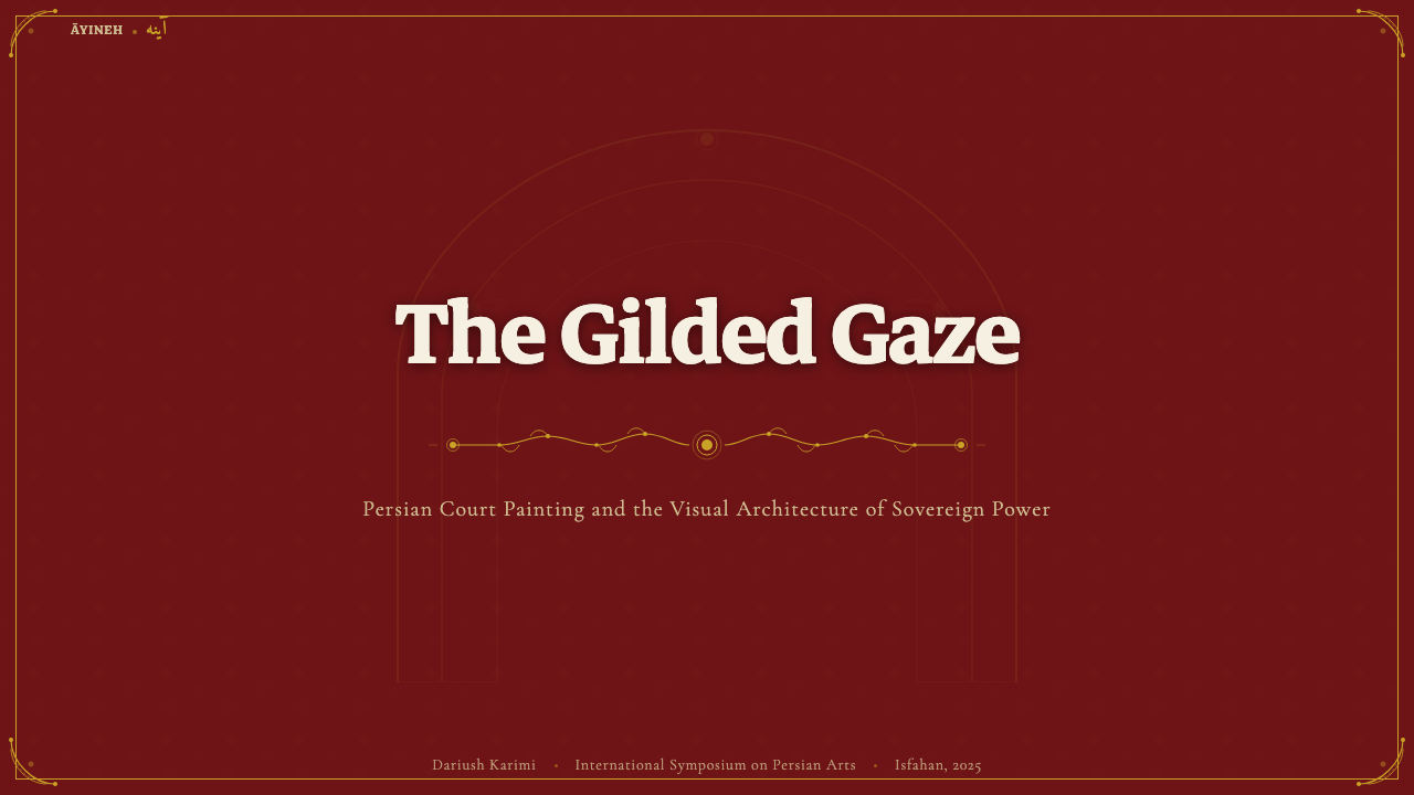
For presentation slides, a cover page benefits from a fully ornamented vermilion-and-gilt ground with the title placed inside a cartouche frame at the composition's symmetrical center, echoing a formal court portrait's central figure. Content slides should use cartouche-framed panels to organize dense information, and data slides can present key figures inside jeweled-frame callouts rather than plain numeral displays, letting a single important statistic carry ceremonial weight.
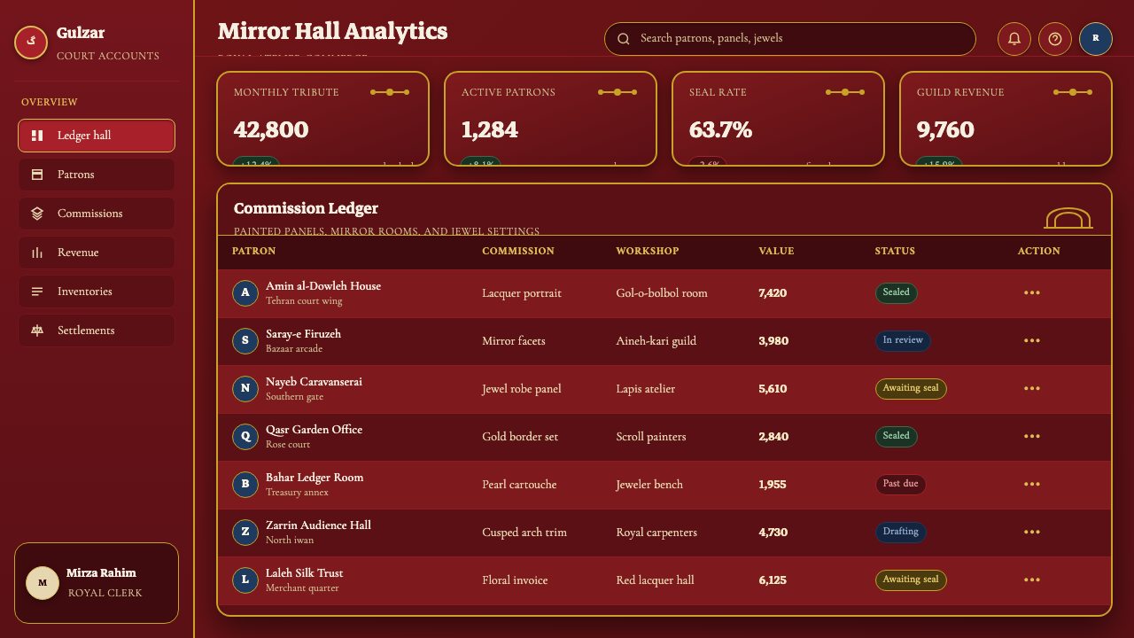
For web interfaces, the style suits luxury, heritage, and ceremonial-occasion products — premium event platforms, luxury hospitality, or cultural institutions — where an impression of richness and authority supports the brand more than minimalist restraint would. Buttons and calls to action read well inside gilt-bordered cartouche shapes rather than plain rectangles.
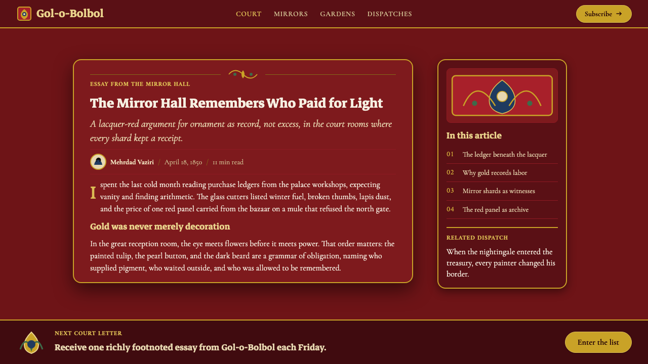
For editorial and marketing work, the aesthetic suits long-form cultural history writing, luxury brand storytelling, and any content positioning itself around heritage, craftsmanship, or ceremonial grandeur. Full-bleed ornamented section breaks and cartouche-framed pull quotes echo the formal portrait tradition without requiring literal figurative illustration on every page.
A common mistake is applying the palette at a restrained, sparse density in the name of modern taste, which undercuts the entire logic of the style — thin, minimal use of vermilion and gilt reads as a diluted reference rather than an authentic one. The ornament needs to commit to coverage, symmetry, and jeweled richness to read as genuinely Qajar rather than generically ornate.
Qajar Persia — FAQ
Why does this style use so much ornament compared to most other historical systems?
Because in Qajar court portraiture, density itself communicated authority. A Persian monarch's portrait was meant to overwhelm the viewer with visible wealth, craftsmanship, and rank — the opposite goal of a restrained modern aesthetic that signals sophistication through negative space. Filling the surface was the point, not a failure of editing.
Can this style be adapted to a lighter or more restrained color palette?
It resists that adaptation more than most historical styles, because the vermilion-and-gilt intensity is inseparable from the authority the aesthetic communicates. A lightened or desaturated version tends to read as a generic ornate pattern rather than a genuine reference to Qajar court portraiture — the saturation is not a stylistic flourish, it is the substance of the reference.
Does the style require literal figurative portraiture to work?
No — the arabesque ornament, cartouche framing, and vermilion-and-gilt palette can carry the reference entirely on their own, the way a jeweled frame or a lacquer pen-box evokes the same world without depicting a person at all. Figurative imagery can reinforce the reference but is not required for the system to read as authentically Qajar.
What kinds of products or contexts does this style struggle to fit?
It struggles wherever speed, clarity, and rapid scanning are the priority — dense analytical dashboards, transactional checkout flows, or any interface where a user needs to process many data points quickly. The style's density and ornamental framing are built for contemplation and ceremony, not efficiency.
How does this style relate to other Persian or Islamic decorative traditions?
It draws directly on centuries of earlier Persian arabesque, manuscript illumination, and textile ornament, so it shares a visual grammar with those broader traditions. What distinguishes the Qajar court portrait specifically is the addition of frontal, hieratic figurative portraiture and the deliberate use of that dense ornamental vocabulary as an instrument of nineteenth-century royal political image-making.
Related design styles
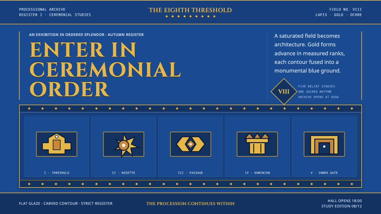 Babylonian Ishtar GateMonumental by procession. Lapis brick, gold registers, and carved capitals ho…
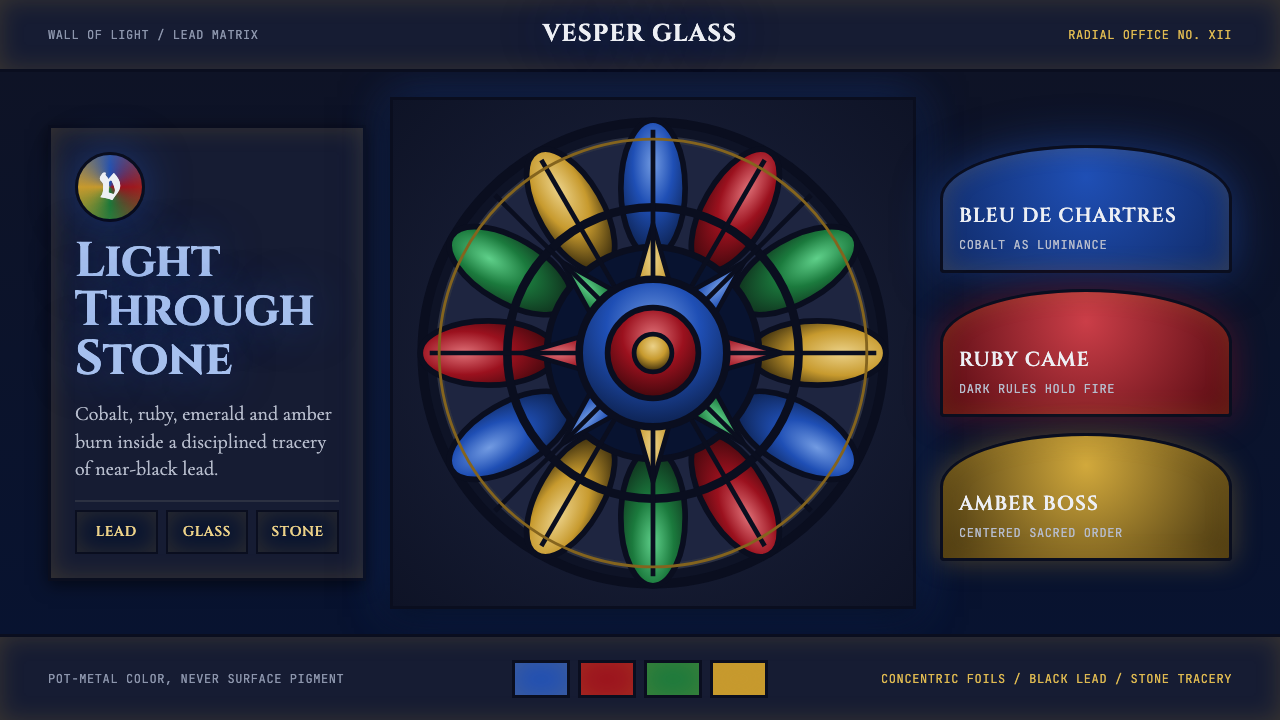 Gothic Rose WindowDarkness becomes light. Cobalt glass, ruby foils and black lead form a radial…
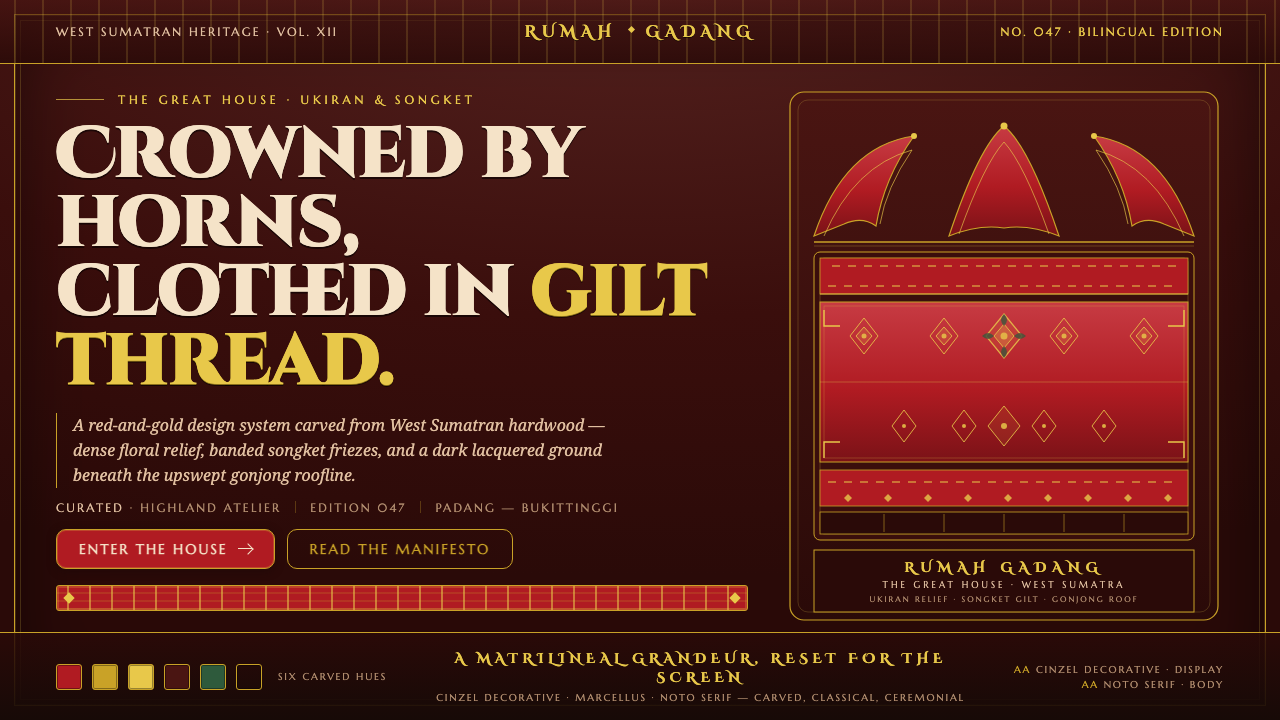 Minangkabau Rumah GadangMatrilineal grandeur, carved. Red-gilt ukiran relief on dark lacquered wood u…
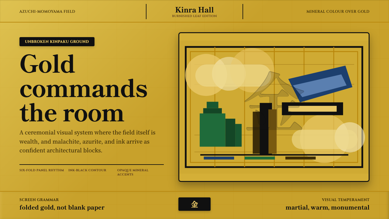 Momoyama Gold ScreenGold is the ground. Panel seams, ink contours, and mineral blocks make the fi…
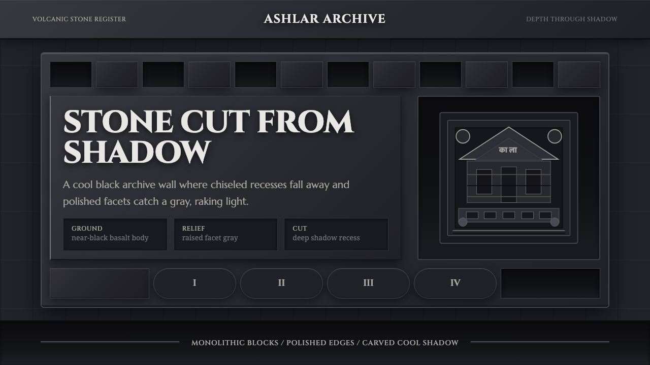 Deccan Basalt TempleMonumental shadow, carved. Near-black basalt, Cinzel capitals, and relief gri…
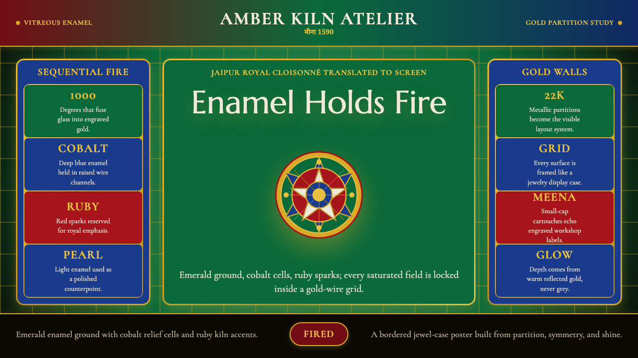 Rajasthani Meenakari EnamelJewel-box intensity. Emerald enamel, cobalt cells, ruby sparks, and gold-wire…