What is Central Asian Ikat?
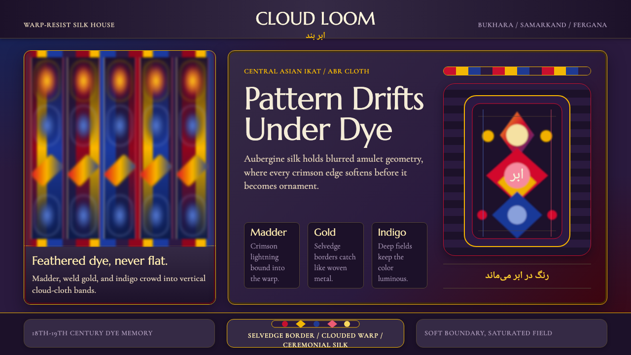
Central Asian ikat dyes the thread before the cloth exists, so every pattern arrives already blurred — a maximal, kaleidoscopic silk that never quite settles into a hard edge.
Central Asian Ikat in brief
Central Asian ikat — called abr, or "cloud," in the region itself — is a warp-resist silk tradition native to 18th- and 19th-century Bukhara and Samarkand. The defining trick is procedural rather than decorative: dyers bind and dip bundles of warp thread in stages, building up a pattern in reserved and dyed sections, long before a single weft crosses the loom. Because the binding can never mask a thread perfectly, and because the cloth is woven only after the dyeing is finished, every motif arrives on the loom slightly off-register from its neighbors. The result is a signature soft, feathered blur at every boundary — as though the pattern were being viewed through moving water.
As a design system, this style takes that blur and makes it the whole point. Saturated madder crimson, golden yellow, and deep indigo crowd together in dense vertical bands, most often set against a dark aubergine ground. The motifs carried in those bands — jagged lightning bolts, pomegranates, ram's horns, amulet forms — are large, repeating, and unapologetically busy. Nothing here is restrained or whispering; it is a maximalist system built from saturated color, tight repetition, and soft, never-quite-sharp edges.
It reads immediately as textile rather than print. Where a hard-edged geometric style asserts control through precision, this one asserts richness through density and bloom — pattern stacked on pattern, color bleeding gently into color, with no flat fields of empty space to rest the eye. The visual effect is intentionally overwhelming in the way a length of real silk ikat is overwhelming up close: too much color, too much motif, and a haze at every seam that keeps it from ever looking mechanically printed.
Where does Central Asian Ikat come from?
Ikat is not unique to Central Asia — related resist-dye weaving traditions exist across Indonesia, India, and parts of Central and South America — but the Bukhara-Samarkand-Fergana corridor produced one of the most concentrated and visually extreme expressions of the technique, reaching its peak in the 18th and 19th centuries. This was Silk Road territory: oasis cities strung along trade routes that had carried silk, dye, and design motifs between China, Persia, and the Mediterranean for well over a thousand years by the time abr weaving reached its height. Bukhara and Samarkand were wealthy trading capitals with the workshops, patronage, and imported dye materials — madder root, indigo, later synthetic dyes — needed to support labor-intensive luxury textile production.
The technique itself is a feat of advance planning. A master dyer had to calculate, before any thread touched dye, exactly where each color needed to land once the warp was stretched on the loom — binding sections of thread bundle by bundle with waterproof wrapping, dyeing the exposed sections, unwrapping, rebinding, and redyeing in a new color across several rounds, until the full multicolor sequence was set into the thread itself. Only then was the warp mounted and woven, typically by a separate weaver, at which point the dyer's calculations either aligned or drifted slightly — and it was that drift, the soft misalignment inherent to the process, that came to define the look rather than being treated as a flaw to eliminate.
The cloth produced this way was worn, not simply displayed: it was cut and sewn into the flowing chapan, the quilted or lined coat worn across the region by both men and women, often in many layers as a sign of status. Robes in the boldest, most saturated abr silk were reserved for special occasions, and the density of pattern and intensity of color scaled with the wealth and rank of the wearer. Production centered on family workshops passed down through generations, with towns such as Margilan in the Fergana Valley developing particular reputations for the abrband — the specialists responsible for the binding and dyeing stage specifically, distinct from the weavers who mounted the finished warp.
Russian imperial expansion into the region in the second half of the 19th century, followed by Soviet industrialization in the 20th, disrupted the workshop economy that had sustained abr production, and for a period the tradition contracted sharply as cheaper printed textiles displaced hand-bound ikat in everyday use. A revival movement in Uzbekistan from the late 20th century onward — centered again in the Fergana Valley — has since restored much of the historical technique, and abr silk is now recognized internationally as a signature Uzbek craft, produced both for domestic wear and for export as a marker of Central Asian textile heritage.
What defines the Central Asian Ikat look?
Color
The palette is deep and saturated rather than bright and clean: madder crimson, golden yellow, and a deep, almost blackened indigo, set against a dark aubergine or eggplant ground. This is a dark-dominant system — light neutrals barely appear — and the colors are chosen for how they glow against darkness rather than how they contrast against white. Hues shift gradually within a single band as the resist-dye process leaves gradients no flat print would produce; a single stripe of red rarely reads as one uniform value all the way through.
Pattern Density
There is no true negative space in this system. Motifs — lightning-bolt zigzags, pomegranate silhouettes, amulet and ram's-horn shapes — repeat edge to edge across the full width of a composition, and the vertical warp bands themselves function as a secondary layer of pattern running underneath the motifs. Where a minimalist system treats empty ground as a resource, this one treats it as wasted opportunity; the eye is meant to travel continuously across the surface rather than land on a single focal point.
The Feathered Edge
The single most identifying trait: every boundary between colors is soft, blurred, and slightly irregular rather than crisp. This is a direct visual signature of the resist-dye process, where binding never masks a thread with total precision. A design system built on this style should never resolve a color transition into a hard vector edge; the blur is not a texture applied on top, it is the structural logic of the whole pattern, and a version that sharpens every edge has misunderstood the source entirely.
Composition — Vertical Banding
The organizing structure is the vertical warp band, a direct inheritance from the loom itself: because the resist-dyeing happens to warp thread before weaving, pattern naturally organizes into columns running top to bottom rather than horizontal registers. A layout drawing on this style should favor tall, repeating vertical divisions over horizontal banding or centered symmetry — the rhythm is columnar, and motifs cascade down each band rather than marching across a single horizontal row.
Motif Vocabulary
The recurring shapes are drawn from a specific regional vocabulary rather than generic geometry: jagged lightning-bolt zigzags, pomegranate and almond silhouettes, ram's-horn curls, and amulet or talismanic forms believed in the originating culture to carry protective meaning. These motifs are large-scale and read as bold silhouettes rather than fine linework — they are meant to be visible from across a room on a moving garment, not examined up close like a fine engraving.
Surface and Sheen
The base material is silk, and the system should carry silk's particular relationship to light: a subtle sheen that shifts with viewing angle, making the same dyed color read slightly differently depending on how light falls across it. This is different from a matte cotton or wool ikat; the shimmer adds another layer of softness on top of the already-blurred dye edges, so that even a static image of this style should suggest gentle, shifting luminosity rather than a flat, uniform surface.
Cultural Weight
Because this pattern language was historically tied to worn status garments rather than disposable decoration, an authentic application should carry a sense of ceremony and value — richness earned through labor and material cost, not through visual noise for its own sake. A design system drawing on this heritage benefits from restraint in scale even as it embraces density in pattern: a few large, confident bands of motif read as luxurious, while too many competing small motifs at once can tip the same vocabulary into clutter.

Who shaped Central Asian Ikat?
The dyeing workshops of Bukhara were among the most sophisticated in the region, working within a wealthy trading capital that could sustain the labor-intensive, multi-round binding-and-dyeing process at scale. Bukhara's abr silk, along with its suzani embroidery tradition, became one of the city's signature luxury exports along the Silk Road corridor, and its workshops are credited with refining the tight, controlled color sequencing that distinguishes the finest historical examples from cruder regional imitations.
Margilan, a city in the Fergana Valley, developed a particular specialization in the abrband role — the craftsperson responsible specifically for binding and dyeing the warp thread, as distinct from the weaver who later mounts and weaves it. This division of labor allowed abrband specialists to develop deep, closely guarded expertise in color sequencing and pattern calculation, and Margilan remains a center of ikat production and revival in Uzbekistan today, with workshops that trace their methods directly back to 19th-century practice.
The weavers who mounted the pre-dyed warp threads and wove them into finished cloth were the second half of a two-stage craft tradition shared across Uzbek and Tajik communities in the Fergana Valley and surrounding oases. Their skill lay in aligning the dyer's calculated color sequence as closely as possible during weaving — and in accepting, rather than fighting, the small misalignments that gave the finished cloth its signature soft blur. This shared regional practice is why ikat silk is claimed as heritage craft by both Uzbekistan and Tajikistan today.
How do you use Central Asian Ikat today?
This style transfers well wherever a project wants to signal richness, craft, and cultural depth rather than clean modern efficiency, but it demands respect for its structural logic — the blur and the density are not optional flourishes, they are the entire mechanism. Applying it as a flat pattern with hard vector edges and generous white space merely borrows the color palette while losing everything that makes the source recognizable.
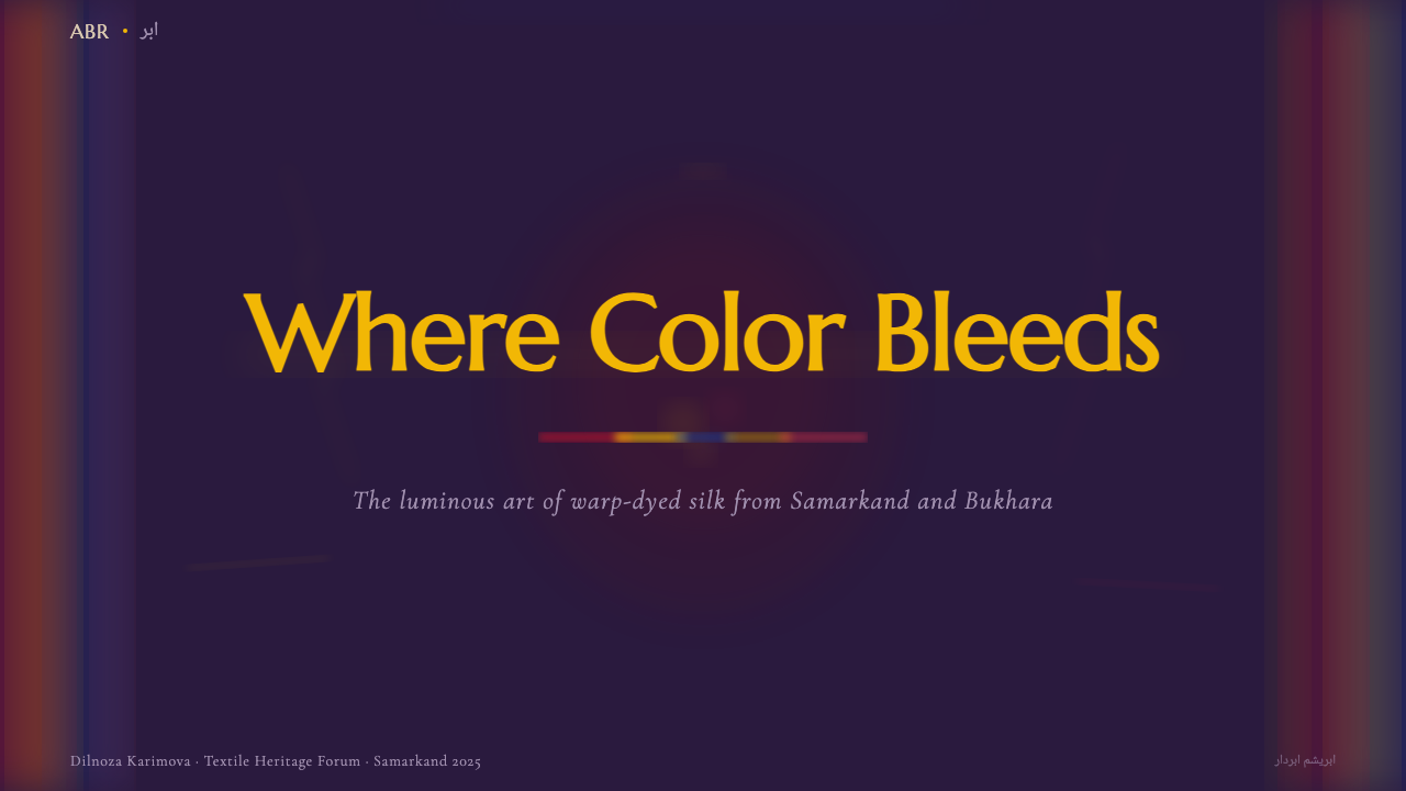
For presentation slides, this style is strongest as a cover treatment and an accent rather than a full-bleed background on every content page. A cover slide can use a dense vertical band of pattern along one edge, with title text set in a calm, high-contrast typeface against a solid area of the deep aubergine ground — the pattern signals richness, so the type should stay simple and let it. Content and data slides should pull one or two colors from the palette as accents against a plain dark ground, reserving the full dense pattern for section dividers or the cover alone; a chart rendered directly in feathered, blurred bands would be nearly unreadable.
For web interfaces such as dashboards and pricing pages, restraint is essential: this is not a pattern for filling large functional surfaces. It works best as a header band, a card border treatment, or a background accent behind a hero section, always paired with a calm, high-contrast neutral area for the actual interactive content and data. Buttons, tables, and form elements should sit on plain dark or light grounds pulled from the palette rather than directly over the patterned bands, or usability collapses.
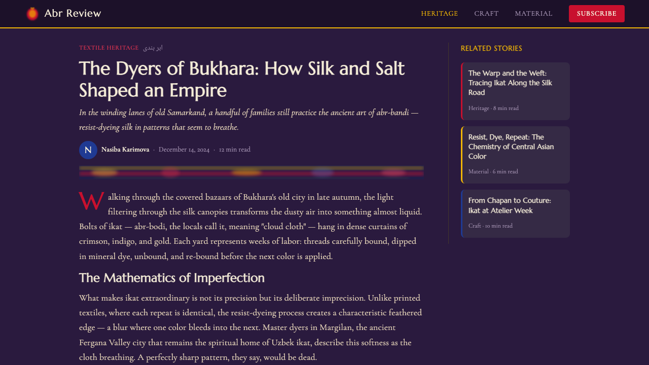
For editorial and marketing contexts, the style suits storytelling around craft, heritage, textiles, travel, or cultural history — a magazine feature or a product page for handmade goods can use a full column or panel of the pattern as a visual anchor, with body text set in a clean, legible face on an uncomplicated ground alongside it. Marketing banners benefit from letting a single dense band bleed off one edge of the frame, implying the pattern continues beyond what is shown, rather than confining it inside a neat bordered rectangle.
The most common mistake is flattening the feathered edges into crisp geometric shapes — the moment color transitions become hard vector lines, the pattern stops reading as ikat and starts reading as a generic ethnic-print cliché. A second common error is spreading the pattern too thinly across too much surface with too little saturation, which drains the maximalism that gives the style its identity; this system wants a few dense, saturated bands used deliberately, not a thin all-over wash applied for texture's sake.
Central Asian Ikat — FAQ
Is this the same as batik?
No, though both are resist-dye techniques and both are frequently confused with one another. Batik is a resist-dye method applied to finished cloth, where wax is painted or stamped directly onto woven fabric to block dye from certain areas — the resist happens after weaving. Ikat, including this Central Asian abr tradition, resists the dye on the thread itself before weaving even begins, which is why ikat patterns always show that soft, feathered blur at their edges while batik patterns, resisted on a flat finished surface, can achieve much crisper, more controlled edges.
Why does the pattern always look slightly misaligned or blurry?
This is not a flaw or a low-resolution rendering — it is the direct physical signature of how the cloth is made. Because the dye is bound onto bundles of warp thread before weaving, and because binding can never mask a thread with perfect precision, the color boundaries drift slightly from thread to thread. When the warp is finally woven, those tiny drifts compound into the soft, feathered edge that defines the entire look. A version of this style with perfectly crisp, aligned edges has effectively removed the one feature that makes it recognizable as ikat.
Can this style work on a light background instead of the dark aubergine ground?
A light-ground version is possible but changes the character significantly. The historical palette earns its intensity by setting saturated madder, gold, and indigo against near-black or deep-purple grounds, which lets each color glow rather than simply sit on the surface. Moved onto a white or pale ground, the same colors read as more decorative and considerably less dramatic — closer to a printed textile swatch than the deep, almost jewel-toned richness of the source. If a lighter application is needed, it works best when at least one deep, saturated ground color is retained somewhere in the composition to anchor the palette.
What kinds of motifs belong in this pattern vocabulary, and can new ones be added?
The historical vocabulary centers on a specific set of forms: jagged lightning-bolt zigzags, pomegranate and almond silhouettes, ram's-horn spirals, and amulet or talismanic shapes tied to regional beliefs about protection. These read as bold, large-scale silhouettes rather than fine detail. New motifs can be introduced in the same spirit — bold, symmetrical or near-symmetrical silhouettes at a similarly large scale — but they should be filtered through the same feathered-edge treatment and vertical-band composition, or they will read as a foreign addition rather than a natural extension of the system.
Does this style suit digital products, or is it really only meant for textiles?
It transfers to digital work well as an accent and mood-setting element — headers, dividers, hero backgrounds, packaging, editorial features about craft or travel — but it struggles as a system for dense functional interfaces like data tables, form-heavy dashboards, or anything requiring fine-grained scannability. The density and blur that make it visually rich also make small text and tight data illegible if placed directly over it. The reliable approach is to let the pattern anchor mood at the edges of a layout while keeping functional content on plain, high-contrast grounds pulled from its palette.
Related design styles
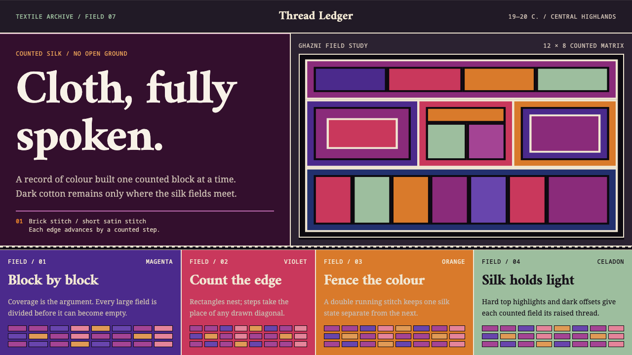 Hazara EmbroideryCoverage is the argument. Magenta silk blocks meet on a dark counted lattice.
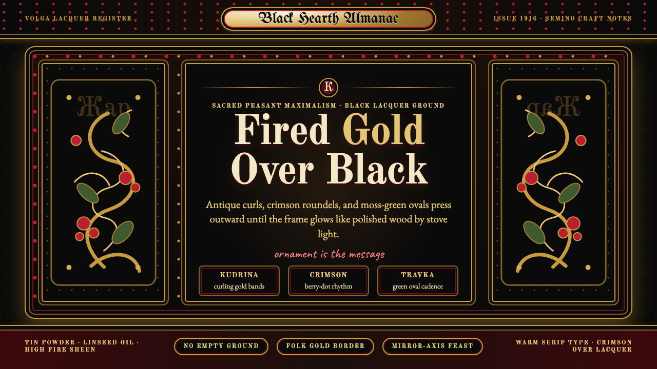 Russian KhokhlomaOrnament is the message. Antique gold curls and crimson dots crowd a black la…
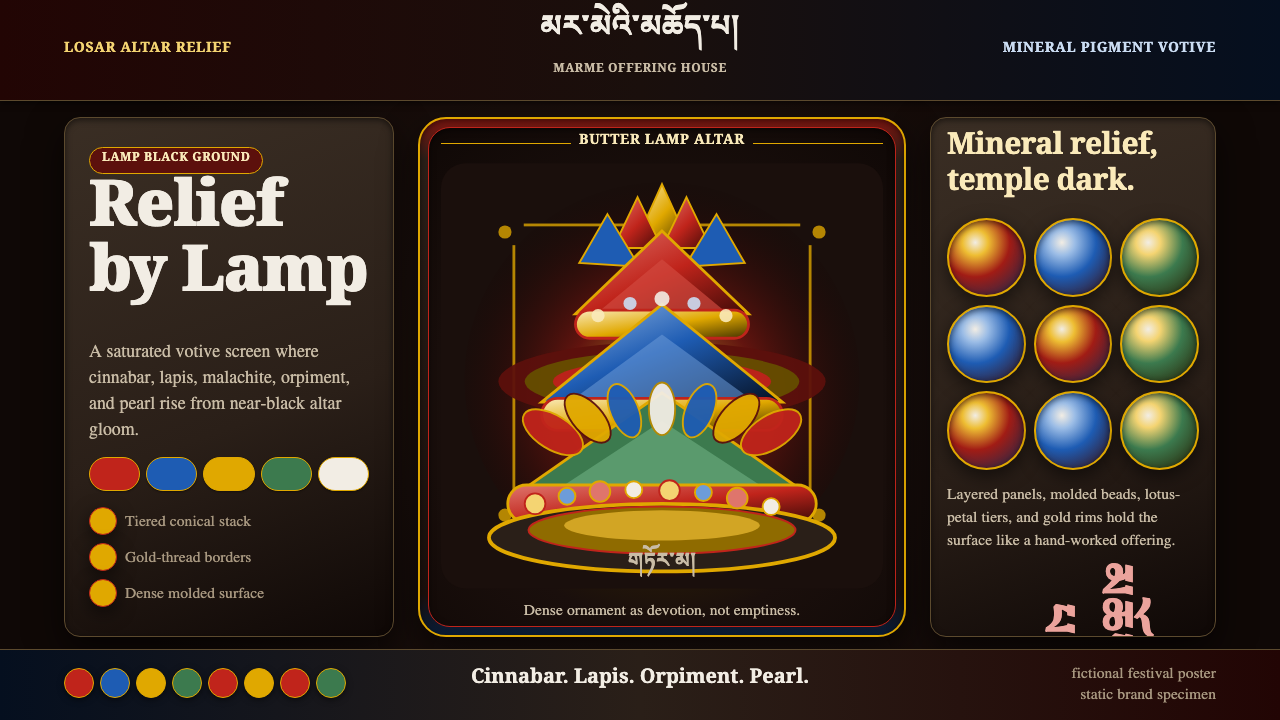 Tibetan Butter SculptureDevotion made dense. Cinnabar, lapis, and gold relief glow from altar black.
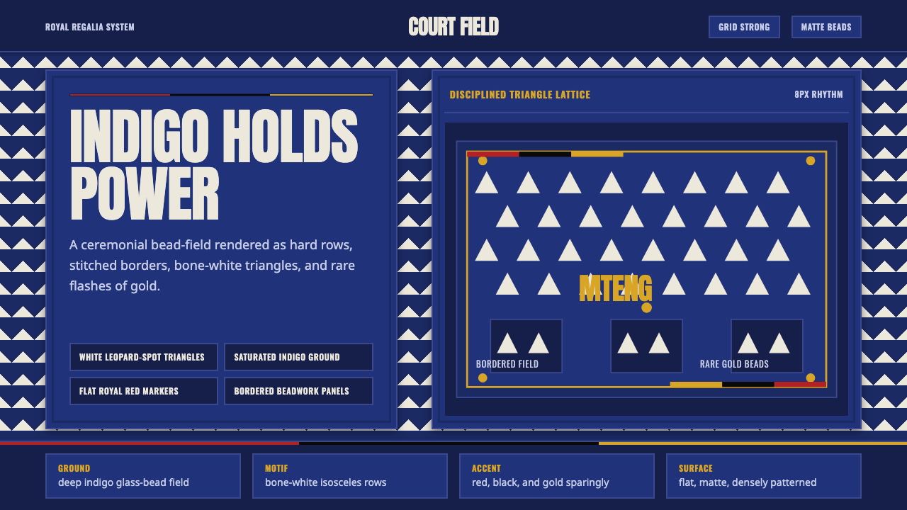 Bamileke Elephant MaskRoyal density. Indigo bead fields lock white triangle rows into ceremonial po…
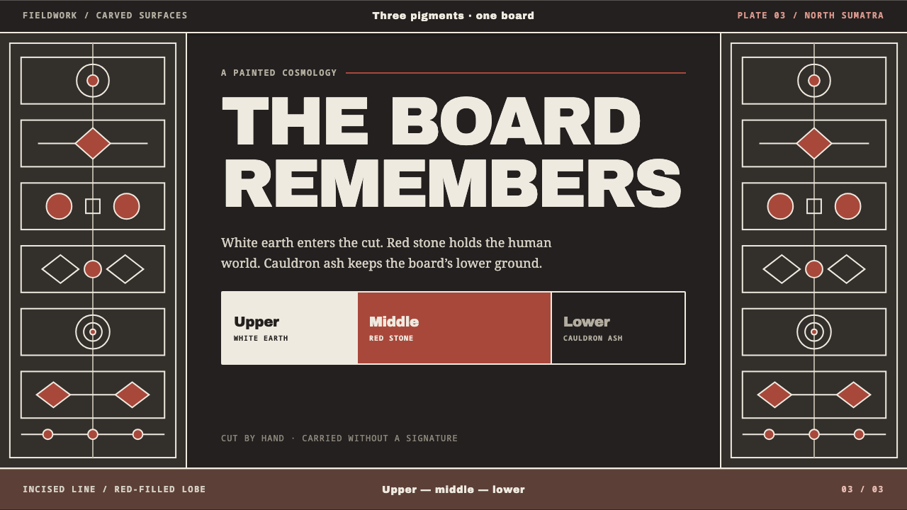 Batak GorgaCosmology cut into wood. Chalk-white lines and batu hula red hold a blackened…
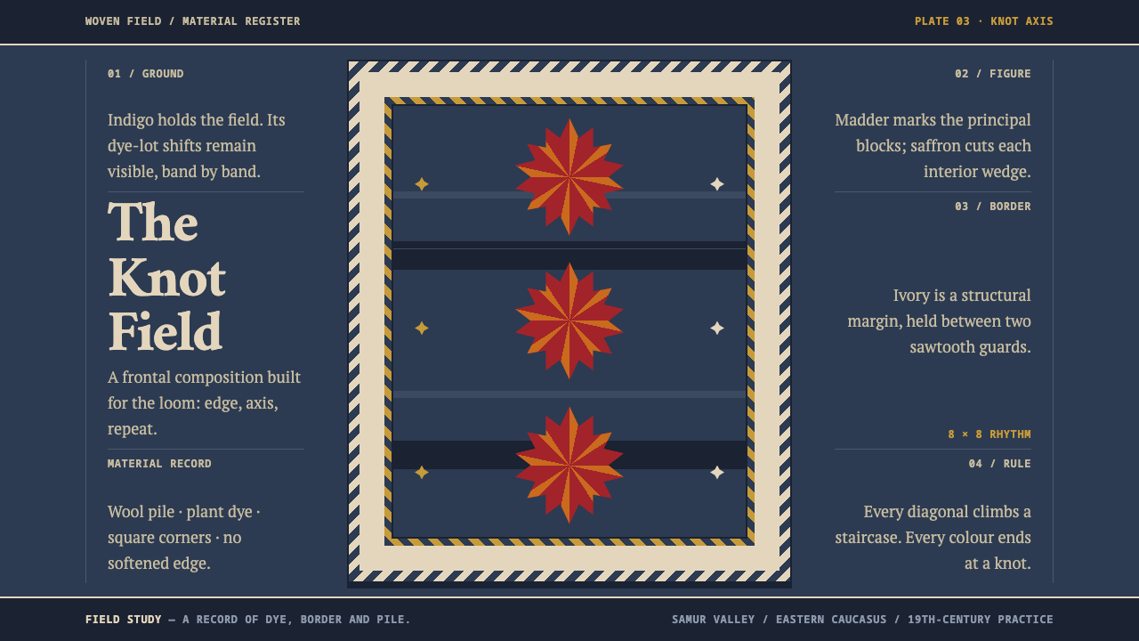 Lezgin Star WeaveKnot logic, made monumental. Madder stars lock into abrash indigo and ivory g…