Design style guide设计风格指南
What is Russian Khokhloma Wood-Red Lacquer?什么是 Russian Khokhloma Wood-Red Lacquer?
Khokhloma is Russia's kiln-fired folk tradition — lacquer-black grounds, scarlet rowanberries, and gold curlicue ornament that turn every wooden spoon into a piece of ceremony.霍赫洛马是俄罗斯窑火中炼就的民间传统——漆黑底面、花楸果猩红与金色卷草,让每一把木勺都成为一件仪式器物。
Russian Khokhloma Wood-Red Lacquer in briefRussian Khokhloma Wood-Red Lacquer 速览
Russian Khokhloma Wood-Red Lacquer is a painted-wood decorative tradition originating in the villages around Semyonov in the Nizhny Novgorod region. Its hallmark is a tricolor palette of absolute authority: a lacquer-black ground carries dense networks of scarlet berries and leaves, while gold curlicue grass winds through every available surface. The result is simultaneously abundant and structured — baroque in density yet clearly organized around a central vine logic that the eye can follow from edge to edge.俄罗斯霍赫洛马漆木红金风格是源自下诺夫哥罗德州谢苗诺夫周边村落的木器彩绘传统,以绝对权威的三色体系著称:漆黑底面上承载着密集交织的猩红浆果与叶片,金色卷草蜿蜒于每一寸可用的表面。最终效果繁盛而有条理——在密度上近于巴洛克,却始终围绕一条中心藤蔓逻辑清晰展开,目光可以从一端追踪至另一端。
What makes Khokhloma visually distinctive is the reversal of expectation. Gold is typically reserved for backgrounds in gilded art, but here it becomes the ornamental mark drawn on top — each stroke of gold grass, each berry cluster, each spiral tendril sits over the black ground like fire reflected in dark water. The scarlet acts as a third term between the extremity of black and the warmth of gold, giving the palette a rhythm that feels neither cold nor garish but genuinely festive.霍赫洛马在视觉上最独特之处在于它对惯例的颠覆。金色在镀金艺术中通常用于底面,而在这里它成为绘制于上层的装饰笔触——每一道金色草叶、每一簇浆果、每一圈螺旋卷须,都悬浮于黑色底面之上,如同暗水中映出的火光。猩红色充当黑色的极致与金色的暖意之间的第三项,赋予整个色板一种节奏感,既不冷峻也不俗艳,而是真正意义上的节庆感。
As a design system, Khokhloma offers a template for surfaces that need to feel simultaneously luxurious and folk-rooted — not the refinement of court aesthetics, but the confident beauty of craftspeople who knew exactly what they were doing. The ornament is never tentative. Every painted surface is worked to fullness, with an understanding that restraint in this tradition reads not as elegance but as incompleteness.作为设计系统,霍赫洛马为那些需要同时传递奢华感与民间根性的表面提供了范本——不是宫廷美学的精炼,而是深知自己在做什么的工匠的笃定之美。装饰从不迟疑。每一块被施以彩绘的表面都被工作至饱满,因为在这一传统中,克制不被读作优雅,而被理解为未竟之功。
Where does Russian Khokhloma Wood-Red Lacquer come from?Russian Khokhloma Wood-Red Lacquer 从何而来?
The story of Khokhloma begins with a technical deception. In the seventeenth century, Old Believer monks — members of a Russian Orthodox sect who had fled persecution into the forests of the Volga-Oka region — brought with them the skills of icon and liturgical-object painting. When the state attempted to collect taxes from woodturners in the surrounding villages, those craftspeople needed a way to produce goods that could pass as gilded altar-ware without the cost of actual gold leaf. The monks showed them a solution: coat a turned wooden object with silvered tin powder, apply linseed-oil varnish, and fire it in a kiln until the combination transmuted into a warm, convincing gold.霍赫洛马的故事始于一场技术性欺骗。十七世纪,旧信徒——一个因拒绝彼得大帝教会改革而遭受迫害、流亡至伏尔加-奥卡河地区森林中的俄罗斯东正教派别——带来了圣像与礼器绘制的技艺。当国家向周边村落的木工车匠征税时,工匠们需要一种方法,能以极低的成本生产出足以冒充镀金祭坛器的商品。旧信徒修士给出了解法:在车制的木器上涂抹镀锡粉末,罩以亚麻仁油清漆,入窑烘烤,使两者发生转化,呈现出温暖而逼真的金色光泽。
The village of Khokhloma, in what is now Nizhny Novgorod Oblast, became the main market hub where these lacquered wooden objects — spoons, kovsh ladles, bratina communal cups, bowls — were traded and eventually gave the style its name. The craft spread through surrounding villages, with each community developing its own plant motifs and compositional conventions while sharing the core palette: black ground, red berry clusters drawn from the native rowanberry, and the signature gold ornament. By the eighteenth and nineteenth centuries, the style had matured into a recognized regional export, with goods traveling to markets throughout Russia and Central Asia.今日下诺夫哥罗德州境内的霍赫洛马村,成为这些漆木器物——木勺、科夫什长柄杯、布拉季纳社交碗、各式盆碗——的主要集散地,并最终将名字赋予了这一风格。工艺随后蔓延至周边村落,各地社区在共享核心色板(黑底、取自本土花楸果的红色浆果、标志性金纹)的同时,发展出各自的植物纹样与构图惯例。至十八、十九世纪,这一风格已成熟为公认的地区出口商品,商货流通至俄罗斯全境及中亚各地。
The technique itself involves multiple stages of patient preparation. A turned wooden form is coated in clay, then in linseed oil, then in a ground layer, before the tin or aluminum powder is applied. The painter then works in tempera, typically building a composition of plant forms — grasses, berries, flowers, sometimes birds or fish as secondary motifs — over the metallic ground. A final application of oil varnish and a second kiln firing locks the colors and converts the metallic ground to gold. The entire process can take weeks for a single complex piece, which is why the tradition demanded skilled village specialists rather than generalist craftspeople.制作工艺本身涉及多个耐心备至的准备阶段。车制成形的木胎先涂以黏土,继而施亚麻仁油,再打底层,最后铺敷锡粉或铝粉。画师随后以蛋彩颜料在金属底层上构建植物形态的画面——草叶、浆果、花卉,有时以飞鸟或游鱼作为次级母题。最终涂抹油清漆并进行第二次窑烧,将颜色固定,并使金属底面转化为金色。整个过程对于一件复杂器物而言可长达数周,这也是为何这一传统需要专精的村落工匠而非全能型手艺人。
The Soviet period brought industrialization to what had been a cottage industry. In 1971, the Khokhloma Artist factory was established in Semyonov as part of broader Soviet efforts to preserve and professionalize folk-art traditions. This institutionalization was a double-edged development: it ensured the survival of Khokhloma techniques through formal training programs and guaranteed markets, but it also standardized some of the natural variation between village painting schools. Key figures in this mid-century revival included Stepan Veselov and Anatoly Strogiy, who documented traditional compositions, and Olga Lushina, whose work in transmitting technique to subsequent generations helped the tradition survive the post-Soviet economic disruption of the 1990s. Today, Khokhloma production continues in Semyonov, with a mix of factory production and individual studio practice.苏联时期将这一家庭手工业推向了工业化。1971年,霍赫洛马艺人工厂在谢苗诺夫建立,是苏联更大范围内保护与专业化民间艺术传统努力的组成部分。这一制度化进程是一把双刃剑:它通过正规培训项目和有保障的市场确保了霍赫洛马技艺的存续,但也将各村落绘画流派之间自然生长的差异标准化了。这一中期复兴中的关键人物包括整理传统构图的斯捷潘·韦谢洛夫与阿纳托利·斯特罗基,以及奥尔嘉·卢申娜——她在向后代传授技艺方面的工作,帮助这一传统渡过了苏联解体后九十年代的经济动荡。时至今日,霍赫洛马的生产在谢苗诺夫延续,工厂生产与个人工作室实践并存。
What defines the Russian Khokhloma Wood-Red Lacquer look?Russian Khokhloma Wood-Red Lacquer 的视觉特征是什么?
The Tricolor Palette三色体系
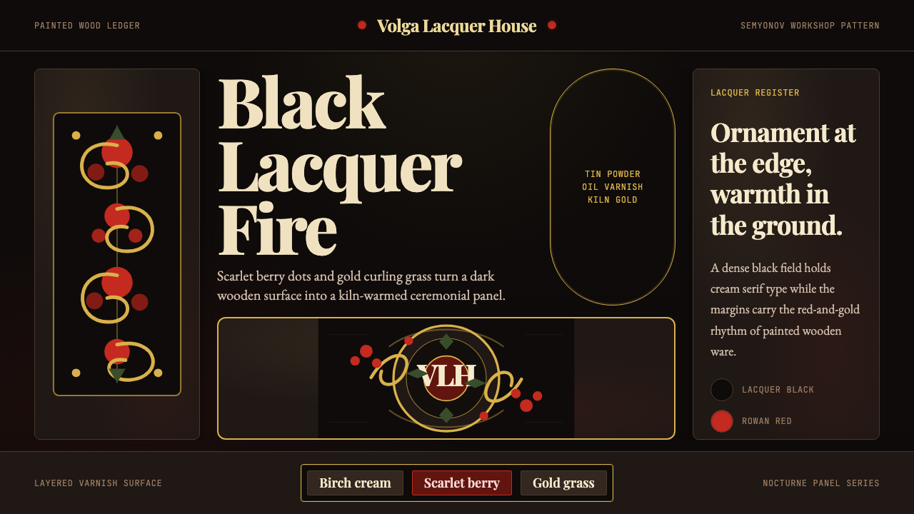
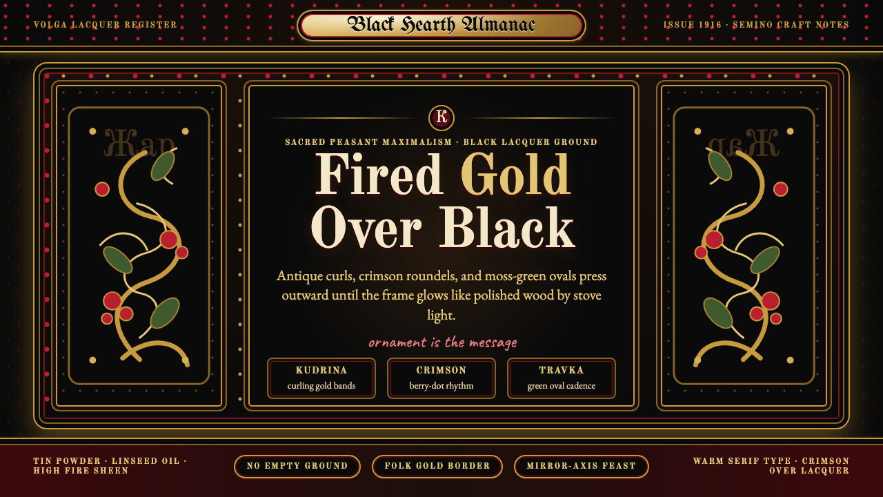
Khokhloma's identity is inseparable from its three-color logic: a deep lacquer black provides the ground; a hot, berry-saturated red — drawn from the native rowanberry — supplies the focal ornament; and a warm, fire-kissed gold traces the connecting grass and vine work. No fourth color competes. The palette achieves its richness not through variety but through the extreme contrast between these three terms, each pushed to its fullest expression against the others.霍赫洛马的身份与其三色逻辑密不可分:深沉的漆黑色提供底面;取自本土花楸果的热烈、浆果般饱和的猩红色构成焦点装饰;温暖而带有窑火气息的金色则勾勒连接各部分的草叶与卷藤。没有第四种颜色参与竞争。这个色板的丰富感不来自多样,而来自这三种元素之间的极度对比——每一种都在另外两种的映衬下被推至最充分的表达。
Organic Ornament Density有机装饰密度
Khokhloma compositions do not leave ground visible as a design element — the black is the canvas, not the breathing space. Grasses, berries, flowers, and spiraling tendrils fill the surface in interlocking layers, with each motif contributing to a continuous flow rather than standing as an isolated element. The density is disciplined: underlying it is a vine-logic structure, typically a central stem from which all secondary forms radiate, that prevents the ornament from becoming visual chaos.霍赫洛马的构图不将底面留白作为设计元素——黑色是画布,而非呼吸空间。草叶、浆果、花卉与螺旋卷须在表面上以交叠的层次填满,每个母题都参与到连续的流动之中,而非作为孤立的元素存在。这种密度是有纪律的:其下隐藏着一种藤蔓式结构逻辑,通常以一根中心茎为轴,所有次级形态从中辐射展开,防止装饰陷入视觉混乱。
Gold as Drawing, Not Ground金色作为绘画,而非底面
In most gilded traditions, gold functions as a background that elevates the subject placed upon it. In Khokhloma, the relationship is inverted: gold is the active mark, the calligraphic line, the energetic flourish drawn over darkness. Each blade of grass, each petal, each spiral terminates in a fine point that emphasizes the painted stroke rather than the fill. This linearity gives Khokhloma ornament a handwritten vitality that flat gilded grounds never achieve.在大多数镀金传统中,金色充当背景,用来烘托置于其上的主体。在霍赫洛马中,这一关系被颠覆:金色是主动的标记,是书法式的线条,是在黑暗之上绘就的充满活力的花饰。每一根草叶、每一片花瓣、每一道螺旋都终结于一个细尖,强调的是笔触本身而非填充区域。这种线性特质赋予霍赫洛马装饰一种手写的生命力,是平铺的镀金底面所无法企及的。
Kiln-Fired Depth窑火炼就的深度
Unlike painted finishes that sit on a surface, authentic Khokhloma lacquer is fused through heat. The final kiln firing does not merely dry the varnish — it chemically transforms the metallic underlayer and locks the painted colors into the lacquer body itself. The resulting surface has a depth that catches light differently than a printed or digitally simulated equivalent: it glows rather than reflects, with a warmth that comes from the material's history of transformation.与停留于表面的普通彩绘不同,真正的霍赫洛马漆器是经由热量熔融而成的。最后的窑烧不仅仅是干燥清漆——它在化学层面上改变了金属底层,并将彩绘颜色锁定于漆体之中。由此形成的表面具有一种深度,它捕捉光线的方式不同于任何印刷品或数字模拟物:它发光而非反光,那种温暖来自材料本身经历转化的历史。
Rowanberry as Signature Motif花楸果作为标志性母题
Among all the botanical elements in the Khokhloma vocabulary — wild strawberries, currants, flowers, herbs — the rowanberry cluster is the most consistently recurring and most immediately identifying. Painted in clusters of small rounded forms, the rowanberry motif carries specific cultural resonance in Russian folk belief: the rowan tree was considered protective, connected to fire and home. In visual terms, the berry cluster provides a focal gathering point within the continuous vine flow, a moment of density that punctuates the ornament's rhythm.在霍赫洛马词汇中的所有植物元素——野草莓、醋栗、花卉、药草——之中,花楸果串是出现最为持续、辨识度最高的一种。以小圆形簇状形式绘制的花楸果母题,在俄罗斯民间信仰中承载着特定的文化共鸣:花楸树被视为具有护佑功能的植物,与火焰和家宅相关联。在视觉层面,浆果簇在连续的藤蔓流动中提供了一个焦点聚集处——装饰节奏中的一个密度顿点。
Bilateral Symmetry and Radial Flow双边对称与放射性流动
Most Khokhloma compositions on flat surfaces — boards, trays, cabinet panels — are organized around a loose bilateral symmetry, with the central vine or floral cluster as the axis. On rounded forms such as bowls and spoons, the composition adapts to a radial logic, spiraling around the form's axis in a way that reads consistently from any viewing angle. This rotational coherence is one of the tradition's most technically demanding achievements, requiring the painter to visualize the complete composition across a curved surface before placing a single mark.霍赫洛马在平面上的构图——木板、托盘、橱柜门板——大多围绕一种宽松的双边对称组织,以中心藤蔓或花卉簇为轴线。在碗、勺等圆弧形器物上,构图则适应一种放射性逻辑,沿器物轴线螺旋展开,从任意观看角度都保持连贯的可读性。这种旋转一致性是这一传统技术要求最高的成就之一,要求画师在落笔之前就在弯曲表面上构想完整的构图。
Festival Register节庆基调
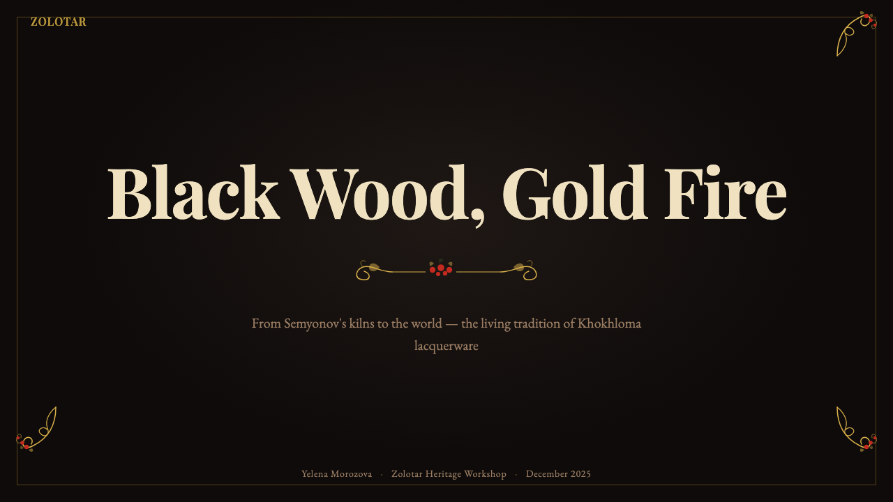
Khokhloma objects were not everyday utensils in the modern sense — they were produced for markets, celebrations, and gift-giving. The visual register of the style reflects this festive function: nothing is understated, nothing is modest. The palette is pushed to its maximum contrast, the ornament to its maximum density, the lacquer to its deepest gloss. Applied to digital surfaces, this register implies a deliberate choice to make the viewer feel that whatever they are looking at is important, valued, and worthy of elaboration.霍赫洛马器物并非现代意义上的日常用具——它们是为集市、节庆与馈赠而生产的。这一风格的视觉基调反映了这种节庆功能:没有任何东西是低调的,没有任何东西是谦逊的。色板被推至最大对比度,装饰被推至最大密度,漆面被推至最深光泽。应用于数字表面时,这种基调意味着一种刻意的选择:让观者感受到他们所看到的一切是重要的、被珍视的、值得繁复对待的。

Who shaped Russian Khokhloma Wood-Red Lacquer?谁塑造了 Russian Khokhloma Wood-Red Lacquer?
Veselov was a master painter active in the mid-twentieth century who contributed to the documentation and transmission of traditional Khokhloma compositional systems. His work helped bridge the gap between the pre-Soviet cottage industry phase and the institutionalized production that followed the 1971 factory establishment, ensuring that the underlying logic of plant-form composition was preserved rather than simply the surface appearance of the style.韦谢洛夫是二十世纪中期活跃的大师级画师,他在传统霍赫洛马构图体系的记录与传授方面作出了重要贡献。他的工作帮助弥合了苏联前家庭手工业阶段与1971年工厂建立后制度化生产之间的断层,确保植物形态构图的内在逻辑得以保全,而不仅仅是风格的表面形态。
Strogiy's contribution lay particularly in the systematic study of historical Khokhloma pieces held in museum collections across Russia. By analyzing and cataloguing the compositional variation between village schools and historical periods, he provided the documentary foundation that allowed the factory revival to draw on authentic source material rather than reconstructing the style from memory or generic folk-art references.斯特罗基的贡献尤其体现在对俄罗斯各地博物馆馆藏历史霍赫洛马器物的系统性研究上。通过分析和整理各村落流派与历史时期之间构图变体,他为工厂复兴提供了文献基础,使其能够从真实的原始材料中汲取养分,而非凭记忆或泛泛的民间艺术参考来重建这一风格。
Lushina's significance is primarily pedagogical. Working through the difficult transitional period of the 1990s, when the factory system faced severe economic pressure and many traditional craft industries collapsed, she maintained active teaching programs that kept the technical knowledge of Khokhloma painting alive in the hands of working practitioners. Her students formed the core of the studio tradition that has since grown alongside the factory system.卢申娜的意义主要体现在教育层面。在九十年代这段艰难的过渡时期——工厂体系承受严峻的经济压力,许多传统工艺产业相继崩溃——她坚持维持活跃的教学项目,使霍赫洛马彩绘的技术知识在实践者手中存续。她的学生构成了此后与工厂体系并行发展的工作室传统的核心。
No single monk is credited by name with the invention of the Khokhloma technique, but the Old Believer communities of the seventeenth-century Volga-Oka forest region are collectively recognized as the originators of the kiln-gilding method that defines the style. Their contribution was not merely technical — they also introduced the icon-painting tradition of compositional richness and the theological association of gold with the divine, which gave Khokhloma its character of sacred seriousness beneath its festive surface.没有哪位修士以名字被记录为霍赫洛马技艺的发明者,但十七世纪伏尔加-奥卡河森林地区的旧信徒群体被集体认定为窑烧镀金方法的创始者——正是这种方法定义了整个风格。他们的贡献不仅是技术层面的:他们同时带来了圣像绘制传统中对构图丰富性的追求,以及金色与神圣性之间的神学关联,赋予霍赫洛马在节庆表面之下那种庄严的底色。
How do you use Russian Khokhloma Wood-Red Lacquer today?今天怎么用 Russian Khokhloma Wood-Red Lacquer?
Khokhloma is one of the most immediately legible folk styles in digital application — its tricolor logic and dense ornamental vocabulary are specific enough to read as a coherent system rather than a generic ethnic decoration. The challenge in applying it correctly is tonal control: the style operates at maximum expressiveness, which means a misapplication tends to feel excessive rather than merely off. Understanding where full intensity serves the design, and where it should be reserved, is the primary skill required.霍赫洛马是数字应用中辨识度最高的民间风格之一——其三色逻辑与密集的装饰词汇足够具体,能被读作一套连贯的系统,而非泛泛的民族装饰。正确应用它的挑战在于基调控制:这一风格在最强表现力的档位上运作,这意味着错误的应用往往让人感到过度而非仅仅跑偏。理解在哪里全力呈现才能服务设计、在哪里应当克制,是所需的核心判断力。
For presentation slides, Khokhloma works most powerfully on covers and section dividers. A cover framing bold title text against a lacquer-dark ground, with gold ornamental elements massed at corners or along margins, establishes the visual register immediately. Content slides should simplify: a dark background with white or warm-toned body text, and perhaps a single Khokhloma-style border element to maintain identity without competing with the information. Data visualization can use the red-and-gold palette for bar fills and accent marks, treating the dark background as the neutral field against which data stands out. The style's natural darkness suits presentations in rooms where screens are ambient — the deep ground absorbs light rather than glaring.在演示文稿中,霍赫洛马在封面与章节分隔页上最具表现力。一张以漆黑色底面衬托粗体标题文字、金色装饰元素集中于角落或页边的封面,能立即确立视觉基调。内容页应当简化:深色背景配以白色或暖调正文,或许加上单条霍赫洛马式边框元素以维系风格身份,同时不与信息内容竞争。数据可视化可以用红-金色板填充柱状条与强调标记,将深色背景作为数据浮现其上的中性场域。这一风格天然的深暗感适合在环境光较暗的会议室放映——深沉的底面吸收光线而非刺目反射。
For web interfaces, Khokhloma is best suited to landing pages, hero sections, and premium product showcases rather than utilitarian interfaces. A dashboard built entirely in the Khokhloma register would overwhelm — the density appropriate to a wooden bowl becomes claustrophobic across a screen full of data. Instead, use the palette and ornamental grammar selectively: a dark header or hero panel with gold ornament framing the brand mark, transitioning to a lighter ground for functional content below. Pricing pages can use the full palette for premium tier cards while keeping lower tiers in a neutral variant, using the visual richness as a signal of value difference.对于网页界面,霍赫洛马最适合落地页、英雄区域与高端产品展示,而非实用性界面。完全以霍赫洛马风格构建的仪表板会令人窒息——适合木碗表面的密度,在充满数据的屏幕上会变得幽闭恐怖。正确做法是选择性地运用色板与装饰语法:深色页眉或英雄面板以金色装饰框住品牌标识,向下过渡到较亮的底面承载功能性内容。定价页面可以为高端套餐卡片使用完整色板,同时将低价套餐保持在中性变体中,以视觉丰富性作为价值差异的信号。
For editorial and marketing work, the style supports opulent title treatments, brand campaigns aimed at cultural resonance, and product photography backgrounds. A food brand evoking artisanal or Eastern European heritage; a spirits label; a festival poster; a luxury goods campaign with Russian cultural associations — all are natural recipients of the Khokhloma vocabulary. Editorial spreads can use a dark-ground panel for pull quotes or chapter openers, with the gold ornament functioning as a typographic surround. Marketing materials targeting Chinese or East Asian audiences should note that the color logic — dark ground, gold and red ornament — shares significant visual DNA with Chinese lacquerware and New Year decoration traditions, making cultural resonance a realistic design goal rather than a stretch.对于编辑与营销内容,这一风格支持华美的标题处理、追求文化共鸣的品牌活动,以及产品摄影背景。一个唤起手工艺或东欧传统的食品品牌;一款烈酒的标签;一张节庆海报;一场带有俄罗斯文化关联的奢侈品推广活动——都是霍赫洛马词汇的自然承接者。编辑跨页可以将深底面板用于引用语或章节起首,金色装饰充当排版围框。面向中国或东亚受众的营销材料应当注意:这一风格的色彩逻辑——深色底面、金红装饰——与中国漆器和新年装饰传统共享大量视觉基因,使文化共鸣成为可期的设计目标而非牵强的联想。
A common mistake is treating Khokhloma as a texture to apply over an otherwise conventional layout. The style does not function as a pattern overlay — it is a complete compositional logic that requires the design to commit to the dark ground and the ornamental density from the start. Applying a Khokhloma border to a white-ground slide, or using the berry motifs as spot decoration on a clean minimalist layout, produces something that looks neither folk nor contemporary but merely confused. The other frequent error is desaturating the red toward burgundy or coral in an attempt to make the palette feel more contemporary. The rowanberry red of Khokhloma is specific — it operates at full chromatic intensity, and moderating it breaks the three-way tension that makes the palette work.一个常见的错误是将霍赫洛马当作叠加于否则常规布局之上的纹理。这一风格并不作为花纹覆层运作——它是一套完整的构图逻辑,要求设计从一开始就在深色底面与装饰密度上全情投入。在白色底面的幻灯片上添加霍赫洛马边框,或将浆果母题作为干净极简布局上的点缀装饰,产生的结果既非民间风格也非当代感,只是令人困惑。另一个常见错误是将猩红色降调至勃艮第红或珊瑚色,试图让色板显得更具当代感。霍赫洛马的花楸果红是特定的——它在完整的色彩强度上运作,降低它会打破使整套色板得以成立的三向张力。
Russian Khokhloma Wood-Red Lacquer — FAQRussian Khokhloma Wood-Red Lacquer · 常见问题
What is the difference between Khokhloma and other Russian folk decorative styles like Gzhel or Zhostovo?霍赫洛马与其他俄罗斯民间装饰风格(如格热利或热斯托沃)有何不同?
All three are distinct regional traditions with non-overlapping visual identities. Gzhel, from the Moscow region, uses cobalt blue on white porcelain with a fluid, painterly brushstroke quality — it is cool, clean, and relatively spare compared to Khokhloma. Zhostovo, also from the Moscow region, features richly modeled floral bouquets on lacquered metal trays, typically on dark grounds but with shaded, three-dimensional flower forms that are far more naturalistic than Khokhloma's flat plant ornament. Khokhloma's defining difference is its gold-on-black ground, its radically flat decorative language, and the kiln-gilding technique that makes its surface a product of transformation rather than applied paint alone.三者都是各自独立的地域传统,视觉面貌互不重叠。格热利来自莫斯科地区,以流畅、绘画性笔触在白瓷上施以钴蓝——与霍赫洛马相比,它是冷调、洁净而相对疏朗的。热斯托沃同样源自莫斯科地区,以漆制金属托盘为载体,呈现丰富塑造感的花卉花束,通常以深色为底,但花卉形态有阴影、具三维感,远比霍赫洛马平面化的植物装饰更具自然主义特质。霍赫洛马的决定性差异在于:金色在黑色底面上的运作方式,彻底平面化的装饰语言,以及使表面成为转化产物而非单纯涂料的窑烧镀金技艺。
Can Khokhloma work effectively in a light-ground digital application, or is the dark background non-negotiable?霍赫洛马在浅色底面的数字应用中能有效运作吗?还是说深色背景是不可协商的?
The dark ground is structurally central — removing it produces something inspired by Khokhloma rather than genuinely applying the system. On a white or cream ground, the gold element loses most of its visibility and the red loses its luminous quality, since both colors derive their intensity from being surrounded by darkness. A light-ground variant is possible for secondary contexts: white backgrounds with rich red plant ornament and selective gold as an accent can evoke the Khokhloma vocabulary for users who need better readability or contrast with surrounding content. But the primary identity of the style lives in the dark ground, and the highest-impact moments in a design using this system should commit to it fully.深色底面是结构性的核心——去除它只能产生受霍赫洛马启发的东西,而非真正运用这一系统。在白色或奶油色底面上,金色元素会失去大部分可见度,红色也会失去其光亮感,因为这两种颜色的强度都来自于被黑暗环绕。浅色底面变体在次级语境中是可行的:白色背景配以丰富的红色植物装饰,以金色作为选择性强调,能够为那些需要更佳可读性或与周围内容形成对比的使用场景召唤霍赫洛马的词汇感。但这一风格的主要身份存在于深色底面中,运用这套系统的设计中最具冲击力的时刻应当对此全情投入。
How does Khokhloma relate to the broader tradition of lacquerware across different cultures?霍赫洛马与不同文化中更广泛的漆器传统有何关联?
Khokhloma emerged independently from East Asian lacquerware traditions, though the functional similarities are striking: dark grounds, gold and red ornament, plant motifs, and objects valued both as utensils and display pieces appear across Chinese, Japanese, Vietnamese, and Korean lacquer traditions as well. The technical methods differ — East Asian lacquerware typically uses urushi resin applied in carefully controlled layers, while Khokhloma uses oil-based varnish kiln-fired over a tin or aluminum underlayer — but the aesthetic outcomes share a family resemblance rooted in the universal logic of gold and red over darkness. This convergence makes Khokhloma-derived design systems broadly legible as festive and precious across different cultural contexts, beyond the specifically Russian or Slavic reference.霍赫洛马与东亚漆器传统是独立发展的,尽管功能性的相似之处颇为惊人:深色底面、金红装饰、植物母题,以及兼具实用与陈设价值的器物形态,在中国、日本、越南与韩国的漆器传统中同样出现。技术方法不同——东亚漆器通常使用大漆(生漆)以精细控制的方式分层涂抹,而霍赫洛马使用油基清漆在锡或铝底层上窑烧——但美学结果共享一种家族相似性,植根于金色与红色映衬黑暗这一普遍的视觉逻辑。这种趋同使得霍赫洛马衍生的设计系统,在超越特定俄罗斯或斯拉夫文化指涉的更广泛文化语境中,都能被读作节庆与珍贵的视觉信号。
Is Khokhloma appropriate for interfaces where accessibility and readability are priorities?霍赫洛马适合以可及性和可读性为优先的界面吗?
The dark-ground palette presents real accessibility challenges when applied to body text — dark backgrounds with colored text require careful attention to ensure sufficient contrast ratios, particularly for red text, which is inherently lower in luminance than white or yellow. The most accessible approach within the Khokhloma system is to reserve the full decorative palette for structural and ornamental elements — headers, borders, section markers, illustration — and to use white or very light warm tones for any body text on dark grounds. Interactive elements should use the gold or white variants rather than red as the primary action color, since red action states can create confusion with error or warning signals. The style is genuinely difficult to apply to dense text-heavy interfaces without compromising either the aesthetic or the readability, which is why it is best suited to surfaces where the decorative register is primary and text density is low.深色底面的色板在应用于正文文字时会带来真实的可及性挑战——深色背景配以彩色文字需要仔细确保足够的对比度,尤其是红色文字,其亮度本身就低于白色或黄色。在霍赫洛马体系内最具可及性的做法是:将完整的装饰色板保留给结构性与装饰性元素——页眉、边框、段落标记、插图——深色底面上的任何正文则使用白色或非常浅的暖调色。交互元素应使用金色或白色变体而非红色作为主要操作色,因为红色操作状态可能与错误或警告信号产生混淆。这一风格确实难以在文字密集的界面上应用而不损害美学或可读性,这也是它最适合装饰基调为主、文字密度较低的表面的原因。
What makes Khokhloma feel authentically folk rather than merely decorative?是什么让霍赫洛马感觉真正具有民间性而非仅仅是装饰性的?
Authentic folk design is characterized by what might be called functional ornament — decoration that has grown from the constraints and purposes of a specific craft tradition rather than being applied from outside. In Khokhloma, the ornament is inseparable from the painted surface: the brushstroke logic, the vine structure, the way each motif terminates in a fine point, all reflect the hand of someone who has internalized the system through years of repetition rather than someone who has looked at reference images and approximated the appearance. When applying the style digitally, the distinction between authentic and decorative manifests in commitment to the underlying logic rather than the surface pattern. Using Khokhloma colors with a minimalist grid layout and no organic structure is decoration; building a composition whose density and vine-logic genuinely echoes the traditional structure is a design that speaks the style's language.真正的民间设计以某种可称为功能性装饰的东西为特征——装饰从特定工艺传统的制约与目的中生长出来,而非从外部附加。在霍赫洛马中,装饰与绘制表面不可分割:笔触逻辑、藤蔓结构、每个母题终结于细尖的方式,都反映着一双通过多年重复将这套系统内化于心的手,而非一个看过参考图像后描摹其外表的人。在数字应用这一风格时,真实性与装饰性之间的区别体现在对底层逻辑而非表面图案的投入上。将霍赫洛马色板与极简网格布局组合、不带任何有机结构,是装饰;构建一个在密度与藤蔓逻辑上真正呼应传统结构的构图,才是一种会说这一风格语言的设计。
Related design styles相关设计风格
 Russian KhokhlomaOrnament is the message. Antique gold curls and crimson dots crowd a black la…纹饰即宣言:黑漆网格上,古金卷草与朱红圆点铺满画面。
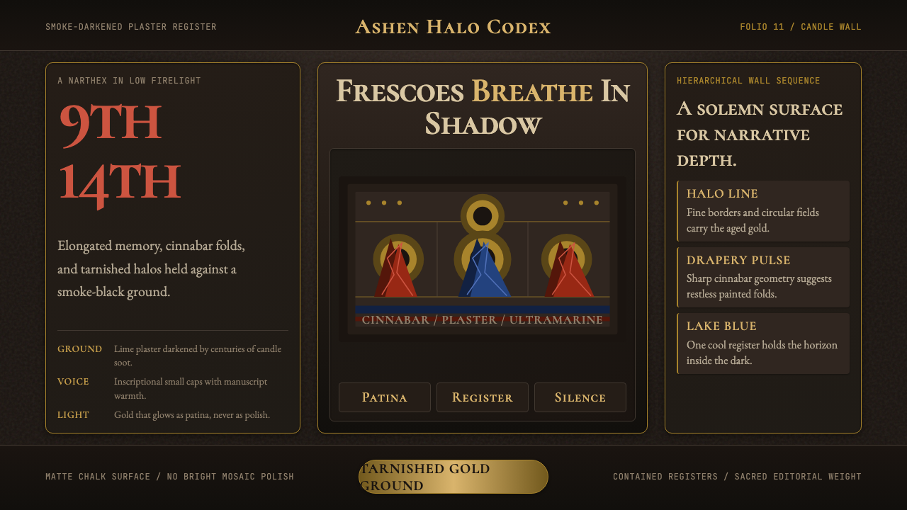 Macedonian Ohrid Fresco (Byzantine)Sacred darkness breathes. Tarnished gold rings, cinnabar folds, and plaster g…神圣暗光在呼吸。暗金圆环、朱砂折线与灰泥颗粒托起它。
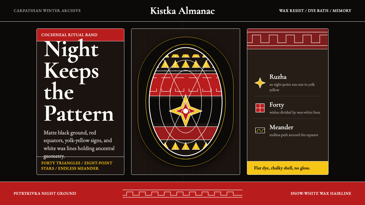 Ukrainian Pysanky (wax-resist egg)Night holds memory. Red bands, yolk geometry, and white wax lines cut matte b…夜色承载记忆:红色带、蛋黄几何与白蜡线刻入哑黑底。
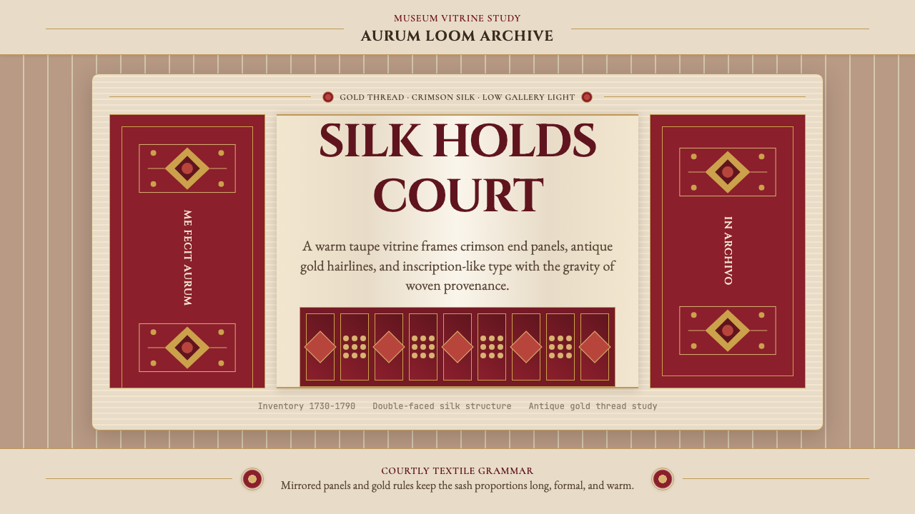 Belarusian Slutsk SashCourtly silk, vitrined. Taupe ground, crimson panels, Cinzel type, antique go…宫廷丝锦入展柜:赭褐底、深红端板、Cinzel 铭文与古金细线。
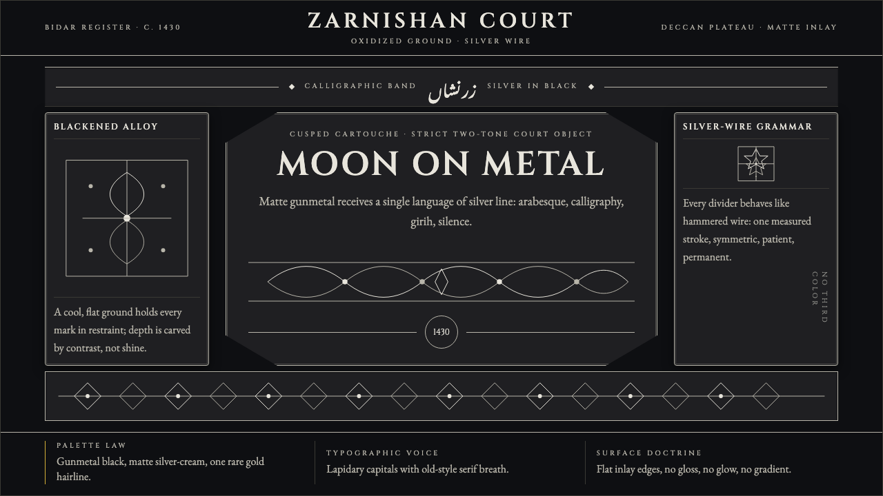 Bidri Deccan MetalworkCourtly darkness, tooled by silver. Cinzel caps and hairline arabesques cut g…宫廷般冷黑。Cinzel 大写与银色藤蔓线切入枪铁黑。
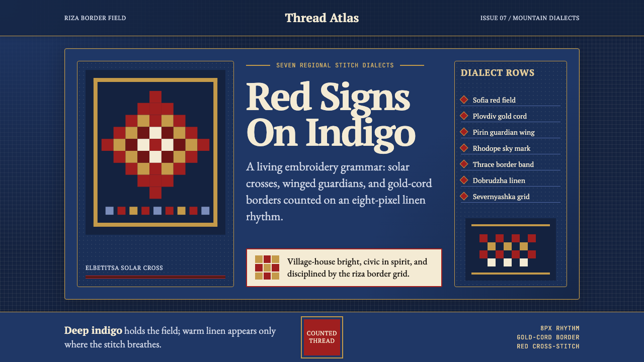 Bulgarian Shevitsa Folk EmbroideryVillage-bright code. Deep indigo carries shevitsa red crosses and gold-cord b…村舍般明亮:深靛蓝承托红色太阳十字与金线边框。