What is Belarusian Slutsk Sash?
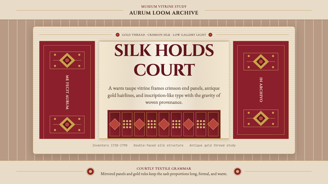
The Slutsk sash — four metres of gold-threaded silk woven for the nobles of the Polish-Lithuanian Commonwealth — is one of Eastern Europe's most opulent textile achievements, and a design system that channels its museum-vitrine grandeur into contemporary work.
Belarusian Slutsk Sash in brief
The Belarusian Slutsk Sash design system draws its entire vocabulary from a single extraordinary object: the kontusz sash, a long silk girdle worn folded or wrapped around the waist of Polish-Lithuanian noblemen from the early eighteenth century onward. These sashes were not mere accessories but declarations of rank, wealth, and cultural identity — embroidered or woven with such precision that each one functioned as a portable monument.
Visually, the style is anchored by a warm taupe ground that evokes aged silk and the ambient light of museum display cases. Against this ground, deep crimson end-panels — the characteristic terminal sections of every genuine sash — provide the primary chromatic drama. Antique gold thread, catching and releasing low light, traces botanical motifs across the surface: stylized pomegranates, carnations, and palmette forms inherited from Persian and Ottoman textile traditions. The overall effect is simultaneously restrained and sumptuous — grandeur held at a respectful distance, as though viewed through glass.
Typography in this system takes its cue from the woven inscriptions that master craftsmen signed into the sash ends. Small-capital letterforms with a classical Roman register echo the gravitas of those Latin signatures. Body text carries an eighteenth-century printing-house weight — substantial, unhurried, meant to be read carefully rather than scanned. Every typographic choice reinforces the sense that the content inside the system has been made with patience and skill.
Where does Belarusian Slutsk Sash come from?
The Slutsk sash owes its existence to a remarkable convergence of patronage, diaspora craft, and imperial fashion. In the early eighteenth century, the wearing of Persian-style silk girdles — imported from Ottoman trade routes or commissioned from craftsmen of Armenian descent — had become essential to the identity of the Polish-Lithuanian szlachta, the noble class defined by its Sarmatian self-mythology. These nobles believed themselves descended from the ancient Sarmatians, a Central Asian warrior people, and their dress code — heavy fur-trimmed coats, sabers, and elaborately woven sashes — performed that ancestral identity.
The Radziwiłł family, one of the most powerful magnate dynasties in the Commonwealth, recognized both the cultural significance and the commercial opportunity. Michał Kazimierz Radziwiłł and his successor Hieronim Florian Radziwiłł established the Persiarnia — literally a Persian-style workshop — in the town of Slutsk, in what is now southern Belarus, in the 1730s. The term Persiarnia underscores the aspiration: this was not merely a textile manufactory but an attempt to transplant the prestige of Eastern luxury production onto Commonwealth soil.
The master weaver who gave the Slutsk sash its definitive character was Jan Madżarski, an Armenian craftsman whose surname signals his heritage. Armenians had long formed a diaspora merchant and artisan community throughout the Commonwealth, and Armenian weavers brought with them the technical traditions of Persian carpet and textile production — the handling of silk warps, the integration of metallic threads, the repertoire of botanical motifs. Jan Madżarski fused these Eastern techniques with European Baroque compositional sensibility, producing sashes that were neither purely Oriental nor purely Western but something singular and distinctive. His signature — woven in Latin into the fabric itself — is one of the earliest known examples of a craftsman's brand, and it became a mark of authentic quality in the sash market.
Production at the Slutsk Persiarnia continued through the 1790s, with Jan's son Leon Madżarski carrying on the work. The sashes were woven on draw looms — complex mechanical frames that allowed the controlled lifting of individual warp threads to create precise figurative patterns. Each sash took months to produce, and the finest examples incorporated gold and silver threads throughout. When the Polish-Lithuanian Commonwealth was partitioned and ultimately dissolved in the 1790s, the cultural context that had sustained the sash trade collapsed. Production dwindled and eventually ceased. Today, surviving Slutsk sashes are among the most prized objects in Belarusian national heritage, held in museum collections across Belarus, Poland, and Lithuania and displayed as witnesses to a vanished civilization's material ambitions.
What defines the Belarusian Slutsk Sash look?
Ground Color
The foundation of the palette is a warm taupe — the exact tone of aged, undyed silk pulled from a museum archive — neither cream nor grey but something between the two, carrying an inherent sense of material age and custodial dignity. This ground does not compete with the ornamental elements laid upon it; instead, it absorbs and amplifies their warmth, functioning like the interior lining of a display case.
Crimson End-Panels
Every authentic Slutsk sash terminates in richly patterned panels that contrast sharply with the main field. In this design system, deep crimson — the hue of madder-dyed silk seen by candlelight — fulfills this structural role. The crimson is used sparingly and purposefully: as a header or footer band, as a primary accent for calls to action, or as a boundary marker in data visualizations. It carries connotations of ceremony and conclusion rather than alarm.
Gold Thread Motifs
Antique gold is the accent that holds the entire palette together. Not a bright modern yellow-gold but something more muted and burnished — the quality of lamp-lit metal thread that has been handled and folded over centuries. In two-dimensional applications, this manifests as hairlines, fine rule separators, and delicate ornamental flourishes that suggest the woven signature or the botanical border of an original sash. Gold is never used in large filled areas; its power comes from restraint.
Botanical Ornament
The floral and foliate vocabulary of the Slutsk sash — pomegranates, carnations, tulips, palmette forms — comes from the long chain of transmission connecting Persian carpet design, Ottoman embroidery, and Armenian weaving craft. In a contemporary design system, this ornament appears as a subtle surface layer: background textures built from repeated botanical motifs at low opacity, decorative dividers styled as stylized floral bands, or illustrative accents that mark key pages. The motifs are always simplified and flattened, never photographic.
Typography Register
The typographic voice of the system is classical and lapidary. Display text is set in small capitals that evoke the Latin inscriptions woven into sash ends — measured, monumental, with each character earning its space. Body text is set in a roman typeface of Old Style character, with generous line spacing that recalls the unhurried pace of eighteenth-century printing. There is no place here for condensed faces, decorative scripts, or the aggressive optical sizing of digital-native design. Everything is measured, patient, and meant to last.
Symmetry and Centrality
Unlike the asymmetric compositional logic of modernist movements, the Slutsk Sash system is rooted in bilateral symmetry — the natural structure of a woven band, which reads the same from either end when doubled back. Headers, hero sections, and decorative panels are typically centered, with ornament disposed evenly on both sides of a central axis. This symmetry communicates formality and permanence, and it distinguishes the style from contemporary grid-based design systems that favor dynamic tension over repose.
Museum Vitrine Atmosphere
Perhaps the most distinctive quality of this design system is its evocation of the curatorial gaze — the experience of encountering a precious object under controlled lighting, behind glass, with a placard providing context. This atmosphere is achieved through generous white space, unhurried layout pacing, a preference for cool but warm-toned ambient backgrounds, and the consistent use of fine separating lines that resemble the display case frame. The viewer is never rushed; every element is presented as worthy of sustained attention.
Who shaped Belarusian Slutsk Sash?
Jan Madżarski was the Armenian master weaver who established the Slutsk Persiarnia's distinctive style in the mid-eighteenth century. His technical genius lay in his ability to fuse the botanical motif vocabulary and metallic thread handling of Persian and Ottoman textile craft with European Baroque compositional principles. His decision to weave his Latin signature into each sash — a practice his son Leon continued — transformed the sash from anonymous craft production into something closer to signed fine art. This act of authorial inscription is one of the reasons surviving Slutsk sashes retain such strong individual identity despite being utilitarian objects.
Leon Madżarski, Jan's son, continued production at the Slutsk Persiarnia through the latter decades of the eighteenth century, maintaining both the technical standards and the signature practice his father had established. The Slutsk sash under Leon's direction developed a slightly more elaborate ornamental vocabulary, reflecting the rococo tendencies of late-Commonwealth artistic taste. His continuation of the workshop into a second generation ensured that Slutsk — rather than other competing manfactories — became the definitive name in Polish-Lithuanian sash production, the provenance that collectors and wearers sought above all others.
Michał Kazimierz Radziwiłł was one of the Radziwiłł magnates whose patronage made the Slutsk Persiarnia possible. As one of the wealthiest and most powerful nobles in the Polish-Lithuanian Commonwealth, he had both the resources to fund a luxury textile manufactory and the social influence to make its products desirable throughout the szlachta. His family's decision to establish the workshop in Slutsk was a deliberate act of cultural prestige-building: by replacing imported Persian and Ottoman sashes with domestically produced equivalents of equal quality, the Radziwiłłs positioned themselves as cultural guardians of Sarmatian noble identity.
Hieronim Florian Radziwiłł, another key member of the dynasty, continued and expanded his family's patronage of the Slutsk manufactory. Under his supervision, the Persiarnia refined its production methods and expanded its range of ornamental patterns. Hieronim Florian's court was itself a center of Sarmatian cultural performance — he maintained the dress code, the ceremonies, and the aesthetic standards that made Slutsk sashes not simply luxury goods but required equipment for participation in Commonwealth noble culture. His role illustrates how closely the workshop's artistic development was tied to the social rituals it served.
No single individual, but the Armenian craftsman community that settled across the Polish-Lithuanian Commonwealth from the medieval period onward deserves recognition as a collective creative force behind the Slutsk sash. Armenian merchants and artisans brought with them the technical knowledge of Near Eastern silk and carpet production — knowledge accumulated over centuries of trade and workshop practice along the Silk Road and through the Armenian homeland. The Madżarski family were among the most prominent members of this diaspora, but the broader community sustained the workshops, transmitted the patterns, and ensured that the visual vocabulary of Persian textile design was available for transformation into something distinctly Commonwealth.
How do you use Belarusian Slutsk Sash today?
The Slutsk Sash design system is well suited to work that needs to communicate heritage, institutional authority, and material quality without resorting to generic luxury clichés. Because its visual vocabulary is specific — rooted in a single extraordinary object and a precisely documented historical context — it produces work that feels researched and intentional rather than loosely evocative. This specificity is both its strength and its constraint: the style rewards audiences who will encounter the depth and strains under contexts that demand frictionless approachability.
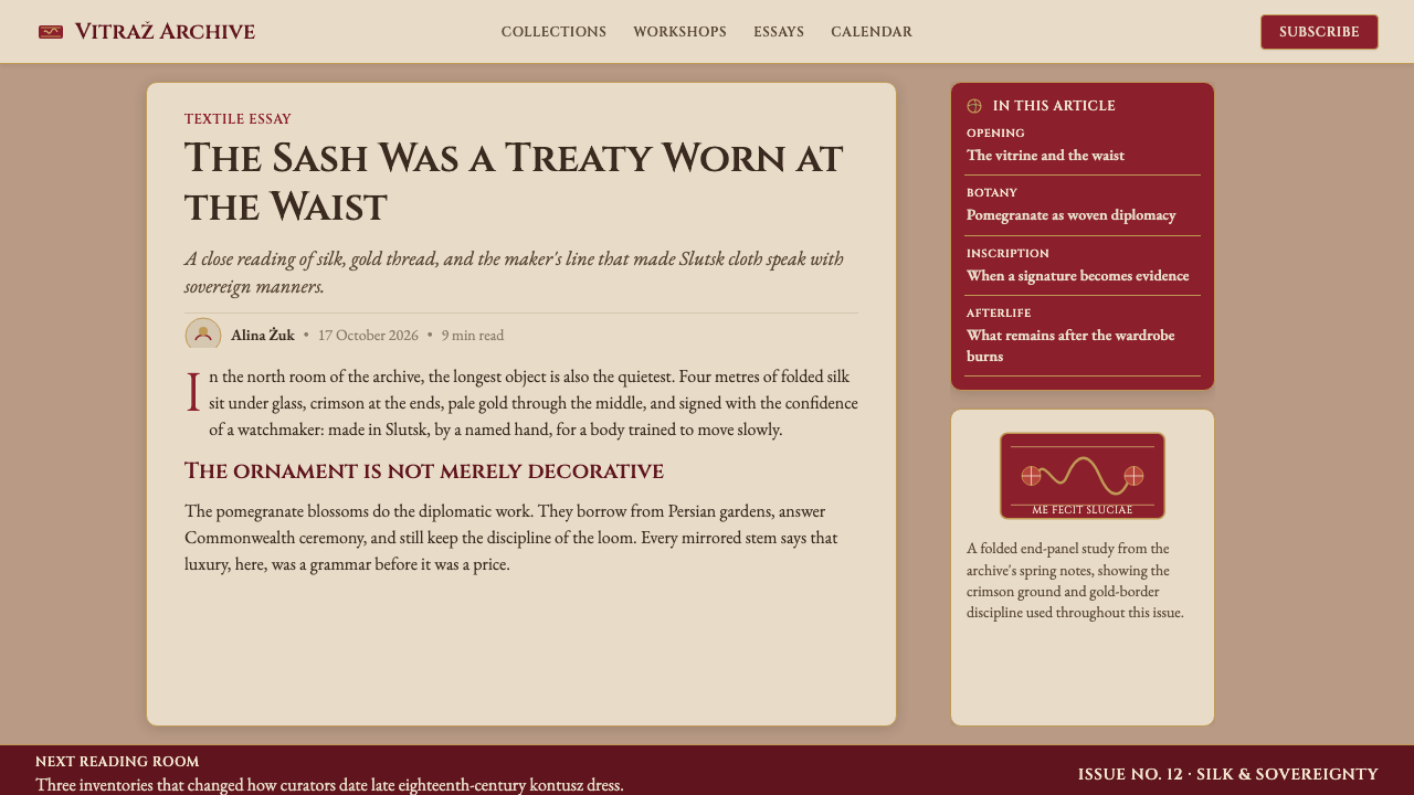
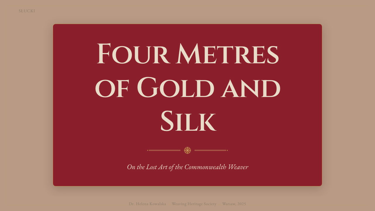
For presentation slides, the system works best in cultural and institutional contexts: museum fundraising decks, heritage brand strategy presentations, academic lecture slides, and high-end cultural-tourism materials. A cover page built in this register uses the warm taupe as the full-bleed ground, places the title in centered small-capital display type, and frames the headline with a pair of fine gold rules above and below. The crimson is held back for section dividers — a full-width horizontal band that marks the transition between chapters. Content slides adopt a simpler variant: taupe ground, black body text in a classical roman face, gold hairlines to separate headers from content, and occasional botanical ornament in corners as a restrained reminder of the system's origin.
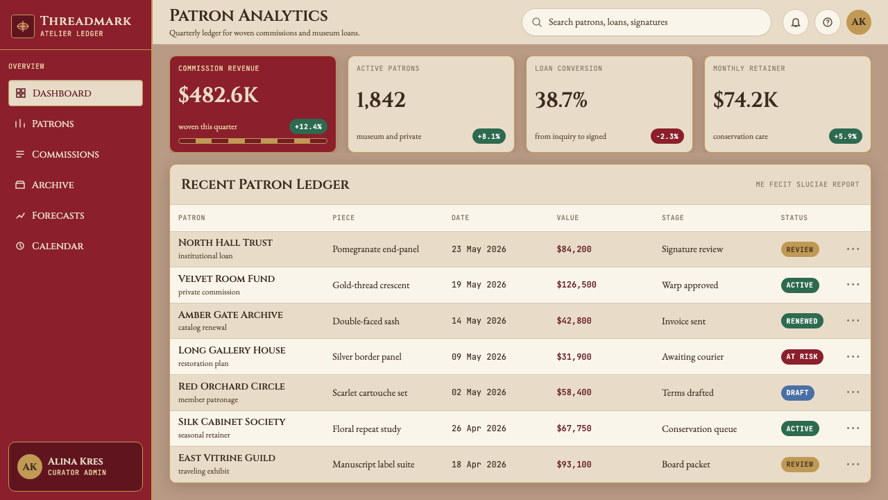
For web applications and digital interfaces, the Slutsk Sash vocabulary maps best onto contexts where the user is expected to slow down and pay attention: online museum collections, digital archives, exhibition catalogue websites, rare-book dealer platforms, and cultural institution dashboards. Navigation should be typographic and unhurried — label-based menus with generous spacing rather than icon-driven compact interfaces. Cards displaying items should use shadow rather than border, and the gold hairline separator should appear consistently between metadata fields. The crimson is reserved for primary interactive elements — a selected state, a purchase button, a featured designation — to preserve its connotative weight.
For editorial and marketing work, the system supports long-form content with high production values. A magazine-style article layout might use the full taupe ground for a chapter opening, drop into white for the reading portion, and use crimson pull-quotes to break long passages. Marketing materials for heritage brands — hospitality, spirits, luxury goods, cultural institutions — can adopt the botanical ornament as a recurring motif across print collateral, packaging, and environmental signage. The gold-on-taupe hairline is a particularly versatile element: it translates to foil-stamped print finishes, embossed stationery, and engraved signage without losing its character.
A common mistake when working with this system is over-saturating the palette — applying the crimson and gold in large areas simultaneously, producing something that reads as Christmas decoration rather than museum vitrine. The original sashes used their colors hierarchically: the vast middle field was relatively subdued, and the vivid patterned end-panels appeared only at the margins, earning their drama through restraint of context. Digital applications should observe the same logic: keep the taupe dominant, introduce crimson at key structural points only, and use gold as a detail layer at small scale. Another frequent error is pairing the system's classical typography with contemporary UI conventions — rounded corners, heavy box shadows, color fills on cards — which dissolves the historical register. Consistency of register, not individual element quality, is what makes this system cohere.
Belarusian Slutsk Sash — FAQ
What exactly is a kontusz sash, and how does it differ from an ordinary belt or sash?
A kontusz sash was not a simple waist fastening but a prestige object worn as part of the formal noble dress code of the Polish-Lithuanian Commonwealth. It was typically four to five metres long and roughly forty centimetres wide, woven from silk with metallic thread, and worn by folding or wrapping it multiple times around the waist over a long coat called a kontusz. The ends — patterned with the most elaborate ornament — were deliberately left visible or draped over the arm as a display of wealth. The sash's function was at least as much social and symbolic as practical: it identified its wearer's class, taste, and the workshop of provenance.
Why is the Slutsk Persiarnia considered so important if similar sashes were produced elsewhere?
Several Polish-Lithuanian cities hosted sash-weaving workshops in the eighteenth century, but Slutsk achieved a reputation for quality and authenticity that its competitors never matched. Jan Madżarski's practice of weaving his signature into each sash created a legible mark of provenance that buyers could trust — and eventually demand. The Radziwiłł family's patronage also meant the workshop had resources to employ the finest materials and maintain consistent standards. In prestige markets, provenance and certification of authorship matter as much as raw quality, and Slutsk established both more effectively than its rivals.
How does this design system work in dark-mode or dark-background applications?
The Slutsk Sash system is fundamentally a light-ground system — its warmth and prestige come from the interaction of taupe, crimson, and gold on a surface that reads as lit from within, like a display case. A dark inversion is possible but requires care. The most effective approach is to replace the taupe ground with a deep, slightly warm near-black — the tone of black velvet used in jeweler's displays — and allow the gold thread motifs to become the dominant surface element, as they would under directed museum lighting. Crimson retains its role but should be used even more sparingly against a dark ground, where it can easily become overwhelming. The classical typography should remain, but line spacing may need to increase to maintain legibility.
Is the botanical ornament necessary, or can the style work without it?
The botanical ornament is a characteristic rather than a structural requirement. The core of the style is the color palette — taupe ground, crimson panels, antique gold accents — and the classical typographic register. These elements alone will produce work that reads as Slutsk-derived. The botanical motifs add a layer of cultural specificity and surface richness that deepens the association, but they can be omitted or minimized in applications where a cleaner surface is needed — digital interfaces, data-heavy dashboards, or minimal editorial layouts. When omitted, the system shifts toward a more generic heritage register; when included, even at low opacity as background texture, the cultural specificity of the reference becomes unmistakable.
What contexts is this style poorly suited for?
The Slutsk Sash system struggles in contexts that require immediacy, informality, or high-energy dynamism. Technology startups, youth-oriented consumer brands, sports and fitness applications, social media-native content, and any product positioning itself as disruptive or anti-establishment will find the style's deliberate formality and historical weight working against the desired impression. The system's symmetry and classical pacing also make it poorly suited to fast-scrolling content formats — the unhurried register assumes the reader will stop and dwell, not swipe past. Finally, the color palette's warmth and historical connotation can feel exclusionary in multicultural contexts where the specific Central European heritage it references carries no resonance or carries unwanted associations.
Related design styles
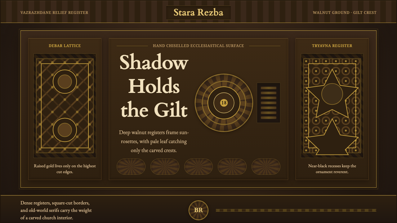 Bulgarian Revival WoodcarvingDark devotion in relief. Walnut panels, Cardo serifs, and gilt rosettes catch…
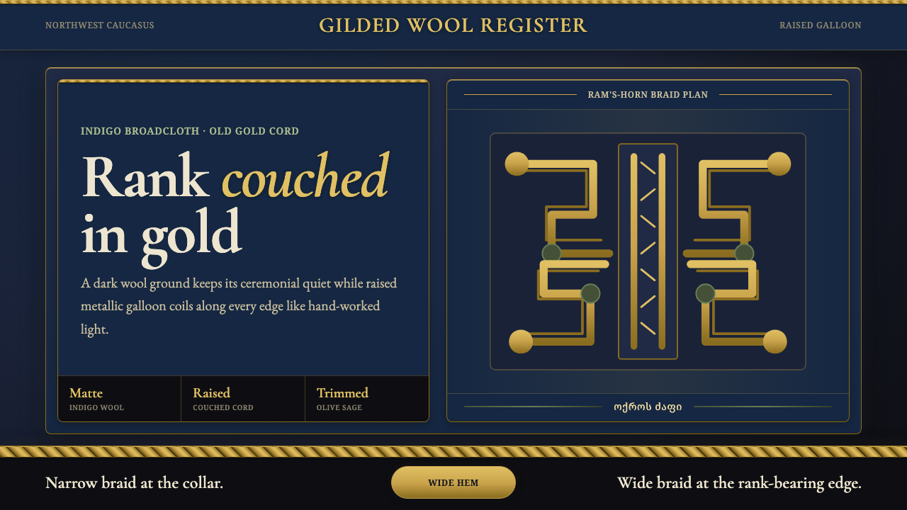 Circassian Adyghe Gold BraidCourtly gold on dark wool. Raised braid edges coil over indigo-black panels.
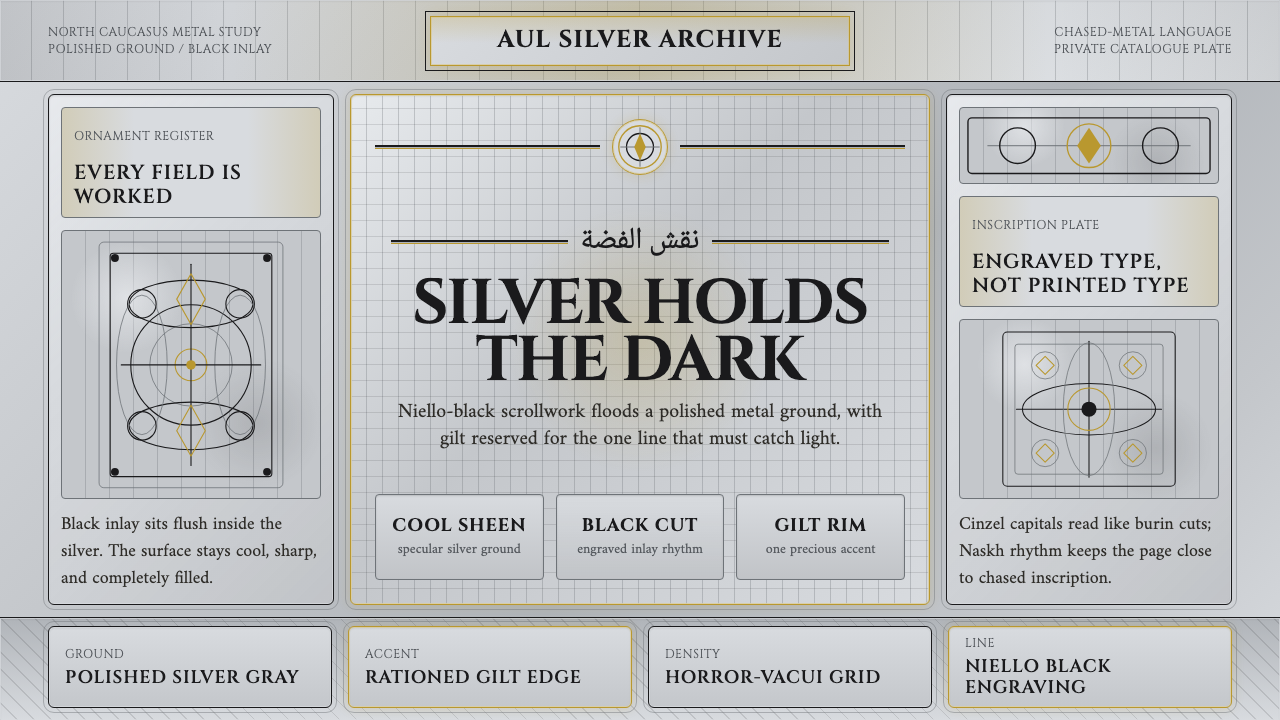 Dagestan Kubachi Silver NielloSilver made obsessive. Niello-black scrolls cover cool metal, with one ration…
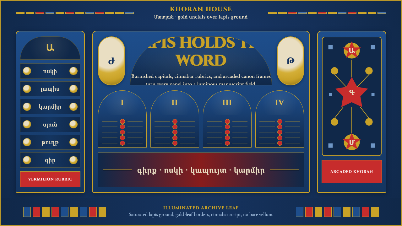 Armenian Manuscript FolkloreJewel-dense devotion. Lapis ground, gold uncials, and vermilion arcades fill…
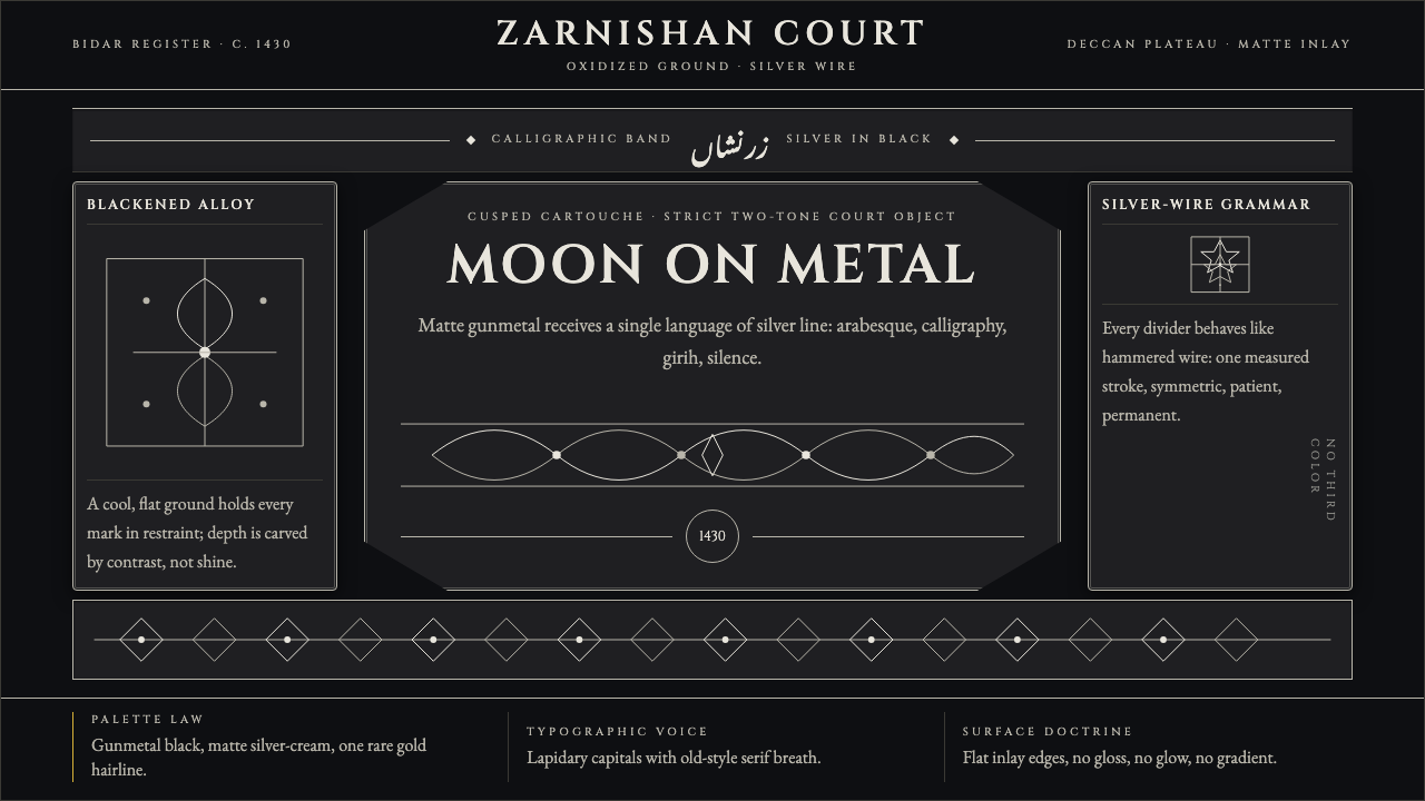 Bidri Deccan MetalworkCourtly darkness, tooled by silver. Cinzel caps and hairline arabesques cut g…
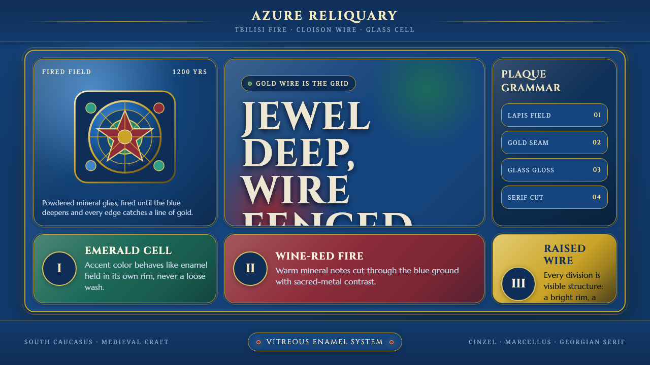 Georgian Minankari CloisonnéJewel-deep and wire-fenced. Lapis enamel, gold seams, emerald cells, glossy s…