Design style guide设计风格指南
What is Kosovar Prizren Filigree Silver?什么是 Kosovar Prizren Filigree Silver?
Prizren filigree turns silver wire finer than human hair into coiled lace — and this design system translates that craft discipline into a palette of cool stone grey, deep burgundy velvet, and hairline geometry.普里兹伦银丝工艺将细如发丝的银线盘绕成蕾丝——这套设计系统将这份匠心转化为冷石灰、深酒红与发丝几何的视觉语言。
Kosovar Prizren Filigree Silver in briefKosovar Prizren Filigree Silver 速览
Kosovar Prizren Filigree Silver is a design system rooted in one of the oldest continuous silversmithing traditions in the Balkans. Prizren filigree — known locally as filigranu — is the art of drawing silver into wire so fine it approaches the diameter of a human hair, then coiling, twisting, and soldering those threads into bridal pendants, prayer amulets, and ceremonial belt ornaments. The craft's visual signature is negative space: the lacework is defined as much by the air inside its spirals as by the silver that forms them.科索沃普里兹伦银丝风格是一套根植于巴尔干半岛最古老持续银器工艺传统之一的设计系统。普里兹伦银丝工艺(当地称 filigranu)是将银线拉至发丝般细度,再经盘绕、扭转与手工焊接,制成新娘吊坠、祈祷护符与礼仪腰带装饰品的技艺。这门工艺的视觉标志是负空间:镂空网格由螺旋内的空气与构成螺旋的银线共同界定。
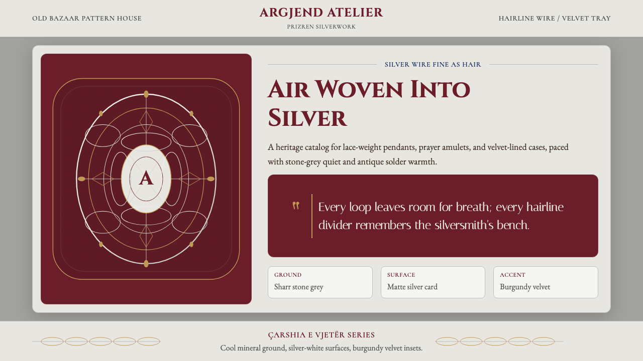
Translated into a screen and print design system, this tradition yields a distinctive palette and a rigorous set of structural principles. Cool Sharr-mountain stone grey serves as the primary ground, evoking the dressed limestone of Prizren's old bazaar buildings. Silver-white card surfaces catch light the way polished metalwork does. Deep burgundy velvet — the traditional display cloth on which silversmiths lay finished pieces — provides the system's darkest accent. Antique gold, borrowed from the color of solder at the point of joining, and a resonant indigo drawn from the Sinan Pasha Mosque's tilework complete the palette.转化为屏幕与印刷设计系统后,这一传统产生了独特的色板与严格的结构原则。沙尔山冷石灰色作为主底色,唤起普里兹伦旧市集石灰岩建筑的质感;银白卡面如抛光金属般捕捉光线;深酒红天鹅绒——银匠陈列成品的传统展布——构成系统最深的强调色。古金色取自焊接点的颜色,清真寺砖石的靛蓝色共同补完整套色板。
What makes this system unusual is its equation of restraint with richness. Filigree jewelry looks dense and elaborate from a distance, but up close it is mostly open air held in place by near-invisible wire. A design system built on this principle treats whitespace not as the absence of content but as the structural material itself — as essential as the dividing lines, the spiral ornaments, and the small-capitals type that reference the craft bench.这套系统的独特之处在于将克制等同于丰富。银丝首饰远观繁复华丽,近看却多为几乎不可见的细线撑起的大片空气。以此为原则建立的设计系统将留白视为结构性材料本身,而非内容的缺席——与细线分隔、螺旋角饰、小型大写字母排版同等重要,共同呼应工匠的工作台。
See the Kosovar Prizren Filigree Silver design system →查看 Kosovar Prizren Filigree Silver 完整设计系统 →
Where does Kosovar Prizren Filigree Silver come from?Kosovar Prizren Filigree Silver 从何而来?
Prizren, in southern Kosovo, has been a silversmithing center since at least the sixteenth century, when the city flourished as a crossroads of Ottoman trade routes connecting the Adriatic coast to the Anatolian interior. The Old Bazaar — Çarshia e Vjetër — concentrated craftsmen by trade in the Ottoman guild tradition, and the silver quarter (argjendar) became one of the densest and longest-lived concentrations of filigree expertise anywhere in the Balkans. By the nineteenth century, when filigree reached its widest circulation as an export craft, Prizren pieces were reaching markets from Thessaloniki to Vienna.科索沃南部的普里兹伦自至少十六世纪起便是银器工艺中心。彼时该城作为奥斯曼贸易路线的十字路口蓬勃发展,连通亚得里亚海岸与安纳托利亚内陆。旧市集(Çarshia e Vjetër)依照奥斯曼行会传统将同业工匠聚集于一处,银匠区(argjendar)成为巴尔干半岛银丝工艺最为密集、延续最久的聚集地之一。十九世纪银丝工艺作为出口手工艺流通最广时,普里兹伦的作品已远销塞萨洛尼基至维也纳的各地市场。
The technique itself descends from a broader Mediterranean and Middle Eastern filigree tradition that traveled along the same Ottoman trade networks, but Prizren developed a recognizable regional character. Local smiths favored tighter, more geometric coil patterns over the floral scrollwork common in coastal Adriatic workshops. The characteristic concentric ring frames and the use of fine twisted wire as a ground for applied spiral elements — rather than a smooth sheet metal backing — mark Prizren pieces as distinct even among expert eyes. The craft was transmitted family to family, often between women who handled the finest finishing work, and the knowledge of specific spiral sequences was treated as proprietary.这门技艺本身源于沿奥斯曼贸易网络传播的更广泛地中海与中东银丝传统,但普里兹伦发展出了可辨识的地域特色。本地工匠偏好更为紧凑、几何感更强的螺旋纹样,而非亚得里亚海岸工坊惯用的花卉卷草。特有的同心环框架,以及以细绞线为底铺设旋转螺旋元素——而非光滑金属板作衬底——的手法,使普里兹伦作品即便在行家眼中也截然有别。这门技艺在家族间口耳相传,负责最精细收尾工作的往往是女性成员,特定螺旋序列的知识被视为家传秘技。
The collapse of Ottoman markets in the late nineteenth and early twentieth centuries, followed by the disruptions of two World Wars and Yugoslav-era industrial policy, brought the trade close to extinction. By the mid-twentieth century, only a handful of family workshops remained in operation. The survival of the tradition into the present is largely attributable to a small number of master smiths — Zeqir Berisha and Naim Ferri among them — who continued working through the Yugoslav period and who trained the next generation. Hatixhe Berisha, who operated her own workshop, represents a line of women practitioners whose role in preserving the finest finishing techniques is historically underrecorded.十九世纪末至二十世纪初奥斯曼市场的衰落,加之两次世界大战与南斯拉夫时期工业政策的冲击,使这门手艺几近消亡。二十世纪中叶,在运营中的家族工坊已屈指可数。传统延续至今,很大程度上归功于极少数坚持工作于南斯拉夫时期并培养下一代的大师——泽齐尔·贝里沙与纳伊姆·费里等人。哈蒂赫·贝里沙经营着自己的工坊,代表着一脉女性从业者的传承,她们在保存最精细收尾技艺方面的历史贡献长期被低估。
Today, Prizren filigree is recognized as part of Kosovo's intangible cultural heritage, and the Old Bazaar district has seen modest revival investment. The craft occupies an ambiguous position — cherished as national emblem and tourist draw, yet practiced by only a few dozen active smiths. This tension between celebration and precarity is built into the design system's sensibility: it treats filigree as a living reference, not a museum artifact, which means adapting its visual grammar to contemporary contexts without flattening the specific knowledge that makes it extraordinary.今日,普里兹伦银丝工艺已被列为科索沃非物质文化遗产,旧市集区也获得了有限的复兴投入。这门手艺处于一种矛盾的位置——被视为民族象征与旅游资源而受到珍视,却只有数十名活跃工匠在坚持。这种褒扬与脆弱并存的张力,融入了这套设计系统的感性底色:它将银丝工艺视为活的参照,而非博物馆文物,这意味着将其视觉语法适配于当代语境,同时不磨平使之非凡的特定知识。
What defines the Kosovar Prizren Filigree Silver look?Kosovar Prizren Filigree Silver 的视觉特征是什么?
Palette色板
The palette is composed of four primary tones drawn directly from the physical craft: cool stone grey (the limestone of Prizren's old bazaar walls), silver-white (the reflective surface of polished filigree), deep burgundy (the velvet display cloth), and antique gold (the color of solder at joining points). Indigo drawn from the Sinan Pasha Mosque's tilework appears as a secondary accent. The palette reads as both archival and austere — no warm pastels, no bright saturated hues. Color carries material memory rather than emotional signal.色板由直接取自实物工艺的四种主调构成:冷石灰色(普里兹伦旧市集建筑的石灰岩)、银白色(抛光银丝的反光表面)、深酒红色(展示用天鹅绒衬布)与古金色(焊接点的颜色)。取自锡南帕夏清真寺砖石的靛蓝色作为次要强调色出现。整套色板兼具档案感与肃穆感——无暖色粉调,无高饱和鲜色。色彩承载的是材料记忆,而非情感信号。
Hairline Dividers发丝细线分隔
Borders and dividing rules in this system are drawn at the thinnest weight that remains visible — referencing silver wire stretched to its limit before it breaks. These hairline rules mark section boundaries, frame content areas, and separate typographic hierarchies without adding visual mass. Where multiple rules appear together, they are spaced in concentric arrangements that echo the concentric ring frames used in physical filigree pendants. The line is the system's most basic gesture, and its fineness is the source of the style's characteristic tension between strength and delicacy.系统中的边框与分割线以保持可见的最细笔画绘制——呼应银线被拉伸至断裂临界时的状态。这些发丝细线标记章节边界、框定内容区域、区分排版层级,而不增加视觉重量。多条线并列时,以同心方式排列,呼应实体银丝吊坠中的同心环框架。线条是这套系统最基本的姿态,其纤细是风格在力量与精致之间特有张力的来源。
Filigree Spiral Ornaments银丝螺旋角饰
Corner ornaments, section markers, and decorative accents in this system are derived from the coiled wire spirals of actual filigree work — simplified into geometric glyphs that retain the sense of hand-crafted rotation. These ornaments appear sparingly: a single spiral at a section break, paired spirals flanking a headline, or a complete concentric arrangement framing a central element. They are never used as background texture or repeated patterns. Each occurrence is as deliberate as a solder joint — placed because it marks a structural point, not for visual decoration.系统中的角饰、章节标记与装饰性点缀均源自实物银丝螺旋——简化为保留手工盘绕感的几何字形。这些装饰元素使用克制:一个螺旋标记章节断点,成对螺旋衬于标题两侧,或以完整同心排列框住中心元素。它们从不用作背景肌理或重复纹样。每次出现都如同一个焊接点一样刻意——因为标记结构节点而存在,而非服务于视觉装饰。
Typography字体排印
Type in this system is set in serif letterforms — ideally classical cut display serifs — at wide tracking and in small capitals for primary headings. This treatment references the engraved inscriptions on Ottoman-era silver pieces, where letters were spaced to accommodate the metalworker's chisel rather than the printer's convenience. Body text sits in a quieter weight and measure, allowing the display lettering to carry architectural weight. The combination of wide tracking and small-capitals conveys both formality and age without resorting to historical pastiche.系统中的字体采用衬线字形——理想情况下为古典切割显示衬线字——以宽字距排列,标题一律使用小型大写字母。这种处理方式呼应奥斯曼时期银器上的镌刻铭文,彼时字母间距是为工匠錾刀留出余地,而非为印刷方便所设。正文以更为安静的字重与行宽排列,使显示字体承担建筑性重量。宽字距与小型大写字母的组合传递出正式感与历史感,而不落入历史风格的拼贴。
Negative Space as Material负空间作为材料
The defining structural principle of filigree is that the object is mostly air — the wire defines the boundary of voids, not the voids themselves. Applied to a design system, this means whitespace is treated as a positive structural element rather than the absence of content. Margins are generous to the point of feeling ceremonial. Sections breathe. Content is placed with the deliberateness of a silversmith positioning a coiled element before soldering. This generosity of space distinguishes the system from mere minimalism: the emptiness is purposeful and precise, not the result of having nothing to say.银丝工艺的核心结构原则在于:作品大部分是空气——银线界定的是空洞的边界,而非空洞本身。应用于设计系统,意味着留白被视为正面的结构性元素,而非内容的缺席。页边距慷慨到近乎仪式感。章节呼吸。内容的放置如同银匠在焊接前定位盘绕元素般刻意。这种空间的慷慨将这套系统与单纯的极简主义区分开来:空白是有目的且精准的,而非因无话可说而产生。
Texture and Material Reference质感与材料参照
Unlike purely geometric or flat-design systems, this one permits subtle surface quality where it serves the material reference — a card surface may carry a faint grain suggesting handmade paper or dressed stone, and display panels may suggest the nap of velvet through tonal variation rather than photographic texture. These material references are always implied, never literal. No photographic textures; no skeuomorphic drop shadows. The surface quality is more like the memory of a material than the material itself.与纯粹几何或平面设计系统不同,这套系统在服务于材料参照的场合允许微妙的表面质感——卡面可带有暗示手工纸或修凿石的轻微纹理,展示面板可通过色调变化而非摄影质感暗示天鹅绒的绒毛。这些材料参照始终是暗示性的,而非字面还原。无摄影纹理;无拟物化投影。表面质感更像是材料的记忆,而非材料本身。
Shadow and Frame投影与框架
Where cards or content blocks are elevated from their ground, the shadow treatment is thin and precise — a narrow offset in a tone darker than the ground, suggesting the shadow cast by a pendant resting on a display cloth rather than the diffuse glow of a floating interface element. Frames, where used, favor the concentric and the rectangular rather than the rounded. Corner ornaments may substitute for continuous frames, marking the corners of a content area without enclosing it completely — the filigree logic again: define the boundary without filling it.卡片或内容块从底面抬起时,投影处理细而精准——以比底面稍深的色调作窄幅偏移,暗示吊坠搁置于展示绒布上投下的阴影,而非漂浮界面元素的漫射光晕。框架若使用,倾向同心式与矩形,而非圆角。角饰可替代连续框架,标记内容区域的四角而不将其完全围合——银丝逻辑再现:界定边界,而不填满它。
See the Kosovar Prizren Filigree Silver design system →查看 Kosovar Prizren Filigree Silver 完整设计系统 →
Who shaped Kosovar Prizren Filigree Silver?谁塑造了 Kosovar Prizren Filigree Silver?
One of the most recognized living Prizren filigree masters, Zeqir Berisha represents the continuity of a family workshop tradition through the Yugoslav period and into independent Kosovo. His work has been documented in cultural heritage surveys and exhibited as a reference example of the craft at its highest technical level. Berisha's practice spans the full range of filigree forms, from small amulet work requiring wire tension control at the limit of human dexterity to larger ceremonial pieces where compositional organization across the whole medallion becomes the primary challenge.作为最受认可的在世普里兹伦银丝工艺大师之一,泽齐尔·贝里沙代表着家族工坊传统经南斯拉夫时期延续至科索沃独立后的脉络。他的作品已被非物质文化遗产调查记录,并作为这门工艺最高技术水准的参照范例展出。贝里沙的实践涵盖银丝工艺的全部形式——从需要在人类灵巧度极限处控制线张力的小型护符,到以整体奖章构图组织为主要挑战的大型礼仪器物。
Hatixhe Berisha operated her own silversmithing workshop in Prizren at a time when women's independent craft enterprise was unusual in the region. Her presence in the historical record as a named practitioner — rather than as an anonymous contributor to family workshop output — is significant. Women in Prizren silversmithing traditionally handled the most delicate finishing stages, including the final positioning and soldering of the smallest spiral elements, where control of heat and wire tension is most critical. Hatixhe Berisha's documented independent practice helps recover this contribution from its historical invisibility.哈蒂赫·贝里沙在女性独立经营手工艺工坊尚属少见的年代,在普里兹伦独立运营自己的银器工坊。她以具名从业者而非家族工坊匿名贡献者的身份留存于历史记录,具有重要意义。普里兹伦银器工艺中,女性传统上负责最精细的收尾阶段——包括最小螺旋元素的最终定位与焊接,此时对热度与线张力的控制要求最为苛刻。哈蒂赫·贝里沙有记录的独立从业实践,有助于将这份贡献从历史的不可见中挽回。
Naim Ferri is among the silversmith practitioners whose continued work through periods of economic and political disruption is credited with preventing the total break in transmission of filigree technique. In craft traditions where knowledge passes through direct apprenticeship and physical demonstration rather than written documentation, a single generation's interruption can be irreversible. Ferri's sustained practice during the difficult decades of the late twentieth century represents the kind of individual continuity on which the survival of this tradition depends.纳伊姆·费里是在经济与政治动荡时期坚持工作,被认为防止了银丝工艺技法传承彻底断裂的银器工匠之一。在知识通过直接学徒制与实物示范而非文字记录传递的工艺传统中,一代人的中断可能是不可逆的。费里在二十世纪末艰难数十年间的持续实践,代表着这门传统存续所依赖的那种个人连续性。
Gjon Buzuku was a sixteenth-century Albanian Catholic priest who produced the first known printed book in the Albanian language — a Catholic missal published in 1555. His connection to this design system is oblique but meaningful: the era of Buzuku's work coincides with the period in which Prizren's silversmithing culture was consolidating its distinctive character under Ottoman patronage. His name is associated with the literate, multilingual, Ottoman-era Kosovo that was the cultural context in which Prizren filigree developed — a reminder that the craft emerged not in isolation but within a sophisticated urban trading world.冈·布祖库是十六世纪阿尔巴尼亚天主教神父,创作了已知最早的阿尔巴尼亚语印刷书籍——一部1555年出版的天主教弥撒书。他与这套设计系统的关联是间接却有意义的:布祖库工作的年代,正值普里兹伦银器工艺文化在奥斯曼赞助下确立其独特面貌的时期。他的名字与奥斯曼时代识字、多语言的科索沃相关联——普里兹伦银丝工艺诞生其中的文化语境——提醒我们这门手艺并非在孤立中成形,而是诞生于一个复杂的城市贸易世界。
How do you use Kosovar Prizren Filigree Silver today?今天怎么用 Kosovar Prizren Filigree Silver?
Prizren Filigree Silver is a system built for contexts where craftsmanship, heritage, and attention to detail are the primary value proposition — luxury goods, cultural institutions, artisan brands, premium editorial, and high-end service companies. It is not a utility system; it does not accelerate reading or compress information density. Its purpose is to make the reader feel that what they are looking at has been made with exceptional care.普里兹伦银丝风格是为工艺感、文化传承与对细节的极致关注作为核心价值主张的场景量身打造的——奢侈品、文化机构、手工艺品牌、高端编辑内容与精品服务公司。这不是一套功能性系统;它不加快阅读速度,也不压缩信息密度。它的目的是让读者感受到:眼前所见是以异乎寻常的用心制作的。
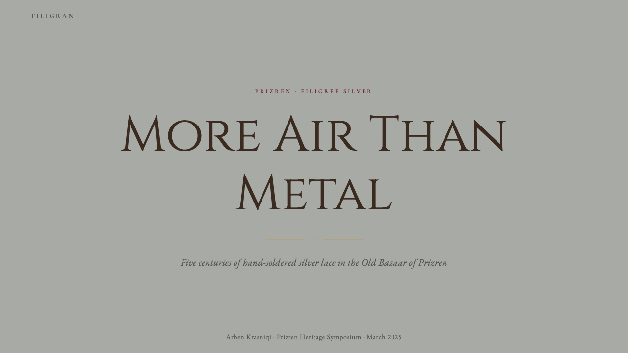
For presentation slides, the system excels at cover pages that need to convey heritage and seriousness without formality becoming stiffness. A cover in this system places the title in wide-tracked small capitals on a stone grey ground, uses a single hairline rule beneath it, and positions a filigree spiral ornament at one corner as the only decorative element. Content slides should honor the negative-space principle: one primary message per slide, generous margins, and section transitions marked by a hairline rule rather than a background color change. Data presented in this system works best as simple ruled tables or single-chart slides, where the chart's frame references the concentric ring vocabulary.在演示文稿中,这套系统最擅长封面——需要传递传承感与严肃感,而又不至让正式流于僵硬。这套系统的封面将标题以宽字距小型大写字母置于石灰灰底面,其下配一条发丝细线,在一个角落点缀一枚银丝螺旋角饰作为唯一装饰元素。内容页应恪守负空间原则:每张幻灯片传递一个核心信息,边距慷慨,章节过渡以发丝细线而非背景色变换标记。数据呈现最适合简洁的带线表格或单图表页,图表框架参照同心环语汇。
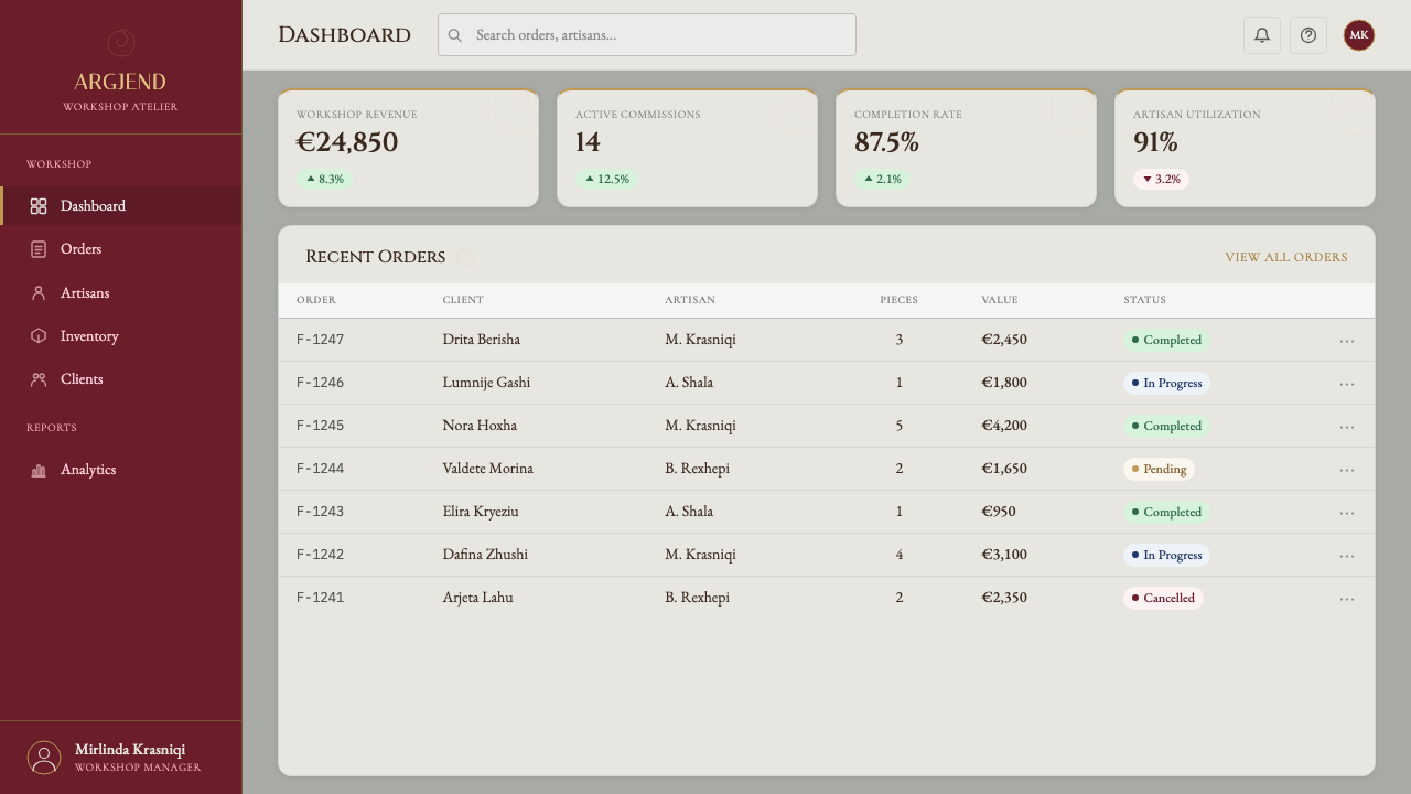
For web user interfaces, the system suits landing pages, product pages, and editorial contexts more naturally than application dashboards. A dashboard in this register risks feeling slow — the generous whitespace that creates ceremony in a presentation feels like wasted screen real estate in a dense information environment. Where the system is applied to pricing pages, the effect is strong: tier differentiation through background shift from silver-white to burgundy velvet reads as a meaningful distinction rather than a marketing flag. Navigation should be typographic and sparse; iconography, if used, should be reduced to the simplest possible geometric form.对于网页用户界面,这套系统比应用仪表板更自然地适合落地页、产品页与编辑型内容。以这种格调构建仪表板有显得迟缓之虞——在演示中营造仪式感的慷慨留白,在信息密集的环境中会沦为浪费的屏幕空间。这套系统用于定价页面时效果强劲:从银白底面到酒红天鹅绒的背景切换传达层级差异,读来是有意义的区分,而非营销旗帜。导航应字体化且稀疏;图标若使用,应简化至可能的最简几何形式。
For editorial and marketing work, this is where the system is most at home. Long-form articles benefit from the wide-margin layout — call-outs and pull quotes live in the margin rather than interrupting the text column, creating the visual rhythm of a well-typeset book rather than a web article. Campaign materials gain authority from the palette's archival quality. The burgundy-and-silver combination reads as both premium and culturally specific, which makes it effective for regional heritage brands, cultural tourism, and institutional communication. Marketing materials should use the filigree spiral ornaments at key visual anchors — the beginning of a section, the framing of a central image — and nowhere else.对于编辑与营销内容,这是这套系统最如鱼得水之处。长篇文章得益于宽边距版式——引语与拉块式引文居于页边,而非打断文字栏,创造出排版精良的书籍而非网络文章的视觉节奏。营销材料从色板的档案质感中获得权威感。酒红与银白的组合既显高端又具文化特殊性,使其在地域遗产品牌、文化旅游与机构传播中尤为有效。营销材料应将银丝螺旋角饰用于关键视觉锚点——章节开头、中心图像框架——仅此而已。
A common mistake when applying this system is interpreting the ornamental vocabulary as permission to add more decorative detail. The system is built on filigree's paradox: extreme craft investment in service of apparent simplicity. When designers begin adding additional ornamental elements — borders within borders, multiple spiral variants, texture overlays — the result loses the tension that makes the original compelling. The spirals work because there are very few of them. The hairlines work because they are the only lines present. Every addition reduces the power of what remains.应用这套系统时的常见错误,是将装饰词汇理解为添加更多装饰细节的许可。这套系统建立在银丝工艺的悖论之上:以极端的工艺投入服务于表观的简洁。当设计师开始叠加更多装饰元素——边框套边框、多种螺旋变体、质感覆盖——结果会失去使原物引人入胜的张力。螺旋之所以奏效,正因为数量极少。发丝细线之所以奏效,正因为它是画面中唯一存在的线条。每一次添加,都削弱了余下之物的力量。
See the Kosovar Prizren Filigree Silver design system →查看 Kosovar Prizren Filigree Silver 完整设计系统 →
Kosovar Prizren Filigree Silver — FAQKosovar Prizren Filigree Silver · 常见问题
Is this system appropriate for digital products, or is it primarily a print style?这套系统适合数字产品吗,还是主要适用于印刷风格?
The system works in digital contexts, but it requires careful adaptation. The hairline rules that define the style must be rendered at sufficient weight to remain visible on screen at all viewing sizes — what reads as a hairline in print can disappear on a low-density display. The generous whitespace that creates the system's ceremonial quality can feel appropriate on large desktop viewports and in long-form reading contexts, but on small screens it may produce layouts where content feels lost. For mobile interfaces, the ornamental vocabulary should be simplified further — one spiral ornament maximum per screen, used only at the most structurally significant moment.这套系统在数字语境中可以运作,但需要审慎适配。定义风格的发丝细线必须以足够的笔画重量渲染,以确保在所有查看尺寸下在屏幕上保持可见——印刷中读来细如发丝的线条在低密度显示器上可能消失。营造仪式感的慷慨留白在大尺寸桌面视口与长篇阅读场景中感觉恰当,但在小屏幕上可能产生内容感觉迷失的版式。对于移动端界面,装饰词汇应进一步简化——每屏最多一枚螺旋角饰,仅用于结构上最重要的时刻。
How does this style relate to other Balkan or Ottoman design traditions?这套风格与其他巴尔干或奥斯曼设计传统有何关联?
Prizren filigree shares a broad family resemblance with filigree traditions from across the Mediterranean, the Middle East, and parts of South and East Asia — the technique of working precious metal wire into open-lattice forms is ancient and widely distributed. Within the Balkan region specifically, Prizren's filigree is distinguished from Serbian, Greek, or Turkish variants primarily by the geometry of its coil patterns and its characteristic concentric framing vocabulary. The design system draws from the Prizren tradition specifically rather than from a generic 'Ottoman' or 'Balkan' aesthetic, and this specificity is where its visual distinctiveness lives.普里兹伦银丝工艺与地中海、中东乃至南亚和东亚部分地区的银丝传统同属一个广泛的工艺家族——将贵金属线加工成开放镂空形式的技艺历史悠久,分布广泛。在巴尔干地区内部,普里兹伦银丝工艺与塞尔维亚、希腊或土耳其变体的区别,主要在于螺旋纹样的几何特征与其特有的同心框架词汇。这套设计系统特指源自普里兹伦传统,而非泛化的'奥斯曼'或'巴尔干'美学,正是这种特殊性赋予了它视觉上的独特性。
Can this system work for a contemporary or technology brand, or is it too historical in register?这套系统能用于当代或科技品牌吗,还是格调过于历史性?
It can work, but the brand's positioning must genuinely warrant the heritage register — not as decoration but as an accurate signal of the brand's values. A craft-focused technology company, a platform for artisan markets, a service for heritage conservation, or a product where the experience of individual attention and exceptional care is the differentiator — these align with the system's values. A fast-moving consumer technology product, a social platform, or any brand whose primary promise is speed, scale, or accessibility will find this style working against them: its deliberateness reads as slowness, its ceremony as friction. The honest question is whether the brand actually embodies care the way filigree does — not whether the aesthetic looks beautiful applied to it.可以运作,但品牌定位必须真正配得上这种传承格调——不是作为装饰,而是作为品牌价值观的准确信号。专注工艺的科技公司、手工艺品市场平台、文化遗产保护服务,或以个人关注与卓越用心的体验为差异化卖点的产品——这些与这套系统的价值观对齐。快速消费科技产品、社交平台,或任何核心承诺是速度、规模或可及性的品牌,会发现这套风格在与它们对着干:刻意被读作迟缓,仪式感被读作摩擦力。真正诚实的问题是:这个品牌是否真正以银丝工艺那样的方式体现用心——而不是这套美学贴上去好不好看。
What is the correct use of the burgundy velvet tone — should it appear as a background or only as an accent?酒红天鹅绒色调应如何正确使用——应作为背景色还是仅作强调色?
Both uses are legitimate, but they serve different functions and should not be mixed freely. As a full background — a full-bleed velvet panel — burgundy is the equivalent of the display cloth on which a silversmith presents finished work: it is a ceremonial context that elevates what is placed on it. This use is high-impact and should be rare, reserved for the most important element on a page. As an accent — a thin rule, a typographic highlight, a small ornament — burgundy marks emphasis without dominating. Mixing both uses on the same page dilutes the impact of each. Choose one register and commit to it across the layout.两种用法都合理,但服务于不同功能,不应随意混用。作为全面背景——满铺的天鹅绒底面——酒红色等同于银匠呈示成品的展示绒布:这是一种仪式性语境,提升其上摆放之物的地位。这种用法冲击力强,应当稀少,保留给页面上最重要的元素。作为强调色——细线、字体高亮、小型角饰——酒红色标示强调而不主导全局。在同一页面上混用两种方式会稀释各自的冲击力。选择一种格调,在整个版式中贯彻到底。
How should this system handle imagery and photography?这套系统应如何处理图像与摄影?
Photography in this system should be treated with the same restraint as the ornamental vocabulary. Macro or close-up images of the filigree craft itself — wire, hands, finished pieces — are naturally aligned with the system's material references. For other subjects, photography works best when it is formally composed, high in tonal contrast, and cropped to isolate a specific object or detail rather than presenting a broad scene. Full-bleed photography as backgrounds should be used exceptionally rarely and only where the image has the same austere quality as the palette. Never use photography as pure atmosphere or lifestyle imagery — that register is at odds with the system's craft-first sensibility.这套系统中的摄影应当与装饰词汇一样克制处理。银丝工艺本身的微距或特写图像——银线、双手、成品——与系统的材料参照天然对齐。对于其他题材,摄影在构图正式、色调对比强、以隔离特定对象或细节而非呈现宽阔场景的方式裁切时效果最佳。满铺背景摄影应极为罕见地使用,且仅限于图像具有与色板相同肃穆质感的场合。绝不将摄影用作纯粹的氛围或生活方式图像——那种格调与这套系统工艺优先的感性相悖。
Related design styles相关设计风格
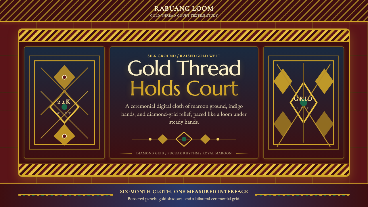 Sumatran Songket (Pandai Sikek)Courtly weight glows. Maroon silk, Cormorant small caps, and gold diamond gri…宫廷重量在发光:酱红丝地、Cormorant 小型大写与金色菱格。
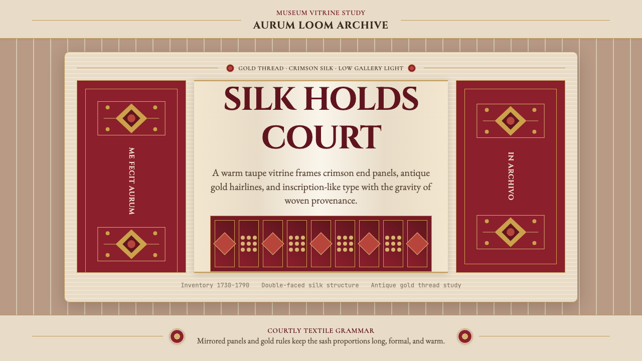 Belarusian Slutsk SashCourtly silk, vitrined. Taupe ground, crimson panels, Cinzel type, antique go…宫廷丝锦入展柜:赭褐底、深红端板、Cinzel 铭文与古金细线。
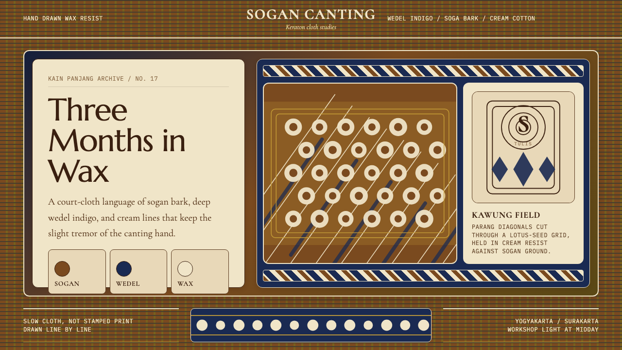 Javanese Batik Tulis (Keraton Sogan)Patience made visible. Sogan brown, indigo, and cream wax-lines form dense co…耐心可见:梭罗褐、靛蓝与奶白蜡线织成密集宫廷网格。
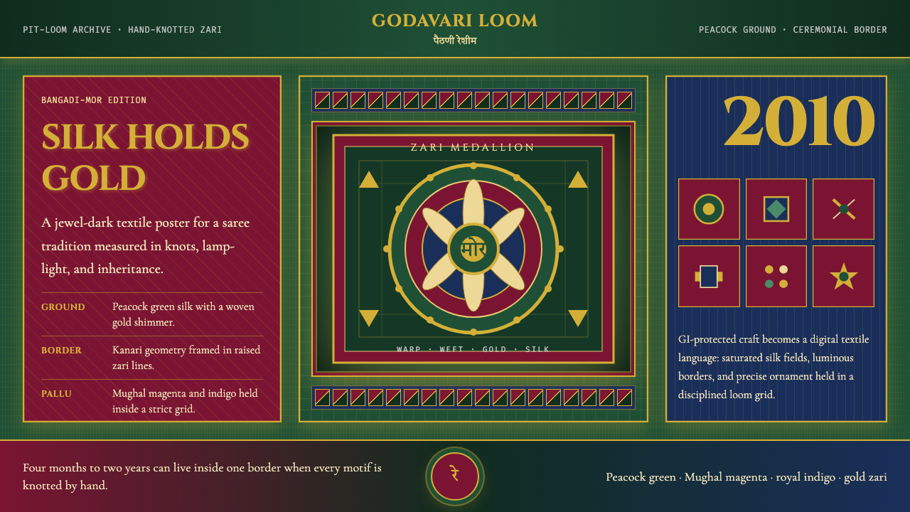 Maharashtra Paithani Peacock SareeSilk carries ceremony. Peacock green, Mughal magenta, and gold grids shimmer…丝绸承载仪式感:孔雀绿、莫卧儿品红与金色网格闪如扎里。
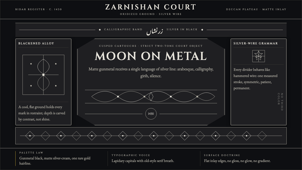 Bidri Deccan MetalworkCourtly darkness, tooled by silver. Cinzel caps and hairline arabesques cut g…宫廷般冷黑。Cinzel 大写与银色藤蔓线切入枪铁黑。
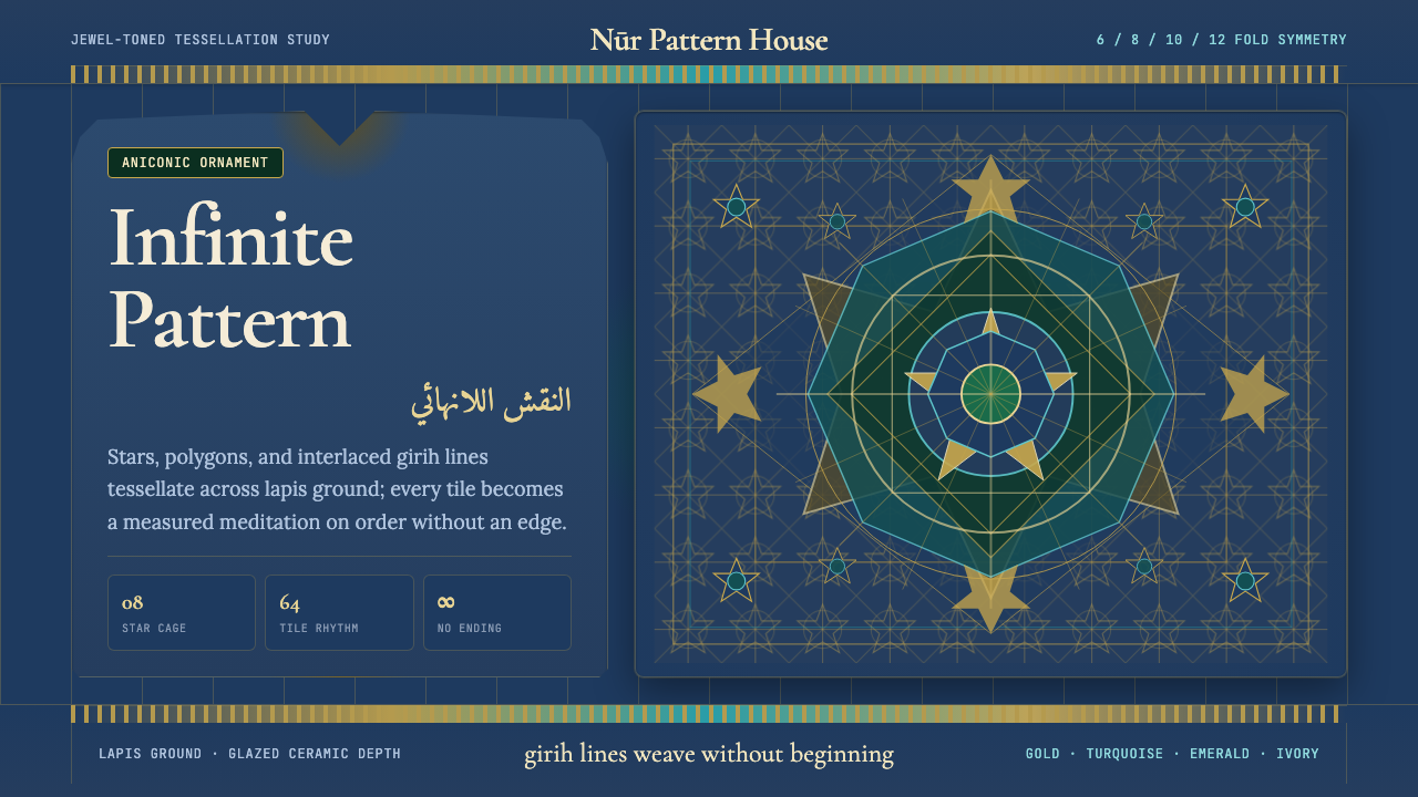 Islamic Geometric ArtInfinite order, fully tiled. Lapis ground with gold girih lines and turquoise…无限秩序,满幅铺陈。青金石底、金色girih线与绿松石星格。