Design style guide设计风格指南
What is Maharashtra Paithani Peacock Saree?什么是 Maharashtra Paithani Peacock Saree?
Paithani silk weaves two thousand years of Maharashtrian ceremony into every thread — peacocks, gold zari, and jewel-saturated color that makes digital flatness feel like an apology.派坦尼丝绸将两千年马哈拉施特拉邦的礼仪传统织入每一根经纬——孔雀纹、真金扎里与宝石饱和的色彩,让数字扁平感觉像一种辜负。
Maharashtra Paithani Peacock Saree in briefMaharashtra Paithani Peacock Saree 速览
Maharashtra Paithani Peacock Saree is a design tradition rooted in one of India's oldest and most technically demanding handwoven textiles: the Paithani saree, made in the town of Paithan on the banks of the Godavari River in Maharashtra. The style takes its name from the most iconic motif in the Paithani vocabulary — the peacock, rendered in gold zari thread against fields of saturated silk — and translates the saree's material grandeur into a complete visual system for contemporary surfaces.马哈拉施特拉邦孔雀派坦尼纱丽是一套根植于印度历史最悠久、工艺最繁复的手织品之一的设计传统:产自马哈拉施特拉邦戈达瓦里河畔派坦镇的派坦尼纱丽。这一风格以派坦尼图案词汇中最具代表性的主题命名——孔雀纹,以真金扎里丝线刺绣于饱和丝绸底面之上——并将纱丽的物质华贵转译为当代界面的完整视觉体系。
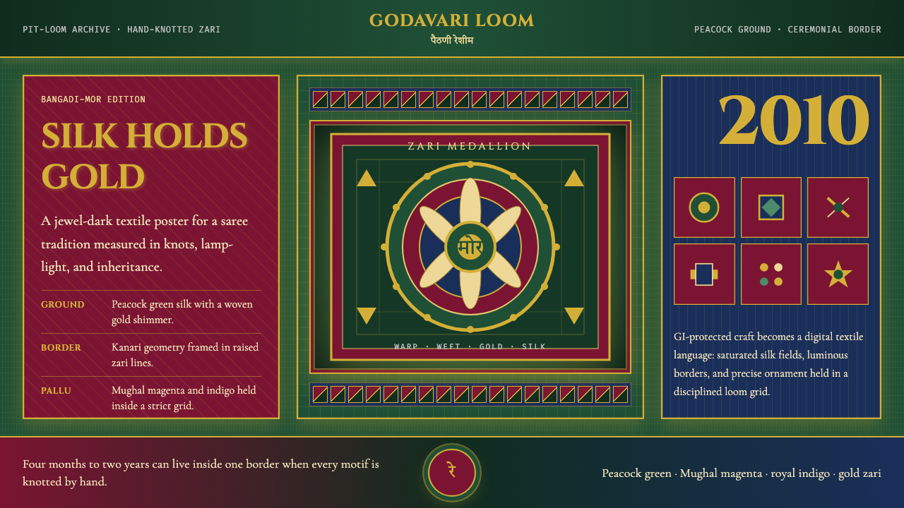
The aesthetic is defined by opulence that feels earned rather than applied. Where many decorative traditions use ornament to fill space, Paithani ornamentation carries structural weight: the bangadi-mor (peacock-in-circle) motifs that anchor each saree's pallu (end panel) and the kanari (border) function like architectural keystones, giving the composition both rhythm and gravity. Translating this into a design system means treating ornamental elements as load-bearing rather than cosmetic — borders do not decorate edges, they frame and contain; motifs do not scatter, they anchor.其美学以一种「华贵感是锻造出来而非涂抹上去」的气质为核心。许多装饰传统用纹样来填充空间,而派坦尼的装饰具有结构性的重量:每条纱丽端饰(pallu)与边饰(kanari)中锚定构图的「圆框孔雀」(bangadi-mor)纹样,如同建筑中的拱心石,赋予整体以韵律与重力。将其转译为设计系统,意味着把装饰元素当作承重结构而非表面点缀来对待——边框不是装点边缘的,而是框定与包容;纹样不是随意散落的,而是锚定视觉重心的。
The color language is anchored by peacock green — a deep, iridescent teal that shifts in quality depending on context — supported by Mughal magenta as the dominant warm accent and gold as the universal highlight. Surfaces carry the visual weight of woven silk rather than printed pigment: backgrounds suggest depth and sheen, not flatness. This is a style fundamentally about material richness, and every design decision should ask whether it honors or cheapens the underlying sensibility.色彩语言以孔雀绿为核心——一种深沉的、因语境而质感流转的水鸭蓝,以莫卧儿品红作为主要暖色强调,以金色作为贯穿全局的高光。界面的视觉质感应当接近手织丝绸而非印刷颜料:背景暗示深度与光泽,而非扁平。这是一种从根本上关于物质丰盛的风格,每一个设计决定都应追问:它是在尊重还是在廉价化这种底层感性。
Where does Maharashtra Paithani Peacock Saree come from?Maharashtra Paithani Peacock Saree 从何而来?
The Paithani tradition traces its origins to the Satavahana dynasty, which ruled the Deccan plateau from roughly 200 BCE onward and made Paithan — then known as Pratishthana — a major center of trade, scholarship, and textile production. Historical accounts and artifacts suggest that silk weaving with gold thread was practiced here for centuries before the tradition received its formal name. The town's position on the Godavari River made it a crossroads for raw silk arriving from Bengal and China and gold thread spun from wire drawn in regional workshops.派坦尼传统的源头可追溯至萨塔瓦哈纳王朝——这个王朝自公元前200年前后起统治德干高原,并将派坦(时称Pratishthana)建设为贸易、学术与纺织生产的重镇。历史记录与文物表明,在这一传统获得正式名称之前,金线丝绸织造已在此延续数百年。这座城市扼戈达瓦里河要冲,是来自孟加拉与中国的生丝,以及当地金丝工坊拉制的金线汇聚交流之地。
The tradition reached its most celebrated height during the Peshwa period (1707–1818), when the Maratha Confederacy's prosperity brought the sarees into the courts and ceremony halls of Maharashtra's nobility. Peshwa patronage drove refinements in both the complexity of motifs — the peacock-in-circle became a hallmark of prestige — and the quality of silk and zari sourced for master weavers. A fully worked Paithani from this period, with its oblique-twill silk ground and individually hand-knotted gold motifs, could take a master weaver and his family one to two years to complete. These were not garments; they were heirlooms.这一传统在白沙瓦时期(1707—1818年)达到其最负盛名的高峰。马拉塔联盟的繁荣将派坦尼纱丽带入了马哈拉施特拉邦贵族的宫廷与仪典厅堂。白沙瓦王朝的赞助推动了纹样复杂度——「圆框孔雀」纹成为尊贵地位的标志——以及为大师级织匠供应的丝绸与扎里品质的全面提升。这一时期一条完整工制的派坦尼纱丽,以斜纹丝绸为底、逐结手工打结金纹,可能需要一位大师织匠与其家人耗时一至两年完成。那不是衣物,而是传家宝。
The Mughal influence on Paithani is visible in the magenta and ruby tones that enter the palette alongside the older jewel greens and ochres. As the Deccan courts engaged with Mughal aesthetics during the sixteenth and seventeenth centuries, saree colorways absorbed the richer, warmer range associated with Mughal court dress while retaining the structural density of the indigenous weaving tradition. The result was a hybrid aesthetic — as opulent as Mughal miniature painting, as structurally intricate as Deccan stone carving.莫卧儿帝国对派坦尼的影响在色调上清晰可辨:品红与红宝石色调在这一时期与更古老的宝石绿和赭石色并置进入色板。随着十六、十七世纪德干宫廷与莫卧儿美学的深度交融,纱丽配色吸收了莫卧儿宫廷服饰中那种更为丰富、温暖的色域,同时保留了本土织造传统的结构性密度。由此形成的是一种混合美学——既有莫卧儿细密画的富丽堂皇,又有德干石雕的结构精密。
Following a period of decline in the nineteenth and early twentieth centuries — a consequence of cheaper imported textiles and the disruption of traditional patronage networks — the tradition was revived through sustained government and institutional support. The Maharashtra State Handicrafts Development Corporation, scholars like Mira Seth who documented India's surviving handloom traditions, and individual master weavers like those in the Desai lineage worked to restore both the technical knowledge and the market for authentic Paithani. Geographical Indication protection was granted in 2010, legally defining the region, materials, and techniques that qualify a saree as a genuine Paithani — a recognition that the tradition is as much intellectual property as it is craft.经历了十九世纪至二十世纪初的衰退期——廉价进口织物的冲击与传统赞助网络的瓦解共同造成了这一局面——这一传统经由持续的政府与机构支持得到了振兴。马哈拉施特拉邦手工艺发展公司、记录印度现存手织传统的学者(如米拉·塞斯),以及德赛家族等世代传承的大师织匠,共同致力于恢复真正派坦尼的技术知识与市场。2010年获得地理标志保护,从法律层面界定了合格派坦尼纱丽所要求的产地、材料与工艺——这一认定表明,这一传统既是手工艺,也是知识产权。
What defines the Maharashtra Paithani Peacock Saree look?Maharashtra Paithani Peacock Saree 的视觉特征是什么?
Color Palette色彩体系
The palette centers on peacock green — a deep, shifting teal evoking the iridescent plumage of the Indian peafowl — and is supported by Mughal magenta, a warm saturated rose-violet that functions as the dominant card and surface color, and gold, which appears as highlight, border, and typographic accent. Secondary tones include deep indigo and ruby, borrowed from other traditional saree colorways. The overall effect is of saturated jewel tones that hold their depth even in digital rendering, never washing out into pastels.色板以孔雀绿为核心——一种深沉而流动的水鸭蓝,令人联想到印度蓝孔雀羽毛上的虹彩光泽——以莫卧儿品红(一种温暖饱和的玫红-紫罗兰,作为主要卡片与界面色)和金色(作为高光、边框与字体强调)为支撑。次要色调包括深靛蓝与红宝石,借自其他传统纱丽配色。整体效果是饱和的宝石色调,即便在数字呈现中也能保持其深度,绝不稀释为粉彩。
Ornamental Borders装饰边框
The Paithani's kanari (side border) and pallu (end panel) are not afterthoughts — they are the saree's primary sites of compositional complexity, where the densest zari work is concentrated. In digital translation, borders carry this same structural authority: they are wide, elaborately patterned, and optically active, functioning as internal frames that give compositions a sense of enclosure and formality. A border in this system is never a thin line; it is a zone of visual density that separates interior from exterior space.派坦尼的边饰(kanari)与端饰(pallu)并非事后添加的——它们是纱丽构图复杂度最为集中的主要区域,最密集的扎里工艺汇聚于此。在数字转译中,边框承载着同样的结构权威:它们宽阔、图案繁复、视觉活跃,作为内部框架赋予构图以围合感与庄重感。这套系统中的边框从不是一条细线,而是一个视觉密度的区域,将内部空间与外部空间分隔开来。
Peacock and Floral Motifs孔雀与花卉纹样
The bangadi-mor — a peacock rendered within a circle — is the Paithani's most prestigious motif, appearing on the finest sarees as a marker of master weaving. Alongside it, lotus flowers, parrots, and stylized vine-and-leaf patterns build a secondary vocabulary of natural forms. In digital application, these motifs are used as focal ornaments rather than tiling patterns: a single large peacock motif might anchor a hero section, while lotus-derived geometric rosettes appear at corner intersections of grid layouts, reinforcing rhythm without overwhelming legibility.「圆框孔雀」(bangadi-mor)——一只被圆环环绕的孔雀——是派坦尼最珍贵的图案,出现于最上乘的纱丽上,是大师级织造工艺的标志。与之并置的是莲花、鹦鹉和程式化的藤蔓叶纹,构成以自然形态为基础的次级图案词汇。在数字应用中,这些纹样被用作焦点性装饰而非重复拼贴:一个大型孔雀纹样可能锚定主视觉区,而莲花衍生的几何花形则出现在网格版面的角部交汇处,在不压制可读性的前提下强化节奏感。
Gold Zari as Typography Accent金扎里作为字体强调
In the original saree, gold zari thread is knotted into the silk ground to create raised, gleaming motifs that catch and scatter light. In typographic terms, this translates to letterforms and display text treated as luminous rather than flat: headline type carries an implied shimmer through careful use of weight contrast, drop shadows that suggest metallic relief, or outline strokes in warm gold tones. Body text remains restrained — dark silk-colored ink on a jewel-toned ground — reserving the zari effect for titles, pull quotes, and navigational waypoints.在原版纱丽中,金扎里丝线被逐结编织进丝绸底面,形成浮凸而闪耀的纹样,捕捉并散射光线。在排版层面,这转化为一种将字形与展示文字视为发光体而非扁平元素的处理方式:标题字体通过精心的字重对比、暗示金属浮雕效果的投影,或暖金色描边,传递出一种隐含的微光感。正文保持克制——深色丝绸调墨水落于宝石色底面之上——将扎里效果保留给标题、引语提炼和导航锚点。
Jewel-Ground Depth宝石底色的深度感
Paithani silk grounds are not merely colored — they are luminous from within, because the silk fiber itself refracts light differently from every angle. Digital surfaces cannot replicate this literally, but they can evoke it through layered depth: card surfaces sit slightly above backgrounds, casting soft warmth-toned shadows; backgrounds carry a subtle directional sheen suggesting woven texture rather than printed ink. The goal is never to simulate silk literally but to communicate the quality of weight, depth, and material intention that the original conveys.派坦尼的丝绸底色不仅仅是被染上的——它从内部发光,因为丝绸纤维本身会从每个角度以不同的方式折射光线。数字界面无法字面复制这一效果,但可以通过层次深度来唤起它:卡片界面微微浮于背景之上,投射出柔和的暖色调阴影;背景带有细腻的方向性光泽,暗示织纹质感而非印刷墨水。目标从不是字面模拟丝绸,而是传达原作所表达的那种重量感、深度感与物质意图。
Symmetry and Ceremonial Formality对称与仪典庄重感
Unlike modernist design traditions that favor asymmetric dynamism, Paithani compositions are broadly symmetrical along the vertical axis — a reflection of the saree's bilateral structure and its use in ritual contexts where balance signals honor and completeness. Page layouts in this system tend toward centered hierarchy: a central motif or title flanked by balanced ornamental fields, navigation elements that mirror across a midline, and section breaks marked by symmetrically composed dividers rather than raw horizontal rules.与偏好非对称动感的现代主义设计传统不同,派坦尼的构图在垂直轴上大体对称——这是纱丽双侧对称结构及其在仪典语境中使用方式的反映,在那些场合,平衡意味着礼敬与完整。这套系统的页面版面倾向于居中层级:中央纹样或标题两侧以对称的装饰性区域护卫,导航元素沿中轴镜像,段落分隔以对称构图的分隔元素而非裸露的水平线来标记。
Dark Ground, Light Ornament深底浅纹
The most celebrated Paithani sarees use a dark jewel-toned ground — deep peacock green, royal indigo, or black-shot teal — against which gold zari and lighter silk motifs gleam. This reversal of the Western figure-ground convention (light background, dark type) is fundamental to the aesthetic: the depth comes first, and the ornament is revealed against it, like gold threading visible only when the fabric is held to light. This makes the Paithani system naturally suited to dark-mode digital environments, where the same reveal logic applies.最受推崇的派坦尼纱丽以深沉的宝石色为底——深孔雀绿、皇家靛蓝,或带黑色交织的水鸭蓝——金扎里与较浅的丝线纹样在其上闪耀。这种对西方图底关系惯例(浅背景、深文字)的逆转是该美学的根本所在:深度先于一切,纹样从中显现,如同只有将织物举至灯光前才可见的金线。这使派坦尼风格天然适合深色模式的数字环境,同样的「在深处显现」逻辑在那里同样成立。
Who shaped Maharashtra Paithani Peacock Saree?谁塑造了 Maharashtra Paithani Peacock Saree?
A practicing master weaver from the Paithan region whose family has sustained the tradition across multiple generations, Madhuri Desai represents the lineage of craft knowledge through which the most technically demanding aspects of Paithani weaving — the precise knotting of zari motifs, the maintenance of the oblique-twill silk ground — have been transmitted. Practitioners like Desai are the living archive of the tradition, and their continued work is what makes authentic Paithani distinguishable from mechanized imitations.玛杜里·德赛是一位来自派坦地区的在世大师级织匠,其家族跨越数代延续着这一传统。她代表着手艺知识的传承脉络,派坦尼织造中技术要求最高的工艺——扎里纹样的精确打结、斜纹丝绸底面的维持——正是经由这条脉络代代相传。像德赛这样的从业者是传统的活态档案,她们的持续工作使真正的派坦尼得以与机械化仿制品相区别。
An IAS officer and scholar who devoted decades to documenting and advocating for India's handloom traditions, Mira Seth's work — particularly her multi-volume study of India's textile heritage — helped establish the academic and policy framework through which traditions like Paithani received institutional support and international recognition. Her research made visible the economic and cultural stakes of handloom decline at a time when policy attention was oriented toward industrial textile production.米拉·塞斯是一位印度行政服务官员兼学者,数十年间致力于记录和倡导印度手织传统。她的工作——尤其是多卷本的印度纺织遗产研究——帮助建立了学术与政策框架,使派坦尼等传统得以获得机构支持与国际认可。她的研究在政策关注点偏向工业纺织生产的时代,揭示了手织业衰落所牵涉的经济与文化风险。
The governmental body most directly responsible for the post-Independence revival and institutionalization of the Paithani tradition. Through procurement programs, weaver cooperatives, design training, and market linkage efforts, the MSHDC helped ensure that master weavers had both a viable livelihood and access to the quality materials — particularly high-grade silk and genuine gold zari — required to maintain the tradition's standards. The Corporation's role in navigating the Geographical Indication application in 2010 codified protections that continue to define what may legally bear the Paithani name.马哈拉施特拉邦手工艺发展公司是独立后直接推动派坦尼传统复兴与制度化的政府机构。通过采购计划、织匠合作社、设计培训与市场联结,该公司确保了大师级织匠既有可持续的生计,又能获得维持传统标准所必需的优质材料——尤其是高品级丝绸与真金扎里。公司在2010年地理标志申请过程中发挥的主导作用,将保护条款编入法律,从此界定了合法使用「派坦尼」之名的条件,这些规定延续至今。
Though not individual figures in the modern sense, the Satavahana rulers (c. 200 BCE – 200 CE) created the material and economic conditions under which the Paithani tradition first emerged. By making Paithan a major trading city on the Godavari River, the dynasty enabled the convergence of raw silk from distant sources, gold-working expertise, and a court culture that valued and commissioned fine textiles. The tradition's two-thousand-year continuity is inseparable from the infrastructure the Satavahanas established.萨塔瓦哈纳王朝(约公元前200年至公元200年)虽非现代意义上的个人,却创造了派坦尼传统最初得以萌生的物质与经济条件。王朝将派坦打造为戈达瓦里河沿岸的重要贸易城市,使来自远方的生丝、金属工艺的技术积累,以及重视并委托制作精美织品的宫廷文化得以汇聚一地。这一传统两千年的延续与萨塔瓦哈纳人建立的基础设施密不可分。
The Peshwa rulers of the Maratha Confederacy (1707–1818) were the tradition's most important historical patrons, transforming Paithani from a regional craft into a national prestige object. Their courts created demand for the most complex and time-intensive sarees — particularly those featuring the bangadi-mor — and their wealth funded the importation of the finest gold wire from which zari thread was drawn. The Peshwa period established the technical and aesthetic standards against which authentic Paithani has been measured ever since.马拉塔联盟的白沙瓦统治者(1707—1818年)是这一传统历史上最重要的赞助人,将派坦尼从一种地区性手工艺转变为全国性的尊贵象征。他们的宫廷为最复杂、最耗时的纱丽——尤其是那些以「圆框孔雀」纹为特征的作品——创造了需求,他们的财富支撑了制作扎里丝线所需的最优质金丝进口。白沙瓦时期确立的技术与美学标准,至今仍是衡量真正派坦尼的基准。
How do you use Maharashtra Paithani Peacock Saree today?今天怎么用 Maharashtra Paithani Peacock Saree?
The Paithani Peacock Saree style is among the most rewarding historical aesthetics to apply digitally, precisely because it operates on principles opposite to modernist minimalism. Where minimal styles succeed through absence, this style succeeds through accumulation — but accumulation that is internally structured, not chaotic. Applying it well requires understanding the difference between richness and clutter, and maintaining that distinction rigorously across every surface.马哈拉施特拉邦孔雀派坦尼纱丽风格是最值得在数字界面中探索的历史性美学之一,恰恰是因为它的运作原则与现代主义极简风格截然相对。极简风格靠「缺席」取胜,而这种风格靠「累积」取胜——但这种累积是有内在结构的,而非混乱的。正确应用它,需要理解「丰盛」与「堆砌」之间的区别,并在每一个界面上严格维持这一区分。
For presentation slides, the system works with particular strength on ceremonial or high-stakes contexts: annual reviews, keynote addresses, cultural institution presentations, or any situation where gravitas and pride of craft are the intended emotional register. A cover slide benefits from a full jewel-toned background — deep peacock green or Mughal magenta — with a centrally composed title in gold-toned type, flanked by symmetrical ornamental border elements drawn from the kanari tradition. Content slides should restrain the ornament: a single zari-style border running along one edge, text in a clean legible weight on a slightly lighter ground, and data visualizations that treat bar segments and chart elements as motif-like blocks of color rather than generic chart defaults.对于演示文稿,这套系统在仪典性或高规格场合中表现尤为出色:年度回顾、主题演讲、文化机构发布,或任何以庄重感与工艺自豪感为情感基调的场合。封面幻灯片适合以深宝石色铺满背景——深孔雀绿或莫卧儿品红——配以居中构图的金色调字体标题,两侧以取自边饰传统的对称装饰元素护卫。内容页应收敛装饰:沿一侧边缘运行的单一扎里式边框、在略浅底面上以清晰可读字重呈现的文字,以及将柱状图与图表元素视为类纹样色块而非通用图表默认值来处理的数据可视化。
For web dashboards and interfaces, the style calls for a different calibration than minimalist systems. Navigation bars carry weight — either a deep jewel-toned background or a prominent gold-accented top border. Card components sit against a slightly warmer background and cast warmth-toned shadows suggesting elevation. State changes — hover, active, selected — use the gold accent rather than generic blue to communicate interaction. The system is particularly well suited to cultural platforms, luxury commerce, editorial publishing, and any interface where the product's value is explicitly tied to heritage, craft, or aesthetic distinction.对于网页仪表板与界面,这种风格需要与极简系统不同的校准方式。导航栏具有视觉重量——要么是深宝石色背景,要么是显眼的金色强调顶部边框。卡片组件在略偏暖的背景上浮起,投射暗示高度感的暖色调阴影。状态变化——悬停、激活、选中——使用金色强调而非通用蓝色来传达交互。这套系统尤其适合文化平台、奢侈品电商、编辑出版,以及任何产品价值明确与传承、工艺或美学鉴别力相挂钩的界面。
For editorial and marketing contexts, the Paithani system supports layouts where imagery and text share visual weight rather than imagery dominating by default. A long-form article could open with a full-bleed jewel-toned header block carrying the title in zari-style type, then transition to a lighter reading surface for body content, with ornamental drop caps or pull quotes rendered in the gold-and-green palette to recall the opening register. Marketing pages can use the style's inherent sense of ceremony to frame product launches or collection introductions — each section separated by a border element that mimics the pallu's transition between body and end panel.对于编辑与营销场景,派坦尼系统支持图像与文字平等分担视觉重量而非图像默认主导的版面。一篇长文章可以用铺满版面的宝石色标题块开场,以扎里式字体承载标题,然后过渡到较浅的阅读底面承托正文,以金绿色板呈现的装饰性首字母或提炼引语来召唤开篇的视觉基调。营销页面可以利用这种风格固有的仪典感来框定产品发布或系列介绍——每个区块以模仿纱丽主体与端饰过渡的边框元素分隔。
The most common mistake when applying this style is treating it as a pattern library rather than an integrated system. Dropping peacock motifs onto an otherwise neutral interface does not produce a Paithani aesthetic — it produces a decorated neutral interface. The style's power comes from its internal consistency: every surface, every shadow, every typographic choice, every color selection should share the same material logic. A second common mistake is over-saturating all surfaces simultaneously. In the original saree, the deepest saturation is concentrated in specific zones — the pallu, the kanari — while the silk ground elsewhere is rich but not blinding. The same zoning discipline should apply digitally: choose one or two dominant surfaces to carry full jewel intensity, and let supporting surfaces be warmer and slightly quieter.应用这种风格时最常见的错误,是将它当作图案库而非整合系统来使用。将孔雀纹样叠加到一个其余部分依然中性的界面上,并不能产生派坦尼美学——它只会产生一个经过装饰的中性界面。这种风格的力量来自其内在一致性:每一个界面、每一处阴影、每一个排版选择、每一个色彩决定,都应共享同一种物质逻辑。第二个常见错误是同时让所有界面过度饱和。在原版纱丽中,最深的饱和度集中在特定区域——端饰、边饰——而其他地方的丝绸底色丰富但不刺眼。同样的分区纪律应当运用于数字界面:选择一两个主导界面来承载完整的宝石色强度,让辅助界面更暖、略微安静。
Maharashtra Paithani Peacock Saree — FAQMaharashtra Paithani Peacock Saree · 常见问题
How does the Paithani style differ from other South Asian textile-inspired design aesthetics?派坦尼风格与其他南亚纺织品启发的设计美学有何不同?
The most important distinction is the Paithani system's structural use of ornament. Many South Asian textile-inspired aesthetics use pattern as surface decoration — applied over a layout rather than integrated into its architecture. Paithani, by contrast, places its ornamental density at structurally significant zones: borders function as frames, not decoration; motifs anchor focal points rather than tiling fields. The palette is also distinctive: while many related aesthetics use warm ochres, terracottas, and reds as dominant tones, Paithani centers on the cool jewel intensity of peacock green against warm magenta — a tension that gives the style its particular visual energy.最重要的区别在于派坦尼系统对装饰的结构性运用。许多南亚纺织品启发的美学将图案用作表面装饰——叠加在版面之上而非整合进其架构之中。相比之下,派坦尼将其装饰密度安置在结构上具有意义的区域:边框作为框架而非点缀;纹样锚定焦点而非填充底面。色板也具有独特性:许多相关美学以温暖的赭石、赤陶与红色为主调,而派坦尼以孔雀绿的冷峻宝石强度对抗温暖品红——这种张力赋予了这种风格独特的视觉能量。
Is this style appropriate for interfaces that need to be highly functional and information-dense?这种风格适合需要高度功能性与信息密度的界面吗?
It can be, but it requires disciplined zoning. The Paithani visual system is not inherently incompatible with high information density — the saree itself packs enormous visual complexity into a coherent whole — but that coherence depends on having clear zones of rest and zones of richness. In a dense interface, apply the ornamental intensity to structural elements: navigation frames, section headers, key metric displays. Keep reading surfaces — body text areas, data tables, form fields — restrained, using the jewel-toned palette as depth and color rather than ornament. The style works against legibility only when ornamental and functional elements compete for the same visual plane.可以,但需要严格的区域划分。派坦尼视觉系统本质上与高信息密度并不冲突——纱丽本身就在一个连贯整体中容纳了巨大的视觉复杂性——但这种连贯性依赖于清晰地划定休憩区与丰盛区。在密集界面中,将装饰强度集中于结构性元素:导航框架、区块标题、关键指标显示。保持阅读界面——正文区域、数据表格、表单字段——的克制,将宝石色板用作深度感与色彩而非装饰。只有当装饰性元素与功能性元素在同一视觉平面上竞争时,这种风格才会损害可读性。
What distinguishes authentic use of this style from kitsch or cultural appropriation?真正运用这种风格与俗气模仿或文化挪用之间的区别是什么?
The distinction lies primarily in intentionality and structural understanding. Kitsch treatment of Paithani aesthetics typically reduces the tradition to its most recognizable surface features — the peacock motif, the jewel colors — applied without understanding the compositional logic that makes those features meaningful in context. A peacock dropped onto a generic card component is decoration; a peacock motif used to anchor a compositional zone, flanked by border elements that reference the kanari structure, within a palette that maintains the silk-and-gold material register, is design reasoning. Cultural appropriation becomes more fraught when the aesthetic is used to sell products unrelated to the tradition without acknowledgment; using it thoughtfully in educational, cultural, or design contexts — with accurate attribution — occupies different ethical ground.区别主要在于意图与结构理解。对派坦尼美学的俗气处理通常将这一传统简化为其最易辨认的表面特征——孔雀纹样、宝石色彩——却不理解使这些特征在语境中具有意义的构图逻辑。将一只孔雀丢在一个通用卡片组件上是装饰;将孔雀纹样用于锚定构图区域、两侧配以参照边饰结构的边框元素、在保持丝绸与金色物质基调的色板之内——这才是设计推理。当这种美学被用于销售与该传统毫无关联的产品且缺乏致敬时,文化挪用问题变得更为复杂;而在教育、文化或设计语境中有思考地使用它——并准确标注来源——则处于不同的伦理立场。
Can this style work in a light-mode context, or is it inherently a dark-background system?这种风格可以在浅色模式下使用吗?还是说它本质上是一套深色背景系统?
The tradition's most celebrated expression uses dark jewel-toned grounds, and the digital system is strongest in that mode — dark backgrounds allow the gold and ornamental elements to gleam as they do in the physical textile. However, a light-mode variant is workable. The key is to preserve the richness by using warm ivory or deep cream rather than flat white as the background, and to increase the weight of the gold and magenta accents so they read with sufficient presence against the lighter field. Light-mode Paithani tends to feel more like a daytime ceremonial aesthetic and less like the deep nocturnal glamour of the dark variant. Both are valid; the choice should reflect the emotional register the product needs to occupy.这一传统最受推崇的表达使用深宝石色底面,数字系统在这种模式下最为强大——深色背景使金色与装饰元素得以如实体织物般闪耀。然而,浅色模式变体是可行的。关键是以暖象牙色或深奶油色而非纯白色作为背景来保持丰盛感,并增加金色与品红强调的分量,使它们在更亮的底面上保持足够的存在感。浅色模式下的派坦尼往往更像白昼仪典的美学,而不像深色变体的深沉夜间华彩。两者都是有效的;选择应当反映产品所需要占据的情感基调。
How should motion and animation be handled in a Paithani-inspired interface?在派坦尼风格的界面中,动效与动画应如何处理?
Motion in this system should reference the quality of the textile itself: the slow, weighted reveal of a saree unfolding rather than the rapid, bouncy transitions of contemporary digital defaults. Entrances should be deliberate — elements that emerge into view from behind a border, or unfold from a central anchor point — rather than sliding in from off-screen without ceremony. Gold accent elements can carry a subtle shimmer or sheen transition on interaction, evoking the way zari thread catches light at different angles. What to avoid entirely: jittery or fast-paced micro-interactions that undercut the system's sense of weight and deliberateness, and decorative animations applied to every element simultaneously — save motion for moments of transition and emphasis, and let the composition itself carry the visual energy between those moments.这套系统中的动效应当参照织物本身的质感:是纱丽缓缓展开时那种迟缓而有分量的揭示,而非当代数字界面默认的快速弹跳式过渡。元素的入场应当是刻意的——从边框后方浮现,或从中央锚点处展开——而非毫无仪式感地从屏幕边缘滑入。金色强调元素可以在交互时携带一种细腻的微光或光泽过渡效果,唤起扎里丝线从不同角度捕捉光线的方式。需要彻底避免的是:破坏系统重量感与庄重感的抖动或快节奏微交互,以及同时施加于所有元素的装饰性动画——将动效保留给过渡与强调的时刻,让构图本身在这些时刻之间承载视觉能量。
Related design styles相关设计风格
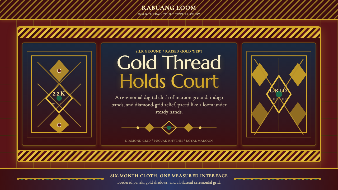 Sumatran Songket (Pandai Sikek)Courtly weight glows. Maroon silk, Cormorant small caps, and gold diamond gri…宫廷重量在发光:酱红丝地、Cormorant 小型大写与金色菱格。
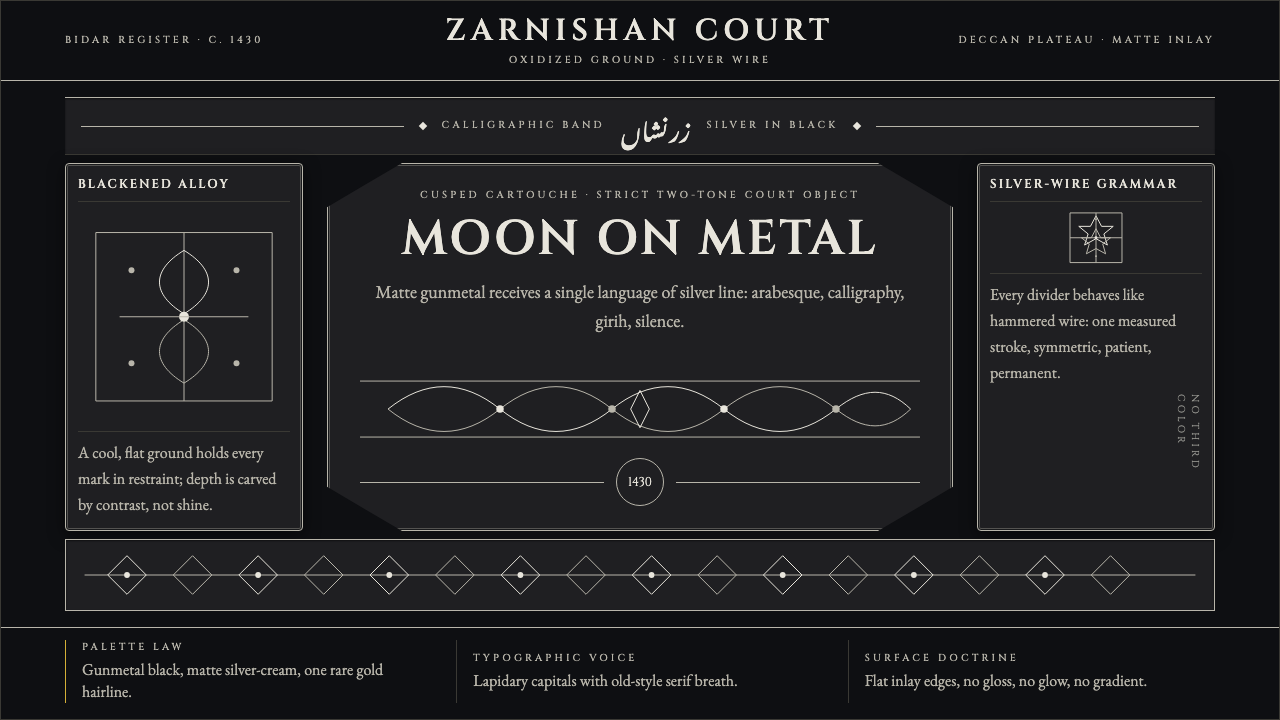 Bidri Deccan MetalworkCourtly darkness, tooled by silver. Cinzel caps and hairline arabesques cut g…宫廷般冷黑。Cinzel 大写与银色藤蔓线切入枪铁黑。
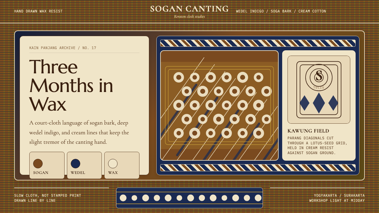 Javanese Batik Tulis (Keraton Sogan)Patience made visible. Sogan brown, indigo, and cream wax-lines form dense co…耐心可见:梭罗褐、靛蓝与奶白蜡线织成密集宫廷网格。
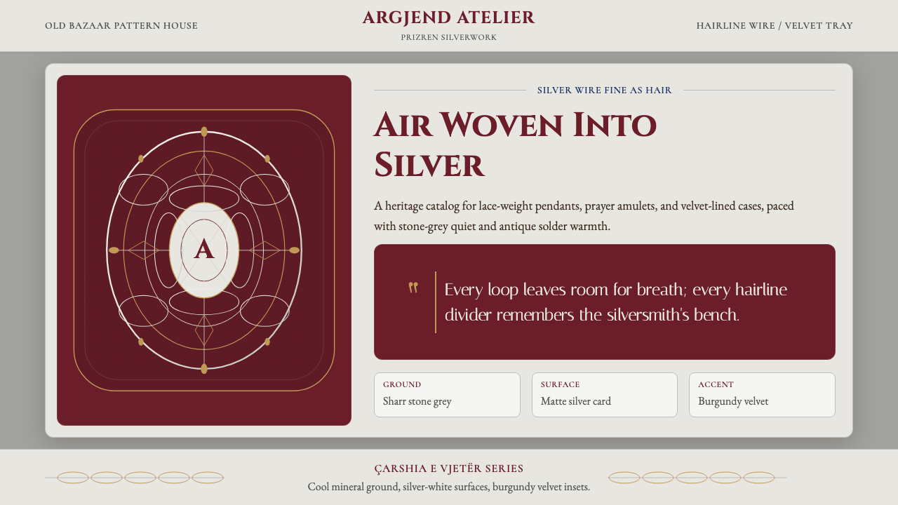 Kosovar Prizren Filigree SilverAir becomes ornament. Burgundy velvet and stone grey frame Cinzel type with c…空气成为纹样:酒红绒面与石灰底托起Cinzel字和盘银几何。
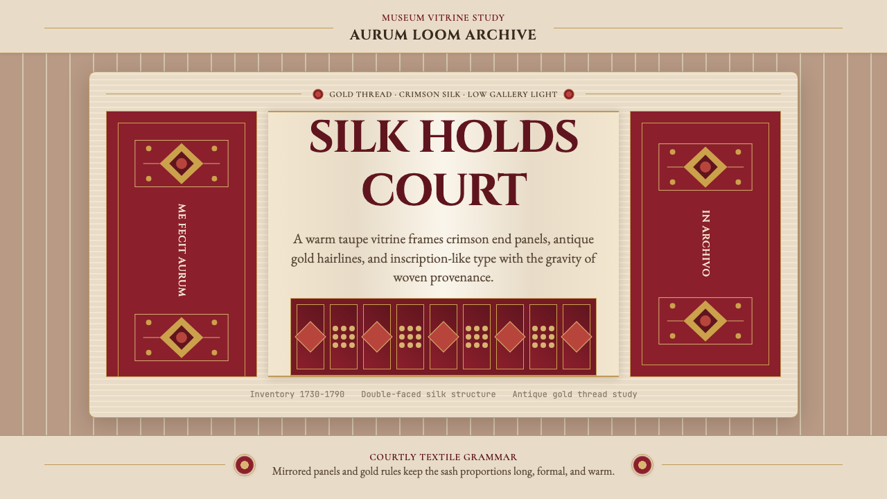 Belarusian Slutsk SashCourtly silk, vitrined. Taupe ground, crimson panels, Cinzel type, antique go…宫廷丝锦入展柜:赭褐底、深红端板、Cinzel 铭文与古金细线。
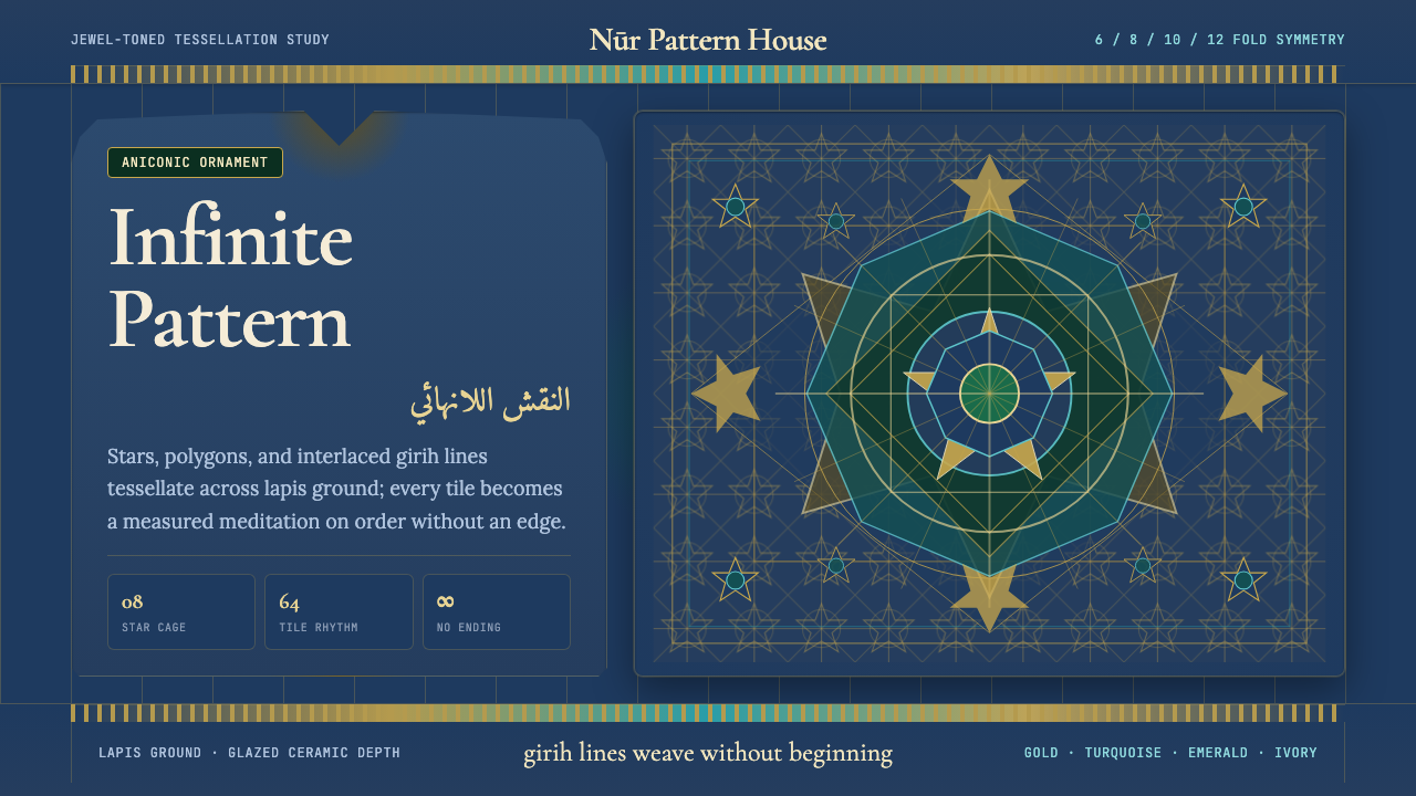 Islamic Geometric ArtInfinite order, fully tiled. Lapis ground with gold girih lines and turquoise…无限秩序,满幅铺陈。青金石底、金色girih线与绿松石星格。