Design style guide设计风格指南
What is Javanese Batik Tulis (Keraton Sogan)?什么是 Javanese Batik Tulis (Keraton Sogan)?
Javanese batik tulis is patience made visible — three to six months of hand-drawn wax lines and repeated dye baths produce cloth so dense with meaning that royal courts once forbade commoners from wearing it.爪哇手绘蜡染是耐心的可见形式——三到六个月的逐线手绘与反复浸染,织就一块意义如此稠密的布料,以至于宫廷曾明令禁止平民穿着。
Javanese Batik Tulis (Keraton Sogan) in briefJavanese Batik Tulis (Keraton Sogan) 速览
Javanese batik tulis is the most labor-intensive textile tradition in Southeast Asia. Each cloth is drawn entirely by hand using a canting — a small copper-spouted kettle that the artisan holds like a pen, guiding molten wax along lines memorized through years of apprenticeship. The wax resists the dye wherever it lands, and the negative space it creates becomes the pattern. After waxing, the cloth is submerged in a dye bath, the wax is scraped away, and the process begins again for the next color. A single finished cloth can represent months of continuous labor.爪哇手绘蜡染(batik tulis)是东南亚劳动强度最高的织物传统。每一块布料完全依靠手工绘制:匠人手持蜡笔(canting)——一只小铜嘴水壶,握法如持笔——沿着经年学徒期间烂熟于心的纹路,引导熔蜡流淌成线。蜡液落处,染料无法渗入,由此形成的负空间便成了花纹。上蜡之后,布料浸入染缸,蜡层刮去,下一道颜色的工序重新开始。一块完整的蜡染布,往往凝结着数月连续的劳作。
The visual language that emerges from this process is unlike anything produced by printing or weaving. Lines have a characteristic slight tremor — the inevitable trace of a human hand guiding liquid wax — and densely packed motifs fill every centimeter of the surface with geometric precision. The palette of the royal keraton workshops centers on warm sogan brown, extracted from the bark of the soga tree, and deep indigo drawn from fermented woad leaf. Against these two saturated grounds, cream wax-resist lines articulate the intricate motifs with a warmth and subtlety that no printed substitute has ever matched.这一工艺造就的视觉语言,与任何印刷或编织技术的产物截然不同。线条带有一种特有的轻微颤动——那是引导液态蜡液的人手留下的必然痕迹——密集的纹样以几何精度铺满布面的每一寸。宫廷蜡染工坊的调色盘以温暖的梭罗褐(sogan,取自梭罗树皮)和深沉的靛蓝为核心,两者皆为天然植物染料。在这两种浓郁底色之间,奶白色的蜡染留白线条将繁复的纹样以一种温润而微妙的方式呈现出来,这是任何印刷替代品从未企及的效果。
The term tulis (written) distinguishes hand-drawn batik from cap (stamped) batik and from mechanically printed imitations. Among collectors and scholars, tulis is recognized as the highest expression of the tradition — not because it is older, but because the hand that draws it is present in every line. Each cloth is simultaneously a textile, a document of labor, and a meditation on pattern as spiritual discipline.「Tulis」(书写)一词将手绘蜡染与印章蜡染(cap)及机械印花仿品区别开来。在收藏家与学者眼中,tulis 被视为这一传统最高的表达形式——不因其古老,而因绘制它的那双手在每一条线里都清晰在场。每一块布料同时是织物、劳动的记录,也是将纹样作为精神修炼的一种沉思。
Where does Javanese Batik Tulis (Keraton Sogan) come from?Javanese Batik Tulis (Keraton Sogan) 从何而来?
The roots of Javanese batik reach back at least to the eighth century, when wax-resist dyeing techniques spread across maritime Southeast Asia along trade routes connecting India, China, and the Indonesian archipelago. Early Javanese courts absorbed these techniques and began transforming them into a courtly art form, codifying motifs and restricting the most sacred patterns to the royal family and nobility. By the time of the Mataram Sultanate in the sixteenth and seventeenth centuries, batik had become inseparable from Javanese identity, ritual, and political order.爪哇蜡染的根源至少可追溯至八世纪——彼时,蜡染技艺随着连通印度、中国与印度尼西亚群岛的贸易路线,在海洋东南亚广泛传播。早期爪哇宫廷吸收了这些技艺,并将其转化为宫廷艺术,将纹样系统化,并将最神圣的图案限制为王室与贵族专属。至十六至十七世纪的马打兰苏丹国时期,蜡染已与爪哇人的身份认同、仪式秩序和政治体制密不可分。
The systematic codification of batik as a court art was carried furthest under Sultan Agung of Mataram, who reigned from 1613 to 1645. His court established hierarchies of motif — the parang rusak (broken blade), kawung (lotus seed), and semen (organic vines) patterns became restricted to royalty and high officials. Wearing a forbidden motif was not merely a fashion transgression; it was a political statement and, in some interpretations, a spiritual trespass. This association between specific patterns and social rank persisted until Indonesian independence in 1945, when the restrictions were formally dissolved.将蜡染作为宫廷艺术加以体系化编码,在苏丹阿贡(Sultan Agung)治下发展至顶峰。阿贡于1613至1645年在位,其宫廷确立了纹样的等级制度——帕兰(parang rusak,折刃纹)、卡温(kawung,莲子圆阵)和塞门(semen,藤蔓花卉)图案成为皇室与高官的专属禁地。穿戴禁用纹样不仅是逾礼的时尚冒犯,更是政治宣言,在某些解读中甚至是精神层面的越界。这种特定纹样与社会等级之间的关联,一直延续至1945年印度尼西亚独立,相关禁令方才正式解除。
The two great keraton (palace) cities of Central Java — Yogyakarta and Surakarta (Solo) — developed distinct regional styles that remain recognizable today. Yogyakarta batik tends toward bold contrast, with deep indigo grounds and strong white resist lines. Surakarta batik, particularly the sogan style associated with the Pakubuwono dynasty, favors warmer brown grounds and softer, more intricate patterning. Pakubuwono X, who ruled from 1893 to 1939, was a significant patron who documented court batik patterns and supported the workshops that preserved the keraton tradition through the colonial period.中爪哇两座伟大的宫廷(keraton)城市——日惹与梭罗——发展出至今仍清晰可辨的地域风格。日惹蜡染倾向于强烈对比,深靛蓝底面配以有力的白色留白线条;梭罗蜡染,尤其是与巴古布沃诺王朝(Pakubuwono)相关的梭罗褐风格,偏好更温暖的棕褐底色与更柔和、更繁复的纹样。1893至1939年在位的巴古布沃诺十世是重要的赞助人,他记录了宫廷蜡染纹样,并在殖民地时期支持着守护宫廷传统的工坊。
In the twentieth century, batik tulis faced two existential pressures: the mass production of cap and printed imitations, which undercut its economic viability, and the broader disruption of traditional court culture. The designer Iwan Tirta, working from the 1960s onward, played a critical role in repositioning batik tulis as a luxury material suitable for contemporary fashion and diplomacy — creating batik garments worn at international summits and collaborating with global fashion houses. K. R. T. Hardjonagoro (Go Tik Swan), a Chinese-Javanese court scholar and designer, similarly devoted his life to documenting and reviving archaic court patterns that were at risk of being lost. In 2009, UNESCO inscribed Indonesian batik on the Representative List of the Intangible Cultural Heritage of Humanity, a recognition that both validated the tradition and created new international demand for authentic handmade cloth.二十世纪,手绘蜡染面临两重生存压力:印章蜡染与印花仿品的大规模生产冲击了其经济可行性;传统宫廷文化也遭受了更广泛的解体。设计师伊万·蒂尔塔(Iwan Tirta)自1960年代起发挥了关键作用——他将手绘蜡染重新定位为适合当代时装与外交场合的奢侈材料,为国际峰会制作蜡染礼服,并与国际时装品牌合作。中爪混血的宫廷学者与设计师哈佐纳格罗(K. R. T. Hardjonagoro,又名 Go Tik Swan),同样毕生致力于记录和复兴濒临失传的古老宫廷纹样。2009年,联合国教科文组织将印度尼西亚蜡染列入人类非物质文化遗产代表作名录,这一认定既肯定了这一传统,也为真正的手工布料创造了新的国际需求。
What defines the Javanese Batik Tulis (Keraton Sogan) look?Javanese Batik Tulis (Keraton Sogan) 的视觉特征是什么?
Color色彩
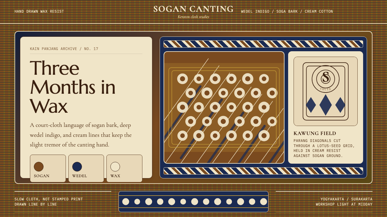
The keraton palette is built on three natural dyestuffs: sogan brown from the soga tree bark, indigo from fermented woad leaf, and the undyed cream of the base cloth. These three tones — warm earth, cool deep blue, and soft natural white — form a deliberately narrow range that reads as simultaneously luxurious and restrained. Color is never flat or uniform; the layering of multiple dye baths creates depth and variation within each tone, so that sogan brown shifts from amber to near-black depending on the density of dyeing. Bright or secondary colors are structurally absent from the classical keraton style.宫廷色板建立在三种天然染料之上:取自梭罗树皮的梭罗褐、发酵蓝草叶提炼的靛蓝,以及底布本身未经染色的奶白。这三种色调——温暖的大地色、沉静的深蓝与柔和的自然白——构成一个刻意收窄的色域,读来既奢华又克制。色彩从不平整均匀;多道染浴的叠加在每个色调内部制造出深度与变化,梭罗褐因浸染密度的不同,可从琥珀色过渡至近乎炭黑。明亮色彩与间色在经典宫廷风格中结构性地缺席。
Pattern Density纹样密度
Keraton batik fills the entire surface of the cloth with interlocking motifs. There is no empty ground — every centimeter carries pattern. This horror vacui is not mere decoration but a philosophical stance: emptiness in the cloth implies incompleteness in the spiritual or social order the cloth represents. Parang diagonal blade motifs interlock at precise angles without interruption; kawung circles tessellate edge to edge. The result is a surface of extraordinary visual density that rewards close inspection with continuously finer levels of detail.宫廷蜡染以相互咬合的纹样铺满布面的每一处。没有空白的底面——每一厘米都承载着纹样。这种对空白的恐惧(horror vacui)并非单纯的装饰偏好,而是一种哲学立场:布料中的空白意味着它所象征的精神或社会秩序的不完整。帕兰对角刃纹以精确的角度无间断地咬合延伸;卡温圆形纹则边边相接地密铺成面。结果是一个视觉密度极高的表面,愈近细看,愈能发现不断细化的纹样层次。
Line Quality线条质感
The defining mark of batik tulis is the slight tremor in every line. Because the canting is hand-held and liquid wax cools rapidly, even a master craftsman's lines carry a micro-wobble that no mechanical process replicates. This quality is not a flaw but the signature of the hand — the visual equivalent of breath in a sung note. A line that is perfectly straight and mechanically uniform is, by this aesthetic, impoverished: it reveals the absence of a human being. The wobble is what makes a tulis cloth alive.手绘蜡染的决定性标志,是每一条线的轻微颤动。由于蜡笔(canting)是手持的,液态蜡液冷却迅速,即便是最熟练的匠人,其线条也带有任何机械工艺无法复制的微颤。这不是瑕疵,而是手的签名——如同歌声中气息的视觉等价物。一条完美笔直、机械均匀的线,在这种美学看来是贫乏的:它揭示的是人的缺席。那一丝颤动,正是让一块手绘布料有生命的东西。
Sacred Geometry神圣几何
The major court motifs are rigorously geometric. The parang is a continuous diagonal blade form that tiles across the cloth at a strict angle. The kawung is a precisely arranged grid of four-lobed circles, each lobe touching the next without gap or overlap. The semen is more organic, but its tendril and vine forms follow a lattice structure that distributes weight evenly across the surface. This underlying geometric discipline gives the cloth an architectural quality: it is pattern governed by spatial law, not freely improvised.主要宫廷纹样具有严格的几何性。帕兰是以固定角度连续对角延伸的刀刃形,铺陈于布面如无缝的几何镶嵌。卡温是由精确排列的四瓣圆圈构成的网格,每片花瓣与相邻的紧密相接,无间隙也无重叠。塞门更具有机感,但其卷须与藤蔓形态遵循着一种能将重量均匀分布于整个表面的格网结构。这种底层几何纪律赋予布料一种建筑性质量:这是受空间法则支配的纹样,而非自由即兴的发挥。
Layered Time叠加的时间
The batik tulis surface is the record of a sequence of decisions made over months, not a single compositional act. Each dye bath adds a layer; each waxing session adds a set of lines; the final cloth is the accumulation of all of them. This layering is visible in the depth of the color and the slight variations where one pass of wax overlaps another. Unlike a painting or a print, which are made at a single moment, a batik tulis cloth is a temporal object — its surface is duration made material.手绘蜡染的表面是数月间一系列决定的记录,而非单一的构图行为。每道染浴叠加一层;每次上蜡增加一组线条;最终的布料是所有这些积累的结果。这种叠加在色彩的深度以及一道蜡线覆盖另一道时形成的细微变化中清晰可见。不同于绘画或印刷品在某一单一时刻完成,手绘蜡染是一个时间性的对象——它的表面是被物质化的时间跨度。
Motif Hierarchy纹样等级
Not all batik patterns carry equal cultural weight. The forbidden court motifs — parang, kawung, semen, and a handful of others — occupy the highest tier of the visual hierarchy, their geometric discipline and historical associations marking them as the most symbolically loaded. Below them sit regional motifs associated with specific cities or workshops, and below those are the pesisir coastal batik patterns, which are livelier, more colorful, and draw on Chinese and European decorative vocabularies. Applying the keraton aesthetic means working primarily within the upper tier of this hierarchy.并非所有蜡染纹样都承载着相同的文化分量。被禁的宫廷纹样——帕兰、卡温、塞门及另外数种——占据视觉等级制度的最高层,其几何纪律与历史渊源赋予了它们最为浓厚的象征负载。其下是与特定城市或工坊相关的地域纹样;再其下是北海岸(pesisir)蜡染纹样——更为活泼、色彩更丰富,融合了中国与欧洲装饰语汇。运用宫廷美学,意味着主要在这一等级制度的最高层内工作。
Restraint as Luxury克制即奢华
The keraton aesthetic does not signal status through brightness or novelty. It signals status through investment of time and skill. A sogan cloth with a narrow palette of brown, indigo, and cream, densely covered in a royal motif drawn by a master craftsman, is more prestigious than any brighter or more complex imitation. This is restraint deployed as a display of mastery: the narrower the palette and the more complex the pattern, the more visible the labor and knowledge behind the cloth. Applied to design, this means that simplicity of means and complexity of execution are not in conflict — they are the same gesture.宫廷美学并不通过鲜亮或新奇来彰显地位,而是通过时间与技艺的投入来表达。一块梭罗褐配靛蓝配奶白的窄色板布料,由大师级匠人密布绘满皇家纹样,比任何更鲜艳或更繁复的仿制品都更为尊贵。这是作为技艺展示的克制:色板越窄,纹样越繁复,布料背后的劳动与知识就越清晰可见。应用于设计,这意味着手段的简约与执行的复杂并不矛盾——它们是同一个姿态。
Who shaped Javanese Batik Tulis (Keraton Sogan)?谁塑造了 Javanese Batik Tulis (Keraton Sogan)?
Sultan Agung of Mataram, who reigned from 1613 to 1645, was the ruler most responsible for codifying batik tulis as a court art with a strict hierarchy of motifs. Under his reign, certain patterns — including the parang and kawung — were formally restricted to the royal family and senior nobility. This act transformed batik from a textile craft into a political instrument, binding cloth to rank in a way that shaped Javanese court culture for the next three centuries.马打兰苏丹阿贡(1613—1645年在位)是将手绘蜡染系统化为具有严格纹样等级制度的宫廷艺术的最重要统治者。在他的统治下,包括帕兰和卡温在内的特定纹样被正式限制为皇室与高级贵族专属。这一举措将蜡染从纺织工艺转变为政治工具,将布料与等级紧密绑定,塑造了此后三个世纪的爪哇宫廷文化。
The ninth Susuhunan of Surakarta, who ruled from 1893 to 1939, was a major patron of batik tulis during the colonial period. Pakubuwono X actively documented court patterns and supported the keraton workshops at a time when cheap imported cloth and printed imitations posed an existential threat to handmade batik. His sustained patronage helped preserve the sogan style that is now considered the definitive expression of the Surakarta tradition.梭罗第九代苏苏胡南(Susuhunan)巴古布沃诺十世(1893—1939年在位),是殖民地时期手绘蜡染的重要赞助人。在廉价进口布料和印花仿品对手工蜡染构成生存威胁之际,巴古布沃诺十世积极记录宫廷纹样,并扶持宫廷工坊。他持续的赞助帮助保存了梭罗褐风格,这一风格如今被视为梭罗传统的权威表达。
Iwan Tirta was the Indonesian fashion designer who most dramatically repositioned batik tulis for the modern world. Working from the 1960s through the 2000s, he created batik garments for state occasions, diplomatic gifts, and international fashion collections, collaborating with luxury houses and dressing heads of state. His work demonstrated that the keraton aesthetic could hold its own in contemporary luxury fashion without being simplified or diluted — the density and labor of the cloth were themselves the argument.伊万·蒂尔塔是将手绘蜡染最有力地重新定位于现代世界的印度尼西亚时装设计师。自1960年代至2000年代,他为国家场合、外交礼品和国际时装系列创作蜡染服装,与奢侈品牌合作,为国家元首设计礼服。他的工作证明,宫廷美学可以在当代奢侈时尚中自持其价——无需简化或稀释——布料的密度与劳作本身就是论据。
Known also as Go Tik Swan, K. R. T. Hardjonagoro was a Chinese-Javanese court scholar, designer, and cultural preservationist who spent his career documenting and reviving archaic court batik patterns. He was one of the first to systematically record the meanings and restricted-use protocols associated with the major keraton motifs, and he trained a generation of craftspeople in techniques that were at risk of disappearing. His scholarly and practical work forms a significant part of the foundation on which contemporary understanding of batik tulis rests.哈佐纳格罗(K. R. T. Hardjonagoro,又名 Go Tik Swan)是中爪混血的宫廷学者、设计师与文化保存者,毕生致力于记录和复兴古老的宫廷蜡染纹样。他是最早系统记录主要宫廷纹样的含义与使用禁忌协议的人之一,并培训了一代面临技艺失传风险的工匠。他的学术与实践工作构成了当代手绘蜡染认知体系的重要基础。
How do you use Javanese Batik Tulis (Keraton Sogan) today?今天怎么用 Javanese Batik Tulis (Keraton Sogan)?
The Javanese batik tulis aesthetic translates into contemporary design work through three core commitments: a palette of near-earth naturals rather than synthetic brightness, an embrace of surface density over empty minimalism, and a visible trace of the hand rather than mechanical perfection. Applying it well requires resisting the urge to simplify — this style rewards complexity, not reduction.爪哇手绘蜡染美学向当代设计实践的转化,依赖三个核心承诺:近乎大地色的自然调色盘而非合成的鲜亮色彩,对表面密度的拥抱而非空洞的极简,以及可见的手的痕迹而非机械的完美。运用它需要抵抗简化的冲动——这种风格奖励复杂,而非削减。
For presentation slides, the keraton aesthetic works best as a backdrop register rather than a primary organizational system. Cover slides benefit from a deep sogan-brown or indigo ground with the title set in a light, fine-weight typeface that allows the background pattern to breathe through it. Content slides should use the narrow palette consistently — resist the urge to introduce bright accent colors for highlights. Data visualization takes on a warmth and distinctiveness when charts are rendered in the two or three tones of the natural palette, with pattern-fill textures used sparingly to differentiate categories. The effect reads as authoritative and culturally specific rather than generic.在演示文稿中,宫廷美学最适合作为背景基调,而非主要的组织系统。封面幻灯片适合以深沉的梭罗褐或靛蓝为底色,标题选用细字重的浅色字体,使背景纹样得以从文字缝隙中透出。内容页应始终如一地使用窄色板——抵制为高亮内容引入鲜亮强调色的冲动。当图表以自然色板的两三种色调呈现,并以纹样填充纹理(审慎使用)区分不同类别时,数据可视化将呈现出一种温润而与众不同的气质,读来令人感受到权威性与文化特殊性,而非普通感。
For web interfaces, batik-derived visual language suits editorial contexts, cultural institutions, luxury e-commerce, and heritage brands more readily than software dashboards or analytical tools. A dashboard that borrows batik motifs as decorative backgrounds risks visual noise that impairs readability at small scales. Used as section borders, divider patterns, or background textures on landing and marketing pages, the motifs work better — their density becomes an asset when contained, a liability when spread across functional UI. Pricing pages and feature grids benefit from restraint: use the palette for background warmth and a single repeated geometric form for structural accents, leaving the motif density for hero moments only.在网页界面中,蜡染衍生的视觉语言更适合编辑类、文化机构、奢侈电商及遗产品牌,而非软件仪表板或分析工具。将蜡染纹样作为装饰背景叠加于仪表板,在小尺寸下容易造成视觉噪音,损害可读性。用作区块边框、分隔纹样,或落地页与营销页上的背景纹理,效果则更好——当纹样密度被限制在特定区域时,它是一种资产;铺展于整个功能性界面时,则成为负担。定价页与功能网格适合保持克制:用调色盘提供背景温度,用单一重复的几何形作为结构性强调,将纹样密度留给英雄区块等关键时刻。
For editorial and marketing design, batik tulis offers a rare combination of visual authority and cultural specificity. A magazine spread or brand campaign built around the keraton palette communicates craft, heritage, and deliberateness — associations that are difficult to fabricate with generic modern styles. The motif vocabulary works well at large scale as full-bleed backgrounds or as textures behind large type, and at small scale as decorative marks or pattern fills within illustrations. In both cases, the sogan-indigo-cream triad should remain the color anchor; introducing additional colors dilutes the aesthetic coherence that gives the style its weight.在编辑与营销设计中,手绘蜡染提供了一种罕见的视觉权威性与文化特殊性的结合。围绕宫廷色板构建的杂志版面或品牌活动,传递出工艺、传承与审慎的联想——这些联想是通用现代风格难以伪造的。纹样词汇在大尺寸下可作为全出血背景或大字体后的纹理发挥很好的作用,在小尺寸下则适合作为插图中的装饰标记或纹样填充。无论哪种情况,梭罗褐-靛蓝-奶白三元色调应始终是色彩锚点;引入额外色彩会稀释赋予这种风格分量的美学一致性。
A common mistake when adapting this aesthetic is reducing it to surface decoration — applying the motif pattern as a clip-art texture while the underlying design system remains generically modern. Batik tulis is not a texture; it is a complete visual philosophy built on density, restraint, and the visible trace of labor. If the motif appears but the palette is full-spectrum, or if the motif appears but the layout is airy and sparse, the result is costume rather than conviction. The most effective applications internalize the aesthetic's core logic — narrow palette, dense pattern, patient geometry — and let the motif emerge as an expression of that logic rather than an addition to it.在借鉴这种美学时,常见的错误是将其简化为表面装饰——把纹样当作剪贴画纹理叠加,而底层设计系统仍是普通的现代风格。手绘蜡染不是一种纹理;它是一套建立在密度、克制与劳动可见痕迹之上的完整视觉哲学。如果纹样出现但色板是全色域的,或者纹样出现但版面轻盈稀疏,结果是戏服而非信念。最有效的运用,是将这种美学的核心逻辑内化——窄色板、密纹样、耐心的几何——让纹样作为这种逻辑的表达自然涌现,而非作为附加物强加其上。
Javanese Batik Tulis (Keraton Sogan) — FAQJavanese Batik Tulis (Keraton Sogan) · 常见问题
What distinguishes batik tulis from other batik types?手绘蜡染与其他类型的蜡染有何区别?
Batik tulis (written batik) is drawn entirely by hand using a canting, a small copper-spouted vessel that delivers liquid wax in a controlled line. Batik cap (stamped batik) uses a copper stamp to apply wax in repeated impressions, producing uniform patterns much faster. Printed batik is mechanically reproduced on fabric using rotary printing and bears no wax resist at all. The three are visually distinguishable to a trained eye: tulis has the characteristic micro-tremor of a hand-held line; cap has perfectly repeated impressions with slight gaps at stamp junctions; printed batik has none of the waxy depth of either. Tulis is the most labor-intensive and the most prestigious, and it commands significantly higher prices than cap or printed equivalents.手绘蜡染(tulis,意为「书写」)完全由手工使用蜡笔(canting)绘制——蜡笔是一种小型铜嘴容器,以可控的线条输送液态蜡液。印章蜡染(cap)使用铜质印章重复施蜡,速度快得多,纹样均匀一致。印花蜡染则用滚筒印刷机械复制于布料上,根本不含蜡液防染工艺。三者对训练有素的眼睛在视觉上可以区分:tulis 带有手持线条特有的微颤;cap 的印痕高度重复,印章接合处有轻微间隙;印花蜡染则不具备前两者的蜡质深度。手绘蜡染是劳动强度最高、声望最高的,价格也显著高于印章版或印花版。
Can the motifs be used freely in contemporary design?宫廷纹样可以在当代设计中自由使用吗?
The legal restrictions on wearing forbidden court motifs were dissolved at Indonesian independence in 1945, so there is no longer a formal prohibition. However, the cultural weight of the sacred patterns — particularly parang, kawung, and semen — remains significant in Javanese and broader Indonesian contexts. Using them thoughtlessly, especially in commercial contexts that trivialize or misrepresent the tradition, is widely considered disrespectful. The most sustainable approach is to engage with the aesthetic vocabulary of the tradition — the palette, the density, the geometric discipline — rather than directly appropriating the most symbolically loaded sacred motifs without acknowledgment of their cultural significance.对穿戴禁用宫廷纹样的法律禁制随1945年印度尼西亚独立而解除,正式的禁令已不复存在。然而,神圣纹样的文化分量——尤其是帕兰、卡温和塞门——在爪哇及更广泛的印度尼西亚语境中依然深重。不加思考地使用这些纹样,尤其是在将传统庸俗化或曲解的商业语境中,被普遍视为不尊重的行为。最可持续的做法,是与这一传统的美学词汇——色板、密度、几何纪律——进行对话,而非不加致认地直接挪用最具象征负载的神圣纹样。
How does this style work in dark-mode or dark-background designs?这种风格在深色模式或深色背景的设计中效果如何?
The keraton palette is inherently dark-ground-capable. Deep indigo and sogan brown are both darker tones that read as backgrounds against cream or light-colored motif lines. A dark-mode design built on an indigo ground with cream wax-resist lines and sogan accents is entirely consistent with the historical aesthetic — in fact, deeply dyed indigo grounds are among the most celebrated expressions of the tradition. The key adjustment is ensuring that the cream or light elements retain enough contrast against the deep ground to preserve the characteristic motif legibility. Bright white should be used more sparingly than in light-mode applications; the slightly warm, natural cream tone is truer to the source material.宫廷色板天然适合深色底面。深靛蓝与梭罗褐都是较深的色调,能以背景色的身份衬托出奶白色或浅色的纹样线条。以靛蓝底搭配奶白蜡染留白线条和梭罗褐点缀的深色模式设计,完全符合历史美学——事实上,深度浸染的靛蓝底面是这一传统最受推崇的表达之一。关键的调整在于确保奶白或浅色元素在深色底面上保持足够的对比度,以维持标志性的纹样可读性。纯白应比浅色模式更为审慎地使用;略带暖意的自然奶白色调更接近源材料的本质。
What makes this style feel luxurious rather than just complex?是什么让这种风格感觉奢华,而不仅仅是复杂?
Luxury in the batik tulis tradition is not communicated through brightness, novelty, or variety — it is communicated through the visible investment of time and skill. A cloth that took three months to draw signals mastery not through ostentation but through the accumulation of careful decisions made across thousands of hand-drawn lines. In contemporary design, this translates to restraint of palette combined with complexity of execution: fewer colors used with greater precision, patterns that reveal more detail the longer you look, and a surface that rewards sustained attention. Complexity that can be perceived immediately is novelty; complexity that reveals itself slowly is craft.手绘蜡染传统中的奢华,并非通过鲜亮、新奇或丰富来传递——而是通过时间与技艺的可见投入来表达。一块耗时三个月绘制的布料,传递技艺的方式不是炫耀,而是数千条手绘线条上积累的审慎决定。在当代设计中,这转化为色板的克制与执行的复杂并举:更少的颜色以更高的精度运用,纹样在你凝视越久时呈现越多细节,一个表面奖励持续的注意力。一眼就能感知的复杂是新奇;缓慢揭示自身的复杂是工艺。
Is this style appropriate for digital products aimed at global audiences?这种风格适合面向全球受众的数字产品吗?
It works well for global audiences when it is applied through its structural principles rather than as surface decoration. A design system built on a narrow earth-toned palette, dense geometric patterns, and visible craft texture communicates deliberateness and warmth across cultural contexts — these are human values, not exclusively Javanese ones. Where cultural specificity becomes a liability is when the motifs are used recognizably as Javanese court patterns without the surrounding context acknowledging their origin. For audiences already familiar with the tradition, direct reference is a strength; for audiences who will encounter it without context, the structural principles — density, restraint, patient geometry — are both more universally legible and more respectful of the source material.当通过结构性原则而非表面装饰来应用时,这种风格对全球受众同样有效。建立在窄幅大地色系色板、密集几何纹样和可见工艺质感之上的设计系统,能够跨越文化语境传递审慎与温暖——这些是人类共通的价值观,而非爪哇独有的。文化特殊性成为负担的情况,是当纹样被清晰辨认为爪哇宫廷图案使用,而周边语境又未能致认其来源之时。对于已经熟悉这一传统的受众,直接引用是一种力量;对于将在缺乏背景的情况下接触它的受众,结构性原则——密度、克制、耐心的几何——既更具普遍可读性,也对源材料更为尊重。
Related design styles相关设计风格
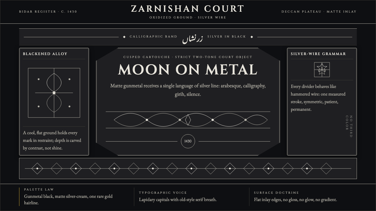 Bidri Deccan MetalworkCourtly darkness, tooled by silver. Cinzel caps and hairline arabesques cut g…宫廷般冷黑。Cinzel 大写与银色藤蔓线切入枪铁黑。
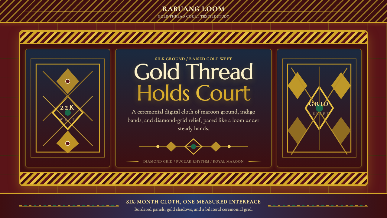 Sumatran Songket (Pandai Sikek)Courtly weight glows. Maroon silk, Cormorant small caps, and gold diamond gri…宫廷重量在发光:酱红丝地、Cormorant 小型大写与金色菱格。
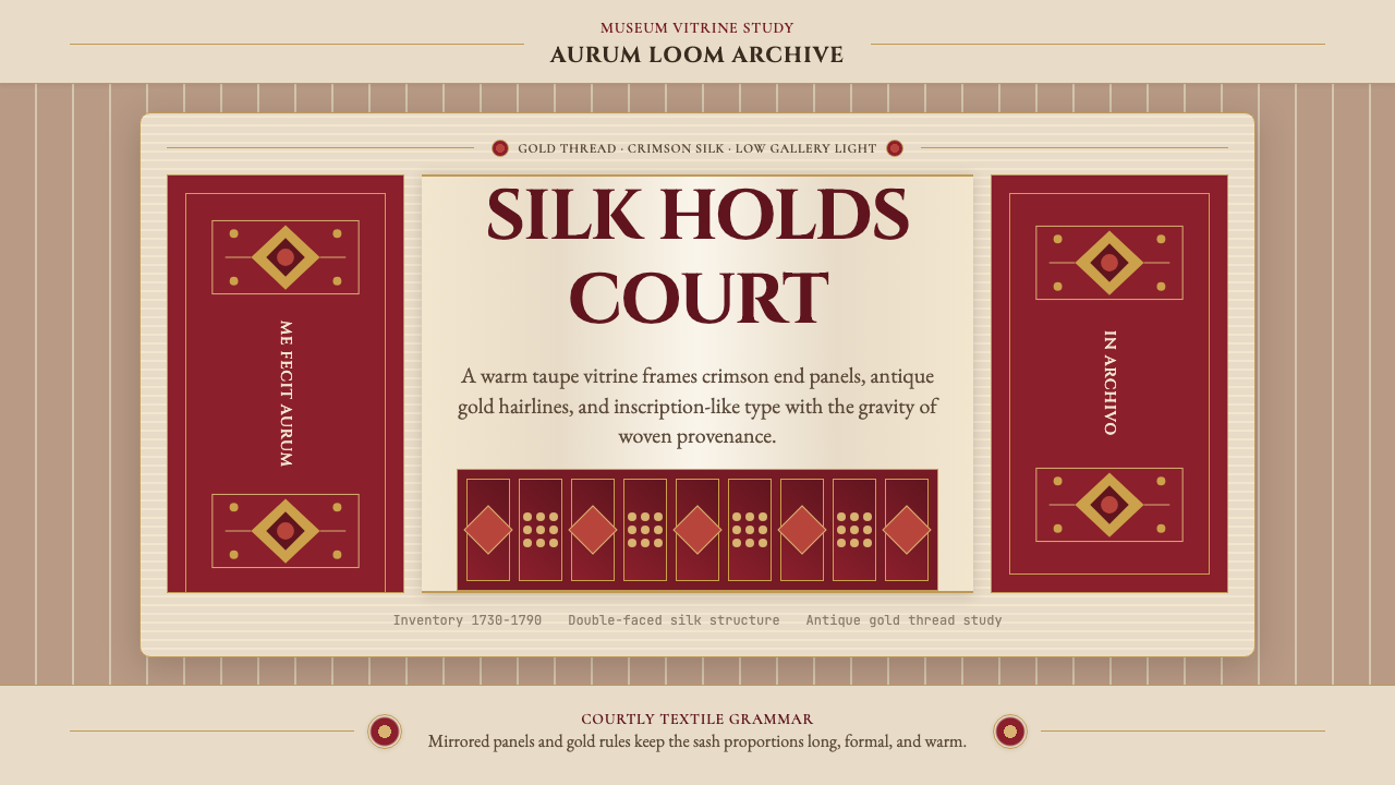 Belarusian Slutsk SashCourtly silk, vitrined. Taupe ground, crimson panels, Cinzel type, antique go…宫廷丝锦入展柜:赭褐底、深红端板、Cinzel 铭文与古金细线。
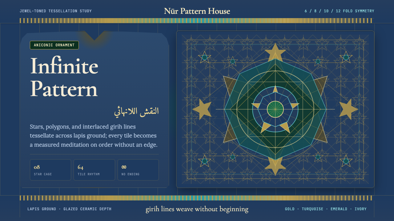 Islamic Geometric ArtInfinite order, fully tiled. Lapis ground with gold girih lines and turquoise…无限秩序,满幅铺陈。青金石底、金色girih线与绿松石星格。
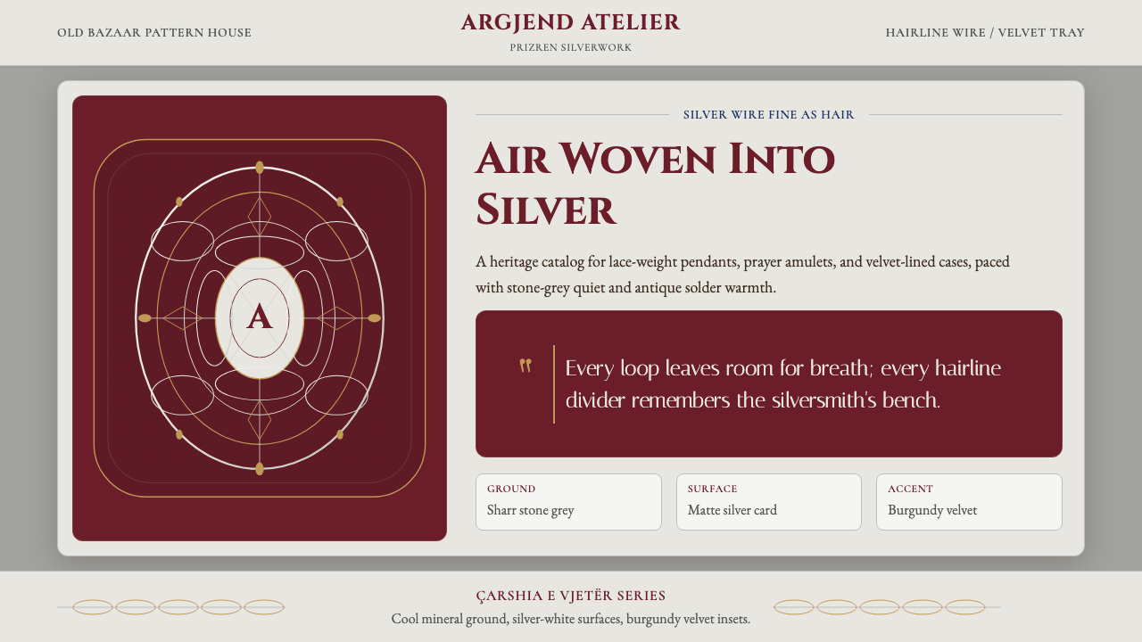 Kosovar Prizren Filigree SilverAir becomes ornament. Burgundy velvet and stone grey frame Cinzel type with c…空气成为纹样:酒红绒面与石灰底托起Cinzel字和盘银几何。
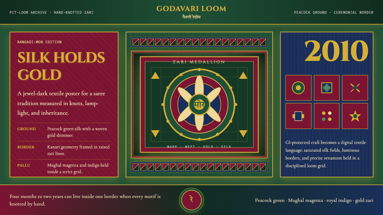 Maharashtra Paithani Peacock SareeSilk carries ceremony. Peacock green, Mughal magenta, and gold grids shimmer…丝绸承载仪式感:孔雀绿、莫卧儿品红与金色网格闪如扎里。