What is Russian Khokhloma?什么是 Russian Khokhloma?
Khokhloma is Russian peasant painting transformed into sacred fire — jet-black lacquer blazing with antique gold, blood-red berries, and curling vines that have crowned Volga woodware for four centuries.霍赫洛马是化作圣火的俄罗斯农民彩绘——漆黑底面上燃烧着古金、血红浆果与卷曲藤蔓,四百年来装点着伏尔加河畔的木器。
Russian Khokhloma in briefRussian Khokhloma 速览
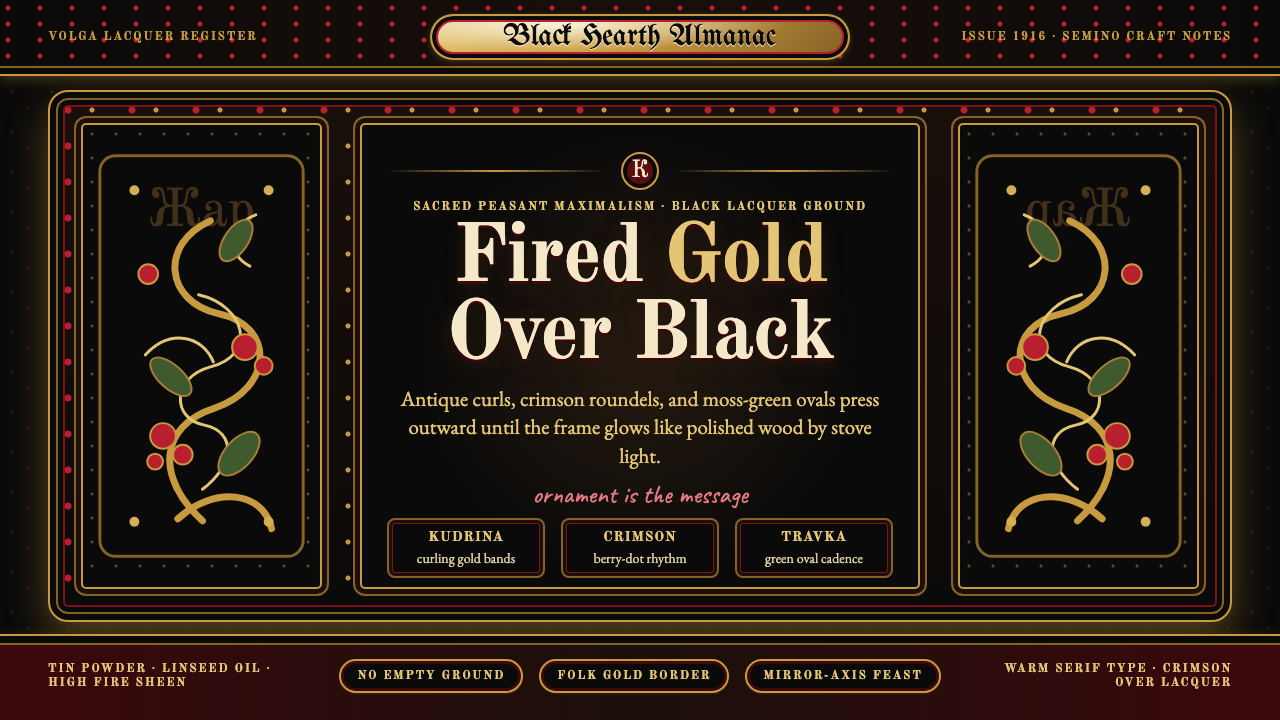
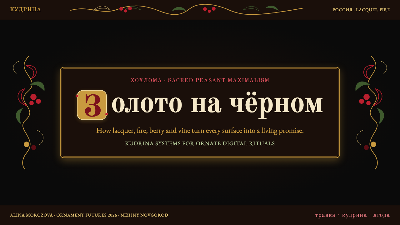
Khokhloma (Хохлома) is a Russian wood-painting tradition whose visual signature is instantly legible: a ground of deep black lacquer overlaid with curling golden vines, scarlet berries, and stylized wildflowers. The characteristic 'false gold' effect is achieved not with gold leaf but through a firing technique that transforms applied tin powder into a warm, burnished surface — the entire aesthetic rests on this alchemical trick of heat and craft. The result reads simultaneously as firelight reflected on polished lacquer and as an illuminated manuscript unfurled across domestic objects.霍赫洛马(Хохлома)是俄罗斯一种木器彩绘传统,其视觉标志极易辨认:深黑漆底,上绘盘曲的金色藤蔓、朱红浆果与程式化野花。标志性的「假金」效果并非来自金箔,而是通过将锡粉涂敷于木胎、经高温焙烧后转化为温暖光泽面的工艺——整套美学建立在这一热与工艺的炼金把戏之上。最终效果如同火光映照在抛光漆器上,又如同一页彩绘手稿铺展于日用器物之上。
The visual system is deliberately maximalist. Every surface is treated as a field to be covered; bare ground is not rest — it is absence. Compositions organize around two principal ornamental grammars: the kudrina, a baroque scroll of large golden curls that crowd one another into a continuous dense canopy, and the travka, a finer tracery of grasses and stems that supports clusters of rowan berries, strawberries, and firebird feathers. These two grammars are rarely mixed; a craftsperson typically commits to one or the other for an entire piece. The symmetry is approximate — hand-painted, with the organic wobble of a living tradition — and this human imprecision is a feature, not a flaw.这套视觉体系是刻意为之的繁饰主义:每一寸表面都是待填满的画布,裸露的底色不是休止,而是缺席。构图围绕两种主要纹饰语法展开:其一是「库德琳娜」(kudrina),一种巴洛克式大金色卷草,相互拥挤形成连续、浓密的华盖;其二是「特拉夫卡」(travka),更细腻的草叶纹网络,托举着山梨浆果、草莓与火鸟羽毛的簇丛。这两种语法鲜少混用——匠人通常在整件作品中贯彻一种。对称是近似的——手工绘制,带有鲜活传统特有的有机颤动——而这种人的不精确,是特征,不是缺憾。
Typographically, Khokhloma's visual world calls for forms that match its ceremonial density. Cyrillic letterforms with strong serifs, blackletter-adjacent structures, or decorative Slavic scripts complement the ornamental register of the painting. Weight and formality matter more than geometric precision. Color is not a variable — it is a fixed grammar: gold on black, red on gold, with black outlines sharpening every element against its neighbor. Nothing about Khokhloma is neutral, and nothing about it is meant to be quiet.在字体感觉上,霍赫洛马的视觉世界需要与其礼仪性浓度相匹配的形式。带有强烈衬线的西里尔字形、接近哥特黑体的结构,或装饰性斯拉夫手写体,都能与绘画的纹饰格调相辅相成。重量感与正式感比几何精度更为重要。色彩不是变量——它是固定语法:金色在黑上,红色在金上,黑色轮廓将每个元素从邻近元素中锐利区分。霍赫洛马没有任何中性之处,也无意安静。
See the Russian Khokhloma design system查看 Russian Khokhloma 完整设计系统
Where does Russian Khokhloma come from?Russian Khokhloma 从何而来?
The technique was developed in the mid-seventeenth century in a cluster of villages along the Volga River in what is now Nizhny Novgorod Oblast — among them Khokhloma, Semino, and Khryashchi. The region had long been a center for woodworking: dense forests supplied birch and linden, rivers provided transport routes, and a tradition of carved and painted domestic objects — bowls, spoons, ladles, spinning wheels — already existed. What transformed this local craft tradition into the Khokhloma system was a conjunction of Old Believer monastic culture, foreign trade networks, and the particular chemistry of the firing technique.这项工艺于十七世纪中叶发展于伏尔加河沿岸一簇村庄,位于今俄罗斯下诺夫哥罗德州境内——其中包括霍赫洛马、谢米诺与赫里亚希村。这一地区长期以来就是木器工艺的重镇:茂密的森林供给桦木与椴木,河流提供运输通道,雕刻与彩绘日用器物——碗、勺、长柄勺、纺车——的传统早已存在。将这一地方工艺传统转化为霍赫洛马体系的,是旧礼仪派修道院文化、域外贸易网络与焙烧工艺特殊化学反应的汇合。
Old Believer communities — dissenters who had split from the Russian Orthodox Church following the Nikon reforms of the 1650s — settled in remote Volga villages to practice their faith outside state reach. These communities included monk-painters who brought icon-painting traditions with them: the use of precious materials, the hierarchical organization of ornamental programs, the discipline of pattern as a form of devotional attention. The 'false gold' technique itself may have been adapted from the gold-foil grounds used in icon production — a way of achieving the visual authority of gold without the prohibitive cost of gold leaf. Whatever its precise origin, the method was kept as a trade secret, transmitted within families and workshops across generations.旧礼仪派群体——因反对尼康于1650年代推行的宗教改革而脱离俄罗斯东正教会的异见者——定居于偏远的伏尔加村庄,在国家管辖之外践行信仰。这些社区中有修道士画师,他们携带圣像绘制传统而来:贵重材料的使用、纹饰程序的等级化组织、将图案作为虔诚专注之形式的修炼纪律。「假金」技法本身或许正是从圣像制作中使用的金箔底面改良而来——一种以视觉上的金的权威性取代昂贵金箔的方法。无论其确切起源如何,这一工艺被作为商业秘密保守,在家族与工坊之间代代相传。
By the late seventeenth and early eighteenth centuries, Khokhloma ware was traveling significant distances. Merchants carried painted bowls and spoons to the Makariev Fair on the Volga, then to the Nizhny Novgorod Fair, which became one of the largest trade fairs in Russia. The goods reached Persia, Central Asia, and through Dutch and English trading houses, Western Europe. This commercial success encouraged specialization: some villages concentrated on the kudrina scroll style, others on the finer travka grass style. The division between form-painters (who applied the black and red ground) and ornament-painters (who executed the detailed vine and berry work) also became formalized during this period.至十七世纪末至十八世纪初,霍赫洛马器物已行销甚远。商人将彩绘碗勺运往伏尔加河畔的马卡里耶夫集市,再到下诺夫哥罗德集市——后者成为俄罗斯规模最大的贸易集市之一。器物随之抵达波斯、中亚,并经由荷兰与英国贸易商行传入西欧。这种商业成功促进了专业化分工:一些村庄专注于库德琳娜卷草风格,另一些则专注于更精细的特拉夫卡草叶风格。底色匠人(负责涂刷黑红底色)与纹饰匠人(负责描绘细部藤蔓与浆果)之间的分工,也在这一时期走向正式化。
The late nineteenth and early twentieth centuries brought both threat and revival. Industrial goods from urban factories began to undercut the market for hand-painted woodware. Responding to this pressure, Russian art philanthropists and reform movements of the Arts and Crafts type — most notably through the efforts of zemstvo organizations — supported the establishment of craft schools and cooperatives in the Volga region. By 1916 a formal cooperative structure had been established in Semino. The Soviet period, paradoxically, gave Khokhloma its widest institutional support: the style was embraced as an expression of authentic Russian folk culture, factory production was organized in Semino under the Khokhlomskaya Rospis enterprise, and the ware was exported internationally as a symbol of Soviet cultural heritage. This mass-production phase standardized certain motifs while keeping the hand-painted character of the surface.十九世纪末至二十世纪初,威胁与复兴并至。来自城市工厂的工业品开始冲击手绘木器市场。为应对这一压力,俄罗斯艺术慈善家及类似工艺美术运动的改革力量——最显著的是通过地方自治会组织的努力——支持在伏尔加地区建立工艺学校与合作社。1916年,一个正式的合作社结构在谢米诺建立。苏联时期以一种矛盾的方式给予了霍赫洛马最广泛的制度支持:这一风格被作为俄罗斯真正民间文化的表达而受到推崇,工厂生产在谢米诺的霍赫洛马斯卡娅·罗斯皮斯企业中得到组织,器物作为苏联文化遗产的象征向国际出口。这一大规模生产阶段在保持表面手绘特征的同时,也将若干纹饰标准化。
What defines the Russian Khokhloma look?Russian Khokhloma 的视觉特征是什么?
Color Grammar色彩语法
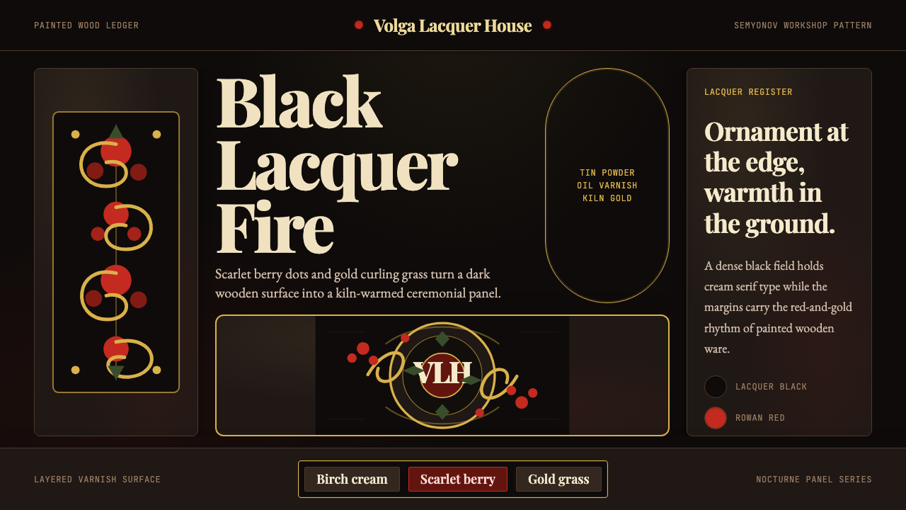
The palette is fixed and non-negotiable: a deep black ground, warm antique gold as the primary positive element, and vivid vermilion or crimson red for berries, flowers, and accents. Black outlines reinforce every form. The gold is never cold or bright — it is always the warm, slightly tarnished tone of fired tin, which reads as candlelight rather than metallic shine. Green appears occasionally as leaf color but is always subordinate, never structural. White is almost entirely absent. The entire system operates on the logic of heat and darkness: light emerging from depth.色板固定而不可商量:深黑底色,温暖的古金色作为主要正形元素,鲜艳的朱红或绯红用于浆果、花朵与点缀。黑色轮廓线强化每一个形体。金色从不冷硬或明亮——它始终是焙烧锡粉特有的温暖、略带古旧的色调,读来如烛光而非金属光泽。绿色偶尔作为叶片颜色出现,但始终处于从属地位,从不构成结构性元素。白色几乎完全缺席。整套体系运作于热与暗的逻辑之上:光从深处浮现。
Ornamental Density纹饰密度
Khokhloma composition is saturated by design. The horror vacui — fear of empty space — is genuine and deliberate. A well-executed Khokhloma piece leaves no significant area of ground uncovered; the vines, grasses, berries, and curling tendrils fill every available quadrant with rhythmic, layered growth. This density is not chaotic: it follows an internal logic of expansion from a central stem or medallion outward, with larger forms anchoring the composition and smaller details filling the interstices. The skill is in maintaining legibility — each berry and leaf remaining individually distinct — within total coverage.霍赫洛马的构图以饱满为设计原则。对空白的恐惧——「恐空症」——是真实而刻意的。一件制作精良的霍赫洛马器物不留任何显著的裸露底面;藤蔓、野草、浆果与卷曲须蔓以有节律的、层叠生长的方式填满每一个可用区域。这种密度并非混乱:它遵循从中央茎干或圆形图案向外扩展的内在逻辑,较大的形体锚定构图,较小的细节填充空隙。技艺在于在全覆盖的同时维持可读性——每一颗浆果与叶片仍保持各自的清晰辨识度。
Kudrina and Travka Grammars库德琳娜与特拉夫卡纹饰语法
The tradition distinguishes two primary ornamental grammars that are rarely combined on a single piece. The kudrina (from the Russian word for curl) is a bold, baroque scroll: large golden spirals unfurl into leaf-like forms and crowd the entire surface, creating an almost architectural canopy of interlocking curves. The travka (from the Russian word for grass) is finer and more botanical: delicate stems support naturalistic clusters of rowan berries, strawberries, and curving leaves, with the black ground still visible between the elements. A master craftsperson's identity is partly expressed by which grammar they favor and how they resolve its internal tensions.这一传统区分出两种主要的纹饰语法,鲜少在同一件作品上混用。库德琳娜(源自俄语中「卷曲」一词)是大胆的巴洛克式卷草:巨大的金色漩涡舒展成叶片状形体,布满整个表面,形成几乎如建筑般壮观的互锁曲线华盖。特拉夫卡(源自俄语中「野草」一词)则更为精细、更富植物感:纤细的茎干托举着自然主义的山梨浆果、草莓与弯曲叶片的簇丛,黑色底色在各元素之间仍可见。一位大师级匠人的身份,部分正体现于他偏爱哪种语法,以及如何化解其内在张力。
The Fired-Gold Surface焙烧金面
The signature material effect — warm antique gold emerging from a black lacquer ground — is the result of a multi-stage process unique to the tradition. Wooden forms are primed and covered with a clay-based sealant, then coated with tin powder mixed with linseed oil. After the ornament is painted in black and red over this metallic undercoat, the piece is fired in an oven at high temperature. The heat oxidizes the tin through the transparent lacquer layers, converting the entire surface to the characteristic warm gold. This is not a decorative choice — it is the fundamental production method, and its visual quality (slightly uneven, warm, with micro-texture from the brush) distinguishes authentic Khokhloma from flat printed simulations.标志性的材质效果——温暖的古金色从黑漆底面浮现——是这一传统特有的多步骤工艺的产物。木胎先经打底与粘土基密封剂处理,再涂敷与亚麻籽油混合的锡粉。在这层金属底涂上以黑色和红色描绘完纹饰后,器物在窑炉中以高温焙烧。热量透过透明漆层氧化锡粉,将整个表面转化为特有的温暖金色。这不是一种装饰选择——它是根本的生产工艺,其视觉品质(略微不均匀、温暖,带有画笔留下的微观肌理)将真正的霍赫洛马与平面印刷的仿品区分开来。
Motif Vocabulary纹饰词汇
The iconographic vocabulary is drawn from the natural world of the Volga forest and from Orthodox devotional imagery. Rowan berries (ryabina) appear in nearly every composition — small red clusters of four or five berries on a short stem, the motif most closely associated with the tradition. Strawberries, currants, and stylized wildflowers round out the berry repertoire. The firebird (zhar-ptitsa) appears as a phoenix-like form whose feathers dissolve into the same curling vine grammar as the botanical elements. Human figures are extremely rare. The overall register is celebratory and sacred simultaneously — folk abundance given a devotional frame.图像词汇取自伏尔加森林的自然世界与东正教的虔诚图像传统。山梨(花楸)浆果在几乎每一件构图中都会出现——短茎上四五颗浆果组成的小型红色簇丛,是与这一传统联系最为紧密的纹饰。草莓、醋栗与程式化野花构成浆果图像的其余部分。火鸟(жар-птица)以凤凰般的形态出现,其羽毛融入与植物元素相同的卷曲藤蔓语法之中。人物形象极为罕见。整体格调同时兼具庆典性与神圣性——民间的富足丰饶被纳入虔诚的框架之内。
Symmetry and Rhythm对称与节律
Khokhloma compositions are broadly symmetrical — mirrored around a central axis for bowls and spoons, radiating from a central medallion for plates — but the symmetry is approximate and organic rather than mechanical. The hand-painted nature of the work means that corresponding motifs on either side of an axis will rhyme without being identical. This living asymmetry within an overall symmetric framework is central to the visual warmth of the tradition: it reads as made rather than manufactured. Rhythm — the regular recurrence of the same berry cluster or curl at metrically spaced intervals — does the structural work that strict symmetry might otherwise impose.霍赫洛马构图大体上是对称的——在碗和勺上以中央轴线为基准镜像,在盘上从中心圆形图案向外辐射——但这种对称是近似的、有机的,而非机械的。手工绘制的特性意味着轴线两侧对应的纹饰会形成呼应,但不会完全相同。这种在整体对称框架内的活的不对称性,是这一传统视觉温度的核心:它读来像是被制造出来的,而非被批量生产的。节律——同一浆果簇或卷草以有规律的间隔周期性出现——承担着严格对称本可施加的结构性功能。
Decorative Borders装饰边框
The borders of Khokhloma objects — the rim of a bowl, the edge of a tray, the handle of a spoon — receive their own distinct ornamental treatment, often a simplified band of berries or a repeated curl motif that serves as a frame for the main central composition. These borders are not mere outlines; they are themselves composed elements that establish the hierarchy between the central field and the edge. In graphic applications, this tradition of tiered border treatment translates directly: a Khokhloma-derived design benefits from a structured outer margin that echoes the central ornament at a reduced scale and simpler resolution.霍赫洛马器物的边缘——碗的沿口、托盘的边沿、勺子的柄部——获得其自身独特的纹饰处理,通常是一条简化的浆果带或重复的卷草母题,为主体中央构图提供框架。这些边框不仅仅是轮廓线;它们本身就是构成性元素,建立起中央画面与边缘之间的层级关系。在平面应用中,这种分层边框处理的传统可直接转化:一个源自霍赫洛马的设计,受益于一个结构化的外边距,以简化的比例和更简单的精度呼应中央纹饰。

See the Russian Khokhloma design system查看 Russian Khokhloma 完整设计系统
Who shaped Russian Khokhloma?谁塑造了 Russian Khokhloma?
The technique's probable founders were communities of Old Believer monks who settled in the Volga forest villages following the Nikon Church reforms of the 1650s. They brought with them the icon-painting tradition of the Muscovite workshops — the discipline of working with precious materials, the organizational hierarchy of ornamental programs, and possibly the metallic ground technique adapted from icon gilding. By transmitting the firing method as a closed craft secret within monastic and then peasant household networks, they ensured the tradition's continuity across centuries of political disruption. Their influence explains the quasi-sacred quality of the ornament: Khokhloma painting carries the devotional gravity of icon work translated into a domestic register.这一技法的可能创始人,是因尼康于1650年代推行教会改革而迁居伏尔加森林村庄的旧礼仪派修道士群体。他们携带着莫斯科工坊的圣像绘制传统而来——使用贵重材料的纪律、纹饰程序的等级化组织,以及可能源自圣像贴金工艺改良而来的金属底面技法。通过在修道院乃至农民家庭网络内将焙烧工艺作为封闭的工艺秘密加以传授,他们确保了这一传统在数个世纪的政治动荡中延续至今。他们的影响解释了这种纹饰的近乎神圣的品质:霍赫洛马绘画承载着圣像作品的虔诚庄重感,转化为日常生活的格调。
Veselov was among the most celebrated individual craftspeople identified within the Khokhloma tradition in the late nineteenth and early twentieth centuries — a period when outside collectors, ethnographers, and reform-movement activists began documenting the tradition systematically. He represented the travka style at its most refined: botanical precision in the placement of berry clusters, an unusually light and airy distribution of the vine tracery that created a sense of breath within the dense ornamental field. His work was collected by Russian art institutions and used as a teaching reference in the craft schools established during the pre-revolutionary reform period, helping to codify the travka grammar for subsequent generations of painters.韦谢洛夫是十九世纪末至二十世纪初在霍赫洛马传统中被记录的最著名的个人匠人之一——那是一个外来的收藏家、民族志学者与改革运动活动家开始系统记录这一传统的时期。他代表了特拉夫卡风格的最精练形态:浆果簇安置的植物学精准性,藤蔓细网格外不寻常的轻盈通透的分布,在浓密的纹饰画面内创造出一种呼吸感。他的作品被俄罗斯艺术机构收藏,并在革命前改革时期建立的工艺学校中用作教学范本,帮助为后代画师编纂了特拉夫卡语法。
The Khokhlomskaya Rospis enterprise — established in Semino during the Soviet period and operating through much of the twentieth century — represents the industrial phase of the tradition. It organized the production of Khokhloma ware at a scale previously impossible for household workshops, trained hundreds of painters in standardized technique, and managed the export of finished goods internationally. The factory's role is ambivalent: it standardized certain motifs and reduced regional variation, but it also kept the hand-painting process alive when purely market-based household production might have collapsed entirely under pressure from cheaper industrial alternatives. Many of the painters trained at Khokhlomskaya Rospis became individual masters who later revived more idiosyncratic studio practice.霍赫洛马斯卡娅·罗斯皮斯企业——在苏联时期于谢米诺建立,运营贯穿二十世纪大部分时间——代表了这一传统的工业化阶段。它以家庭作坊此前无法企及的规模组织霍赫洛马器物的生产,以标准化技法培训了数百名画师,并管理着成品的国际出口。这家工厂的角色是矛盾的:它标准化了若干纹饰,削减了地区差异,但也在纯粹以市场为基础的家庭生产可能在更廉价工业替代品的压力下彻底崩溃之际,使手工绘制工艺得以存续。在霍赫洛马斯卡娅·罗斯皮斯受训的许多画师后来成为个人大师,重新振兴了更具个人风格的工作室实践。
Less a person than an institution, the Nizhny Novgorod Fair and the broader Volga trade network it anchored was the commercial engine that carried Khokhloma from a village craft into an internationally recognized style. From the early eighteenth century onward, Volga merchants displayed Khokhloma bowls, spoons, and ladles alongside silk, furs, and grain at what became one of the largest periodic markets in the world. Persian and Central Asian buyers brought the work south and east; Dutch and English trading houses introduced it to Western Europe. The fair's commercial logic forced a degree of consistency and quality standard that the tradition might otherwise not have achieved — and the international exposure generated by the fair circuit is what gave Khokhloma its identity as a distinctly Russian art form in the eyes of the outside world.与其说是一个人,不如说是一种制度:下诺夫哥罗德集市及其所锚定的更广泛的伏尔加贸易网络,是将霍赫洛马从村庄工艺推向国际知名风格的商业引擎。从十八世纪初起,伏尔加商人在这个日后成为世界最大定期集市之一的场所,将霍赫洛马的碗、勺、长柄勺与丝绸、皮草、谷物一同展售。波斯与中亚买家将器物带往南方与东方;荷兰与英国贸易商行将其引介至西欧。集市的商业逻辑迫使这一传统形成了一定程度的一致性与品质标准——而集市巡回带来的国际曝光,正是使霍赫洛马在外部世界眼中获得其「俄罗斯艺术形式」身份认同的原因。
How do you use Russian Khokhloma today?今天怎么用 Russian Khokhloma?
Applying Khokhloma in contemporary design work requires understanding that the style is constitutionally maximalist — it does not dilute gracefully into 'Khokhloma-inspired minimalism.' The visual system makes its impact through coverage, density, and the warmth of the fired-gold surface. Stripped of these properties, what remains is a generic floral motif with no particular cultural weight. Successful application means committing to the logic: dark grounds, gold and red primary palette, ornamental density, decorative borders, and a typographic register that matches the ceremonial gravity of the painting.在当代设计实践中应用霍赫洛马,需要理解这种风格在本质上是繁饰主义的——它不能优雅地稀释为「霍赫洛马风格的简约」。这套视觉体系通过覆盖度、密度与焙烧金面的温度来产生冲击力。剥离了这些属性,剩下的只是一个没有特别文化重量的通用花卉纹样。成功的应用意味着遵从这套逻辑:深色底面、金色与红色的主色板、纹饰密度、装饰边框,以及与彩绘礼仪庄重感相匹配的字体格调。
For presentation slides, Khokhloma works most powerfully as a cover or chapter-divider treatment rather than as a system for content slides. A cover built on this style should use a full-bleed black ground with a Khokhloma-derived ornamental border panel — either a full frame or a header and footer band — in gold and red. The title type should sit in gold or cream against the black field, in a typeface with strong serifs or Cyrillic-compatible decorative structure. Content slides require restraint: a simplified border motif as a repeated header element, body text in cream or warm white on the dark ground, and data visualizations in the primary gold-red palette. Overloading content slides with the full ornamental density of a cover will make them unreadable.对于演示文稿,霍赫洛马最有力的应用是作为封面或章节分隔页的处理方式,而非内容幻灯片的系统。以这种风格构建的封面,应使用全出血黑色底面,配合金色与红色的霍赫洛马衍生纹饰边框——无论是全帧还是页眉页脚带状——标题字体以金色或奶油色置于黑色底面,选用具有强烈衬线或与西里尔字母相容的装饰结构的字体。内容幻灯片则需要克制:以简化的边框纹样作为重复性页眉元素,正文以奶油色或暖白色置于深色底面,数据可视化采用金红主色板。将封面级别的纹饰密度叠加到内容幻灯片上,只会使其难以阅读。
For web interfaces and dashboards, Khokhloma is best deployed as a brand-layer treatment over standard UI components rather than as a structural design system. The approach: establish a black or very deep warm-dark background, use gold as the primary interactive and headline color, and reserve red for alerts, highlights, or data callouts. Navigation bars, footers, and modal headers benefit from a simplified Khokhloma-style border or divider — a single-pixel gold line with small berry motifs at intervals. Card components work on a slightly lighter dark ground than the page background, differentiated by the warm glow of a gold-tinted border rather than a drop shadow. This approach suits cultural platforms, spirits or premium food brands, festival and event microsites, and Russian-heritage product interfaces.对于网页界面与仪表板,霍赫洛马最好作为标准UI组件之上的品牌层处理,而非作为结构性设计系统。方法如下:建立黑色或非常深的暖深色背景,以金色作为主要交互与标题色,将红色保留给警报、高亮或数据标注。导航栏、页脚与模态框标题受益于简化的霍赫洛马风格边框或分割线——一条单像素金线,间隔点缀小型浆果母题。卡片组件在比页面背景略浅的深色底面上运作,以金色调边框的温暖光晕而非投影加以区分。这种方式适合文化平台、烈酒或高端食品品牌、节庆与活动微型站点,以及俄罗斯文化遗产主题的产品界面。
For editorial and marketing work, the style supports immersive, high-impact visual narratives where the reader's attention is already secured — a luxury brand catalog, a festival program, a heritage spirits packaging suite. Full-spread editorial layouts work well with a black ground, a central photographic or illustrative image framed by Khokhloma-derived ornamental borders, and headline type in gold or deep red. For social media and marketing cards, simplify the ornamental vocabulary to a corner or bottom border element — a small sprig of berries and a curl or two — to maintain the stylistic signal without crowding the primary message. The dark ground with gold type reads as premium and ceremonial across formats, making it effective for announcements, invitations, and product launches where gravity is the desired tone.对于编辑与营销作品,这种风格支持沉浸式、高冲击力的视觉叙事——读者的注意力已经被吸引的场合,如奢侈品牌目录、节庆节目册、传承烈酒包装套装。全版展开的编辑布局以黑色底面为基础运作,中央的摄影或插图图像被霍赫洛马衍生的装饰边框所框定,标题字体以金色或深红呈现。对于社交媒体与营销卡片,将纹饰词汇简化为角落或底部的边框元素——一小枝浆果与一两个卷草——在不拥挤主要信息的前提下维持风格信号。深色底面配金色字体在各种格式中都能传递出高端与礼仪的感受,使其在需要庄重感的公告、邀请函与产品发布场合中颇具成效。
A common mistake when working with Khokhloma is treating the gold and red palette as sufficient on its own, without the dark ground. Gold-and-red ornament on a white or cream background loses the firelight quality that is the style's defining affect — the sense of illumination emerging from darkness. The contrast between the dense black lacquer and the warm metallic gold is not decorative detail; it is the system's emotional core. A second frequent error is mixing the Khokhloma ornamental vocabulary with other folk traditions — Ukrainian Petrykivka painting, Scandinavian rosemaling, or Baroque European florals — under a generic 'folk' umbrella. Each of these traditions has its own internal logic and color grammar; combining them produces visual noise rather than cultural resonance.运用霍赫洛马时一个常见错误,是将金色与红色的色板本身视为充分条件,而忽视深色底面。金红纹饰置于白色或奶油底面上,失去的是这种风格的决定性情感——光从黑暗中浮现的感觉。浓密黑漆与温暖金属光泽之间的对比,不是装饰细节;它是这套体系的情感核心。第二个常见错误,是将霍赫洛马的纹饰词汇与其他民间传统混合——乌克兰佩特里基夫卡绘画、斯堪的纳维亚玫瑰画、或巴洛克欧洲花卉——归纳在笼统的「民间」标签之下。这些传统各自拥有内在逻辑与色彩语法;将它们混合产生的是视觉噪音,而非文化共鸣。
See the Russian Khokhloma design system查看 Russian Khokhloma 完整设计系统
Russian Khokhloma — FAQRussian Khokhloma · 常见问题
Is Khokhloma painting only produced on wooden objects, or can the style be applied to other surfaces?霍赫洛马彩绘只制作在木器上吗?这种风格能应用于其他材质吗?
Historically, Khokhloma is exclusively a wood-painting tradition — the fired-gold technique requires a wooden substrate that can absorb the clay-based sealant and withstand the oven temperature. The objects are almost entirely utilitarian: bowls, spoons, ladles, cups, trays, and furniture. In graphic and digital applications, the style's visual vocabulary — the color palette, the ornamental density, the kudrina and travka motifs — translates freely to any surface or medium. What cannot be reproduced is the material quality of the fired surface itself: the micro-texture, the slight variation in the gold tone across the piece, and the warm three-dimensionality of actual lacquered wood. Good digital and print applications acknowledge this limitation by compensating with richness in other dimensions — high-resolution ornamental detail, warm color calibration — rather than attempting to simulate the surface texture itself.从历史上看,霍赫洛马完全是一种木器彩绘传统——焙烧金面工艺需要木质基底,以吸收粘土基密封剂并承受窑炉温度。器物几乎全部是日用品:碗、勺、长柄勺、杯子、托盘与家具。在平面与数字应用中,这种风格的视觉词汇——色板、纹饰密度、库德琳娜与特拉夫卡母题——可以自由转移至任何表面或媒介。无法复制的是焙烧表面本身的材质品质:微观肌理、金色色调在整件器物上的细微变化,以及真实髹漆木材的温暖立体感。出色的数字与印刷应用承认这一局限,通过在其他维度上补偿——高分辨率的纹饰细节、温暖的色彩校准——而非试图模拟表面质感本身来应对。
How does Khokhloma differ from other Russian folk arts like Gzhel or Palekh?霍赫洛马与格热尔或帕列赫等其他俄罗斯民间艺术有何不同?
The three traditions are distinct in material, palette, and ornamental logic. Gzhel is a ceramic painting tradition from the Moscow Oblast whose defining characteristic is cobalt blue brushwork on a white porcelain ground — botanical and figurative motifs in a single color against white, as opposed to Khokhloma's dense multi-element gold-and-red coverage on black. Palekh is a miniature lacquer-painting tradition from Ivanovo Oblast that depicts narrative scenes — fairy tales, Orthodox subjects, historical episodes — with fine figurative detail on a black lacquer ground. Palekh shares the black ground and the lacquer technique with Khokhloma but is representational where Khokhloma is ornamental, and its palette includes a full range of colors including flesh tones, whereas Khokhloma's palette is fixed. All three are recognized as Russian folk art traditions, but they should not be combined or treated as interchangeable.三种传统在材质、色板与纹饰逻辑上截然不同。格热尔(Gzhel)是莫斯科州的一种陶瓷彩绘传统,其决定性特征是白色瓷底上的钴蓝色笔触——植物与具象纹样以单一颜色置于白底,与霍赫洛马在黑底上浓密的多元素金红覆盖形成鲜明对比。帕列赫(Palekh)是伊万诺沃州的一种微型漆绘传统,在黑色漆底上以精细的具象细节描绘叙事场景——童话故事、东正教主题、历史情节。帕列赫与霍赫洛马共享黑色底面与漆绘技法,但前者是具象的,而后者是纹饰性的;帕列赫的色板包含完整的色彩范围(包括肤色),而霍赫洛马的色板是固定的。三者都被认可为俄罗斯民间艺术传统,但不应将它们混合或视为可互换的。
Can Khokhloma work in light-background layouts, or does the dark ground define the style?霍赫洛马能在浅色背景版面中使用吗?还是说深色底面是这种风格的决定性特征?
The dark ground is not merely a preference — it is structurally integral to the fired-gold technique and to the visual logic of the style. The antique gold reads as luminous precisely because it is seen against black; on a cream or white background, the same gold tone becomes flat and decorative rather than ceremonial. That said, a partial application is possible: Khokhloma-derived ornamental elements — a border panel, a corner sprig, a medallion — can be used on a lighter ground if they are treated as contained decorative zones rather than as an all-over system. The ornament should still use the gold-and-red palette. What the light-ground application loses is the immersive, firelit quality of a full Khokhloma composition. Use it when you need to signal the style's cultural reference without committing to the full dark aesthetic — but understand that the reference will read as lighter and more ornamental, less as the authentic ceremonial weight of the tradition.深色底面不仅仅是一种偏好——它在结构上是焙烧金面工艺与这种风格视觉逻辑的有机组成部分。古金色之所以显得光华耀目,恰恰是因为它在黑底的映衬下被观看;在奶油色或白色背景上,同样的金色调会变得平淡而装饰性,而非礼仪性。话虽如此,局部应用是可能的:霍赫洛马衍生的纹饰元素——一个边框板块、一个角落枝蔓、一个圆形图案——可以用于浅色底面,前提是将它们作为包含性的装饰区域,而非全覆盖系统来处理。纹饰仍应使用金红色板。浅色底面的应用失去的是完整霍赫洛马构图的沉浸式、篝火般的品质。当你需要传达这种风格的文化参照,但又不愿承诺完整的深色美学时,可以使用这种方式——但请理解,这种参照读来将更轻盈、更具装饰性,而非传统真正的礼仪分量。
Is Khokhloma still actively produced today, or is it primarily a historical reference?霍赫洛马今天是否仍在积极生产,还是主要作为历史参照而存在?
Khokhloma remains an active craft tradition. The Khokhlomskaya Rospis enterprise in Semino and the Khokhloma Painting factory in Kovernino continue to produce painted woodware, training new craftspeople in the traditional technique. Individual studio painters also work outside the factory context, often in more experimental or idiosyncratic directions. The tradition has the same tension as many living craft traditions: factory production maintains volume and employment but can tend toward repetition of standard motifs; individual studio work is more inventive but operates at smaller scale. Museums in Nizhny Novgorod and Moscow maintain significant collections of historic Khokhloma ware, and the tradition is recognized as part of Russia's intangible cultural heritage. For designers working with the style, this living context matters: the reference is not purely historical but points to an ongoing craft community.霍赫洛马至今仍是一种活跃的工艺传统。谢米诺的霍赫洛马斯卡娅·罗斯皮斯企业与科韦尔尼诺的霍赫洛马彩绘工厂继续生产彩绘木器,培训掌握传统工艺的新一代匠人。个人工作室画师也在工厂体制之外进行创作,通常朝向更具实验性或个人风格的方向。这一传统与许多鲜活工艺传统面临着同样的张力:工厂生产维持产量与就业,但可能趋向标准纹饰的重复;个人工作室创作更具创造力,但规模更小。下诺夫哥罗德与莫斯科的博物馆保存有重要的历史霍赫洛马器物藏品,这一传统被认定为俄罗斯非物质文化遗产的组成部分。对于运用这种风格的设计师而言,这一鲜活的背景至关重要:参照并非纯粹历史性的,而是指向一个仍在延续的工艺社区。
What typographic approach pairs best with Khokhloma ornament?什么样的字体排印方式最能与霍赫洛马纹饰相配合?
Khokhloma's visual gravity calls for typefaces with ceremonial weight and formal structure — qualities found in heavily drawn serif faces with strong contrast between thick and thin strokes, in decorative Cyrillic display types with calligraphic roots, and in blackletter-adjacent forms that echo the tradition's Orthodox manuscript heritage. The key is weight and formality: a light geometric sans-serif will look incongruous against the ornamental density of the painting, as if the type belongs to a different visual world entirely. Scale matters as much as style: headlines should be large and bold enough to hold their own against the surrounding ornament. For body text in longer-form applications, a sturdy serif at a comfortable reading size works better than attempting to extend the decorative register through the entire text block — the ornament is the spectacle; the text is the structure that holds it.霍赫洛马的视觉分量需要具备礼仪重量与正式结构的字体——这些品质存在于粗细笔画对比强烈的重量衬线字体中、存在于具有书法根基的装饰性西里尔展示字体中、也存在于呼应这一传统东正教手稿渊源的接近哥特黑体的形式中。关键在于重量感与正式感:轻盈的几何无衬线字体置于彩绘浓密的纹饰旁边,看起来会格格不入,仿佛属于一个完全不同的视觉世界。比例与风格同样重要:标题应足够大、足够粗,才能在周围的纹饰中站稳脚跟。对于较长形式应用中的正文,在舒适阅读字号下使用粗壮的衬线字体,比试图通过整个文字块延伸装饰格调的效果更好——纹饰是奇观;文字是承托它的结构。
Related design styles相关设计风格
 Russian Khokhloma Wood-Red LacquerKiln-fired ornament. Lacquer black, scarlet dots, and Playfair gold curls cro…窑火般华丽:漆黑底、猩红圆点与金色卷草挤满画框。
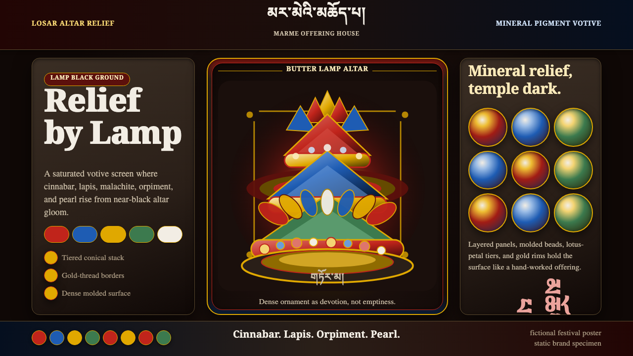 Tibetan Butter SculptureDevotion made dense. Cinnabar, lapis, and gold relief glow from altar black.繁密即供养。朱砂、青金与金色浮雕从坛城黑中发光。
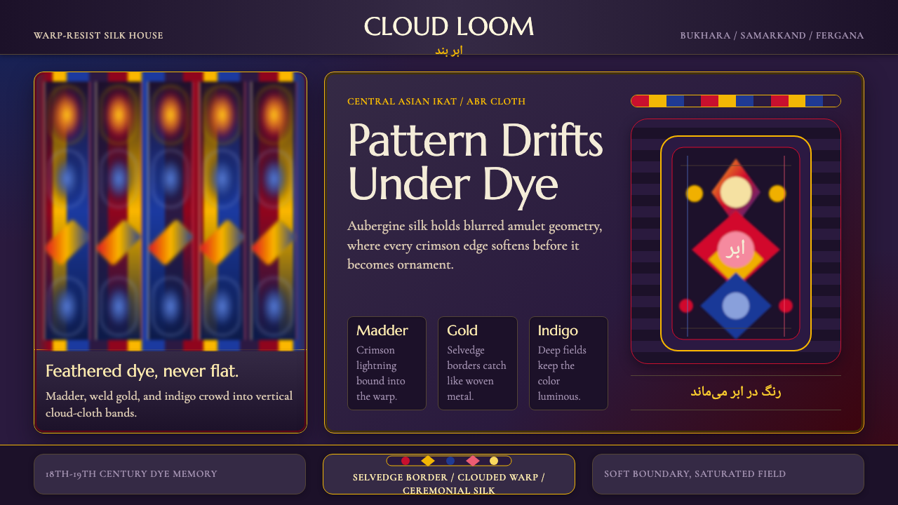 Central Asian IkatMaximal silk haze. Madder, gold, and indigo warp bands feather across aubergi…极繁丝绸雾感。茜红、金黄、靛蓝经带在茄紫底上羽化。
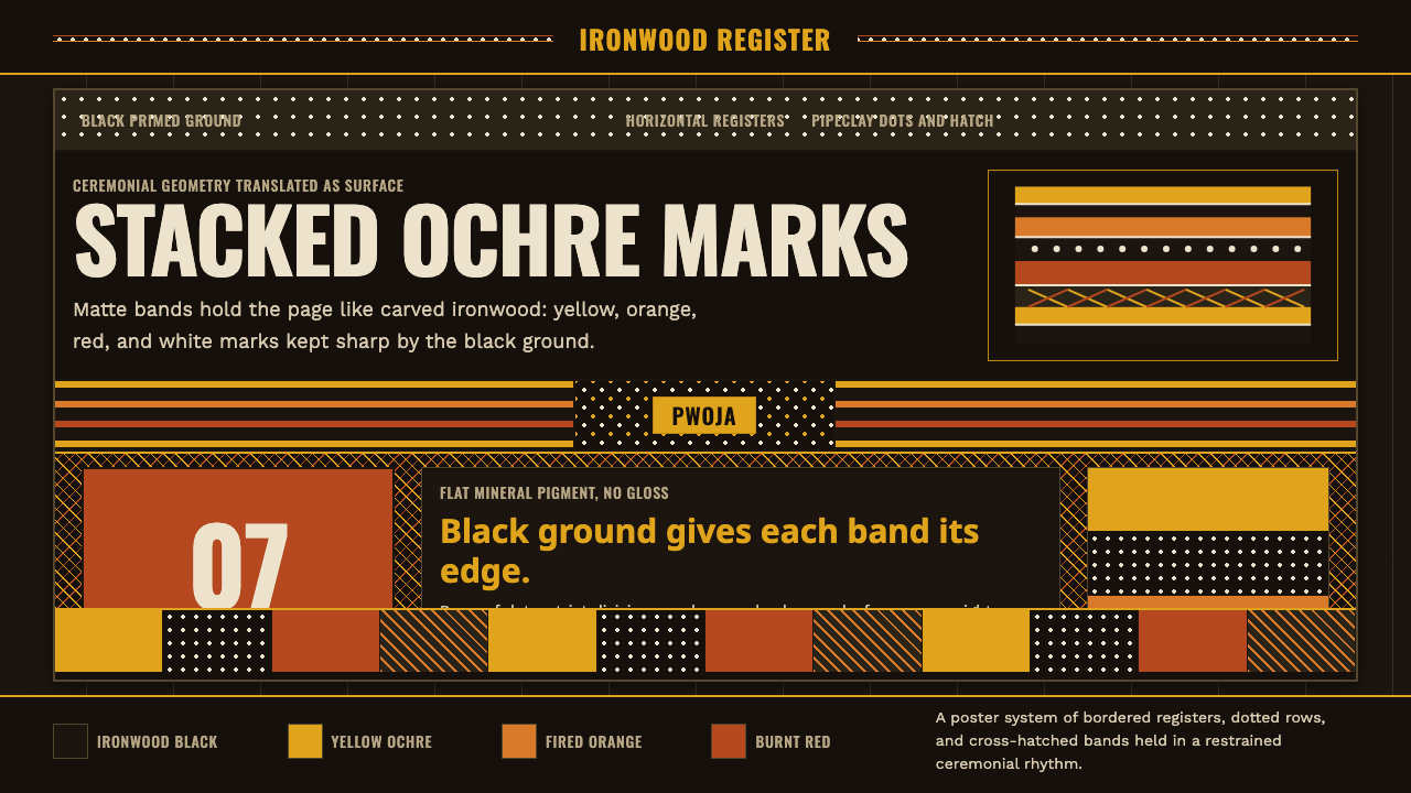 Tiwi Pukumani PoleBlack ground carries ceremony. Ochre bands, pipeclay dots, and hatch stack li…黑底承载仪式感。赭石条带、白土圆点与交叉纹如雕木层层堆叠。
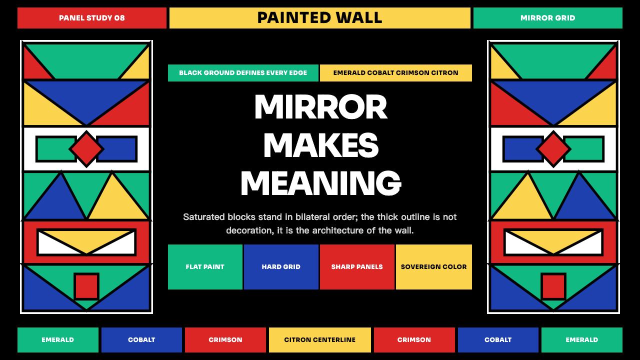 Ndebele Geometric MuralSymmetry declares presence. Emerald, cobalt, crimson and citron lock into bla…对称宣示存在:翠绿、钴蓝、深红与柠檬黄锁进黑描边色块。
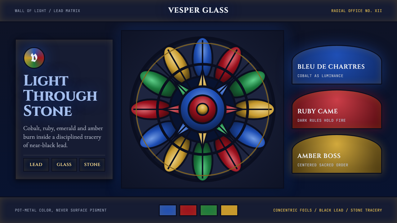 Gothic Rose WindowDarkness becomes light. Cobalt glass, ruby foils and black lead form a radial…黑暗化作光:钴蓝玻璃、红宝石叶瓣与黑铅条组成放射玫瑰窗。