What is Tibetan Butter Sculpture?
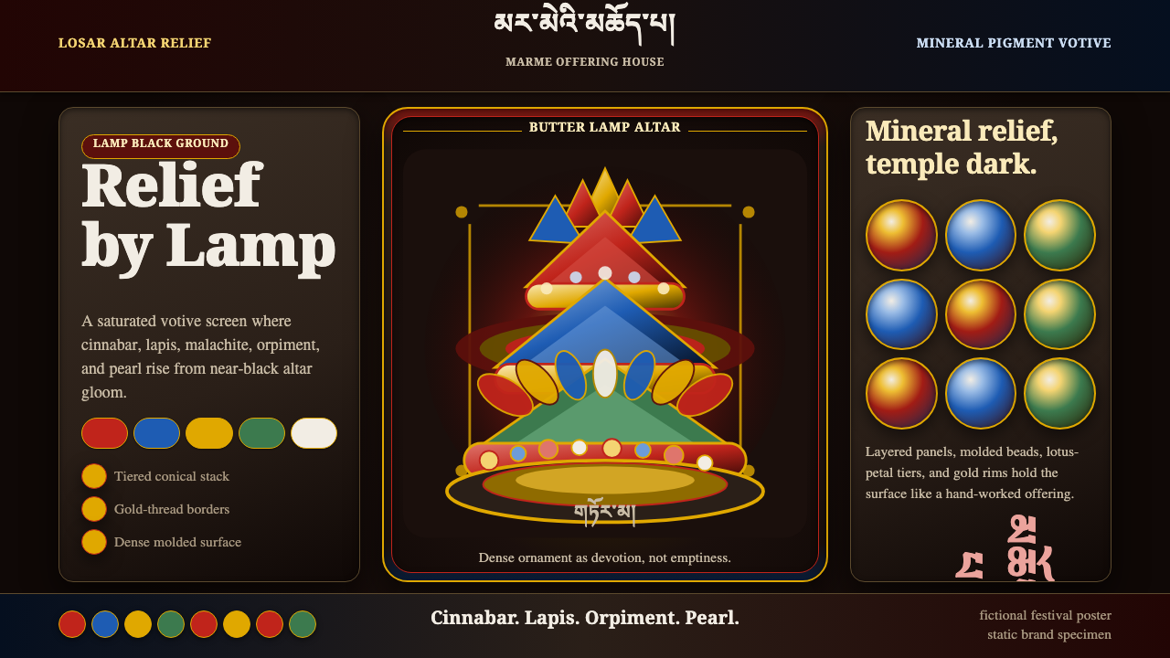
Tibetan butter sculpture turns devotion into density — cinnabar, lapis, and gold relief molded from dyed butter and barley flour, glowing out of an altar-black temple gloom.
Tibetan Butter Sculpture in brief
Tibetan butter sculpture — known as torma or, in its most elaborate ceremonial form, tsepdro — is a votive relief art built not from paint or stone but from dyed yak butter mixed with barley flour, worked by hand into tiered, deeply ornamented forms. The style this system distills is the visual result of that craft: a saturated, maximally detailed bright relief set against a near-black ground, every surface worked to the point of density rather than restraint.
The palette is drawn directly from the mineral pigments used to tint the butter — the same family of colors that decorates thangka scroll paintings. Cinnabar red, lapis and azurite blue, malachite green, orpiment yellow, and pearl white are pressed into petal, flame, and lotus forms, then stacked into conical tiers that narrow as they rise, echoing the shape of a small votive stupa.
What makes this system distinctive as a design language is its total rejection of negative space as an organizing principle. Where many devotional or ceremonial styles leave breathing room around a central icon, this one fills every available surface with ornament, then relies on the darkness of the ground to keep that density legible rather than chaotic. Brightness is concentrated, not distributed.

Where does Tibetan Butter Sculpture come from?
Butter sculpture belongs to Tibetan Buddhist ritual art, practiced within monastery workshops rather than by individual named artists — the tradition privileges lineage and monastic training over personal authorship. Gelug ritual artisans, working within the monastic curriculum, learn the craft as a devotional discipline: the labor of shaping butter that will melt and be reformed each year is itself considered a meditation on impermanence.
The offerings reach their fullest expression during Losar, the Tibetan New Year, when monasteries mount elaborate tiered torma displays as centerpieces of the festival. The timing matters: butter is a material that must be worked in cold conditions, often by monks who periodically plunge their hands in icy water to keep the butter from softening under body heat, and Losar falls in the depth of the Tibetan winter.
The setting for these works is the monastery's assembly hall or temple, lit by rows of butter lamps rather than daylight — an environment of deep shadow interrupted by small, warm points of flame. Set on dark altars, the torma's bright mineral colors are designed to be read by that flickering light, which is why the forms favor bold, high-contrast ornament over fine gradation: subtlety would simply disappear in lamplight.
This is a living tradition, still practiced in monasteries across the Tibetan plateau today, rather than a historical style recovered from artifacts. That continuity is part of what gives the visual language its confidence — the conventions of tiered form, mineral color, and altar-black staging have been refined through repeated annual practice rather than fixed once and left unchanged.
What defines the Tibetan Butter Sculpture look?
Color
The palette is built from mineral pigments shared with thangka painting — cinnabar red, lapis and azurite blue, malachite green, orpiment yellow, and pearl white — each color saturated and used in flat, unblended fields rather than gradients. These bright colors are always staged against a near-black ground, which is what allows such an intense palette to read as rich rather than garish.
Tiered Form
The characteristic silhouette narrows as it rises — a base tier broader than the tiers above it, echoing the proportions of a small stupa. This stacking logic is structural, not decorative: it organizes ornament into legible horizontal bands rather than letting detail spread without hierarchy.
Density as Devotion
Unlike styles that treat empty space as a sign of restraint or sophistication, this system treats maximal surface coverage as the point — every visible plane carries petal, flame, or scroll ornament worked by hand. Density here signals labor and devotion rather than clutter; the absence of negative space is a deliberate value, not an oversight.
Ornament Motifs
Recurring forms include the lotus petal, arranged in radiating tiers around a central axis; the flame, used as a crowning ornament at the top of the composition; and scrolling floral relief that fills the bands between tiers. These motifs carry symbolic weight within Tibetan Buddhist iconography and are never used as arbitrary filler.
Altar-Black Staging
The ground is consistently near-black rather than the pale or cream backgrounds common to many decorative styles. This choice is functional as much as aesthetic — it recreates the low, flame-lit environment of a monastery hall where the sculptures were traditionally viewed, and it lets a small number of intensely saturated hues carry the entire composition.
Hand-Worked Surface
Every surface bears the trace of hand-shaping rather than mechanical uniformity — small variations in petal thickness, slightly irregular scroll curves, subtle asymmetries between tiers. This is a style built on craft evidence rather than the flawless repetition of print or vector graphics.
Gold as Accent, Not Ground
Gold appears sparingly, as a relief accent on crowns, flame tips, or the finest ornamental edges — never as a dominant field. This restraint keeps gold legible as a highlight of highest value rather than diluting it across the whole composition.

Who shaped Tibetan Butter Sculpture?
Rather than individual named artists, torma craft is transmitted through monastery workshops, where senior monks train novices in shaping, coloring, and assembling the tiered forms. This collective, lineage-based authorship is characteristic of much Tibetan ritual art and shapes how the style is understood — as a shared devotional practice rather than a signed body of individual work.
The Gelug school, one of the major traditions of Tibetan Buddhism, maintains particularly elaborate torma practices as part of its ritual calendar. Its artisans work within a codified set of proportions and color conventions passed down through monastic training, giving the style consistency across different monasteries and generations.
Though not a person, the Losar festival itself functions as the style's defining occasion — the annual moment when the most elaborate tiered torma are commissioned, displayed, and later ritually dismantled. The festival's recurring demand is what keeps the craft's conventions alive and continuously refined rather than fossilized.
How do you use Tibetan Butter Sculpture today?
This style rewards content that wants to feel ceremonial, dense, and precious rather than clean or minimal. On a presentation cover slide, it works well as a full-bleed near-black field with a single saturated ornamental motif — a lotus tier or flame crown — placed centrally, letting the darkness do the framing work that a border or margin would normally do. Content slides should resist the urge to add negative space for its own sake; instead, group related information into tiered or nested blocks that echo the stacked-form logic, with color used to distinguish tiers rather than to decorate freely.
For web interfaces, the style suits premium or ceremonial contexts — luxury product pages, cultural or museum-adjacent platforms, invitation-style landing pages — more than everyday dashboards, where its density would fight against scannability. A hero section can use the near-black ground with a concentrated bright motif as focal point; supporting content areas should keep the same restrained, high-saturation-on-black logic in smaller doses rather than diluting into pastel tints.
In editorial or marketing work, the style is well suited to feature stories about craft, ritual, or heritage, where density signals care rather than noise. A pull-quote or section break can borrow the tiered-form idea by nesting a smaller ornamental motif inside a larger one, echoing the stupa-like silhouette without needing literal petal or flame imagery.
Because the style depends on contrast between saturated ornament and dark ground, it does not translate well onto light backgrounds — attempting a pale or white version loses the altar-lamp quality that makes the palette legible and instead reads as simply overly colorful. Content with long stretches of body text should isolate ornamental elements to headers and dividers rather than spreading the dense motif language across paragraphs, where it would compete with readability.
A common mistake is treating this as simply 'a dark theme with bright accent colors.' The style is not about accenting a dark neutral ground with occasional color — it is about filling the visible surface with worked, tiered ornament and letting darkness be the negative space that makes that density legible. Skipping the tiered structure and scattering ornament randomly loses the sense of hierarchy that gives the style its ceremonial authority.

Tibetan Butter Sculpture — FAQ
Is this style only appropriate for religious or cultural content?
Not exclusively. While its origin is devotional, the underlying visual logic — saturated ornament concentrated against a dark ground, organized in tiered hierarchy — transfers well to any context aiming for a premium, ceremonial, or precious mood: luxury retail, heritage-brand storytelling, invitation design, or museum-adjacent digital experiences. What matters is respecting the source rather than treating its motifs as generic decoration; using literal Buddhist iconography outside a relevant context would be inappropriate, but the color and density logic can be applied more broadly.
Why does the palette work on black but not on white?
The saturated mineral colors — cinnabar, lapis, malachite, orpiment — were chosen historically to be legible under low, flickering butter-lamp light against a dark altar. That contrast relationship is what gives each color its perceived richness. Placed on a white or pale ground instead, the same hues lose their glow and simply read as a bright, busy palette without the sense of concentrated light emerging from shadow that defines the style.
How does the tiered form differ from a simple pyramid or stack layout?
A generic pyramid layout narrows uniformly and often uses flat color blocks per tier. The torma-derived tiered form narrows while carrying dense, hand-worked ornament on every tier — petal, scroll, and flame motifs rather than plain color fields — and typically culminates in a crowning flame or finial rather than a flat apex. The hierarchy is expressed through both proportion and ornamental density, not proportion alone.
Can this style be simplified for a minimal or low-density product without losing its identity?
Only to a point. The style's identity is built on density as a value in itself, so stripping ornament down too far — leaving large empty fields on a black ground with a single small motif — risks losing what makes it recognizable and can instead read as a generic dark theme. A better path for a lower-density context is to shrink the scale of application (use it for a single section, a badge, or a divider) while keeping that section itself fully dense, rather than thinning the ornament out across the whole surface.
Related design styles
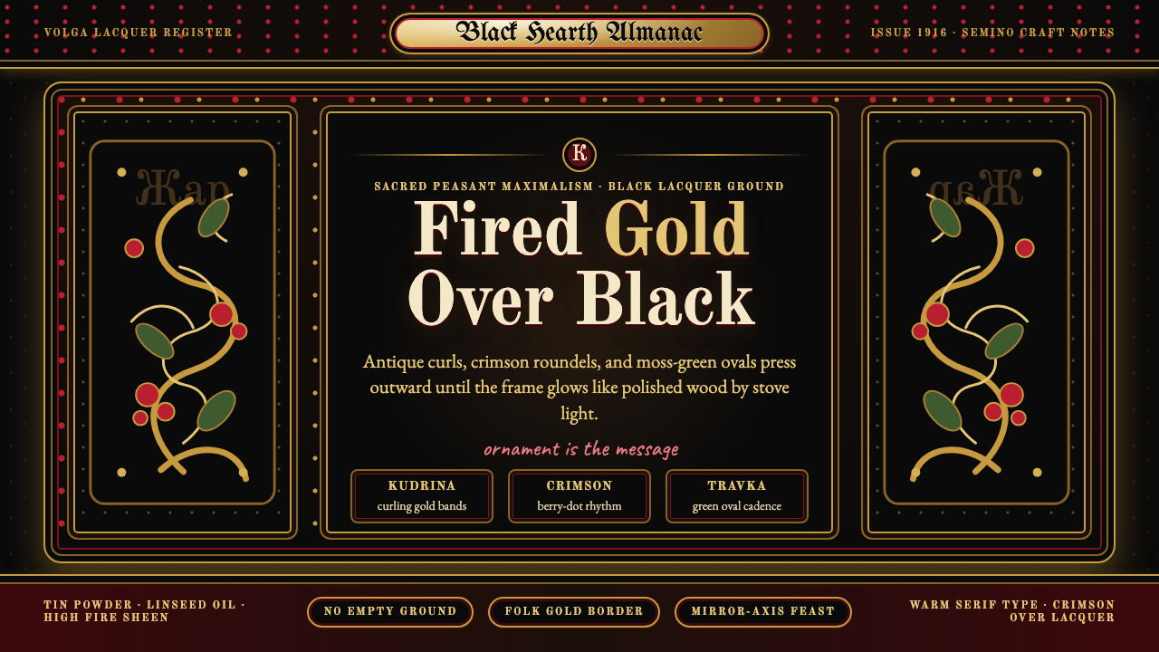 Russian KhokhlomaOrnament is the message. Antique gold curls and crimson dots crowd a black la…
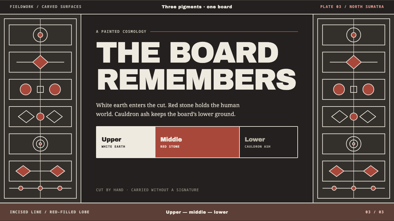 Batak GorgaCosmology cut into wood. Chalk-white lines and batu hula red hold a blackened…
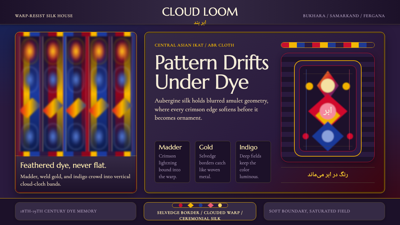 Central Asian IkatMaximal silk haze. Madder, gold, and indigo warp bands feather across aubergi…
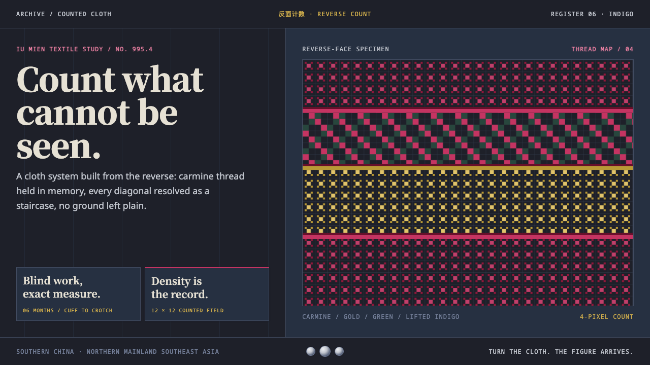 Mien Yao Cross-StitchDensity is the achievement. Carmine counted stitches saturate near-black indi…
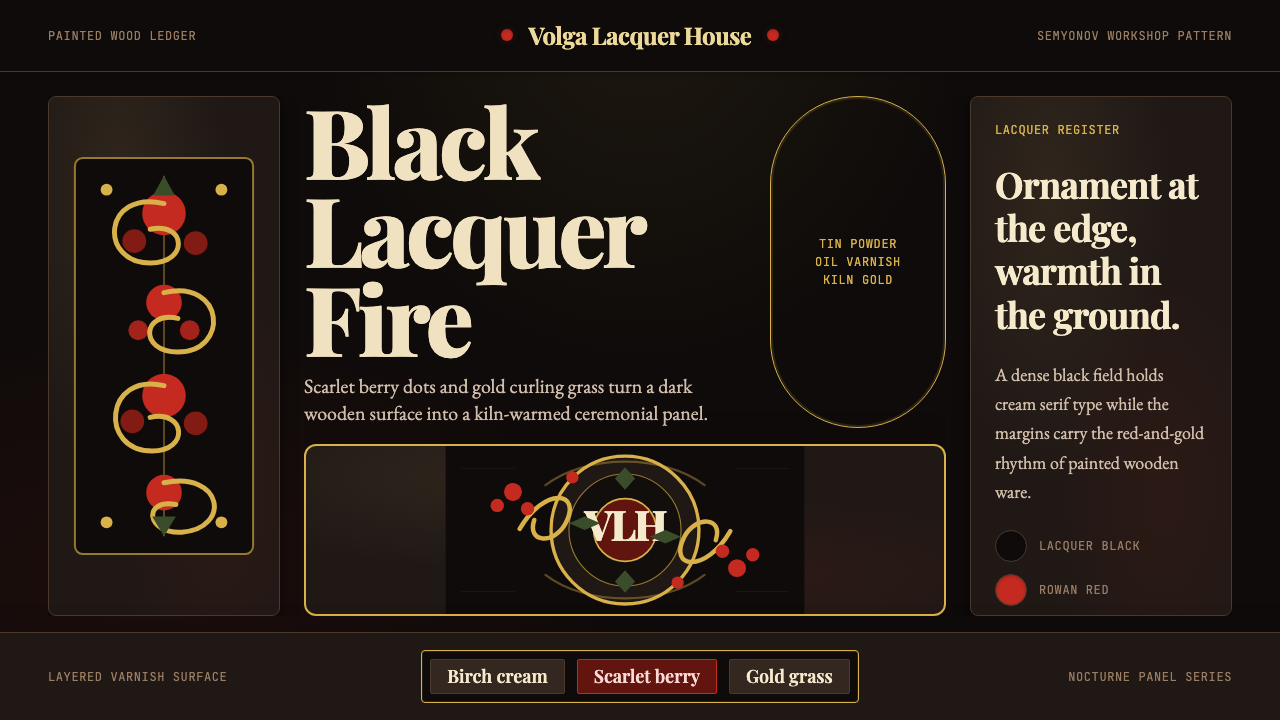 Russian Khokhloma Wood-Red LacquerKiln-fired ornament. Lacquer black, scarlet dots, and Playfair gold curls cro…
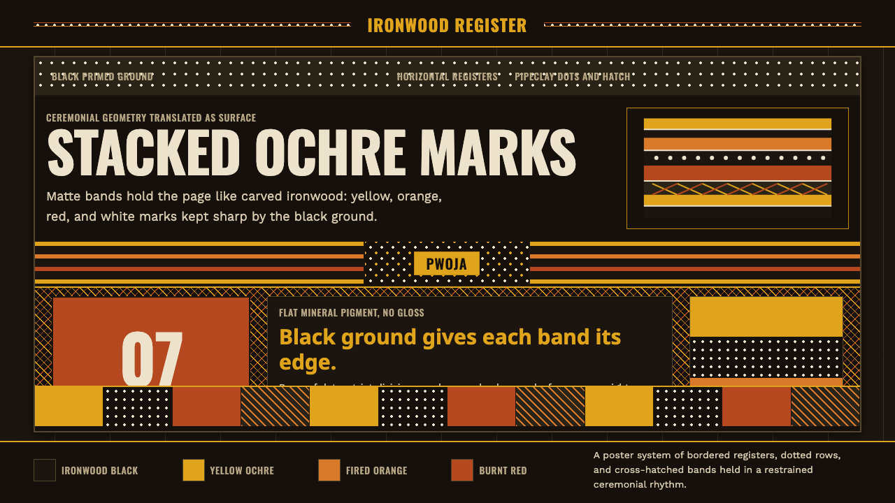 Tiwi Pukumani PoleBlack ground carries ceremony. Ochre bands, pipeclay dots, and hatch stack li…