What is Batak Gorga?
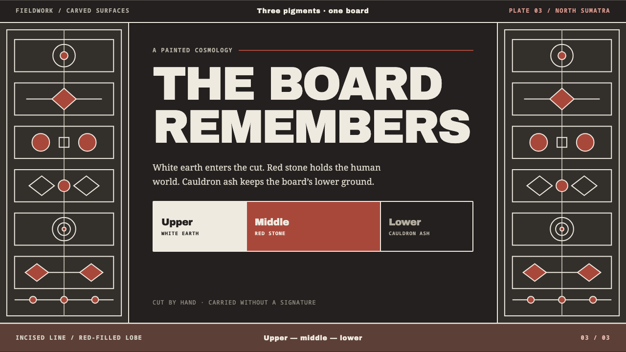
Batak Gorga translates the carved and painted house boards of the Toba Batak into a design language of three colours that are really three worlds: a black ground, a chalk-white line cut into it, and red where people act.
Batak Gorga in brief
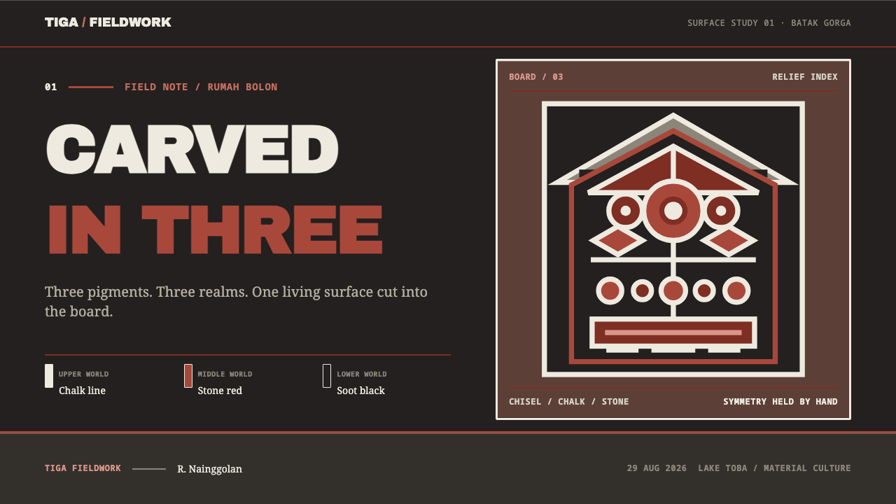
Batak Gorga is a design style drawn from gorga, the carved and painted ornament that runs across the gable and outer boards of the traditional Toba Batak house, the rumah bolon, in the highlands around Lake Toba in North Sumatra. A board is first incised, then blackened. Chalk-white line-work is laid into the cut, and red fills the lobes. Three pigments, all made on site, do all the work.
The triad is cosmology, not a palette. White stands for the upper world, red for the middle world of the living, and black for the lower world. The design system keeps that reading as a rule: black is the ground you build on, the board that has been cut; white is the line incised into it, not paper laid over it; and red appears only where people are meant to act.
The look that follows is dense, bold and ordered. Surfaces are covered edge to edge, lines are wide and hand-cut rather than hairline-thin, and compositions are bilaterally symmetrical, yet no two curls on a board are quite identical. It suits subjects that have a deep sense of order, lineage and place, and it is one of the most visually rigorous three-colour systems in any craft tradition.
Where does Batak Gorga come from?
The Toba Batak are a highland people of North Sumatra, Indonesia, whose homeland lies around Lake Toba, the great volcanic lake at the island's northern centre. Their traditional architecture, which belongs to what is called adat, the body of customary law and practice, is built around the rumah bolon, literally the big house, raised on posts under a sweeping saddle-shaped roof. The decoration of such a house is gorga, and a house that carries it is a ruma gorga. The tradition is understood to predate 1900 and was carved and repainted continuously through the twentieth century, so the surfaces in the design reference are maintained rather than frozen.
The making is a sequence. A carver incises the design into the board. The board is blackened. White line-work is then laid into the cut, and red is filled into the lobes between. All three pigments are made on site: a white earth called tano buro, mixed with water; a red stone called batu hula, ground to powder; and black from plants pounded together with cauldron ash. Because the white sits inside the cut and the red inside the lobes, the finished board reads as a black field engraved and inlaid, not painted on top.
The meaning is as important as the method. The three-colour system, known as Sitolu Warna, maps onto the three realms of Batak cosmology: white for the upper world, Banua Ginjang; red for the middle world where people live, Banua Tonga; and black for the lower world, Banua Toru. A gorga board is therefore a small cosmos, and the colours are not interchangeable. Black is the foundation, white is what is carved into it, and red is life, which is why the style limits red to the places where something happens.
Authority and anonymity both run through the craft. The carver, called a pande, traditionally does not sign his work. Which household may use which motif is decided by the datu, the ritual specialist who also kept written knowledge in the Surat Batak script, so patterns carry rank and cannot simply be picked at will. This is why the design system is careful about order: full coverage to the edges, wide hand-cut lines, and a symmetry in which each curl is slightly different from its twin, as it would be when cut by hand.
What defines the Batak Gorga look?
Black as the Board and the Lower World
Black is the ground of every composition. In the craft it is the board itself once it has been cut and darkened, and in the cosmology it is the lower world. The style treats it as the surface you build on, solid and dense, not as empty space. Margins and gaps are never left as neutral voids; the black is an active, worked material that holds everything else in place.
Chalk-White Line Cut into the Ground
White is a line, not a field. It behaves like an engraved or incised mark inside the black, outlining forms and carrying the pattern, the way the white earth is pressed into the cut. It is the upper world, the thing that gives structure and order. In layouts this means white is used for rules, outlines and type, and it is never laid across the surface as a large flat panel.
Red Where People Act
Red fills the lobes and enclosed spaces of the pattern, standing for the middle world of the living. It is used with intent: it appears where there is something to do, to see or to answer. Because black and white carry most of the structure, a red lobe immediately reads as a point of life or action, and the system relies on that contrast rather than on additional hues.
Full Coverage to the Edge
Gorga boards are covered edge to edge, with no empty centre and no generous margin. Pattern fills the board right up to its frame, and the composition feels like a woven or inlaid surface rather than an object floating in space. In design terms this is a dense, high-coverage layout: rhythm and repetition do the work that white space does in minimalist styles.
Wide, Hand-Cut Lines
Lines are broad and deliberate, with the slight irregularity of a chisel moving through wood. They are never hairline-thin or mechanically perfect. This gives the style its weight and its sense of being made by a person: curves swell and taper, corners are decided rather than rounded off by software, and every outline looks like it cost effort.
Symmetry with Variation
Compositions are bilaterally symmetrical, but each curl differs slightly from its mirror partner. The effect is order that has been made by hand: balanced enough to feel stable, varied enough to feel alive. A design that copies one half exactly onto the other loses this quality, and the system asks for deliberate small differences in shape, spacing or fill.
Rank and Strict Order
Motifs are graded, and which household may use which pattern is not a matter of taste. The system carries that sense of order: a strict three-colour rule with no fourth hue, fixed roles for black, white and red, and a clear hierarchy of what sits at the frame, what sits in the middle and what is allowed to carry emphasis. Constraint is the character of the style.
Who shaped Batak Gorga?
The pande is the carver and builder who cuts the design into the board, prepares the pigments and lays them in. By tradition the pande does not sign the work, which is why the style carries no personal flourish. What remains is the hand: broad, deliberate lines, slightly different curls, and a skill that is handed on through apprenticeship rather than written down.
The datu is the ritual specialist who decides which household may use which motif, so that patterns carry rank rather than being chosen freely. Datu also kept written knowledge in the Surat Batak script. In design terms the datu is the voice of the rules: the reason the system has a fixed meaning for each colour, and a strict order in which they may appear.
The family that lives in a ruma gorga is the reason the boards exist and the audience they speak to. The gorga announces the household's place in the adat order, and the house is a statement of lineage as much as shelter. For a designer, the family is a reminder that this ornament was never decoration for its own sake but a way of saying who one is and where one belongs.
How do you use Batak Gorga today?
Batak Gorga is a dark-ground style with a strong, ordered personality. It works for subjects that have genuine connection to heritage, lineage, craft or place, and for projects that want a serious, structured look with a human hand in it: cultural institutions, travel and heritage storytelling, museums, books, ceremonial or community products and brands built on rootedness.
For presentation slides, the cover should feel like a carved gable. A black field filled almost to the edges with white-line pattern, a clear central area left for the title in white, and a small number of red accents at the points that matter. Content slides can use the symmetric frame as a recurring structure, with white outlines separating zones and red limited to the one thing the audience must act on. Data slides suit this style well when bars, lines and labels are drawn in white against black, with red used only to mark the single highlighted series.
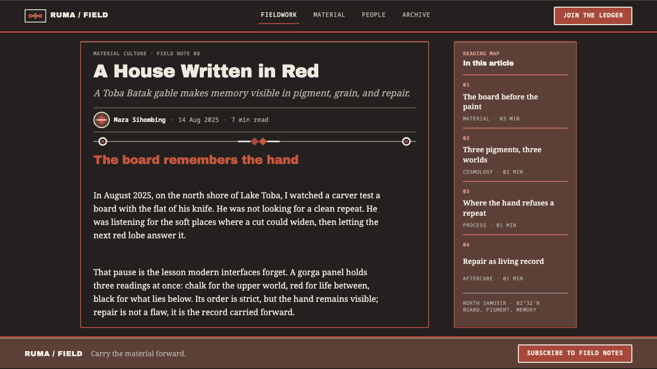
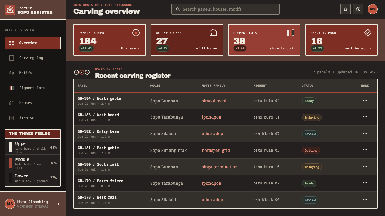
For web interfaces, treat black as the working surface and white as structure: outlines, dividers and type. Reserve red for interactive moments such as primary buttons, active states and notifications, in keeping with the idea of red as the place where people act. Cards and panels can be defined by a white inset line rather than by shadow. Pricing pages can arrange tiers symmetrically around a centre, with the recommended tier alone carrying a red fill.
For editorial and marketing work, the style makes strong covers, posters and section openers. A long article can open with a pattern band and use the frame to separate chapters, while body text stays in white on black with generous line spacing. Photography should be reduced to high-contrast monochrome or framed as an inset panel, so that it does not compete with the pattern. Keep the symmetry, but allow small variations from one side to the other.
The most common mistake is to treat the style as a pattern pack and scatter the motifs over unrelated work. The colours are cosmology and the patterns are ranked, so using them casually can be disrespectful as well as visually weak. A second mistake is introducing a fourth colour or spreading red as decoration, which dissolves the three-world logic. A third is making the lines too thin and too perfect, which turns hand-cut gorga into generic geometric ornament.
Batak Gorga — FAQ
What does gorga mean, and is it a script?
Gorga is the carved and painted ornament found on the gable and outer boards of a Toba Batak house, not a writing system. The Batak do have their own script, Surat Batak, which was used by the datu for ritual and medical knowledge, but gorga is pattern and symbol, not text. The style takes its visual logic from gorga and treats the script as a separate heritage that deserves its own credit.
Why only three colours?
Because the three colours are the three worlds of Batak cosmology, and the craft has no fourth. Each is made from a specific local material: white earth, red stone, and black from plants and cauldron ash. The constraint is the point. With only three, every placement of a colour has meaning, and the page gains a clarity that a wide palette could not give.
Does symmetry mean mirroring one side exactly?
No. Gorga compositions are balanced left to right, but because they are cut by hand, each curl differs slightly from its partner. An exact digital mirror removes the human trace and makes the work feel mechanical. Aim for balance of mass and structure, and let small differences in curve, spacing or fill remain.
Can the style work on a light background?
It is designed around the black ground, because black is the board and the lower world that the other colours are cut into. A light version would reverse the logic, turning white from an incised line into a field. If you need a lighter surface, keep black as the dominant structural colour in panels and borders, and keep white as line work rather than as the main ground.
How should I use this style respectfully?
Name the tradition and its place, Toba Batak gorga from the highlands around Lake Toba, and use it where heritage, craft or place is part of what you are saying. Avoid scattering the motifs on unrelated products, and avoid inventing meanings for the colours. The best use takes the structure, the three-colour order and the hand-cut quality, and leaves the specific ranked motifs to those they belong to.
Related design styles
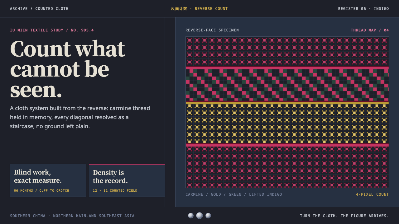 Mien Yao Cross-StitchDensity is the achievement. Carmine counted stitches saturate near-black indi…
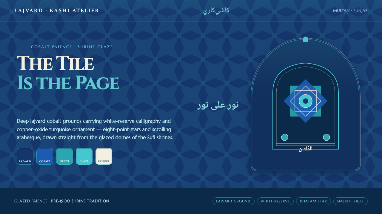 Multani Kashi TileworkThe cobalt tile is the page. Lajvard grounds carry white-reserve script and f…
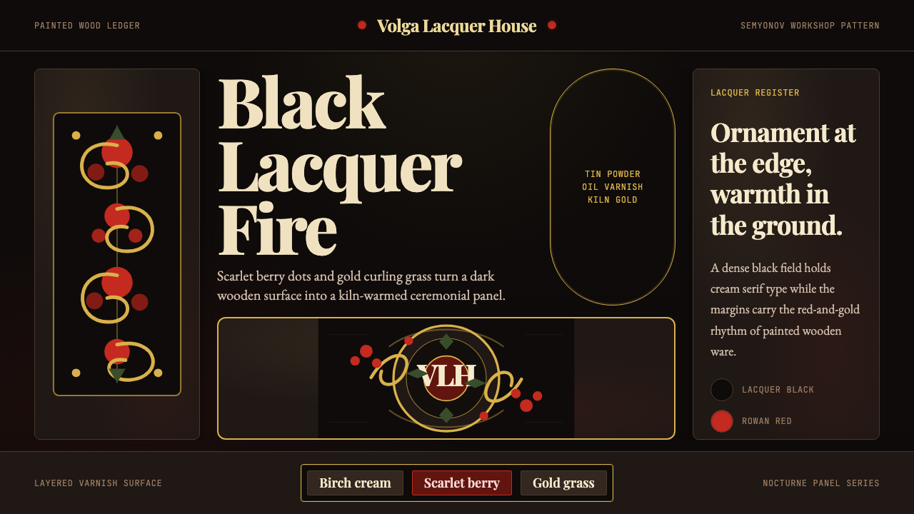 Russian Khokhloma Wood-Red LacquerKiln-fired ornament. Lacquer black, scarlet dots, and Playfair gold curls cro…
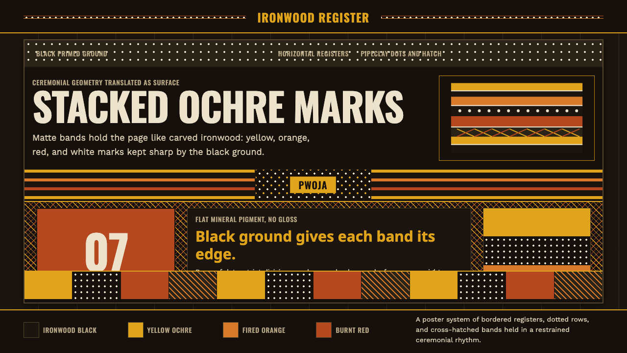 Tiwi Pukumani PoleBlack ground carries ceremony. Ochre bands, pipeclay dots, and hatch stack li…
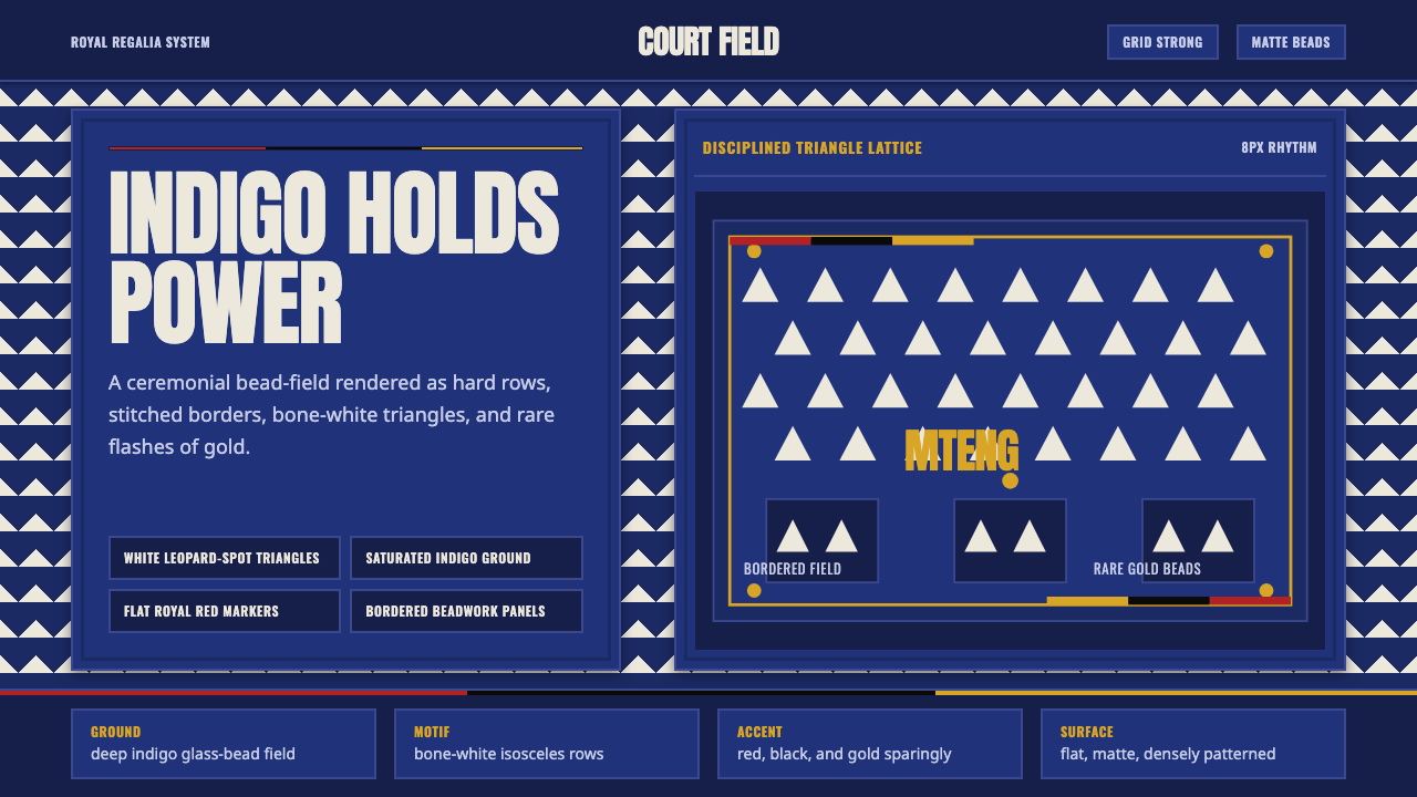 Bamileke Elephant MaskRoyal density. Indigo bead fields lock white triangle rows into ceremonial po…
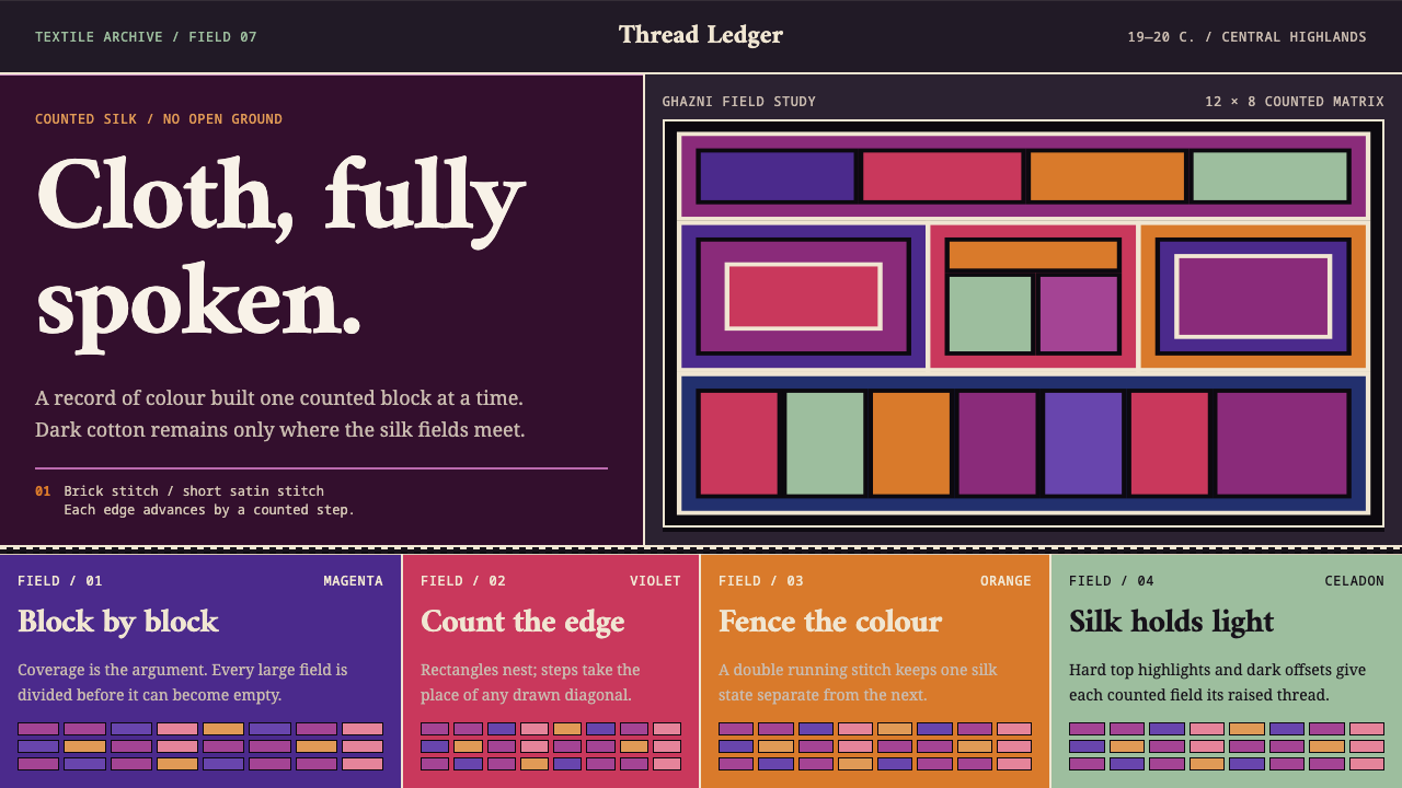 Hazara EmbroideryCoverage is the argument. Magenta silk blocks meet on a dark counted lattice.