What is Multani Kashi Tilework?
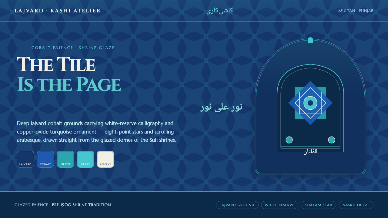
Multani kashi tilework turns a saturated cobalt field into architecture, where white-reserve calligraphy and turquoise stars make ornament feel devotional rather than decorative.
Multani Kashi Tilework in brief
Multani kashi-kari is a glazed faience tile tradition associated with Multan in Punjab, Pakistan. It is seen on the terracotta-brick domes and walls of the Shah Rukn-e-Alam tomb and other Sufi shrines, but its visual identity lies in the finished cladding rather than the structure beneath it. The viewer encounters a continuous, luminous blue skin: deep lajvard cobalt carrying floral motifs, star forms, and Quranic calligraphy.
Its digital translation begins from that same surface logic. Cobalt is not a background added behind content; it is the primary material of the page. White appears as reserve, producing script and highlights that seem held within the glaze. Firozi turquoise supplies a cooler counterpoint, especially in floral details and eight-point-star ornament. The result should read as tiled continuity, not as a generic dark interface decorated with isolated Islamic motifs.
The style is dense, ceremonial, and highly ordered. Its richness comes from contrast between saturated blue, bright reserve, and jewel-like turquoise rather than from pictorial depth. Repeated ornament creates rhythm, while calligraphy gives the surface a focal gravity. A successful application lets these systems coexist: text remains legible, stars remain structural, and floral pattern enriches the field without turning it into visual noise.
Where does Multani Kashi Tilework come from?
The mature tradition belongs to pre-1900 Multani kashi-kari, a form of Indo-Islamic glazed faience cladding shaped by Persian influence. Its regional setting is Multan, in Punjab, Pakistan, where glazed tiles were used to cover shrine architecture. The source material is architectural rather than portable: domes and walls become expansive tile fields whose color and pattern can be read from a distance as a unified surface.
The Shah Rukn-e-Alam shrine, associated with the fourteenth century and afterward, is the central reference for this visual language. Its tiled surfaces establish the essential relationship between material and image: a terracotta-brick structure is clad in blue glaze, and the glaze carries the visual program. The brick body matters as support, but it is not the intended face of the composition.
Hereditary kashigar tile-maker guilds of Multan sustained the making tradition. Their work joined glaze, floral ornament, star geometry, and shrine calligraphy into one architectural vocabulary. This is why the style should not be reduced to a palette. Cobalt, turquoise, white reserve, and eight-point stars gain their force through repetition, placement, and their relation to sacred inscription.
Naskh shrine calligraphy gives the system a second kind of order. Rather than behaving like a decorative label placed over a pattern, the script belongs to the cladding itself, reserved in white against saturated blue. In contemporary work, that relationship remains the key lesson: words should feel integrated into the visual field, while ornament should frame and support reading rather than compete with it.
What defines the Multani Kashi Tilework look?
Lajvard Ground
The dominant surface is deep cobalt lajvard. It should feel glazed, continuous, and enveloping, as though content has been set into a tile field rather than placed over an empty dark backdrop. This blue establishes the visual climate before any ornament appears.
White Reserve
White is most convincing when treated as a reserved absence within the cobalt field. It gives Quranic calligraphy and key highlights a crisp, luminous presence. Its role is not to soften the palette but to make inscription, hierarchy, and contrast feel embedded in the glaze.
Firozi Accent
Copper-oxide turquoise, known here as firozi, provides the essential secondary note. It works best as an inlaid accent within stars, floral motifs, and small structural details. Used too broadly, it weakens cobalt’s authority; used selectively, it makes the surface shimmer with cool depth.
Eight-Point Star
The eight-point star is a structural ornament, not a floating icon. Repeated across a field, it can organize corners, intersections, separators, and emphasis zones. Its geometry should remain precise and calm, creating an architectural cadence rather than a festive scatter of symbols.
Floral Rhythm
Floral-and-star motifs add movement to an otherwise monumental surface. They should grow through recurrence and variation within a disciplined field, never through naturalistic illustration. The goal is a patterned rhythm that makes the tiled ground feel alive while preserving the clarity of script and content.
Cladding Logic
The style represents the glazed blue tile, never the terracotta body beneath. Avoid exposing brick-like texture as a primary aesthetic signal. Material honesty here means honoring the visible finish: the page should feel like faience cladding with pattern and inscription, not like rough masonry made digital.
Who shaped Multani Kashi Tilework?
The hereditary kashigar tile-maker guilds are the human continuity behind the Multani tradition. Their significance lies in sustaining a combined practice of glazed faience, floral and star ornament, and shrine-bound inscription. They explain why the visual language must be understood as a craft system rather than a collection of independently usable motifs.
The Shah Rukn-e-Alam shrine is the principal architectural reference in the supplied tradition. Associated with the fourteenth century and after, it demonstrates the central premise of Multani kashi-kari: tile cladding transforms dome and wall into a monumental cobalt field whose ornament and calligraphy are part of the architecture.
Naskh shrine calligraphy functions as a defining visual actor within the tile system. Reserved in white against saturated blue glaze, it makes language part of the ornamental field without surrendering readability. For designers, it is the clearest model for pairing high-status text with dense decorative surroundings.
How do you use Multani Kashi Tilework today?
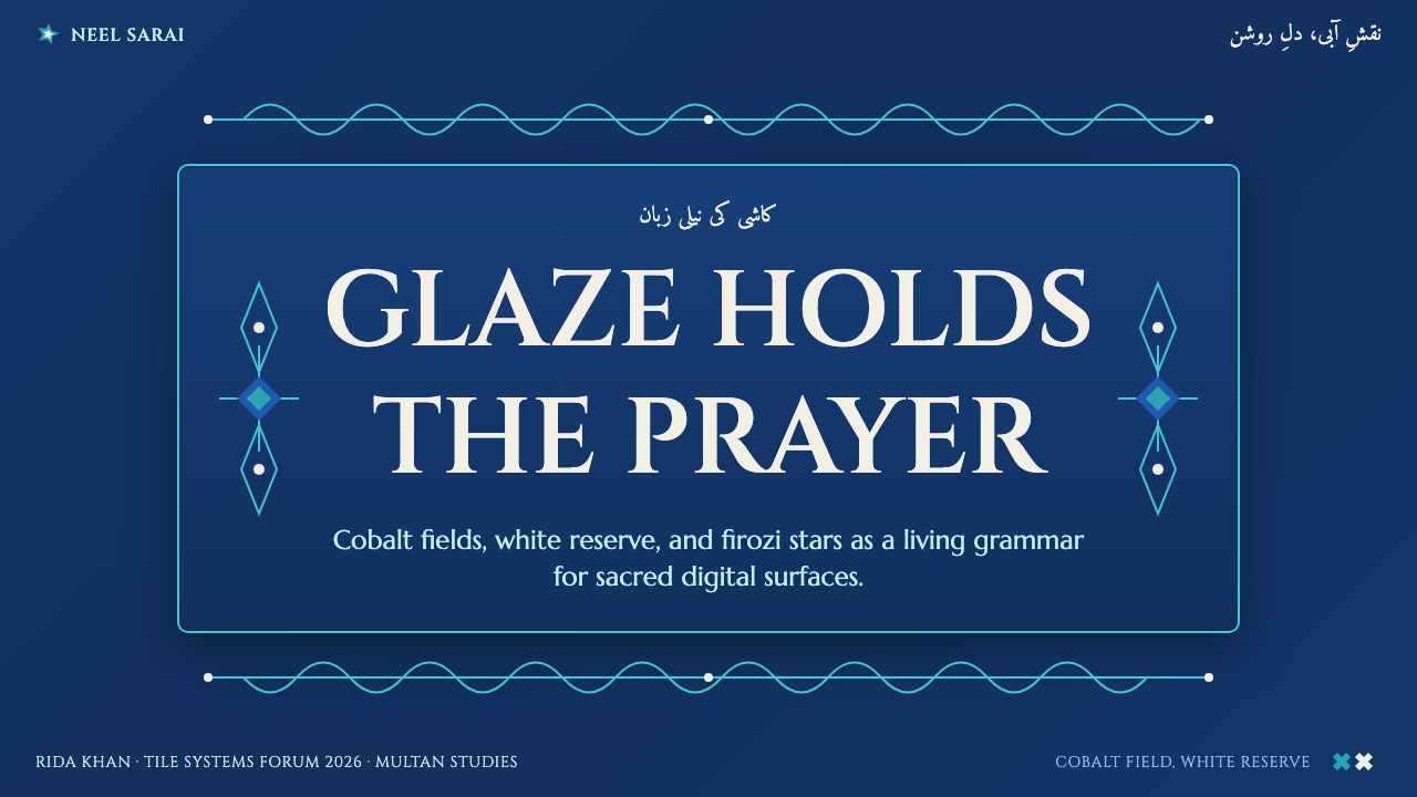
For slide covers, use the cobalt field as the entire setting and give the title a white-reserve presence. A single eight-point star or a restrained floral border can establish the theme, but the cover should retain the monumental quiet of shrine cladding. Content slides need more open blue field, with white text arranged as inscription and turquoise used only to distinguish key ideas or sections.
Data slides work when charts are treated as part of the ornament system rather than imported office graphics. Keep the analytic structure clear in white, use cobalt as the unifying ground, and reserve firozi for selected comparisons or emphasis. Star geometry can frame a summary or act as a quiet marker, but it should never obscure axes, labels, or the relationship being explained.
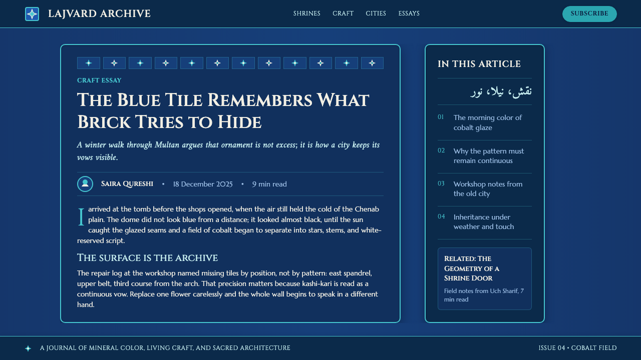
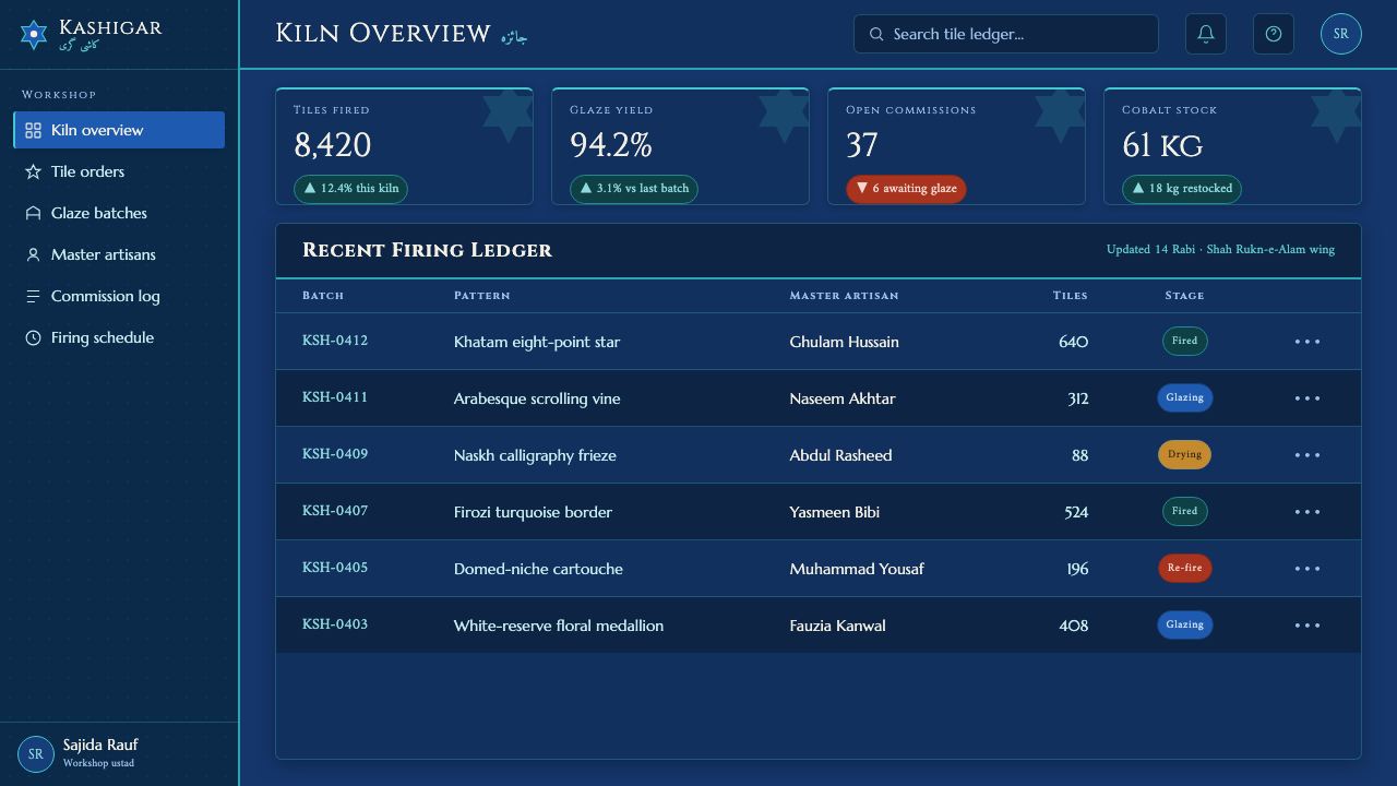
In web interfaces, the style is especially suited to cultural archives, editorial destinations, membership areas, and dashboards that benefit from gravity and a strong sense of place. Let the cobalt surface carry navigation, panels, and reading areas as one environment. White-reserve typography should establish primary hierarchy, while turquoise signals selected states, related information, or active pathways without breaking the field into unrelated components.
For editorial and marketing work, build campaigns around surface, inscription, and repetition. A feature section can feel like a tiled wall, with a large white statement held against cobalt and floral-star pattern confined to margins, dividers, or background zones. Marketing material benefits when ornament provides ceremonial framing for a message instead of becoming a generic exotic flourish.
The common mistake is to combine every available signal at once: heavy pattern, abundant stars, broad turquoise areas, multiple decorative scripts, and exposed brick texture. That loses the essential hierarchy. Keep cobalt dominant, make white reserve meaningful, use firozi as a deliberate accent, and remember that the reference is glazed cladding on sacred architecture, not a collage of loosely related regional cues.
Multani Kashi Tilework — FAQ
Is Multani kashi tilework simply a dark blue interface style?
No. The dark cobalt field is fundamental, but it only becomes Multani kashi-kari when it operates like glazed cladding: white reserve carries inscription and contrast, firozi supports the field as an accent, and floral-star ornament creates a disciplined surface rhythm. A blue interface without this material and architectural logic may be attractive, but it is not a faithful application of the tradition.
Should terracotta brick texture be visible in a digital adaptation?
No. The supplied design system is explicit that the visible subject is the glazed blue tile itself, never the brick body beneath it. The historic structure may be terracotta brick, but the aesthetic being translated is the saturated cladding. Brick texture changes the material story from finished faience surface to exposed masonry and weakens the intended visual identity.
How should turquoise be balanced against cobalt?
Treat firozi as an accent embedded in the larger lajvard field. It is most persuasive in small floral passages, star details, and selected markers because it makes the cobalt appear deeper by contrast. If turquoise becomes a second dominant surface, the system loses the clear hierarchy described by the source tradition.
Can eight-point stars be used as ordinary icons?
They can mark information, but they should not be treated as interchangeable decorative icons. In this system, the eight-point star belongs to architectural ornament and works through repeated geometric order. Use it to organize a corner, transition, frame, or emphasis area, and keep its role connected to the tiled field around it.
What is the role of calligraphy in this style?
The source tradition identifies Quranic calligraphy, including Naskh shrine calligraphy, as white reserve against saturated blue glaze. Its importance is structural as well as devotional: it gives the patterned surface a readable center of gravity. In a contemporary layout, prominent text should receive comparable respect through placement, contrast, and surrounding restraint.
Related design styles
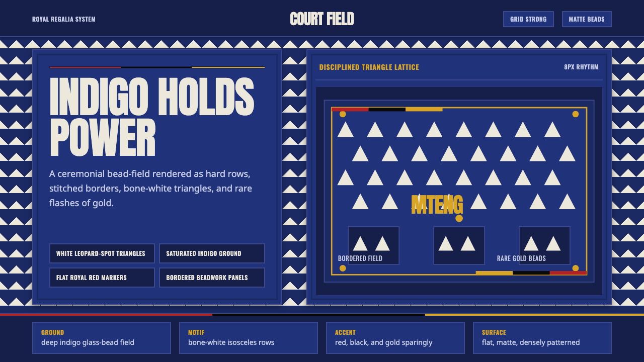 Bamileke Elephant MaskRoyal density. Indigo bead fields lock white triangle rows into ceremonial po…
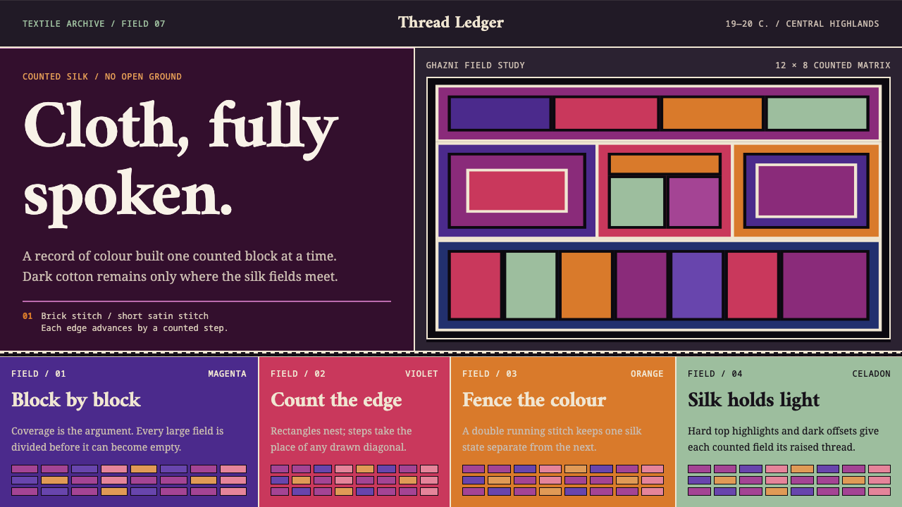 Hazara EmbroideryCoverage is the argument. Magenta silk blocks meet on a dark counted lattice.
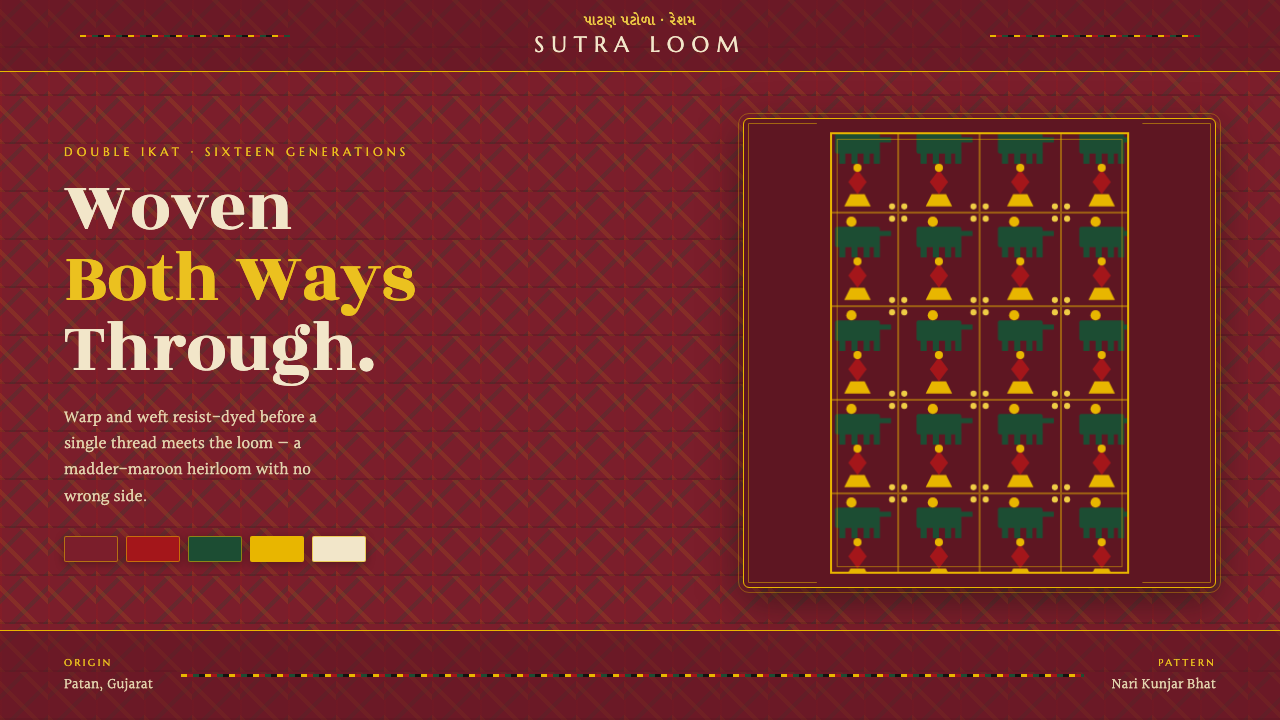 Patan Patola Double IkatReversible by design. Madder-maroon ground, a strict red-green-gold lattice,…
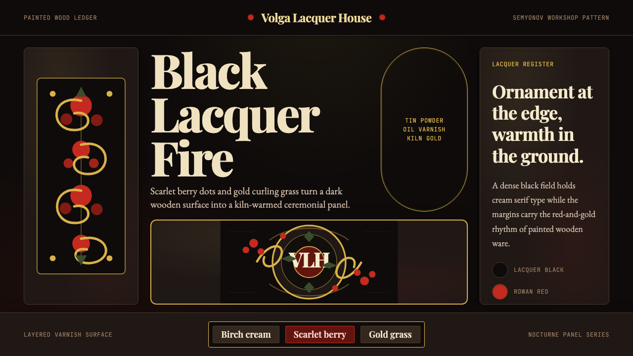 Russian Khokhloma Wood-Red LacquerKiln-fired ornament. Lacquer black, scarlet dots, and Playfair gold curls cro…
 Tiwi Pukumani PoleBlack ground carries ceremony. Ochre bands, pipeclay dots, and hatch stack li…
 Central Asian IkatMaximal silk haze. Madder, gold, and indigo warp bands feather across aubergi…