Design style guide设计风格指南
What is Mexican Día de Muertos (Marigold Ofrenda)?什么是 Mexican Día de Muertos (Marigold Ofrenda)?
Día de Muertos wraps grief in blazing marigold light — a design tradition where death becomes the most vivid reason to celebrate.亡灵节用炽烈的万寿菊光芒拥抱哀思——这套设计传统把死亡变成了最鲜活的庆典理由。
Mexican Día de Muertos (Marigold Ofrenda) in briefMexican Día de Muertos (Marigold Ofrenda) 速览
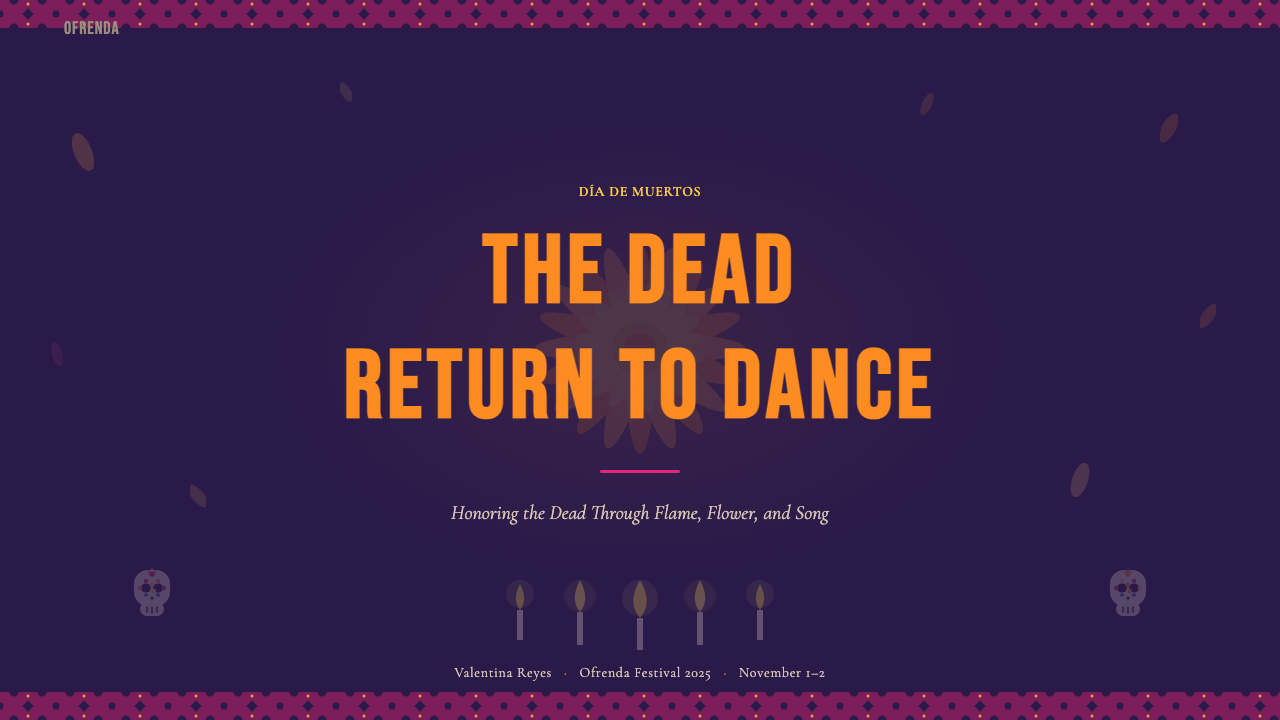
Mexican Día de Muertos (Marigold Ofrenda) is a design system rooted in one of the Americas' most visually arresting ritual traditions: the annual November altar-building ceremony in which Mexican families honor their dead with multi-tiered ofrendas draped in cempasúchil marigold blossoms, cut-paper banners, sugar skulls, candles, and photographs. The visual language that emerges from this tradition is unmistakably bold — deep velvet-purple grounds blazing with marigold orange, hot magenta, and candle-flame yellow, all edged by the crisp geometric lacework of papel picado.墨西哥亡灵节(万寿菊祭坛)是一套设计体系,其根基是美洲最具视觉震撼力的仪式传统之一:每年十一月,墨西哥家庭为逝去的亲人搭建多层祭坛(ofrenda),铺满万寿菊(cempasúchil)、剪纸旗(papel picado)、糖骷髅、蜡烛与照片。由这一传统生长出来的视觉语言无比大胆——深邃的丝绒紫底色上,万寿菊橙、灼热洋红与烛光金黄竞相燃烧,四周镶着剪纸的锐利几何花边。
What makes this style distinctive is its treatment of contrast and celebration as moral arguments. The darkness of midnight velvet is not somber — it is a stage that makes the warm fluorescent tones of marigold petals glow with even greater intensity. The style refuses the Western convention that equates death with muted palettes and restrained form. Instead, it insists that remembrance is an act of visual generosity: every element is given maximum presence, every color earns its place by radiating warmth.这种风格的独特之处,在于它把对比与庆典当作道德主张来处理。午夜丝绒的深邃并非压抑——它是一座舞台,让万寿菊花瓣的温暖荧光显得更加耀眼。这种风格拒绝西方将死亡等同于低饱和色调与克制形式的惯例,转而坚持:纪念是一种视觉上的慷慨行为——每个元素都被赋予充分的存在感,每一种色彩都以散发温度来赢得它的位置。
The aesthetic operates simultaneously on two registers: the sacred geometry of the ofrenda's tiered structure and the exuberant folk craft of cempasúchil arrangements and papel picado. These two registers — sacred order and festive ornament — are not in tension but in dialogue. The result is a visual system that feels both ceremonially precise and emotionally abundant, organized without being cold, decorative without being frivolous.这套美学在两个层次上同时运作:祭坛多层结构的神圣几何,以及万寿菊花环与剪纸旗的欢腾民间工艺。这两个层次——神圣秩序与节庆装饰——并非对立,而是对话。其结果是一套视觉系统,既有仪式的精确感,又有情感的丰盛感;有组织而不冷漠,有装饰而不轻浮。
Where does Mexican Día de Muertos (Marigold Ofrenda) come from?Mexican Día de Muertos (Marigold Ofrenda) 从何而来?
The roots of Día de Muertos stretch back to pre-Hispanic Aztec civilization, which held elaborate months-long festivals honoring the dead — particularly in the ninth month of the Aztec solar calendar, dedicated to Mictecacihuatl, the Lady of the Dead. Cempasúchil marigolds were central to these rites: their intense fragrance and blazing color were believed to guide the souls of the departed back to the world of the living. The flower's path from field to altar was not merely decorative but navigational, a luminous road of petals.亡灵节的根脉深植于前西班牙时代的阿兹特克文明。阿兹特克人举行长达数月的繁复祭祀,尤以太阳历第九个月为甚——这一月份献给亡灵女神米克特卡西瓦特尔(Mictecacihuatl)。万寿菊(cempasúchil)在这些仪式中居于核心:其浓烈的香气与炽烈的色彩被认为能引导逝者的灵魂回返人间。花朵从田野铺向祭坛的路,不仅是装饰,更是导航——一条由花瓣铺就的光亮之路。
When Spanish conquistadors arrived after 1521 and Catholic missionaries followed, they encountered these deeply embedded death practices and made a calculated decision to overlay rather than eradicate them. The Aztec festivals were merged with the Catholic feasts of All Saints' Day and All Souls' Day (November 1 and 2), producing a syncretic tradition that retained the marigold petals, the offerings of food and objects, and the idea of the dead returning to visit, while absorbing Christian prayers and iconography. The ofrenda's multi-tiered structure, for instance, reflects both pre-Hispanic cosmological layers and Catholic altar conventions.1521年西班牙征服者入侵、天主教传教士随后而来,他们遭遇了这些深根蒂固的死亡仪式,并作出战略性选择:叠加而非消除。阿兹特克的祭祀被与天主教的万圣节和追思节(十一月一日与二日)合并,生成一种混融传统——保留了万寿菊花瓣、食物与器物供奉、逝者灵魂回访的观念,同时吸收了基督教祈祷与圣像学。例如,祭坛的多层结构既映射前西班牙时代的宇宙学层次,也呼应天主教祭坛的惯例。
The tradition acquired much of its contemporary visual character in the nineteenth century, particularly through the work of printmaker and caricaturist José Guadalupe Posada (1852–1913). Posada's calaveras — satirical broadside illustrations featuring skeletons in everyday bourgeois dress — cemented the irreverent, witty relationship with death that defines the festival's tone. His most enduring creation, La Catrina (a elegantly dressed female skull), was later immortalized by Diego Rivera in his monumental 1947 mural Dream of a Sunday Afternoon in Alameda Park, which helped elevate Posada's folk imagery into the canon of Mexican national art.这一传统的当代视觉面貌,很大程度上形成于十九世纪,尤其经由版画家与讽刺漫画家何塞·瓜达卢佩·波萨达(José Guadalupe Posada,1852—1913)的工作得以固化。波萨达的骷髅画(calaveras)——描绘骷髅身着资产阶级日常服装的讽刺版画——确立了这一节日与死亡之间那种不恭而机智的关系。他最经久不衰的创作「卡特里娜」(La Catrina,一具着装优雅的女性骷髅)后来被迭戈·里维拉在其1947年的巨幅壁画《阿拉米达公园星期日下午的梦》中永久定格,将波萨达的民间图像推入墨西哥国家艺术的经典之列。
After the Mexican Revolution (1910–1920), Día de Muertos became a focal point of postrevolutionary nationalist cultural policy. The muralist movement — Diego Rivera, José Clemente Orozco, David Alfaro Siqueiros — positioned indigenous and syncretic traditions as the authentic foundation of Mexican identity, in explicit contrast to European colonial aesthetics. Octavio Paz, in his landmark 1950 essay collection The Labyrinth of Solitude, argued that the Mexican attitude toward death — festive, intimate, ironic — was itself a philosophical stance, a way of domesticating mortality that distinguished Mexican culture from the death-denial of the industrialized North. UNESCO recognized Día de Muertos as an Intangible Cultural Heritage of Humanity in 2008, which formalized the tradition's global standing while also stimulating careful discussions about authenticity and commercialization.墨西哥革命(1910—1920年)之后,亡灵节成为革命后民族主义文化政策的焦点。壁画运动的艺术家——迭戈·里维拉、何塞·克莱门特·奥罗斯科、大卫·阿尔法罗·西盖罗斯——将本土与混融传统定位为墨西哥身份认同的真实基础,以此明确对抗欧洲殖民美学。奥克塔维奥·帕斯在其1950年的重要文集《孤独的迷宫》中论证:墨西哥人对待死亡的态度——节庆性的、亲密的、反讽的——本身就是一种哲学立场,一种将死亡驯化为日常的方式,区别于工业化北方的死亡回避文化。2008年,联合国教科文组织将亡灵节列为人类非物质文化遗产,这一认定正式确立了该传统的全球地位,同时也引发了关于真实性与商业化的审慎讨论。
What defines the Mexican Día de Muertos (Marigold Ofrenda) look?Mexican Día de Muertos (Marigold Ofrenda) 的视觉特征是什么?
Color色彩
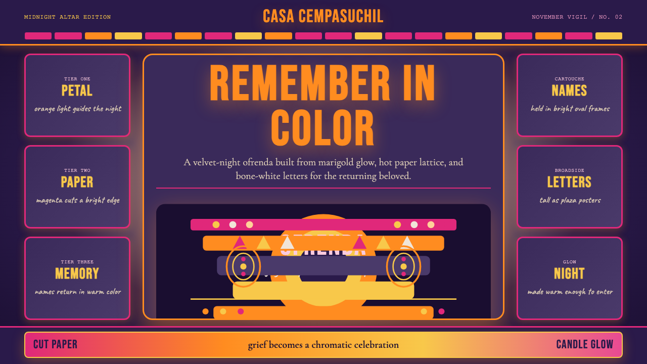
The palette centers on a deep velvet purple as the primary ground, evoking the midnight sky above an illuminated altar. Against this darkness, marigold orange functions as the dominant accent — warm, fluorescent, and insistent, like the petals themselves. Hot magenta provides the sharpest contrast, drawn from the cut-paper decorations that frame ofrendas. Candle-flame yellow adds warmth without softening the overall drama. These colors are never muted or desaturated; their job is to glow, to be seen from a distance, to guide the way.色板以深邃的丝绒紫作为主底色,唤起照亮的祭坛上方午夜天空的意象。在这片深邃之上,万寿菊橙充当主导强调色——温暖、荧光而坚持,如同花瓣本身。灼热的洋红提供最强烈的对比,源自装饰祭坛的剪纸旗帜。烛光金黄增添温度,却不软化整体的戏剧感。这些颜色从不被低沉或去饱和;它们的使命是发光,是在远处被看见,是为灵魂引路。
Pattern and Surface图案与表面
Papel picado — the traditional cut-paper banners hung above ofrendas — supplies the style's signature geometric lattice. Designs are based on repeated diamond, skull, floral, and chevron motifs punched or cut with geometric regularity, creating a surface that is simultaneously ornamental and structural. This lacework quality appears as borders, dividers, and background textures. The key characteristic is that the pattern is always defined by what is removed — the negative space of the cut — rather than by what is added.剪纸旗(papel picado)——悬挂于祭坛上方的传统彩纸旗——提供了这种风格标志性的几何镂花。图案基于反复出现的菱形、骷髅、花卉与人字形母题,以几何规律刺穿或剪裁,形成兼具装饰性与结构性的表面。这种蕾丝般的品质出现在边框、分割线和背景纹理之中。关键特征在于:图案永远由被移除的部分定义——剪切的负空间——而非由添加的部分定义。
Typography字体排印
The typographic register draws on two distinct traditions: the condensed, high-contrast letterforms of Posada's nineteenth-century broadside engravings (impact-style display type, used for headlines and festival banners) and the more refined literary serif tradition of Mexican editorial culture. In practice, this means headlines carry weight and urgency — tight letter spacing, bold stroke contrast — while body text benefits from serif elegance that grounds the celebratory surface. Decorative letterforms with skull or floral insets appear as special-occasion elements, not as everyday text.字体排印的基调来自两种截然不同的传统:波萨达十九世纪版画的窄体高对比字形(冲击性展示字体,用于标题与节庆横幅),以及墨西哥编辑文化中更为精致的文学衬线传统。实践中,标题承载重量与紧迫感——紧缩字距、粗笔画对比;正文则受益于衬线字体的优雅,为欢腾的表面提供压舱。带有骷髅或花卉镶嵌的装饰性字形作为特殊场合元素出现,而非日常文本用字。
Light and Glow光与辉光
The ofrenda is a lit environment — dozens of candles illuminate it from within. This quality of internal luminosity is central to the style: warm tones appear to emit light rather than reflect it. Halos, bloom effects, and soft radiance around key elements mimic the candlelight glow that defines the nighttime altar. This is one of the few design traditions where glow is not decorative excess but a direct reference to the ritual context — the light that guides the returning dead.祭坛是一个被光点亮的空间——数十支蜡烛从内部照亮它。这种内发光的品质是该风格的核心:暖色调看起来是在发光而非反光。关键元素周围的光晕、溢光效果与柔和辐射,模拟了定义夜间祭坛的烛光辉芒。这是少数几种辉光效果不是装饰过剩、而是直接指涉仪式语境的设计传统之一——那道引导归来亡灵的光。
Iconography图像志
The style carries a specific and historically grounded set of icons: the calavera (decorative skull), the cempasúchil blossom in full face, the monarch butterfly (believed to carry the souls of the dead), the marigold petal path, the ofrenda's tiered silhouette, and the candle flame. These are not arbitrary decorations but symbolic anchors with specific meanings in the ritual context — each item placed on a real ofrenda serves a function, and the same precision carries into design use. Sugar skull motifs, in particular, follow rules: symmetrical decoration, floral patterning in the eye sockets, and a palette that mirrors the overall warm-on-dark scheme.这种风格携带一套特定且有历史根据的图像:装饰性骷髅(calavera)、正面盛放的万寿菊花朵、帝王蝶(被认为承载逝者灵魂)、万寿菊花瓣路径、祭坛多层轮廓,以及烛焰。这些不是任意的装饰,而是在仪式语境中具有特定含义的象征性锚点——真实祭坛上摆放的每件物品都有其功能,同样的精确性延伸到设计应用中。糖骷髅母题尤其遵循规则:对称装饰、眼窝处花卉图案,以及与整体暖色调-深底方案相呼应的配色。
Composition and Layering构图与层叠
The ofrenda's physical structure — multiple ascending tiers, each level hosting its own arrangement of objects — translates into design compositions that use vertical layering and depth to create hierarchy. Foreground elements (photographs, sugar skulls, candles) sit above middle-ground decorations (marigold carpets, cut-paper banners) which sit above the dark ground. This sense of depth is achieved through scale, overlap, and tonal shift rather than perspective drawing. Compositions are typically centered or radially balanced — the altar's bilateral symmetry is a model — with asymmetric festive elements breaking the formality at the edges.祭坛的物理结构——多个上升的层次,每层都安置着自己的物品——转化为使用垂直叠加与深度创造层级的设计构图。前景元素(照片、糖骷髅、蜡烛)悬浮于中景装饰之上(万寿菊花毯、剪纸旗),而后者又悬浮于深色底面之上。这种深度感通过尺度、叠压与色调转换实现,而非透视绘图。构图通常居中或放射性平衡——祭坛的左右对称是其模型——边缘处以非对称的节庆元素打破正式感。
Texture质感
Velvet, petal, paper, wax, and bone: the style's material reference points are specific and tactile. In digital work, these translate not into literal texture overlays but into the qualities of surfaces — the slight softness of a velvet ground versus the crisp geometric edge of cut paper, the warm blur of candlelight versus the clean outline of a calavera. Texture is evoked through the relationship between elements rather than applied as a filter. The palette itself carries textural information: deep purple reads as velvet, marigold orange reads as petal, hot magenta reads as dyed tissue paper.丝绒、花瓣、纸张、蜡与骨骸:这种风格的材质参照点是特定而触觉性的。在数字作品中,这些并不转化为字面意义上的纹理叠加,而是表面品质——丝绒底面的轻柔感与剪纸锐利几何边缘的对比,烛光温暖的模糊感与骷髅画面清晰轮廓的对比。质感通过元素之间的关系而非作为滤镜被施加来唤起。色板本身携带质感信息:深紫读作丝绒,万寿菊橙读作花瓣,灼热洋红读作染色薄纸。

Who shaped Mexican Día de Muertos (Marigold Ofrenda)?谁塑造了 Mexican Día de Muertos (Marigold Ofrenda)?
Posada (1852–1913) was a prolific Mexican printmaker and illustrator whose calavera broadside engravings — skeletal figures dressed as politicians, dandies, and society ladies engaged in everyday activities — established the irreverent visual vocabulary that defines Día de Muertos iconography. His most enduring creation, La Calavera Garbancera (later renamed La Catrina by Diego Rivera), showed death as a dandified aristocrat, skewering class pretension with dark humor. Posada worked in a deliberately popular register, producing cheap printed ephemera distributed on the streets of Mexico City, and his willingness to make death simultaneously funny and fearless set the aesthetic tone for all subsequent design in the tradition.波萨达(1852—1913)是多产的墨西哥版画家与插画家,其骷髅主题讽刺版画——骷髅形象的政客、花花公子与社交名媛从事日常活动——确立了定义亡灵节图像志的那种不恭视觉词汇。他最经久不衰的创作「骷髅加班塞拉」(后被迭戈·里维拉命名为「卡特里娜」)将死亡呈现为一位矫饰的贵族,以黑色幽默嘲弄阶级虚荣。波萨达刻意在通俗层面工作,生产廉价印刷品在墨西哥城街头散发,他让死亡同时变得滑稽与无畏的意愿,为此后传统中的所有设计奠定了美学基调。
Rivera (1886–1957) did more than any other figure to elevate Día de Muertos imagery from popular folk art to high national culture. His 1947 mural Dream of a Sunday Afternoon in Alameda Park placed Posada's La Catrina at the center of a grand panorama of Mexican history, surrounding her with figures from the colonial period to the Revolution. Rivera also systematized the use of marigold and ofrenda imagery in monumental public art, and his close collaboration with Frida Kahlo — whose own work absorbed the visual language of death and folk tradition — amplified both artists' influence on how the world understands Mexican visual culture.里维拉(1886—1957)比任何其他人都更多地将亡灵节图像从通俗民间艺术提升为高度国家文化。他1947年的壁画《阿拉米达公园星期日下午的梦》将波萨达的「卡特里娜」置于墨西哥历史全景的中心,以殖民时期到革命时代的各路人物将她环绕。里维拉还系统化地在宏大公共艺术中运用万寿菊与祭坛的图像,他与弗里达·卡罗的密切合作——卡罗的作品深度吸收了死亡与民间传统的视觉语言——放大了两位艺术家对世界理解墨西哥视觉文化的影响。
Kahlo (1907–1954) brought Día de Muertos iconography — skulls, marigolds, ex-votos, folk saints — into the tradition of self-portrait painting, making the intersection of death, pain, and vibrant color a personal and political statement rather than merely a seasonal ritual. Her palette of deep reds, bright yellows, and warm terracottas against dark grounds closely parallels the ofrenda color logic. Kahlo's work also demonstrated that the tradition's festive relationship with mortality could support genuine emotional complexity, not just celebration — a nuance that design applications of the style must reckon with.卡罗(1907—1954)将亡灵节图像志——骷髅、万寿菊、还愿牌、民间圣像——带入自画像绘画传统,将死亡、痛苦与鲜亮色彩的交汇变为个人与政治的表达,而非仅仅是季节性仪式。她深红、亮黄与暖赭色在深色底面上的色彩逻辑与祭坛配色高度平行。卡罗的作品还证明,这一传统与死亡的节庆性关系可以支撑真实的情感复杂性,而不仅仅是庆典——这一细微之处是设计应用这种风格时必须正视的。
Paz (1914–1998), Nobel Prize laureate and Mexico's most internationally recognized poet-essayist, provided the philosophical framework through which Día de Muertos acquired its cultural meaning for a global audience. His 1950 essay 'The Day of the Dead' in The Labyrinth of Solitude argued that the Mexican relationship with death — festive, intimate, ironic — was a form of philosophical courage: by making death a party guest, Mexicans refused the terror that death-denial produces. Paz's analysis shifted the tradition from ethnographic curiosity to philosophical statement, which in turn shaped how designers and artists approach the style: not as macabre novelty but as a coherent worldview expressed through color and form.帕斯(1914—1998),诺贝尔奖得主、墨西哥国际知名度最高的诗人-散文家,提供了亡灵节在全球观众面前获得文化意义所依赖的哲学框架。他在1950年《孤独的迷宫》中的文章《亡灵节》论证:墨西哥人与死亡的关系——节庆性的、亲密的、反讽的——是一种哲学勇气的形式:通过让死亡成为派对宾客,墨西哥人拒绝了死亡回避所产生的恐惧。帕斯的分析将这一传统从民族志奇观转变为哲学表达,这反过来塑造了设计师与艺术家接触这种风格的方式:不是将其视为恐怖的新奇事物,而是通过色彩与形式表达的连贯世界观。
How do you use Mexican Día de Muertos (Marigold Ofrenda) today?今天怎么用 Mexican Día de Muertos (Marigold Ofrenda)?
Día de Muertos (Marigold Ofrenda) is a high-presence style — it announces itself immediately and creates strong emotional associations with warmth, celebration, and cultural specificity. Applying it correctly requires understanding that the palette's power comes from the dark ground, not from the warm accents alone. If you lift the marigold and magenta onto a white or light background, you lose the fluorescent glow that defines the style. The deep velvet purple (or near-black) ground is not optional; it is what makes the warm tones sing.亡灵节(万寿菊祭坛)是一种高存在感的风格——它立刻宣告自己,并与温暖、庆典和文化特殊性建立强烈的情感联系。正确应用它,需要理解色板的力量来自深色底面,而非仅仅来自暖色强调色。如果你把万寿菊橙与洋红搬到白色或浅色背景上,你将失去定义这种风格的荧光辉芒。深邃的丝绒紫(或接近纯黑)底面不是可选项;正是它让暖色调得以歌唱。
For presentation slides, the style excels on ceremonial or celebratory content: festival announcements, cultural event programs, heritage brand launches, annual report covers for organizations with a strong identity story to tell. A cover slide works best with a deep-ground full bleed, the title set in high-contrast warm type, and a central motif — a marigold rosette, a calavera silhouette, a papel picado border — that anchors the composition. Content slides should use the dark ground with reduced visual density: one warm accent color per slide, geometric dividers in the papel picado lattice style, and body text in a clean legible face that does not compete with decorative elements. Data slides can use marigold orange and magenta as category colors against the dark ground, treating bar charts and donut charts as stained-glass-like arrangements.在演示文稿中,这种风格在仪式性或庆典性内容上表现卓越:节日公告、文化活动手册、传统品牌发布、有着深厚身份故事可讲的机构年报封面。封面页最适合深底全出血,标题以高对比暖色字体排印,以一个中心母题——万寿菊花环、骷髅剪影、剪纸边框——锚定构图。内容页应使用深底并降低视觉密度:每页一种暖强调色,以剪纸格子风格的几何分割线,以及不与装饰元素竞争的清晰易读正文字体。数据页可将万寿菊橙与洋红用作深底上的类别色,将柱状图与环形图处理为彩窗玻璃般的排列。
For web interfaces, this style is best suited to cultural organizations, festival platforms, artisan marketplaces, and heritage brands where the celebration of cultural identity is the product itself. A dashboard in this style should use the deep purple as the sidebar or header ground, with marigold orange reserved for primary interactive states (active navigation items, primary buttons, key metrics). Hot magenta works well for alert states and secondary calls to action. The papel picado pattern makes an excellent structural divider between sections — rendered as a thin geometric border rather than a full-bleed texture — and iconography should draw from the ritual vocabulary: stylized blossoms, candle silhouettes, butterfly motifs.对于网页界面,这种风格最适合文化机构、节日平台、工匠市集和传统品牌——那些以庆典文化身份本身为产品的场景。这种风格的仪表板应将深紫用于侧边栏或页头底面,万寿菊橙保留给主要交互状态(激活的导航项、主按钮、关键指标)。灼热洋红适合警示状态与次级行动号召。剪纸图案是区块间的优良结构分割线——呈现为细几何边框而非全出血纹理——图标学应取自仪式词汇:程式化的花朵、蜡烛剪影、蝴蝶母题。
For editorial and marketing work, the style supports rich, immersive full-page layouts. A feature article or campaign spread benefits from alternating full-bleed dark sections with marigold accent photography treated as warm-toned cutouts. Marketing materials for cultural events, food brands with Mexican heritage, or tequila and mezcal brands can use the style's full register: deep grounds, the complete warm palette, papel picado borders, and calavera-inspired display lettering. The style also works well for seasonal campaigns — Halloween-adjacent content, Día de Muertos programming, autumn harvest themes — where warmth and darkness together create the right atmospheric register.对于编辑与营销内容,这种风格支持丰富沉浸的全页面布局。特稿或活动宣传跨页适合将全出血深色区块与处理为暖色调剪影的万寿菊橙摄影交替出现。面向文化活动、有墨西哥传承的食品品牌、或龙舌兰与梅斯卡尔品牌的营销材料,可以使用这种风格的全部配置:深色底面、完整暖色板、剪纸边框,以及骷髅启发的展示字体。这种风格也适合季节性活动——接近万圣节的内容、亡灵节主题、秋收主题——在这些场景中,温暖与深邃共同创造恰当的氛围基调。
The most common mistake when applying this style is treating it as a Halloween palette in disguise: orange and black without the velvet depth, the warmth, the floral density, or the cultural specificity. Authentic application requires committing to the full visual logic — the deep purple ground, the layered composition, the papel picado geometry, and the specific symbolic vocabulary. A second common mistake is desaturating or softening the palette to make it feel more neutral or corporate. The style's communicative power depends on its boldness; taming it produces neither authentic Día de Muertos nor a coherent neutral alternative. If boldness is inappropriate for the context, a different style is the answer.应用这种风格时最常见的错误,是将其视为万圣节色板的变体:橙与黑,却没有丝绒的深邃、温暖、花卉的密度,或文化的特殊性。真实的应用需要承诺于完整的视觉逻辑——深紫底面、层叠构图、剪纸几何,以及特定的象征词汇。第二个常见错误是将色板去饱和或柔化,试图让它显得更中性或更企业化。这种风格的传达力量依赖于它的大胆;驯化它既产生不出真实的亡灵节,也产生不出连贯的中性替代方案。如果大胆感在该语境中不合适,答案是换用不同的风格。
Mexican Día de Muertos (Marigold Ofrenda) — FAQMexican Día de Muertos (Marigold Ofrenda) · 常见问题
Is this style appropriate for contexts outside Mexican culture?这种风格适用于墨西哥文化以外的场景吗?
The style is transferable but carries cultural weight that requires honest handling. It works well for contexts that have a genuine thematic connection to the tradition's values — celebration of life and memory, festive rituals, vibrant cultural identity, seasonal ceremonies — regardless of geography. It works poorly, and risks feeling appropriative, when applied as pure visual novelty with no thematic connection to what it represents. The distinction is between using the style's visual logic to express something genuinely aligned with its meaning, versus borrowing the palette and motifs as decoration while ignoring the tradition's depth. When in doubt, connecting the usage to at least one of the style's core themes — the beauty of remembrance, the warmth of communal ritual, the dignity of honoring the dead — is the honest path.这种风格可以迁移,但承载着需要诚实对待的文化重量。它适合与该传统价值观有真实主题联系的场景——纪念与生命的庆典、节庆仪式、充满活力的文化身份、季节性典仪——不论地理位置。当被当作纯粹的视觉新奇事物应用、而与它所代表的内涵毫无主题联系时,它表现欠佳,且有文化挪用之嫌。区别在于:用这种风格的视觉逻辑表达与其含义真实契合的内容,还是仅借用色板与母题作装饰而忽略传统的深度。如有疑虑,将应用与这种风格至少一个核心主题相连——纪念的美、集体仪式的温暖、以尊严悼念逝者——是诚实的路径。
How do I prevent this style from reading as Halloween rather than Día de Muertos?如何防止这种风格被读成万圣节而非亡灵节?
The distinction lies in warmth, depth, and specificity. Halloween palettes trend toward flat orange and black with a theatrical, spooky register. Día de Muertos palettes are distinguished by the velvet purple ground (not black), the fluorescent warmth of marigold orange (not pumpkin orange), the addition of hot magenta, and the candle-flame yellow. The iconography is also specific: calavera skulls are elaborately decorated with floral patterns and warm colors, not skeletal and threatening. Marigold blossoms, monarch butterflies, and papel picado banners have no Halloween equivalents. Committing to these specific elements — and avoiding generic cobweb, bat, and jack-o-lantern imagery — keeps the cultural reference clear.区别在于温暖、深度与特殊性。万圣节色板倾向于平面的橙与黑,带有戏剧性的阴森基调。亡灵节色板以丝绒紫底面(而非纯黑)、万寿菊橙的荧光温暖(而非南瓜橙)、灼热洋红的加入以及烛光金黄来区分自己。图像志也是特定的:骷髅画(calavera)以花卉图案和暖色精心装饰,而非骨感威吓。万寿菊花朵、帝王蝶与剪纸旗帜在万圣节中没有对应物。承诺这些特定元素——并避免通用的蜘蛛网、蝙蝠与南瓜灯图像——可以保持文化参照的清晰度。
Can this style work for a light-background interface?这种风格能用在浅色背景界面上吗?
Technically yes, but at the cost of one of the style's defining qualities. The ofrenda's visual power depends on warm tones glowing against a dark ground — this is the fluorescent quality that makes marigold orange look alive. On a white or cream background, marigold and magenta become warm accents rather than glowing emitters, and the result reads as a cheerful Latin-inspired palette rather than the specific ceremonial register of Día de Muertos. A light variant works better when used sparingly — perhaps for print materials or a section of a page — and when the deep purple is brought in as a structural element (a header bar, a full-width section) to preserve some of the original contrast dynamic.技术上可以,但要以失去这种风格的一个决定性品质为代价。祭坛的视觉力量依赖于暖色调在深色底面上发光——这是让万寿菊橙看起来充满生命感的荧光品质。在白色或奶油色背景上,万寿菊橙与洋红变成温暖的强调色而非发光的辐射源,结果读作一套欢快的拉丁风格色板,而非亡灵节特有的仪式基调。浅色变体在适度使用时效果更好——也许用于印刷材料或页面的某个区块——并且当深紫作为结构元素(页头栏、全宽区块)引入以保留部分原始对比动态时,效果最为理想。
What makes skull imagery in this style different from generic skull motifs?这种风格中的骷髅图像与通用骷髅母题有何不同?
Día de Muertos calavera skulls follow a specific decorative grammar that distinguishes them sharply from the threatening or generic skulls common in heavy metal imagery, pirate iconography, or Halloween decoration. The calavera is always adorned rather than bare: floral patterns fill the eye sockets, chevron and diamond motifs decorate the cranium, and warm colors — marigold, magenta, turquoise — are used rather than bone white or threatening black. The expression is often serene, smiling, or even elegant rather than frightening. The calavera is also associated with specific figures (La Catrina as aristocrat, soldier calaveras, market woman calaveras) rather than being an anonymous death symbol. This specificity is what makes it culturally resonant rather than merely macabre.亡灵节的骷髅画(calavera)遵循一套特定的装饰语法,将其与重金属图像、海盗图像志或万圣节装饰中常见的威吓性或通用骷髅明确区分开来。骷髅画永远是装饰精美的而非裸露的:花卉图案填充眼窝,人字形与菱形母题装饰颅骨,使用的是暖色——万寿菊橙、洋红、青绿——而非骨白或威吓性的纯黑。表情通常是宁静的、微笑的,甚至是优雅的,而非恐怖的。骷髅画还与特定人物相关联(卡特里娜作为贵族、战士骷髅、市场女性骷髅),而非匿名的死亡符号。正是这种特殊性使它具有文化共鸣而非单纯的阴森感。
How does this style handle text legibility on dark backgrounds?这种风格如何处理深色背景上的文字易读性?
Legibility on the deep velvet-purple ground requires deliberate choices. The highest-contrast option is warm white or cream text directly on the dark ground — this reads cleanly and maintains the style's thermal quality. Marigold orange works for display-size headings and short labels but should be avoided for body text, where its warmth can cause eye fatigue against the dark background. Hot magenta is best reserved for small interactive elements and never used for extended reading. The key principle is to use the warmest and most saturated tones for the shortest text units, and reserve near-white or light cream for any extended reading — body copy, captions, navigation labels. Decorative elements like papel picado borders should sit below the text layer rather than behind it to avoid competing with legibility.在深邃丝绒紫底面上保持易读性需要有意识的选择。对比度最高的方案是直接在深底上使用暖白或奶油色文字——这读来清晰,并维持这种风格的热量感。万寿菊橙适合展示尺寸的标题与短标签,但应避免用于正文,因为在深色背景上它的温暖感会造成视觉疲劳。灼热洋红最好保留给小型交互元素,绝不用于长篇阅读。关键原则是:将最温暖、饱和度最高的色调用于最短的文字单元,并为任何延伸阅读——正文、说明文字、导航标签——保留近白或浅奶油色。装饰性元素如剪纸边框应置于文字层之下而非之后,以避免与易读性竞争。
Related design styles相关设计风格
 Bissau-Guinean Pano de PenteIndigo remembers. Narrow bands and kaolin seams turn weave grammar into pixel…靛蓝会记忆。窄幅竖带与瓷白缝线,把织纹语法变成像素。
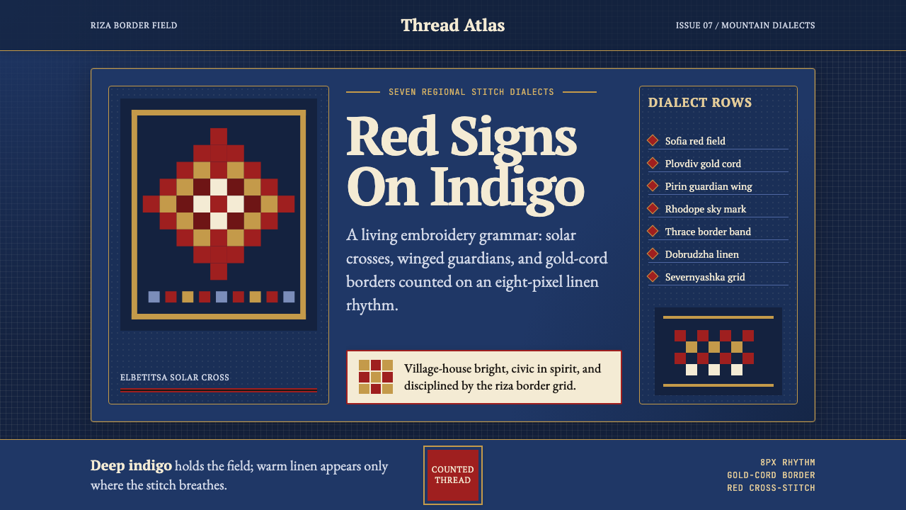 Bulgarian Shevitsa Folk EmbroideryVillage-bright code. Deep indigo carries shevitsa red crosses and gold-cord b…村舍般明亮:深靛蓝承托红色太阳十字与金线边框。
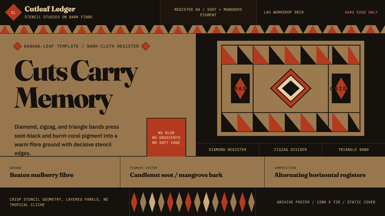 Fijian Masi (Bark Stencil)Stencil memory stays sharp. Soot black and burnt coral strike bark-fibre band…模板记忆锋利:烟黑与焦珊瑚红压入树皮纤维横带。
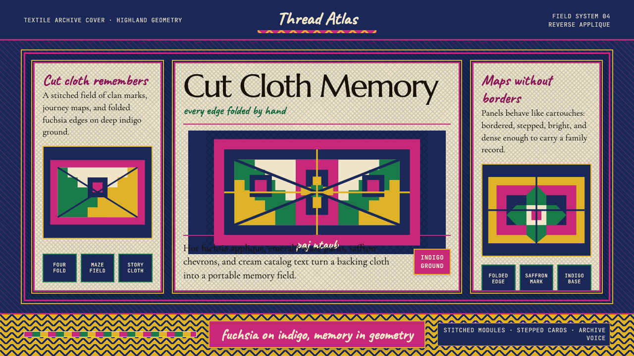 Hmong Paj Ntaub (Flower Cloth)Memory is geometric. Fuchsia applique on indigo forms stepped maze panels.记忆是几何的:靛蓝底上桃红贴花,组成阶梯迷宫面板。
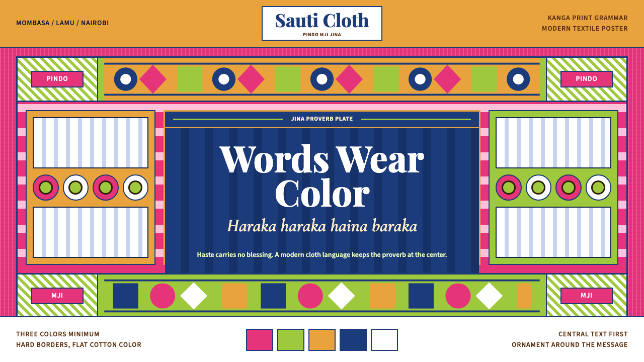 Kenyan Kanga PrintText speaks first. Hot pink ground, lime pindo border, indigo italic proverb…文字先发声:热粉底、青柠边框、靛蓝斜体谚语板。
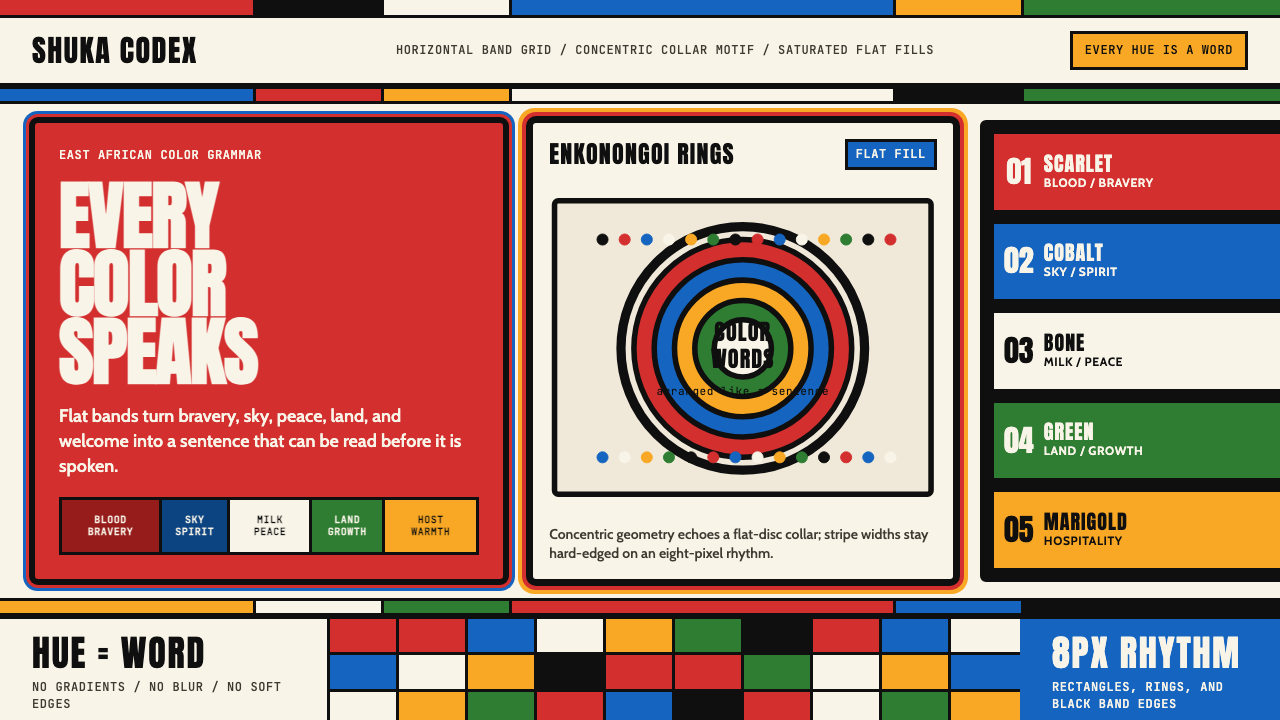 Maasai Shuka & BeadworkColor becomes language. Scarlet bands, cobalt panels, and concentric bead rin…色彩即语言:绯红横带、钴蓝面板与同心珠环共同编码。