What is Maasai Shuka & Beadwork?什么是 Maasai Shuka & Beadwork?
Among the world's color-coded visual systems, Maasai shuka cloth and beadwork stand apart — every hue a word, every geometric arrangement a sentence carrying age, lineage, and ceremony.在世界上所有色彩编码的视觉体系中,马赛族舒卡布与珠饰独树一帜——每种颜色是一个词,每种几何排列是一句话,承载着年龄、世系与仪式。
Maasai Shuka & Beadwork in briefMaasai Shuka & Beadwork 速览
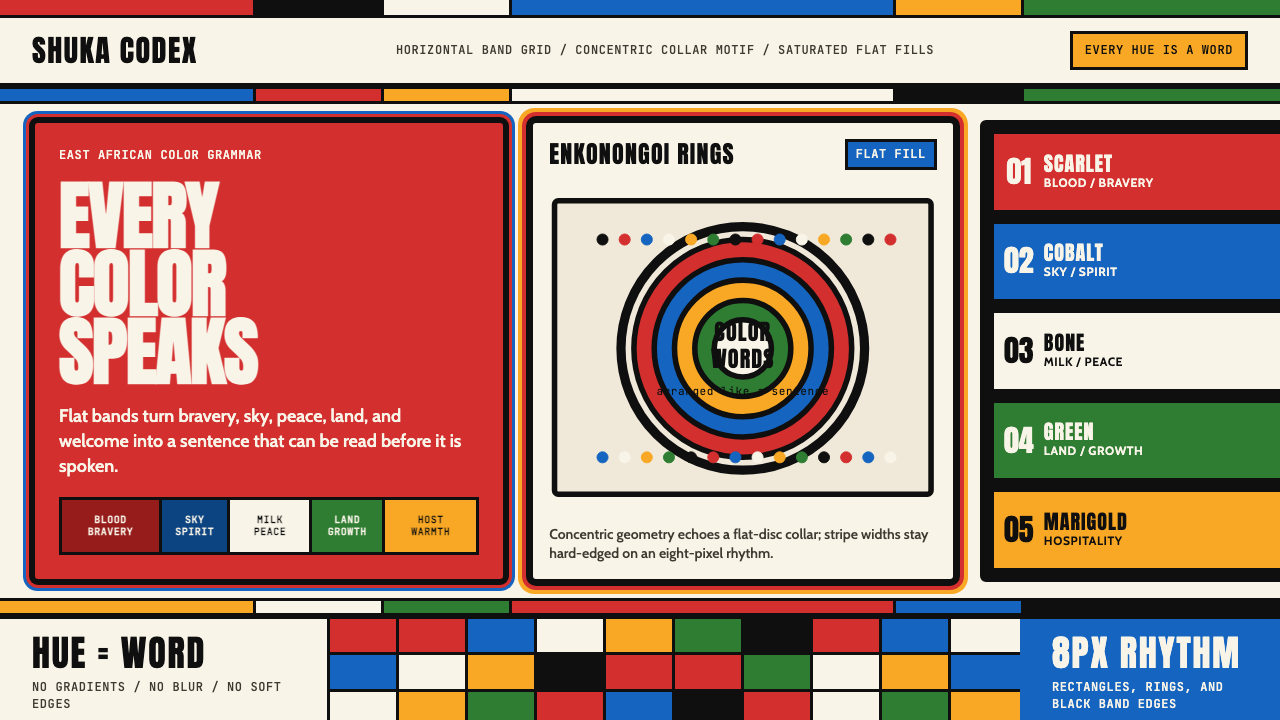
Maasai shuka and beadwork constitute one of the most legible and semantically precise visual systems in the world. Unlike decorative traditions where color choice is primarily aesthetic, every hue in the Maasai palette carries a fixed, community-agreed meaning: red speaks of blood and bravery, blue represents the sky and the divine, white evokes peace and the nourishment of milk, green stands for the land that sustains the herds, and yellow signals hospitality and fertility. These meanings are not metaphorical suggestions — they are established vocabulary, as fixed as letters in an alphabet.马赛族舒卡与珠饰构成了世界上最清晰、语义最精确的视觉体系之一。与色彩选择主要出于审美的装饰传统不同,马赛色板中的每种颜色都承载着固定的、经社群共同约定的含义:红色意味着血液与勇气,蓝色代表天空与神灵,白色唤起和平与牛奶的滋养,绿色象征养育牛群的大地,黄色传达好客与丰饶。这些含义不是隐喻性的暗示,而是如同字母表中的字母一样固定的词汇。
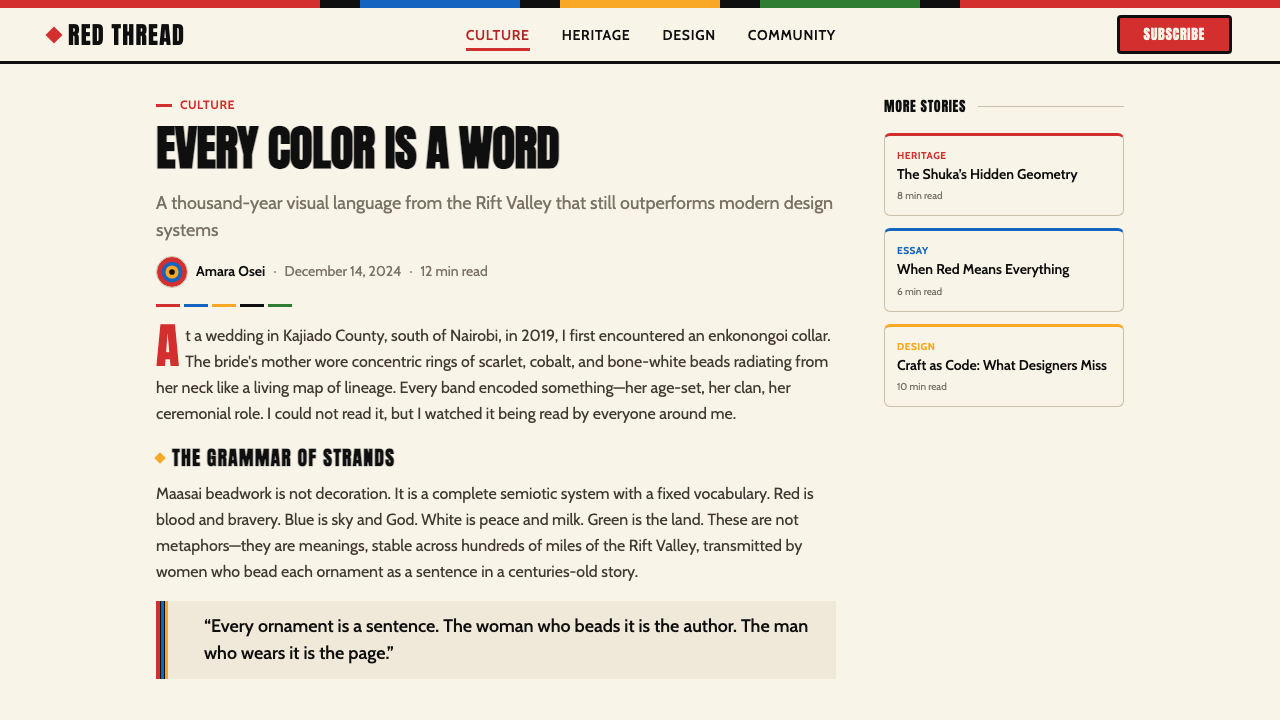
The woven shuka — a rectangular cloth worn draped over one or both shoulders — is the garment form that carries this palette in its most public and immediately visible expression. Traditionally woven in strong horizontal bands and bold check patterns, the shuka's geometry derives from the practical constraints of East African pastoral life: flat, durable, highly visible across open savanna. The beadwork tradition, practiced primarily by women within age-set collectives, extends this system into jewelry: flat-disc collars called enkonongoi, stacked bracelets, headbands, and earrings that communicate a woman's marital status, age-grade, and community affiliation through the specific arrangement and proportion of colored beads.织造而成的舒卡——一块披挂于单肩或双肩的矩形布料——是这套色板在公共场合最直接可见的表达形式。舒卡传统上以强烈的水平带状和粗犷的格纹图案织成,其几何形式源于东非游牧生活的实际需求:平展、耐用、在开阔的草原上具有高度可视性。珠饰传统主要由年龄组中的女性集体实践,将这套体系延伸至首饰领域:名为恩科农戈伊的平盘项圈、层叠手镯、头带和耳饰,通过彩色珠子的具体排列与比例,传递女性的婚姻状况、年龄等级和社群归属。
As a design vocabulary for contemporary digital work, this tradition offers something rare: a complete color-meaning system with geometric rigor already built in. The visual grammar is one of hard edges, flat saturated fills, horizontal banding, and concentric ring motifs — all derived directly from the textile and beadwork forms. Gradients, soft shadows, and organic curves have no place in this vocabulary. The result is a visual language that is simultaneously ancient, encyclopedic, and strikingly modern in its geometric clarity.作为当代数字设计的视觉词汇,这一传统提供了罕见的东西:一套已内置几何严谨性的完整色彩-意义系统。其视觉语法由硬边、平涂饱和色、水平带状结构和同心环形母题构成——全部直接源自织物与珠饰形式。渐变、柔和阴影和有机曲线在这套词汇中没有立足之地。其结果是一套视觉语言,既古老、百科全书式,又在几何清晰度上显得惊人地现代。
See the Maasai Shuka & Beadwork design system查看 Maasai Shuka & Beadwork 完整设计系统
Where does Maasai Shuka & Beadwork come from?Maasai Shuka & Beadwork 从何而来?
The Maasai are a Nilotic people whose ancestors migrated southward from the Nile Valley region into the Great Rift Valley area of East Africa over several centuries, with significant settlement of what is now southern Kenya and northern Tanzania — encompassing the Kajiado and Narok counties and the Arusha and Manyara regions of Tanzania — established by roughly the seventeenth and eighteenth centuries. They developed as a semi-nomadic pastoral society organized around cattle herding, and their material culture — including dress, jewelry, and body adornment — evolved to serve the social requirements of a community constantly on the move, where portable visual markers of identity, status, and ceremony were essential.马赛族是尼罗特人,其祖先历经数百年从尼罗河谷地区向南迁徙至东非大裂谷地带,大约在十七至十八世纪在如今的肯尼亚南部和坦桑尼亚北部——包括卡贾多县、纳罗克县以及坦桑尼亚的阿鲁沙和曼亚拉地区——形成了稳定的定居格局。他们发展成为一个围绕牧牛组织的半游牧牧业社会,其物质文化——包括服装、首饰和身体装饰——演变为服务于一个不断迁徙的社群的社会需求,在这样的社群中,可携带的身份、地位与仪式的视觉标识至关重要。
Beads entered Maasai material culture through the extensive trade networks of the Swahili coast. Glass and ceramic beads — originally from Venice, Bohemia, and later from South Asia and Japan — reached the interior of East Africa via Swahili-speaking merchants along the Indian Ocean trade routes. By the nineteenth century, Maasai beadwork had absorbed and transformed these imported materials into a highly codified local tradition. The color-meaning assignments that define the system — red for bravery, blue for the sky and God, white for peace and milk, green for land, yellow for hospitality — appear to have stabilized into broadly agreed community conventions during the nineteenth and twentieth centuries, though some color associations have deeper roots in pre-colonial pastoral symbolism.珠子通过斯瓦希里海岸广泛的贸易网络进入马赛族的物质文化。玻璃和陶瓷珠子——最初来自威尼斯、波西米亚,后来来自南亚和日本——经由斯瓦希里语商人沿印度洋贸易路线进入东非内陆。到十九世纪,马赛族珠饰已将这些进口材料吸收并转化为一套高度规范化的本地传统。界定这套体系的色彩-意义对应关系——红色象征勇气,蓝色代表天空与神灵,白色意味和平与牛奶,绿色是大地,黄色表达好客——似乎在十九至二十世纪间逐渐固化为广泛认可的社群惯例,尽管部分色彩关联在前殖民时代的游牧象征体系中具有更深的根基。
The shuka cloth's characteristic check and stripe patterns have roots in trade cloth traditions, with the bold red-and-blue or red-and-white check patterns that became most iconic emerging as commercially woven blankets became available and were adopted and adapted into Maasai dress. The shuka is not a garment of pure pre-colonial origin but rather a living tradition that absorbed external materials while maintaining internal meaning. This capacity for absorption without loss of semantic precision is one of the tradition's most remarkable characteristics.舒卡布的格纹和条纹图案有其贸易布料传统的渊源,最具标志性的大胆红蓝或红白格纹,是在商业机织毯布进入流通后被采纳并改造进入马赛服饰的。舒卡并非纯粹的前殖民地起源服装,而是一种在维持内部意义的同时吸收外部材料的活态传统。这种在不丧失语义精确性的前提下进行吸收的能力,是这一传统最值得关注的特征之一。
Age-grade systems — which organize Maasai society into cohorts of men and women who move through defined life stages together — are the primary social mechanism that gives beadwork its communicative precision. Women's age-set beadwork collectives are responsible for producing the jewelry that marks transitions between life stages: a girl's beadwork differs from that of a newly initiated woman, which differs again from that of a married woman or an elder. The enkonongoi collar, worn as a flat disc of concentric colored rings, is one of the most visually distinctive expressions of this system, with its ring structure encoding social information through color sequence and proportion. In more recent decades, designers including Anyango Mpinga and the studio Pichulik have worked with Maasai beadwork traditions to develop contemporary jewelry and fashion that honor the geometric and chromatic logic of the source material while engaging global design conversations.年龄等级制度——将马赛社会组织为共同经历固定人生阶段的男女同伴群体——是赋予珠饰交流精确性的主要社会机制。女性年龄组珠饰集体负责制作标志人生阶段转变的首饰:女孩的珠饰有别于新近经过成年礼的女性,后者又有别于已婚女性或长老。名为恩科农戈伊的项圈以同心彩环构成的平盘形式佩戴,是这套体系最具视觉辨识度的表达之一,其环形结构通过色彩顺序与比例编码社会信息。近几十年来,包括安扬戈·姆宾加和工作室Pichulik在内的设计师已开始与马赛珠饰传统合作,在尊重源材料几何与色彩逻辑的同时参与全球设计对话。
What defines the Maasai Shuka & Beadwork look?Maasai Shuka & Beadwork 的视觉特征是什么?
Saturated Flat Color饱和平涂色彩
Every color in the Maasai palette is applied at maximum saturation with no gradation, tinting, or shading. The fills are absolute: a band of red is fully red from edge to edge, a bead of cobalt blue is uniform across its entire surface. This flatness is not a simplification — it is a requirement of the semantic system, because gradients would introduce ambiguity into what is designed to be an unambiguous code. In digital application, this means fills should be pure and undiluted, with no atmospheric haze or glow effects blending one color into another.马赛色板中的每种颜色都以最大饱和度平涂,没有渐变、淡化或明暗处理。填充是绝对的:一条红色带从边到边都是完整的红色,一颗钴蓝珠子在整个表面是均匀一致的。这种平涂并非简化——它是语义系统的要求,因为渐变会在一套本为消除歧义而设计的符码中引入模糊性。在数字应用中,这意味着填充应当纯粹、不经稀释,没有将一种颜色融入另一种颜色的大气朦胧感或发光效果。
Horizontal Banding水平带状结构
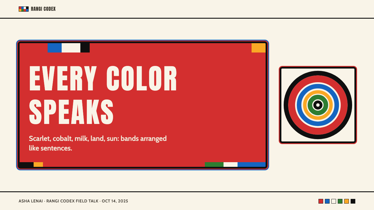
The shuka's most fundamental compositional unit is the horizontal band — a full-width stripe of solid color that stacks with other bands to form the complete textile. This orientation is not arbitrary: it follows the natural drape of cloth across the body, the horizon line of the open landscape, and the practical logic of a loom. In design application, horizontal banding means organizing layouts into stacked full-width registers rather than modular cards or scattered elements. Each register can carry one dominant color and one information function, creating pages that read from top to bottom with the same clarity that a shuka reads from collar to hem.舒卡最基本的构图单位是水平带——一条贯穿全幅的纯色条纹,与其他条纹叠加形成完整的织物。这种方向性并非任意的:它遵循布料横跨身体的自然垂落、开阔地景的地平线,以及织机的实践逻辑。在设计应用中,水平带状意味着将布局组织为层叠的全宽寄存器,而非模块化卡片或散布的元素。每个寄存器可承载一种主导色彩和一种信息功能,创造出从上至下阅读如同舒卡从领口到下摆一样清晰的页面。
Concentric Ring Motif同心环形母题
The enkonongoi collar — the flat circular beadwork disc worn around the neck — is built from concentric rings of alternating colors, each ring encoded with social meaning through its hue and its position relative to the center and the outer edge. This radial structure translates directly into circular design elements: progress indicators, data visualizations, icon frames, and decorative borders that work outward from a center. The key discipline is that the rings must be clearly distinct — each ring reads as a separate band, not as a gradient transition. The concentric form should feel architectural rather than decorative.恩科农戈伊项圈——佩戴于颈部的平圆形珠饰盘——由交替色彩的同心环构成,每个环通过其色调及其相对于圆心和外缘的位置编码社会含义。这种放射状结构直接转化为圆形设计元素:进度指示器、数据可视化、图标框架和装饰边框,均从圆心向外延展。关键的约束是环必须清晰区分——每个环读起来是独立的带状,而非渐变过渡。同心形式应当给人建筑感而非装饰感。
Semantic Color Assignment语义化色彩分配
What makes this system unusual among world textile traditions is that its colors are not chosen for visual harmony or regional taste — they are chosen for what they mean. Red communicates blood, sacrifice, and bravery. Blue addresses the divine and the sky. White carries peace, purity, and milk. Green speaks of land, sustenance, and growth. Yellow conveys warmth, hospitality, and sun. In digital application, this means each color should be assigned a consistent role — one color for calls to action, one for informational elements, one for status indicators — rather than being deployed interchangeably for visual variety. The meaning should be stable across the entire system.使这套体系在世界织物传统中显得不寻常的,是其色彩并非因视觉和谐或地域喜好而选择——它们因其含义而被选择。红色传达血液、牺牲与勇气。蓝色指向神圣与天空。白色承载和平、纯洁与牛奶。绿色言说大地、滋养与生长。黄色传递温暖、好客与阳光。在数字应用中,这意味着每种颜色应被分配一个固定角色——一种颜色用于行动召唤,一种用于信息性元素,一种用于状态指示——而不是为了视觉多样性而交替使用。含义应当在整个系统中保持稳定。
Hard Geometric Edges硬边几何轮廓
Beadwork and woven textiles share one structural property: their edges are always hard. A bead ends where the thread holds it; a woven stripe ends where the weft changes color. There are no feathered boundaries, no blended transitions, no soft zones of influence between one color region and the next. In digital translation, this means borders between color blocks should be sharp and precise — a thin dividing line or an abrupt color change, never a gradient buffer zone. Rounded corners should be used with restraint; the geometry of this tradition is rectangular and circular, not soft-edged or pill-shaped.珠饰与编织织物共享一种结构性质:它们的边缘始终是硬边。一颗珠子在线绳固定处结束;一条织纹条纹在纬线换色处结束。在一个色彩区域与下一个之间,没有羽化边界,没有混合过渡,没有柔和的影响区。在数字转化中,这意味着色块之间的边界应当锐利精准——一条细分割线或突然的颜色变化,绝不是渐变缓冲区。圆角应当节制使用;这一传统的几何形式是矩形与圆形,而非软边或药片形。
Check and Grid Pattern格纹与网格图案
The shuka's check pattern — created by the intersection of differently colored warp and weft threads — produces a regular grid of color blocks that is one of the most recognizable elements of Maasai visual identity. In this pattern, every cell is equal in size, every color is equally saturated, and the overall rhythm is relentlessly regular. In design work, this translates to a disciplined grid where column widths and row heights follow a consistent ratio, and where variations in content are contained within identical structural cells rather than allowed to break the container.舒卡的格纹——由不同颜色的经线与纬线交织产生——形成规则的色块网格,是马赛视觉身份最具辨识度的元素之一。在这种图案中,每个格子大小相等,每种颜色饱和度相同,整体节奏不断重复。在设计工作中,这转化为一种严格的网格:列宽和行高遵循一致的比例,内容的变化被包含在相同的结构单元内,而不是被允许打破容器。
No Gradient, No Ornament无渐变,无装饰
The Maasai visual tradition produces objects — beads, cloth, leather — that are entirely flat, entirely saturated, and entirely without decorative embellishment that does not carry semantic weight. There are no flourishes, no filigree, no softening effects. The beads do not glow; the cloth does not shimmer in its representation. When translated into screen design, this principle means rejecting drop shadows intended to suggest depth, rejecting gradient fills intended to suggest luminosity, and rejecting decorative elements — botanical motifs, abstract textures, subtle patterns — that have no role in the system's communication logic. Every element that appears on the screen should be there because it means something.马赛视觉传统生产的对象——珠子、布料、皮革——完全平涂、完全饱和,完全没有不承载语义重量的装饰点缀。没有花饰,没有细丝,没有柔化效果。珠子不发光;布料在其再现中不闪烁。转化为屏幕设计时,这一原则意味着拒绝旨在暗示深度的投影阴影,拒绝旨在暗示发光性的渐变填充,以及拒绝在系统交流逻辑中没有任何角色的装饰性元素——植物母题、抽象纹理、微妙图案。屏幕上出现的每个元素都应该在那里,因为它意味着某些东西。
See the Maasai Shuka & Beadwork design system查看 Maasai Shuka & Beadwork 完整设计系统
Who shaped Maasai Shuka & Beadwork?谁塑造了 Maasai Shuka & Beadwork?
The primary custodians and innovators of the beadwork tradition are not individual named artists but the age-set collectives — groups of women of the same approximate generation who learn, practice, and transmit beadwork knowledge together. Within these collectives, color choices, bead arrangements, and collar construction techniques are taught, debated, and refined across generations. The collectives function as both quality-control institutions and living archives of social knowledge, ensuring that the semantic content of each beadwork piece remains legible to community members across different regions and generations. Their anonymous, collective authorship is itself a design principle: the system's meaning derives from community consensus, not individual invention.珠饰传统的主要守护者与创新者不是有名有姓的个人艺术家,而是年龄组集体——由大致同代女性组成的群体,她们一起学习、实践并传承珠饰知识。在这些集体中,色彩选择、珠子排列和项圈制作技艺跨代教授、讨论和精炼。这些集体既是质量控制机构,也是社会知识的活态档案,确保每件珠饰作品的语义内容对不同地区和世代的社群成员保持清晰可读。她们匿名的集体著作权本身就是一种设计原则:系统的意义来自社群共识,而非个人发明。
Anyango Mpinga is a Kenyan-born, internationally active fashion designer whose work has directly engaged with Maasai and broader East African textile and beadwork traditions. Working across ready-to-wear and couture contexts, Mpinga has brought the color logic and geometric vocabulary of Maasai visual culture into contemporary fashion in ways that acknowledge the tradition's cultural specificity while projecting it onto global platforms. Her work is notable for treating the beadwork color system as a living design language rather than an ethnographic reference — using the semantic color assignments as active organizational principles in contemporary garment construction.安扬戈·姆宾加是一位出生于肯尼亚、活跃于国际的时装设计师,其作品直接与马赛及更广泛的东非织物与珠饰传统进行对话。在成衣与高级定制语境中工作,姆宾加将马赛视觉文化的色彩逻辑与几何词汇带入当代时装,在承认传统文化特殊性的同时将其投射到全球平台上。她的工作值得关注之处在于将珠饰色彩系统视为活态设计语言而非民族志参考——将语义化色彩分配作为当代服装构造的主动组织原则加以运用。
Pichulik is a Cape Town-based jewelry and accessories studio founded by Katherine-Mary Pichulik, whose practice draws explicitly on African beadwork traditions — including Maasai beadwork — to develop bold, wearable geometric jewelry in rope, bead, and textile combinations. The studio's work demonstrates how the concentric ring structures, saturated flat color logic, and hard geometric forms of beadwork traditions can be translated into contemporary product design without losing the visual authority that comes from a coherent underlying system. Pichulik's pieces are widely cited in conversations about how African design traditions can inform global contemporary aesthetics.Pichulik是一家总部位于开普敦的首饰与配饰工作室,由凯瑟琳-玛丽·皮丘利克创立,其实践明确借鉴非洲珠饰传统——包括马赛珠饰——以绳索、珠子和织物的组合开发大胆、可穿戴的几何首饰。工作室的作品展示了珠饰传统的同心环结构、饱和平涂色彩逻辑和硬边几何形式如何在不失去一套连贯底层系统所赋予的视觉权威性的情况下被转化为当代产品设计。Pichulik的作品在有关非洲设计传统如何影响全球当代美学的讨论中被广泛引用。
The material history of Maasai beadwork cannot be told without the Indian Ocean trade networks centered on the Swahili coast. From roughly the ninth century onward, Swahili-speaking merchants acted as intermediaries between Indian Ocean trading partners — including Arab, Indian, and later European traders — and the East African interior. Glass beads manufactured in Venice, Bohemia, and later in South Asia and Japan flowed inland through these networks and were adopted by interior communities including the Maasai, who transformed imported trade goods into the raw material of an entirely local semantic system. The tradition's capacity to absorb external materials without losing internal coherence is one of the defining characteristics of its design intelligence.马赛珠饰的物质史离不开以斯瓦希里海岸为中心的印度洋贸易网络。大约从九世纪起,斯瓦希里语商人充当印度洋贸易伙伴——包括阿拉伯、印度以及后来的欧洲商人——与东非内陆之间的中间人。在威尼斯、波西米亚以及后来在南亚和日本制造的玻璃珠子通过这些网络流入内陆,被包括马赛族在内的内陆社群采用,后者将进口贸易商品转化为一套完全本地语义系统的原材料。这一传统在不失去内部连贯性的情况下吸收外部材料的能力,是其设计智慧最具决定性的特征之一。
How do you use Maasai Shuka & Beadwork today?今天怎么用 Maasai Shuka & Beadwork?
Maasai Shuka and Beadwork is a design system built on semantic precision rather than aesthetic mood, which makes it one of the more disciplined historical styles to apply in contemporary digital work. Getting it right requires understanding the color system as a system — assigning each hue a fixed communicative role and maintaining that assignment consistently across every surface and element. The visual effect is immediate and high-contrast: users will notice the palette before they notice anything else about the layout, so the palette must be doing real communicative work rather than simply creating visual interest.马赛舒卡与珠饰是一套建立在语义精确性而非审美情绪之上的设计系统,这使其成为当代数字工作中需要更多约束才能正确应用的历史风格之一。正确应用它需要将色彩系统理解为一个系统——为每种色调分配固定的交流角色,并在每个界面和元素上始终如一地维持这种分配。视觉效果是直接而高对比度的:用户会在注意到布局其他任何东西之前注意到色板,因此色板必须承担真实的交流工作,而不仅仅是制造视觉趣味。
For presentation slides, the style excels on both cover and content pages but demands different approaches to each. A cover slide benefits from treating the full surface as a shuka composition: stacked horizontal bands of two or three colors, with the title placed as a white or black text block within the dominant band. No photographic background, no gradient overlay — just flat registers of saturated color with type placed at high contrast within one band. Content slides should commit to the horizontal register logic: one band per major information category, with the band color indicating the category type (red for warnings or critical data, blue for contextual information, green for growth metrics, yellow for opportunities). Data slides work exceptionally well: bar charts rendered as geometric blocks in the primary colors, with consistent color-to-category assignments across the entire deck.在演示文稿中,这种风格在封面页和内容页上都表现出色,但对两者需要不同的处理方式。封面幻灯片适合将整个表面视为一幅舒卡构图:两到三种颜色的叠加水平带状,标题作为白色或黑色文本块置于主导色带内。没有摄影背景,没有渐变叠加——只是饱和色的平涂寄存器,文字以高对比度置于其中某条带内。内容幻灯片应遵循水平寄存器逻辑:每个主要信息类别一条带,带状颜色指示类别类型(红色用于警告或关键数据,蓝色用于上下文信息,绿色用于增长指标,黄色用于机会点)。数据幻灯片效果尤为出色:以主色渲染的几何色块形式呈现的柱状图,在整个演示文稿中保持一致的颜色-类别对应关系。
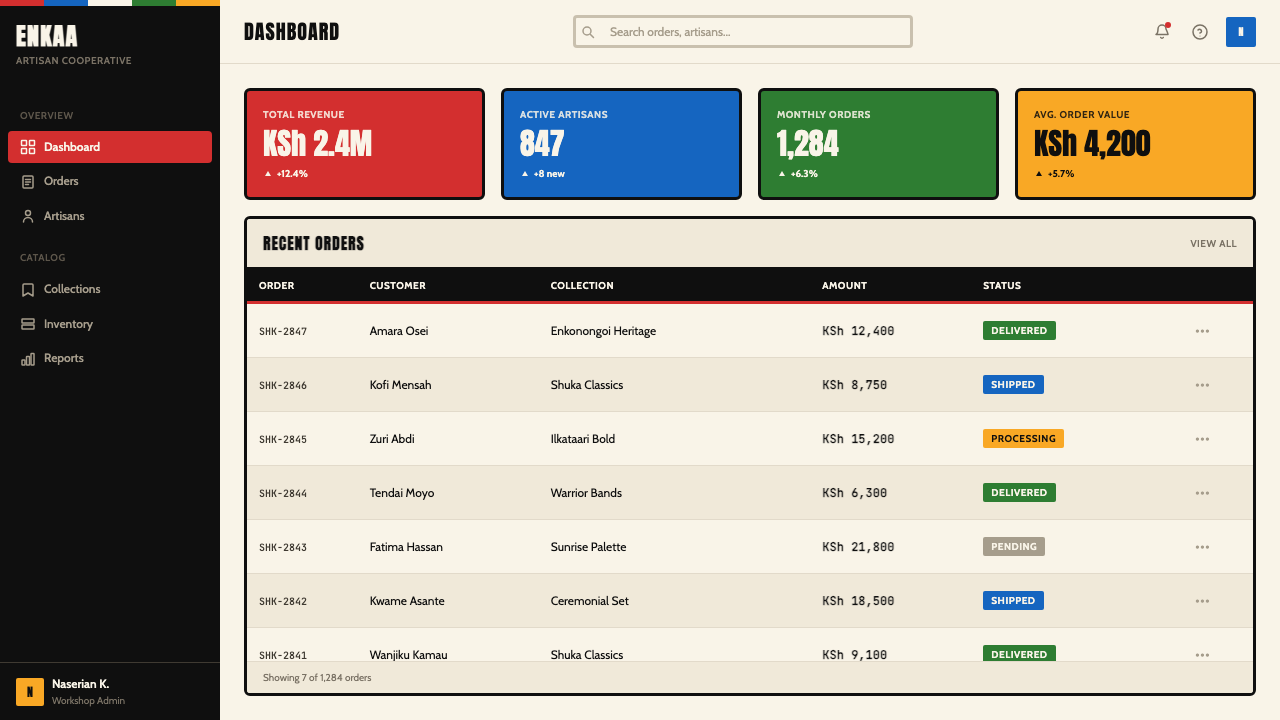
For web user interfaces, dashboards and pricing pages are the natural home of this vocabulary. The approach begins with defining a strict horizontal grid — the page organized into full-width sections that stack like shuka bands rather than into a field of floating cards. Navigation should be typographically clean with color reserved for active states. Dashboard components work best when data categories map to specific colors from the palette, and those mappings are stated explicitly in a legend that respects the geometric precision of the tradition. Pricing tiers can use one color per tier, applied as a full-width band behind the tier name and carried through into the call-to-action button and any highlighted features. Hard borders replace soft-shadow cards; solid backgrounds replace frosted glass or blur effects.对于网页用户界面,仪表板和定价页面是这套词汇最自然的归宿。方法从定义严格的水平网格开始——页面组织为像舒卡条带一样叠加的全宽区段,而非漂浮卡片的场域。导航应当在字体上干净,颜色保留给活跃状态。当数据类别映射到色板中的特定颜色,且这些映射在尊重传统几何精确性的图例中明确说明时,仪表板组件效果最佳。定价等级可以每个等级使用一种颜色,作为全宽带应用于等级名称后方,并延伸到行动召唤按钮和任何突出显示的特性上。硬边框替代软阴影卡片;实色背景替代磨砂玻璃或模糊效果。
For editorial and marketing work, the vocabulary supports strong visual hierarchy and immediate readability at a distance — qualities that made shuka patterns legible across open savanna are equally useful in digital advertising and editorial layout. Full-width color bands alternating between two or three hues from the palette create a reading rhythm that feels organized rather than monotonous. Marketing pages work well with large typographic statements placed within colored bands — white type on a red band for a hero statement, black type on a white or cream band for body content, a yellow band for a featured testimonial or call-to-action section. The geometric precision of concentric rings makes excellent candidates for icons, loading indicators, and section markers: a series of concentric circles in alternating palette colors reads immediately as a Maasai-derived motif while remaining completely functional as a UI element.对于编辑和营销工作,这套词汇支持强烈的视觉层级和远距离的即时可读性——使舒卡图案在开阔草原上清晰可见的品质,在数字广告和编辑版面中同样有用。交替使用色板中两到三种色调的全宽色带,创造出有组织感而非单调感的阅读节奏。营销页面适合将大型排版声明置于彩色带内——红色带上的白色文字用于主角声明,白色或奶油色带上的黑色文字用于正文内容,黄色带用于特色证言或行动召唤区段。同心环的几何精确性使其成为图标、加载指示器和区段标记的绝佳选择:交替色板颜色的一系列同心圆既立刻被解读为源自马赛的母题,又作为界面元素完全实用。
A common mistake when applying this style is using all five palette colors simultaneously across a single surface without assigning them stable roles. In authentic Maasai beadwork, color combinations within a single piece are deliberate and rule-governed — not every bead color appears in every collar. In digital application, selecting two or three colors as primary working colors and reserving the remaining palette colors for specific exceptions (alerts, highlights, interactive states) produces far more coherent results than attempting to deploy the full chromatic range everywhere. A second common error is softening the system with gradients or rounded elements out of an instinct to make it feel more contemporary or approachable. The authority of this visual tradition comes precisely from its refusal to soften, and that authority is what the style offers to the products that use it.应用这种风格时最常见的错误是在单个界面上同时使用全部五种色板颜色而不为它们分配稳定角色。在真实的马赛珠饰中,单件作品内的色彩组合是有意而规则性的——并非每种珠子颜色都出现在每个项圈中。在数字应用中,选择两到三种颜色作为主要工作色,将其余色板颜色保留给特定例外(警报、突出显示、交互状态),比尝试在每个地方都部署完整色彩范围产生远更连贯的结果。第二个常见错误是出于让系统感觉更当代或更平易近人的本能,用渐变或圆形元素来软化系统。这套视觉传统的权威性恰恰来自其拒绝软化,而这种权威性正是这种风格为使用它的产品所提供的东西。
See the Maasai Shuka & Beadwork design system查看 Maasai Shuka & Beadwork 完整设计系统
Maasai Shuka & Beadwork — FAQMaasai Shuka & Beadwork · 常见问题
Is this style appropriate for non-African products and brands, or does it risk cultural appropriation?这种风格适合非非洲产品和品牌吗?使用它是否有文化挪用的风险?
The distinction that matters most is between appropriation and informed application. Using Maasai visual vocabulary without acknowledgment, stripping it of meaning, or deploying it as mere exotic decoration is appropriation. Applying it as a design system with an understanding of what each element communicates — and presenting it to users with that context — is something different. The Curio framework treats this tradition as a design system with specific structural properties, not as a surface aesthetic for borrowing. Designers using it should be prepared to acknowledge the source tradition and should avoid applications that flatten the semantic content of the color system into pure decoration. The style works best for products whose values align with the tradition's core qualities: clarity, communal legibility, and the principle that every visual element carries meaning.最重要的区分在于挪用与有知情的应用之间的差别。在不加承认的情况下使用马赛视觉词汇、剥离其意义、或将其作为纯粹的异域装饰来部署,是挪用。将其作为设计系统应用——理解每个元素传达什么,并在向用户呈现时携带这种背景——是另一回事。Curio框架将这一传统视为具有特定结构性质的设计系统,而非可供借用的表面美学。使用它的设计师应准备好承认源传统,并应避免将色彩系统的语义内容压平为纯装饰的应用。这种风格最适合其价值观与传统核心品质相一致的产品:清晰度、社群可读性,以及每个视觉元素都承载意义的原则。
Can this style work on a dark background, or is a light ground required?这种风格能在深色背景上使用吗?还是必须用浅色底面?
The tradition itself is neutral on this question — shuka cloth exists on cream, white, and occasionally dark grounds depending on the dye used for the base fabric, and beadwork is often set against dark leather. A dark-ground application is entirely viable, but it requires reassigning the roles of white and black within the palette. On a dark ground, white becomes a high-visibility accent color rather than a neutral base, which shifts its semantic weight considerably. The discipline required on a dark ground is greater: with all five primary palette colors potentially appearing at high contrast against dark, the risk of chromatic overload increases sharply. A practical approach is to commit to one or two palette colors as foreground elements and treat the dark ground as the background register, reserving the full palette for accent and data roles only.这一传统本身对这个问题保持中立——舒卡布存在于奶油色、白色以及偶尔的深色底面上,具体取决于底布使用的染料,而珠饰通常镶嵌在深色皮革上。深色底面应用完全可行,但需要重新分配色板中白色和黑色的角色。在深色底面上,白色成为高可见度强调色而非中性底色,这相当程度地改变了其语义重量。深色底面上需要更大的约束:五种主要色板颜色都可能以高对比度出现在深色背景上,色彩过载的风险急剧增加。一种实用方法是将一两种色板颜色作为前景元素,将深色底面视为背景寄存器,仅将完整色板保留用于强调和数据角色。
How do I handle typography within this system — does it have a specific type style?在这套系统中如何处理字体排印——它有特定的字体风格吗?
The tradition itself is non-typographic — Maasai visual culture does not have a historic script or typographic system that can be directly translated. What the tradition does supply is a set of compositional principles that constrain type choices: high contrast between text and ground, clear and unambiguous letterforms, and text that functions as a visual block within the horizontal register system rather than as flowing prose. In practice, this points toward geometric sans-serif typefaces that share the tradition's formal qualities — faces whose characters are constructed from simple curves and straight lines, set in strong size contrasts to establish hierarchy, and placed within colored bands rather than on complex textured backgrounds. Avoid typefaces with pronounced calligraphic variation or high stroke contrast — these qualities belong to different visual traditions and will compete with the beadwork vocabulary's flatness.这一传统本身不涉及字体排印——马赛视觉文化没有可以直接转化的历史文字或排版系统。传统确实提供了一套约束字体选择的构图原则:文字与底面之间的高对比度,清晰无歧义的字形,以及在水平寄存器系统中作为视觉块而非流动散文运作的文字。在实践中,这指向与传统形式品质共通的几何无衬线字体——字符由简单曲线和直线构成的字型,以强烈的尺寸对比设置以建立层级,并置于彩色带内而非复杂纹理背景上。避免具有明显书法变化或高笔画对比度的字体——这些品质属于不同的视觉传统,会与珠饰词汇的平涂性质相竞争。
What is the difference between this style and other African textile-inspired design systems?这种风格与其他受非洲织物启发的设计系统有什么区别?
African textile traditions are enormously diverse, and the visual systems they generate are correspondingly distinct. Kente cloth from Ghana is characterized by narrative strip-weaving with complex multi-color sequences and symbolic patterns that encode royal and social histories — its geometry is narrower and its color logic more complex. West African wax-print (ankara) traditions use curvilinear, high-density pattern repeats that are the visual opposite of Maasai flatness and horizontal banding. Ndebele geometric painting from southern Africa uses bold angular forms and strong color blocks but on an architectural rather than textile surface. What distinguishes the Maasai system specifically is the semantic precision of its five-color palette, the combination of horizontal banding with concentric ring motifs, and the absolute commitment to flat saturated fills with no surface complexity. It is the most directly translatable to digital interfaces precisely because its visual logic most closely resembles the logic of digital color blocks and modular layout grids.非洲织物传统极为多样,它们产生的视觉系统也相应各异。来自加纳的肯特布以叙事性条状编织为特征,具有编码皇室与社会历史的复杂多色序列和象征图案——其几何形式更窄,色彩逻辑更复杂。西非蜡染(安卡拉)传统使用曲线形、高密度图案重复,在视觉上与马赛的平涂和水平带状结构完全相反。南非恩德贝勒几何彩绘使用大胆的角形和强烈的色块,但作用于建筑而非织物表面。马赛系统的独特之处在于其五色色板的语义精确性、水平带状结构与同心环形母题的结合,以及对无任何表面复杂性的平涂饱和色的绝对承诺。它之所以最直接可转化为数字界面,恰恰是因为其视觉逻辑与数字色块和模块化布局网格的逻辑最为接近。
Does this style suit consumer-facing products, or is it better suited to professional tools?这种风格适合面向消费者的产品,还是更适合专业工具?
The style's high-contrast, semantically dense visual language gives it authority and clarity — qualities that map well to professional tools, data platforms, educational content, and any product where users need to parse information quickly and reliably. It can work in consumer contexts, but the products that will benefit most are those where the user relationship is one of trust and clarity rather than emotional warmth. Financial products, health monitoring dashboards, travel planning tools, and productivity applications align well with the style's visual values. It struggles in contexts that require softness, intimacy, or sensory pleasure as the primary emotional register — luxury goods, wellness brands, children's applications, and food experiences are environments where the style's flatness and semantic rigidity can feel cold or inaccessible. The test is whether the product's core value proposition is best expressed through clarity and precision, or through warmth and sensory richness.这种风格的高对比度、语义密集的视觉语言赋予其权威性与清晰度——这些品质很好地映射到专业工具、数据平台、教育内容以及任何用户需要快速可靠地解析信息的产品上。它可以在消费者语境中使用,但受益最多的产品是那些用户关系建立在信任与清晰度而非情感温暖上的产品。金融产品、健康监测仪表板、旅行规划工具和生产力应用与该风格的视觉价值观高度契合。它在需要柔软感、亲密感或感官愉悦作为主要情感基调的场景中表现欠佳——奢侈品、健康品牌、儿童应用和餐饮体验是该风格的平涂性和语义刚性可能让人感到冷漠或难以亲近的环境。判断标准是:产品的核心价值主张是通过清晰度与精确性来最好地表达,还是通过温暖感与感官丰富性来表达。
Related design styles相关设计风格
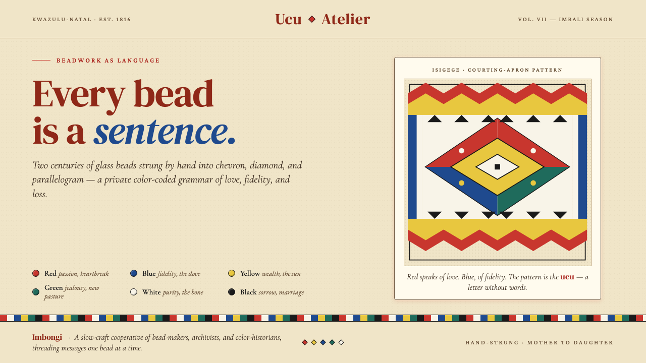 Zulu Beadwork (KwaZulu-Natal)Every bead is a sentence. Saturated glass primaries strung into chevron and d…每一颗珠子都是一句话:饱和玻璃原色在米色帆布上排成 chevron 与菱形——…
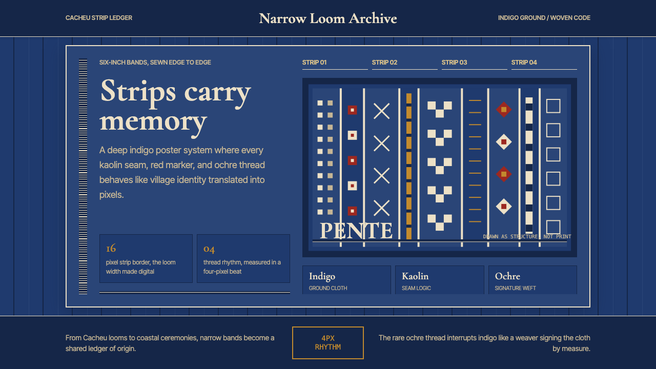 Bissau-Guinean Pano de PenteIndigo remembers. Narrow bands and kaolin seams turn weave grammar into pixel…靛蓝会记忆。窄幅竖带与瓷白缝线,把织纹语法变成像素。
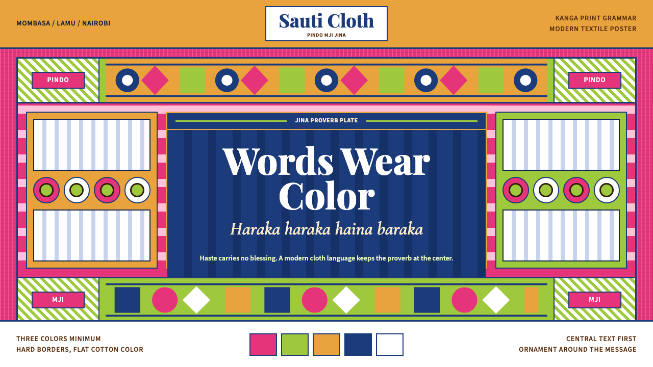 Kenyan Kanga PrintText speaks first. Hot pink ground, lime pindo border, indigo italic proverb…文字先发声:热粉底、青柠边框、靛蓝斜体谚语板。
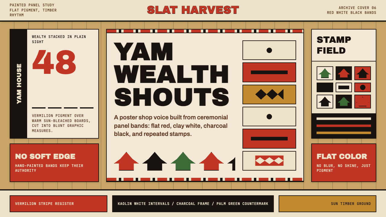 Trobriand Yam House PaintPainted wealth speaks loud. Vermilion bands and black stamp silhouettes hit t…彩绘财富直接发声:木色底上朱红条带与黑色印章剪影。
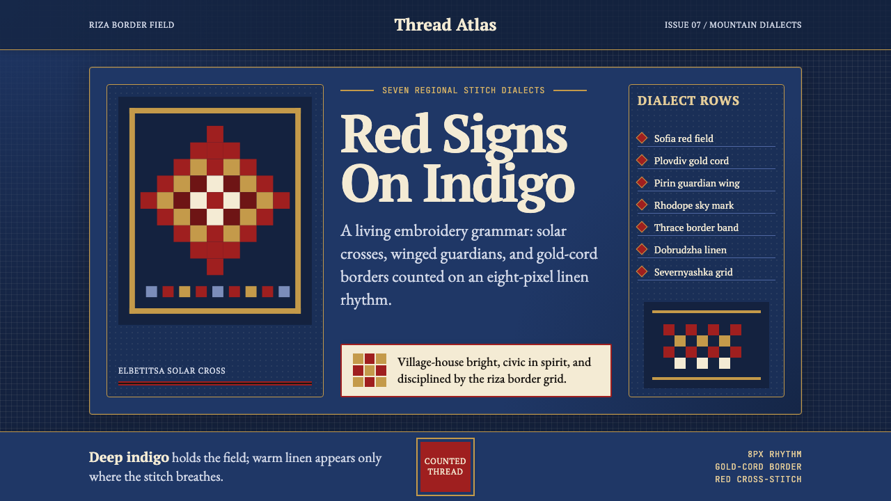 Bulgarian Shevitsa Folk EmbroideryVillage-bright code. Deep indigo carries shevitsa red crosses and gold-cord b…村舍般明亮:深靛蓝承托红色太阳十字与金线边框。
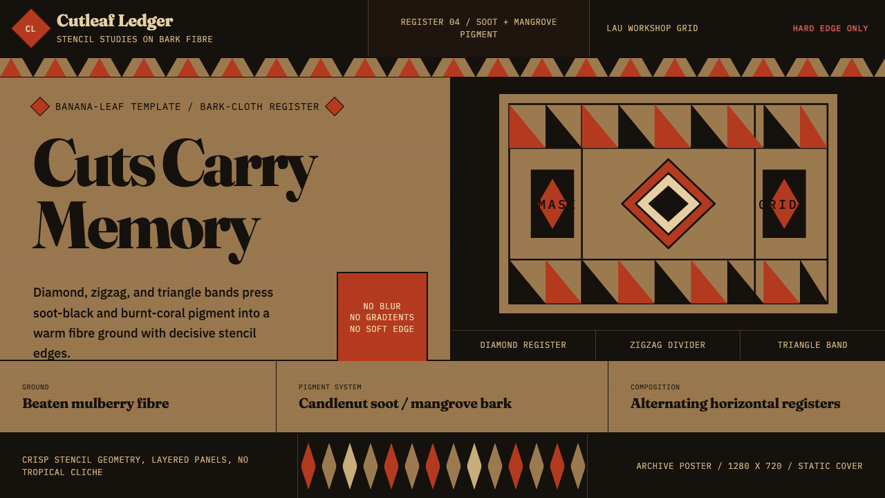 Fijian Masi (Bark Stencil)Stencil memory stays sharp. Soot black and burnt coral strike bark-fibre band…模板记忆锋利:烟黑与焦珊瑚红压入树皮纤维横带。