Design style guide设计风格指南
What is Trobriand Yam House Paint?什么是 Trobriand Yam House Paint?
On the Trobriand Islands, a painted yam house is not decoration — it is a ledger of power, read by every passing canoe.在特罗布里恩群岛,一座彩绘薯屋不是装饰——它是一份权力账簿,每一艘路过的独木舟都能读懂。
Trobriand Yam House Paint in briefTrobriand Yam House Paint 速览
Trobriand Yam House Paint is a bold graphic tradition rooted in the ceremonial architecture of the Trobriand Islands, a coral archipelago in Milne Bay Province, Papua New Guinea. The central artifact is the bwema — a towering, slatted timber structure built to store and display the ceremonial yam harvest. Ownership of yams is political currency here, and the painted facade of the bwema announces the chief's wealth to the whole village.特罗布里恩薯屋彩绘是一套根植于特罗布里恩群岛仪式建筑的粗犷图形传统,该群岛坐落于巴布亚新几内亚米尔恩湾省的珊瑚礁海域。这一传统的核心物件是薯屋(bwema)——一种高耸的板条木塔,专为陈列仪式性的薯芋丰收而建。薯芋的拥有量在这里等同于政治资本,薯屋正面的彩绘图案向全村宣告酋长的财富。
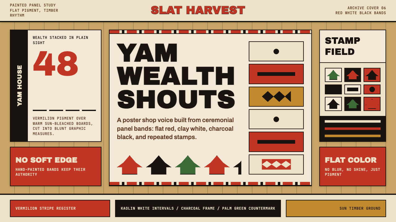
The visual vocabulary is immediately striking: broad horizontal bands of vermilion red and kaolin white march across sun-bleached timber boards, interrupted by stamp-like silhouettes of birds, fish, and geometric forms rendered in deep black. The graphic quality is closer to a woodblock print than to decorative painting — flat, high-contrast, without shadow or gradation. Each motif repeats in a rhythmic sequence that reads from a distance, making the structure a kind of sign that broadcasts status across the open village plaza.这套视觉语言一眼就能认出:朱红与高岭土白的宽阔横向条带横贯日晒褪色的木板,中间点缀着用深黑色绘制的鸟、鱼与几何形印章式剪影。这种图形品质更接近木刻版画而非装饰性绘画——平面、高对比度、无阴影、无渐变。每个母题按节拍重复排列,远距离即可辨读,使整座建筑成为一块向开阔村落广场广播地位的告示牌。
As a contemporary design system, Trobriand Yam House Paint translates these qualities into interface language. It brings the warmth of raw timber tan as a ground, the assertiveness of vermilion as its primary action color, the quiet authority of kaolin white as a secondary field, and deep matte black for structure and typography. The motif logic — stamp, repeat, band — becomes a modular pattern grammar applicable across digital surfaces.作为一套当代设计体系,特罗布里恩薯屋彩绘将上述品质转化为界面语言。它以原木褐黄作为底色带来温度感,以朱红作为主要行动色传递强势感,以高岭土白作为次要底场赋予安静的权威感,以深沉亚光黑处理结构与文字。印章、重复、条带的母题逻辑,演化为一套可应用于各类数字界面的模块化图案语法。
See the Trobriand Yam House Paint design system →查看 Trobriand Yam House Paint 完整设计系统 →
Where does Trobriand Yam House Paint come from?Trobriand Yam House Paint 从何而来?
The Trobriand Islands have been inhabited for thousands of years, and their ceremonial culture was largely unknown to the outside world until the Polish-British anthropologist Bronisław Malinowski arrived for extended fieldwork between 1915 and 1918. Malinowski's writings — particularly Argonauts of the Western Pacific (1922) and Coral Gardens and Their Magic (1935) — documented a society of startling complexity, organized around two great systems of exchange: the kula ring, a vast inter-island circuit of shell valuables, and the urigubu, the formal presentation of yam tribute from a man's brothers-in-law to his household.特罗布里恩群岛已有数千年的定居历史,但其仪式文化在外部世界几乎不为人知,直到波兰裔英国人类学家布罗尼斯瓦夫·马林诺夫斯基于1915至1918年间到此进行长期田野调查。马林诺夫斯基的著作——尤其是《西太平洋的航海者》(1922)与《珊瑚园及其巫术》(1935)——记录了一个结构繁复得令人惊异的社会,其组织核心是两大交换体系:库拉圈(kula ring,一个横跨诸岛的贝壳贵重物品流通网络)和乌里古布(urigubu,男人的姻亲向其家族正式呈献薯芋贡品的仪式)。
In Trobriand society, yams are not merely food. The size, quality, and public display of a chief's yam harvest directly express his mana — his social efficacy and spiritual potency. Bwema are built taller and more elaborately painted the more powerful the chief, and a chief's political standing can be read, with some accuracy, from the height of his yam house and the density of its painted decoration. The horizontal bands and silhouette panels on the facade are not arbitrary — they follow conventions established across generations, with specific motifs associated with particular clans and lineages.在特罗布里恩社会,薯芋绝不仅仅是食物。酋长薯芋丰收的规模、品质与公开展示,直接表达着他的玛纳(mana)——社会效能与精神潜力的综合体现。薯屋的建造越高大、彩绘越精密,说明酋长越有权势;一位酋长的政治地位,可以从其薯屋的高度与绘饰的密度中相当准确地读出。正面上的横向条带与剪影图案并非随意为之——它们遵循着世代相传的惯例,特定母题与特定氏族及世系相关联。
Malinowski's fieldwork partner Annette Weiner, who conducted research in the Trobriands in the 1970s, documented additional layers of meaning in the visual system. Her work Women of Value, Men of Renown (1976) revealed that the economy of display extended beyond yams to include woven banana-leaf bundles and skirts, objects controlled by women and exchanged at mortuary ceremonies. The painted bwema sits within this broader economy of visibility, in which aesthetic intensity — the boldness of the color, the precision of the pattern — is itself a form of social argument.马林诺夫斯基的后继研究者安妮特·韦纳于1970年代在特罗布里恩开展田野研究,在这套视觉体系中发掘出更深的意义层次。她的著作《有价值的女性,有声誉的男性》(1976)揭示了展示经济的延伸:除薯芋之外,还涵盖由女性掌控、在葬礼仪式中流通的编织香蕉叶束与裙饰。彩绘薯屋置身于这一更宏观的能见度经济之中——在这里,美学强度本身(色彩的大胆、图案的精准)就是一种社会论证。
The graphic tradition has survived into the present, with contemporary Trobriand communities continuing to build and paint bwema for festivals and harvest ceremonies. The encounter between this tradition and global visual culture has been gradual rather than disruptive: the motif vocabulary and palette have remained remarkably stable, grounded in locally available pigments and the practical constraints of large-scale timber painting. What makes the tradition relevant for contemporary design is precisely this stability — the forms that have persisted are the ones with the highest communicative efficiency.这一图形传统延续至今,当代特罗布里恩社区在节日与丰收仪式中仍在持续建造并彩绘薯屋。这一传统与全球视觉文化的相遇是渐进而非断裂式的:母题词汇与色板在本地可获取颜料和大规模木材彩绘的实际约束下,保持着惊人的稳定性。这种传统之所以与当代设计相关,恰恰在于这份稳定——留存下来的形式,是那些传播效率最高的形式。
What defines the Trobriand Yam House Paint look?Trobriand Yam House Paint 的视觉特征是什么?
Palette色板
The palette is built on three protagonists and one ground: vermilion red, kaolin white, and deep matte black perform against a sun-bleached timber tan. The red is warm and aggressive — closer to brick and earth ochre than to cool primary red — giving the system organic heat rather than clinical energy. White is used for banding and negative-space relief rather than as a neutral field. Black is structural and silhouette-forming, never used as a background. The timber tan ground is the fourth actor, a natural surface that warms the whole composition and prevents it from reading as purely graphic.色板由三个主角与一个底面构成:朱红、高岭土白与深沉亚光黑在日晒褪色的木质褐黄底色上演出。这里的红色温暖而强势——比冷性的纯原色红更接近砖红与赭土,赋予体系有机的热度而非临床式的能量感。白色用于横向条带与负形释放,而非作为中性背景场。黑色是结构性的、形成剪影的,从不用作背景。木质褐黄底色是第四个角色,一个天然的表面,温暖整体构图,使之不至于被读解为纯粹图形式的冷漠。
Pattern Logic图案逻辑
The organizing principle is horizontal banding interrupted by stamped-motif panels. Broad bands of alternating color stack rhythmically across the surface, broken at intervals by panels containing silhouettes of birds, fish, canoes, or geometric forms. The motifs read as stamps — flattened, thick-contoured, without internal detail — repeated in rows or mirrored pairs. This band-and-panel grammar is the system's primary modularity: any surface can be structured by defining the band width, the panel placement, and the motif selection.组织原则是横向条带与印章图案面板的交替。宽阔的交替色带有节奏地叠加覆盖表面,在间隔处被包含鸟、鱼、独木舟或几何形剪影的图案面板打断。这些母题读起来像印章——压平、轮廓粗壮、无内部细节——以排列或镜像对的方式重复。这套条带加面板的语法是体系的主要模块性所在:任何表面都可以通过定义条带宽度、面板位置与母题选择来结构化。
Silhouette Quality剪影品质
Figural imagery is reduced entirely to silhouette. Birds are readable as birds — wing spread, beak angle, tail shape — but all internal feather detail is omitted. Fish have scale rhythm but no individual scales. This reductive approach gives the forms iconic clarity: they communicate their subject at a glance and scale without degradation from the height of a bwema facade to the scale of a button icon. The silhouette is always a single flat color — no gradients, no outlines separate from the fill, no dimensional modeling.具象图像被彻底简化为剪影。鸟可以被辨认为鸟——翅膀展开、喙的角度、尾部形态——但所有内部羽毛细节均被省略。鱼有鳞片的节奏感但无单片鳞片。这种简化手法赋予形态图标式的清晰度:无论是从薯屋正面的高度还是缩至按钮图标的尺寸,它们都能一眼传达主题,缩放时不失精度。剪影始终是单一平面色——无渐变,无独立于填充之外的轮廓线,无立体造型。
Hand-Painted Edge手绘边缘
What distinguishes authentic Trobriand painting from mechanical repetition is the quality of the edge. Lines are firm but not perfectly straight; band boundaries have micro-variation that speaks of a brush loaded with pigment and drawn against the grain of the timber. In digital application, this quality can be referenced through subtly imperfect geometry — edges that suggest handcraft without mimicking it literally. A line that is slightly uneven reads as authored; a line that wobbles randomly reads as broken. The distinction is intention.将真实的特罗布里恩彩绘与机械重复区分开来的,是边缘的品质。线条坚定但不是完美的直线;条带边界有微小变化,诉说着一支装满颜料的画笔沿木纹拉过的故事。在数字应用中,这种品质可以通过略显不完美的几何形来呼应——那些暗示手工制作却不字面模仿的边缘。一条略微不均匀的线条读起来是被人书写的;一条随机抖动的线条读起来是损坏的。区别在于意图。
Rhythmic Repetition节律重复
Motifs are never isolated — they repeat. The rhythm is regular enough to read as a system and varied enough to hold attention. A panel might contain three bird silhouettes at equal spacing, or a row of fish alternating direction, or a geometric diamond repeated seven times across the band. This repetition is not tedium: it is the grammar of the tradition, signaling that the painted surface is intentional, systematic, and authored by someone with enough resources to fill it completely.母题从不孤立出现——它们重复。节奏足够规则,可被读解为体系;又足够有变化,能够持续抓住注意力。一个图案面板可能包含三个等距的鸟形剪影,或一排交替方向的鱼,或一个几何菱形沿条带重复七次。这种重复并非单调:它是这一传统的语法,标志着彩绘表面是有意为之、有系统的,出自一个拥有足够资源将其完整填满的人之手。
Structural Horizontality结构性横向性
The architecture of the bwema — a tall, narrow facade of horizontal timber slats — dictates horizontal reading. The painted system reinforces this: bands run edge to edge, motif panels are wider than they are tall, and text-equivalent elements (if any) run in horizontal sequences. Vertical emphasis is structural and implicit (the height of the whole facade), never decorative. This horizontality translates directly to wide-aspect digital layouts: hero sections, data dashboards, editorial headers.薯屋的建筑形制——一座高而窄的横向板条木正面——决定了横向阅读方向。彩绘体系强化了这一点:条带从一边延伸到另一边,图案面板横向宽于纵向高,文字性元素(若有)以横向序列排布。纵向强调是结构性与隐含的(整个正面的高度),从不是装饰性的。这种横向性直接转化为宽幅数字版面:英雄区、数据仪表板、编辑类页头。
Social Legibility社会可读性
The painted bwema is designed to be read from a distance — from across the village plaza, from a passing canoe. Every design decision privileges legibility at scale: high contrast between figure and ground, thick strokes on motifs, broad bands rather than fine lines. This broadcast quality carries into digital application as a preference for boldness over refinement. Elements should be readable at a glance, not studied. The system is for announcement, not contemplation.彩绘薯屋是为了在远处被阅读而设计的——从村落广场对面,从路过的独木舟上。每一个设计决定都优先考虑大尺度下的可读性:图形与底面之间的高对比度、母题上的粗笔触、宽阔条带而非细线。这种广播品质延伸到数字应用中,表现为对大胆优先于精致的偏好。元素应当一眼可读,而非需要细究。这套体系是为宣告而生,不是为沉思而设。
See the Trobriand Yam House Paint design system →查看 Trobriand Yam House Paint 完整设计系统 →
Who shaped Trobriand Yam House Paint?谁塑造了 Trobriand Yam House Paint?
Malinowski's three-year fieldwork in the Trobriands (1915–1918) produced the first systematic documentation of bwema construction and decoration, embedding the visual tradition in the anthropological record. His account of the kula ring and the urigubu yam tribute system established the framework through which subsequent researchers understood how aesthetic intensity — the height of the painted facade, the density of its motifs — functions as social communication. Without his work, the design logic of Trobriand painted architecture would remain largely uninterpreted.马林诺夫斯基在特罗布里恩长达三年的田野调查(1915—1918年)留下了对薯屋建造与装饰的首批系统性记录,将这一视觉传统嵌入人类学档案。他对库拉圈与乌里古布薯芋贡献体系的叙述,建立了后续研究者理解美学强度——彩绘正面的高度、母题的密度——如何发挥社会传播功能的分析框架。没有他的工作,特罗布里恩彩绘建筑的设计逻辑将在很大程度上无从解读。
Weiner's fieldwork in the Trobriands in the 1970s extended and complicated Malinowski's account, revealing that the economy of display was not confined to yams and male prestige goods but encompassed women's wealth in woven textiles and banana-leaf bundles. Her analysis of Trobriand visual culture as a system of social argument — in which the completeness and boldness of a decorated surface signals the decorator's social efficacy — provides the theoretical grounding for understanding why the painted bwema looks the way it does. Her monograph Women of Value, Men of Renown (1976) remains a core reference.韦纳在1970年代的特罗布里恩田野工作延伸并深化了马林诺夫斯基的叙述,揭示了展示经济并不局限于薯芋和男性声望物品,而是涵盖了以编织织物和香蕉叶束为代表的女性财富。她将特罗布里恩视觉文化分析为一套社会论证体系——其中一个装饰表面的完整性与大胆程度标志着装饰者的社会效能——为理解彩绘薯屋为何呈现其外观提供了理论根基。她的专著《有价值的女性,有声誉的男性》(1976)至今仍是核心参考文献。
The Trobriand painting tradition does not exist in isolation but is part of a broader Massim cultural area encompassing the islands of eastern Papua New Guinea's offshore archipelagos. Shared visual conventions — flat silhouette motifs, horizontal banding, the privileging of high-contrast graphic work — appear across Massim canoe prow carvings, dance shields, and body painting, suggesting a regional visual grammar with deep roots. Understanding Trobriand yam house painting as one expression of this broader Melanesian graphic sensibility helps calibrate what is uniquely Trobriand versus what is regionally shared.特罗布里恩彩绘传统并非孤立存在,而是属于更广泛的马西姆文化区域——涵盖巴布亚新几内亚东部近海群岛诸岛。平面剪影母题、横向条带、对高对比度图形的偏好,这些共同的视觉惯例出现在马西姆的独木舟船首雕刻、舞蹈盾牌与身体彩绘中,暗示着一套根系深远的地区性视觉语法。将特罗布里恩薯屋彩绘理解为这一更广泛美拉尼西亚图形感性的一种表达,有助于校准哪些是特罗布里恩独有的,哪些是区域共享的。
Kiriwina, the largest of the Trobriand Islands, is the primary site where bwema construction and painting traditions have been best documented and continue most actively. Contemporary Kiriwina communities maintain the painted yam house as a living practice, not a museum artifact. The tradition's survival into the present — including in contexts where the underlying prestige economy has shifted substantially — speaks to the resilience of the visual system itself: forms that communicate clearly outlast the specific social conditions that generated them.基里维纳岛是特罗布里恩群岛中最大的岛屿,也是薯屋建造与彩绘传统被记录最完整、至今最为活跃的主要场所。当代基里维纳社区将彩绘薯屋作为活态实践而非博物馆文物加以维系。这一传统在声望经济已发生实质性转变的当下依然延续——这本身就证明了这套视觉体系的韧性:那些能够清晰传播的形式,比催生它们的具体社会条件存活得更久。
How do you use Trobriand Yam House Paint today?今天怎么用 Trobriand Yam House Paint?
Trobriand Yam House Paint suits presentations and digital surfaces where authority, warmth, and immediate visual impact need to coexist. The system is not precious or subtle — it is a broadcasting language, designed to be read at distance and understood without caption. This makes it well-suited to contexts where the audience has limited time and the message needs to land in seconds: pitch decks, conference slides, product launch pages, social media graphics.特罗布里恩薯屋彩绘适合权威感、温度感与即时视觉冲击力需要共存的演示文稿与数字界面。这套体系并不精致或内敛——它是一种广播语言,生来就是要在远处被阅读、无需说明即可被理解。这使它非常适合受众时间有限、信息需要在数秒内落地的场景:路演幻灯片、会议演示、产品发布页、社交媒体图形。
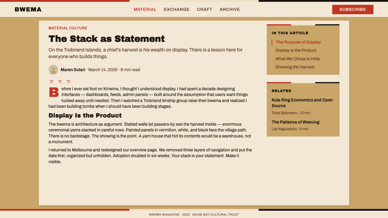
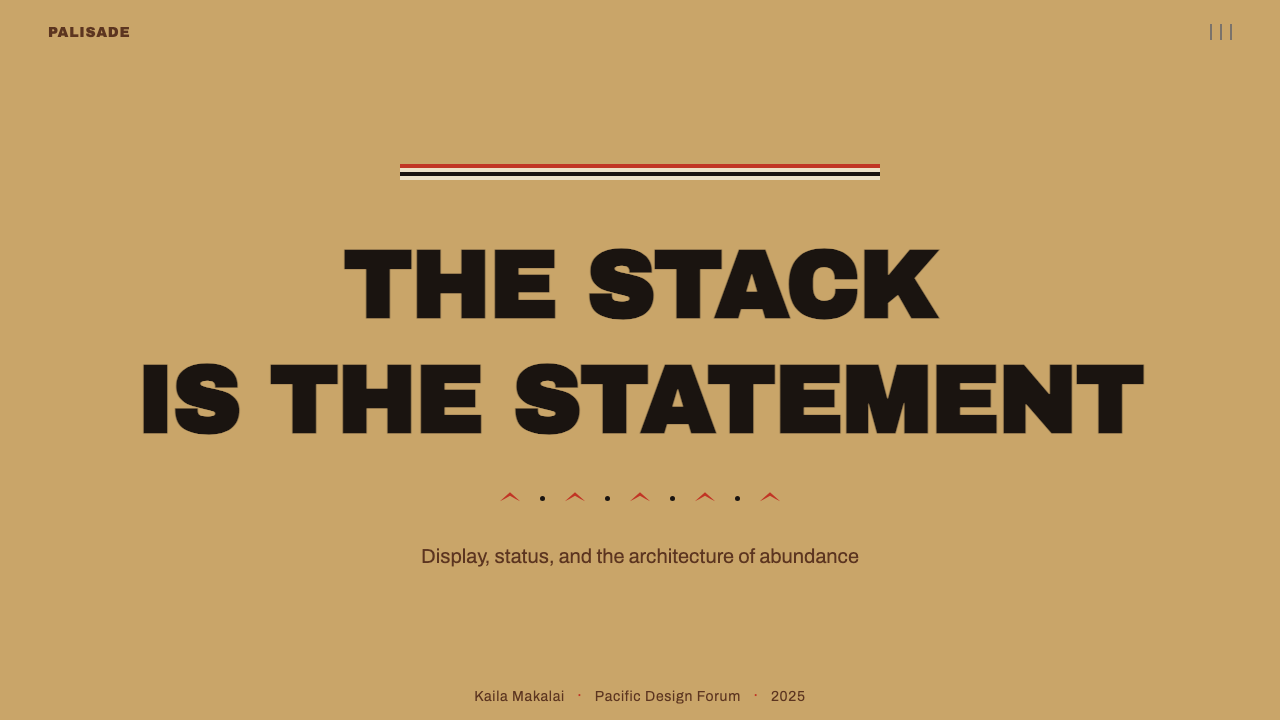
For presentation slides, the system excels on bold cover pages and section dividers. A cover built in this style uses the timber tan ground as the base, places a wide vermilion band across the upper third, and drops the title in heavy black type on the tan or white field below. A single bird or fish silhouette, large and placed asymmetrically, functions as the only graphic element — no photographs, no abstract textures. Content slides should carry the horizontality forward: use band-weight ruled lines to separate sections, keep body text left-aligned in a wide measure, and reserve vermilion for the single most important callout per slide. Data visualizations adopt the palette directly — bar charts in vermilion, comparison bars in kaolin white edged with black, annotations in black — giving charts the same authority as the decorative panels.在演示文稿中,这套体系在大胆的封面页与章节分隔页上表现最佳。以这种风格制作的封面,以木质褐黄作为底色,在上方三分之一处横置宽阔朱红条带,在其下的褐黄或白色底面上放置粗重黑色标题文字。一个大型的鸟或鱼剪影,尺寸大、位置不对称,作为唯一图形元素——无照片,无抽象质感。内容页应延续横向性:用条带粗细的横线分隔段落,正文在宽阔行宽中保持左对齐,将朱红保留给每页中最重要的那一个标注。数据可视化直接采用色板——柱状图用朱红,对比柱用高岭土白加黑边,注释用黑色——赋予图表与装饰面板同等的权威感。
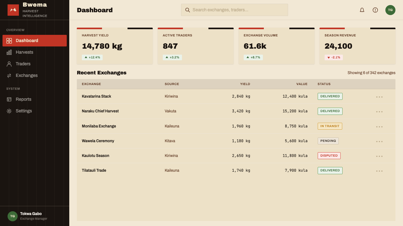
For web interfaces, the style is best deployed in marketing and editorial contexts rather than in dense transactional UI. A landing page built on this system uses alternating bands — timber tan, then vermilion, then kaolin — as the structural grid for section backgrounds. Navigation should be typographically heavy: wordmarks and labels in the same black as the silhouette motifs, with no icon decorations except the occasional geometric stamp used as a bullet or marker. Pricing or feature comparison pages benefit from the banding logic applied to table rows: alternating the tan and kaolin creates visual rhythm without relying on ruled lines. Dashboards are a stretch — the warmth of the palette and the graphic boldness work against the information density that dashboard users need.对于网页界面,这套风格最适合营销与编辑场景,而非密集的交易型界面。基于此体系构建的落地页,以木质褐黄、朱红、高岭土白的交替条带作为各区块背景的结构网格。导航应当字体重量显著:文字标识与标签使用与剪影母题相同的黑色,除偶尔作为项目符号或标记的几何印章外无图标装饰。定价或功能对比页面可以将条带逻辑用于表格行:褐黄与高岭土白交替,无需依赖横线即可创造视觉节律。仪表板是一种勉强的应用——色板的温度感与图形的大胆,与仪表板用户所需的信息密度形成张力。
For editorial and marketing work, the style's poster-like energy is a natural fit. A feature article layout can open with a full-width header band in vermilion carrying the headline in kaolin white, then transition to a timber tan ground for the body. Pull quotes or callout boxes work well as horizontal bands spanning the content column, with the quote set in large black type on vermilion. Marketing materials — event graphics, social posts, printed materials — can use the motif vocabulary directly: a series of bird silhouettes across a banner, a fish-stamp pattern as a background texture in the margin, horizontal stripe banding as a framing device.对于编辑与营销内容,这套风格的海报式能量是天然的契合。一篇特写文章的版面,可以用朱红色全宽页头条带承载高岭土白的标题,然后过渡到褐黄底色的正文区域。引用框或标注块可以是横跨内容栏的水平条带,引用文字以大号黑字置于朱红底面上。营销物料——活动图形、社交媒体帖子、印刷品——可以直接使用母题词汇:一排鸟形剪影横跨横幅,鱼形印章图案作为边距中的底纹,横向条带作为框架装置。
The most common mistake when applying this style is decorating it further. The bwema facade works because each element is necessary and the composition is full without being cluttered. Adding gradients, soft drop shadows, or layered textures breaks the broadcast logic — the surface starts to whisper when it should be announcing. Similarly, using the full palette simultaneously at equal visual weight produces visual noise rather than hierarchy. In a well-calibrated application of this system, vermilion leads, black structures, white relieves, and the timber tan grounds — each element has a role, and none competes for the same function.应用这套风格时最常见的错误,是在此基础上继续添加装饰。薯屋正面之所以有效,是因为每个元素都是必要的,构图丰满而不拥挤。添加渐变、柔和投影或分层质感,会破坏广播逻辑——表面本该宣告,却开始低语。同样,将全套色板以相等视觉分量同时呈现,产生的是视觉噪音而非层级。在这套体系的精准应用中,朱红主导,黑色构建,白色释放,木质褐黄托底——每个元素都有其角色,没有哪两个争夺相同的功能。
See the Trobriand Yam House Paint design system →查看 Trobriand Yam House Paint 完整设计系统 →
Trobriand Yam House Paint — FAQTrobriand Yam House Paint · 常见问题
Is this a well-documented tradition or are we reading too much into it?这是一套有充分文献记录的传统,还是我们过度解读了?
Trobriand yam house painting is one of the more thoroughly documented examples of graphic art in Melanesia, precisely because Malinowski and subsequent anthropologists treated the visual system as inseparable from the social and economic system it expressed. The interpretation of the painted bwema as a form of social communication — rather than mere decoration — is grounded in the community's own explanations of what the paintings mean and who has the right to display which motifs. This is not projection from outside; it is the tradition's own self-description.特罗布里恩薯屋彩绘是美拉尼西亚图形艺术中有记录最为详尽的案例之一,恰恰是因为马林诺夫斯基及后续人类学家将这套视觉体系视为其所表达的社会与经济体系的不可分割部分。将彩绘薯屋解读为一种社会传播形式——而非单纯装饰——是建立在社区成员自身对这些画作含义及谁有权展示哪些母题的解释之上的。这不是外部投射,而是这一传统自身的表述。
How does this compare to other Pacific Island visual traditions?这与其他太平洋岛屿视觉传统相比如何?
Trobriand yam house painting shares the Melanesian preference for high-contrast, flat-silhouette graphic work that appears across canoe prow carvings, tapa cloth, and dance shields throughout the western Pacific. What distinguishes the Trobriand tradition is the combination of strong horizontal banding with the stamp-like motif repetition, and the specific palette that gives primary importance to vermilion against timber. Other Melanesian traditions tend toward more intricate curvilinear pattern or toward a different palette structure. The overall graphic sensibility — bold, broadcast-legible, socially indexed — is broadly shared.特罗布里恩薯屋彩绘与整个西太平洋地区——独木舟船首雕刻、塔帕布、舞蹈盾牌——中广泛存在的美拉尼西亚高对比度、平面剪影图形偏好一脉相承。将特罗布里恩传统区别开来的,是强烈横向条带与印章式母题重复的组合,以及将朱红对木质褐黄置于首位的特定色板结构。其他美拉尼西亚传统往往倾向于更繁复的卷曲线条图案或不同的色板结构。大胆、广播式可读、具有社会索引功能这一总体图形感性,则是广泛共享的。
Can this style work for consumer products, or is it too bold?这套风格能用于消费品吗,还是太粗犷了?
The boldness is the point, not an obstacle. The question is whether the product benefits from the associations the style carries: authority, display, warmth, and a sense that the maker is announcing something with confidence. Food brands and artisan goods are a natural fit — the timber tan ground and handpainted-edge quality read as authentic and craft-adjacent. Fashion and lifestyle products can leverage the graphic intensity as a signal of cultural confidence. Where the style struggles is in products that need to project delicacy, luxury quietness, or precision engineering — the broadcast logic of the bwema works against understatement.大胆感本身就是要点,而非障碍。问题在于产品是否能从这套风格所携带的联想中获益:权威、展示、温度,以及一种制作者正在自信宣告某事的感觉。食品品牌和手工艺品是天然的契合——木质褐黄底色与手绘边缘品质读起来真实而接近手工。时尚与生活方式产品可以将这种图形强度作为文化自信的信号加以利用。这套风格表现欠佳的地方是那些需要传递纤巧、奢华静默或精密工程感的产品——薯屋的广播逻辑与低调克制相悖。
What does it mean to use this style ethically?以负责任的方式使用这套风格意味着什么?
Using Trobriand visual conventions in contemporary design means working with a living tradition from a community that is still active. Ethical use starts with acknowledgment — identifying the origin clearly rather than presenting the aesthetic as generically Pacific or exotic. It means not lifting specific sacred or clan-affiliated motifs for commercial use without understanding their status. The broad principles — horizontal banding, high-contrast silhouette, bold palette — belong to a visual grammar that can be engaged with respect. The specific motifs — if they carry clan or ceremonial significance — warrant more care. The distinction matters.将特罗布里恩视觉惯例用于当代设计,意味着在与一个仍然活跃的社区的活态传统互动。负责任的使用从承认开始——明确标识来源,而非将这种美学呈现为泛泛的太平洋风情或异域风味。它意味着不在未了解其地位的情况下,将特定的神圣或氏族关联母题用于商业目的。宽泛的原则——横向条带、高对比度剪影、大胆色板——属于一套可以被尊重地借鉴的视觉语法。特定母题——若携带氏族或仪式意义——则需要更多审慎。这一区别至关重要。
How do I avoid making it look like generic tropical decoration?如何避免它看起来像泛泛的热带装饰?
Generic tropical decoration tends toward soft, rounded forms, pastel or saturated Caribbean colors, and an overall sweetness. Trobriand yam house painting is none of these: it is graphic, flat, formally structured, and socially purposeful. The safeguards are the palette discipline (vermilion is warm-earthen, not bright-tropical), the silhouette austerity (no gradients, no detailed illustration), and the horizontal banding structure (which gives the composition architectural rather than decorative logic). If what you are producing reads as festive or friendly, you have drifted. If it reads as authoritative and direct, you are in the right territory.泛泛的热带装饰往往倾向于柔软圆润的形态、淡彩或饱和的加勒比色调,以及总体的甜美感。特罗布里恩薯屋彩绘没有这些特点:它是图形化的、平面的、形式上有结构的、在社会上有目的的。保持风格纯粹的关键在于色板纪律(朱红是温暖的土性,而非明亮的热带感)、剪影的简洁(无渐变,无详细插图)以及横向条带结构(赋予构图建筑性而非装饰性的逻辑)。如果你正在制作的东西读起来是节日的或友好的,你已经偏离了。如果它读起来是权威而直接的,你就在正确的领域。
Related design styles相关设计风格
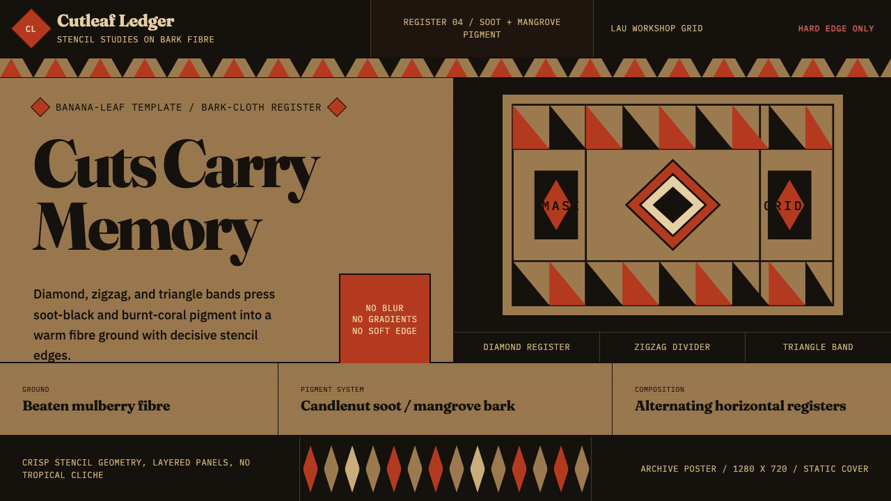 Fijian Masi (Bark Stencil)Stencil memory stays sharp. Soot black and burnt coral strike bark-fibre band…模板记忆锋利:烟黑与焦珊瑚红压入树皮纤维横带。
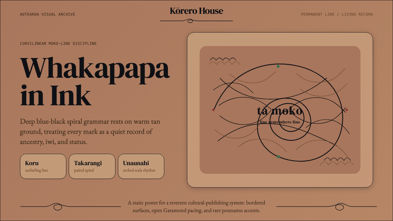 Māori Tā Moko (Facial Tattoo)Ancestry feels carved. Blue-black spirals on tan ground carry a restrained Ga…祖谱如刻入肌理。蓝黑螺旋落在暖棕肤底,Garamond克制叙事。
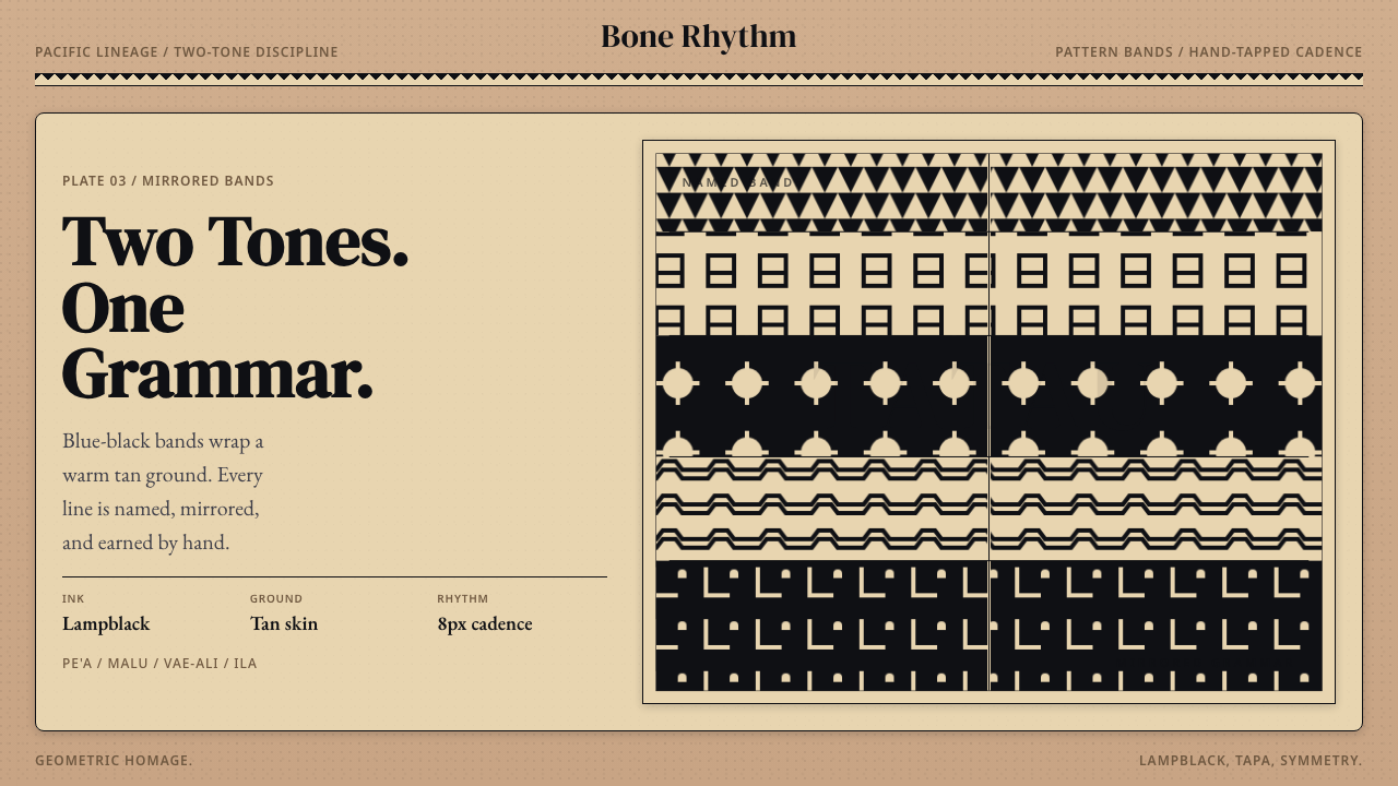 Samoan Tatau (Traditional Tattoo)Strict two-tone discipline. Tan ground, blue-black bands, hand-tapped symmetr…双色纪律。棕底、蓝黑纹带与手敲对称。
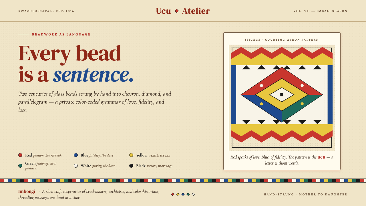 Zulu Beadwork (KwaZulu-Natal)Every bead is a sentence. Saturated glass primaries strung into chevron and d…每一颗珠子都是一句话:饱和玻璃原色在米色帆布上排成 chevron 与菱形——…
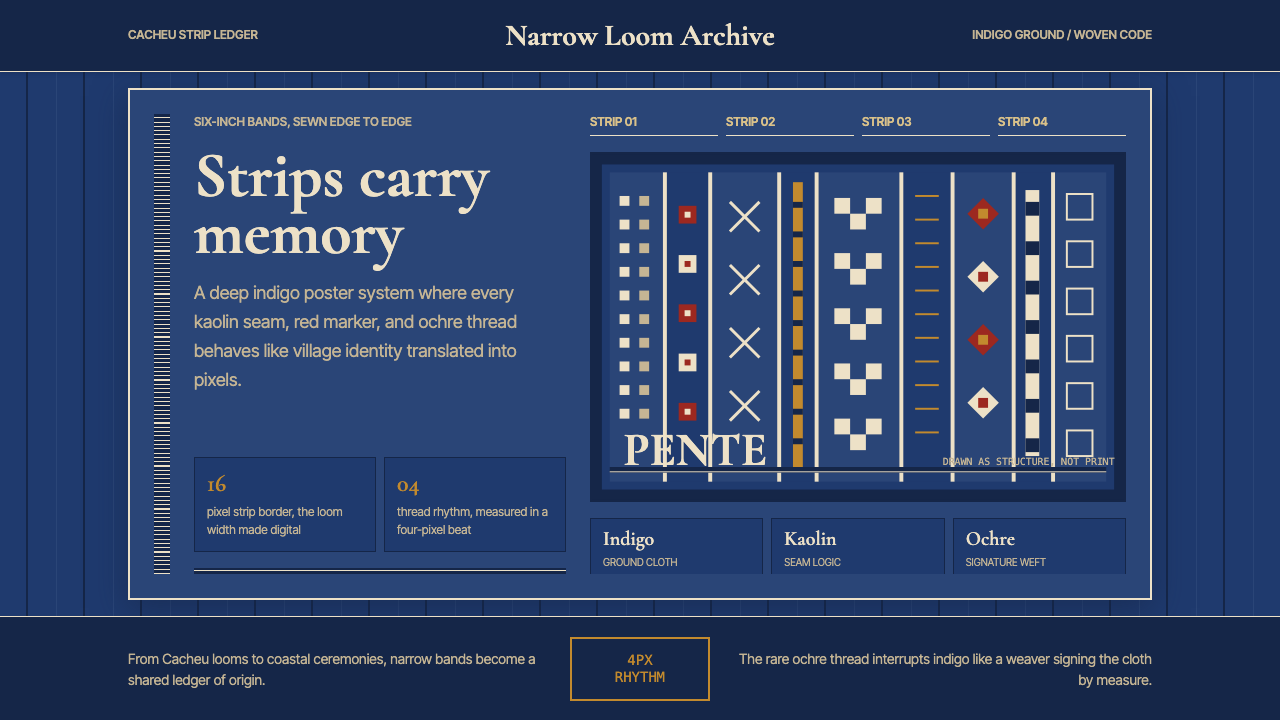 Bissau-Guinean Pano de PenteIndigo remembers. Narrow bands and kaolin seams turn weave grammar into pixel…靛蓝会记忆。窄幅竖带与瓷白缝线,把织纹语法变成像素。
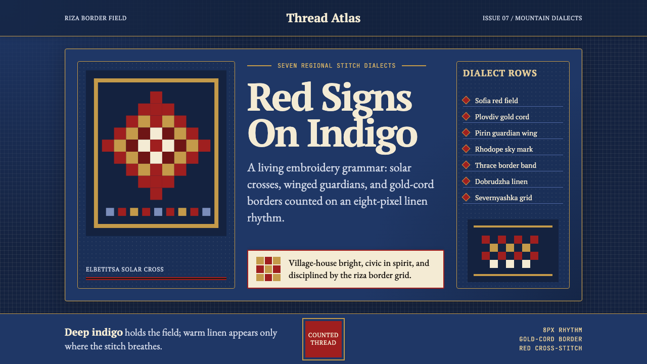 Bulgarian Shevitsa Folk EmbroideryVillage-bright code. Deep indigo carries shevitsa red crosses and gold-cord b…村舍般明亮:深靛蓝承托红色太阳十字与金线边框。