What is Commemorative Coin?
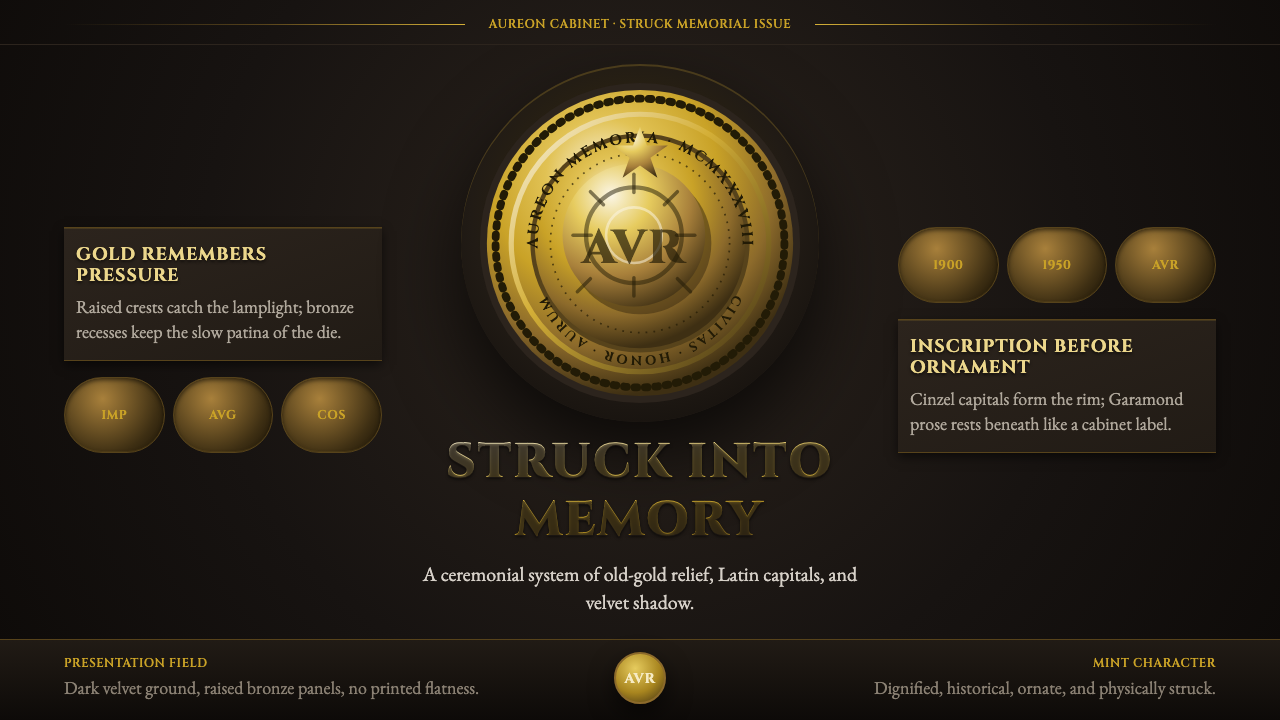
Commemorative Coin translates the language of the struck medal into digital design — old-gold relief, denticled rims, and Cinzel capitals staged against a deep velvet ground, evoking the cabinet of a coin collector rather than a screen.
Commemorative Coin in brief
Commemorative Coin is a design system rooted in the visual language of numismatic relief — the struck medallions, commemorative coins, and state medals produced predominantly between the late nineteenth century and the mid-twentieth. Its defining formal qualities are high-contrast metallic relief (bright crests of gold catching the light, bronze and patina shadow pooling in the recesses), denticled or beaded rims framing a circular or oval field, and Latin-style inscriptions set in Trajan-derived capitals. Everything is staged against a dark, near-black presentation ground, as though the coin rests on the velvet lining of a presentation case.
The aesthetic is one of institutional gravity. Commemorative medals were issued to mark victories, deaths, anniversaries, and the founding of states; they were designed to outlast the people who ordered them. That weight translates directly into the design system: it privileges permanence over novelty, authority over approachability, precious metal over painted surface. The result feels stamped and certified rather than designed and printed.
In contemporary application, Commemorative Coin occupies a very specific register — one of ceremony, heritage, and earned distinction. It is not a style of everyday commerce but of recognition and occasion. Used correctly, it signals that something matters enough to be commemorated; used carelessly, it tips into parody or grandiosity.
Where does Commemorative Coin come from?
The tradition of struck commemorative medals stretches back to the Renaissance, when Italian city-states began commissioning portrait medals to rival ancient Roman coins. Pisanello's medals of the 1430s and 1440s established the enduring template: a profile bust on the obverse, a symbolic scene or allegory on the reverse, a legend running around the rim. Renaissance medal-makers treated the format as a prestige object — miniature sculpture in base metal — and introduced conventions that would persist for five centuries: the denticled border, the exergue line separating the field from inscription, the shallow but highly modelled relief.
The great period of commemorative coin and medal design as a formal discipline runs roughly from 1880 to 1950. In France, the Monnaie de Paris trained generations of die-engravers — graveurs en médailles — who competed in the annual Salon and whose work reflects the influence of Art Nouveau and later the restrained classicism that succeeded it. Oscar Roty, whose flowing allegorical figure of the Sower (La Semeuse) appeared on French francs from 1897, and Louis-Oscar Roty's contemporaries in Belgium, Switzerland, and the United States produced a body of medallic art that combined technical mastery of deep relief engraving with figural authority. American medallic work under Augustus Saint-Gaudens reached a peak of classicist ambition with the gold eagle and double eagle coins of 1907, widely regarded as the finest struck coins in American history.
The visual conventions that Commemorative Coin draws upon — Trajan-style letterforms, the raised rim, the dark patinated field, the laurel and wreath motifs — are themselves inherited from Roman numismatic practice. Roman aurei and denarii established the profile portrait as the canonical representation of authority, and the Roman taste for inscriptions crowding the rim edge was the direct ancestor of later Western commemorative typography. When Renaissance medal-makers revived these forms, they were consciously invoking Roman legitimacy; when the design system reuses them, it inherits this entire chain of cultural authority.
Medals fell out of fashion as a primary art form after the Second World War, when the era's distrust of monumental symbolism made the medal's association with state power feel uncomfortable. But the visual grammar survived in institutional contexts — Olympic medals, state awards, university seals, corporate achievement trophies — and returned as a deliberate aesthetic reference in digital design, branding, and packaging as nostalgia for the pre-digital material world gathered force in the 2010s. The Commemorative Coin design system distills this revival: the tactile gravity of struck metal, translated for screens.
What defines the Commemorative Coin look?
Metallic Relief Palette
The color system simulates struck metal rather than printed ink. A dark velvet ground — deep charcoal or near-black — serves as the presentation field. Against this, old gold tones span a wide range: brilliant highlight gold for the topmost struck surface, mid-tone amber for the middle relief, and deep bronze or green-black patina for the recesses. The palette evokes the play of raking light across a coin held at an angle, not a flat surface seen straight on. No pastels, no saturated hues from outside the gold-bronze-black axis.
High-Relief Depth Simulation
The visual system is built on the illusion of physical depth — not the shallow flatness of contemporary UI, but the genuine three-dimensionality of a coin's struck relief. Elements are modelled with highlight, midtone, and shadow in a consistent light direction, as though light enters from the upper left and rakes across a raised surface. The depth is not skeuomorphic in the 2010s sense of adding decorative texture; it is structural, describing the actual contours of a conceptual metal object. Flat elements feel wrong in this system.
Trajan Capitals and Classical Lettering
Typography draws directly from Roman inscriptional traditions. All-capitals settings in Trajan or closely related classical serif letterforms carry the legends, titles, and labels. The letterforms themselves are characterized by high stroke contrast — thick strokes meet fine hairline serifs — and an engraved quality that suggests they were cut into stone or metal rather than drawn. Mixed case is rare and functions as a concession to legibility rather than a stylistic preference. Body text, where it appears, uses a classical serif with similar engraved dignity.
Circular and Medallion Framing
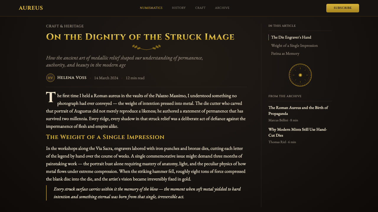
The default compositional unit is the circle or oval — the shape of the coin or medal itself. Primary content elements are arranged within this disc, with subsidiary information, dates, or labels running around the rim in the manner of a legend. Denticles (small, regular tooth-like projections) or a beaded border articulate the edge between the disc and its surrounding field. This framing device is not merely decorative; it encloses and consecrates whatever it surrounds, functioning as a visual declaration that the content inside is worthy of commemoration.
Patina and Age as Authenticity
Genuine commemorative medals develop patina over time — the chemical darkening of exposed metal that collectors prize as evidence of age and authenticity. This system incorporates patina simulation as a deliberate design element, not a flaw to be corrected. Dark pooling in recessed areas, slight oxidation tones on mid-ground surfaces, and the muted, slightly desaturated quality of the overall palette all contribute to a sense of earned age. The design should feel as though it was struck decades ago, not just minted today.
Profile Portrait and Figural Bas-Relief
Where figurative imagery appears in the system, it follows the conventions of medallic bas-relief: profiles rather than full-face, simplified contours that read clearly at the small scale of a coin, and a reduction of detail that emphasizes silhouette over internal modeling. The profile pose — inherited from Roman imperial portraiture — carries connotations of authority and timelessness; it presents the subject as worthy of study rather than as a spontaneous or candid presence. Allegories (a sower, a female figure with outstretched wings, a rearing horse) are equally characteristic.
Ceremonial Spacing and Gravity
Layout choices reinforce the sense of occasion. Generous surrounding space — the dark velvet ground extending beyond the coin's edge — gives every element room to breathe and be regarded. Text is set with wide tracking, befitting an inscription meant to be read slowly and reverently. Nothing crowds nothing; nothing rushes the eye. The visual experience is decelerated by design: the pacing of a medal being turned in the hand rather than a page being scrolled.

Who shaped Commemorative Coin?
The Irish-American sculptor Saint-Gaudens is widely considered the greatest medallic artist working in the United States. His relief portraits — most famously his memorial relief for Colonel Robert Gould Shaw in Boston — demonstrate the full expressive range of the medium. His coins for the United States Mint, commissioned by President Theodore Roosevelt in 1905 to reform American coinage, produced the 1907 double eagle and eagle gold coins whose high-relief designs became the standard against which all subsequent American coinage was measured. His work defines the vocabulary of noble profile, deep sculptural relief, and classical inscription that the Commemorative Coin system draws upon.
Roty was the French medalist whose flowing allegory of the Sower — a striding female figure scattering seed — became one of the most reproduced images in European numismatic history, appearing on French francs from 1897 to the introduction of the euro. His work exemplifies the Art Nouveau influence on turn-of-the-century medallic art: elongated, graceful figures, sinuous contours, and a softness of modelling that contrasts with the harder classicism of Roman precedent. Roty's Sower established that the commemorative medal could carry national identity as effectively as any painting or monument.
The French engraver Ponscarme is the largely unsung reformer who transformed French medallic art in the second half of the nineteenth century. Before Ponscarme, French medal production was technically accomplished but aesthetically conservative. He reintroduced the direct study of ancient coins into French practice, insisted on the primacy of natural observation over academic convention, and trained a generation of medalists — including Roty — who would define French medallurgic art at the turn of the century. His method of observing the fall of light on a real face and translating it into relief depth without exaggeration remains the technical foundation of the style.
Not a person but an artifact: the inscription at the base of Rome's Trajan Column (dedicated AD 113) is the canonical source of Trajan-style letterforms. Carved by anonymous Roman stonecutters into Luna marble, the letters demonstrate the proportional system — varying stroke width, triangular serifs, precise spacing — that typeface designers have been studying and systematizing ever since. The inscription's influence on the Commemorative Coin visual system is total: every all-capitals legend in the system is a descendant of those letters, carrying with it the authority of an empire that built monuments intended to last forever.
Founded in 864 AD, the Monnaie de Paris is the oldest continuously operating mint in the world and the institutional home of French medallic art for centuries. Its workshops trained the succession of engravers — Gatteaux, Depaulis, Barre, Ponscarme, Roty, Vernon, Dropsy — who define the tradition the Commemorative Coin system draws upon. The Monnaie's annual Salon de la Monnaie was the primary exhibition venue for medallic art in Europe through the early twentieth century, and its technical standards for die-engraving, relief depth, and patination process remain the benchmark that any faithful revival of the genre must acknowledge.
How do you use Commemorative Coin today?
Commemorative Coin is a highly specific style — it does not generalize well across context types, and attempting to apply it broadly produces confusion rather than distinction. Its appropriate domains are those where ceremony, gravitas, and the marking of occasion are primary values: awards programs, limited-edition product packaging, institutional identity systems (universities, foundations, professional orders), anniversary campaigns, and commemorative digital objects such as achievement badges or NFT-adjacent collectibles. In all these contexts, the style signals that what is being presented has been evaluated, selected, and found worthy of permanent record.
For slide decks, Commemorative Coin is best reserved for high-stakes ceremonial contexts: awards presentations, commencement materials, annual reports framed as records of achievement, or brand history retrospectives. A cover slide works well with a central medallion form — the key title or honoree name within the disc, the date and institutional name running around the rim, the whole set against the dark velvet ground. Content slides should use this approach sparingly; most content within a Commemorative Coin deck should be treated as supporting material to the central medallion moment, using clean classical serif typography without the full relief treatment.
For web and interface design, the style is most effective in bounded contexts: a reward or achievement display, a hall-of-fame section, a membership tier badge, a certificate of completion. Attempting to design a full application or website in this style risks overwhelming users — the visual weight of the system is appropriate for a moment of recognition, not for sustained navigation and task completion. The key principle for UI: use the medallion as a focal component surrounded by simpler, quieter interface elements that defer to it.
For editorial and marketing work, Commemorative Coin functions best as accent rather than system — the cover of an anniversary magazine, a commemorative poster, the central hero image of a heritage product's packaging. In these applications, the medallion or relief element should occupy a generous central position; surrounding typographic and layout elements should be calm, classical, and uncompetitive with the central object. The entire design should feel as though it has been composed to frame and present the medallion, rather than the medallion being one element among many.
The most common mistake when applying Commemorative Coin is overuse of the gold palette in a way that reads as generic luxury rather than specific numismatic heritage. Generic luxury gold tends toward flat gradients, bright yellow golds, and shiny surfaces; the Commemorative Coin palette is specifically old gold — darker, more amber, with the deliberate desaturation of aged metal. A second frequent error is combining the style's classical typography with contemporary sans-serif typefaces for body text, creating a tonal collision that undermines the period conviction the style depends on. Everything in the system should feel as though it belongs to the same cabinet.
Commemorative Coin — FAQ
How is Commemorative Coin different from general luxury or gold design?
The critical distinction is specificity of reference. Luxury gold design draws on a broad vocabulary of opulence — shiny surfaces, contemporary sans-serif lettering, clean gradients, aspirational minimalism. Commemorative Coin refers to a very specific historical object: the struck numismatic medal of 1880–1950. The gold is old and patinated, not bright and shiny. The typography is all-capitals Trajan inscription, not a contemporary wordmark. The depth is modelled sculptural relief, not a gradient effect. The framing is a denticled disc, not a rectangular card. These distinctions matter: the first style signals contemporary luxury; the second signals historical permanence. Using them interchangeably produces work that feels neither genuinely luxurious nor authentically numismatic.
Can Commemorative Coin work on a light background?
Technically yes, but the effect changes substantially. The dark presentation ground is not arbitrary — it performs a specific function: it makes the gold relief read as foreground light against shadow, replicating the experience of a coin on velvet. On a light background, the relationship inverts: the gold now reads as a warm tone against a neutral field, and the illusion of struck relief is significantly weakened. If a light background is required by context — a day-mode interface, a light-paper printed piece — the approach must compensate by strengthening the depth modelling, increasing the contrast between highlight and shadow within the medallion, and ensuring the denticled border is clearly defined. The white or cream ground can work for a portrait of a single medal; it struggles for complex multi-element layouts.
Is Commemorative Coin appropriate for digital products used daily, or only for special occasions?
Special occasions, emphatically. The visual weight of the system — the dark ground, the heavy gold relief, the ceremonial spacing — is appropriate for a bounded moment of recognition or achievement, not for sustained daily use. Cognitively, the style signals importance and slows the viewer down; this is valuable when you want someone to feel the significance of an award, a milestone, or a heritage object. Applied to a daily-use product, the same heaviness becomes exhausting and alienating. The practical rule: use it for the ceremony, not for the workflow. A user should encounter this style when they unlock an achievement, not when they are using the product to accomplish tasks.
How should imagery be handled within the Commemorative Coin system?
Imagery should follow the logic of medallic bas-relief: profiles over frontal views, silhouettes over detailed rendering, simplified contours over photographic complexity. Photographic imagery is essentially incompatible with the system unless it is treated in a way that approximates the character of struck metal — very high contrast, converted to a limited gold-and-shadow tone range, cropped tightly to eliminate background context. Illustrative imagery works better when it follows the conventions of allegorical figure engraving: clear silhouette, reduced internal detail, posed rather than candid, and small enough relative to the disc that the lettering and border still read as dominant elements.
What is the relationship between Commemorative Coin and heraldry?
They share roots — both traditions draw on the visual conventions of Western European institutional authority, and heraldic motifs (shields, eagles, laurel, crowns) frequently appear in numismatic relief. But they are distinct systems with different compositional logics. Heraldry is organized around the shield as primary unit, with strict rules governing the arrangement of charges, fields, and ordinaries within that shield. Numismatic relief is organized around the circle and the concept of the struck disc, with the legend-around-the-rim as a defining feature. Commemorative Coin is a numismatic system; it may incorporate heraldic motifs as subsidiary elements without being a heraldic system. Mixing the two too freely — using full shield compositions within medallion frames — tends to produce visual competition rather than coherence.
Related design styles
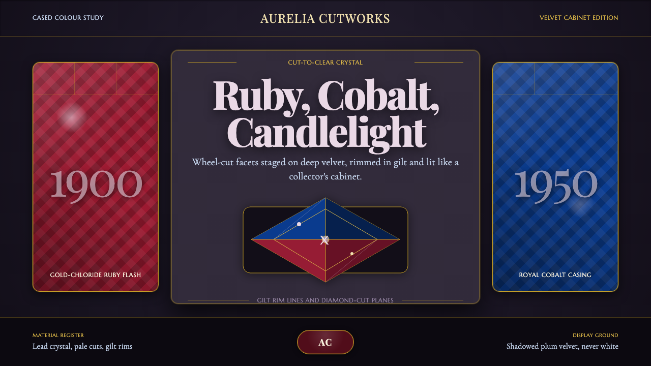 Bohemian Cut CrystalOpulence glows in shadow. Ruby and cobalt facets sit on velvet under gilt rim…
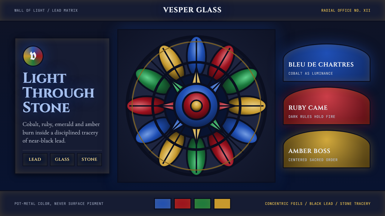 Gothic Rose WindowDarkness becomes light. Cobalt glass, ruby foils and black lead form a radial…
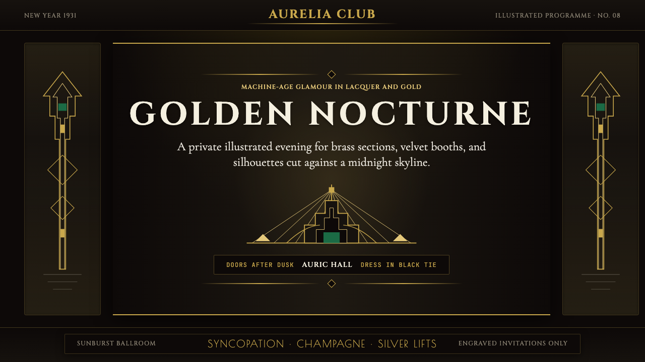 Art Deco Jazz AgeJazz Age glamour. Sunburst rays, stepped ziggurats, gold on black — Chrysler…
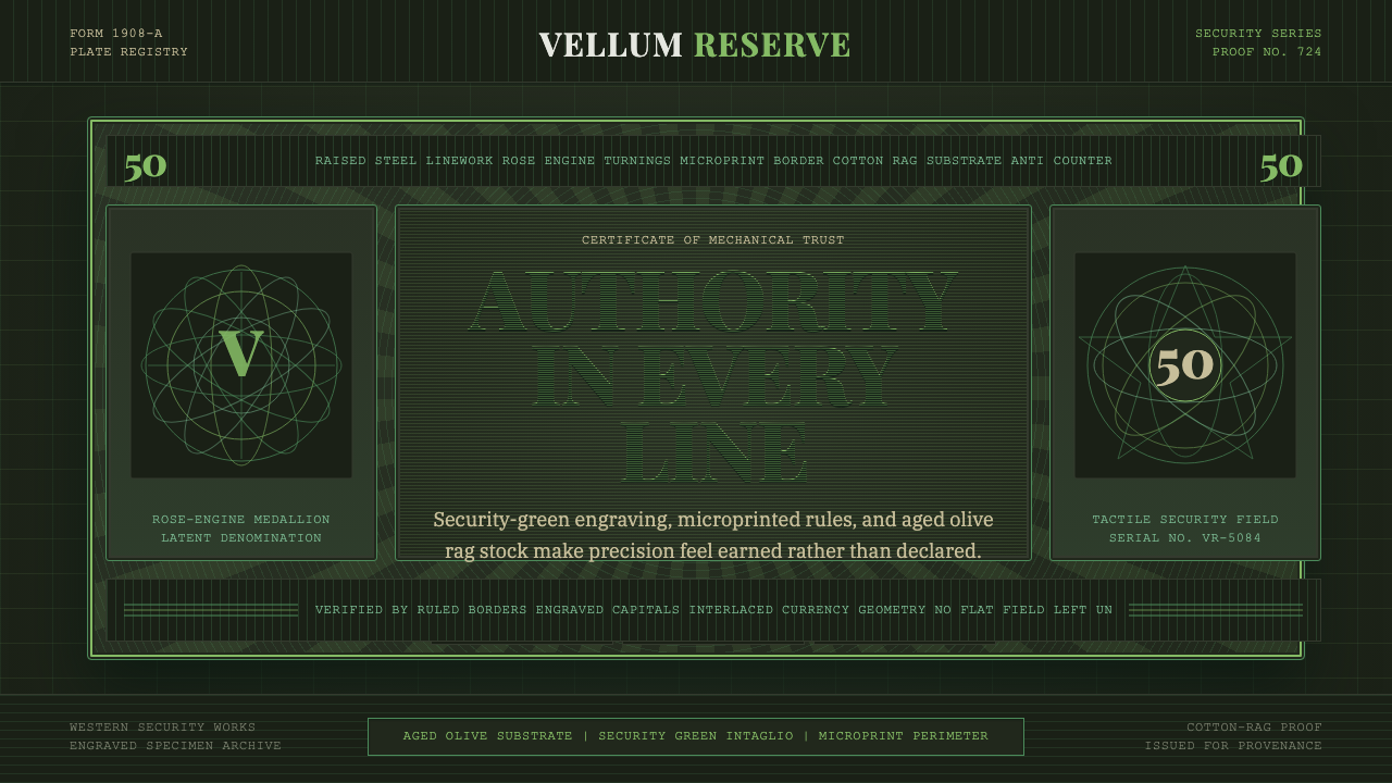 Banknote GuillochéMoney as precision. Security green guilloche frames aged olive rag stock.
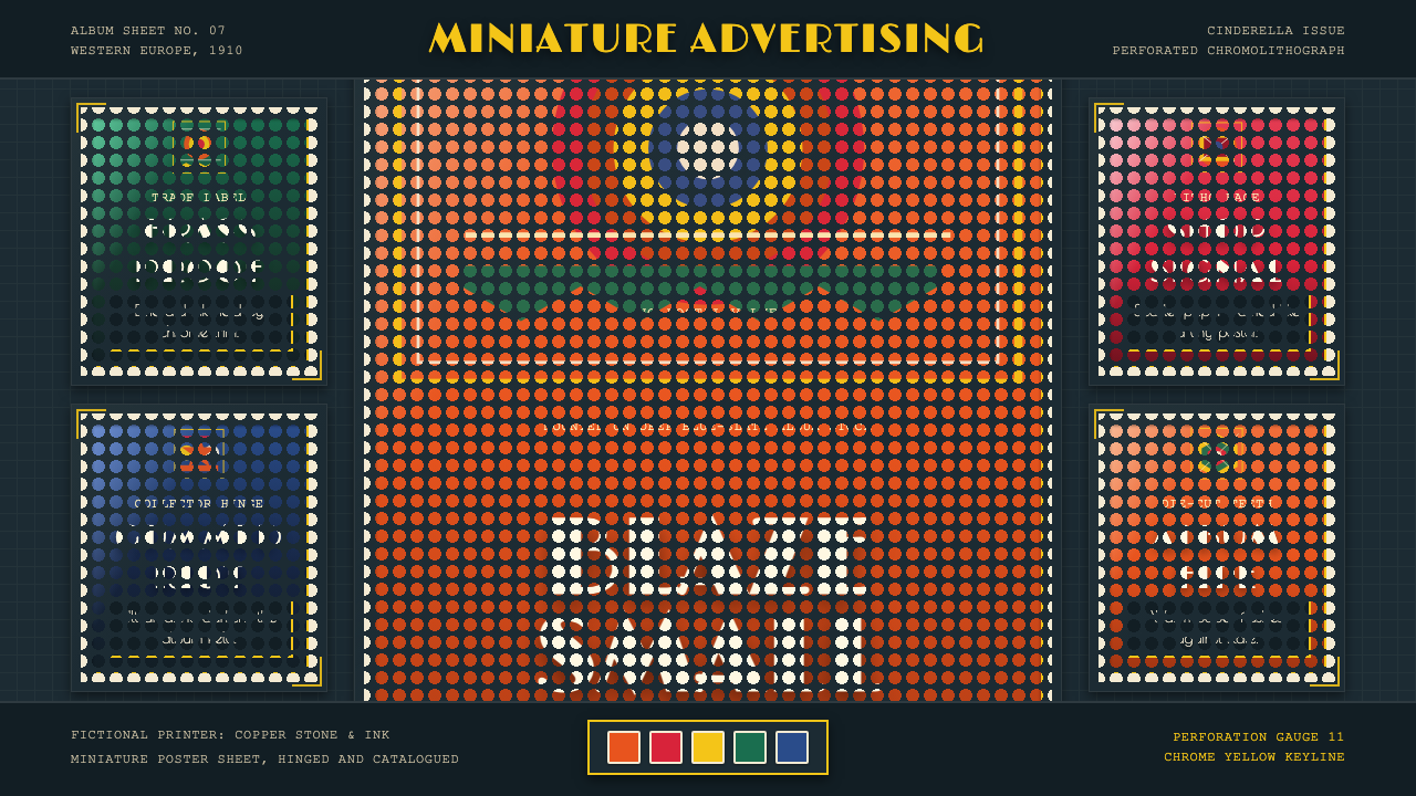 Poster Stamp (Cinderella)Blazes in miniature. Vermilion stamps, chrome keylines, and toothed edges on…
 Vienna Secession 1897Ornament is structure. Leaf-gold grids and black hairlines glow on bronze nig…