What is Poster Stamp (Cinderella)?
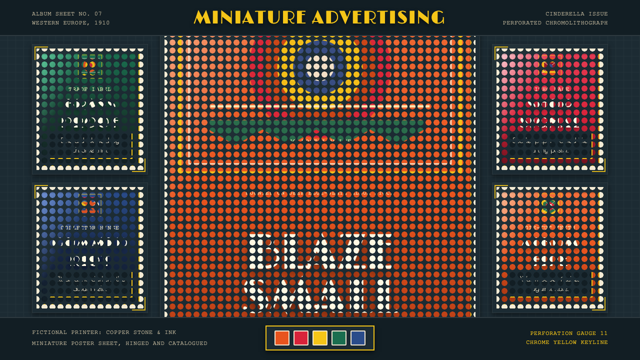
The poster stamp — Reklamemarke to the German collector, Cinderella to the philatelist — compressed the entire drama of early commercial art into a gummed, perforated square the size of a thumbnail. Printed by multi-stone chromolithography at the height of the advertising-ephemera craze, these miniatures blazed with vermilion, chrome yellow, and ultramarine on slate-blue album pages, turning a scrapbook into a fire-lit cabinet of commercial wonders.
Poster Stamp (Cinderella) in brief
The poster stamp — known in German as Reklamemarke, and in English philatelic circles as the 'Cinderella' stamp — was a commercially produced adhesive label, typically square or rectangular and perforated at its edges like a postage stamp, designed to be collected in albums and used as miniature advertising posters. They proliferated across Western Europe, and especially in the German-speaking world, between roughly 1900 and 1930, coinciding with the peak era of chromolithographic printing and the Art Nouveau-to-Art-Deco transition in decorative commercial art.
What distinguished the Reklamemarke from other advertising ephemera was its dual life as both functional promotional object and collector's item. Manufacturers, exhibitions, and municipal tourist bureaux issued them in series, encouraging consumers to assemble complete sets. Albums were designed specifically to showcase them: the collector would hinge each stamp onto dark-toned pages — deep blue, slate grey, or oxblood — so that the saturated stamp faces blazed against the dark ground. The design system that bears this name reconstructs exactly that showcase: vivid display lettering in the spirit of Art Nouveau transitioning to Deco, toothed perforation borders, and corner-hinge mounting on a deep blue-slate ground.
The visual language is one of controlled extravagance. The chromolithographic process allowed printers to layer multiple translucent inks, building up colors of exceptional depth and saturation — vermilion over scarlet, chrome yellow over gold, emerald over viridian — with a glossy, jewel-like finish that no modern offset print quite replicates. Each stamp was a proof of the printer's mastery of registration and color separation, and collectors prized the finest examples the way they might prize a fine enamel or a miniature painting.
Where does Poster Stamp (Cinderella) come from?
The Reklamemarke emerged from the collision of two phenomena: the late nineteenth-century mass-chromolithography revolution and the European craze for collecting stamps, trade cards, and other small-format printed ephemera. Chromolithography — the process of printing in multiple colors from separate stone or metal plates, each inked in a different hue — reached its industrial maturity in the 1880s and 1890s, enabling commercial printers to produce richly colored labels and packaging at scale. The technique had already produced tobacco cards, cigar-box labels, and trade cards in America; in Germany and Austria, where postal culture and album-keeping were especially ingrained social habits, it gave birth to the Reklamemarke.
The golden age of the poster stamp ran from roughly 1900 to 1920, closely mapped onto the reign of the Art Nouveau movement in commercial graphic arts. The sinuous floral borders, flowing typographic letterforms, and allegorical female figures that distinguished high Art Nouveau translated remarkably well to the postage-stamp format: the small scale forced discipline on the composition, and the perforated edge — borrowed from the postal stamp — lent a ready-made visual boundary that functioned like a picture frame. As the 1910s advanced and Art Nouveau gave way to the proto-Deco geometry of the Wiener Werkstätte and the early Expressionists, poster stamp design shifted accordingly: borders became more angular, lettering more architectural, color contrasts bolder and more heraldic.
The major sites of Reklamemarke culture were Germany, Austria-Hungary, Switzerland, and France, with German firms and exhibition organizers accounting for a disproportionate share of production. World expositions and trade fairs were especially prolific sources: the Brussels World's Fair of 1910, the Leipzig Trade Fair, and dozens of municipal exhibitions all produced official stamp series, which served simultaneously as collectibles, advertising vehicles, and proof of the host city's cultural ambition. Companies across virtually every industry — iron foundries, soap manufacturers, department stores, railway lines, spa resorts — issued their own series, and specialist Reklamemarken albums with printed guidelines for mounting became best-sellers in stationery shops.
The practice declined sharply after World War I, partly because of post-war austerity, partly because advertising budgets shifted to newer media — cinema, radio, the modern billboard — and partly because lithographic printing was itself being superseded by faster, cheaper photomechanical processes that could not replicate the color depth of multi-stone chromolithography. By 1930 the Reklamemarke was largely a nostalgia object, preserved in the albums of an older generation. But those albums, and the chromolithographic studios that produced their contents, left behind a visual vocabulary of saturated color, miniature grandeur, and jewel-like surface perfection that the Cinderella design system now reconstructs for digital contexts.
What defines the Poster Stamp (Cinderella) look?
Color Saturation
The defining visual property of Reklamemarken is color of exceptional richness and depth, built up through layered chromolithographic inks rather than applied as flat areas. Vermilion, scarlet, chrome yellow, emerald, and ultramarine appear at near-maximum saturation, yet each reads as pure and jewel-like rather than garish because the multi-layer printing creates depth and luminosity rather than flat opacity. The dark album page ground — deep blue-slate — serves as a foil that makes the saturated stamp faces burn with even greater intensity. In this design system, deep, jewel-toned primaries are paired against dark grounds so that color appears to emit light rather than reflect it.
Perforation Border
The toothed perforation border — borrowed directly from the postage stamp — is the visual signature of the Cinderella format. It creates a ready-made framing device that no other commercial printing format used, lending each stamp the quality of a miniature print meant to be cut out and kept. The perforation rhythm — the spacing and depth of the teeth — varies between series and printers, and expert collectors read these variations as manufacturer fingerprints. In design terms, the perforated border functions as both frame and texture: it softens the hard rectangular boundary of the composition, introduces a repeated micro-pattern at the edge, and signals that the object is meant to be held in the hand.
Display Typography
Lettering on poster stamps occupies a disproportionately large share of the composition, often competing with — or directly anchoring — the central image. In the Art Nouveau period, type was drawn rather than typeset: sinuous, organic letterforms with swelling strokes, floral terminals, and ligatures that merged letter into ornament. As Deco geometry arrived after 1910, lettering became more upright, more architectural, more reliant on strong verticals and horizontal crossbars. In both phases, the type weight is heavy relative to the image area, and company names or event titles are set at display scale — the brand or occasion, not the product illustration, is the star of the composition.
Corner Hinge Mounting
The traditional practice of mounting poster stamps onto album pages used small folded paper hinges at two or all four corners — the same technique used for postage stamps in early philatelic albums. These corner mounts became a recognized design element in their own right: small triangular or rectangular flags of translucent paper, visible at the corners of the stamp, anchoring it to the page while leaving the image itself unobscured. The design system interprets corner mounts as a framing device: visible corner marks on a dark ground signal the compositional logic of the collector's album, distinguishing the design from the lookalike territory of Art Nouveau illustration or vintage poster pastiche.
Dark Ground Presentation
The canonical presentation context for poster stamps was always a dark album page, never a white one. Collectors understood intuitively that light-ground stamps — common in postage philately — required white mounts to reveal watermarks, but advertising stamps were meant to be displayed at their most vivid, which demanded a dark foil. The deep blue-slate ground used in this design system is drawn directly from period album pages and serves an optical function: it suppresses all ambient color competition, driving the eye immediately to the saturated stamp face, and gives the overall composition a sense of nocturnal richness — a cabinet of illuminated specimens rather than a simple catalogue.
Chromolithographic Gloss
The multi-stone chromolithographic printing process produced a characteristic surface finish that distinguishes authentic Reklamemarken from later photomechanical reproductions: a glassy, slightly convex gloss over the inked areas, created by the pressure of the printing stones and the properties of oil-based inks drying on coated paper. This gloss gave the stamps a physical presence — they caught light differently from the page around them, appearing almost lacquered. The design system translates this property into a subtle surface luminosity that distinguishes the stamp face from its dark surround: colors appear to sit on the surface rather than sink into it.
Miniature Grandeur
The most paradoxical quality of the poster stamp is the scale ambition it packs into a thumbnail-sized object. Printer and designer collaborated to reproduce — at postage-stamp dimensions — the full visual impact of a large exhibition poster or advertising hoarding. This required extreme compositional discipline: every element had to register clearly at small scale, which meant bold silhouettes, high color contrast, minimal mid-tones, and typography that read as a single visual mass rather than a set of individually legible characters. The result was a design economy that is actually more demanding than large-format poster work: nothing can be vague, nothing can be approximate, nothing can rely on the viewer leaning closer.

Who shaped Poster Stamp (Cinderella)?
The anonymous workshops and printing houses of Germany, Austria, and Switzerland — firms such as Meisenbach Riffarth in Berlin, Stengel in Dresden, and dozens of regional lithographers — were the true creative engine of the Reklamemarken era. They combined artistic draughtsmanship with highly skilled press operation, employing specialist stone artists who could decompose a design into its component color layers and register them with sub-millimeter precision on steam-powered presses. The chromolithographic studio was simultaneously a fine-art atelier and a precision manufacturing plant, and the best Reklamemarken it produced are as technically impressive as they are visually dazzling.
The Viennese commercial artist Julius Klinger was among the most accomplished poster designers of the early twentieth century, and his style directly influenced the Reklamemarken aesthetic as it transitioned from Art Nouveau toward the proto-Deco of the 1910s. Klinger's work is characterized by extreme simplification — bold flat silhouettes, sharply contrasting color fields, and lettering that functions as graphic mass rather than linguistic detail. His exhibition and product posters were often produced in parallel Reklamemarken versions, making him one of the few designers who can be specifically identified with the miniature format. His late work anticipated the flat, high-contrast heraldic sensibility that makes the Cinderella system visually distinctive.
The German-born, later American commercial artist Lucien Bernhard invented the 'Sachplakat' or object poster — a radical simplification in which the advertised product is shown isolated against a flat color ground, with the brand name in bold display type and nothing else. The Sachplakat aesthetic, which Bernhard developed from about 1905, directly fed into Reklamemarken design by demonstrating that extreme visual reduction could be more memorable than elaborate illustration. Several Bernhard designs were issued as poster stamps, and his influence on the flatter, more architecturally lettered Reklamemarken of the 1910s is visible throughout the period.
The Viennese artist and co-founder of the Wiener Werkstätte, Koloman Moser developed a graphic sensibility that bridged the organic curves of Art Nouveau and the geometric rigor that would define the early twentieth century. His exhibition materials, magazine covers for Ver Sacrum, and decorative designs demonstrated that richly saturated color could be combined with a disciplined geometric framework — a synthesis that became foundational for the higher-quality Reklamemarken produced in the Austrian sphere. Moser's square-format compositional thinking was particularly influential: he understood the frame as an active design element rather than a passive boundary.
The most elaborate and technically ambitious Reklamemarken were produced for world expositions and major trade fairs — events where host cities and national pavilions competed to demonstrate cultural sophistication. The official stamp series for the 1910 Brussels World's Fair and the 1913 Leipzig International Building Exhibition (Bugra) represent the peak of the format: multi-part compositions designed to be displayed as connected tableaux across adjacent album pages, with complex architectural perspectives, allegorical figures rendered in fine chromolithographic detail, and letterforms drawn by specialist type designers. These official series were sold in presentation envelopes and remain the most avidly sought Cinderella items among advanced collectors.
How do you use Poster Stamp (Cinderella) today?
The Cinderella poster stamp system is a dark-ground showcase aesthetic — it is built around the logic of the collector's album rather than the blank canvas. Applying it correctly means committing to the fundamental inversion: the background is deep and dark (blue-slate, near-black, oxblood), the content elements are vivid and saturated, and the implicit framing is always the presentation mount. This is not a style that works as white-label design with a few jewel tones dropped in. The dark ground is structural, not decorative.
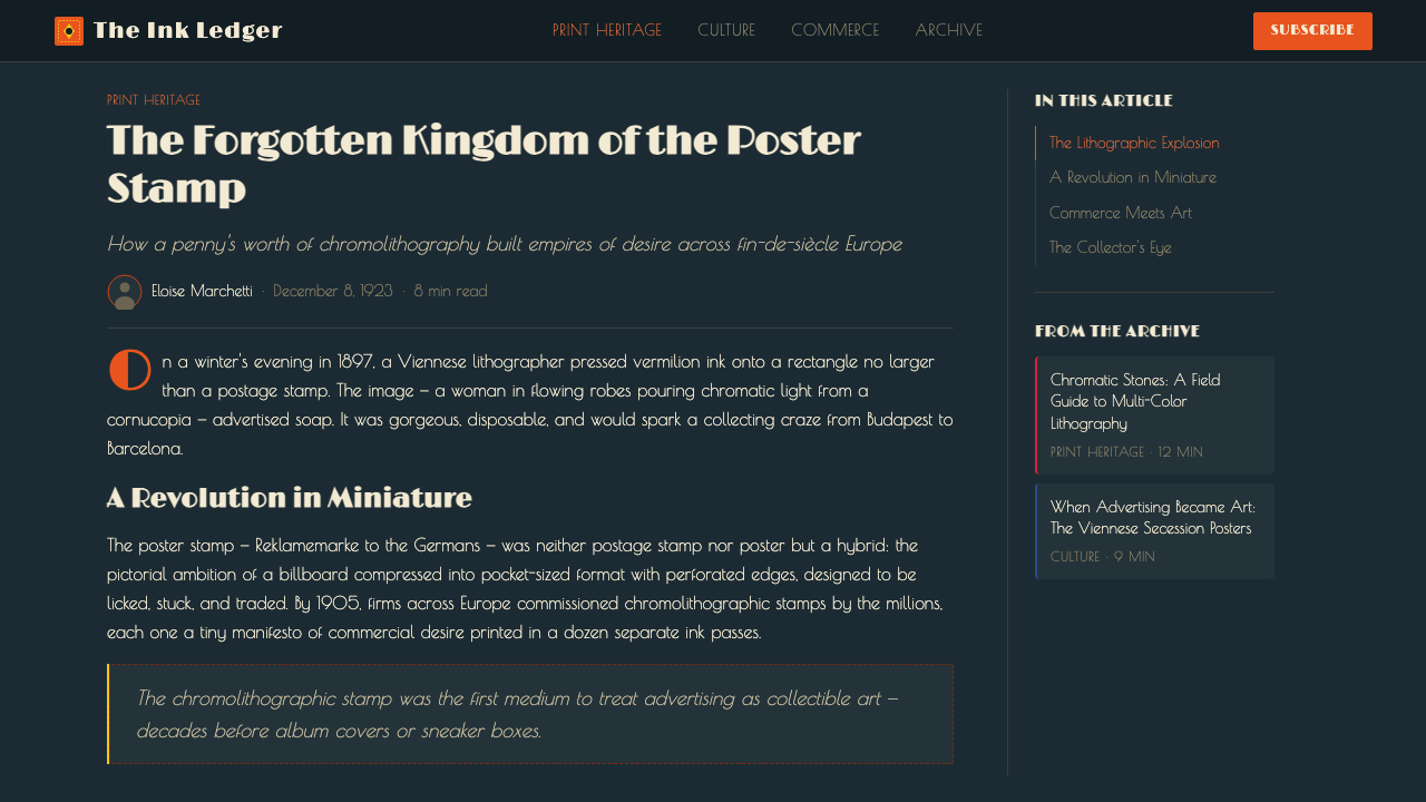
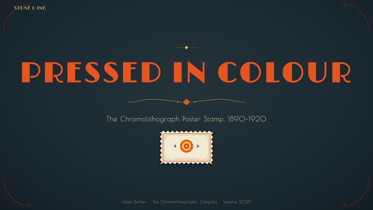
For presentation slides, the system works with dramatic authority on cover slides and section dividers, where the full dark-ground stamp-format logic can operate. A cover slide treated as a single large Reklamemarke — deep blue-slate field, centered or asymmetrically weighted central image in saturated vermilion or chrome yellow, bold display lettering in the upper or lower third, and toothed border marks at the corners — creates an immediate impact of collected grandeur. Content slides should be treated as light-on-dark: white or pale primary type on deep backgrounds, with the primary-color palette reserved for key data points or hierarchy markers. Resist the temptation to apply the dark ground to every slide; the system works best when dark and light alternate, with the stamp format reserved for moments of emphasis.
For web interfaces, the system is best suited to portfolio showcases, gallery pages, editorial features, and any context where individual items need to feel curated and precious. The stamp-mounting logic translates naturally to card components: each card is treated as a stamp — dark background, saturated image or color field, corner-mark details, perforated border as a CSS texture. Navigation and body text should remain in a restrained palette — near-white on near-black, or the reverse — reserving the saturated jewel tones for the featured elements only. Dashboard or data-heavy interfaces are a poor fit; the system's drama comes from restraint in the structural elements and extravagance in the featured ones.
For editorial and marketing contexts, the system's natural home is the print-heritage visual: exhibition announcements, collection catalogues, event programs, and any brand material that wants to communicate a sense of historical depth and collectible value. The perforated border motif works especially well as a design element on physical collateral — event badges, product labels, packaging inserts — where the stamp-format reference connects to the object's physical presence. In digital editorial, the dark-background feature spread using one dominantly saturated primary color (vermilion for urgency, chrome yellow for warmth, ultramarine for authority) with the page title in heavy display type creates the sense of a curated display.
The most common mistake with this system is treating it as generic vintage or Art Nouveau pastiche. The Cinderella system is specifically about the miniature showcase logic — the stamp displayed against the dark album — not about the organic curves of decorative Art Nouveau or the angular geometry of Deco in isolation. Using the dark ground with white backgrounds, applying the saturated palette without the corner-mount framing device, or mixing multiple historical styles in the same composition all break the logic of the system. Equally damaging is color promiscuity: the system's palette is built on one dominant saturated hue per composition, supported by one or two secondaries, against the dark ground. Throwing all jewel tones simultaneously into a single layout produces visual noise, not Reklamemarken drama.
Poster Stamp (Cinderella) — FAQ
What exactly is a 'Cinderella' stamp, and why is it called that?
In philatelic terminology, a 'Cinderella' is any adhesive label that resembles a postage stamp but was not issued by a government postal authority for the prepayment of postage. The name — which dates to the mid-twentieth century — implies that these items are the overlooked, unglamorous cousins of 'real' stamps: they do the same job visually, they share the same perforated format, but they are excluded from the serious philatelic canon. The irony is that Reklamemarken — the commercial advertising stamps of the 1900–1930 period — are often technically and artistically superior to the contemporaneous government issues. The Cinderella design system reclaims the name as a badge of pride for this underrated tradition.
Is this style only suitable for vintage or heritage brands, or can it work in contemporary contexts?
The Cinderella system works in contemporary contexts when the product's story genuinely involves curation, collection, rarity, or miniature craftsmanship. A design library, a limited-edition digital collectible, an artisan food brand, or a cultural institution presenting archived material all have legitimate reasons to invoke the poster stamp's logic. The risk is treating the style as costume: applying it to a product that has no natural connection to collecting, miniature grandeur, or historical depth will read as nostalgic decoration without content. The system is most persuasive when the aesthetic choice reflects something true about the product.
How does the Cinderella system relate to Art Nouveau, and where does it diverge?
The poster stamp format was born in the Art Nouveau era and the early Reklamemarken share many of its hallmarks: sinuous hand-drawn letterforms, organic border ornaments, allegorical female figures, and the overall sense of a composition growing rather than being built. But the Cinderella system as a design language foregrounds the structural and material properties of the format — the dark ground, the perforation border, the corner mount, the chromolithographic gloss — rather than the specifically Art Nouveau decorative vocabulary. These structural properties persisted across both the Art Nouveau and the proto-Deco phases of Reklamemarken production, and they are what make the format visually distinctive. You can apply Cinderella system logic with angular Deco lettering or with flowing Art Nouveau type; the format's identity is in the showcase structure, not in any particular decorative vocabulary.
The system is marked as dark-background. Can it be adapted to light backgrounds?
A light-background adaptation is technically possible but requires understanding what is being sacrificed. The dark ground is not decorative but functional: it suppresses ambient color competition so that the saturated stamp colors blaze at maximum intensity, and it connects the design to the specific showcase logic of the collector's album. On a white or cream background, the jewel-toned colors lose their burning quality and read instead as rich but ordinary. If a light background is necessary — for print-on-white, for accessibility reasons, or for a specific product context — the system can still work if the saturated colors are deployed at even higher contrast, the border and corner-mount details are rendered in deep ink rather than pale line, and the overall composition is kept tightly framed rather than open. The identity shifts from 'collector's album' to 'printed ephemera', which is still historically grounded but less visually distinctive.
How should photography or illustration be used within this system?
Authentic Reklamemarken imagery was always drawn or painted, never photographic — the chromolithographic process was a drawing-to-printing workflow, and photography had not yet been fully integrated into commercial lithographic production at the peak of the format's popularity. Illustration within the Cinderella system should therefore lean toward the bold-silhouette, high-contrast graphic style of period commercial art: flat or lightly modeled forms, strong outlines, no photographic gradients. If photography must be used, treat it as the Bauhaus photographers treated their images: high contrast, tight crop, isolated against the dark ground, processed to read as a flat graphic element rather than a naturalistic image. Heavily filtered, duotoned, or posterized photography is preferable to naturalistic color photography within this system.
Related design styles
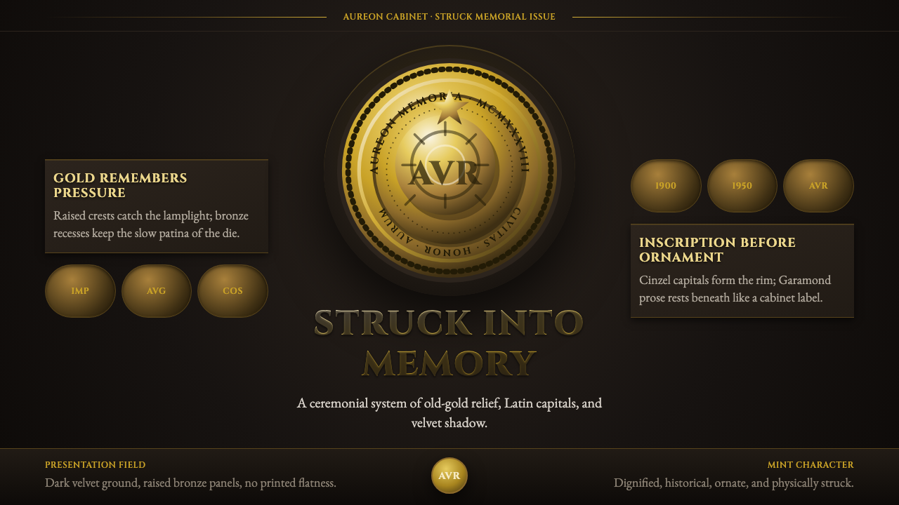 Commemorative CoinAuthority struck in metal. Old-gold relief, denticled rims, and Cinzel capita…
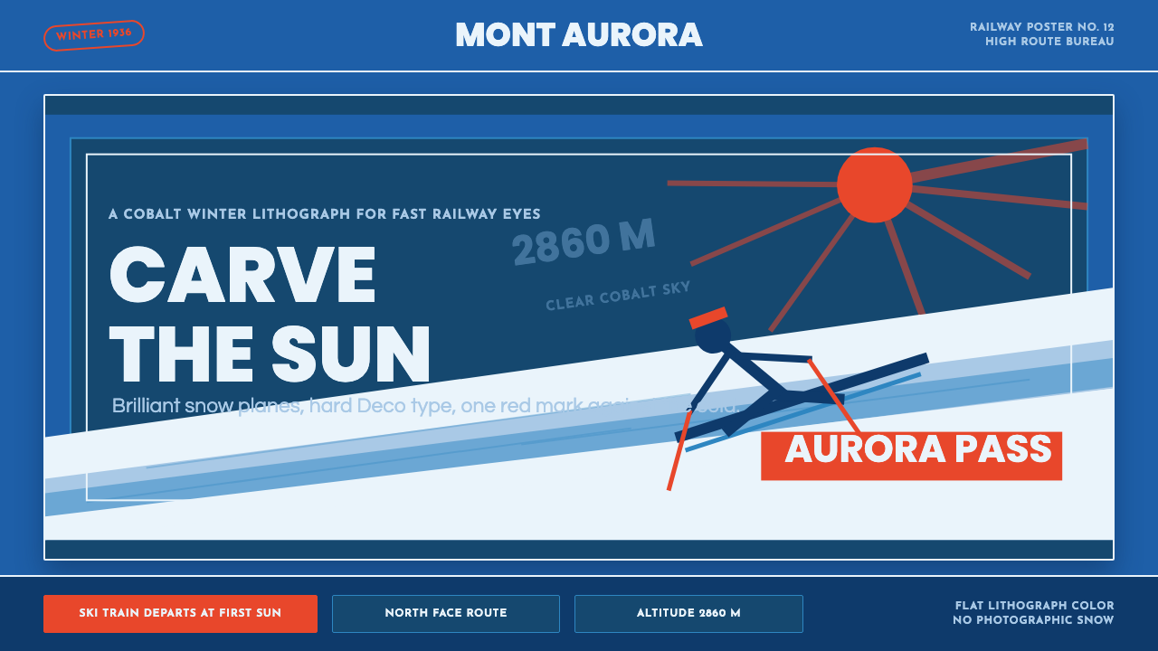 Alpine Ski PosterCold speed sells winter. Cobalt sky, snow planes, sun rays, and one resort-re…
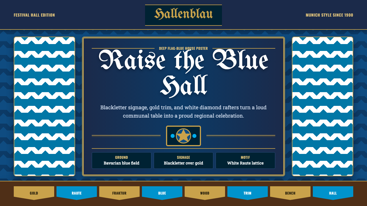 Bavarian Beer HallHearty regional ceremony. Deep flag-blue, Fraktur signage, gold trim, and whi…
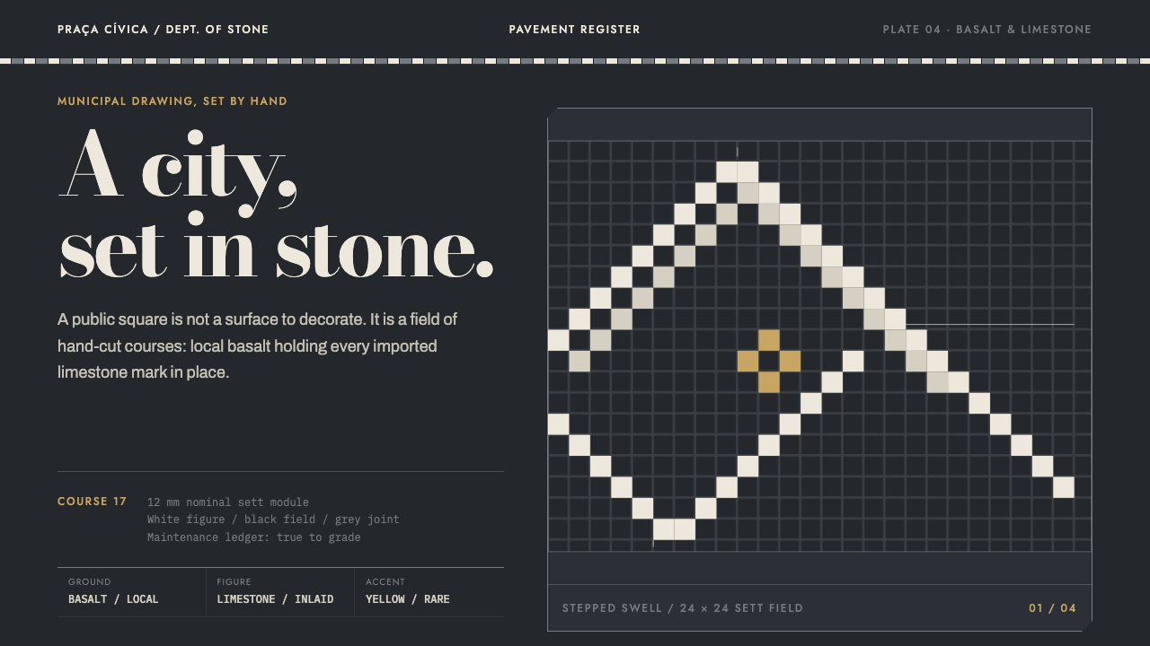 Calçada PortuguesaA city drawn in stone. Stepped limestone courses cut across a basalt grid.
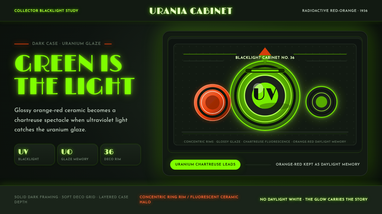 Fiestaware Radioactive Red-OrangeGlows like a collector's secret. Chartreuse rims cut through a dark deco case.
 Harley Orange & BlackBuilt like a tank badge. Burnt orange, chrome hairlines, gothic type on near…