What is Bavarian Beer Hall?
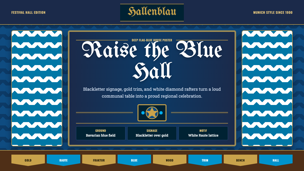
The Munich beer hall at the turn of the twentieth century is one of the most recognizable vernacular design systems in the world — deep Bavarian flag-blue, blackletter Fraktur signage, gold festival trim, and the blue-and-white Raute diamond repeated from the rafters to the stein to the pennant.
Bavarian Beer Hall in brief
The Bavarian Beer Hall style is a visual language rooted in the communal drinking halls of Munich and the surrounding Bavarian countryside, reaching its mature form between roughly 1880 and 1930. Its signature elements — the deep saturated blue of the Bavarian state flag, interlocking white diamond lozenges (Raute), ornate blackletter (Fraktur) lettering, and hammered-gold accents — fused heraldic tradition, Catholic festival culture, and guild craft into a single unmistakably regional identity.
Where most historical design systems grow out of fine-art movements or court patronage, the beer hall style emerged from the bottom up: from brewers' guild signage, painted brewery facades, commemorative ceramic steins, Volksfest (folk festival) decoration, and the shared rituals of communal benches under dark timber-framed ceilings. Its audience was always the community as a whole — not a noble patron, not an educated bourgeoisie — which is why its visual vocabulary favors legibility, bold color, and emphatic ornament over subtlety.
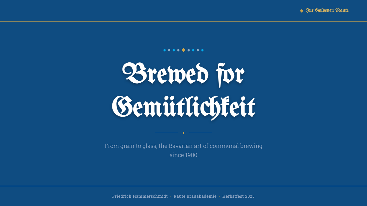
Today the Bavarian Beer Hall aesthetic functions as a globally recognized shorthand for festivity, regional pride, and communal warmth. It appears in event branding, hospitality design, food packaging, and digital interfaces seeking to evoke Gemütlichkeit — that untranslatable Bavarian word for the feeling of belonging and ease in a convivial setting.
Where does Bavarian Beer Hall come from?
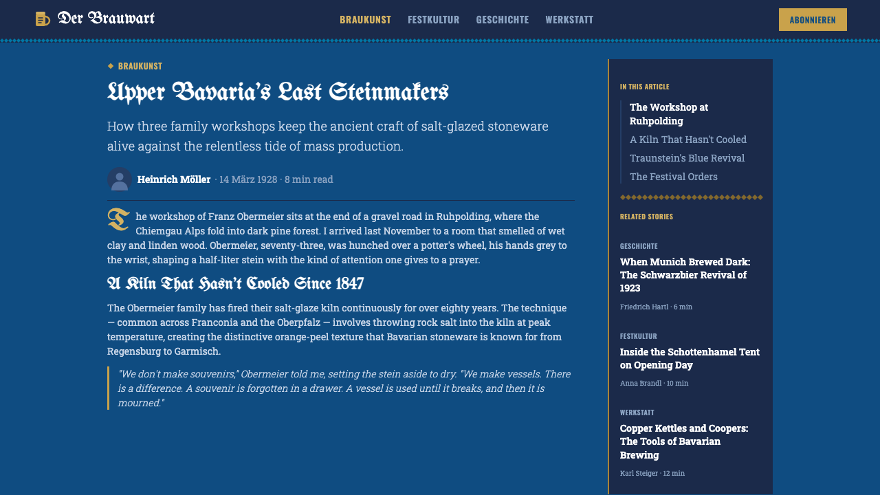
The Bavarian flag's blue-and-white Raute diamond pattern dates to medieval heraldry — the lozenges appear on the arms of the House of Wittelsbach, which ruled Bavaria from 1180 until 1918. By the nineteenth century the pattern had migrated from royal shields into popular culture: painted on brewery facades, woven into festival bunting, applied to the bases of ceramic Maßkrug steins. The pattern's ubiquity in beer-hall decoration was therefore not invented by a designer but accumulated over centuries of ceremonial repetition.
Blackletter — the Fraktur, Schwabacher, and related broken-script letterforms that had been the standard German printing type from Gutenberg's era through the late nineteenth century — remained the dominant signage typeface in Bavaria long after roman type had displaced it in northern German publishing. For Bavarian brewers and innkeepers, Fraktur was not an archaism but a living tradition: it appeared on brewery licenses, menu boards, commemorative labels, and festival posters with an authority that roman letters could not match in that regional context.
The Munich Oktoberfest, first held in October 1810 to celebrate the marriage of Crown Prince Ludwig to Princess Therese of Saxe-Hildburghausen, codified many of the visual conventions that had been developing organically in the beer halls. The festival grounds (Theresienwiese, named for the princess) brought together brewers' tents, artisans' stalls, and government pavilions, each competing for visual prominence through bold flag-blue textiles, Fraktur signage, and gold trim. By the 1870s and 1880s, the Oktoberfest visual vocabulary had become stable and self-reinforcing: each year's decoration referenced the previous year's, producing a design system through tradition rather than through intentional authorship.
The turn of the century — roughly 1890 to 1910 — was the aesthetic high point of the beer hall style. Munich was then the largest city in Bavaria, a major art capital (home to the Jugendstil artists of the Munich Secession as well as to conservative academic painting), and the headquarters of the major Bavarian breweries: Hofbräuhaus, Augustinerbräu, Paulaner, Löwenbräu. The great brewery halls built or expanded in this period — the Hofbräuhaus renovation of 1897 being the most famous — established the interior language that the style still draws from: high timber ceilings with painted medallion panels, long shared tables of raw or lightly stained pine, painted plaster walls carrying Raute patterns or hunting scenes, and ironwork chandeliers.
What defines the Bavarian Beer Hall look?
Color: Deep Flag-Blue as Ground
Unlike most historical European decorative traditions that built ornament on a white or cream ground, the Bavarian beer hall style grounds everything in deep, fully saturated Bavarian flag-blue. This is not a tint or a muted slate — it is the heraldic blue of the Wittelsbach escutcheon, applied to walls, textiles, and ceramic surfaces with the confidence of a state symbol. The blue is paired with pure white for the Raute diamonds, warm gold for festival trim and metalwork, and an earthy warm cream for unpainted timber and stonework. This ground-up use of deep color gives the style its visual density and authority; pale or washed-out blues immediately read as imitations rather than the genuine tradition.
The Raute Diamond Pattern
The interlocking blue-and-white lozenge — the Raute — is the single most concentrated symbol of Bavarian visual identity. In beer hall applications it appears at multiple scales simultaneously: large painted panels on exterior walls, medium-sized woven borders on flag bunting, small repeated prints on ceramic stein glazes. The pattern is never used hesitantly; it either covers a surface comprehensively or is concentrated into a deliberate band or panel. A single isolated Raute is almost never seen — the motif depends on repetition to carry its heraldic weight. The blue-and-white arrangement is fixed: inverting or recoloring the Raute breaks the symbolic chain.
Blackletter Signage and Fraktur Authority
Fraktur and related blackletter scripts carry the typographic voice of the beer hall. At the scale of a brewery name painted across a stone facade, or a menu heading chalked on a board, the broken curves and angular strokes of blackletter read as the voice of tradition, craft, and regional belonging. The letterforms are dense and upright, with strong contrast between the main strokes and the thin connecting hairlines. This density makes Fraktur legible at large display sizes but demanding at small ones — which is why the style naturally distributes type into a hierarchy: a blackletter display headline over a roman or semi-condensed body for menus and programs. The frequent mistake of using Fraktur for body text produces illegibility rather than atmosphere.
Gold Trim and Festival Ornament
Where the Raute provides the structural pattern and blue the dominant ground, hammered or painted gold functions as the festival accent — the visual signal that something ceremonial is underway. Gold appears on the rims of steins, on the painted borders framing heraldic panels, on the lettering of brewery crests, and on the fringes of hanging pennants and flags. It is always warm and slightly aged in character — the gold of brass fittings and commemorative medallions rather than the cold metallic gold of modern foil. The warmth of the gold reads against the cool depth of the blue as a complementary tension, giving the overall palette its festive richness without tipping into vulgarity.
Timber, Ceramic, and Material Warmth
The material palette of the historic beer hall — dark-stained or naturally aged pine and oak timber, cream salt-glazed stoneware, heavy wrought iron — gives the visual style a warmth and texture that prevents the deep blue from reading as cold. In two-dimensional applications (posters, menus, packaging, digital interfaces), this material warmth must be translated qualitatively: through slightly rough or hand-lettered textures on signage elements, through the choice of a warm rather than cool off-white for neutral fields, and through the visual weight of thick strokes and solid fills that recall the heft of a ceramic stein or a timber beam. The risk of removing all material texture is a style that looks like a flat graphic exercise rather than a genuine cultural vernacular.
Communal Scale and Generous Proportion
Beer hall design does not whisper — everything is sized for a crowded hall and for a community rather than an individual. Signage is large and broadly legible; pennants and flags run the full height of the space; murals fill entire walls. In digital and print applications, this translates to generous typography (headlines that command attention, not merely sit on a page), full-bleed or nearly full-bleed color fields, and a layout density that feels celebratory rather than austere. Margins, where they exist, are used to concentrate emphasis rather than to create minimalist breathing room. The style is fundamentally optimistic and open-handed about visual weight.
Heraldic Symmetry and Ceremonial Structure
Where Bauhaus composition is asymmetric and tension-based, the beer hall style prefers heraldic symmetry — centered crests, mirrored pennant arrangements, paired columns of text flanking a central emblem. This symmetry is not the minimalist balance of contemporary design but the ceremonial balance of shields and coats of arms: robust, declarative, and slightly frontal in its relationship to the viewer. Layouts feel like proclamations rather than arguments. This symmetrical register also makes the style highly adaptable to badge and emblem design — circular or shield-shaped compositions with Raute borders, central brewing motifs (a hop cone, a Maßkrug, a wheat sheaf), and Fraktur lettering arranged in arcs.

Who shaped Bavarian Beer Hall?
The great Munich breweries were not merely producers of beer but custodians and propagators of the visual style. The Hofbräuhaus, founded in 1589 by Duke Wilhelm V as a ducal brewery and converted to a public hall in the nineteenth century, established the interior template most strongly: long tables under painted timber ceilings, heraldic panels, and flag-blue Raute decoration on every available surface. Its 1897 renovation under city architect Max Littmann fixed the canonical interior image that subsequent beer halls worldwide have referenced. The brewery guilds controlled the visual standards of Oktoberfest decorations, ensuring that the aesthetic remained consistent across competing tents.
The annual Oktoberfest, held on the Theresienwiese meadow since 1810, became the world's largest laboratory for Bavarian visual style. Each major brewery tent — which could seat several thousand people — was itself a complete built environment: exterior facades covered in Raute banners and Fraktur signage, interior ceilings hung with hundreds of pennants, walls carrying painted murals of Bavarian landscapes and hunting scenes, and every surface integrated into a coherent chromatic scheme. Competition between the major brewers for visual spectacle drove continuous elaboration of the style from the 1870s onward. The tent interiors, renewed each year, preserved the core visual vocabulary while allowing seasonal variation and increasing technical refinement.
The stein — the Maßkrug or Bierkrug — is the single most portable carrier of Bavarian beer hall imagery. Salt-glazed and tin-glazed stoneware steins produced in the Westerwald region of Germany and in Bavarian workshops from the sixteenth century onward developed a repertoire of applied decorative motifs: Raute patterns, painted brewery crests, heraldic lions, hunting scenes, and commemorative inscriptions. The stein's physical form — heavy, hand-scale, with a pewter lid — directly shaped the style's vocabulary of generous proportion, solid material presence, and tactile weight. Similarly, the linen and wool weaving traditions of Bavaria contributed the textile grammar: indigo-dyed Raute cloth, woven borders, and the flag-blue bunting that frames every beer hall gathering.
King Ludwig I (reigned 1825–1848) was a pivotal figure in consolidating Bavarian regional identity as a deliberate cultural project. His building program in Munich — the Ludwigstrasse, the Propylaea, the Glyptothek, the Pinakothek — mixed Neoclassical architecture with Bavarian heraldic motifs, establishing the precedent for official culture drawing on regional symbolism. More directly relevant to the beer hall style, Ludwig's promotion of Bavarian folk customs (Volkstum) and his patronage of regional craft traditions helped legitimize the Raute diamond, Fraktur signage, and traditional dress (Tracht) as dignified markers of regional identity rather than merely rustic remnants. The Oktoberfest itself began under his father Maximilian I's reign as Ludwig's wedding celebration; Ludwig's own commitment to Bavarian particularism ensured the festival grew into a state-sponsored cultural institution.
From the 1870s onward, the development of chromolithography made possible large-format color festival posters that synthesized the beer hall's visual vocabulary into single-sheet compositions. The annual Oktoberfest poster, commissioned by the city of Munich and later by the individual breweries, became an annual design exercise in Bavarian visual identity: a central figure (a barmaid carrying steins, a couple in Tracht, a procession on horseback) surrounded by Fraktur lettering, Raute borders, and flag-blue grounds. These posters were widely collected and distributed, carrying the Bavarian beer hall aesthetic far beyond Munich into German-speaking Central Europe, the German diaspora communities of the United States, and eventually to a global tourist audience in the twentieth century.
How do you use Bavarian Beer Hall today?
The Bavarian Beer Hall style is one of the few historical vernacular aesthetics that translates readily into contemporary digital design — because its visual system is built around bold, flat color fields, high-contrast type, and repeating pattern, all of which are native to screen rendering. The challenge is authenticity rather than technical difficulty: the style is so widely imitated that superficial versions abound, and the difference between a genuine application and a Halloween-store Oktoberfest decoration lies in how deeply the underlying visual logic is understood.
For presentation slides, the style works best on covers and section dividers rather than body content slides. A cover built in this tradition centers a dominant Raute diamond arrangement on a deep blue ground, reserves a heraldic panel at the top or bottom for the title in display type (blackletter or a bold condensed serif), and uses gold accents sparingly as borders or rules. Section divider slides can carry pennant or banner motifs. Data and content slides should shift to a much simpler register — off-white or cream ground, dark body type, and only occasional touches of blue or gold as data highlights — to preserve legibility and avoid visual fatigue.
For web and app interfaces, the style is most appropriate for hospitality, food and beverage, event, and cultural institution brands. A Bavarian-influenced dashboard or landing page grounds its hero section in deep blue, uses the Raute pattern as a subtle or emphatic background texture, and concentrates Fraktur or blackletter-inflected display type at large scale for headlines. Interactive elements (buttons, badges, notification chips) adopt the gold-trimmed or blue-and-white banded vocabulary. Navigation and body text should remain in a legible roman face; blackletter should never appear at body sizes.
For editorial and marketing work, the poster tradition offers the clearest model: a strong central image or motif symmetrically framed by heraldic type and Raute borders. Event invitations, festival programs, packaging for Bavarian food and drink products, and heritage brand identity systems all benefit from the style's declarative confidence. The temptation in editorial applications is to use the style's ornamental vocabulary (Fraktur, borders, pennants) as decoration without committing to the underlying color logic — the result is a collection of German-looking elements rather than a coherent style.
The most common mistake when applying the Bavarian Beer Hall aesthetic is desaturating or lightening the blue to make it 'more versatile' or 'more modern.' The deep, fully saturated flag-blue is not a branding preference — it is the structural foundation of the entire system. Diluting it immediately shifts the style from authentic regionalism toward generic Oktoberfest novelty. The second most common mistake is using Fraktur at body-text sizes, producing illegibility and reader frustration rather than atmosphere. Blackletter belongs at display scale, and only one or two headline uses per composition — not as a default text face for all type.
Bavarian Beer Hall — FAQ
Is the Bavarian Beer Hall style only appropriate for food and drink brands?
Not at all, though that is its most natural home. The style's underlying visual logic — deep ground color, repeating heraldic pattern, declarative type, symmetrical structure — can support any brand or context that needs to communicate tradition, communal identity, regional pride, or celebratory occasion. It has been effectively applied to event branding (music festivals, sporting events), cultural institutions (museums, heritage tours), and product packaging across categories from clothing to craft goods. The key is committing to the full visual system rather than borrowing surface ornaments; an application that uses Fraktur headlines against a neutral white ground looks like costume rather than style.
How do I distinguish the Bavarian Beer Hall style from generic 'German' or 'Alpine' aesthetics?
The distinguishing markers are specific: the deep Bavarian flag-blue (not a lighter cerulean, not a generic navy) as the primary ground color; the blue-and-white interlocking Raute lozenge (not generic checkered patterns); Fraktur or Schwabacher blackletter (not any decorative gothic or display script); and gold as an accent rather than a primary color. Generic 'Alpine' aesthetics often substitute red for blue, use naturalistic illustration of mountains and edelweiss, or rely on yodeling-poster clichés that have no specific historical grounding. The Bavarian style is heraldically precise: its vocabulary traces to specific institutions (the Wittelsbach house, the Munich breweries, the Oktoberfest grounds) and does not generalize across the broader Alpine region.
Can the Bavarian Beer Hall style work in a digital dark-mode interface?
The style is already fundamentally dark-mode in its traditional form — the deep Bavarian blue is as dark as many dark-mode backgrounds, and the Raute pattern, gold accents, and cream or white type sit on that dark ground naturally. The challenge with a purely dark (near-black) digital dark mode is that replacing the Bavarian blue with a neutral dark grey or charcoal breaks the color logic entirely: the system depends on that specific saturated blue to carry its heraldic weight. A more productive approach is to use the authentic deep blue as the dark ground even in 'dark mode' contexts, and treat it as the canonical dark surface — which it historically was — rather than trying to adapt the style to a generic dark-grey UI convention.
Why does Fraktur feel so different from other display typefaces with historical character?
Fraktur's visual difference comes from its structural logic. Where roman typefaces and most serifs are built on a pen held at a consistent oblique angle — producing the familiar contrast between thick strokes and thin serifs — Fraktur is built on a broad-nib pen held nearly vertically, producing a different distribution of thick and thin, and then further articulated with broken pen-lifts at the transition points between strokes. The result is a letterform where the main body is dense and upright but the terminals and connectors are angular rather than rounded, creating a visual texture that is simultaneously decorative and architecturally rigid. Fraktur does not feel calligraphic in the way italic or script typefaces do; it feels constructed, even carved — which is why it reads as authoritative and institutional rather than personal and flowing.
Is the Bavarian Beer Hall style tied to specific cultural or political associations that I should be aware of before using it?
The most significant historical awareness concerns Fraktur's trajectory in the twentieth century. Blackletter was strongly associated with German nationalist movements in the 1920s and 1930s, and was officially promoted by the Nazi regime — ironically, until 1941 when Hitler denounced it as 'Schwabacher Jewish letters' and mandated roman type for all official uses instead. This history means that Fraktur can carry unintended associations if used carelessly in certain contexts, particularly in heavily typographic applications, in political or civic branding, or in markets with strong awareness of this history. In the beer hall context specifically — and especially in clear connection with Bavarian regional culture, Oktoberfest, or hospitality — the style reads as regional festivity, not as political symbol. The distinction matters: use the full visual system coherently (blue, Raute, gold, communal scale), and the heraldic and folk-festival origins dominate. Lift only the Fraktur in isolation, and the political associations become more visible.
Related design styles
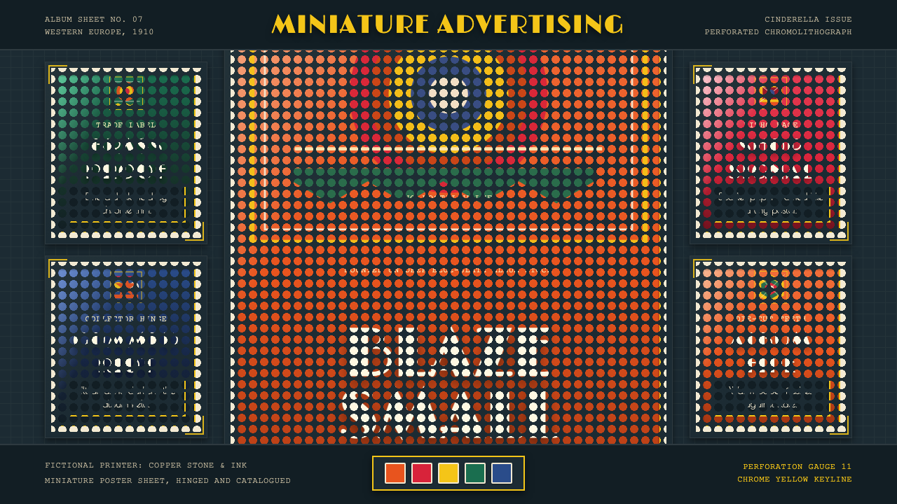 Poster Stamp (Cinderella)Blazes in miniature. Vermilion stamps, chrome keylines, and toothed edges on…
 Toblerone Matterhorn (1908)A mountain compressed into a mark. Foil gold, alpine red and strict triangles…
 Uzbek Adras & Atlas IkatColour bound before the loom. Magenta, gold and green bleed into feathered cl…
 Vegemite Jar LabelInstant pantry recall. Golden yellow, vermilion oval type, and hard black key…
 Alpine Ski PosterCold speed sells winter. Cobalt sky, snow planes, sun rays, and one resort-re…
 Cunard Liner PosterOceanic grandeur. Vermilion funnels, teak-gold caps, and a marine-blue poster…