What is Italian Espresso Bar?
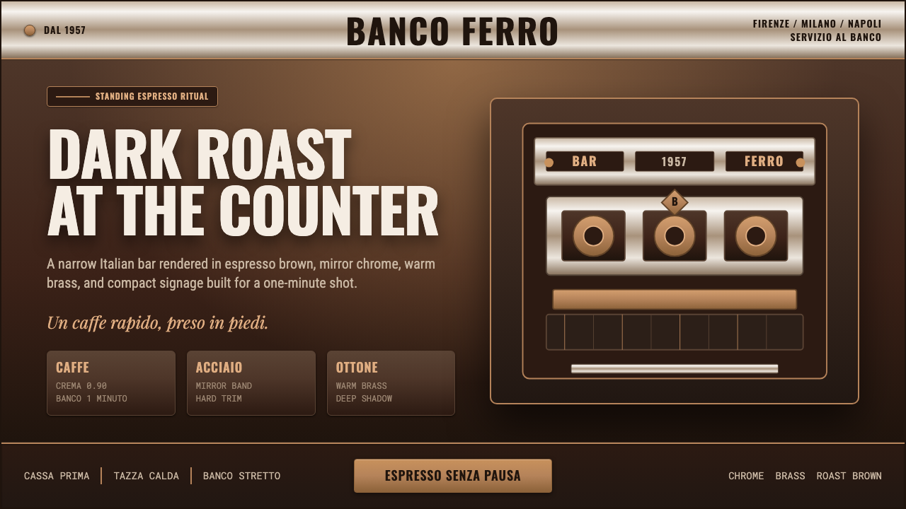
Italian Espresso Bar renders the post-war Milanese coffee counter in metal — brass fittings, mirror-polished steel, and condensed signage type pressed hard against a dark-roast ground.
Italian Espresso Bar in brief
Italian Espresso Bar is a dark, hard-surfaced aesthetic drawn from the stand-up coffee counters that spread across Italian cities in the decades after the Second World War. It is not a soft, cafe-culture look — no pastel awnings, no hand-lettered chalkboards. It is industrial and metallic: the visual residue of a room built around a machine, where customers drink standing up and leave within minutes.
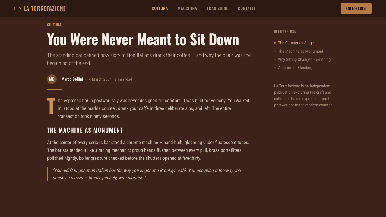
The style's governing idea is that everything visible in an espresso bar earns its place through function. The counter is deep brown because it hides stains. The fittings are brass and steel because they survive daily abuse and steam. The signage is condensed and bold because it has to be read at a glance by someone already halfway through the door. Nothing about the look is decorative for its own sake — it is a working environment that happens to be beautiful, not a beautiful environment designed to look like it works.
Visually, the style reads as dense and warm-dark rather than bright. Deep espresso brown dominates as a ground color, lifted by the gleam of polished metal and small hits of golden crema tone. Where Bauhaus uses primary color to organize a flat plane, Italian Espresso Bar uses material contrast — matte roasted surfaces against reflective chrome — to do the same organizing work. The overall effect should feel dense, mechanical, and specifically Italian: rich and dark-roasted rather than cozy or rustic.
Where does Italian Espresso Bar come from?
The espresso bar as a fixed cultural institution took shape in Italy in the years following the Second World War, as the country rebuilt its cities and its economy in what would become the postwar boom. Coffee had been part of Italian urban life for generations, but the specific ritual this style depicts — a narrow room, a long metal counter, a queue of patrons drinking a single shot standing up before returning to work — crystallized between roughly 1950 and 1990, spreading from Florence and Milan down through Naples and becoming one of the most recognizable public rituals of Italian daily life.
The engine of that ritual was the espresso machine itself, and its lineage runs back to Florence in 1927, when the La Marzocco company was founded by brothers Giuseppe and Bruno Bambi. La Marzocco's machines — recognizable by an eagle crest and a heavy, chrome-and-brass body — set the template for what an espresso machine should look like as much as how it should work: a solid, gleaming, faintly ceremonial object mounted at the center of the counter, visible to every customer, radiating heat and pressure and the smell of dark roast.
The style's material palette follows directly from that machine's construction. Espresso machines of this era were built from mirror-finish stainless steel for the boiler housings and brass for fittings, valves, and trim — materials chosen for heat tolerance, ease of cleaning, and durability under constant use, not for their appearance. Over decades of daily polishing and steam, these surfaces became a kind of vernacular metalwork, and the condensed, bold signage lettering common to Italian bar and shopfront branding of the period grew up alongside them, designed to be legible in narrow storefronts and at a hurried glance from the street.
Unlike movements built around a manifesto or a single design school, Italian Espresso Bar has no founding document and no faculty — its 'design language' emerged from decades of commercial repetition: the same brass, the same steel, the same signage conventions, refined bar by bar across Italian cities until the look became self-evidently 'espresso bar' to anyone who has stood at one.
What defines the Italian Espresso Bar look?
Color
The palette is dark and unromantic: deep espresso brown as the dominant ground, warmed by golden crema tones and roasted-bean hues, and lifted by the cool gleam of chrome highlight. This is not a moody or atmospheric darkness — it is the literal color of the product and the machinery, everyday and unglamorous by design. Bright or pastel colors have no place here; even the metallic highlights read as functional shine rather than decorative accent.
Typography
Signage lettering is condensed, bold, and set tight — letterforms compressed horizontally so more can fit across a narrow shopfront or menu board, with little space between characters or lines. This is a legibility-under-pressure typography: the kind meant to be read once, quickly, by someone already reaching for their wallet, not lingered over. Weight is heavy and unwavering; there is no delicate or light-weight type anywhere in the system.
Metal Surfaces
Mirror-finish stainless steel and warm brass are the two defining materials, and their contrast does much of the visual work that color does in other styles. Steel appears in flat, reflective planes — counter edges, machine housings — while brass shows up in fittings, trim, and small mechanical details. The combination reads as polished but hardworking: surfaces kept gleaming through daily use and cleaning, not through preciousness.
The Machine as Centerpiece
Every composition in this style implicitly or explicitly organizes itself around a central mechanical object — the espresso machine, with its eagle-crested, chrome-and-brass body sitting at the visual and functional center of the room. Layouts derived from this style tend to place one solid, gleaming, vertically emphatic object as an anchor, with everything else — text, secondary imagery, supporting detail — arranged around it the way a bar is arranged around its machine.
Density and Restraint
The narrow-room origin of the style produces a visual density: elements sit close together, with little of the generous breathing room favored by lighter, airier styles. This is not clutter — it is efficiency. Every surface is doing a job, and the composition should feel purposefully tight rather than crowded, the way a well-run espresso bar packs maximum function into minimum floor space.
Surface Finish over Ornament
Where other dark, industrial-adjacent styles might add texture through pattern or illustration, Italian Espresso Bar relies entirely on the interplay of matte and reflective finishes to create visual interest. A composition should read as though built from a handful of real material surfaces — brushed metal, polished chrome, a flat roasted-brown ground — rather than from applied graphic decoration. If an element cannot be explained as a plausible physical surface in an espresso bar, it does not belong.
Compact Hierarchy
Because the source ritual is fast — order, drink, pay, leave — the style's information hierarchy favors very few levels, resolved instantly rather than explored. A price, a name, a single mechanical image: the composition should communicate its full content in the time it takes to glance up from a counter, mirroring the actual speed of the transaction it depicts.
Who shaped Italian Espresso Bar?
Giuseppe Bambi co-founded La Marzocco in Florence in 1927, and the company's chrome-and-brass espresso machines — marked by their distinctive eagle crest — established the physical template that this style still draws from: a solid, gleaming mechanical centerpiece built to dominate a narrow counter. The engineering choices the Bambi brothers made for durability and heat tolerance became, decades later, aesthetic signatures in their own right.
Bruno Bambi, Giuseppe's brother and La Marzocco co-founder, shared in building the machine lineage that gave the Italian espresso bar its mechanical soul. The brothers' company became synonymous with the professional espresso machine as an object of trust and craft, and its enduring chrome-and-brass silhouette continues to define what 'a proper espresso machine' should look like in bars across Italy and, eventually, the world.
How do you use Italian Espresso Bar today?
Italian Espresso Bar transfers well into design work that wants to feel dense, dark, mechanical, and unmistakably confident, rather than airy or approachable. Applying it means thinking in materials first — what would be steel, what would be brass, what would be flat roasted-brown ground — rather than starting from a color swatch.
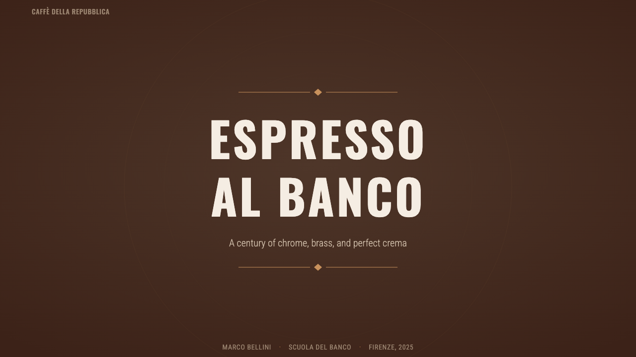
For presentation slides, a cover page benefits from treating the frame the way a bar counter is composed: one dominant dark ground, a single gleaming focal object (rendered as a metallic shape or icon) placed the way a machine sits at the center of a counter, and condensed, heavy title type set tight with little letterspacing. Content and data slides should stay dense rather than spacious — tightly packed rows of information, metallic dividing lines standing in for the physical trim on a counter, and numbers or key figures treated as if stamped in metal rather than printed on paper.
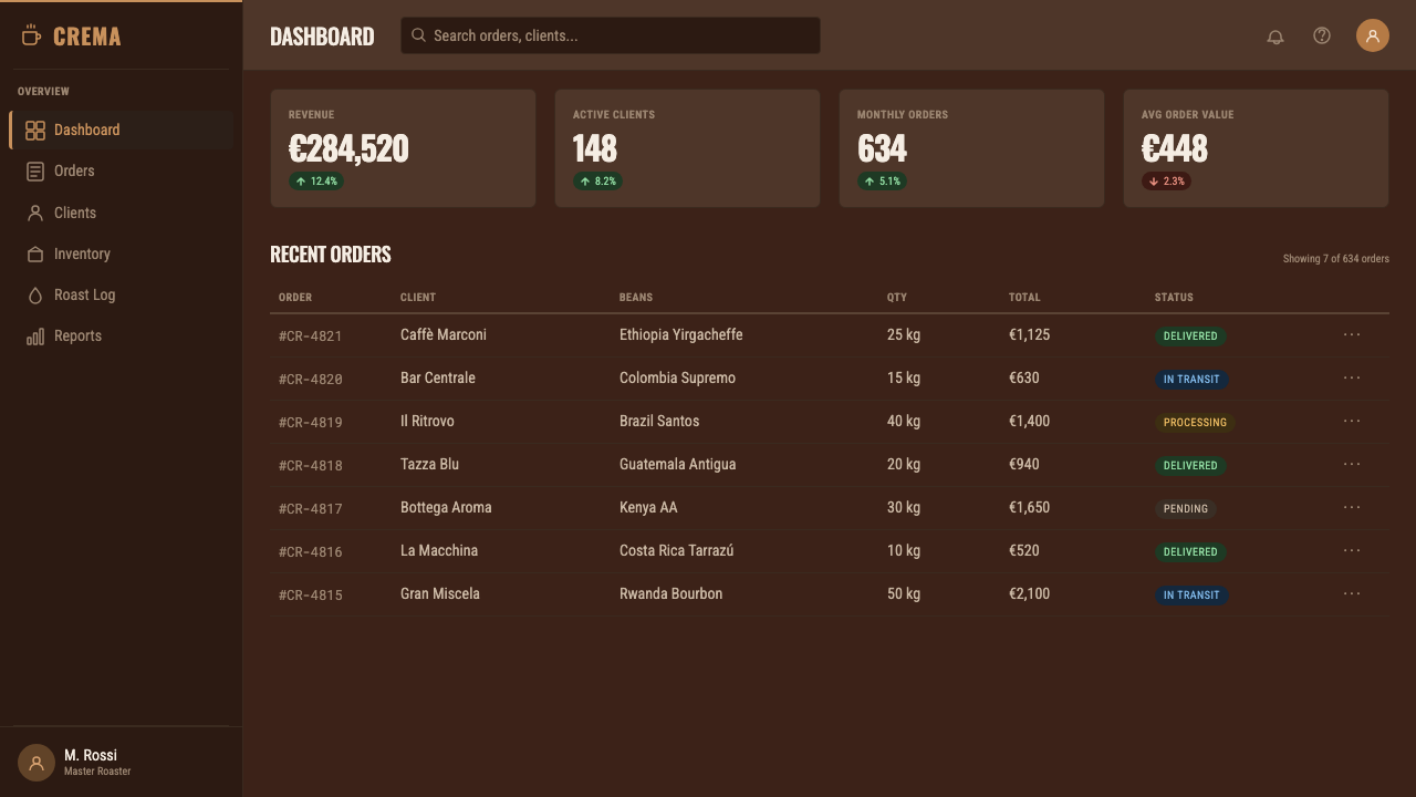
For web UI, the style suits dashboards and pricing pages that want to project precision and seriousness rather than friendliness. A dashboard skinned this way keeps a dark roasted-brown or near-black base, uses chrome-like highlight sparingly on active states and key metrics, and favors dense, tightly-spaced data tables over generously padded cards. Pricing pages benefit from treating the featured tier the way the machine is treated on a counter — as the one solid, gleaming, centrally placed object that everything else in the layout defers to.
For editorial and marketing work, the style supports bold, poster-like statements more than long-form warmth: condensed heavy headlines against a dark roasted ground, brass-toned rules separating sections, and photography or imagery treated in high-contrast, metallic tones rather than soft or naturalistic lighting. It works especially well for brands wanting to signal craft, heritage, and no-nonsense quality — hospitality, tools, and premium food-and-beverage positioning all borrow its confidence naturally.
A common mistake is softening the style until it becomes generic 'coffee shop' branding — adding pastel accents, hand-drawn illustration, or airy whitespace in an attempt to make it feel warmer. That undoes the entire premise. The style's warmth comes from material richness (the glow of brass, the depth of roasted brown) and density, not from softness or whimsy; lightening the palette or loosening the composition erases what makes it recognizably Italian Espresso Bar rather than a generic cafe look.
Italian Espresso Bar — FAQ
How is Italian Espresso Bar different from a generic 'coffee shop' aesthetic?
A generic coffee-shop look tends toward warmth through softness — pastel accents, hand-lettering, cozy textures, generous whitespace meant to feel relaxed and lingering. Italian Espresso Bar does the opposite: its warmth comes from material density and confidence, not softness. It depicts a room built for speed and function around an industrial machine, so it stays dark, metallic, tightly composed, and unsentimental. If a layout feels relaxed or leisurely, it has drifted away from this style.
Why brass and steel specifically, rather than other metals or finishes?
Brass and mirror-finish stainless steel were the materials actually used to build professional espresso machines and bar fittings in this era, chosen for heat resistance, durability under constant use, and ease of daily cleaning. The style borrows its material palette directly from that engineering reality rather than from an invented visual theme, which is part of why the combination feels authentic rather than arbitrary: every metallic surface in the style traces back to a real functional surface in a real espresso bar.
Can this style work in a light or bright layout, or does it require a dark ground?
The style is built around a dark ground — deep espresso brown is foundational, not incidental, and the whole system of metallic contrast depends on having a dark, matte surface for chrome and brass to gleam against. A light or white-ground version would lose the central visual relationship the style relies on. If a lighter feel is genuinely needed, it is more honest to reach for a different style than to strip the dark ground from this one.
How should typography be handled if condensed Italian signage fonts aren't available?
The governing principle matters more than any single typeface: choose a bold, heavy weight and set it condensed and tight, with minimal letterspacing, so it reads as signage meant for a quick glance rather than body copy meant for lingering. Any sufficiently bold, geometrically tight sans-serif can stand in, as long as the composition preserves that dense, no-nonsense legibility rather than opening the letterforms up for a softer, more leisurely read.
What kinds of products or brands should avoid this style?
Brands seeking to project lightness, playfulness, or casual approachability will find this style works against them — its density and dark, metallic seriousness read as intense rather than friendly. It also sits awkwardly with products aimed at broad, low-commitment browsing, since the style's compact, glance-and-go hierarchy assumes a confident, already-decided user rather than one still exploring options. It is best reserved for contexts where craft, heritage, and no-nonsense precision are genuine selling points.
Related design styles
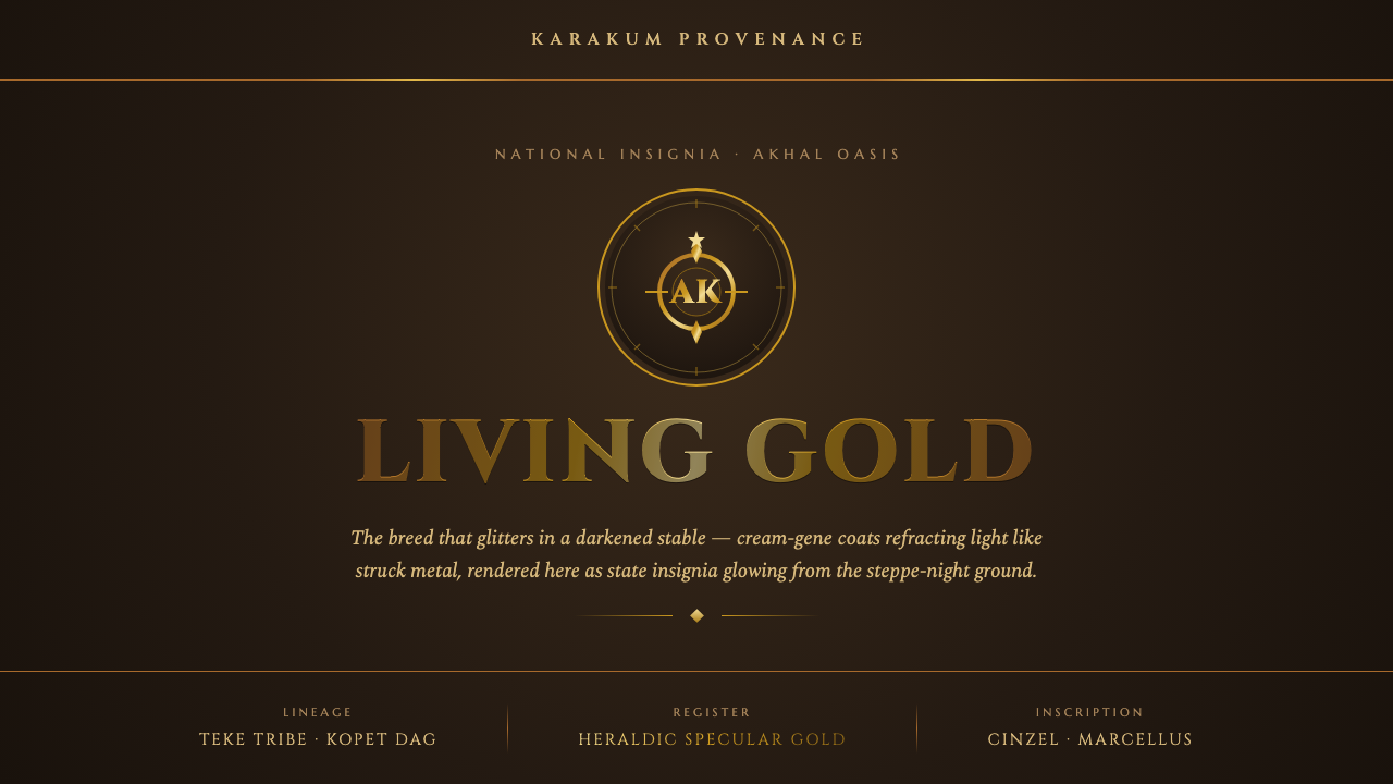 Akhal-Teke Golden HorseGold that behaves like light. Specular sheen glowing from a stable-dark groun…
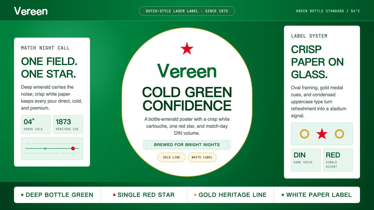 HeinekenEmerald owns the field. White label, red star, gold line, and condensed type…
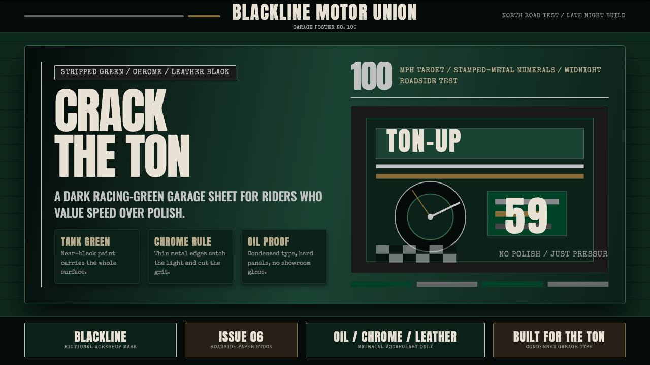 Café Racer Ton-UpGarage grit at speed. Near-black racing green, chrome rules, condensed sign t…
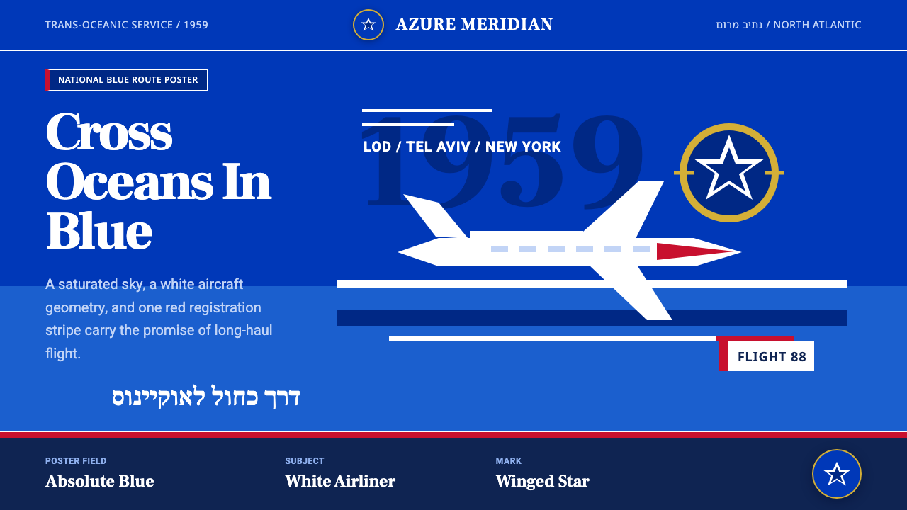 El Al Israel AirlinesNational blue takes command. White aircraft geometry cuts a flat jet-age post…
 Havana Club Cuban RumSunset in print. Crimson slab type and ocean teal rules age on chalk-white pa…
 Marlboro Red Flip-Top (1955)Authority in one fold. Cadmium red, white chevron, and gold type read like a…