What is Havana Club Cuban Rum?什么是 Havana Club Cuban Rum?
Sunset bottled in print — Havana Club's crimson slab type, ocean-teal rules, and chalk-white stock carry the full weight of Cuba's golden age of lithographic craft.将日落封存于印刷之中——哈瓦那俱乐部的深红粗衬线、海洋青绿线框与白垩纸张,共同承载着古巴石版印刷黄金年代的全部分量。
Havana Club Cuban Rum in briefHavana Club Cuban Rum 速览
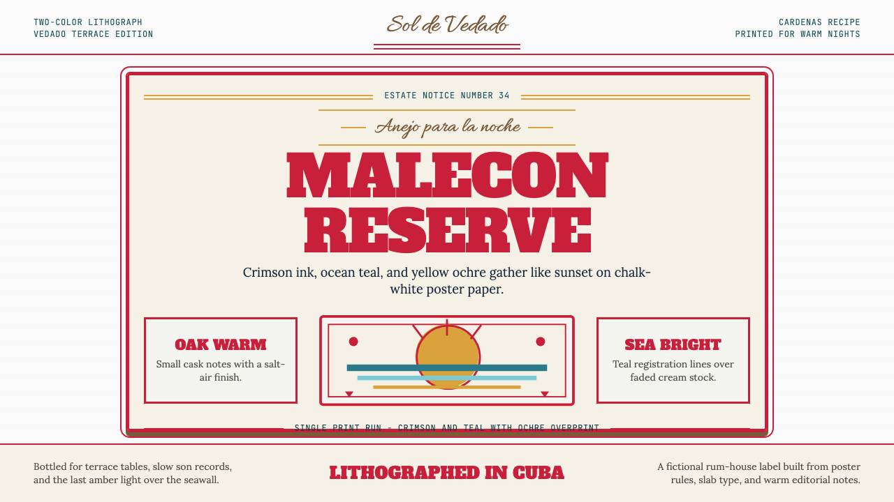
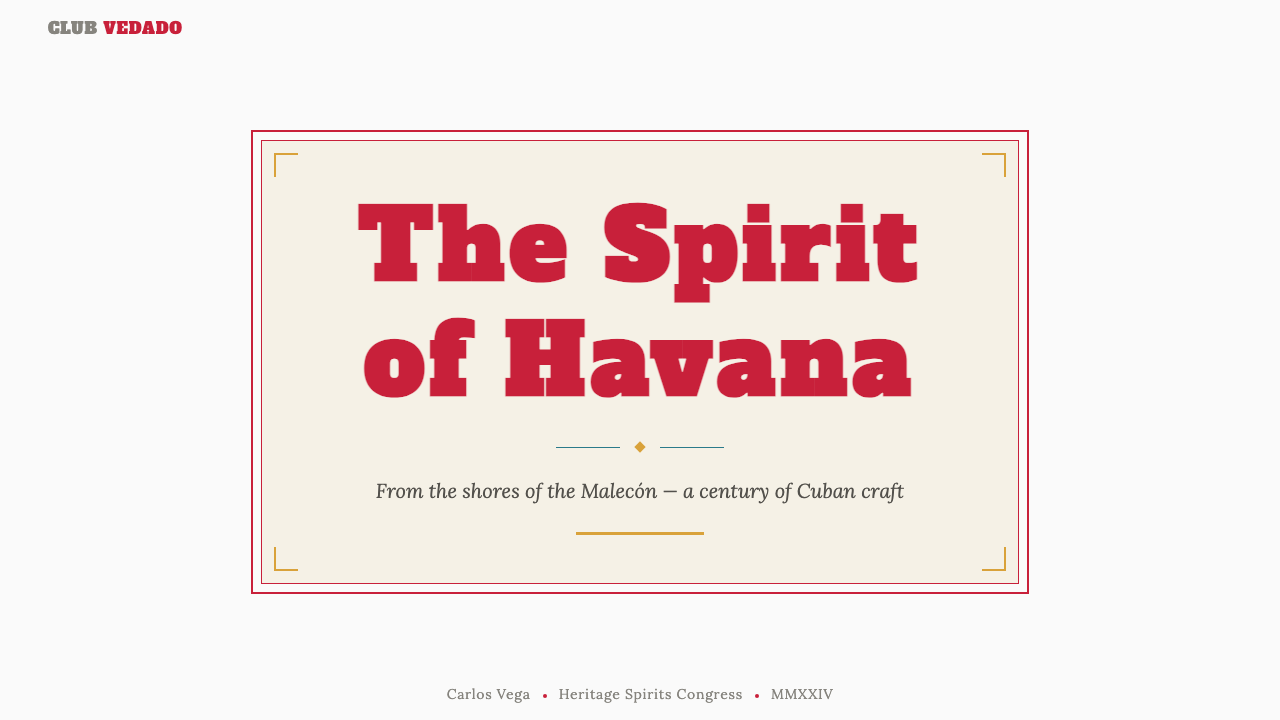
Havana Club Cuban Rum Vintage is a design system rooted in the visual traditions of Cuba's mid-twentieth-century lithographic poster school. It is characterized by a commanding crimson slab-serif headline type, ocean-teal accent rules and borders, chalk-white or aged-paper grounds, and ornamental corner cartouches that echo the hand-crafted tobacco and rum label craft of pre-Revolution Havana. The system is not merely retro pastiche — it is a precise reconstruction of a specific printing culture, governed by the material constraints of two-color lithography and the aesthetic ambitions of Cuban commercial artists working at the peak of their tradition.哈瓦那俱乐部古巴朗姆酒复古风格是一套植根于二十世纪中叶古巴石版海报传统的视觉系统。其标志性元素包括:气势磅礴的深红色粗衬线标题字体、海洋青绿色的强调线框与边饰、白垩色或泛黄的仿旧纸底,以及呼应革命前哈瓦那烟草与朗姆酒标签工艺的装饰性角花。这套系统并非简单的复古拼贴——它是对一种特定印刷文化的精确重建,受限于双色石版印刷的材料条件,也承载着古巴商业艺术家在传统巅峰时期的美学抱负。
The visual logic of the system centers on warmth, legibility, and ceremonial weight. Every composition is built to feel like a label or a poster: type is set large and bold, rules are used as structural frames rather than decoration, and the limited palette is deployed with the confidence of a printer who knows that restraint is not poverty but mastery. The ornamental flourishes — cartouches, double-rules, script accents — are not applied arbitrarily but follow the grammar of lithographic label design, where every mark had a practical origin in the registration and hierarchy demands of commercial printing.该系统的视觉逻辑以温度、易读性与仪式感为核心。每一个构图都被打造得如同一张标签或海报:字体设置得宽大而粗重,线条作为结构性框架而非装饰使用,有限的色板以印刷师的自信部署——那种自信源于对克制并非贫乏而是掌握的深刻理解。装饰性元素——角花、双线框、花体脚本强调——并非随意添加,而是遵循石版标签设计的语法,这套语法中每一个标记都在商业印刷的套色与层级要求中有其实际起源。
At its heart, this design language is a celebration of craft specificity. It communicates provenance, tradition, and the pleasures of a particular place and time. Applied well, it conveys the sensation of holding something genuinely old — not artificially aged, but matured through the real accumulation of cultural meaning. It is a style for brands, publications, and experiences that want to feel earned rather than engineered.从本质上说,这套设计语言是对工艺特殊性的颂扬。它传递着出处、传统,以及某个特定时间与地点所独有的愉悦。运用得当时,它会让人感受到持有某件真正古老之物的感觉——不是人工做旧,而是通过文化意涵的真实积淀而自然成熟。这是一种适合品牌、出版物和体验的风格——它让人感到那种质感是挣来的,而非被制造的。
See the Havana Club Cuban Rum design system查看 Havana Club Cuban Rum 完整设计系统
Where does Havana Club Cuban Rum come from?Havana Club Cuban Rum 从何而来?
Havana Club was founded in 1934 in Cárdenas, Cuba, by José Arechabala, a Spanish immigrant entrepreneur who had built a sugar and spirits business on the island. The Arechabala family distillery produced a rum that quickly became associated with the glamour of mid-century Havana — the Vedado bars, the Malecón promenades, the hotel rooftops where American tourists and Cuban society mingled in the years before the Revolution. The brand's visual identity during this founding era drew directly from the lithographic poster culture that was simultaneously flourishing in Havana's commercial printing houses.哈瓦那俱乐部于1934年由西班牙移民企业家何塞·阿雷查巴拉在古巴卡德纳斯创立。阿雷查巴拉家族在岛上经营糖业与烈酒生意,其酿制的朗姆酒迅速与二十世纪中叶哈瓦那的光辉岁月联系在一起——韦达多区的酒吧、马雷贡海堤的漫步长廊、以及革命前美国游客与古巴社会名流混迹其中的酒店屋顶。品牌在这一创立时期的视觉形象,直接汲取自哈瓦那商业印刷厂同期蓬勃发展的石版海报文化。
The aesthetic context from which Havana Club's visual language emerged was the Cuban lithographic poster school of the 1940s and 1950s — one of the richest commercial art traditions in the Western Hemisphere. Cuban poster artists of this period, including the caricaturist and graphic designer Conrado Massaguer and the painter and illustrator Eduardo Abela, developed a visual vocabulary that fused Spanish colonial decorative traditions, Art Deco geometry, and the bold two-color printing possibilities of the lithographic press. Massaguer, in particular, was known for his magazine covers and advertising work that combined slab-serif display type with ornamental cartouches and vivid tropical color — elements that read directly in the Havana Club visual grammar.哈瓦那俱乐部视觉语言的美学土壤,是二十世纪四五十年代的古巴石版海报流派——西半球最丰富的商业艺术传统之一。这一时期的古巴海报艺术家,包括漫画家兼平面设计师孔拉多·马萨盖尔与画家兼插图师爱德华多·阿贝拉,发展出一套融合西班牙殖民装饰传统、装饰艺术几何感与石版印刷机大胆双色印刷可能性的视觉词汇。马萨盖尔尤以其结合粗衬线展示字体、装饰性角花与浓烈热带色彩的杂志封面与广告作品著称——这些元素在哈瓦那俱乐部的视觉语法中清晰可辨。
The 1959 Revolution fundamentally disrupted the brand's continuity. The Arechabala family's assets were nationalized, and the family emigrated. The Cuban state continued producing rum under the Havana Club name, while the Arechabala family attempted — ultimately unsuccessfully — to revive the brand in exile. In 1993, Pernod Ricard entered a joint venture with the Cuban state enterprise Cuba Ron S.A., relaunching Havana Club as an international premium rum brand. This relaunch required a visual identity that could carry the weight of the brand's authentic Cuban heritage while functioning in contemporary global markets. The design team returned to the pre-Revolution lithographic tradition, excavating and systematizing the visual codes of the 1950s golden age.1959年的革命从根本上打断了品牌的延续。阿雷查巴拉家族资产被收归国有,家族成员流亡海外。古巴国家政权继续以哈瓦那俱乐部之名生产朗姆酒,而阿雷查巴拉家族则在流亡中尝试——最终未能成功——重振品牌。1993年,保乐力加与古巴国营企业古巴朗姆公司合资,将哈瓦那俱乐部重新推向国际高端朗姆酒市场。此次重新上市需要一套视觉形象,能够承载品牌真实古巴传承的分量,同时在当代全球市场中有效运作。设计团队回溯革命前的石版印刷传统,发掘并系统化了二十世纪五十年代黄金年代的视觉密码。
The master rum blender Don Pancho Fernandez became a central figure in the brand's post-1993 identity, serving as the keeper of production knowledge and the human face of Cuba's rum-making tradition. His presence in brand communications reinforced the connection between the visual system and the craft reality it represented — a reminder that the aesthetic choices were not arbitrary heritage cosplay but an attempt to honestly represent a specific artisanal tradition that had survived the discontinuities of Cuban history. The visual language thus functions simultaneously as graphic design and as cultural testimony, carrying information about a place, a practice, and a period that cannot be adequately conveyed through purely contemporary forms.首席调酒师唐·潘乔·费尔南德斯成为品牌1993年后形象的核心人物,作为生产工艺知识的守护者与古巴朗姆酒酿造传统的人格化象征。他在品牌传播中的存在,强化了视觉系统与其所代表的工艺现实之间的联系——这是一个提醒:那些美学选择并非任意的传统扮演,而是对一种特定手工艺传统的诚实呈现,那种传统跨越了古巴历史的诸多断层得以留存。这套视觉语言因此同时作为平面设计与文化见证发挥功能,携带着一个地方、一种实践与一个时代的信息——这些信息无法通过纯粹当代的形式得到充分传达。
What defines the Havana Club Cuban Rum look?Havana Club Cuban Rum 的视觉特征是什么?
Color Palette色板
The palette is anchored by a deep, saturated crimson that functions as the primary structural and typographic color — it carries the same weight as black in conventional label design but adds the warmth of the tropics. Ocean teal provides the secondary accent, used for horizontal rules, thin border lines, and occasional ornamental fills. The ground is chalk-white or a slightly warm off-white that evokes aged paper stock. This three-value system — crimson, teal, and near-white — is the entire vocabulary; additional colors appear only in very specific heritage contexts and never at high saturation. The restraint is deliberate: two-color lithographic printing made this economy a necessity, and the aesthetic has preserved it as a virtue.色板以深度饱满的深红色为锚——它作为主要的结构性与字体性色彩发挥作用,与常规标签设计中黑色的地位相当,但多了一份热带的温度。海洋青绿色提供次级强调,用于横向线条、细边框线与偶发的装饰性填充。底色是白垩白或略带暖调的米白,唤起泛黄纸张的质感。这个三值系统——深红、青绿、近白——构成全部词汇;其他色彩只在极为特定的传承语境中出现,且从不以高饱和度呈现。这种克制是刻意为之的:双色石版印刷使这种经济性成为必需,而这套美学将其保存为了一种美德。
Slab-Serif Typography粗衬线字体排印
Headline type is set in heavy slab-serif letterforms — the kind of bold, block-footed display type that dominated nineteenth and early twentieth century commercial printing and was the default choice of Cuban lithographic poster artists. These letterforms carry the visual weight of woodblock type: wide, confident, built to be read across a bar room. Body and supporting text shifts to a warm editorial serif, softening the overall register without losing legibility. A hand-lettered script accent — used sparingly for product names or decorative sub-headings — introduces the human touch of a skilled letterer and anchors the system in artisanal rather than mechanical production.标题字体采用厚重的粗衬线字形——那种宽大、块脚分明的展示字体,主导了十九世纪与二十世纪初期的商业印刷,也是古巴石版海报艺术家的默认选择。这些字形承载着木刻活字的视觉分量:宽阔、自信,专为穿越酒吧空间的距离而设计。正文与辅助文字转向温暖的编辑衬线字体,在不失易读性的前提下柔化了整体基调。手写花体风格的脚本强调——克制地用于产品名称或装饰性副标题——引入了技艺熟练的书法匠人的人文触感,将系统锚定于手工而非机械生产的传统之中。
Ornamental Cartouches and Rules装饰角花与线框
Thin double-rules frame the composition in the manner of a formal label, creating a contained, ceremonial reading space. Corner cartouches — small ornamental brackets or flourishes at the intersection of border lines — echo the tobacco and rum label conventions of pre-Revolution Cuba, where such details signaled authenticity and artisanal care. These elements are structural as much as decorative: they establish hierarchy by defining zones, they signal that what is inside the frame deserves careful attention, and they translate the physical experience of holding a bottle label into a flat graphic context. The rules and cartouches are always rendered in crimson or teal, never in black, preserving the warmth of the palette.细双线框以正式标签的方式围合构图,创造出一个收束而具有仪式感的阅读空间。角花——边框线交汇处的小型装饰性括弧或花饰——呼应革命前古巴烟草与朗姆酒标签的惯例,那些细节在当时象征着真实性与手工艺的用心。这些元素既是装饰性的,也是结构性的:它们通过划定区域来建立层级,它们传递出框架内的内容值得细细品读的信号,它们将持握一张酒瓶标签的物理体验转化为平面图形语境。线框与角花始终以深红或青绿呈现,从不用黑色,保全了色板的温度。
Paper and Surface Texture纸张与表面肌理
The ground evokes uncoated, slightly absorbent paper — the kind of stock on which real lithographic inks would feather imperceptibly at the edges and acquire a slight bloom after years in Caribbean humidity. This is not a uniform digital white but a material white, with the warmth and slight unevenness of physical paper. In digital applications, this quality is achieved through a subtly warm off-white ground rather than a pure neutral, and occasionally through restrained use of aged-paper textures that suggest time without performing decay. The texture is always subordinate to typography and color — it provides ground, not visual competition.底色质感唤起的是无涂层、略带吸墨性的纸张——那种在真实石版印刷中油墨边缘会微不可察地晕染、在多年的加勒比湿气中会略微泛花的用纸。这不是均匀的数字纯白,而是一种有材质感的白,带着实体纸张的温度与轻微的不均匀性。在数字化应用中,这种品质通过略带暖调的米白底——而非纯中性色——来实现,偶尔也会审慎地运用泛黄纸张肌理,暗示时间感而不表演腐败感。质感始终服从于字体与色彩——它提供的是背景,而非视觉竞争。
Composition and Hierarchy构图与层级
Compositions are centered and formally symmetrical in the manner of a label, rather than the dynamic asymmetry characteristic of modernist poster design. This symmetry is not static: it is activated by strong vertical and horizontal axes, by deliberate contrast between the heavy slab headline and the lighter supporting text, and by the rhythmic placement of ornamental elements. The hierarchy is clear and immediate: crimson slab headline at the top, teal rule beneath it, editorial body text in the middle zone, and script accent or ornamental cartouche at the base. Reading direction is top-to-bottom and center-outward, following the conventions of a formal label read in hand.构图采用以标签方式为准的居中与正式对称,而非现代主义海报设计所特有的动态非对称。这种对称并非静态的:它通过强烈的垂直与水平轴线得到激活,通过粗重粗衬线标题与较轻辅助文字之间的刻意对比得到激活,也通过装饰性元素的韵律性布置得到激活。层级清晰而即时:深红粗衬线标题居顶,其下是青绿线条,中间区域是编辑风格正文,底部是花体脚本强调或装饰角花。阅读方向是自上而下、由中央向外,遵循手持正式标签时的阅读惯例。
Script Accents and Hand-Lettering花体脚本强调与手写字
The hand-lettered script element — appearing in product naming, sub-headings, or decorative flourishes — is the system's most emotionally warm component. It signals that a human hand participated in the making: not a generic calligraphic font dropped onto a layout, but a letterform with the personality and slight irregularity of genuine craftsmanship. In the broader Cuban lithographic tradition, hand-lettering was a prestige marker — the finest label work involved artists who could letter consistently at size, creating forms that had both the legibility of type and the expressiveness of drawing. This heritage gives the script element its authority; used sparingly, it elevates the whole composition.手写花体脚本元素——出现于产品命名、副标题或装饰性花饰中——是系统中情感温度最高的组成部分。它传递出一双人手曾参与制作的信号:不是将某种通用花体字体放置于版面,而是具有真正手工艺性格与轻微不规则感的字形。在更广泛的古巴石版印刷传统中,手写字是一种声望标记——最精良的标签作品需要能在规格尺寸下保持一致性的字形艺术家,那些字形同时具备印刷字体的易读性与绘画的表现力。这一传承赋予了花体脚本元素其权威性;克制使用时,它能提升整个构图的格调。
Tropical Warmth and Light热带温度与光感
Underlying the entire visual system is an evocation of light — not the cool, northern light of European modernist design, but the rich, sideways light of late afternoon in the Caribbean. This is not achieved through gradients or atmospheric illustration but through color temperature: the warmth of the crimson, the softness of the chalk-white ground, and the slight saltiness of the ocean teal together create a palette that reads as warm without a single warm neutral. The system's emotional register is sunset on the Malecón — the specific quality of light at a specific hour on a specific sea wall — rendered through the economy of two-color commercial printing.整个视觉系统的底层是一种对光线的召唤——不是欧洲现代主义设计那种清冷的北方光线,而是加勒比海傍晚时分那种浓郁的斜射光。这种效果不是通过渐变或大气氛围插图实现的,而是通过色温实现的:深红的温度、白垩白的柔软,以及海洋青绿的轻微咸意,共同创造出一套在没有任何暖性中性色的情况下却读来温暖的色板。系统的情感基调是马雷贡海堤上的日落——特定海堤上特定时刻的特定光质——通过双色商业印刷的经济性手段得以呈现。
See the Havana Club Cuban Rum design system查看 Havana Club Cuban Rum 完整设计系统
Who shaped Havana Club Cuban Rum?谁塑造了 Havana Club Cuban Rum?
The Spanish-born entrepreneur who founded Havana Club in Cárdenas in 1934. Arechabala built his distillery on the sugar industry wealth of the Cuban interior, and his brand's early visual identity was shaped by the commercial printing culture of the period — slab-serif display type, ornamental label conventions, and the two-color lithographic vocabulary that Cuban printers had developed to a high art. The family's exile after 1959 created the discontinuity that would later define the brand's complex history and the particular weight of its heritage identity.1934年在卡德纳斯创立哈瓦那俱乐部的西班牙裔企业家。阿雷查巴拉依托古巴内陆制糖业的财富建立了自己的蒸馏厂,品牌早期的视觉形象由当时的商业印刷文化塑造——粗衬线展示字体、装饰性标签惯例,以及古巴印刷师已发展为高度艺术形式的双色石版印刷词汇。1959年后家族的流亡造成了那道断层,这道断层后来定义了品牌复杂的历史,也赋予了其传承形象特殊的分量。
One of the defining figures of Cuban commercial art in the first half of the twentieth century, Massaguer was a caricaturist, illustrator, and graphic designer whose magazine covers and advertising work established the visual conventions that the Havana Club system draws upon. His combination of slab-serif display type, ornamental cartouches, and vivid two-color printing captured the energy and sophistication of Havana's golden age social scene. His magazine Social, published from 1916, was the primary venue for Cuban Art Deco commercial illustration and set the aesthetic standard for high-end Cuban graphic design.孔拉多·马萨盖尔是二十世纪上半叶古巴商业艺术的定义性人物之一,作为漫画家、插图师与平面设计师,他的杂志封面与广告作品建立了哈瓦那俱乐部系统所援引的视觉惯例。他对粗衬线展示字体、装饰性角花与鲜活双色印刷的结合,捕捉到了哈瓦那黄金年代社交场景的活力与精致。他自1916年出版的杂志《社会》(Social)是古巴装饰艺术商业插图的主要阵地,确立了高端古巴平面设计的美学标准。
A major Cuban painter and caricaturist of the republican era, Abela's work bridged fine art and commercial illustration in ways that typified the richest Cuban graphic tradition. His satirical and celebratory images of Cuban life — characterized by warm color, confident line, and a deep affection for the visual details of everyday Cuban culture — contributed to the visual vocabulary that commercial artists, including those who designed rum and tobacco labels, drew upon throughout the mid-century period. His work represents the high-art dimension of a tradition that the Havana Club aesthetic systematically mines.爱德华多·阿贝拉是共和国时期的重要古巴画家与漫画家,他的作品以典型古巴最丰富图形传统的方式跨越了纯艺术与商业插图之间的边界。他对古巴生活的讽刺性与颂扬性描绘——以温暖色彩、自信线条,以及对古巴日常文化视觉细节的深厚情感为特征——为商业艺术家(包括朗姆酒与烟草标签的设计者)提供了视觉词汇,并在整个世纪中叶延续使用。他的作品代表了哈瓦那俱乐部美学系统性汲取的那个传统的纯艺术维度。
The master rum blender who became the human face of Havana Club's post-1993 revival and the embodiment of Cuban rum-making tradition. Don Pancho's presence in brand communications was not merely ambassadorial — he represented the continuity of craft knowledge that had survived the disruptions of Cuban history, and his association with the brand gave its heritage visual language a living referent. The design system's insistence on artisanal authenticity — hand-lettered accents, label conventions rooted in real production culture — draws authority from the fact that the production tradition it references is real and ongoing, not merely historical.唐·潘乔·费尔南德斯是首席调酒师,成为哈瓦那俱乐部1993年复兴后的人格化形象,以及古巴朗姆酒酿造传统的具身化象征。他在品牌传播中的存在不仅仅是大使性质的——他代表着跨越古巴历史动荡而得以延续的工艺知识,他与品牌的关联赋予了其传承视觉语言一个活生生的参照。设计系统对手工艺真实性的坚持——手写花体强调、植根于真实生产文化的标签惯例——正是从这样一个事实中获得权威:它所援引的生产传统是真实且持续的,而非仅仅是历史性的。
How do you use Havana Club Cuban Rum today?今天怎么用 Havana Club Cuban Rum?
The Havana Club Cuban Rum Vintage design system is best understood as a label-poster hybrid: it brings the formal structure and ornamental vocabulary of a traditional spirits label into larger compositional contexts. Applying it well requires internalizing that grammar — knowing when a double-rule frames and when it clutters, when a script accent elevates and when it merely decorates. The system rewards restraint and punishes accumulation; adding more crimson ornaments does not intensify the effect, it dilutes it.哈瓦那俱乐部古巴朗姆酒复古设计系统最好被理解为一种标签-海报混合体:它将传统烈酒标签的正式结构与装饰性词汇带入更大的构图语境。要运用得当,需要内化这套语法——知道双线框在何时起到框定作用、在何时制造杂乱;知道花体脚本强调在何时提升格调、在何时仅仅是装饰。这套系统奖励克制,惩罚堆砌;添加更多深红装饰不会强化效果,只会稀释它。
For presentation slides, the system works best when cover pages adopt the label-as-poster structure: a centered composition within a thin crimson double-rule border, a dominant slab-serif headline in crimson, a teal horizontal rule as section divider, and the organization name or tagline in the smaller editorial serif at the base. Content slides should simplify: drop the ornamental border, retain the slab-serif for section headers, use the editorial serif for body text, and reserve the teal for data highlights or structural rules. Data slides benefit from the palette's warmth — charts in crimson and teal against a near-white ground feel considered rather than corporate, and the label convention of clear, bold labeling translates directly into legible data visualization.在演示文稿中,该系统在封面页采用标签即海报的结构时效果最佳:在细红双线框边内进行居中构图,以深红色粗衬线字体设置主导标题,以青绿色横向线条作为区块分隔线,在底部以较小的编辑衬线字体排列机构名称或标语。内容页应当简化:去掉装饰性边框,保留粗衬线字体用于区块标题,使用编辑衬线字体用于正文,将青绿色保留给数据高亮或结构性线条。数据页从色板的温度中受益——深红与青绿色的图表置于近白色底面上,感觉是经过考量的而非企业化的,标签传统中清晰、醒目的标注方式也直接转化为易读的数据可视化。
For web interfaces, the system is particularly well-suited to heritage brand sites, editorial publications, and premium product pages where the user's emotional engagement is as important as information delivery. The approach: use a slightly warm off-white as the page ground, set navigation in the slab-serif or editorial serif (never a geometric sans), and use crimson for primary calls to action and teal for secondary interactive elements. Card components benefit from a thin crimson border rather than a soft shadow — this is a label-derived aesthetic that treats every content unit as a labeled object. Pricing and feature tables gain authority from the formal, centered symmetry of label design; hierarchy is established through type size and weight rather than color.在网页界面中,该系统尤其适合传承品牌网站、编辑类出版物与高端产品页面——在这些场景中,用户的情感参与与信息传递同等重要。方法如下:以略带暖调的米白色作为页面底色,以粗衬线字体或编辑衬线字体设置导航(绝不使用几何无衬线字体),以深红色用于主要行动号召,以青绿色用于次级交互元素。卡片组件适合使用细红边框而非柔和阴影——这是一种标签衍生的美学,将每个内容单元视为一个加了标签的对象。定价与功能表格从标签设计的正式居中对称中获得权威性;层级通过字体大小与字重而非色彩来建立。
For editorial and marketing applications, the style's strongest mode is the poster: a single dominant message in large slab-serif type, supported by a teal rule, an ornamental cartouche, and a carefully selected script accent. This poster grammar scales from social media cards to full-page magazine advertisements without losing coherence. Marketing campaigns built on this system gain from consistency: using the double-rule border on every asset, maintaining the crimson-teal color relationship across all touchpoints, and reserving the script accent for the single most important communicative element in each piece creates a visual system that feels both rich and disciplined.在编辑与营销应用中,这种风格最强的模式是海报:一条主导性信息以大号粗衬线字体呈现,辅以青绿线条、装饰角花,以及一个精心挑选的花体脚本强调。这套海报语法从社交媒体卡片扩展至整版杂志广告,在此过程中保持连贯性不失。建立在这套系统之上的营销活动从一致性中获益:在每个素材上使用双线框边,在所有触点上维持深红-青绿的色彩关系,并将花体脚本强调保留给每件作品中最重要的单一传达元素——这创造出一套既丰富又有纪律感的视觉系统。
The most common mistake in applying this aesthetic is conflating warmth with busyness. Because the system's emotional register is celebratory and ornamental, designers are often tempted to add more — more rules, more cartouches, more script, more crimson at higher saturation. The authentic lithographic label tradition the system references was disciplined by the economics of printing: every additional color, every additional ornamental element, cost real money. That discipline is part of the aesthetic. A composition with one well-placed cartouche and one script accent is more powerful than one covered in both; a headline in crimson slab-serif reads more boldly against white than against a busy patterned field. The restraint is the message.在应用这套美学时最常见的错误,是将温度感与繁复感混为一谈。由于该系统的情感基调是欢庆性与装饰性的,设计师往往会受诱惑而添加更多——更多线条、更多角花、更多花体脚本、更高饱和度的深红色。这套系统所参照的真实石版标签传统,受到了印刷经济学的约束:每增加一种颜色、每增加一个装饰元素,都是真实的成本。那种约束是美学的一部分。一个有一处精心放置的角花和一处花体脚本强调的构图,比布满二者的构图更有力量;深红粗衬线标题在白底上的视觉冲击力,远超在繁杂图案底面上的效果。克制本身就是信息。
See the Havana Club Cuban Rum design system查看 Havana Club Cuban Rum 完整设计系统
Havana Club Cuban Rum — FAQHavana Club Cuban Rum · 常见问题
How is this different from generic tropical or tiki aesthetics?这与通用的热带或提基(Tiki)美学有何不同?
Generic tropical aesthetics typically rely on loose, illustrative imagery — palm trees, parrots, waves — rendered in a broadly warm, saturated palette without specific historical grounding. Tiki aesthetics draw from a mid-century American fantasy of Polynesia rather than any specific regional tradition. The Havana Club system is grounded in a specific historical practice: the Cuban lithographic poster school of the 1940s and 1950s, with its particular color conventions, its slab-serif typography tradition, and its ornamental label grammar. The difference is specificity — this system references a real place, a real period, and real practitioners, and that specificity gives it coherence and depth that generic tropical styles lack.通用热带美学通常依赖于宽泛的插图图像——棕榈树、鹦鹉、海浪——以泛泛的暖色、高饱和色板呈现,缺乏特定的历史根基。提基美学源自二十世纪中叶美国对波利尼西亚的幻想,而非任何特定的地域传统。哈瓦那俱乐部系统根植于一种具体的历史实践:二十世纪四五十年代的古巴石版海报流派,具有其特定的色彩惯例、粗衬线字体排印传统,以及装饰性标签语法。区别在于特殊性——这套系统援引的是一个真实的地方、一个真实的时期与真实的从业者,这种特殊性赋予了它通用热带风格所缺乏的连贯性与深度。
Can this aesthetic work for brands that have nothing to do with rum or Cuba?这套美学能用于与朗姆酒或古巴毫无关联的品牌吗?
Yes, with two important conditions. First, the brand's values should align with what the system communicates: craftsmanship, heritage, warmth, and a certain ceremonial pleasure. It suits premium food and beverage brands, heritage lifestyle companies, travel and hospitality brands, and editorial publications focused on culture, craft, or pleasure. It is poorly suited to technology companies, financial services, or any brand whose core value proposition is speed, efficiency, or clinical precision. Second, the system should be applied for its aesthetic and structural logic, not as Cuban cultural borrowing — the label grammar, the color relationships, and the typographic hierarchy are the transferable elements, not the specific cultural signifiers.可以,但有两个重要前提。首先,品牌的价值观应当与该系统所传达的内容对齐:工艺感、传承、温度,以及某种仪式性的愉悦。它适合高端食品与饮料品牌、传承生活方式公司、旅行与酒店品牌,以及专注于文化、工艺或愉悦的编辑类出版物。它不适合科技公司、金融服务,或任何核心价值主张是速度、效率或临床精准性的品牌。其次,这套系统应当因其美学与结构逻辑而被应用,而非作为对古巴文化的借用——可移植的元素是标签语法、色彩关系与字体层级,而非特定的文化符号。
Is the system appropriate for digital screens, or is it fundamentally a print aesthetic?这套系统适合数字屏幕吗,还是它从根本上是一种印刷美学?
The system translates well to digital screens, partly because its foundational constraints — a limited palette, flat color, strong typographic hierarchy, absence of gradients — are also good digital design principles. The chalk-white ground reads warmly on screens without requiring adjustment. The crimson and teal hold their character across the color-rendering variations of different devices. The areas requiring the most care in the digital translation are small ornamental details — cartouches and fine rules can lose clarity at small sizes on low-resolution displays — and the script accent, which may require a slightly bolder weight than its print equivalent to remain legible at screen resolutions. Interactive states should use tonal variations within the crimson or teal rather than introducing new colors.这套系统可以很好地应用于数字屏幕,部分原因在于其基础约束——有限的色板、平面色彩、强烈的字体层级、渐变的缺席——同时也是良好的数字设计原则。白垩白底色在屏幕上呈现出温暖感,无需调整。深红与青绿在不同设备的色彩渲染差异中保持其特性。数字转化中需要最多关注的领域是小型装饰细节——角花与细线条在低分辨率显示器的小尺寸下可能失去清晰度——以及花体脚本强调,可能需要比印刷版本略粗的字重才能在屏幕分辨率下保持易读性。交互状态应在深红或青绿色的色调变化范围内处理,而非引入新的颜色。
How does the system handle photography and illustration?这套系统如何处理摄影图像与插图?
Photography is best treated in the manner of the lithographic tradition: high-contrast, with warm toning toward the amber-sepia range, cropped formally and framed within the label-border structure rather than used as a full-bleed background. A portrait or product shot treated as a high-contrast duotone in crimson and cream becomes a compositional object within the system rather than a naturalistic window. Full-bleed photography is generally at odds with the system's enclosed, label-derived grammar and should be avoided. Original illustration, when used, should reflect the flat, confident line quality of the Cuban commercial art tradition — figurative but reduced, warm in color, and subordinate to typography rather than competing with it.摄影图像最好以石版印刷传统的方式处理:高对比度,带有朝向琥珀-棕褐色范围的暖调处理,在标签边框结构内进行正式裁切与框定,而不是用作满幅出血背景。一张以深红与奶油色双色调处理的高对比度人像或产品照,在系统中成为一个构图性对象,而非一个自然主义的窗口。满幅出血的摄影图像通常与该系统封闭的、标签衍生的语法相抵触,应当避免使用。原创插图在使用时应反映古巴商业艺术传统的平面、自信的线条质感——具象但化简,色彩温暖,从属于字体而非与之竞争。
What is the single most important rule for working within this system?在这套系统中工作时最重要的单一规则是什么?
Every element must justify its presence. The lithographic label tradition from which this system descends was defined by the practical discipline of printing economics: you paid for ink, you paid for color separations, you paid for the printer's time setting ornaments. Nothing appeared on a label without reason. Translating that discipline into digital and print contexts means asking, of every rule, every cartouche, every script accent, every crimson headline: does this element earn its place, or is it present because it feels festive? A system that answers this question honestly produces work that reads as genuine heritage. A system that does not produces pastiche — warm in color, hollow in character.每一个元素都必须为自己的存在提供正当理由。这套系统所源自的石版标签传统,由印刷经济学的实际约束所定义:你为油墨付费,为色彩分版付费,为印刷师设置装饰的时间付费。标签上没有任何元素是无缘无故出现的。将这种约束转化到数字与印刷语境,意味着要对每一条线、每一个角花、每一处花体脚本强调、每一个深红色标题提问:这个元素是靠自身挣到了一席之地,还是仅仅因为它让人感觉喜庆而存在?诚实回答这个问题的系统,会产出读来如真实传承的作品。未能如此的系统产出的是拼贴——色彩温暖,内里空洞。
Related design styles相关设计风格
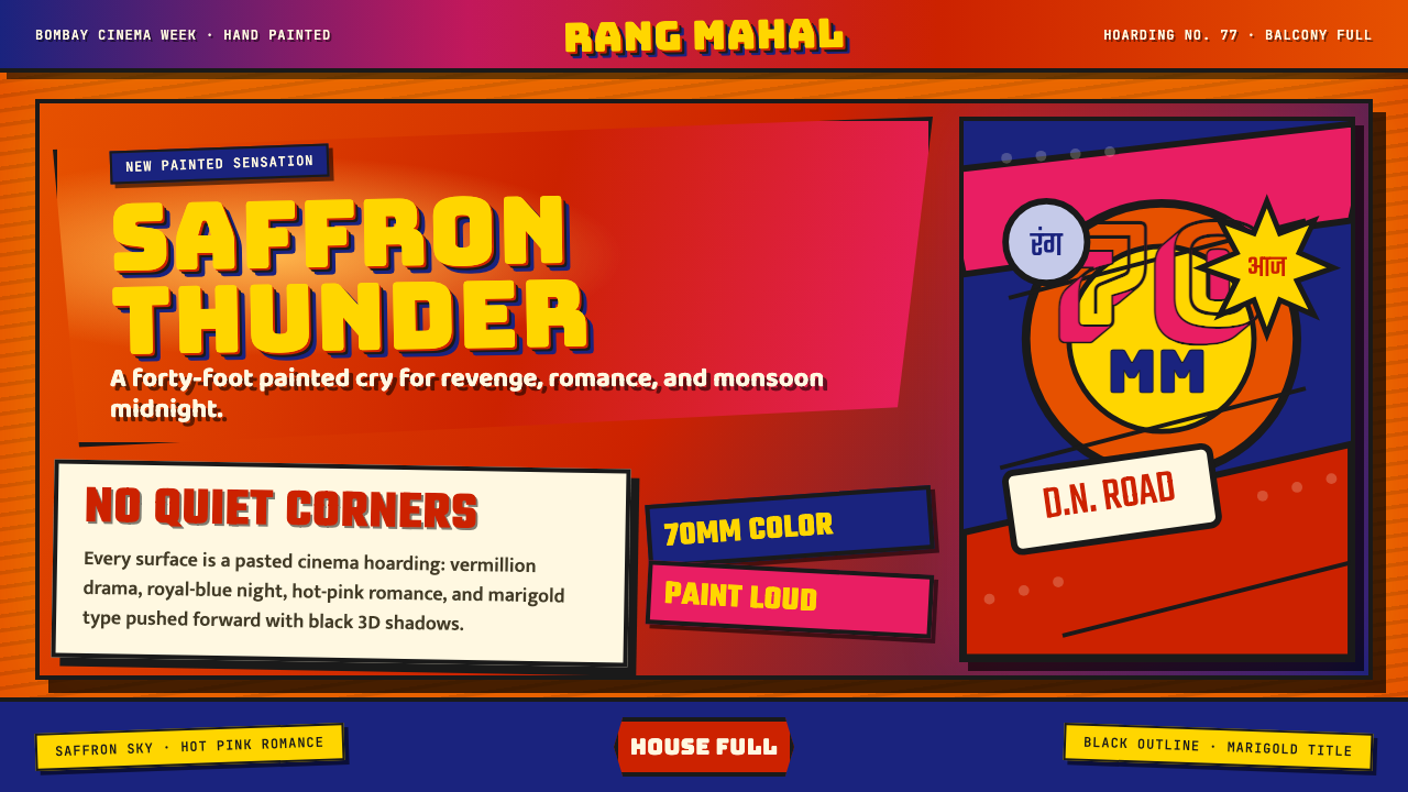 Bollywood Poster Art (1970s)Subtlety is unaffordable. Saffron fields, Bungee shadows, diagonal hoarding d…节制太便宜:藏红花底、Bungee黑影与斜向招贴制造十米戏剧。
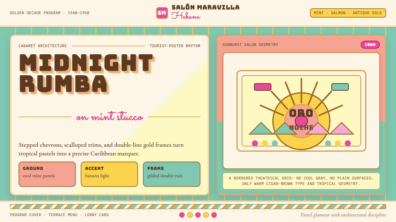 Cuban Art Deco (Havana 1950)Tropical Deco goes theatrical. Mint and salmon panels, gold double rules, Bun…热带装饰艺术登上舞台:薄荷与三文鱼色分区,金色双线框配Bungee招牌字。
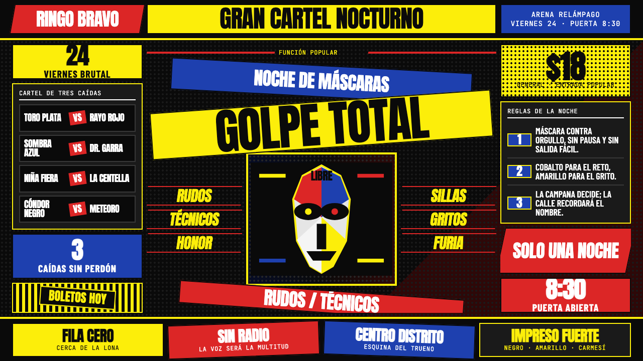 Lucha Libre PosterStreet-poster voltage. Yellow Anton banners, crimson diagonals, cobalt grids…街头高压海报:黑底上的荧光黄Anton、猩红斜线与钴蓝网格。
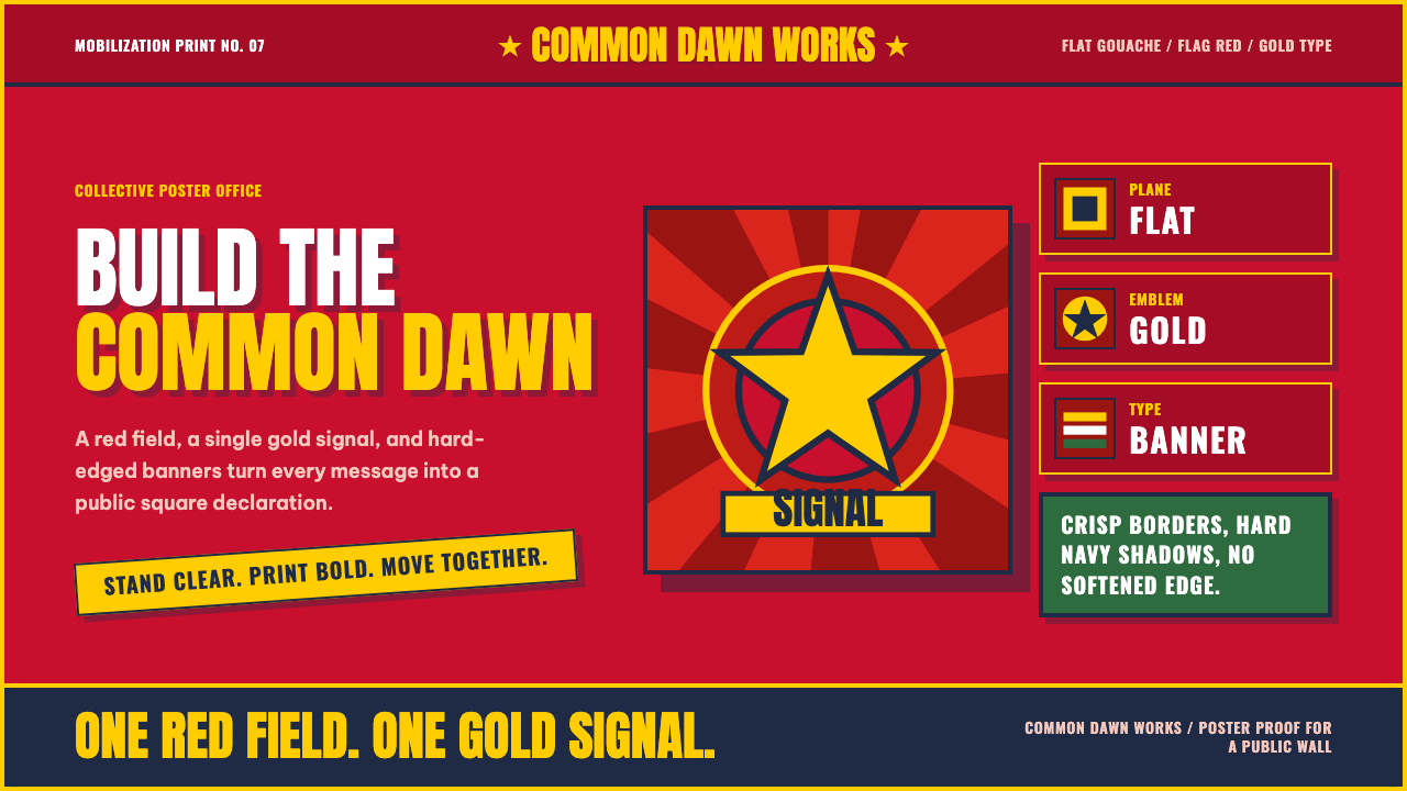 Vietnamese PropagandaFlat color commands. Flag-red fields, gold star rays, and Anton slogans hit a…平涂色块发号召:旗红、金星射线与粗体标语形成海报级冲击。
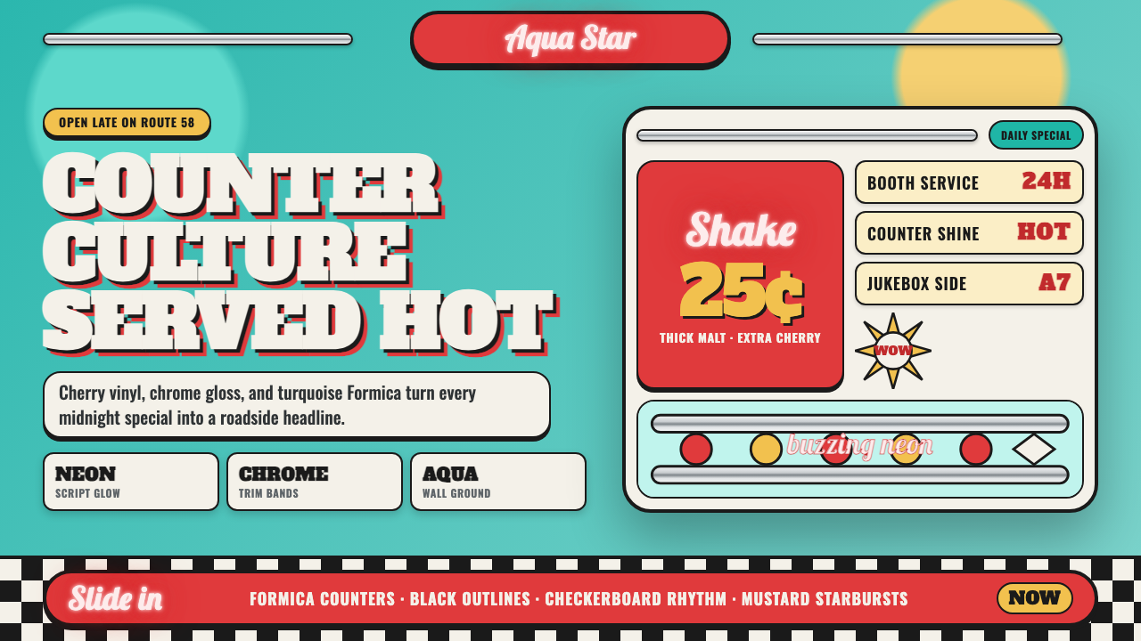 1950s Diner AquaRoadside optimism shouts. Aqua walls, cherry vinyl, chrome bands, and neon sc…公路乐观主义在叫卖:湖水蓝墙、樱桃红皮革、镀铬条与霓虹手写体发光。
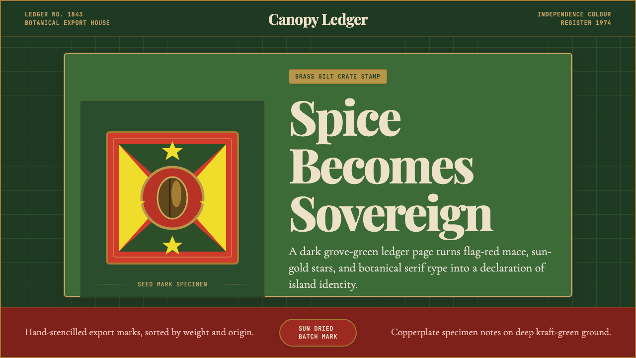 Grenadian Spice & Nutmeg FlagSpice becomes sovereign. Grove green, flag red, brass borders, and serif ledg…香料成为主权宣言:林冠绿、旗红、黄铜边框与账本衬线。