Design style guide设计风格指南
What is Grenadian Spice & Nutmeg Flag?什么是 Grenadian Spice & Nutmeg Flag?
Grenada put a nutmeg on its flag, and this design style turns that audacious act of botanical sovereignty into a complete visual language of spice-grove greens, brick reds, and brass-gilt warmth.格林纳达把肉豆蔻印上国旗,这套设计风格将那个大胆的植物主权宣言转化为完整的视觉语言——香料林冠绿、砖红与黄铜烫金的暖意。
Grenadian Spice & Nutmeg Flag in briefGrenadian Spice & Nutmeg Flag 速览
The Grenadian Spice and Nutmeg Flag style is a design vocabulary rooted in the visual heritage of the Caribbean spice trade — specifically Grenada, the world's most celebrated nutmeg producer and the only nation whose national flag bears the likeness of the spice. The aesthetic draws from three overlapping archival traditions: the hand-stencilled crate stamps used to mark export consignments at the Gouyave and Grenville cooperatives, the copperplate botanical illustration plates produced by European naturalists documenting the island's flora, and the kraft-paper-and-brass-gilt sensibility of nineteenth-century merchant ledgers and spice-house signage.格林纳达香料与肉豆蔻旗帜风格,是一套植根于加勒比香料贸易视觉遗产的设计语言——尤其是格林纳达:这里是世界上最负盛名的肉豆蔻产地,也是唯一将这种香料绘入国旗的国家。这套美学融合了三条相互交织的档案传统:古亚韦与格伦维尔加工合作社用于标记出口批次的手工模板箱标,欧洲博物学家记录岛屿植物群的铜版植物图谱,以及十九世纪商人账本与香料仓库招牌所特有的牛皮纸加黄铜烫金质感。
At its core, the style is a post-colonial reclamation of colonial-era visual forms. The crate stamp, the botanical plate, and the merchant ledger were all instruments of the plantation economy — tools of valuation, classification, and extraction. This design system reappropriates their aesthetic grammar and regrounds it in Grenadian identity, particularly the tricolour of the 1974 independence flag: the deep canopy green of the nutmeg grove, the brick red of the dried nutmeg shell, and the bright gold of the flag's star medallions.从本质上看,这套风格是对殖民时代视觉形式的后殖民再占有。箱标、植物图谱、商人账本,都曾是种植园经济的工具——用于估价、分类与榨取。这套设计体系将它们的美学语法重新收回,并将其根植于格林纳达的身份认同,尤其是1974年独立旗帜的三种颜色:肉豆蔻林冠层的深绿、晒干果壳的砖红,以及旗帜星形徽章的明亮金黄。
The resulting visual language occupies an unusual register: it is simultaneously archival and contemporary, earthy and ceremonial, humble in its craft references and proud in its cultural assertion. It functions as a design system that carries meaning at multiple levels — a palette that is historically legible, a typographic sensibility drawn from the ledger and the botanical plate, and a textural character derived from the physical materials of the spice trade itself.由此产生的视觉语言占据了一个罕见的调性区间:既是档案的也是当代的,既是泥土气的也是仪式感的,工艺参照上谦逊、文化表达上骄傲。它是一套在多个层次上承载意义的设计体系——一套历史上可辨认的调色板,一种源自账本与植物图谱的排版感性,以及一种由香料贸易实体材料衍生出的质感性格。
See the Grenadian Spice & Nutmeg Flag design system →查看 Grenadian Spice & Nutmeg Flag 完整设计系统 →
Where does Grenadian Spice & Nutmeg Flag come from?Grenadian Spice & Nutmeg Flag 从何而来?
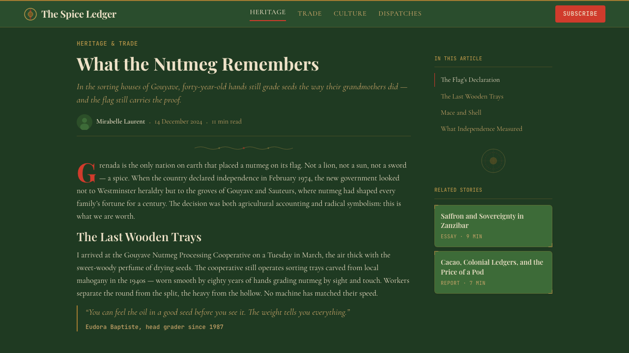
Nutmeg arrived in Grenada in 1843, when a single consignment of seeds was introduced to the island. The crop thrived in Grenada's volcanic soil and humid valleys, and by the early twentieth century the island had become one of the world's two dominant nutmeg producers, alongside Indonesia. The spice cooperative system — centered on the Grenada Cooperative Nutmeg Association, founded in 1947 — brought smallholders together under collective ownership, creating the processing and export infrastructure whose visual identity directly informs this design style. The stamps, crates, and ledgers of the cooperative era are the style's primary archival source.肉豆蔻于1843年抵达格林纳达,当时一批种子被引入这座岛屿。这种作物在格林纳达的火山土壤与潮湿谷地中蓬勃生长,到二十世纪初,这座岛屿已成为世界两大肉豆蔻产地之一(另一个是印度尼西亚)。1947年成立的格林纳达肉豆蔻合作社协会将小农户纳入集体所有制,建立起加工与出口基础设施,而这套基础设施的视觉识别直接构成了这套设计风格的来源。合作社时代的戳记、木箱与账本,是这套风格最主要的档案资料。
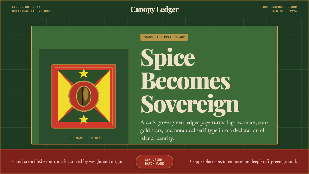
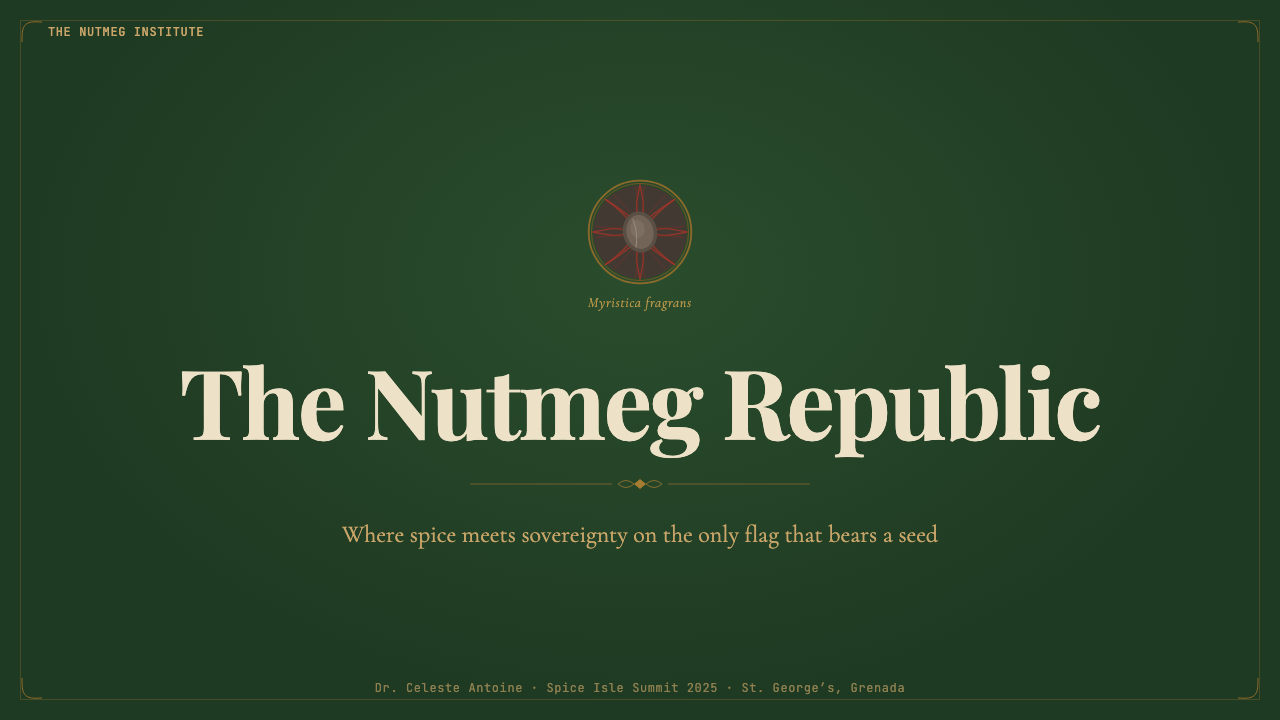
The national flag adopted at independence on 7 February 1974 was designed with deliberate symbolic density. Its designer, Anthony C. George, arranged a bicolor field of gold and green — the nutmeg grove and its fruit — divided by red borders representing the warmth and vitality of the people. A nutmeg is placed in the hoist-side green triangle: the only vegetable symbol on any sovereign nation's flag. This was not incidental branding. Grenada's economy was, and to a significant degree remains, dependent on nutmeg and mace (the red aril that encases the nutmeg seed). The flag declares that dependency as identity.1974年2月7日独立时采用的国旗,凝结了刻意为之的象征密度。设计师安东尼·C·乔治将金色与绿色组成的双色底面——肉豆蔻林与果实——以红色边框分隔,象征人民的热情与活力。旗帜靠杆侧的绿色三角形内绘有一枚肉豆蔻:这是世界上所有主权国家国旗中唯一一个以蔬果为符号的。这并非偶然的品牌选择。格林纳达的经济在很大程度上依赖肉豆蔻与假种皮(包裹肉豆蔻种子的红色网膜)。这面旗帜宣告:依存即身份。
The botanical illustration tradition that feeds into the style's decorative register has a longer history. European natural history expeditions of the seventeenth through nineteenth centuries produced detailed copperplate engravings of the Myristica fragrans plant — root, trunk, leaf, flower, fruit, and the split nut revealing the mace-wrapped seed within. These images circulated through botanical journals and were reproduced on spice-company labels, packaging, and promotional materials. Their visual logic — precise linework, labeled diagrams, restrained decorative borders — passed into the commercial idiom of the spice trade and left a traceable mark on how Caribbean botanical products were packaged and presented across several centuries.滋养这套风格装饰语汇的植物图谱传统有着更长的历史。十七至十九世纪欧洲博物学探险队为肉豆蔻植株——根、干、叶、花、果实,以及剖开后露出假种皮包裹种子的开裂坚果——制作了详尽的铜版图谱。这些图像在植物学期刊中流传,并被再版于香料公司的标签、包装与宣传材料上。它们的视觉逻辑——精确线描、标注图解、克制的装饰边框——渗入了香料贸易的商业惯用语,并在数个世纪间留下清晰可循的印记,塑造了加勒比植物产品的包装与呈现方式。
The post-independence political history of Grenada also shadows this style's character. The 1979 revolution led by Maurice Bishop and the New Jewel Movement, and the subsequent 1983 US invasion, brought the island unusual global attention and complicated its relationship with colonial and post-colonial visual symbolism. Historian and cultural scholar Beverley Steele documented the richness of Grenadian folk tradition and the particular way the island's communities used decorative and craft objects to assert cultural continuity through political disruption. The style carries that assertion quietly — it is not protest art, but it wears its sovereignty visibly.格林纳达的后独立政治史同样投影在这套风格的性格上。1979年莫里斯·毕晓普与新宝石运动领导的革命,以及随后1983年的美国入侵,使这座岛屿获得了异乎寻常的全球关注,也使其与殖民和后殖民视觉符号的关系变得复杂。历史学家与文化学者贝弗利·斯蒂尔记录了格林纳达民间传统的丰富性,以及岛上社区在政治动荡中借助装饰与工艺品宣示文化连续性的特有方式。这套风格安静地承载着那种宣示——它不是抗议艺术,但它让主权清晰可见。
What defines the Grenadian Spice & Nutmeg Flag look?Grenadian Spice & Nutmeg Flag 的视觉特征是什么?
Color Palette色彩调色板
The palette is anchored by three flag-derived hues: a deep, shadowed grove green that reads almost like a dark forest canopy, a brick red that recalls the dried nutmeg shell and the flag's border bands, and a warm amber-gold drawn from the flag's star medallions and brass-gilt label printing. These sit against grounds of aged kraft — the warm off-white of unbleached paper — or near-black inkwash. The cocoa-brown of the seed interior and the crimson of the mace aril appear as secondary accents. The palette is earthy and saturated but never garish; it carries the density of pigment applied to physical material rather than the brightness of backlit color.调色板以三种源自国旗的色调为锚:深沉的、带阴影感的林冠绿,几乎接近暗森林的色调;让人联想到晒干果壳和旗帜边框条纹的砖红;以及取自旗帜星形徽章和黄铜烫金标签印刷的暖琥珀金。这些色彩铺设在陈化牛皮纸——未漂白纸张的温暖米白——或近黑墨渍的底面上。种子内部的可可棕和假种皮的绯红作为次级强调色出现。这套调色板泥土气十足且饱和度高,但绝不俗艳;它承载的是颜料涂抹于实体材料的厚重感,而非背光色彩的明亮。
Typography字体排印
The typographic register draws from two historical sources: the serif ledger typefaces used in nineteenth-century merchant accounting books, and the condensed stencil letterforms of export crate stamps. Display type tends toward tall, slightly compressed serifs with sturdy bracketing — the kind of letterform designed for legibility in copperplate reproduction and bookkeeping at small sizes. Stencil-style headlines introduce a rougher, more manual character, as though cut from craft board and pressed through a screen. The combination creates a layered hierarchy: formal and institutional at the detail level, physical and handmade at the headline level.字体语汇源自两个历史源头:十九世纪商人会计账本使用的衬线账本字体,以及出口箱标的窄缩模板字形。展示字体倾向于高挑、略微压缩、托架粗实的衬线——这类字形原本为铜版复制中的清晰辨认和小号记账而设计。模板式标题引入了更粗糙、更手工的性格,仿佛从工艺纸板上裁下再通过筛网压印而成。两者的结合创造出层叠的层级:细节层面正式而机构化,标题层面则物质而手工。
Texture and Surface质感与表面
Texture is central rather than decorative in this style. The visual language actively evokes physical materials: the grain of unbleached kraft paper, the slight bleed of ink into a fibrous surface, the embossed relief of a brass seal, the layered lacquer of a tin spice canister. In digital or print application, this means surface treatments that suggest material depth — subtle paper grain overlays, slight ink irregularity in edges and type, aged or foxed margins — without crossing into nostalgic pastiche. The texture serves to root the design in the physical world of the spice trade rather than the smooth surfaces of contemporary digital production.在这套风格中,质感是核心而非装饰。视觉语言主动唤起实体材料:未漂白牛皮纸的纹理,墨水渗入纤维表面时的轻微晕散,黄铜印章的浮雕纹路,锡制香料罐的层叠漆光。在数字或印刷应用中,这意味着暗示材料深度的表面处理——细腻的纸张纹理叠加、边缘与字体的轻微墨迹不规则感、陈化或锈蚀的页边——但不滑入怀旧仿古的俗套。质感的作用是将设计根植于香料贸易的实体世界,而非当代数字生产的光滑表面。
Decorative Motifs装饰母题
The primary decorative vocabulary is botanical: the nutmeg fruit in cross-section revealing the mace-encased seed, the Myristica fragrans leaf in naturalistic or stylized engraving style, and the radiating star form taken from the Grenadian flag's seven-pointed stars. Secondary motifs include compass roses and directional charts referencing trade routes, rope-and-knot borders drawn from maritime tradition, and the concentric ruled lines of the export stamp and customs seal. These motifs appear as structural framing devices — borders, corner ornaments, section dividers — rather than as illustrative fill.主要装饰语汇是植物学的:剖面呈现假种皮包裹种子的肉豆蔻果实,以博物写实或风格化版画手法描绘的肉豆蔻叶,以及取自格林纳达国旗七角星的放射星形。次级母题包括指代贸易航路的罗盘玫瑰与航向图,源自航海传统的绳结边框,以及出口戳记与海关印章的同心线圈。这些母题作为结构性框架装置出现——边框、角落装饰、段落分隔——而非作为插图填充使用。
Composition构图
Layouts in this style tend toward centered or near-centered compositions, in contrast to the asymmetric dynamism of modernist systems. The crate stamp and botanical plate — both primary references — are traditionally centered, formally balanced, and structured around a clear visual hierarchy: a dominant central image or name, surrounded by secondary information arranged in concentric or radial order. This centering reads as ceremonial rather than passive; it places the subject at the heart of the composition as an object of attention and value.这套风格的版面倾向于居中或接近居中的构图,与现代主义体系的非对称动感形成对比。箱标与植物图谱——两个主要参照——传统上都是居中排列、形式对称、围绕清晰视觉层级展开的:一个主导性的中央图像或名称,周围是以同心或放射状排列的次级信息。这种居中感读来是仪式性而非被动性的;它将主题置于构图的核心,作为值得关注与珍视的对象。
Illustration Register插图语汇
When figurative imagery appears, it follows the disciplined conventions of scientific botanical illustration: clean controlled linework, cross-hatching for shadow and depth, labeled callouts identifying plant parts, and the characteristic combination of the whole fruit alongside its dissected interior. This illustration register is neither purely decorative nor purely documentary — it carries the prestige of scientific authority while celebrating the beauty of the subject. Digital applications of the style often translate this into high-contrast engraving-style illustration or vector-drawn botanical motifs that echo the copperplate source.当具象图像出现时,它遵循科学植物插图的严谨惯例:干净可控的线描,用于表现阴影与深度的交叉排线,标注植物各部位的说明引线,以及整果与剖面内部并置的特征性呈现。这套插图语汇既非纯粹装饰也非纯粹记录——它承载着科学权威的威望,同时颂扬着主题的美丽。这套风格的数字应用往往将其转译为高对比度的版画风插图或矢量植物母题,以呼应铜版画的原始来源。
Dark Field and Light Figure深底浅图
The style is comfortable with dark grounds — the deep grove green and near-black inkwash — against which type, botanical motifs, and gold-gilt ornament appear in warm light tones. This dark-field-light-figure relationship references the printing tradition of the spice label, where dark backgrounds were used to make gold and cream lettering pop with a richness legible at commercial scale. In the flag itself, the green and red fields provide the dark ground against which the gold star medallions assert themselves. This relationship gives the style a ceremonial weight that lighter schemes cannot achieve.这套风格对深底色感到自在——深林冠绿和接近黑色的墨渍底面——衬托出文字、植物母题与黄金烫饰以暖浅色调呈现。这种深底浅图的关系,参照的是香料标签的印刷传统:深色背景用来使金色和奶油色字体以商业规模可辨的丰盛感凸显出来。在国旗本身中,绿色和红色的底面提供了衬托金色星形徽章的深色基础。这种关系赋予这套风格一种更浅色方案所无法企及的仪式感重量。
See the Grenadian Spice & Nutmeg Flag design system →查看 Grenadian Spice & Nutmeg Flag 完整设计系统 →
Who shaped Grenadian Spice & Nutmeg Flag?谁塑造了 Grenadian Spice & Nutmeg Flag?
George designed the Grenadian national flag adopted at independence in 1974, embedding the nutmeg at the center of its hoist-side triangle. The decision to place a food crop on the sovereign flag was a deliberate post-colonial assertion: identity rooted in agricultural labor and cooperative economy rather than colonial heraldry. George's compositional choices — the seven stars, the tricolor field, the botanical center — established the visual vocabulary that this design style directly inherits.乔治设计了1974年独立时采用的格林纳达国旗,将肉豆蔻嵌入靠杆侧三角形的中心。将一种农作物置于主权旗帜上的决定,是一个刻意为之的后殖民宣示:身份植根于农业劳动与合作经济,而非殖民纹章学。乔治的构图选择——七颗星、三色底面、植物学中心——确立了这套设计风格直接继承的视觉语汇。
Steele, a Grenadian historian and cultural scholar, documented the folk traditions, material culture, and visual practices of Grenadian communities through decades of research. Her work traced the ways ordinary Grenadians used craft, decoration, and symbolic objects to maintain cultural identity through colonialism and political upheaval. The design style's rooting in cooperative-era material culture — the stamp, the crate, the ledger — draws on the traditions Steele chronicled and preserved.斯蒂尔是格林纳达历史学家与文化学者,数十年的研究记录了格林纳达社区的民间传统、物质文化与视觉实践。她的工作追溯了普通格林纳达人如何通过工艺、装饰与象征物来维系殖民与政治动荡中的文化认同。这套设计风格对合作社时代物质文化——戳记、木箱、账本——的植根,正是汲取自斯蒂尔所记录和保存的传统。
Bishop led the 1979 New Jewel Movement revolution that briefly transformed Grenada's political and cultural landscape before his assassination in 1983. His government promoted a Grenadian cultural identity that emphasized the island's own agricultural and folk heritage over imported models. The period shaped how Grenadian symbols — including the nutmeg — were mobilized in public life, and the design style's assertion of local botanical identity over European colonial aesthetics carries an echo of the cultural politics of that era.毕晓普领导了1979年新宝石运动革命,短暂改变了格林纳达的政治与文化格局,直至他于1983年遇刺。他的政府推动了一种强调岛屿农业与民间遗产而非外来模式的格林纳达文化认同。那个时期塑造了格林纳达符号(包括肉豆蔻)在公共生活中的动员方式,而这套设计风格对本地植物学身份高于欧洲殖民美学的宣示,正回响着那个时代的文化政治。
Founded in 1947, the GCNA became the institutional backbone of the Grenadian spice economy, providing smallholder farmers with collective bargaining power, processing facilities, and export infrastructure. Its visual identity — cooperative stamps, crate markings, ledger accounting — constitutes the primary archival material from which this design style draws its commercial and craft references. The GCNA's post-independence role in asserting Grenadian ownership over a historically colonial export crop makes its visual language an act of economic sovereignty as well as aesthetic tradition.格林纳达肉豆蔻合作社协会成立于1947年,成为格林纳达香料经济的机构骨干,为小农户提供集体谈判权、加工设施与出口基础设施。其视觉识别——合作社戳记、箱标、账本记录——构成了这套设计风格商业与工艺参照的主要档案材料。合作社在独立后宣示格林纳达对历史上殖民出口作物的所有权这一作用,使其视觉语言既是经济主权的行动,也是美学传统的传承。
How do you use Grenadian Spice & Nutmeg Flag today?今天怎么用 Grenadian Spice & Nutmeg Flag?
The Grenadian Spice and Nutmeg Flag style translates most naturally into contexts where warmth, cultural specificity, and material richness are desired values — food brands, artisan products, cultural institutions, tourism, and any project whose brand story involves provenance, craft, or place. It is substantially less suited to clinical, technological, or high-abstraction contexts where its density and ceremonial weight would create tonal friction. Understanding this alignment — where the style's values serve the project's values — is more important than any technical application detail.格林纳达香料与肉豆蔻旗帜风格最自然地转译到温暖感、文化特殊性与材料丰富性是期望价值的场景——食品品牌、手工艺产品、文化机构、旅游,以及任何品牌故事涉及产地、工艺或地方感的项目。它与临床、科技或高度抽象的场景则相当不符——在那些场景中,它的密度与仪式感会制造调性摩擦。理解这种对齐关系——风格价值观在哪里服务于项目价值观——比任何技术应用细节都更重要。
For presentation slides, the style works best on covers and section dividers that need to carry visual authority and cultural presence. A cover built in this register might pair a centered botanical engraving-style illustration with display type set in a tall bracketed serif, on a deep grove-green or aged-kraft ground. Content slides should restrain the texture: use the color palette without the material surface treatments, keeping the body of the presentation legible and uncluttered. Data slides work well with the botanical-illustration logic applied to charts — use the palette's earthy, saturated hues to distinguish data series, and frame charts with the style's ruled-line borders rather than default software gridlines.在演示文稿中,这套风格最适合需要承载视觉权威与文化存在感的封面和章节分隔页。以这种语言构建的封面,可能将居中的植物版画风插图与高挑有托架衬线的展示字体配对,置于深林冠绿或陈化牛皮纸的底面上。内容页应克制质感处理:使用色彩调色板但不施加材料表面效果,保持演示主体的可读性与简洁。数据页可以将植物图谱的逻辑应用到图表上——用这套调色板的泥土气、饱和的色调区分数据系列,并用这套风格的直线边框而非软件默认网格线来框定图表。
For web interfaces, the style is well-suited to product pages, brand landing pages, and editorial sites for food, craft, or cultural brands. The centering tendency works well in hero sections and product feature blocks. Navigation and body text should use the serif ledger register rather than the stencil headline register — the latter is too rough for extended reading. Keep background textures subtle enough not to interfere with text legibility. Dashboards and data-heavy interfaces are a poor match: the style's ceremonial quality slows down the scannability that functional UIs require.对于网页界面,这套风格适合食品、工艺或文化品牌的产品页、品牌落地页和编辑类网站。居中倾向在首屏区和产品特性区块中表现良好。导航和正文应使用账本衬线语汇而非模板标题语汇——后者对延续阅读而言过于粗糙。背景质感应足够微妙,不干扰文字可读性。仪表板和数据密集型界面与这套风格不匹配:其仪式性品质会降低功能性界面所需的可扫描速度。
For editorial and marketing applications, the style excels in packaging design, brand identity, print collateral, and any material that benefits from a strong sense of origin and provenance. A brand identity built in this language might use the botanical motif as a recurring structural element, the flag-derived palette as a consistent color system, and the ledger serif as the primary typographic voice. Marketing pages work well with alternating dark-field and light-field sections — deep green headers followed by kraft-ground body sections — creating rhythm through the style's characteristic tonal contrast.对于编辑与营销应用,这套风格在包装设计、品牌识别、印刷辅助材料以及任何受益于强烈产地感与来源感的物料上表现卓越。以这套语言构建的品牌识别,可能将植物母题作为贯穿性结构元素,将旗帜衍生的调色板作为一致的色彩体系,将账本衬线作为主要排印声调。营销页面在深色底与浅色底交替的版块中效果良好——深绿标题区与牛皮纸底正文区交替——通过这套风格特有的色调对比创造节奏。
A common mistake when applying this style is over-saturating the textural elements until the design reads as themed rather than designed. Aged paper effects, rough stamp edges, and engraving crosshatching are powerful in small doses; when applied uniformly across every element, they collapse the hierarchy and make the design feel like a Halloween prop rather than a considered visual system. The discipline is to use texture as accent — on the primary display element, on the section borders, on key motifs — while keeping the body fields clean and the type sharp. Similarly, the three palette anchors (green, red, gold) should not all appear at full weight in every composition; typically one leads, a second accents, and the third appears only in small ornamental details.应用这套风格时最常见的错误,是把质感元素推到过度饱和,直至设计读来像是主题化而非设计化。陈化纸张效果、粗糙戳印边缘、版画交叉排线,少量使用时威力强大;若均匀施加于每一个元素,则会让层级崩塌,使设计感觉像道具而非深思熟虑的视觉体系。自律之道是将质感作为强调——用在主要展示元素、版块边框、关键母题上——同时保持主体版面干净、字体清晰。同样,三个调色板锚点(绿、红、金)不应在每一个构图中都以满载重量同时出现;通常一种主导,一种强调,第三种只在小型装饰细节中现身。
See the Grenadian Spice & Nutmeg Flag design system →查看 Grenadian Spice & Nutmeg Flag 完整设计系统 →
Grenadian Spice & Nutmeg Flag — FAQGrenadian Spice & Nutmeg Flag · 常见问题
Is this style only appropriate for Caribbean or food-related projects?这套风格是否只适合加勒比地区或食品相关项目?
Its strongest natural fit is with projects that benefit from associations of provenance, craft, warmth, and cultural specificity — which does include food, artisan goods, and travel, but extends to cultural institutions, heritage brands, and any project whose identity is rooted in a specific place or tradition. It is not appropriate for projects requiring neutral, universal, or clinical aesthetics — technology, finance, or healthcare products would typically find the style's ceremonial richness tonally misaligned. The question to ask is whether the project's brand values include the kind of grounded, material warmth that this style carries, not whether it is geographically or categorically adjacent to the Caribbean.它最自然的适配是那些能从产地感、工艺感、温暖感和文化特殊性联想中获益的项目——这确实包括食品、手工艺品和旅游,但也延伸到文化机构、遗产品牌,以及任何身份植根于特定地方或传统的项目。它不适合需要中性、普适或临床美学的项目——科技、金融或医疗产品通常会发现这套风格的仪式性丰富感在调性上不匹配。要问的问题是:项目的品牌价值观是否包含这套风格所承载的那种有根基的、物质性的温暖感,而不是它在地理或类别上是否与加勒比地区相邻。
How do you use the botanical motifs without making the design feel like a restaurant menu?如何使用植物母题而不让设计看起来像餐厅菜单?
The botanical motifs in this style carry their authority from the scientific illustration tradition, not the decorative tradition. The distinction in application is structural: use botanical imagery as a framing device — a border, a corner ornament, a section anchor — rather than as surface decoration scattered across the layout. A single, precisely rendered nutmeg cross-section placed at the center of a composition, at significant scale, has an entirely different weight than the same image tiled as a background pattern. The engraving register also matters: loose, sketchy botanical illustration reads as casual; precise, labeled, cross-section illustration reads as authoritative. Applying the motifs with architectural discipline — one dominant, sparingly placed — keeps the style in its ceremonial register.这套风格中的植物母题,其权威性来自科学插图传统而非装饰传统。应用上的区别是结构性的:将植物图像用作框架装置——边框、角落装饰、版块锚点——而非散布于版面的表面装饰。一个精确描绘的肉豆蔻剖面,以相当的尺度居中置于构图中央,与同一图像被平铺为背景图案,具有截然不同的分量。版画语汇同样重要:松散、素描式的植物插图读来随意;精确、有标注、带剖面的插图读来权威。以建筑学式的自律应用这些母题——一个主导、节制放置——能让这套风格保持在其仪式性的语域中。
Can this style work in a digital product interface, or is it primarily for print?这套风格能用于数字产品界面,还是主要适合印刷?
Its origins are in print and material culture — the spice label, the botanical plate, the ledger — and it carries those sensibilities most naturally in print, packaging, and editorial contexts. Digital application is possible but requires selective translation: the texture and aged-surface treatments that define the style can feel heavy or slow in interactive interfaces, where users expect responsive, unambiguous visual feedback. A practical approach is to use the color palette and typographic register at full fidelity while treating the textural elements as header or hero-section accents only, keeping functional UI zones (navigation, forms, data tables) in the cleaner end of the palette. The style works better in marketing and editorial digital contexts — brand sites, editorial features, digital publications — than in transactional or dashboard contexts.它的根源在于印刷与物质文化——香料标签、植物图谱、账本——在印刷、包装和编辑语境中最自然地承载这些感性。数字应用是可能的,但需要有选择性的转译:定义这套风格的质感与陈化表面处理,在交互界面中可能感觉沉重或迟缓——在那里,用户期待响应迅速、毫不含糊的视觉反馈。实用的做法是全量保留色彩调色板和排版语汇,同时将质感元素仅限于页头或首屏区域的强调,保持功能性界面区域(导航、表单、数据表格)处于调色板的较干净一端。这套风格在营销和编辑类数字语境——品牌站点、编辑专题、数字出版物——中,比在交易性或仪表板语境中表现更好。
What distinguishes this style from generic 'vintage tropical' design?这套风格与通用的「复古热带」设计有何区别?
Generic vintage tropical design tends to draw from a broad, undifferentiated pool of colonial-era tropicalia — pineapples, parrots, palm fronds, Art Deco sun rays — assembled for nostalgic mood rather than cultural specificity. The Grenadian Spice style has a precise cultural address: the nutmeg as a specific botanical and sovereign symbol, the flag's specific tricolor as the palette foundation, the cooperative movement's specific visual vocabulary as the typographic and compositional reference. The precision is the difference. Using this style correctly means being committed to its particular geography, botany, and historical context — not reaching for generically warm, tropical, or aged aesthetics.通用的复古热带设计倾向于从广泛而无差别的殖民时代热带图像库中取材——菠萝、鹦鹉、棕榈叶、装饰艺术风太阳光芒——为怀旧情绪而非文化特殊性而组合。格林纳达香料风格有着精确的文化地址:肉豆蔻作为特定的植物学与主权符号,旗帜特定的三色作为调色板基础,合作社运动特定的视觉语汇作为排版与构图参照。精确性是区别所在。正确使用这套风格,意味着对其特定的地理、植物学与历史语境保持承诺——而非伸手去取泛化的温暖感、热带感或陈旧感美学。
How should the flag's tricolor be used without the design looking like a national flag?如何使用国旗的三色而不让设计看起来像一面国旗?
The flag's tricolor is the palette foundation, not a literal template. The key is that in the flag, the three colors appear as flat bands and fields of roughly equal visual weight. In applied design work, one color must lead — typically the grove green or the kraft ground — with the red and gold appearing as accent weights rather than as co-equal fields. The botanical and ledger motifs serve as the mediating visual vocabulary that gives the color system its design identity beyond its flag origin. A composition that uses deep green as the dominant ground, brick red for display type or border rules, and gold only for ornamental details and highlight accents will read as a distinct design identity rather than a flag reproduction.国旗的三色是调色板基础,而非字面模板。关键在于,在旗帜中,三种颜色以大致相等的视觉重量出现为平铺色带和色块。在应用设计工作中,必须有一种颜色主导——通常是林冠绿或牛皮纸底——红色和金色以强调分量而非并列等重的色块出现。植物与账本母题作为中介视觉语汇,赋予色彩体系超越其旗帜来源的设计身份。一个以深绿为主导底色、砖红用于展示字体或边框线条、金色仅用于装饰细节和高光强调的构图,读来是鲜明的设计身份,而非国旗复制。
Related design styles相关设计风格
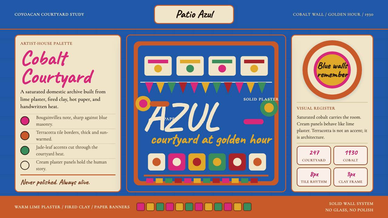 Mexican Frida Blue House (Coyoacán 1930)Maximum color, intimate walls. Cobalt, cream panels, terracotta grid, cut-pap…浓烈而私密。钴蓝墙、奶油面板、赤陶网格与剪纸节奏。
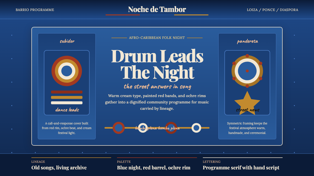 Puerto Rican Bomba & PlenaNight festival dignity. Drum-red stripes and cream Playfair type on deep trop…夜祭般庄重:深蓝底、鼓红条纹与暖白 Playfair 字体。
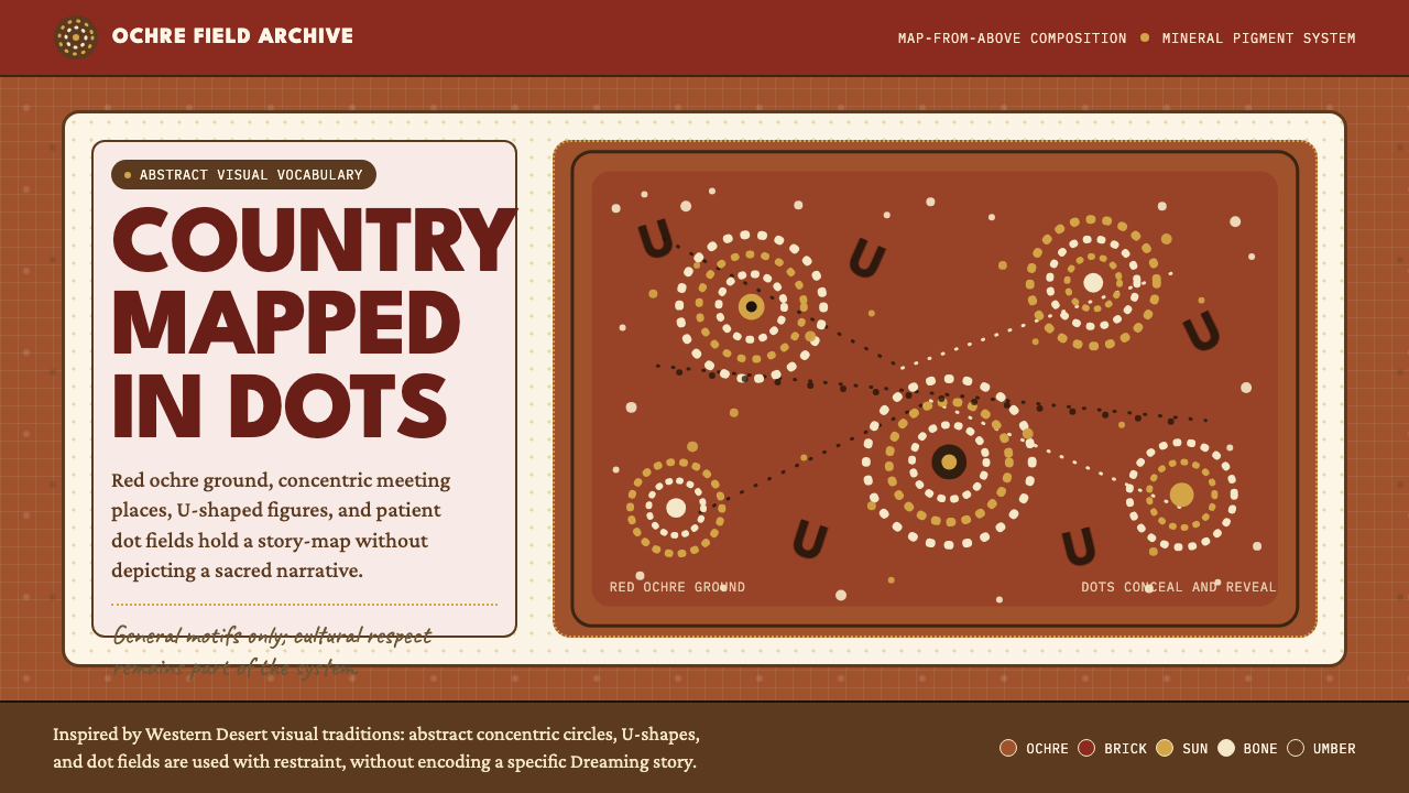 Aboriginal Dot PaintingAncient story-map energy. Red ochre, bone dots, concentric circles, and U-mar…古老故事地图感:红赭底、骨白点、同心圆与 U 形构成大地。
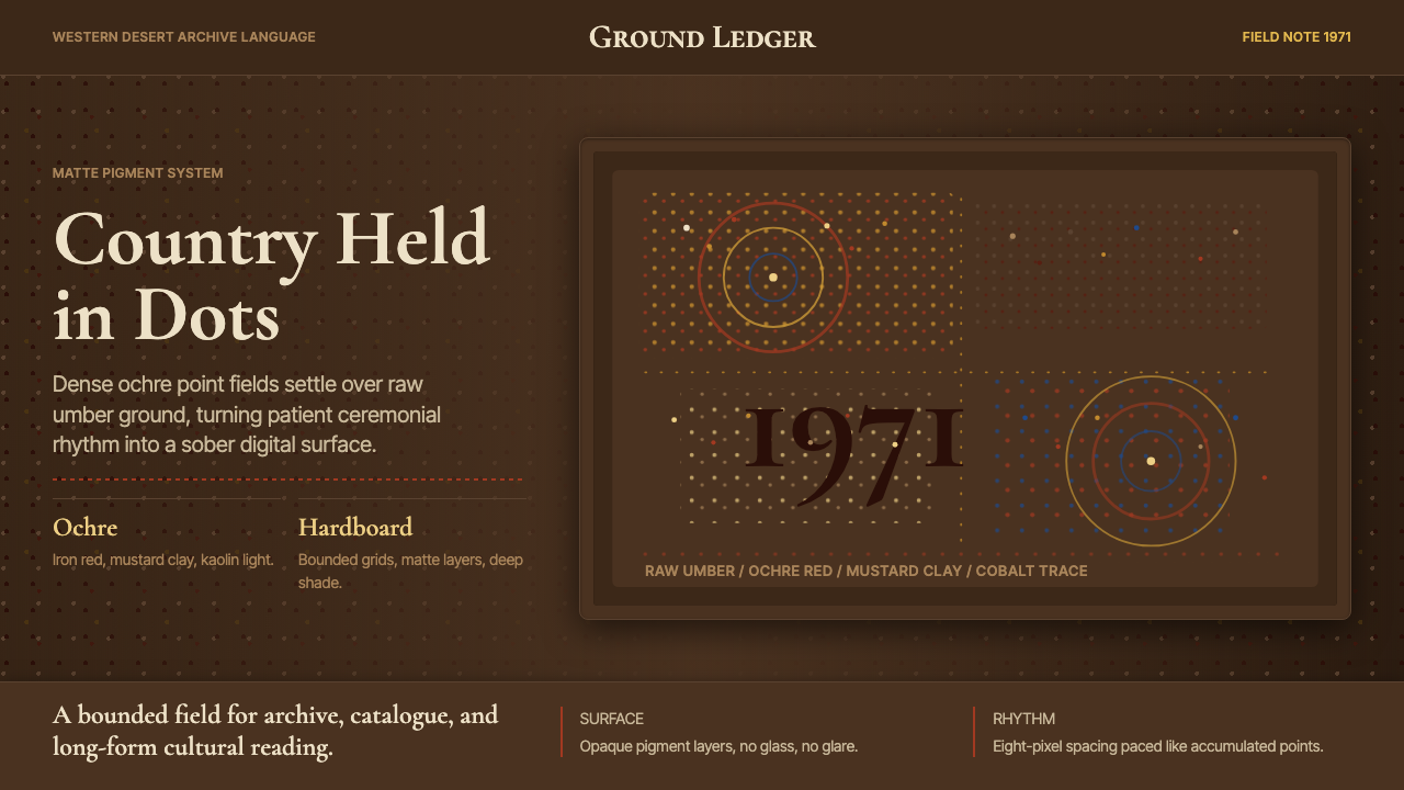 Aboriginal Dot Painting (Papunya 1971)Ochre memory, held steady. Raw umber ground, Cormorant type, disciplined dot-…赭石记忆沉稳留存:生赭黑地、Cormorant 字体与克制点阵。
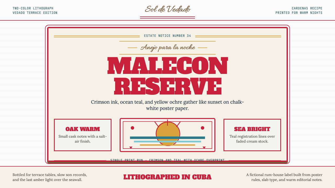 Havana Club Cuban RumSunset in print. Crimson slab type and ocean teal rules age on chalk-white pa…印刷里的日落。深红粗衬线与海洋青绿线框落在白垩纸上。
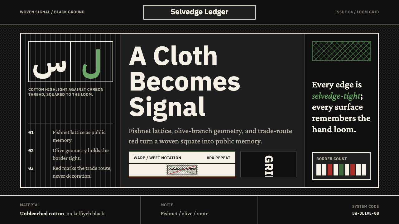 Levantine Keffiyeh Black & WhitePolitical textile, not ornament. Cotton type and fishnet lattice cut through…政治纺织,不是装饰。棉白字体与渔网格纹切入黑底。