What is Aboriginal Dot Painting?什么是 Aboriginal Dot Painting?
Forty thousand years of story compressed into fields of dancing dots — Aboriginal dot painting is the world's oldest continuous visual tradition reborn as a map of the sacred.四万年的故事凝缩于律动的点阵之中——澳大利亚原住民点画是世界上最古老的连续视觉传统以神圣地图形式焕发的新生。
Aboriginal Dot Painting in briefAboriginal Dot Painting 速览
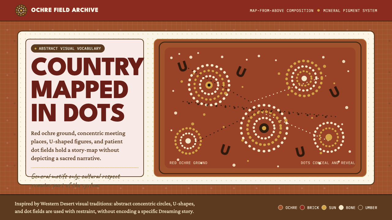
Aboriginal dot painting is a contemporary canvas art movement rooted in the ceremonial and body-painting traditions of the Western Desert peoples of Australia. Its most recognizable feature — dense, rhythmically applied fields of acrylic dots covering every centimeter of the picture plane — is not decorative texture but a deliberate encoding system. Concentric circles denote waterholes or campsites; U-shaped marks represent seated human figures; meandering lines trace ancestral travel routes; radiating dot fields express country seen from above. Every composition is simultaneously an abstract painting and a map of the Dreaming.澳大利亚原住民点画是一场当代画布艺术运动,其根源深植于澳大利亚西部沙漠民族的仪式传统与身体彩绘习俗。它最具辨识度的特征——浓密而有节律的丙烯圆点覆盖整个画面——并非装饰性肌理,而是一套蓄意构建的编码系统。同心圆代表水源地或营地,U形标记代表坐姿人物,蜿蜒的线条描绘祖先的迁徙路径,放射状点阵则呈现从高空俯瞰大地的景象。每一幅构图同时是一幅抽象画,也是一张梦境时代的地图。
The Dreaming — known in the Anangu language as Tjukurpa — is the foundational law and cosmology of Aboriginal peoples: the time before time when ancestral beings shaped the land, created its features, and established the moral and social codes that govern living communities. Dot paintings do not merely illustrate these stories; they are considered active embodiments of them, made through the same ritual intention that animates ceremony. The material world of the painting and the spiritual world of Tjukurpa are understood as continuous rather than separate.梦境时代——阿南古语称为Tjukurpa——是澳大利亚原住民的基础法则与宇宙观:在时间之前的时代,祖先生灵塑造了大地,创造了其地貌特征,并确立了规范生活社群的道德与社会准则。点画作品并不仅仅是这些故事的图解;它们被视为故事的主动体现,以驱动仪式的相同仪式意图创作而成。画作的物质世界与Tjukurpa的精神世界被理解为连续的整体,而非彼此分离的两界。
Visually, the style is distinguished by its mineral-earth palette — deep red ochres, warm umbers, chalky bone whites, and muted brick reds drawn from the pigments of the Central Australian desert — and by the all-over quality of its composition. There is no empty background. Every surface is activated. The dot itself, applied in even, deliberate strokes, carries both visual and spiritual weight. Color relationships are warm and earthbound; contrast emerges from the interaction of closely valued tones rather than from sharp light-and-dark opposition.在视觉上,这种风格以其矿物质大地色调为特征——深沉的红赭、温暖的焦褐、粉笔般的骨白,以及取自澳大利亚中部沙漠颜料的柔和砖红——并以构图的全覆盖性著称。画面中没有空白的背景:每一处表面都被激活。圆点本身,以均匀而专注的笔触施加,承载着视觉与精神的双重分量。色彩关系温暖而大地化,对比感来自色调相近的色彩之间的相互作用,而非强烈的明暗对立。
See the Aboriginal Dot Painting design system查看 Aboriginal Dot Painting 完整设计系统
Where does Aboriginal Dot Painting come from?Aboriginal Dot Painting 从何而来?
The contemporary canvas tradition has a precise and well-documented origin: July 1971, in the remote settlement of Papunya, two hundred and fifty kilometers northwest of Alice Springs in the Northern Territory of Australia. A young Sydney schoolteacher named Geoffrey Bardon had been posted there to teach the children of Luritja and Pintupi people. Watching his students draw traditional symbols in the sand, and observing the older men's reluctance to demonstrate their knowledge in school, Bardon recognized that an extraordinarily rich visual tradition was at risk of going undocumented. He encouraged the elders to paint — first on the school wall, then on boards and canvases — using house paints that he supplied. The resulting mural, completed by a group including Kaapa Tjampitjinpa, depicted Honey Ant Dreaming and became the catalyst for the entire movement.当代画布传统有一个精确而有据可查的起点:1971年7月,澳大利亚北领地爱丽丝泉西北约两百五十公里的偏远定居点帕潘亚。一位名叫杰弗里·巴登的年轻悉尼教师被派往那里教授卢里贾族和平图皮族孩子。在观察学生在沙地上描绘传统符号,并注意到年长男性对于在学校展示自身知识的抵触之后,巴登意识到一种极其丰富的视觉传统正面临消失的风险。他鼓励长老们作画——先在学校墙面上,后来在他提供的木板和画布上——使用的是他供应的家用涂料。由包括卡帕·贾姆皮金帕在内的一组人完成的壁画描绘了「蜜蚁梦境时代」,成为整个运动的催化剂。
What Bardon had witnessed was not the invention of a new art form but the translation of an ancient one into a new medium. Western Desert peoples had encoded Dreaming narratives in sand drawing, body painting, ground designs, and carved wooden objects for tens of thousands of years. The same symbols — circles, arcs, lines, dots — had appeared in rock art across the region for at least forty thousand years. What changed in 1971 was the support: canvas and acrylic paint allowed works to survive, travel, and be exchanged outside the community. The dot, in particular, which had been used to obscure sacred designs from uninitiated eyes when works entered the public sphere, became the defining visual device of the movement.巴登所目睹的,并非一种新艺术形式的发明,而是一种古老艺术形式向新媒介的转译。西部沙漠民族在沙地绘画、身体彩绘、地面图案与雕刻木器中编码梦境时代叙事已有数万年历史。同样的符号——圆圈、弧线、直线、圆点——在该地区的岩石艺术中已出现至少四万年。1971年改变的,是支持条件:画布与丙烯颜料使作品得以保存、流通,并在社区之外进行交换。圆点本身——此前被用于在作品进入公共领域时遮蔽神圣图案,以防未经入会礼的人窥见——成为这场运动决定性的视觉符号。
The artists who gathered around Bardon's initiative formed the Papunya Tula Artists cooperative in 1972, the first Indigenous-owned and -run art organization in Australia. Its founding members — including Clifford Possum Tjapaltjarri, Johnny Warangkula Tjupurrula, Tim Leura Tjapaltjarri, and Mick Namarari Tjapaltjarri — had no prior experience selling art, negotiating with gallery owners, or navigating the art market. Within a decade, their work was selling in major Australian galleries; within two, it had entered international museum collections. The movement they seeded spread from Papunya to communities across the Western Desert: Yuendumu, Kintore, Balgo, and eventually to the Utopia homelands in the east, where Emily Kngwarreye emerged in the late 1980s as one of the most internationally celebrated Aboriginal artists of the twentieth century.聚集在巴登倡议周围的艺术家于1972年成立了帕潘亚图拉艺术家合作社,这是澳大利亚第一个由原住民所有并自主经营的艺术组织。创始成员——包括克利福德·波瑟姆·贾帕尔贾里、约翰尼·瓦兰库拉·朱普鲁鲁、提姆·莱乌拉·贾帕尔贾里和米克·纳马拉里·贾帕尔贾里——此前没有任何出售艺术品、与画廊主人谈判或驾驭艺术市场的经验。十年之内,他们的作品开始在澳大利亚主要画廊售卖;再过十年,它已进入国际博物馆收藏。他们播下的运动种子从帕潘亚蔓延至西部沙漠各社区:尤恩杜穆、金托尔、巴尔戈,最终抵达东部的乌托邦家园——艾米莉·昂瓦雷耶在1980年代末期于此崛起,成为二十世纪国际上最受赞誉的原住民艺术家之一。
The history of the movement is not without ethical complexity. Early dealers and collectors profited enormously from work acquired for very little; questions of copyright, community authorship, and the commercialization of sacred knowledge remain ongoing. The dot itself became so commercially identified with Aboriginal art that artists from communities with no traditional dot-painting heritage began producing it for the tourist market — a phenomenon Aboriginal communities and art organizations have consistently distinguished from authentic community-based practice. These tensions are part of the tradition's living history, not peripheral to it, and any serious engagement with the style must hold them in view.这场运动的历史并非没有伦理复杂性。早期的经销商和收藏家从以极低价格获得的作品中获利丰厚;版权归属、社区集体创作权以及神圣知识商业化等问题至今仍未解决。圆点本身在商业上与原住民艺术的关联已如此紧密,以至于来自没有点画传统的社区的艺术家也开始为旅游市场生产这类作品——一种原住民社区和艺术组织一贯与真实社区实践加以区别的现象。这些张力是这一传统活态历史的组成部分,而非其附属,任何对这种风格的认真使用都必须将它们纳入视野。
What defines the Aboriginal Dot Painting look?Aboriginal Dot Painting 的视觉特征是什么?
The Dot Field点阵覆盖
The defining structural element of the style is the all-over dot field: small, consistently sized marks applied in dense, rhythmic repetition across the entire picture plane. Unlike stippling, which modulates light and shadow, the Aboriginal dot is tonally consistent within a given color zone and changes only when the underlying symbol or territory changes. The visual effect is vibrant and almost optical — the surface appears to pulse when colors of similar warmth are placed in adjacent fields.这种风格的决定性结构元素是全覆盖点阵:大小一致的细小圆点以密集、有节律的方式重复施加于整个画面。与用于调制明暗的点画技法不同,原住民点画的圆点在给定色彩区域内色调一致,仅在底层符号或领地发生变化时才改变。视觉效果充满活力,几乎具有光学错视感——当色调相近的暖色相互毗邻时,画面表面仿佛在搏动。
Ancestral Symbols祖先符号
Beneath and within the dot field, a fixed vocabulary of ancestral symbols organizes the composition. Concentric circles of varying sizes mark sites — waterholes, campsites, ceremonial grounds. U-shapes clustered around a circle represent people seated at a place. Parallel lines indicate paths, rivers, or digging sticks. Arcs and semi-circles represent shade structures or shields. These symbols are not decorative; they have fixed referential meaning within their cultural context, and compositions are structured by the relationships between sites rather than by conventional pictorial perspective.在点阵之下和之中,一套固定的祖先符号词汇组织着构图。大小不一的同心圆标记地点——水源地、营地、仪式场所。围绕圆圈聚集的U形代表坐在某地的人。平行线表示路径、河流或挖掘棒。弧形与半圆代表遮荫结构或盾牌。这些符号不是装饰性的;它们在其文化语境中具有固定的指涉意义,构图的结构由各地点之间的关系决定,而非由传统绘画透视法决定。
Aerial Perspective俯视视角
Aboriginal dot compositions are organized from a bird's-eye or map-like perspective — the viewer looks down on country rather than across it. This is not a Western mapping convention; it reflects the way Dreaming narratives describe territory: as a network of connected sites rather than as a landscape seen from a fixed horizon. The aerial perspective allows a single work to encompass vast geographic and temporal scales, collapsing hundreds of kilometers and thousands of years into a unified field.原住民点画构图从鸟瞰或地图式视角组织——观者向下俯视大地,而非平视。这并非西方制图惯例,它反映了梦境时代叙事描述领地的方式:作为互联地点的网络,而非从固定地平线所见的风景。俯视视角使单幅作品得以涵盖广阔的地理与时间尺度,将数百公里的空间和数千年的时间压缩进统一的画面之中。
Mineral Earth Palette矿物大地色调
The authentic color range of Western Desert painting is derived from the mineral pigments of the landscape itself: the deep warm reds and burnt oranges of iron-rich ochre, the dark earthy browns of umber and manganese, the chalky near-white of ground clay, and the muted dusty yellows of sandstone. On canvas, these mineral tones are approximated with warm-toned acrylics that retain the matte, earthy quality of their pigment originals. The palette is warm throughout; cool grays and blues are largely absent from traditional work, appearing mainly in later urban and gallery-oriented practice.西部沙漠绘画的真实色彩范围来源于大地景观本身的矿物颜料:富含铁质的赭石呈现出深沉温暖的红色与焦橙,赭褐与锰土带来深邃的大地棕褐,研磨的黏土形成粉笔般的接近白色,砂岩则呈现出柔和的尘黄。在画布上,这些矿物色调以保留原始颜料哑光、大地质感的暖调丙烯颜料来近似还原。整体色调偏暖;冷灰与蓝色在传统作品中基本缺席,主要出现于后期面向都市与画廊的创作实践中。
All-Over Composition全覆盖构图
There is no hierarchy between figure and ground in the traditional Aboriginal dot painting sense: the entire surface is equally activated. Background is not an empty field waiting to receive imagery — it is itself composed of meaningful marks. This creates a visual density quite different from Western compositional conventions, where negative space is used to direct attention and create rest for the eye. In dot painting, attention is distributed evenly across the field; meaning accumulates through pattern rather than through focal isolation.在传统原住民点画的意义上,图与底之间并不存在层级之分:整个画面被均等激活。背景并非等待接受图像的空白区域——它本身就由有意义的标记构成。这创造了一种与西方构图惯例截然不同的视觉密度:在西方构图中,负空间被用于引导注意力并为眼睛提供休息点。在点画中,注意力均匀分布于整个画面;意义通过图案的积累而生成,而非通过焦点的孤立。
Ceremonial Intentionality仪式性意图
The act of mark-making in the Aboriginal tradition carries ritual weight regardless of the medium. Paintings are made with awareness of the ancestral authority behind each symbol, and the knowledge of which stories may be publicly shown and which must remain restricted is carefully maintained by senior custodians. This does not make the style inaccessible to design application, but it means that any use of the visual language should be approached with acknowledgment of its origin and with respect for the distinction between cultural homage and appropriation.在原住民传统中,留下标记的行为无论使用何种媒介都承载着仪式的分量。作画时需怀有对每个符号背后祖先权威的认知,哪些故事可以公开展示、哪些必须保持限制,由资深文化守护者谨慎维护。这并不使这种风格无法用于设计实践,但意味着任何对这种视觉语言的使用都应在认知其起源的前提下进行,并尊重文化致敬与文化挪用之间的界限。
Rhythm and Repetition韵律与重复
The visual power of dot painting comes significantly from controlled repetition: the same small mark, made thousands of times with consistent pressure and spacing, builds into an almost meditative surface. Adjacent color zones vibrate against each other, creating optical movement that no single dot could generate alone. This structural use of repetition — rhythm as content rather than decoration — distinguishes authentic dot-painting-derived design from work that merely scatters dots as surface texture.点画的视觉力量在很大程度上来自受控的重复:同样的细小标记,以一致的力度和间距重复数千次,构建出一种近乎冥想式的画面表层。相邻色彩区域彼此震动,产生任何单个圆点都无法单独生成的光学运动感。这种将重复作为结构手段——节奏作为内容而非装饰——将真正源自点画传统的设计与那些仅仅将圆点散落于表面作为肌理装饰的作品区别开来。
See the Aboriginal Dot Painting design system查看 Aboriginal Dot Painting 完整设计系统
Who shaped Aboriginal Dot Painting?谁塑造了 Aboriginal Dot Painting?
Bardon was an art teacher from Sydney posted to Papunya in 1971. His central contribution was not artistic but catalytic: he recognized the visual intelligence of the community's elders, supplied materials, and — crucially — encouraged artists to work on portable surfaces rather than ephemeral ones. His sustained advocacy helped establish Papunya Tula Artists as a cooperative, and his documentation of the early years, including photographs and written accounts, became the primary historical record of the movement's founding. He is remembered not as a creator of the tradition but as the person who created the conditions for it to enter the world.巴登是1971年被派往帕潘亚的悉尼美术教师。他的核心贡献不在于艺术,而在于催化:他识别了社区长老的视觉智慧,提供了材料,并——至关重要地——鼓励艺术家在可移动的媒介而非转瞬即逝的媒介上创作。他持续的倡导帮助帕潘亚图拉艺术家合作社得以成立,他对早期岁月的记录——包括照片与文字记述——成为这场运动创始阶段的主要历史档案。人们记住他,不是作为这一传统的创造者,而是作为为它进入世界创造条件的人。
One of the founding members of Papunya Tula Artists and widely considered among the greatest Aboriginal painters of the twentieth century, Clifford Possum was a Anmatyerre man whose large-scale narrative compositions mapped multiple Dreaming stories simultaneously across single canvases. His masterwork, Warlugulong, painted in 1976, covers more than two meters and encodes an intricate web of overlapping ancestral narratives. The work entered the National Gallery of Australia's collection and has been described as one of the most significant Australian paintings of the century. Clifford Possum's technical innovation — layering stories in strata of dots at different scales — defined the visual ambition of the Papunya Tula school.帕潘亚图拉艺术家合作社的创始成员之一,被广泛认为是二十世纪最伟大的原住民画家之一。克利福德·波瑟姆是安马捷尔人,他的大幅叙事性构图能在单张画布上同时呈现多个梦境时代的故事。他的代表作《瓦尔鲁古隆》创作于1976年,幅面超过两米,编码了一张错综复杂的祖先叙事交叉网络。该作品进入澳大利亚国家美术馆收藏,被誉为本世纪最重要的澳大利亚画作之一。克利福德·波瑟姆的技术创新——以不同尺度的圆点层叠编织故事——定义了帕潘亚图拉画派的视觉野心。
Emily Kame Kngwarreye began painting on canvas at Utopia station in the Eastern Desert only in 1988, at an estimated age of around eighty. In the eight years before her death in 1996, she produced more than three thousand works — a prolific output matched by its formal range. Where earlier Papunya work is organized by legible symbol systems, Emily's paintings move toward a more gestural abstraction: thick skeins of color flowing across the canvas in sinuous lines, fields of layered marks building into atmospheric fields that Western critics compared to Abstract Expressionism. She represented Australia at the 1997 Venice Biennale, the only time a single artist has held that honor, and her retrospective at the National Gallery of Victoria drew record attendance.艾米莉·坎·昂瓦雷耶直到1988年才在东部沙漠的乌托邦牧场开始在画布上创作,彼时她估计已年届八旬。在1996年去世前的八年里,她创作了逾三千件作品——这一丰沛的产量与其形式上的宽度相得益彰。相较于早期帕潘亚作品依托可辨识的符号系统组织画面,艾米莉的绘画走向一种更具姿态性的抽象:厚重的色彩束流在画布上蜿蜒流淌,层层叠叠的标记构建出西方评论家与抽象表现主义相提并论的氛围性色域。她代表澳大利亚参加了1997年威尼斯双年展——这是迄今唯一一次由单一艺术家独享此荣誉——她在维多利亚国家美术馆的回顾展创下了创纪录的观展人次。
A Pintupi elder and founding member of Papunya Tula, Mick Namarari was known for the intense focus and meditative quality of his compositions — often centering on a single Dreaming site rendered through concentric fields of dots that radiate outward from a central motif. His late works, made in the 1990s, reduced this approach to its most essential form: a single circular composition of dots in a tightly controlled palette, almost monochromatic, that anticipated the formal concerns of Western minimalist painting while remaining entirely grounded in Pintupi ceremonial knowledge. His work is held in major Australian and international collections.平图皮长老,帕潘亚图拉的创始成员,米克·纳马拉里以其构图的专注与冥想品质著称——通常以单个梦境时代地点为核心,通过从中央母题向外放射的同心点阵加以呈现。他在1990年代创作的晚期作品将这一方式简化至最本质的形态:以高度受控的色调——近乎单色——构成单一圆形点阵构图,在预示西方极简主义绘画形式关切的同时,依然完全植根于平图皮仪式知识。他的作品被澳大利亚及国际各大收藏机构收藏。
Kaapa was among the very first artists to paint at Papunya in 1971, and his work on the original Honey Ant Dreaming mural was foundational. A Anmatyerre and Arrernte man, he went on to win the prestigious Caltex Art Award in 1972 — the first Aboriginal artist to win a major national art competition in Australia — a moment that brought significant public attention to the Papunya movement at a critical early stage. His compositions often feature bold, large-scale geometric arrangements of Dreaming symbols set against richly dotted grounds, and his early career success helped legitimize the commercial viability of desert painting at a moment when the market was still skeptical.卡帕是1971年帕潘亚最早开始作画的艺术家之一,他参与创作的原始「蜜蚁梦境时代」壁画具有奠基意义。作为安马捷尔和阿雷伦特人,他于1972年赢得了颇负盛名的卡尔德克斯艺术奖——成为澳大利亚第一位在全国性主要艺术竞赛中获奖的原住民艺术家——这一时刻在关键的早期阶段为帕潘亚运动带来了广泛的公众关注。他的构图常以大胆的大尺度梦境时代符号几何排列为特征,设置在密集点阵的底面之上,他早期职业生涯的成功在市场仍持怀疑态度之际,帮助确立了沙漠绘画的商业可行性。
How do you use Aboriginal Dot Painting today?今天怎么用 Aboriginal Dot Painting?
Aboriginal dot painting translates into contemporary design work most powerfully when its structural logic — all-over pattern, symbolic mark-making, and a warm mineral palette — is treated as an organizing system rather than as surface decoration. The most common failure is to scatter dots loosely across a layout as a texture or background flourish. Authentic dot-painting-derived design commits to the full-field approach: dots are not accent marks but the primary compositional material, and every zone of the layout should feel purposefully activated rather than randomly filled.原住民点画在当代设计工作中,当其结构逻辑——全覆盖图案、象征性标记创作与温暖的矿物色调——被作为组织系统而非表面装饰来处理时,转化效果最为有力。最常见的失败在于将圆点随意散落于版面作为肌理或背景点缀。真正源自点画传统的设计恪守全画面方法:圆点不是强调性标记,而是主要的构图材料,版面的每个区域都应感觉被有目的地激活,而非随机填充。
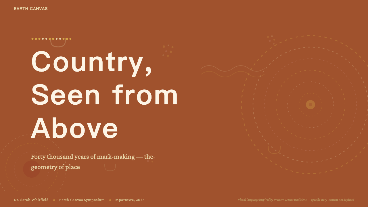
For presentation slides, the style works exceptionally well for covers and section dividers. A cover treated in this language uses a warm earth tone as the full-bleed ground and builds the foreground from concentric circular motifs or radiating dot fields that frame the title. The title itself should be set in clean, unadorned type that does not compete visually with the dot pattern — the pattern carries the cultural weight, the type carries the information. Content slides should use a restrained version of the palette: a single warm ground color, dot-pattern accents limited to borders or small decorative zones, and generous clear space for text. Data visualizations can adopt circular and radial structures that echo the concentric-ring motif, using warm ochres and umbers to differentiate segments without imposing the full dot texture on chart elements.对于演示文稿,这种风格在封面和章节分割页上效果尤为出色。以这种语言处理封面时,使用暖大地色调作为满版底色,并从同心圆母题或放射状点阵构建前景,用以框定标题。标题本身应以简洁、无装饰的字体排版,不与点画图案形成视觉竞争——图案承载文化分量,文字承载信息。内容页应使用克制版本的色调:单一暖色调底色,点阵图案强调限于边框或小型装饰区域,为文字保留充裕的清晰空间。数据可视化可采用呼应同心环母题的圆形与放射状结构,使用温暖的赭石与焦褐区分数据段,而不在图表元素上强加完整的点画肌理。
For web interfaces, the style is best suited to hero sections, loading screens, cultural landing pages, and decorative editorial contexts where visual richness is appropriate. Dashboard and data-dense interfaces do not suit the all-over pattern well — the visual complexity of the dot field competes with the informational complexity of the content. Where the style is applied to UI, the most effective approach is contrast: a patterned zone adjacent to a clean, minimal information zone, so that the dot field frames and draws attention to the content area without overwhelming it. Pricing pages can use the style for tier-differentiation headers, with each tier identified by a distinct color from the earth palette, the dot density adjusted to signal hierarchy.对于网页界面,这种风格最适合主视觉区块、加载页面、文化落地页以及视觉丰富性适宜的装饰性编辑场景。仪表板和数据密集型界面不适合全覆盖图案——点阵的视觉复杂度与内容的信息复杂度相互竞争。将该风格用于界面时,最有效的方法是对比:将图案化区域与简洁、极简的信息区域相邻放置,使点阵画面框定并引导注意力至内容区域,而不至于将其淹没。定价页可以将该风格用于等级区分的头部区域,以大地色调中的不同颜色区分各等级,并通过调整点密度来传达层级关系。
For editorial and marketing work, the style supports immersive, culturally resonant visual storytelling. Full-bleed dot-pattern images work as section backgrounds in long-form editorial layouts, with reversed type sitting directly on the pattern — provided the pattern's tonal value is consistent enough to maintain legibility. In marketing contexts, the palette's warmth and organic quality work well for brands in the cultural, travel, wellness, and artisanal sectors. Posters and social cards in this style benefit from the same approach as historical Aboriginal works: a dominant central motif — a circle, a set of concentric rings — surrounded by a field of smaller marks in an adjacent but distinct color, creating the layered depth that the tradition's compositional logic naturally produces.对于编辑与营销内容,这种风格支持沉浸式的、具有文化共鸣的视觉叙事。满版点阵图案图像作为长篇编辑版面中的章节背景效果出色,反白字体可直接叠放于图案之上——前提是图案的色调值足够均匀以维持可读性。在营销场景中,这种色调的温暖感与有机质感适合文化、旅行、健康与工艺领域的品牌。这种风格的海报与社交卡片受益于与历史上原住民作品相同的方法:一个主导性的中央母题——圆圈、一组同心环——被相邻但有别的颜色构成的细小标记场所包围,产生这一传统的构图逻辑自然催生的层叠深度感。
The most significant mistake when applying this style is treating it as generically decorative ethnic pattern — using any collection of dots in warm colors and calling it Aboriginal-inspired. This both misrepresents the tradition and produces weak design, because the visual power of actual dot painting comes from the specific structural relationships between symbol, field, and color that the tradition's logic defines. A second common error is combining the dot-painting palette with cool-toned typographic treatments or blue-dominant interface elements; the mineral warmth of the palette is not merely atmospheric but structural, and introducing competing color temperatures undermines the system's coherence. Finally, whenever this style is used commercially, attribution and acknowledgment of the tradition's origin should be considered standard practice — not as legal obligation but as creative honesty.应用这种风格时最重大的错误,是将其视为泛泛的装饰性民族图案——用暖色调中的任意圆点集合并称之为「原住民风格」。这不仅歪曲了传统本身,也产生了薄弱的设计,因为真实点画的视觉力量来自传统逻辑所定义的符号、画面与色彩之间的具体结构关系。另一个常见错误是将点画色调与冷调字体处理或蓝色主导的界面元素相结合;这种色调的矿物温暖感不仅仅是氛围性的,而是结构性的,引入竞争性的色温会破坏整个系统的连贯性。最后,每当这种风格被用于商业目的时,标注来源并致谢这一传统的起源应被视为标准实践——不是作为法律义务,而是作为创作诚信。
See the Aboriginal Dot Painting design system查看 Aboriginal Dot Painting 完整设计系统
Aboriginal Dot Painting — FAQAboriginal Dot Painting · 常见问题
Is it appropriate to use Aboriginal dot painting as a design inspiration?将原住民点画作为设计灵感来源是否得当?
This is a genuinely contested question, and a thoughtful answer holds more nuance than a simple yes or no. The visual language of Western Desert painting has entered the global design consciousness and is widely used; many Aboriginal artists and organizations support broader awareness of the tradition. The relevant distinctions are: using the visual logic of the style (its compositional principles, color relationships, structural approach to the dot field) is different from reproducing specific sacred symbols whose meaning and custodianship belong to particular communities. Crediting the tradition explicitly, working with Aboriginal artists or consultants when possible, and avoiding the reductive flattening of the culture to a surface texture are the practical markers of respectful use.这是一个真正存在争议的问题,一个审慎的回答比简单的是或否更具层次。西部沙漠绘画的视觉语言已进入全球设计意识并被广泛使用;许多原住民艺术家和组织支持对这一传统的更广泛认知。相关的区分在于:使用这种风格的视觉逻辑(其构图原则、色彩关系、对点阵的结构性处理方式)与复制特定神圣符号是不同的——后者的意义与保管权归属于特定社区。明确标注传统来源、尽可能与原住民艺术家或顾问合作,以及避免将文化简化为表面肌理的做法,是尊重性使用的实际标志。
How do I distinguish authentic Aboriginal art from work made for the tourist market?如何区分真实的原住民艺术与面向旅游市场生产的作品?
Authentic work is made by artists from communities with a genuine custodial relationship to the Dreaming stories depicted, sold through Indigenous-owned or community-certified art centers, and accompanied by provenance documentation identifying the artist, their country, and the story the work encodes. The Australian government's Indigenous Art Code provides a framework for ethical trade. Work sold as Aboriginal at tourist markets without provenance — or made by non-Aboriginal artists imitating the style — is both ethically problematic and legally actionable under Australian law. For design reference purposes, institutional collections (National Gallery of Australia, South Australian Museum) and the catalogues of established community art centers are the most reliable sources.真实的作品由与所描绘梦境时代故事具有真正保管关系的社区艺术家创作,通过原住民所有或社区认证的艺术中心出售,并附有标明艺术家、其所属领地及作品所编码故事的来源文件。澳大利亚政府的《原住民艺术规范》为道德贸易提供了框架。在旅游市场上销售的无来源文件的所谓原住民艺术品——或由非原住民艺术家模仿这种风格创作的作品——在道德上存在问题,在澳大利亚法律下也可能构成违法行为。就设计参考目的而言,机构收藏(澳大利亚国家美术馆、南澳大利亚博物馆)及成熟社区艺术中心的图录是最可靠的来源。
Can this style work in dark-background or nighttime contexts?这种风格能在深色背景或夜间主题的场景中使用吗?
The traditional palette of Western Desert painting is strongly associated with the warm, sunlit earth tones of the Central Australian landscape. Dark inversions are possible in design contexts — replacing warm ochre grounds with deep charcoal or near-black, and shifting the dot colors to more luminous warm tones — but they should be approached with care. The risk is that the visual warmth and earthbound quality that makes the style distinctive evaporates when the ground darkens, leaving only a generic dot pattern. A successful dark version typically retains at least one strong ochre or warm amber element that anchors the composition to the tradition's color world, even on a predominantly dark ground.西部沙漠绘画的传统色调与澳大利亚中部大地温暖的阳光色调紧密相连。在设计场景中可以进行深色反转处理——将温暖的赭石底色替换为深炭灰或接近黑色,并将圆点颜色调整为更具光感的暖调——但应谨慎处理。风险在于:当底色变暗时,使这种风格独具特色的视觉温暖感与大地气质可能随之消散,留下的只是一种泛泛的点阵图案。成功的深色版本通常至少保留一个强烈的赭石或暖琥珀色元素,即便在以深色为主的底面上,也能将构图锚定于这一传统的色彩世界之中。
How is this style different from other dot-based design approaches like pointillism or halftone?这种风格与点彩派或半调网点等其他基于圆点的设计手法有何不同?
The differences are fundamental rather than superficial. Pointillism (the Post-Impressionist technique of Seurat and Signac) uses dots of optically mixed color to simulate light and atmospheric tone — each dot is a unit of light, and the composition is governed by naturalistic representation. Halftone uses a grid of dots varying in size or density to reproduce photographic tonal ranges in print — it is a mechanical reproduction technology, not a compositional system. Aboriginal dot painting uses the dot as a unit of spatial activation and symbolic covering: it is not simulating light, not reproducing photography, and not organized by a mechanical grid. The marks are applied by hand, the color zones are defined by ancestral geography, and the overall surface is structured by the relationships between sites and stories rather than by optical or photographic logic.这些差异是根本性的,而非表面性的。点彩派(修拉和西涅克的后印象主义技法)使用光学混色的圆点来模拟光线与大气色调——每个圆点是一个光线单位,构图受自然主义再现的支配。半调网点使用大小或密度变化的点阵网格,在印刷中再现摄影的色调范围——它是一种机械复制技术,而非构图系统。原住民点画将圆点作为空间激活与象征性覆盖的单位:它不是在模拟光线,不是在再现摄影,也不是由机械网格组织的。标记由手工施加,色彩区域由祖先地理定义,整体画面的结构由地点与故事之间的关系决定,而非由光学或摄影逻辑决定。
What are the most common mistakes when designing in this style?用这种风格进行设计时最常见的错误是什么?
Three errors recur most frequently. First: using dots as loose scatter texture rather than as a disciplined all-over field — the dot must be applied with intention and density, not scattered decoratively. Second: mixing the style's warm earth palette with cool interface colors, particularly cool grays and desaturated blues, which fight the system's tonal warmth and read as a category confusion rather than a design choice. Third: borrowing the visual surface of the style without engaging its compositional logic — producing work that has the color and the dot but not the organizing principles of concentric structures, all-over activation, and aerial perspective that give authentic dot painting its visual power. The style rewards systematic commitment; it does not reward casual quotation.最频繁出现的是三种错误。第一:将圆点作为松散散落的肌理而非有纪律的全覆盖画面——圆点必须以意图和密度施加,而非装饰性地散布。第二:将这种风格的暖大地色调与冷色调界面颜色混合,尤其是冷灰与去饱和蓝,这与系统的色调温暖感相冲突,呈现为类别混乱而非设计选择。第三:借用这种风格的视觉表面而不介入其构图逻辑——产生的作品有色彩有圆点,却缺乏同心结构、全面激活与俯视视角这些赋予真实点画视觉力量的组织原则。这种风格回报系统性的承诺;它不回报随意的引用。
Related design styles相关设计风格
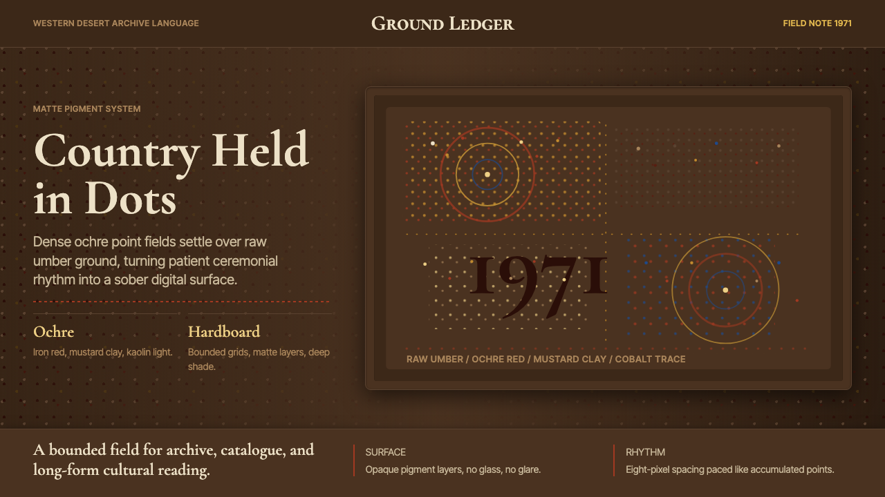 Aboriginal Dot Painting (Papunya 1971)Ochre memory, held steady. Raw umber ground, Cormorant type, disciplined dot-…赭石记忆沉稳留存:生赭黑地、Cormorant 字体与克制点阵。
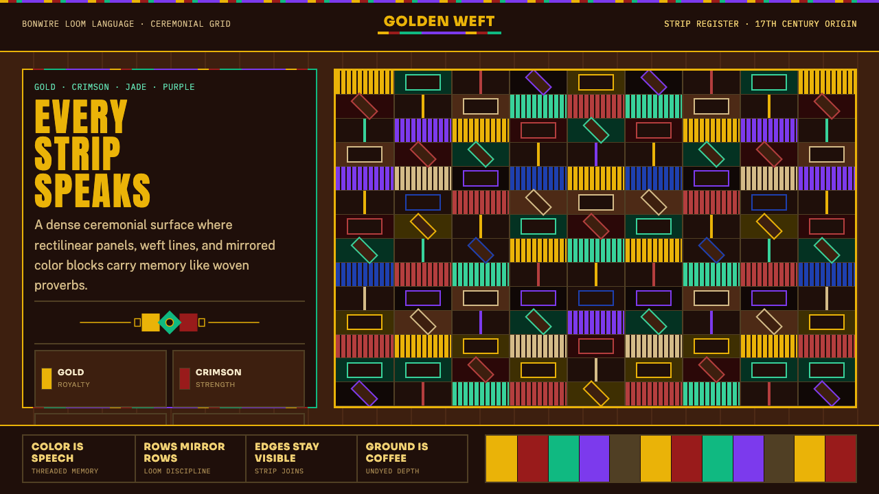 West African Kente ClothWoven authority. Gold, crimson, jade, and purple strips lock into a dense cof…织出权威感:金、朱红、翡翠与紫色条带锁进咖啡棕密格。
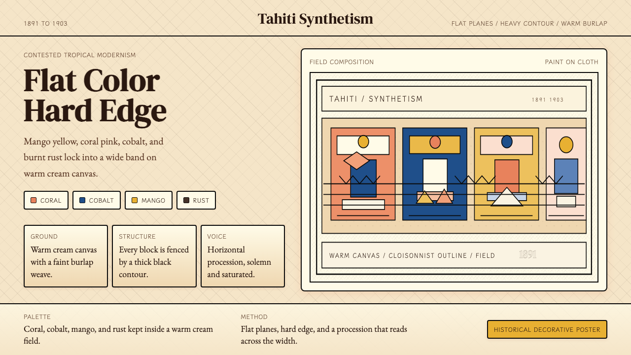 Gauguin — Tahiti SynthetismFlat color, hard edge. Cream canvas, coral, cobalt, and rust lock into a frie…平涂硬边。奶油底上珊瑚、钴蓝与焦土红排成壁带。
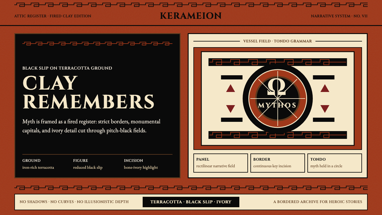 Greek Antiquity (Attic Vase)Myth becomes architecture. Terracotta, black slip, and Greek-key borders fram…神话化为建筑:赤陶、黑釉与希腊回纹框住叙事。
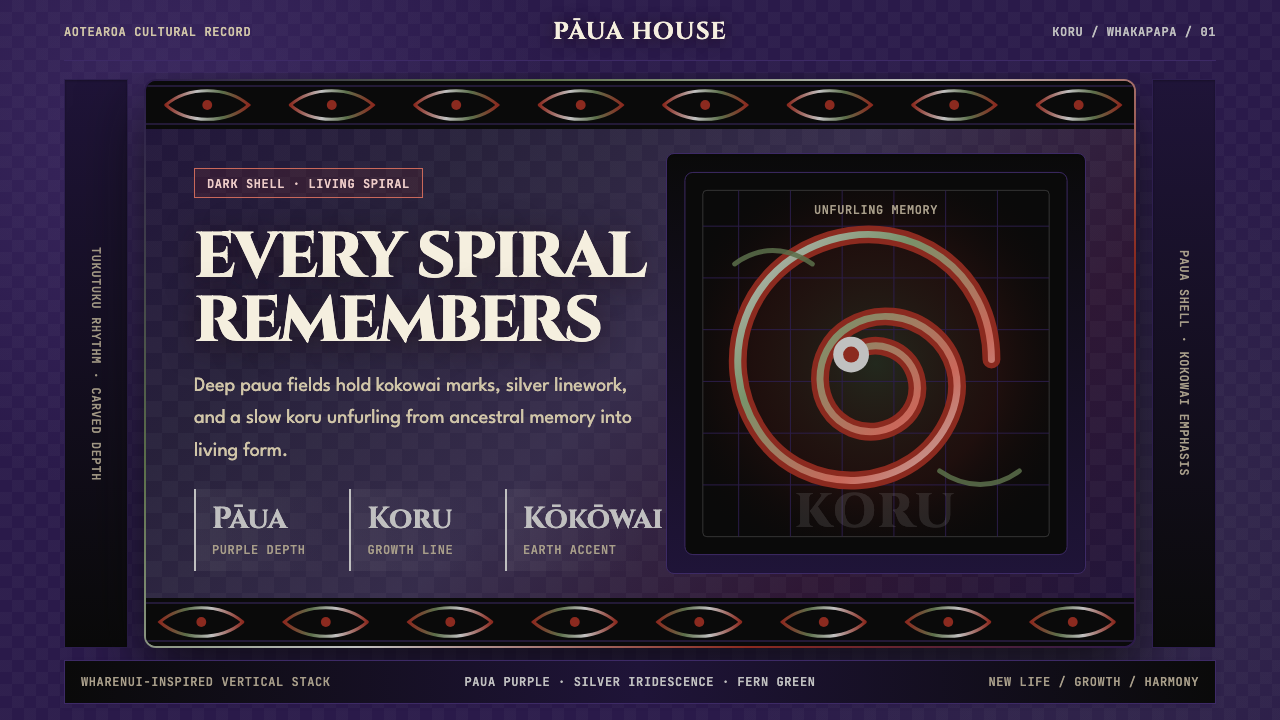 Māori Koru (Aotearoa)Ancestry glows in the dark. Paua purple, kokowai red, and silver koru frame t…黑暗中祖脉发光:鲍紫、赭红与银色科鲁框住纵向层叠。
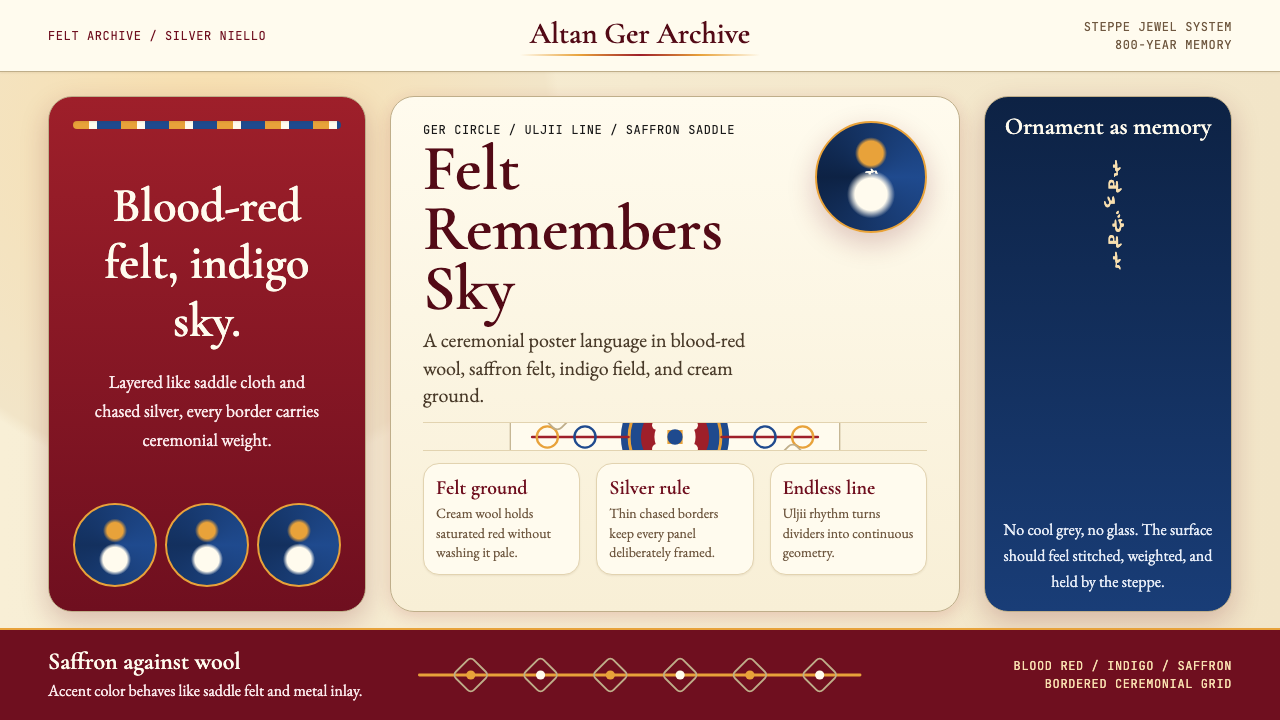 Mongolian Nomadic SteppeSteppe memory in jewel tones. Blood-red felt, saffron, indigo, and bordered u…草原记忆浓烈如宝石:深红毡、藏蓝与番红花色,边框乌力吉几何。