Design style guide设计风格指南
What is Aboriginal Dot Painting (Papunya 1971)?什么是 Aboriginal Dot Painting (Papunya 1971)?
In a remote settlement in the Northern Territory in 1971, senior Aboriginal men transferred sacred sand-painting knowledge onto hardboard with acrylic paint — and accidentally founded one of the most consequential art movements of the twentieth century.1971年,澳大利亚北领地一处偏远定居点,几位年长的原住民男性用丙烯颜料将神圣的沙画知识转移到硬纸板上——无意间开创了二十世纪最重要的艺术运动之一。
Aboriginal Dot Painting (Papunya 1971) in briefAboriginal Dot Painting (Papunya 1971) 速览
Aboriginal Dot Painting in the Papunya tradition is a visual language rooted in the Dreaming — the complex cosmological framework through which Aboriginal Australians understand the creation of the land, its spiritual geography, and the laws governing human conduct. The distinctive dense dot-fields that define the style are not decorative texture; they were initially a protective veil drawn over sacred iconography that could not be shown to uninitiated viewers, encoding the landscape itself as a constellation of marks.帕潘亚传统的原住民点画是一种植根于“梦幻时代”(Dreaming)的视觉语言。“梦幻时代”是澳大利亚原住民理解土地创生、精神地理与人类行为法则的复杂宇宙观框架。定义这一风格的密集点阵并非装饰性肌理——它们最初是遮盖在神圣图像之上的保护性面纱,用于向未经启蒙者隐藏不可示人的内容,同时将大地本身编码为点迹的星群。
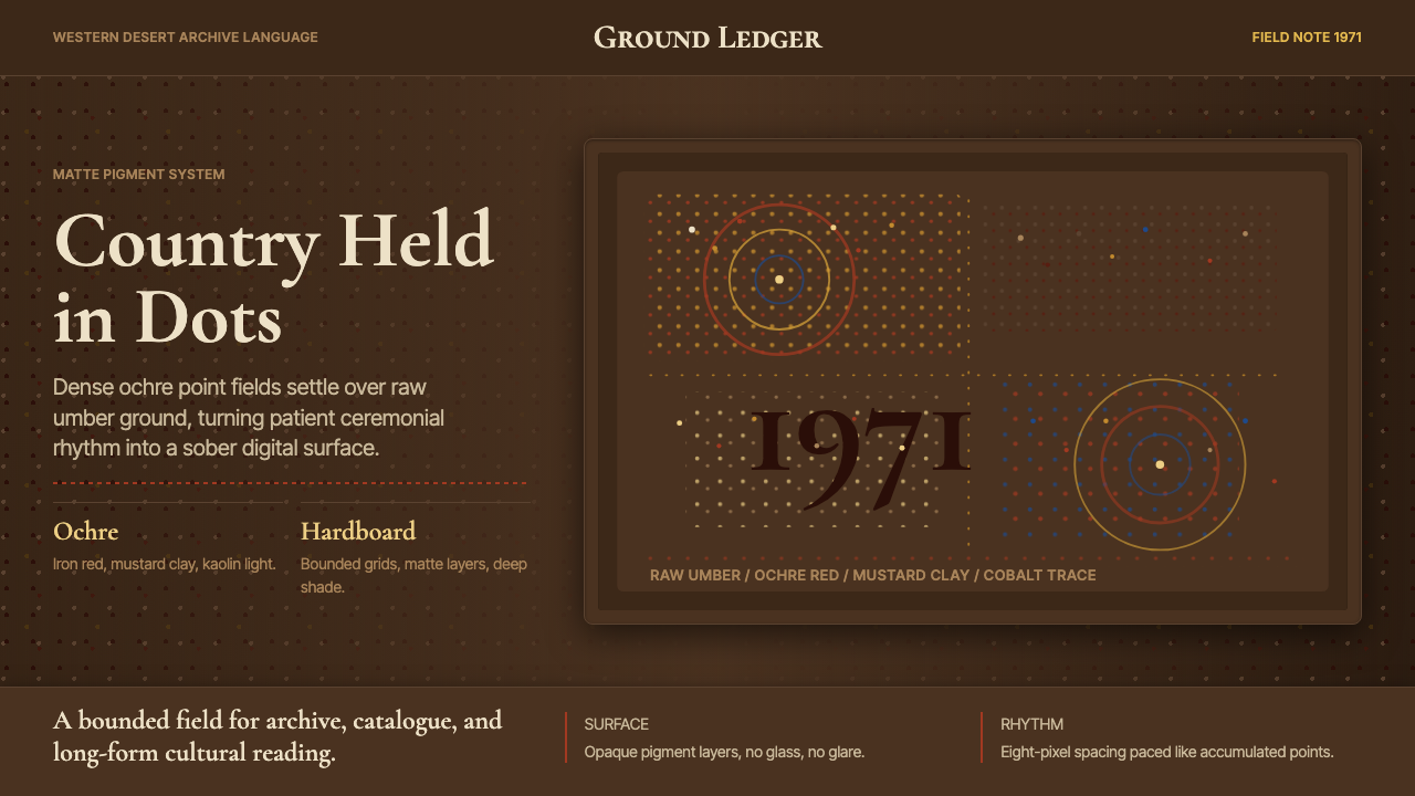
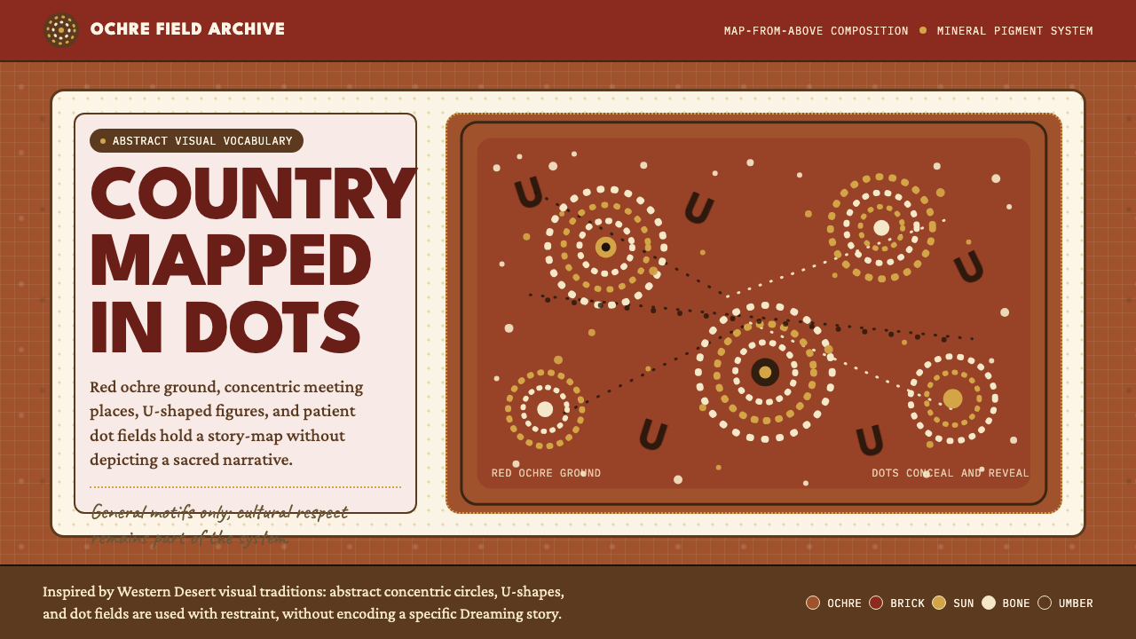
The resulting aesthetic is one of remarkable visual density and rhythm. Ochre, raw sienna, burnt umber, and desert white are the dominant earth tones, punctuated by the deep charcoal of the hardboard ground or, in later works, deep acrylic blacks. Dots accumulate into fields of vibrating color, circles nest inside larger circles to indicate waterholes and ceremonial sites, and meandering lines trace the paths of ancestral beings across Country. The compositions are typically read from above — a bird's-eye topographic perspective that maps spiritual territory rather than literal space.由此形成的美学具有非凡的视觉密度与节奏感。赭黄、生赭、焦赭与沙漠白是主导的大地色调,被硬纸板底色的深炭灰或后期作品中的深丙烯黑所穿插。点迹积聚成色彩振动的色域,大小同心圆标示水坑与仪式场所,蜿蜒的线条勾勒出祖先存在在“国土”上的行迹。构图通常以俯视视角呈现——一种鸟瞰式的地形视角,绘制的是精神领地而非字面上的空间。
What makes this style enduringly powerful as a design language is its unique combination of strict geometric discipline with what reads as organic vitality. The palette is deeply earthy yet visually electric. The repetitive dot-work creates optical vibration that contemporary screen interfaces can exploit without diminishing its cultural gravity — provided the application is handled with awareness and restraint.这种风格之所以作为设计语言经久不衰,在于它将严格的几何纪律与充满有机活力的视觉感受独特地结合在一起。色板深沉质朴却在视觉上充满张力。重复的点作产生光学振动,当代屏幕界面可以加以利用,而不必削减其文化厚重感——前提是应用时保持足够的意识与克制。
Where does Aboriginal Dot Painting (Papunya 1971) come from?Aboriginal Dot Painting (Papunya 1971) 从何而来?
The story of Papunya Tula begins in 1971 at Papunya, a government settlement about 240 kilometres north-west of Alice Springs established in the late 1950s to consolidate disparate Aboriginal communities — Pintupi, Luritja, Warlpiri, Aranda, and Anmatyerre peoples — onto a single administered location. The displacement was profound. Men and women who had lived according to the laws and ceremonial cycles of specific Country found themselves crowded into corrugated-iron housing on land not their own.帕潘亚图拉的故事始于1971年的帕潘亚定居点——一处位于爱丽丝泉西北约240公里处的政府聚居地,建于1950年代末,旨在将平图比、卢里查、瓦尔皮里、阿兰达和安马贾雷各族人并入同一行政管理地点。这场位移意义深远。曾按特定“国土”的法则与仪式周期生活的男女老少,被迫挤入并非其故土的波纹铁皮屋舍之中。
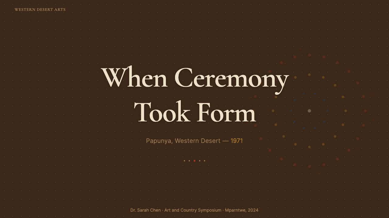
In 1971, Geoffrey Bardon, a young schoolteacher from Sydney, arrived at Papunya and began encouraging the men to paint the ceremonial designs they recalled from their homelands onto the school walls. What followed was unexpected. Senior law men — including Kaapa Tjampitjinpa, Johnny Warangkula Tjupurrula, and Mick Namarari Tjapaltjarri — began producing works of extraordinary visual sophistication on sheets of hardboard and later canvas. The mural painted on the school wall in July 1971, depicting the Honey Ant Dreaming, is considered the founding moment of the Western Desert art movement.1971年,年轻的悉尼教师杰弗里·巴顿来到帕潘亚任教,开始鼓励男性们将他们记忆中故乡的仪式图案绘制在学校墙壁上。随后发生的事出乎所有人预料。包括卡帕·查姆皮金帕、约翰尼·瓦朗库拉·朱普鲁拉和米克·纳马拉里·查帕尔查里在内的年长法律持有者,开始在硬纸板上——后来扩展到画布上——创作出视觉上极为成熟的作品。1971年7月绘制在学校墙上、描绘蜜蚁梦幻故事的壁画,被视为西部沙漠艺术运动的奠基时刻。
Papunya Tula Artists was formally incorporated as an artists' cooperative in 1972, becoming the first Indigenous-owned art cooperative in Australia. The cooperative gave artists control over the sale of their work and established a model that Indigenous art centres across Australia would later adopt. Early Papunya boards were distinguished by explicit sacred iconography — concentric circle complexes, U-shapes representing seated figures, tracks and body-part symbols — that reflected the full ceremonial knowledge the painters carried. However, concerns from senior custodians about revealing sacred designs to non-initiated people led artists to develop the dot-overlay technique: dots were applied in dense fields over sacred elements, both obscuring specific knowledge and creating the distinctive visual texture the style became known for worldwide.帕潘亚图拉艺术家合作社于1972年正式注册,成为澳大利亚首个由原住民自主运营的艺术合作社。合作社赋予艺术家对作品销售的控制权,并确立了一套日后被澳大利亚各地原住民艺术中心广泛效仿的模式。早期帕潘亚木板画以明确的神圣图像为特征——同心圆复合体、代表席地而坐的人形U形符号、脚印和身体部位象征——反映着画家们所承载的完整仪式知识。然而,来自年长监护人的顾虑——担忧向未经启蒙者揭示神圣图案——促使艺术家发展出点阵覆盖技法:在神圣图案之上密集施点,既遮蔽了特定知识,又创造出后来令这一风格享誉全球的独特视觉肌理。
Clifford Possum Tjapaltjarri emerged in the mid-1970s as the movement's most ambitious cartographer of Dreaming narratives. His large-scale canvases mapped multiple overlapping Dreaming tracks across a single surface, creating compositions of remarkable spatial complexity — different story-lines coexisting in a single aerial view of Country. By the 1980s, works by Papunya Tula artists were entering major international collections. The 1988 Australian Bicentenary sparked renewed international attention, and throughout the 1990s and 2000s, the paintings became both cultural icons and significant commercial objects. Today the tradition continues across Western Desert communities, with artists navigating the ongoing tension between the ceremonial obligations of country knowledge and the demands of a global art market.克利福德·波塞姆·查帕尔查里在1970年代中期崭露头角,成为这一运动中最雄心勃勃的梦幻叙事制图者。他的大幅画布在单一画面上呈现多条交叠的梦幻足迹,创造出空间复杂性非凡的构图——不同故事线在同一幅“国土”鸟瞰图中共存。进入1980年代,帕潘亚图拉艺术家的作品开始进入世界各大主要收藏机构。1988年澳大利亚建国两百周年纪念再度引发国际关注,整个1990至2000年代,这些画作既成为文化图腾,也成为重要的商业标的。时至今日,这一传统仍在西部沙漠社区延续,艺术家们持续在国土知识的仪式义务与全球艺术市场的需求之间寻求平衡。
What defines the Aboriginal Dot Painting (Papunya 1971) look?Aboriginal Dot Painting (Papunya 1971) 的视觉特征是什么?
Earth-Tone Palette大地色板
The foundational color register draws from the pigments available in the Western Desert landscape: ochres ranging from pale yellow to deep burnt orange, raw umber darks, red-brown siennas, and chalky desert whites. These earth tones are rarely used at full brightness; they are layered and modulated, giving the surface a warmth that reads as aged and material even in digital applications. The darkest grounds — near-black or deep charcoal — serve as recessive fields against which the warmer dots advance, creating a depth that is atmospheric rather than spatial.基础色彩基调取材于西部沙漠景观中可获取的颜料:从浅黄到深焦橙的各色赭黄、深沉的生赭棕、红褐色的赭土,以及粉质沙漠白。这些大地色调鲜少以最高亮度使用;它们被层叠与调制,赋予画面一种温度,即便在数字应用中也呈现出陈年与物质感。最暗的底色——近黑或深炭——作为退隐的色域,让更暖的点迹向前推进,创造出一种大气感而非空间感的深度。
Dot-Field Rhythm点阵节奏
The defining visual element is the accumulation of individual dots into continuous fields that vibrate with optical energy. Dots are not applied randomly; they follow contour lines, radiate outward from central motifs, or fill negative space in dense, meditative rows. The spacing between dots is as deliberate as the dots themselves — tighter clusters read as solid mass, more open fields breathe and recede. This creates a kind of halftone logic that predates digital screens by decades: the image is constructed from discrete marks whose spacing controls perceived density and color value.定义性的视觉元素是单个点迹积聚成的连续色域,以光学能量振动着。点迹并非随机施加;它们沿轮廓线分布,从中心母题向外辐射,或以密集而沉思的行列填充负空间。点与点之间的间距与点本身同样经过深思熟虑——更密集的簇团呈现为实体质量,更开阔的色域则透气而后退。这制造出一种早于数字屏幕数十年的半色调逻辑:图像由离散的点迹构成,间距控制着感知到的密度与色彩明度。
Concentric Circle Geometry同心圆几何
Circular forms — particularly concentric rings nested inside one another — are the most immediately recognizable formal element of the Western Desert tradition. In the original ceremonial context, concentric circles mark sites of significance: waterholes, campsites, sacred locations on the Dreaming map. As a compositional device, they function as focal anchors around which dot-fields organize themselves, creating visual hierarchies that the eye reads as landscape features. Multiple circle-complexes distributed across a composition produce the effect of a topographic map viewed from altitude.圆形——尤其是相互嵌套的同心环——是西部沙漠传统中最易于辨认的形式元素。在原初仪式语境中,同心圆标示着具有重要意义的地点:水坑、营地、梦幻地图上的神圣位置。作为构图手段,它们充当焦点锚点,点阵色域围绕其组织自身,创造出眼睛将其解读为地貌特征的视觉层级。在构图中分布的多个圆形复合体,产生从高空俯瞰地形图的视觉效果。
Aerial Topographic Perspective空中地形视角
Papunya compositions are organized from a bird's-eye viewpoint — not the European pictorial convention of horizon and vanishing point, but a flat, overhead mapping of territory. This perspective means that all compositional elements exist in the same plane: there is no foreground, middle ground, or background in the conventional sense. Tracks, circles, and sinuous lines coexist as marks on a surface that is simultaneously physical ground and spiritual map. In interface applications, this produces layouts that feel simultaneously abstract and geographical — capable of organizing large amounts of information without conventional spatial hierarchy.帕潘亚构图以鸟瞰视角组织——并非欧洲绘画惯例中的地平线与消失点,而是对领地的平面俯瞰制图。这一视角意味着所有构图元素共存于同一平面:没有传统意义上的前景、中景或背景。足迹、圆形与蜿蜒线条作为痕迹并置于画面之上,这一画面同时是物质的地面与精神的地图。在界面应用中,这产生了既抽象又地理化的版面感——能够在不依赖传统空间层级的情况下组织大量信息。
Controlled Chromatic Contrast受控色彩对比
While the palette is grounded in earth tones, Papunya works achieve striking visual impact through the careful juxtaposition of warm and cool within a narrow tonal range. A rust-orange dot-field against a deep charcoal ground creates intense contrast without departing from the earth-tone register. Later artists introduced more saturated intervals — turquoise or deep mineral blue — as accent colors that register against the warm darks. The result is a palette that feels simultaneously ancient and contemporary: restrained enough to seem timeless, varied enough to sustain visual interest across large-scale applications.尽管色板以大地色调为基础,帕潘亚作品仍通过在狭窄色调范围内对冷暖的精心并置取得震撼的视觉冲击力。锈橙色的点阵色域叠于深炭色底面之上,在不脱离大地色调基调的前提下创造出强烈对比。后期艺术家引入了更为饱和的间色——绿松石色或深矿物蓝——作为在暖暗色上映衬的强调色。由此形成的色板同时具有古老与当代的气息:足够克制而显得超越时间,又足够多变以在大规模应用中维持视觉趣味。
Line as Story-Path线条作为故事路径
Sinuous, meandering lines traverse Papunya compositions, connecting circle-sites and tracking the routes of ancestral beings across Country. These are not decorative curves; they carry narrative function, tracing the journeys that Dreaming stories describe. In visual terms, they introduce a calligraphic element into the otherwise dot-dominant surface: a flowing counterpoint to the static accumulation of marks. In design applications, such lines can serve as movement paths, connection indicators, or thematic threads that stitch otherwise discrete elements into a legible whole.蜿蜒流转的线条穿越帕潘亚构图,连接各个圆形地点,追踪祖先存在在“国土”上的行迹。这些并非装饰性曲线;它们承载叙事功能,描摹梦幻故事所讲述的旅程。在视觉上,它们将书法性元素引入原本以点为主导的画面:在静态积聚的点迹之间形成流动的对位。在设计应用中,这样的线条可以充当运动路径、连接指示符,或将其他离散元素缝合为可读整体的主题线索。
Material Density材质密度
Original Papunya works were built up in multiple layers: ground color, motif layer, and then the dot-overlay applied with controlled pressure to achieve varying heights of impasto. The result is physically tactile — the surface has topography. In digital and print applications, this material quality must be evoked rather than replicated: through the use of slight tonal variation within dot-fields, through layering that suggests depth without introducing gradients, and through restraining the temptation to make elements look 'flat' in the contemporary minimalist sense. The style reads best when it feels like it has been made, not generated.原初帕潘亚作品以多层堆积构建:底色层、母题层,然后以受控力道叠加点阵覆盖,以达到不同高度的厚涂效果。结果在触觉上是真实的——画面具有地形起伏。在数字与印刷应用中,这种物质感必须被唤起而非复制:通过在点阵色域内引入细微色调变化,通过暗示深度但不引入渐变的分层处理,以及通过抵制将元素做成当代极简主义意义上“平面”外观的诱惑。当这种风格令人感觉是被制作出来而非被生成出来时,它的呈现效果最佳。
Who shaped Aboriginal Dot Painting (Papunya 1971)?谁塑造了 Aboriginal Dot Painting (Papunya 1971)?
An art teacher from Sydney who arrived at Papunya in 1971, Bardon occupies a complicated but foundational position in the movement's history. He encouraged senior Aboriginal men to paint their ceremonial designs and provided them with materials — initially house paints and hardboard. His instinct that the paintings warranted serious artistic attention, and his persistence in bringing early works to the attention of buyers and institutions, gave the movement its initial commercial footing. Bardon documented the early period extensively; his records remain among the most important historical accounts of Papunya's founding years.巴顿是一位1971年来到帕潘亚任教的悉尼美术教师,在这一运动的历史中占据着复杂而奠基性的地位。他鼓励年长的原住民男性将仪式图案绘制下来,并为他们提供材料——起初是房屋涂料和硬纸板。他对这些画作值得认真对待的艺术直觉,以及他坚持将早期作品引荐给买家与机构的努力,为这一运动奠定了最初的商业基础。巴顿对早期阶段留下了大量文献记录,至今仍是帕潘亚创立年代最重要的历史资料之一。
Tjapaltjarri emerged by the mid-1970s as the artist most responsible for expanding the formal ambitions of the Papunya movement. His large multi-narrative canvases overlaid multiple Dreaming stories from different countries, producing compositions of exceptional spatial and narrative complexity. His 1977 work mapping the Warlugulong Dreaming narrative is considered a landmark in the development of the Western Desert style. His ability to hold competing ceremonial obligations in a single visual field while maintaining compositional legibility made him the movement's most technically demanding practitioner, and his works command some of the highest prices achieved by any Australian artist.查帕尔查里在1970年代中期崭露头角,成为在形式上扩展帕潘亚运动雄心最重要的艺术家。他的大幅多叙事画布叠加了来自不同“国土”的多条梦幻故事,产生了具有非凡空间与叙事复杂性的构图。他于1977年创作的描绘瓦鲁古隆梦幻叙事的作品被视为西部沙漠风格发展史上的里程碑。他在单一视觉平面上兼顾相互竞争的仪式义务同时维持构图可读性的能力,使他成为这一运动中技术要求最高的践行者,其作品拍出了澳大利亚艺术家迄今最高成交价之列。
One of the original Honey Ant Mural painters of 1971, Tjupurrula was among the first Pintupi men to take up acrylic on hardboard. His compositions are distinguished by their use of interlocking dot-fields in warm ochre and red-brown tones against dark grounds, with an unusually intimate quality that contrasts with the epic scale pursued by some contemporaries. His work Water Dreaming at Kalipinypa, painted in 1972, became one of the most celebrated of the early Papunya period and played a significant role in establishing the international reputation of the movement.作为1971年蜜蚁壁画的原初绘制者之一,朱普鲁拉是最早在硬纸板上使用丙烯颜料的平图比族男性之一。他的构图以暖赭黄与红棕色调的相互交扣点阵色域叠于深色底面为特征,具有一种与某些同代人追求的史诗尺度形成对比的非凡亲密感。他于1972年创作的《卡利宾亚帕的水梦幻》成为帕潘亚早期最著名的作品之一,在确立这一运动国际声誉方面发挥了重要作用。
Namarari Tjapaltjarri's work is among the most formally austere within the Papunya tradition. His mature compositions often reduce the Dreaming map to near-abstract fields of dots arranged in geometric patterns — concentric circles, parallel lines, and radial forms — with the narrative content encoded so deeply within the formal structure that the works read as pure abstraction to uninitiated viewers. This quality made his paintings among the most legible to Western gallery audiences, who approached them through the lens of mid-century abstraction, while the ceremonial depth remained intact for those who shared the cultural knowledge.纳马拉里·查帕尔查里的作品在帕潘亚传统中属于形式上最简朴的一类。他成熟时期的构图往往将梦幻地图简化为几近抽象的点迹色域,排列成几何图案——同心圆、平行线与放射形——叙事内容深深编码于形式结构之中,使作品在未经启蒙的观者眼中呈现为纯粹的抽象。这一特质使他的画作在西方画廊观众中获得极高可读性——他们通过二十世纪中期抽象主义的视角来解读这些作品,而仪式深度则对共享这一文化知识的人保持完整。
Though not a Papunya Tula artist — she was an Anmatyerre woman from Utopia Station who began painting in 1988 — Kngwarreye is essential to any account of the Western Desert tradition's reach and development. Her late work abandoned dot-fields for sweeping gestural marks that retained the earthen palette and the topographic sensibility while producing something completely unprecedented in Australian art. She produced an extraordinary volume of work in just eight years before her death in 1996, and her paintings have been exhibited at the Venice Biennale and the National Museum of Modern Art in Tokyo — demonstrating the breadth to which the visual language developed at Papunya has expanded.肯瓦雷虽非帕潘亚图拉艺术家——她是来自乌托邦牧场的安马贾雷族女性,1988年才开始绘画——但她对于完整叙述西部沙漠传统的影响与发展不可或缺。她晚期作品放弃了点阵色域,转向大幅挥洒的姿势性笔触,保留了大地色板与地形感知,同时创造出在澳大利亚艺术中前所未有的东西。她在去世前的短短八年间(她于1996年辞世)创作了数量惊人的作品,其画作已在威尼斯双年展和东京国立近代美术馆展出——证明了帕潘亚所发展的视觉语言所达到的广度。
How do you use Aboriginal Dot Painting (Papunya 1971) today?今天怎么用 Aboriginal Dot Painting (Papunya 1971)?
The Papunya visual language translates into digital and print contexts most effectively when the application preserves the two qualities that give the style its power: the meditative repetition of marks, and the grounded, earthy color register. Applying this style superficially — scattering a few dots over a neutral background — produces something that reads as cultural tokenism rather than as a coherent design system. The approach requires committing to density.帕潘亚视觉语言在数字与印刷语境中最有效的转化,是保留赋予这一风格力量的两种品质:点迹的冥想性重复,以及扎实质朴的大地色彩基调。浅层应用这一风格——在中性背景上散落几个点——产生的效果读起来像文化符号的堆砌,而非连贯的设计系统。这种方法需要对密度的坚定承诺。
For presentation slides, the style works best on cover and transition pages where full-bleed treatment is possible. A cover image built on a near-black or deep charcoal ground, with dense ochre and rust dot-fields radiating from a central concentric circle motif, creates immediate visual authority. Text should sit in high-contrast cream or white, set at a scale that does not compete with the dot texture. Content slides should extract from the palette rather than reproduce the full dot-treatment: earth-tone backgrounds with clean typographic hierarchies, using the warm-to-cool contrast of the palette for category differentiation. Data visualizations benefit from using the concentric circle motif as a focal anchor for donut charts or radial displays.对于演示文稿,这一风格最适合可实现全出血处理的封面与过渡页面。以近黑或深炭色底面为基础,浓密的赭黄与锈色点阵从中央同心圆母题向外辐射,构建的封面图像立刻建立起视觉权威感。文字应以高对比度的奶油色或白色置于其上,设定的字号不与点阵肌理相竞争。内容页面应从色板中提取而非复制完整的点阵处理:以大地色调为背景,配以清晰的字体层级,用色板中的冷暖对比进行类别区分。数据可视化受益于将同心圆母题作为圆环图或放射状图表的焦点锚。
For web interfaces, the style is best suited to landing pages, hero sections, and cultural or heritage contexts where the richness of the visual texture is a feature rather than a distraction. Applied to a full-width hero, a dot-pattern generated from the Papunya palette — ochre, sienna, and near-black — creates a background of unusual warmth and authority. Navigation and interactive elements should stay typographically clean against these textured grounds, with the earth-tone palette carried through into button states and accent colors. Dashboards and data-dense layouts should use the palette and the topographic perspective but minimize the dot-texture in favor of clear information hierarchy.对于网页界面,这一风格最适合落地页、英雄区段,以及视觉肌理的丰富性是特色而非干扰的文化或遗产语境。应用于全宽英雄区段时,从帕潘亚色板——赭黄、赭土与近黑——生成的点阵图案,创造出具有非凡温度与权威感的背景。导航与交互元素应在这些肌理底面上保持排版上的清洁,大地色板则延续至按钮状态与强调色中。仪表板与信息密集型版面应使用色板与地形视角,但尽量减少点阵肌理,以让位给清晰的信息层级。
For editorial and marketing work, the style supports richly textured feature imagery and section dividers. Magazine layouts can use a full-spread dot-ground as a background for portrait photography — the warmth of the earth tones flatters skin tones across a wide range of subjects, and the texture adds depth without competing with the photographic subject. Marketing materials for cultural institutions, tourism, arts organizations, and indigenous-owned businesses can use the visual language with particular coherence when the connection to the tradition is genuine. Environmental graphics and wayfinding systems can use the concentric circle motifs as location markers, adapting the topographic logic of the original painting tradition to navigational purposes.对于编辑与营销工作,这一风格支持丰富肌理的特色图像与分区分隔。杂志版面可以使用全版点阵底色作为肖像摄影的背景——大地色调的温度对各类肤色的人物都有修饰效果,肌理增加深度而不与摄影主体竞争。文化机构、旅游业、艺术机构和原住民自主运营企业的营销材料,当与这一传统的联结是真实的时候,可以以特别连贯的方式运用这一视觉语言。环境图形与导视系统可以将同心圆母题用作位置标记,将原初绘画传统的地形逻辑适配于导航目的。
The most common mistake when applying this visual language is conflating it with generic decorative dot patterns. The Papunya tradition is specific: the dots are dense and rhythmic, organized around concentric circles and meandering lines, and the palette is anchored in earth tones rather than bright primaries. A random scatter of dots in primary colors is not this style — it is a misreading of it. Equally problematic is using the aesthetic without acknowledgment in contexts where it could be mistaken for an endorsement by or collaboration with Aboriginal artists or communities. The visual language carries cultural weight that should be handled with transparency about the source of inspiration.应用这一视觉语言时最常见的错误,是将其与通用装饰性点阵图案混为一谈。帕潘亚传统是特定的:点迹密集而有节奏,围绕同心圆与蜿蜒线条组织,色板以大地色调为锚点而非鲜亮的原色。在原色中随机散布的点,并非这一风格——而是对它的误读。同样值得警惕的是:在可能被误解为获得原住民艺术家或社区背书或合作的语境中使用这一美学,却不作任何说明。这一视觉语言承载着文化分量,应以对灵感来源保持透明的方式加以运用。
Aboriginal Dot Painting (Papunya 1971) — FAQAboriginal Dot Painting (Papunya 1971) · 常见问题
What is the cultural significance of the dot overlay technique?点阵覆盖技法有何文化意义?
The dot overlay was not an aesthetic decision in origin — it was a solution to a cultural problem. When the Papunya painters began exhibiting and selling their work to non-Aboriginal audiences, senior custodians of ceremonial law became concerned that sacred iconography was being shared too broadly. The response was to apply dense dot-fields over the sacred elements, obscuring specific knowledge while preserving the overall composition. This means the visual texture that defines the style internationally — the shimmering, meditative dot-fields — was invented as a form of cultural protection. Understanding this origin matters when applying the aesthetic: the dots are not decorative fill; they are a layer of deliberate concealment.点阵覆盖技法在起源上并非一个审美决定——而是对文化问题的解决方案。当帕潘亚画家开始向非原住民观众展览和销售作品时,仪式法律的年长监护者对神圣图像被过于广泛分享感到担忧。应对之策是在神圣图案之上施加密集的点阵色域,在保留整体构图的同时遮蔽特定知识。这意味着在国际上定义这一风格的视觉肌理——那些闪烁着、充满冥想性的点阵色域——是作为一种文化保护形式而被发明的。理解这一起源在应用这一美学时至关重要:点迹并非装饰性填充,而是刻意遮蔽的一层。
How does this style differ from other Australian Aboriginal art traditions?这一风格与其他澳大利亚原住民艺术传统有何不同?
Australia's Aboriginal art traditions are extraordinarily diverse — the dot-and-circle style associated with Papunya and the Western Desert is specific to that cultural region and was, in its current acrylic form, essentially invented in 1971. Other regional traditions include the cross-hatching (rarrk) designs of Arnhem Land in the Northern Territory, the bark paintings of the Yolŋu people with their intricate figurative and geometric forms, and the X-ray style paintings of Kakadu. The Kimberley region has its own traditions of Wandjina spirit figures. The mistake of treating all Aboriginal Australian art as a single tradition — visually unified by dots — erases the cultural specificity of each distinct tradition. The Papunya style is one among many, and its global visibility is partly a historical accident of the movement's early commercialization.澳大利亚原住民艺术传统极为多样——与帕潘亚和西部沙漠相关联的点圆风格是该文化区域所特有的,而其当前的丙烯形式本质上是在1971年才被发明的。其他区域传统包括:北领地阿纳姆地的交叉影线(rarrk)图案、约尔努族具有繁复具象与几何形态的树皮画,以及卡卡杜的X光式绘画。金伯利地区有其自己的旺吉纳灵魂图像传统。将所有澳大利亚原住民艺术当作以点为视觉统一标志的单一传统来对待,这一错误抹去了每个独特传统的文化特殊性。帕潘亚风格只是众多传统之一,而其全球能见度在一定程度上是这一运动早期商业化的历史偶然。
Is using this visual style culturally appropriate?使用这一视觉风格在文化上是否恰当?
This is a question without a single clean answer, and intellectual honesty requires acknowledging that directly. The Papunya style has entered the global visual vocabulary through legitimate commercial channels — it has been exhibited in major museums, reproduced in licensed prints, and built into design systems with the involvement of Aboriginal art organizations. At the same time, the tradition carries ceremonial significance that purely aesthetic application does not honor. The clearest guidance is this: using the general visual language (earth-tone dot-fields, concentric circle geometry, topographic perspective) as design inspiration is distinct from reproducing specific sacred iconography, which should not be used outside its ceremonial context. Acknowledging the source, working with or through Aboriginal art organizations where possible, and avoiding contexts that could imply cultural endorsement that does not exist are the minimum standards of responsible application.这个问题没有简洁干净的单一答案,知识诚信要求直接承认这一点。帕潘亚风格通过合法的商业渠道进入了全球视觉词汇——它在主要博物馆展出,以授权版画形式复制,并在原住民艺术机构的参与下被纳入设计系统。与此同时,这一传统承载着纯粹审美应用所无法尊重的仪式意涵。最清晰的指引是:将一般视觉语言(大地色调点阵色域、同心圆几何、地形视角)作为设计灵感使用,与复制特定神圣图像截然不同——后者不应在其仪式语境之外使用。注明灵感来源、尽可能与原住民艺术机构合作或通过其渠道工作,以及避免可能暗示实际上并不存在的文化背书的语境,是负责任应用的最低标准。
What makes a dot-pattern authentically read as Papunya rather than generic?是什么让点阵图案真实地读起来像帕潘亚而非通用图案?
Several factors distinguish authentic Papunya-derived work from generic dot decoration. First, the palette: earth tones grounded in ochres, siennas, and umbers against near-black or deep charcoal grounds — not bright primaries on white. Second, the organizational logic: dots are not scattered randomly but accumulate along contour lines, radiate from central circle motifs, or fill regions defined by sinuous path-lines. Third, density: the dot-fields should be genuinely dense, creating optical vibration rather than a sparse, decorative sprinkle. Fourth, the compositional structure: the overall composition should read as a topographic map of connected sites rather than a pattern repeating across a surface. Achieving this combination requires studying actual Papunya Tula works rather than working from stylized derivatives.有几个因素将真正源自帕潘亚的作品与通用点阵装饰区分开来。首先是色板:以赭黄、赭土和生赭棕为基础的大地色调,叠于近黑或深炭色底面之上——而非白色底面上的鲜亮原色。其次是组织逻辑:点迹并非随机散布,而是沿轮廓线积聚、从中央圆形母题向外辐射,或填充由蜿蜒路径线界定的区域。第三是密度:点阵色域应当真正密集,产生光学振动而非稀疏的装饰性点缀。第四是构图结构:整体构图应读起来像相互连接的地点组成的地形图,而非在画面上重复的图案。实现这种组合,需要研究真实的帕潘亚图拉作品,而非从风格化的衍生版本出发。
How does the style work at small scale — icons, thumbnails, or UI components?这一风格在小尺寸下——图标、缩略图或界面组件——效果如何?
The Papunya style faces genuine challenges at small scale, because its defining qualities — dense dot-fields and concentric circle complexity — require sufficient visual space to resolve properly. At icon size, individual dots collapse into textured noise rather than controlled rhythm. The most effective small-scale adaptation is to abstract the vocabulary rather than miniaturize the full composition: a concentric circle rendered cleanly in the earth-tone palette functions as a recognizable reference to the tradition without requiring dots to be legible. At thumbnail scale, a region of the full dot-pattern can be used as a crop — the partial composition reads as texture and atmospheric depth rather than as a complete image. Attempting to reproduce the full compositional logic at small scale usually results in visual clutter; restraint and abstraction are better strategies than miniaturization.帕潘亚风格在小尺寸下面临真实的挑战,因为其定义性品质——密集的点阵色域与复杂的同心圆——需要足够的视觉空间才能正确呈现。在图标尺寸下,单个点迹会崩溃为肌理噪声而非受控节奏。最有效的小尺寸适配是抽象这一视觉词汇而非缩小完整构图:以大地色板清晰呈现的同心圆,可以作为对这一传统的可识别指涉,而不需要点迹在视觉上清晰可辨。在缩略图尺寸下,可以将完整点阵图案的某一区域用作裁切——局部构图读起来像肌理与大气深度,而非完整图像。试图在小尺寸下复制完整的构图逻辑,通常会产生视觉混乱;克制与抽象是比缩小化更好的策略。
Related design styles相关设计风格
 Aboriginal Dot PaintingAncient story-map energy. Red ochre, bone dots, concentric circles, and U-mar…古老故事地图感:红赭底、骨白点、同心圆与 U 形构成大地。
 West African Kente ClothWoven authority. Gold, crimson, jade, and purple strips lock into a dense cof…织出权威感:金、朱红、翡翠与紫色条带锁进咖啡棕密格。
 Gauguin — Tahiti SynthetismFlat color, hard edge. Cream canvas, coral, cobalt, and rust lock into a frie…平涂硬边。奶油底上珊瑚、钴蓝与焦土红排成壁带。
 Aztec CodexSacred records stay severe. Ochre amatl ground, Cinzel capitals, black cartou…神圣记录保持庄严。赭黄纸底、Cinzel 大写与黑色匣框。
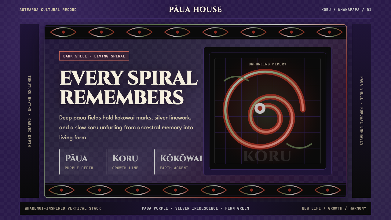 Māori Koru (Aotearoa)Ancestry glows in the dark. Paua purple, kokowai red, and silver koru frame t…黑暗中祖脉发光:鲍紫、赭红与银色科鲁框住纵向层叠。
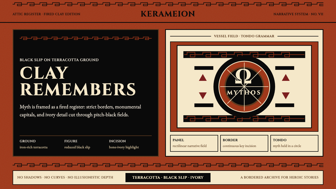 Greek Antiquity (Attic Vase)Myth becomes architecture. Terracotta, black slip, and Greek-key borders fram…神话化为建筑:赤陶、黑釉与希腊回纹框住叙事。