What is Māori Koru (Aotearoa)?什么是 Māori Koru (Aotearoa)?
From the unfurling silver fern frond to the carved meeting house, Māori visual culture spirals outward from ancestral memory into living, breathing design.从蜷曲伸展的银蕨嫩芽到雕刻精美的会堂内室,毛利视觉文化以螺旋的姿态从祖先记忆向外展开,成为鲜活的设计语言。
Māori Koru (Aotearoa) in briefMāori Koru (Aotearoa) 速览
Māori Koru (Aotearoa) is a design system rooted in the indigenous visual traditions of the Māori people of Aotearoa, New Zealand. Its central motif is the koru — the tightly coiled spiral of the silver fern frond as it unfurls into new growth. Around this symbol, an entire aesthetic universe assembles: carved rafter paintings called kowhaiwhai, interlaced lattice panels called tukutuku, and the intricate surface carving of wharenui (meeting houses). Together these traditions form one of the most coherent and philosophically grounded visual systems in the Pacific.毛利科鲁(奥特亚罗瓦)是一套植根于新西兰毛利原住民视觉传统的设计体系。其核心图腾是「科鲁」——银蕨嫩芽蜷曲待展的紧密螺旋。围绕这一符号,一整套美学宇宙由此展开:椽梁上的考怀怀彩绘、格状编织的图库图库板,以及会堂(法雷努伊)内部繁复的表面雕刻。这些传统共同构成了太平洋地区最具整体性、哲学厚度最深的视觉体系之一。
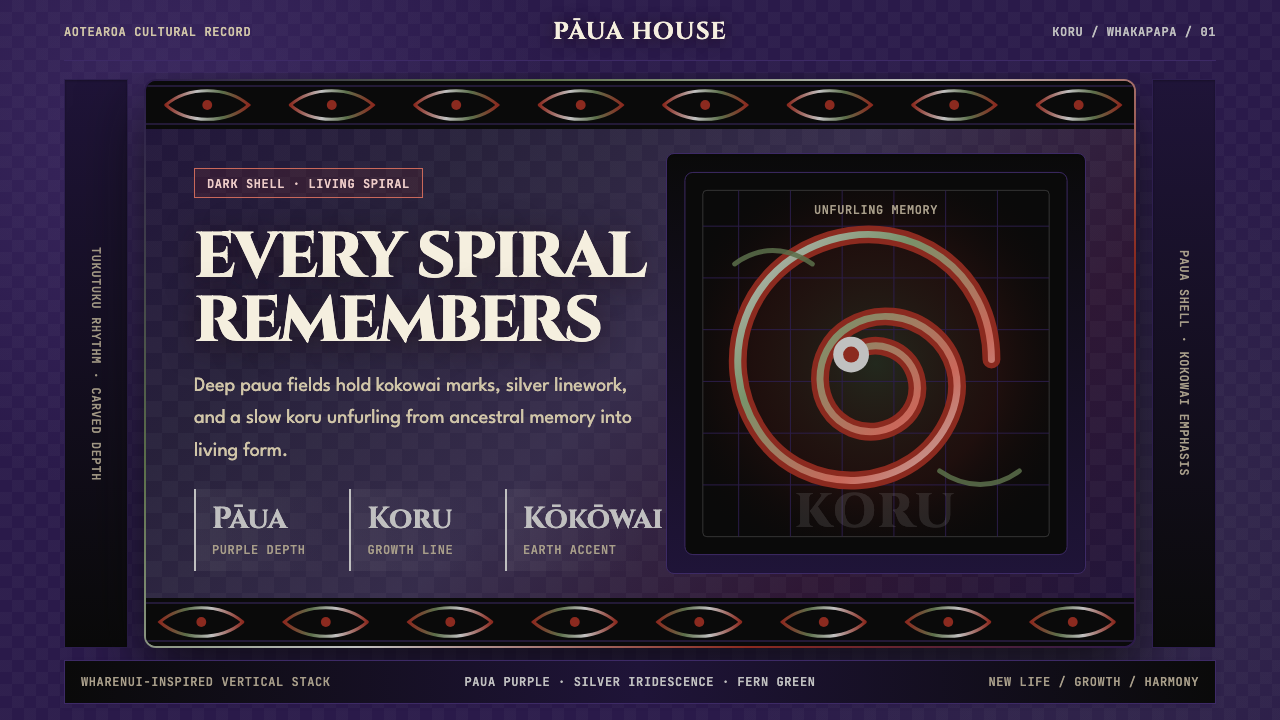
The palette is immersive and distinctly of the land and sea. Deep paua-shell hues — the iridescent blue-purple of abalone — ground compositions in oceanic darkness. Against this, kokowai, the sacred red ochre pigment ground from iron-rich earth, provides warmth and vitality. Silver and white, the colours of the silver fern and of moonlight on water, arc and spiral across the dark ground. Black line work, dense and deliberate, defines the koru outline and the interlocking scroll forms that give the system its unmistakable identity.这套体系的色彩沉浸感强烈,取材于大地与海洋。深沉的鲍鱼壳色调——珍珠鲍虹彩般的蓝紫——将构图锚定于海洋的幽暗之中。在此底面之上,科科外伊——从富铁土壤研磨而来的神圣赭红颜料——带来温暖与生命力。银色与白色,来自银蕨与月光映水的颜色,在深色底面上以弧线和螺旋游走。浓重而刻意的黑色线条勾勒出科鲁的轮廓,以及赋予这套体系独特身份的相互咬合的卷旋形态。
What distinguishes Koru design from mere decorative borrowing is its philosophical coherence. Every spiral form carries whakapapa — genealogy, lineage, the continuous thread connecting living people to ancestors. Growth moves outward from a coiled centre, mirroring the patterns of biological life. Symmetry and asymmetry coexist: kowhaiwhai panels repeat and mirror their scroll forms to create a sense of rhythmic momentum, while carved surfaces may stack forms in deliberate hierarchical sequence. The result is a visual language that is simultaneously ancient and immediately contemporary.将科鲁设计与单纯装饰性借用区别开来的,是其哲学上的整体性。每一道螺旋形都承载着「哇卡帕帕」——族谱、血脉、将在世之人与祖先连结在一起的不断之线。生长从蜷曲的中心向外展开,与生命的生物形态相互映照。对称与不对称并存:考怀怀板的卷旋形重复与镜像,制造出律动感与推进感,而雕刻表面则可能以刻意的层级序列叠放形态。最终呈现的是一套古老而又直接指向当代的视觉语言。
See the Māori Koru (Aotearoa) design system查看 Māori Koru (Aotearoa) 完整设计系统
Where does Māori Koru (Aotearoa) come from?Māori Koru (Aotearoa) 从何而来?
Māori visual art traditions predate European contact by centuries. The ancestors of the Māori people, Polynesian voyagers who navigated by stars and ocean currents, arrived in Aotearoa from eastern Polynesia beginning around the thirteenth century CE. They brought with them the shared Polynesian vocabulary of curvilinear form and surface ornament, and over the following centuries developed it into something entirely distinct: a visual system shaped by the specific materials, landscapes, and spiritual frameworks of the new land.毛利视觉艺术传统早于欧洲接触数百年便已形成。毛利人的祖先是靠星辰与洋流导航的波利尼西亚航海者,约从公元十三世纪起从东波利尼西亚抵达奥特亚罗瓦。他们带来了波利尼西亚共有的曲线形态与表面装饰词汇,并在其后数百年间将其发展为独特的存在:一套由这片新土地的特定材料、地理景观与精神框架所塑造的视觉体系。
The koru spiral as a central motif appears throughout early Māori carving, particularly in the interlocking scroll forms known as pitau, which animate the surfaces of whakairo (wood carving) found in wharenui, waka (canoes), and pātaka (storehouses). Kowhaiwhai rafter painting, applied in bold curvilinear repeating patterns to the rafters of meeting houses, developed its own formal vocabulary of scroll, notch, and interlace that could be read as genealogical record, spiritual protection, or ceremonial boundary — sometimes all three simultaneously. Tukutuku latticework, woven from kiekie rushes and muka (prepared flax fibre), added geometric counterpoint, its angular forms in dialogue with the curvilinear energy of the carved and painted surfaces.作为核心图腾,科鲁螺旋贯穿于早期毛利雕刻之中,尤其体现在被称为「皮陶」的咬合卷旋形态中——这些形态激活了法雷努伊(会堂)、独木舟(瓦卡)和储物屋(帕塔卡)表面的雕刻生命。施于会堂椽梁的考怀怀彩绘以粗犷的曲线重复图案展开,形成一套由卷旋、缺口与交织构成的自有形式词汇,可被解读为族谱记录、精神守护或仪式界限——有时三者兼而有之。由基基藤和苎麻(经处理的亚麻纤维)编织而成的图库图库格子板则引入几何的对位,其角形与雕刻和彩绘表面的曲线能量相互对话。
European colonisation from the late eighteenth century onwards brought severe disruptions to Māori cultural practice. The land confiscations and cultural suppression of the nineteenth and early twentieth centuries threatened the continuity of carving, weaving, and painting traditions. The survival of these arts owes much to institutions like Te Aute College, where Māori leaders in the 1890s initiated a programme of cultural revival, and to master carvers and weavers who maintained their craft through periods of intense pressure. By the mid-twentieth century, organisations such as the Māori Arts and Crafts Institute at Whakarewarewa worked actively to document, teach, and practise traditional forms.十八世纪末起的欧洲殖民对毛利文化实践造成了严重冲击。十九世纪至二十世纪初的土地没收与文化压制威胁到雕刻、编织与彩绘传统的延续。这些艺术得以存活,很大程度上归功于特奥特学院等机构——那里的毛利领导人在1890年代发起了文化复兴计划——以及那些在巨大压力下坚守技艺的雕刻与编织大师。到二十世纪中叶,设于华卡雷瓦雷瓦的毛利艺术与工艺学院等机构积极开展传统形式的记录、教授与实践工作。
The modern Māori cultural renaissance from the 1970s onward transformed the tradition again, this time on its own terms. Artists such as Cliff Whiting, Robyn Kahukiwa, Shane Cotton, and Lisa Reihana brought traditional visual vocabulary into contemporary galleries, prints, film, and digital media. They were not simply reproducing old forms but translating them: examining what koru, kowhaiwhai, and whakairo could mean in new contexts, for new audiences, while remaining grounded in whakapapa. This contemporary practice is now globally recognised and has influenced branding, architecture, and graphic design well beyond Aotearoa.从1970年代起的现代毛利文化复兴再次转化了这一传统,这一次完全出于自身的主动意志。克里夫·惠廷、罗宾·卡胡基瓦、谢恩·科顿和丽莎·雷哈纳等艺术家将传统视觉词汇带入当代画廊、版画、电影与数字媒介。他们不是简单地复制旧形式,而是在翻译它们:在植根于哇卡帕帕的同时,探索科鲁、考怀怀和雕刻在新语境中、对新观众意味着什么。这一当代实践如今已获得全球认可,并在奥特亚罗瓦之外的品牌、建筑与平面设计领域产生深远影响。
What defines the Māori Koru (Aotearoa) look?Māori Koru (Aotearoa) 的视觉特征是什么?
The Koru Spiral科鲁螺旋
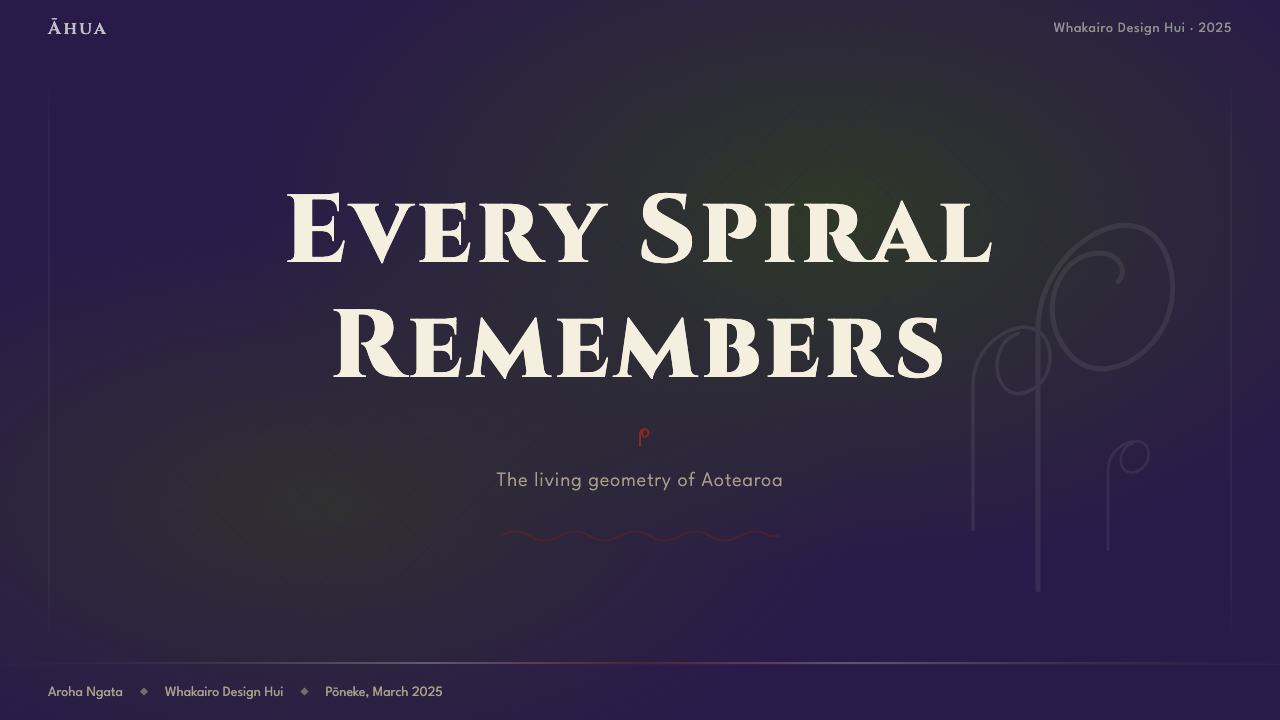
The koru is the visual and philosophical core of the system. Derived from the silver fern frond as it coils before opening, the form is neither a simple circle nor an open curl but a specific shape: a tightly wound spiral that terminates in a bulbous, seed-like head. This terminal swell distinguishes the koru from other spiral traditions and encodes its meaning — potential, new life held in tension before release. In layouts, koru forms function as focal anchors, as connective tissue linking panels, or as directional signals guiding the eye from dense centre to open perimeter.科鲁是这套体系在视觉与哲学上的核心。它取自银蕨嫩芽在展开前的蜷曲姿态,既非单纯的圆形,也非开放的弧线,而是一种特定形状:紧密缠绕的螺旋在末端膨大成球状的种子头。这一末端的饱满感使科鲁有别于其他螺旋传统,并为其编码了含义——潜能,新生命在释放前的蓄势待发。在版面中,科鲁形态既可作为焦点锚点,也可作为连接各板块的结缔组织,或引导视线从密集中心向开放边缘移动的方向信号。
Dark Oceanic Ground深海底色
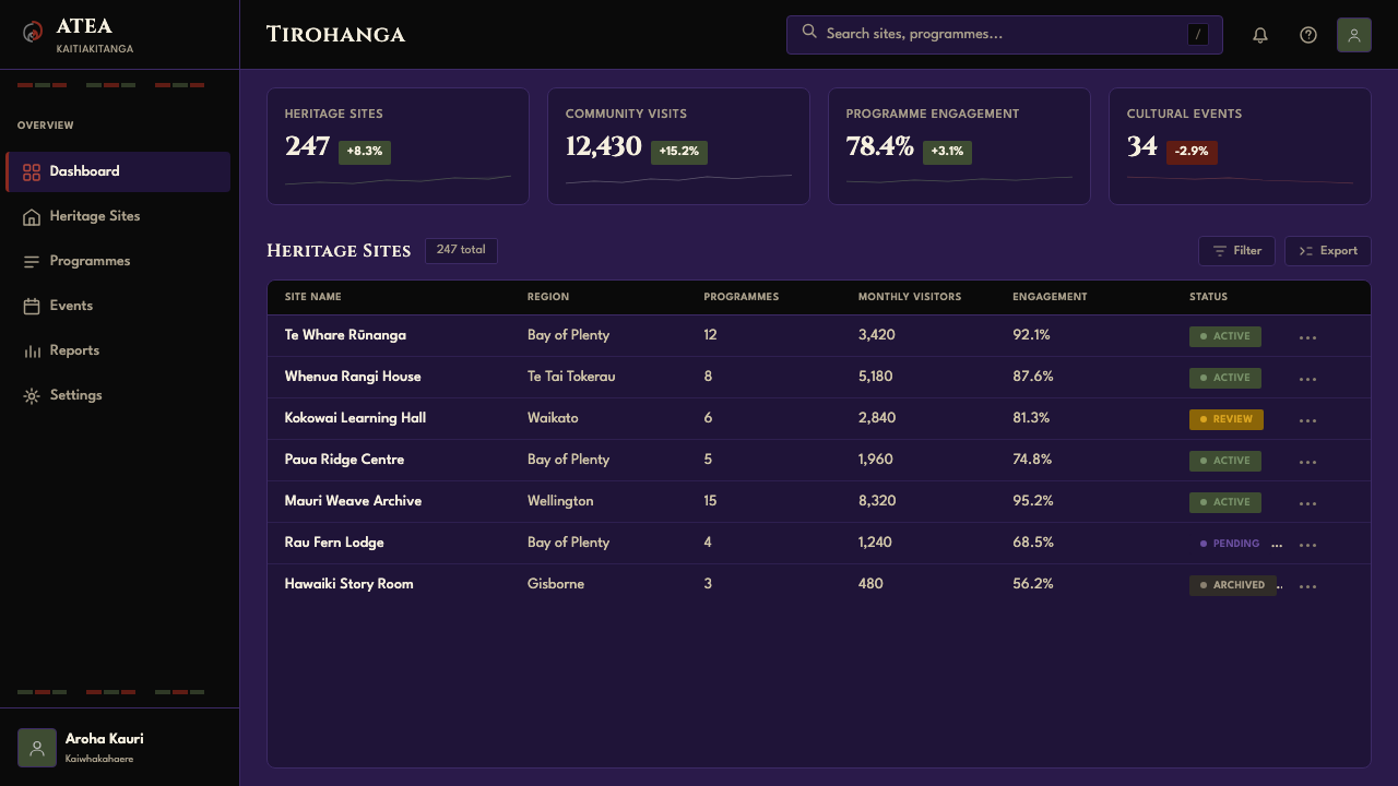
The canonical ground of Koru design is deep and immersive rather than light and neutral. Paua-shell hues — the shifting blue-purple iridescence of abalone — establish a base that feels simultaneously dark and alive. This is not the flat black of many dark-mode interfaces but a colour with depth, suggesting the ocean floor, the night sky over the Pacific, or the interior of a carved meeting house lit by firelight. Against this ground, lighter forms — silver spirals, white line work, cream glyphs — appear to emerge rather than sit on the surface.科鲁设计的典型底色深沉而富有沉浸感,而非轻盈中性。鲍鱼壳色调——珍珠鲍虹彩般流变的蓝紫——建立起一种既深沉又鲜活的基底。这不是许多深色界面所用的平淡纯黑,而是具有深度的色彩,令人联想到海洋底部、太平洋夜空,或壁炉光照下雕刻会堂的内部。在这一底色之上,较浅的形态——银色螺旋、白色线条、奶油色图符——看起来是从底面涌现出来,而非置于其上。
Kokowai Accent赭红点睛
Kokowai, the red ochre pigment used in traditional Māori painting and ceremony, functions as the system's primary warm accent. It is a red with evident earthen origin — denser and more mineral than a pure scarlet, warmer than a pure crimson — and it carries ceremonial weight. In digital applications, a kokowai-inspired accent reads as a signal of sacred importance, used sparingly on the most critical interactive elements, calls to action, or structural highlights. Its power depends entirely on restraint: surrounded by dark ground and silver line work, even a small kokowai form commands immediate attention.科科外伊——毛利彩绘与仪式中使用的赭红颜料——在这套体系中充当首要的暖色点缀。这是一种带有明显大地起源的红:比纯正红更厚重、更具矿物感,比深红更温暖——并且承载着仪式的重量。在数字应用中,受科科外伊启发的强调色被读作神圣重要性的信号,克制地用于最关键的交互元素、行动号召或结构性高亮。其力量完全依赖于克制:在深色底面与银色线条的包围下,即便一个小小的赭红形态也能立即吸引注意。
Silver Iridescence银色虹彩
Silver and near-white carry a specific cultural resonance in Māori visual culture: they evoke the silver fern, the shimmer of moonlight on water, and the pale highlights of paua shell. In the design system, silver is used for primary line work — the koru outlines, the scrolling borders of kowhaiwhai panels, the structural wireframe of a composition. Unlike flat white, a silver with slight warmth or iridescent quality adds a sense of material presence without disrupting the dark-ground composition. It also provides accessible contrast for text placed within the system.银色与近白色在毛利视觉文化中承载着特定的文化共鸣:它们唤起银蕨的形象、月光映水的波光,以及鲍鱼壳浅淡的高光。在这套设计体系中,银色用于主要的线条工作——科鲁的轮廓、考怀怀板的卷旋边框、构图的结构骨架。与平淡的纯白不同,略带暖调或虹彩质感的银色增添了一种材质存在感,同时不破坏深色底面的整体构图。它也为体系内的文字提供了清晰可读的对比度。
Interlocking Scroll Rhythm咬合卷旋的律动
Kowhaiwhai painting organises its forms through repetition and mirroring: a single scroll unit is reflected and rotated, creating bands of interlocking pattern that move across a surface with rhythmic momentum. This is not random decoration but a formal system with its own internal logic — each element relates to its neighbours through rotation, reflection, or scaling. Applying this principle to digital design means treating repeated motifs as a generative system rather than a stamped pattern: the spacing, scale variation, and directional energy of the repeating unit all carry meaning.考怀怀彩绘通过重复与镜像来组织形态:一个基本卷旋单元被翻转与旋转,形成在表面以律动势能推进的咬合纹带。这不是随机的装饰,而是一套具有自身内在逻辑的形式体系——每个元素都通过旋转、反射或缩放与其邻近元素发生关联。将这一原则应用于数字设计,意味着将重复图案视为一种生成性体系而非简单的盖印图案:重复单元的间距、尺度变化与方向能量都承载着意义。
Layered Depth and Darkness层叠的深度与暗度
Unlike many design systems that build depth through drop shadows or elevation tokens, Koru design achieves depth through tonal layering within a dark range. Surfaces do not cast shadows so much as they recede — a slightly lighter ground suggests a raised panel, a slightly darker border suggests depth, a luminous koru form floats above the ground through tonal contrast alone. This approach creates a sense of carved space, as though the interface were a wharenui interior whose carved surfaces emerge from and recede into the wood.与许多通过投影或高度层级来构建深度的设计体系不同,科鲁设计通过深色区间内的色调分层来实现深度感。表面不是投射阴影,而是后退——稍浅的底面暗示一块凸起的板块,稍深的边框暗示深度,发光的科鲁形态仅靠色调对比就能漂浮于底面之上。这种方式创造出一种被雕刻过的空间感,仿佛界面是一座法雷努伊的内部,雕刻表面从木材中涌现而后复归于其中。
Whakapapa as Structure哇卡帕帕即结构
In Māori thought, whakapapa — genealogy, the layering of origins — is not merely ancestry but a structural principle: everything that exists can be understood by tracing its connections back through time. This translates into design as a preference for hierarchical, layered compositions that make relationships explicit. Larger forms contain or generate smaller forms; the spiral unfurls in a legible sequence; panel borders announce transitions between domains. Structure is narrative. The system resists flat, non-hierarchical arrangements in favour of compositions that can be read as having a beginning, a lineage, and a direction.在毛利思想中,哇卡帕帕——族谱、起源的层叠——不仅仅是血脉,而是一种结构性原则:万物皆可通过追溯其穿越时间的连结来理解。这在设计中转化为对层级式、层叠式构图的偏好,使关系得以明确呈现。较大的形态包含或生成较小的形态;螺旋以清晰的序列展开;板块边框宣告领域之间的转换。结构即叙事。这套体系抵制扁平化、无层级的排列,倾向于可被解读为具有开始、血脉与方向的构图。
See the Māori Koru (Aotearoa) design system查看 Māori Koru (Aotearoa) 完整设计系统
Who shaped Māori Koru (Aotearoa)?谁塑造了 Māori Koru (Aotearoa)?
Cliff Whiting (1936–2014) was a central figure in the mid-to-late twentieth century renaissance of Māori visual art. A master carver and painter, he was instrumental in bringing kowhaiwhai and traditional carving vocabularies into large-scale public commissions, including the celebrated Te Hono ki Hawaiki installation at the National Library of New Zealand. Whiting argued consistently that Māori visual forms were not merely decorative but carried epistemological weight — ways of knowing encoded in spirals and interlace. His influence shaped how a generation of artists and designers understood the relationship between form and meaning in Māori practice.克里夫·惠廷(1936—2014年)是二十世纪中后期毛利视觉艺术复兴运动的核心人物。身为雕刻与彩绘大师,他在将考怀怀与传统雕刻词汇引入大型公共委托方面发挥了关键作用,其中包括新西兰国家图书馆的著名装置「特弘诺基哈瓦基」。惠廷始终主张:毛利视觉形态不仅仅是装饰,更承载着认识论的重量——编码于螺旋与交织之中的认知方式。他的影响塑造了一代艺术家与设计师对毛利实践中形式与意义之关系的理解。
Robyn Kahukiwa (born 1940) is a painter and illustrator whose work has been foundational in bringing Māori women's perspectives and spiritual forms into contemporary fine art and popular culture. Her distinctive visual language combines traditional koru and figurative forms with bold, flat colour and a confrontational directness that reads powerfully in both gallery and printed contexts. Her picture books and paintings have introduced Māori visual vocabulary to audiences far beyond Aotearoa, making her one of the most significant translators of the tradition into accessible contemporary form.罗宾·卡胡基瓦(1940年生)是一位画家与插画家,其作品在将毛利女性视角与精神形式引入当代纯艺术和大众文化方面具有奠基性意义。她独特的视觉语言将传统科鲁与具象形态结合大胆的平面色彩,以一种对抗性的直接感呈现,在画廊与印刷语境中都具有强烈的感召力。她的绘本与画作将毛利视觉词汇介绍给了奥特亚罗瓦之外的广大受众,使她成为将这一传统转译为亲切当代形式的最重要人物之一。
Shane Cotton (born 1964, Ngāti Rangi, Ngāpuhi) works at the intersection of Māori visual tradition and contemporary painting practice. His canvases bring together koru spirals, kowhaiwhai forms, and moko (facial tattoo) patterns with a painterly sensibility that acknowledges both their cultural specificity and their capacity to generate meaning for audiences without prior knowledge of Māori tradition. Cotton's work demonstrates that the Koru design vocabulary can operate at high aesthetic sophistication without losing its cultural grounding — a model for how the style might be applied in contemporary contexts.谢恩·科顿(1964年生,属恩加提兰吉、恩加普希族)的创作立于毛利视觉传统与当代绘画实践的交汇处。他的画布汇聚了科鲁螺旋、考怀怀形态与莫科(面部纹身)图案,以一种画家式的感性呈现,既承认其文化特殊性,又认可其对没有毛利传统背景的受众产生意义的能力。科顿的作品证明:科鲁设计词汇能够在不失去文化根基的前提下,以高度的美学复杂性运作——这为这种风格在当代语境中的应用提供了范本。
Lisa Reihana (born 1964, Ngāpuhi, Ngāti Hine) is a multi-disciplinary artist and filmmaker whose works bring Māori visual language into immersive digital and video contexts. Her panoramic video work Emissaries — which represented Aotearoa at the 2017 Venice Biennale — demonstrated the capacity of Pacific visual traditions to occupy and transform contemporary large-scale installation. Reihana's practice is relevant to contemporary designers not just as cultural reference but as a demonstration of how depth, movement, and ancestral form can be translated into immersive digital environments without diminishing their power.丽莎·雷哈纳(1964年生,属恩加普希、恩加提希内族)是一位跨学科艺术家与电影人,其作品将毛利视觉语言带入沉浸式数字与影像语境。她的全景影像作品《使者》——代表奥特亚罗瓦参展2017年威尼斯双年展——展示了太平洋视觉传统占领并转化当代大型装置空间的能力。雷哈纳的实践对当代设计师而言,不仅是文化参照,更是一次示范:深度、运动与祖传形式如何被转译进沉浸式数字环境而不失其力量。
Though primarily remembered as a religious leader and military commander of the nineteenth century, Te Kooti (c. 1832–1893) was also the founder of the Ringatū faith, whose meeting houses prompted a distinctive flowering of carved and painted interior design. The wharenui built for Ringatū communities brought the full vocabulary of koru carving, kowhaiwhai painting, and tukutuku weaving into a unified interior environment at a moment when Māori cultural practice was under severe colonial pressure. These buildings survive as some of the most complete and historically documented examples of the total Māori interior design tradition.特科提·阿里基兰吉·特图鲁基(约1832—1893年)虽主要以十九世纪的宗教领袖与军事指挥官身份被铭记,但他同时也是林加图信仰的创立者——正是这一信仰的会堂催生了雕刻与彩绘内室设计的独特繁荣。为林加图社区建造的法雷努伊在殖民压力最为严酷的时期,将科鲁雕刻、考怀怀彩绘与图库图库编织的完整词汇汇聚于统一的内部空间。这些建筑至今留存,是毛利室内设计传统最完整、历史记录最翔实的实例之一。
How do you use Māori Koru (Aotearoa) today?今天怎么用 Māori Koru (Aotearoa)?
Māori Koru is one of the most immediately recognisable of the Pacific design traditions, and precisely because of that recognisability it demands careful, informed application. The system's visual power comes from its coherence: the dark ground, the silver koru, the kokowai accent, and the scroll-rhythm of kowhaiwhai all depend on each other. Picking individual elements — a koru here, an earthy red there — without engaging the underlying compositional logic produces decoration rather than design. Begin by committing to the dark-ground palette and the spiral as the primary organisational motif before introducing any secondary elements.毛利科鲁是太平洋设计传统中辨识度最高的体系之一,正是因为这种辨识度,它要求审慎而知情的应用。这套体系的视觉力量来自其整体性:深色底面、银色科鲁、赭红点缀,以及考怀怀卷旋的律动节奏,彼此相互依存。在没有介入底层构图逻辑的情况下只摘取个别元素——这里一个科鲁,那里一抹大地红——产生的是装饰而非设计。在引入任何次级元素之前,先对深色底面调色板和作为主要组织图腾的螺旋形做出整体承诺。
For presentation decks, Koru works with exceptional force on cover slides. A full-bleed dark ground with a large koru spiral in silver anchoring one corner, a kokowai accent line marking the title zone, and high-contrast white or cream type creates a cover with genuine presence. Content slides should maintain the dark palette and use silver line work as section dividers — a single bold horizontal scroll border separates sections more effectively than a conventional rule. Data slides benefit from the system's tonal layering: charts and diagrams drawn in silver line work on dark grounds, with kokowai highlighting critical values, feel embedded in the visual system rather than imported from a default charting library.对于演示文稿,科鲁在封面幻灯片上具有非凡的感召力。满版深色底面,银色大螺旋锚定一角,赭红强调线条划定标题区域,高对比度的白色或奶油字体——这样的封面具有真实的气场。内容页应保持深色调色板,以银色线条作为章节分隔,一条粗犷的水平卷旋边框比常规分割线更有效地区隔章节。数据页受益于这套体系的色调分层:在深色底面上以银色线条绘制图表和图形,用赭红高亮关键数值,这样的图表感觉是嵌入视觉体系的,而非从默认图表库中导入的。
For web interfaces, Koru translates well to dashboards, cultural and arts organisation sites, and premium product platforms where depth and singularity are valued. A full-dark layout with paua-toned grounds and silver type gives dashboards a distinctive visual authority. Navigation should be typographic, with koru-derived icons used sparingly for wayfinding. Pricing pages work with the system's natural hierarchy: a kokowai border or background signals the recommended tier, while the remaining tiers recede against the dark ground. Interactive states — hover, active, focus — can be marked by a shift toward the silver-iridescent end of the palette.对于网页界面,科鲁在仪表板、文化与艺术机构网站,以及重视深度与独特性的高端产品平台上转化效果出色。以鲍鱼壳色调为底、银色字体的全深色布局赋予仪表板独特的视觉权威感。导航应当是字体性的,以科鲁衍生的图标克制地用于路径指引。定价页面适合利用这套体系的自然层级:赭红边框或背景标示推荐方案,其余方案在深色底面上自然退后。交互状态——悬停、激活、聚焦——可通过向调色板银色虹彩端的偏移来标记。
For editorial and marketing contexts, the system's bold tonal contrast supports strong information hierarchy. A long-form article layout using a dark ground with cream body text and silver heading accents reads as both immersive and authoritative. Section breaks marked by a kowhaiwhai-derived scroll band replace conventional typographic dividers. Marketing pages suit the system's poster-like intensity: full-width feature blocks alternate between dark-ground and slightly lighter mid-tone panels, with kokowai used exclusively for primary calls to action, ensuring the accent colour never loses its ceremonial weight through overuse.对于编辑与营销语境,这套体系的大胆色调对比支持强劲的信息层级。以深色底面、奶油色正文与银色标题点缀构成的长文版面,读来既沉浸又权威。以考怀怀衍生的卷旋带替代传统排版分隔符来标记章节转换。营销页面适合这套体系的海报式强度:全宽特性区块在深色底面与略浅的中间调板块之间交替,赭红专门用于主要行动号召,确保强调色不因过度使用而失去其仪式性的重量。
A common and serious mistake in applying Koru design is treating it as generic Pacific or Polynesian decoration. The koru, kowhaiwhai, and tukutuku forms are specifically and culturally Māori; using them without understanding their origins, their meaning, or their community context is cultural appropriation rather than design reference. The most effective and respectful applications of this vocabulary work with Māori artists or cultural advisers, treat the forms as a living tradition rather than a historical artifact, and are transparent about the sources of their visual decisions. Organisations working with Māori communities or audiences in Aotearoa should also consider whether indigenous design leadership rather than aesthetic borrowing is the appropriate framing for their project.应用科鲁设计时最常见也最严重的错误,是将其视为泛太平洋或波利尼西亚装饰。科鲁、考怀怀和图库图库形态在文化上是特定属于毛利的;在不理解其起源、意义或社区语境的情况下使用它们,是文化挪用而非设计参照。这套词汇最有效、最具尊重性的应用方式,是与毛利艺术家或文化顾问合作,将这些形态视为活着的传统而非历史文物,并对其视觉决策的来源保持透明。在奥特亚罗瓦与毛利社区或受众合作的机构,还应考虑:对于他们的项目而言,由原住民主导设计是否比美学借用更为合适的框架。
See the Māori Koru (Aotearoa) design system查看 Māori Koru (Aotearoa) 完整设计系统
Māori Koru (Aotearoa) — FAQMāori Koru (Aotearoa) · 常见问题
Is it appropriate for non-Māori designers to use this visual system?非毛利设计师使用这套视觉体系是否合适?
This is the most important question to ask before applying the style, and the answer is nuanced. The Koru design vocabulary is a living cultural tradition, not a historical artifact in the public domain. Using it respectfully means understanding its origins, engaging with Māori cultural perspectives, and ideally working in partnership with Māori designers or cultural advisers. It is quite different from applying a historical movement like Bauhaus — whose creators made their work explicitly universalist — to a new project. If your work is for a Māori community, a New Zealand organisation with Treaty obligations, or an explicitly bicultural context, the more important question is whether Māori design leadership is appropriate rather than aesthetic borrowing. If you are working in a global context using Koru as a reference point, do so with full acknowledgement of sources and without claiming cultural ownership.这是应用这种风格之前最重要的问题,答案是微妙的。科鲁设计词汇是一种活着的文化传统,不是公共领域的历史文物。尊重地使用它,意味着理解其起源、介入毛利文化视角,最理想的是与毛利设计师或文化顾问建立合作关系。这与将包豪斯——其创立者明确赋予其普世主义意图——这样的历史运动应用于新项目有本质区别。如果你的作品是为毛利社区、具有《条约》义务的新西兰机构或明确的双文化语境而创作,更重要的问题是:由原住民主导设计是否比美学借用更为恰当。如果你在全球语境中将科鲁作为参照,请完整承认来源,并且不要声称文化所有权。
How is Koru different from other Pacific or Polynesian design traditions?科鲁与其他太平洋或波利尼西亚设计传统有何不同?
While Māori visual culture shares broad Polynesian roots — the preference for curvilinear form, the centrality of ancestor worship, the use of surface ornament to encode genealogy — it developed in ways that are distinctly Aotearoa-specific. The koru spiral is particular to the silver fern of New Zealand and is not found in the same form in Samoan, Tongan, or Hawaiian design traditions. Kowhaiwhai rafter painting and tukutuku latticework are forms that emerged from the specific building traditions of the wharenui. The dark paua-shell palette reflects the marine environment of the New Zealand coast. Treating Koru as interchangeable with other Pacific traditions is an error of the same kind as treating Bauhaus as interchangeable with Art Deco because both are European and twentieth-century.尽管毛利视觉文化共享宽泛的波利尼西亚根源——对曲线形态的偏好、祖先崇拜的核心地位、以表面装饰编码族谱的实践——但它发展出了独特属于奥特亚罗瓦的面貌。科鲁螺旋特定取自新西兰的银蕨,在萨摩亚、汤加或夏威夷的设计传统中并无相同形态。考怀怀椽梁彩绘和图库图库格子板是从法雷努伊的特定建筑传统中涌现出来的形式。深沉的鲍鱼壳调色板反映的是新西兰海岸的海洋环境。将科鲁与其他太平洋传统混为一谈,是与「将包豪斯和装饰艺术混同,因为两者都是欧洲的、二十世纪的」同等性质的错误。
Can the Koru system work in light-background contexts, or is dark ground essential?科鲁体系能用于浅色背景吗?深色底面是否必不可少?
The deep, immersive ground is central to the system's visual and cultural logic — the darkness evokes the interior of a carved meeting house, the depth of ocean, and the nocturnal quality of paua shell. A light-ground inversion is technically possible but culturally and aesthetically at odds with the system's character. On a cream or white ground, the kokowai red tends to dominate aggressively, the silver line work loses its luminous quality, and the sense of forms emerging from depth — which is the system's primary spatial achievement — disappears entirely. If a light-background application is required by context, consider using the forms and the kokowai palette while acknowledging that you are working with a significant adaptation rather than a true Koru application. A more faithful approach might be a dark panel or card component within an otherwise light layout.深沉的沉浸式底色是这套体系视觉与文化逻辑的核心——黑暗唤起雕刻会堂的内部空间、海洋的深度,以及鲍鱼壳的夜间质感。浅色底面的反转在技术上可行,但在文化和美学上与这套体系的特性相悖。在奶油色或白色底面上,赭红往往会攻击性地主导视觉,银色线条失去其发光的品质,而形态从深度中涌现的感觉——这正是这套体系最主要的空间成就——也将完全消失。如果语境要求使用浅色背景,可以考虑保留形态与赭红调色板,同时承认这是一次重大改编而非真正的科鲁应用。一种更忠实的做法可能是:在总体浅色布局中使用深色面板或卡片组件。
How does the system handle typography, given that traditional Māori art is non-typographic?鉴于传统毛利艺术并非字体性的,这套体系如何处理文字排印?
Traditional Māori visual culture encodes language in form — in the spiral, the lattice, the scroll — rather than in alphabetic text. Contemporary applications of the system therefore face an interesting challenge: introducing Latin or te reo Māori text into a visual environment whose logic is curvilinear and pictographic. The most successful approaches treat type as another structural element rather than a layer above the design: generous size contrasts between headings and body text mirror the scale relationships found in koru forms; typographic spacing is open, reflecting the breathing quality of spiral composition rather than tight European text setting. Type drawn in silver or cream against the dark ground appears to belong to the same material world as the silver koru. Avoid typefaces with heavy decorative serifs, which compete with the organic complexity of the scroll forms.传统毛利视觉文化将语言编码于形态之中——螺旋、格子、卷旋——而非字母文字。因此,这套体系的当代应用面临一个有趣的挑战:将拉丁文字或毛利语文字引入一个以曲线和图符逻辑为主的视觉环境中。最成功的方式是将文字视为又一个结构性元素,而非设计之上的叠加层:标题与正文之间慷慨的尺寸对比,呼应了科鲁形态中的比例关系;排版间距开阔,反映螺旋构图的呼吸品质,而非紧凑的欧式文字排布。在深色底面上以银色或奶油色呈现的文字,看起来属于与银色科鲁相同的材质世界。避免使用带有沉重装饰性衬线的字体,那会与卷旋形态的有机复杂性相互竞争。
What is the difference between using Koru as a design system and cultural appropriation?将科鲁作为设计体系使用与文化挪用之间的区别是什么?
The line between respectful design reference and cultural appropriation is drawn primarily by context, consent, and credit. Appropriation typically involves taking forms without acknowledgement, using them in ways that misrepresent their meaning, profiting from cultural capital without returning value to the culture of origin, or displacing indigenous practitioners from opportunities that the style creates. Respectful reference involves transparently acknowledging Māori origins, engaging with the actual cultural meaning of the forms rather than their surface appearance, supporting Māori artists and designers in contexts where the style is commercially applied, and seeking input from Māori cultural advisers where the stakes are high. The scale of the project also matters: a student poster exploring Pacific design traditions sits in a very different ethical context from a multinational brand campaign using koru spirals as a marketing device.尊重性的设计参照与文化挪用之间的界线,主要由语境、同意与致谢来划定。挪用通常涉及:未加承认地取用形态,以歪曲其意义的方式使用它们,从文化资本中获益而不向文化起源地返还价值,或将原住民从这种风格创造的机会中排挤出去。尊重性的参照则涉及:透明地承认毛利起源,介入这些形态的实际文化含义而非其表面外观,在商业应用这种风格的语境中支持毛利艺术家与设计师,并在风险较高时寻求毛利文化顾问的意见。项目的规模同样重要:一张探索太平洋设计传统的学生海报,与一个以科鲁螺旋作为营销手段的跨国品牌活动,处于截然不同的伦理语境之中。
Related design styles相关设计风格
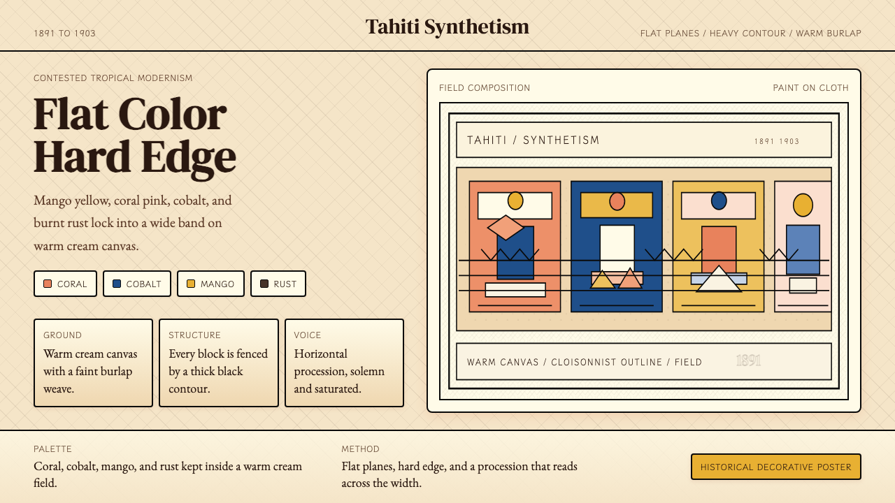 Gauguin — Tahiti SynthetismFlat color, hard edge. Cream canvas, coral, cobalt, and rust lock into a frie…平涂硬边。奶油底上珊瑚、钴蓝与焦土红排成壁带。
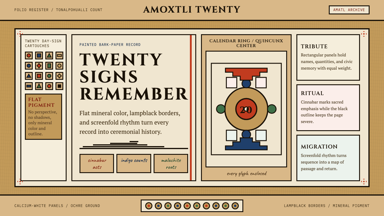 Aztec CodexSacred records stay severe. Ochre amatl ground, Cinzel capitals, black cartou…神圣记录保持庄严。赭黄纸底、Cinzel 大写与黑色匣框。
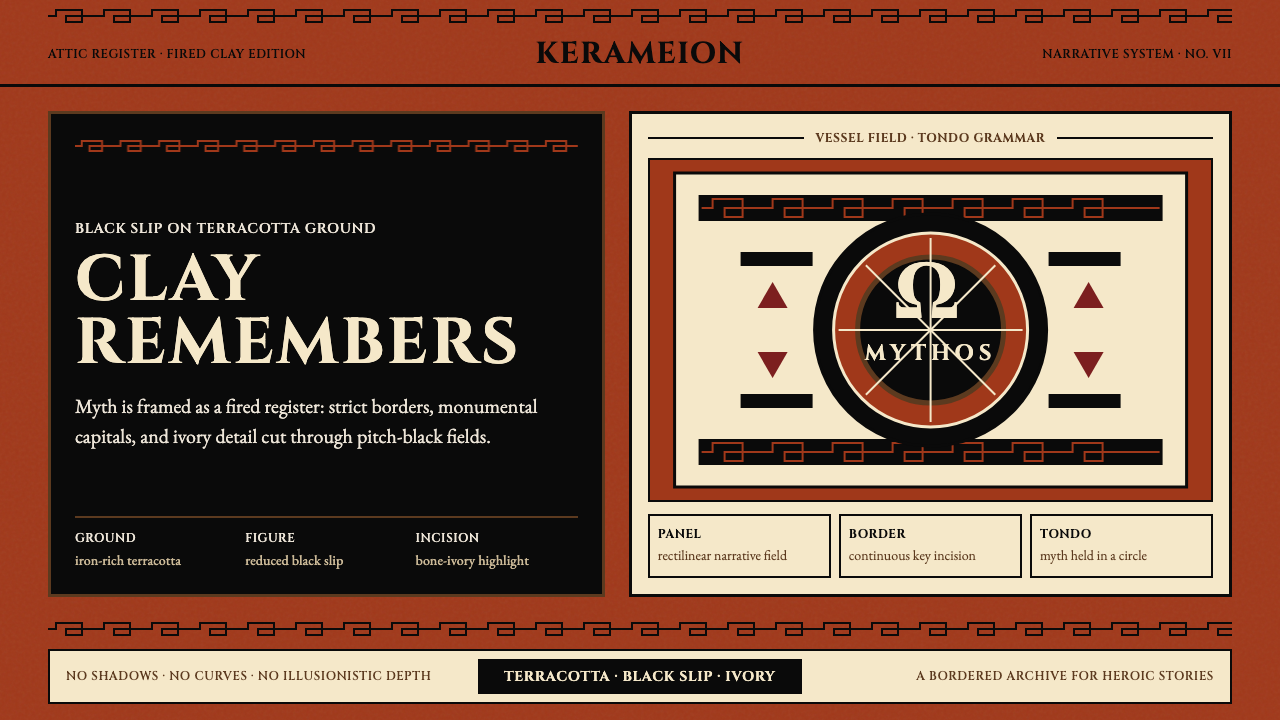 Greek Antiquity (Attic Vase)Myth becomes architecture. Terracotta, black slip, and Greek-key borders fram…神话化为建筑:赤陶、黑釉与希腊回纹框住叙事。
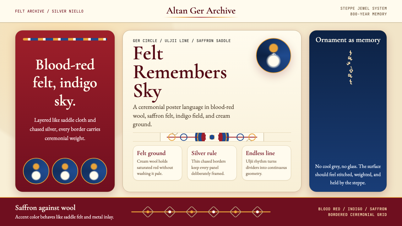 Mongolian Nomadic SteppeSteppe memory in jewel tones. Blood-red felt, saffron, indigo, and bordered u…草原记忆浓烈如宝石:深红毡、藏蓝与番红花色,边框乌力吉几何。
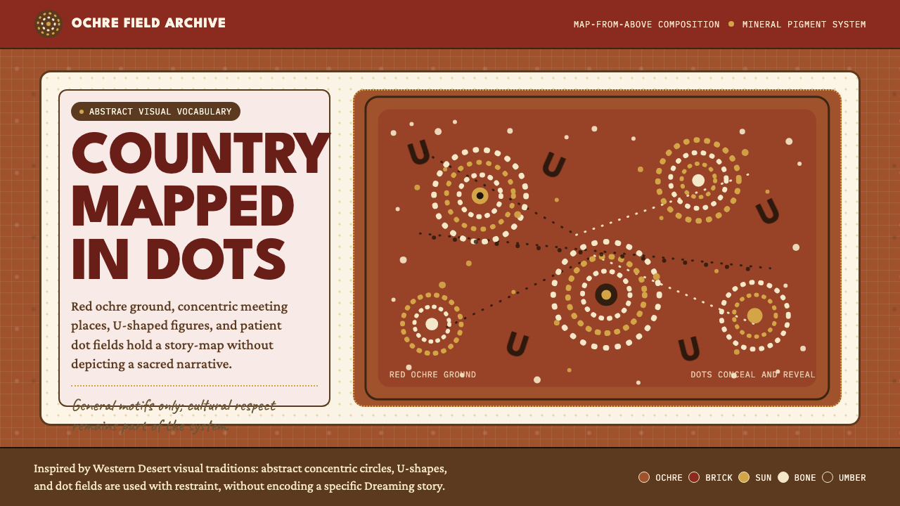 Aboriginal Dot PaintingAncient story-map energy. Red ochre, bone dots, concentric circles, and U-mar…古老故事地图感:红赭底、骨白点、同心圆与 U 形构成大地。
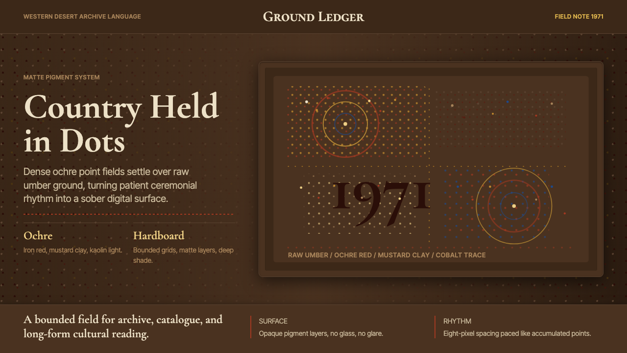 Aboriginal Dot Painting (Papunya 1971)Ochre memory, held steady. Raw umber ground, Cormorant type, disciplined dot-…赭石记忆沉稳留存:生赭黑地、Cormorant 字体与克制点阵。