What is Gauguin — Tahiti Synthetism?什么是 Gauguin — Tahiti Synthetism?
Gauguin's Tahitian canvases shattered Western perspective with flat planes of mango-yellow, coral-pink, and cobalt ringed by heavy Cloisonnist outlines — a color blast that became both a cornerstone of modernism and one of its most contested inheritances.高更的塔希提画布以芒果黄、珊瑚粉与钴蓝的平涂色块炸开了西方透视——这场色彩爆发既是现代主义的基石,也是其最具争议的遗产之一。
Gauguin — Tahiti Synthetism in briefGauguin — Tahiti Synthetism 速览
Gauguin — Tahiti Synthetism is a Post-Impressionist visual language developed by Paul Gauguin during his 1891–1903 stays in French Polynesia. It is defined by flat, unmodulated color planes bounded by heavy, deliberate outlines — a technique Gauguin had begun developing in Brittany in 1888 under the name Synthetism and then carried into his Polynesian work, intensifying both the palette and the conceptual stakes.高更塔希提综合主义是保罗·高更在1891至1903年旅居法属波利尼西亚期间发展出的后印象派视觉语言。其核心是以粗重而刻意的轮廓线围合的、未经调和的平涂色块——这一技法高更早在1888年的布列塔尼时期便已在「综合主义」的名义下开始探索,而后带入波利尼西亚创作,令色板与概念张力双双走向极致。
The visual system dispenses entirely with naturalistic skin tones, atmospheric perspective, and chiaroscuro modeling. Figures press flat against richly ornamented backdrops as if arranged in a Quattrocento frieze, while Tahitian-language inscriptions float in upper corners. Colors are not mixed toward realism but chosen for emotional and symbolic weight: coral-pink for flesh and warmth, cobalt for sky and water, mango-yellow for light and abundance, burnt-rust for earth and shadow. The rough texture of burlap canvas is not hidden but allowed to read through the paint, adding a material honesty to the otherwise anti-naturalist surface.这套视觉系统彻底抛弃了自然主义的肤色处理、大气透视与明暗塑形。人物如四世纪壁带般平压于装饰繁复的背景之上,塔希提语题字浮于画角。色彩并非为了趋近现实而调配,而是依照情感与象征的重量被选取:珊瑚粉对应肌肤与温度,钴蓝对应天空与水域,芒果黄对应光线与丰盛,焦土红对应土地与阴影。粗麻布画布的肌理未被遮掩,而是允许透过颜料透出,为这一反自然主义的表面增添了一种材料的诚实。
It is essential to approach this aesthetic with both admiration and critical awareness. The visual innovations are genuinely foundational to twentieth-century modernism — influencing Fauvism, Expressionism, and primitivist strands of abstraction. But they emerged from a colonial context: Gauguin's appropriation of Tahitian imagery, his mythologizing of indigenous life, and the power asymmetries embedded in his presence on the islands are inseparable from the work. Applying this style in contemporary design demands a measured, respectful approach — one that honors the visual intelligence without reducing it to a cheap tropical fantasy.以欣赏与批判的双重眼光审视这一美学,是使用它的前提。它的视觉创新确实奠定了二十世纪现代主义的基础,影响了野兽派、表现主义以及抽象艺术中的原始主义脉络。但这些创新生于殖民语境之中:高更对塔希提图像的挪用、他对当地生活的神话化建构,以及他在群岛上存在本身所包含的权力不对等——这一切与作品不可分割。在当代设计中应用这套风格,需要的是克制与尊重——一种铭记其视觉智识、而不将其简化为廉价热带奇观的态度。
See the Gauguin — Tahiti Synthetism design system查看 Gauguin — Tahiti Synthetism 完整设计系统
Where does Gauguin — Tahiti Synthetism come from?Gauguin — Tahiti Synthetism 从何而来?
The roots of Gauguin's Tahitian style reach back to Brittany in the late 1880s. Working at the artists' colony of Pont-Aven, Gauguin and the painter Émile Bernard developed Synthetism — a method of painting that synthesized the outward form of things, the painter's inner feelings, and a pure aesthetic surface into a single statement. Their 1888 collaboration produced works like The Vision After the Sermon, in which flat red fields, heavy black contours, and simplified figures abandon any pretense of representational depth. Vincent van Gogh, with whom Gauguin lived briefly in Arles, reinforced the commitment to bold unnatural color, though their temperaments ultimately made the partnership explosive and short-lived.高更塔希提风格的根源可追溯至1880年代末的布列塔尼。在蓬塔旺艺术家聚落,高更与画家埃米尔·伯纳德共同发展出「综合主义」——一种将事物的外在形态、画家的内在情感与纯粹美学表面合而为一的绘画方法。两人1888年的协作催生了《布道后的幻象》等作品:平涂的红色地面、粗重的黑色轮廓与简化的人物形象,彻底抛弃了写实深度的一切假象。文森特·梵高——高更曾在阿尔勒与他短暂共处——进一步强化了他对大胆非自然色彩的坚守,尽管两人气质上的冲突最终使这段合作如爆炸般戛然而止。
Gauguin first arrived in Tahiti in June 1891, driven by a combination of genuine disillusionment with European civilization and a romanticized fantasy of escaping it. He had read Pierre Loti's novel Rarahu (known in French as Le Mariage de Loti) and imagined Polynesia as a prelapsarian paradise outside history. What he found was a French colonial territory already deeply transformed by missionary activity and administration. Nevertheless, his painting practice flourished. The Tahitian light, the unfamiliar plant life, and his immersion — however partial and problematic — in Māori visual culture accelerated and deepened the Synthetist approach he had developed in Brittany. The heavy outline became heavier; the color planes became bolder and more confrontational.1891年6月,高更初抵塔希提,驱动他的是对欧洲文明真实的幻灭感,以及一个逃离它的浪漫幻想。他读过皮埃尔·洛蒂的小说《拉拉胡》(法文名《洛蒂的婚姻》),将波利尼西亚想象为一片置身历史之外的前堕落乐园。他遇到的现实是一片被传教活动与殖民管理深度改造的法国领土。尽管如此,他的绘画实践在此大放异彩。塔希提的光线、陌生的植被,以及他对毛利视觉文化或深或浅、或真或幻的浸入,加速并深化了他在布列塔尼确立的综合主义路径。轮廓线变得更重;色块变得更大胆、更具对抗性。
The theoretical framework for Gauguin's mature style was articulated in part by the critic Albert Aurier, who published an influential essay in the Mercure de France in 1891 identifying Gauguin as the exemplary Symbolist painter. Aurier described the Symbolist ideal as an art that was ideist (representing ideas rather than appearances), synthetist (simplifying form to its essential character), subjective (filtered through the artist's temperament), and decorative in the Polynesian and Japanese sense — meaning that the picture surface was to be organized as a flat decorative object rather than as a window onto three-dimensional space. Gauguin absorbed these formulations and pushed them further, combining Cloisonnism's hard outlines with a palette informed by Japanese ukiyo-e prints and the flat color fields of Javanese temple friezes he had encountered at the 1889 Paris World's Fair.为高更成熟风格提供理论框架的,是批评家阿尔贝·奥里耶于1891年在《法国墨丘利》发表的一篇重要文章。奥里耶将高更认定为象征主义绘画的典范,将象征主义理想描述为:观念性(呈现观念而非外观)、综合性(将形态简化至其本质特征)、主观性(经由艺术家气质过滤)以及波利尼西亚和日本意义上的装饰性——即画面表面应被组织为一个平面装饰物,而非通向三维空间的窗口。高更吸收了这些表述并推进得更远:将掐丝珐琅法的硬轮廓与日本浮世绘版画及他在1889年巴黎世博会上见到的爪哇庙宇浅浮雕平涂色域融为一体。
Gauguin's second stay in Polynesia, from 1895 until his death in the Marquesas Islands in 1903, produced some of his most ambitious canvases — including the monumental Where Do We Come From? What Are We? Where Are We Going? (1897–98), which he painted as what he considered a philosophical testament. By this stage, the style had fully matured: figures of monumental scale arranged across a horizontal frieze, the palette anchored by deep indigo and warm ochre, Tahitian text integrated directly into the picture field as both inscription and visual element. When Post-Impressionism was formally introduced to British and American audiences through Roger Fry's 1910 Post-Impressionist exhibition in London, Gauguin's Polynesian work was central to the revelation — and the controversy.高更第二次旅居波利尼西亚(1895年至1903年在马克萨斯群岛去世)期间,创作了若干最雄心勃勃的画布,其中包括他视为哲学遗嘱的纪念碑式作品《我们从哪里来?我们是谁?我们往哪里去?》(1897—1898年)。此时风格已完全成熟:巨型人物横向排列于壁带式构图中,深蓝靛与暖赭色锚定色板,塔希提文字直接融入画面,既是题字又是视觉元素。1910年罗杰·弗莱在伦敦策划的后印象派展览将这批波利尼西亚作品首次正式引介给英美观众,它们既是此次展览的核心启示,也是最大的争议焦点。
What defines the Gauguin — Tahiti Synthetism look?Gauguin — Tahiti Synthetism 的视觉特征是什么?
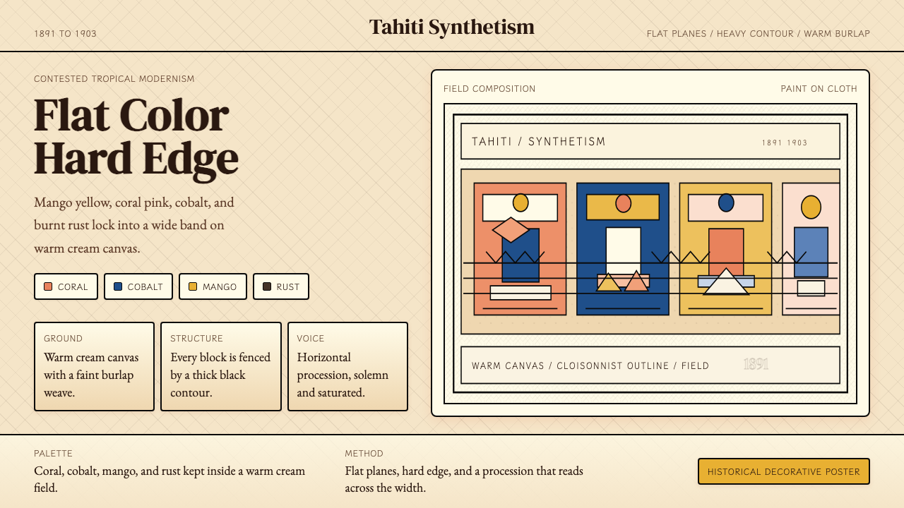
Flat Color Planes平涂色块
Color is applied as flat, unmodulated fields with no internal tonal variation or blending. A coral-pink arm does not transition through rose and peach toward highlight — it remains uniformly coral from outline to outline. This flatness derives from Gauguin's study of Japanese woodblock prints, stained-glass Cloisonnism, and Polynesian tapa cloth, all of which treat color as a bounded zone rather than a modeled volume. The effect removes atmospheric distance and places every element on a single decorative plane.色彩以平涂、无调和的色块施加,内部无色调变化或过渡。珊瑚粉的手臂不会向高光方向渐变出玫瑰色或桃色——它从轮廓线到轮廓线保持均匀的珊瑚色。这种平面性源自高更对日本木版画、掐丝珐琅彩玻璃画以及波利尼西亚树皮布的研究,三者都将色彩视为一个有边界的区域,而非一个被塑形的体积。这一效果消除了大气距离,将每个元素置于同一个装饰平面之上。
Cloisonnist Outline掐丝轮廓线
Heavy, dark contour lines enclose each color plane much as the lead channels of stained glass contain individual panes of color. These outlines are not naturalistic edge-detection — they are deliberate graphic decisions, often heavier than the depicted form would suggest and sometimes slightly detached from it. The Cloisonnist technique was borrowed from Émile Bernard, who had adapted it from medieval enamelwork and Japanese woodblock borders. In Gauguin's mature Polynesian work, the outlines become increasingly expressive, with variable weight that contributes to the emotional character of a figure.粗重的深色轮廓线围合每一个色块,一如彩绘玻璃的铅条将各个色玻璃嵌片包裹其中。这些轮廓线并非对自然边缘的写实描绘——它们是刻意的图形决定,通常比描绘对象本身所暗示的更重,有时甚至略微脱离对象。掐丝技法借鉴自埃米尔·伯纳德,后者将其从中世纪珐琅工艺与日本木版画边框中加以改造。在高更成熟的波利尼西亚作品中,轮廓线愈发富有表现力,粗细的变化为人物的情感性格增添了厚度。
Symbolic, Non-Naturalistic Palette象征性非自然色板
The palette is organized around emotional and cultural meaning rather than optical accuracy. Mango-yellow signals light, spiritual abundance, and heat; coral-pink and salmon stand in for flesh across a range of figures regardless of their actual skin tone; cobalt and deep indigo represent water, sky, and the spiritual realm; burnt-rust and ochre anchor the earth and the human. Secondary colors appear where pictorial structure demands them, not where nature would place them. Gauguin himself described his use of color as musical — harmonies rather than descriptions.色板围绕情感与文化意涵而非光学准确性来组织。芒果黄意指光线、精神丰盛与热度;珊瑚粉与鲑鱼色无论实际肤色如何,统一用于各类人物的肌肤;钴蓝与深靛蓝代表水域、天空与精神领域;焦土红与赭黄锚定大地与人性。间色出现于画面结构要求之处,而非自然会将其置于的位置。高更本人曾将他的色彩使用描述为音乐性的——是和声,而非描绘。
Frieze-Like Horizontal Composition壁带式横向构图
Figures are arranged laterally across the picture plane in shallow, stage-like space, recalling Egyptian friezes, Javanese temple reliefs, and Polynesian tapa cloth patterns. There is minimal recession into depth: backgrounds are rendered as patterned tapestries rather than as spatial environments. This compositional logic means that figures at different 'distances' are often the same size and rendered at the same tonal value — depth is implied by overlap and placement rather than by scale diminishment or atmospheric fading.人物横向排列于画面平面之上,处于浅薄如舞台的空间中,令人联想到埃及壁带、爪哇庙宇浮雕与波利尼西亚树皮布图案。向纵深的退却极为有限:背景被呈现为图案化的挂毯,而非空间性的环境。这一构图逻辑意味着不同「距离」的人物往往尺寸相同、色调相当——深度由重叠与位置暗示,而非由比例缩小或大气渐远来表达。
Tahitian Text as Visual Element塔希提语文字作为视觉元素
Gauguin frequently inscribed Tahitian words or phrases directly into the picture plane — most famously in Ia Orana Maria (1891) and the monumental triptych question of 1897–98. These inscriptions are not captions or labels; they are compositional elements, placed in upper corners or along horizontal registers where they function both as linguistic content and as abstract mark-making that echoes the flat graphic logic of the rest of the surface. This integration of lettering into pictorial space anticipates later modernist practice in collage and poster design.高更常将塔希提语词汇或短语直接题于画面——最著名的见于《伊亚·奥拉纳·玛利亚》(1891年)与1897—1898年那幅纪念碑式的三联问句。这些题字并非说明文字或标签,而是构图元素:置于画角或水平分布带,既承载语言内容,又作为抽象的书写痕迹,呼应着整个画面的平面图形逻辑。这种将文字融入图像空间的做法,预示了后来现代主义在拼贴与海报设计中的实践。
Canvas Texture as Material Presence画布肌理作为材料在场
Gauguin frequently worked on coarse burlap or sackcloth rather than fine-weave canvas, and he applied paint thinly enough to allow the rough, irregular texture to read through. This was partly a practical decision — quality materials were expensive and hard to obtain in Polynesia — but it became an aesthetic one: the visible grain of the support adds a material rawness that counterpoints the otherwise bold, graphic color fields. In design applications, this quality can be evoked through subtle surface texture, though it must remain subordinate to the overall flat graphic logic.高更常在粗麻布或麻袋布而非细织画布上作画,涂料施加之薄,足以让粗粝不平的肌理透过色层显现。这在一定程度上出于实际考量——优质材料在波利尼西亚既昂贵又难以获取——但最终成为一种美学选择:支撑物的可见纹理为画面增添了一种原始的材料感,与大胆的图形色块形成对位。在设计应用中,这一品质可通过细微的表面纹理加以召唤,但须始终从属于整体的平面图形逻辑。
Decorative Pattern as Background Field装饰图案作为背景域
Rather than receding into undefined atmospheric space, backgrounds in Gauguin's Polynesian work are often filled with dense, flat pattern — flowers, foliage, fabric motifs, or abstract geometric repetition. These pattern fields are rendered at the same visual intensity as the foreground figures, refusing the conventional Western hierarchy that subordinates background to figure. The result is an all-over surface richness that aligns the paintings with textile and decorative art traditions rather than with easel painting conventions.高更波利尼西亚作品的背景并不退入模糊的大气空间,而往往填充着浓密而平涂的图案——花卉、叶饰、织物母题或抽象的几何重复。这些图案域以与前景人物相同的视觉强度呈现,拒绝了将背景从属于人物的西方传统层级。结果是一种全幅的表面丰富性,使这批画作更接近纺织与装饰艺术传统,而非架上绘画惯例。
See the Gauguin — Tahiti Synthetism design system查看 Gauguin — Tahiti Synthetism 完整设计系统
Who shaped Gauguin — Tahiti Synthetism?谁塑造了 Gauguin — Tahiti Synthetism?
Gauguin (1848–1903) began his career as a successful Paris stockbroker who painted on weekends, then abandoned his family and career to pursue painting full-time after encountering Impressionism in the late 1870s. His Brittany years (1886–1891) produced Synthetism in collaboration with Émile Bernard. His two Polynesian periods — 1891–1893 in Tahiti, then 1895–1903 in Tahiti and the Marquesas — generated the body of work for which he is now known. His final years on Hiva Oa in the Marquesas, where he died in May 1903, produced some of his most monumental compositions. His legacy is inseparable from ongoing critical debate about the ethics of his presence in Polynesia and his representation of Tahitian women and culture.高更(1848—1903年)早年是一位成功的巴黎股票经纪人,利用周末作画;1870年代末接触印象派后,他抛弃家庭与职业,全身心投入绘画。布列塔尼时期(1886—1891年)与埃米尔·伯纳德合作催生了综合主义。两次波利尼西亚旅居——1891—1893年在塔希提,1895—1903年在塔希提与马克萨斯——构成了他如今广为人知的核心创作。他在马克萨斯群岛希瓦瓦的最后岁月,于1903年5月在此离世,留下了一批最具纪念碑式格局的作品。他的遗产与关于他在波利尼西亚的存在伦理及其对塔希提女性与文化的再现的持续批判性讨论,不可分离。
Bernard (1868–1941) was the younger Pont-Aven painter whose experiments with flat color and heavy outline in 1887–1888 directly preceded — and were later disputed as the origin of — the Cloisonnist technique that became central to Synthetism. His collaboration with Gauguin was creatively productive but personally contentious; Bernard believed Gauguin had appropriated his innovations without sufficient credit. Bernard's subsequent turn toward more academic religious painting limited his long-term influence, but his early work remains foundational to understanding how Synthetism emerged.伯纳德(1868—1941年)是年轻的蓬塔旺画家,他在1887—1888年对平涂色彩与粗重轮廓的实验,直接先于——并在后来被争议为——成为综合主义核心的掐丝技法的起源。他与高更的合作在创作上富有成效,在个人层面则充满矛盾;伯纳德认为高更在未给予充分认可的情况下挪用了他的创新。伯纳德随后转向更为学院派的宗教绘画,限制了其长远影响,但他早期的作品对于理解综合主义如何形成仍具奠基性意义。
Van Gogh (1853–1890) and Gauguin shared two turbulent months in Arles in 1888, during which both artists pushed toward bold unnatural color and simplified form. While their temperaments clashed catastrophically — the episode ending in van Gogh's self-mutilation — the artistic exchange reinforced Gauguin's commitment to expressive color divorced from optical reality. Van Gogh's influence on the emotional intensity of the palette, and Gauguin's reciprocal challenge to van Gogh to abandon Impressionist brushwork, shaped both bodies of work.梵高(1853—1890年)与高更于1888年在阿尔勒共处了动荡的两个月,期间两人都在向大胆的非自然色彩与简化形态的方向迈进。尽管两人气质上的冲突以灾难性的方式告终——这段经历以梵高的自我伤害作结——但这场艺术交流强化了高更对脱离光学现实的表现性色彩的坚守。梵高对色板情感强度的影响,以及高更对梵高放弃印象派笔触的反向挑战,共同塑造了两人的创作。
Aurier (1865–1892) was the Symbolist critic whose 1891 essay in the Mercure de France, 'Le Symbolisme en peinture: Paul Gauguin,' provided the first and most influential theoretical framework for Gauguin's mature style. Aurier defined the Symbolist work as ideist, synthetist, subjective, and decorative — terms that Gauguin absorbed and that subsequent art historians have used to position Synthetism within the broader landscape of Post-Impressionism and Symbolism. Aurier's early death from typhoid at twenty-seven cut short what had been an extraordinarily precocious critical career.奥里耶(1865—1892年)是象征主义批评家,他1891年发表于《法国墨丘利》的文章《绘画中的象征主义:保罗·高更》为高更成熟风格提供了第一个也是最具影响力的理论框架。奥里耶将象征主义作品定义为观念性、综合性、主观性与装饰性的——这些术语被高更所吸收,也被后来的艺术史学家用于将综合主义定位于后印象派与象征主义更宏观的版图之中。奥里耶二十七岁便因伤寒早逝,终结了一段才华异常早熟的批评生涯。
Fry (1866–1934) was the British critic and curator who coined the term 'Post-Impressionism' for his landmark 1910 exhibition Manet and the Post-Impressionists at the Grafton Gallery in London. By placing Gauguin's Polynesian paintings at the center of this exhibition alongside Cézanne and van Gogh, Fry introduced the visual logic of Tahitian Synthetism to British and subsequently American audiences, triggering both the Bloomsbury Group's engagement with the style and a wave of critical controversy that has not fully subsided. Fry's formalist analysis — focusing on the pictorial logic of flat color and line rather than subject matter — shaped how the twentieth century received and theorized Gauguin's work.弗莱(1866—1934年)是英国批评家与策展人,他为1910年在伦敦格拉夫顿画廊举办的里程碑式展览《马奈与后印象派》创造了「后印象派」这一术语。弗莱将高更的波利尼西亚画作与塞尚、梵高并列置于展览核心,将塔希提综合主义的视觉逻辑引介给英国及其后的美国观众,既引发了布卢姆斯伯里圈子对这一风格的参与,也激起了一波至今未曾平息的批评性争论。弗莱的形式主义分析——聚焦平涂色彩与线条的图像逻辑而非题材——塑造了二十世纪接受和理论化高更作品的方式。
How do you use Gauguin — Tahiti Synthetism today?今天怎么用 Gauguin — Tahiti Synthetism?
Gauguin Tahiti Synthetism is one of the richest and most challenging historical styles to bring into contemporary design work. Its power comes from the interplay of flat, bounded color fields with heavy structural outlines — a system that is simultaneously graphic and sensory, bold and decorative. Applying it well requires understanding its internal logic: color is symbolic rather than descriptive, outline is structural rather than mimetic, and pattern is a foreground element rather than a retreating background. Applying it poorly means borrowing only the tropical color associations while abandoning the formal discipline that gives those colors their force.高更塔希提综合主义是引入当代设计实践中最丰富也最具挑战性的历史风格之一。它的力量来自平涂有界色块与粗重结构轮廓线的相互作用——一套同时具有图形性与感官性、大胆与装饰性的系统。正确应用它需要理解其内部逻辑:色彩是象征性的而非描述性的,轮廓是结构性的而非模仿性的,图案是前景元素而非退隐的背景。应用不当则意味着仅借用热带色彩联想,而抛弃了赋予这些色彩力量的形式自律。
For presentation slides, the style suits both cover and content applications, but they function differently. A cover should commit to one dominant color field — mango-yellow or deep cobalt — as the ground, with a strongly outlined figure or motif and a title set in a bold, weighty typeface with generous scale contrast. Content slides should resist the temptation to introduce the full palette at once; a restrained two-color system — one warm, one cool — with heavy ruled lines as structural dividers will read far more clearly than a profusion of competing coral, yellow, and indigo. Data slides can treat charts as Cloisonnist objects: bars and segments outlined rather than naked, colored according to a clear symbolic logic rather than for visual variety.在演示文稿中,这种风格适用于封面与内容页,但两者的运作方式不同。封面应以一种主导色块——芒果黄或深钴蓝——作为底面,配合一个强轮廓人物或母题,以及一个以粗重字体大尺度呈现的标题。内容页应抵制一次性引入全部色板的诱惑;一套两色体系——一暖一冷——配合粗水平线作为结构分隔,将比珊瑚色、黄色与靛蓝相互竞争的纷杂画面清晰得多。数据页可将图表视为掐丝式对象:柱条与扇区以轮廓线围合而非裸露,依照清晰的象征逻辑而非视觉多样性来着色。
For web interfaces — dashboards, pricing pages, editorial landing pages — the style delivers strong hierarchy and immediate visual presence. The approach: establish a warm cream or off-white ground as the baseline, use deep cobalt or indigo for primary navigation and headings, reserve coral or mango for calls to action and key data highlights. Card components can echo the Cloisonnist principle by using a visible border rather than a shadow; inputs and form elements should have defined, unambiguous edges. Avoid soft drop shadows, gradient overlays, and ambient glows — every depth cue should be flat and architectural. Full-bleed image sections work best when photographs are treated as flat color fields: high contrast, desaturated toward the palette, or overlaid with a dominant Gauguin hue.对于网页界面——仪表板、定价页、编辑型落地页——这种风格提供强劲的层级感与即时的视觉存在感。方法如下:以温暖的奶油色或米白色作为基础底面,用深钴蓝或靛蓝做主导航与标题,将珊瑚色或芒果黄保留给行动号召与关键数据高亮。卡片组件可通过可见边框而非阴影来呼应掐丝原则;输入框与表单元素应有清晰、明确的边缘。避免柔和投影、渐变叠加与环境光晕——每一个深度暗示都应是平面而建筑性的。全出血图像区块在照片被处理为平涂色域时效果最佳:高对比度、去饱和度向色板靠拢,或叠加一种主导的高更色调。
For editorial and marketing work, the style supports theatrical visual impact. A Gauguin-inflected poster or feature spread works by establishing a single dominant color plane as background — filling edge to edge — and composing a simplified figure or motif against it in flat complementary tones. Typography should be large, authoritative, and contrasted boldly against the ground; decorative borders, when used, should be geometric and pattern-based rather than floral or calligraphic. Marketing materials benefit from the style's frieze-like horizontal logic: a wide-format banner or social card organized as a lateral arrangement of simplified forms reads instantly and memorably. The decorative pattern vocabulary — repeated botanical or geometric motifs in the background field — can be used sparingly to add surface richness without undermining the flat graphic structure.对于编辑与营销内容,这种风格支持戏剧性的视觉冲击力。一张具有高更气质的海报或特辑版面,应以一个单一主导色块作为背景——铺满至边缘——并在其上以平涂互补色调构成简化的人物或母题。字体应大而权威,与底面形成强烈对比;装饰性边框若使用,应是几何与图案式的,而非花草或书法式的。营销物料受益于这种风格的壁带式横向逻辑:以横幅或社交卡片格式组织成简化形态的横向排列,令人一见即记。背景域中的装饰图案词汇——重复的植物或几何母题——可节制使用,以增添表面丰富性而不破坏整体的平面图形结构。
A critical mistake when applying this style is collapsing its visual intelligence into generic tropical cliché — lime greens, turquoise blues, and hibiscus imagery that evoke leisure brands rather than the formal seriousness of Gauguin's work. The palette should be anchored in the specific hues of the paintings: mango-yellow, coral-pink, cobalt and deep indigo, burnt-rust and warm ochre. A second common failure is using the style without acknowledging its ethical complexity: given Gauguin's colonial context, this aesthetic should not be applied to content that romanticizes indigenous culture, travel escapism, or exoticized representations of any people. The visual power of the style is real; so is the responsibility it carries. Use it for its formal intelligence — the flat color logic, the frieze composition, the integration of lettering into graphic space — not as a shorthand for the exotic.应用这种风格时最关键的错误,是将其视觉智识折叠进廉价的热带陈词——石灰绿、绿松石蓝与芙蓉花图像,令人联想到休闲品牌而非高更作品的形式严肃性。色板应锚定于画作的具体色调:芒果黄、珊瑚粉、钴蓝与深靛蓝、焦土红与暖赭色。第二种常见失误是在不承认其伦理复杂性的情况下使用这一风格:鉴于高更的殖民语境,这套美学不应被应用于美化原住民文化、旅行逃遁或任何群体被异域化呈现的内容。这种风格的视觉力量是真实的;它所承载的责任同样如此。使用它应为了其形式智识——平涂色彩逻辑、壁带式构图、文字融入图形空间的整合——而非将其作为异域风情的简称。
See the Gauguin — Tahiti Synthetism design system查看 Gauguin — Tahiti Synthetism 完整设计系统
Gauguin — Tahiti Synthetism — FAQGauguin — Tahiti Synthetism · 常见问题
Is Gauguin Synthetism the same as Cloisonnism?高更综合主义与掐丝主义是同一回事吗?
They overlap but are not identical. Cloisonnism is a specific technique — flat color areas separated by heavy dark outlines, named after the cloisonné enamelwork it resembles — developed by Émile Bernard and Louis Anquetin around 1887. Synthetism is a broader aesthetic philosophy that includes Cloisonnism's technique but adds a theoretical layer: the idea that painting should synthesize outward appearance, inner feeling, and aesthetic form into a single unified surface. Gauguin's Polynesian work uses Cloisonnist technique within a Synthetist philosophy, but Synthetism also encompasses the symbolic use of color, the rejection of naturalistic space, and the integration of pattern and lettering that go beyond technique alone.两者有重叠,但并不等同。掐丝主义是一种具体技法——以粗重深色轮廓线分隔的平涂色域,以其形似掐丝珐琅工艺而得名——由埃米尔·伯纳德与路易·安克坦约于1887年发展出来。综合主义是一种更宏观的美学哲学,包含掐丝主义的技法,但增添了一个理论层面:绘画应将外在外观、内在情感与美学形式综合为一个统一表面的理念。高更的波利尼西亚作品在综合主义哲学框架内运用掐丝主义技法,但综合主义还涵盖色彩的象征性使用、对自然主义空间的拒绝,以及超越单纯技法的图案与文字整合。
How should this style be applied given its colonial context?鉴于这种风格的殖民语境,应如何应用它?
With deliberate care and clear purpose. The visual formal language — flat color planes, heavy outlines, frieze composition, pattern backgrounds, integrated lettering — can be applied independently of the problematic subject matter. What this means practically: use the style for its compositional and chromatic logic, not as a vehicle for representing or invoking Pacific Islander people, culture, or mythology. Avoid imagery that exoticizes or flattens actual cultural traditions. The style's power in contemporary design contexts comes from its formal intelligence, not from any appropriation of its subjects. A pricing page or dashboard that uses cobalt, coral, and heavy outlines draws on Gauguin's compositional innovations without engaging with the colonial dynamics of the source material.需要审慎而目的明确地使用。其视觉形式语言——平涂色块、粗重轮廓线、壁带构图、图案背景、整合文字——可以独立于问题性的题材而被应用。这在实践中意味着:使用这种风格应为了其构图与色彩逻辑,而非作为呈现或召唤太平洋岛民人民、文化或神话的媒介。避免将实际文化传统异域化或平面化的图像。这种风格在当代设计语境中的力量来自其形式智识,而非对其题材的任何挪用。一个使用钴蓝、珊瑚色与粗重轮廓线的定价页面或仪表板,借鉴了高更的构图创新,而无需涉入源材料的殖民动态。
Does the style work well in dark-background layouts?这种风格在深色背景版面中效果好吗?
The historical palette was warm-ground — Gauguin worked predominantly on burlap with warm ochre or cream underlayers, and most of his canonical compositions read as warm-toned fields. A dark inversion is possible but requires rethinking the palette. On a very dark or near-black ground, the mango-yellow and coral must be applied sparingly or they will overpower the composition; deep cobalt and indigo read much more naturally as dark-mode primaries. A workable dark variant might use deep indigo as the ground, with coral and mango appearing only as accent and highlight — the frieze structure and outline logic can be preserved, but the chromatic balance shifts significantly. Test the composition carefully: flat color that reads with authority on a warm ground can feel strident or garish inverted.历史色板以暖色底面为基础——高更主要在粗麻布上作画,底层为暖赭色或奶油色,大多数经典构图呈现为暖调色域。深色反转版本是可能的,但需要重新思考色板。在极深或接近黑色的底面上,芒果黄与珊瑚色必须克制使用,否则会主导并压垮整个构图;深钴蓝与靛蓝作为深色模式的主色读来自然得多。一个可行的深色变体可能以深靛蓝作为底面,珊瑚色与芒果黄仅作为强调与高光出现——壁带结构与轮廓逻辑可以保留,但色彩平衡发生了显著改变。请仔细测试构图:在暖色底面上以权威感呈现的平涂色彩,反转后可能显得尖锐或刺眼。
What distinguishes an authentic application from a tropical-theme pastiche?真正的风格应用与热带主题仿冒品之间的区别在哪里?
The most reliable test is whether the formal logic of the style is doing meaningful work, or whether only surface associations are being borrowed. An authentic application uses flat color planes as a structural system — each color field has a compositional purpose, bounded by deliberate outlines, arranged in a lateral frieze-like order. A pastiche borrows the warm tropical color associations — lime, turquoise, coral, hibiscus — without the underlying formal discipline: colors blend or gradient into each other, outlines are absent or decorative rather than structural, depth is simulated rather than flattened. In practical terms: if you can remove all the 'tropical' imagery and the design still holds together as a coherent visual system, you are working with the style. If removing the imagery collapses the design, you were using the imagery as a crutch.最可靠的检验标准是:这种风格的形式逻辑是否在发挥实质性作用,还是仅仅借用了表面联想。真正的应用以平涂色块作为结构系统——每个色域都有构图目的,由刻意的轮廓线围合,以横向壁带式秩序排列。仿冒品借用了暖调热带色彩联想——石灰绿、绿松石蓝、珊瑚色、芙蓉花——却没有底层的形式自律:色彩相互过渡或渐变,轮廓线缺失或装饰性地存在而非结构性地发挥作用,深度被模拟而非被平坦化。在实践中:如果你去除所有「热带」图像,设计依然作为一个连贯的视觉系统成立,那么你在运用这种风格。如果去除图像后设计崩塌,你只是把图像当作了拐杖。
How does this style relate to later modernist movements it influenced?这种风格与它所影响的后来现代主义运动有什么关系?
Gauguin Synthetism was a direct catalyst for several early-twentieth-century movements. The Fauves — Matisse, Derain, Vlaminck — took the non-naturalistic color logic and pushed it further into pure chromatic expression, abandoning the heavy outline while retaining and amplifying the flat color plane. German Expressionists, particularly the Brücke group, absorbed both the emotional intensity and the flattened pictorial space. The Arts and Crafts movement and early Art Nouveau were contemporaneous rather than derivative, but shared the commitment to pattern as foreground element and the rejection of academic illusionism. Later, Paul Klee and other Bauhaus artists drew on Synthetism's integration of color symbolism with flat form. In contemporary design terms, this means Gauguin Synthetism sits upstream of several established visual languages — it has a more raw, original, and ethically complex character than its descendants, and should be engaged with accordingly.高更综合主义是几个二十世纪初运动的直接催化剂。野兽派——马蒂斯、德兰、弗拉曼克——接过了非自然主义色彩逻辑,将其进一步推向纯粹的色彩表达,放弃了粗重轮廓线,同时保留并放大了平涂色块。德国表现主义者,尤其是桥社成员,吸收了其情感强度与平面化图像空间。工艺美术运动与早期新艺术主义是同时代而非派生关系,但共享着将图案作为前景元素的承诺以及对学院派幻觉主义的拒绝。此后,保罗·克利与其他包豪斯艺术家借鉴了综合主义将色彩象征与平面形态整合的方式。在当代设计语境中,这意味着高更综合主义处于数种成熟视觉语言的上游——它拥有比其后继者更原始、更本源、伦理上更复杂的性格,应当以相应的审慎态度加以对待。
Related design styles相关设计风格
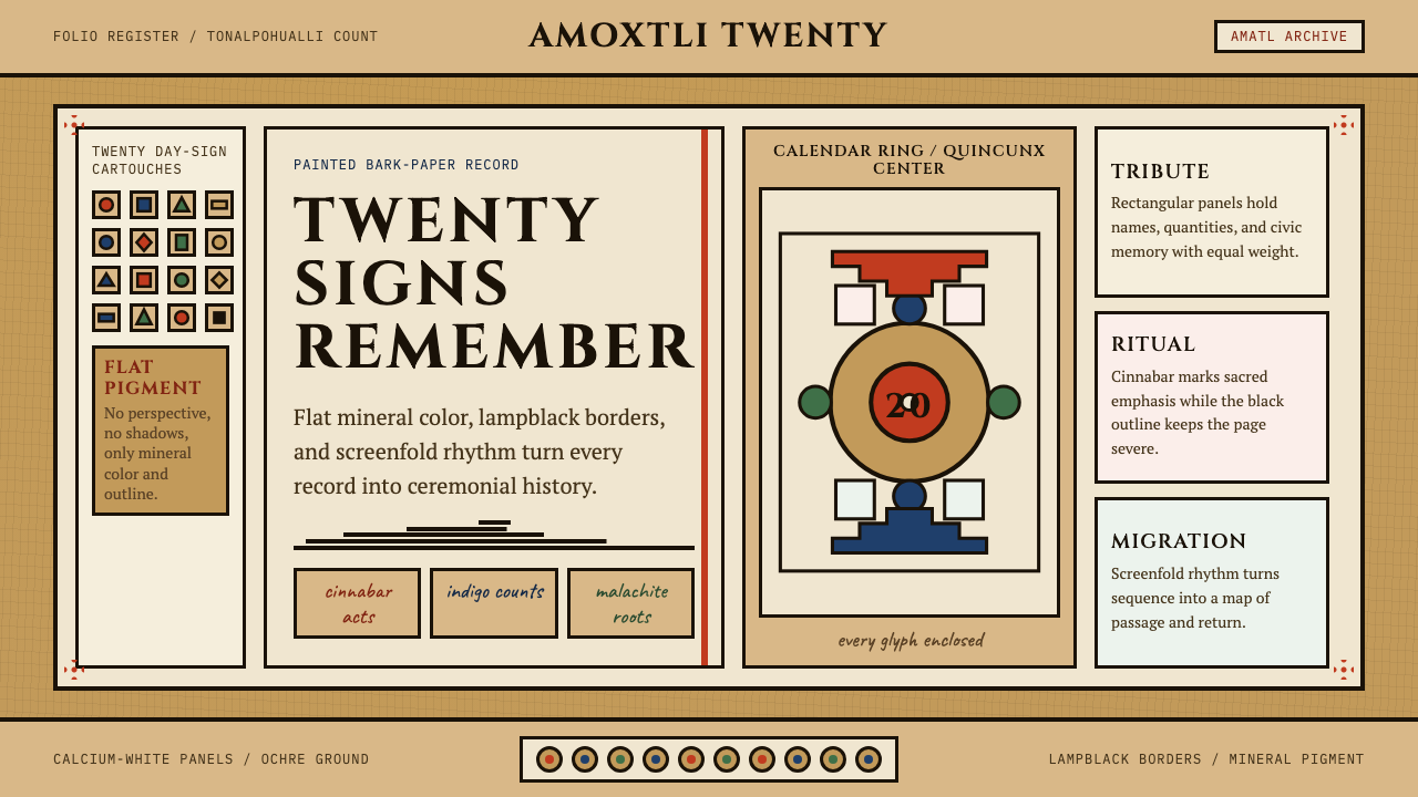 Aztec CodexSacred records stay severe. Ochre amatl ground, Cinzel capitals, black cartou…神圣记录保持庄严。赭黄纸底、Cinzel 大写与黑色匣框。
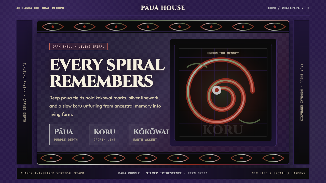 Māori Koru (Aotearoa)Ancestry glows in the dark. Paua purple, kokowai red, and silver koru frame t…黑暗中祖脉发光:鲍紫、赭红与银色科鲁框住纵向层叠。
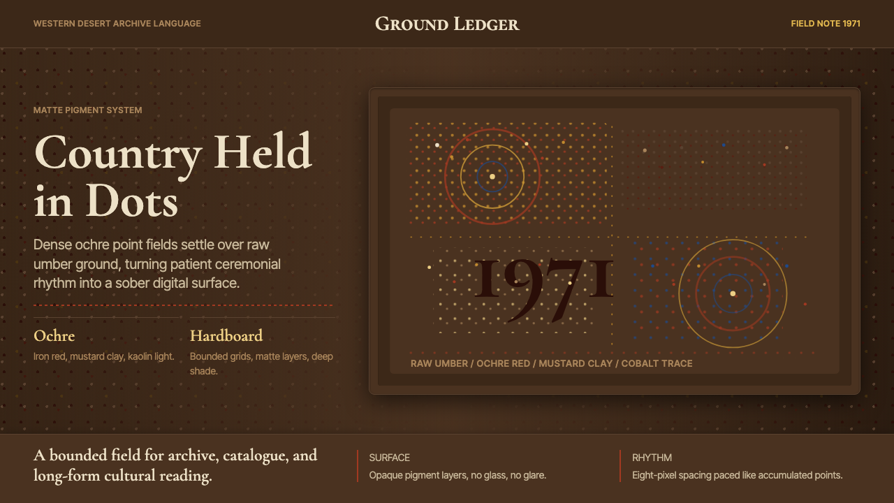 Aboriginal Dot Painting (Papunya 1971)Ochre memory, held steady. Raw umber ground, Cormorant type, disciplined dot-…赭石记忆沉稳留存:生赭黑地、Cormorant 字体与克制点阵。
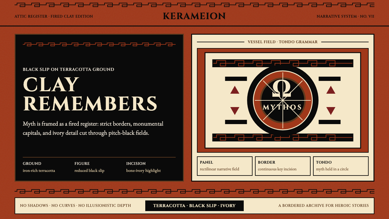 Greek Antiquity (Attic Vase)Myth becomes architecture. Terracotta, black slip, and Greek-key borders fram…神话化为建筑:赤陶、黑釉与希腊回纹框住叙事。
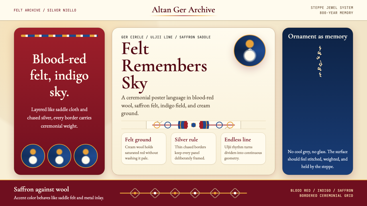 Mongolian Nomadic SteppeSteppe memory in jewel tones. Blood-red felt, saffron, indigo, and bordered u…草原记忆浓烈如宝石:深红毡、藏蓝与番红花色,边框乌力吉几何。
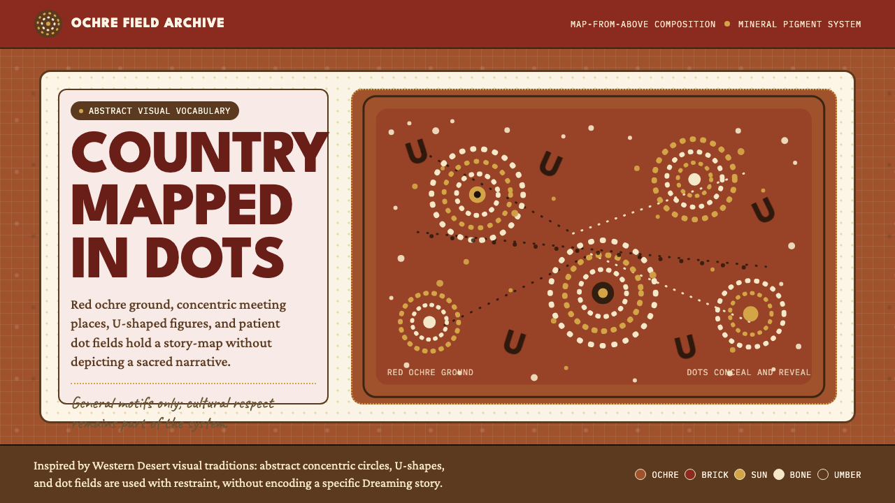 Aboriginal Dot PaintingAncient story-map energy. Red ochre, bone dots, concentric circles, and U-mar…古老故事地图感:红赭底、骨白点、同心圆与 U 形构成大地。