What is Aztec Codex?什么是 Aztec Codex?
Painted on folded bark paper by anonymous tlacuilo scribes, Aztec codices compressed an entire civilization — its gods, calendars, and conquests — into flat mineral color and thick black outline.无名的「抄本书写者」将整个文明——诸神、历法与征战——以矿物颜料和墨黑轮廓压缩进一张张折叠树皮纸之中。
Aztec Codex in briefAztec Codex 速览
Aztec Codex is a design system derived from the painted bark-paper screenfolds (amatl) produced by the Mexica civilization between roughly 1300 and 1577. These manuscripts — among them the Codex Mendoza, the Codex Borgia, and the Florentine Codex — recorded tribute obligations, ritual calendars, and cosmological narratives in a visual language that is simultaneously symbolic, sequential, and architecturally ordered. The design system extracts that visual language into a contemporary toolkit: amatl ochre as the dominant ground, cinnabar red and indigo blue as structural accents, malachite green for categorical differentiation, lampblack for outline and type, and limestone white for panel breaks and negative space.「阿兹特克古抄本」是一套源自墨西加(Mexica)文明的设计系统,取材自约公元1300至1577年间绘制的树皮纸折叠式手抄本(amatl)。《门多萨抄本》《博尔吉亚抄本》《佛罗伦萨抄本》等典籍以一套兼具象征性、序列性与建筑感的视觉语言,记录着贡赋义务、祭仪历法与宇宙叙事。这套设计系统将上述视觉语言提炼为当代工具集:树皮纸赭黄色为主底,朱砂红与靛蓝为结构性强调,孔雀石绿用于类别区分,灯黑用于轮廓与文字,石灰白用于面板分隔与留白。
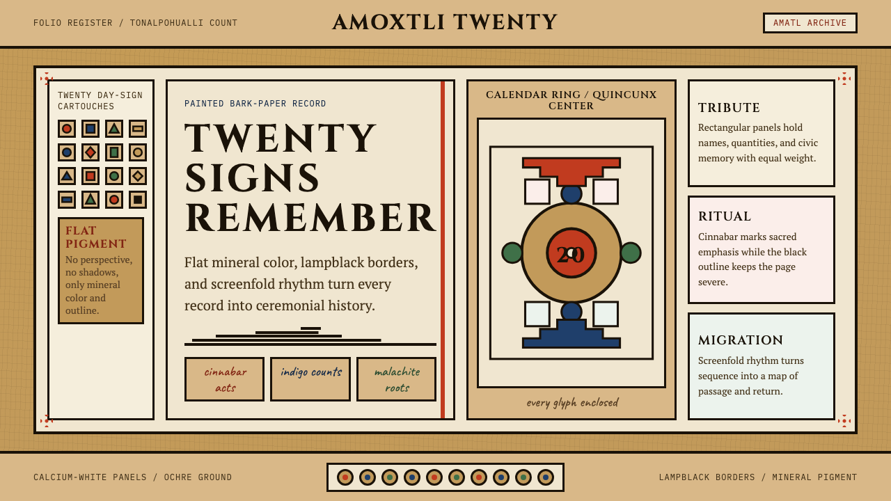
The system is distinguished by three formal commitments: flatness, frontality, and cartouching. Every figure sits flush against its ground with no cast shadow or atmospheric perspective. Figures are depicted frontally or in strict profile — never at intermediate angles — reflecting the codex convention that orientation carries meaning rather than illusion. And every significant element is enclosed in a thick-stroked rectangular or stepped cartouche, the visual equivalent of a sentence boundary in prose. Day-sign glyphs, tribute tallies, and deity portraits each occupy their own bounded field, creating a grid of cells that reads simultaneously as image and as data.这套系统以三项形式承诺为核心:扁平性、正面性与匣框化。每个图形紧贴底面,无投影亦无大气透视。人物以正面或严格侧面描绘——绝无中间角度——反映抄本传统中方向携带意义而非幻觉的惯例。每个重要元素均被粗描边的矩形或阶梯状匣框所围合,相当于散文中的句子边界。日符徽章、贡赋计数与神像各自占据一个封闭格,构成一张可同时作为图像和数据来读取的格状阵列。
What makes Aztec Codex distinctive among historical revival styles is its refusal of fiesta kitsch. The palette is mineral and muted, not festive and saturated. The geometry is rigorous and calendrical, not decorative. The system is designed for narrative, archival, and culturally grounded interfaces — contexts where visual weight and historical authority matter, not contexts where surface warmth or commercial friendliness is the goal.在诸多历史复兴风格中,「阿兹特克古抄本」的独特之处在于对嘉年华式浅俗的彻底拒绝。调色盘取自矿物、色调沉稳,而非节日式的高饱和。几何结构严谨如历法,而非装饰性的点缀。这套系统为叙事性、档案性、文化厚度较高的场景而设计——适合视觉分量与历史权威感至关重要的语境,而非追求表面温度或商业亲和力的场景。
Where does Aztec Codex come from?Aztec Codex 从何而来?
The visual culture that Aztec Codex draws upon developed over centuries in Central Mexico within the overlapping traditions of the Mexica (Aztec) empire and its neighbors in the Valley of Mexico. The tlacuilo — a specialized scribe-painter whose training began in childhood at institutions called calmecac — was responsible for producing these manuscripts. Tlacuilos were not simply copyists; they were specialists who held knowledge of the tonalpohualli (the 260-day ritual calendar), the xiuhpohualli (the 365-day solar calendar), and the pictographic conventions that allowed both to be rendered legibly on bark paper or deerskin. The surviving pre-conquest codices, including the Codex Borgia and the Codex Laud, were produced in this tradition and represent the most intact examples of the pre-colonial visual system.「阿兹特克古抄本」所援引的视觉文化,在中美洲中部历经数百年演变,形成于墨西加(阿兹特克)帝国及其在墨西哥谷地邻族的交叠传统之中。「抄本书写者」(tlacuilo)是一类从幼年起便在名为「卡尔梅卡克」(calmecac)的机构接受训练的专业书写-绘画者,负责制作这些典籍。他们不仅仅是誊抄者,更是掌握通纳尔波瓦利(260日祭仪历)、修波瓦利(365日太阳历)以及将两套历法清晰呈现于树皮纸或鹿皮上所需图画惯例的专门知识者。现存的前征服时期抄本,包括《博尔吉亚抄本》与《劳德抄本》,均出自这一传统,是前殖民时期视觉系统保存最为完整的例证。
The Spanish conquest of Tenochtitlan in 1521 disrupted but did not immediately destroy the codex tradition. Colonial administrators quickly recognized that the pictographic manuscripts were indispensable records of tribute, land tenure, and local governance. The Codex Mendoza, commissioned around 1541 by Antonio de Mendoza, the first Viceroy of New Spain, was explicitly produced to convey to the Spanish Crown the structure of Aztec tribute and conquest history. Its pages were painted by tlacuilo scribes using the traditional pictographic system, with Spanish-language glosses added alongside. This hybrid document — pre-Columbian in its visual grammar, colonial in its administrative purpose — is among the finest exemplars of the style.1521年西班牙攻陷特诺奇蒂特兰,打断了抄本传统,却未立即将其摧毁。殖民地行政官员很快意识到,这些图画典籍是记录贡赋、土地所有权与地方治理不可或缺的档案。约1541年,新西班牙第一任总督安东尼奥·德·门多萨委托编制的《门多萨抄本》,明确旨在向西班牙王室呈现阿兹特克贡赋体系与征服史。书页由书写者以传统图画体系绘制,旁加西班牙语注疏。这份在视觉语法上属于前哥伦布时期、在行政目的上属于殖民时期的混合文献,是这种风格最精美的范本之一。
The Franciscan friar Bernardino de Sahagún undertook the most systematic colonial documentation of Mexica culture between roughly 1545 and 1590. His General History of the Things of New Spain, commonly known as the Florentine Codex, compiled in twelve volumes with both Nahuatl text and Spanish summaries, was illustrated by trained Nahua artists working in a style that blended the indigenous pictographic tradition with European naturalistic conventions. The illustrations in the Florentine Codex are a critical record of the transition period and show how the original visual system began to absorb Renaissance line-weight variation and perspectival hints while retaining its essentially flat and cartouched character.方济各会修士贝尔纳迪诺·德·萨阿贡于约1545至1590年间,对墨西加文化进行了最为系统的殖民时期文献记录。他的《新西班牙诸物通史》(通称《佛罗伦萨抄本》)以十二卷的篇幅同时收录纳瓦特尔语原文与西班牙语摘要,插图由受过训练的纳瓦艺术家绘制,风格将原住民图画传统与欧洲写实惯例相融合。《佛罗伦萨抄本》的插图是这一过渡时期的关键记录,展示了原始视觉系统如何在保留其本质上的扁平性与匣框化特征的同时,开始吸收文艺复兴式的线条粗细变化与透视暗示。
The modern design legacy of Aztec codices emerged through two channels. The first was archaeological and art-historical scholarship: from the late nineteenth century onward, major codices held in European libraries — the Codex Borgia in the Vatican, the Codex Vindobonensis in Vienna, the Codex Mendoza in Oxford — were photographically reproduced and made available to scholars and designers worldwide. The second was the Mexican Muralist movement of the early twentieth century, in which Diego Rivera, José Clemente Orozco, and David Alfaro Siqueiros drew heavily on pre-Columbian visual conventions to construct a national visual identity. Contemporary use of the Aztec Codex aesthetic in design descends from both traditions: rigorous historical scholarship about what the original manuscripts actually looked like, and a longer cultural tradition of treating these images as living visual resources rather than archaeological artifacts.阿兹特克抄本的现代设计遗产经由两条路径得以延续。其一是考古与艺术史研究:从十九世纪晚期起,收藏于欧洲图书馆的主要抄本——梵蒂冈的《博尔吉亚抄本》、维也纳的《维也纳抄本》、牛津的《门多萨抄本》——被摄影复制,向全球学者和设计师广泛传播。其二是二十世纪初的墨西哥壁画运动,迭戈·里维拉、何塞·克莱门特·奥罗斯科与大卫·阿尔法罗·西凯罗斯大量汲取前哥伦布时期的视觉惯例,以构建国家视觉身份。当代设计中对「阿兹特克古抄本」美学的使用,正是从这两个传统中延伸而来:一方面是对原始抄本外貌的严谨历史考据,另一方面是将这些图像视为活态视觉资源而非考古文物的长久文化传统。
What defines the Aztec Codex look?Aztec Codex 的视觉特征是什么?
Palette色彩
The palette is mineral and historically grounded: amatl ochre (the warm, slightly darkened tan of processed bark paper) serves as the dominant ground. Against this ground, cinnabar red signals ritual importance and structural emphasis, indigo blue marks celestial and watery domains, malachite green distinguishes vegetation and fertility figures, and lampblack provides all outlines and typographic elements. Limestone white appears as a highlight and panel separator. The overall character is earthy, saturated but not bright — colors that appear to have been ground from stone rather than mixed from synthetic pigment.调色盘取自矿物,具有历史依据:树皮纸赭黄(加工过的树皮纸所呈现的温暖、略带暗沉的棕褐色)作为主底色。在此底色之上,朱砂红标示祭仪重要性与结构强调,靛蓝标记天界与水域,孔雀石绿区分植被与丰产神像,灯黑提供所有轮廓与字体元素。石灰白以高光与面板分隔符的形式出现。整体气质质朴厚重,饱和而不耀目——色彩看起来像是从石头中研磨而来,而非由合成颜料调配。
Outline and Cartouche轮廓与匣框
Every figure and significant element is bounded by a thick, consistent black stroke. There is no line-weight variation for depth or atmosphere — the outline weight is structural, not expressive. Cartouches take two primary forms: the rectangular border (used for tribute counts, day-sign registers, and text panels) and the stepped or interlocking border (echoing the talud-tablero architectural profile of Mesoamerican temple platforms). These borders are not decorative additions; they are the primary organizational mechanism, equivalent to the cell structure of a spreadsheet or the frame of a comic panel.每个图形与重要元素均以粗细一致的黑色描边界定。没有因深度或大气感而产生的线条粗细变化——描边粗细是结构性的,而非表现性的。匣框呈现两种主要形态:矩形边框(用于贡赋计数、日符排列与文字面板)和阶梯状或互扣式边框(呼应中美洲神庙台基的塔卢德-塔布雷罗建筑剖面)。这些边框不是装饰性附加,而是首要组织机制,相当于电子表格的单元格结构或漫画格的框架。
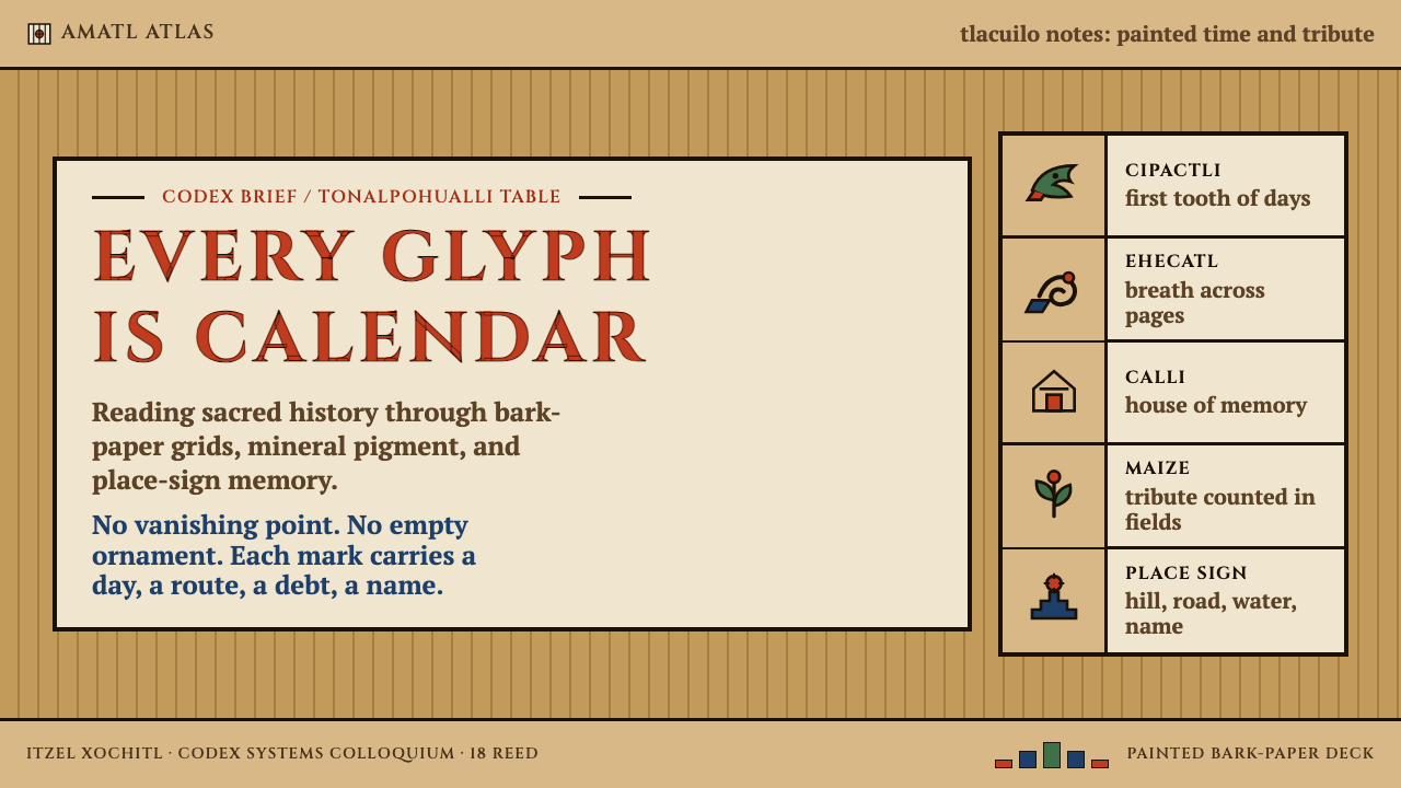
Day-Sign Glyphs日符徽章
The tonalpohualli calendar is divided into twenty named day-signs — Crocodile, Wind, House, Lizard, Serpent, Death, Deer, Rabbit, Water, Dog, Monkey, Grass, Reed, Ocelot, Eagle, Vulture, Movement, Flint, Rain, Flower — each with a fixed pictographic form. These glyphs appear in registers along the borders of composition, marking calendrical sequence. In contemporary use, day-sign glyphs function as repeating border motifs, section dividers, or icon-like categorical markers. Their strict formal constraints — each fits within a roughly square cell — make them highly adaptable as a modular visual system.通纳尔波瓦利历法分为二十个命名日符——鳄鱼、风、房屋、蜥蜴、蛇、死亡、鹿、兔、水、狗、猴、草、芦苇、豹、鹰、兀鹫、运动、燧石、雨、花——每个日符都有固定的图画形态。这些符号以连续排列的方式沿构图边缘分布,标记历法序列。在当代设计中,日符徽章可用作重复性边框母题、段落分隔符或图标式的类别标记。其严格的形式约束——每个符号都适配于近似正方形的格内——使其作为模块化视觉系统具有高度适应性。
Frontality and Profile Convention正面性与侧面惯例
Human and divine figures in the codices are rendered either fully frontal or in strict profile — these are the only two orientations the system recognizes. There is no three-quarter view, no foreshortening, no atmospheric perspective. Frontality denotes authority or sacred status; profile denotes action or narrative sequence. This convention is not a limitation of skill — tlacuilo painters who worked after the conquest demonstrated fluency with European spatial conventions when required — but a deliberate semantic choice in which orientation carries meaning. Applying this principle in contemporary design means treating the angle of every figure as a communicative decision rather than a stylistic preference.抄本中的人物与神像以完全正面或严格侧面两种方式呈现——这是这套系统所承认的仅有两种方向。没有四分之三视角,没有透视缩短,没有大气透视。正面表示权威或神圣地位;侧面表示动作或叙事序列。这一惯例并非技能的限制——在征服之后从事创作的书写者在需要时完全能够运用欧洲空间惯例——而是一种刻意的语义选择,其中方向本身承载意义。在当代设计中应用这一原则,意味着将每个图形的朝向视为传达性决定,而非风格偏好。
Grid and Sequence格状结构与序列
The internal organization of a codex page is not compositional in the Western easel-painting sense — it is sequential and cellular. Reading order follows a boustrophedon or serpentine path through a grid of cartouched cells, with footprints, lines, and directional glyphs indicating the reading path explicitly. This grid-and-sequence logic translates directly into contemporary interface design: the codex page structure is essentially a data table or dashboard panel array, where each cell is self-contained but positioned within a larger navigational sequence. The aesthetic of the structure is not imposed but intrinsic.抄本页面的内部组织并非西方架上绘画意义上的构图性安排,而是序列性和格状性的。阅读顺序沿一张由匣框格构成的网格以往复蛇行路径展开,脚印、线条与方向性符号明确指示阅读路径。这种格状-序列逻辑可以直接转化为当代界面设计:抄本页面结构本质上就是一张数据表或仪表板面板阵列,每个格子自成一体,又在更大的导航序列中占有固定位置。这种结构的美学不是外加的,而是内生的。
Typography and Glyph Integration字体排印与字形整合
In the original codices, there was no alphabetic text — meaning was encoded entirely in pictographic and ideographic glyphs. The contemporary Aztec Codex system integrates Roman capitals with serif letterforms that carry a weight and axis reminiscent of colonial-era stonecutting — the Trajan tradition — to bridge the pre-Columbian visual grammar with legible Latin text. This combination is deliberate: the serif capital evokes the colonial-Latin inscriptions that appeared alongside codex imagery in the decades after the conquest, creating a historically layered visual voice. Body text and captions benefit from the same axial consistency, keeping the typographic register austere and monumental rather than warm and approachable.在原始抄本中并无字母文字——意义完全编码于图画符号与表意符号之中。当代「阿兹特克古抄本」系统将罗马大写字母与带衬线字形整合,其笔画分量与轴线令人联想到殖民时期石刻传统(Trajan 传统),以此在前哥伦布时期视觉语法与可读拉丁文字之间搭建桥梁。这一组合是刻意为之:衬线大写字母唤起征服后数十年间出现在抄本图像旁的殖民时期拉丁铭文,创造出具有历史层次感的视觉声音。正文与说明文字同样受益于这种轴线一致性,使字体排印的调性保持庄严肃穆,而非温暖亲切。
Symbolic Color Assignment象征性色彩分配
In the codices, color functions as a taxonomic code rather than a decorative choice. Tlaloc, the rain deity, is consistently rendered in indigo blue and malachite green; Xipe Totec wears cinnabar red; Quetzalcoatl appears in turquoise and white. This system of fixed color-identity pairings was not arbitrary — it encoded cosmological and calendrical associations that a literate viewer would recognize immediately. Applying Aztec Codex in contemporary design means honoring this principle: assign colors to categories or states consistently and systematically, and resist the impulse to introduce additional hues for visual variety. The constraint is the meaning.在抄本中,色彩充当的是分类编码而非装饰选择。雨神特拉洛克(Tlaloc)始终以靛蓝与孔雀石绿呈现;希佩·托特克(Xipe Totec)着朱砂红;羽蛇神魁扎尔科亚特尔(Quetzalcoatl)以绿松石色与白色出现。这套固定的色彩-身份配对系统并非任意为之——它编码着有文化素养的观看者能够立即识别的宇宙论与历法关联。在当代设计中应用「阿兹特克古抄本」,意味着尊重这一原则:将色彩系统而一致地分配给类别或状态,并抵制为追求视觉多样性而引入额外色调的冲动。约束本身即是意义。
Who shaped Aztec Codex?谁塑造了 Aztec Codex?
The tlacuilo (plural tlacuiloque) were specialist scribe-painters trained from childhood in the calmecac, the Mexica institution for priestly and administrative education. They held proprietary knowledge of both calendrical systems, the pictographic conventions for representing deities, tribute items, place names, and human figures, and the material techniques for preparing amatl bark paper, grinding mineral pigments, and laying color in flat, opaque layers. Because the Spanish colonial authorities suppressed knowledge of who made specific codices, and because the pre-Columbian tradition did not involve individual attribution in the Western sense, the tlacuiloque remain collectively anonymous — yet they are the direct authors of the entire visual vocabulary that Aztec Codex draws upon.「抄本书写者」(tlacuilo,复数 tlacuiloque)是在「卡尔梅卡克」(calmecac,墨西加祭司与行政教育机构)中自幼受训的专业书写-绘画者。他们掌握两套历法系统的专有知识、描绘神像-贡赋物品-地名-人物的图画惯例,以及制备树皮纸(amatl)、研磨矿物颜料、以扁平不透明色层敷色的材料技艺。由于西班牙殖民当局压制了关于特定抄本制作者的知识,而且前哥伦布时期传统本就不存在西方意义上的个人署名,书写者们以集体匿名的形式留存于历史——然而他们正是「阿兹特克古抄本」所援引的全部视觉词汇的直接创作者。
Antonio de Mendoza, the first Viceroy of New Spain (serving 1535–1550), commissioned the document now known as the Codex Mendoza around 1541. His intention was to produce a comprehensive account of Aztec tribute, conquest history, and daily life for presentation to the Spanish Crown. The resulting codex is a hybrid object: its images were painted by tlacuilo scribes using the traditional pictographic system in full, while Spanish-language glosses were added to translate the content for European readers. The Codex Mendoza is among the best-preserved and most extensively studied of all surviving codices, and its pages — particularly the tribute lists with their systematic grid of commodity icons — are among the most direct antecedents for the contemporary Aztec Codex design system.安东尼奥·德·门多萨,新西班牙第一任总督(任期1535—1550年),约于1541年委托编制了如今被称为《门多萨抄本》的文献,旨在为西班牙王室提供关于阿兹特克贡赋体系、征服历史与日常生活的全面记录。由此产生的抄本是一件混合物:图像由书写者以传统图画体系完整绘制,旁加西班牙语注疏以为欧洲读者翻译内容。《门多萨抄本》是现存保存最完好、研究最深入的抄本之一,其页面——尤其是以系统化商品图标网格呈现的贡赋清单——是当代「阿兹特克古抄本」设计系统最直接的先驱。
Sahagún (c. 1499–1590) was a Franciscan friar who arrived in New Spain in 1529 and devoted most of his subsequent life to documenting Mexica language and culture. His monumental work, the General History of the Things of New Spain (Florentine Codex), compiled over several decades, is one of the most comprehensive ethnographic records of any pre-modern culture. Crucially for the design legacy, the Florentine Codex was illustrated by Nahua artists working under Sahagún's direction, producing images that sit at the intersection of the indigenous pictographic tradition and European naturalistic conventions introduced by colonial contact. These illustrations — showing how the codex visual system adapted under external pressure while retaining its essential character — are a key reference for understanding both the range and the limits of the style.萨阿贡(约1499—1590年)是一位1529年抵达新西班牙的方济各会修士,此后将大半生投入到对墨西加语言与文化的文献记录。他历数十年编纂的巨著《新西班牙诸物通史》(《佛罗伦萨抄本》)是迄今对任何前现代文化最全面的民族志记录之一。对于设计遗产而言至关重要的是,《佛罗伦萨抄本》的插图由在萨阿贡指导下工作的纳瓦艺术家绘制,其图像处于原住民图画传统与殖民接触所引入的欧洲写实惯例的交汇点上。这些插图——展示了抄本视觉系统在外力压迫下如何适应同时保留其本质特征——是理解这种风格的范围与边界的关键参照。
Rivera (1886–1957) is the figure most responsible for bringing the visual conventions of Aztec codices into twentieth-century design consciousness. His large-scale murals at the National Palace in Mexico City, painted between 1929 and 1935, reconstruct pre-Columbian scenes using a synthesis of codex iconography, European fresco technique, and Socialist Realist spatial organization. Rivera did not copy the codices — he reinterpreted them, demonstrating that the flat, frontal, cartouched visual grammar of the Mexica could bear the weight of monumental historical narrative in a modern context. His influence on subsequent Mexican graphic design, typography, and visual culture established the path through which contemporary designers encounter and absorb the codex aesthetic.里维拉(1886—1957年)是将阿兹特克抄本视觉惯例带入二十世纪设计意识的最重要人物。他于1929至1935年间在墨西哥城国家宫绘制的大型壁画,以抄本图像志、欧洲湿壁画技法与社会主义现实主义空间组织的综合,重建前哥伦布时期场景。里维拉并非照搬抄本——他是对其进行再诠释,证明了墨西加文明扁平、正面、匣框化的视觉语法,能够在现代语境下承载宏大历史叙事的分量。他对此后墨西哥平面设计、字体与视觉文化的影响,奠定了当代设计师接触和吸收抄本美学的路径。
Zelia Nuttall (1857–1933) was an American archaeologist whose 1902 facsimile publication of the pre-Columbian screenfold now known as the Codex Nuttall made an exceptionally high-quality version of a Mixtec codex widely available to scholars and artists for the first time. Her work at the intersection of archaeological field research and publication — she also worked on the Codex Magliabechiano — helped establish the scholarly apparatus through which codex imagery became accessible as a visual resource outside specialist libraries. The availability of high-quality facsimiles is a prerequisite for faithful design revival, and Nuttall's contributions to that availability in the early twentieth century were foundational.泽利亚·纳托尔(1857—1933年)是一位美国考古学家,她于1902年出版的前哥伦布时期折叠式手抄本(即现称《纳托尔抄本》)摹本,首次将一份米斯特克(Mixtec)抄本的高质量版本广泛提供给学者和艺术家。她在田野考古研究与出版工作交汇处所做的贡献——她还研究了《马利亚贝奇亚诺抄本》——帮助建立起使抄本图像得以作为视觉资源在专业图书馆之外广泛传播的学术体系。高质量摹本的可及性是忠实设计复兴的前提,纳托尔在二十世纪初为此做出的贡献具有奠基意义。
How do you use Aztec Codex today?今天怎么用 Aztec Codex?
Aztec Codex is among the most structurally coherent of historical design styles available to contemporary practitioners, because its organizing logic — the cartouched grid, the fixed color taxonomy, the sequential register — maps directly onto common interface and presentation structures. Applying it correctly requires engaging with that structure rather than simply borrowing the surface palette and adding stepped borders to otherwise conventional layouts.「阿兹特克古抄本」是当代从业者可用的历史设计风格中结构最为连贯的一种,因为其组织逻辑——匣框网格、固定色彩分类、序列排列——与常见的界面和演示结构直接对应。正确应用这套风格,需要真正介入这种结构,而不仅仅是借用表面色板并在常规版面上添加阶梯式边框。
For presentation slides, the style excels at both cover compositions and data-heavy content pages. A cover slide benefits from a full-bleed amatl ochre ground with a large cartouched title panel centered or slightly offset, flanked by a border register of day-sign glyphs. Content slides should be treated as codex pages: organize information into a grid of bordered cells rather than using bullet lists or floating text blocks. A four-cell or six-cell grid with one dominant panel and several subordinate panels — each with its own thick-bordered frame — creates a visual structure that is immediately recognizable as codex-derived. Data slides gain particular power in this system: charts and diagrams rendered as flat geometric shapes in the codex palette, enclosed in cartouche frames, read as tribute tallies updated for contemporary data.在演示文稿中,这种风格在封面构图和数据密集的内容页上均表现出色。封面幻灯片适合以树皮纸赭黄满版底色为基础,配以居中或略偏的大型匣框标题面板,两侧饰以日符徽章的边框排列。内容幻灯片应当被当作抄本页面处理:将信息组织进有边框的格状单元,而非使用项目符号列表或浮动文字块。一个由一个主面板和若干次级面板组成的四格或六格网格——每格都有自己的粗边框——创造出一种立即可辨认为抄本衍生的视觉结构。数据幻灯片在这套系统中尤为有力:以抄本色板渲染为平面几何形、围以匣框的图表,读来如同为当代数据更新的贡赋清单。
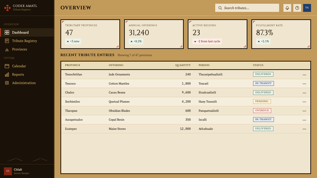
For web interfaces, Aztec Codex suits dashboards, analytics platforms, and archival or museum-adjacent products exceptionally well. The core approach for a dashboard: set the page ground to the warm ochre or a desaturated near-white that echoes amatl paper, use thick-bordered card components in place of soft-shadow panels, color-code data categories using the fixed palette of cinnabar, indigo, and malachite, and use serif capitals for section labels and navigation. Pricing pages benefit from the system's ability to encode hierarchy through containment: tier cards with thick stepped borders, each tier differentiated by a single accent color from the codex palette, communicate relative value through the visual weight of their framing rather than through gradient fills or glassmorphism.对于网页界面,「阿兹特克古抄本」尤其适合仪表板、数据分析平台以及档案馆或博物馆性质的产品。仪表板的核心方法:将页面底色设为温暖的赭黄色或呼应树皮纸的低饱和近白色,以粗边框卡片组件取代软阴影面板,使用朱砂、靛蓝与孔雀石绿的固定色板对数据类别进行色彩编码,节标题与导航使用衬线大写字母。定价页面受益于这套系统通过容纳来编码层级的能力:以粗阶梯式边框界定的套餐卡,每个套餐以抄本色板中的单一强调色加以区分,通过框架的视觉分量而非渐变填充或玻璃拟态来传达相对价值。
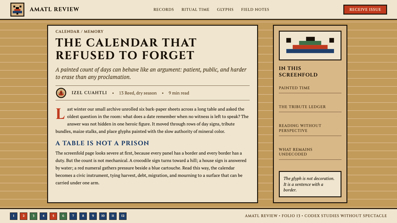
For editorial and marketing applications, the style supports strong visual authority. An editorial layout in the Aztec Codex mode uses a narrow body text column with generous margins, section breaks marked by a full-width border register (a horizontal band of repeating day-sign or geometric motifs rather than a simple rule), and pull quotes contained within cartouche frames. Marketing pages work well with the system's poster-like boldness: alternating content blocks on ochre and lampblack grounds, figure illustrations rendered in flat profile silhouette, and calls to action enclosed in cinnabar-accented cartouches. The style is particularly effective for cultural institutions, educational platforms, publishing brands, and any product whose audience expects historical weight and visual seriousness.对于编辑与营销应用,这种风格支持强烈的视觉权威感。「阿兹特克古抄本」模式的编辑版面使用窄正文栏配以宽裕留白,段落分隔以全宽边框排列(一条重复日符或几何母题的水平带,而非简单直线)为标志,引语置于匣框中。营销页面适合这套系统的海报式气魄:赭黄与灯黑底面交替的内容区块,以扁平侧面剪影呈现的人物插图,以朱砂强调色匣框围合的行动号召。这种风格对文化机构、教育平台、出版品牌,以及任何受众期待历史厚度与视觉严肃性的产品尤为有效。
A common mistake when applying Aztec Codex is mistaking the decorative surface for the structural logic — adding stepped borders and earth-tone colors to conventional layouts without adopting the grid-and-cartouche organizing system beneath them. The result reads as costume rather than architecture. A second mistake is importing festive associations from folk-art or Day of the Dead visual culture, which shares some surface elements — skull motifs, saturated color, organic curves — but belongs to an entirely different aesthetic tradition. Aztec Codex should read as archival and monumental, not celebratory or festive. A third mistake is ignoring the symbolic specificity of the color assignments: using the codex palette as a general earth-tone scheme, with colors applied decoratively rather than taxonomically, loses the system's most powerful distinguishing feature.应用「阿兹特克古抄本」时最常见的错误,是将装饰性表面误认为结构性逻辑——在常规版面上添加阶梯式边框和大地色调,却未采用其背后的格状-匣框组织系统。结果看起来像是戏服而非建筑。第二个错误是引入源自民间艺术或亡灵节视觉文化的节日联想——尽管二者共享某些表面元素(骷髅母题、高饱和色彩、有机曲线),但属于完全不同的美学传统。「阿兹特克古抄本」应当读来如同档案馆与纪念碑,而非庆典与嘉年华。第三个错误是忽视色彩分配的象征特异性:将抄本色板当作普通大地色调方案使用,以装饰性而非分类性的方式施色,会失去这套系统最强大的区别性特征。
Aztec Codex — FAQAztec Codex · 常见问题
Is Aztec Codex appropriate for brands with no connection to Mesoamerican culture?「阿兹特克古抄本」适合与中美洲文化毫无关联的品牌使用吗?
The question of cultural appropriateness is real and deserves a direct answer. The Aztec Codex aesthetic is a living cultural heritage with deep significance to Nahua and broader Mexican communities, not simply a historical style that has passed into neutral public domain. Using it thoughtfully means engaging with its actual visual logic — the grid, the taxonomy, the flatness — rather than extracting surface elements as exotic decoration. Brands that do this with research, credit, and genuine structural engagement occupy a different position than brands that borrow skull imagery and earth tones without awareness. The strongest argument for legitimate use by non-Mexican brands is when the product's values — archival seriousness, calendrical or data structure, long historical time-depth — genuinely align with what the codex system was built to do.文化适当性问题是真实存在的,值得正面回答。「阿兹特克古抄本」美学是对纳瓦特尔(Nahua)群体及更广泛的墨西哥社区具有深刻意义的活态文化遗产,而非简单地进入中立公共领域的历史风格。以审慎态度使用它,意味着真正介入其视觉逻辑——格状结构、分类体系、扁平性——而非将表面元素提取为异域装饰。以研究、致谢与真正的结构性介入为基础的品牌使用,与不具任何文化自觉地借用骷髅图像和大地色调的品牌使用,占据着不同的立场。非墨西哥品牌进行合理使用的最有力论据,是当该产品的价值观——档案的严肃性、历法或数据结构、深远的历史时间跨度——真正与抄本系统被建构来完成的工作相契合时。
How does Aztec Codex differ from other Mesoamerican or indigenous visual styles?「阿兹特克古抄本」与其他中美洲或原住民视觉风格有何不同?
Mesoamerica encompassed many distinct visual traditions, and conflating them is a significant error. The Aztec Codex system draws specifically from the Central Mexican Mexica / Aztec pictographic tradition — the tonalpohualli day-signs, the amatl bark-paper ground, the tribute-list grid format, the flat mineral palette. This is distinct from the Maya visual tradition (which favored curvilinear forms, profile figures with elaborate headdresses, and a different glyph system), the Mixtec tradition (which shares the screenfold format but has different iconographic conventions and a different palette emphasis), the Zapotec tradition, and the many regional variants within the broader Mesoamerican world. Within the Aztec codex tradition itself, there is also meaningful variation between pre-conquest codices and the colonial-period hybrid codices produced after 1521 — the latter show European influence in line weight, spatial depth, and compositional organization.中美洲涵盖了许多不同的视觉传统,将其混为一谈是一个重大错误。「阿兹特克古抄本」系统具体取材于中美洲中部的墨西加/阿兹特克图画传统——通纳尔波瓦利日符、树皮纸底面、贡赋清单格式、矿物色板。这与玛雅视觉传统(偏爱曲线形态、佩戴精美头饰的侧面人物与不同的字形系统)、米斯特克传统(共享折叠手抄本格式,但图像志惯例与色板重点不同)、萨波特克传统,以及中美洲世界更广泛地域变体均有所不同。在阿兹特克抄本传统内部,前征服时期抄本与1521年后制作的殖民时期混合抄本之间也存在显著差异——后者在线条粗细、空间深度与构图组织上显示出欧洲影响。
Can the style work in a light or white-ground version, or is the ochre ground mandatory?这种风格能以浅色或白色底面呈现吗,还是赭黄底色是必须的?
The amatl ochre ground is not mandatory, but it is the element that most immediately places a design within the Aztec Codex visual tradition. A version using a near-white or cream ground is workable — it shifts the register from archival warmth toward something more neutral and contemporary — but it risks losing the distinctive material character that separates the style from generic earth-tone or Southwestern design aesthetics. If using a lighter ground, the critical compensation is to strengthen the cartouche borders (keeping them thick and fully black) and to increase the color specificity of the categorical palette. The system does not work well on a pure cool white or a dark background: the mineral palette was developed for warm grounds, and the colors lose their character and hierarchy when placed against strongly contrasting cool or dark fields.树皮纸赭黄底色不是强制要求,但它是最能立即将一个设计置入「阿兹特克古抄本」视觉传统的元素。以近白色或奶油色为底面的版本是可行的——它将调性从档案式的温暖转向更为中性与当代的感觉——但这样做有失去将这种风格与普通大地色调或西南美洲设计美学区分开来的独特材料特性的风险。若使用较浅的底面,关键的补偿措施是加强匣框边框(保持其粗厚且完全黑色),并提高类别色板的色彩特异性。这套系统在纯粹的冷白色或深色底面上效果不佳:矿物色板是为温暖底面而设计的,当置于强烈对比的冷色或深色背景上时,色彩会失去其特性与层级感。
What is the difference between the pre-conquest and colonial-era codex styles, and does it matter for design?前征服时期与殖民时期抄本风格有何差异,这对设计有影响吗?
The pre-conquest codices (Codex Borgia, Codex Laud, Codex Fejéráry-Mayer) are the purest expression of the Mexica visual system: completely flat, no atmospheric perspective, no line-weight variation for depth, figures rendered in strict frontal or profile orientation, color used purely taxonomically. The colonial-era hybrid codices (Codex Mendoza, Florentine Codex, produced roughly 1521–1577) show increasing European influence: line weights begin to vary for shadow suggestion, some figures acquire three-quarter views, perspective depth hints appear in architectural depictions. For design purposes, the pre-conquest mode produces a more severe, more rigorous, and more historically grounded result. The colonial hybrid mode is slightly more legible to audiences unfamiliar with the indigenous visual grammar, because it begins to incorporate familiar naturalistic conventions. Choosing between them is a question of how much severity versus accessibility the design context can support.前征服时期抄本(《博尔吉亚抄本》《劳德抄本》《费耶尔瓦里-迈耶尔抄本》)是墨西加视觉系统最纯粹的表达:完全扁平,无大气透视,无因深度而变化的线条粗细,图形以严格正面或侧面方式呈现,色彩纯粹用作分类标记。殖民时期混合抄本(《门多萨抄本》《佛罗伦萨抄本》,大约制作于1521至1577年间)显示出日益增强的欧洲影响:线条粗细开始为暗示阴影而变化,部分图形呈现四分之三视角,建筑描绘中出现透视深度暗示。就设计目的而言,前征服时期模式产生更为严峻、更为严谨、历史依据更为充分的结果。殖民混合时期模式对不熟悉原住民视觉语法的受众而言略为易读,因为它开始融入熟悉的写实惯例。在二者之间选择,是一个设计语境能支撑多少严峻性与多少可及性的问题。
How should day-sign glyphs be used without misrepresenting their calendrical meaning?如何在不曲解其历法意义的情况下使用日符徽章?
The twenty tonalpohualli day-signs each have specific names and cosmological associations — Cipactli (Crocodile) is the first day of the cycle, associated with primordial earth; Miquiztli (Death) is the sixth, associated with the underworld; Ollin (Movement) is the seventeenth, associated with earthquakes and the current cosmic era. Using them decoratively as generic geometric ornament ignores this specificity and risks inadvertent misrepresentation. The responsible approaches are: use them as a sequential register (preserving their cyclical order) rather than selecting individual glyphs for their visual appeal alone; or, if selecting specific glyphs, research and acknowledge their meaning and choose based on genuine alignment with the content. The visual logic of the tonalpohualli as a repeating twenty-element cycle maps naturally onto categorical systems with similarly bounded, cyclical, or modular structures.通纳尔波瓦利历法的二十个日符各有其专名与宇宙论关联——「西帕克特利」(鳄鱼)是循环的第一天,与原初大地相关;「米基兹特利」(死亡)是第六天,与冥界相关;「奥林」(运动)是第十七天,与地震和当前宇宙纪元相关。将它们作为普通几何装饰性元素使用,忽视了这种特异性,并有无意间造成误读的风险。负责任的做法是:以序列排列的方式使用日符(保持其循环顺序),而非仅凭视觉吸引力单独挑选个别符号;或者,若确实需要选择特定符号,应研究并承认其含义,并基于与内容的真实契合度进行选择。通纳尔波瓦利作为一个重复出现的二十元素循环,其视觉逻辑自然映射到具有类似封闭性、循环性或模块性结构的分类系统上。
Related design styles相关设计风格
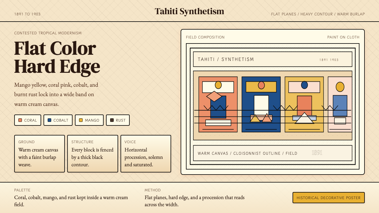 Gauguin — Tahiti SynthetismFlat color, hard edge. Cream canvas, coral, cobalt, and rust lock into a frie…平涂硬边。奶油底上珊瑚、钴蓝与焦土红排成壁带。
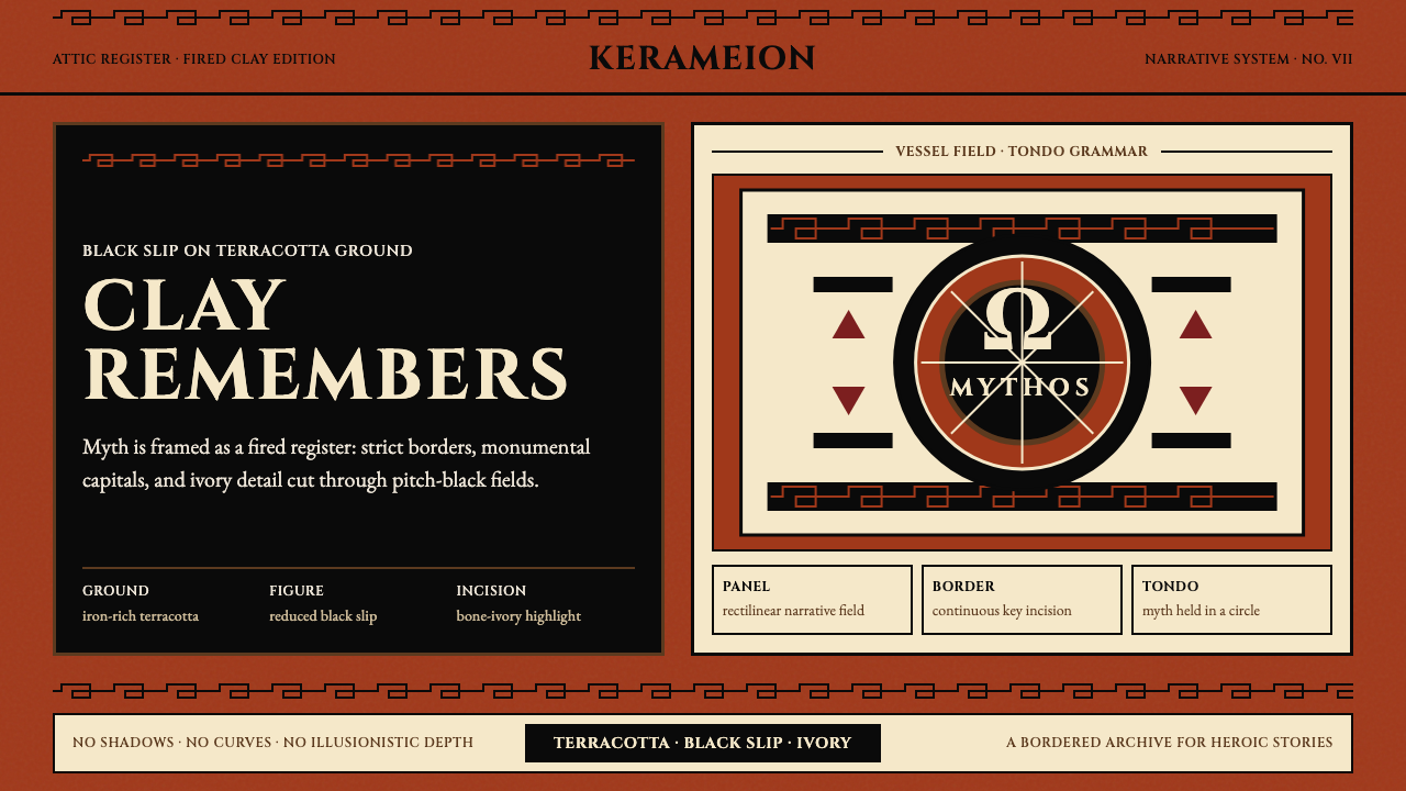 Greek Antiquity (Attic Vase)Myth becomes architecture. Terracotta, black slip, and Greek-key borders fram…神话化为建筑:赤陶、黑釉与希腊回纹框住叙事。
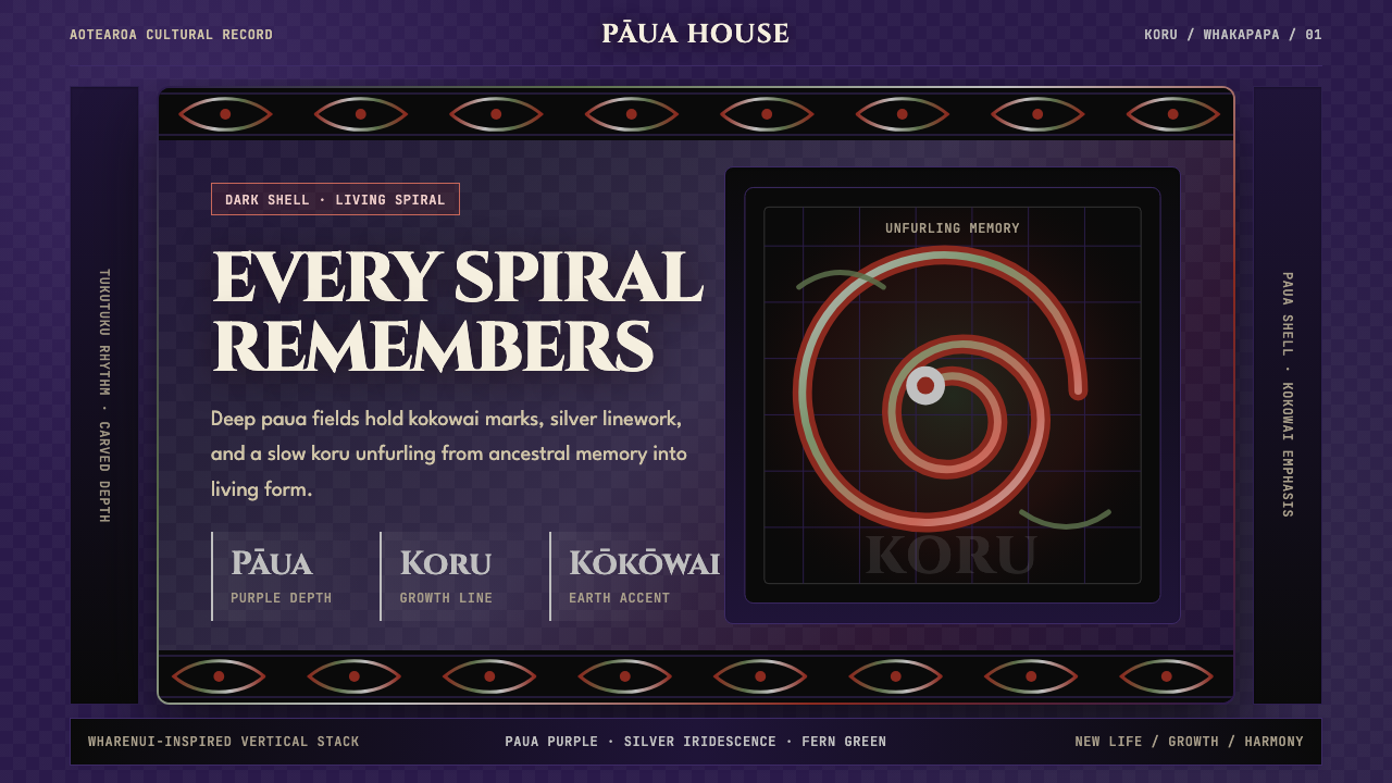 Māori Koru (Aotearoa)Ancestry glows in the dark. Paua purple, kokowai red, and silver koru frame t…黑暗中祖脉发光:鲍紫、赭红与银色科鲁框住纵向层叠。
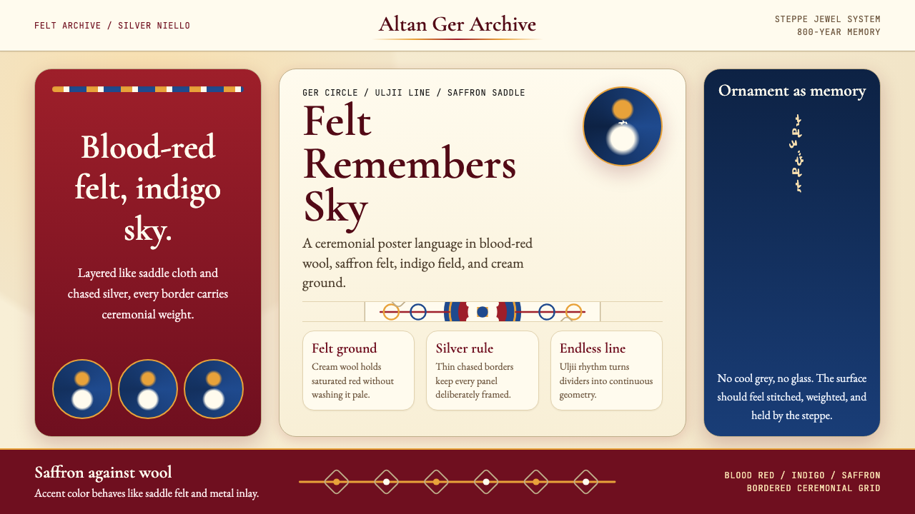 Mongolian Nomadic SteppeSteppe memory in jewel tones. Blood-red felt, saffron, indigo, and bordered u…草原记忆浓烈如宝石:深红毡、藏蓝与番红花色,边框乌力吉几何。
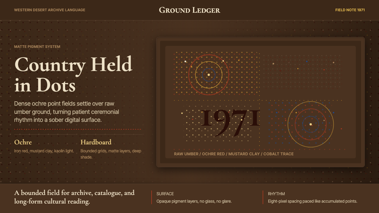 Aboriginal Dot Painting (Papunya 1971)Ochre memory, held steady. Raw umber ground, Cormorant type, disciplined dot-…赭石记忆沉稳留存:生赭黑地、Cormorant 字体与克制点阵。
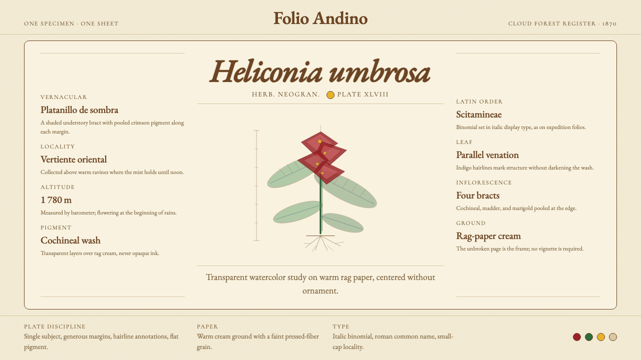 Colombian Botanical (Triana)Observation becomes ornament. Crimson watercolor specimen breathes on cream r…观察即装饰。绯红水彩标本静置于奶油破布纸。