What is West African Kente Cloth?什么是 West African Kente Cloth?
Every strip of kente cloth is a sentence — woven in gold, crimson, jade, and purple on coffee-brown grounds, each color a proverb, each pattern a name carried across centuries of Asante royal ceremony.每一条肯特布都是一句话——金、朱红、翡翠与紫色织于咖啡棕底布之上,每种颜色是一句谚语,每种图案是跨越数百年阿散蒂王室仪式的名字。
West African Kente Cloth in briefWest African Kente Cloth 速览
Kente cloth is the most symbolically dense woven textile tradition in West Africa. Originating among the Asante people of present-day Ghana, it is constructed by weaving narrow strips of fabric — each only a few finger-widths across — on a specialized horizontal loom, then sewing those strips edge to edge to form a larger cloth. The resulting surface is a dense grid of interlocking color blocks, weft accent lines, and geometric micro-patterns whose combinations encode proverbs, social status, historical events, and personal identity.肯特布是西非符号意义最为丰厚的织物传统。它起源于今日加纳的阿散蒂人,通过将窄条布料(每条仅数指宽)在专用水平织机上编织,再将条带边对边缝合成整幅布料。最终呈现的布面是一张由交锁色块、纬线装饰线与几何微图案构成的密集网格,其组合方式蕴含谚语、社会地位、历史事件与个人身份的多重编码。
The palette is dominated by gold, the color of royalty and wealth; crimson, associated with political strength and sacrifice; jade green, signifying growth and renewal; and deep purple, representing spiritual potency and high feminine achievement. These saturated hues are assembled against a ground of deep coffee-brown or black, creating a visual rhythm of heat and depth that reads from a distance as bold and ceremonial, and up close as intricately layered. The interplay between vertical strip seams and horizontal weft patterns gives kente its distinctive woven-grid structure — a geometry that is simultaneously rigid and vibrant.色板以金色为主导,代表王权与财富;朱红与政治力量和牺牲相关联;翡翠绿象征生长与更新;深紫代表精神力量与女性的崇高成就。这些饱和色彩铺设于深咖啡棕或黑色底布之上,形成一种热烈与深沉交织的视觉节奏——远看宏大而仪式化,近看则层次精密。垂直条带接缝与水平纬线图案之间的交叠,赋予肯特布独特的织物网格结构——一种同时具备刚性与活力的几何体系。
Unlike decorative textiles that treat pattern as surface ornament, kente's visual system is fundamentally semantic. A specific arrangement of colors and patterns constitutes a named cloth with a known meaning, the way a coat of arms carries heraldic information. This makes kente one of the rare textile traditions in the world that functions as written language as well as visual art — and it is this semiotic density that makes the style so productive when translated into digital design systems.与将图案视为表面装饰的织物不同,肯特布的视觉系统从根本上是语义性的。特定的色彩与图案组合构成一块具名布料,携带已知含义,如同纹章承载纹章信息。这使肯特布成为世界上少数既充当书写语言、又充当视觉艺术的织物传统之一——正是这种符号密度,使其在转化为数字设计系统时具有极强的生产力。
See the West African Kente Cloth design system查看 West African Kente Cloth 完整设计系统
Where does West African Kente Cloth come from?West African Kente Cloth 从何而来?
The Asante oral tradition places the origin of kente weaving in the late seventeenth century, in the village of Bonwire near Kumasi, the capital of the Asante kingdom in what is now Ghana. The founding myth describes two brothers, Kurugu and Ameyaw, who observed a spider weaving its web and were so captivated by the geometric precision of the pattern that they taught themselves to replicate it on a loom using raffia fibers. They brought their cloth to Asantehene Osei Tutu, the powerful king who had recently consolidated the Asante confederacy, and the cloth was immediately adopted as a royal textile. Osei Tutu's court institutionalized kente as an emblem of Asante sovereignty — a material expression of the same cultural energy that produced the Golden Stool, the sacred symbol of the Asante nation.阿散蒂口述传统将肯特布编织的起源追溯至十七世纪末,地点是今日加纳阿散蒂王国首都库马西附近的邦维雷村。创世神话描述了两兄弟库鲁古和阿梅亚乌:他们观察蜘蛛织网,深被其几何精准所折服,遂自学在织机上以拉菲亚棕榈纤维复制这一图案。他们将布料呈献给阿散蒂王奥塞·图图——那位刚刚整合了阿散蒂邦联的强大国王——布料随即被采纳为王室专属织物。奥塞·图图的宫廷将肯特布制度化为阿散蒂主权的象征——与神圣的阿散蒂金凳同属这一文化力量的物质表达。
Alongside the Asante tradition, the Ewe people of present-day Togo and the Volta region of Ghana developed their own parallel kente tradition, characterized by more pictorial figurative elements and a somewhat different color symbolism. Ewe kente tends to incorporate representational motifs — birds, tools, human figures — woven into the strip patterns, while Asante kente more strictly adheres to abstract geometric arrangements. The two traditions cross-pollinated over centuries of trade and intermarriage, and today most kente sold internationally draws on conventions from both lineages. The distinction matters to specialists and to communities for whom the cloth carries specific cultural ownership.与阿散蒂传统并行,今日多哥及加纳沃尔特地区的埃维族人发展出自己的肯特布传统,以更多象形写实元素和略有差异的色彩象征体系为特征。埃维肯特倾向于在条带图案中织入具象母题——鸟类、工具、人形,而阿散蒂肯特则更严格地遵循抽象几何排列。两种传统在数百年的贸易与通婚中相互渗透,如今国际市场上销售的大多数肯特布兼采两支血统的惯例。这一区别对于专业人士以及将布料视为特定文化所有权的社群而言具有重要意义。
The Adinkra symbol system, developed by the Gyaman people of the Brong-Ahafo region and adopted by the Asante, forms a closely related visual tradition. Adinkra symbols — compact geometric glyphs, each encoding a proverb or philosophical concept — appear stamped on cloth as a parallel communicative textile. Several Adinkra symbols share their geometric vocabulary with kente patterns, and in contemporary design applications the two systems are often referenced together: kente provides the woven-grid color structure, while Adinkra contributes the concentrated ornamental glyph. Understanding the relationship between the two systems prevents shallow application of either.由布朗-阿哈福地区贾曼人发展、后被阿散蒂采纳的阿丁克拉符号体系,构成一套密切相关的视觉传统。阿丁克拉符号——紧凑的几何字形,每个字形编码一句谚语或哲学概念——以压印方式出现在布料上,形成平行的传意纺织品。若干阿丁克拉符号与肯特图案共享几何词汇,在当代设计应用中两套系统常被同时引用:肯特提供织物网格色彩结构,阿丁克拉贡献集约的装饰字形。理解两套系统之间的关系,有助于避免对任一系统的浅表化应用。
The twentieth century transformed kente from a closely controlled royal textile into a global symbol of African and African diasporic identity. The transition began in the 1950s and 1960s when newly independent African nations, including Ghana under Kwame Nkrumah, adopted kente as a symbol of Pan-African pride. Diaspora communities in the United States, the Caribbean, and Europe began wearing kente — particularly kente-trimmed graduation robes and ceremonial stoles — as an act of cultural affirmation. By the 1990s kente had become one of the most recognized visual markers of African heritage internationally. Ghanaian fashion designers such as Christie Brown and collectives such as Studio 189 have in recent decades brought kente into dialogue with contemporary fashion and global design audiences, insisting on craft integrity and fair attribution while expanding the vocabulary of the tradition into new contexts.二十世纪将肯特布从受到严格管控的王室织物转变为非洲及非洲离散族裔身份认同的全球符号。这一转变始于1950至60年代,新独立的非洲国家——包括恩克鲁玛领导下的加纳——将肯特布采纳为泛非自豪感的象征。美国、加勒比地区和欧洲的离散社群开始穿戴肯特布——尤其是饰有肯特布边饰的毕业服和仪式绶带——作为文化认同的行动。到1990年代,肯特布已成为国际上最具辨识度的非洲遗产视觉标志之一。加纳时装设计师克里斯蒂·布朗及工作室189等集体近年来将肯特布带入当代时尚与全球设计受众的对话之中,在坚守工艺完整性与公正归属的同时,将这一传统的词汇拓展至新的语境。
What defines the West African Kente Cloth look?West African Kente Cloth 的视觉特征是什么?
Strip-Grid Structure条带网格结构
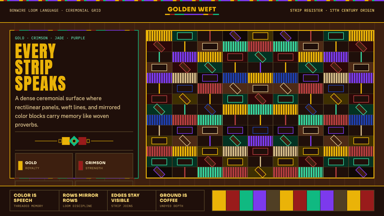
The defining structural feature of kente is its woven-strip construction: narrow panels sewn side by side create visible vertical seams that run the full length of the cloth. These seams are not hidden — they are structural lines that divide the surface into columns, much like a grid system in print layout. Within each strip, horizontal weft patterns create row divisions. The result is an inherent two-axis grid of columns and rows whose intersections can carry different color and pattern information. In digital translation, this produces a visual system built on strong vertical panels intersected by horizontal accent lines, giving surfaces a woven rather than painted quality.肯特布的决定性结构特征是其条带编织构造:并排缝合的窄幅条带形成贯穿布料全长的垂直接缝。这些接缝并不隐藏——它们是将布面分割为列的结构线,类似印刷版面中的网格系统。在每条条带内部,水平纬线图案形成行分割。最终结果是一个由列与行构成的内在双轴网格,其交叉节点可承载不同的色彩与图案信息。在数字转化中,这产生了一套以强垂直面板与水平装饰线交叠为基础的视觉系统,赋予界面织物般而非绘画般的质感。
Royal Color Symbolism王室色彩象征
Kente color is never decorative in a casual sense — each hue carries fixed cultural meaning that has accumulated over centuries. Gold signals royalty, wealth, and high status; it is the dominant tone and the one most closely associated with the Asante kingdom's identity. Crimson and red convey political power, sacrifice, and blood lineage. Jade and forest green represent growth, renewal, and the living world. Purple and violet denote spiritual protection and high feminine achievement. Black, used as a ground or accent, signals maturity, aging, and connection to the ancestral realm. In digital application, this symbolic logic suggests using color purposefully rather than decoratively — gold for premium or primary states, crimson for emphasis and critical information, green for growth-related data.肯特布的色彩从不在随意的意义上充当装饰——每种色调承载着数百年积累的固定文化含义。金色标志王权、财富与高贵地位,是主导色调,也是与阿散蒂王国身份最为紧密相连的颜色。朱红与红色传达政治权力、牺牲与血脉传承。翡翠与森林绿代表生长、更新与活态世界。紫与紫罗兰色表示精神庇护与女性的崇高成就。黑色作为底色或强调色,象征成熟、衰老与祖先领域的联系。在数字应用中,这种象征逻辑建议有目的而非装饰性地使用色彩——金色用于高级或主要状态,朱红用于强调和关键信息,绿色用于成长相关数据。
Mirror-Symmetric Geometry镜像对称几何
Kente patterns are constructed through systematic repetition and mirroring. A pattern unit within one strip is typically repeated across the adjacent strip in a mirror or rotated arrangement, creating large-scale symmetrical compositions from small-scale repeated units. This differs from random or ad hoc ornament: the geometric logic is rule-based and predictable, which is precisely what gives kente its sense of authority and visual weight. Translated into digital layouts, this principle favors modular, symmetrically organized panels — a horizontal band that mirrors itself across a center axis, or a data dashboard whose left and right halves echo each other structurally while carrying different content.肯特图案通过系统性重复与镜像构建。单条条带内的图案单元通常在相邻条带上以镜像或旋转方式重复,由小尺度重复单元形成大尺度对称构图。这有别于随机或随意的装饰:几何逻辑是基于规则、可预测的,这恰恰赋予肯特布以权威感与视觉分量。转化为数字版面时,这一原则倾向于模块化、对称组织的面板——一条沿中心轴自我镜像的水平带,或左右两半在结构上相互呼应、内容各异的数据仪表板。
Weft Accent Lines纬线装饰线
Within each narrow strip, the weft threads running horizontally create thin accent lines that punctuate the larger color blocks. These fine horizontal lines — often in contrasting gold, white, or black — function as visual breathing points that prevent the dense color grid from becoming oppressive. They are analogous to the hairline rules in fine typography: structural but delicate, defining rhythm without competing with the dominant shapes. In screen design, translating this element as thin horizontal dividers or subtle line separators within panels preserves the characteristic kente visual texture while maintaining readability.在每条窄幅条带内部,水平延伸的纬线创造出细密的装饰线,为较大的色块提供节奏标点。这些细水平线——常以对比性的金色、白色或黑色呈现——起到视觉呼吸点的作用,防止密集色彩网格变得压迫。它们类似于精密排版中的细线规:具有结构性但轻盈,定义节奏而不与主导形态竞争。在屏幕设计中,将这一元素转化为面板内的细水平分隔线或微妙线条分隔符,可在保持可读性的同时保留肯特布特有的视觉纹理。
Ceremonial Scale and Weight仪式性尺度与分量
A full kente cloth worn by an Asante king may span several meters — a physical embodiment of authority through sheer material presence. This quality of overwhelming visual weight, achieved through the relentless accumulation of colored strips, translates in digital design as an emphasis on visual density and boldness over restraint. Kente-inspired interfaces do not whisper; they declare. Large color blocks occupy dominant portions of the screen, type is set at generous sizes with confident weight, and the overall impression is rich and ceremonial rather than spare and functional. This boldness must be calibrated carefully for screen contexts: what works on cloth worn before thousands works differently on a laptop display.一位阿散蒂国王穿戴的整幅肯特布可绵延数米——通过纯粹的材料存在感实现权威感的物质化体现。这种通过色彩条带的无尽积累而产生的压倒性视觉分量,在数字设计中转化为对视觉密度与大胆感的强调,而非克制。受肯特布启发的界面不低语;它们宣示。大面积色块占据屏幕的主导区域,文字以慷慨的尺寸和自信的字重排列,整体印象是丰富而仪式化的,而非简省而功能性的。这种大胆感在屏幕语境中需要仔细校准:在数千人面前穿戴时奏效的东西,在笔记本电脑显示器上会以不同方式呈现。
Adinkra Symbol Integration阿丁克拉符号融合
Kente cloth is often worn alongside or combined with Adinkra-stamped garments, and contemporary kente-inspired design frequently incorporates Adinkra symbols as ornamental glyphs. Adinkra symbols are compact, ideographic geometric forms — spirals, crosses, interlocking curves — each encoding a specific proverb or philosophical concept. In digital application they function similarly to iconography: a small, information-dense graphic unit that communicates precisely. Used as section markers, watermarks, or structural corner ornaments in kente-style layouts, they add cultural specificity without overwhelming the color-grid system. The key constraint: each symbol carries a specific meaning that should be used with that meaning in mind, not chosen for shape alone.肯特布常与阿丁克拉压印服装搭配穿戴或组合使用,当代受肯特布启发的设计也频繁将阿丁克拉符号作为装饰字形引入。阿丁克拉符号是紧凑的表意几何形态——螺旋、十字、交错曲线——每个形态编码特定的谚语或哲学概念。在数字应用中,它们的功能类似图标:小型、信息密集的图形单元,能够精确传达意义。在肯特风格版面中用作章节标记、水印或结构性角落装饰,它们在不压制色彩网格系统的前提下增添文化特异性。关键约束:每个符号携带特定含义,应基于该含义使用,而非仅凭形状选择。
Named Pattern Vocabulary具名图案词汇
Unlike most decorative textiles where patterns are chosen for visual appeal, kente patterns are chosen for meaning. Each named cloth — and there are hundreds, with names such as Sika Futuro (gold dust), Oyokoman (a pattern reserved for royalty), or Asasia (for kings and queens) — carries specific social and ceremonial associations that determine who may wear it and on what occasion. This principle of semantic specificity, translated into design, suggests that visual choices in a kente-inspired system should be intentional and readable: a specific color combination for a specific content category, a specific panel arrangement for a specific page type. Randomness of pattern is culturally foreign to kente.与大多数装饰性织物按视觉吸引力选择图案不同,肯特图案按含义选择。每种具名布料——多达数百种,名称如Sika Futuro(金尘)、Oyokoman(王室专属图案)或Asasia(供国王与王后使用)——都携带特定的社会与仪式关联,决定谁可以穿戴以及在何种场合穿戴。这种语义特异性原则转化为设计语言,意味着肯特启发系统中的视觉选择应当是有意图且可读的:特定色彩组合对应特定内容类别,特定面板排列对应特定页面类型。图案的随机性与肯特的文化本质格格不入。
See the West African Kente Cloth design system查看 West African Kente Cloth 完整设计系统
Who shaped West African Kente Cloth?谁塑造了 West African Kente Cloth?
Osei Tutu was the founder and first king of the Asante confederacy, ruling from approximately 1701 to 1717. His court institutionalized kente as a royal textile, transforming what had been a craft tradition into a regulated emblem of Asante sovereignty. By associating kente with the Golden Stool — the sacred object believed to hold the soul of the Asante nation — Osei Tutu elevated the cloth from artifact to political symbol. His legacy is why kente's gold-dominant palette carries connotations of royal authority rather than mere decoration, a semiotic weight that persists in contemporary applications of the style.奥塞·图图是阿散蒂邦联的创始人及首任国王,统治期约为1701至1717年。他的宫廷将肯特布制度化为王室织物,将一种工艺传统转变为受到规范管理的阿散蒂主权象征。通过将肯特布与金凳——被认为承载阿散蒂民族灵魂的神圣器物——相关联,奥塞·图图将布料从工艺品提升为政治符号。他的遗产决定了为何肯特布以金色为主导的色板承载王室权威的含义,而非仅是装饰——这种符号重量在当代风格应用中依然存在。
The village of Bonwire, located near Kumasi in the Ashanti Region of Ghana, has been the acknowledged center of kente weaving for over three hundred years. Bonwire weavers hold hereditary knowledge of named patterns, color sequencing rules, and loom techniques that are passed from master to apprentice across generations. The Ghanaian government has formally recognized Bonwire as the home of authentic kente production, and the village remains a living workshop where both traditional ceremonial cloths and contemporary interpretations are produced. The collective knowledge of the Bonwire weaving community represents the primary custodianship of the technical and semiotic tradition.位于加纳阿散蒂地区库马西附近的邦维雷村,三百余年来一直是公认的肯特布编织中心。邦维雷织工持有具名图案、色彩排序规则与织机技术的世袭知识,这些知识代代在师徒之间传授。加纳政府正式承认邦维雷为正宗肯特布生产的故乡,该村至今仍是一个活态工坊,传统仪式用布与当代诠释版本均在此生产。邦维雷织工社群的集体知识代表着这一技术与符号传统的首要守护权。
Christie Brown is a Ghanaian fashion brand founded in 2008 by designer Aisha Ayensu, widely credited with bringing kente and other Ghanaian textile traditions into dialogue with international luxury fashion. Rather than reproducing kente as an ethnic accessory, Ayensu's designs integrate kente structures — the strip geometry, the color rhythm, the weft texture — into contemporary silhouettes and garment construction, demonstrating that the textile's formal properties are sophisticated enough to anchor high-fashion work without cultural reduction. Christie Brown's international runway presence has been instrumental in framing kente as a living design tradition rather than a heritage artifact.克里斯蒂·布朗是由设计师艾莎·阿延苏于2008年创立的加纳时装品牌,被广泛认为将肯特布及其他加纳纺织传统引入了与国际奢侈时尚的对话。阿延苏的设计并非将肯特布复制为民族配饰,而是将肯特结构——条带几何、色彩节奏、纬线纹理——融入当代廓形与服装结构,展示了这种织物的形式特质足以在不造成文化简化的前提下支撑高端时尚作品。克里斯蒂·布朗在国际时装秀上的亮相,对于将肯特布定位为一种活态设计传统而非遗产文物起到了关键作用。
Studio 189 is a Ghana- and New York-based fashion and lifestyle company co-founded by actress Rosario Dawson and entrepreneur Abrima Erwiah. The studio works directly with Ghanaian artisans, including kente weavers, to produce contemporary fashion and home goods that center African craft traditions while operating within global commercial markets. Studio 189's model — artisan-direct, transparency-focused, community-reinvestment-oriented — has been influential in demonstrating that African textile traditions can be brought into contemporary design contexts without the extraction patterns that historically accompanied their global spread. Their work provides a contemporary ethical framework for how institutions and designers should engage with kente.Studio 189是一家总部位于加纳与纽约的时尚与生活方式公司,由女演员罗莎里奥·道森与企业家阿布里玛·尔维亚共同创立。该工作室直接与加纳工匠合作——包括肯特布织工——生产以非洲工艺传统为核心的当代时尚品与家居用品,同时在全球商业市场中运营。Studio 189的模式——工匠直接合作、注重透明度、社区再投资导向——在证明非洲纺织传统可以在不重蹈历史上其全球传播所伴随的提取模式的前提下进入当代设计语境方面颇具影响力。他们的工作为机构和设计师应如何参与肯特布文化提供了当代伦理框架。
As Ghana's first president following independence in 1957, Kwame Nkrumah actively promoted kente cloth as a symbol of Pan-African unity and cultural pride. He wore kente at international diplomatic events, including at the United Nations, transforming the garment from a Ghanaian royal textile into an internationally recognizable emblem of African self-determination. Nkrumah's embrace of kente in the 1960s directly catalyzed the cloth's adoption by African diaspora communities in the United States and elsewhere, where it became associated with the civil rights movement and, later, with Afrocentric cultural identity. His political recontextualization of the cloth is why kente today carries meanings that extend far beyond its Asante origins.作为加纳1957年独立后的首任总统,夸梅·恩克鲁玛积极推广肯特布作为泛非团结与文化自豪感的象征。他在包括联合国在内的国际外交场合穿戴肯特布,将这种服饰从加纳王室织物转变为国际社会可辨识的非洲自决旗帜。恩克鲁玛在1960年代对肯特布的拥抱,直接催化了美国及其他地区非洲离散社群对这种布料的采纳——在那里,它与民权运动以及后来的非洲中心主义文化身份认同相关联。他对布料的政治语境再造,是今日肯特布所承载的含义远超其阿散蒂起源的根本原因。
How do you use West African Kente Cloth today?今天怎么用 West African Kente Cloth?
Kente cloth's visual system translates into digital design most naturally through its two defining structural principles: vertical strip division and saturated, symbolically loaded color. Applying this style correctly means understanding that both of these elements carry meaning — the grid is not arbitrary scaffolding and the color is not chosen for mood. Before beginning any kente-inspired design, it helps to decide which color will carry primary weight (typically gold for prestige, crimson for urgency), which will serve as accent, and which will serve as structural ground. This decision made in advance prevents the common failure mode of all-at-once saturated color that collapses the hierarchy.肯特布的视觉系统通过其两项决定性结构原则最自然地转化为数字设计:垂直条带划分与具有象征负载的饱和色彩。正确应用这种风格意味着理解这两种元素都承载含义——网格并非任意搭建的脚手架,色彩并非为情绪而选择。在开始任何肯特风格设计之前,预先决定哪种颜色承担主要分量(金色通常用于彰显价值,朱红用于传达紧迫感),哪种充当强调,哪种充当结构底色,这一决定有助于预防所有饱和色同时出现、层级崩溃的常见失败模式。
For presentation slides, the kente system works powerfully on both cover and full-bleed section dividers. A cover page benefits from a deep coffee-brown or near-black ground with vertical strip panels in gold and crimson occupying the left or right third of the frame, while the title sits in large, high-contrast type against this field. The contrast between the dense, pattern-rich strip zone and the open text field creates immediate visual tension that commands attention. Content slides should restrain the palette to one or two accent colors on a near-neutral ground: a gold left-border rule signals a quote or callout, a crimson top-band marks a critical finding. Data slides gain from the kente color logic — assigning gold to the leading metric, crimson to the comparison metric, and jade to growth or positive deviation makes charts legible and thematically consistent without explanation.在演示文稿中,肯特系统在封面页与全出血章节分隔页上均能产生强大效果。封面页适合以深咖啡棕或近黑色为底,金色与朱红垂直条带面板占据画面左侧或右侧三分之一,标题以大号高对比度字体置于这一底面之上。密集、富于图案的条带区域与开阔文字区域之间的对比,产生即刻的视觉张力,引人注目。内容页应将色板限制在接近中性底色上的一到两种强调色:金色左边框线标示引用或重点,朱红顶部色带标记关键发现。数据页受益于肯特色彩逻辑——将金色分配给主要指标,朱红分配给对比指标,翡翠绿分配给增长或正向偏差,使图表无需说明即可读且主题一致。
For web interfaces and dashboards, the strip-grid structure maps onto column-based layouts with notable clarity. A left navigation panel in deep coffee-brown with gold typographic labels, a main content area structured by horizontal weft-line dividers, and a right data panel with crimson accent indicators reproduces the essential kente surface grammar in interface form. Pricing pages work well with kente's tiered color logic: a standard tier in neutral tones, a premium tier in gold-dominant treatment, and an enterprise tier optionally marked with deep purple. The key is reserving the saturated hues for the highest-value or most critical elements — overusing gold at every level destroys the hierarchy that kente color is specifically designed to encode.对于网页界面与仪表板,条带网格结构与列式布局的映射具有显著的清晰度。深咖啡棕左导航面板配以金色排版标签,由水平纬线分隔线结构化的主内容区,以及带有朱红强调指示符的右侧数据面板,以界面形式再现了肯特布的基本表面语法。定价页面适合利用肯特的分层色彩逻辑:标准层级以中性色调处理,高级层级以金色主导方式呈现,企业层级可选用深紫色标记。关键在于将饱和色彩保留给最高价值或最关键的元素——在每个层级过度使用金色,会破坏肯特色彩专门设计用来编码的层级结构。
For editorial and marketing work, kente's boldness supports high-impact feature layouts. A full-width hero section with alternating vertical color strips — a narrow gold strip, a wide dark ground with headline text, a narrow crimson strip — creates immediate cultural visual energy without requiring any photographic imagery. Long-form article layouts can use a narrow Adinkra-derived glyph as a section marker in the margin, a thin gold horizontal rule as a paragraph break, and a coffee-brown sidebar for pull quotes. Marketing emails and social content benefit from the poster-like decisiveness of the style: one large color field, one weight of type, one clear call to action in a contrasting band — no gradient, no soft shadow, no decorative filigree that diffuses the visual authority the style is built to project.对于编辑与营销内容,肯特的大胆感支持高冲击力的特色版面。一个全宽英雄区域,交替排列垂直色彩条带——一条窄金带、一条带有标题文字的宽暗色底、一条窄朱红带——无需任何摄影图像即可立即创造出文化视觉张力。长篇文章版面可在页边距处使用衍生自阿丁克拉的细小字形作为章节标记,以细金色水平线作为段落分隔,以咖啡棕边栏承载引文。营销邮件与社交内容受益于这种风格的海报式决断性:一块大色域、一种字重、一个以对比色带呈现的清晰行动号召——无渐变、无柔和阴影、无扩散视觉权威感的装饰性细丝。
The most common mistake when applying kente-inspired design is treating the palette as ethnically decorative rather than structurally symbolic — using all the colors simultaneously at full saturation, adding Adinkra symbols as generic exotic ornament without regard for their meanings, or applying the strip pattern as surface texture on top of an otherwise unrelated layout. Authentic kente-derived work commits to the grid at every scale: the macro layout divides into strips, each strip contains a clear color or pattern function, and no element exists outside that structural logic. A second common error is visual timidity — applying one muted gold accent on a white background and calling it kente-inspired. The tradition is ceremonially bold, and digital translations that shy away from that visual authority produce something closer to an allusion than a genuine application of the system.应用肯特启发设计时最常见的错误,是将色板视为民族装饰性的而非结构象征性的——同时以全饱和度使用所有色彩,将阿丁克拉符号作为不考虑其含义的通用异域装饰添加,或将条带图案作为表面纹理叠加在其他不相关版面之上。真正的肯特衍生作品在每个尺度上都遵守网格:宏观版面划分为条带,每条条带承载清晰的色彩或图案功能,没有元素存在于该结构逻辑之外。第二个常见错误是视觉胆怯——在白色背景上添加一抹柔和的金色强调,然后称其为肯特启发。这一传统本质上是仪式性的大胆,回避这种视觉权威感的数字转化,产生的更接近暗示而非对该系统的真正应用。
See the West African Kente Cloth design system查看 West African Kente Cloth 完整设计系统
West African Kente Cloth — FAQWest African Kente Cloth · 常见问题
Is it culturally appropriate to use kente aesthetics in commercial design work?在商业设计作品中使用肯特美学是否文化上恰当?
This question is legitimate and deserves a direct answer. The appropriateness depends heavily on how the style is used and attributed. Using kente's visual logic — the strip grid, the color symbolism, the geometric regularity — as the structural foundation of a design system, while being transparent about its origins and not claiming cultural authorship, is broadly considered respectful engagement. What becomes problematic is using Adinkra symbols as generic graphic decoration without knowledge of their meanings, passing kente-derived work off as an original design language, or extracting the aesthetic while the communities who created and maintain it receive no credit or economic benefit. The safest approach is to attribute the tradition explicitly, avoid using sacred or royal-specific patterns in trivial commercial contexts, and consider whether any collaboration with Ghanaian designers or artisans is appropriate to the project's scale.这是一个合理的问题,值得直接回答。恰当性在很大程度上取决于风格的使用方式与归属说明。将肯特布的视觉逻辑——条带网格、色彩象征、几何规律性——作为设计系统的结构基础,同时对其起源保持透明,不声称文化原创性,这在广义上被视为尊重性的参与。有问题的做法包括:在不了解阿丁克拉符号含义的情况下将其用作通用图形装饰,将肯特衍生作品标榜为原创设计语言,或在创造并维护这一传统的社群未获任何认可或经济利益的情况下提取其美学。最安全的做法是明确归属该传统,避免在微不足道的商业语境中使用神圣或王室专属图案,并考虑与加纳设计师或工匠的合作是否与项目规模相称。
How is kente cloth different from other African textile traditions like mudcloth or Ankara print?肯特布与泥布、安卡拉印花布等其他非洲纺织传统有何区别?
The differences are fundamental, not merely aesthetic. Kente is a woven textile — its pattern is created structurally through the interlacing of colored warp and weft threads, meaning the design is inseparable from the fabric's construction. Mudcloth (bogolanfini) from Mali is a resist-dyed cotton textile in which patterns are applied through a chemical process using fermented mud, producing a characteristically matte, earth-toned surface with graphic geometric motifs. Ankara (also called African wax print or Dutch wax) is a machine-printed cotton fabric whose bold, colorful patterns were introduced by European manufacturers in the nineteenth century and adopted across West Africa; despite its widespread association with African fashion, its industrial origins are distinctly different from hand-woven traditions like kente. Each textile carries its own regional, ethnic, and historical identity, and conflating them is the design equivalent of treating all European architectural styles as interchangeable.差异是根本性的,而非仅是美学上的。肯特布是一种织物——其图案通过有色经纬线的交织在结构上产生,意味着图案与布料的建构不可分离。来自马里的泥布(bogolanfini)是一种防染棉织物,图案通过使用发酵泥土的化学工艺施加,产生具有特征性的亚光、大地色调表面与图形几何母题。安卡拉(亦称非洲蜡染印花布或荷兰蜡染)是一种机器印花棉织物,其大胆、色彩丰富的图案由欧洲制造商在十九世纪引入、随后在西非广泛采纳;尽管它与非洲时尚普遍关联,但其工业起源与肯特布等手工织造传统截然不同。每种织物都携带各自的地区、民族与历史身份,将它们混为一谈,在设计上相当于将所有欧洲建筑风格视为可互换的。
Can kente-inspired design work in a light or white-ground layout, or does it require a dark background?肯特启发的设计能否在浅色或白色底面版面中运用,还是必须使用深色背景?
Kente's historical palette is dark-ground — the deep coffee-brown or black ground is what makes the gold, crimson, and jade sing at full intensity. However, light-ground applications are viable with adjustment. On a light or cream background, the saturated accent colors need to be used more sparingly to avoid visual cacophony: one strong gold element as the primary anchor, one crimson element for emphasis, and neutral or near-neutral fields for everything else. The strip-grid structure still works on light backgrounds — a narrow gold vertical rule on white reads clearly as a structural divider — but the sense of ceremonial weight diminishes proportionally. Light-ground kente works best for editorial contexts where readability must dominate, or for interfaces where the kente heritage is a tonal gesture rather than the full visual commitment.肯特布的历史色板是深色底面的——深咖啡棕或黑色底面使金色、朱红与翡翠以全强度共鸣。然而,浅色底面应用经过调整后是可行的。在浅色或奶油色背景上,饱和强调色需要更节制地使用以避免视觉噪音:一个强劲的金色元素作为主要锚点,一个朱红元素用于强调,其余部分使用中性或接近中性的色域。条带网格结构在浅色背景上依然有效——白色底面上的窄金色垂直线规清晰可读,充当结构分隔符——但仪式性分量感会成比例地减弱。浅色底面肯特最适合可读性必须占主导地位的编辑语境,或肯特传统作为色调姿态而非全面视觉承诺的界面。
How do I avoid the kente-inspired layout looking chaotic given how many colors and patterns are involved?鉴于涉及如此多的色彩与图案,如何避免肯特启发的版面看起来混乱?
The discipline that prevents chaos in authentic kente cloth is the same discipline required in digital translation: strict structural hierarchy and selective deployment of pattern. In a real kente cloth, the weaver does not fill every available space with maximum color variation — areas of solid color blocks anchor the eye, and the more complex pattern zones are bounded by those solid fields. Applied to digital design: define two or three color zones and keep them structurally separate (one dominant ground color, one primary accent zone, one secondary accent zone), use the complex strip-pattern logic only in designated structural elements like headers or sidebar panels, and let the main content area breathe with a simpler color treatment. The visual richness of kente comes from controlled density in specific zones, not from scattering pattern everywhere. Any element that does not clearly belong to the strip-grid logic should be simplified or removed.防止真实肯特布出现混乱的自律,与数字转化中所需的自律相同:严格的结构层级与有选择性的图案部署。在真实的肯特布中,织工并不用最大色彩变化填满每一处可用空间——纯色块区域为眼睛提供锚点,而更复杂的图案区域被那些纯色域所界定。应用于数字设计:定义两到三个色彩区域并保持结构上的分离(一种主导底色、一个主要强调色区域、一个次要强调色区域),仅在指定的结构性元素——如页眉或侧边栏面板——中使用复杂的条带图案逻辑,让主内容区以更简洁的色彩处理获得呼吸空间。肯特的视觉丰富感来自特定区域的受控密度,而非将图案散布各处。任何不明确属于条带网格逻辑的元素,都应简化或移除。
What is the difference between Asante kente and Ewe kente, and does it matter for design?阿散蒂肯特与埃维肯特有何区别,这对设计有影响吗?
Asante kente, originating in Bonwire near Kumasi, is characterized by strictly abstract geometric patterns within each strip — no figurative or pictorial elements. The color combinations and pattern sequences are governed by a precise naming system in which each cloth configuration corresponds to a named meaning. Ewe kente, from the Volta region and Togo, incorporates pictorial representational elements: birds, human figures, tools, and narrative scenes may appear woven into the strips alongside geometric patterns. Ewe kente also tends toward a wider range of colors and a somewhat less rigid structural grammar. For design purposes, the distinction matters in terms of what you can legitimately reference: Asante kente's abstract geometry is highly adaptable to systematic digital design without pictorial complications; Ewe kente's figurative elements suggest different, more illustrative design directions. Mixing conventions from both without awareness of their distinct origins can produce technically incoherent visual results.起源于库马西附近邦维雷的阿散蒂肯特,以每条条带内严格的抽象几何图案为特征——没有具象或图画性元素。色彩组合与图案序列受一套精确命名系统管辖,其中每种布料配置对应一种具名含义。来自沃尔特地区和多哥的埃维肯特,则将图画性写实元素融入其中:鸟类、人形、工具与叙事场景可能与几何图案并排织入条带。埃维肯特也倾向于使用更宽泛的色彩范围和相对不那么严格的结构语法。就设计而言,这一区别在于你可以合理引用的内容:阿散蒂肯特的抽象几何高度适合系统性数字设计,没有图画性复杂因素;埃维肯特的具象元素则暗示不同的、更具插图性的设计方向。在不了解两者各自起源的情况下混用两种惯例,可能产生技术上不连贯的视觉结果。
Related design styles相关设计风格
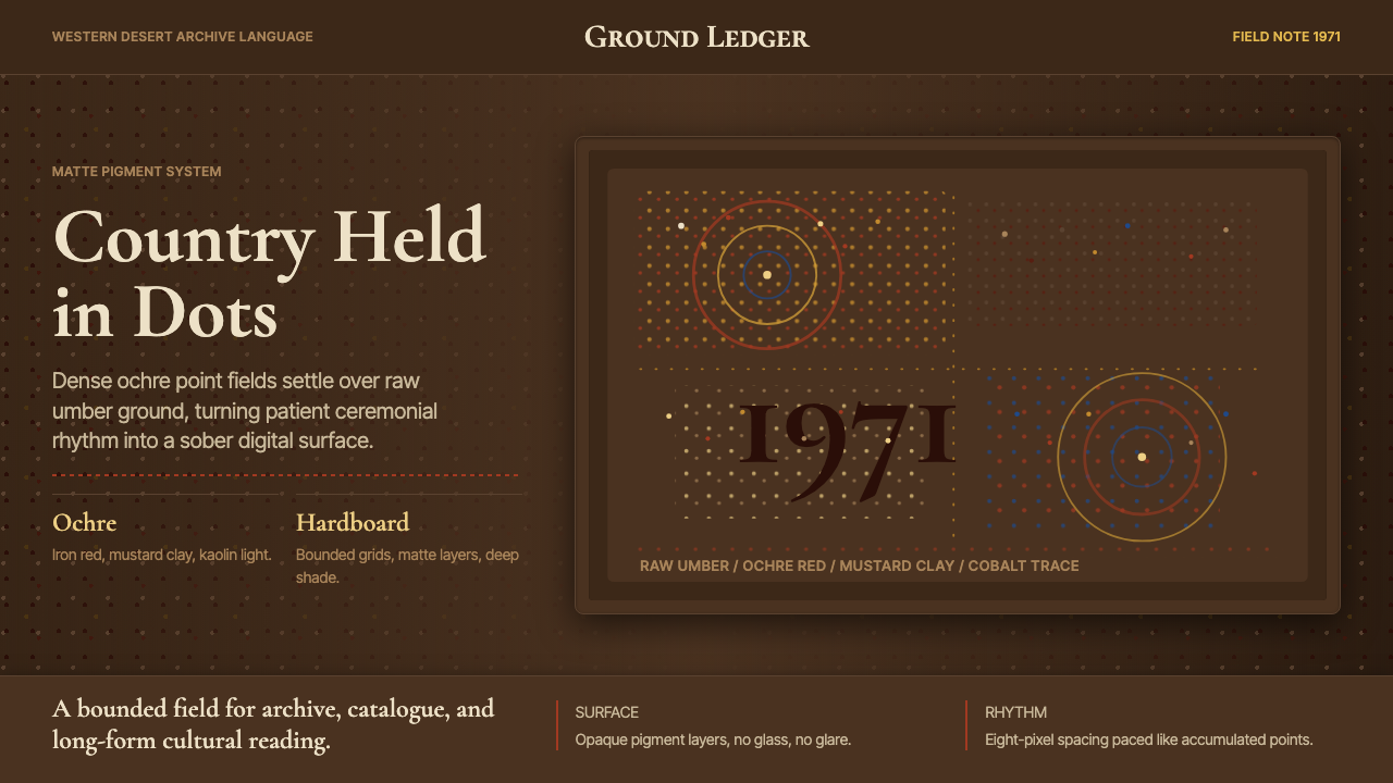 Aboriginal Dot Painting (Papunya 1971)Ochre memory, held steady. Raw umber ground, Cormorant type, disciplined dot-…赭石记忆沉稳留存:生赭黑地、Cormorant 字体与克制点阵。
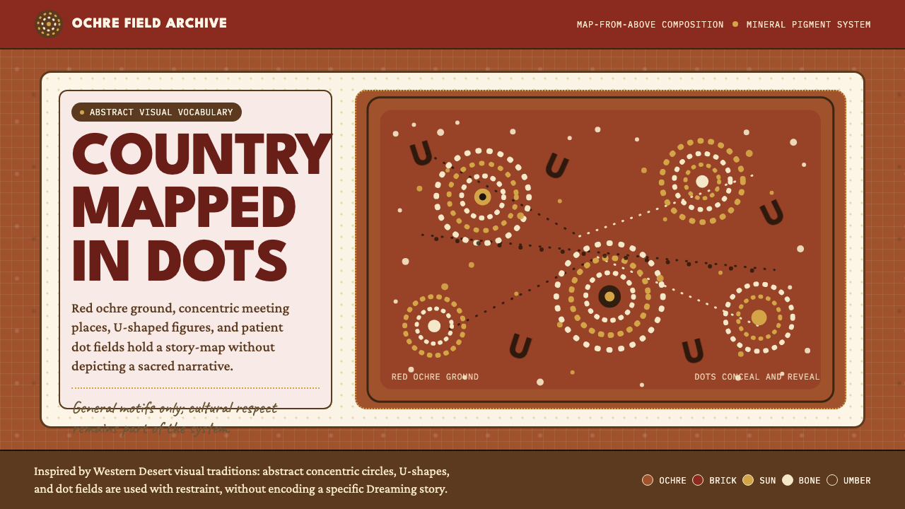 Aboriginal Dot PaintingAncient story-map energy. Red ochre, bone dots, concentric circles, and U-mar…古老故事地图感:红赭底、骨白点、同心圆与 U 形构成大地。
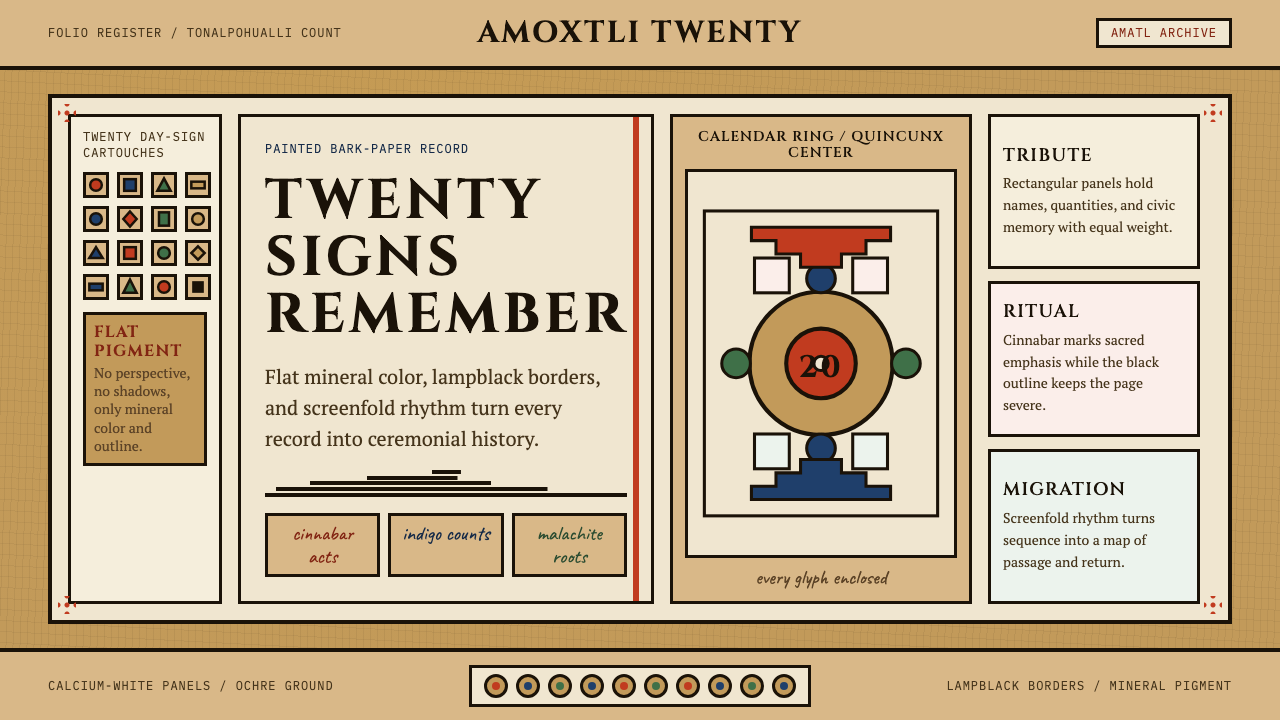 Aztec CodexSacred records stay severe. Ochre amatl ground, Cinzel capitals, black cartou…神圣记录保持庄严。赭黄纸底、Cinzel 大写与黑色匣框。
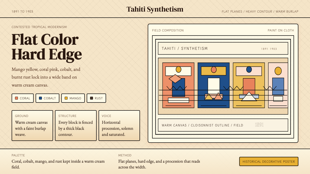 Gauguin — Tahiti SynthetismFlat color, hard edge. Cream canvas, coral, cobalt, and rust lock into a frie…平涂硬边。奶油底上珊瑚、钴蓝与焦土红排成壁带。
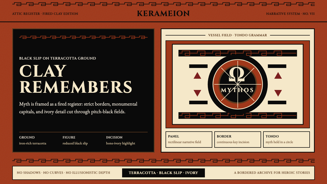 Greek Antiquity (Attic Vase)Myth becomes architecture. Terracotta, black slip, and Greek-key borders fram…神话化为建筑:赤陶、黑釉与希腊回纹框住叙事。
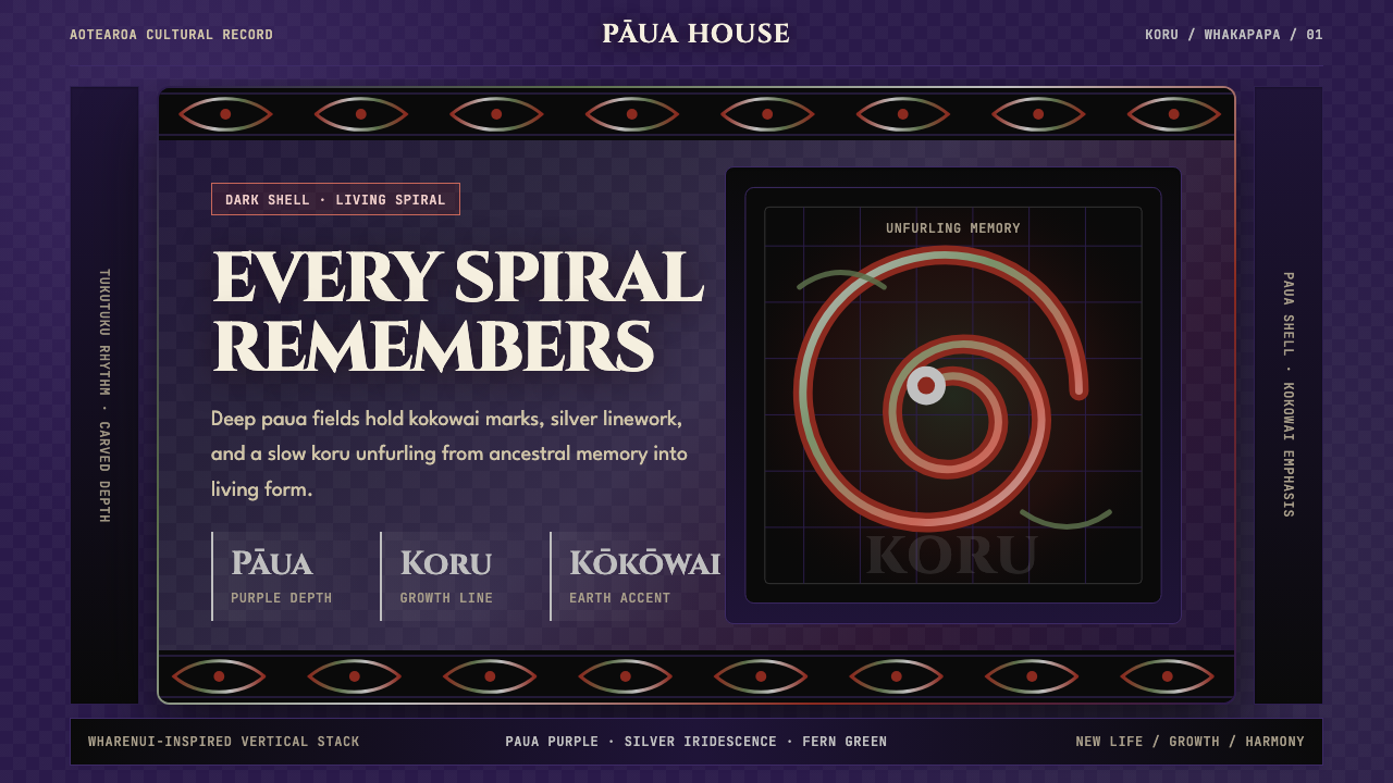 Māori Koru (Aotearoa)Ancestry glows in the dark. Paua purple, kokowai red, and silver koru frame t…黑暗中祖脉发光:鲍紫、赭红与银色科鲁框住纵向层叠。