Design style guide设计风格指南
What is Levantine Keffiyeh Black & White?什么是 Levantine Keffiyeh Black & White?
The Palestinian keffiyeh transforms a hand-woven cotton textile — fishnet lattice, olive-branch borders, trade-route motifs — into a design language built on political weight, geometric discipline, and unbleached restraint.巴勒斯坦库菲耶将一块手工编织的棉质纺织品——渔网格纹、橄榄枝边饰、贸易路线图案——转化为一套建立在政治分量、几何克制与未漂白节制之上的设计语言。
Levantine Keffiyeh Black & White in briefLevantine Keffiyeh Black & White 速览
The Levantine Keffiyeh Black & White design system takes its entire visual logic from one of the world's most politically charged textiles: the Palestinian keffiyeh, a black-and-white cotton headscarf hand-woven in Hebron whose fishnet lattice, olive-branch borders, and trade-route chain motifs have carried decades of solidarity, resistance, and cultural identity. Where most historical styles abstract their source into generic ornament, this system insists on legibility — every pattern element remains traceable to the original cloth.黎凡特库菲耶黑白设计系统从世界上政治含义最浓厚的纺织品中汲取全部视觉逻辑:巴勒斯坦库菲耶——一块在希伯伦手工编织的黑白棉质头巾,其渔网格纹、橄榄枝边饰和贸易路线链式图案承载了数十年的团结、抵抗与文化认同。大多数历史风格会将其来源抽象为通用装饰,而这套系统坚持可读性——每一个图案元素都可追溯至原始织物。
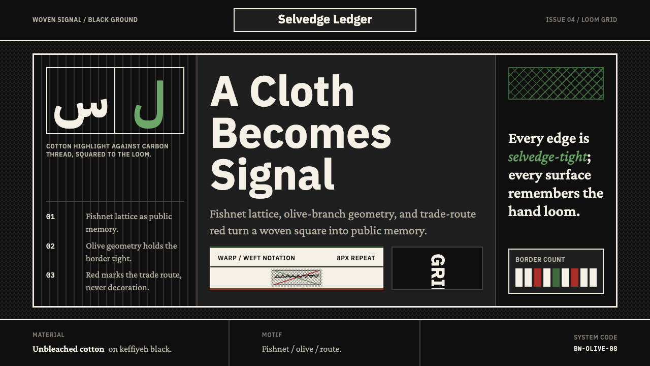
At its core, the style operates in a binary: deep, full black against unbleached cotton white. There is no softening gray ramp, no warm neutral midtone that would dilute the contrast. The fishnet lattice — the open diamond grid that gives the keffiyeh its woven texture — functions here as a structural ground layer, applied at low opacity so it reads as surface rather than decoration. Olive-branch chain motifs become dividers, section breaks, and ruling elements. The geometry is square-built throughout, honoring the orthogonal logic of a hand-loom grid where every thread crosses at a right angle.在核心层面,这种风格运作于二元对立之间:深邃的纯黑与未漂白的棉白相对。没有柔化的灰色渐进层次,没有会稀释对比度的温暖中性色调。渔网格纹——赋予库菲耶编织质感的开放菱形网格——在这里作为结构性底层运作,以极低透明度铺陈,使其呈现为肌理而非装饰。橄榄枝链式图案成为分隔线、章节断点与标尺元素。几何形态自始至终保持方正,呼应手工织机网格的正交逻辑——每一根线都以直角相交。
The system carries an optional third accent derived from the trade-route variant of the keffiyeh, where a restrained olive green or a muted Palestinian red replaces pure white as the highlight tone. These accents appear sparingly — a single call-to-action, a status indicator, a highlighted row — and are never deployed simultaneously. The aesthetic discipline of the keffiyeh itself enforces the restraint: the original cloth uses pattern variation, not color multiplication, to create visual complexity.该系统有一个可选的第三强调色,源自库菲耶的贸易路线变体——在那种变体中,克制的橄榄绿或低饱和的巴勒斯坦红取代纯白成为高光色调。这些强调色出现得极为节制——一个行动号召按钮、一个状态指示、一行高亮——且绝不同时并用。库菲耶本身的美学纪律强制了这种克制:原始织物依靠图案变化而非色彩叠加来制造视觉复杂度。
See the Levantine Keffiyeh Black & White design system →查看 Levantine Keffiyeh Black & White 完整设计系统 →
Where does Levantine Keffiyeh Black & White come from?Levantine Keffiyeh Black & White 从何而来?
The keffiyeh has been worn across the Greater Levant — Palestine, Jordan, Iraq, Syria — for centuries as practical headwear: protection against sun, sand, and cold. The specific black-and-white pattern that defines this design system crystallized in the early twentieth century around the villages and textile workshops of Hebron, known in Arabic as al-Khalil. The Hirbawi Textile Factory, founded by Yasser Hirbawi and later continued by his son Izzat Hirbawi, became the last operational keffiyeh loom in Palestine — a living artifact of a craft tradition that industrialization and conflict nearly extinguished.数百年来,库菲耶作为实用头饰在大黎凡特地区广泛穿戴——巴勒斯坦、约旦、伊拉克、叙利亚——用于遮挡阳光、风沙与寒冷。定义这套设计系统的特定黑白图案,在二十世纪初于希伯伦(阿拉伯语称哈利勒)周边的村庄与纺织作坊中逐渐成型。由亚瑟·希尔巴维创办、后由其子伊扎特·希尔巴维继承的希尔巴维纺织厂,成为巴勒斯坦最后一台仍在运转的库菲耶织机——一件工业化与战乱几乎令其灭绝的手工艺传统的活态文物。
The keffiyeh's transformation into a political symbol accelerated during the 1936 Arab Revolt, when Palestinian peasants adopted the black-and-white checkered headscarf as a marker of solidarity and resistance — one that could not be confiscated like a flag or a pamphlet. After 1948, the scarf traveled with the Palestinian diaspora, and by the 1960s it had become the signature item of the fedayeen, the Palestinian guerrilla fighters whose visual identity was photographed and broadcast worldwide. Yasser Arafat, who led the Palestine Liberation Organization for decades, made the keffiyeh draped in a specific triangular fold over the right shoulder into a personal emblem recognized internationally.库菲耶转变为政治符号的过程在1936年阿拉伯起义期间加速——巴勒斯坦农民采用黑白格纹头巾作为团结与抵抗的标志,它不像旗帜或传单那样容易被没收。1948年后,这条头巾随巴勒斯坦离散群体流散各地;到1960年代,它已成为费达因(巴勒斯坦游击队)的标志性装束,后者的视觉形象被摄影记录并传播至全球。领导巴解组织数十年的亚瑟·阿拉法特,将库菲耶以特定三角形折叠法披覆右肩的方式,变成了一个举世公认的个人象征。
Leila Khaled, the Palestinian activist and PFLP member photographed holding a Kalashnikov in 1969, wore the keffiyeh in images that circulated globally through the 1970s and became touchstones for the Left's adoption of Palestinian solidarity iconography. By the 1980s and 1990s, the keffiyeh had migrated far beyond its geographic and political origins: it appeared on European student protestors, American anti-war demonstrators, and eventually in mainstream fashion. Each wave of adoption introduced new readings — solidarity symbol, anti-establishment marker, fashion accessory — while the original Hebron-woven cloth continued its contested, politically charged existence.1969年,巴勒斯坦活动人士、解放巴勒斯坦人民阵线成员莱拉·哈立德手持卡拉什尼科夫步枪的照片在全球流传,她在照片中佩戴库菲耶的形象贯穿整个1970年代,成为左翼采用巴勒斯坦团结图像学的标志性时刻。到1980至90年代,库菲耶已远远超出其地理与政治起源:它出现在欧洲学生抗议者、美国反战示威者身上,最终进入主流时尚。每一波挪用都带入新的解读——团结符号、反建制标记、时尚配饰——而原始的希伯伦手工织物则在争议不断、政治色彩浓厚的处境中延续至今。
The keffiyeh-as-solidarity moment intensified again from the 2010s onward, particularly in the context of the Boycott, Divestment and Sanctions movement and renewed international attention to the Palestinian situation. The Hirbawi factory, which had nearly closed due to competition from Chinese-manufactured imitations, became a focus of conscious-consumer campaigns. For designers engaging with this visual system, the origin is not background context — it is structural information. The pattern's political legibility is inseparable from its aesthetic identity. Using it without that awareness produces work that is aesthetically coherent but historically illiterate.库菲耶作为团结符号的热潮从2010年代起再度升温,尤其是在抵制、撤资和制裁运动以及国际社会对巴勒斯坦局势重新关注的背景下。因中国仿制品竞争而几近关闭的希尔巴维工厂,成为有意识消费运动的焦点。对于运用这套视觉系统的设计师而言,这段起源并非背景信息——它是结构性信息。图案的政治可读性与其美学特性密不可分。在缺乏这种认知的情况下使用它,只会产生美学上连贯但历史上无知的作品。
What defines the Levantine Keffiyeh Black & White look?Levantine Keffiyeh Black & White 的视觉特征是什么?
Binary Palette二元色板
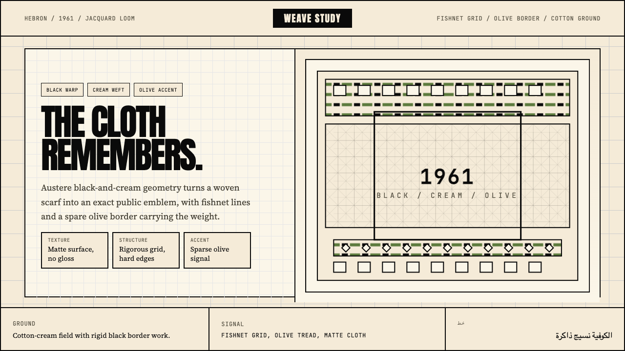
The foundational palette is an uncompromised pairing of deep black and unbleached cotton white — not pure optical white, but the warm, slightly cream tone of undyed cotton fiber. This distinction matters: the warmth of the cotton ground prevents the high-contrast palette from reading as sterile or clinical. Everything else — texture, pattern, depth — is produced through layering within this binary, not through additional hues.基础色板是深黑与未漂白棉白的毫不妥协配对——不是纯粹的光学白,而是未染色棉纤维的温暖、略带奶油感的色调。这一区别至关重要:棉布底色的温度防止高对比度色板被解读为无菌或临床感。其余一切——质感、图案、深度——都通过在这一二元体系内的叠压来产生,而非借助额外色相。
Fishnet Lattice Ground渔网格纹底层
The open diamond lattice woven into the keffiyeh functions in this system as a structural texture applied beneath content layers. At very low opacity it reads as surface grain — the visual equivalent of feeling a woven cloth. At higher opacity it becomes an explicit decorative field. The key discipline is never allowing the lattice to compete with content; it exists to make surfaces feel material, not to demand attention.编织进库菲耶的开放菱形格纹在这套系统中作为结构性肌理,铺陈于内容层之下。以极低透明度呈现时,它读作表面颗粒感——相当于触摸织物时的视觉等价物。以较高透明度呈现时,它成为明确的装饰性区域。关键的纪律是绝不让格纹与内容争抢注意力:它的存在是为了让表面感觉有材质,而非要求被关注。
Olive-Branch Dividers橄榄枝分隔
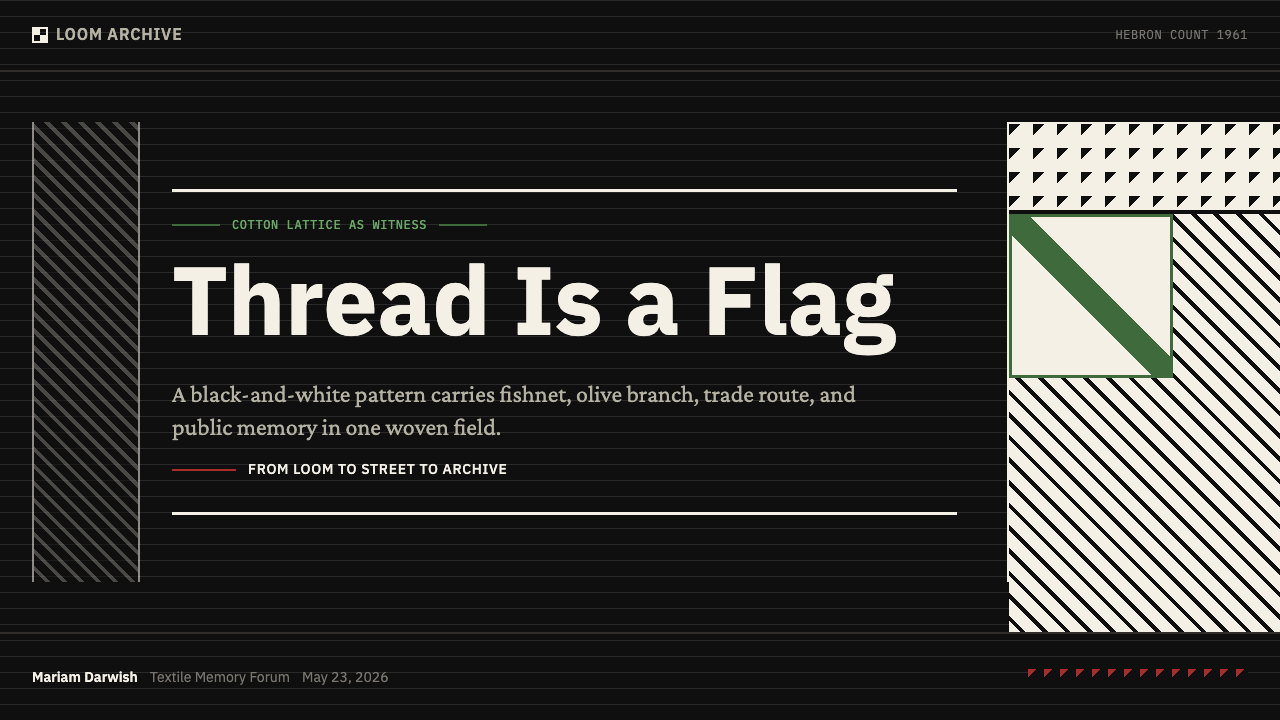
The olive-branch border motif that runs along the keffiyeh's selvedge edge becomes, in interface and layout work, a primary structural divider. Rendered as a continuous chain pattern in fine line weight, it separates sections, marks hierarchy breaks, and functions as a ruled line that carries symbolic freight. The motif should be used sparingly — as a section separator or a single decorative rule — never tiled as background fill.沿库菲耶布边延伸的橄榄枝边饰图案,在界面与版面工作中成为主要的结构性分隔元素。以细线重量渲染为连续链式图案,它分隔章节、标记层级断点,并作为承载象征意义的标尺线条发挥作用。该图案应节制使用——作为章节分隔或单一装饰线——绝不平铺作背景填充。
Square Grid Geometry方形网格几何
Every compositional decision in this system defers to the orthogonal logic of the hand-loom grid. Layouts are built on square or near-square modules. Rounded corners are excluded — the selvedge edge of a woven cloth is perfectly straight. Data visualizations, cards, containers, and image crops all share this hard-edged, right-angled geometry. The effect is one of structural inevitability: nothing feels arbitrarily placed.这套系统中的每一个构图决定都服从于手工织机网格的正交逻辑。版面建立在方形或近方形模块之上。圆角被排除——手工织物的布边是完全笔直的。数据可视化、卡片、容器与图像裁切共享这种硬边、直角的几何形态。效果是一种结构上的必然感:没有任何东西感觉是随意放置的。
Selvedge-Tight Edges布边紧实的边缘
Where most contemporary styles allow generous bleed and visual breathing room at margins, the keffiyeh system draws inspiration from the tight selvedge edge of the woven cloth — the finished border where threads are locked in. In practice, this translates to confident, close-cropped compositions where content reaches near to the container boundary. Negative space is used precisely and intentionally, not as ambient air.当大多数当代风格在边距处允许充裕的出血与视觉呼吸空间时,库菲耶系统从织物紧实的布边中汲取灵感——那条线头被锁定的成品边界。在实践中,这转化为自信、紧凑的构图,内容延伸至接近容器边界。留白被精确而有意地使用,而非作为环境空气。
Trade-Route Accent贸易路线强调色
The classic black-and-white keffiyeh has a less common variant that introduces a third color — a muted olive green or a Palestinian red — representing the dye colors of the trade routes that historically connected the Levant to broader Mediterranean and Arabian networks. In this design system, one of these tones may be introduced as a single accent for interactive states, calls to action, or alert conditions. The accent is always singular: olive green and red never appear together.经典的黑白库菲耶有一种不那么常见的变体,引入了第三种颜色——低饱和的橄榄绿或巴勒斯坦红——代表历史上连接黎凡特与更广阔地中海和阿拉伯贸易网络的染料色彩。在这套设计系统中,其中一种色调可以作为单一强调色引入,用于交互状态、行动号召或警示条件。强调色始终是单一的:橄榄绿与红色绝不同时出现。
Woven Surface Quality织物表面质感
The overarching sensory register of the system is textile rather than digital. Surfaces should feel woven — achieved through the lattice ground texture, through avoiding smooth gradient fills, and through favoring slightly irregular or hand-cut visual rhythms over mechanically perfect repetition. This quality distinguishes the style from purely geometric black-and-white systems that read as corporate or clinical. The imperfection is intentional: it is the signature of the hand-loom.这套系统总体上的感官基调是纺织品而非数字化的。表面应该感觉像是被编织的——通过格纹底层纹理、通过避免光滑渐变填充、通过偏爱略带不规则或手工剪切的视觉节奏而非机械完美重复来实现。这种品质使该风格区别于纯几何黑白系统——后者往往被解读为企业或临床感。不完美是有意为之的:它是手工织机的签名。

See the Levantine Keffiyeh Black & White design system →查看 Levantine Keffiyeh Black & White 完整设计系统 →
Who shaped Levantine Keffiyeh Black & White?谁塑造了 Levantine Keffiyeh Black & White?
Yasser Hirbawi founded the Hirbawi Textile Factory in Hebron, which became the last Palestinian-owned keffiyeh manufacturer still using traditional looms. His son Izzat continued the operation after Yasser's death, maintaining hand-loom production in the face of severe competition from mass-manufactured imitations, particularly those produced cheaply in China from the 1990s onward. The Hirbawi family's factory is both the material source of the authentic pattern and a symbol of Palestinian artisanal survival — it represents the specific woven geometry that this design system directly translates.亚瑟·希尔巴维在希伯伦创办了希尔巴维纺织厂,这里后来成为仍在使用传统织机的最后一家巴勒斯坦库菲耶制造商。亚瑟去世后,其子伊扎特继续经营,在来自大规模仿制品(尤其是1990年代起中国廉价生产品)的激烈竞争中坚持手工织机生产。希尔巴维家族的工厂既是正宗图案的物质来源,也是巴勒斯坦手工艺存续的象征——它代表了这套设计系统直接转化的特定编织几何形态。
As chairman of the Palestine Liberation Organization from 1969 until his death in 2004, Arafat made the keffiyeh — draped in a triangular fold over his right shoulder and pinned to suggest the shape of historic Palestine — into one of the most recognizable political garments of the twentieth century. His consistent wearing of the black-and-white pattern at every international forum, from the United Nations General Assembly to the Oslo Accords signing, transformed the textile from regional headwear into a global diplomatic symbol. For designers working with this system, Arafat's visual identity demonstrates how a single textile pattern can function as a complete communications strategy.作为1969年至2004年去世期间巴勒斯坦解放组织的主席,阿拉法特将库菲耶——以三角形折叠法披覆右肩、别针固定以暗示历史上巴勒斯坦的轮廓——变成了二十世纪最具辨识度的政治服装之一。他在每一个国际场合——从联合国大会到奥斯陆协议签署——始终穿戴黑白图案,将这块纺织品从地区性头饰转化为全球外交符号。对于运用这套系统的设计师而言,阿拉法特的视觉形象展示了单一纺织图案如何能够作为完整的传播策略运作。
Photographed in 1969 by Eddie Adams's colleague Leroy Griffith, Khaled became one of the most visually circulated women in 1970s political photography. Her image — keffiyeh-draped, with a rifle — was reproduced on posters across Europe, the Middle East, and Latin America, cementing the keffiyeh's association with resistance movements globally and accelerating its adoption by left-wing solidarity movements far outside the Arab world. From a design-history perspective, Khaled's image marks the moment the keffiyeh pattern became an international graphic symbol, detaching from its textile origin to function as pure visual shorthand.1969年,哈立德被摄影师拍下身披库菲耶、手持步枪的形象,成为1970年代政治摄影中传播最广的女性形象之一。她的照片被复制到欧洲、中东和拉丁美洲各地的海报上,在全球范围内巩固了库菲耶与抵抗运动的关联,并加速了其在阿拉伯世界以外的左翼团结运动中的采用。从设计史的角度看,哈立德的形象标志着库菲耶图案成为国际图形符号的时刻——它从纺织品起源中脱离出来,作为纯粹的视觉速记运作。
The collective decision during the 1936 Arab Revolt in Mandatory Palestine for urban Palestinian men to adopt the keffiyeh — previously rural headwear — as a mark of solidarity and as camouflage (making it harder for British authorities to identify urban organizers among peasant crowds) was a decisive moment in the textile's political biography. This strategic adoption transformed the keffiyeh from a class marker into a cross-class solidarity symbol, and established the pattern's association with organized resistance that persisted through every subsequent generation. The 1936 moment is the direct historical ancestor of the contemporary design system's political charge.1936年巴勒斯坦委任统治地阿拉伯起义期间,巴勒斯坦城市男性集体决定采用库菲耶(此前为农村头饰)作为团结标志,同时也作为伪装(使英国当局更难在农民人群中辨认城市组织者)——这是这块纺织品政治传记中的决定性时刻。这一战略性挪用将库菲耶从阶级标志转变为跨阶级的团结符号,并确立了图案与有组织抵抗的关联,这种关联在此后每一代人中持续存在。1936年这一时刻是当代设计系统政治张力的直接历史先祖。
How do you use Levantine Keffiyeh Black & White today?今天怎么用 Levantine Keffiyeh Black & White?
The Levantine Keffiyeh Black & White system is built for contexts where strength of conviction, cultural depth, and visual authority matter more than approachability or warmth. Before applying it, a practitioner must sit with the question of intent: the pattern carries political meaning that is actively contested. Applied thoughtlessly, it reads as appropriation; applied with awareness and purpose — in solidarity contexts, cultural editorial, documentary work, or explicitly political communication — it can be among the most powerful visual systems available.黎凡特库菲耶黑白系统为那些信念力量、文化深度与视觉权威比亲和力或温暖感更重要的场景而生。在应用它之前,实践者必须认真面对意图这一问题:这个图案携带着正在被积极争议的政治意义。未经思考地使用,它会被解读为文化挪用;在充分认知与明确目的下使用——在团结语境、文化编辑、纪录片工作或明确政治传播中——它可以成为最强大的视觉系统之一。
For presentation slides, the system performs best on high-stakes cover pages and section dividers where the binary drama of deep black against cotton white can be fully deployed. A cover built on this system should use one large structural element — a wide horizontal band of lattice texture, an olive-branch rule running the full slide width — as the compositional anchor. The title sits in bold, uppercase type with generous tracking; no decorative borders compete with the pattern elements. Content slides should strip back to near-white grounds with black type and the lattice texture dialed to near-invisible: let the cover's visual power carry forward as memory, not as constant repetition.对于演示文稿幻灯片,这套系统在高风险的封面页与章节分隔页上表现最佳——在那里,深黑与棉白之间的二元戏剧可以被充分展开。建立在这套系统上的封面应使用一个大型结构性元素——一条宽大的横向格纹纹理带,或一条贯穿全幻灯片宽度的橄榄枝标尺线——作为构图锚点。标题以粗体、大写字体呈现,配以充裕的字距;没有装饰边框与图案元素竞争。内容页应退回至接近白色的底面搭配黑色文字,格纹纹理调至近乎不可见:让封面的视觉力量作为记忆延续,而非持续重复。
For web dashboards and data-heavy interfaces, the system offers a disciplined alternative to the generic light-gray-and-blue that dominates enterprise software. The binary palette maps cleanly to state differentiation: active rows use the cotton-white ground, inactive or empty states use a near-black field with reversed type. Data tables and charts built on the square-grid module system maintain the orthogonal rigidity that makes the style recognizable. A single trade-route accent — olive green for positive indicators, muted red for alerts — provides the semantic color layer without diluting the system's stark identity. Pricing pages benefit from the style's poster-like authority: a full-width hero in deep black with white headline type, a lattice-texture section break, then a clean white comparison table below.对于网页仪表板和数据密集型界面,这套系统提供了一个对企业软件中普遍存在的通用浅灰蓝色方案的纪律性替代。二元色板清晰地映射到状态区分:活跃行使用棉白底面,非活跃或空状态使用接近黑色的底面配以反白文字。建立在方形网格模块系统上的数据表格与图表保持了使风格具有辨识度的正交严格性。单一的贸易路线强调色——橄榄绿用于正向指示器,低饱和红用于警示——提供语义色彩层,而不稀释系统的清冷身份。定价页面受益于这种风格的海报式权威感:全宽深黑英雄区配以白色标题字体,格纹纹理章节分隔,下方是干净的白色对比表格。
For editorial and marketing work — particularly in publishing, documentary, or cultural journalism — the system lends gravitas and historical resonance to layouts that need to feel considered rather than produced. An article layout in this system uses a narrow primary text column with wide margins reserved for pull quotes set in high-contrast reversed type (white on black). Section headers appear as olive-branch-ruled breaks. Photography, when used, should be treated with high-contrast processing that flattens tonal range — mid-tones compressed, highlights pulled toward cotton white, shadows toward full black — so images feel continuous with the typographic field rather than interrupting it.对于编辑与营销工作——尤其是出版、纪录片或文化新闻领域——这套系统为需要显得经过深思熟虑而非简单生产的版面赋予庄重感与历史共鸣。这套系统中的文章版面使用窄幅主文字列,宽边距保留给以高对比度反白排版(黑底白字)的引文。章节标题以橄榄枝标尺断点呈现。使用摄影时,应进行高对比度处理——压缩中间调、将高光拉向棉白、将暗部推向纯黑——使图像与排版场感觉连续,而非打断它。
The most common mistake when applying this system is deploying the lattice texture at high opacity as a background fill across large surface areas. At full opacity, the lattice competes with every element placed over it, destroying the hierarchy the system depends on. The second common mistake is treating the black-and-white palette as license for theatrical high-contrast without restraint — stacking bold reversed type over lattice-textured dark panels while also using both accent colors simultaneously. Authentic application of this system requires the same discipline as the original textile: pattern variation, not pattern saturation. One structural element at a time. Silence is where the weight lives.应用这套系统时最常见的错误是在大面积底面上以高透明度部署格纹纹理作为背景填充。以满透明度呈现时,格纹与置于其上的每个元素竞争,破坏了系统所依赖的层级。第二个常见错误是将黑白色板理解为不加克制地使用戏剧性高对比度的许可——在格纹纹理深色面板上叠加粗体反白文字的同时,又同时使用两种强调色。正宗地应用这套系统需要与原始纺织品同等的纪律:图案变化,而非图案饱和。每次只有一个结构性元素。沉默是重量所在之处。
See the Levantine Keffiyeh Black & White design system →查看 Levantine Keffiyeh Black & White 完整设计系统 →
Levantine Keffiyeh Black & White — FAQLevantine Keffiyeh Black & White · 常见问题
Is it appropriate to use the keffiyeh pattern in commercial design?在商业设计中使用库菲耶图案是否合适?
This is genuinely contested territory. The keffiyeh pattern has been adopted by fashion brands, streetwear labels, and commercial designers — and has drawn criticism each time for reducing a politically charged symbol to aesthetic merchandise. The more thoughtful approach is to treat this system as suitable for contexts where the pattern's political and cultural weight is acknowledged and engaged rather than erased: documentary campaigns, solidarity branding, cultural publishing, editorial work. For purely decorative commercial applications where the origin is irrelevant, the aesthetic goals are usually better served by geometric black-and-white systems that carry no borrowed cultural freight.这是真正有争议的领域。库菲耶图案曾被时尚品牌、街头服饰厂牌和商业设计师采用——每次都因将政治含义浓厚的符号简化为美学商品而招致批评。更为周全的处理方式是将这套系统视为适用于那些图案的政治与文化重量被承认和回应而非被抹除的场景:纪录片运动、团结品牌、文化出版、编辑工作。对于起源无关紧要的纯装饰性商业应用,几何黑白系统——不携带任何借用的文化分量——通常能更好地服务于美学目标。
How does this system differ from other black-and-white geometric styles?这套系统与其他黑白几何风格有何不同?
The key distinction is texture and origin. Systems like Bauhaus or Swiss International Style use black and white as a neutral structural ground — the color relationship is about contrast and clarity, not cultural reference. The keffiyeh system introduces surface texture through the lattice motif and the olive-branch divider, both of which are recognizable as specific cultural artifacts. The result is a black-and-white system that reads as material and historically situated rather than universal and ahistorical. The warmth of the cotton-white ground is also different from the cool optical white of the Swiss tradition.关键区别在于质感与起源。包豪斯或瑞士国际主义风格等系统将黑白用作中性结构底色——色彩关系是关于对比与清晰度,而非文化指涉。库菲耶系统通过格纹图案与橄榄枝分隔元素引入表面质感,两者都作为特定文化人工制品而具有辨识度。结果是一套被解读为有材质感且历史定位明确的黑白系统,而非普世和去历史化的。棉白底色的温度也不同于瑞士传统中的冷光学白。
Can the system be used in a light-ground rather than dark-ground layout?这套系统能用在浅色底面而非深色底面的版面中吗?
Yes, and the light-ground version — cotton white as the primary field, deep black as type and structural elements — is arguably more versatile for sustained reading contexts like long-form editorial or documentation. The dark-ground version (deep black primary, white type) carries more visual weight and is better suited for cover pages, section breaks, and hero panels where impact takes priority over readability. The system should commit to one or the other within a given composition; mixing light and dark grounds works only when the transition is used as a deliberate structural signal, not as decoration.可以,浅色底面版本——棉白作为主要底面,深黑用于文字与结构元素——可以说对持续阅读场景(如长篇编辑内容或文档)更为通用。深色底面版本(深黑为主、白色文字)携带更大的视觉重量,更适合封面页、章节分隔与英雄面板——在那些场景中冲击力优先于可读性。在给定的构图中,系统应选定一种并坚持;浅深底面的混合只在过渡被用作蓄意结构信号而非装饰时才有效。
What kind of typefaces work with this system?什么样的字体与这套系统搭配?
The system's orthogonal, textile-inflected geometry calls for typefaces with strong structural clarity — extended sans-serif families with a range of weights from light to bold, where the letterforms feel constructed rather than drawn. Condensed weights work well for headlines alongside the lattice texture because they echo the vertical warp threads of the woven cloth. Arabic script, where used, should be chosen from modern geometric Arabic designs that share the system's orthogonal discipline rather than from calligraphic styles whose organic curves would read as contradictory. The key principle is that the typeface should feel like it belongs to the same structural logic as the pattern.这套系统的正交、纺织品感几何形态需要具有强烈结构清晰度的字体——具有从细到粗多种字重的扩展无衬线字族,其字形感觉是构建出来的而非描绘出来的。压缩字重在格纹纹理旁配合标题使用效果很好,因为它们呼应了织物中垂直经线的感觉。阿拉伯文字(如使用)应从现代几何阿拉伯设计中选取——它们共享这套系统的正交纪律——而非书法风格,书法的有机曲线会被解读为矛盾。关键原则是:字体应感觉与图案属于同一结构逻辑。
Does the political context of the keffiyeh make this system off-limits for non-Palestinian designers?库菲耶的政治背景是否使这套系统对非巴勒斯坦设计师不可用?
Cultural exclusivity is not the argument this design system makes. The keffiyeh has functioned as a global solidarity symbol for decades — it has been worn and used by people worldwide in explicit acts of political engagement. The question is not identity but intent and context. A non-Palestinian designer working on a solidarity campaign, a documentary publication, or cultural journalism is engaging with the system in the tradition of the keffiyeh's own political history. The same designer applying the pattern to a corporate brand identity for an unrelated business would be engaging in the kind of aesthetic extraction that the system's origin makes ethically uncomfortable. Knowing the difference matters more than national origin.这套设计系统并不主张文化排他性。库菲耶数十年来一直作为全球团结符号运作——世界各地的人们在明确的政治参与行为中佩戴和使用它。问题不是身份而是意图与语境。一位非巴勒斯坦设计师在团结运动、纪录片出版物或文化新闻工作中使用这套系统,是在库菲耶自身政治历史的传统中参与。同一位设计师若将这个图案应用于无关商业的企业品牌形象,则是在从事一种因系统起源而在伦理上令人不安的美学抽取。理解这一差别比国籍出身更重要。
Related design styles相关设计风格
 Palestinian Keffiyeh GridMemory in black and cream. Fishnet grid, olive border, and austere Anton type.黑白承载记忆。渔网格、橄榄边与峻厉标题字。
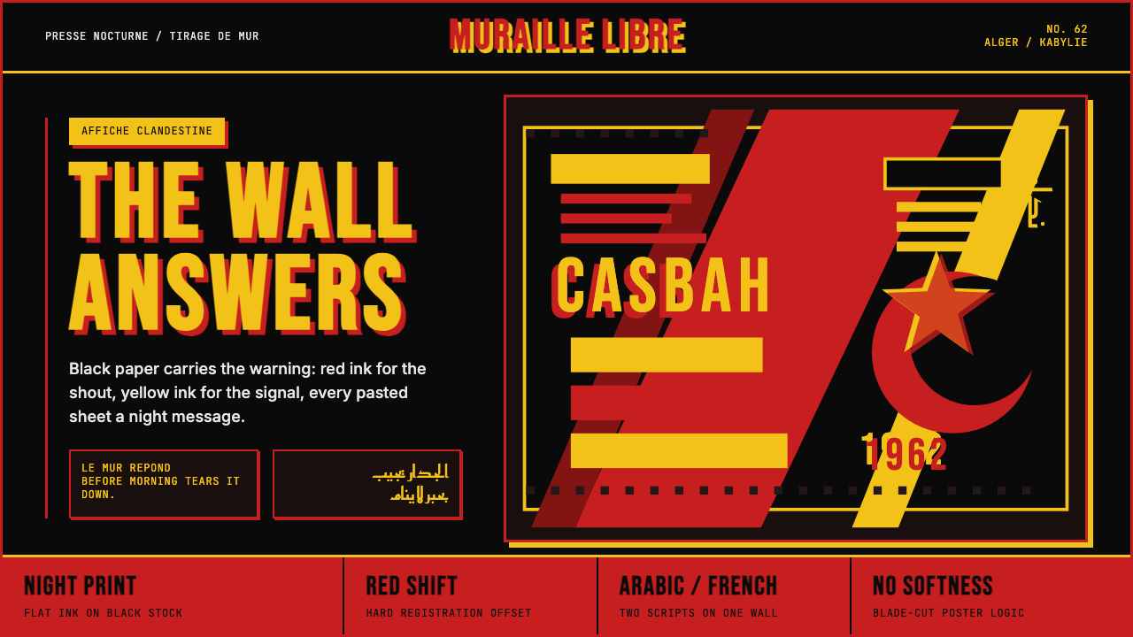 Algerian Casbah Poster (1954–1962)Every surface is a manifesto. Blood red, warning yellow, and stencil type hit…每个表面都是宣言:血红、警示黄与模板字撞上黑色新闻纸。
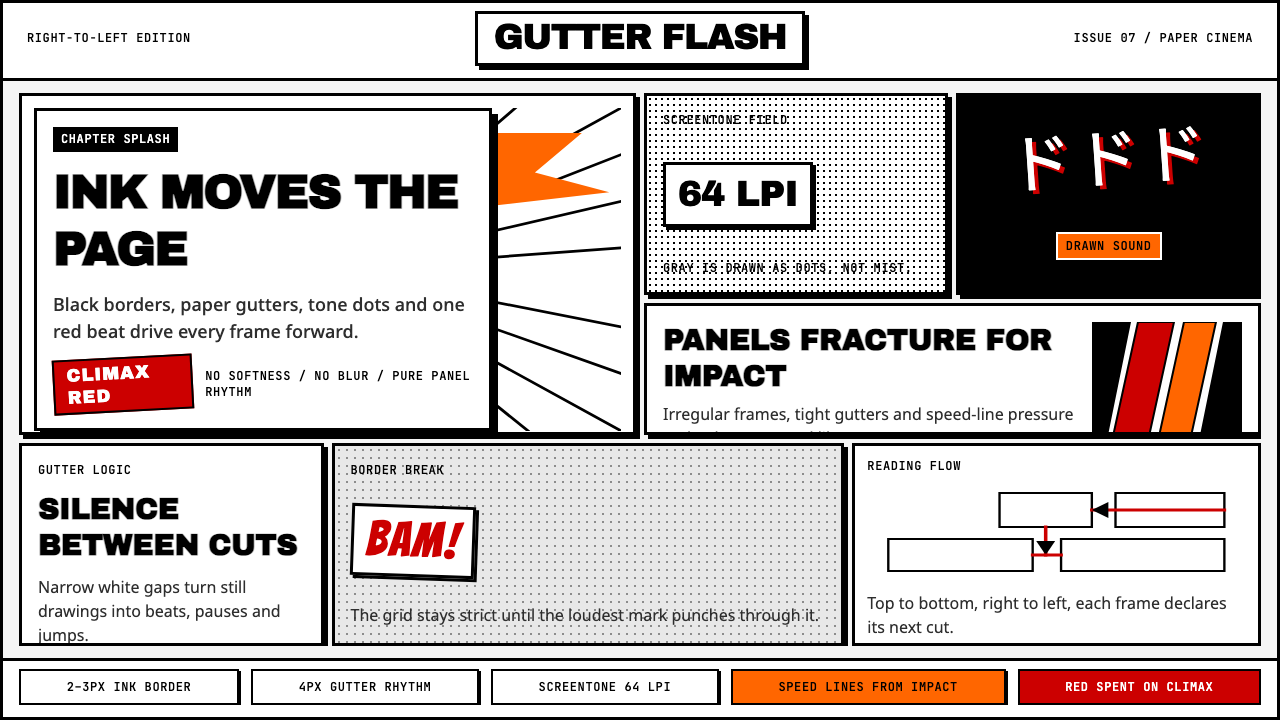 Manga Panel LayoutCinema in ink. Black panels, screentone dots, speed lines, and one red strike.墨线即电影:黑框、网点、速度线与一记少年红。
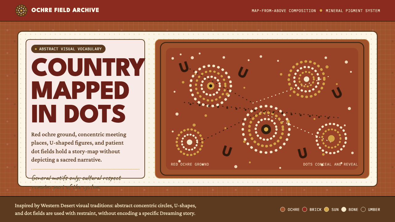 Aboriginal Dot PaintingAncient story-map energy. Red ochre, bone dots, concentric circles, and U-mar…古老故事地图感:红赭底、骨白点、同心圆与 U 形构成大地。
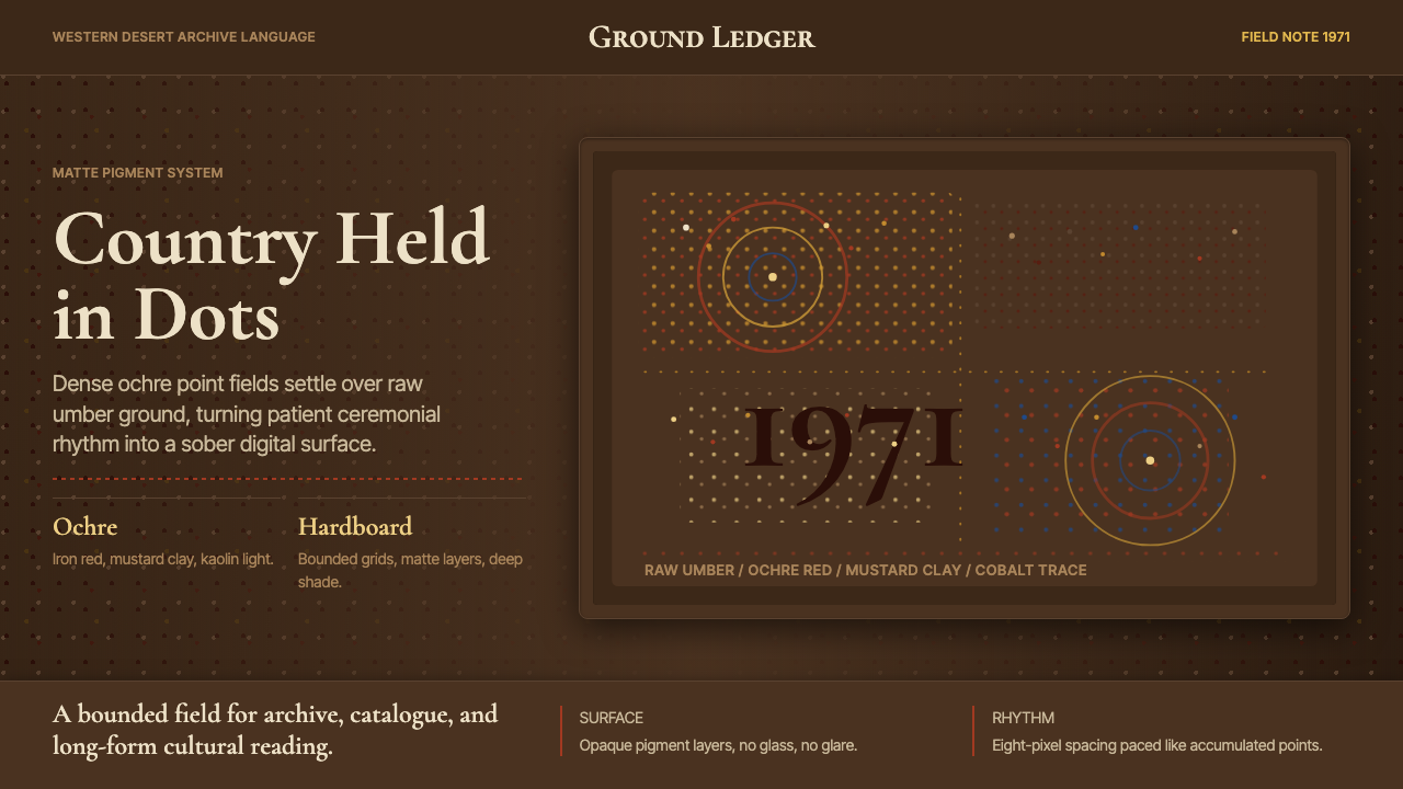 Aboriginal Dot Painting (Papunya 1971)Ochre memory, held steady. Raw umber ground, Cormorant type, disciplined dot-…赭石记忆沉稳留存:生赭黑地、Cormorant 字体与克制点阵。
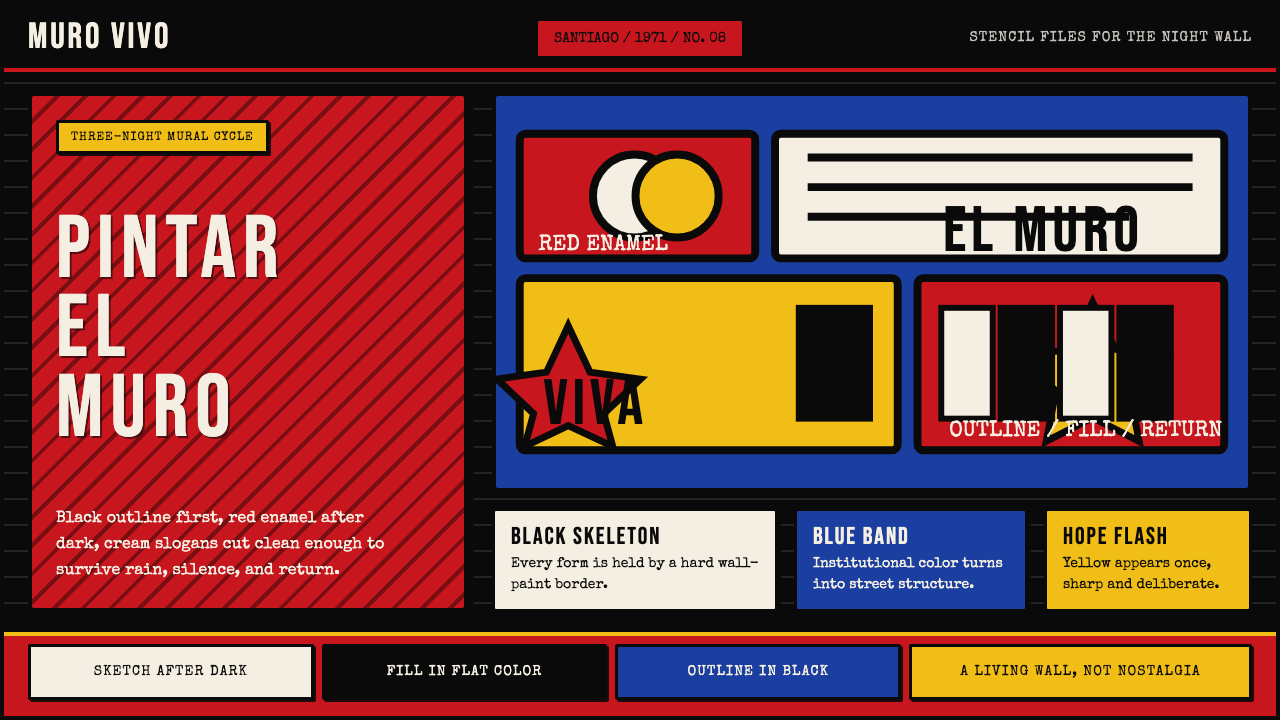 Chilean BRP Ramona Parra 1971Resistance stays alive. Blood red panels, black outlines, and stencil type re…抵抗仍在呼吸:血红墙面、粗黑轮廓与模板字重建街墙。