What is Palestinian Keffiyeh Grid?什么是 Palestinian Keffiyeh Grid?
The Palestinian keffiyeh encodes agricultural life, national identity, and resistance into a single woven cloth — and its rigorous two-color geometry translates with surprising fidelity into digital design.巴勒斯坦库菲耶将农耕生活、民族认同与抵抗精神编织进一块布中——其严谨的双色几何语言以惊人的忠实度转化为数字设计。
Palestinian Keffiyeh Grid in briefPalestinian Keffiyeh Grid 速览
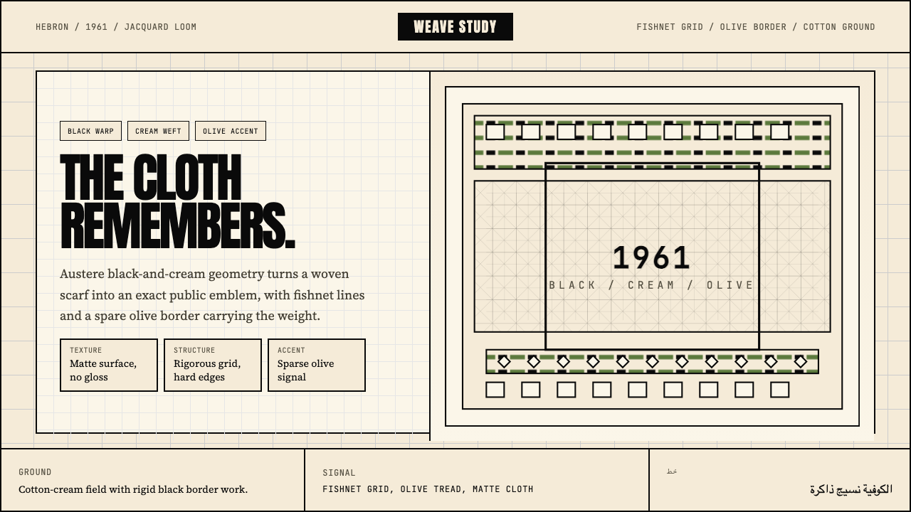
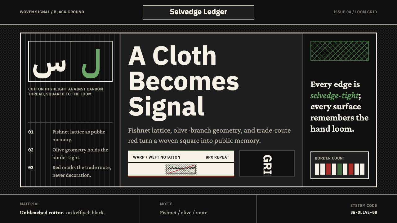
The Palestinian Keffiyeh Grid is a design system derived from the visual structure of the keffiyeh, a traditional Levantine headscarf whose black-and-white fishnet grid, olive-leaf vine border, and cotton-cream ground have become one of the most recognized textile-graphic identities in modern political-visual culture. The system translates this woven language into a digital vocabulary: rectilinear grids, cream-toned surfaces, austere black typography, and olive-green accents drawn directly from the scarf's iconic motifs.巴勒斯坦库菲耶网格是一套源自库菲耶视觉结构的设计系统。库菲耶是黎凡特地区的传统头巾,其黑白渔网格纹、橄榄叶藤蔓边饰与棉麻米色底布,已成为现代政治视觉文化中最具辨识度的纺织图形之一。该系统将这种织物语言转化为数字词汇:直线网格、米色调表面、肃穆的黑色字体,以及直接源自围巾标志性图案的橄榄绿点缀。
At its core, the style is built on rigorous two-color discipline. The dominant relationship is between deep black and cotton cream — not pure white, but the warm off-white of unbleached fabric — with olive green appearing as a restrained third voice. The fishnet grid pattern, rendered as a repeating orthogonal weave, gives backgrounds and dividers a structural texture that reads simultaneously as pattern and as grid. This is a design system that refuses decoration for its own sake: every visual element earns its place by carrying either structural or cultural weight.从本质上看,这种风格建立在严格的双色纪律之上。主导关系存在于深黑与棉布米色之间——不是纯白,而是未漂白织物的那种温暖米白——橄榄绿则以克制的第三声部出现。渔网格纹以重复的正交织纹形式呈现,赋予背景与分隔线一种结构性纹理,同时传达出图案感与网格感。这是一套拒绝为装饰而装饰的设计系统:每一个视觉元素都通过承载结构性或文化性的分量来赢得自己的位置。
Unlike purely historical revival styles, the Keffiyeh Grid carries inherent cultural meaning that practitioners should hold consciously. Using it well means understanding that the scarf's geometry is not abstract — it encodes a specific community, a specific geography, and a specific political history. Designs that adopt the aesthetic without acknowledging its origin risk what scholars of material culture call visual appropriation. When the context is appropriate, however, the system offers a vocabulary of remarkable visual force: spare, precise, politically serious, and rooted in one of the world's longest-surviving craft traditions.与纯粹的历史复兴风格不同,库菲耶网格本身携带着设计师应有意识地保持的文化含义。善用这种风格意味着理解:围巾的几何形并非抽象的——它编码了一个特定的群体、一片特定的地理,以及一段特定的政治历史。仅借用美学而不承认其来源的设计,有陷入物质文化学者所称的视觉挪用的风险。然而,当语境合适时,这套系统提供了一种具有非凡视觉力量的词汇:简练、精确、政治上严肃,根植于世界上延续时间最长的手工艺传统之一。
See the Palestinian Keffiyeh Grid design system查看 Palestinian Keffiyeh Grid 完整设计系统
Where does Palestinian Keffiyeh Grid come from?Palestinian Keffiyeh Grid 从何而来?
The keffiyeh as a generic form — a large square of woven cotton, folded diagonally and draped over the head — has existed across the Arab world and the broader Middle East for centuries. Its origins lie in practical agricultural necessity: the fabric shielded rural workers from sun, wind, and dust, and could be quickly reconfigured as a face covering, a bag, or a ground cloth. The specific black-and-white checked variant that became globally associated with Palestinian national identity developed in the Levant — the eastern Mediterranean coastal region encompassing present-day Palestine, Jordan, Lebanon, and Syria — during the early decades of the twentieth century.库菲耶作为一种通用形式——一块大型方形织物棉布,沿对角线折叠后披覆在头上——在阿拉伯世界和更广泛的中东地区已存在数百年。其起源在于实际的农业需要:织物保护农村劳动者免受阳光、风沙的侵袭,并可迅速改装为面罩、布袋或铺地布。那种在全球范围内与巴勒斯坦民族认同相关联的特定黑白格纹变体,在二十世纪初几十年间在黎凡特——涵盖今日巴勒斯坦、约旦、黎巴嫩和叙利亚的东地中海沿海地区——逐渐成形。
The scarf became a political garment during the Arab Revolt of 1936 to 1939, when Palestinian peasants rose against British Mandate rule. Fighters and villagers adopted the black-and-white keffiyeh both practically — as camouflage and face covering — and symbolically, as a marker of solidarity with the rural working class. The urban educated class, who typically wore the Turkish tarboush, were urged to switch to the keffiyeh as an act of national unity. By the end of the revolt, the scarf had been transformed from a regional peasant accessory into a symbol of Palestinian collective identity.在1936年至1939年的阿拉伯起义期间,这条围巾演变为政治性服饰。巴勒斯坦农民揭竿而起,反抗英国委任统治。战士与村民采用黑白库菲耶,既有实用目的——作为伪装和面罩——也有象征意义,作为与农村工人阶级团结的标志。通常佩戴土耳其费斯帽的城市知识阶层,被号召换上库菲耶,以示民族团结。到起义结束时,这条围巾已从地区性的农民配件转变为巴勒斯坦集体认同的象征。
The figure who most durably fused the keffiyeh with Palestinian political imagery on the world stage was Yasser Arafat, leader of the Palestine Liberation Organization from 1969 until his death in 2004. Arafat wore his keffiyeh folded in a distinctive way that mapped the shape of historical Palestine, a deliberate and photographically powerful choice that ensured the scarf appeared in thousands of news images over four decades. The Hirbawi Textile Factory in Hebron — founded by Yaser Hirbawi in 1961 — became and remains the last surviving Palestinian manufacturer of authentic keffiyehs, producing the scarves on mechanical looms whose patterns have not changed in over sixty years.将库菲耶与巴勒斯坦政治形象在世界舞台上最持久地融为一体的人物,是亚西尔·阿拉法特——他从1969年到2004年辞世,一直担任巴勒斯坦解放组织领导人。阿拉法特以一种独特的折叠方式佩戴库菲耶,使其形状映射出历史上巴勒斯坦的轮廓,这一刻意而具有摄影力量的选择确保了这条围巾在四十年间出现在数以千计的新闻图像中。位于希伯伦(哈利勒)的希尔巴维纺织厂——由亚瑟·希尔巴维于1961年创建——已成为并仍是巴勒斯坦最后一家正宗库菲耶制造商,在其上面的图案六十余年来从未改变的机械织机上生产着这些围巾。
The keffiyeh entered the vocabulary of international solidarity movements during the 1960s and 1970s, worn by activists in Europe, Latin America, and East Asia who associated it with anti-colonial struggle broadly. Textile scholar Shelagh Weir documented the scarf's pre-political embroidery and craft traditions extensively, situating it within the wider context of Palestinian material culture. Writer and activist Wafa Ghnaim has more recently brought the story of Palestinian women's embroidery — closely related to the keffiyeh's textile traditions — to global audiences, arguing that the textile arts are a form of historical record-keeping as much as aesthetic practice. It is from this layered history — agricultural origin, political transformation, global diaspora, ongoing craft survival — that the Keffiyeh Grid design system draws its visual and moral authority.库菲耶在1960至70年代进入国际团结运动的词汇体系,被欧洲、拉丁美洲和东亚的活动人士佩戴,他们将其与广义上的反殖民斗争相联系。纺织品学者谢拉·维尔对围巾的前政治刺绣与工艺传统进行了广泛记录,将其置于巴勒斯坦物质文化的更宏观语境中。作家兼活动人士瓦法·格纳姆近年来则将巴勒斯坦妇女刺绣的故事——与库菲耶纺织传统密切相关——带到了全球观众面前,她主张纺织艺术与其说是美学实践,不如说是一种历史记录方式。正是从这段层叠的历史中——农业起源、政治蜕变、全球离散、持续延续的手工艺——库菲耶网格设计系统汲取了其视觉与道义上的权威。
What defines the Palestinian Keffiyeh Grid look?Palestinian Keffiyeh Grid 的视觉特征是什么?
Color色彩
The palette is founded on a strict two-color relationship: deep black and cotton cream — a warm, slightly yellowed off-white that reads as the unbleached ground of the original textile, quite different from optical white. Olive green appears as a tertiary accent, drawn from the scarf's vine-border motif and representing the olive tree's centrality to Palestinian agricultural life. The palette communicates gravity and restraint; high-saturation or warm colors are absent by design. When olive is used for emphasis, it carries cultural specificity — it is not a generic accent green but a reference to a particular landscape.色板以严格的双色关系为基础:深黑与棉布米色——一种温暖、略微偏黄的米白,传达出原始织物未漂白底色的质感,与光学白截然不同。橄榄绿以第三级点缀色出现,源自围巾的藤蔓边饰图案,代表橄榄树在巴勒斯坦农耕生活中的核心地位。这套色板传递出庄重与克制;高饱和或暖色系的缺席是有意为之。当橄榄色用于强调时,它承载着文化特殊性——它不是通用的强调绿,而是对一片特定风景的指涉。
Grid and Fishnet Pattern网格与渔网纹
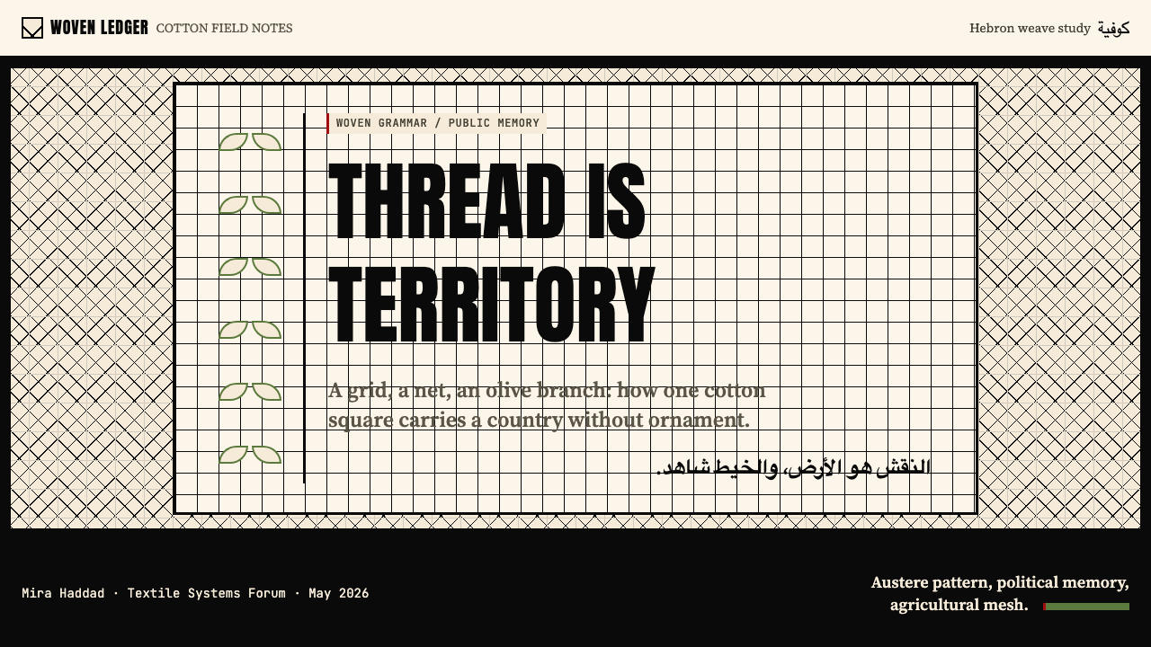
The defining structural element is the orthogonal fishnet grid — a pattern of fine black lines crossing at regular intervals against a cream ground, producing dense square cells that reference the woven structure of the textile directly. This pattern can operate at multiple scales: at fine scale it functions as a background texture; at medium scale it becomes a section divider or framing device; at large scale it reads as a bold geometric motif in its own right. The grid is never purely decorative — it always implies the underlying weave, the production logic of the original cloth.最具定义性的结构元素是正交渔网格——细密的黑色线条在米色底面上以规律间距交叉,形成密集的方形网格,直接参照纺织品的织造结构。这种图案可在多种尺度下运作:在精细尺度上作为背景纹理;在中等尺度上成为区段分隔符或框架装置;在大尺度上则作为独立的大胆几何母题。网格从不纯粹作为装饰出现——它始终暗示着底层的织物结构,暗示着原始布料的生产逻辑。
Typography字体排印
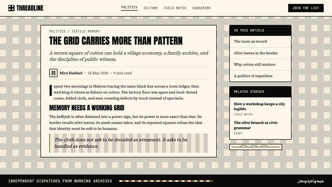
Type is set with austerity and weight. Headlines demand a strong, condensed form — something with the visual mass of a woodblock print, bold enough to hold its own against the dense fishnet pattern below. Body text recedes into the cream ground, set at a comfortable reading weight with generous leading. The combination produces a stark contrast between display and reading registers that echoes the keffiyeh's own visual logic: bold black lines on a light ground, nothing in between. Bilingual Arabic-Latin typography, when present, should be treated as a compositional equality rather than a primary-secondary hierarchy.排版以肃穆与分量为原则。标题需要强劲、紧缩的字形——那种具有木版印刷视觉重量的形态,足够粗重以在下方密集的渔网格纹中保持存在感。正文隐入米色底面,以舒适的阅读字重排列,行距宽裕。这种组合在展示层级与阅读层级之间制造了强烈对比,呼应着库菲耶自身的视觉逻辑:浅色底面上的粗黑线条,中间什么都没有。当双语阿拉伯文-拉丁文排版出现时,应当将两者作为构图上的平等对待,而非主次层级。
Border and Edge Motifs边饰与边缘图案
The keffiyeh's border is structurally distinct from its field: where the central zone is a uniform grid, the border is a running vine-and-leaf pattern — denser, more organic, marking the boundary between interior and exterior. In the design system, this logic translates to strong framing: thick borders, pronounced edge rules, and contained layout zones that signal their own boundaries clearly. Cards and panels carry visible borders rather than relying on shadow or background-color differentiation alone. The border is not decorative trim; it is structural enclosure.库菲耶的边饰在结构上与其中心区域截然不同:中央区域是均匀的网格,而边饰则是连续的藤蔓叶纹——更为密集,更具有机感,标示着内部与外部的边界。在设计系统中,这种逻辑转化为强劲的框架感:粗重的边框、显著的边缘线,以及能够清晰标示自身边界的封闭版面区域。卡片与面板带有可见边框,而非仅依赖阴影或背景色差来区分。边框不是装饰性的修饰——它是结构性的围合。
Geometry and Texture in Tension几何与纹理的张力
The Keffiyeh Grid sits at an unusual intersection: it is simultaneously rigidly geometric (the orthogonal grid, the square cells) and textural (the woven character of the pattern, the cotton warmth of the ground). Most grid-based design systems present pure geometric abstraction; this one retains a material memory. The pattern carries the implication of thread, of weaving, of hand and craft — even when rendered digitally. This tension between the mechanical and the artisanal is a feature, not a problem. It gives the system warmth that pure geometric styles lack, while maintaining the structural clarity that pure textural styles sacrifice.库菲耶网格处于一种不寻常的交叉点:它同时是严格几何的(正交网格、方形格眼)和纹理性的(图案的织造特质、底面的棉布温暖感)。大多数基于网格的设计系统呈现纯粹的几何抽象;这套系统保留了物质性的记忆。图案携带着线、织造、手工与匠艺的暗示——即便在数字化呈现时亦如此。机械性与手工性之间的这种张力是一种特性,而非问题。它赋予系统以纯几何风格所欠缺的温度,同时维持着纯纹理风格所牺牲的结构清晰度。
Restraint and Gravity克制与庄重
The overall affect of the system is serious and intentional. There is no playfulness, no irony, and no surface decoration without function. Negative space is used generously — the cream ground is allowed to breathe, the grid pattern is not crowded with competing elements, and type sits with room around it. This gravity is appropriate to the cultural source material and should be honored. Applications that lighten the system with bright accent colors or casual illustration do not merely fail aesthetically — they are tonally wrong. The seriousness of the style is its most essential characteristic.整套系统的整体情感基调是严肃而有意的。没有嬉戏感,没有反讽,没有无功能的表面装饰。留白被慷慨地运用——米色底面被允许呼吸,网格图案不被竞争性元素所拥挤,文字有足够的周边空间。这种庄重感与文化源材料相契合,应当被尊重。那些用明亮点缀色或随意插图来减轻系统分量的应用,不仅在美学上失败——它们在情感基调上也是错误的。风格的严肃性是其最本质的特征。
Cultural Legibility文化可读性
The system carries visual references that are widely legible across cultures: the fishnet grid is internationally recognizable as a keffiyeh motif, the olive-green accent reads as Mediterranean and Levantine, and the black-and-cream palette carries the weight of political graphic traditions from poster art to protest banners. This legibility is a design resource — it allows the system to communicate positioning and affiliation without laborious explanation. But it also places an ethical responsibility on the practitioner to deploy the references accurately and in appropriate contexts.该系统携带着在不同文化间广泛可读的视觉参照:渔网格纹在国际上被广泛识别为库菲耶图案,橄榄绿点缀色传达出地中海与黎凡特的意涵,而黑白米色调色板则承载着从海报艺术到抗议横幅的政治图形传统的分量。这种可读性是一种设计资源——它使系统能够在无需繁复解释的情况下传达立场与归属。但它同时也对使用者提出了伦理责任:要求准确部署这些参照,并在适当的语境中使用。
See the Palestinian Keffiyeh Grid design system查看 Palestinian Keffiyeh Grid 完整设计系统
Who shaped Palestinian Keffiyeh Grid?谁塑造了 Palestinian Keffiyeh Grid?
The founder of the Hirbawi Textile Factory in Hebron, established in 1961, which became and remains the last surviving Palestinian manufacturer of authentic keffiyehs. Hirbawi's factory has operated continuously through decades of political disruption, maintaining the original mechanical loom patterns without modification. The factory's survival represents a form of cultural resistance as much as economic enterprise — preserving the physical production of an object whose visual language has circulated globally while its manufacturing home has faced sustained pressure. The Hirbawi name has become synonymous with the authentic article in a market flooded with cheaper imported imitations, primarily from China.希尔巴维纺织厂的创始人,该厂于1961年在希伯伦(哈利勒)建立,已成为并仍是巴勒斯坦最后一家正宗库菲耶制造商。希尔巴维的工厂在数十年的政治动荡中持续运营,未经改动地保持着原有的机械织机图案。工厂的延续既是经济事业,也是文化抵抗的一种形式——在一件视觉语言已在全球流通、而其制造原产地持续承受压力的物件上,守护着其实体生产。在一个充斥廉价进口仿冒品(主要来自中国)的市场中,希尔巴维之名已成为正品的代名词。
Leader of the Palestine Liberation Organization from 1969 until his death in 2004, Arafat made the black-and-white keffiyeh his permanent public signature. He wore it folded in a specific manner — with one draped corner shaped to approximate the outline of historical Palestine — and rarely appeared in photographs without it. Over four decades of media coverage, his image became inseparable from the scarf, transforming a national textile tradition into a universally recognized political symbol. More than any other single act of personal styling in twentieth-century politics, Arafat's consistent wearing of the keffiyeh demonstrated how a garment could function as a sustained political statement.1969年至2004年辞世期间担任巴勒斯坦解放组织领导人,阿拉法特将黑白库菲耶作为自己永久性的公开标志。他以一种特定方式折叠佩戴,使下垂的一角近似历史上巴勒斯坦的轮廓,并在照片中几乎从不摘下。在长达四十年的媒体报道中,他的形象与这条围巾已无法分离,将一种民族纺织传统转化为举世公认的政治符号。在二十世纪政治中所有的个人装扮行为中,阿拉法特对库菲耶的持续佩戴最有力地证明了一件服饰如何能够发挥持续政治声明的功能。
British textile scholar and curator at the British Museum, Weir produced the definitive scholarly study of Palestinian costume and embroidery, published as Palestinian Costume in 1989. Her work documented the pre-political craft traditions of Palestinian textiles — the regional variations in embroidery patterns, the social significance of particular garments, the technical vocabulary of woven and embroidered cloth — situating the keffiyeh and related textiles within the long history of Levantine material culture rather than only within the shorter frame of twentieth-century political conflict. Weir's scholarship provided the foundation for understanding Palestinian textiles as a complex cultural system rather than a single political symbol.英国大英博物馆纺织品学者与策展人,维尔创作了巴勒斯坦服饰与刺绣的权威学术研究著作,于1989年以《巴勒斯坦服饰》为题出版。她的工作记录了巴勒斯坦纺织品的前政治手工艺传统——刺绣图案的地区变体、特定服饰的社会意义、织造与刺绣布料的技术词汇——将库菲耶及相关纺织品置于黎凡特物质文化的悠长历史中,而非仅置于二十世纪政治冲突的更短框架内。维尔的学术研究为将巴勒斯坦纺织品理解为一个复杂文化系统——而非单一政治符号——奠定了基础。
Palestinian-American author and activist whose work has brought the history of Palestinian women's embroidery — tatreez — to global audiences in the contemporary period. Ghnaim's advocacy frames Palestinian textile arts as a form of living historical record: the patterns encode geography, tribal affiliation, life events, and resistance in a visual language passed between generations of women. Her argument that embroidery is a documentary practice, not merely a decorative one, extends naturally to the keffiyeh: the textile's patterns are not aesthetic choices but encoded statements about land, labor, and identity. Ghnaim's framing is particularly useful for designers working with the Keffiyeh Grid who wish to understand the cultural weight of the visual references they are deploying.巴勒斯坦裔美国作家兼活动人士,其工作在当代将巴勒斯坦妇女刺绣艺术——塔特里兹(tatreez)——的历史带给了全球观众。格纳姆的倡导将巴勒斯坦纺织艺术界定为一种活的历史记录形式:图案以在女性间代代相传的视觉语言,编码了地理、部落归属、生活事件与抵抗。她关于刺绣是一种记录性实践而非仅仅是装饰性实践的论断,自然延伸至库菲耶:纺织品的图案不是美学选择,而是关于土地、劳动与身份的编码陈述。格纳姆的框架对于希望理解其所部署视觉参照之文化分量的、使用库菲耶网格进行工作的设计师尤为有益。
How do you use Palestinian Keffiyeh Grid today?今天怎么用 Palestinian Keffiyeh Grid?
The Keffiyeh Grid is not a neutral aesthetic system — it carries specific political and cultural associations that constrain where it can be appropriately deployed. The style works best for organizations and projects whose values align with the imagery's cultural weight: human rights communications, solidarity-oriented nonprofits, cultural institutions presenting Palestinian or Levantine subject matter, documentary and editorial journalism, and political campaigns or advocacy work that can honestly claim the reference. It should not be applied to commercial products seeking cultural cachet without substantive connection, nor to contexts where its political gravity would be misleading or exploitative.库菲耶网格并非一套中性的美学系统——它携带着特定的政治与文化关联,限定了其可以适当部署的语境。这种风格最适合那些价值观与图像文化分量相契合的组织和项目:人权传播、以团结为导向的非营利组织、呈现巴勒斯坦或黎凡特主题的文化机构、纪录性与编辑性新闻工作,以及能够诚实地主张这一参照的政治运动或倡导工作。它不应被应用于在没有实质性联系的情况下追求文化光环的商业产品,也不应被应用于其政治分量会产生误导性或剥削性的语境。
For presentation slides, the system performs well across both cover and content contexts. A cover slide benefits from the visual contrast between the dense fishnet background — used at medium or large scale — and a bold centered or asymmetrically placed headline in the heaviest available weight. The olive accent can mark a subtitle or a year. Content slides should commit to the grid logic: text lives within defined columns, every separator is a ruled line rather than a gradient fade, and data panels take on the enclosed card quality of the border motif. Data visualization inherits the two-color discipline naturally — bars, lines, and proportional areas rendered in black against a cream ground, with olive reserved for a single data series that requires emphasis.在演示文稿中,这套系统在封面和内容页上均表现出色。封面幻灯片得益于密集渔网格背景——以中等或大尺度使用——与以最重可用字重居中或非对称放置的大胆标题之间的视觉对比。橄榄色可用于标记副标题或年份。内容幻灯片应当坚守网格逻辑:文字生活在定义好的列内,每一个分隔符都是直线而非渐变淡出,数据面板呈现出边饰图案所具备的封闭卡片质感。数据可视化自然继承了双色纪律——柱条、折线和面积在米色底面上以黑色呈现,橄榄色保留给需要强调的单一数据系列。
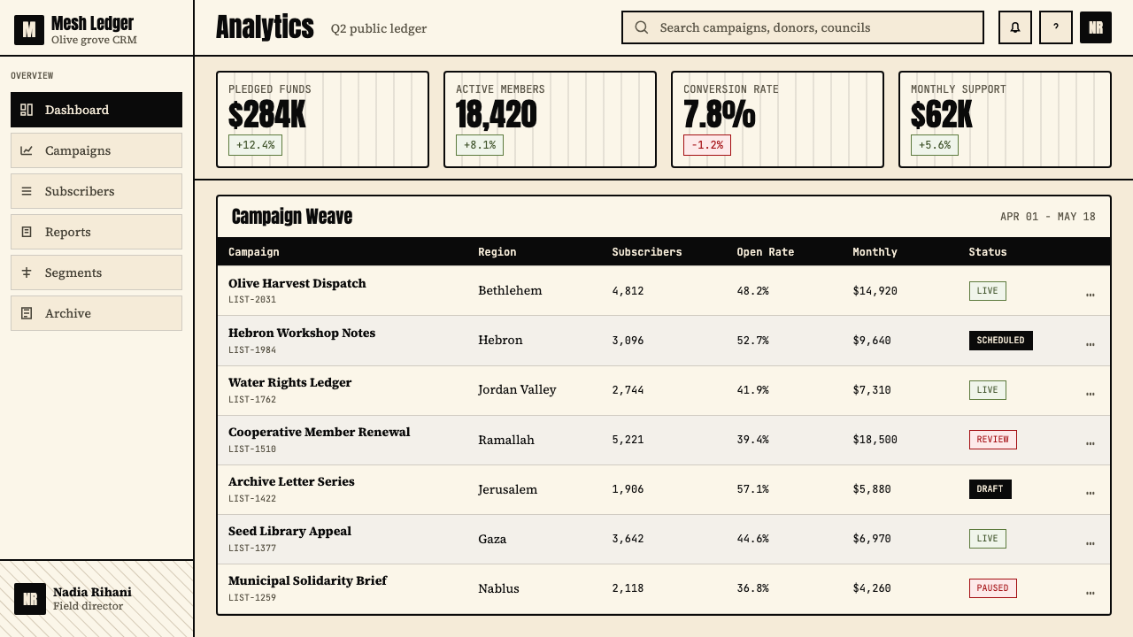
For web interfaces and dashboards, the style is well suited to information-dense contexts where visual authority and legibility are primary values: journalism platforms, research portals, documentation sites, and analytical dashboards. The approach requires committing to structural borders rather than soft-shadow cards, maintaining the cream ground rather than defaulting to pure white, and using the fishnet pattern sparingly as a textural element in headers or feature panels rather than as a wallpaper across the entire background. Navigation should be typographic and declarative; interactive states can use olive as a controlled accent without introducing new hues. The system resists rounded corners — the geometry is rectilinear throughout.对于网页界面和仪表板,这种风格适合视觉权威性与可读性是首要价值的信息密集型语境:新闻平台、研究门户、文档站点和分析仪表板。这种方法要求坚持结构性边框而非柔和阴影卡片,维持米色底面而非默认纯白,并将渔网图案节制地用作标题或特性面板中的纹理元素,而非铺遍整个背景作为壁纸。导航应当是字体性和陈述性的;交互状态可以使用橄榄色作为受控的点缀,而不引入新的色相。这套系统抗拒圆角——其几何形态自始至终是直角的。
For editorial and marketing work, the Keffiyeh Grid's poster-like quality becomes an asset. Feature pages and campaign materials benefit from the high-contrast black-on-cream typographic treatment at large scale, with the fishnet grid appearing as a background field behind a key image or as a framing border around a full-bleed photograph. Marketing copy should match the style's tone — direct, specific, unembellished — rather than adopting the visual register while keeping saccharine language. The olive accent is particularly effective for pull quotes, callouts, and section markers, where its cultural specificity reinforces the seriousness of the content.对于编辑和营销工作,库菲耶网格的海报式品质成为一种资产。特性页面和活动材料得益于大尺度下高对比度的黑色印米色字体处理,渔网格以背景底面的形式出现在关键图像后方,或作为全出血照片的框架边界。营销文案的语气应当与风格相匹配——直接、具体、无矫饰——而非借用视觉层级的同时保持矫情的语言。橄榄色点缀对于引用语、标注和区段标记尤为有效,其文化特殊性在这些位置强化了内容的严肃性。
The most common mistake when applying this system is treating it as a general-purpose geometric style and introducing warm accent colors, rounded forms, or casual typographic choices that break the tonal register. A second frequent error is overusing the fishnet pattern — applying it as an uninterrupted background across large screen areas makes the texture claustrophobic and undermines the legibility it is meant to support. A third failure mode is ignoring the cultural specificity of the references: using the pattern in ironic or playful contexts, or pairing it with messaging that contradicts its political gravity, produces not just aesthetic failure but cultural disrespect. The system rewards restraint and intentionality at every decision point.应用这套系统时最常见的错误,是将其视为通用几何风格,引入温暖的点缀色、圆角形态或随意的排版选择,从而打破了情感基调层级。第二个频繁出现的错误是过度使用渔网图案——将其作为连续不断的背景铺满大面积屏幕区域,会使纹理产生压迫感,并削弱其本应支撑的可读性。第三种失败模式是忽视参照的文化特殊性:在讽刺或嬉戏的语境中使用该图案,或将其与和政治分量相矛盾的信息配对,不仅产生美学失败,更是文化上的不尊重。这套系统在每一个决策点都奖励克制与有意为之。
See the Palestinian Keffiyeh Grid design system查看 Palestinian Keffiyeh Grid 完整设计系统
Palestinian Keffiyeh Grid — FAQPalestinian Keffiyeh Grid · 常见问题
Is it appropriate for non-Palestinian designers to use this style?非巴勒斯坦设计师使用这种风格是否合适?
Appropriateness depends on context, intent, and transparency. A designer creating communications for a Palestinian cultural organization, a human rights campaign, or a journalistic project about the region is working in contexts where the reference is relevant and the use is in service of the subject. A designer applying the aesthetic to an unrelated product — a tech startup, a food brand, a fashion label — in order to borrow cultural currency without connection risks what scholars call visual appropriation. The middle ground requires honesty: using the style should involve acknowledging its origin, deploying it in contexts where the reference is meaningful, and not flattening its specific cultural content into generic 'ethnic pattern' aesthetics.合适与否取决于语境、意图与透明度。一位为巴勒斯坦文化机构、人权运动或关于该地区的新闻项目创作传播材料的设计师,工作在参照具有相关性且使用服务于主题的语境中。一位将这套美学应用于无关产品——科技创业公司、食品品牌、时尚标签——以借用文化资本而无实质联系的设计师,则面临学者所称的视觉挪用的风险。中间地带需要诚实:使用这种风格应当包括承认其来源,将其部署在参照有意义的语境中,并不将其特定的文化内容压平为通用的「民族图案」美学。
How does the Keffiyeh Grid differ from other grid-based design systems?库菲耶网格与其他基于网格的设计系统有何不同?
Most grid-based design systems — Swiss International Style, modular grid systems, contemporary design tokens — treat the grid as a neutral organizational infrastructure invisible in the final output. The Keffiyeh Grid inverts this: the grid is the content. The fishnet pattern is not an underlying structure that the design sits on top of; it is itself a primary visual element derived from a specific textile tradition. This means the grid carries historical and cultural weight that purely structural grids do not. A secondary difference is the palette: where Swiss-derived systems tend toward pure white grounds and a broad typographic palette, the Keffiyeh Grid commits to cream and black as co-equal visual poles, with olive as a culturally specific accent rather than a generic tertiary color.大多数基于网格的设计系统——瑞士国际主义风格、模块化网格系统、当代设计令牌——将网格视为在最终输出中不可见的中性组织基础设施。库菲耶网格反转了这一点:网格就是内容。渔网图案不是设计架构于其上的底层结构;它本身就是源自特定纺织传统的主要视觉元素。这意味着网格承载着纯结构性网格所不具备的历史与文化分量。第二个区别在于色板:瑞士衍生系统倾向于纯白底面和宽泛的排版色板,而库菲耶网格将米色与黑色作为同等重要的视觉两极,以橄榄色作为具有文化特殊性的点缀,而非通用的第三色。
Can this system work for digital products with dark-mode requirements?这套系统能否适用于有深色模式需求的数字产品?
A true dark inversion of the Keffiyeh Grid is structurally possible — substituting a very deep charcoal or near-black ground for the cream, with the fishnet rendered in a slightly lighter tone rather than stark white — but it loses something significant. The cream ground is not merely a background color choice; it carries the material memory of unbleached cotton fabric. On a dark ground, that textile reference weakens, and the system begins to resemble a generic dark geometric pattern rather than a keffiyeh-derived visual language. For products with genuine dark-mode requirements, a pragmatic approach is to use the light palette as the primary register and limit dark surfaces to specific UI components — navigation bars, modal overlays, code blocks — rather than inverting the entire system.库菲耶网格的真正深色反转在结构上是可行的——将极深的炭色或近黑色底面替代米色,渔网以略浅的色调而非纯白呈现——但它会失去一些重要的东西。米色底面不仅仅是一种背景颜色选择;它承载着未漂白棉布的物质记忆。在深色底面上,这种纺织品参照会弱化,系统开始类似于通用的深色几何图案,而非源自库菲耶的视觉语言。对于有真实深色模式需求的产品,一种务实的方法是将浅色色板作为主要层级,将深色表面限制在特定的界面组件中——导航栏、模态遮罩、代码块——而非反转整个系统。
What is the right way to use the fishnet pattern — as texture, as motif, or as structural element?使用渔网图案的正确方式是什么——作为纹理、母题还是结构元素?
All three, at different scales and densities, but with discipline. At fine scale and low contrast — a slightly-darker-than-background tone on the cream field — the pattern functions as texture, giving surfaces depth without competing with content above. At medium scale and higher contrast — as a ruled grid with perceptible cell size — it functions as a structural element: a page divider, a column separator, a section background that signals containment. At large scale, particularly when cropped or masked, the pattern becomes a motif — a bold visual anchor that references the textile directly. The error is using all three simultaneously at high contrast across a single layout, which produces visual noise rather than the quiet authority the system is capable of.三者皆可,在不同的尺度和密度下,但需要纪律。在精细尺度和低对比度下——米色底面上略深于背景的色调——图案作为纹理发挥作用,赋予表面深度而不与上方内容形成竞争。在中等尺度和较高对比度下——作为具有可感知格眼尺寸的规则网格——它作为结构性元素发挥作用:页面分隔符、列分隔符、标示封闭感的区段背景。在大尺度下,特别是经过裁切或蒙版处理时,图案成为母题——一个直接参照纺织品的大胆视觉锚点。错误在于在单一版面中同时以高对比度使用全部三种方式,这会产生视觉噪音,而非这套系统所能够呈现的那种静默的权威感。
How should olive green be used, and what counts as overuse?橄榄绿应如何使用,过度使用的边界在哪里?
Olive green earns its presence in this system by cultural specificity — it refers to the olive tree, to the vine-border motif of the scarf, to the agricultural landscape of the Levant. This specificity means it should be used with proportional restraint: as an accent on a single interactive element per page, as a highlight on a single data series, as color on a single typographic level such as a subheading or section label. The threshold for overuse is lower than most designers expect. When olive appears on more than one or two elements in a composition, it begins to read as a general-purpose color rather than a culturally loaded accent, and the system loses precision. In the original textile, the olive-leaf border is a narrow band framing the dominant black-and-white field — that proportional relationship is a useful guide.橄榄绿通过文化特殊性在这套系统中赢得其存在——它指涉橄榄树、围巾的藤蔓边饰图案、黎凡特的农耕风景。这种特殊性意味着它应当以相称的克制使用:作为每页单一交互元素上的点缀,作为单一数据系列的高亮,作为单一排版层级如小标题或区段标签的色彩。过度使用的门槛比大多数设计师预期的要低。当橄榄色出现在一个构图中超过一两个元素上时,它开始被解读为通用色彩而非具有文化载荷的点缀,系统也因此失去精确性。在原始纺织品中,橄榄叶边饰是框住主体黑白区域的一条窄带——这种比例关系是一个有用的参照。
Related design styles相关设计风格
 Levantine Keffiyeh Black & WhitePolitical textile, not ornament. Cotton type and fishnet lattice cut through…政治纺织,不是装饰。棉白字体与渔网格纹切入黑底。
 JDM BosozokuNight culture shouts. Candy violet, cyan neon, and stacked Mincho-blackletter…夜色里吼叫:糖果紫与电光青,明朝体和黑体叠满柏油。
 Aboriginal Dot Painting (Papunya 1971)Ochre memory, held steady. Raw umber ground, Cormorant type, disciplined dot-…赭石记忆沉稳留存:生赭黑地、Cormorant 字体与克制点阵。
 Algerian Casbah Poster (1954–1962)Every surface is a manifesto. Blood red, warning yellow, and stencil type hit…每个表面都是宣言:血红、警示黄与模板字撞上黑色新闻纸。
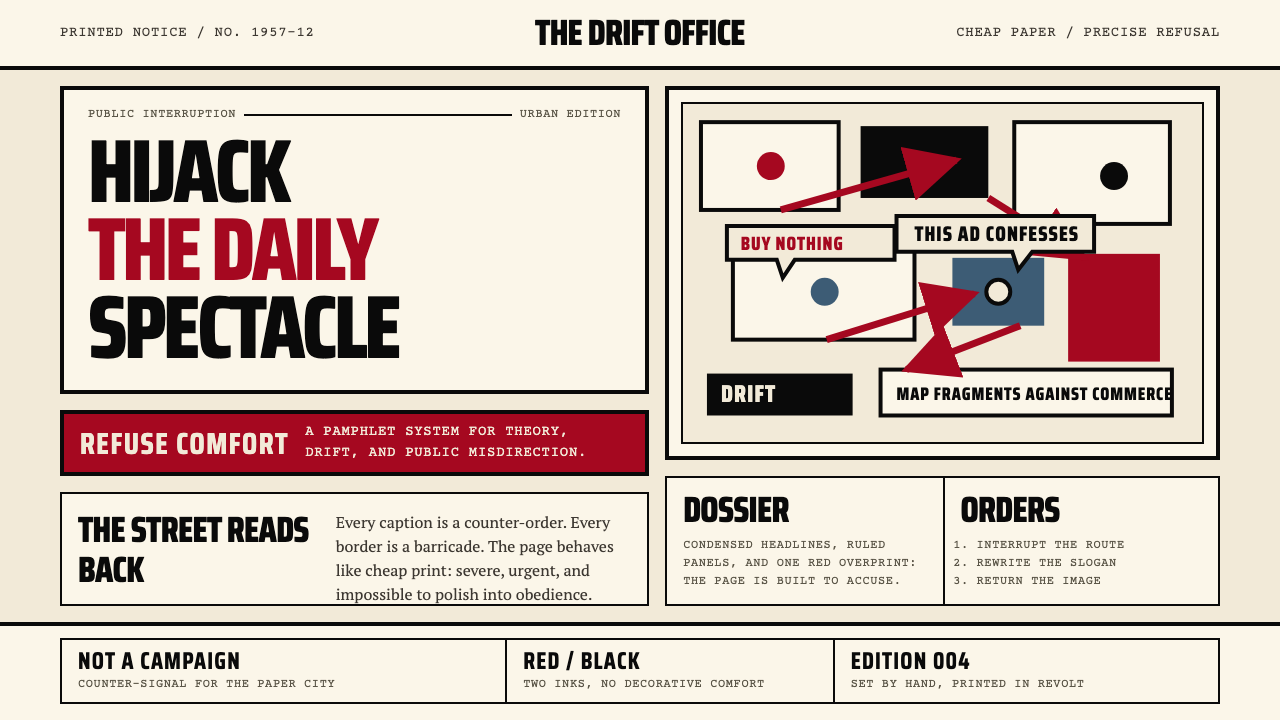 Situationist International (Debord, 1957)Agitation becomes structure. Red-black blocks and condensed type weaponize ne…煽动化为结构。红黑块面与压缩字体把新闻纸变成武器。
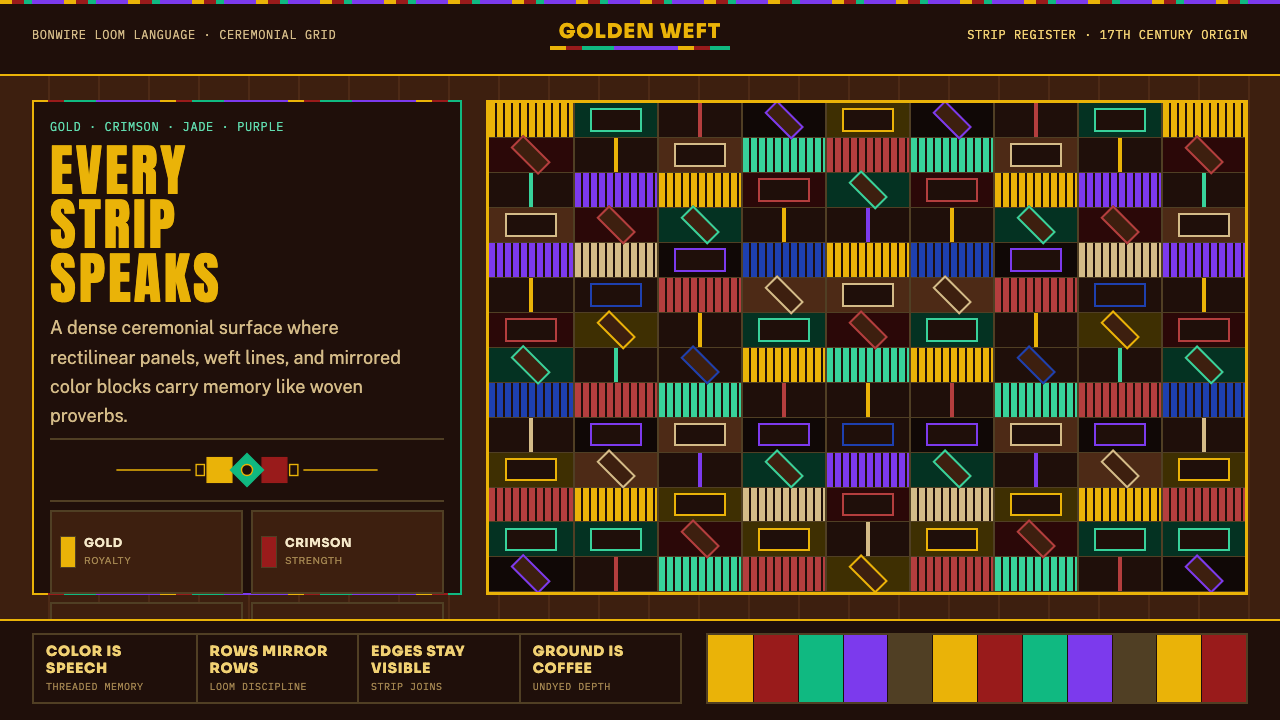 West African Kente ClothWoven authority. Gold, crimson, jade, and purple strips lock into a dense cof…织出权威感:金、朱红、翡翠与紫色条带锁进咖啡棕密格。