What is JDM Bosozoku?
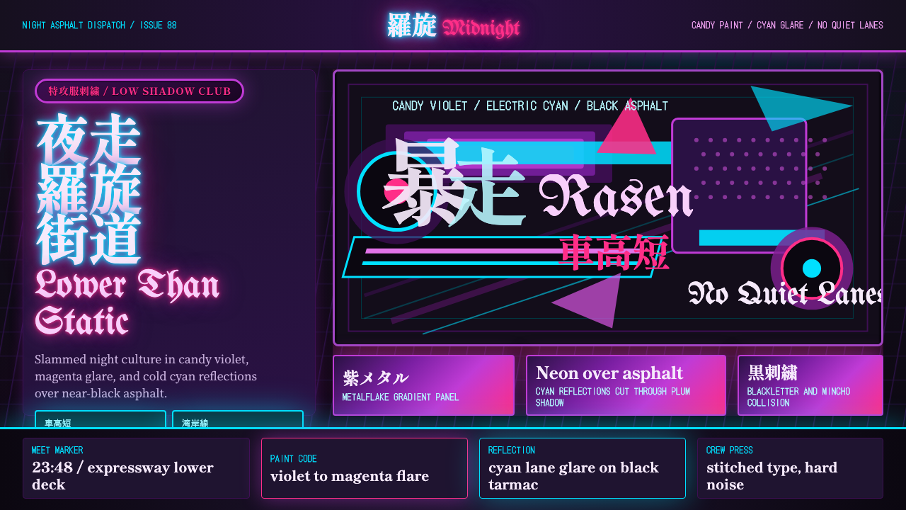
JDM Bosozoku takes Japan's outlaw night-car culture — slammed bodies, screaming exhausts, candy-violet paint under neon — and turns it into a visual language of maximalist, bilingual noise.
JDM Bosozoku in brief
JDM Bosozoku is the visual language of Japan's underground night-driving subcultures — bosozoku biker gangs, kaido-racer street tuners, and shakotan ("lowered car") builders — compressed into a single aesthetic. It draws its palette and mood from the same source: a black-asphalt stage lit only by sodium streetlamps, headlights, and the electric bleed of neon signage. Where most car-culture aesthetics photograph well in daylight, this one only exists properly at night.
The style is defined by excess and collision. Bodywork is dropped low enough to spark on speed bumps, hung with oversized exhaust pipes and towering tail wings that serve spectacle over aerodynamics. Paint is not flat color but candy-coat gradient — a translucent tint sprayed over metallic base so the panel shifts hue as light rakes across it, most often through violets, magentas, and electric blues. Chrome trim and mirror-polished surfaces exist to catch and multiply whatever light is available.
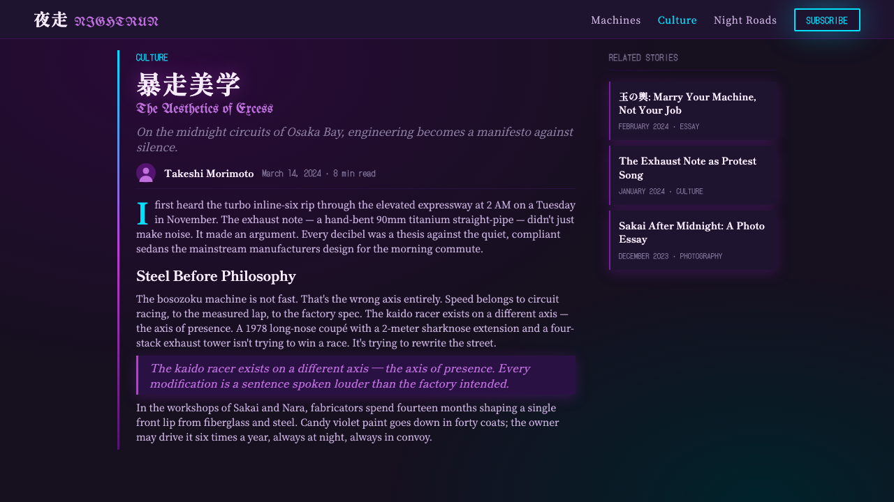
Typography is where the style becomes unmistakable. Heavy Mincho-style kanji and thick calligraphic brushwork, lifted from tokkō-fuku (the embroidered bomber jackets bosozoku gangs wear) and shodō calligraphy traditions, are layered directly against Old-English blackletter Latin lettering. The two scripts don't take turns — they overlap, stack, and compete for the same space, producing a density that reads as barely-controlled visual noise rather than tidy bilingual signage.
Where does JDM Bosozoku come from?
Bosozoku (literally "violent running tribe") emerged in Japan in the years following the Second World War, when returning veterans and disaffected youth began forming motorcycle gangs that rode in loud, illegal convoys through city streets. By the 1970s the subculture had a fully developed visual identity: riders wore tokkō-fuku, boiler-suit-like jackets embroidered with kanji slogans, military-style imagery, and calligraphic flourishes, borrowing the visual authority of wartime kamikaze pilot uniforms while inverting their meaning into rebellion against postwar conformity. The bikes themselves were modified with raised handlebars, extended forks, and exhaust pipes bent upward into distinctive shapes designed purely to be loud and visible.
As the subculture matured through the 1980s bubble economy, its energy spread from motorcycles to cars, producing two related but distinct car-modification lineages. Kaido-racer ("highway racer") style took cues from Japanese Group 5 and Super Silhouette touring-car racing of the late 1970s and early 1980s — cars flared with oversized wheel-arch extensions, deep front spoilers, and towering GT wings, built to look like a race car even when it never left public roads. Shakotan, meaning "lowered car," took a different route: slamming a car's suspension until it nearly scraped the ground, tucking wheels under flared arches, and finishing the whole package in mirror-polish and candy paint so that a parking-lot meet became a rolling exhibition of light and color.
Both lineages converged on the same nocturnal staging ground: the parking lots and expressway rest stops on the edges of Japanese cities, where builders gathered after dark to display finished cars under sodium lamps and each other's headlights. This is why the aesthetic is inseparable from night — it was designed and judged entirely under artificial light, and candy-coat paint, chrome trim, and neon reflection all read as showroom-flat and unremarkable in daylight but ignite under exactly the conditions where the culture actually lived.
The visual identity crystalized around a shared rejection of factory restraint and postwar quietism, channeling the same defiant, anti-establishment energy as the bosozoku gangs that gave the movement its name — even as the car-building side of the culture, especially shakotan, drifted toward being a purely aesthetic pursuit largely detached from the biker gangs' more confrontational, sometimes criminal reputation. What all three strands share is the conviction that more is the point: more light, more layered text, more contrast, more spectacle than any single element could produce alone.
What defines the JDM Bosozoku look?
Night as Ground
The default ground is near-black — asphalt rather than paper or canvas — because the entire aesthetic was born under nighttime parking-lot lighting rather than daylight. Every other choice in the system, from candy paint to neon accents, is calibrated to perform against this dark stage rather than a light one. Applied to a light background, the same elements read as garish; against black, they read as electric.
Candy-Coat Gradient Color
Color behaves like automotive candy paint: a translucent tint over a reflective base so hue shifts with the angle of light rather than sitting flat. Violet, magenta, and electric cyan dominate, frequently blended into each other across a single surface rather than used as separate flat blocks. This is fundamentally different from a flat neon palette — the point is iridescence and depth, not just saturation.
Chrome and Mirror Surfaces
Reflective, mirror-polished surfaces are treated as light-catching devices rather than decoration. Trim, rims, and highlight lines exist specifically to pick up and multiply whatever ambient light — streetlamp, headlight, neon — is available, functioning almost like the specular highlight of a photograph rather than a static material choice.
Bilingual Layered Typography
Heavy Mincho and brush-calligraphy kanji, drawn from tokkō-fuku embroidery and shodō tradition, are layered directly over Old-English blackletter Latin lettering rather than placed side by side. The two scripts overlap, compete, and crowd the same space, producing dense, almost illegible stacks that favor visual impact and texture over clean legibility.
Exaggerated Silhouette
Forms favor extremity over proportion: bodies slammed low, wheel arches flared wide, wings and spoilers scaled well past anything aerodynamics would justify. The exaggeration is the message — every silhouette is built to be read instantly, from a distance, under low light, as a declaration rather than a subtle refinement.
Neon and Artificial Light
Light in this system is always artificial and colored — sodium-orange streetlamp, cyan or magenta neon signage, white headlight glare — never soft daylight. Glow effects, light bleed, and reflected color pools on wet asphalt are treated as core compositional elements, not atmospheric extras.
Maximalist Density
Where many design systems treat negative space as a resource to protect, this one treats it as unclaimed territory. Text stacks on text, chrome catches light against neon glow against candy paint, and compositions are judged successful when they are dense and layered rather than restrained. The aesthetic has no equivalent of Bauhaus-style ornament rejection — accumulation is the discipline.
Who shaped JDM Bosozoku?
The original bosozoku motorcycle gangs of the postwar decades established the subculture's core visual grammar: tokkō-fuku jackets embroidered with kanji slogans and calligraphic flourishes, raised handlebars, and exhaust pipes bent into deliberately loud, attention-grabbing shapes. Their appropriation of wartime kamikaze-pilot imagery — inverted from duty into defiance — is the direct ancestor of the style's bilingual, calligraphy-heavy typography.
Street tuners who built kaido-racer ("highway racer") cars translated the visual drama of late-1970s and early-1980s Japanese touring-car racing — Group 5 and Super Silhouette machinery with flared arches and towering GT wings — onto cars that never left public roads. Their contribution is the exaggerated, race-inspired silhouette: wide-body extensions and oversized aero pieces built for spectacle rather than lap times.
Shakotan ("lowered car") builders pursued a purely aesthetic lineage focused on stance and finish: suspensions slammed until the body nearly scraped asphalt, wheels tucked flush under the arches, and bodywork finished in mirror-polish chrome and candy-coat gradient paint. Their parking-lot night meets are the origin of the style's inseparable link to artificial light and dark asphalt as a display ground.
The embroiderers who produced tokkō-fuku jackets developed the dense, kanji-and-slogan-heavy textile tradition that the style's typography still draws on directly. Their work fused military insignia conventions with calligraphic brushwork, establishing the precedent for text treated as bold, oversized visual mass rather than small-scale informational labeling.
How do you use JDM Bosozoku today?
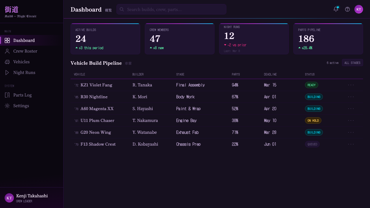
JDM Bosozoku is a high-impact, high-risk style: it reads as authentic only when its density and night-bound logic are respected, and as costume-like pastiche when reduced to a color swatch of purple and cyan on a light background. Applying it correctly starts with committing to a dark ground and building light, color, and texture as things that ignite against that darkness rather than sit flat on top of it.
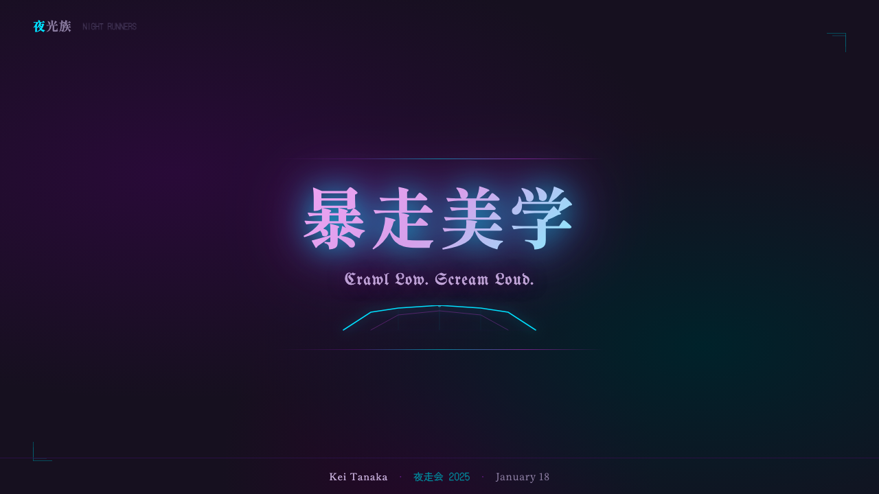
For presentation cover slides, the style works best as a single dramatic scene rather than a busy collage: a dark asphalt-toned field, one strong candy-gradient accent shape or silhouette, and a title set in bold layered bilingual-style lettering treated as the hero graphic rather than a caption. Content and data slides should be handled more carefully than the cover — full maximalist density becomes exhausting across many slides of body text, so a disciplined application keeps the dark ground and neon accent language for headers and section dividers while body copy reverts to high-contrast, legible type on a calmer near-black field.
For web UI, dashboards, and pricing pages, the style suits products that want to signal night-driven, underground, or subcultural energy — gaming, automotive, nightlife, streetwear commerce — rather than tools that need to project calm neutrality. A dark near-black interface base with neon-cyan or magenta used sparingly for interactive states, chrome-like specular highlights reserved for premium tiers or call-to-action buttons, and restraint on the bilingual-typography treatment (saved for hero moments, not body UI text, which needs to stay legible) keeps the system usable rather than overwhelming.
For editorial and marketing work, the aesthetic is a natural fit for automotive culture writing, nightlife and music promotion, and any brand voice built around rebellion or subculture authenticity. Magazine-style layouts benefit from full-bleed dark photography, candy-color duotone treatments on images, and pull-quotes set in the layered bilingual lettering treatment as the loudest element on the page — reserved for one or two focal moments per layout rather than every headline.
The most common mistake is treating this as simply "neon on black" and skipping the two elements that make it authentic: the layered bilingual calligraphy-and-blackletter typography, and the candy-coat gradient logic in color rather than flat neon fills. Without those two, the result reads as generic synthwave or cyberpunk rather than JDM Bosozoku specifically. A second common mistake is applying the full density everywhere at once — the style reads as deliberate maximalism only when it has quieter moments to contrast against; uniform noise across an entire layout just reads as visual clutter.
JDM Bosozoku — FAQ
Is JDM Bosozoku the same thing as synthwave or cyberpunk aesthetics?
They share a surface-level palette — dark grounds, neon violet and cyan — but they come from entirely different sources and read differently once you look closely. Synthwave draws on 1980s American media nostalgia (VHS grain, retro-futurist grids, sunset gradients); cyberpunk draws on dystopian megacity fiction. JDM Bosozoku draws specifically on real Japanese car and biker subculture, and its defining feature — layered bilingual typography combining Mincho/brush-calligraphy kanji with Old-English blackletter Latin — has no equivalent in either synthwave or cyberpunk. Strip out that typography and the candy-coat automotive paint logic, and what's left is generic neon-on-black, not this style specifically.
Why does the style rely so heavily on bilingual typography instead of just Japanese or just Latin lettering?
The bilingual layering reflects the actual visual culture it comes from: tokkō-fuku jackets historically mixed kanji slogans with borrowed foreign iconography, and kaido-racer and shakotan builders freely combined Japanese calligraphic tradition with imported Western car-culture references (race liveries, English slogans). The collision of the two scripts — rather than either alone — is what produces the sense of maximalist, slightly chaotic energy that defines the aesthetic. Using only one script tends to read as either a generic Japanese-typography style or a generic Western gothic-lettering style, losing the specific cultural collision that makes JDM Bosozoku recognizable.
Does this style only work with automotive-related content?
Automotive content is the most natural fit, but the underlying visual logic — dark ground, candy-gradient color, layered bilingual typography, artificial neon light — transfers to any brand or content built around night culture, subcultural rebellion, or maximalist visual energy: gaming, streetwear, nightlife and music events, or youth-oriented entertainment brands. What does not transfer well is any context requiring calm, neutral, or highly legible-at-a-glance communication; the style's density works against fast scanning, which is why it should be reserved for hero moments and dialed back for dense informational content.
How should candy-coat gradient color be handled digitally, since it depends on physical light reflecting off paint?
The digital equivalent is a smooth multi-hue gradient — typically moving through violet, magenta, and cyan — applied across a surface as if light were raking across it at an angle, rather than a single flat neon fill. The gradient should feel directional and continuous, echoing how real candy paint shifts hue as a viewer's angle to a car body changes. Pairing this gradient logic with a glow or bloom effect around edges helps simulate how these colors behave against dark asphalt under real streetlight, which is what separates an authentic rendition from a flat two-tone neon look.
What's the relationship between bosozoku (bikers) and shakotan (lowered cars) — are they the same subculture?
They're related but not identical. Bosozoku refers specifically to the motorcycle gangs that emerged in the postwar decades and established the tokkō-fuku, calligraphic-slogan visual grammar. Kaido-racer and shakotan are car-focused lineages that emerged somewhat later, drawing on bosozoku's rebellious, spectacle-driven energy and on Japanese touring-car racing visuals, but largely developing into a distinct, more purely aesthetic pursuit centered on car shows and night meets rather than the biker gangs' more confrontational reputation. This style treats all three as one combined visual source because they share the same night-lit, maximalist, bilingual-typography language even though their real-world social contexts differ.
Related design styles
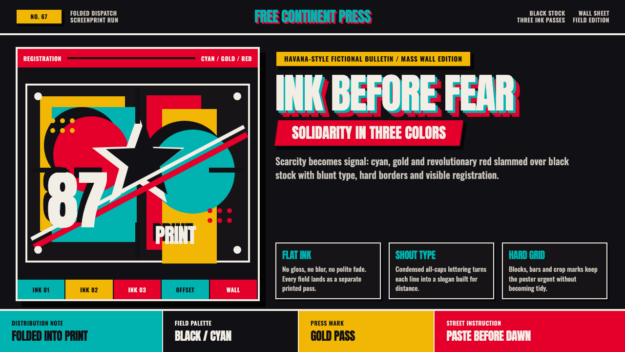 Cuban OSPAAAL Tricontinental PosterUrgency from scarcity. Cyan, gold and red slam over black in blunt silkscreen…
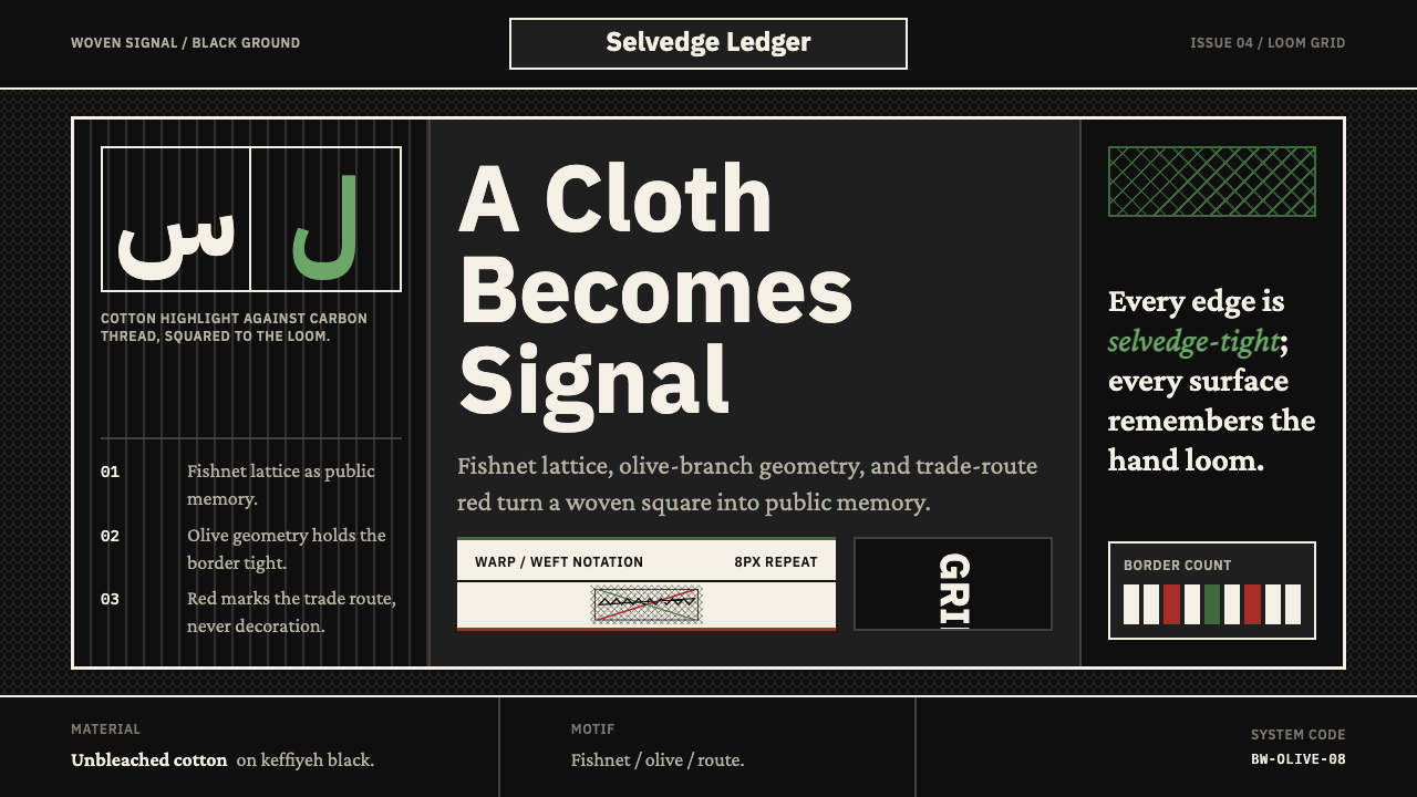 Levantine Keffiyeh Black & WhitePolitical textile, not ornament. Cotton type and fishnet lattice cut through…
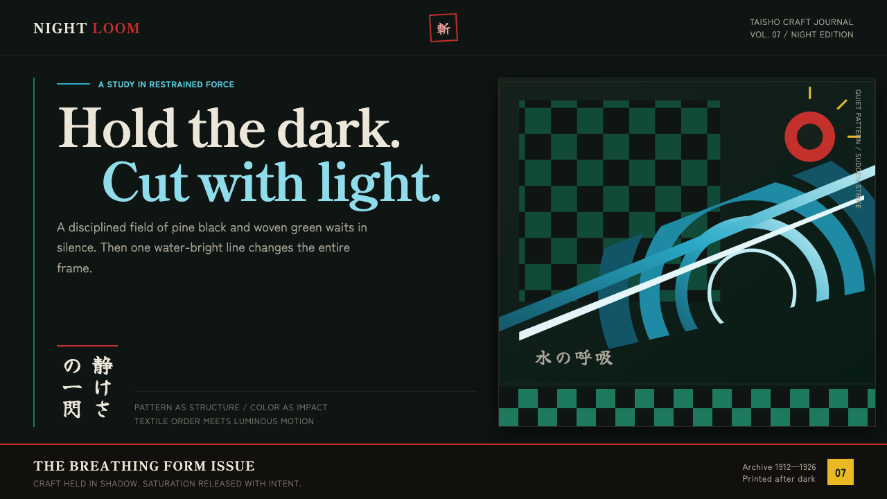 Demon Slayer (2019)Quiet craft, sudden force. Pine-black checks split beneath a water-teal strik…
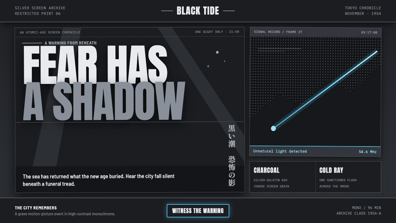 Godzilla (1954 Showa)Fear takes monumental form. Charcoal halftones split under one atomic-blue ra…
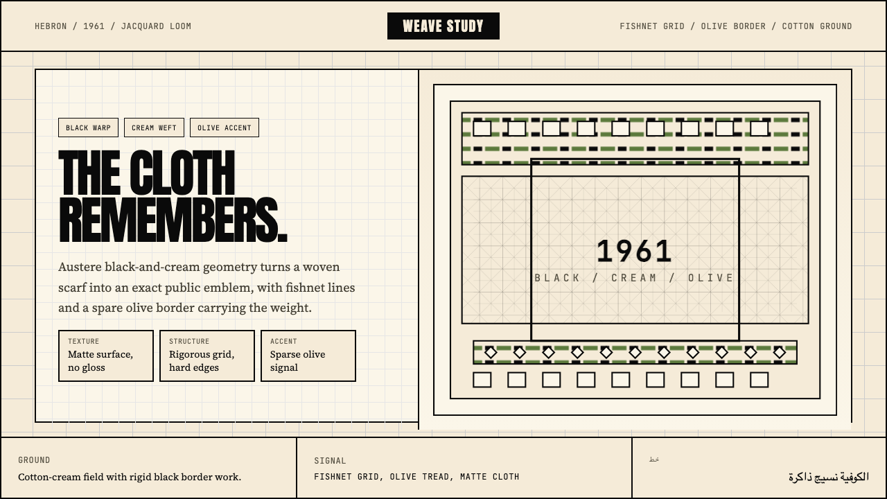 Palestinian Keffiyeh GridMemory in black and cream. Fishnet grid, olive border, and austere Anton type.
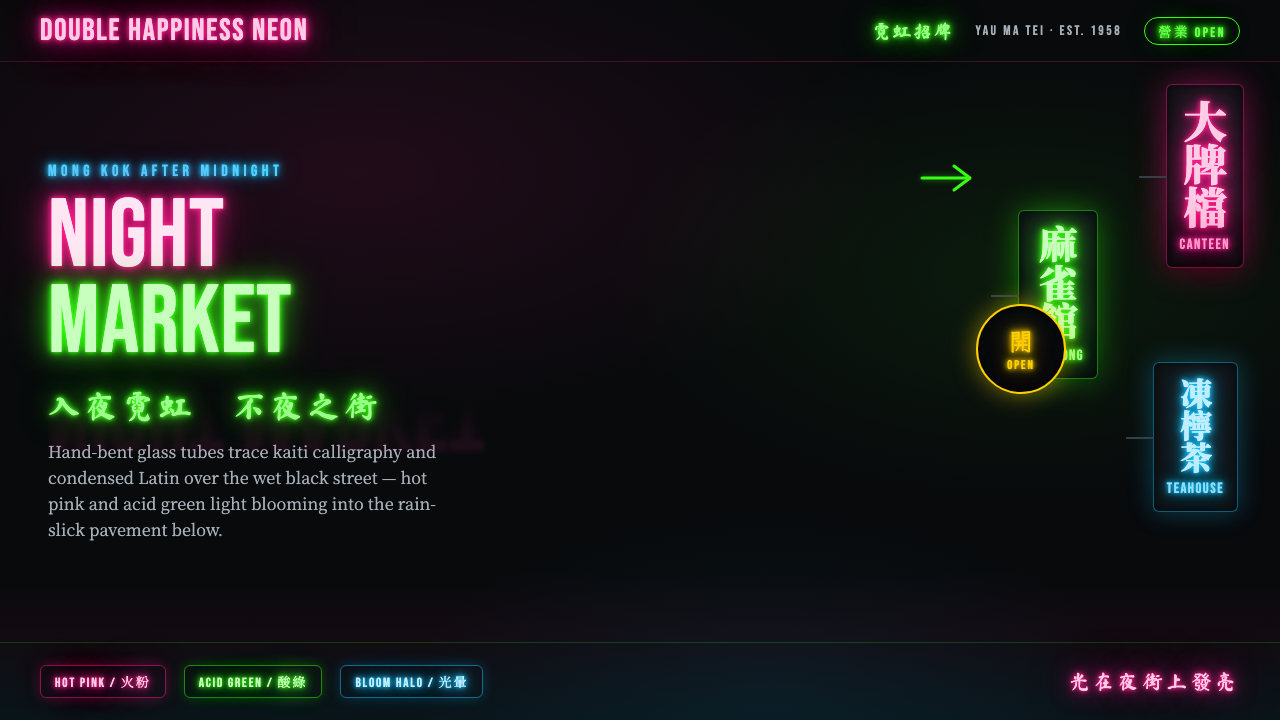 Hong Kong Neon SignboardsLight only reads against the wet black night. Hand-bent pink and green tubes…