What is Bollywood Poster Art (1970s)?什么是 Bollywood Poster Art (1970s)?
India's hand-painted cinema billboards turned the streets of Bombay into a ten-metre opera — maximum saturation, diagonal fury, and heroes too large for any frame.印度手绘电影招贴把孟买街头变成一场十米高的歌剧——饱和度拉满、斜向的怒火、大过任何画框的英雄。
Bollywood Poster Art (1970s) in briefBollywood Poster Art (1970s) 速览
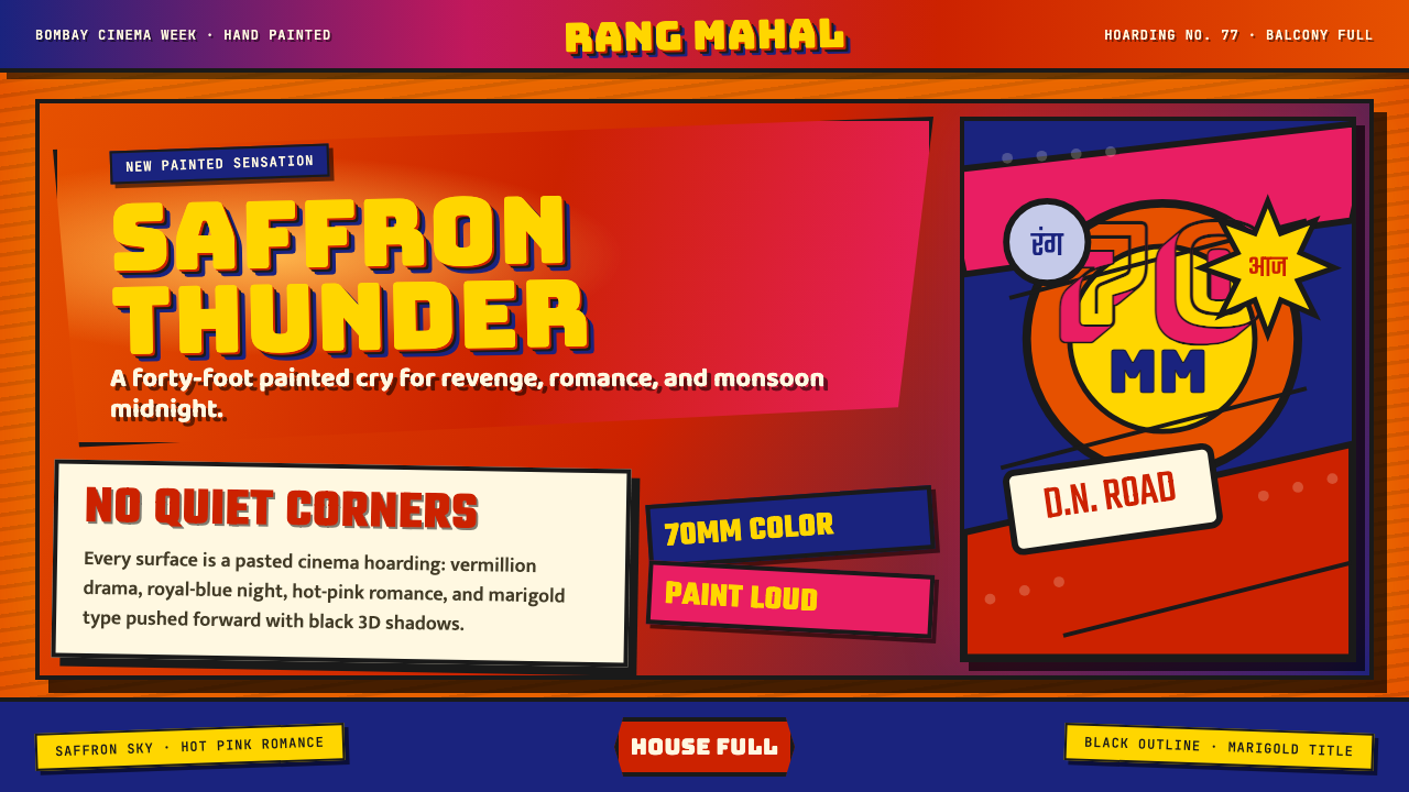
Bollywood Poster Art of the 1970s is the hand-painted cinema billboard tradition of Mumbai — monumental actor portraits, thundering diagonal compositions, and colors pushed to the outer edge of visibility, all executed by master craftsmen in the studios that lined D.N. Road in what was then Bombay. This is the visual grammar of Hindi cinema's golden age: the era of Sholay, Deewaar, and the brooding, fist-clenched 'angry young man' embodied by Amitabh Bachchan.七十年代宝莱坞海报,是孟买 D.N. 路海报工坊里手绘师傅们留下的电影招贴传统。巨幅的主角肖像、轰鸣的斜向构图、被推到可见性极限的颜色,全部出自当时孟买(Bombay)各家电影工坊的匠人之手。这是印地语电影黄金时代的视觉语法:《Sholay》《Deewaar》的年代,阿米特巴·巴沙坎(Amitabh Bachchan)那个阴郁握拳的「愤怒青年」的年代。
The style operates on a single governing conviction: subtlety is an affordable luxury, and nobody in this industry could afford it. Every hue is opened to full saturation. Every title is cast in deep three-dimensional shadow. Every figure — hero, villain, leading lady — bursts diagonally across the picture plane as though the hoarding itself cannot contain them. The background is never neutral; it is saffron orange, Bengal red, midnight indigo, or a churning collision of all three, overlaid with the thick, pressured texture of oil and enamel applied by brush at enormous scale.这种风格只有一条核心信条:节制是奢侈的选择,而这个行业里没有人负担得起。每一种颜色都被调到最浓的一档。每一个片名都投下深邃的三维阴影。每一个人物——英雄、反派、女主角——都斜斜扑出画面,仿佛那块铁皮广告牌根本装不下他们。背景从来不是中性的:是藏红花橙、孟加拉红、午夜靛蓝,或者三者正面碰撞,再叠上手持画笔在巨大尺幅上运笔留下的油彩与瓷漆的厚重质感。
What makes this tradition visually distinctive is not excess for its own sake but the internal coherence of its visual language. The hand-painted medium produces a warmth and slight imprecision that no mechanical print can replicate — brush strokes remain legible at close range, yet at thirty paces the composition locks into an irresistible gestalt. The poster had to sell a film to an audience passing on foot, on bicycle, on a crowded bus; it had to work in direct sunlight and monsoon rain. These material constraints produced an aesthetic logic as rigorous, in its own way, as anything the Bauhaus ever codified.使这一传统在视觉上独树一帜的,并非单纯的过剩,而是其视觉语言内在的连贯性。手绘媒介产生出一种任何机械印刷都无法复制的温度与轻微的不精确性——近看时笔触清晰可辨,退到三十步外构图便锁定为一个不可抗拒的整体。海报必须向步行、骑车、挤在拥挤公共汽车上路过的观众售卖一部电影;它必须在直射阳光和季风暴雨中都能发挥作用。这些物质层面的制约,催生出一套美学逻辑,以其独特的方式,与包豪斯的严谨一样彻底。
See the Bollywood Poster Art (1970s) design system查看 Bollywood Poster Art (1970s) 完整设计系统
Where does Bollywood Poster Art (1970s) come from?Bollywood Poster Art (1970s) 从何而来?
The tradition of hand-painted cinema publicity in India traces back to the silent film era of the 1910s and 1920s, when studios in Bombay began commissioning large outdoor hoardings to announce new releases. The artists who produced these works came from a range of craft backgrounds — sign-painting, theatrical backcloth work, and the older tradition of devotional image-making — and they brought to cinema publicity a visual vocabulary already calibrated for maximum impact at distance. By the time sound cinema arrived in the early 1930s, a distinct professional class of film poster artists had emerged, concentrated in the workshops along D.N. Road in central Bombay.印度手绘电影宣传的传统可以追溯到十九世纪一〇年代至二〇年代的无声电影时代,当时孟买的制片公司开始委托制作大型户外招贴,为新片上映造势。创作这些作品的画师来自各种手工艺背景——路牌绘制、戏剧布景制作,以及更古老的宗教图像传统——他们将一套早已为远距离视觉冲击而校准的视觉语汇带入了电影宣传领域。有声电影于三十年代初到来之际,一个独特的专业电影海报画师群体已然成形,聚集在孟买市中心 D.N. 路的各家工坊里。
The 1950s and 1960s saw the craft reach a level of sophistication that set the stage for the explosion of the following decade. As the Hindi film industry grew in commercial scale, the budgets available for publicity materials increased, and the artists working in D.N. Road studios were able to develop increasingly ambitious visual strategies. The shift from a largely monochrome or limited-color aesthetic to the fully saturated polychrome approach that defines the 1970s style was partly driven by improvements in the pigments and enamels available to painters, and partly by the escalating competitive pressure between studios to claim visual dominance on the street.五十年代至六十年代,这门手艺达到了一种精熟程度,为此后十年的爆发奠定了基础。随着印地语电影行业商业规模的扩大,用于宣传物料的预算随之增加,D.N. 路工坊里的画师们得以发展出日益雄心勃勃的视觉策略。从相对单色或有限色彩美学向定义七十年代风格的全饱和多色方案的转变,一方面源于画师可用颜料和瓷漆品质的提升,另一方面也源于各制片公司之间在街头争夺视觉主导权的激烈竞争。
The 1970s represented the peak of this tradition for several reasons that extend beyond aesthetics. Hindi cinema in this period was navigating profound social tensions — the collapse of the optimistic Nehruvian vision, urban unemployment and migration, political corruption, and a deep sense of systemic injustice among the working poor. The figure of the angry young man, scripted by Salim-Javed and embodied by Amitabh Bachchan in films like Zanjeer (1973), Deewaar (1975), and Sholay (1975), gave this social turbulence a cinematic face. The posters reflected this emotional register: their visual violence — the clashing colors, the figures lunging out of the frame, the explosive typography — was not decorative but expressive of the films' own psychological intensity.七十年代是这一传统的巅峰期,原因不止在于美学层面。这一时期的印地语电影正在穿越深刻的社会张力——尼赫鲁式乐观主义的幻灭、城市失业与移民潮、政治腐败,以及底层劳工阶层对体制性不公的深切感受。由萨利姆-贾维德(Salim-Javed)编剧、阿米特巴·巴沙坎在《Zanjeer》(1973)、《Deewaar》(1975)和《Sholay》(1975)等片中具身演绎的「愤怒青年」形象,为这种社会动荡赋予了一张银幕面孔。海报折射出同样的情感基调:撞色、冲出画框的人物、爆炸性的字体排印——这些视觉暴力不是装饰性的,而是电影自身心理强度的表达。
The hand-painted tradition began its gradual decline in the 1980s as offset lithography and, later, digital printing made mechanical reproduction faster and cheaper than commissioning individual paintings. By the early 1990s, most major productions had shifted to photographic and digitally composed key art, and the D.N. Road studios had dwindled significantly. A handful of master artists continued working into the 2000s, and the tradition has since been the subject of significant archival and preservation work — most notably by collector and filmmaker Shreyank Arora and by institutions including the Osian's Cinema Foundation. What was once purely commercial ephemera is now recognized as a major chapter in South Asian popular art history.手绘传统从八十年代开始逐步衰落,胶印石版印刷,以及其后的数字印刷,使机械复制比委托单幅绘制更快、更廉价。九十年代初,大多数大制作已转向摄影合成与数字制作的主视觉,D.N. 路的工坊也大幅萎缩。少数大师级画师延续工作至二〇〇〇年代,这一传统此后受到相当程度的档案整理与保存关注——最具代表性的是收藏家兼电影人 Shreyank Arora 以及 Osian's 电影基金会等机构的工作。曾经纯粹作为商业短命品存在的东西,如今已被认定为南亚大众艺术史的重要篇章。
What defines the Bollywood Poster Art (1970s) look?Bollywood Poster Art (1970s) 的视觉特征是什么?
Saturated Palette极饱和色板
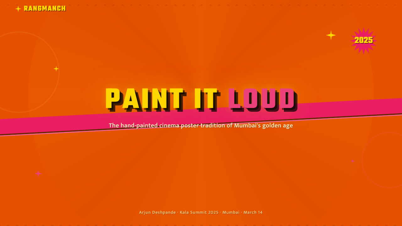
The color language of 1970s Bollywood posters operates at the absolute outer limit of pigment saturation. Saffron orange, crimson red, electric yellow, and deep indigo are not modulated or toned down — they are deployed at full intensity and allowed to collide without mediation. This is not a failure of color theory but a deliberate strategy for a specific display environment: the hoarding must compete with sunlight, with the noise of the street, and with every other hoarding on the block. The result is a palette that registers as festive, urgent, and emotionally overwhelming at distance.七十年代宝莱坞海报的色彩语言运作在颜料饱和度的绝对极限。藏红花橙、深红、电光黄与靛蓝并非被调和或降调——它们以全强度部署,任由其正面碰撞而无需过渡。这不是色彩理论的失误,而是针对特定展示环境的刻意策略:广告牌必须与阳光竞争,与街道的嘈杂竞争,与街区里每一块其他广告牌竞争。结果是一套在远距离上传递出节日感、紧迫感与情感压倒性的色板。
Diagonal Drama斜向戏剧性
The compositional spine of a Bollywood poster is almost always diagonal. Figures lean, lunge, or fall across the picture plane at sharp angles; title lettering cascades at a slant; background architectural elements and action lines reinforce the sense of arrested motion. This diagonal bias has both a practical and an expressive justification: a diagonal composition is more dynamic than a vertical or horizontal one, and it allows the artist to fit multiple large-scale figures into a single frame without resorting to equal-sized stacking. The diagonal implies velocity — something is happening, has just happened, or is about to happen.宝莱坞海报的构图脊骨几乎总是斜向的。人物以锐角倾斜、冲刺或倒落于画面;片名字母斜着倾泻;背景中的建筑元素与动作线条进一步强化了静止运动的感觉。这种对角线偏好既有实用理由也有表达理由:斜向构图比垂直或水平构图更富动感,同时允许画师在单一画面中容纳多个大尺度人物,而无需采用等大叠放。斜向意味着速度——某件事正在发生、刚刚发生,或即将发生。
Three-Dimensional Lettering三维片名字体
Film titles in 1970s Bollywood posters are never flat. They are built up as three-dimensional objects — letterforms extruded with deep offset shadows, often in a contrasting or complementary hue, and sometimes outlined in a third color to separate them from the background. The shadow direction is consistent within a poster but varies between artists and productions. The effect makes the title legible at great distance and gives the words a physical presence, as though they have been pressed into or grown out of the poster surface rather than applied to it.七十年代宝莱坞海报里的电影片名从不是平面的。它们被构建成三维物体——字形带有深厚的偏移阴影,通常采用对比色或互补色,有时还加上第三种颜色的轮廓线以与背景分离。阴影方向在单张海报内保持一致,但在不同画师与制片之间有所不同。这种效果使片名在极远距离依然清晰,并赋予文字以实体存在感,仿佛它们是从海报表面生长出来的,而非被施加于其上。
Heroic Portraiture英雄式肖像
The human figure is the central subject of every major Bollywood poster, and it is rendered at a scale that verges on the iconic. The lead actor's face — or the assembled cast arranged in hierarchical scale — dominates the composition, with peripheral figures rendered smaller not for spatial-perspective reasons but to signal their lesser narrative importance. Skin tones are heightened: complexions are painted warmer and more luminous than photographic reality, with strong highlight passages on the forehead, cheekbones, and chin that give faces a sculpted, almost metallic quality. Eyes are rendered with particular intensity, sometimes enlarged slightly beyond anatomical proportion to ensure legibility at distance.人物形象是每张重要宝莱坞海报的核心主题,以趋近图腾的尺度呈现。主演的面孔——或按等级尺度排列的全阵容——主导整个构图,边缘人物被画得更小,不是出于空间透视的理由,而是为了标示其较低的叙事重要性。肤色被强化:肤质被画得比摄影现实更温暖、更光亮,额头、颧骨与下巴上有力的提亮笔触赋予面部一种雕塑般、近乎金属质感的品质。眼睛以特别的强度呈现,有时略微放大超出解剖比例,以确保在远距离的可读性。
Narrative Collage叙事拼贴
A single Bollywood poster often contains the narrative information of an entire film compressed into one image. The main figure occupies the foreground; secondary characters or key scenes are arranged as smaller vignettes in the middle and background layers; vehicles, weapons, landscapes, or architectural motifs fill any remaining space. There is no white space, no breathing room — every square inch is committed to storytelling or visual excitement. This density is not clutter but a deliberate abundance, a promise to the viewer that the film itself will be equally full.一张宝莱坞海报常常将整部电影的叙事信息压缩进单一画面。主要人物占据前景;次要角色或关键场景以更小的小品形式分布于中景与背景层次;车辆、武器、风景或建筑母题填满所有剩余空间。没有留白,没有呼吸空间——每一平方英寸都服务于故事叙述或视觉激动。这种密度不是杂乱,而是刻意的丰盛:向观众承诺电影本身将同样饱满。
Hand-Crafted Texture手工质感
The hand-painted surface of the Bollywood hoarding is both a technical fact and an aesthetic resource. At close range, individual brushstrokes are visible — particularly in sky areas, flesh tones, and background washes — and they give the image a haptic quality that mechanical printing cannot achieve. The slight imprecision of hand-rendering means that no two copies of a poster were ever identical; artists working in the same studio from the same reference would produce subtly different results. This variability was not a flaw but a mark of the living craft behind the image.宝莱坞广告牌的手绘表面既是技术事实,也是美学资源。近看时,单个笔触清晰可见——尤其是天空区域、肤色与背景渲染处——赋予图像一种机械印刷无法达到的触觉性。手绘固有的轻微不精确性意味着,同一张海报的任何两份副本永远不会完全相同;在同一工坊依照相同参考创作的画师,会产出微妙不同的结果。这种变异性不是缺陷,而是图像背后活着的手工艺的印记。
Emotional Hyperbole情感夸张性
The Bollywood poster does not represent a scene from a film — it performs an emotional state at maximum amplitude. Villains scowl with theatrical menace; heroes glower with compressed rage; romantic leads glow with an idealized tenderness that transcends any specific moment. The visual register is deliberately larger than life, because the hoarding is competing for attention in a chaotic urban environment and because Hindi popular cinema of this period was itself a form of emotional spectacle rather than psychological realism. The poster is an advertisement for a feeling, not a document of a story.宝莱坞海报并非表现电影中的某个场景,而是以最大振幅演绎一种情感状态。反派以戏剧性的威慑怒目;英雄以压缩的愤怒凝视;爱情主角以超越任何具体时刻的理想化温柔发光。视觉基调刻意大于生活,因为广告牌在混乱的城市环境中争夺注意力,也因为这一时期的印地语大众电影本身就是情感奇观的一种形式,而非心理现实主义。这张海报是一种感受的广告,而不是一个故事的文献。
See the Bollywood Poster Art (1970s) design system查看 Bollywood Poster Art (1970s) 完整设计系统
Who shaped Bollywood Poster Art (1970s)?谁塑造了 Bollywood Poster Art (1970s)?
Maqbool Fida Husain is the most internationally recognized figure to emerge from the tradition of Indian commercial art, though his engagement with cinema was as a filmmaker and fine artist rather than a poster craftsman. His own painting practice — monumental figuration, raw color, and compressed narrative — shares deep structural affinities with the Bollywood poster aesthetic and has been credited with helping legitimize Indian popular visual culture in the eyes of fine-art institutions. His 1967 filmThrough the Eyes of a Painter and subsequent works demonstrated that the sensibility of Indian cinema culture had penetrated the highest registers of the fine arts.马克布尔·菲达·侯赛因(Maqbool Fida Husain)是从印度商业美术传统中走出的最具国际知名度的人物,尽管他与电影的关联是以电影人与纯艺术家的身份,而非海报画师。他自身的绘画实践——巨型具象、原始色彩、压缩叙事——与宝莱坞海报美学具有深层结构上的亲缘关系,被认为有助于在纯艺术机构眼中为印度大众视觉文化正名。他1967年的电影《通过画家的眼睛》及其后作品证明,印度电影文化的感性已渗入纯艺术的最高层级。
Karkare was among the most celebrated master artists working in the D.N. Road studios at the peak of the tradition. His facility with large-scale portraiture — the ability to render recognizable likenesses of actors at billboard scale using oil and enamel on metal or canvas — made him one of the most sought-after craftsmen in the Bombay film publicity industry. He trained a generation of younger artists who carried forward the technical practices of the studio tradition even as the commercial context around them changed.卡尔卡雷(Karkare)是这一传统巅峰时期在 D.N. 路工坊工作的最著名大师画师之一。他在大尺幅肖像方面的技艺——在金属或画布上以油彩与瓷漆于广告牌尺度上呈现演员可辨认面孔的能力——使他成为孟买电影宣传行业最炙手可热的匠人之一。他培养了一代年轻画师,即便在商业环境发生变化之后,这些人依然延续了工坊传统的技术实践。
Pandit represented the compositional sophistication end of the craft spectrum — his posters were distinguished not only by technical facility but by a considered approach to the arrangement of multiple figures, the management of competing color fields, and the integration of lettering into pictorial space. Where some D.N. Road artists excelled in portraiture and others in action composition, Pandit was noted for his ability to resolve complex multi-element briefs into images that read as unified wholes rather than assembled parts.潘迪特(Pandit)代表了这门手艺在构图精巧性上的高端——他的海报不仅以技术娴熟见长,还以对多人物排布、竞争色域管理以及字体融入图像空间的深思熟虑著称。D.N. 路的一些画师擅长肖像,另一些擅长动作构图,而潘迪特则以将复杂多元素委托解决为整体而非拼装感图像的能力而闻名。
Balkrishna Arts was one of the most prominent studios in the D.N. Road ecosystem, functioning less as an individual artist and more as a collective workshop in which multiple painters worked on different aspects of a single commission — one specialist handling portraiture, another handling background environments, a third handling lettering and title treatment. This division-of-labor model allowed the studios to meet the volume demands of a booming film industry while maintaining quality, and it closely parallels the guild-workshop traditions of European historical painting in its organizational logic.巴尔克里希纳美术(Balkrishna Arts)是 D.N. 路生态中最著名的工坊之一,与其说是单一画师,不如说是一个集体工坊——多位画师负责同一委托的不同方面:一位专攻肖像,另一位处理背景环境,第三位负责字体与片名处理。这种分工模式使工坊能够在维持质量的同时满足蓬勃发展的电影行业的体量需求,其组织逻辑与欧洲历史绘画中的行会工坊传统高度平行。
How do you use Bollywood Poster Art (1970s) today?今天怎么用 Bollywood Poster Art (1970s)?
Bollywood poster art of the 1970s is a style that requires commitment rather than restraint — its power comes from a willingness to occupy the full emotional and visual register rather than from holding back. Applying it correctly means understanding what the visual system is doing at a structural level: diagonal composition to create urgency, maximum saturation to claim attention, figure-dominant layout to establish emotional stakes, and typographic extrusion to make text compete visually with imagery rather than subordinate to it.七十年代宝莱坞海报风格需要的是投入而非克制——它的力量来自于愿意占据情感和视觉的全幅度,而非有所保留。正确应用它,意味着理解这套视觉系统在结构层面上做的是什么:斜向构图制造紧迫感,最大饱和度夺取注意力,以人物为主导的版面建立情感砝码,以及字体的挤出处理使文字在视觉上与图像竞争而非臣服于其下。
For presentation slides, this style is most effective at high-visibility moments: covers, section dividers, and key-statement slides where a single bold claim needs to land with force. A cover built in this language should place the speaker or subject at an angle against a field of vivid, saturated color, with the event or presentation title rendered in thick, shadow-cast lettering that crowds into the top or bottom third of the frame. Content slides should be used sparingly within this framework — the style is too visually intense for dense data or long prose. When data slides are required, treat charts as graphic elements in their own right: bars and segments should be rendered in the same saturated hues as the palette, with no neutral grays, and the chart title should receive the same typographic boldness as a film title.对于演示文稿,这种风格在高能见度时刻最为有效:封面、章节分隔页,以及需要一句有力宣言落地的关键陈述页。以这套语言构建的封面,应将演讲者或主题人物以一定角度置于一片鲜明饱和色彩的背景前,活动或演示标题以粗重的投影字体呈现,拥挤于画面的上三分之一或下三分之一处。内容页在这一框架内应克制使用——这种风格在视觉上过于强烈,不适合密集数据或长篇文字。当必须使用数据页时,将图表作为独立的图形元素对待:柱条与扇区应使用与色板相同的饱和色,不使用中性灰,图表标题应获得与电影片名同等的字体粗重度。
For web interfaces, the style maps well onto landing pages, campaign pages, and product launches where impact and memorability are more important than long-session readability. A hero section built in this aesthetic should use a full-bleed saturated background, place the primary human subject at a dramatic diagonal, and layer the headline in bold extruded or outlined type that reads as an object in the composition rather than a label above it. Dashboard and data-heavy interfaces are a poor fit — the palette is too activating for extended screen use, and the density of visual information conflicts with the scannability that analytical tools require.对于网页界面,这种风格适合落地页、活动页和产品发布页,即冲击力与记忆度比长时间阅读舒适度更重要的场合。以这套美学构建的主视觉区块应使用满铺饱和背景,将主要人物以戏剧性斜角置入,以粗重的挤出或描边字体叠加标题——作为构图中的物体存在,而非漂浮于其上的标签。仪表板与数据密集型界面是不适合的场景——这套色板对延长屏幕使用过于激活,视觉信息的密度也与分析工具所需的可扫描性相冲突。
For editorial and marketing work, the style supports cultural celebration, film and entertainment coverage, travel and festival contexts, and any brief that calls for warmth, energy, and a distinctly non-Western visual authority. A magazine feature using this language might run a full-bleed portrait at diagonal crop, with pull quotes set in extruded display type, and section breaks marked not by horizontal rules but by bands of saturated color that interrupt the text field. Poster and out-of-home applications are the native territory of this style — it was born at billboard scale and performs best when the physical context allows the color and scale to do their full work.对于编辑与营销内容,这种风格支持文化庆典、电影与娱乐报道、旅游与节日语境,以及任何呼唤温度、能量与鲜明非西方视觉权威的委托。使用这套语言的杂志特稿,可以斜裁满铺肖像,引用段落以挤出展示字体排版,段落分隔不用水平线而用打断文字栏的饱和色色带。海报与户外媒体是这种风格的原生领域——它诞生于广告牌尺度,在物理语境允许色彩和尺度充分发挥作用时表现最佳。
The most common mistake when applying this style is using it as a surface treatment — adding saturated colors and a diagonal element to an otherwise conventional layout — without adopting its underlying compositional logic. The style only works when the diagonal, the figure scale, the color intensity, and the typographic weight all function together as a unified system. A second frequent error is color timidity: choosing versions of the palette colors that are slightly muted or slightly cooled, because the full-saturation versions feel excessive. They are not excessive — they are the point. A third mistake is applying this language to contexts where it creates cultural friction without illumination: deploying it for a fintech platform or a healthcare interface in a way that suggests South Asian popular culture as costume rather than as a coherent and rigorous visual tradition will read as superficial at best and appropriative at worst.应用这种风格时最常见的错误,是将其作为表面处理——在一个本质上传统的版面上添加饱和色和斜向元素——而不采纳其底层的构图逻辑。这种风格只有在斜向、人物尺度、色彩强度和字体重量作为统一系统共同运作时才能发挥作用。第二个常见错误是色彩上的怯懦:选择略微柔和或略微偏冷的色板颜色,因为全饱和版本感觉过分。它们并不过分——过分本身就是重点。第三个错误是在会产生文化摩擦而非启迪的语境中使用这套语言:以一种将南亚大众文化当作戏服而非连贯严谨视觉传统的方式,将其用于金融科技平台或医疗界面,往往最好也不过显得肤浅,最坏则是一种挪用。
See the Bollywood Poster Art (1970s) design system查看 Bollywood Poster Art (1970s) 完整设计系统
Bollywood Poster Art (1970s) — FAQBollywood Poster Art (1970s) · 常见问题
Is this style purely nostalgic, or does it have genuine contemporary relevance?这种风格纯粹是怀旧的吗,还是具有真正的当代相关性?
It is neither purely nostalgic nor trivially contemporary. The 1970s Bollywood poster represents a set of compositional solutions to a genuine design problem — how to communicate narrative, hierarchy, and emotional intensity at large scale in a visually competitive environment — and those solutions remain valid wherever that problem recurs. Contemporary music festival posters, theatrical campaign art, and sports marketing materials frequently rediscover the same diagonal-dominant, figure-forward, saturated-ground approach independently. The style becomes nostalgic only when it is deployed specifically to evoke the 1970s rather than to solve a present communication challenge.它既非纯粹怀旧,也非肤浅的当代时髦。七十年代宝莱坞海报代表了一套对真实设计问题的构图解决方案——如何在视觉竞争激烈的环境中以大尺度传递叙事、层级与情感强度——而这些解决方案在这一问题再度出现的任何地方仍然有效。当代音乐节海报、剧场活动视觉与体育营销物料常常独立地重新发现同样的斜向主导、人物优先、饱和色底的方式。只有当这种风格被刻意用于唤起七十年代,而非解决当下的传播挑战时,它才变得怀旧。
How does this style handle text-heavy content, and what are its limits there?这种风格如何处理文字密集型内容?它的局限在哪里?
The style is fundamentally pictorial and was designed for a single dramatic message at a single reading distance. It handles short, punchy copy — a film title, a tagline, a cast list in hierarchical scale — very effectively. It handles long-form body text poorly, because the visual environment it creates is too activating for sustained reading, and because the typographic conventions of the style — large scale, heavy weight, strong shadow — are incompatible with the smaller, lighter, more neutral letterforms that comfortable extended reading requires. If you need to combine this aesthetic with significant amounts of text, treat the text block as a separate quieter zone within the composition rather than attempting to apply the poster's typographic logic uniformly.这种风格从根本上是图像性的,是为在单一阅读距离传递单一戏剧性信息而设计的。它能很好地处理简短有力的文案——电影片名、宣传语、按层级排列的演员表。它对长篇正文的处理较差,因为它所创造的视觉环境对于持续阅读过于激活,而且这种风格的排版惯例——大尺度、重字重、强阴影——与舒适延伸阅读所需的更小、更轻、更中性的字形不兼容。如果需要将这套美学与大量文字结合,应将文字段落作为构图中一个独立的、较安静的区域处理,而非尝试将海报的排版逻辑统一施用。
Can this style work for digital interfaces designed to be used in dark or dim environments?这种风格能用于为暗光或弱光环境设计的数字界面吗?
With significant adaptation. The original tradition was designed for outdoor daylight conditions, where maximum saturation is needed to cut through ambient brightness. In a dark interface context — a cinema kiosk, an entertainment app used in a darkened room, a streaming service night mode — the full-saturation palette becomes overwhelming and can cause eye strain in extended use. A dark-environment adaptation works best by reducing the number of simultaneously active saturated hues to one or two, using deep jewel-toned grounds (very dark versions of the palette colors) rather than pure black, and reserving peak saturation for focal interactive elements only. The diagonal composition and figure-forward portrait conventions can transfer intact; the palette requires modulation.需要经过相当程度的改编。这一传统原本为户外日光环境设计,在那里需要最大饱和度才能穿透环境亮度。在暗色界面语境中——电影院自助终端、在暗室中使用的娱乐应用、流媒体服务的夜间模式——全饱和色板会变得压倒性,在长时间使用中可能导致视疲劳。暗光环境下的改编最有效的做法是:将同时活跃的饱和色数量减少到一至两种,使用深宝石色调底面(色板颜色的极深版本)而非纯黑,将峰值饱和度仅保留给焦点交互元素。斜向构图和以人物为主的肖像惯例可以完整移植;色板则需要调节。
What distinguishes authentic engagement with this style from superficial borrowing?对这种风格的真实运用与表面借用之间的区别是什么?
Authentic engagement means understanding the compositional and communicative logic of the tradition and applying that logic to a new context. It means knowing that the diagonal is not decorative but structural — it manages multiple figures and implies motion. It means knowing that the saturation is not arbitrary but calibrated to an outdoor environment, and adapting it accordingly when the display context changes. It means treating the human figure as the primary carrier of emotional meaning, not as one visual element among many. Superficial borrowing means applying the surface markers — the saturated orange, the shadow on the title, the diagonal tilt — to content that has no connection to the tradition's communicative logic, producing work that looks like a costume rather than a continuation.真实运用意味着理解这一传统的构图与传播逻辑,并将这种逻辑应用于新的语境。这意味着知道斜向不是装饰性的而是结构性的——它管理多个人物并暗示运动。这意味着知道饱和度不是任意的,而是为户外环境而校准的,并在显示语境改变时相应调整。这意味着将人物形象作为情感意义的主要承载者,而非众多视觉元素之一。表面借用则意味着将表面标志——饱和的橙色、片名上的阴影、斜向倾斜——施加于与这一传统传播逻辑毫无关联的内容,制造出看起来像戏服而非延续的作品。
How should color be chosen when adapting this style, given its historically specific palette?在改编这种风格时,考虑到其历史上特定的色板,应如何选择颜色?
The historical palette of saffron, crimson, electric yellow, and indigo is not a mandatory formula but a set of choices that solved a specific problem — visibility in direct sunlight against the colors of a busy Indian street. When adapting the style, the relevant principle is maximum pigment saturation and warm-to-hot color temperature, not those specific hues. A version built around deep magenta, gold, and forest green could be as faithful to the aesthetic logic as one built around orange and red, provided that the saturation level is uncompromised and that the colors chosen have the same competitive relationship — they should push against each other, not harmonize. Harmonious color palettes are the opposite of this tradition's approach.藏红花色、深红、电光黄与靛蓝的历史色板并非强制公式,而是解决特定问题的一组选择——在印度繁忙街道的各种颜色中于直射阳光下保持可见度。改编这种风格时,相关原则是最大颜料饱和度与暖至热的色温,而非那些特定色相。以深洋红、金色与森林绿构建的版本,可以与以橙色和红色构建的版本同样忠实于这套美学逻辑,前提是饱和度水平不打折扣,且所选颜色具有同样的竞争关系——它们应相互对抗,而非和谐共处。和谐的色板正是这一传统方式的反面。
Related design styles相关设计风格
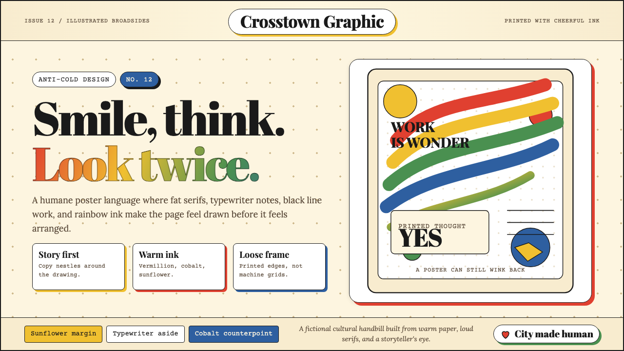 Milton Glaser / Push PinWarm counter-Swiss joy. Vermillion, cobalt and sunflower arcs orbit fat serif…温暖地反叛瑞士冷感:奶油纸上朱砂、钴蓝、向日葵弧线环绕粗衬线。
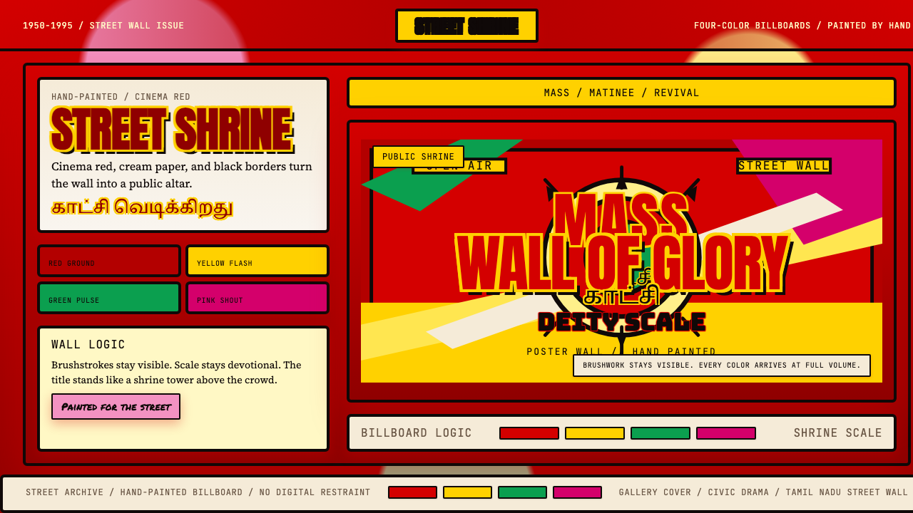 Tamil Cinema Poster (MGR era)The wall becomes a shrine. Red, yellow, green, and pink crash into cream pane…墙面化作神龛。红黄绿粉撞上奶油底与黑框。
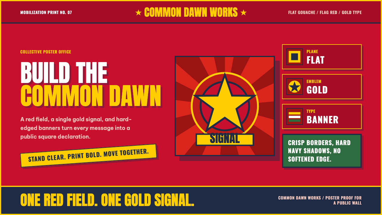 Vietnamese PropagandaFlat color commands. Flag-red fields, gold star rays, and Anton slogans hit a…平涂色块发号召:旗红、金星射线与粗体标语形成海报级冲击。
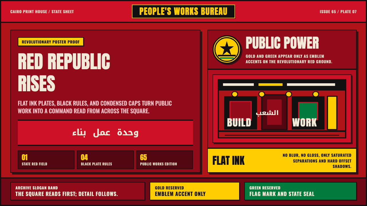 Egyptian Political PosterState power shouts. Red poster grids, black keylines, kufic type, gold-green…国家力量高声宣告:红底海报网格、黑色粗线、库法体与金绿徽记。
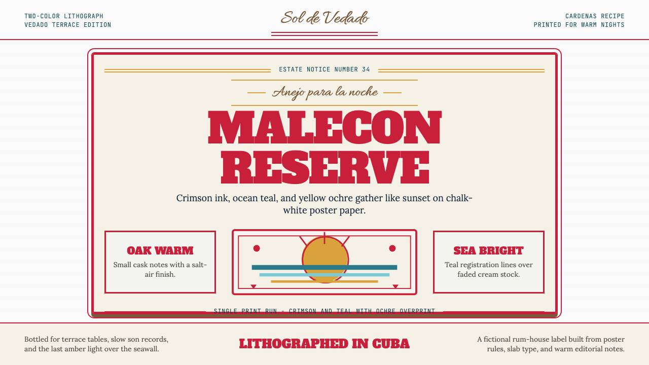 Havana Club Cuban RumSunset in print. Crimson slab type and ocean teal rules age on chalk-white pa…印刷里的日落。深红粗衬线与海洋青绿线框落在白垩纸上。
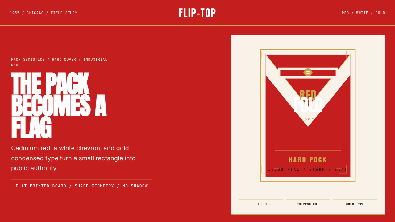 Marlboro Red Flip-Top (1955)Authority in one fold. Cadmium red, white chevron, and gold type read like a…一折成旗。镉红、白人字与金字排出强硬权威。