What is Tamil Cinema Poster (MGR era)?什么是 Tamil Cinema Poster (MGR era)?
Every wall a shrine, every actor a god — Tamil cinema's hand-painted billboards forged one of the twentieth century's most jubilant and unapologetically loud visual languages.每一面墙都是神龛,每一位演员都是神祇——泰米尔电影的手绘广告牌,锻造出二十世纪最狂欢、最毫无愧疚的喧嚣视觉语言。
Tamil Cinema Poster (MGR era) in briefTamil Cinema Poster (MGR era) 速览
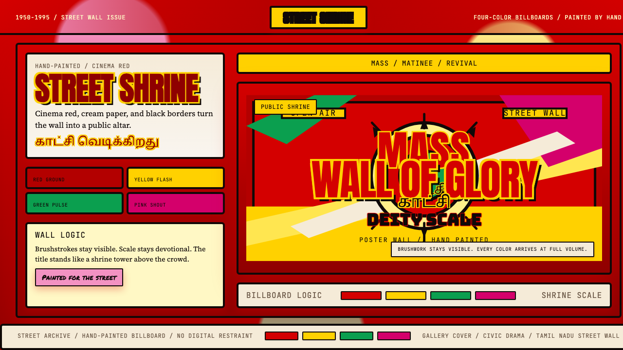
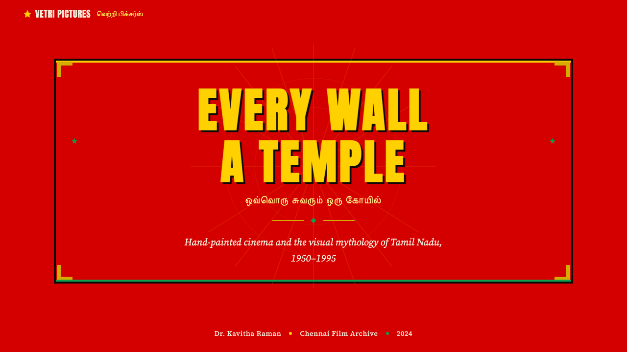
Tamil Cinema Poster (MGR era) is a maximalist graphic tradition developed by hand-painters across Tamil Nadu between the 1950s and the 1990s, reaching its most exuberant expression during the golden decades of M. G. Ramachandran's screen dominance. The style is defined by a collision of at least four fully saturated colors — a blazing cinema-red ground, electric yellow, vivid green, and hot pink — set against cream-paper panels and framed with heavy black outlines. Text and image compete for attention at equal volume, and that competition is the point.泰米尔电影海报(MGR时代)是一种极繁主义平面传统,由泰米尔纳德邦各地手绘师在1950年代至1990年代间发展而成,在M. G. 拉玛钱德兰(MGR)主导银幕的黄金数十年间达到最为张扬的表达。这种风格以至少四种完全饱和的色彩相撞为标志——灼热的电影红底色、电光黄、鲜艳绿与炽烈粉红——映衬着奶油纸内容面板,并以厚重的黑色轮廓线框定。文字与图像以同等分贝争夺注意力,而这场竞争本身就是目的。
The visual system is iconographic at its core: the film star is not a person but a divine presence, rendered in the conventions of Hindu temple portraiture — frontal gaze, heroic scale, and an aura of sacred light suggested by halo-like compositions. This conflation of cinematic celebrity and religious imagery was not accidental. Kollywood stars, particularly MGR, operated as political figures with devout mass followings, and the poster functioned simultaneously as advertisement, political banner, and object of communal devotion.这套视觉系统在本质上是图像崇拜的:电影明星不是凡人,而是神圣存在,以印度教寺庙肖像画的惯例呈现——正面凝视、英雄尺度,以及由光环式构图暗示的圣光氛围。这种将电影名人与宗教图像混融的做法并非偶然。宝莱坞(Kollywood)明星,尤其是MGR,作为政治人物运作,拥有虔诚的大众追随者,海报同时承担着广告、政治横幅与公共朝圣对象三重功能。
Unlike modernist poster traditions that sought to reduce and rationalize, the MGR-era aesthetic operates by accumulation. More color is better than less. More lettering is better than silence. The hand-painted quality — visible brushwork, slight imprecision in letterforms, the warmth of pigment on rough-cast walls — is not a flaw to be corrected but the medium's signature. Every surviving example is unique; the style carries within it the memory of the craftsman's hand.与寻求简化和理性化的现代主义海报传统不同,MGR时代的美学以积累为运作逻辑:色彩越多越好,字体越密越好。手绘质感——可见的笔触、字形的些微不精确、颜料在粗糙墙面上的温度——不是需要纠正的缺陷,而是这种媒介的签名。每一件幸存的作品都是独一无二的;这种风格在其内部携带着工匠之手的记忆。
See the Tamil Cinema Poster (MGR era) design system查看 Tamil Cinema Poster (MGR era) 完整设计系统
Where does Tamil Cinema Poster (MGR era) come from?Tamil Cinema Poster (MGR era) 从何而来?
The story begins not in a design school but on the streets of Chennai (then Madras), Madurai, and Coimbatore in the early 1950s, when the Tamil film industry was expanding rapidly and needed ways to announce new releases to largely non-literate mass audiences. Printed lithographic posters existed, but they were expensive, slow to produce, and small. The solution that emerged was the hand-painted billboard: enormous canvases — sometimes thirty feet across — executed directly on whitewashed compound walls or on cloth-and-wood hoardings erected at street intersections and cinema entrances across the state.故事的起点不是设计学校,而是1950年代初金奈(当时称为马德拉斯)、马杜赖和哥印拜陀的街头。那时泰米尔电影业正在迅速扩张,需要向主要由文盲构成的大众受众宣传新片。石版印刷海报虽然存在,但造价昂贵、制作缓慢、尺寸有限。应运而生的解决方案是手绘广告牌:有时宽达三十英尺的巨幅画作,直接绘制在石灰粉刷的院墙上,或绘在竖立于全邦街道路口和电影院入口的布-木支架上。
The craftsmen who created these works were professional sign-painters, many of them trained in the traditions of South Indian decorative arts, temple banner painting, and festival decoration. Their visual vocabulary merged several distinct streams: the frontal, hieratic portraiture of Hindu temple iconography, in which divine or royal figures are shown in full-face with symbolic attributes; the Soviet socialist-realist poster aesthetic, which had filtered into South Asian political imagery through the Indian communist and Dravidian political movements of the 1940s and 1950s; and the raw commercial energy of Western film publicity, itself already lurid and attention-seeking. The result of this collision was something wholly indigenous — a style that did not exist anywhere else on earth.创作这些作品的工匠是专业招牌画师,其中许多人受训于南印度装饰艺术、寺庙旗幡绘制和节庆装饰的传统。他们的视觉词汇融合了几条截然不同的源流:印度教寺庙图像志的正面、神圣式肖像画传统(神祇或王室人物以正脸呈现,配有象征性标志);苏联社会主义现实主义海报美学(经由1940至50年代印度共产主义和达罗毗荼政治运动渗入南亚政治图像);以及西方电影宣传的原始商业能量(本身已足够夺目张扬)。这场碰撞的结果是某种完全本土的东西——一种在地球上任何其他地方都不存在的风格。
The Dravidian political context is inseparable from the visual language. MGR was not merely a film star; he was the face of the AIADMK party and eventually Chief Minister of Tamil Nadu. His films carried explicit political messaging, and his posters were simultaneously campaign materials. The aesthetic of the MGR poster — the heroic scale, the divine glow, the colors associated with prosperity and auspiciousness in South Indian tradition — served a political as much as a cinematic function. The painter C. Madhavan and workshop traditions in Madurai and Chennai developed codified conventions for representing MGR: specific color combinations signaled specific emotional registers.达罗毗荼政治背景与这种视觉语言不可分割。MGR不仅仅是电影明星;他是全印安纳德拉维达进步联盟(AIADMK)党的面孔,最终成为泰米尔纳德邦首席部长。他的电影承载着明确的政治信息,他的海报同时也是竞选材料。MGR海报的美学——英雄尺度、神圣光辉、与南印度传统中繁荣和吉祥相关联的色彩——服务于政治目的,不亚于服务于电影目的。画师C. 马达万和马杜赖、金奈的工坊传统,发展出一套程式化的MGR表现惯例:特定色彩组合传达特定的情感调性。
The tradition reached its technical apex in the 1960s and 1970s, when large workshops employed dozens of painters working in relay — one specialist handling backgrounds, another skin tones, another lettering, another the elaborate decorative borders. Individual painters achieved reputations and fan followings of their own. Veera Santhanam, among others, was celebrated for the luminous quality of his flesh tones and the particular energy of his hand-lettered Tamil script. The tradition began its decline with the spread of offset lithography in the 1980s and digital printing in the 1990s, but it never entirely disappeared: a small community of practitioners continued working into the 2010s, and the style has attracted renewed documentary attention and revival efforts from that decade onward.这一传统在1960至70年代达到技术顶峰,大型工坊雇用数十名画师接力作业——一位专攻背景,一位专攻肤色,一位专攻字体,一位专攻精心繁复的装饰边框。个别画师获得了属于自己的声誉与粉丝群体。维拉·桑塔纳姆等人以其皮肤色调的光辉质感和手绘泰米尔文字的特有张力享誉一时。随着1980年代胶版石印和1990年代数字印刷的普及,这一传统开始式微,但从未彻底消失:一小群从业者持续工作至2010年代,这种风格从那十年起吸引了新的纪录片关注与复兴努力。
What defines the Tamil Cinema Poster (MGR era) look?Tamil Cinema Poster (MGR era) 的视觉特征是什么?
Color Saturation and Simultaneity色彩饱和度与同时性
The defining characteristic is the use of four or more fully saturated colors at once, without hierarchy or apology. A cinema-red ground (associated with both drama and auspiciousness in Tamil culture) underlies cream-paper content panels; electric yellow, vivid green, and hot pink are deployed across lettering, decorative borders, and secondary figure elements. No single color moderates the others. The effect is additive — each hue amplifies rather than balances its neighbors — producing an overall field of energy that reads from great distances and under bright tropical sunlight.最核心的特征是同时使用四种或四种以上完全饱和的色彩,无层级、无道歉。电影红底色(在泰米尔文化中与戏剧性和吉祥均有关联)衬托奶油纸内容面板;电光黄、鲜艳绿与炽烈粉红铺展于字体、装饰边框和次要人物元素之间。没有任何一种颜色节制其他颜色。效果是叠加性的——每一种色调放大而非平衡其邻色——产生一个整体的能量场,在遥远距离和明亮热带阳光下依然清晰可辨。
Iconographic Portraiture图像崇拜式肖像
The central figure — almost always the lead actor — is rendered in a frontal or three-quarter gaze derived from Hindu temple portraiture. The scale is heroic: the face occupies a disproportionately large area of the composition, often spanning the full width of the billboard. Skin tones are idealized and luminous, rendered with careful gradation by skilled painters. A halo-like treatment of the background behind the head — lighter values, radiating compositional lines, or aureole-shaped decorative frames — elevates the figure toward the divine. Expression is direct and commanding rather than naturalistic or introspective.中心人物——几乎总是主演——以正面或四分之三视角呈现,源自印度教寺庙肖像画传统。尺度是英雄式的:面部占据构图中不成比例的巨大面积,常常横跨广告牌的全部宽度。肤色被理想化并富有光辉,由技艺娴熟的画师以细心的渐变呈现。头部后方背景的光环式处理——更浅的色调、向外辐射的构图线条、或光环形装饰框架——将人物提升至神圣境界。表情是直接而具有权威感的,而非自然主义或内省式的。
Heavy Black Outlining厚重黑色轮廓
Every major element — figures, lettering, panel borders, decorative motifs — is defined by a thick black outline. This convention has both practical and aesthetic functions: practically, it ensures legibility at distance and in varied lighting conditions; aesthetically, it flattens depth and gives the composition a graphic, almost stained-glass quality. The outlines do not describe shadow or form modelling; they are boundary declarations. Even fine interior details are separated from their ground by visible black separation lines, giving the work its characteristic crispness within its overall maximalism.每一个主要元素——人物、字体、面板边框、装饰母题——都以粗重的黑色轮廓线定义。这一惯例兼具实用和美学功能:在实用上,它确保在远距离和不同光线条件下的可读性;在美学上,它压平了深度,赋予构图一种平面的、近乎彩色玻璃式的品质。轮廓线不描述阴影或形态塑造,而是边界宣言。即使是精细的内部细节也以可见的黑色分隔线与底面区分开来,在整体极繁主义中赋予作品其特有的清晰感。
Cream Panel Insets奶油色嵌板
Against the assertive colored grounds, cream or off-white rectangular panels serve as the breathing space for title text, billing information, and supporting imagery. These panels do not use a pure, clinical white — the warmth of the cream tone references the paper and cloth grounds on which early posters were painted, and it harmonizes with the warm-toned skin tones of the central figures. The cream panels are often framed with decorative double-line borders or ornamental corner treatments rendered in contrasting saturated hues, maintaining the overall festive register while organizing information.在强势的彩色底面映衬下,奶油色或米白色矩形嵌板作为片名文字、演职员信息和支持图像的喘息空间。这些面板并不使用纯粹、临床式的白色——奶油色调的温暖感参照了早期海报所绘制的纸张和布料底面,并与中心人物温暖的肤色形成和谐。奶油嵌板常以装饰性双线边框或以对比饱和色描绘的花饰角落处理加以框定,在组织信息的同时维持整体节庆氛围。
Hand-Lettered Display Typography手写展示字体
Title lettering in both Tamil script and Roman characters is hand-painted rather than typeset, giving each letterform a weight and individuality that commercial type cannot reproduce. Tamil characters are drawn at monumental scale, with exaggerated stroke contrast — swelling curves and tapered terminals — that makes them readable from moving vehicles. Roman lettering follows similar conventions, often condensed and stacked vertically to fit panel proportions. The letters themselves are frequently filled with secondary color fields or graduated tones, and outlined in black, so that each word operates as a self-contained graphic object rather than a stream of text.泰米尔文字和罗马字母的片名文字均为手绘而非排印,赋予每个字形一种商业字体无法复制的重量感与个性。泰米尔字符以庄严尺度绘制,具有夸张的笔画对比——膨胀的曲线与收尖的末端——使其在行进的车辆上依然可读。罗马字母遵循类似惯例,常被压缩并垂直叠排以适应面板比例。字母本身常以次要色域或渐变色调填充,并以黑色勾边,使每个词语作为独立的平面对象运作,而非文字流。
Decorative Borders and Festive Ornament装饰边框与节庆纹样
The composition is typically enclosed by one or more layers of decorative border — geometric interlace, stylized floral motifs, stepped patterns derived from South Indian temple architecture, or bands of repeated dots and dashes. These borders are not structural in any modernist sense; they are celebratory punctuation. Their visual vocabulary draws on the kolam (floor-pattern) tradition, festival garland arrangements, and the decorative programs of gopuram (temple tower) sculpture. The border signals that this image is an occasion, not merely a notice.构图通常被一层或多层装饰边框包裹——几何交错纹、程式化花卉母题、源自南印度寺庙建筑的阶梯图案、或重复点与横线的带状纹样。这些边框在任何现代主义意义上都不具有结构功能;它们是庆典性的标点。其视觉词汇取材于kolam(地面图案)传统、节庆花环排布,以及gopuram(寺庙塔楼)雕塑的装饰程式。边框传递着一个信号:这幅图像是一个场合,而不仅仅是一则通知。
Narrative Compression叙事压缩
Where Western film posters of the same era tended toward a single dominant image, Tamil cinema posters of the MGR period regularly contain multiple narrative scenes arranged in smaller vignette panels around the central portrait — a fight sequence here, a romantic scene there, a landscape establishing the film's setting. This narrative compression, borrowed partly from temple narrative sculpture and partly from illustrated calendar art (known as bazaar art or Ravi Varma prints), means the poster functions as a visual summary of the entire film. A viewer who had not yet seen the movie could form a complete picture of its story and mood from the billboard alone.同一时代的西方电影海报倾向于单一主导图像,而MGR时期的泰米尔电影海报则常常在中心肖像周围,以小型插图面板排列多个叙事场景——这里一段打斗,那里一段爱情,另有一处建立电影场景的风景。这种叙事压缩——部分借鉴自寺庙叙事雕塑,部分借鉴自插图历书艺术(即集市艺术或拉维·瓦尔马版画)——意味着海报作为整部电影的视觉摘要而运作。一个尚未观看该电影的观众,仅凭广告牌就能形成对其故事与氛围的完整认知。
See the Tamil Cinema Poster (MGR era) design system查看 Tamil Cinema Poster (MGR era) 完整设计系统
Who shaped Tamil Cinema Poster (MGR era)?谁塑造了 Tamil Cinema Poster (MGR era)?
MGR was the actor whose persona gave the entire poster tradition its defining character. Born in Sri Lanka and raised in Tamil Nadu, he became the dominant star of Tamil cinema from the early 1950s through the 1970s, known for roles as a righteous hero who championed the poor. His films were unambiguously moralistic, his screen presence was physical and commanding, and his political ambitions — he founded the AIADMK party in 1972 and served as Chief Minister of Tamil Nadu from 1977 until his death in 1987 — were inseparable from his cinema identity. Poster painters developed a specific iconographic repertoire for MGR: his characteristic tilted cap, his athletic stance, the glow of near-sacred light around his head. He is, in the most literal sense, the reason the style exists as it does.MGR是以其荧幕形象赋予整个海报传统核心特征的演员。他出生于斯里兰卡,在泰米尔纳德邦成长,从1950年代初至70年代成为泰米尔电影的主宰明星,以扮演为穷人伸张正义的道德英雄著称。他的电影具有鲜明的道德说教色彩,他的荧幕气场富有体魄感与权威感,他的政治抱负——1972年创立AIADMK党,1977年至1987年去世前担任泰米尔纳德邦首席部长——与他的电影形象不可分割。海报画师为MGR发展出一套特定的图像词汇:他标志性的斜戴帽、他的运动姿态、他头部周围近乎神圣的光辉。从最字面的意义上说,他就是这种风格以其现有形式存在的原因。
MGR's great rival on screen, Sivaji Ganesan represented an entirely different acting philosophy — psychologically intense, theatrical, and trained in classical performance traditions rather than action choreography. Though his persona required different poster conventions (more formal, more emotionally volatile compositions), his enormous fame through the 1960s and 1970s meant that painters working in his tradition refined the style's capacity for expressive facial rendering and emotional range. The competition between MGR's and Sivaji's fan bases was also a competition between poster painters, which drove technical excellence and visual innovation across the tradition.MGR荧幕上的劲敌西瓦吉·甘纳珊代表着截然不同的表演哲学——心理密度高、戏剧性强,受训于古典表演传统而非动作编舞。尽管他的形象需要不同的海报惯例(更正式、情感更为波动的构图),但他在1960至70年代的巨大名气意味着在其传统中工作的画师精炼了这种风格在表情描绘和情感表达幅度方面的能力。MGR与西瓦吉粉丝群体之间的竞争同时也是海报画师之间的竞争,推动了整个传统的技术精进与视觉创新。
One of the most celebrated hand-painters in the Tamil cinema tradition, Santhanam was renowned for the luminous quality of his portraiture — particularly his rendering of skin tones under the flat, direct tropical light convention of the style. He worked in Madurai and developed a following among filmmakers who specifically sought out his workshops for key poster commissions. His name attached to a billboard functioned somewhat like an auteur credit. The attention paid to individual painters like Santhanam reflects the degree to which this commercial tradition was also understood, by its own participants, as an artistic one.作为泰米尔电影传统中最受推崇的手绘师之一,桑塔纳姆以其肖像画的光辉质感而享誉——尤其是他在这种风格的平面、直射热带光线惯例下对肤色的渲染。他在马杜赖工作,并在电影人中建立了声誉,那些人专程寻访他的工坊委托重要海报任务。他的名字附在广告牌上,功能上有些像作者声明。对桑塔纳姆这类个别画师的关注,反映出这种商业传统在其自身参与者眼中同时也被理解为一种艺术传统的程度。
Madhavan was a prominent figure in the Chennai workshop tradition who helped systematize the visual conventions for representing Tamil film stars during the height of the MGR era. His workshop trained multiple generations of painters and established production methods that balanced speed — a large billboard might need to be executed within days of a film's announcement — with the quality of finish expected of prestige productions. His work represents the workshop-based, collaborative dimension of the tradition, as opposed to the individual-artist model. Many Chennai cinema billboards of the 1960s and 1970s passed through his workshop.马达万是金奈工坊传统中的重要人物,在MGR时代鼎盛时期帮助系统化了描绘泰米尔电影明星的视觉惯例。他的工坊培训了多代画师,并建立了平衡速度(一幅大型广告牌可能需要在电影宣布后数日内完成)与精品制作所期望的完成质量的生产方法。他的工作代表着这一传统以工坊为基础的集体协作维度,有别于个人艺术家模式。1960至70年代许多金奈电影广告牌都经由他的工坊产出。
How do you use Tamil Cinema Poster (MGR era) today?今天怎么用 Tamil Cinema Poster (MGR era)?
Tamil Cinema Poster (MGR era) is a high-energy, maximalist system that rewards deliberate overstatement. Applying it correctly means committing fully to its logic of accumulation: more saturated color, more declared hierarchy, more celebratory frame — not as decoration layered over a restrained layout, but as the organizing principle from which the entire composition is built. The single most common failure is attempting to blend this system with modernist restraint, producing something that looks neither festively loud nor cleanly minimal.泰米尔电影海报(MGR时代)是一套高能量、极繁主义的系统,奖励经过审慎的夸张。正确应用它意味着完全投身于其积累逻辑:更饱和的色彩、更明确的层级、更多的庆典性边框——不是叠加在克制版面上的装饰,而是整个构图由此建立的组织原则。最常见的失败是试图将这套系统与现代主义克制融合,产出的结果既不够欢腾喧嚣,也不够干净极简。
For presentation slides, the style works most powerfully on title and divider pages. A cinema-red or deeply saturated full-bleed ground with cream-panel insets for the title creates immediate visual authority. The cover benefits from a large, centered or slightly asymmetric typographic treatment — the title in massive display weight, framed by decorative border elements at the corners or edges. Content slides should be treated as structured panels: use distinct background blocks (cream, red, yellow) to separate content zones rather than relying on subtle grid lines. Data slides gain character when chart elements — bars, donut segments, progress rings — are rendered in the primary colors of the palette, with heavy black outlines giving them the bounded, object-like quality of the poster's figure elements.对于演示文稿,这种风格在标题页和分隔页上最为强效。以电影红或深饱和底色满幅铺底,奶油嵌板承载标题,即刻产生强烈的视觉权威感。封面受益于大型、居中或略微非对称的字体处理——标题以极大展示字重呈现,由角落或边缘的装饰边框元素加以框定。内容页应被当作结构化面板处理:使用明显的背景色块(奶油色、红色、黄色)分隔内容区域,而非依赖微妙的网格线。当图表元素——柱条、环形图扇区、进度环——以调色板的主色呈现,并以粗重黑色轮廓线赋予它们有界的、对象式的品质时,数据页获得了海报人物元素的那种特征。
For web interfaces, the style is most at home in promotional landing pages, event microsites, and entertainment-sector dashboards where high visual energy is appropriate and even expected. Approach the layout as a series of full-width banded sections, each carrying a distinct background color from the palette, with cream or off-white text panels as information containers. Navigation and interactive elements benefit from the style's heavy outlining convention: bordered buttons with no radius or very slight radius, outlined card components, text links that carry visible underline weight. Pricing or tier differentiation works well when each tier is assigned one distinct saturated hue from the palette, treated as an identity rather than a gradient.对于网页界面,这种风格最适合推广落地页、活动微型站点和娱乐行业仪表板——在那些场合,高视觉能量是恰当的,甚至是被期待的。将版面设计为一系列全宽带状区段,每段承载调色板中一种不同的背景色,奶油色或近白色文字面板作为信息容器。导航和交互元素受益于这种风格的重轮廓惯例:无圆角或极小圆角的边框按钮、带轮廓的卡片组件、带可见下划线粗度的文字链接。当每个等级被分配调色板中一种明确饱和色调(作为身份而非渐变来处理)时,定价或等级区分的呈现效果尤为出色。
For editorial and marketing work, the style enables a poster-scale boldness that cuts through visual noise. Feature headlines and section titles can be set at a scale most editorial designers would consider excessive — in this system, excess is correct. Marketing one-pagers work well with the alternating-panel convention: a red band followed by a cream band followed by a yellow band, each containing a distinct content block. The festive border convention translates naturally to section dividers and call-out boxes. Illustration assets that follow the flat, outlined, high-saturation conventions of the style will integrate more naturally than photography; if photography is used, it works best when treated as a silhouetted figure against a solid color ground rather than as a realistic scene.对于编辑和营销内容,这种风格能够实现海报级的大胆感,穿透视觉噪音。功能性标题和章节标题可以设置在大多数编辑设计师认为过度的尺度——在这套系统中,过度是正确的。营销单页以交替面板惯例运作效果良好:红色带状区段,接以奶油色带状区段,再接以黄色带状区段,每段包含一个独立的内容块。节庆边框惯例自然转化为章节分隔线和引用框。遵循这种风格的平面、轮廓线、高饱和惯例的插图资产,比摄影图像更自然地融入;若使用摄影,以轮廓剪影形式(人物映衬纯色底面)呈现,比作为写实场景呈现效果更佳。
The most common mistake when working with this style is treating the palette as a selection problem — picking one or two colors from the system and applying them cautiously. The MGR-era poster draws its power from simultaneity: all the saturated colors are present at once, and their collective pressure is the effect. A second common error is using the style's ornamental elements — the decorative borders, the corner treatments — as accent details on an otherwise plain layout. In the source tradition, ornament is structural: it frames, organizes, and declares the sacred register of the composition. Applied as decoration alone, it reads as costume rather than system.使用这种风格时最常见的错误,是将调色板视为选择问题——从系统中挑选一两种颜色谨慎应用。MGR时代的海报从同时性中汲取力量:所有饱和色彩同时在场,它们的集体压力就是效果。第二种常见错误是将这种风格的装饰性元素——装饰边框、角落处理——作为点缀细节附于本质上朴素的版面上。在源传统中,纹样是结构性的:它框定、组织并宣告构图的神圣调性。仅作为装饰应用时,读起来像是服装,而非系统。
See the Tamil Cinema Poster (MGR era) design system查看 Tamil Cinema Poster (MGR era) 完整设计系统
Tamil Cinema Poster (MGR era) — FAQTamil Cinema Poster (MGR era) · 常见问题
Is this style appropriate for serious or professional contexts, or only for entertainment?这种风格只适合娱乐场景,还是也能用于严肃或专业语境?
The style's origins are in cinema publicity and political campaigning — both of which require the highest possible visual authority, just directed at mass rather than elite audiences. The MGR-era poster is not frivolous; it is maximally serious in its intentions, deploying every visual register available to demand attention and project power. In contemporary use, the style works well wherever that combination of celebratory energy and commanding authority is appropriate: product launches, festival-scale events, cultural institutions, entertainment platforms, and any context where the goal is to be remembered rather than merely noticed. It struggles in contexts that require understated credibility — legal, financial, or medical professional services, for example — where its exuberance reads as lacking gravity.这种风格的起源是电影宣传与政治竞选——两者都需要最高可能的视觉权威感,只是面向大众受众而非精英受众。MGR时代的海报并不轻浮;它在意图上是极度严肃的,部署一切可用的视觉语域来要求注意力、投射权力。在当代应用中,这种风格在任何需要庆典能量与权威感相结合的场合都运作良好:产品发布、节庆规模的活动、文化机构、娱乐平台,以及任何目标是被铭记而非仅被注意的语境。它在需要低调可信度的场合则表现欠佳——例如法律、金融或医疗专业服务——在那里,它的张扬可能被解读为缺乏庄重感。
How should photography be handled when working in this style?在这种风格中如何处理摄影图像?
The MGR-era poster tradition was hand-painted, not photographic, so photography requires deliberate adaptation. The most faithful approach is to treat photographic portraits as the hand-painters treated their subjects: extract the figure from its original background, place it against a solid saturated color ground, and add a heavy outline treatment to the silhouette edge. This gives the photograph the bounded, object-like quality of the painted figure. Realistic, context-rich photography — candid scenes, documentary images, environmental portraits — resists the style because it imports naturalistic depth into a system built on flat declaration. High-contrast, strongly lit studio portraits adapt most readily because their graphic simplicity is already close to the painting tradition's conventions.MGR时代的海报传统是手绘的,而非摄影的,因此摄影图像需要刻意改造。最忠实的方式是以手绘师对待主体的方式处理摄影肖像:从原始背景中提取人物,置于纯饱和色底面上,并在轮廓边缘添加粗重的描边处理。这赋予照片绘制人物那种有界的、对象式的品质。写实的、背景丰富的摄影——抓拍场景、纪实图像、环境肖像——与这种风格相抵触,因为它将自然主义的深度引入了一个建立在平面宣告之上的系统。高对比度、强烈打光的棚拍肖像最易改造,因为其平面化的图形简洁性已接近绘画传统的惯例。
Can this style be used in a restrained or 'quiet' version for contexts that cannot handle full maximalism?这种风格能否用于需要克制或「安静」版本的场合——对于无法承受完全极繁主义的语境?
A reduced version is possible, but it requires conscious choices about which elements carry the style's identity and which can be scaled back without losing recognition. The non-negotiable elements are the color logic (cream panels against saturated grounds), the heavy black outlining, and the display-scale typography. The most reducible elements are the decorative borders and the narrative vignette panels — these can be stripped away for a cleaner composition that still reads as belonging to the tradition. Using only two saturated colors rather than four, and limiting ornamental borders to a single framing element, produces a version that is legible in moderately formal contexts without becoming unrecognizably generic. Going further than this — removing the outlining, softening the colors to pastels, or switching to fine-weight type — exits the style entirely.简化版本是可行的,但需要有意识地判断哪些元素承载这种风格的识别性、哪些可以缩减而不失辨识度。不可妥协的元素是色彩逻辑(饱和底色上的奶油嵌板)、粗重黑色轮廓线,以及展示级字体。最可削减的元素是装饰边框和叙事插图面板——这些可以去除,形成更简洁的构图,仍然可被识别为属于这一传统。仅使用两种而非四种饱和色,并将装饰边框限于单一框架元素,产出的版本在适度正式的场合中是可读的,而不至于沦为无法识别的通用风格。超出这个范围——去除轮廓线、将色彩软化为粉彩、或换用细字重字体——则完全脱离了这种风格。
What distinguishes this style from other South Asian or Bollywood poster traditions?这种风格与其他南亚或宝莱坞海报传统有何区别?
Several features are distinctive to Tamil Nadu and the Dravidian cultural context specifically. First, the degree of religious iconographic overlay: the deification of the star is more explicit, more formal, and more structurally central in Tamil cinema poster conventions than in most Hindi film publicity of the same era. Second, the color density: Tamil posters of the MGR period use saturated colors at a simultaneity and intensity that exceeds most North Indian or Bengali film poster traditions, which tended toward more gradient-based rendering and more limited palettes. Third, the political dimension: the direct conflation of cinema poster and political campaign material — using identical visual conventions for both — is particularly strong in the Tamil context because of the Dravidian movement's deep integration of cinema and politics. Bollywood posters of the 1950s to 1970s have their own distinct conventions, typically more gestural and romantic in figure treatment, less iconographic and less politically coded.几个特征是专属于泰米尔纳德邦和达罗毗荼文化语境的。首先是宗教图像叠加的程度:在泰米尔电影海报惯例中,明星的神化比同时代大多数印地语电影宣传更为明确、更为正式、在结构上更居核心位置。其次是色彩密度:MGR时期的泰米尔海报以超越大多数北印度或孟加拉电影海报传统的同时性和强度使用饱和色彩,后者倾向于更多基于渐变的渲染和更有限的色板。第三是政治维度:电影海报与政治竞选材料的直接混融——对两者使用相同的视觉惯例——在泰米尔语境中尤为突出,因为达罗毗荼运动将电影与政治深度整合。1950至70年代的宝莱坞海报有其自身独特惯例,在人物处理上通常更具姿态感和浪漫气质,图像崇拜色彩较弱,政治编码也较少。
How does the style handle dark or night-mode interfaces?这种风格如何处理深色或夜间模式界面?
The MGR-era poster tradition was conceived for daylight visibility on outdoor walls — its entire logic is calibrated for maximum legibility under bright tropical sun. A direct dark-mode inversion is therefore somewhat against the style's grain. That said, a workable dark variant exists: replace the cream panel grounds with a deep charcoal or near-black, maintain the cinema-red and other saturated hues as accent colors, and keep the heavy black outlines as reversed-out white or cream outlines instead. This preserves the outline structure and the color logic while shifting the atmospheric register from festive daylight to something closer to a cinema-interior or festival-night feeling. The key constraint is that the saturated colors must remain fully saturated — desaturating them to accommodate a dark ground produces a muddy, unrecognizable result.MGR时代的海报传统是为户外墙面的日光可见性而构想的——其全部逻辑都针对明亮热带阳光下的最大可读性而校准。因此,直接的深色模式反转在某种程度上违背这种风格的本质。尽管如此,一种可行的深色变体是存在的:将奶油嵌板底面替换为深炭灰或近黑色,保持电影红和其他饱和色调作为强调色,并将粗重黑色轮廓线改为反白或奶油色轮廓线。这在将氛围调性从节庆日光转向更接近电影院内部或节庆夜晚感觉的同时,保留了轮廓结构和色彩逻辑。关键约束是饱和色必须保持完全饱和——为适应深色底面而降低饱和度,会产生浑浊、无法辨认的结果。
Related design styles相关设计风格
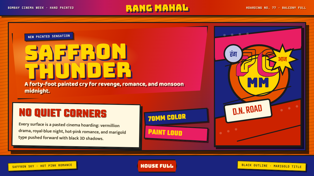 Bollywood Poster Art (1970s)Subtlety is unaffordable. Saffron fields, Bungee shadows, diagonal hoarding d…节制太便宜:藏红花底、Bungee黑影与斜向招贴制造十米戏剧。
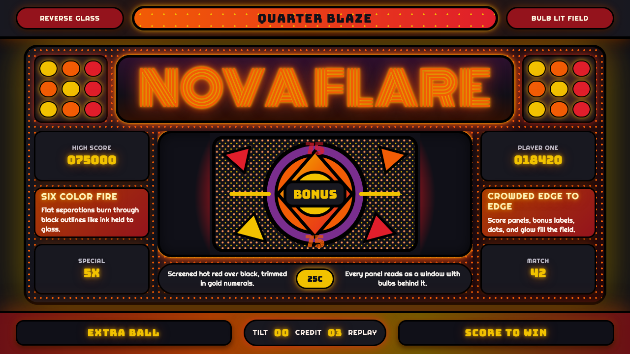 Pinball BackglassGlows like paid light. Monoton type, black outlines, orange-red halftones cro…像投币后的灯光燃起。Monoton 字体、黑描边与橙红半调挤满玻璃。
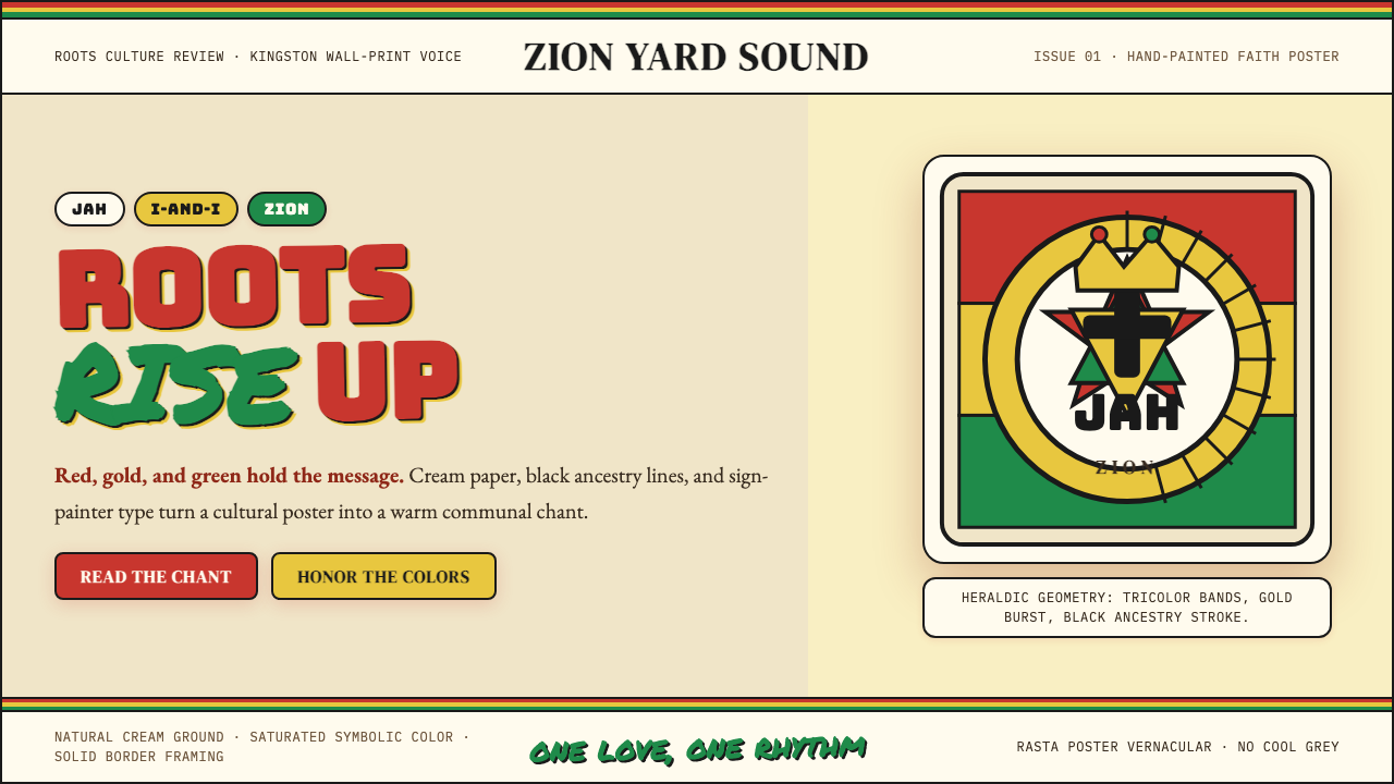 Caribbean Rastafarian (Jamaica)Warm faith, loud color. Red-gold-green bands and black poster type carry the…温暖信仰,高饱和发声:红金绿横带与黑色海报字承载吟唱。
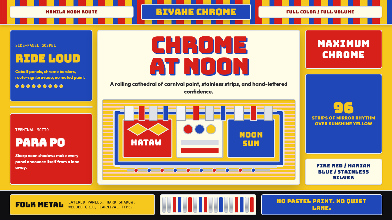 Filipino Jeepney (Chrome & Streamer)Maximalism has wheels. Sunshine yellow, chrome strips, Bungee route-sign type.极繁主义上路:阳光黄、铬银饰条与 Bungee 路牌字。
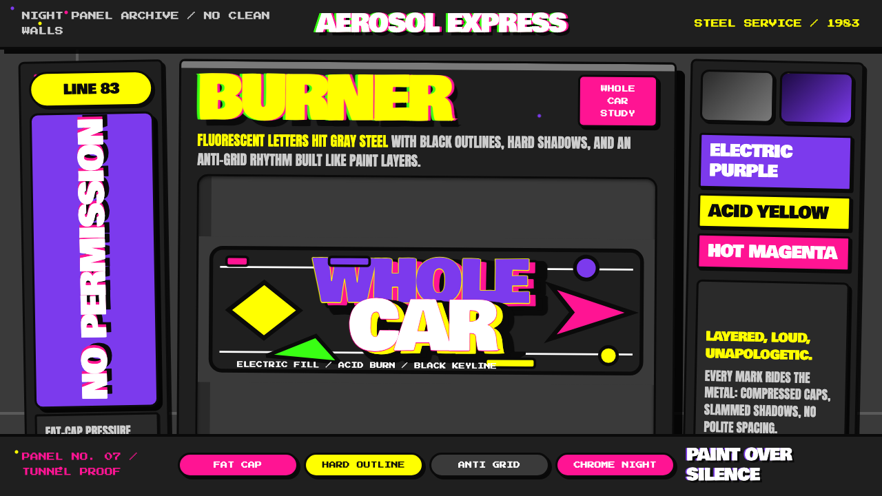 NYC Subway Graffiti (1983)Bombed steel gets loud. Electric purple and acid yellow stack as hard-outline…钢板被炸响:电紫与酸黄层叠,黑线框出狂野字形。
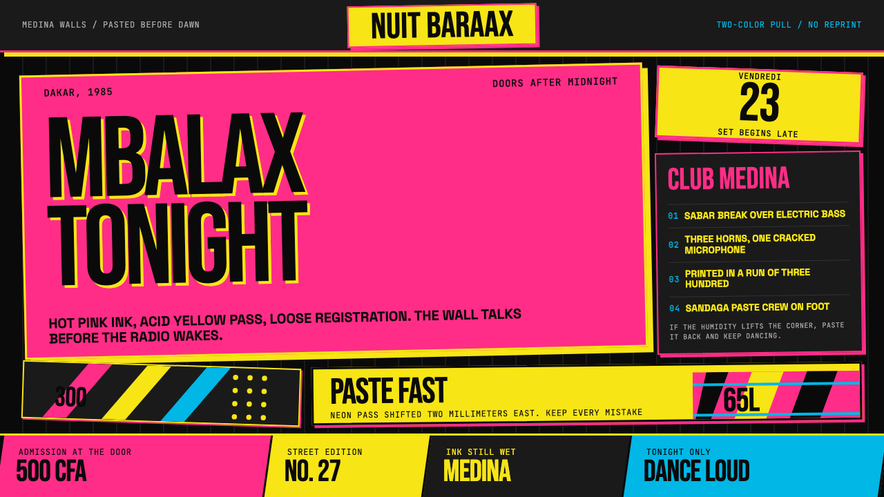 Senegalese Mbalax Poster (Dakar 1985)Street urgency, screen-printed loud. Hot pink and acid yellow drift over blac…街头急迫感:黑色新闻纸上,荧光粉与酸黄错位套印。