What is Pinball Backglass?
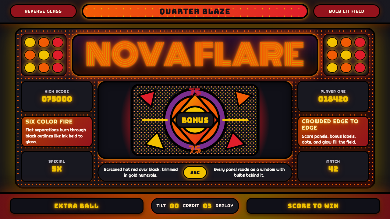
Pinball Backglass glows like paid light in a darkened room — flaming orange-red halftones, heavy black outlines, and a Monoton marquee buzz crowding the glass.
Pinball Backglass in brief
Pinball Backglass Art is a design system drawn from the illustrated glass panels mounted on the backboard of mid-1970s pinball machines. A backglass is screen-printed in reverse — art applied to the back of a sheet of glass, one color layer at a time, six to twelve separate passes for a single image — so that when the machine's internal bulbs switch on in a darkened arcade, the finished artwork glows from behind rather than simply reflecting ambient light.
The visual language built around that lighting condition is unmistakable: saturated, flaming oranges and hot reds float over a deep, uninterrupted black field, every shape separated by a heavy black outline the way each color layer in the printing process needed a hard edge to register cleanly against the next. Halftone dot screens — the same technique used in comic-book printing — render gradation and volume without ever softening into a smooth digital blend.
Score panels and bonus-number windows, lit independently from the illustration around them, are folded directly into the composition rather than treated as separate technical elements. The system carries that same logic: nothing on the page is purely decorative background, because on a real backglass, everything either was lit or sat beside something that was — the whole point of the object was to command attention across a noisy, dim arcade floor.
Where does Pinball Backglass come from?
Pinball backglass art matured during the 1950s-through-1990s era of electromechanical and early solid-state pinball, with its visual peak generally placed in the mid-1970s, when improved printing technology and a golden age of American arcade culture intersected. The 'big three' manufacturers of the period — Bally, Gottlieb, and Williams, all based in and around Chicago — competed as much on the strength of their backglass artwork as on gameplay, since the backglass was the first thing a player saw across a crowded arcade floor, and often the deciding factor in which machine got a coin dropped into it.
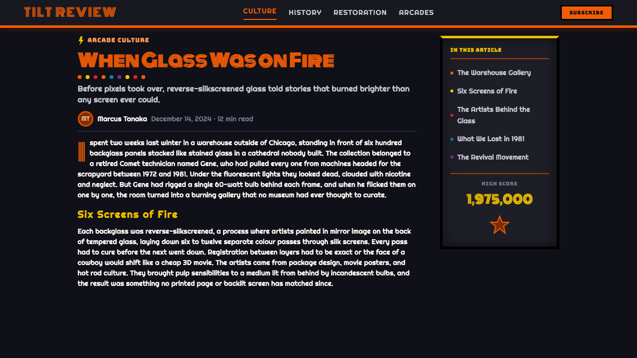
The printing process itself shaped the aesthetic directly. Reverse screen printing onto glass required each color to be applied as a separate pass, printed in reverse order from how it would ultimately be viewed, with the layer meant to sit 'on top' visually applied first. Artists worked with six to twelve separate color separations for a single backglass, and because registration between layers had to be precise, heavy black keylines were used to hide small misalignments and give every shape a hard, graphic edge — a technical necessity that became the style's most recognizable visual signature.
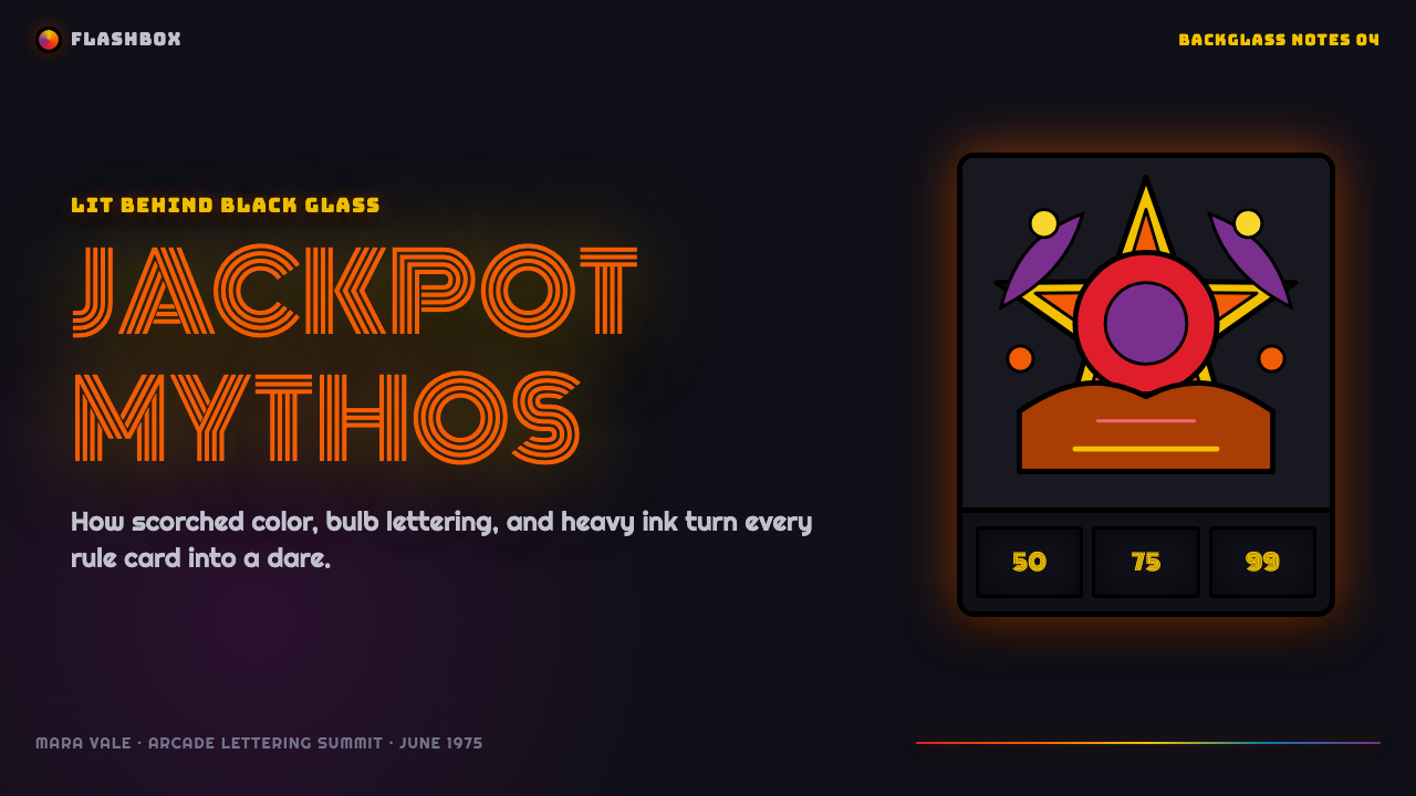
Artists working for these manufacturers pushed saturation deliberately to its limit, since the backglass had to compete for attention under low arcade lighting from across a room. Dave Christensen, a prolific Bally artist, became known for flaming, high-contrast compositions blending psychedelic fantasy and science-fiction imagery with pin-up-style figures; Gordon Morison worked in a similar vein for Williams, and Christian Marche brought a French-American illustrative sensibility to work for Gottlieb. Their combined output defined the genre's dominant visual grammar: hot orange-red color separations, heavy outlines, and unapologetic maximalist illustration crowding every available inch of glass.
The backglass was never illustration alone — score reels and bonus-number windows, lit from within by their own bulbs, sat directly inside the illustrated composition, meaning artists had to design around functional lit elements rather than working on an empty canvas. This constraint, combined with the technical demands of multi-layer reverse printing and the competitive need to dominate a dim, crowded arcade visually, is the direct origin of everything this design system treats as characteristic: glow, saturation, hard outline, and total compositional density.
What defines the Pinball Backglass look?
Color
Flaming orange and hot red dominate, always set against a deep, uninterrupted black field. The contrast is total and unsoftened — this is a palette built to be backlit and read from across a dim room, not to be subtle at close range.
Typography
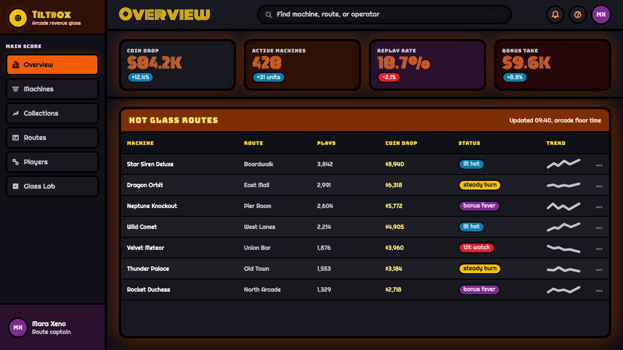
Lettering draws on Monoton, a display typeface built from thin parallel lines that evoke neon marquee tubing. Type functions as another glowing sign within the composition, not as neutral informational text — it should feel lit, not printed.
Heavy Black Outline
Every shape is bordered by a heavy, unbroken black keyline, a direct legacy of multi-layer reverse screen printing where registration between color separations demanded a hard edge. The outline is structural, not stylistic embellishment.
Halftone Screens
Gradation and volume are built from visible halftone dot patterns rather than smooth blends, the same technique used in comic-book color printing. The dots should remain perceptible, not softened into a digital gradient.
Psychedelic Fantasy Illustration
Subject matter leans into science-fiction, fantasy, and pin-up-style figures rendered with maximalist density — the compositional opposite of restraint. Every available surface carries illustrated content; empty space is rare.
Backlit Glow
Warm colors should read as if lit from behind rather than merely painted bright — a distinction achieved by keeping the surrounding field genuinely black rather than dark gray, so warm tones appear to emit light rather than simply reflect it.
Integrated Lit Panels
Functional display elements — score counters, bonus indicators — are designed as part of the illustration itself rather than boxed off separately, echoing how a real backglass integrated its lit score windows directly into the artwork's composition.
Who shaped Pinball Backglass?
A prolific artist for Bally during the golden age of backglass art, Christensen became known for flaming, high-saturation compositions blending psychedelic fantasy and science-fiction imagery with pin-up-style figures. His work exemplifies the style's maximalist density and total commitment to saturated glow.
Morison worked in a comparable idiom for Williams, one of the era's 'big three' manufacturers, contributing to the shared visual grammar of hot color separations and heavy outlines that made backglasses from different companies visually recognizable as belonging to the same genre.
Marche brought a French-American illustrative sensibility to his work for Gottlieb, another of the era's leading manufacturers, contributing to the whimsical, pin-up-inflected fantasy imagery that characterized much of mid-1970s backglass art.
The 'big three' Chicago-based pinball manufacturers of the era competed directly on backglass artwork quality, since it was the first thing a player saw across a crowded arcade floor. Their competitive pressure to visually dominate a dim room is the direct commercial origin of the style's extreme saturation and density.
How do you use Pinball Backglass today?
Pinball Backglass Art works best wherever a design needs to feel loud, energetic, and impossible to ignore — the visual equivalent of a machine competing for a coin in a crowded, dim arcade. Applying it well means committing fully to saturation and contrast rather than moderating them; this style has no quiet register.
On a presentation cover slide, a deep black field crowded with flaming orange-red illustration, heavy black outlines separating every shape, and a Monoton-set title reading like a lit marquee sign makes an unmissable, high-energy opener. Content slides should treat any data display — a counter, a metric, a callout number — as if it were a lit score window embedded directly into the surrounding illustration, rather than a neutral card floating on white. Data visualizations suit bold, halftone-textured bars and flat color-separated shapes rather than smooth gradients.
For web interfaces, the style suits products in gaming, entertainment, nightlife, or anything explicitly nostalgic for arcade culture. A dashboard can use deep black as its base surface, reserve flaming orange-red for primary actions and active states, and render any numeric display — scores, counts, streaks — as a distinctly 'lit' element with its own outlined panel. Pricing pages benefit from treating the featured tier like a jackpot callout: bordered, glowing, and impossible to miss against the surrounding black.
In editorial and marketing contexts, the style supports content about gaming history, arcade culture, and maximalist visual nostalgia particularly well. Long-form articles can use halftone-textured section breaks and heavy-outlined pull-quotes; marketing pages work well as full-bleed, backglass-style hero compositions where the product name itself is rendered as the marquee element, glowing against black.
A common mistake is softening the palette into muted or pastel oranges and reds in the name of 'good taste' — this defeats the entire premise of a style built to dominate a dim room through unapologetic saturation. An equally common error is using smooth digital gradients instead of visible halftone dot patterns and hard color-separated edges, which erases the printing-process texture that gives the style its authentic, screen-printed-glass character.
Pinball Backglass — FAQ
Why is the black outline around every shape so heavy?
It's a direct legacy of the printing process. Reverse screen printing onto glass required six to twelve separate color layers to register precisely against one another, and heavy black keylines hid small misalignments while giving every shape a hard, graphic edge. What began as a technical necessity became the style's most recognizable signature.
Can this style work with a softer, more muted color palette?
Not really, without losing its identity. The entire style exists because backglasses had to compete for attention across a dim, crowded arcade floor — saturation and hard contrast are the point, not a stylistic excess to be tempered. Muting the palette produces something closer to generic retro illustration than authentic backglass art.
Why does typography use Monoton specifically?
Monoton is built from thin parallel lines that visually evoke neon marquee tubing — the lit signage of an arcade itself. Using it keeps typography functioning as another glowing element within the composition, consistent with the system's core idea that nothing on the page is neutral background.
Does this style suit calm, minimal product interfaces?
No — it is structurally incompatible with minimalism. Its identity depends on maximum compositional density, saturated color, and total contrast; stripping any of those away to create breathing room produces a diluted, unrecognizable version of the style rather than a calmer variant of it.
What's a common mistake when applying this style digitally?
Replacing halftone dot texture and hard color-separated edges with smooth digital gradients. The halftone screen and heavy outline aren't decorative choices — they're the visible fingerprint of the reverse-screen-print-on-glass process this entire style is drawn from, and smoothing them away erases the thing that makes it recognizable as backglass art rather than generic neon illustration.
Related design styles
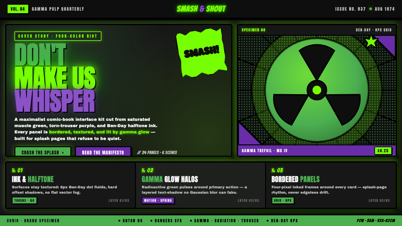 Hulk Gamma GreenDon't make us whisper. Muscle green, trouser purple, inked panels, Ben-Day ha…
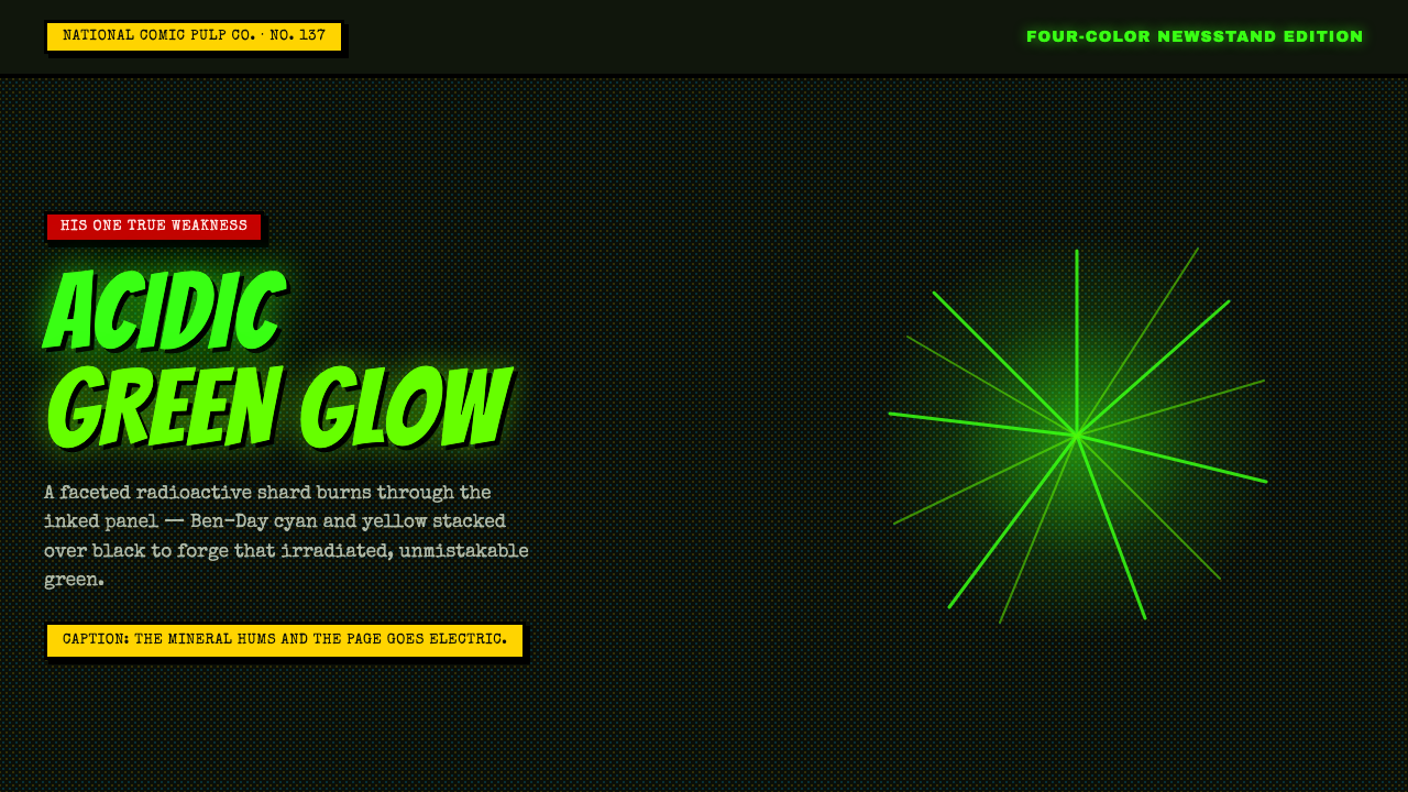 Kryptonite GreenRadioactive pulp glows hard. Neon green shard, black gutters, Ben-Day grit.
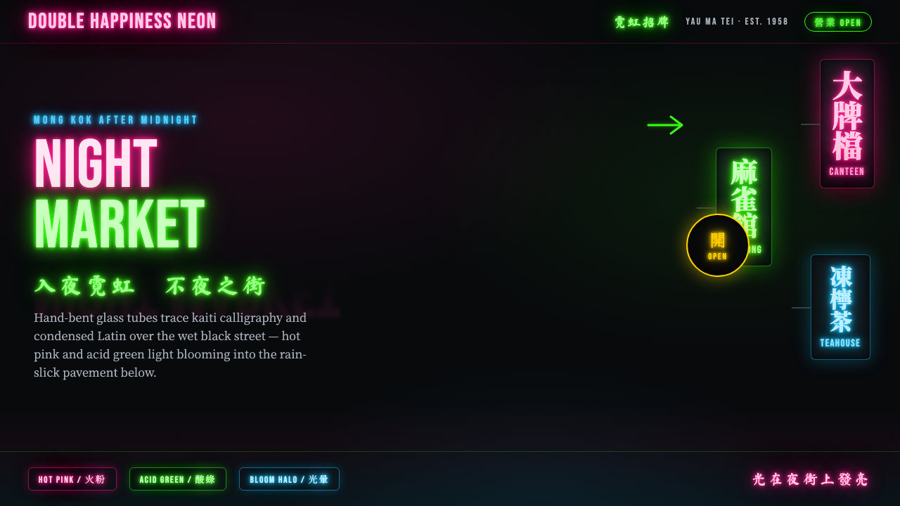 Hong Kong Neon SignboardsLight only reads against the wet black night. Hand-bent pink and green tubes…
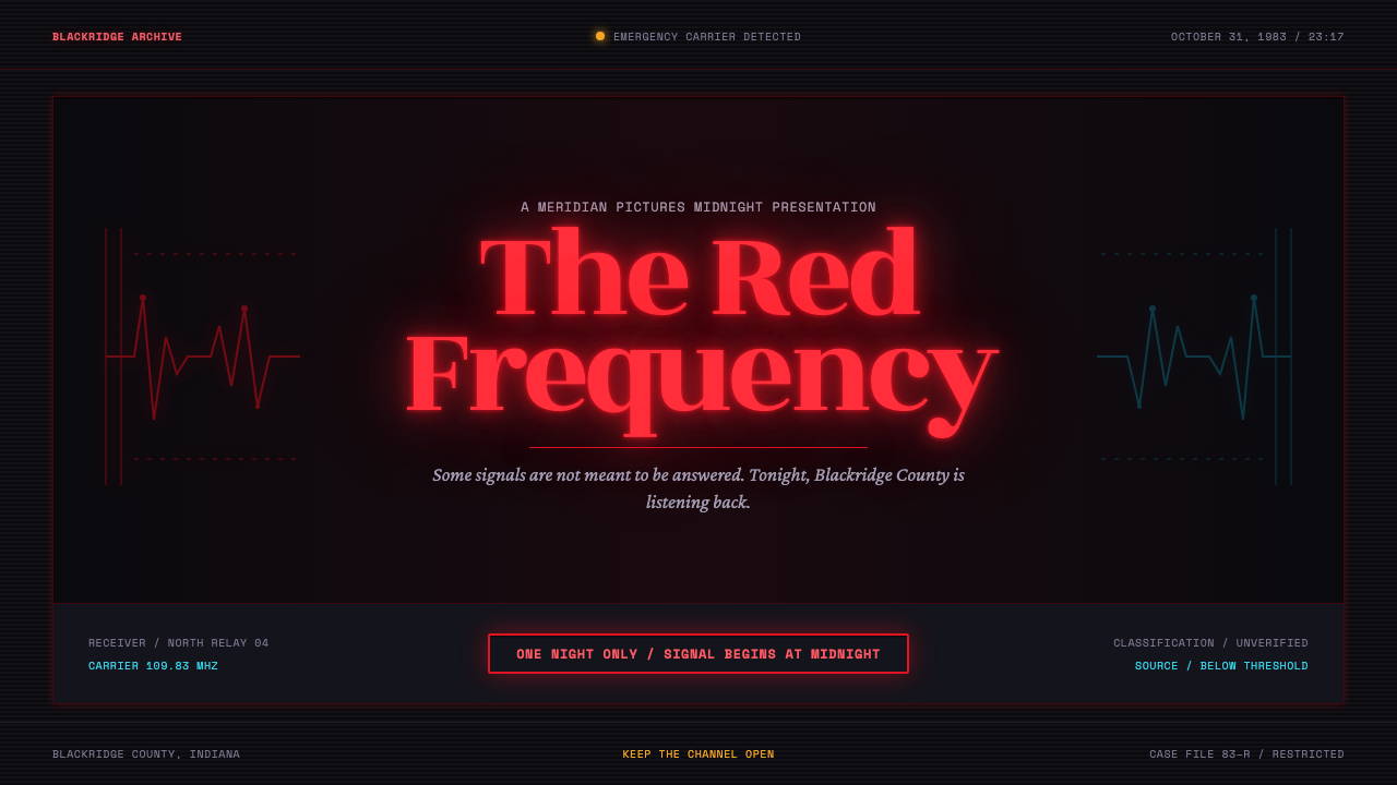 Stranger Things (1983)Red light breaks the void. A spurred serif blooms through VHS static and cold…
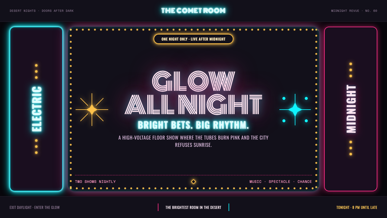 Las Vegas Neon (1960)Night refuses to dim. Hot-pink tubes, cyan bloom and amber bulbs turn black i…
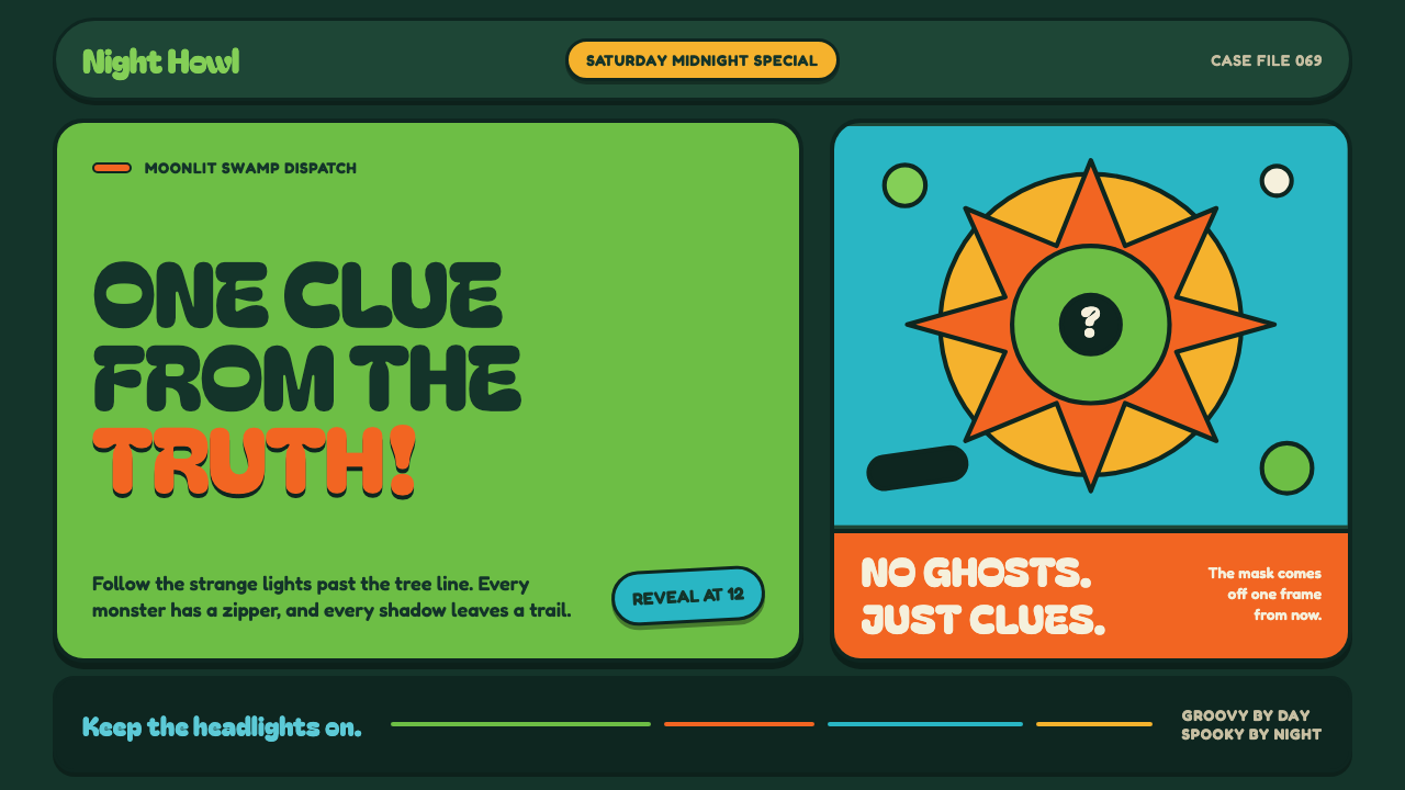 Mystery Machine (Scooby-Doo 1969)Groovy by day, spooky by night. Balloon type and acid-green panels hide the n…