What is Prince — Purple Rain (1984)?什么是 Prince — Purple Rain (1984)?
Prince turned Minneapolis into a purple-lit cathedral — eggplant violet, metallic gold, and smoke converging into the most theatrical design identity of the 1980s.Prince将明尼阿波利斯变成紫光大教堂——茄紫、金属光泽与烟雾交汇,铸就了1980年代最具戏剧张力的视觉身份。
Prince — Purple Rain (1984) in briefPrince — Purple Rain (1984) 速览
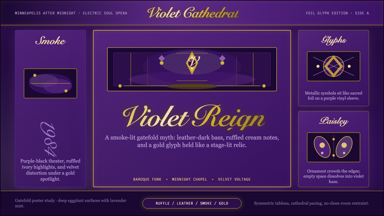
Purple Rain is the visual language born from Prince's 1984 album and film of the same name — a design identity built on deep eggplant violet, metallic gold, and the grammar of theatrical excess. Where most pop aesthetics of the era leaned toward neon brightness or stark minimalism, Prince's visual world went baroque: layered ornament, ruffled lace against motorcycle leather, rain-streaked photography, and the Love Symbol glyph elevated to the status of a religious icon.《Purple Rain》是Prince 1984年同名专辑与电影诞生的视觉语言——一套建立在深茄紫色、金属光泽与戏剧过度文法之上的设计身份。同时代大多数流行美学倾向于霓虹明亮或极简冷峻,而Prince的视觉世界却走向巴洛克:层叠的装饰、褶边蕾丝与摩托车皮革的对话、雨滴划过的摄影、爱之符号被供奉为宗教圣像。
The style is defined by a deliberate tension between the sacred and the sensual. Architectural forms — cathedral arches, columnar symmetry, candlelit depth — coexist with the unapologetically hedonistic: paisley teardrops, gold foil lettering, silk and velvet surface textures rendered through dramatic photographic lighting. This is not decoration applied to a design; the ornament is the design. Every surface is understood as a site for meaning-making.这种风格由神圣与官能之间刻意制造的张力所定义。建筑性形态——哥特式拱门、柱式对称、烛光深度——与毫不掩饰的享乐主义并存:佩斯利泪滴纹、金箔字体、通过戏剧性摄影光线呈现的丝绒与绸缎表面质感。这不是叠加在设计上的装饰;装饰本身就是设计。每一个表面都被理解为意义生产的场所。
As a transferable aesthetic, Purple Rain sits in a tradition of rock and soul visual grandeur that draws from glam, baroque portraiture, and 1970s blaxploitation. What distinguishes it is the specificity of its color world — that particular deep violet that reads simultaneously as royalty, spirituality, and danger — and the discipline with which metallic gold is deployed as the sole counterpoint, never diluted by neutral tones.作为可迁移的美学,《Purple Rain》承袭了摇滚与灵魂乐视觉宏大传统,汲取于华丽摇滚、巴洛克肖像画与1970年代黑人剥削电影。使它与众不同的,是其色彩世界的特殊性——那种深紫色同时读作皇室、灵性与危险——以及金属金被部署为唯一反调时的克制:从不被中性色稀释。
See the Prince — Purple Rain (1984) design system查看 Prince — Purple Rain (1984) 完整设计系统
Where does Prince — Purple Rain (1984) come from?Prince — Purple Rain (1984) 从何而来?
Prince Rogers Nelson began developing his visual identity through the late 1970s and early 1980s, establishing a persona that fused the flamboyance of Little Richard and Jimi Hendrix with the precision of James Brown's theatrical control. The Purple Rain project — album, film, and accompanying visual campaign — crystallized this into a cohesive world. Released in June 1984, the album's cover photograph showed Prince astride a motorcycle in a purple haze, shot in a way that compressed glam-rock mythology and Minneapolis street reality into a single frame.Prince Rogers Nelson从1970年代末至1980年代初逐步建立起自己的视觉身份,将Little Richard与Jimi Hendrix的奢华张扬,与James Brown戏剧性表演控制力的精确熔为一炉。《Purple Rain》项目——专辑、电影及配套视觉宣传——将这一切凝结为一个连贯的世界。1984年6月发行时,专辑封面照片呈现Prince跨坐于摩托车上置身紫色烟雾之中,将华丽摇滚神话与明尼阿波利斯街头现实压缩于单一画框。
The visual execution of the project involved a close collaboration between Prince and his creative circle. Art director Laura LiPuma and photographer Sam Erickson were central to translating Prince's instincts into reproducible visual systems — establishing the palette, the lighting logic, the balance of regal symmetry against gritty authenticity. The album sleeve, posters, and film promotional materials shared a consistent visual grammar: deep violet grounds, high-contrast backlighting, gold as the only warm accent, and a typography that leaned on condensed, slightly gothic letterforms without ever fully committing to historical revival.该项目的视觉执行涉及Prince与其创意圈的紧密合作。艺术总监Laura LiPuma与摄影师Sam Erickson是将Prince的直觉转化为可复制视觉系统的核心人物——确立色板、光照逻辑、皇家对称与粗粝真实之间的平衡。专辑封套、海报与电影宣传物料共享一套连贯的视觉文法:深紫色底面、高对比度背光、金色作为唯一暖调,字体倾向于紧缩而略带哥特气息的字形,却从未完全归入历史复兴风格。
The design draws from a lineage that stretches from European baroque portraiture — the use of deep, dark backgrounds to make a single luminous figure emerge — through the concert poster traditions of 1960s psychedelia, with its rich, saturated color and ornamental letterforms, to the LP sleeve art of early 1970s artists who understood the album as a designed object rather than a packaging afterthought. Prince synthesized these without direct quotation, arriving at something that felt historically resonant without being retrospective.这种设计承袭了一条谱系,从欧洲巴洛克肖像画——以深暗背景托出单一发光主体——经由1960年代迷幻音乐会海报的浓郁饱和色彩与装饰字形,到1970年代初期将LP封套理解为设计对象而非包装附属品的艺术家传统。Prince综合了这些来源而不直接引用,抵达一种既有历史共鸣又不具有回顾性的视觉语言。
The 1984 release coincided with a moment when music videos had become a primary medium for visual identity, and Prince's visual language translated exceptionally well to the moving image. The Purple Rain film — shot in and around Minneapolis, at venues like First Avenue — grounded the baroque visual fantasy in recognizable geography, giving the ornamental aesthetic an unlikely documentary texture. This tension between the mythological and the real-place specific became a signature of the Purple Rain world, and it distinguishes the style from contemporaneous glam productions that relied on pure fantasy staging.1984年的发行恰逢音乐录影带成为视觉身份主要媒介的时刻,Prince的视觉语言在活动影像中表现尤为出色。《Purple Rain》电影——在明尼阿波利斯及周边取景,在First Avenue等场馆拍摄——将巴洛克视觉幻想扎根于可辨认的地理空间,赋予这套装饰美学以意想不到的纪录片质感。神话性与具体地理之间的张力成为《Purple Rain》世界的标志,也使这种风格有别于依赖纯粹幻想舞台的同时代华丽摇滚作品。
What defines the Prince — Purple Rain (1984) look?Prince — Purple Rain (1984) 的视觉特征是什么?
Color World色彩世界
The palette is anchored by a deep eggplant violet — not the bright purple of heraldry, but a dark, almost bruised hue that reads as simultaneously regal and ominous. Against this ground, metallic gold functions as the sole warm accent: in letterforms, in glyphs, in trim details. The combination recalls ecclesiastical decoration — gold leaf on dark wood — while the photographic context grounds it in something more carnal. Black and near-black tones build depth and shadow throughout. Cool white appears rarely, as a highlight edge or a breath of light in smoke.色板以深茄紫色为锚——不是纹章学中的明亮紫色,而是深暗、近乎瘀伤的色调,同时读作皇家与不祥。以此为底,金属金充当唯一的暖调:出现在字形、符号与装饰细节中。这种组合令人联想到教堂装饰——深色木材上的金箔——而摄影语境将其拉入更具肉身感的领域。黑色与近黑色贯穿始终,构建深度与阴影。冷白色极少出现,仅作为高光边缘或烟雾中的一缕光亮。
Theatrical Symmetry戏剧性对称
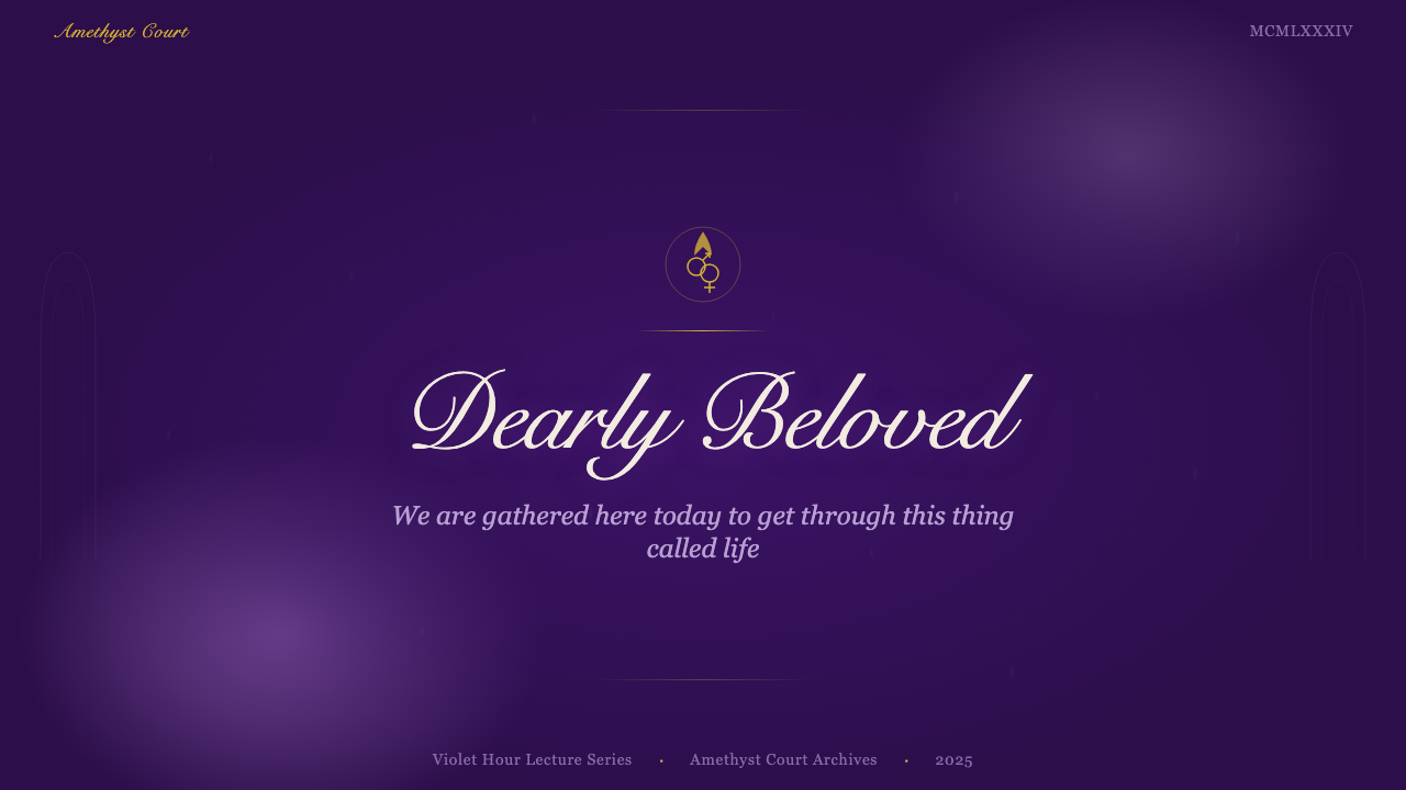
Composition gravitates toward a centered, frontal symmetry that mirrors the visual grammar of altarpieces and portrait paintings. The lone figure placed at the center of the frame — backlit, elevated, slightly removed from the viewer — establishes a hierarchy of presence that is devotional in its structure. This symmetry is theatrical rather than rigid: smoke, rain, and backlighting introduce controlled asymmetric texture at the edges, preventing the composition from feeling static or formulaic.构图倾向于居中的正面对称,呼应祭坛画与肖像画的视觉文法。孤独的身影置于画面中央——背光、高抬、与观者保持微妙距离——建立起一种在结构上近乎礼拜性质的存在层级。这种对称是戏剧性的而非刻板的:烟雾、雨水与背光在边缘引入受控的非对称质感,防止构图流于静止或公式化。
Ornament as Identity装饰即身份
Where Bauhaus or Swiss Style would eliminate ornament as waste, Purple Rain treats it as the primary carrier of meaning. Paisley teardrops, ruffle details, lace textures, and the Love Symbol glyph are not embellishments applied to an underlying structure — they are the structure. Each decorative element carries biographical and symbolic weight: the paisley connects to a South Asian textile heritage recontextualized through 1960s psychedelia; the Love Symbol, later replacing Prince's name, functions as a logographic identity mark of the first order.包豪斯或瑞士风格会将装饰作为浪费而消除,《Purple Rain》则将其视为意义的主要载体。佩斯利泪滴纹、褶皱细节、蕾丝肌理与爱之符号字形,不是叠加在底层结构之上的点缀——它们就是结构本身。每个装饰元素承载着传记性与象征性的重量:佩斯利连接到经由1960年代迷幻文化再语境化的南亚纺织传统;爱之符号后来取代Prince之名,作为一等字形身份标记而运作。
Photographic Drama摄影戏剧性
Photography in the Purple Rain visual world is characterized by hard backlighting against dark or smoky grounds, creating silhouette-dominant images where the figure is defined by the light it blocks rather than the light that falls on it. Foreground detail — the texture of leather, the fall of fabric — is revealed in isolated pools of warm light, while the middle ground dissolves into atmospheric haze. Rain, literal and implied, adds vertical movement to otherwise static compositions. This is not documentary photography; it is staged mythology.《Purple Rain》视觉世界中的摄影以深暗或烟雾背景下的硬背光为特征,创造出以轮廓为主导的图像——人物由其遮挡的光线而非落在其上的光线所定义。前景细节——皮革质感、面料垂坠——在孤立的暖光池中显现,中景则消融于大气雾霭之中。雨水,字面与隐喻层面的雨,为本来静态的构图增添垂直运动感。这不是纪录摄影;这是被导演的神话。
Glyph and Logographic Identity字形与标志性身份
The Love Symbol — Prince's custom glyph combining elements of the symbols for male and female with an additional flourish — operates as a visual anchor throughout the era. Rendered in gold on dark grounds, it achieves the weight of a religious or alchemical symbol: compact, dense with implied meaning, recognizable at any scale. The broader typography of the era favors condensed letterforms with slightly gothic inflection — tall, narrow, with pointed arches — that reinforce the cathedral register without requiring literal historical reference.爱之符号——Prince的自定义字形,融合了男性与女性符号的元素并加以花饰延伸——贯穿整个时代作为视觉锚点运作。在深色底面上以金色呈现,它获得了宗教或炼金术符号的分量:紧凑、隐含意义密集、在任何尺度下均可识别。这一时代更广泛的字体风格倾向于带有轻微哥特韵味的紧缩字形——高挑、纤细、尖拱顶——在不需要字面历史参考的情况下强化了大教堂音调。
Texture and Surface质感与表面
Unlike flat-design aesthetics, the Purple Rain world is saturated with implied tactility: the sheen of silk, the weave of velvet, the grain of photographic film, the irregularity of rain on a lens. These textures are not rendered digitally — they are photographic facts that accumulate into a sensory richness. Gold foil stamping on physical print media adds a literal tactile dimension. The style resists any reduction to flat color fields; its depth is always material and atmospheric.与平面设计美学不同,《Purple Rain》的世界充满隐含的触感:丝绸的光泽、丝绒的织纹、胶片的颗粒感、雨水打在镜头上的不规则痕迹。这些质感并非数字渲染——它们是摄影事实,累积成感官的丰富性。实体印刷品上的金箔压印增添了字面意义上的触觉维度。这种风格抵制任何向平面色块的简化;它的深度始终是材料性与大气性的。
Sacred and Sensual Register神圣与官能的音调
The defining tension of the Purple Rain aesthetic is its simultaneous invocation of the devotional and the erotic. Cathedral architecture, candlelight, and frontal symmetry evoke sacred iconography; leather, lace, bare skin under dramatic lighting, and paisley evoke pleasure and transgression. Neither register cancels the other — the collision is the point. This dual reading gives the style its particular voltage: it is not simply glamorous or simply spiritual, but insists on both at once.《Purple Rain》美学的定义性张力,在于其同时召唤礼拜性与情欲性。大教堂建筑、烛光与正面对称唤起神圣图像学;皮革、蕾丝、戏剧光线下的裸露皮肤与佩斯利纹样唤起享乐与越界。两种音调互不抵消——碰撞本身就是重点。这种双重阅读赋予这种风格以独特的电压:它不仅仅是华丽,也不仅仅是精神性的,而是坚持两者同时成立。
See the Prince — Purple Rain (1984) design system查看 Prince — Purple Rain (1984) 完整设计系统
Who shaped Prince — Purple Rain (1984)?谁塑造了 Prince — Purple Rain (1984)?
Prince was the primary author of the Purple Rain visual world, exercising close control over every dimension of the aesthetic — from clothing choices and stage design to album art direction and film visual language. His instinct for theatrical self-presentation drew from a wide range of influences including Little Richard, Jimi Hendrix, David Bowie, and James Brown, but the synthesis was entirely his own. The Love Symbol, the signature purple palette, and the fusion of sacred and sensual registers were not committee decisions; they were expressions of a singular creative vision sustained across decades.Prince是《Purple Rain》视觉世界的主要作者,对美学的每个维度都保持紧密控制——从服装选择与舞台设计,到专辑艺术方向与电影视觉语言。他对戏剧性自我呈现的直觉汲取自广泛的影响来源,包括Little Richard、Jimi Hendrix、David Bowie与James Brown,但这种综合完全属于他自己。爱之符号、标志性紫色色板、神圣与官能的融合,都不是委员会的决定;它们是跨越数十年持续坚守的单一创造性愿景的表达。
As art director for the Purple Rain project, Laura LiPuma was responsible for translating Prince's instincts into a coherent visual system that could be reproduced across print, photography, and promotional materials. Her work established the specific graphic decisions — palette discipline, layout symmetry, typographic register — that gave the album's visual identity its consistency and longevity. The collaboration between Prince's vision and LiPuma's systematic design thinking is central to understanding why the Purple Rain aesthetic has remained legible and influential decades after its initial release.作为《Purple Rain》项目的艺术总监,Laura LiPuma负责将Prince的直觉转化为连贯的视觉系统,使其可在印刷、摄影与宣传物料中复制。她的工作确立了具体的图形决策——色板纪律、版面对称、字体音调——赋予专辑视觉身份以一致性与持久性。Prince的愿景与LiPuma的系统性设计思维之间的协作,是理解《Purple Rain》美学何以在初始发行数十年后依然清晰可辨且具影响力的核心所在。
Photographer Sam Erickson was instrumental in establishing the photographic language of the Purple Rain era — the backlighting logic, the use of atmospheric smoke and rain, the balance between silhouette and selective detail revelation. The visual choices made in his photography with Prince became templates for the broader aesthetic: how deep violet translates under studio lighting, how gold reads against dark grounds, how the human figure can be simultaneously mythologized and grounded in physical specificity.摄影师Sam Erickson在确立《Purple Rain》时代的摄影语言方面发挥了关键作用——背光逻辑、烟雾与雨水的大气感运用、轮廓与选择性细节揭示之间的平衡。他与Prince合作的摄影所做的视觉选择,成为更广泛美学的模板:深茄紫色在影棚光线下如何呈现,金色在深色底面上如何读取,人物如何同时被神话化又扎根于物理的具体性。
Jimi Hendrix is not a direct contributor to Purple Rain but is its most important visual and musical precedent. Hendrix established that a Black rock musician could inhabit a maximalist, psychedelic visual world without apology — that extravagance of costume, color, and theatrical gesture were legitimate modes of artistic expression. Prince studied Hendrix's integration of visual identity and musical persona deeply, and the Purple Rain aesthetic carries that inheritance: the willingness to be spectacular, the use of the guitar as a theatrical prop, and the integration of spiritual and erotic imagery.Jimi Hendrix并非《Purple Rain》的直接贡献者,但却是其最重要的视觉与音乐先例。Hendrix确立了一位黑人摇滚音乐家可以毫无歉意地栖居于极繁主义的迷幻视觉世界——服装、色彩与戏剧性姿态的挥霍无度是合法的艺术表达方式。Prince深入研究了Hendrix对视觉身份与音乐人格的整合,《Purple Rain》美学承载着这份遗产:愿意成为奇观的勇气、将吉他作为戏剧道具的运用,以及精神性与情欲意象的融合。
David Bowie's Ziggy Stardust and Aladdin Sane eras demonstrated that a pop musician could construct and inhabit a fully realized visual persona — that costume, makeup, hair, and designed imagery could constitute an artistic statement as significant as the music itself. Prince absorbed this lesson and pushed it in a distinctly American, distinctly Black direction. Where Bowie's theatricality was often cool and alien, Prince's was warm, funky, and explicitly sexual. The Purple Rain visual identity owes its ambition — if not its specific aesthetic choices — to Bowie's proof that total visual self-authorship was possible.David Bowie的Ziggy Stardust与Aladdin Sane时代证明了一位流行音乐人可以建构并栖居于一个完全实现的视觉人格——服装、妆容、发型与设计图像可以构成与音乐本身同等重要的艺术声明。Prince吸收了这一课题,并将其推向一个鲜明美国化、鲜明黑人化的方向。Bowie的戏剧性往往是冷峻而异域的,Prince的则是温热、放克且明确性感的。《Purple Rain》视觉身份欠下的,是Bowie证明全面视觉自我创作可能性的雄心——即便不是其具体的美学选择。
How do you use Prince — Purple Rain (1984) today?今天怎么用 Prince — Purple Rain (1984)?
The Purple Rain aesthetic is a high-commitment design language — it rewards full adoption and resists half-measures. Unlike Bauhaus, where a subset of principles can be applied cleanly, Purple Rain requires the full atmospheric stack to read as intentional: the deep violet ground, the metallic gold accent, the photographic or smoke-and-light texture layer, and the ornamental detail. Applying the palette without the texture produces something merely purple. Applying the texture without the palette produces something merely moody. The style only fully activates when all its registers operate simultaneously.《Purple Rain》美学是一种高投入设计语言——它奖励全面采纳,抵制半途而废。与包豪斯不同,包豪斯的部分原则可以被单独干净地应用;《Purple Rain》需要完整的大气层叠才能读作有意图的设计:深紫色底面、金属金强调、摄影或烟雾与光线的质感层,以及装饰细节。仅应用色板而缺乏质感,产生的不过是某种紫色的东西。仅应用质感而缺乏色板,产生的不过是某种阴郁的东西。只有当所有音调同时运作,这种风格才完全激活。
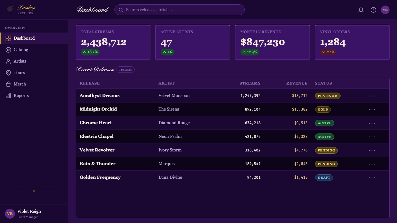
For presentation slides, the Purple Rain style works powerfully for covers, section openers, and high-stakes moments requiring an impression of gravity and grandeur. A cover slide benefits from a centered, symmetrical composition: deep violet ground, a central image or glyph in gold, a title set in condensed letterforms. Content slides should respect the atmospheric register — use the deep violet or near-black consistently, deploy gold sparingly for emphasis only, and allow generous negative space rather than filling the surface. Data visualizations in this style take on a jewel-like quality: charts rendered with deep-toned bars and gold highlight lines against dark grounds, where each data point feels weighted and significant.对于演示文稿,《Purple Rain》风格在封面、章节开篇页以及需要传达庄重与宏大感的高风险时刻效果强烈。封面适合居中对称构图:深紫色底面、金色中央图像或字形、以紧缩字形排列的标题。内容页应尊重大气音调——一致使用深紫色或近黑色,仅将金色稀疏部署于强调,并保留充裕的负空间而非填满表面。这种风格下的数据可视化呈现出宝石般的质感:以深色调条形与金色高光线条在深色底面上呈现的图表,每个数据点都感觉有分量、有意义。
For web interfaces and dashboards, Purple Rain suits premium, exclusive, or experience-forward products where the user expects to feel something before they analyze anything. A pricing page or membership tier layout in this style uses dark violet backgrounds with gold typographic hierarchy for tier names and featured pricing. Dashboard interfaces should be used selectively — the style carries high visual weight and is best reserved for key metrics or hero states rather than dense data tables. The ornamental register can be introduced through subtle textural backgrounds and gold border or separator details rather than full pictorial decoration.对于网页界面与仪表板,《Purple Rain》适合高端、专属或体验导向的产品——用户期待在分析任何事物之前先有所感受。这种风格下的定价页或会员层级布局,使用深紫色背景与金色字体层级标注等级名称与特色定价。仪表板界面应选择性使用——这种风格视觉分量高,最好保留用于关键指标或主视觉区域,而非密集数据表格。装饰性音调可通过微妙的纹理背景与金色边框或分隔线细节引入,而非全幅图像装饰。
For editorial and marketing applications, the style excels at premium product launches, music and entertainment branding, fashion editorial, and any context where luxury signaling and cultural connotation are desired. A full-page editorial spread works well with a centered portrait on deep violet, headline set in condensed gold-tinted type, and body text in a lighter warm tone for contrast. Marketing campaigns with this aesthetic should commit to a consistent color temperature throughout: cool whites and pale grays will break the atmospheric unity. Instead, work within the warm-dark range of the palette — plum, eggplant, near-black — and introduce light only as accent.对于编辑与营销应用,这种风格在高端产品发布、音乐与娱乐品牌、时装编辑,以及任何需要奢华信号与文化联想的场景中表现卓越。全页编辑跨页适合深紫色底面上的居中肖像、金色调紧缩字体标题,以及较浅暖色正文以形成对比。采用这种美学的营销活动应在整体上保持一致的色温:冷白色与淡灰色将破坏大气的统一性。相反,应在色板的暖-暗范围内工作——紫红、茄紫、近黑——仅将光亮作为强调引入。
The most common mistake when applying the Purple Rain style is reaching for purple without establishing depth. A mid-saturation purple on a light background produces a generic, underpowered result — it reads as decorative rather than dimensional. The style depends on darkness as its foundation: the violet should be deep enough that gold appears luminous against it, and photographic or textural elements should add atmospheric density rather than surface clarity. A second common error is over-literal ornament — adding decorative borders or paisley patterns without integrating them into the structural logic of the design. In the source material, ornament is always materially motivated: it is the actual texture of a garment, the actual grain of a photograph, not applied decoration. When in doubt, let the lighting and the palette do the work; explicit ornament should be used with restraint.应用《Purple Rain》风格时最常见的错误,是拿来了紫色却没有建立深度。浅色背景上的中饱和度紫色产生平庸而无力的结果——读起来像装饰而非维度。这种风格以暗为基础:紫色应深到足以使金色在其衬托下发光,摄影或质感元素应增加大气密度而非表面清晰度。第二个常见错误是过于字面的装饰——在未将装饰元素整合进设计的结构逻辑时添加装饰边框或佩斯利图案。在原始素材中,装饰始终有材料动机:是服装的真实质感、照片的真实颗粒感,而非应用上去的装饰。有疑惑时,让光线与色板来完成工作;显性装饰应克制使用。
See the Prince — Purple Rain (1984) design system查看 Prince — Purple Rain (1984) 完整设计系统
Prince — Purple Rain (1984) — FAQPrince — Purple Rain (1984) · 常见问题
Does the Purple Rain style only work for music-related projects?《Purple Rain》风格只适合音乐相关的项目吗?
No — while the style originated in a music context, its core components translate to any product or communication that benefits from associations of luxury, theatricality, spiritual depth, or premium exclusivity. Fashion brands, high-end experiential events, entertainment platforms, premium membership programs, and editorial work in culture and lifestyle verticals all have natural affinity with the aesthetic. The style struggles in contexts that require utilitarian clarity — dense data interfaces, consumer utilities, or brands positioning on accessibility and openness. The question is not genre but value alignment: does the product want to feel exclusive, ceremonial, and experiential? If yes, the style is available.不——尽管这种风格源于音乐语境,但其核心组件可以迁移至任何受益于奢华、戏剧性、精神深度或高端专属性联想的产品或传播。时尚品牌、高端体验活动、娱乐平台、高级会员计划,以及文化与生活方式垂直领域的编辑作品,都与这种美学有天然亲和力。这种风格在需要实用清晰度的场景中力不从心——密集数据界面、消费者工具,或以可及性与开放性定位的品牌。问题不在于类型,而在于价值对齐:产品是否希望感觉专属、仪式感强、体验导向?若是,这种风格是可用的。
How do I avoid the style looking like generic 'dark luxury' design?如何避免这种风格看起来像通用的「暗色奢侈品」设计?
Generic dark luxury design typically uses silver or white as its metallic accent, cool blue-black as its dark ground, and serif typography with thin strokes — a vocabulary borrowed from high-end fashion and jewelry. Purple Rain is distinguished by its specific warmth: the violet is warm and slightly reddish, not cool or bluish; the metallic accent is yellow gold rather than silver; and the typographic register leans toward condensed, slightly gothic letterforms rather than elegant thin serifs. Additionally, the style carries an ornamental and sensual texture — a material richness — that generic dark luxury avoids in favor of restraint. Lean into the warmth, the gold, and the decorative texture to avoid the generic version.通用的暗色奢侈品设计通常使用银色或白色作为金属强调,冷蓝黑色作为暗色底面,以及细笔画衬线字体——一套借自高端时装与珠宝的词汇。《Purple Rain》的区别在于其特定的暖调:紫色是暖的且略带红调,而非冷或偏蓝;金属强调是黄金而非银;字体音调倾向于紧缩的略带哥特气息的字形,而非优雅细衬线。此外,这种风格承载着装饰性与官能性的质感——一种材料的丰富性——而通用暗色奢华为了克制而回避这一点。向暖调、金色与装饰质感倾斜,可以避免通用版本。
Can the style be adapted for a light-background layout?这种风格能适配浅色背景版面吗?
With care, yes — but light adaptation fundamentally changes the style's register. On a cream or pale ground, the violet palette shifts from its characteristic depth and menace toward something closer to romantic or nostalgic. The atmospheric qualities — smoke, darkness, backlit luminosity — cannot exist in the same way on a light ground; they depend on darkness to function. A light adaptation works best for printed collateral like invitations or editorial features where the violet appears as a strong accent hue rather than as the encompassing ground. Use deep violet for typographic elements and decorative details, gold sparingly, and rely on rich photographic imagery to carry the sensory weight. Expect a substantially different emotional effect than the dark canonical form.谨慎操作的话可以——但浅色适配从根本上改变了风格的音调。在奶油色或浅色底面上,紫色色板从其标志性的深度与不祥感,转向更接近浪漫或怀旧的东西。大气品质——烟雾、黑暗、背光发光——无法在浅色底面上以同样方式存在;它们依赖暗色才能运作。浅色适配最适合请柬或编辑专题等印刷附属品,其中紫色作为强烈强调色出现,而非作为包覆性的底面。将深紫色用于字体元素与装饰细节,金色稀疏使用,并依赖丰富的摄影图像来承载感官分量。预期与暗色经典形式截然不同的情感效果。
How should the Love Symbol glyph or custom iconography be approached in new work?在新作品中应如何处理爱之符号字形或自定义图形标志?
The Love Symbol itself is Prince's intellectual property and cannot be used directly in commercial work without licensing. More broadly, the lesson of the Love Symbol for new design work is about logographic identity: the idea that a brand or creative entity can be represented by a single custom glyph that operates simultaneously as a signature, an icon, and a symbol carrying layered meaning. If working in the Purple Rain aesthetic for a new project, consider designing a custom mark — a glyph, monogram, or abstract symbol — that can function in the role the Love Symbol plays: rendered in gold on dark ground, scaled to be impactful at small sizes, and carrying enough visual distinctiveness to be recognizable without supporting text.爱之符号本身是Prince的知识产权,未经许可不能直接用于商业作品。更广泛地说,爱之符号对新设计作品的启示在于字形身份的概念:品牌或创意实体可以由单一自定义字形来表示,该字形同时作为签名、图标与承载多层意义的符号运作。若为新项目采用《Purple Rain》美学,可以考虑设计一个自定义标记——字形、字母组合或抽象符号——使其能够扮演爱之符号所扮演的角色:在深色底面上以金色呈现,缩放至小尺寸时依然有视觉冲击力,并具有足够的视觉独特性,无需辅助文字即可辨认。
How does Purple Rain relate to contemporary dark-mode design trends?《Purple Rain》与当代深色模式设计趋势有何关联?
Contemporary dark mode, as implemented across operating systems and applications from the mid-2010s onward, is primarily a functional response to screen use in low-light environments — it prioritizes reduced eye strain, battery efficiency on certain display types, and a sense of premium refinement. Its palette is typically neutral: very dark grays rather than true blacks, and cool-tinted mid-tones, with minimal use of saturated color. Purple Rain shares the dark ground but departs from dark mode conventions in almost every other way: it uses deep saturated violet rather than neutral gray, it embraces warm metallics rather than cool neutrals, and it privileges atmospheric richness and ornament over the clean utility that dark mode is designed to serve. Purple Rain is theatrical darkness; dark mode is functional darkness. Using Purple Rain principles within a dark-mode product context creates a strong and intentional contrast — appropriate when the product wants to feel experiential rather than merely efficient.当代深色模式,从2010年代中期起在操作系统与应用程序中广泛实施,主要是对低光环境屏幕使用的功能性响应——它优先考虑减少眼睛疲劳、特定显示类型的电池效率,以及高端精致感。其色板通常是中性的:深灰色而非纯黑色,冷调中间色,饱和色的运用极为克制。《Purple Rain》共享深色底面,但在几乎所有其他方面都偏离了深色模式惯例:它使用深度饱和的紫色而非中性灰色,拥抱暖调金属质感而非冷中性色,并将大气丰富性与装饰置于深色模式旨在服务的简洁实用性之上。《Purple Rain》是戏剧性的黑暗;深色模式是功能性的黑暗。在深色模式产品语境中运用《Purple Rain》原则,创造出强烈而有意图的对比——当产品希望感觉是体验性的而非仅仅高效时,这是合适的。
Related design styles相关设计风格
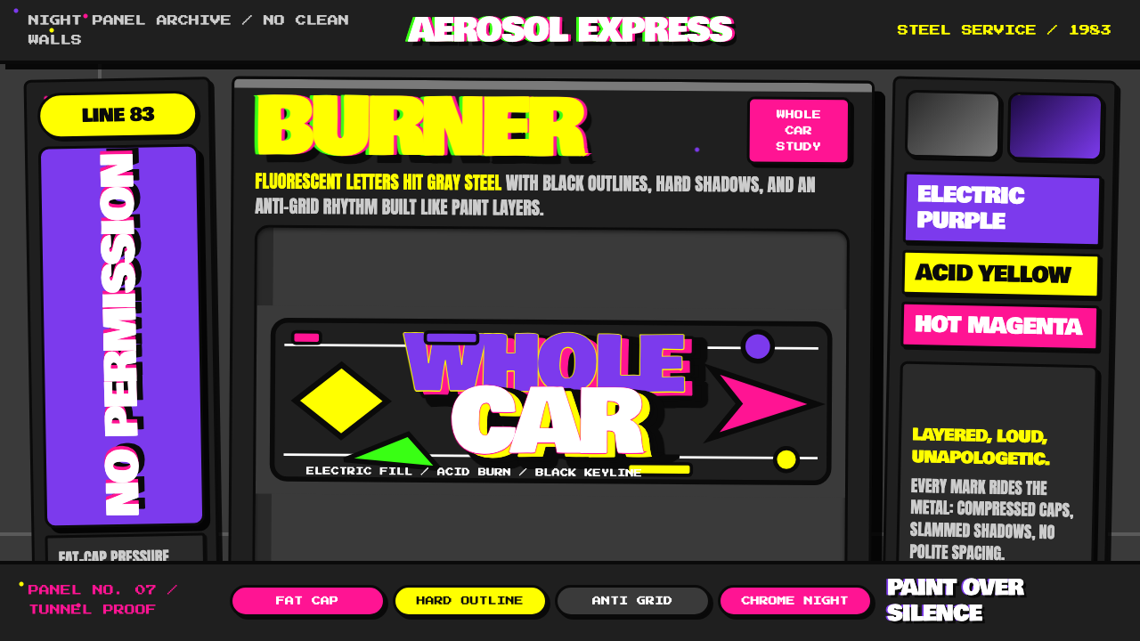 NYC Subway Graffiti (1983)Bombed steel gets loud. Electric purple and acid yellow stack as hard-outline…钢板被炸响:电紫与酸黄层叠,黑线框出狂野字形。
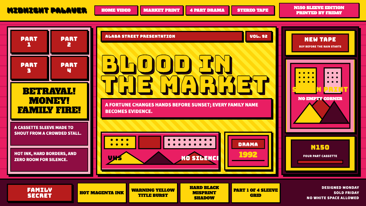 Nollywood VHS CoversEvery inch shouts. Magenta, warning yellow, hard shadows, and part stamps pac…每寸都在叫卖:洋红、警示黄、硬黑投影和分集印章塞满画面。
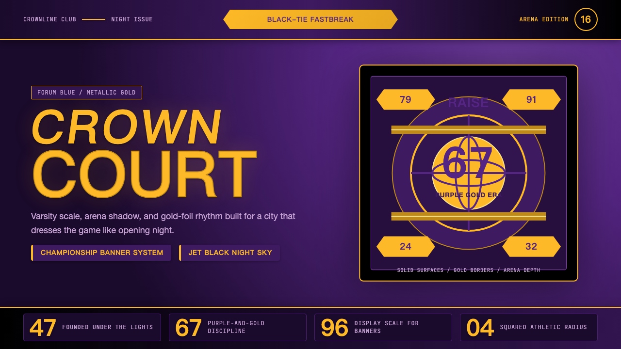 Los Angeles LakersShowtime royalty. Forum Blue and metallic gold turn varsity type into arena g…Showtime 王权:论坛蓝与金属金,让校队字型化作球馆魅力。
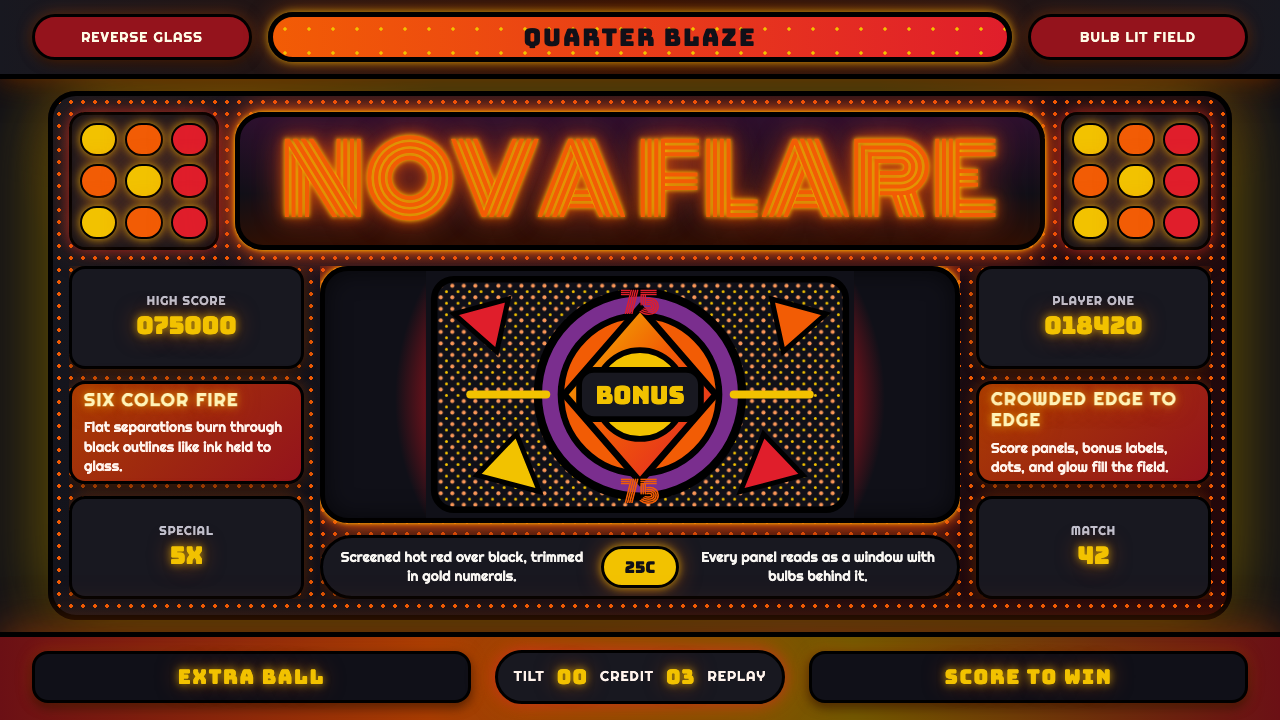 Pinball BackglassGlows like paid light. Monoton type, black outlines, orange-red halftones cro…像投币后的灯光燃起。Monoton 字体、黑描边与橙红半调挤满玻璃。
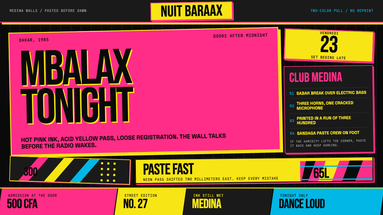 Senegalese Mbalax Poster (Dakar 1985)Street urgency, screen-printed loud. Hot pink and acid yellow drift over blac…街头急迫感:黑色新闻纸上,荧光粉与酸黄错位套印。
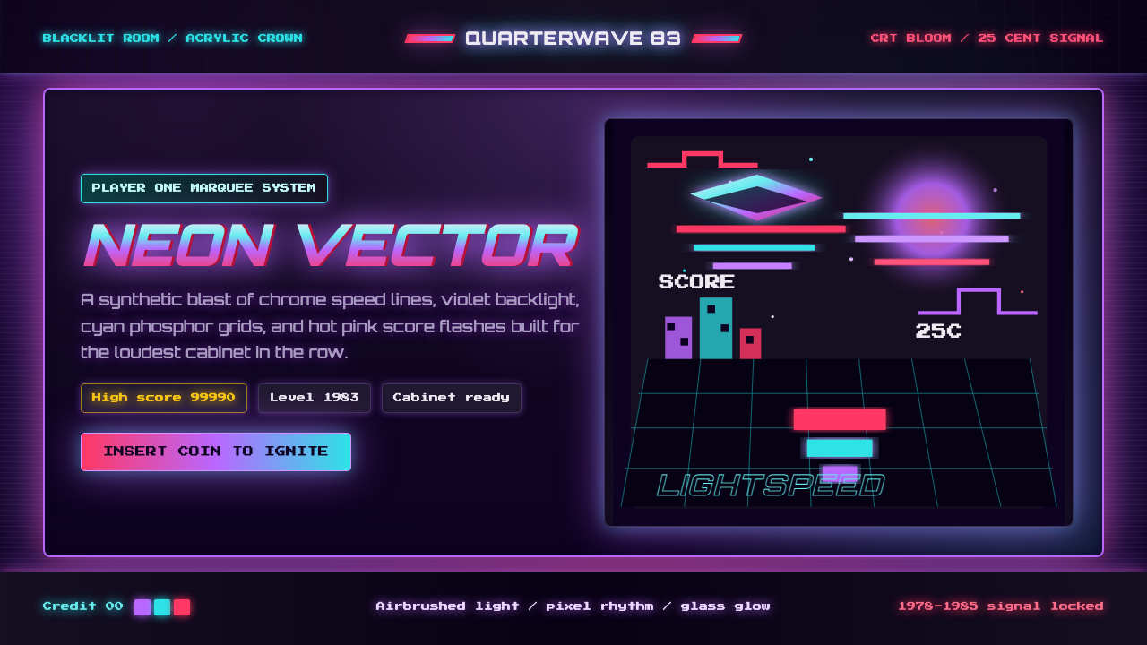 Arcade Cabinet MarqueeToo loud to ignore. Black-indigo glass, violet glow, cyan grids, hot-pink arc…刺眼才对。黑靛玻璃、霓虹紫光、电青网格与品红像素字。