Design style guide设计风格指南
What is Nollywood VHS Covers?什么是 Nollywood VHS Covers?
Nollywood VHS covers turned a cassette sleeve into a screaming billboard — hot magenta, hard shadows, and airbrushed melodrama packed into every square centimeter.诺莱坞VHS封面把一张录像带封套变成了尖叫的广告牌——炽热的洋红、硬边投影、喷枪渲染的家庭伦理剧,塞满每一平方厘米。
Nollywood VHS Covers in briefNollywood VHS Covers 速览
Nollywood VHS cover design is the maximalist graphic language that emerged from Nigeria's home-video film industry in the early 1990s and dominated African popular visual culture through the early 2000s. It is an aesthetic born of constraint and urgency: cassette sleeves had to sell themselves unassisted from market stalls in Lagos's Alaba International Market and Onitsha's sprawling trading floors, competing for attention without the benefit of theatrical posters, billboards, or professional marketing budgets.诺莱坞VHS封面设计是一种极繁主义视觉语言,诞生于1990年代初尼日利亚家庭录像电影工业,在整个2000年代初主导了非洲大众流行视觉文化。这种美学生于匮乏与紧迫:封套必须在拉各斯阿拉巴国际市场的摊位上和奥尼查广阔的交易楼层里独立叫卖自己,在没有影院海报、路牌广告或专业营销预算的情况下争夺买家的注意力。
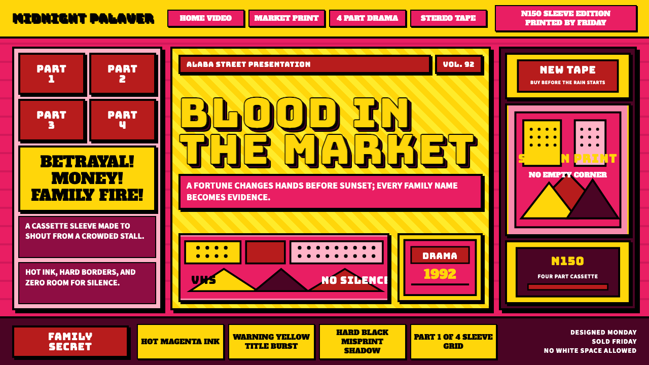
The look is immediately recognizable — saturated colors pushed far beyond comfort, type rendered with chunky drop shadows borrowed from American gospel-tract printing, airbrushed celebrity portraits that blend photographic likeness with painterly exaggeration, and compositional density that treats empty space as wasted opportunity. Where Western graphic design of the same era moved toward minimalism and structured grids, Nollywood covers moved in the opposite direction: more color, more faces, more text, more urgency.这种风格一眼就能认出——饱和度远超舒适区的色彩,借鉴美国福音传单印刷的粗壮阴影字体,将照片真实感与绘画夸张融为一体的喷枪明星肖像,以及把空白视为浪费的构图密度。当同时代的西方平面设计向极简主义和结构网格迈进时,诺莱坞封面却朝反方向走:更多色彩、更多面孔、更多文字、更强紧迫感。
This is not chaotic design — it is a purposefully calibrated language aimed at a specific audience with specific needs. The covers had to communicate genre, drama level, cast prestige, and episode count at a glance, to buyers who might be standing in direct sunlight with a dozen competing products in front of them. Every visual choice is a market decision.这不是混乱的设计——而是一套针对特定受众、特定需求精准校准的语言。封面必须让在直射阳光下站着、面前摆着十几件竞品的买家,一眼读出类型、戏剧烈度、卡司分量和集数。每一个视觉选择背后都是一个市场决策。
See the Nollywood VHS Covers design system →查看 Nollywood VHS Covers 完整设计系统 →
Where does Nollywood VHS Covers come from?Nollywood VHS Covers 从何而来?
The story of Nollywood begins with a practical accident. In 1992, Igbo trader Kenneth Nnebue found himself with a warehouse full of unsold blank VHS tapes imported from Taiwan. To move the stock, he financed a low-budget Yoruba drama called Living in Bondage, shot it quickly on consumer video equipment, duplicated it onto those tapes, and sold it directly through the Onitsha and Lagos markets. The film sold hundreds of thousands of copies. The home-video industry was born overnight — and with it, the need for cover art that could move product.诺莱坞的故事从一场实用主义的意外开始。1992年,伊博族商人肯尼斯·纳布乌发现自己的仓库里堆满了从台湾进口的滞销空白VHS磁带。为了清库存,他出资拍摄了一部低成本约鲁巴语家庭剧《活在枷锁中》,用消费级摄像设备快速完成拍摄,将影片复制到那批磁带上,直接在奥尼查和拉各斯市场销售。这部影片卖出了数十万盘。家庭录像工业在一夜之间诞生,随之而来的是对能够推动销量的封面艺术的迫切需求。
The visual tradition that Nollywood cover artists drew from was already well-established in southern Nigeria. Onitsha market literature — pamphlets and chapbooks sold in the same markets as the cassettes — had developed a bold vernacular graphic style over the preceding decades, combining hand-lettered type, moral melodrama illustrated with direct figurative imagery, and color printing that maxed out whatever the available press could produce. Parallel to this, the hand-painted billboard tradition practiced by artists like Chief Twins Seven Seven and the commercial sign painters of Lagos and Aba had trained a generation of image-makers in large-scale figuration, dramatic foreshortening, and the use of color to communicate emotional register rather than documentary accuracy.诺莱坞封面艺术家所借鉴的视觉传统,在尼日利亚南部早已根深蒂固。奥尼查市场文学——与录像带在同一市场销售的小册子和廉价读物——在过去数十年间发展出一套大胆的本土平面风格,将手写字体、用直白具象图像呈现的道德伦理剧情、以及将现有印刷机推至极限的彩色印刷融为一体。与此平行的,是由首席双胞胎七七等艺术家以及拉各斯和阿巴的商业广告画师所传承的手绘广告牌传统,他们训练出一代擅长大尺幅人物描绘、戏剧性透视缩短,以及用色彩传达情感调性而非纪实准确性的图像创作者。
The cassette sleeve format itself shaped the aesthetic. A VHS sleeve is narrow and tall — a format that favors vertical stacking of information. Cover designers learned to read this as an opportunity: a portrait-format face at top, a title band in the middle, supporting cast and episode information below, and warnings or certification stamps at the bottom. The resulting compositions look dense because they are dense — every horizontal band carries a distinct layer of information, and the color contrasts between bands do the work that white space would do in a more restrained system.VHS封套的格式本身也塑造了这种美学。VHS封套窄而高——这种纵向格式天然适合信息的垂直叠加。封面设计师学会将其视为一种机遇:顶部是竖向人像,中部是标题带,下方是配角和集数信息,底部是警示或认证印章。由此产生的构图之所以看起来密集,是因为它本来就是密集的——每一条横向色带承载着独立的信息层,色带之间的色彩对比承担着在更克制的体系中由留白来完成的工作。
By the mid-1990s, production had industrialized. Designers working in Surulere and Alaba could turn a finished film into print-ready cover art within days, using whatever combination of photocopied publicity stills, hand-drawn lettering, and airbrush illustration was available. The market rewarded speed and visibility over refinement. Films were routinely released in two, three, or four parts, and the cover art for each part had to maintain recognizable continuity while signaling escalating drama — a convention that pushed designers toward increasingly intense color and compositional compression.到1990年代中期,生产已经工业化。工作于苏鲁莱和阿拉巴的设计师能在数天内将一部完成的影片转化为可印刷的封面美术,使用的是复印的宣传剧照、手绘字体和喷枪插图的各种组合。市场奖励速度和视觉冲击力,而非精致度。影片惯常分两集、三集或四集发行,每集的封面都必须保持可辨认的延续性,同时暗示不断升级的戏剧张力——这一惯例推动设计师走向越来越强烈的色彩和越来越极致的构图压缩。
What defines the Nollywood VHS Covers look?Nollywood VHS Covers 的视觉特征是什么?
Color Intensity色彩强度
The palette operates at maximum saturation as a baseline, not as an accent. Hot magenta, warning yellow, electric blue, and deep blood red appear simultaneously and at full force, with no neutral field to rest the eye. Color relationships are chosen for contrast and attention-stopping power rather than harmony. The effect reads as urgency — which is exactly what a market-stall product competing for a buyer's split-second attention requires. Cool or muted tones appear rarely and only in backgrounds that need to recede behind a portrait.这套色板以最高饱和度作为基准,而非作为点缀。炽热洋红、警示黄、电光蓝和深血红同时出现、全力释放,没有中性色域供眼睛休息。色彩关系依照对比度和吸引眼球的能力来选择,而非追求和谐。效果传递出一种紧迫感——这正是一件在市场摊位上争夺买家一瞬注意力的产品所需要的。冷色或低饱和色调极少出现,且仅用于需要退到人像背后的背景区域。
Airbrushed Portraiture喷枪肖像
Celebrity faces dominate the composition and are rendered through a combination of photographic source material and hand-airbrushed painterly finish. Skin tones are warmed and idealized, features are slightly exaggerated for legibility at small scale, and background elements are burned away to make the face read cleanly. The result sits between photography and illustration — realistic enough to be recognizable but heightened enough to convey glamour and drama. Multiple faces are often stacked or overlapping, arranged hierarchically by billing and role.明星面孔主导构图,通过摄影底图与手工喷枪绘制的混合方式呈现。肤色被暖化和理想化,五官被略微夸张以在小尺寸下保持可读性,背景元素被消除以使面孔清晰突出。效果介于摄影与插画之间——真实到足以被认出,却又被强化到足以传递光彩与戏剧性。多张面孔通常被叠加或重叠,按照署名顺序和角色重要性进行层级排列。
Shadow Typography阴影字体
Title lettering is never set without a hard, offset drop shadow — often in a contrasting color rather than simply a darker version of the letter fill. This shadow convention was inherited from American gospel-tract and revival-meeting print culture, where it served the same function: making type readable against any background, at any viewing distance, with no assumptions about controlled viewing conditions. Letter forms tend toward bold condensed styles with exaggerated serifs or slab construction, maximizing the visual weight of each character.标题字体从不缺少硬边偏移阴影——通常是对比色阴影,而非简单地使字母填充色变深。这一阴影惯例源自美国福音传单和布道会印刷文化,在那里它服务于同样的功能:让文字在任何背景、任何观看距离下都清晰可读,不依赖受控的观看条件。字形偏向粗壮的紧凑风格,配以夸张的衬线或板状结构,使每个字符的视觉重量最大化。
Part Stamps and Certification Badges分集印章与认证徽章
A Nollywood VHS cover is never unmarked by stamps and badge elements — part numbers (Part 1, Part 2, and so on rendered in emphatic starburst or ribbon forms), distributor logos, and censor-board certification marks. These functional elements are treated as graphic assets rather than necessary evils, integrated into the composition as high-contrast visual punctuation. The part stamp in particular becomes a design feature: it signals franchise value and creates serialized anticipation in buyers who have already purchased earlier volumes.诺莱坞VHS封面从不缺少印章和徽章元素——以强调性星爆或丝带形式呈现的集数编号(第一集、第二集等)、发行商标志,以及审查委员会的认证标记。这些功能性元素被当作图形资产而非不得不放的必要之物,作为高对比度的视觉标点融入整体构图。集数印章尤其成为一项设计特色:它向已购买前几集的买家传递系列价值并激发连载期待。
Compositional Density构图密度
Empty space is structurally absent. Every zone of the cover carries information — portrait, title, subtitle, cast list, plot synopsis, episode stamp, distributor mark, format specifications — and the zones are packed tightly against each other without padding or breathing room. This density is not a failure of design discipline; it is the design discipline of a market where any blank area is perceived as wasted selling surface. Foreground elements overlap background elements; text runs over portrait imagery; starburst graphics interrupt title bands.空白从结构上被排除在外。封面的每一个区域都承载着信息——人像、标题、副标题、演职员表、剧情简介、集数印章、发行商标记、格式规格说明——各区域紧密相接,没有内边距或呼吸空间。这种密度不是设计纪律的失败,而是市场纪律的体现:在那个市场里,任何空白区域都被视为浪费了的销售表面。前景元素覆盖背景元素,文字压过人像图像,星爆图形打断标题带。
Moral and Dramatic Framing Text道德与戏剧性框架文字
Beyond the title, Nollywood covers typically carry additional text fragments that frame the moral stakes of the film: taglines warning of spiritual danger, proclamations of family betrayal, or declarations that the story is based on true events. This text tradition descends directly from Onitsha market literature, where pamphlet covers bore similarly urgent moral declarations. In the design system, these fragments appear as secondary type in contrasting colors, often in italicized or oblique letterforms to signal their emotional register against the more upright title treatment.除标题之外,诺莱坞封面通常还带有额外的文字片段,用以框定影片的道德赌注:警示灵性危险的标语、宣告家庭背叛的声明,或宣称故事改编自真实事件的断言。这一文字传统直接源自奥尼查市场文学,那里的小册子封面同样带有紧迫的道德宣言。在这套设计体系中,这些文字片段以对比色的次级字体出现,通常采用斜体或倾斜字形,与更为正立的标题字形形成对比,传递其情感调性。
Screen-Print and Offset Reproduction Aesthetics丝网印刷与胶印复制美学
The production realities of 1990s Lagos — rapid turnaround, limited color registration precision, and consumer-grade print quality — shaped the visual language as much as any intentional style choice. Color fields bleed slightly into each other, registration between ink layers can drift, and the overall surface has a quality of productive imprecision that distinguishes it from digitally-clean contemporary design. Authentic interpretations of this style incorporate these production artifacts — slight misregistrations, ink density variation, the visible grain of halftone screens — as features rather than flaws.1990年代拉各斯的生产现实——快速周转、有限的套色精度和消费级印刷质量——与任何刻意的风格选择一样深刻地塑造了这套视觉语言。色块之间轻微渗透,油墨层之间的套准可能偏移,整体表面呈现出一种富有成效的不精确感,使其有别于数字化精确的当代设计。对这种风格的真实诠释将这些生产痕迹——轻微的套准偏差、油墨密度的变化、半调网点的可见颗粒感——作为特色而非缺陷加以保留。
See the Nollywood VHS Covers design system →查看 Nollywood VHS Covers 完整设计系统 →
Who shaped Nollywood VHS Covers?谁塑造了 Nollywood VHS Covers?
Nnebue is credited as the founding entrepreneur of the Nollywood home-video model. His 1992 decision to distribute Living in Bondage directly through the Onitsha and Lagos cassette markets — bypassing theatrical exhibition entirely — established the commercial logic that the entire industry followed. The packaging and marketing approach he pioneered, which treated the VHS sleeve as the primary advertising surface, set the template for Nollywood cover design conventions.纳布乌被誉为诺莱坞家庭录像模式的创业奠基人。他1992年绕过院线发行、直接通过奥尼查和拉各斯磁带市场发行《活在枷锁中》的决定,确立了整个行业随后遵循的商业逻辑。他开创的营销方式——将VHS封套视为主要广告载体——为诺莱坞封面设计惯例设定了模板。
Edochie became one of the most reproduced faces in early Nollywood cover art — his imposing presence and association with elder and patriarch roles made him a reliable signal of prestige production values. His face on a cover communicated seriousness and gravitas to buyers before a single frame of the film was viewed. The visual treatment of his portrait — formal, frontally lit, with airbrushed skin smoothing — became a template for how senior male stars were depicted across the cover design ecosystem.埃多奇成为早期诺莱坞封面艺术中被复制最多的面孔之一——他强大的存在感和与长者、族长角色的关联,使他成为优质制作价值的可靠信号。他的面孔出现在封面上,在买家观看任何一帧画面之前,就已传递了严肃感与分量感。他的人像处理方式——正式、正面打光、喷枪磨皮——成为整个封面设计生态中呈现男性资深明星的模板。
Nnaji's emergence in the late 1990s and early 2000s introduced a different register of female portraiture into the cover vocabulary. Her image — consistently styled with a combination of contemporary fashion and aspirational glamour — helped shift the visual language of romantic drama covers toward a slightly more polished aesthetic while retaining the underlying maximalism. Her repeated presence across hundreds of covers made her face one of the most recognizable visual elements in the entire Nollywood archive.纳贾伊在1990年代末和2000年代初的崛起,为封面视觉词汇引入了一种不同调性的女性肖像。她的形象——始终以当代时尚与向往式魅力的结合来呈现——在保留底层极繁主义的同时,帮助浪漫剧情封面的视觉语言向略显精致的美学转变。她在数百张封面上的反复出现,使她的面孔成为整个诺莱坞档案中最具辨识度的视觉元素之一。
Benson was one of the defining dramatic presences of Nollywood's founding decade, particularly associated with supernatural thriller and spiritual warfare genres that produced some of the most intense cover art of the era. Covers featuring her work in these genres pushed the visual vocabulary toward its most extreme expressions — the deepest saturations, the most dramatic shadow typography, the densest compositional layering — because the genre itself demanded that the cover communicate spiritual stakes and existential threat.本森是诺莱坞创立十年中最具决定性的戏剧存在之一,尤其与超自然惊悚和灵性战争类型紧密关联,这些类型产出了那个时代最为强烈的封面艺术。以她的此类作品为特色的封面,将视觉词汇推向最极端的表达——最深的饱和度、最戏剧性的阴影字体、最密集的构图分层——因为类型本身要求封面传递灵性赌注与生死威胁。
Though not a single figure, the collective tradition of Onitsha market literature and its anonymous designers and printers constitutes the most direct formal ancestor of Nollywood cover design. Active from the 1940s through the 1980s, Onitsha pamphlet publishing produced hundreds of titles covering moral tales, romantic advice, and social commentary — all packaged with a bold, hand-composed graphic style that prioritized impact over refinement. When the cassette market emerged, the same presses, the same graphic conventions, and in some cases the same designers made the transition.尽管并非单一人物,奥尼查市场文学的集体传统及其无名设计师和印刷商群体,构成了诺莱坞封面设计最直接的形式先驱。活跃于1940年代至1980年代,奥尼查小册子出版业出产了数百种涵盖道德故事、浪漫建议和社会评论的读物——全部以一种优先冲击力而非精致度的大胆手工排版图形风格包装。当录像带市场出现时,同样的印刷机、同样的图形惯例,乃至在某些情况下同样的设计师,完成了这一转型。
How do you use Nollywood VHS Covers today?今天怎么用 Nollywood VHS Covers?
Nollywood VHS cover aesthetics translate most powerfully into contemporary contexts where maximum attention capture is the primary goal — event promotion, campaign launches, cultural festival materials, and any visual context where restraint would read as absence rather than sophistication. The style requires full commitment: half-measures produce work that looks accidentally cluttered rather than intentionally maximalist.诺莱坞VHS封面美学在最大限度捕获注意力是首要目标的当代场景中最具爆发力——活动推广、战役发布、文化节材料,以及任何克制会被解读为缺席而非老练的视觉语境。这种风格需要全力投入:半心半意的尝试会产生看起来像意外混乱而非刻意极繁的作品。
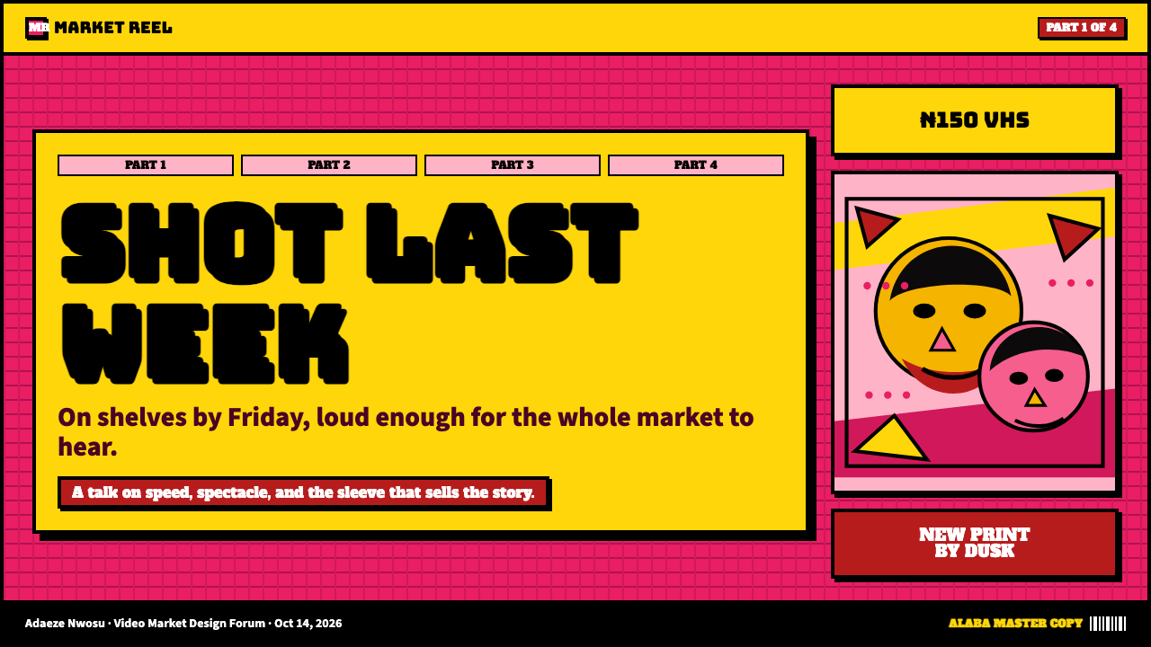
For presentation slides, this aesthetic works best on cover and section-opener pages where the goal is impact rather than sustained readability. A cover slide built on this system uses a large portrait or figure as the primary visual anchor, stacks the title in bold shadow lettering across the center of the frame, and employs multiple saturated colors in distinct horizontal zones. Content slides within a Nollywood-influenced presentation should pull back from the full intensity — reduce the color count to two or three dominant hues, maintain the bold typography convention, and treat text as a graphic element rather than a reading exercise. Data slides work well when the chart elements are treated as colored graphic forms against a high-contrast ground.对于演示文稿,这种美学在封面和章节开篇页上效果最佳,因为这些位置的目标是冲击力而非持续的可读性。基于这一体系构建的封面页使用大型人像或人物作为主要视觉锚点,将粗壮阴影字体的标题叠放在画面中央,并在独立的横向色带中运用多种饱和色彩。受诺莱坞影响的演示文稿中,内容页应从全强度中退一步——将色彩数量减少到两到三种主导色调,保留粗壮字体惯例,将文字视为图形元素而非阅读材料。当图表元素被当作高对比底面上的彩色图形形态处理时,数据页效果也很好。
For web interfaces and digital products, this style is most appropriate for landing pages, event sites, cultural platforms, and streaming services oriented toward African popular entertainment. A dashboard or productivity tool built in this aesthetic will generally feel jarring rather than compelling — the intensity that works for a ten-second cover browse becomes fatigue-inducing over an extended session. Where it is applied to interactive products, the key is using the style's color intensity for state changes, calls to action, and alert states, while keeping baseline UI surfaces closer to a neutral ground that provides visual relief.对于网页界面和数字产品,这种风格最适合落地页、活动网站、文化平台,以及面向非洲流行娱乐的流媒体服务。以这种美学构建的仪表板或生产力工具通常会给人突兀感而非吸引力——在十秒钟的封面浏览中有效的强度,在持续的使用过程中会造成视觉疲劳。将其应用于交互产品时,关键是将这种风格的色彩强度用于状态变化、行动号召和警示状态,同时将基础UI表面保持在更接近中性底面的状态,以提供视觉缓解。
For editorial and marketing work — campaign posters, social media graphics, merchandise, and event collateral — this aesthetic offers immediate cultural legibility and strong differentiation from the restrained visual norms of most contemporary design. The part-stamp convention can be redeployed as a serialization device for multi-phase campaigns. The moral-declaration text tradition adapts naturally to product benefit claims or call-to-action copy. The airbrushed portrait convention works for any context where celebrity or personality is central to the visual message.对于编辑和营销工作——活动海报、社交媒体图形、周边产品和活动辅助材料——这种美学提供了即时的文化可读性,以及与大多数当代设计克制视觉规范的强烈差异化。分集印章惯例可被重新部署为多阶段战役的序列化装置。道德宣言文字传统自然适应于产品利益声明或行动号召文案。喷枪肖像惯例适用于任何以名人或个性为视觉信息核心的场景。
The most common mistake when working in this aesthetic is treating the density as an accident to be managed rather than a system to be designed. Authentic Nollywood cover density is layered and hierarchical — there are three or four distinct information zones, and each zone is packed internally but separated from adjacent zones by color contrast. Designers who simply pile elements onto a canvas without establishing these zones produce work that reads as confusion rather than maximalism. The second common mistake is reproducing only the visual surface — the colors and the drop shadows — while omitting the underlying dramatic content logic. This style works because every element is doing communicative work; decorative application of the palette without content purpose produces pastiche.在这种美学中工作时,最常见的错误是将密度视为需要管理的意外结果,而非需要设计的系统。真实的诺莱坞封面密度是分层且有层级的——存在三到四个独立的信息区域,每个区域内部是密集的,但通过色彩对比与相邻区域分隔。那些只是将元素堆积在画布上而不建立这些区域的设计师,产出的作品读起来是混乱而非极繁主义。第二个常见错误是只复制视觉表面——色彩和阴影——而省略了底层的戏剧性内容逻辑。这种风格之所以有效,是因为每个元素都在承担传播功能;没有内容目的地装饰性应用色板,只会产生仿制品。
See the Nollywood VHS Covers design system →查看 Nollywood VHS Covers 完整设计系统 →
Nollywood VHS Covers — FAQNollywood VHS Covers · 常见问题
Is Nollywood VHS aesthetics the same as general African popular art?诺莱坞VHS美学等同于非洲大众艺术的整体风格吗?
No — it is a specific vernacular tradition with a specific geographic and commercial origin. Nigerian cover design from the Lagos and Onitsha markets has clear family resemblances to other West and Central African popular graphic traditions, but it is distinct from, say, Congolese rumba-music cassette art, Ghanaian gospel-video covers, or the hand-painted signage traditions of East Africa. Treating these as interchangeable would be like treating all mid-century European modernism as one style. The shared traits — high saturation, dense composition, dramatic figuration — reflect shared commercial pressures rather than a unified aesthetic movement.不——它是一种有着特定地理和商业起源的特定本土传统。来自拉各斯和奥尼查市场的尼日利亚封面设计与其他西非和中非大众图形传统有着明显的家族相似性,但它有别于刚果热带鼓音乐磁带艺术、加纳福音视频封面,或东非的手绘招牌传统。将这些视为可互换,就好比将所有中世纪欧洲现代主义视为同一风格。它们共享的特征——高饱和度、密集构图、戏剧性人物描绘——反映的是共同的商业压力,而非统一的美学运动。
Can this style work in a light, airy, or minimalist context?这种风格能在轻盈、通透或极简的场景中使用吗?
Not without fundamental transformation. The Nollywood VHS aesthetic is structurally maximalist — its visual logic depends on density, color competition, and the absence of negative space. Applying its palette and type treatment to a sparse layout produces a hybrid that satisfies neither system: the colors overwhelm the minimal structure, and the composition lacks the density that gives the style its communicative force. If your context calls for minimalism, a different historical style will serve it better. If you want to incorporate specific elements — the airbrushed portrait convention, the hard shadow typography, the starburst stamp — you can borrow those individual elements into other systems, but what results is no longer Nollywood-derived design.不经根本性转化是不行的。诺莱坞VHS美学在结构上是极繁主义的——其视觉逻辑依赖于密度、色彩竞争和负空间的缺席。将其色板和字体处理应用于稀疏版面,会产生两种体系都无法满足的混合物:色彩压倒了极简结构,而构图又缺乏赋予这种风格传播力量的密度。如果你的场景需要极简主义,其他历史风格会更好地服务于它。如果你想融入某些特定元素——喷枪肖像惯例、硬边阴影字体、星爆印章——你可以将这些单独元素借用进其他体系,但由此产生的结果不再是源自诺莱坞的设计。
How is this different from Y2K or 1990s graphic nostalgia in general?这与Y2K或1990年代图形怀旧风格有何不同?
They share a time period but almost nothing else. Y2K and late-1990s Western graphic nostalgia draws from digital utopianism, early internet interfaces, and consumer electronics design — chrome gradients, lens flares, inflated 3D letterforms, and a palette drawn from the colors of early LCD and plasma screens. Nollywood VHS design is analog, painterly, and market-stall vernacular — its reference points are screen printing, airbrushed portraiture, and the moral-declaration text of Onitsha pamphlet culture. The two aesthetics would not be confused by anyone looking at them side by side; conflating them collapses a genuinely specific cultural tradition into a generic decade label.它们共享同一个时代,但几乎没有其他共同之处。Y2K和1990年代末西方图形怀旧风格汲取自数字乌托邦主义、早期互联网界面和消费电子设计——金属渐变、镜头光晕、膨胀的三维字形,以及源自早期液晶和等离子屏幕色彩的色板。诺莱坞VHS设计是模拟的、绘画性的、市场摊位式的本土风格——其参照点是丝网印刷、喷枪肖像,以及奥尼查小册子文化的道德宣言文字。任何并排看过两者的人都不会将它们混淆;将二者混为一谈,是把一种真正特定的文化传统折叠进了一个笼统的年代标签。
Does using this aesthetic appropriately require cultural context?恰当地使用这种美学需要文化背景知识吗?
Yes, meaningfully so. The Nollywood VHS cover is not a neutral graphic style — it carries specific cultural associations, including the history of Nigerian entrepreneurial cinema, Igbo and Yoruba popular cultural production, and the economic conditions of the home-video market. Using it with fluency requires understanding what the visual system is doing and why, not just what it looks like. Designers working outside this cultural context who apply the style without that understanding risk producing work that reads as caricature rather than reference — borrowing the surface intensity while missing the communicative intelligence that makes the original system work. Research into specific examples from the 1992–2008 period and engagement with the broader context of Nollywood's history will produce more substantive results than surface-level imitation.是的,这很重要。诺莱坞VHS封面并非中性的图形风格——它承载着特定的文化关联,包括尼日利亚创业电影的历史、伊博族和约鲁巴族的大众文化生产,以及家庭录像市场的经济条件。流畅地使用它,需要理解这套视觉系统在做什么、为什么这样做,而不仅仅是它看起来是什么样子。在这一文化语境之外工作、不加理解地套用这种风格的设计师,有可能产出被解读为讽刺漫画而非致敬参考的作品——借用了表面的强烈感,却错失了使原始体系得以运作的传播智慧。研究1992年至2008年间的具体案例,并介入诺莱坞历史的更广泛语境,会比表面模仿产出更有实质意义的结果。
What happened to this visual style as Nollywood moved to digital production?随着诺莱坞转向数字制作,这种视觉风格发生了什么变化?
The transition to digital distribution through platforms like iROKOtv and later Netflix brought a pronounced shift toward international streaming-service visual norms — cleaner photography, more restrained title treatments, and composition influenced by the thumbnail-optimized aesthetics of global platforms. The dense, hand-crafted maximalism of the VHS era faded from mainstream Nollywood marketing by the early 2010s as higher production budgets and new distribution channels shifted the design brief. The original aesthetic survives most actively in straight-to-market physical media, in local cinema advertising, and in the work of artists and designers who consciously engage with it as a historical and cultural reference — a trajectory that mirrors how other vernacular commercial graphic traditions have been absorbed into contemporary design discourse.通过iROKOtv等平台、后来又通过Netflix实现的数字发行转型,带来了向国际流媒体服务视觉规范的明显转变——更简洁的摄影、更克制的标题处理,以及受全球平台缩略图优化美学影响的构图。随着更高的制作预算和新的发行渠道改变了设计任务,VHS时代密集的手工极繁主义在2010年代初从诺莱坞主流营销中逐渐消退。原始美学最活跃地保存于直供市场的实体媒体、本地影院广告,以及有意识地将其作为历史和文化参照加以运用的艺术家和设计师的作品中——这一轨迹与其他本土商业图形传统被吸收进当代设计话语的历程如出一辙。
Related design styles相关设计风格
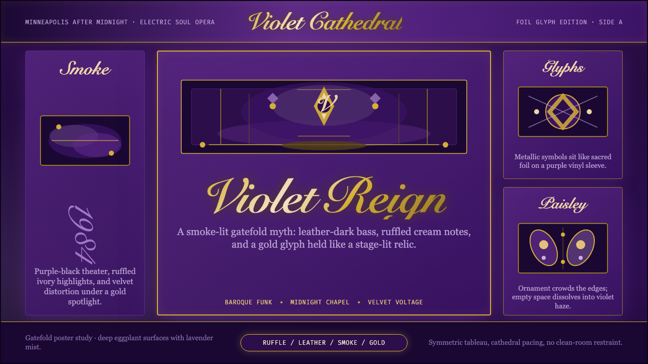 Prince — Purple Rain (1984)Decadence turns electric. Eggplant violet, gold foil glyphs, and smoky symmet…颓艳通电:茄紫、金箔符号与烟雾对称搭起神话舞台。
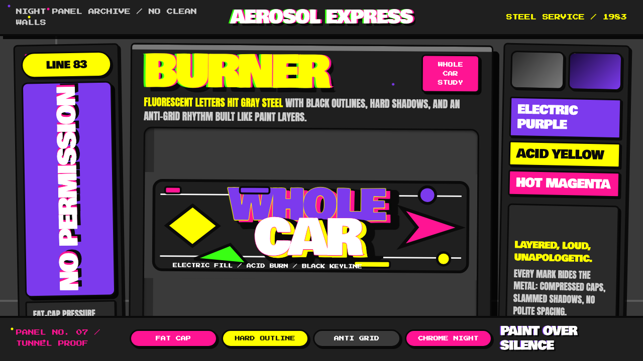 NYC Subway Graffiti (1983)Bombed steel gets loud. Electric purple and acid yellow stack as hard-outline…钢板被炸响:电紫与酸黄层叠,黑线框出狂野字形。
 Cartoon Network 90s BlocksKids-cable noise, squared. Black-white checkerboards crash into hot-yellow Bu…方块化的儿童有线电视噪音:黑白棋盘撞上热黄 Bungee 字块。
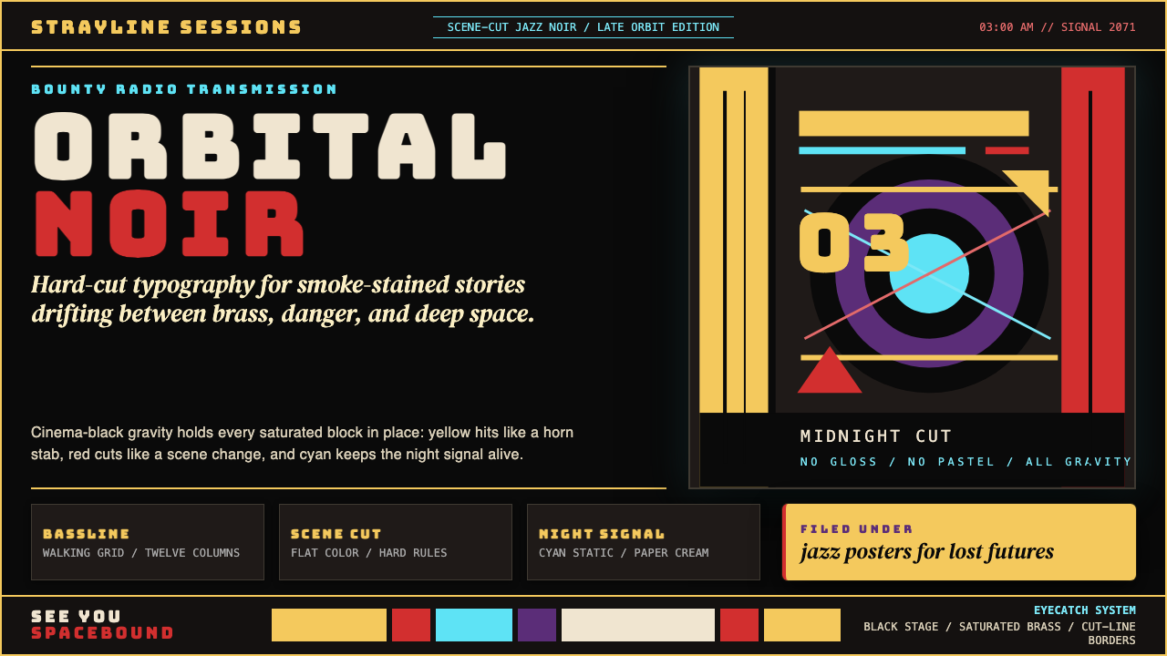 Cowboy Bebop Jazz-NoirCool at 3 AM. Bungee type, jazz yellow, red cuts, and cyan rules hit deep bla…凌晨三点的酷:黑底上 Bungee 字、爵士黄、红切线与青色规则。
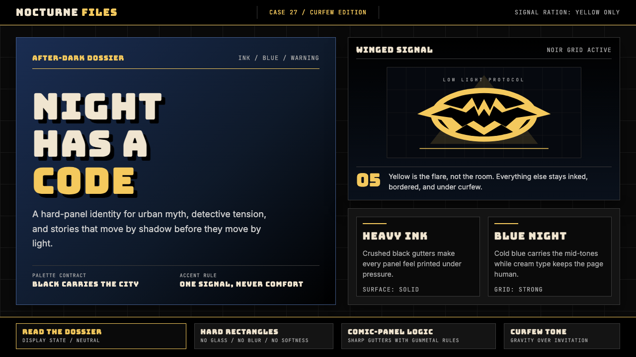 DC Comics Batman NoirGravity, not cheer. Black panels, Gotham blue, and one bat-yellow signal cut…重力而非欢愉:黑色分镜、哥谭蓝与一束蝙蝠黄切开夜色。
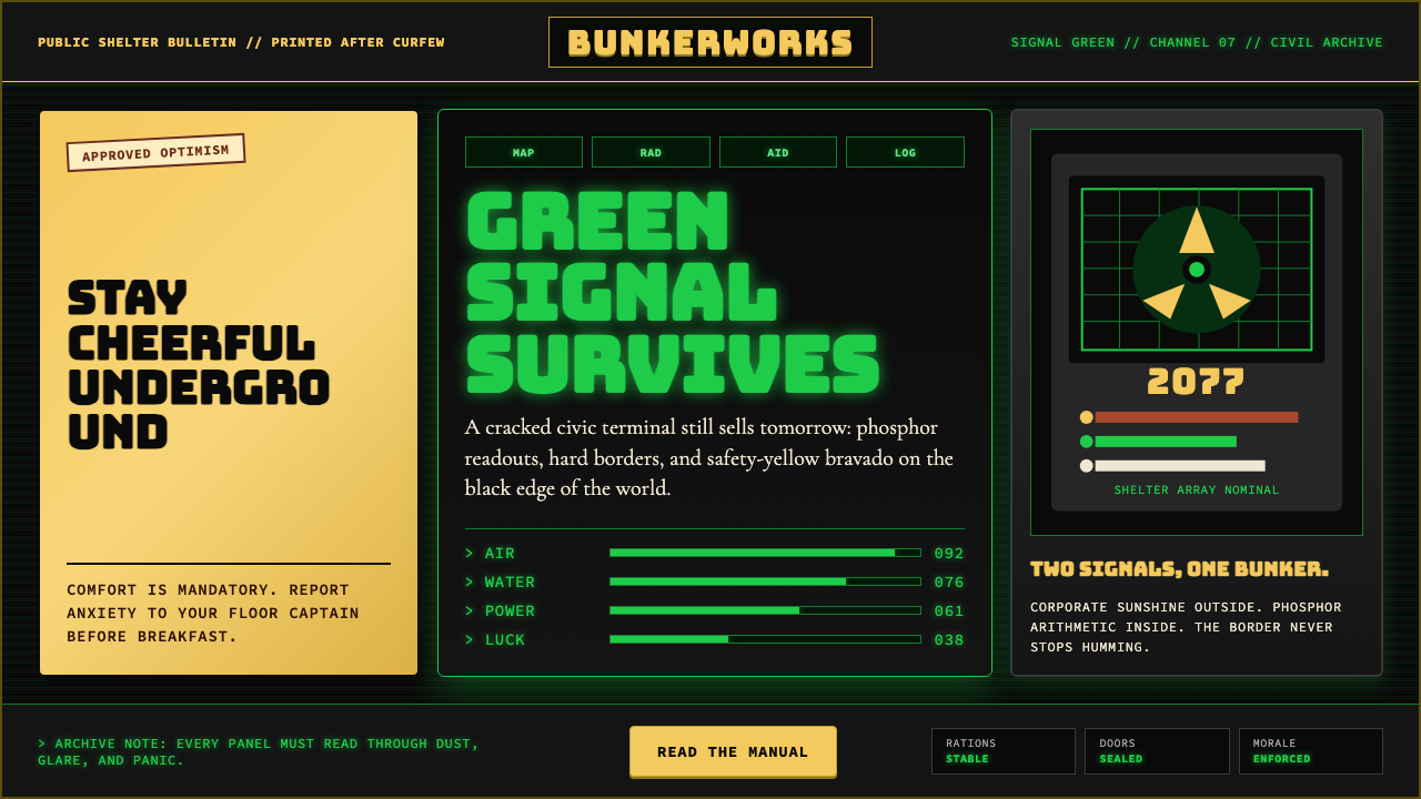 Fallout Vault-Tec Pip-BoyIrradiated optimism. Vault yellow and CRT green lock into a bordered bunker g…辐照乐观主义:避难所黄与CRT绿嵌入硬边地堡网格。