What is NYC Subway Graffiti (1983)?什么是 NYC Subway Graffiti (1983)?
In 1983, New York's subway system was the world's loudest gallery — every train a rolling canvas of wildstyle lettering, fluorescent flares, and pitch-black outlines that announced a new visual language born from the streets.1983年,纽约地铁是全世界最喧嚣的画廊——每列列车都是流动的画布,狂野字形、荧光闪耀、漆黑轮廓,共同宣告一种诞生于街头的全新视觉语言。
NYC Subway Graffiti (1983) in briefNYC Subway Graffiti (1983) 速览
NYC Subway Graffiti at its 1983 peak represents the most explosive typographic movement America ever produced. Writers working under names like DONDI, LEE Quiñones, PHASE 2, and FUTURA 2000 transformed MTA rolling stock into mobile masterworks — fluorescent paint layered over industrial gray steel, every surface pushed to visual saturation. The style reached its international audience through two landmark documents released in that same era: the Style Wars documentary film and the Subway Art photo book by Martha Cooper and Henry Chalfant.1983年巅峰时期的纽约地铁涂鸦,是美国有史以来最具爆发力的字体运动。以DONDI、LEE Quiñones、PHASE 2、FUTURA 2000为代表的涂鸦写手,将MTA列车变成了移动的杰作——荧光颜料层叠喷涂于工业灰钢板,每个表面都被推向视觉饱和的极限。这种风格通过两部里程碑式的文献传播至国际:纪录片《Style Wars》和玛莎·库珀与亨利·查尔芬特合著的摄影集《Subway Art》。
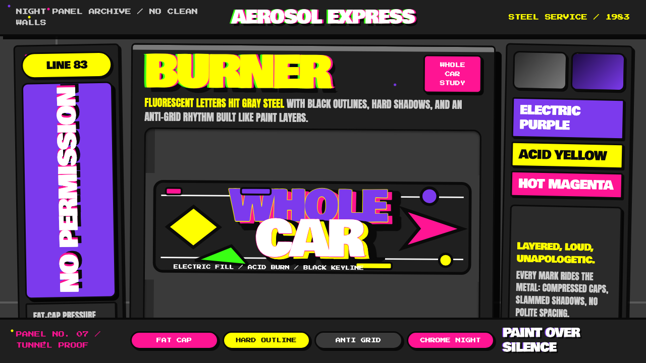
The visual system is built on controlled tension. Background grounds in the dark, weathered tones of subway metal — corroded charcoal, industrial gray, the blackened grime of underground tunnels — serve as the foil against which electric colors explode. Fills range from deep electric purple and acid yellow to hot magenta, chrome-silver, and fire-engine red, each bounded by thick pitch-black outlines that give every form its structure and legibility. The effect is simultaneously dense and readable: information packed to maximum density yet organized by a rigorous internal logic of outline, fill, and highlight.这套视觉系统建立于可控的张力之上。背景以地铁金属的暗哑色调为底——腐蚀的炭灰、工业灰、地下隧道的污黑——成为电光色彩爆发的衬托。填色从深邃的电光紫、酸性黄,到热洋红、铬银、消防车红,每种颜色都被厚重的漆黑轮廓线框定,赋予每个形态其结构与可读性。效果既密集又可读:信息被压缩至最大密度,却由轮廓、填色与高光的严密内在逻辑组织起来。
At its core, this is a typographic art form. Letters are the primary subject, not backgrounds or figures. Wildstyle compositions push individual letterforms to their formal limits — arrows pierce and extend strokes, interlocking elements create three-dimensional depth, highlights and burnished fills suggest volume and speed. The best pieces read simultaneously as abstract surface design and legible signature, a balance that took years of study within the writer community to achieve.从根本上说,这是一种字体艺术形式。字母是主要主题,而非背景或人物。狂野字形构图将单个字母形态推至形式极限——箭头刺穿并延伸笔画,相互咬合的元素创造三维深度,高光与磨光填色暗示体积与速度。最优秀的作品同时作为抽象平面设计和可辨认签名而被解读——这种平衡需要在写手社群中经过多年研习才能达到。
See the NYC Subway Graffiti (1983) design system查看 NYC Subway Graffiti (1983) 完整设计系统
Where does NYC Subway Graffiti (1983) come from?NYC Subway Graffiti (1983) 从何而来?
The movement traces its roots to 1971, when a teenager named TAKI 183 — living on 183rd Street in Washington Heights — began writing his tag on surfaces throughout the city's subway system. Journalists noticed the proliferation of the name and interviewed TAKI for The New York Times, inadvertently publishing the first mainstream account of what would become a global subculture. Other young writers quickly adopted the formula: a name plus a street number, repeated obsessively across every available subway surface. Within two years, the competition had escalated from simple tags to more elaborate lettered pieces.这场运动的根源可追溯至1971年。一个名叫TAKI 183的少年——居住在华盛顿高地183街——开始在全市地铁系统的各个表面涂写自己的标签。记者注意到这个名字的大量出现,采访了TAKI并将报道刊登于《纽约时报》,无意间发表了关于这一将成为全球亚文化的现象的首篇主流报道。其他年轻写手迅速采纳了这一公式:名字加街道号码,强迫性地重复于每一个可用的地铁表面。不到两年,竞争便从简单标签升级为更精心制作的字母作品。
By the mid-1970s, the social conditions in New York City had made the subway system a unique canvas. Municipal fiscal crisis had left the MTA underfunded and the trains largely unmaintained; yards went unguarded at night, and writers discovered they could work for hours on a single train car. The physical context shaped the aesthetic — writers needed paint that would read from platform level as a train passed at speed, which drove the adoption of the largest possible letterforms and the most saturated available colors. Phase 2, one of the earliest innovators, developed bubble letters precisely because their rounded, inflated forms held legibility at distance and speed.到1970年代中期,纽约市的社会状况使地铁系统成为独特的画布。市政财政危机使地铁管理局资金严重不足,列车几乎无人维护;车辆段夜间疏于看管,写手们发现他们可以在单节车厢上工作数小时。物理语境塑造了美学——写手需要能在列车高速驶过站台时从站台高度被看清的颜料,这推动了尽可能大的字母形态和最饱和颜色的采用。作为最早的创新者之一,PHASE 2正是由于泡泡字母圆润膨胀的形态能在距离与速度下保持可读性,才发展出这种字体风格。
The period from 1979 to 1984 is widely considered the movement's golden age. Writers had developed a sophisticated internal vocabulary of styles — simple tags at one extreme, elaborate wildstyle pieces at the other, with throw-ups and masterpieces occupying the range between them. The wildstyle, developed and codified by writers including Tracy 168 and subsequently elaborated by hundreds of practitioners, pushed letterforms into near-abstraction: interlocking arrows, interlocking forms, three-dimensional fills, and chrome-and-black highlight systems that created an illusion of metallic depth on flat steel. The 1983 Style Wars documentary, directed by Henry Chalfant and Tony Silver, captured this moment at its apex, filming writers including DONDI, SKEME, and SEEN executing full-car masterpieces in the Bronx and Brooklyn yards.1979年至1984年被普遍认为是这场运动的黄金时代。写手们已发展出一套精密的内部风格词汇——一端是简单标签,另一端是精心制作的狂野字形,抛写和杰作占据中间范围。狂野字形由Tracy 168等写手创立并加以整理,随后由数百位实践者进一步演化,将字母形态推向近乎抽象的境地:相互咬合的箭头、交织的形态、三维填色,以及铬银与黑色的高光系统,在平整的钢板上制造出金属质感的深度幻觉。1983年由亨利·查尔芬特与托尼·西尔弗执导的纪录片《Style Wars》捕捉了这一时刻的顶峰,记录了DONDI、SKEME、SEEN等写手在布朗克斯和布鲁克林车辆段完成整节车厢杰作的过程。
The movement ended not through aesthetic exhaustion but through administrative suppression. New York City Mayor Ed Koch declared war on graffiti in 1984, implementing a Clean Train Movement that buffed — painted over — every tagged car before it could re-enter service. By 1989, the MTA had achieved a graffiti-free fleet. Many writers responded by moving to canvases, gallery walls, and commissioned work; others carried the visual vocabulary to cities across Europe, where a second generation had already adopted and was transforming the New York style into regional variants that would eventually be recognized as a global urban art form.这场运动的终结不是因为美学上的耗尽,而是行政压制。纽约市长爱德华·科赫于1984年宣战涂鸦,实施了「清洁列车运动」——任何被标记的车厢在重新投入使用前都会被涂刷覆盖。到1989年,地铁管理局已实现无涂鸦车队。许多写手转向画布、画廊墙壁和委托创作;另一些人则将这套视觉词汇带到了欧洲各城市——那里的第二代写手早已采纳并正在将纽约风格转化为地区变体,这些变体最终将被认可为一种全球性的城市艺术形式。
What defines the NYC Subway Graffiti (1983) look?NYC Subway Graffiti (1983) 的视觉特征是什么?
Color色彩
The palette is built on maximum chromatic contrast against a dark industrial ground. Electric purple, acid yellow, hot magenta, chrome silver, and fire-engine red appear as fill colors, each pushed to the highest available saturation. Colors are never blended softly — they are stacked in hard-edged fills separated by black outlines, or layered as highlights and burnished reflections that create an illusion of metallic surface. The ground itself is the dark, corroded tone of painted steel — not neutral gray but the specific charcoal of underground grime — which makes every saturated fill appear to vibrate.色板建立于深色工业底色与最大色彩对比度之上。电光紫、酸性黄、热洋红、铬银、消防车红作为填色出现,每种颜色都被推至可用饱和度的极限。颜色从不柔和混合——它们以硬边填色形式叠放,由黑色轮廓线分隔,或以高光与磨光反射的形式层叠,制造出金属表面的幻觉。底色本身是涂漆钢铁的暗哑腐蚀色调——不是中性灰,而是地下污垢特有的炭黑——这使每一种饱和填色都显得振动发光。
Typography字体排印
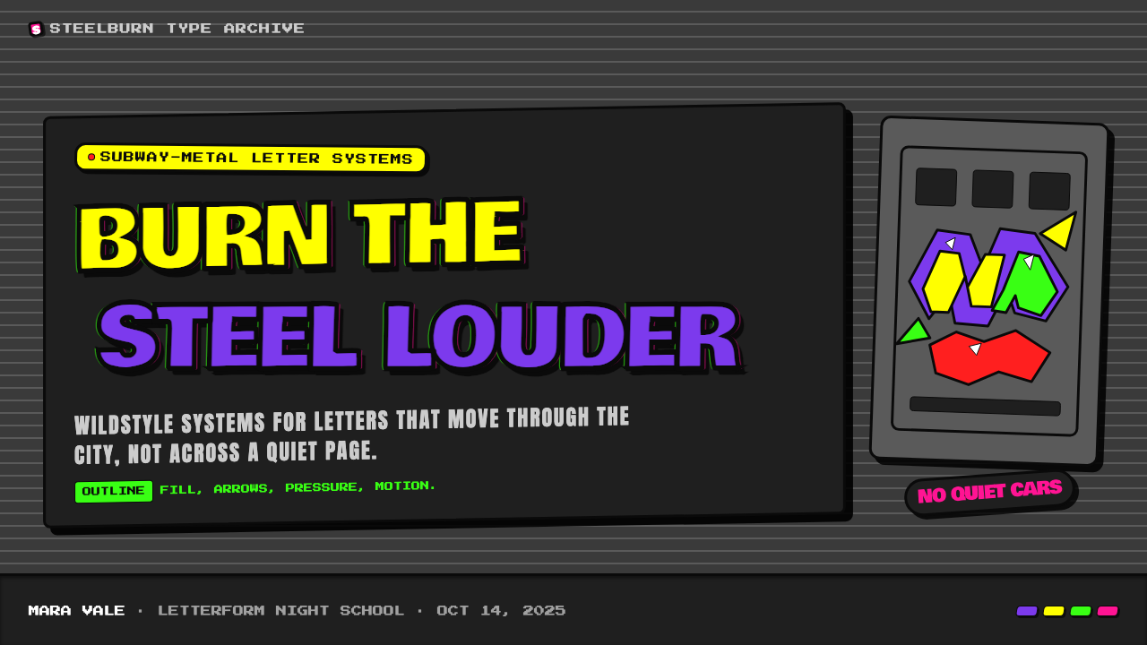
Letterforms are the entire subject of the art. Wildstyle letters are pushed far beyond legibility thresholds into structures where arrows extend and pierce strokes, where adjacent letters share and merge components, and where the overall composition reads first as visual field and second as word. Bubble letters occupy the more accessible end of the spectrum: inflated, rounded forms with consistent thick fills, thick outlines, and highlight marks that suggest three-dimensional inflation. Both styles treat the letter as an architectural object — a structure with walls, depth, and volume — rather than as a flat mark.字母形态是艺术的全部主题。狂野字形的字母被推至远超可读性阈值的结构——箭头延伸并刺穿笔画,相邻字母共享并融合部件,整体构图首先作为视觉场域被解读,其次才是词语。泡泡字母占据更易于接近的一端:膨胀的圆润形态,配以一致的厚填色、厚轮廓线,以及暗示三维膨胀感的高光标记。两种风格都将字母视为建筑对象——一个有墙壁、有深度、有体积的结构——而非平面标记。
Outline and Structure轮廓与结构
The thick black outline is the structural logic of the entire system. Every form — letter, arrow, highlight, fill region — is bounded by a bold, consistent outline that creates figure-ground separation against the dark background and holds the composition together when fills are at maximum saturation. Outlines are not uniform strokes but expressive calligraphic marks: wider on structural load-bearing edges, narrower on decorative extensions. A second lighter outline in white or pale color often appears outside the black, creating a halo that further separates the piece from the background.厚重的黑色轮廓线是整个系统的结构逻辑。每一个形态——字母、箭头、高光、填色区域——都被粗壮一致的轮廓线框定,在深色背景下创造图底分离,并在填色达到最大饱和度时将构图凝聚在一起。轮廓线并非均匀的笔触,而是富有表现力的书法性标记:在承重的结构性边缘较宽,在装饰性延伸处较窄。黑线外侧通常还会出现白色或浅色的第二条轮廓线,形成光晕,进一步将作品从背景中分离出来。
Depth and Dimension深度与维度
Despite being spray-painted on flat surfaces, the best subway pieces create a convincing illusion of three-dimensional form. This depth is achieved through two techniques: drop shadows cast at a consistent angle in a dark or contrasting color, and chrome-style highlights — curved white or light-colored fills placed inside letterforms to suggest a reflective, cylindrical surface. The combination of hard drop shadow and interior highlight makes letters appear to float above the surface and bulge outward toward the viewer. Chrome-style pieces, which extend this logic to a full silvered-surface effect, represent the highest technical achievement of the style.尽管是喷涂于平面钢板上,最优秀的地铁作品创造出令人信服的三维形态幻觉。这种深度通过两种技术实现:以深色或对比色以固定角度投射的落影,以及铬银风格的高光——置于字母形态内部的弧形白色或浅色填色,暗示出反光的圆柱形表面。硬边落影与内部高光的结合使字母看起来漂浮于表面之上,并向观者凸出。将这一逻辑延伸至完整镀银表面效果的铬银风格作品,代表了这种风格的最高技术成就。
Layering and Density层叠与密度
The surface of a finished subway masterpiece is never empty. Background fills are frequently decorated with clouds, stars, geometric shapes, or abstract patterns that create visual texture without competing with the foreground lettering. Over these backgrounds, the main letters are constructed, and over the letters, highlights and arrows are added as a final layer. The compositional logic is additive — layer upon layer — with each level maintaining its position in the hierarchy through scale, contrast, and the unifying black outline. The total effect is of maximum density that never collapses into illegibility.一幅完成的地铁杰作的表面从不空旷。背景填色经常饰有云朵、星形、几何形状或抽象图案,创造视觉质感而不与前景字母争夺注意力。在这些背景之上,主要字母被构建出来,字母之上,高光与箭头作为最后一层被叠加。构图逻辑是累加的——层叠于层叠之上——每一层通过尺度、对比度和统一的黑色轮廓线保持其在层级中的位置。总体效果是达到最大密度却从不崩溃为难以辨认。
Arrows and Extensions箭头与延伸
Arrows are not decorative afterthoughts in wildstyle — they are structural extensions of the letterforms themselves. Horizontal strokes extend beyond their natural endpoints and terminate in stylized arrowheads; serifs mutate into directional spurs; curves twist into ribbon-like tails. These extensions give the composition a sense of explosive outward force, as though the letters are in the process of breaking free from the rectangle of the train panel. In the most complex wildstyle pieces, the arrows and extensions are as legible as the core letters — a second layer of visual syntax operating simultaneously.在狂野字形中,箭头不是装饰性的事后添加——它们是字母形态本身的结构性延伸。水平笔画延伸超出其自然端点,终止于程式化的箭头;衬线变异为方向性的尖刺;曲线扭转成丝带状尾翼。这些延伸赋予构图一种向外爆发的力量感,仿佛字母正在从列车车厢的矩形框架中挣脱而出。在最复杂的狂野字形作品中,箭头与延伸和核心字母一样清晰——一套同时运作的第二层视觉语法。
Ground and Context底色与语境
The industrial ground of the subway car — corroded metal, painted steel, the grime and surface damage of years underground — is not a neutral white page. The ground has texture, color, and history, and the most sophisticated writers accounted for it as part of the composition. Pieces were planned to work with the panel seams, door edges, and window frames of specific car models, using the physical structure of the train as an organizing element. When applied to contemporary design contexts, this quality translates to a willingness to treat background texture not as error but as material — an active participant in the visual field rather than a surface to be erased.地铁车厢的工业底色——腐蚀的金属、涂漆的钢板、多年地下运营留下的污垢与表面损伤——不是中性的白页。底色有其质感、色彩和历史,最有经验的写手会将其作为构图的一部分加以考量。作品被规划为与特定车型的车厢接缝、门边和窗框配合,以列车的物理结构作为组织元素。当应用于当代设计语境时,这种品质转化为一种意愿:将背景质感视为材料而非错误——是视觉场域的主动参与者,而非需要被抹除的底面。
See the NYC Subway Graffiti (1983) design system查看 NYC Subway Graffiti (1983) 完整设计系统
Who shaped NYC Subway Graffiti (1983)?谁塑造了 NYC Subway Graffiti (1983)?
Donald White, known as DONDI, is widely regarded as one of the most technically accomplished subway writers of the early 1980s. His pieces demonstrated an exceptional control of letter structure and color blending rare among spray-can practitioners, and his Children of the Grave series — executed across multiple connected subway cars — established a benchmark for compositional scale and narrative ambition that influenced an entire generation. DONDI was among the first writers to exhibit work in gallery settings, helping to legitimize graffiti as a fine art practice in New York and internationally.唐纳德·怀特,以DONDI之名为人所知,被普遍认为是1980年代初期技术最为精湛的地铁写手之一。他的作品展现出在喷漆实践者中罕见的字母结构与色彩混合的卓越控制,而他跨越多节相连车厢创作的《Children of the Grave》系列,确立了构图规模与叙事野心的标杆,影响了整整一代人。DONDI是最早在画廊展出作品的写手之一,帮助在纽约及国际上为涂鸦作为纯艺术实践的合法性奠定了基础。
Lee George Quiñones became one of the most recognized figures of the New York graffiti era through his large-scale whole-car and whole-train compositions that often incorporated political and social commentary — anti-nuclear imagery, civil rights themes, and urban social critique — into the wildstyle visual language. His collaboration with filmmaker Charlie Ahearn led directly to the 1983 film Wild Style, the first feature film centered on New York hip-hop culture, in which Quiñones played the lead role. This film served as a primary vehicle through which New York graffiti, breakdancing, and hip-hop music were exported to European and global audiences.李·乔治·基尼奥内斯因其大规模的整节或整列车厢构图而成为纽约涂鸦时代最具辨识度的人物之一——这些构图经常将政治与社会评论融入狂野字形的视觉语言:反核图像、民权主题、城市社会批评。他与电影人查理·阿亨的合作直接促成了1983年电影《Wild Style》的诞生——这是第一部以纽约嘻哈文化为中心的故事片,基尼奥内斯在其中出演主角。这部电影成为纽约涂鸦、霹雳舞和嘻哈音乐向欧洲及全球受众输出的主要载体。
Lonny Wood, known as PHASE 2, is credited as one of the originators of the bubble letter style — the rounded, inflated letterforms that became the most widely recognized visual element of New York subway graffiti. He developed this approach in the early 1970s as a solution to the practical problem of creating readable letters at speed and distance, and his formal innovations proved foundational to virtually every subsequent wildstyle development. Phase 2 was also an early theorist and documentarian of the culture, publishing zines and writings that articulated the internal logic and values of the writer community at a time when outside commentary was almost uniformly dismissive.朗尼·伍德,以PHASE 2之名为人所知,被认为是泡泡字母风格的创始人之一——这种圆润膨胀的字母形态成为纽约地铁涂鸦最广为人知的视觉元素。他在1970年代初发展出这一方法,作为在速度与距离下创造可读字母这一实际问题的解决方案,他的形式创新被证明是几乎所有后续狂野字形发展的基础。PHASE 2同时也是这种文化的早期理论家与记录者,出版了单页印刷品和文章,在外界评论几乎一律贬斥的时代,清晰表述了写手社群的内在逻辑与价值观。
Leonard Hilton McGurr, known as FUTURA 2000, distinguished himself from many contemporaries by moving away from letterforms toward increasingly abstract compositions — geometric shapes, cosmic imagery, and gestural mark-making that drew on abstract expressionism and science fiction visual culture simultaneously. This made him one of the first subway writers to develop a practice that translated directly into the gallery context without requiring formal translation. His subsequent collaborations with The Clash and his design work in streetwear and sneaker culture gave the subway graffiti tradition a sustained presence in popular culture through the 1980s and beyond.莱昂纳德·希尔顿·麦格尔,以FUTURA 2000之名为人所知,以从字母形态转向日益抽象的构图而与许多同时代人区别开来——几何形状、宇宙图像以及同时借鉴抽象表现主义与科幻视觉文化的姿态性标记。这使他成为最早发展出一种无需形式转译便可直接进入画廊语境的实践的地铁写手之一。他随后与The Clash乐队的合作,以及在街头服饰和球鞋文化中的设计工作,使地铁涂鸦传统在整个1980年代及之后持续存在于流行文化之中。
Joseph Fer, known as SEEN, earned the title 'Godfather of Graffiti' through sheer volume and consistency — thousands of pieces executed across decades, maintaining technical quality from the early 1970s subway era through to the present day. His work demonstrated that the visual vocabulary of subway graffiti was not a moment but a discipline, capable of sustained practice and refinement. SEEN was prominently featured in the Style Wars documentary, and his ongoing activity through the 1980s transition from subway to canvas helped define what a professional career rooted in graffiti culture could look like.约瑟夫·费尔,以SEEN之名为人所知,凭借惊人的数量与一致性赢得了「涂鸦教父」的称号——横跨数十年创作了数千件作品,从1970年代初的地铁时代到今天始终保持着技术水准。他的工作证明了地铁涂鸦的视觉词汇不是一个短暂的时刻,而是一门学科,能够经受持续的实践与精进。SEEN在《Style Wars》纪录片中占据突出位置,他在1980年代从地铁到画布的转型期间的持续活动,帮助定义了一种以涂鸦文化为根基的职业生涯可以呈现的面貌。
How do you use NYC Subway Graffiti (1983) today?今天怎么用 NYC Subway Graffiti (1983)?
NYC Subway Graffiti is one of the most powerful available options when a design needs to communicate authenticity, energy, and unapologetic visual force. Because the style is rooted in specific cultural history rather than abstract formal principles, applying it well requires understanding what it actually communicates — not just visual loudness, but the specific tension between structure and improvisation, between community-coded meaning and broad visual impact. Used casually as pure decoration, it reads as pastiche; used with understanding, it brings a charge that clean digital styles cannot replicate.当设计需要传达真实性、能量和毫无歉意的视觉力量时,纽约地铁涂鸦是最有力的可用选项之一。由于这种风格根植于具体的文化历史而非抽象的形式原则,正确应用它需要理解它实际上传达了什么——不仅仅是视觉上的喧嚣,而是结构与即兴之间、社群编码意义与广泛视觉冲击之间的特定张力。随意用作纯装饰,它会显得像是仿制品;以理解为基础使用,它带来一种干净的数字风格无法复制的冲击力。
For presentation slides, the style demands a deliberate commitment. A cover slide benefits from a dark near-black or deep industrial-charcoal ground with a central wildstyle-inspired typographic treatment in one electric fill color — electric purple or acid yellow — bounded by thick outlines and given a hard drop shadow offset at a consistent angle. Supporting type should be kept bold, clean, and minimal to prevent visual competition with the hero treatment. Content slides work best with the dark ground maintained, one or two fill colors used consistently for data categories or call-outs, and generous negative space on each slide — the style's density should appear as a deliberate focal point, not as a default background condition.对于演示文稿,这种风格要求有意识的全情投入。封面幻灯片适合以接近黑色的深色或深工业炭灰为底,以一种电光填色——电光紫或酸性黄——制作中央野生字形风格的字体处理,并以厚轮廓线框定,以固定角度偏移的硬边落影赋予分量。辅助文字应保持粗重、简洁、极简,以防止与主角处理产生视觉竞争。内容幻灯片最好维持深色底面,以一到两种填色颜色一致地用于数据类别或标注,每张幻灯片保留充足的负空间——风格的密度应作为刻意设计的焦点出现,而非作为默认的背景状态。
For web interfaces, the style is most effective on marketing landing pages, event sites, limited-edition product launches, and any context where an immediate emotional impact is the primary goal. Dashboard and productivity interfaces are generally unsuitable because the style's density and energy work against sustained readability in information-dense environments. Where it does apply: hero banners and section breaks benefit from the explosive typographic energy; CTA buttons styled with thick outlines, bright fill colors, and hard drop shadows carry a physical weight that soft modern button styles lack; section backgrounds alternating between the dark industrial ground and single-color fills create a scrolling rhythm that matches the visual momentum of the style.对于网页界面,这种风格在营销登陆页、活动网站、限量产品发布以及任何以即时情感冲击为首要目标的场景中最为有效。仪表板和生产力界面通常不适合,因为该风格的密度与能量在信息密集的环境中会阻碍持续可读性。适用的场景:英雄横幅和章节分隔从爆炸性的字体能量中获益;以厚轮廓线、明亮填色和硬边落影设计的行动号召按钮具有柔和的现代按钮风格所缺乏的物理分量;在深色工业底色与单色填色之间交替的章节背景,创造出与风格视觉动量相匹配的滚动节奏。
For editorial and marketing work, the style supports campaign identities and limited-run printed materials better than it supports ongoing brand systems. A campaign poster or event flyer in this visual language can achieve an immediacy and memorability that more refined typographic styles struggle to match. The key is committing fully: half-applied graffiti aesthetics look accidental rather than intentional. Marketing materials that use the style effectively typically treat the entire surface as a composition — no unused corners, no orphaned white space — with type and graphic elements unified by the consistent structural logic of outline, fill, and layering.对于编辑与营销工作,这种风格更适合支持活动视觉识别和限量印刷材料,而非持续的品牌体系。这种视觉语言的活动海报或活动传单能够达到更精致的字体风格难以企及的即时性与记忆度。关键在于全情投入:半心半意应用的涂鸦美学显得偶然而非刻意。有效使用这种风格的营销材料通常将整个表面作为一个构图来处理——没有闲置的角落,没有孤立的白色空间——字体与图形元素由轮廓、填色与层叠的一致结构逻辑统一起来。
The most common mistake is treating the style as a collection of surface textures — adding a spray-paint brush stroke here, a graffiti font there — without engaging with its underlying compositional logic. Authentic subway graffiti is structurally rigorous: every element has its place in a hierarchy of outline, fill, highlight, and background, and the overall composition is as planned and deliberate as any canonical modernist poster. A second common mistake is using the style in contexts that call for trust, calm, or premium positioning — financial services, healthcare, high-end hospitality — where the aesthetic's associations with urban resistance and rule-breaking actively undermine the communication goals.最常见的错误是将这种风格视为表面质感的集合——在这里添加一笔喷漆笔触,在那里使用一种涂鸦字体——而不涉及其潜在的构图逻辑。真实的地铁涂鸦在结构上是严格的:每个元素在轮廓、填色、高光与背景的层级中都有其位置,整体构图与任何经典现代主义海报一样经过规划与深思熟虑。第二个常见错误是在需要信任感、平静感或高端定位的场景中使用这种风格——金融服务、医疗保健、高端酒店——在这些场景中,该美学与城市抵抗和规则打破相关联的联想会主动破坏传播目标。
See the NYC Subway Graffiti (1983) design system查看 NYC Subway Graffiti (1983) 完整设计系统
NYC Subway Graffiti (1983) — FAQNYC Subway Graffiti (1983) · 常见问题
Is this style appropriate for professional or corporate design contexts?这种风格适合用于专业或企业设计场景吗?
It depends entirely on what the brand or project is communicating. The style carries strong associations with authenticity, urban energy, youth culture, and counter-cultural positioning — qualities that can be genuinely valuable for streetwear brands, music and entertainment platforms, sports and fitness campaigns, and cultural institutions seeking to reach younger audiences. It is actively unsuitable for contexts requiring conventional authority — financial services, healthcare, legal, or premium luxury positioning — where the visual vocabulary's associations with resistance and rule-breaking work directly against the communication goals. The most successful applications commit to the style fully rather than applying it as a surface treatment, and they choose it because its values align with the project's values.这完全取决于品牌或项目在传达什么。这种风格与真实性、城市能量、青年文化和反主流定位有着强烈的关联——这些品质对于街头服饰品牌、音乐与娱乐平台、体育与健身活动,以及寻求触达年轻受众的文化机构,可能具有真正的价值。它在需要传统权威感的场景中则明显不适合——金融服务、医疗保健、法律或高端奢侈品定位——在这些场景中,该视觉词汇与抵抗和打破规则相关联的联想,会直接破坏传播目标。最成功的应用是全情投入而非表面处理,并且选择它是因为其价值观与项目的价值观相契合。
How does this style differ from contemporary street art or modern graffiti-inspired design?这种风格与当代街头艺术或现代涂鸦风格设计有何不同?
The 1983 NYC subway style is historically specific: it emerged from a particular set of material constraints — spray can technology of the era, the physical surface of subway steel, the viewing conditions of a passing train — and a particular community with its own internal vocabulary, hierarchy, and standards. Contemporary street art and graffiti-inspired design often borrow surface elements — spray texture, tag-like type, urban color palettes — without the underlying structural logic. The 1983 system is characterized by the dominance of letterforms over all other elements, the specific relationship between thick black outline, saturated fill, and metallic highlight, and the compositional logic of layering. Design work that references these structural principles will read as historically grounded; work that borrows only surface textures will read as illustration.1983年纽约地铁风格具有历史特殊性:它从一组特定的物质限制中生发——那个时代的喷漆技术、地铁钢板的物理表面、列车经过时的观看条件——以及一个拥有其自身内部词汇、层级和标准的特定社群。当代街头艺术和受涂鸦启发的设计,经常借用表面元素——喷漆质感、标签式字体、城市调色板——而不涉及潜在的结构逻辑。1983年的系统以字母形态对所有其他元素的统治为特征,以厚重黑色轮廓线、饱和填色与金属高光之间的特定关系为特征,以层叠的构图逻辑为特征。参照这些结构原则的设计工作将被解读为有历史依据的;仅借用表面质感的工作将被解读为插图风格。
Can the style work effectively on light or white backgrounds?这种风格能在浅色或白色背景上有效运作吗?
The canonical subway graffiti aesthetic is fundamentally dark-ground — the dark industrial metal of the train panel is not incidental but structural. The chromatic relationships between the saturated fill colors and the dark ground create the specific visual tension that defines the style. On a white or light background, the same color palette becomes less charged, the outlines lose some of their structural urgency, and the overall impression shifts toward illustration or decorative graphic design rather than the raw confrontational energy of the original. A light-background variant is possible and can read as a cleaned-up, gallery-context version of the style — which itself has historical precedent in the canvas and poster work that many subway writers transitioned to in the mid-1980s — but it should be understood as an interpretation rather than a direct application.经典的地铁涂鸦美学从根本上是深色底面的——列车车厢的深色工业金属不是偶然的而是结构性的。饱和填色与深色底面之间的色彩关系,创造了定义这种风格的特定视觉张力。在白色或浅色背景上,相同的颜色组合变得不那么充电,轮廓线失去一些结构上的紧迫感,整体印象转向插图或装饰性平面设计,而非原作的原始对抗性能量。浅色背景变体是可能的,可以被解读为这种风格的整洁化、画廊语境版本——这本身在1980年代中期许多地铁写手转向的画布和海报作品中有历史先例——但它应当被理解为一种诠释而非直接应用。
How should the wild letter forms be approached without imitating specific writers' signatures?如何在不模仿特定写手签名的情况下运用狂野字形?
The signatures — the specific ways individual writers formed their particular letters — are proprietary in a cultural and often in a legal sense. Design work should engage with the structural principles of wildstyle rather than copying individual letterform solutions. The principles are: letters as three-dimensional architectural objects rather than flat marks; extensions and arrows as integral to the letterform rather than decorative additions; the consistent system of outline, fill, and highlight as the organizational logic; layering as a compositional method. These principles can generate an unlimited range of wildstyle-adjacent letterforms without reproducing anyone's specific tag or signature. Working with a type designer who specializes in expressive lettering, and briefing them on the structural logic rather than asking them to replicate existing work, will produce more legally and culturally appropriate results.签名——各个写手形成其特定字母的具体方式——在文化意义上、通常也在法律意义上是专有的。设计工作应当涉及狂野字形的结构原则,而非复制个别字母形态的解决方案。这些原则是:字母作为三维建筑对象而非平面标记;延伸与箭头作为字母形态的有机组成部分而非装饰性添加;轮廓、填色与高光的一致系统作为组织逻辑;层叠作为构图方法。这些原则能够生成无限范围的近似狂野字形的字母,而不复制任何人的特定标签或签名。与专注于表现性书法的字体设计师合作,就结构逻辑进行沟通而非要求复制现有作品,将产生在法律上和文化上更为恰当的结果。
What is the relationship between this style and hip-hop culture more broadly?这种风格与更广义的嘻哈文化有何关联?
Subway graffiti is one of the four foundational elements of hip-hop culture as originally articulated by DJ Afrika Bambaataa and the Universal Zulu Nation in the South Bronx in the early 1970s — the others being DJing, MCing (rapping), and breakdancing. These four elements did not develop independently; they shared social spaces, practitioners, and values, and their formal vocabularies influenced one another. The cut-and-layer logic of DJing — taking existing material and recombining it into new compositions — has an equivalent in the graffiti writer's use of existing visual conventions recombined into individual styles. The improvised, competitive, and community-evaluated character of all four elements gave rise to a shared set of values: authenticity over commercial smoothness, skill demonstrated publicly, and the elevation of the vernacular into art. Using this visual style without acknowledging these cultural roots produces work that is formally competent but culturally hollow.地铁涂鸦是嘻哈文化四大基础元素之一,由DJ非洲竹巴塔与宇宙祖鲁国于1970年代初在南布朗克斯最初阐述——另外三个是DJ、MC(说唱)和霹雳舞。这四个元素并非独立发展;它们共享社会空间、实践者和价值观,并且彼此的形式词汇相互影响。DJ的剪切与分层逻辑——获取现有素材并将其重新组合为新构图——在涂鸦写手使用现有视觉惯例重新组合为个人风格这一做法中有其对应物。所有四个元素即兴的、竞争性的、由社群评价的特性,催生了一套共同的价值观:真实性优于商业光洁度,公开展示的技巧,以及将日常口语提升为艺术。在不承认这些文化根源的情况下使用这种视觉风格,会产生形式上称职但文化上空洞的作品。
Related design styles相关设计风格
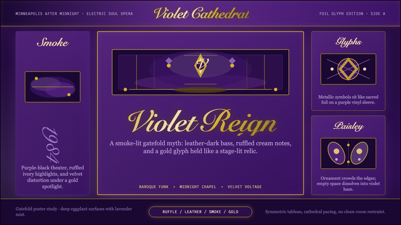 Prince — Purple Rain (1984)Decadence turns electric. Eggplant violet, gold foil glyphs, and smoky symmet…颓艳通电:茄紫、金箔符号与烟雾对称搭起神话舞台。
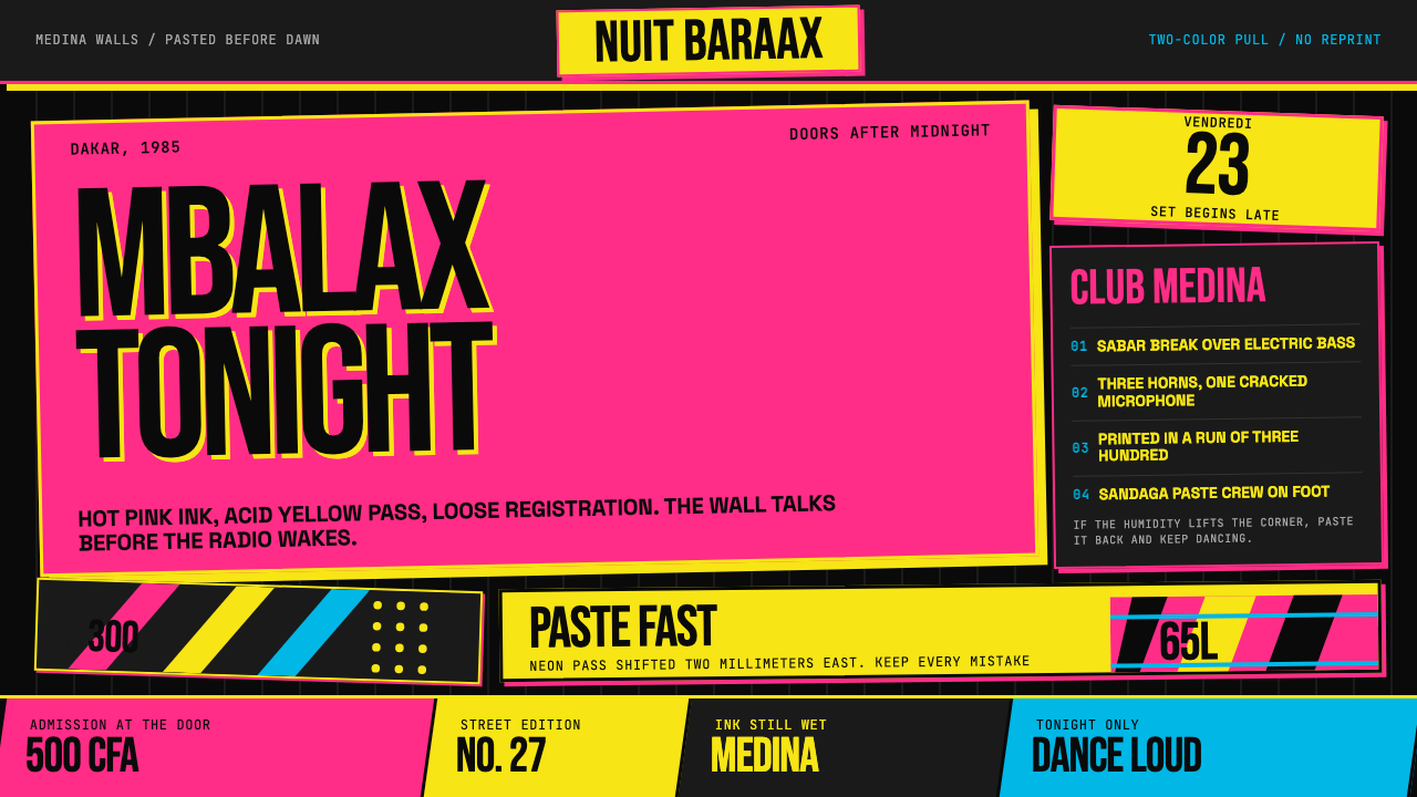 Senegalese Mbalax Poster (Dakar 1985)Street urgency, screen-printed loud. Hot pink and acid yellow drift over blac…街头急迫感:黑色新闻纸上,荧光粉与酸黄错位套印。
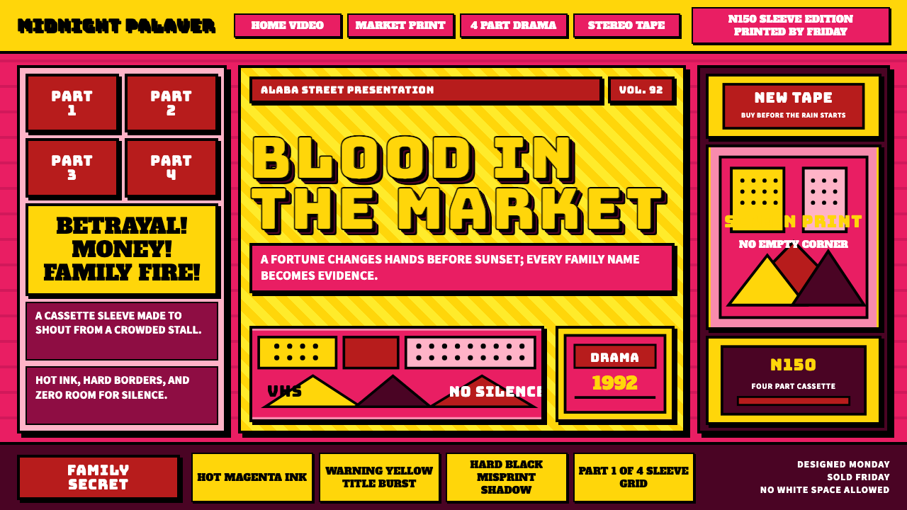 Nollywood VHS CoversEvery inch shouts. Magenta, warning yellow, hard shadows, and part stamps pac…每寸都在叫卖:洋红、警示黄、硬黑投影和分集印章塞满画面。
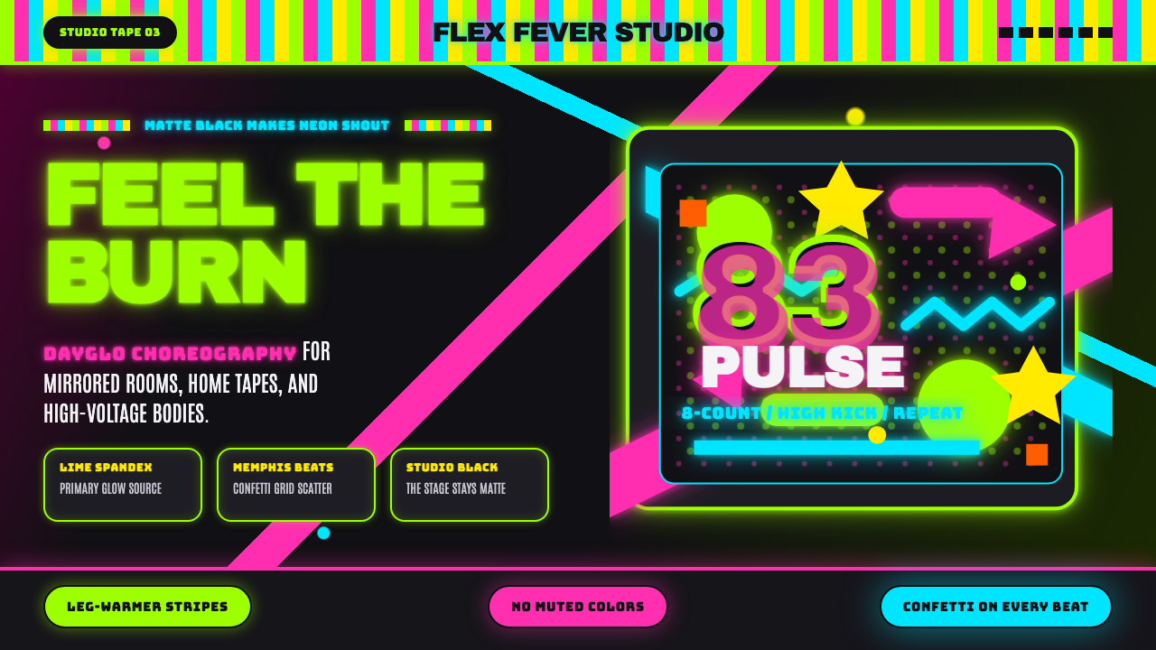 80s Aerobics Fluoro SpandexNeon refuses restraint. Lime spandex, pink-cyan confetti, and black-stage typ…霓虹拒绝克制:荧光绿氨纶、粉蓝彩屑与黑场大字一起燃烧。
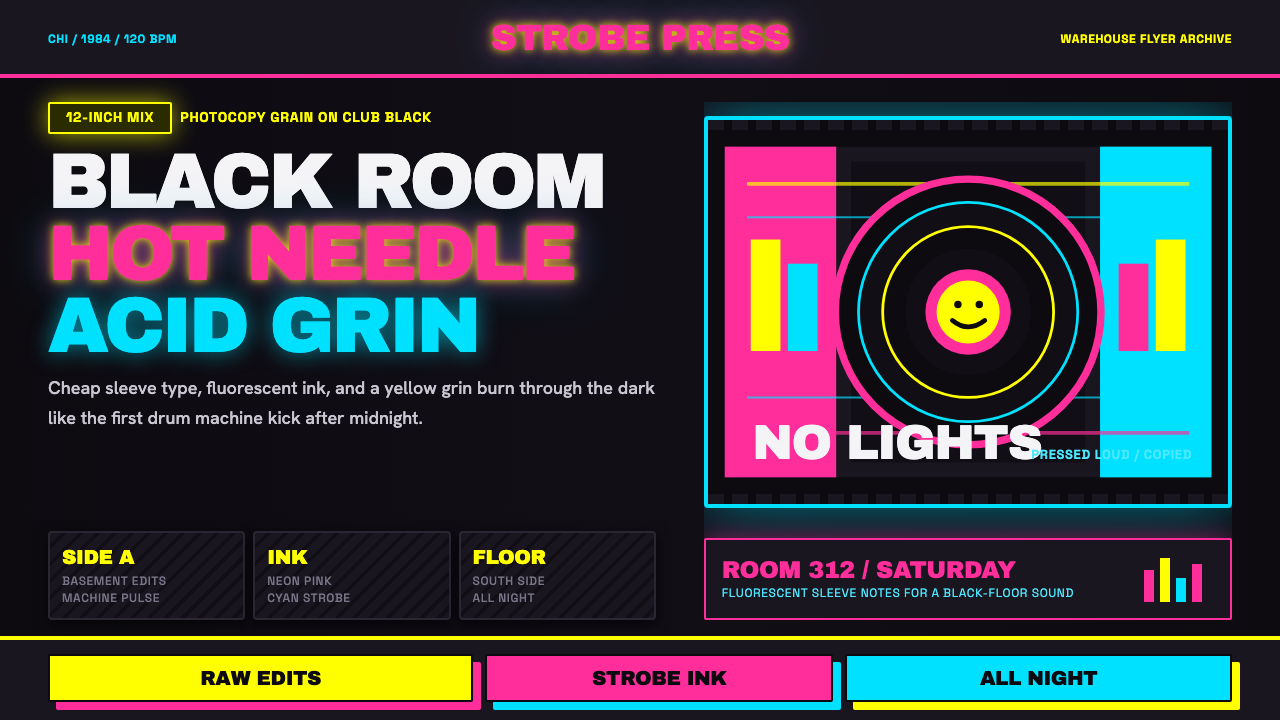 Chicago HouseDarkness starts the track. Neon pink, yellow and cyan hit black like Xerox st…黑暗先起拍。霓虹粉、黄与青打在黑底上,像复印频闪。
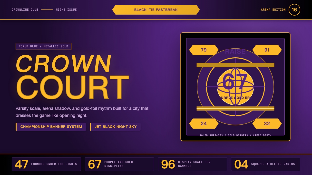 Los Angeles LakersShowtime royalty. Forum Blue and metallic gold turn varsity type into arena g…Showtime 王权:论坛蓝与金属金,让校队字型化作球馆魅力。