What is 80s Aerobics Fluoro Spandex?
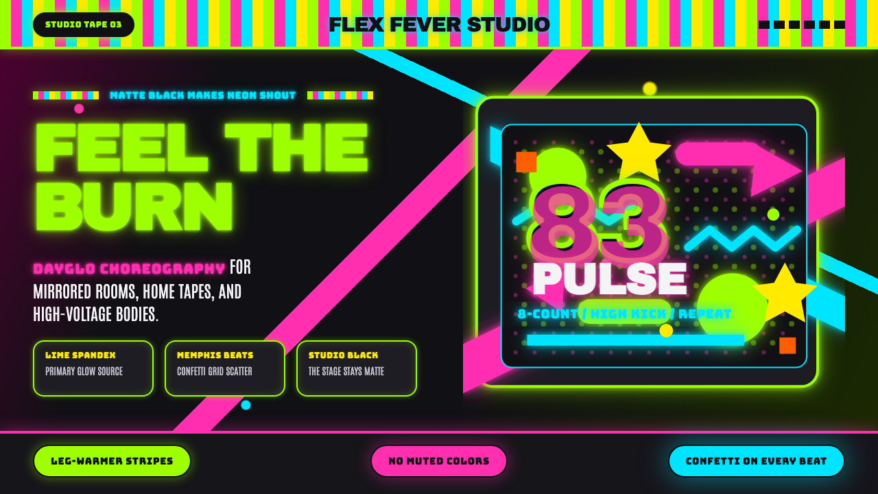
80s Aerobics Fluoro Spandex is the sound of a VHS tape turned up loud — lime-neon leotards, clashing confetti shapes, and studio-black backgrounds built for maximum burn.
80s Aerobics Fluoro Spandex in brief
80s Aerobics Fluoro Spandex captures the exact visual moment when home fitness culture went fluorescent. In the early 1980s, the aerobics studio and the suburban living room television both became stages lit by dayglo color — lime, hot pink, electric cyan — worn on spandex bodysuits and legwarmers, filmed against mirrored studio walls or flat black video backdrops.
The style is unapologetically loud, and that loudness is structural rather than accidental: the high-saturation neon hues only read correctly against a near-black ground, the same way stage lighting needs darkness to pop. Layered on top are the graphic tics of the era — jagged confetti shapes, zigzag lines, and halftone dot patterns borrowed from the Memphis Design movement that was reshaping consumer product design at the same moment.
Typography leans into chunky, condensed display letterforms that mimic the bold sans-serif branding on period leotard packaging, VHS box art, and gym signage — thick enough to read from across a room, exactly as it needed to on a cassette shelf.

Where does 80s Aerobics Fluoro Spandex come from?
The aerobics boom traces its cultural ignition point to 1982, when actress Jane Fonda released her Workout video, a home-exercise tape that became one of the best-selling VHS releases of the entire decade. Fonda's video, shot in a mirrored dance studio with a small ensemble of instructors in brightly colored leotards, singlehandedly turned home aerobics into a mainstream American phenomenon and made neon spandex a fashion statement rather than purely functional gymwear.
The look spread quickly through California fitness studios and into a wider home-video culture: Richard Simmons brought a more theatrical, comedic energy to the format, while musicians and performers like Olivia Newton-John (whose 1981 song and video Physical helped popularize the aerobics-as-lifestyle aesthetic) reinforced the connection between fitness, fashion, and pop culture in the public imagination.
The visual vocabulary surrounding this moment did not emerge in isolation — it borrowed heavily from Memphis Design, the Milan-based movement founded by designer Ettore Sottsass in 1981. Memphis furniture and product design rejected the muted, tasteful minimalism of preceding decades in favor of clashing colors, squiggle motifs, and geometric confetti patterns applied to everyday objects. That same visual DNA — bold, deliberately 'tacky' by traditional design standards, unafraid of clashing hues — found its way onto gym walls, leotard prints, and the graphic packaging of fitness videotapes.
By the mid-1980s the aerobics aesthetic had fully saturated American consumer culture: gyms, television commercials, magazine spreads, and airbrushed poster art all adopted the same dayglo-on-black formula, cementing it as one of the most recognizable visual signatures of the decade.
What defines the 80s Aerobics Fluoro Spandex look?
Color
The palette is built on high-saturation dayglo neons — lime green, hot pink, electric cyan, and sunburst yellow — deployed at full intensity against a near-black or true-black ground. Colors are rarely muted or blended; they sit as flat, punchy fields that clash intentionally with one another, echoing the multi-hued leotards of the era.
Typography
Display type is chunky and condensed, often set in all-capitals with heavy weight, mimicking the bold sans-serif lettering on VHS covers and gym signage. Letterforms favor blocky geometry over refinement — the goal is instant, poster-level legibility rather than typographic elegance.
Confetti and Squiggle Motifs
Scattered geometric confetti — triangles, small circles, zigzags, and free-floating squiggle lines — appear across surfaces as decorative texture, directly descended from Memphis Design's ornamental vocabulary. These shapes are used loosely and asymmetrically rather than in a repeating pattern.
Halftone and Airbrush Texture
Gradients in this style are rendered as visible halftone dot patterns or soft airbrushed glows rather than smooth digital blends, recalling the printing and photography techniques used on period posters and VHS box art.
Ground and Contrast
The near-black background is not optional decoration — it is the mechanism that makes the neon colors read as glowing rather than merely bright. Any lightening of the ground immediately mutes the entire effect.
Studio and Stage Framing
Compositions often imply a stage or studio setting — a spotlight-like glow around a central figure or object, mirrored-surface reflections, and diagonal energy lines suggesting movement, echoing the choreography of an aerobics routine.
Energy and Movement
Diagonal lines, motion streaks, and dynamic angles are used throughout to suggest kinetic energy — this is a style about exertion and momentum, and static, perfectly balanced compositions work against its spirit.

Who shaped 80s Aerobics Fluoro Spandex?
Fonda's 1982 Workout video is the single event most credited with igniting the home-aerobics boom, turning neon spandex from gymwear into a defining fashion statement of the decade and putting the mirrored-studio aesthetic into millions of American living rooms.
Simmons brought a theatrical, high-energy showmanship to fitness video production, reinforcing the aerobics genre's embrace of bright costuming and exaggerated studio staging as entertainment rather than purely instructional content.
Her 1981 song and video Physical helped fuse fitness culture with mainstream pop imagery, reinforcing the visual link between exercise, fashion, and music video aesthetics that defined the era's aerobics look.
As founder of the Memphis Design collective in 1981, Sottsass established the clashing-color, geometric-confetti visual vocabulary that the aerobics aesthetic directly absorbed, linking a Milan furniture movement to American gym-culture graphics.
How do you use 80s Aerobics Fluoro Spandex today?
80s Aerobics Fluoro Spandex is a maximalist, high-energy style, and it works best in contexts that want to feel loud, playful, and unapologetically nostalgic rather than restrained or premium. Applying it well means embracing the dark-ground-plus-neon formula fully rather than diluting it into a pastel approximation.
For presentation slides, the style shines on cover slides and section dividers where a single bold neon shape or headline can dominate a black field — think a giant condensed numeral in lime green with confetti scattered around it. Content and data slides should keep the black ground consistent throughout the deck and use one or two neon accents per slide to highlight key figures, rather than spreading every color across every element.
For web interfaces, this aesthetic suits retro-themed consumer products, fitness or wellness apps leaning into 80s nostalgia, event and party platforms, or entertainment brands wanting a high-energy, youthful identity. Buttons and calls to action read well in the boldest neon hue, while the surrounding UI recedes into black or near-black panels; halftone or confetti textures work as section dividers rather than covering entire backgrounds.
For editorial and marketing pieces, the style supports poster-style layouts: a large black canvas, one dominant neon color for the headline, and scattered geometric confetti as texture rather than as the main content. It pairs naturally with retro photography treatments, VHS-style scan lines, or grain effects that reinforce the period feeling.
A common mistake is using too many neon colors at equal intensity across a single composition, which produces visual noise rather than the era's characteristic punch. Authentic period work typically leads with one or two dominant neons and uses the rest sparingly as accent — restraint in color count, even within a maximalist style, keeps the hierarchy readable.

80s Aerobics Fluoro Spandex — FAQ
Why does this style insist on a black or near-black background?
The near-black ground is what makes the neon colors read as glowing rather than merely bright, mimicking the way stage lighting and dayglo pigments actually work — they need surrounding darkness to create contrast. On a white or light background, the same neon hues look garish rather than luminous, and the entire visual thesis of the style collapses.
How is this different from generic 80s retro or synthwave styles?
Synthwave and Miami-style retro aesthetics typically lean on magenta-to-cyan gradients and grid horizons evoking arcade and sunset imagery. This style instead centers on the specific fitness-culture iconography of the aerobics boom — spandex, leotards, confetti motifs, gym signage — and draws its texture language from Memphis Design rather than from synth-driven retro-futurism.
Can this style be applied without any literal fitness imagery?
Yes. The core visual mechanics — neon-on-black contrast, confetti and squiggle motifs, condensed bold type, halftone texture — transfer to any brand wanting an energetic 80s mood, from music and events to youth-oriented consumer products, without needing to reference leotards or gym settings directly.
What typography avoids undermining this style's energy?
Thin, delicate, or highly refined serif faces work against the style's intent. Condensed, heavy-weight sans-serif letterforms, ideally set in all-caps, keep the poster-like punch that the era's video packaging and gym signage relied on.
Does this style work for a calm, professional product?
It struggles there. The style is intentionally loud, high-energy, and nostalgic — qualities that undercut a calm or authoritative brand voice. It is best reserved for products, events, or content that want to feel fun, retro, and unapologetically maximalist rather than restrained.
Related design styles
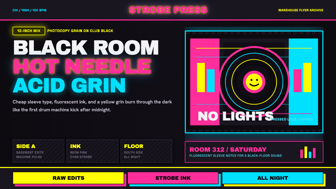 Chicago HouseDarkness starts the track. Neon pink, yellow and cyan hit black like Xerox st…
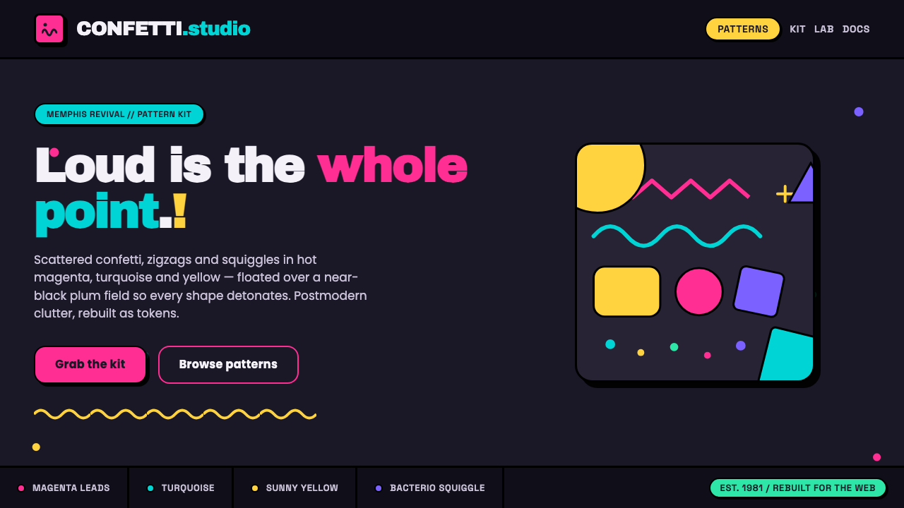 Memphis Web Pattern RevivalLoud is the point. Confetti dots, zigzags and Bacterio squiggles in hot magen…
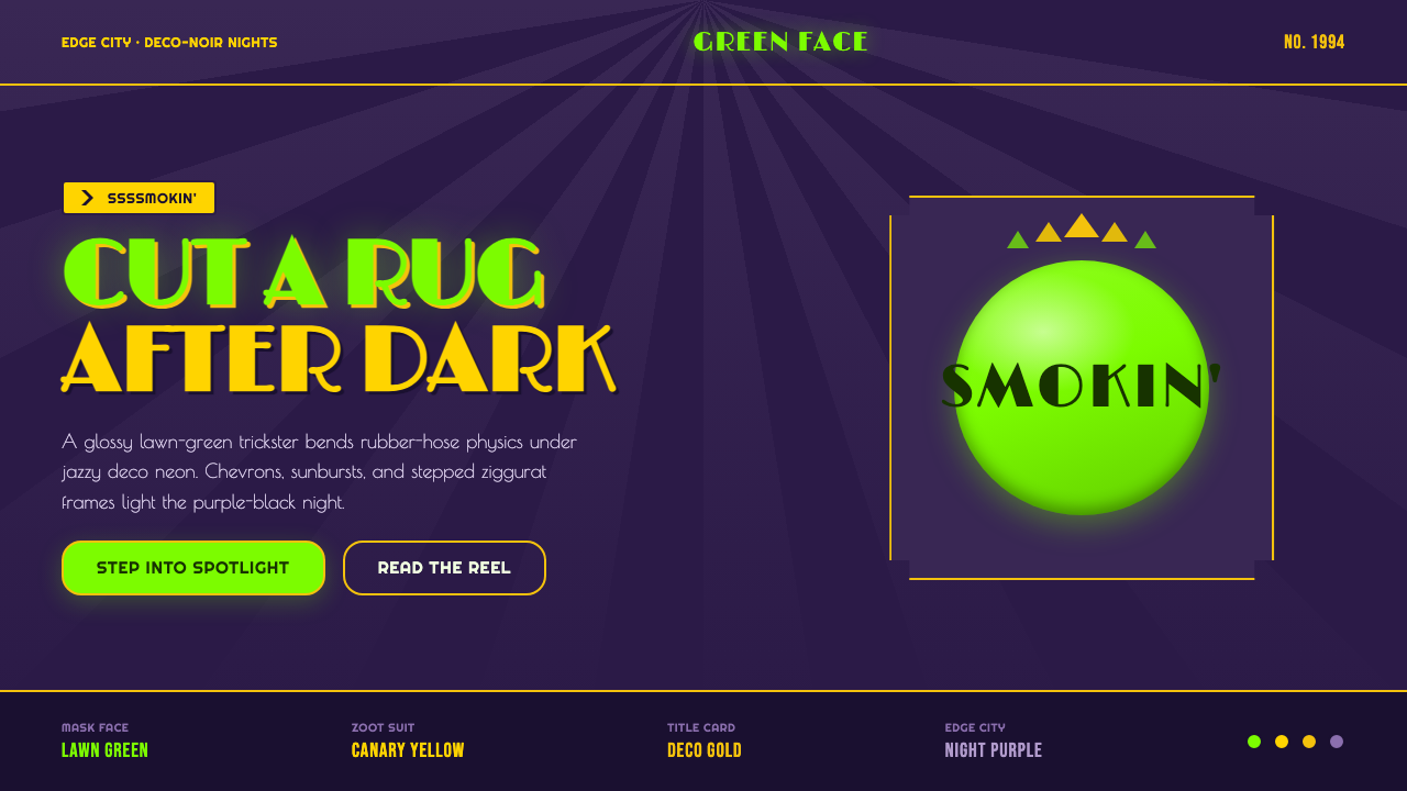 The Mask 1994 Green FaceLoud, theatrical, ssssmokin'. Lawn-green and canary-yellow scream against dec…
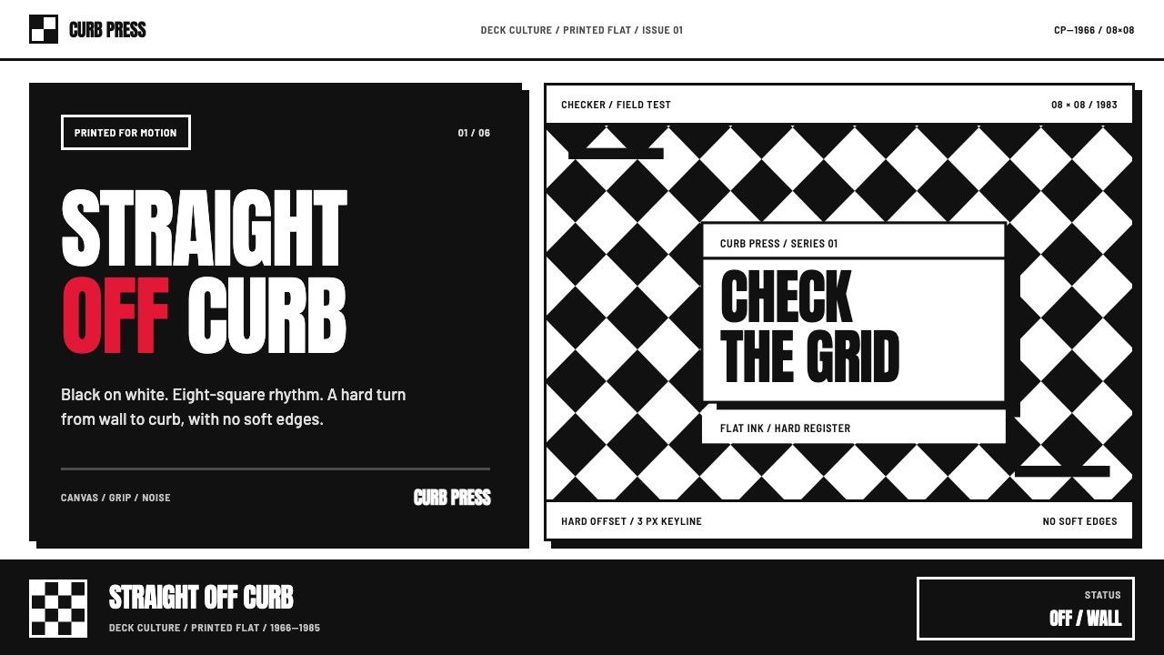 Vans Checkerboard (1966)Built to hit hard. Anton type, black-white checkers, one sanctioned red mark.
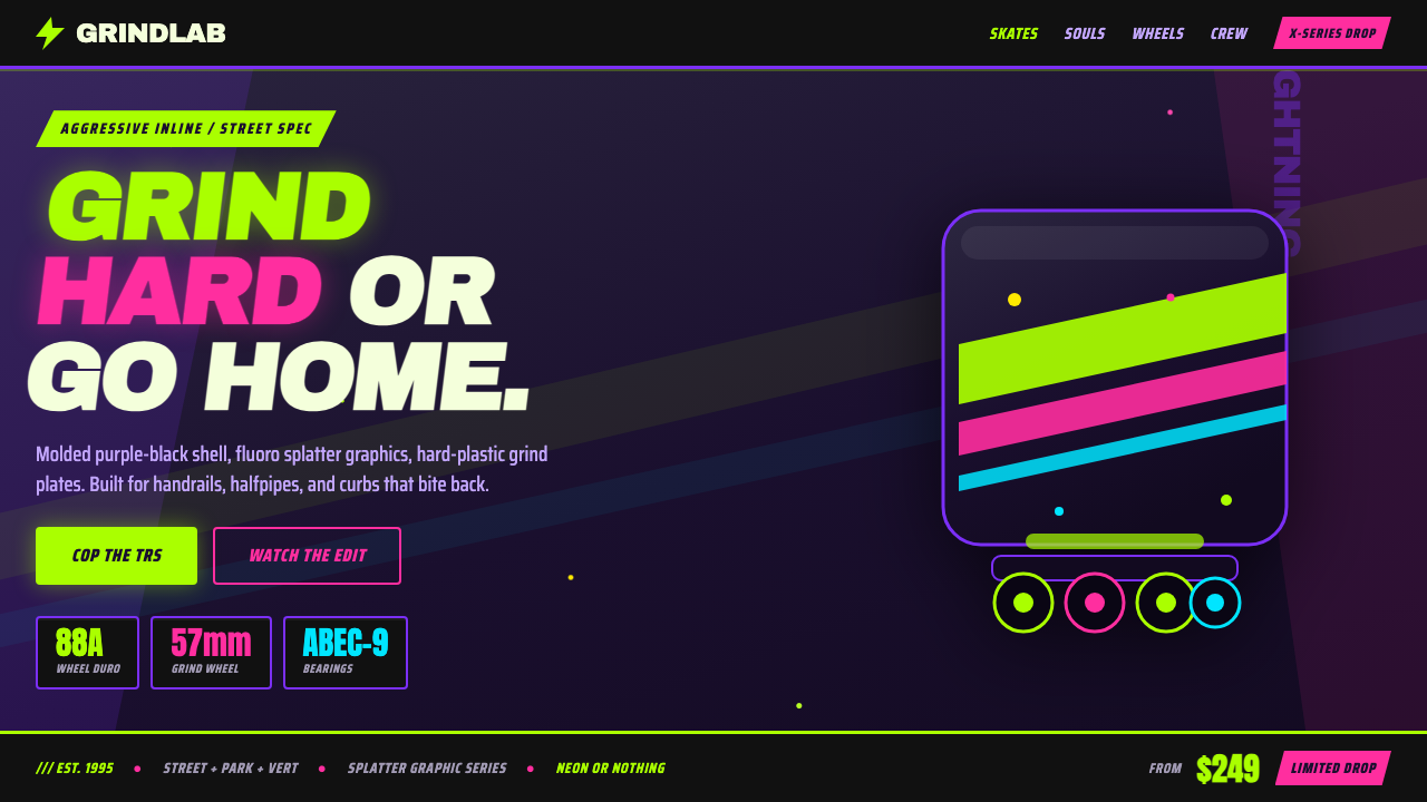 90s Aggressive Inline SkateX-Games attitude in plastic and paint. Fluoro lime and magenta slash across m…
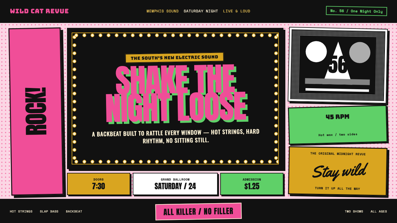 Elvis Presley (1956)Rock learned to shout. Bubblegum pink, acid green and jailhouse type land wit…