What is Elvis Presley (1956)?
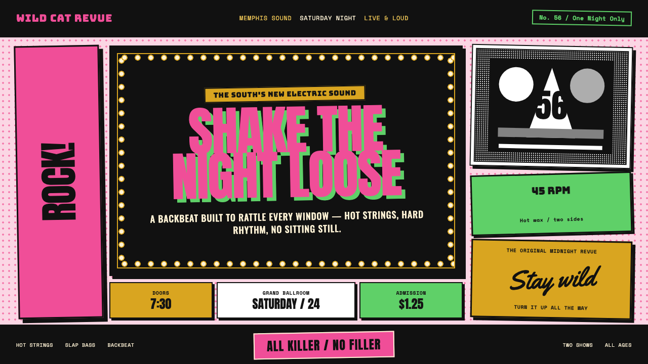
In 1956, Elvis Presley gave rock and roll a visual voice: pink and acid green shouting over a grainy howl, with black shadows hitting like a backbeat.
Elvis Presley (1956) in brief
Elvis Presley 1956 is the visual language of rock and roll at its first explosive public scale. It takes the energy of a performer caught mid-howl and translates it into a design system of oversized type, tilted photographs, stark contrast, and colors that seem to shout across the page. The central image is not polished celebrity portraiture. It is a black-and-white, grainy, physical moment: a young singer in motion, mouth open, body committed to the sound.
Its most recognizable gesture is typographic collision. ELVIS drops vertically in bubblegum pink while PRESLEY slams across the lower edge in acid green. Both names appear in fat, narrow jailhouse-style capitals, less like refined lettering than a public announcement pasted onto a wall. The words do not politely frame the photograph; they compete with it, turning the performer’s name into another burst of volume.
The style combines several linked worlds: Memphis working-class energy, rockabilly speed, RCA Victor pop ambition, and teen-idol pin-up culture. Chrome-and-pink Cadillac surfaces, gold lamé under stage lights, and warm Vegas marquee bulbs add glamour, but the glamour never becomes delicate. Everything remains loud, greased-back, oversized, and joyful. It looks dangerous because it refuses restraint, yet it is also inviting because its exaggeration is playful rather than severe.
Where does Elvis Presley (1956) come from?
The style belongs to the 1954–1957 breakout period of Elvis Presley, with 1956 as its defining year. The route runs from Memphis through Nashville to New York, following the expansion of a local, charged performance identity into a national popular image. Rock and roll was not presented as a quiet musical category. It arrived as an event that needed a face, a name, a pose, and a visual rhythm equal to its sound.
Memphis supplies the roughness at the center of the aesthetic. The imagery favors grain, movement, and directness over polished distance, keeping the performer close to the working world named by the style’s mood. A truck driver from Memphis becomes a figure who can kick open the fifties while wearing gold. That contradiction is essential: the look is neither purely street-level nor purely glamorous, but a collision between ordinary origins and spectacular visibility.
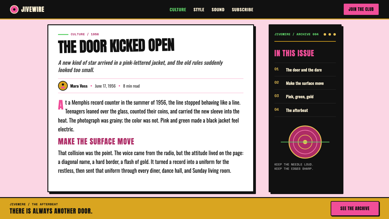
Rockabilly and early rock and roll provide the visual tempo. The tilted snapshot feels fast, the heavy letters feel percussive, and the black slam shadow gives each colored word a second hit. The design does not seek calm balance. It creates an impression of music already in motion, with the image, lettering, and shadow all pushed slightly beyond ordinary restraint.
RCA Victor pop and teen-idol pin-up culture widened the frame. A single performer could become both a singer and a mass-circulated image, recognizable through name treatment as much as through a photograph. Sam Phillips, Scotty Moore, and Alfred Wertheimer belong to the same originating field as Elvis: music-making, early rock and roll presence, and the visual record of a performer becoming an icon. Their names locate the style in a real cultural transition rather than in a later nostalgic imitation.
What defines the Elvis Presley (1956) look?
Color Collision
Bubblegum pink and acid green are used as declarations, not as background atmosphere. Their job is to make the name impossible to miss against a rough black-and-white image. Chrome pink, gold lamé, and the warm glow of marquee bulbs widen the palette’s emotional range, but the central logic remains confrontation: bright color lands abruptly, holds attention, and refuses to blend politely into the composition.
Jailhouse Lettering
The lettering is fat, condensed, capitalized, and unapologetically public. It has the blunt authority of a painted sign or a shouted headline. Rather than introducing subtle typographic nuance, the narrow block forms compress visual pressure into every letter. A name set this way becomes a logo, a chant, and an instruction to look.
Slam Shadows
Black shadows sit hard and offset behind type and graphic elements. They do not imitate soft stage lighting; they act like a second printed layer displaced by force. The result gives bright letters physical weight and makes the composition feel punched, stamped, and rhythmically doubled. Shadow is part of the beat, not a finishing effect.
Grain and Halftone
Photography stays visibly rough. Grain and halftone dot fields preserve the feeling of a reproduced snapshot rather than an immaculate portrait. This texture matters because it keeps the style connected to paper, ink, publicity, and movement. The image looks captured and circulated, not sealed behind the gloss of distant celebrity.
Tilted Momentum
Tilted snapshots keep the frame from settling into formal portrait order. The angle implies a performer who is moving too quickly to be contained, while the oversized lettering amplifies that instability. This is a style built around release: an image leans, a word falls, a shadow hits, and the whole page feels as though it has arrived one beat ahead of itself.
Marquee Glamour
Marquee bulbs, chrome, pink Cadillac surfaces, and gold lamé introduce show-business brightness without smoothing away the style’s rough edge. The glamour is theatrical and public, closer to a sign burning over a street than to private luxury. It allows the system to be celebratory while retaining the noisy, working-class urgency at its core.
Who shaped Elvis Presley (1956)?
Presley is the style’s central presence: the young performer whose mid-howl image, oversized name treatment, gold lamé, and high-contrast public persona made rock and roll feel visually inseparable from motion and volume. His 1956 breakout established the reference point for this look.
Phillips belongs to the Memphis origin story behind the style’s charged, working-class edge. His presence anchors the language in the early rock and roll world from which Elvis emerged, before the visual system expanded into a broad RCA Victor pop image.
Moore is named within the rockabilly and early rock and roll field that gives the design its pace. The visual language shares that field’s sense of attack and propulsion: nothing sits quietly, and each major element seems to answer another with an immediate, emphatic response.
Wertheimer represents the visual record of Elvis becoming an icon. His place in the story emphasizes that this style depends on photography as much as on lettering: a captured performer, made vivid through grain, contrast, crop, and the sense that an unrepeatable live moment has been pulled into public circulation.
How do you use Elvis Presley (1956) today?
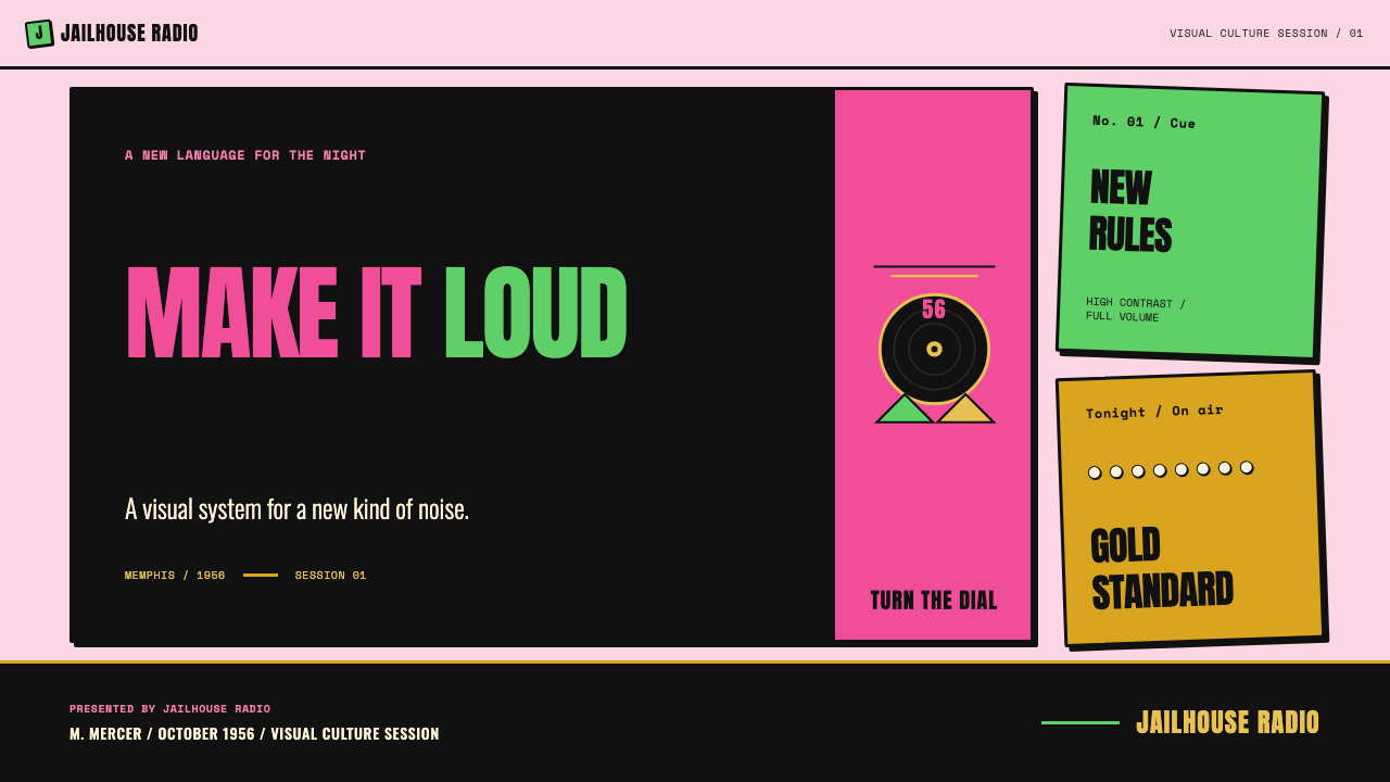
For presentation covers, use the style as an opening chord. Choose one grainy black-and-white performance image or a similarly direct subject, then let a name or short title enter at a dramatic angle in one bright color. A second color can create a deliberate counter-hit, while a hard black offset shadow prevents the composition from becoming sweet or decorative. Keep the rest of the slide sparse enough that the title still feels like a shout.
For content and data slides, translate its volume into hierarchy rather than chaos. Use a large jailhouse-style heading for the main claim, then hold supporting information in simpler, highly readable text. Data can be treated as a set of bold public signals: strong bars, sharply separated categories, and labels that feel printed rather than delicate. A restrained halftone field or black-and-white image can supply atmosphere, but data must remain the clearest voice on the page.
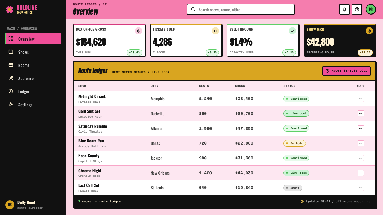
For web interfaces, this language works best where personality and urgency matter more than quiet neutrality: music discovery, ticketing, event promotion, campaign-style launches, creator portfolios, or culture-led dashboards. The interface should preserve a strong reading path, using one loud accent at a time for action and status. Cards can take on the feel of pasted posters through hard shadows and forceful titles, while navigation stays direct enough that theatricality never obstructs use.
For editorial and marketing work, the style is effective when the story has momentum. Feature pages can alternate between grainy portraits, oversized names, bright typographic interruptions, and breathing areas of pale space. Marquee motifs can frame a headline or announcement, while chrome, gold, and pink surfaces suggest celebration. The most successful pages let a photograph carry human immediacy and let type carry the promotional force.
The common mistake is reducing the style to retro colors and novelty fonts. Bubblegum pink, acid green, halftone dots, and marquee bulbs alone can quickly become costume. The real system depends on collision between rough photography, forceful naming, hard shadow, tilted momentum, and a working-class-meets-show-business tension. If every element is loud, nothing has impact; choose one dominant visual shout, then use the remaining elements to make it land harder.
Elvis Presley (1956) — FAQ
Is this simply a generic fifties retro style?
No. Its reference is more specific: the 1954–1957 Elvis Presley breakout period, especially 1956. The distinctive combination is a grainy black-and-white performance image, bubblegum-pink and acid-green name treatment, fat jailhouse capitals, and black slam shadows. General fifties nostalgia may include diners or vintage cars, but this style is built around the visual force of early rock and roll becoming mass culture.
Why are the colors so deliberately abrasive?
The bright colors are meant to behave like sound. Bubblegum pink and acid green make the performer’s name immediate and public against a grainy monochrome photograph. Their clash expresses the loud, dangerous, and joyful quality described by the style. Soft coordination would weaken the sense that the design has been shouted, stamped, or thrown onto the page.
Can the style work without an Elvis photograph?
Yes, provided the substitute keeps the same role: a direct, kinetic, human image with visible grain or high contrast. A posed, polished portrait usually weakens the effect because the original language depends on a performer caught in a physical, unguarded moment. If no photography is available, a bold name treatment, tilted composition, and hard shadow can still establish the rhythm, but the result will be more typographic and less immediate.
How should marquee bulbs be used without making a layout busy?
Treat them as a single framing gesture, not as a texture to scatter everywhere. They work best around one headline, one announcement, or one hero image, where their warm glow can signal show-business spectacle. Let the rest of the page remain comparatively open and graphic. The bulbs should make a focal point feel staged, not compete with every piece of information.
Where does this style struggle?
It struggles when the product needs calm reassurance, subdued authority, or dense long-form reading without interruption. The visual language is intentionally extroverted, so applying its color collision and headline force to every interface state can become tiring. It is strongest in moments that benefit from an entrance, an announcement, a performer, or a burst of cultural energy; quieter tasks need a calmer supporting system around it.
Related design styles
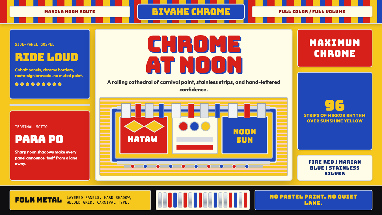 Filipino Jeepney (Chrome & Streamer)Maximalism has wheels. Sunshine yellow, chrome strips, Bungee route-sign type.
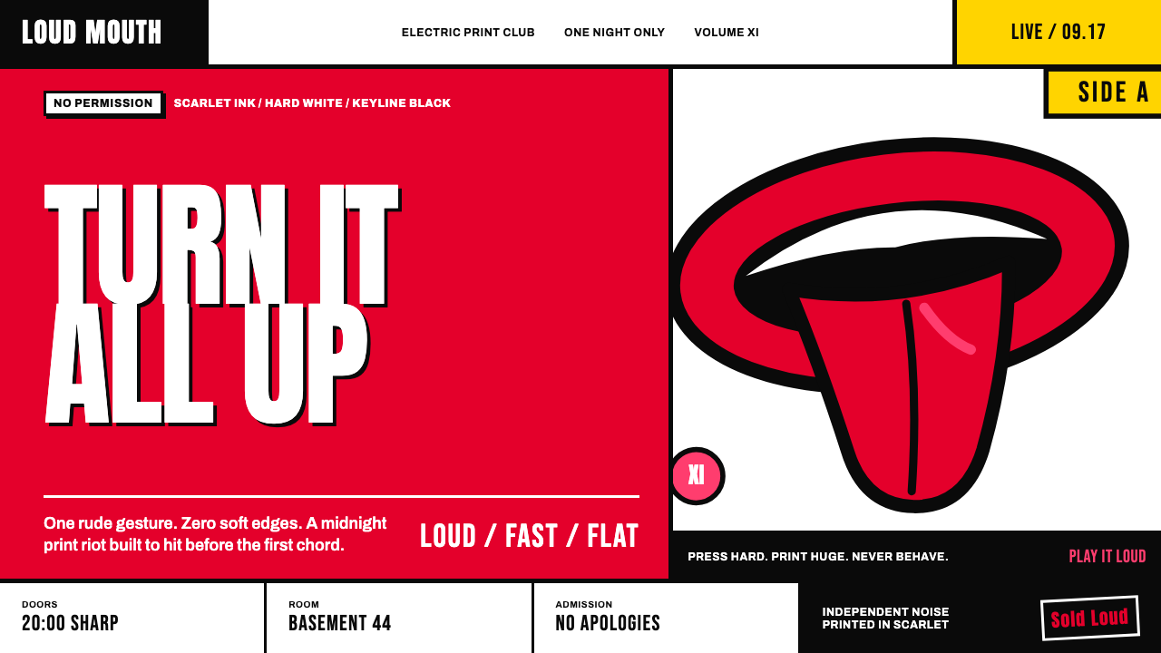 Rolling Stones Tongue (1971)Flat ink shouts loud. Scarlet curves, black keylines, and cropped poster scal…
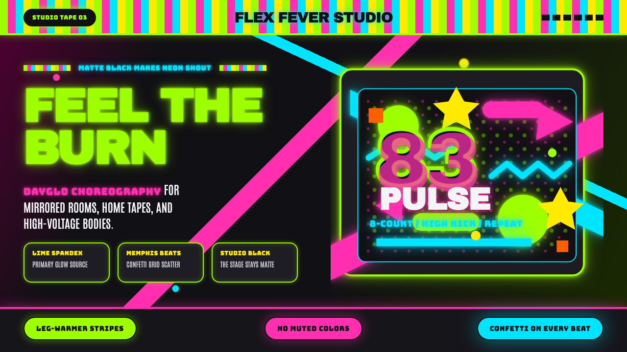 80s Aerobics Fluoro SpandexNeon refuses restraint. Lime spandex, pink-cyan confetti, and black-stage typ…
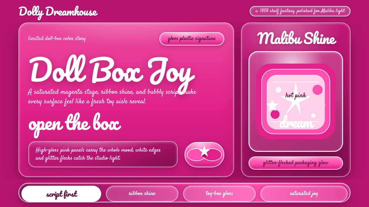 Barbie Hot Pink (Pantone 219)Saturated joy in plastic. Hot magenta, cursive script, gloss streaks, and gli…
 Chicago HouseDarkness starts the track. Neon pink, yellow and cyan hit black like Xerox st…
 Mexican Lucha Mask GraphicComic-book lucha, lit from above. Silver-blue mask out of arena-night dark, h…