What is Rolling Stones Tongue (1971)?
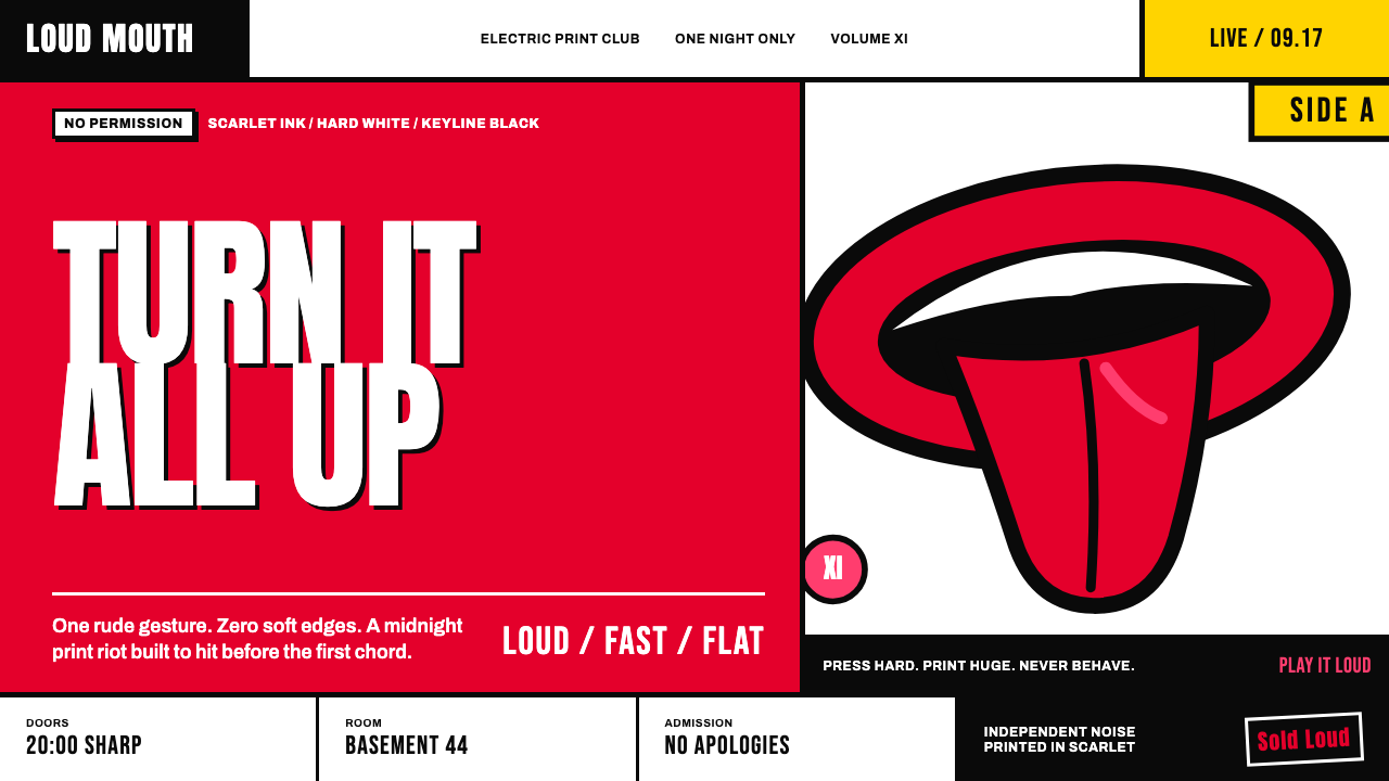
The Rolling Stones tongue turns a single insolent gesture into a complete visual identity: wet scarlet, heavy black, and loud enough to survive any stage.
Rolling Stones Tongue (1971) in brief
The Rolling Stones Tongue is the unmistakable logo introduced with Sticky Fingers in 1971: a red tongue hanging between full scarlet lips, surrounded by a thick black keyline. It is a remarkably compressed image. There is no wordmark, scene, texture, or supporting symbol to explain it. The mouth does everything at once, reading as a grin, a shout, a taunt, and an act of physical excess. Its directness gives the mark the force of a poster even when it appears at a small scale.
Its visual language belongs to British Pop art, glam poster graphics, rock-and-roll branding, and anti-establishment counterculture. The image is flat, graphic, and unapologetically artificial: red areas behave like printed ink rather than skin, black outlines hold the forms together, and the white or black field around it makes the gesture feel isolated and amplified. Rather than suggesting refinement, the mark embraces exaggeration. The lips are fat, the tongue is broad, and the open mouth is deliberately more theatrical than natural.
The system built around the tongue follows the same logic. The image can be enlarged until it feels rude, cropped until it becomes an abstract pattern, or placed alone with enough empty space to make its presence confrontational. It does not depend on subtle tonal modeling, polished shine, or decorative detail. Its confidence comes from hard edges, simple color contrast, and a single visual act repeated without apology.
Where does Rolling Stones Tongue (1971) come from?
The logo emerged in London during 1970–1971, a moment described by its source context through British Pop art, glam poster graphics, rock-and-roll branding, and anti-establishment counterculture. These are not merely background labels. They explain why the mark rejects the restrained, corporate manner expected of many visual identities. It presents a body part as a graphic emblem and treats provocation as a communicative asset rather than a problem to be softened.
Mick Jagger commissioned the design from John Pasche in August 1970. The commission established the essential relationship behind the mark: a performer associated with an outsized public presence asking for an image capable of carrying comparable force. Pasche answered with a mouth rather than a portrait, a name, or a conventional badge. That decision made the image more portable than a likeness and more immediate than typography. It could speak before anyone read a title.
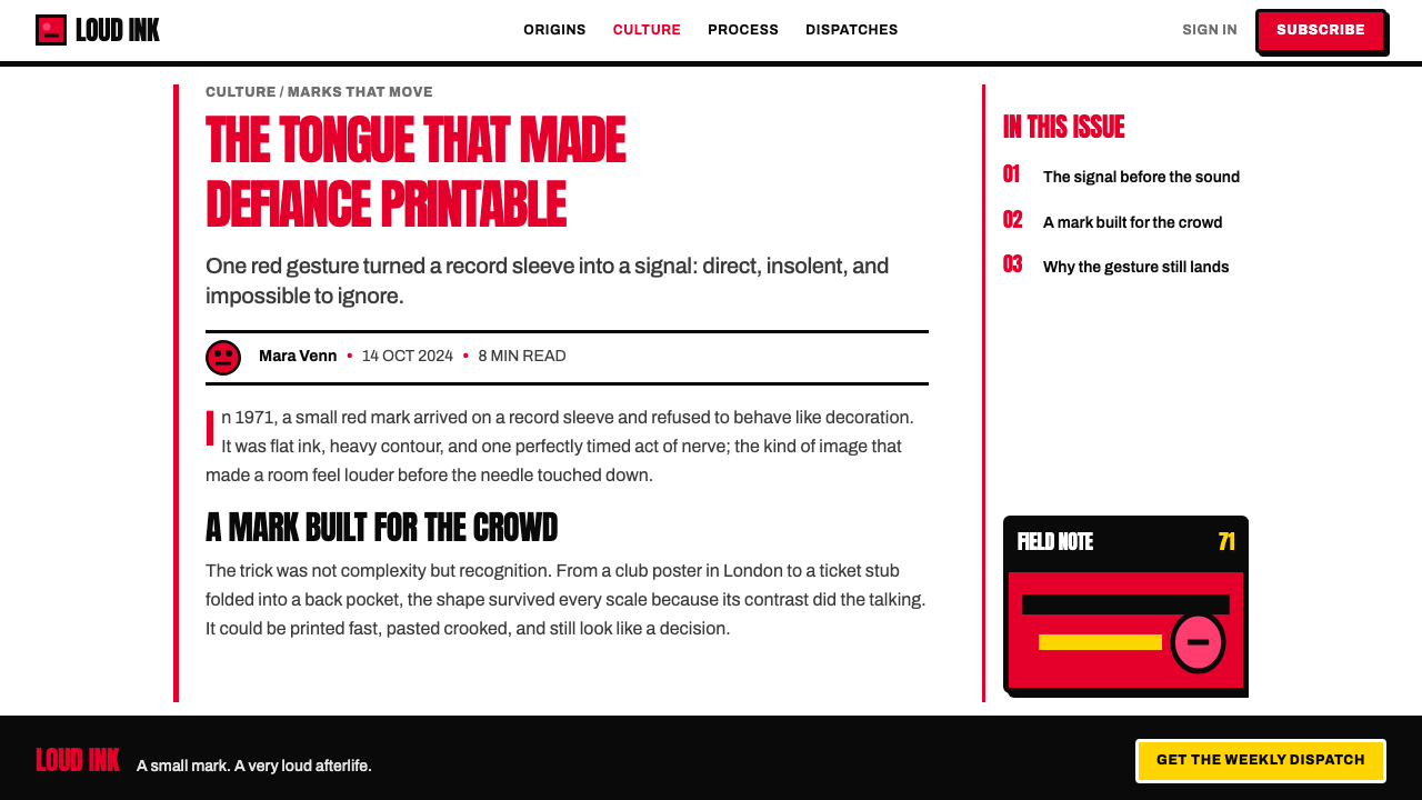
The tongue made its public debut on the inner sleeve of Sticky Fingers in April 1971. Its appearance there gave the image an unusually strong first setting: it was not introduced as a minor decorative stamp but as an object tied directly to the record’s physical package and visual drama. From the beginning, the mark could operate at poster scale, where its cropped forms and emphatic outline became part of the experience rather than a discreet signature.
Andy Warhol and Craig Braun are also named among the key figures in the approved source context. Their inclusion places the tongue within a wider creative environment around the record’s presentation, while the core authorship described here remains clear: Pasche drew the logo for Jagger, and it reached the public with Sticky Fingers. The resulting image has endured because its original premise is exceptionally economical. A single mouth carries the attitude of an entire rock-and-roll identity.
What defines the Rolling Stones Tongue (1971) look?
Scarlet Ink
Red is the image’s emotional engine. It is used as a flat, assertive ink field across lips and tongue, not as natural flesh color or atmospheric lighting. The result is immediate and bodily, but also unmistakably printed. The color does not whisper or recede; it arrives first, carrying heat, appetite, noise, and visual danger.
Black Keyline
The heavy black outline gives the mark its authority. It separates red from the surrounding field, preserves legibility under enlargement or cropping, and makes every curve feel cut from a printed poster. This is not a delicate contour. The keyline is structural, almost as important as the red fill, turning a loose gesture into an emblem with enough graphic discipline to repeat.
Exaggerated Anatomy
The lips and tongue are recognizably anatomical but intentionally inflated beyond realism. Their scale and curves create a cartoon-like physicality that is funny, sexual, defiant, and slightly grotesque at the same time. The image gains force by refusing to become a tasteful illustration. It is a mouth designed to occupy space, interrupt attention, and make restraint look irrelevant.
Flat Pop Surface
The mark relies on flat color and decisive edges rather than modeled volume. There are no soft transitions to persuade the eye that the tongue is physically lit, and no glossy treatment to make it feel luxurious. That flatness ties the image to ink, screen print, poster reproduction, and Pop art’s pleasure in bold commercial surfaces. It looks reproduced by design, not diminished by reproduction.
Oversize and Crop
At large scale, the tongue becomes less like a logo and more like an environment. Cropping the lips or tongue at an edge converts recognizable anatomy into rhythm, curve, and color mass. This technique makes the image feel impatient with the frame, as though it cannot be politely contained. Used well, the crop creates tension without needing additional decoration or visual effects.
White or Black Stage
The preferred surrounding field is hard white or black, chosen not for atmosphere but for confrontation. White lets the red and black feel like a printed sign pinned into open space. Black makes the scarlet forms strike outward with greater theatrical force. Both grounds keep the composition simple enough that the mouth remains the event, never merely one component among competing details.
Who shaped Rolling Stones Tongue (1971)?
Pasche drew the tongue logo after Mick Jagger commissioned it in August 1970. His contribution established the mark’s essential visual formula: scarlet lips and tongue, a thick black keyline, and a complete absence of explanatory clutter. The image’s durability rests on that compression. It is specific enough to be unmistakable yet simple enough to remain forceful across changing formats and contexts.
Jagger commissioned the design in 1970, making him central to the logo’s origin. The resulting symbol does not depend on his name being printed beside it, but it carries the oversized, confrontational theatricality associated with the commission’s rock-and-roll context. By choosing a mouth as the central device, the identity speaks through gesture rather than through a conventional written label.
Warhol is named as a key figure in the approved source context for the Rolling Stones Tongue era. His presence situates the logo within the broader visual world of Pop art and the Sticky Fingers presentation, where commercial reproduction, celebrity, provocation, and graphic immediacy could meet. The tongue’s flat, loud surface belongs naturally to that visual climate.
Braun is also identified as a key figure in the approved source context. Alongside Pasche, Jagger, and Warhol, his name signals that the tongue entered the world through a collaborative record-presentation environment rather than as an isolated exercise in logo design. That setting matters: the image was made to live on a physical music object and to carry the volume, scale, and attitude of rock-and-roll packaging.
How do you use Rolling Stones Tongue (1971) today?
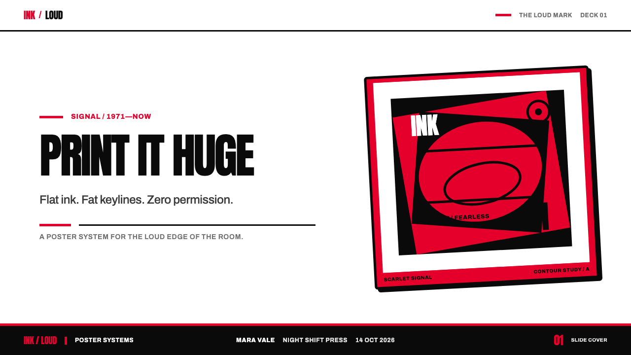
For presentation covers, treat the tongue as an opening gesture rather than a small corner signature. Use hard white or black as the field, let a single cropped section of lips or tongue push against an edge, and keep the title direct and secondary to the image. On content slides, reduce the logo to a structural accent: a small full mark can signal section identity, while black rules, red blocks, and generous empty space organize text. The point is not to cover every slide with the mouth, but to preserve its sense of interruption.
Data slides can borrow the system’s graphic clarity without turning every chart into merchandise. Use black as the stable framework, reserve scarlet for the series or figure that needs emphasis, and keep secondary information quieter. Large labels, bold directional shapes, and sharply separated fields work better than elaborate legends or decorative textures. The tongue itself should appear only when it has a clear role, such as framing a summary or punctuating a decisive conclusion.
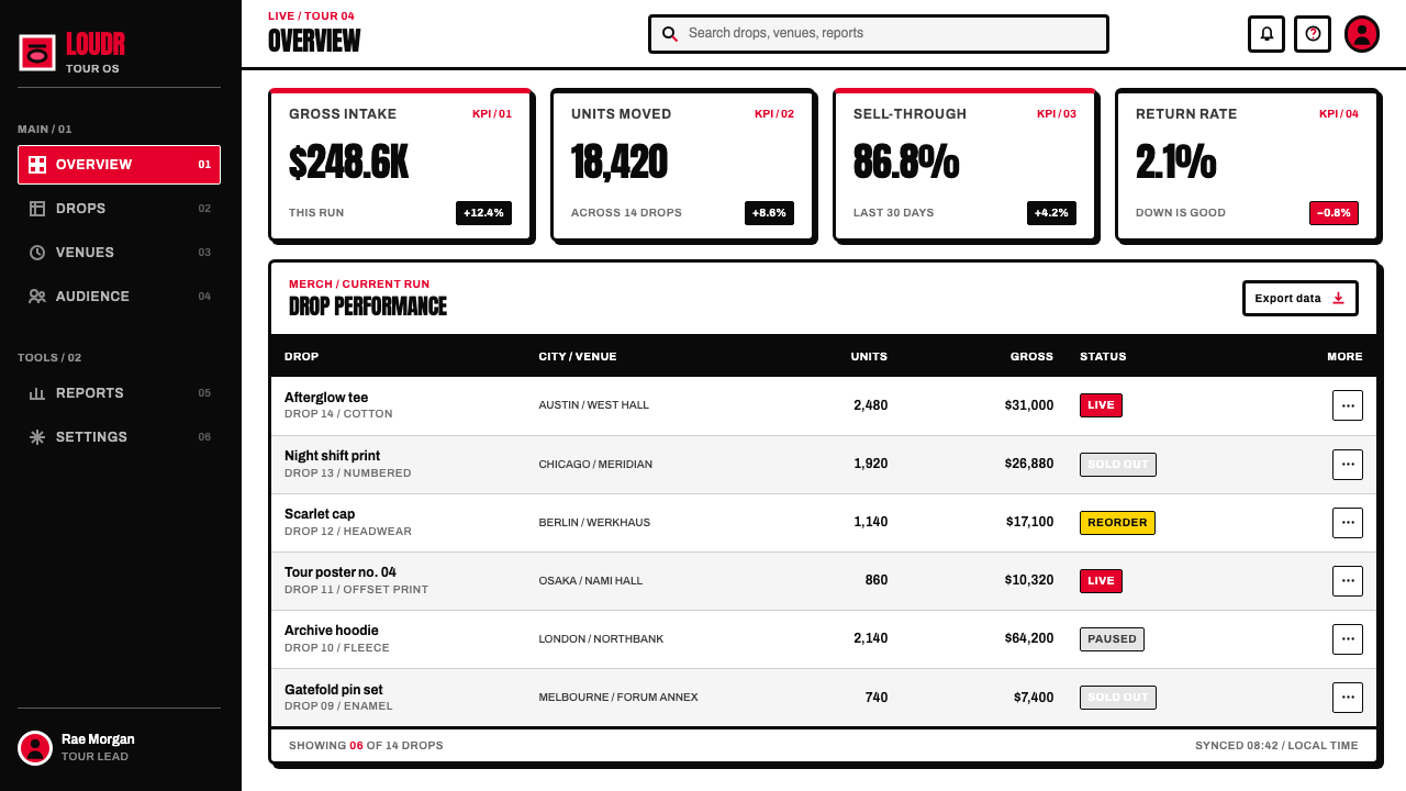
For web interfaces, this style is most persuasive in campaign pages, music-adjacent products, event experiences, dashboards with a strong editorial voice, and pricing pages that need a confrontational point of view. A white interface can use black type and scarlet accents to make actions feel immediate; a black variant can make red buttons, indicators, and cropped artwork feel stage-lit. Components should remain firm and graphic: clear borders, high-contrast labels, and images that feel printed or poster-like rather than softly polished.
For editorial and marketing layouts, use poster logic. Let a headline enter at a large scale, permit one image crop to dominate the page, and allow empty space to become part of the attitude. A long-form article can use the tongue sparingly at section transitions, while a campaign page can alternate full-image statements with blunt text blocks. The visual voice is strongest when copy is equally decisive: short declarations, direct calls, and no ornamental language trying to compete with the image.
The common mistake is mistaking loudness for accumulation. Filling a page with repeated tongues, multiple red accents, distressed textures, flames, gloss, or random rock clichés weakens the original system. The mark succeeds because one exaggerated gesture is given room to land. Keep the palette narrow, choose either a full mark or a purposeful crop, and make every other element support the same printed, insolent clarity.
Rolling Stones Tongue (1971) — FAQ
Why is the Rolling Stones tongue so effective without a wordmark?
Because the image is built around an instantly legible action. A protruding tongue communicates attitude before language enters: it can suggest noise, pleasure, mockery, rebellion, and performance in a single glance. The thick black keyline and scarlet fill make the silhouette easy to retain. Instead of asking viewers to remember a name, it gives them a gesture they can recognize immediately.
Can the tongue work on both light and dark backgrounds?
Yes. Hard white and black are both integral to the visual logic described in the source material. On white, the red and black read as bold printed marks in open space. On black, the scarlet appears more theatrical and forceful. In either version, the surrounding field should remain simple enough that the logo’s flat ink, outline, and silhouette retain control of the composition.
Should a Rolling Stones Tongue-inspired design use gradients or gloss?
No. The source material defines the image through confident flat ink rather than gradients, gloss, or modeled lighting. Adding polished highlights or soft volume changes the image’s character from a forceful printed gesture into a rendered object. Keep surfaces flat, use black outlines decisively, and let contrast between scarlet and the surrounding field create the energy.
When should the logo be cropped rather than shown in full?
Crop it when the goal is atmosphere, scale, or pattern rather than immediate identification. A partial tongue or lip can create a strong poster field and make the composition feel larger than its frame. Show the complete mark when recognition matters, such as a title moment, section marker, or primary identity statement. The crop should feel intentional and bold, never like accidental clipping.
What is the biggest mistake in applying this visual style?
The biggest mistake is turning a single strong gesture into indiscriminate decoration. The original image gets its force from reduction: one mouth, scarlet ink, black keyline, and a stark field. Repeating it too often or adding unrelated effects makes the result noisy without making it more powerful. Let the image be oversized when needed, but give it enough space to remain the loudest thing on the page.
Related design styles
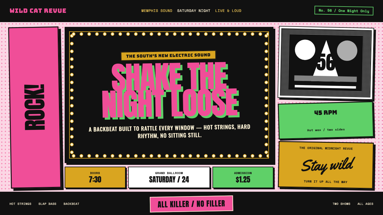 Elvis Presley (1956)Rock learned to shout. Bubblegum pink, acid green and jailhouse type land wit…
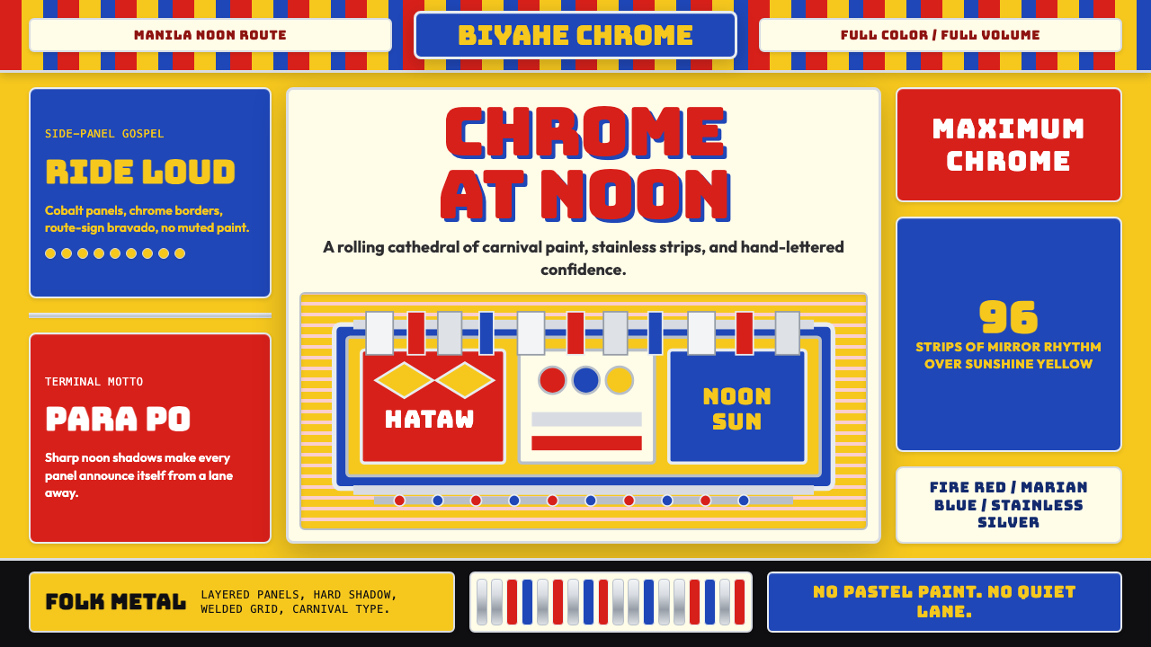 Filipino Jeepney (Chrome & Streamer)Maximalism has wheels. Sunshine yellow, chrome strips, Bungee route-sign type.
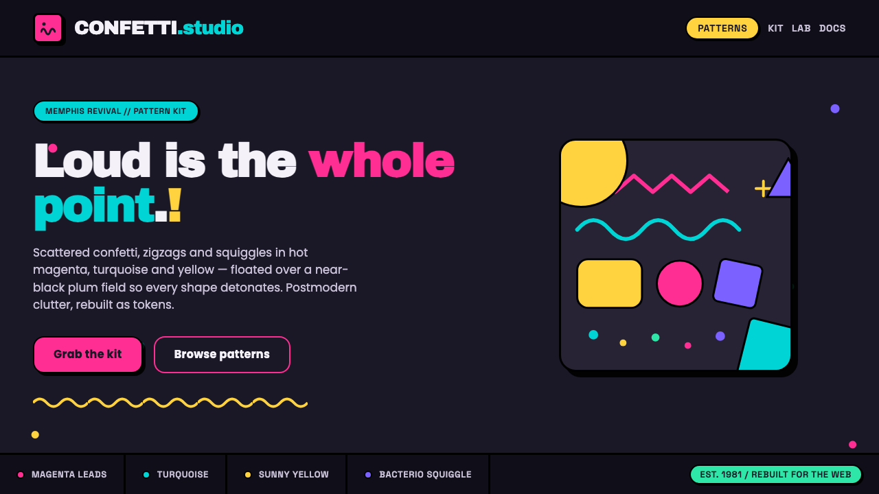 Memphis Web Pattern RevivalLoud is the point. Confetti dots, zigzags and Bacterio squiggles in hot magen…
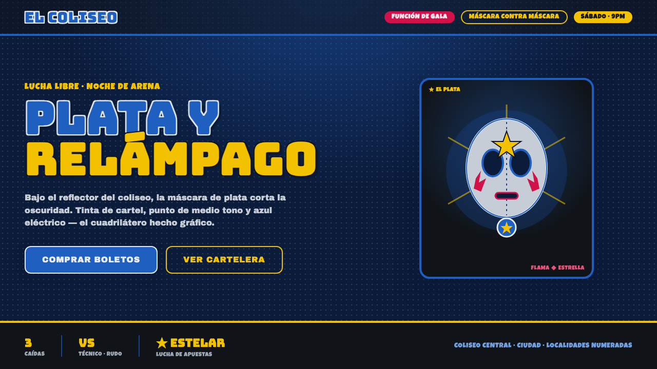 Mexican Lucha Mask GraphicComic-book lucha, lit from above. Silver-blue mask out of arena-night dark, h…
 80s Aerobics Fluoro SpandexNeon refuses restraint. Lime spandex, pink-cyan confetti, and black-stage typ…
 BarbarellaSpace-camp overload. Hot pink shag, lava blobs, and op-art rings collide.