What is Memphis Web Pattern Revival?
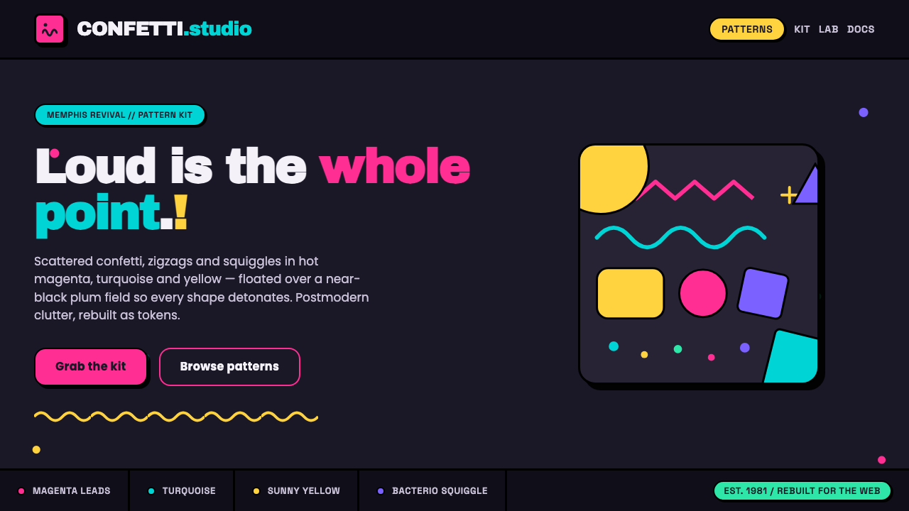
Memphis Web Pattern Revival makes visual noise deliberate: confetti dots, zigzags, Bacterio squiggles, and clashing color turn a dark screen into a postmodern stage.
Memphis Web Pattern Revival in brief
Memphis Web Pattern Revival is a contemporary screen interpretation of the Memphis Group’s 1981 visual language. It brings scattered confetti dots, zigzags, squiggles, and geometric blobs into web layouts, using high-contrast magenta, turquoise, and yellow to make each motif immediately visible. The result is intentionally loud, playful, and resistant to the quiet refinement associated with many modern digital interfaces.
Its central move is a reversal of the historical material setting. Where 1980s Memphis placed decorative motifs over white laminate, the web revival places them on a near-black plum field, especially in prominent hero areas. The dark ground gives bright marks theatrical intensity: dots read like tossed confetti, turquoise cuts across the page, yellow flashes as a signal, and magenta becomes the dominant emotional charge.
This is not a style that seeks visual calm. Asymmetry, clutter, overlap, and color collision are treated as expressive tools rather than mistakes to be corrected. Thick black geometry frames the disorder, while Ettore Sottsass’s Bacterio squiggle supplies a recognizable signature. The system feels graphic rather than polished, festive rather than restrained, and knowingly decorative rather than apologetic about decoration.
Where does Memphis Web Pattern Revival come from?
The source language of this revival is Memphis design, a postmodern decorative movement associated with the Memphis Group, founded in 1981. Its origin is Milan, but its contemporary web revival belongs to a global internet context. That distance between a Milan-based design group and today’s worldwide screen culture matters: the revival is not a museum reconstruction, but a translation of a recognizable visual attitude into interfaces, campaigns, and digital publishing.
The historic language is defined here by motifs rather than by quiet formal restraint. Confetti dots, zigzags, squiggles, and geometric blobs create a vocabulary that can be scattered rather than centered, layered rather than tidied, and made deliberately irregular rather than harmonized into a conventional composition. Postmodern decoration is the key inheritance: ornament is not a secondary finish applied after structure, but part of the message and atmosphere from the beginning.
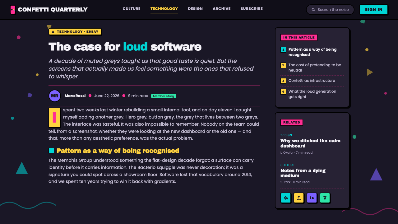
Ettore Sottsass is central to the revival’s visual identity through the Bacterio squiggle, the signature wavy motif named in the source material. Nathalie Du Pasquier is also identified as a key figure of the Memphis Group. In web use, these references are condensed into a compact pattern language: a dark plum field, hot magenta leadership, turquoise and yellow accents, and black geometric framing around a field of intentionally unruly marks.
The modern web revival extends from 2010 to the present, with the supplied visual framing focused on the early 2020s. Its persistence comes from how well the style creates immediate distinction on crowded screens. Instead of competing through minimal reduction, it competes through personality: a page announces itself through pattern, contrast, and a confident refusal to make every element behave politely.
What defines the Memphis Web Pattern Revival look?
Dark Plum Stage
A near-black plum ground is the decisive web adaptation. It replaces the white laminate association of 1980s Memphis with a darker, more theatrical field, allowing bright motifs to appear as illuminated objects rather than surface decoration. The background should feel dense and enveloping, but not empty: it is the stage that gives every scattered mark its force.
Color Collision
Hot magenta leads the palette, with turquoise and yellow acting as sharp countervoices. Their role is not to create a gentle spectrum or a naturalistic harmony. They should feel like separate declarations that meet abruptly on the dark field. Black geometry intensifies the contrast by providing a heavy visual frame around the brightest activity.
Bacterio Squiggle
The Bacterio squiggle is the signature motif associated with Sottsass in the supplied material. Its wandering, wavy path breaks the authority of rigid geometry and keeps the composition from becoming merely a grid of colored shapes. Use it as a recurring gesture: a line that looks playful, slightly unruly, and unmistakably at home among the dots and zigzags.
Confetti and Geometric Blobs
Scattered dots and blobs create the style’s sense of celebration and visual surplus. They should not read as background texture alone; each one is a small event in the composition. Irregular distribution is more faithful to the revival than orderly repetition. The page benefits when marks feel tossed, interrupted, or caught mid-motion rather than evenly spaced.
Zigzag Tension
Zigzags introduce direction without requiring a conventional arrow or orderly navigation cue. Their repeated turns create tension, speed, and a slightly synthetic graphic energy. Against soft circular confetti and wandering squiggles, the zigzag is the abrupt mark: it interrupts the field, sharpens transitions, and gives an otherwise loose composition a graphic snap.
Framed Chaos
The style is not random, even when it looks crowded. Thick black geometric framing gives the colorful field a counterweight and prevents its intentional disorder from dissolving into visual indecision. Borders, blocks, and hard-edged shapes should establish where the energy is contained. The useful contradiction is simple: the motifs may misbehave, but the composition still knows where its edges are.
Who shaped Memphis Web Pattern Revival?
Sottsass is named as a key figure in the source material and is directly associated with the Bacterio squiggle. In the web revival, that wavy motif functions as a concise visual bridge to the Memphis language: it brings playful irregularity into layouts otherwise organized by dots, zigzags, blobs, and heavy black geometry.
Du Pasquier is identified as a key figure of the Memphis Group in the supplied material. For the revival, her presence signals that the reference is not limited to a single motif or isolated decorative flourish. It belongs to a wider Memphis pattern language whose energy comes from the coexistence of color, geometry, irregular marks, and postmodern decoration.
The Memphis Group, founded in 1981 and originating in Milan, is the collective source of the revival’s visual language. The web pattern revival adapts its postmodern decorative vocabulary for a global internet setting, retaining the recognizable combination of graphic motifs and color collision while shifting the principal field from white laminate toward near-black plum.
How do you use Memphis Web Pattern Revival today?
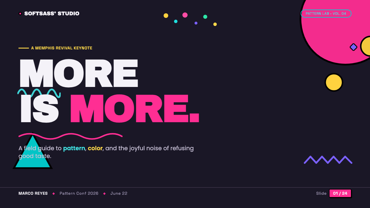
For presentation slides, use the style most confidently on cover pages and section openers. Let the dark plum field establish a strong first impression, then place a bold title among a small number of brightly colored motifs. A magenta geometric mass or Bacterio line can carry the eye toward the title, while yellow and turquoise appear as interruptions rather than equal competitors. The cover should feel like a poster with room for surprise, not like a decorative border surrounding ordinary slide content.
Content slides need a more controlled version of the same language. Keep information in clearly framed regions, using thick black geometry and generous dark ground to separate ideas. Confetti and zigzags can sit at corners, edges, or transitions, but should not cross every line of text. For data slides, treat charts as part of the pattern system: use the bright palette to distinguish selected categories, let black framing define the chart’s structure, and keep the surrounding motifs subordinate to the values the audience needs to read.
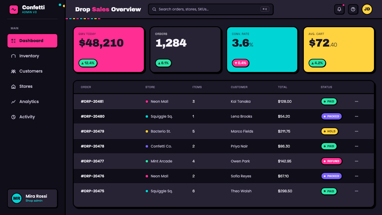
For web interfaces, the revival is especially effective in high-attention hero areas, campaign pages, landing pages, and distinctive pricing experiences. A dark plum hero with scattered marks can create immediate brand recognition before a user reads a word. In dashboards, apply the language selectively: use it for headers, empty states, featured metrics, or promotional modules, while preserving calmer framed areas for dense tasks. The goal is a memorable interface, not a field of decorative obstacles.
For editorial and marketing work, Memphis Web Pattern Revival works well when a message benefits from exuberance, novelty, or cultural confidence. Feature stories can use a patterned opening spread and then let article sections emerge from black geometric frames. Marketing pages can alternate concentrated pattern moments with quieter reading areas. The strongest compositions give the reader visual rests, then reintroduce squiggles, dots, and color collisions at moments of emphasis rather than maintaining maximum intensity everywhere.
The common mistake is mistaking loudness for indiscriminate saturation. If every surface carries every motif, every color, and every frame at once, the page loses the purposeful tension that makes Memphis work. Lead with magenta, give turquoise and yellow distinct jobs, and let the dark ground do substantial work. Similarly, do not regularize the pattern into perfect repetition: the style depends on controlled imbalance, not on a generic decorative wallpaper.
Memphis Web Pattern Revival — FAQ
Is Memphis Web Pattern Revival the same as historical Memphis design?
They are closely related, but the revival is a screen adaptation rather than a literal reconstruction. The supplied material identifies Memphis design as the source and describes the web version as a reinterpretation of its 1981 postmodern language. The major shift is the setting: motifs associated with white laminate are placed on a near-black plum web field, making contrast and screen presence central to the contemporary version.
Why is the background so dark when Memphis is often associated with white surfaces?
The near-black plum field is the revival’s defining translation for the web. It makes magenta, turquoise, and yellow appear to pop with greater intensity, turning decorative motifs into foreground events. The dark field also gives scattered dots, zigzags, and squiggles a shared stage, so their apparent disorder feels intentional rather than detached from the layout.
How should the Bacterio squiggle be used?
Treat it as a signature gesture, not as filler. The source material identifies Sottsass’s Bacterio squiggle as the style’s defining motif. It works best when it interrupts rigid geometry, connects separated visual areas, or adds a playful counterpoint to dots and zigzags. Repeating it with some variation preserves its wandering character better than arranging it into a perfectly regular pattern.
Can this style work for functional interfaces, not only promotional pages?
Yes, but it needs clear containment. Dashboards and pricing pages can use the revival for emphasis, brand moments, featured modules, and section transitions while keeping task-heavy areas visually calmer. Thick black geometry is useful here because it can frame information and preserve hierarchy. The style succeeds in functional work when its expressive patterns signal importance without competing with the user’s actual task.
What makes a Memphis-inspired page feel wrong?
The usual failure is either excessive regularity or uncontrolled accumulation. Perfectly repeated motifs can make the page feel like generic wallpaper, while placing every color and shape everywhere removes hierarchy. The revival needs asymmetry, clutter, and collision, but those qualities still require a dark stage, black framing, a leading magenta voice, and enough visual rest for the patterns to retain their impact.
Related design styles
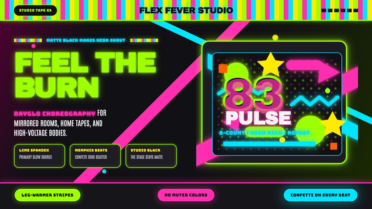 80s Aerobics Fluoro SpandexNeon refuses restraint. Lime spandex, pink-cyan confetti, and black-stage typ…
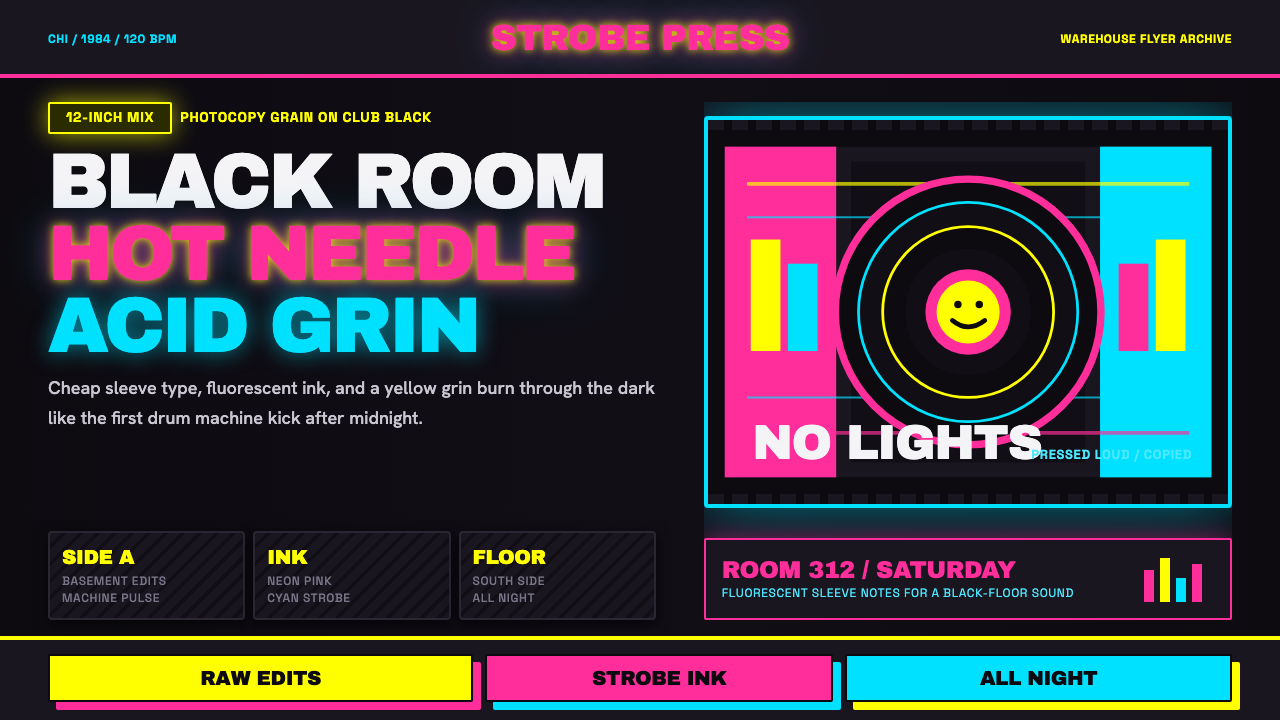 Chicago HouseDarkness starts the track. Neon pink, yellow and cyan hit black like Xerox st…
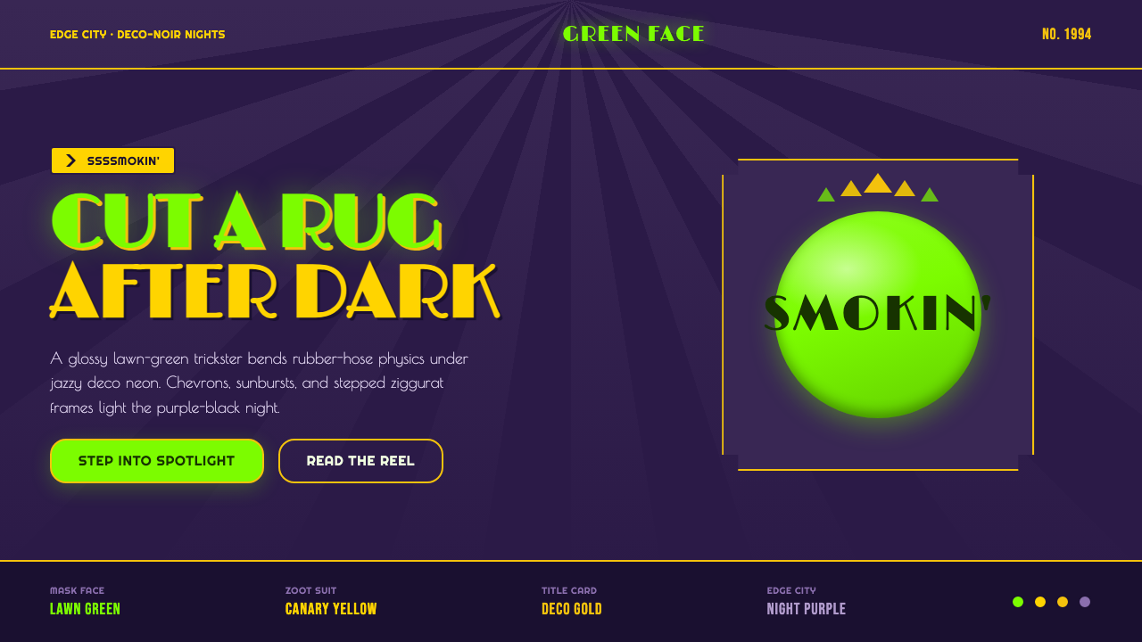 The Mask 1994 Green FaceLoud, theatrical, ssssmokin'. Lawn-green and canary-yellow scream against dec…
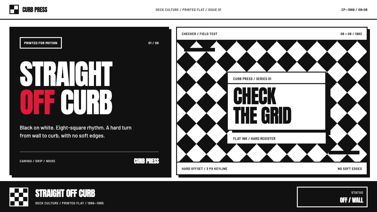 Vans Checkerboard (1966)Built to hit hard. Anton type, black-white checkers, one sanctioned red mark.
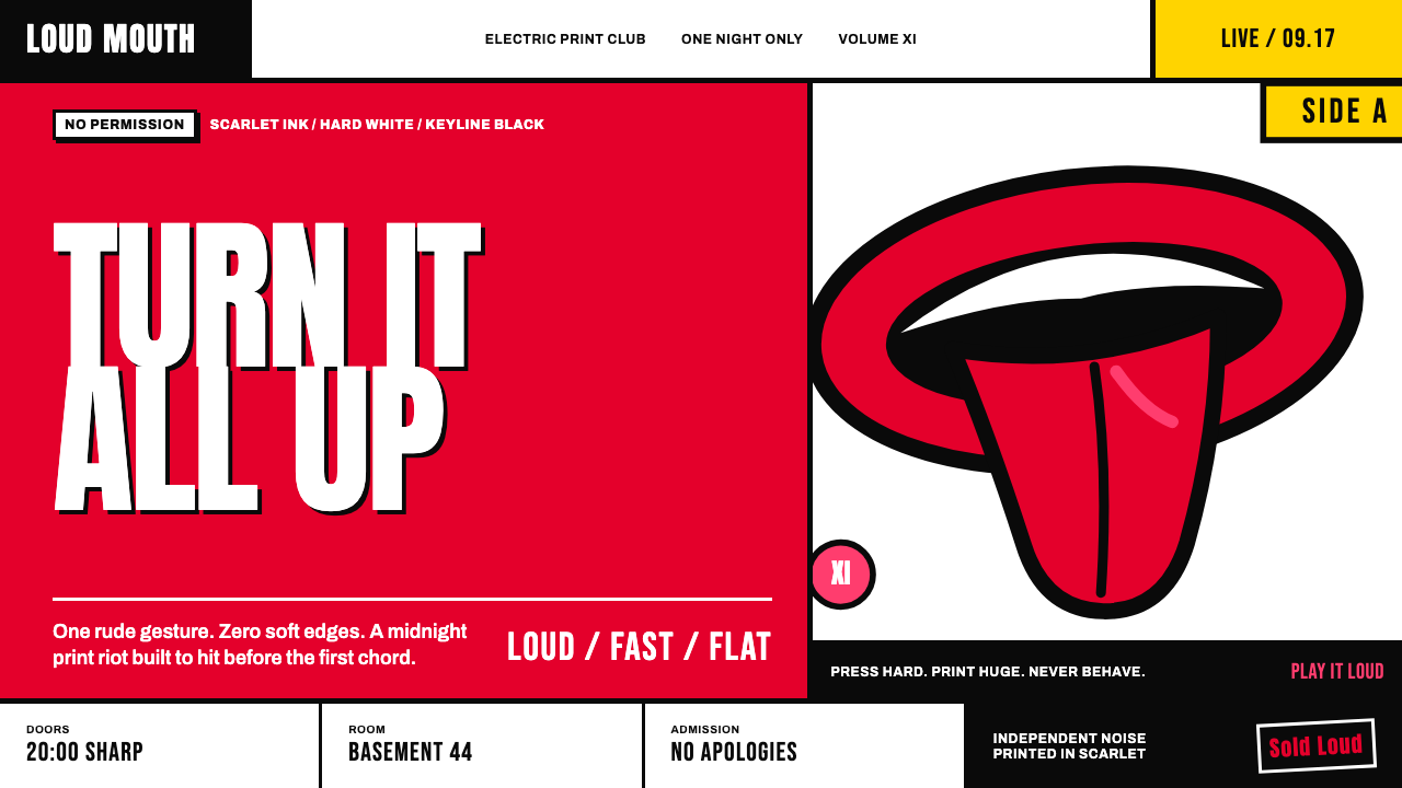 Rolling Stones Tongue (1971)Flat ink shouts loud. Scarlet curves, black keylines, and cropped poster scal…
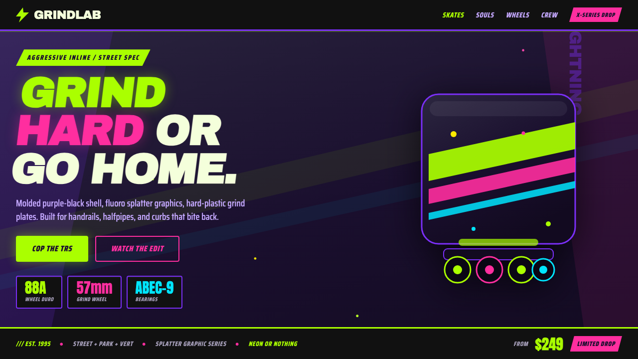 90s Aggressive Inline SkateX-Games attitude in plastic and paint. Fluoro lime and magenta slash across m…