What is Vans Checkerboard (1966)?
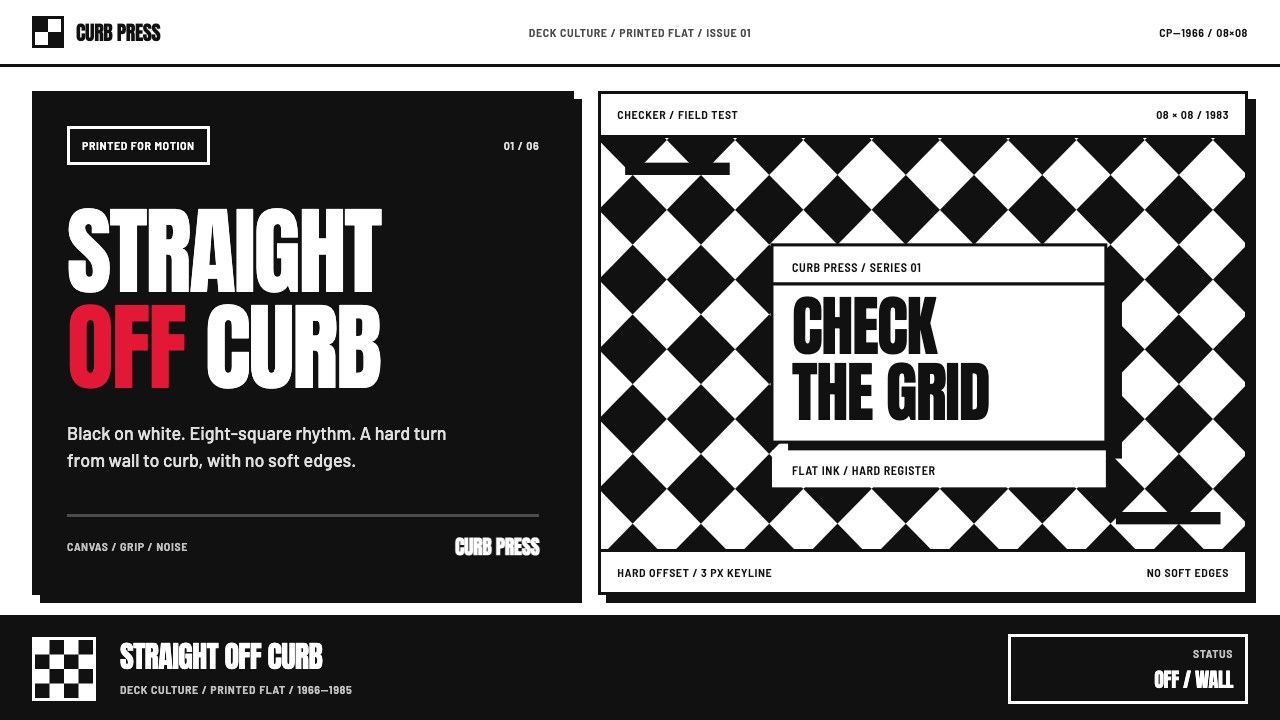
Vans Checkerboard turns a hand-drawn skate-kid gesture into a visual system: black-and-white impact, condensed type, hard sticker shadows, and one red mark that never asks permission.
Vans Checkerboard (1966) in brief
Vans Checkerboard is a Southern California street-style language built around the familiar alternating grid of black and white squares. Its force comes from directness rather than refinement. The pattern reads instantly on a slip-on, a poster, a deck-park sign, or a screen: a repeatable field that feels physical, graphic, and slightly confrontational. It carries the blunt confidence of skate culture without needing an illustration of a skateboarder to explain itself.
The checker is not a background texture added after a layout is complete. It is the organizing surface. Headlines, badges, product imagery, labels, and calls to action sit against it as if they have been pasted, stamped, or screenprinted onto an existing object. Heavy condensed display type, especially Anton-style lettering, compresses words into solid blocks. Thick dark outlines keep every component legible against the moving visual rhythm of the grid.
This is a deliberately restricted system. Black and white establish the main argument; a single Vans-red accent supplies emphasis when a message needs to hit harder. There are no gradients, soft atmospheres, or delicate decorative effects. Hard-offset shadows make elements feel like stickers lifted from a printed sheet. Slight misregistration is useful when it looks intentional: it suggests a fast, physical process rather than an immaculate digital surface.
Where does Vans Checkerboard (1966) come from?
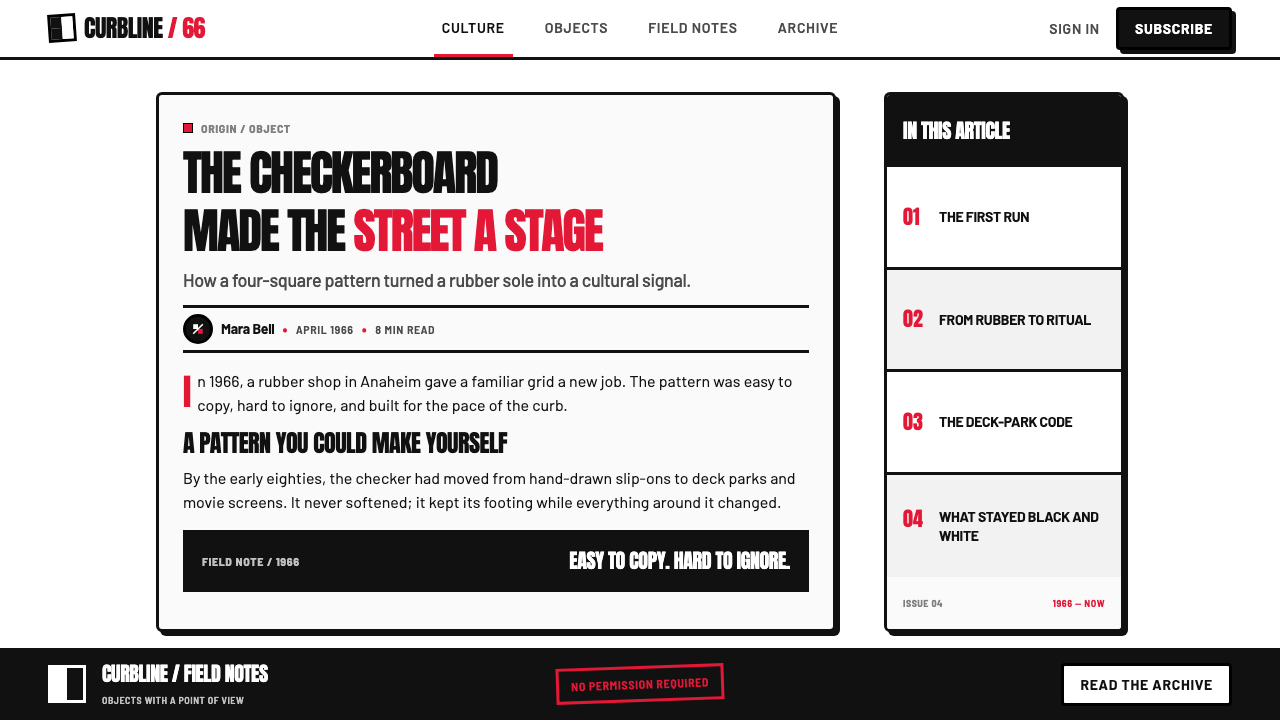
Vans began in 1966 in an Anaheim rubber shop, in the wider setting of Southern California. The place matters to the style. Anaheim and the South Bay supplied a street environment where shoes were equipment as much as apparel: they met pavement, curbs, decks, and the daily wear of skating. Waffle-sole grip belongs to that practical foundation, while the checkerboard eventually became its most visible graphic counterpart.
Before Vans printed checkerboard slip-ons, kids were already drawing the pattern on their own canvas shoes. That origin gives the motif its essential character. It was not introduced as a distant fashion symbol or a polished corporate pattern; it emerged as a simple, reproducible intervention made by the people wearing the shoes. The grid could be copied quickly, read at a glance, and altered without losing its identity.
The checkerboard era reached its strongest popular visibility from 1979 through 1985, during the explosion of the slip-on. Skate parks and the screen carried the pattern beyond its local setting and fixed it in pop memory. In this period, the shoe became more than footwear: its surface became a compact billboard for an attitude that was casual, stubborn, and visibly rooted in the curb-level world.
The style sits where SoCal skateboarding, DIY punk and hardcore, and “Off the Wall” street style overlap. These influences explain its refusal of polish. A design in this language should feel made to survive contact with real surfaces and real movement. The result is not nostalgia for its own sake; it is a visual shorthand for independence, repetition, speed, and the confidence to make something recognizable from the simplest available marks.
What defines the Vans Checkerboard (1966) look?
Checkerboard Field
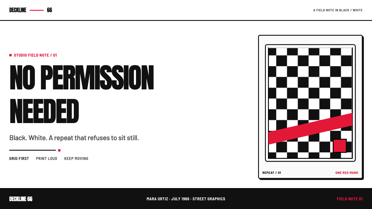
Alternating black and white squares are the primary visual engine. The grid may fill a large area or enter as a cropped strip, but it should retain a hard, regular rhythm. It creates energy through repetition, making any solid shape, headline, or red accent feel more forceful by contrast.
Condensed Display Type
Heavy condensed lettering gives copy the compressed impact of a stamp or venue poster. Anton is the defining reference: tall, bold, and built to occupy space without becoming ornate. Headlines should be brief and declarative, allowing their silhouette to work as part of the composition.
One Red Mark
Red is sanctioned as an exception, not expanded into a broad palette. It can identify a key label, a button, a price, a warning, or a logo moment. Because the rest of the system is black and white, red should arrive with purpose and remain scarce enough to retain its charge.
Hard Sticker Shadow
Shadows are solid and offset, never hazy or naturalistic. They make labels and objects appear cut out, pasted down, or pushed slightly off the printed surface. This is graphic depth rather than realistic lighting: a second shape reinforces the first one.
Screenprint Edge
Thick dark keylines give the system a printed, durable edge. Small signs of rough registration can support the mood when they stay controlled; the point is not damage, but the sense that ink, pressure, and hand-made decisions are present behind the image.
No Softening
Gradients, diffuse shadows, and gentle decorative transitions contradict the language. Edges should declare where forms begin and end. The style is strongest when it accepts visual friction: black against white, straight type against a restless grid, and a red interruption against both.
Who shaped Vans Checkerboard (1966)?
Paul Van Doren is named among the key figures in the 1966 Anaheim origin story. His place in the narrative anchors the checkerboard language to Vans' founding context rather than treating it as a later, detached graphic trend.
Steve Van Doren is a key figure in the source material's Vans lineage. Within this style story, that lineage matters because the visual language remains connected to a shoe, a local scene, and a lived street identity.
Stacy Peralta is identified as a key figure in the Southern California skate context surrounding the checkerboard era. His inclusion locates the pattern within skateboarding's cultural world, not merely within fashion graphics.
How do you use Vans Checkerboard (1966) today?
For presentation covers, let the checkerboard establish the first read. Use it as a dominant field or a forceful cropped corner, then place a short Anton-style title over a clean opposing area. Content slides need more restraint: use a narrow checker strip as a section marker, strong black type for hierarchy, and hard-outlined labels for categories. On data slides, charts should stay simple and high-contrast; use the checker only to frame or separate information, never as a busy fill behind values.
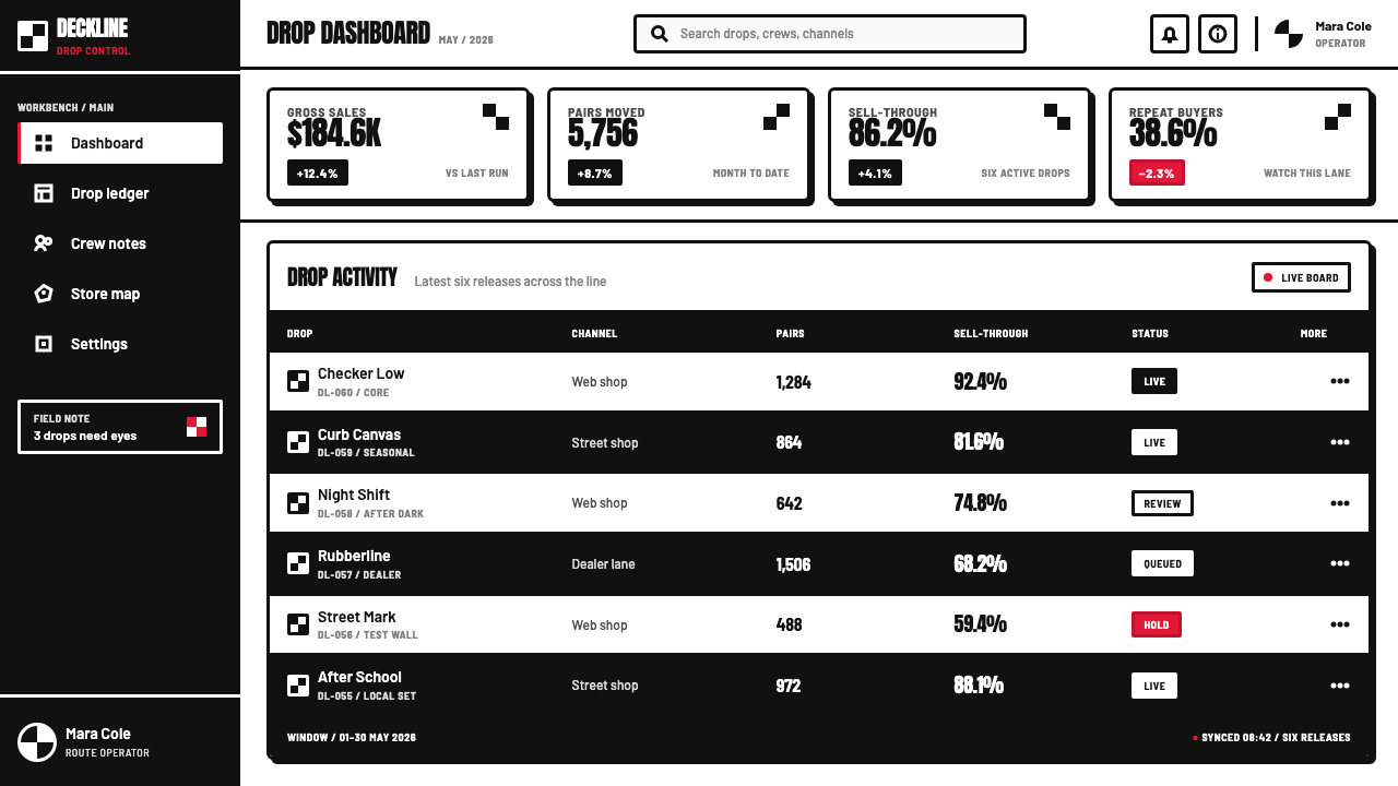
For web interfaces, Vans Checkerboard fits campaign pages, product drops, skate-oriented communities, and dashboards that benefit from immediate hierarchy. A pricing page can use black-and-white tier distinctions, one red action cue, and sticker-like plan labels. In a dashboard, reserve the grid for headers, empty states, selected panels, or navigation moments so task-oriented content remains easy to scan.
For editorial and marketing work, the language suits posters, event announcements, product stories, limited releases, and social assets. Build compositions as printed layers: a bold headline, a cropped checker field, one outlined photo or object, and a single red interruption. Copy should be plainspoken and active. The visual system becomes less convincing when paired with overly luxurious language or delicate lifestyle photography.
A common mistake is turning checkerboard into wallpaper. If every surface is gridded, nothing hits and the eye loses hierarchy. Another is treating red as a secondary background color rather than a scarce signal. Keep broad areas black or white, give the grid a specific structural role, and let the red mark identify the moment that deserves the strongest attention.
The style also struggles when a product needs quiet reassurance, organic warmth, or prolonged reading comfort. It can become tiring if its visual aggression is applied uniformly. Use the full language for entry points and decisive moments, then allow clear white space and straightforward body copy to carry longer explanations.
Vans Checkerboard (1966) — FAQ
Is Vans Checkerboard only a shoe pattern?
No. The slip-on is its most memorable carrier, but the checker functions as a complete visual language. Its grid can organize typography, labels, graphics, layouts, and campaign imagery. The important distinction is that it should still feel connected to the shoe's physical, street-level origin rather than used as a generic retro pattern.
Why is red used so sparingly?
Because the black-and-white field already provides the system's main visual pressure. Red works as a sanctioned interruption: it directs attention to the one label, action, or moment that needs priority. Expanding it across the composition weakens that contrast and makes the language feel less decisive.
Can the checkerboard be used behind body text?
Usually it should not. The pattern is too active to support sustained reading comfortably. Keep long-form copy on plain black or white surfaces, and use checkerboard as a frame, a chapter break, a side panel, or a cropped visual interruption. This preserves both readability and impact.
What makes a checkerboard layout feel authentic rather than generic?
Treat the grid as part of a disciplined system: condensed type, dark outlines, hard sticker shadows, restricted color, and blunt copy all need to agree. A checkerboard paired with soft gradients, decorative type, many colors, or polished luxury imagery loses the street-print character that gives the language its force.
Related design styles
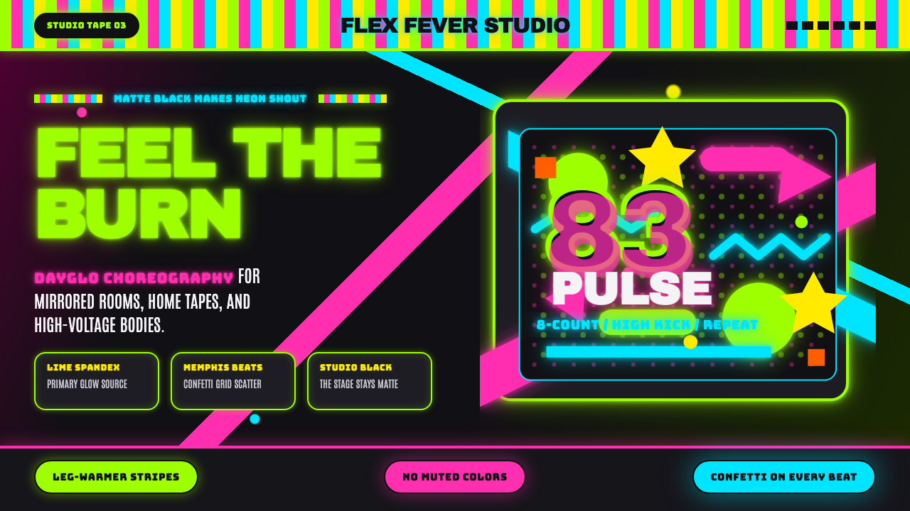 80s Aerobics Fluoro SpandexNeon refuses restraint. Lime spandex, pink-cyan confetti, and black-stage typ…
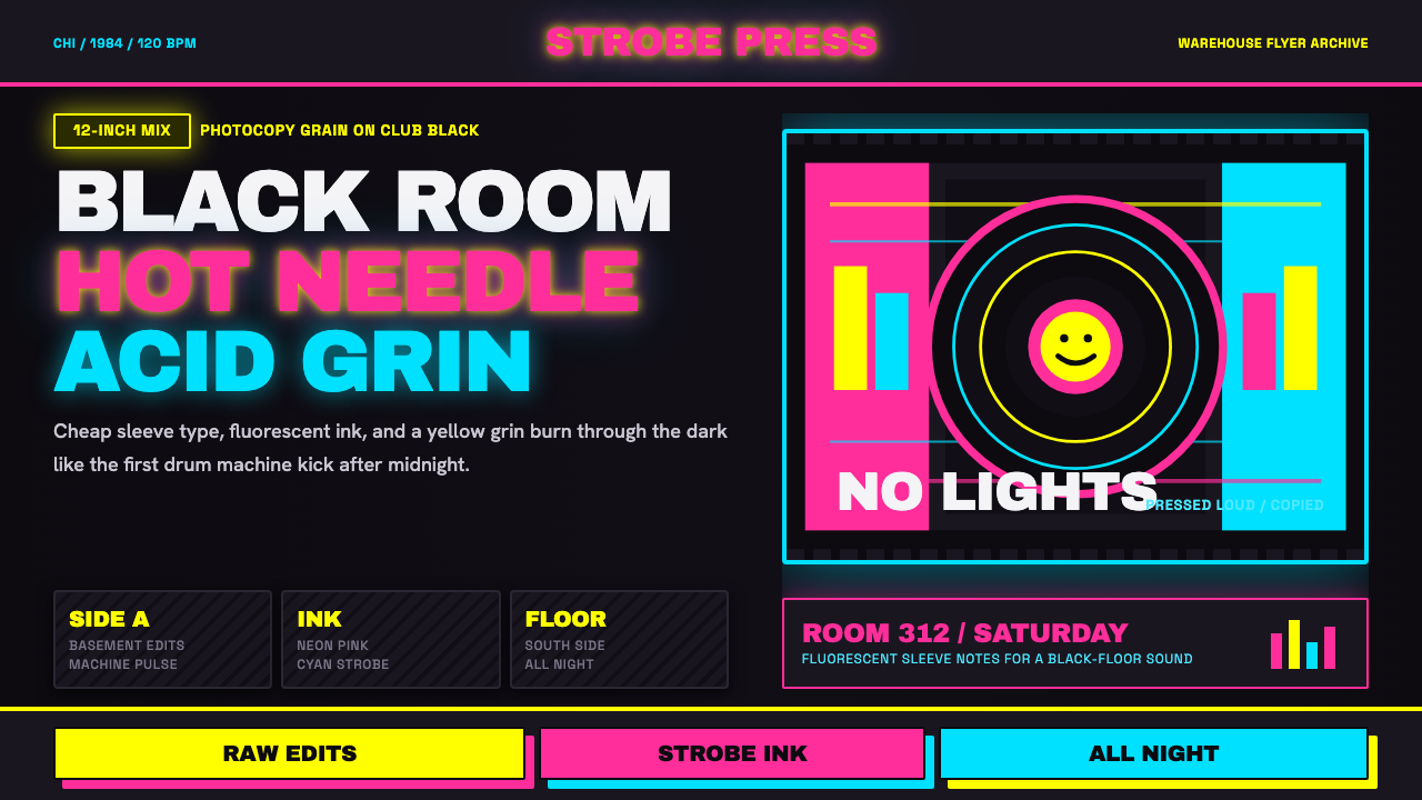 Chicago HouseDarkness starts the track. Neon pink, yellow and cyan hit black like Xerox st…
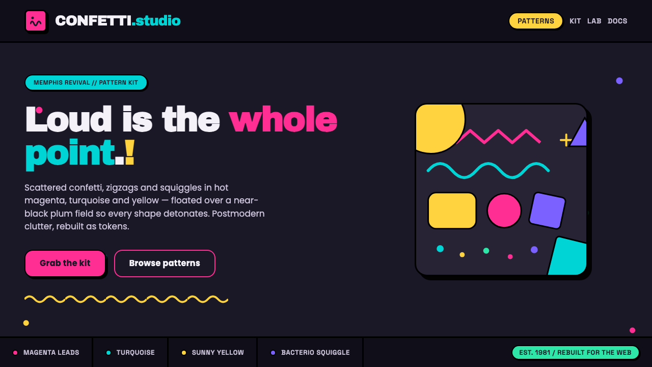 Memphis Web Pattern RevivalLoud is the point. Confetti dots, zigzags and Bacterio squiggles in hot magen…
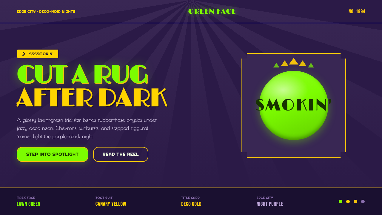 The Mask 1994 Green FaceLoud, theatrical, ssssmokin'. Lawn-green and canary-yellow scream against dec…
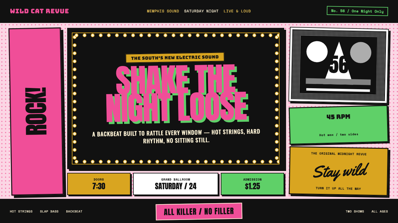 Elvis Presley (1956)Rock learned to shout. Bubblegum pink, acid green and jailhouse type land wit…
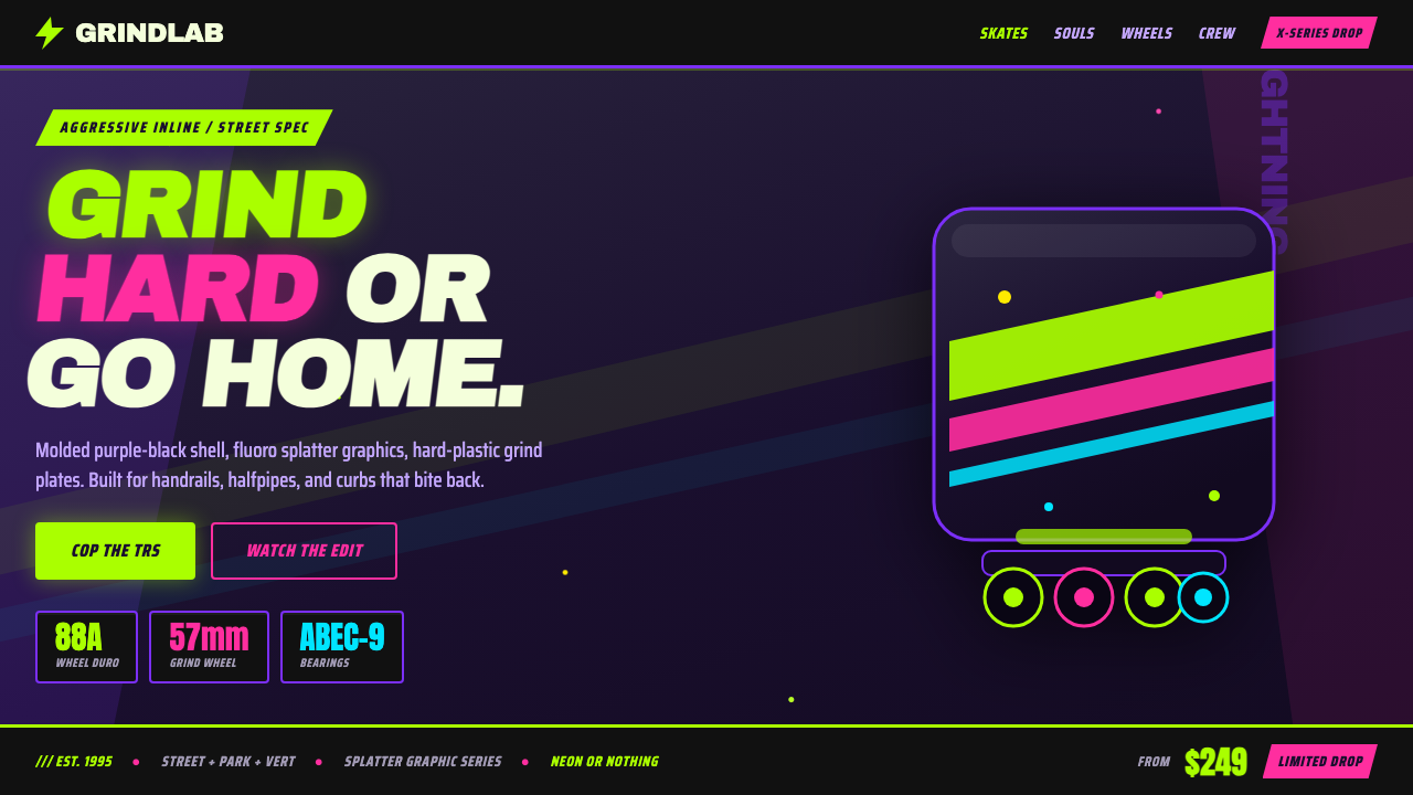 90s Aggressive Inline SkateX-Games attitude in plastic and paint. Fluoro lime and magenta slash across m…