What is The Mask 1994 Green Face?
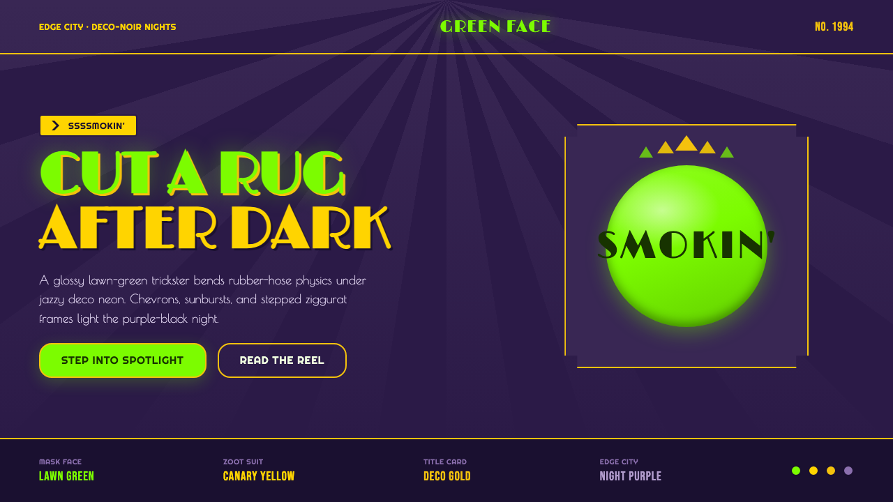
The Mask 1994 Green Face turns a cartoon-green grin, a canary-yellow zoot suit, and a purple-black deco-noir night into pure theatrical acceleration.
The Mask 1994 Green Face in brief
The Mask 1994 Green Face is a cinematic visual style drawn from The Mask, the 1994 film set in the fictional Edge City. Its defining collision is immediate: a glossy green face and canary-yellow suit erupt against a dark art-deco night. Rather than trying to blend these ingredients into a tasteful whole, the style lets them clash. Green feels mischievous and impossible to ignore; yellow acts like a stage light; purple-black supplies the nocturnal frame that makes both colors feel louder.
The style belongs to a particular kind of cartoon comedy: the trickster does not merely move through a realistic world, but bends its rules through rubber-hose physics. Forms stretch, squash, snap outward, and recover with the elastic confidence of a performance built for an audience. That animated logic is paired with jazzy title-card geometry: chevrons, sunbursts, stepped ziggurat frames, and neon-like spotlights. The result is neither pure vintage deco nor a neutral cartoon look. It is deco-noir pushed into comic exaggeration.
Applied as a design system, the look is loud, theatrical, and knowingly artificial. Display typography should feel like it is announcing a late-night spectacle rather than quietly labeling an interface. Frames behave like prosceniums, color works like costume and lighting, and every large shape should appear to be entering the scene with intent. The point is not subtle polish. The point is to make the screen feel as though it has just burst into a jazz-fueled cartoon number.
Where does The Mask 1994 Green Face come from?
The immediate source is The Mask, released in 1994, within the broader 1990–2010 era band identified for the style. The film places its heightened comedy in fictional Edge City, a North American deco-noir setting associated with New Line Cinema. This city is not presented as a neutral backdrop. Its dark, stylized night gives the green face and yellow suit somewhere to perform: the visual contrast depends on the sensation of bright costume and cartoon force breaking into an urban after-hours world.
The style also has a source in Dark Horse Comics, where The Mask appeared in 1991. That comic origin matters because the central visual premise is already graphic and transformational: a face, body, and environment can become expressive material. The film system carries this premise into a glossy, highly theatrical visual field. It treats transformation less as an invisible effect than as the visible event around which color, gesture, and framing are organized.
Chuck Russell and Jim Carrey are key figures in the film’s public identity, while ILM is named among the key contributors behind its screen world. Together, the credited framework points to the style’s hybrid character: live-action comedy meeting cartoon-scale transformation. The visual language does not ask viewers to forget the mechanism of exaggeration. Instead, it makes exaggeration the attraction, giving the trickster a face, costume, and motion vocabulary that can compete with the dark deco setting rather than disappear into it.
Its named movements explain the unusual coherence of the result: 1990s CGI-cartoon comedy, art-deco and deco-noir revival, and homage to rubber-hose animation. These influences are not stacked as separate references. The deco elements establish theatrical order through stepped frames, chevrons, and sunburst energy; the cartoon tradition breaks that order through elastic action; the comedy makes the break feel celebratory. The style’s lasting lesson is that ornamental geometry and comic chaos can intensify each other when both are treated as performance.
What defines the The Mask 1994 Green Face look?
Green, Yellow, and Purple-Black
The palette is a deliberate visual shout. Lawn green is the unruly protagonist, canary yellow behaves as costume and spotlight, and purple-black creates the deco-noir night around them. The dark field is essential because it gives the bright colors theatrical contrast. Use the bright hues as large, decisive gestures rather than scattering them into timid accents; the palette should feel staged, not merely colorful.
Deco-Noir Night
The setting is dark but never empty. Purple-black grounds suggest a city after dark, while stepped frames and spotlight-like illumination turn negative space into a theater. Deco structure should feel architectural and nocturnal: layered silhouettes, rising edges, and deep fields that make the foreground appear lit from within. The mood is urban stagecraft, not generic darkness.
Sunbursts and Stepped Frames
Chevrons, sunbursts, and stepped ziggurat frames supply the compositional grammar. They point, radiate, and contain. A sunburst can turn a face, title, or object into the center of a performance; a stepped frame can make an ordinary panel feel like a marquee. These forms should be crisp and emphatic, arranged to direct attention rather than used as ornamental wallpaper.
Deco Display Type
Typography carries the authority of a title card. Display lettering should feel glamorous, compressed by the stage, and capable of standing beside the image rather than retreating behind it. The treatment favors strong silhouettes and theatrical hierarchy over quiet editorial neutrality. Supporting text can be more restrained, but headings should announce a spectacle with the confidence of a nightclub sign.
Gloss and Elasticity
The green face is glossy, and the motion logic is stretch-and-squash. Together they make surfaces and bodies feel theatrically alive. Gloss should read as a cartoon highlight, not as a realistic material study. Elastic transformations should feel sudden, legible, and playful: a shape expands for emphasis, compresses under comic force, then returns as if the scene itself enjoys the joke.
Theatrical Contrast
Nothing in this system should behave apologetically. A bright figure against a deep night, a hard geometric frame around a rubbery gesture, and jazzy visual rhythm around an exaggerated expression all create productive tension. Contrast is not a finishing touch. It is the narrative device that makes the image feel loud, comic, and instantly present.

Who shaped The Mask 1994 Green Face?
Jim Carrey is a key figure in the film’s identity because the trickster’s cartoon force is carried through performance. The visual system’s green face, yellow zoot suit, and elastic physical comedy are inseparable from the sense of a body behaving according to rubber-hose logic. In design terms, his role establishes the style’s central rule: exaggeration should feel performed, not merely decorated.
Chuck Russell is identified as a key figure of The Mask. Within the style’s public framework, the film connects comedy, theatricality, and a dark deco environment rather than treating them as incompatible genres. That combination is the reason a contemporary interpretation should preserve both the nocturnal frame and the exuberant interruption inside it.
ILM is listed among the key figures behind the film’s screen language. Its presence marks the style as part of 1990s CGI-cartoon comedy, where transformation has a glossy, visible, showstopping role. The relevant design lesson is not technical imitation; it is to give impossible changes a clear silhouette, an expressive payoff, and enough visual space to become the event.
Dark Horse Comics is the source associated with The Mask in 1991. Its place in the story reminds designers that the style begins from graphic transformation before it becomes a film spectacle. The green-faced trickster is effective because identity can change visibly and instantly; a faithful visual adaptation should preserve that graphic decisiveness instead of softening it into ordinary retro decoration.
How do you use The Mask 1994 Green Face today?
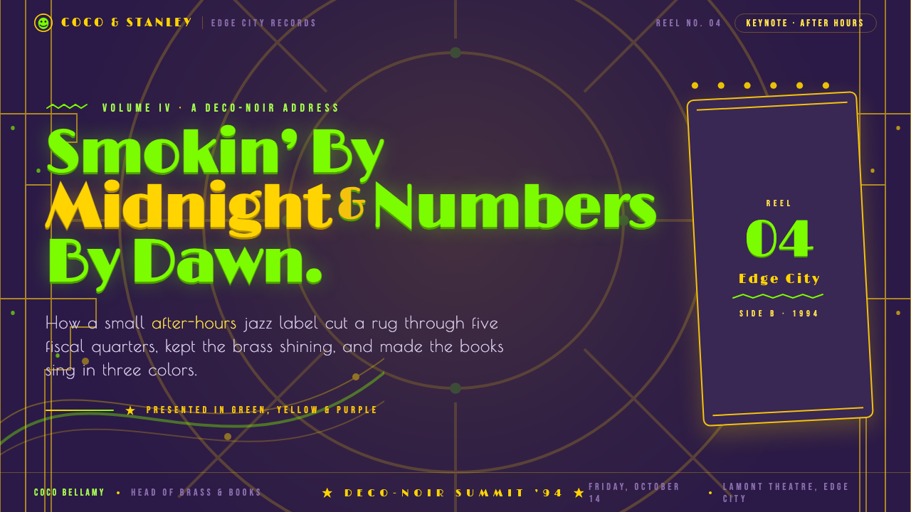
For presentation covers, treat the page as a theatrical title card. Place a large green focal form or character-like silhouette against a purple-black field, then let a canary-yellow suit-like block, spotlight, or headline create the counterpoint. A stepped deco frame can hold the title, while a sunburst or chevron system establishes direction. The cover should feel like an entrance: one unmistakable focal event, surrounded by enough darkness for its color and gesture to land.
For content and data slides, retain the show-business energy but give information a disciplined stage. Use stepped frames to separate sections, deco display type only for the most important statements, and calmer supporting text for explanation. Charts can inherit the language through green, yellow, and dark contrast, with chevrons or rays used to highlight a decisive insight rather than every value. A data page succeeds when it reads quickly while still feeling like the reveal point of a performance.
For web interfaces, this style fits promotional homepages, entertainment dashboards, event spaces, and pricing experiences that benefit from confident theatrical hierarchy. Build the interface around a dark deco-noir canvas, large display moments, and bright interactive focal points. Panels should resemble framed stage zones rather than anonymous containers. Navigation can stay clear and restrained, while primary actions receive the loud green or yellow treatment that makes them feel like a cue under a spotlight.
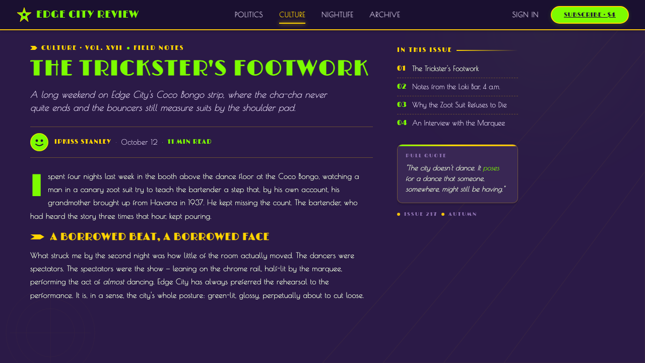
For editorial and marketing work, use the system to turn announcements, launches, features, and calls to action into visual acts. A dark opening field can introduce a headline through a stepped frame; subsequent sections can alternate between shadowy city-night compositions and bright costume-like blocks of color. Photography or illustration, if present, should be treated as a performance element: cropped boldly, placed against graphic rays, or given room to play against the frames instead of being used as quiet background texture.
The most common mistake is reducing the look to a green face plus random deco ornaments. That loses the tension that makes it recognizable. The style needs all of its roles working together: the nocturnal purple-black environment, the green-yellow visual shout, the disciplined title-card geometry, and the elastic cartoon interruption. It also fails when every surface is equally loud. Protect a deep field of darkness and a clear hierarchy so the spectacle has somewhere to happen.
The Mask 1994 Green Face — FAQ
Is this simply an Art Deco style?
No. Art-deco and deco-noir revival provide the framing language: stepped ziggurats, sunbursts, chevrons, theatrical symmetry, and a nocturnal city mood. The Mask 1994 Green Face changes that framework through 1990s CGI-cartoon comedy and rubber-hose animation homage. The decisive feature is the collision between controlled deco geometry and an elastic trickster who seems able to break every physical rule inside it.
Can the style work without a character or green face?
Yes, if the system preserves the role played by the character. You need a disruptive focal event: a bold product image, oversized headline, animated object, or brilliant graphic form that enters the dark deco stage with comic confidence. Green does not have to become a face, but it should retain its trickster role. Without an active focal interruption, the result becomes ordinary deco-noir rather than this more explosive hybrid.
How should motion feel in this visual system?
Motion should borrow the expressive logic of stretch-and-squash rather than naturalistic realism. Elements can swell into attention, compress under comic pressure, overshoot a resting position, or snap into a framed reveal. The action should be readable and theatrical, as if it is responding to a jazz cue or a punchline. Avoid delicate, almost invisible transitions: this style works when movement feels like part of the act.
Where does the style work best?
It is strongest where spectacle is useful: entertainment, launches, campaigns, event promotion, playful product storytelling, and dashboards that need a memorable focal hierarchy. It is less natural for quiet, trust-first, or contemplative experiences, because the palette and theatrical geometry deliberately demand attention. The right question is whether the product benefits from a mischievous, jazzy entrance rather than whether deco decoration can be applied to it.
Related design styles
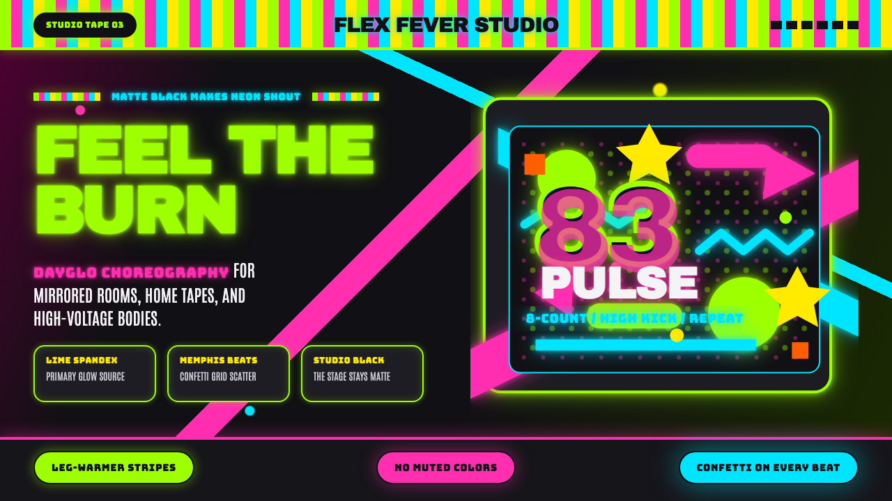 80s Aerobics Fluoro SpandexNeon refuses restraint. Lime spandex, pink-cyan confetti, and black-stage typ…
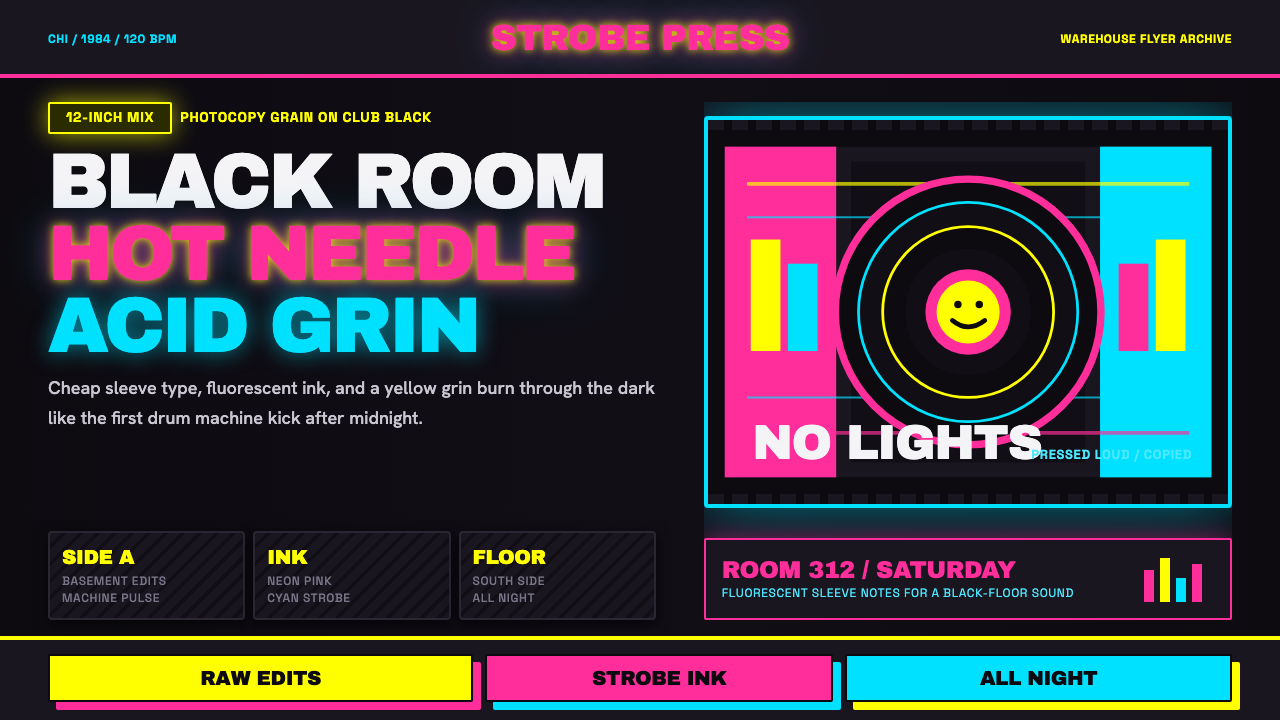 Chicago HouseDarkness starts the track. Neon pink, yellow and cyan hit black like Xerox st…
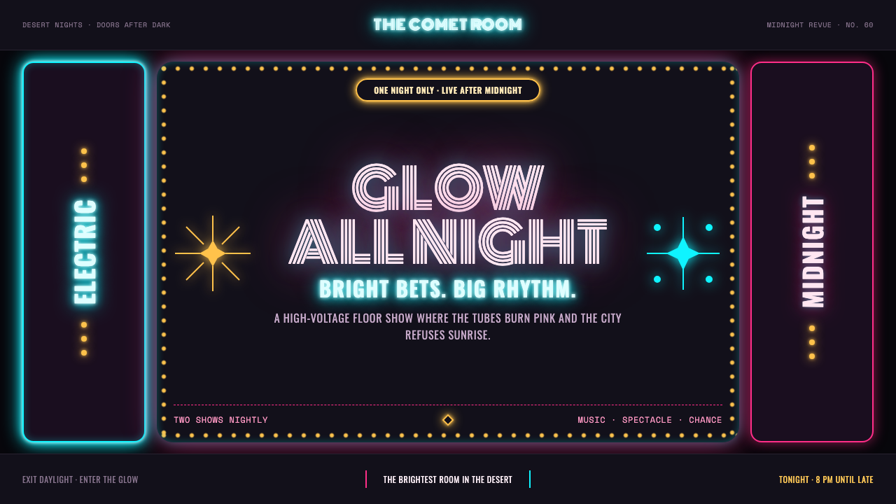 Las Vegas Neon (1960)Night refuses to dim. Hot-pink tubes, cyan bloom and amber bulbs turn black i…
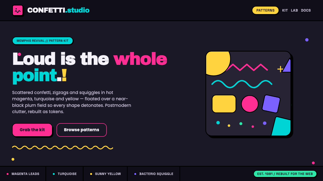 Memphis Web Pattern RevivalLoud is the point. Confetti dots, zigzags and Bacterio squiggles in hot magen…
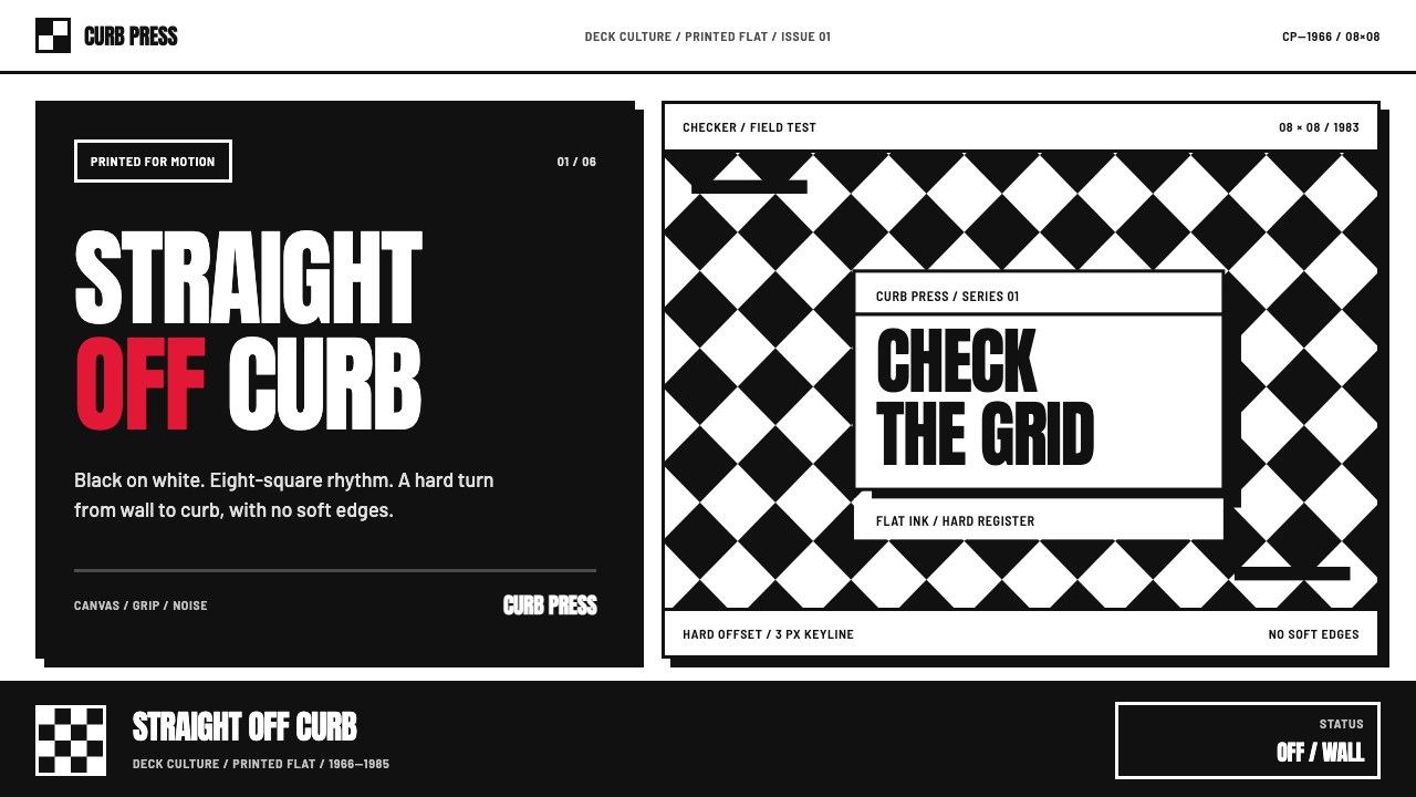 Vans Checkerboard (1966)Built to hit hard. Anton type, black-white checkers, one sanctioned red mark.
 Arcade Cabinet MarqueeToo loud to ignore. Black-indigo glass, violet glow, cyan grids, hot-pink arc…