What is Las Vegas Neon (1960)?
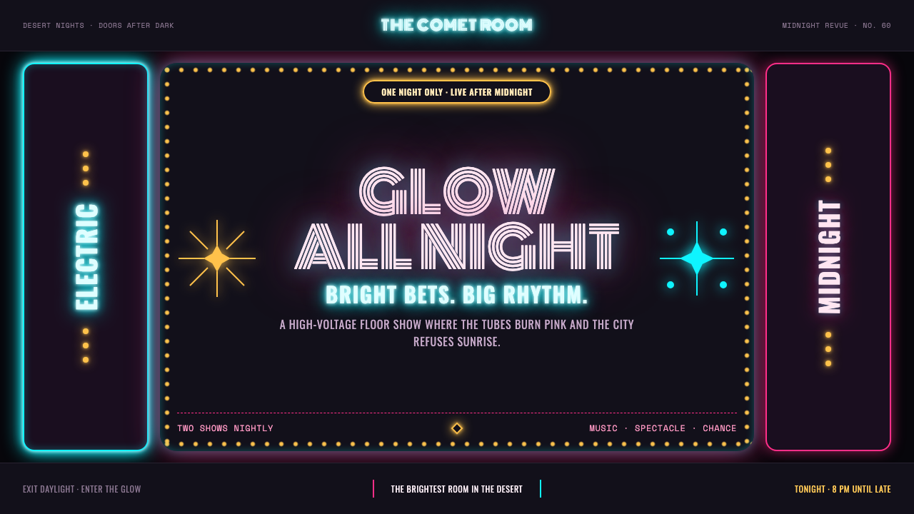
Las Vegas Neon is the Strip in 1960, after dark, before the corporate resorts — hot-pink and electric-cyan glass tubing glowing against true black, where a marquee could out-shout the desert and a font could gamble.
Las Vegas Neon (1960) in brief
This is a system with no flat surfaces — only lit ones. Every glyph and shape behaves as its own light source, wrapped in a colored bloom halo the way an actual glass neon tube glows softly around its edges. The ground is always true, dead black, the color of desert night rather than an ordinary dark theme, because the glow only reads as spectacle against real darkness.
Hot-pink and electric-cyan glass tubing traces cursive script and outline shapes the way a sign-bender's hand traced them by hand in 1960 — nothing here is a printed logotype, everything reads as if bent from continuous tubing. Googie-style starbursts explode off corners, borrowed from the space-age roadside architecture of the same period, and amber chase bulbs blink in sequence, adding rhythm and motion to what would otherwise be a static glow.
Nothing fades gently. Colors are saturated at full intensity, contrast is absolute, and the mood is closer to the Fremont Street 'boneyard' at midnight — rows of retired, still-glowing signage stacked against the dark — than to a soft ambient evening. This is a system built to be loud.
Where does Las Vegas Neon (1960) come from?
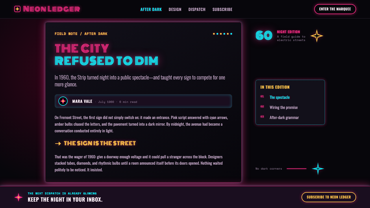
Neon signage in Las Vegas reached its defining peak between 1946 and 1965, with the years 1958 through 1962 marking the height of the era on both the Strip and downtown's Fremont Street, nicknamed 'Glitter Gulch' for the density and brightness of its signage. This was a period before corporate mega-resorts consolidated the city's visual identity, when individual casino and motel owners competed directly through the scale and inventiveness of their signs — a single marquee genuinely could outshine the desert horizon around it.
The visual language drew heavily from Googie architecture, also known as Populuxe design — a roadside commercial style defined by starburst motifs, boomerang shapes, and atomic-age optimism, developed for coffee shops, motels, and gas stations built to catch the eye of passing car traffic. Neon signcraft and Googie architecture developed hand in hand: a building's angular canopy and a sign's exploding starburst were designed as a single visual statement meant to be read at speed, from a moving car, at night.
Betty Willis designed some of the era's most enduring signage work, contributing to the visual identity that came to define the Strip's welcoming, playful character. Kermit Wayne and other dedicated neon sign-benders worked as craftsmen in their own right, hand-forming glass tubing into cursive script and pictorial shapes for individual casino and motel clients. Architect Wayne McAllister designed several of the resorts these signs were built to advertise, integrating Googie architectural forms with the neon signage that announced them from the highway.
Thomas Young and other sign-industry figures of the period helped establish neon signcraft as a distinct commercial trade — combining glass-bending, gas-filling, and electrical engineering — that turned advertising into architecture. The tradition of retiring old signs rather than destroying them, preserved today in collections like the Neon Museum's 'boneyard,' reflects how central these signs were to the city's own sense of its history: not disposable advertising, but landmarks in their own right.
What defines the Las Vegas Neon (1960) look?
Glow Over Flat
Nothing in this system reads as a flat, unlit surface. Every glyph and shape is treated as a light source, wrapped in a soft colored bloom halo that mimics how actual neon glass glows around its edges against the dark.
True Black Ground
The background is always a true, saturated black — desert night, not an ordinary dark-mode gray. The glow only registers as spectacle when it is set against genuine darkness; a lighter or grayer ground flattens the entire effect.
Hand-Bent Script
Lettering follows the logic of a physically bent glass tube rather than a printed typeface — continuous cursive strokes, no sharp printed edges, and a sense that a sign-bender's hand, not a font file, produced every curve.
Googie Starbursts
Angular, exploding star and boomerang shapes borrowed from atomic-age roadside architecture punctuate corners and headers, signaling speed, optimism, and space-age modernity rather than restraint.
Amber Chase Bulbs
Sequenced amber bulbs add rhythm and implied motion to borders and marquees, referencing the chase-lighting patterns that animated classic casino and theater signage — motion built from timing and sequence, not from a moving shape.
Boneyard Density
Compositions favor a dense, stacked arrangement of multiple glowing elements over a single isolated sign, echoing the visual density of the Fremont Street strip or the Neon Museum's boneyard, where retired signs stand shoulder to shoulder rather than in isolation.
Who shaped Las Vegas Neon (1960)?
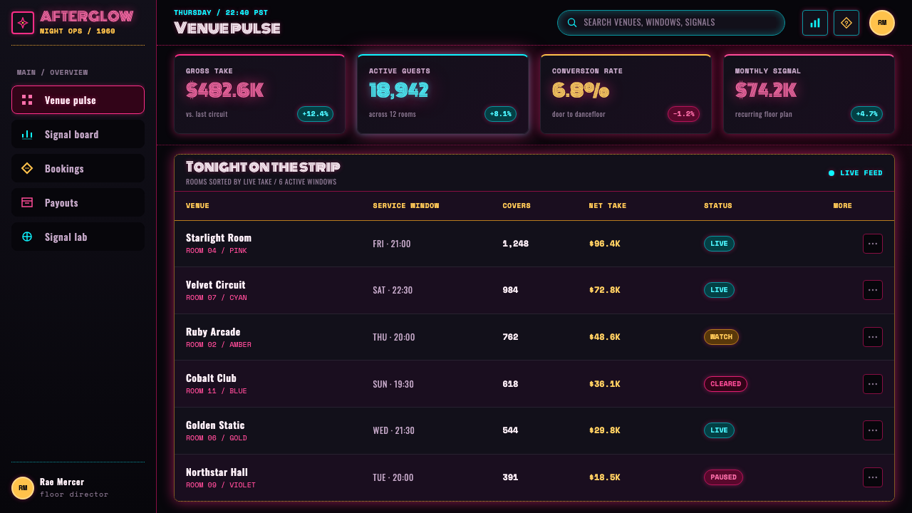
Willis designed some of the most enduring signage work of the era, contributing to the visual character that came to define the welcoming, playful identity of the Las Vegas Strip during its peak neon years.
Wayne worked as a neon sign-bender, hand-forming glass tubing into the cursive lettering and pictorial shapes that gave individual casino and motel signs their distinctive, handmade character during the Strip's classic era.
McAllister, an architect, designed several of the resorts whose signage this system draws from, integrating Googie-influenced architectural forms with the neon marquees built to announce them to passing highway traffic.
Young was among the sign-industry figures who helped establish neon signcraft — combining glass-bending, gas-filling, and electrical engineering — as a distinct commercial trade that effectively turned advertising into architecture during the era.
How do you use Las Vegas Neon (1960) today?
This system rewards work that wants to feel loud, celebratory, and unapologetically bright rather than restrained — applying it well means committing to true black grounds and full-saturation glow rather than softening the contrast for comfort.
For presentation slides, the style is strongest on cover pages built around a single glowing script wordmark against true black, with a Googie starburst accent in one corner. Content slides should keep the black ground consistent and use glow-outline text sparingly for headers only, since a page of fully glowing body text becomes unreadable; data slides can borrow the chase-bulb motif as an animated or implied-motion accent around a key figure.
For web interfaces, the palette suits entertainment, nightlife, gaming, and event-ticketing products where energy and spectacle matter more than calm usability. A true-black base with glow-outline buttons in hot pink or cyan reads as an invitation to something exciting; overuse across every element, however, quickly becomes visually exhausting, so glow should be reserved for primary actions and hero moments.
For editorial and marketing work, the system suits nightlife coverage, entertainment history, and brand campaigns built around spectacle and nostalgia for mid-century Americana. Treat a hero headline like a marquee — centered, glowing, oversized — and let secondary information sit in plain, legible type rather than competing for the same glow treatment.
The most common mistake is applying neon color without true black — a dark gray or navy background instead of dead black flattens the bloom-halo glow effect that makes the whole system read as neon rather than simply 'bright colors on dark.' A second common mistake is using too many colors at once; the historic palette leans on two or three saturated hues plus amber, not a full rainbow.
Las Vegas Neon (1960) — FAQ
Why does the background always need to be true black rather than dark gray?
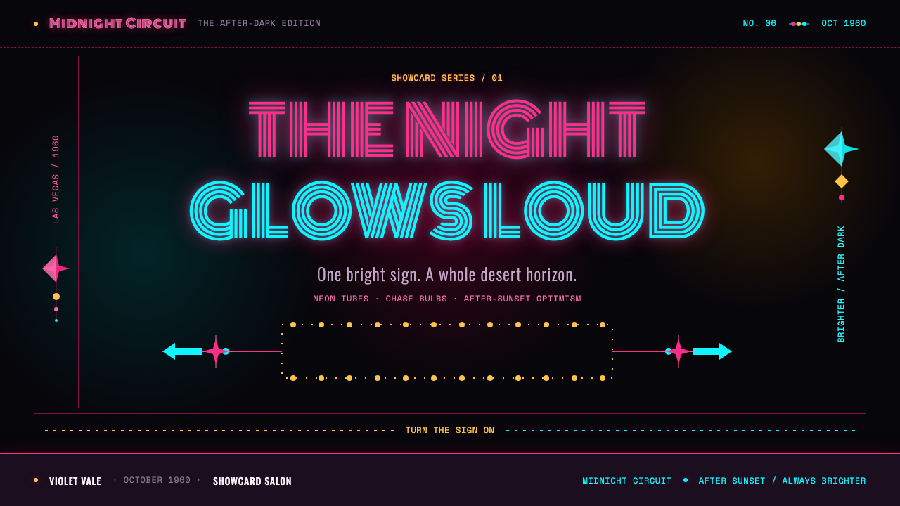
The signature bloom-halo glow effect only reads convincingly against genuine darkness. A neon tube's light physically stands out most against true night; a lighter or grayer background reduces the contrast that makes each glyph look like it is emitting its own light, and the system starts to read as ordinary bright colors rather than neon spectacle.
What is Googie architecture and why does it matter here?
Googie, also called Populuxe design, was a roadside commercial architecture style built around starburst motifs, boomerang shapes, and atomic-age optimism, developed for coffee shops, motels, and gas stations meant to catch a driver's eye at speed. Neon signcraft and Googie architecture developed together in this period, which is why starburst motifs and angular shapes are treated as core system elements rather than optional decoration.
Why are amber chase bulbs part of the system if the main colors are pink and cyan?
Chase bulbs historically provided rhythm and implied motion around the edges of a marquee or border, a role distinct from the cursive script and shape work handled by hot-pink and cyan tubing. Amber is a supporting, animated accent rather than a competing hero color, and its sequenced blinking pattern is what gives static signage a sense of motion.
Is this the same as generic 'cyberpunk neon' styling?
They share a glow-on-black logic but come from different sources. Cyberpunk neon typically leans on cool blues, purples, and magentas with a futuristic, dystopian mood and often uses gridlines or scanline textures. This system is rooted in a specific mid-century American commercial moment — hot pink, electric cyan, and amber, cursive script rather than futuristic sans-serif, and a celebratory rather than dystopian tone.
Can this style work for a calm, minimal product?
It resists that context structurally. The entire system is built around maximum contrast, saturation, and visual density — the opposite of minimalism's restraint. Diluting the glow, softening the black, or thinning out the density to fit a calmer product removes the exact qualities that make this style recognizable as Las Vegas neon rather than a generic dark theme with a colored accent.
Related design styles
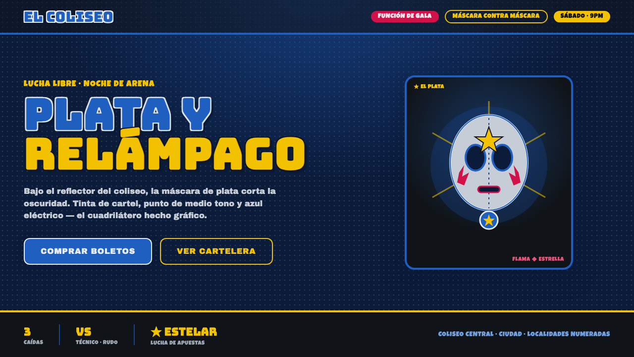 Mexican Lucha Mask GraphicComic-book lucha, lit from above. Silver-blue mask out of arena-night dark, h…
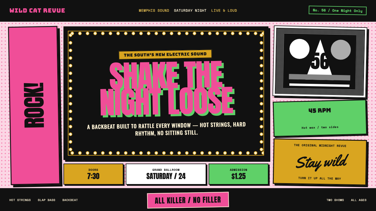 Elvis Presley (1956)Rock learned to shout. Bubblegum pink, acid green and jailhouse type land wit…
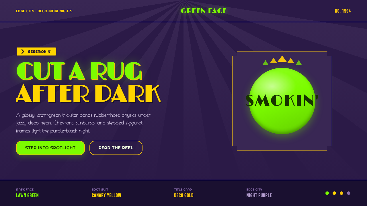 The Mask 1994 Green FaceLoud, theatrical, ssssmokin'. Lawn-green and canary-yellow scream against dec…
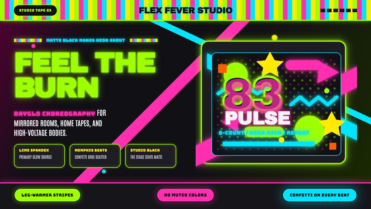 80s Aerobics Fluoro SpandexNeon refuses restraint. Lime spandex, pink-cyan confetti, and black-stage typ…
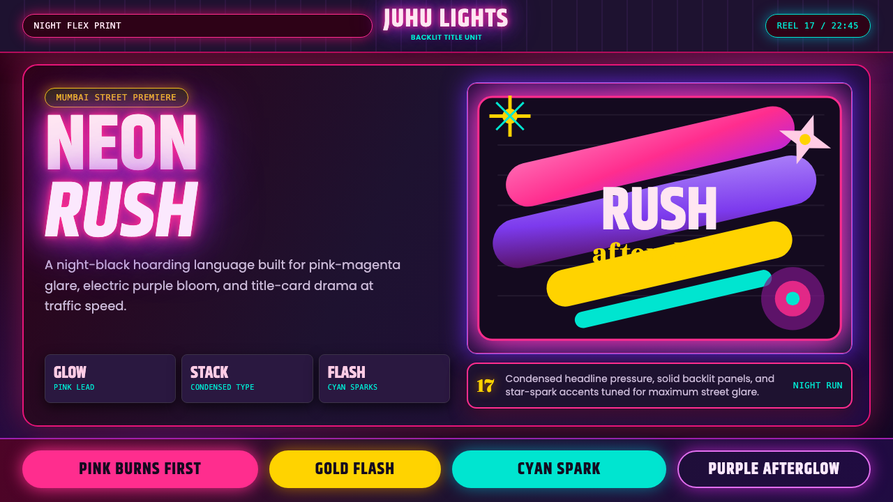 Bollywood Neon MumbaiMumbai pop burns bright. Khand stacks glow over night-black, with pink-purple…
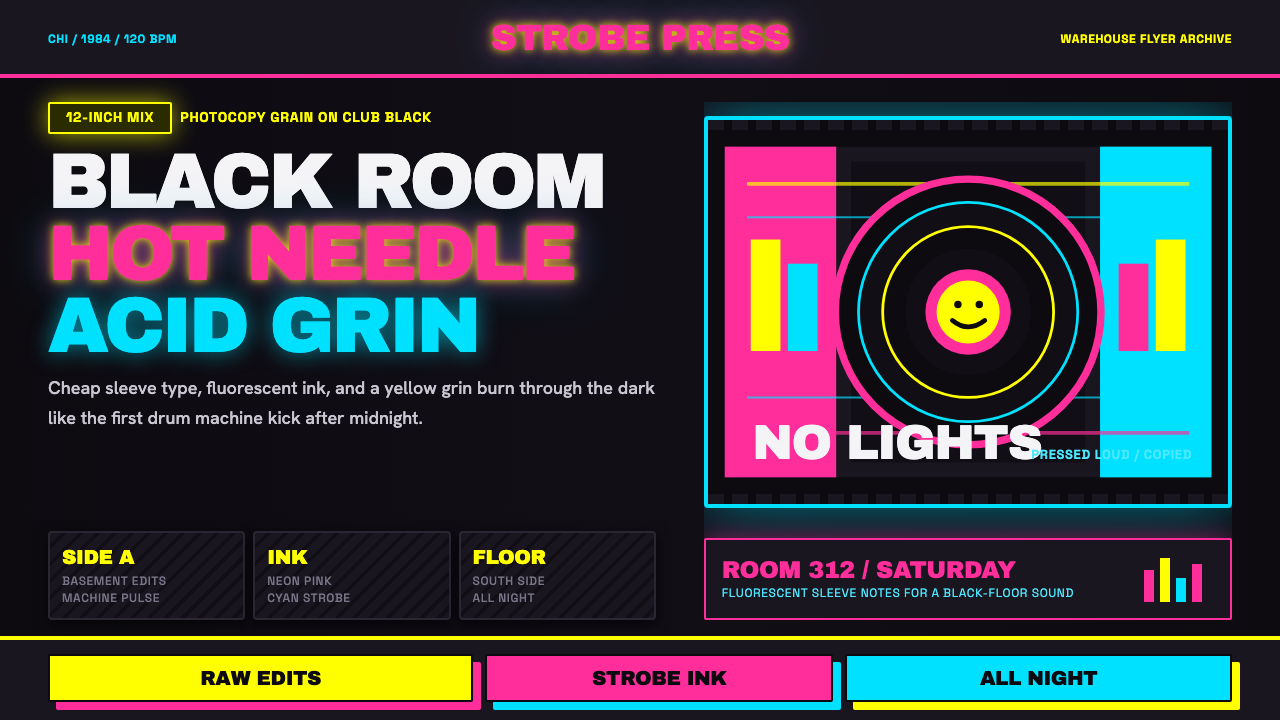 Chicago HouseDarkness starts the track. Neon pink, yellow and cyan hit black like Xerox st…