What is Bollywood Neon Mumbai?
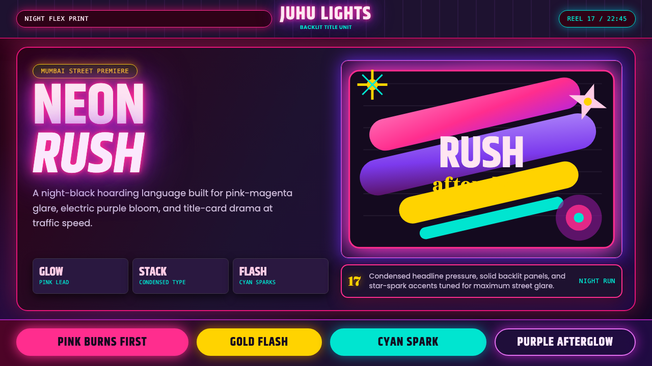
Bollywood Neon Mumbai is not a historical style to be studied — it is a living visual storm still blazing across Mumbai's skyline tonight. Saturated neon pinks and electric purples sear through night-black, halos bloom around condensed headlines, and every surface craves the luminous intensity of a backlit hoarding on the Western Express Highway.
Bollywood Neon Mumbai in brief
Bollywood Neon Mumbai is the visual idiom of contemporary Hindi-cinema street advertising: the glossy backlit hoardings and digitally printed poster culture of Mumbai from roughly 2010 onward. Its signature is maximum luminosity — neon pink-magenta and electric purple punching through deep night-black grounds, releasing the optical sensation that every surface is lit from within.
The style is defined by excess as craft: layered bloom halos, lens-flare star-bursts, stacked condensed display type set at outsized scale, and diagonal compositional energy that feels perpetually in motion. Where other poster traditions value restraint, Bollywood Neon Mumbai values spectacle. Glare is not an accident — it is the whole point.
Unlike historical Indian decorative traditions — Mughal miniature, temple relief, rangoli geometry — this visual language is entirely contemporary and deliberately international in its media references, absorbing club-night typography, digital glow effects, and Hollywood blockbuster poster conventions while remaining distinctly rooted in the kinetic commercial energy of Mumbai's streets.
Where does Bollywood Neon Mumbai come from?
The roots of Bollywood Neon Mumbai lie in the painted hoarding culture that dominated Mumbai's film advertising from the 1950s through the 1990s. Enormous hand-painted signboards — sometimes stretching twenty or thirty feet across a building facade — were the dominant medium for film promotion. Specialist hoarding painters developed virtuosic airbrushing techniques for depicting skin luminosity, dramatic lighting effects, and larger-than-life star portraiture. The physical constraint of large-format hand painting created conventions around compressed type, high-contrast figure-ground relationships, and expressive color temperature that survived the transition to digital.
The shift from painted to digitally printed hoardings accelerated dramatically through the 2000s and reached near-total replacement by the early 2010s. Digital printing liberated the medium from the physical constraints of hand-rendered media: bloom effects that had been approximated with airbrush could now be rendered precisely; lens flares, halation halos, and motion-blur streaks became inexpensive additions. The first decade of digital hoardings in Mumbai saw a wholesale adoption of the visual vocabulary of Adobe Photoshop's glow and lighting effects, which were simultaneously being deployed in Hollywood blockbuster poster design. The neon-magenta-purple palette became dominant because it read with maximum intensity on both backlit and unlit surfaces, and because it signaled contemporaneity against the deeper golden tones of the painted-hoarding era.
The style consolidated as a recognizable aesthetic during the 2010s, shaped partly by the increasing production budgets of Hindi-language blockbusters and partly by the digitization of the entire marketing pipeline. Title-card typographers — the specialists who design the distinctive stacked headlines of Hindi film credits — became important aesthetic arbiters, developing letterforms and layout conventions that translated the energy of 90s-era hand-lettered film posters into digitally scalable formats. The style also absorbed influences from Punjabi pop music video aesthetics and, increasingly, from South Korean and North American club-night design.
By the mid-2010s, the aesthetic had spread well beyond cinema hoardings into urban commercial signage, fast-food graphics, mobile-carrier advertising, and event promotion across South Asia. The visual language was no longer exclusively cinematic — it had become the general idiom for high-energy, aspirational mass-market communication in urban India.
What defines the Bollywood Neon Mumbai look?
Color and Luminosity
The defining chromatic move is deep black as a ground against which saturated neon pink-magenta and electric violet-purple glow at maximum intensity. These two hues are treated not as flat color but as light sources: they are rendered with halation — a soft bloom halo extending outward from the saturated core, simulating the overexposure phenomenon of a bright light photographed on film. Secondary colors (electric blue, acid green, hot orange) appear as accent sparks or lens-flare fragments but never dominate. The black ground is not a neutral — it is an active void that amplifies the apparent brightness of everything placed against it.
Typography and Lettering
Bollywood Neon Mumbai typography is built on condensed display typefaces set at aggressive scales — the headline often occupies more than half the total composition height. Multiple typefaces coexist in deliberate tension: a heavy condensed Latin-alphabet face for the English film title, a bold Devanagari display face for the Hindi title, and a contrasting lighter weight for supporting information such as cast names and release dates. Stacking is compositional logic: two or three lines of type are layered vertically, sometimes with each line set in a different color from the neon palette. Letter-spacing on the lead display face is often tightened to near-zero, making the word mass feel dense and heavy.
Glow and Optical Effects
The glow effect is the technical signature of the style. Applied to type, to portrait images, and to abstract light-streak elements, glow manifests as concentric layers of decreasing-opacity color emanating outward from an object's edges. Lens flares appear as diagonal arrays of hexagonal or circular light artifacts crossing the composition. Star-burst effects — typically eight-pointed, sometimes twelve-pointed — mark the hottest apparent light sources. These are not decorative additions; they are the visual mechanism by which the flat printed surface simulates the experience of looking at a live backlit sign under nighttime conditions.
Composition and Diagonal Energy
Compositions frequently employ diagonal axes to create kinetic tension. The main portrait or figure is often positioned at an angle, with light-streak elements cutting across the frame diagonally. Title type may be set on a slight incline, or the overall compositional weight may be distributed asymmetrically with a strong diagonal implied between the heaviest element and the main accent color. This directional energy distinguishes the style from static poster formats — the viewer's eye is pulled across the surface rather than settling at a central point.
Portrait and Figure Treatment
Film star portraiture is central to the tradition. Faces are processed to appear hyper-luminous: skin highlights are boosted to near-white, shadows are deepened but not muddied, and the overall image sits somewhere between a high-key studio photograph and an airbrush illustration. Eyes are frequently enhanced with a catchlight or inner glow. The figure is often extracted from its photographic background and composited against the neon-and-black ground, creating a hard silhouette edge that integrates with the overall glow composition. The effect is aspirational and mythic — the star appears as a being composed partly of light.
Dark Ground as Active Space
The deep black background is not merely an absence of light — it is the most important structural element in the composition. Unlike dark modes in contemporary UI design where dark backgrounds are chosen for visual comfort, the Bollywood Neon Mumbai black ground is chosen for maximum contrast amplification. Neon colors read as luminous only against near-total darkness; against any lighter value, they become flat. This means the black field must be maintained with discipline — any lightening toward dark gray risks destroying the illusion of actual light emission.
Layering and Depth Without Perspective
Bollywood Neon Mumbai achieves a sense of visual depth through layering — stacked typographic elements, overlapping glow halos, portrait images composited over abstract light-streak backgrounds — without using linear perspective or three-dimensional spatial cues. The result is a compressed depth that feels dense rather than recessive. Multiple compositional layers coexist at near-equal visual priority, held together by color temperature (the hottest pinks and purples advance while the darkest elements recede) rather than spatial logic.
Who shaped Bollywood Neon Mumbai?
The anonymous master painters who dominated Mumbai's film advertising from the 1950s through the 1990s were the foundational craftsmen of this tradition. Working at enormous scale on building facades and billboard structures, they developed airbrush and oil-paint techniques for simulating luminosity, dramatic backlit glow, and star portraiture that no camera of the era could fully replicate on print. The visual conventions they established — the relationship between deep shadow grounds and incandescent highlights, the compression of multiple type hierarchies into a single surface, the diagonal compositional energy — all survived the transition to digital production and remain identifiable in contemporary hoarding design.
The specialist typographers who design the opening title sequences and promotional headline typography for major Bollywood productions are key aesthetic gatekeepers of the style. Their work bridges the calligraphic tradition of Devanagari hand-lettering with digital type design, developing display faces that need to read legibly both at the scale of a ten-foot hoarding and compressed into a mobile screen preview. The stacked multi-language title conventions they have codified — Hindi name large, English translation secondary, tagline in a contrasting weight — have become the standard template for the entire genre.
The marketing and visual identity teams at India's largest production houses have been among the most consistent developers of the Bollywood Neon Mumbai aesthetic in its polished contemporary form. Their poster design departments set the benchmark for digital glow treatment, color grading consistency across campaign materials, and the integration of celebrity portraiture with abstract light design. Their output across major productions from the 2010s onward represents the canonical form of the style at its most resourced and technically refined.
The physical infrastructure of Mumbai's outdoor advertising industry — the fabricators, printers, and installation crews who produce and erect the hoardings visible across the city — has shaped the style through material constraints and production realities. The need to maintain visual impact at distance, in variable lighting conditions (daylight and illuminated night), and on surfaces viewed from moving vehicles created strong selective pressure toward compositions with maximum contrast, simplified color relationships, and type treatments that remain legible at reduced viewing angles.
Punjabi pop music video production, centered in the Punjab region but with a global Diaspora audience, developed a parallel visual language in the 2010s that shared many qualities with Bollywood Neon Mumbai while inflecting it differently: more gold and warm-toned accents alongside the neons, more agricultural and heritage imagery reprocessed through digital glow, and a slightly more maximalist approach to surface decoration. Cross-pollination between Bollywood film advertising and Punjabi pop video design has been substantial, with both traditions influencing and accelerating each other's development of the glow-and-darkness visual syntax.
How do you use Bollywood Neon Mumbai today?
Bollywood Neon Mumbai is a high-energy, high-contrast style that works best when the product, event, or content genuinely warrants spectacle. It is suited to entertainment marketing, music releases, cultural events, consumer product launches targeting youth markets, nightlife and festival branding, and any context where the competitive goal is to stop attention rather than hold considered attention. It does not translate well to contexts requiring trust-building, technical authority, or sustained reading — the visual intensity that makes it effective for momentary impact is the same quality that makes it difficult to sustain.
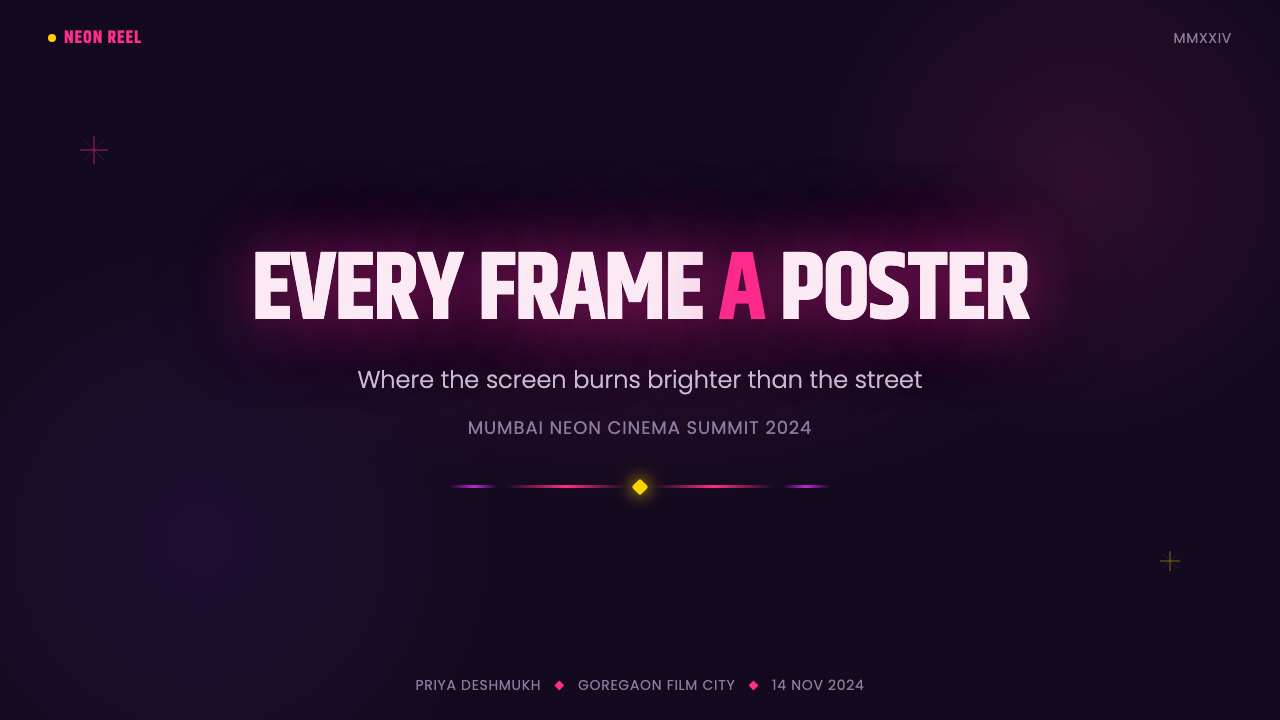
For presentation slides, the style is most effective on high-impact event-opening and section-divider slides where the goal is emotional temperature-setting rather than information transfer. A cover slide using Bollywood Neon Mumbai: deep black fill, a condensed display headline in neon pink with bloom halo, a subtitle in contrasting electric violet, and a diagonal light-streak element that draws the eye across the frame. Content slides are harder — the visual density that defines the style competes with bullet-point legibility. The solution is selective: use the neon palette for accents only, maintain black backgrounds and white body text, and reserve bloom effects for callout numbers or stat highlights rather than applying glow universally.
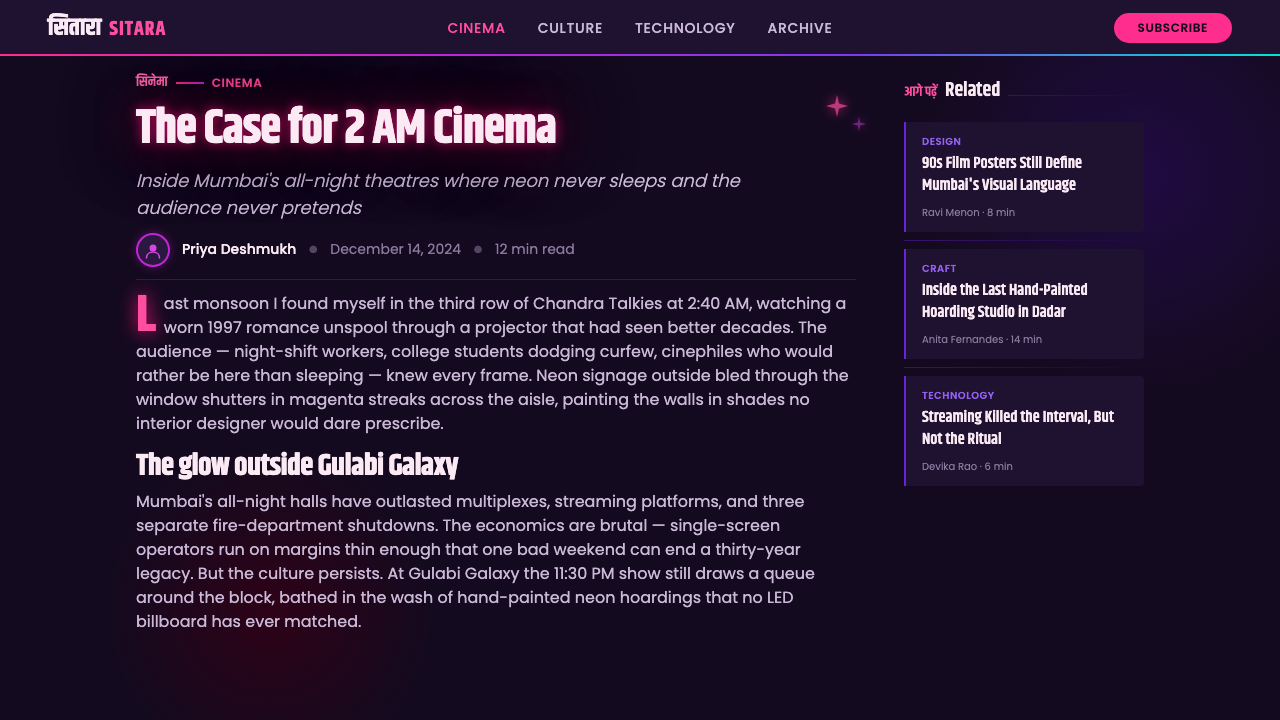
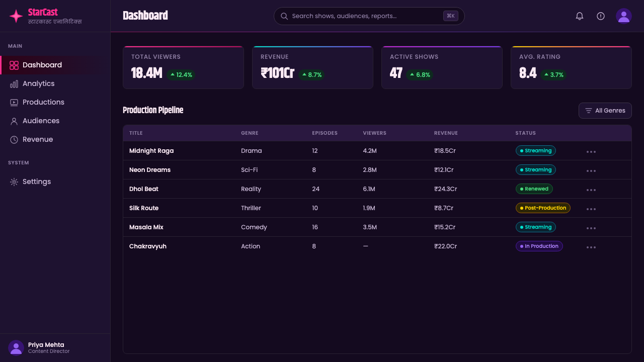
For web UI — landing pages, event sites, entertainment platforms, music streaming features, gaming interfaces — the style provides strong visual differentiation. Key implementation principle: use black backgrounds as primary with neon colors limited to interactive elements (hover states, active tabs, progress indicators), headings, and primary calls to action. Avoid applying glow effects to body text — legibility degrades rapidly. Hero sections and full-width feature blocks can carry the full visual weight of the style; content-dense pages should dial back the effects to reduce cognitive load. Button styles should be solid-fill in the neon palette, not outlined — the style does not suit ghost button conventions.
For editorial and marketing applications — event posters, music-release graphics, festival visuals, social media announcement cards — the style is at its most natural. The proportional relationships of a typical Bollywood hoarding translate directly to a portrait-format social media card or a horizontal event banner. Center the main visual element (a portrait, a product shot, a geometric light-burst), stack the title text above and the secondary information below, and set the entire type treatment in the neon palette against the black ground. Diagonal light streaks crossing the composition from lower-left to upper-right add kinetic energy.
The most common mistake when applying Bollywood Neon Mumbai is treating the glow effects as optional polish rather than as structural necessity. Without the bloom halos, the neon pinks and purples read as flat poster colors rather than as light sources. The glow is not decoration layered on top of the design — it is the visual mechanism by which deep-dark color reads as luminous rather than dark. A second common mistake is using the style's black background as an invitation to reduce contrast discipline: maintaining a strict hierarchy between the neon accent colors and pure white supporting text is essential. Allowing supporting text to drift toward warm gray or off-white undermines the maximum-contrast logic the entire system depends on.
Bollywood Neon Mumbai — FAQ
Is Bollywood Neon Mumbai the same as general neon or dark-mode aesthetics?
No. General neon aesthetics — as seen in retrofuturist synthwave design, cyberpunk graphics, or contemporary dark-mode UI — typically use the full neon spectrum (cyan, green, pink, purple, orange) and emphasize grid lines, chrome surfaces, or futuristic geometry. Bollywood Neon Mumbai is more restricted and more specific: its neon palette is concentrated in hot pink-magenta and electric purple-violet with minimal use of other neons, its compositional logic comes from poster advertising rather than science fiction, and its typographic conventions derive from Hindi film title sequences rather than from digital subculture aesthetics. The presence of Devanagari type, the portrait-centered compositional structure, and the specific quality of the glow effect (bloom halo rather than electric grid-line) distinguish it clearly from generalized neon style.
How does this style work for brands that are not in the entertainment industry?
The style is transferable but requires the product context to support it. It works for consumer brands targeting youth markets in categories with high emotional purchase stakes: streetwear, mobile gaming, music streaming platforms, energy drinks, festival experiences, sports team branding. It works less well — or requires significant softening — for brands where trust, restraint, and considered purchase behavior are primary values: financial services, healthcare, professional software, premium goods markets where understatement signals quality. The key question is whether the brand's values are amplified or contradicted by visual spectacle. Bollywood Neon Mumbai amplifies sensation, energy, and aspiration; it does not communicate precision, expertise, or care.
Can Bollywood Neon Mumbai be adapted for light backgrounds?
Technically yes, but the result will no longer read as Bollywood Neon Mumbai — it will read as a generic saturated-color style. The entire perceptual mechanism of the style depends on the relationship between deep darkness and apparent luminosity. On a white or light-gray background, neon pink and electric purple do not glow — they simply appear as saturated flat colors, indistinguishable in kind from any saturated poster style. If a light-background application is necessary, the honest design move is to use the style's typographic conventions (condensed stacking, multi-language hierarchy) and color palette reference while acknowledging that the defining quality — the sensation of light emission — cannot survive the background inversion.
How does the Devanagari script factor into the style?
Devanagari — the script used for Hindi and several other South Asian languages — is structurally quite different from Latin letterforms. Its continuous horizontal headline bar (the shirorekha) and the characteristic descending vertical strokes create a visual rhythm that is denser and more vertical than equivalent Latin type at the same point size. In Bollywood Neon Mumbai, the tension between Devanagari and Latin type is compositional: Devanagari headlines tend to be set wider with more horizontal presence, while Latin type can be compressed to taller and narrower proportions. Using both scripts simultaneously is not a challenge to be solved but a structural resource — the contrast in letter-density and visual texture between the two scripts generates internal compositional energy. Designers applying the style without actual Devanagari can reference this principle by using two contrasting type families or by introducing contrasting script systems relevant to their own audience.
Does the style have any relationship to traditional Indian visual culture?
The relationship is attenuated and largely structural rather than directly referential. Bollywood Neon Mumbai does not draw consciously on Mughal miniature painting, temple iconography, rangoli, or classical textile patterns. What it does share with some strands of traditional South Asian visual culture is an embrace of chromatic intensity and compositional density — an aesthetic preference for more rather than less, for surfaces read as abundant rather than spare. But the specific color language (neon magenta-purple against night-black), the typographic idiom (condensed Latin-Devanagari stacking), and the optical effects (digital glow and lens flare) are entirely products of the contemporary global media environment. Designers who read the style as a continuation of 'Indian maximalism' as a cultural constant are projecting historical continuity where the practitioners themselves see rupture and modernity.
Related design styles
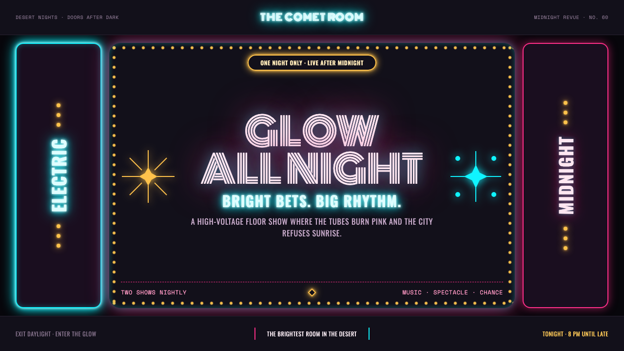 Las Vegas Neon (1960)Night refuses to dim. Hot-pink tubes, cyan bloom and amber bulbs turn black i…
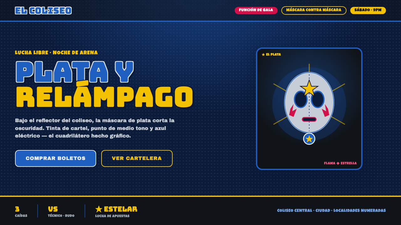 Mexican Lucha Mask GraphicComic-book lucha, lit from above. Silver-blue mask out of arena-night dark, h…
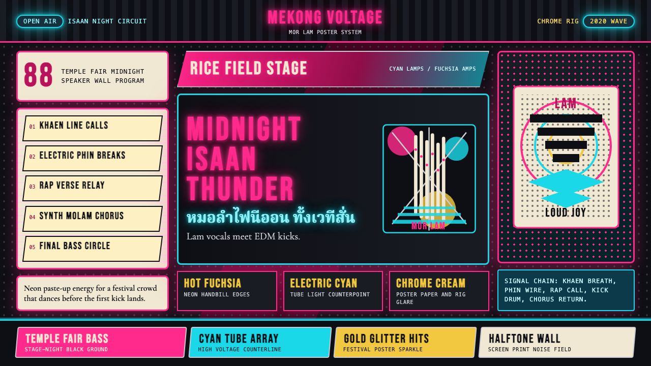 Thai Mor Lam Isaan (2020)Joy at maximum volume. Fuchsia-cyan neon, chrome type, and halftone grids hit…
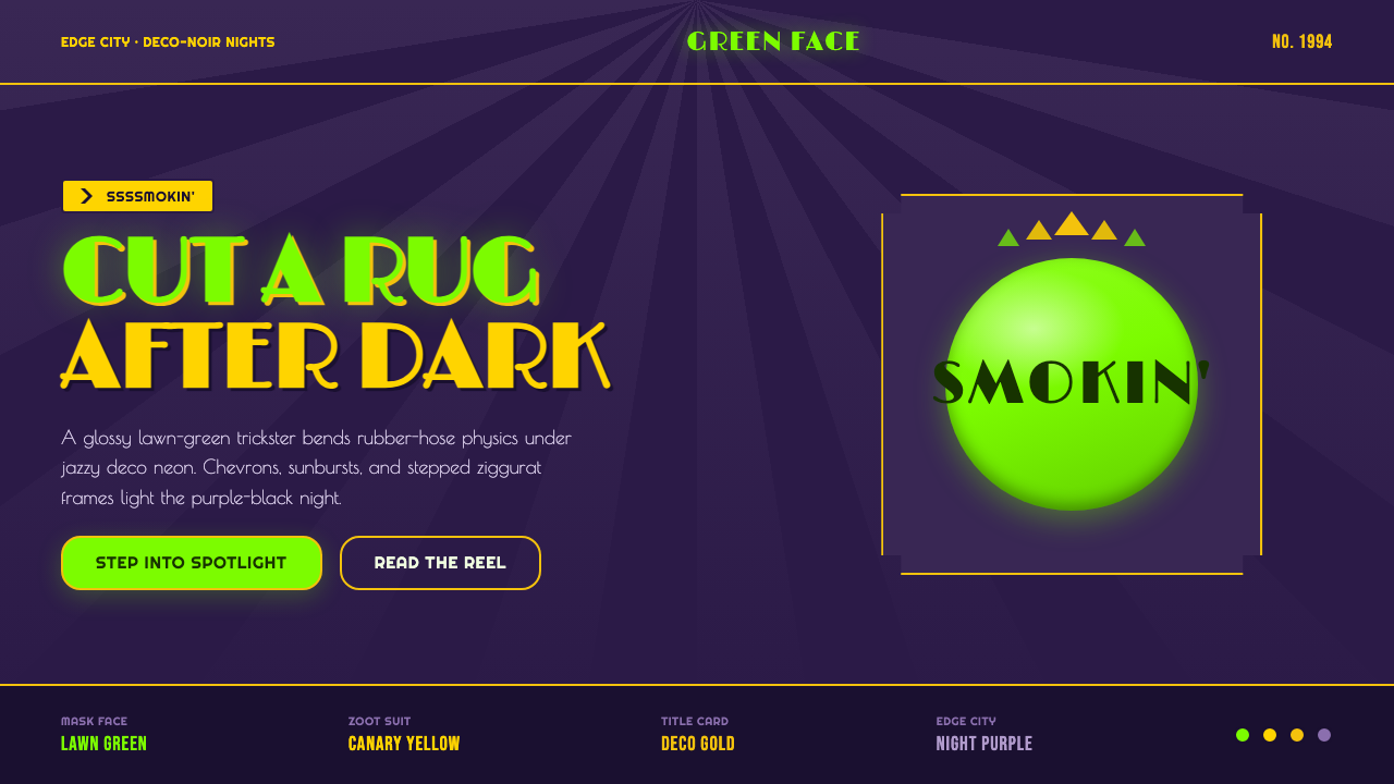 The Mask 1994 Green FaceLoud, theatrical, ssssmokin'. Lawn-green and canary-yellow scream against dec…
 80s Aerobics Fluoro SpandexNeon refuses restraint. Lime spandex, pink-cyan confetti, and black-stage typ…
 Bad Bunny YHLQMDLGMaximal night-pop collides. Bubblegum pink and acid lime stickers glow on mid…