What is BTS Army Purple 2020?什么是 BTS Army Purple 2020?
Sixty million fans turned a single phrase — 'I purple you' — into a complete visual language, and that language turned out to be a fully usable design system.六千万粉丝将一句「보라해」化为完整的视觉语言,而这套语言最终成为一个真正可用的设计系统。
BTS Army Purple 2020 in briefBTS Army Purple 2020 速览
BTS Army Purple 2020 is the visual system that crystallized around the global BTS fandom between 2018 and 2020. It draws from the specific aesthetic register that sixty million fans — the ARMY — collectively built through fan art, lyric cards, concert imagery, and social media. The anchor is Borahae purple: not a corporate color chosen by a branding agency, but the particular deep violet that V (Kim Taehyung) named in 2016 when he told fans 'I purple you,' explaining that purple is the last color of the rainbow and represents a promise to trust and love each other forever. That single utterance gave a color an emotional grammar and, by extension, gave an entire design system its soul.「BTS Army Purple 2020」是2018年至2020年间,围绕全球BTS粉丝圈(ARMY)凝练而成的视觉系统。它汲取六千万粉丝通过同人艺术、歌词卡、演唱会影像与社交媒体共同建构的特定美学语境。整套系统的核心是Borahae紫——并非由品牌公司选定的企业色,而是V(金泰亨)于2016年用「보라해」命名的那种深紫色。他向粉丝解释,紫色是彩虹的最后一种颜色,象征着彼此信任与永远相爱的承诺。这句话赋予了一种颜色情感语法,也赋予了整个设计系统灵魂。
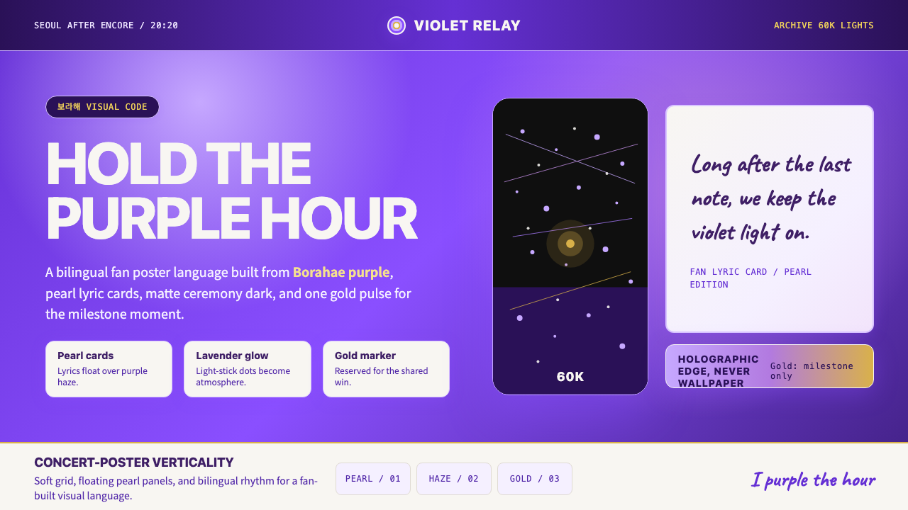
The system layers this signature purple with pearl-white surfaces recalling the handwritten lyric cards fans trade at concert venues, matte-black ceremonial grounds evoking the darkened stadium before the encore begins, and holographic lavender glows that mimic the Army Bomb — the synchronized light stick that turns sixty thousand concert-goers into a single constellation. One warm gold accent, reserved and precise, marks milestone moments: the achievement unlocked, the anniversary commemorated, the limited edition released. The result is a palette that can read as intimate and handmade at small scale and as vast and atmospheric at large scale.这套系统将标志性的深紫与多个层次叠合:珍珠白表面,令人联想到粉丝在演唱会现场交换的手写歌词卡;哑光黑仪式性底色,唤起安可前暗场时刻体育场的氛围;以及全息薰衣草光晕,模拟「ARMY Bomb」——那支能与六万名观众同步发光的应援棒,让人群变成一片紫色星海。一抹温暖的金色,克制而精准,专为里程碑时刻保留:解锁的成就、纪念的周年、限量的发售。这套色盘在小尺寸下可以读作亲密与手作,在大尺寸下可以读作壮阔与氛围感。
Typography in this system bridges Korean and Latin scripts with the fluency of a generation raised on bilingual pop culture. The default workhorse combines a contemporary Korean geometric sans-serif — the kind of clean, post-2020 industrial standard that Korean design studios adopted en masse — with a neutral Latin counterpart that holds up equally well in English and romanized Korean. A secondary handwritten script voice, loose and personal, carries the register of the fan-made lyric card: informal intimacy inside a formally organized system. Every spacing and sizing decision is built around the vertical poster composition that defines K-pop visual culture, with generous leading that lets Hangul breathe alongside Latin letterforms.这套系统的字体排印,以一个双语流行文化成长世代的流畅度,连接了韩语与拉丁文字。主力字体将当代韩国几何无衬线体——2020年后韩国设计工作室大规模采用的那种干净的行业标准——与一套中性拉丁字体搭配,后者在英文与罗马音韩语中表现同样出色。第二层手写体声音,松弛而个人化,承载粉丝手作歌词卡的情感温度:在形式化组织的系统内部保持非正式的亲密感。每一个间距与大小决定,都围绕着K-pop视觉文化标志性的竖版海报构图建构,宽松的行距让韩文字形与拉丁字母并存时各自呼吸。
See the BTS Army Purple 2020 design system查看 BTS Army Purple 2020 完整设计系统
Where does BTS Army Purple 2020 come from?BTS Army Purple 2020 从何而来?
BTS debuted on June 13, 2013, under Big Hit Entertainment (now HYBE), a relatively small Seoul agency at the time. The group — seven members from diverse Korean cities — launched into a domestic market dominated by established agencies, with none of the institutional support that typically guaranteed survival. What set their early trajectory apart was a decision to engage fans not as passive recipients of content but as active co-creators: BTS logged their practice sessions, shared their doubts and struggles, and addressed fans directly through platforms that allowed unmediated communication. The ARMY fandom name was established in July 2013, and within the first year the fan community had developed its own visual vocabulary for supporting the group.BTS于2013年6月13日在Big Hit娱乐(现HYBE)旗下出道,彼时这是一家规模相对较小的首尔经纪公司。七名来自韩国各地城市的成员,在既有大型公司主导的国内市场中起步,几乎没有通常意义上的机构资源支撑。使其早期轨迹与众不同的,是一个将粉丝视为主动共同创作者而非被动内容接受者的决定:BTS记录排练过程、分享疑虑与挣扎,并通过允许直接沟通的平台与粉丝交流。ARMY这一粉丝名称于2013年7月确立,在第一年内,粉丝社群便发展出了属于自己的视觉支持词汇。
The color purple entered the story on November 13, 2016, during the final night of the HYYH On Stage: Epilogue concert tour in Seoul. V — Kim Taehyung — held up a purple ARMY Bomb and told the audience that purple was the last color of the rainbow, representing a promise to trust each other 'for a long time.' The phrase '보라해' (Borahae) — a portmanteau of 'purple' (보라) and 'I love you' (사랑해) — spread immediately through the global ARMY network. Within hours, fan accounts across Twitter, Weibo, and Tumblr had begun building a vocabulary of purple-forward visual content: purple gradients in header images, purple lyric overlays, purple concert photography edits. The color did not originate from a design brief; it originated from an emotional moment that millions of people simultaneously decided to render visual.紫色进入这个故事,发生在2016年11月13日——HYYH On Stage: Epilogue巡回演唱会首尔站最后一夜。V(金泰亨)举起一支紫色ARMY Bomb,告诉现场观众紫色是彩虹的最后一种颜色,代表着「长久信任彼此」的承诺。「보라해」这个词——由「紫色」(보라)与「我爱你」(사랑해)组合而成——立即在全球ARMY网络中扩散。数小时内,推特、微博与Tumblr上的粉丝账号便开始构建以紫色为主的视觉内容词汇:主页横幅的紫色渐变、歌词图的紫色叠层、演唱会照片的紫色后期处理。这种颜色并非源自设计简报,而是源自一个情感时刻——数百万人同时决定将这个时刻视觉化。
The ARMY Bomb — the official light stick, which debuted in its first version in 2016 and reached its third generation in 2019 — became the physical anchoring object for the color system. Unlike many K-pop light sticks, the ARMY Bomb can be synchronized via Bluetooth to arena-controlled lighting sequences, meaning entire stadiums could simultaneously shift from white to purple to lavender. Concert documentation photography from the 2017 Wings Tour and the 2018—2019 Love Yourself world tour generated millions of images featuring this synchronized purple light at stadium scale, and those images became primary reference material for the fan design community. The aesthetic of Borahae was not a flat digital color but a glowing, atmospheric, slightly hazy light phenomenon — which is why holographic gradients, soft bloom effects, and light-leak textures became the characteristic expressive vocabulary of ARMY fan design.ARMY Bomb——官方应援棒,2016年推出第一代,2019年迭代至第三代——成为这套色彩系统的实体锚定物。与许多K-pop应援棒不同,ARMY Bomb可以通过蓝牙与场馆灯光系统同步,这意味着整个体育场可以同步从白色切换至紫色再至薰衣草色。2017年Wings Tour和2018至2019年Love Yourself世界巡演的演唱会纪实摄影,产生了数百万张捕捉这种体育场规模紫色同步光效的图像,这些图像成为粉丝设计社群的主要参考素材。Borahae的美学并非一种平面数字色彩,而是一种发光的、充满氛围感的、带有朦胧感的光效现象——这正是为何全息渐变、柔光散景与漏光纹理,成为ARMY粉丝设计的标志性表达词汇。
Visual codification accelerated substantially between 2018 and 2020. The 2018 Love Yourself: Answer album era and the associated Speak Yourself stadium tour introduced more polished, high-budget official visuals — pearl and cream textures, gold foil accents on physical album packaging, matte black ceremonial aesthetics — that the ARMY absorbed and reinterpreted. By 2020, when pandemic conditions moved fan expression almost entirely online, the community had produced enough shared visual language that individual fan artists across dozens of countries were producing work that was identifiably part of a single coherent aesthetic system. The Curio design system crystallizes this community-built vocabulary into a structured, deployable set of design decisions.视觉规范化在2018年至2020年间显著加速。2018年「Love Yourself: Answer」专辑时代及配套的Speak Yourself体育场巡演,引入了更精致、高预算的官方视觉——实体专辑包装上的珍珠与奶油纹理、金箔点缀、哑光黑仪式美学——这些元素被ARMY吸收并再诠释。到2020年,当疫情将粉丝表达几乎全部转移至线上时,社群已积累了足够丰富的共享视觉语言,以至于数十个国家的个人粉丝艺术家,所创作的作品都能被辨认为属于同一套连贯美学系统。Curio设计系统将这套由社群构建的词汇,凝练为一套结构化、可部署的设计决策。
What defines the BTS Army Purple 2020 look?BTS Army Purple 2020 的视觉特征是什么?
Borahae Purple DominanceBorahae紫的主导性
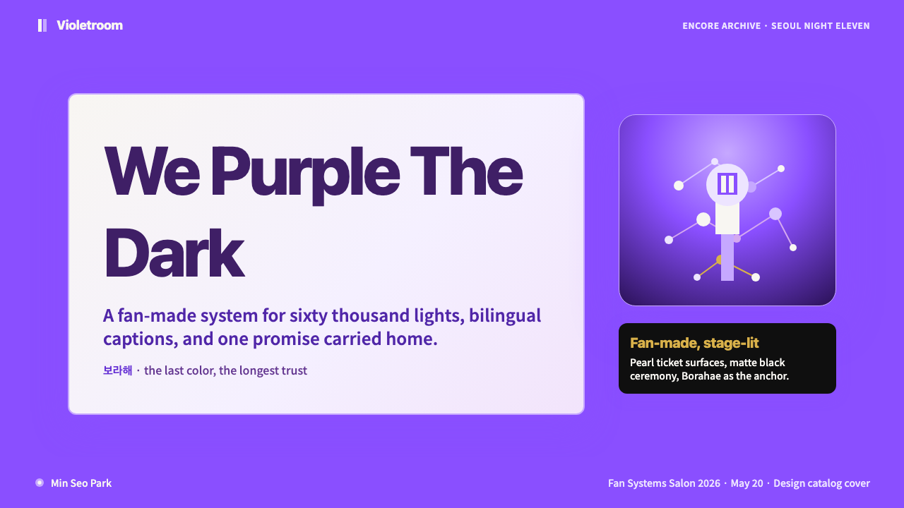
The palette centers on a deep, saturated violet — luminous but not neon, rich but not muddy — that carries the emotional weight of the Borahae narrative. It occupies large surface areas: full-bleed backgrounds, wide header bands, dominant illustration fills. Secondary tones shift toward lavender and soft violet for glow and ambient light effects, creating a sense of depth within the purple family rather than introducing contrasting hues. The overall impression is immersive and atmospheric, like being inside a lit arena.色盘以一种深沉、饱和的紫罗兰为核心——明亮但不荧光,浓郁但不浑浊——承载着Borahae叙事的情感分量。它占据大面积表面:全出血背景、宽幅标题色带、主要插图填充。次级色调向薰衣草与柔和紫渐变,用于光晕与环境光效果,在紫色家族内部创造深度感,而非引入对比色系。整体观感沉浸而充满氛围,犹如置身点亮的演唱会场馆内部。
Pearl-White Lyric Card Surface珍珠白歌词卡质感
A soft, slightly warm off-white — evoking pearl and parchment rather than clinical white — serves as the primary neutral ground. This tone references the physical lyric cards (fan-made and official) that are central to ARMY culture, where printed Hangul and English lyrics on slightly textured card stock became a tactile form of affection. In digital application, this surface reads as gentle and handmade, softening the drama of the purple and preventing the overall palette from tipping into severity.一种柔和、略带暖意的米白——令人联想到珍珠与羊皮纸而非临床白色——作为主要中性底色。这种色调源自歌词卡(粉丝制作与官方发行两类),歌词卡是ARMY文化的核心:印有韩文与英文歌词的略带质感卡纸,是一种触觉性的情感表达。在数字应用中,这种表面读作温柔与手作感,柔化了紫色的戏剧性,防止整体色盘滑向严峻。
Holographic Glow and Light Bloom全息光晕与光晕散景
Unlike design systems that reject soft gradients, BTS Army Purple actively deploys them — but in a specific register: holographic, light-emanating, atmospheric rather than decorative. Glow effects radiate outward from focal points like a light stick in darkness. Gradients shift from deep violet through lavender to near-white, simulating the actual optical quality of synchronized concert lighting. This makes soft transitions and bloom textures structural elements of the system rather than violations of it.与拒绝柔和渐变的设计系统不同,BTS Army Purple积极运用渐变——但在特定语境下:全息的、散发光感的、氛围性的而非装饰性的。光晕效果从焦点向外辐射,如黑暗中的应援棒发光。渐变从深紫过渡至薰衣草再至近白,模拟演唱会同步灯光的实际光学质感。这使柔和过渡与光晕纹理成为系统的结构性元素,而非对系统的违背。
Matte Black Ceremonial Ground哑光黑仪式性底色
Matte black functions as the high-stakes surface — the awards ceremony, the world tour announcement, the milestone achievement. It evokes the darkened stadium in the moments before the light show begins: charged anticipation, collective held breath. Against black grounds, the Borahae purple reads as luminous and the pearl-white as radiant; gold accents achieve maximum impact. This pairing of deep black and Borahae purple is the system's most formal register, reserved for content that carries real ceremonial weight.哑光黑作为高规格场合的底面——颁奖典礼、世界巡演宣布、里程碑成就。它唤起演唱会灯光秀开始前暗场时刻的体育场:充满张力的期待、集体屏息。在黑色底面上,Borahae紫读作发光体,珍珠白读作辉光,金色点缀达到最大冲击力。这种深黑与Borahae紫的配对,是系统最正式的语境,专为承载真正仪式分量的内容保留。
Gold Milestone Accent金色里程碑强调
A single warm gold functions as the system's scarcity signal: it appears for achievements, anniversaries, chart records, and limited-edition releases — never for routine content. Its restraint is its power. Used sparingly, gold reads as genuinely significant; used liberally, it collapses into background noise. In the BTS visual world, gold carries the specific weight of recognition — a chart milestone, a certification, a sold-out run — and the design system preserves that specificity by treating gold as a resource to be spent, not scattered.单一暖金色作为系统的稀缺性信号:出现于成就、周年、榜单纪录与限量发售——从不用于日常内容。克制是它的力量所在。用得少,金色读作真正的重要;用得多,则沦为背景噪音。在BTS视觉世界中,金色承载着认可的特定分量——榜单里程碑、认证记录、场次售罄——设计系统通过将金色视为有限资源而非随意撒布来保持这种特异性。
Vertical Poster Composition竖版海报构图
The native compositional orientation of this system is vertical: tall portrait formats that read naturally on mobile screens and as physical wall posters. Content is arranged in a layered, center-weighted manner — unlike the asymmetric tension of Bauhaus or Swiss Grid — with the central image, text, or light source pulling the eye inward and downward. This composition mirrors the visual grammar of K-pop album art and the concert poster tradition, where the human figure (often flooded with light from above) anchors a surrounding atmospheric field.这套系统的原生构图方向是竖版:高窄的肖像格式,在移动屏幕上与实体海报上都能自然阅读。内容以分层、居中加权的方式排布——与包豪斯或瑞士网格的非对称张力不同——中心图像、文字或光源将视线向内向下引导。这种构图呼应K-pop专辑封面与演唱会海报的视觉语法传统:人物(通常被从上方倾泻的光线淹没)锚定着周围的氛围场域。
Bilingual Korean-English Typography韩英双语字体排印
The system is inherently bilingual, with Korean (Hangul) and English treated as co-equal typographic voices rather than one primary and one subordinate. Contemporary Korean geometric sans-serif forms — the design-industry standard that emerged as Korea's visual identity modernized in the post-2010 era — carry body text and headlines in both scripts. A handwritten accent layer introduces personal intimacy: the fan who copies lyrics by hand, the message written on a fan letter, the caption that breaks out of the formal grid. Type sizing is generous, with expressive scale contrast between headline and body that references concert screen and poster traditions.这套系统本质上是双语的,韩文(韩字)与英文被视为对等的排印声音,而非一主一辅的关系。当代韩国几何无衬线字形——韩国视觉身份在2010年代后现代化进程中形成的设计行业标准——承载两种文字的正文与标题排版。手写体的强调层引入个人亲密感:手抄歌词的粉丝,粉丝信件上的笔迹,从正式网格中逸出的图注。字体尺寸慷慨,标题与正文之间富有表现力的尺度对比,呼应演唱会屏幕与海报传统。
See the BTS Army Purple 2020 design system查看 BTS Army Purple 2020 完整设计系统
Who shaped BTS Army Purple 2020?谁塑造了 BTS Army Purple 2020?
V coined the Borahae phrase on November 13, 2016, during the final Seoul night of the HYYH On Stage: Epilogue tour, holding up a purple Army Bomb and explaining that purple — the last color of the rainbow — symbolized a promise to trust and love fans 'for a long time.' The phrase became immediately and globally viral. By giving a color an emotional origin story specific enough to be remembered and retold, V created the founding myth of a design system. Every purple surface in this aesthetic traces its emotional authority to that single stadium moment.V于2016年11月13日,在HYYH On Stage: Epilogue巡演首尔最后一夜,举起一支紫色ARMY Bomb,解释紫色——彩虹的最后一种颜色——象征着「长久信任并爱着」粉丝的承诺,由此创造了「보라해」这个词。这句话随即在全球病毒式传播。通过赋予一种颜色足够具体、可被记忆与转述的情感起源故事,V创造了一个设计系统的建构神话。这套美学中的每一个紫色表面,其情感权威都可追溯至那一个体育场时刻。
As BTS's leader and primary voice in English-language interviews and social media, RM has been the most consistent articulator of the group's relationship with visual culture, art, and fandom. His own interests — contemporary art, museum visits documented on social media, thoughtful engagement with design and space — shaped the intellectual register that distinguishes ARMY fan culture from casual fandom. The bilingual, artistically literate sensibility of the design system reflects, in part, the standard RM modeled for how to engage seriously with aesthetics.作为BTS的队长与英语访谈及社交媒体上的主要发言人,RM是对该组合与视觉文化、艺术及粉丝关系表述最为一贯的成员。他本人的兴趣——当代艺术、记录于社交媒体的博物馆参观、对设计与空间的深思熟虑——塑造了将ARMY粉丝文化与普通粉丝圈区分开来的知识分子气质。这套设计系统的双语、具艺术素养的感性,部分反映了RM为如何认真对待美学所树立的标准。
The HYBE (formerly Big Hit Entertainment) design team produced the official album packaging, concert visual systems, merchandise, and promotional materials that provided the professional design scaffolding the ARMY aesthetic was built around. The pearl-and-cream textures of the Love Yourself album era packaging, the matte-black ceremonial surfaces of award show visuals, and the gold foil certification aesthetics of milestone releases all originated from official HYBE production. Fan designers absorbed, reinterpreted, and democratized these high-production-value references into a community-accessible visual language.HYBE(前Big Hit娱乐)内部设计团队制作了官方专辑包装、演唱会视觉系统、周边商品与宣传物料,为ARMY美学提供了专业设计脚手架。「Love Yourself」专辑时代包装上的珍珠奶油纹理、颁奖典礼视觉的哑光黑仪式美学、里程碑发行的金箔认证美学,均源自HYBE官方制作。粉丝设计师吸收、再诠释并民主化了这些高制作价值参考,将其转化为社群可获取的视觉语言。
The dispersed global network of ARMY fan artists — active primarily on Twitter, Weibo, Instagram, and Tumblr from 2016 onward — collectively produced the visual grammar that distinguishes this design system from any top-down corporate aesthetic. Working individually but cross-pollinating constantly, fan artists from South Korea, the United States, Brazil, the Philippines, Indonesia, and dozens of other countries developed shared conventions around purple glow effects, lyric card formats, vertical concert edits, and gold accent usage. No single figure created this vocabulary; it emerged from millions of acts of creative response to shared emotional experience.从2016年起,主要活跃于推特、微博、Instagram与Tumblr的分散全球ARMY粉丝艺术家网络,共同生产了使这套设计系统有别于任何自上而下企业美学的视觉语法。来自韩国、美国、巴西、菲律宾、印度尼西亚及数十个其他国家的粉丝艺术家,各自独立创作但持续相互交融,围绕紫色光晕效果、歌词卡格式、竖版演唱会剪辑与金色强调用法,发展出共同的约定。没有任何单一人物创造了这套词汇;它从数百万个对共同情感体验的创意回应中涌现。
The ARMY Bomb — the official BTS light stick, which reached its Bluetooth-synchronized third generation in 2019 — is the physical object that transformed Borahae from a spoken phrase into a mass visual experience. At synchronized concerts, sixty thousand light sticks could shift from white to deep purple to lavender on command, creating a stadium-scale color performance that generated the millions of documentary photographs that became the primary visual reference for the ARMY aesthetic. The light stick's glow quality — soft, atmospheric, surrounded by slight haze — established the holographic bloom as the system's characteristic expressive texture.ARMY Bomb——BTS官方应援棒,于2019年推出蓝牙同步的第三代——是将Borahae从口语词汇转化为大规模视觉体验的实体物件。在同步演唱会上,六万支应援棒可以按指令从白色切换至深紫色再至薰衣草色,创造出体育场规模的色彩表演,生成了数百万张纪实照片,成为ARMY美学的主要视觉参考。应援棒的光效质感——柔和、充满氛围、略带朦胧——确立了全息光晕散景作为这套系统标志性表达纹理的地位。
How do you use BTS Army Purple 2020 today?今天怎么用 BTS Army Purple 2020?
BTS Army Purple is a system built for emotional resonance at scale — its deepest competency is making digital surfaces feel like they belong to a lived experience rather than a product specification. Applying it correctly requires working with the atmospheric logic of the palette rather than against it: this is a system that earns its soft gradients and glow effects because they reference something real (stadium lighting, handmade objects, synchronized community acts) rather than using them as default polish.BTS Army Purple是一套为大规模情感共鸣而构建的系统——其最深的能力在于让数字表面感觉像是属于某种真实体验,而非产品规格。正确应用它,需要顺应色盘的氛围逻辑而非抗拒它:这套系统之所以能赢得柔和渐变与光晕效果的使用权,是因为它们指向真实存在的事物(演唱会灯光、手作物品、同步的集体行为),而非将其作为默认的视觉抛光。
For presentation slides, the system delivers maximum impact on cover pages and milestone announcement slides. A cover built in this language layers the deep Borahae purple as the full-bleed background, places the title in large, clean sans-serif type in pearl-white, and adds a radiant glow or bloom effect emanating from behind the title block — evoking a light source in darkness. Section opener slides work well with a vertical center-weighted composition and a restrained gold accent for the section number or label. Data and content slides should calm down considerably: use the pearl-white surface as the primary ground, reserve purple for accent bars in charts and active state indicators, and let generous white space carry the structural clarity. The risk in data slides is over-applying the atmospheric textures — glow effects on every chart bar will read as decorative noise rather than emotional signal.在演示文稿中,这套系统在封面页与里程碑宣布幻灯片上发挥最大冲击力。用这套语言构建的封面,以深Borahae紫作为全出血背景,在珍珠白色的大块干净无衬线字体中放置标题,并在标题块后方添加向外辐射的光晕或散景效果——唤起黑暗中的光源感。章节开场幻灯片适合竖版居中加权构图,以克制的金色用于章节编号或标签。数据与内容幻灯片应当大幅平静下来:以珍珠白表面为主要底色,将紫色保留用于图表的强调柱条与活跃状态指示符,以充足的留白承载结构清晰度。数据幻灯片的风险在于过度应用氛围纹理——每个图表柱条上都加光晕效果,读作装饰噪音而非情感信号。
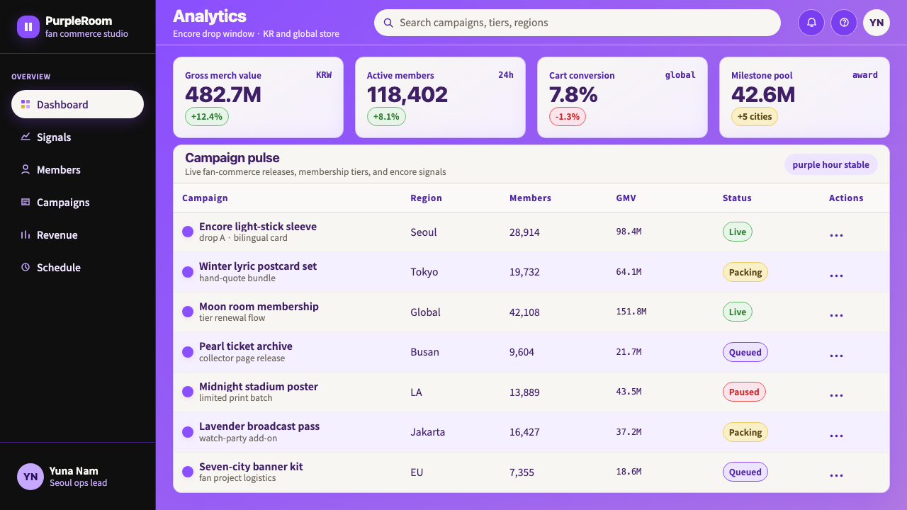
For web interfaces — particularly dashboards, fan community platforms, K-pop themed services, and music streaming contexts — the system provides a strong visual identity that distinguishes the product immediately. Dashboard layouts work well with a deep purple left navigation rail against a near-white or pearl content area, with gold used exclusively for achievement badges, streak indicators, or premium tier markers. Pricing pages benefit from the matte-black ceremonial register for premium tiers and the pearl surface for standard tiers, with Borahae purple reserved for the recommended or most-popular plan border and call-to-action button. Interactive states (hover, focus, active) should use the lavender-to-purple gradient to create a sense of light response rather than a simple flat color flip.对于网页界面——特别是仪表板、粉丝社群平台、K-pop主题服务与音乐流媒体场景——这套系统提供了能立即区分产品的强烈视觉身份。仪表板版面适合以深紫色左侧导航栏配合近白或珍珠色内容区域,金色专门用于成就徽章、连续打卡指示符或高级会员标记。定价页面中,哑光黑仪式语境适用于高级层级,珍珠表面适用于标准层级,Borahae紫专门用于推荐或最受欢迎方案的边框与行动召唤按钮。交互状态(悬停、聚焦、激活)应使用薰衣草至紫色渐变,创造光线响应感而非简单的颜色翻转。
For editorial and marketing work, the system's poster sensibility translates directly into hero imagery, announcement graphics, and social media assets. Full-bleed vertical compositions with a central light source (a glow, a beam, a star) work for announcements and events. Lyric-card aesthetics — white or pearl surfaces with large expressive type in Hangul or English, generous leading, and a single purple or gold accent element — work for quote graphics, testimonial callouts, and feature highlights in editorial layouts. Marketing emails in this system should use the pearl surface as the primary canvas, Borahae purple for the header block and primary call-to-action, and gold only for a single high-priority element per email (a launch date, a limited-availability notice, a milestone figure).对于编辑与营销内容,这套系统的海报感性直接转化为主视觉图像、宣布公告图形与社交媒体素材。以中心光源(光晕、光束、星点)为核心的全出血竖版构图,适用于宣布与活动场合。歌词卡美学——白色或珍珠底面上的韩文或英文大字,宽松行距,单一紫色或金色强调元素——适用于引用图形、见证语引用框,以及编辑版面中的功能亮点。这套系统的营销邮件应以珍珠表面为主要画布,以Borahae紫用于标题块与主要行动召唤,金色仅用于每封邮件中单一高优先级元素(发售日期、限量库存提示、里程碑数字)。
The most common mistake when applying this system is conflating atmospheric with decorative. Glow effects, gradients, and light blooms in ARMY Purple are atmospheric because they reference the specific optical experience of a concert light stick in a dark arena — they carry meaning. The same effects applied indiscriminately to every element in a layout stop being atmospheric and become visual clutter. Discipline is: ask what each soft transition is referencing. If the answer is nothing, replace it with a flat surface. A second common error is using all four colors — deep purple, pearl, matte black, and gold — simultaneously at full saturation on the same screen. Authentic applications of this palette commit one surface to dominance per context: this is a purple moment, or a black-and-gold moment, or a pearl moment — not all four at once.应用这套系统最常见的错误,是将氛围性与装饰性混为一谈。ARMY Purple中的光晕效果、渐变与光晕散景之所以是氛围性的,是因为它们指向演唱会应援棒在黑暗场馆中的具体光学体验——它们承载意义。相同效果无差别地应用于版面中的每一个元素,便不再是氛围性的,而成为视觉杂乱。准则是:问清楚每一个柔和过渡在指向什么。如果答案是什么都没有,则用平面表面替换它。第二个常见错误,是在同一屏幕上同时以满饱和度使用全部四种颜色——深紫、珍珠、哑光黑与金色。这套色盘的真实应用,是每个场景让一种表面占主导:这是一个紫色时刻,或是一个黑金时刻,或是一个珍珠时刻——而不是四者同时。
See the BTS Army Purple 2020 design system查看 BTS Army Purple 2020 完整设计系统
BTS Army Purple 2020 — FAQBTS Army Purple 2020 · 常见问题
Is BTS Army Purple appropriate for projects with no connection to K-pop or fan culture?BTS Army Purple适合用在与K-pop或粉丝文化毫无关联的项目上吗?
Yes, with clear eyes about what you are borrowing. The system's emotional register — intimate at small scale, atmospheric and immersive at large scale, with a ceremonial high mode and a warm everyday mode — is genuinely useful for a wide range of contexts: music and entertainment platforms, community-driven products, wellness and mindfulness applications, creative agency portfolios, event promotion, and premium consumer goods where aspiration and warmth need to coexist. The primary risk is applying the palette without understanding the light-and-atmosphere logic that gives it coherence. Used purely as a 'purple and gold' color scheme without the atmospheric depth, it reads as generic luxury rather than as the specific emotionally resonant system it actually is.可以,但需要清楚地意识到自己在借用什么。这套系统的情感语境——小尺寸下的亲密感、大尺寸下的氛围沉浸感,以及仪式感高模式与温暖日常模式——对广泛的场景真实有用:音乐与娱乐平台、社群驱动产品、健康与正念应用、创意机构作品集、活动推广,以及需要愿景感与温度感共存的高端消费品。主要风险在于应用色盘时未理解赋予其连贯性的光效与氛围逻辑。若纯粹作为「紫色与金色」配色方案使用而不具备氛围深度,则会读作通用奢华感,而非其实际所是的那套具体、具情感共鸣的系统。
How does this system handle light mode versus dark mode?这套系统如何处理浅色模式与深色模式的切换?
The system has two native modes rather than a simple light-dark inversion. The everyday mode uses the pearl-white surface as the primary ground — this is warm, accessible, and readable for long-form content. The ceremonial mode uses matte black as the primary ground — this is high-contrast, dramatic, and appropriate for milestone content, product launches, and high-stakes moments. In web interface terms, a typical application might default to the pearl mode for standard navigation and content, then switch to the matte-black ceremonial mode for modal announcements, achievement celebrations, or premium gate moments. The Borahae purple works in both modes but behaves differently: against pearl it reads as accent and emphasis; against black it reads as the primary light source.这套系统有两种原生模式,而非简单的浅色-深色反转。日常模式以珍珠白表面为主要底色——温暖、易读、适合长篇内容。仪式模式以哑光黑为主要底色——高对比、戏剧性,适合里程碑内容、产品发布与高规格时刻。在网页界面层面,典型应用可能默认采用珍珠模式用于标准导航与内容,然后在模态宣布、成就庆祝或高级权限门控时刻切换至哑光黑仪式模式。Borahae紫在两种模式下都有效,但表现不同:在珍珠底面上读作强调色;在黑色底面上读作主要光源。
Can this system work for printed materials, or is it primarily digital?这套系统适用于印刷品吗,还是主要面向数字场景?
The system has strong print roots — the lyric card, the album liner note, the concert program, and the promotional poster are all physical print objects that shaped the aesthetic's development. For print applications, the key adjustments are: the holographic glow effects that work in screen-backlit contexts need to be handled as soft gradients or foil treatments in print; the matte-black ceremonial surface works beautifully in print and benefits from actual matte coating or soft-touch lamination; pearl-white surfaces translate well as uncoated or lightly textured stock; and gold, which is a screen-simulated warm accent digitally, reaches its natural home in print as foil stamping or metallic ink. Editorial spreads, event programs, album-style booklets, and luxury packaging are all strong use cases for this system in print.这套系统有深厚的印刷根基——歌词卡、专辑内页、演唱会节目册与宣传海报,都是塑造这套美学的实体印刷物件。对于印刷应用,关键调整如下:在屏幕背光场景下有效的全息光晕效果,在印刷中需要作为柔和渐变或镭射处理来呈现;哑光黑仪式表面在印刷中效果极佳,实际哑光涂层或磨砂覆膜能使其更为出色;珍珠白表面能以非涂布或轻纹理纸张良好转化;而数字环境中作为屏幕模拟暖色调强调的金色,在印刷中以烫金或金属油墨的形式到达其天然归宿。编辑版面、活动节目册、专辑风格小册子与奢华包装,都是这套系统在印刷领域的强适用场景。
How is this different from generic 'purple and gold' luxury aesthetics?这套系统与通用的「紫色与金色」奢华美学有什么区别?
The difference is specificity of origin and atmospheric logic. Generic purple-and-gold luxury (think traditional royalty palettes, certain wine and spirits brands, legacy jewelry advertising) uses purple as a signifier of rarity and gold as a signifier of value — they are symbolic stand-ins. Borahae purple has a specific emotional etymology: it was named in a stadium by a person, at a specific moment, with a specific meaning, and sixty million people internalized that meaning simultaneously. The design system's atmospheric elements — the glow, the lavender haze, the synchronized light quality — reference that specific origin. A system built correctly in this aesthetic feels like fandom and community and collective experience; a generic purple-and-gold layout feels like a product claiming to be premium. The distinction shows up most clearly in the glow textures: if they look like light sticks in a darkened arena, you are in the right register. If they look like a jewelry brand's website background, something has gone wrong.区别在于起源的特异性与氛围逻辑。通用的紫色与金色奢华美学(想想传统皇室色调、某些葡萄酒品牌、传统珠宝广告)将紫色用作稀缺性符号、将金色用作价值符号——它们是象征性的替代物。Borahae紫有具体的情感词源:它由一个人在一座体育场里、在一个特定时刻、以一个特定含义命名,而六千万人同时将那个含义内化于心。设计系统的氛围元素——光晕、薰衣草雾气、同步光效质感——指向那个具体的起源。以这套美学正确构建的系统,感觉像是粉丝情感、社群归属与集体体验;通用的紫金版面感觉像是一个声称自己高端的产品。这一区别在光晕纹理上最为清晰:如果它们看起来像黑暗场馆中的应援棒,你就在正确的语境里。如果它们看起来像某个珠宝品牌的网站背景,那么某个地方出了问题。
Is the handwritten typography layer optional, or essential to the system?手写字体层是可选的,还是系统的核心元素?
Optional but meaningful. The handwritten layer references the fan-made lyric card — a physical object central to ARMY culture — and introduces a register of personal intimacy that the clean geometric sans-serif cannot achieve. In contexts where warmth and personal connection are important (community platforms, social content, fan-facing communications), including the handwritten accent enriches the system considerably. In contexts where authority and formality are primary (financial dashboards, data-heavy reports, B2B interfaces), the handwritten layer can be omitted entirely without breaking the system's coherence — the Borahae purple, pearl surface, and atmospheric glow logic carry the identity on their own. Think of the handwritten voice as the system's warmth dial: present when you need intimacy, absent when you need authority.可选,但有意义。手写体层指向粉丝制作的歌词卡——一件在ARMY文化中举足轻重的实体物件——引入了干净几何无衬线体无法实现的个人亲密感语境。在温度感与个人连接至关重要的场景中(社群平台、社交内容、面向粉丝的沟通),加入手写体强调层能显著丰富系统。在权威感与正式感为主的场景中(金融仪表板、数据密集报告、B2B界面),手写体层可以完全省略而不破坏系统的连贯性——Borahae紫、珍珠表面与氛围光晕逻辑足以独立承载视觉身份。将手写体声音视为系统的温度旋钮:需要亲密感时打开,需要权威感时关闭。
Related design styles相关设计风格
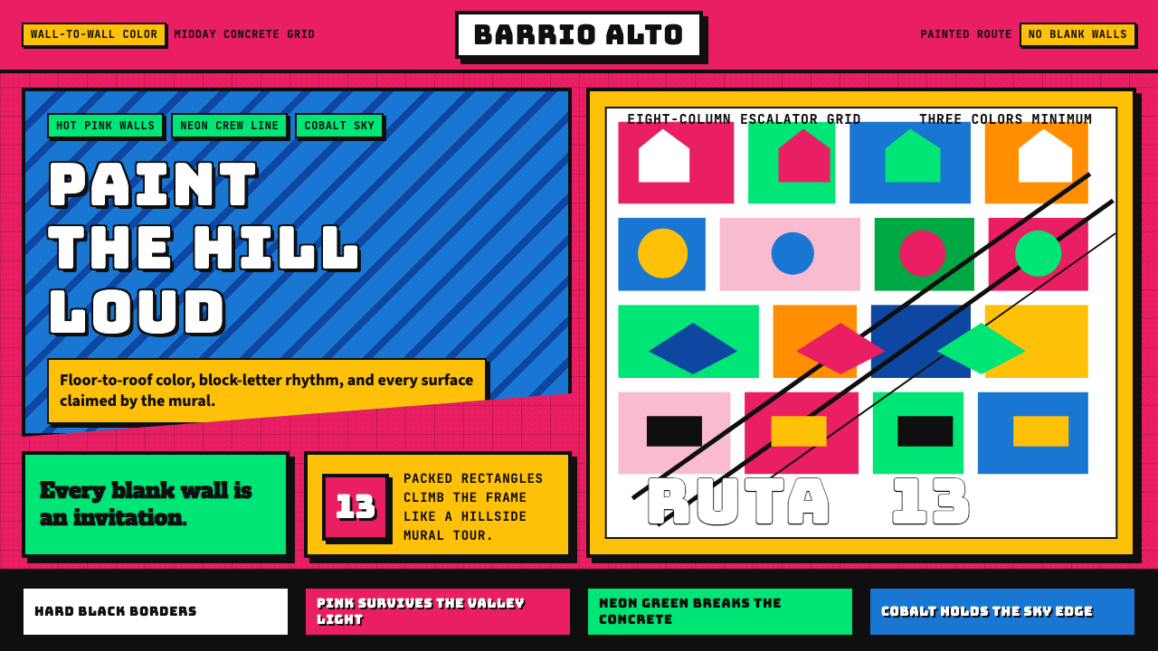 Medellín Comuna 13 MuralsRefuses blank walls. Hot pink, neon green, and cobalt blocks pack the grid li…拒绝空白墙:玫红、霓虹绿与钴蓝块面挤满网格。
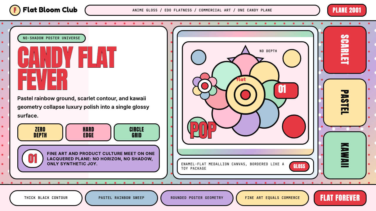 Takashi Murakami SuperflatJoy has no depth. Pastel rainbow, scarlet accents, and black contours flatten…快乐没有纵深:粉彩彩虹、猩红点缀与黑色粗描边压平成花。
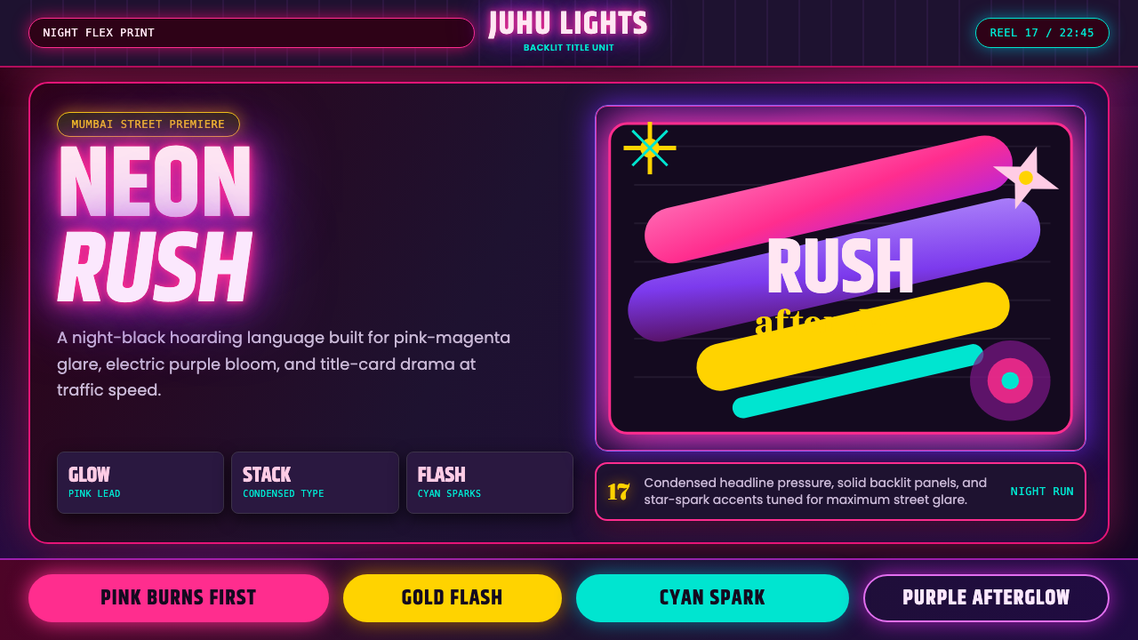 Bollywood Neon MumbaiMumbai pop burns bright. Khand stacks glow over night-black, with pink-purple…孟买流行灼亮:Khand 堆叠夜黑底,粉紫霓虹与星芒爆闪。
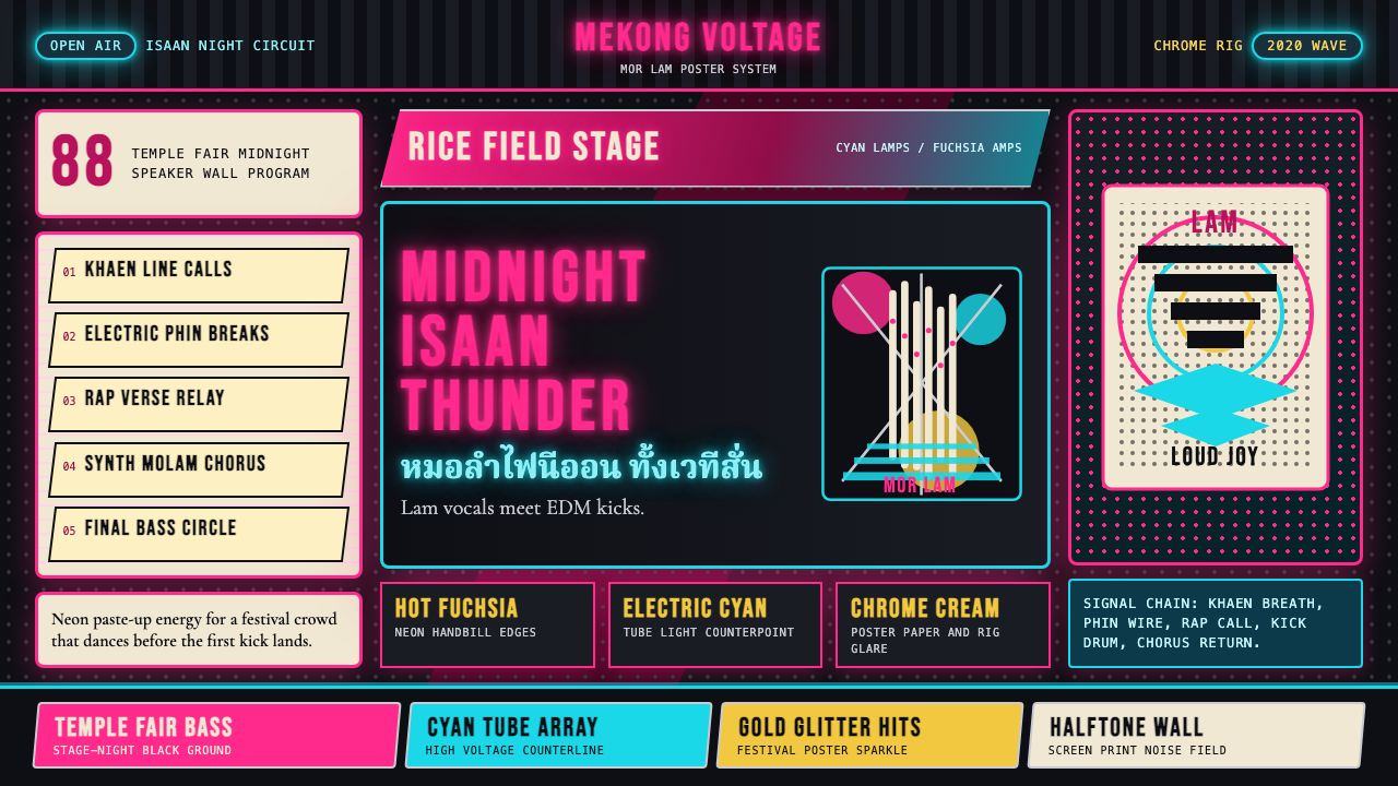 Thai Mor Lam Isaan (2020)Joy at maximum volume. Fuchsia-cyan neon, chrome type, and halftone grids hit…最大音量的欢愉:黑底上洋红青霓虹、铬字与网点格爆发。
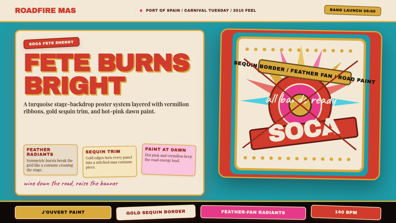 Trinidad Carnival Soca (2010)Joy overload. Turquoise field, vermilion banners, gold sequins, feather-fan g…快乐过载:绿松石底、朱红横幅、金色亮片与羽扇几何。
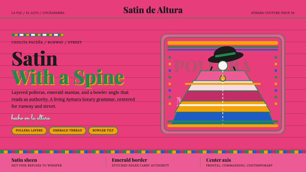 Bolivian Cholita FashionUnapologetic satin power. Hot pink fields, emerald stitches, centered pollera…拒绝低语的缎面力量。亮粉底、翡翠绣线与居中波列拉轴线。