What is Medellín Comuna 13 Murals?什么是 Medellín Comuna 13 Murals?
The murals of Medellín's Comuna 13 turned a hillside scarred by violence into Latin America's most powerful proof that color, community, and art can rebuild a city.麦德林第13区的壁画,将一片被暴力蹂躏的山坡变成了拉丁美洲最有力的证明——色彩、社区与艺术可以重建一座城市。
Medellín Comuna 13 Murals in briefMedellín Comuna 13 Murals 速览
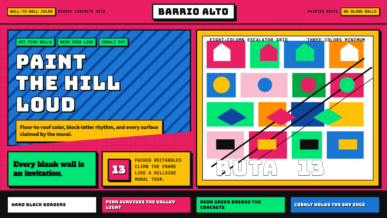
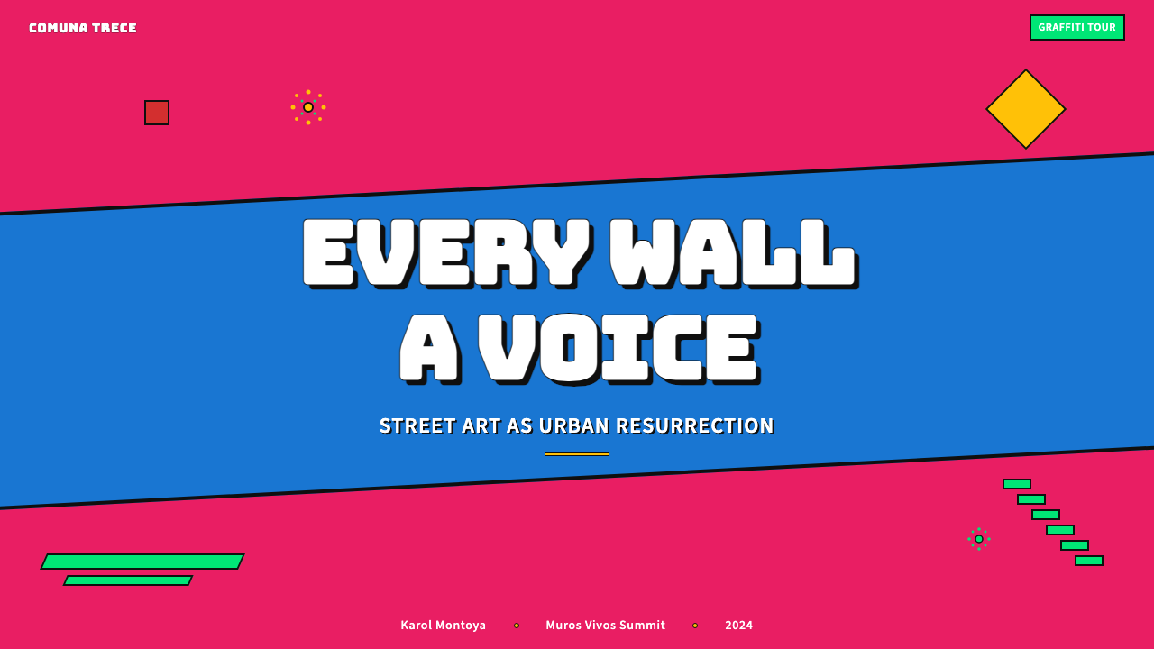
The Medellín Comuna 13 mural style is an outdoor urban art movement rooted in the San Javier neighborhood of Medellín, Colombia. It fuses hip-hop visual culture, Andean folk imagery, and community testimony into compositions of extraordinary chromatic intensity. Walls, stairways, rooftops, and escalator columns are treated as continuous canvases, filled floor-to-roofline with saturated hot pinks, neon greens, and cobalt blues that hold their luminosity under the sharp midday light of the Colombian highlands.麦德林第13区壁画风格是一种植根于哥伦比亚麦德林圣哈维尔社区的户外城市艺术运动。它将嘻哈视觉文化、安第斯民俗图像与社区历史见证融合为色彩强度非凡的构图。墙面、阶梯、屋顶和扶梯廊柱均被当作连续画布,从地面到屋顶铺满饱和的玫红、霓虹绿与钴蓝,在哥伦比亚高原强烈的正午光线下保持着耀眼的明度。
The aesthetic is deliberate and maximalist. There is no blank wall, no unpainted corner — every surface participates. Figures are bold and legible at architectural scale: faces drawn with fluid outlines, wings and feathers that explode across multiple stories, text and lettering integrated into composition as pictorial elements rather than caption. Graffiti letterforms coexist with painterly muralism; abstract geometric sections neighbor photorealistic portraiture. What unifies the style is not a single technique but a shared commitment to saturation, density, and communal voice.这种美学是刻意为之的极繁主义。没有空白墙,没有未着色的角落——每一个表面都参与其中。形象在建筑尺度上大胆而清晰可读:用流动轮廓线勾勒的面孔、跨越数层楼面爆发的羽翼、与构图融为一体的文字与字母体。涂鸦字形与绘画性壁画共存,抽象几何区块与写实肖像毗邻。统一这种风格的不是单一技法,而是对饱和度、密度与集体声音的共同承诺。
As a transferable visual language, the style is defined by its unapologetic loudness and its insistence on treating color as presence rather than decoration. It is not subtle. It communicates pride, survival, and creative reclamation at maximum volume — a quality that makes it equally potent when applied to digital contexts where visual energy must compete for attention.作为一种可移植的视觉语言,这种风格以其毫不掩饰的张扬、以及坚持将色彩视为存在而非装饰的态度为核心特征。它不追求微妙。它以最大音量传达自豪、生存与创造性重建——这种特质使它在数字化语境中同样有力,那些场合里视觉能量必须在竞争中争夺注意力。
See the Medellín Comuna 13 Murals design system查看 Medellín Comuna 13 Murals 完整设计系统
Where does Medellín Comuna 13 Murals come from?Medellín Comuna 13 Murals 从何而来?
The transformation of Comuna 13 is inseparable from Medellín's broader effort to reinvent itself after decades of catastrophic violence. Throughout the 1980s and 1990s, the neighborhood was one of the most dangerous in a city already considered among the most dangerous on earth. It was a battleground for rival armed groups — paramilitaries, guerrillas, and gangs — and residents endured military operations, forced disappearances, and sustained poverty. The 2002 military operation known as Operación Orión, in which Colombian armed forces and paramilitaries conducted a large-scale sweep of the neighborhood, left deep trauma that residents and artists would spend the following decade processing through paint.第13区的转型与麦德林在数十年灾难性暴力之后重塑自身的更广泛努力密不可分。整个1980至1990年代,这个社区是这座城市中最危险的地区之一,而当时这座城市本身已被认为是地球上最危险的城市之一。这里是武装各方——准军事组织、游击队和帮派——的角斗场,居民饱受军事清剿、强迫失踪和持续贫困之苦。2002年被称为「猎鹰行动」(Operación Orión)的军事清剿,造成深重的创伤,居民与艺术家将在此后十年用油漆加以消化和处理。
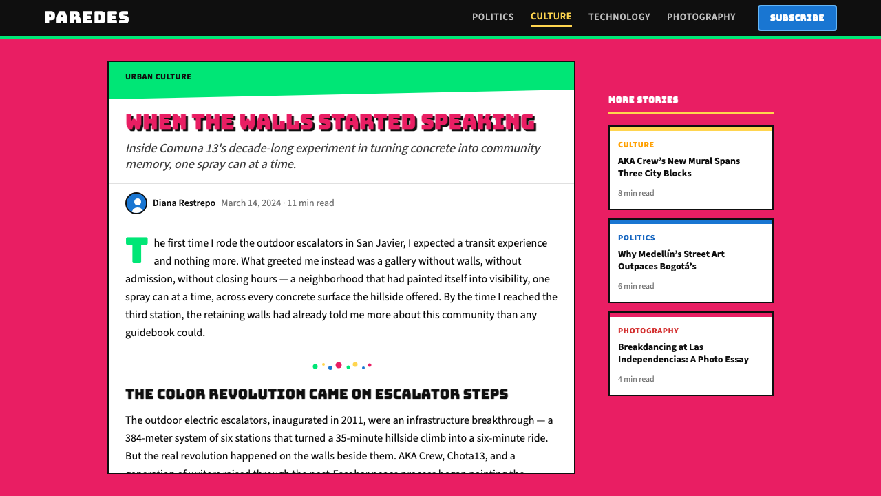
The physical catalyst for the mural movement was the 2011 inauguration of outdoor electric escalators connecting the steep hillside communities of San Javier to the city below. The escalators — a project of Medellín's social urbanism program under Mayor Alonso Salcedo and continued by Aníbal Gaviria — reduced what had been a forty-five-minute climb to a six-minute ride and brought urban infrastructure into areas that had long felt abandoned by the state. With the escalators came tourism and international attention, and with attention came resources that local artists and collectives could channel into large-scale murals. The walls of the escalator corridors became the first major canvases.推动壁画运动的物质催化剂,是2011年连接圣哈维尔山坡社区与市区的户外电动扶梯正式投用。这些扶梯——是市长阿隆索·萨尔塞多主政期间麦德林社会城市主义计划的产物,由阿尼瓦尔·加维里亚接续推进——将原本耗时四十五分钟的攀登压缩为六分钟的乘行,将城市基础设施延伸至长期被国家遗忘的地区。随扶梯而来的是旅游业与国际关注,随关注而来的是资源,当地艺术家与集体得以将这些资源引入大规模壁画创作。扶梯走廊的墙面成为最初的主要画布。
The artistic communities that shaped the style had been organizing for years before the escalators arrived. Casa Kolacho — founded by Jeihhco and other hip-hop artists from the neighborhood — established a cultural center that used rap, breakdancing, and graffiti as tools for youth engagement and conflict prevention as early as the mid-2000s. The collective AKA, led by Yader 'Perrograff' Vargas, and Chota13 developed graffiti vocabularies rooted in the neighborhood's own visual memory: faces of residents, local landmarks, Andean animals, and scenes of daily life rendered at a scale that reclaimed the built environment. Cripta-13 added darker, more symbolic imagery that processed the neighborhood's violent history directly.塑造这种风格的艺术社群早在扶梯落成之前已经组织多年。Casa Kolacho——由杰伊科(Jeihhco)及其他社区嘻哈艺术家创立——早在2000年代中期便建立了文化中心,以说唱、霹雳舞和涂鸦作为青少年参与和冲突预防的工具。AKA涂鸦团队由亚德尔·「佩罗格拉夫」·巴尔加斯(Yader 'Perrograff' Vargas)领导,与Chota13集体共同发展出植根于社区视觉记忆的涂鸦词汇:居民面孔、当地地标、安第斯动物,以及以重新占领建成环境的尺度呈现的日常生活场景。Cripta-13则加入了更为黑暗、更具象征性的图像,直接处理社区的暴力历史。
By 2013 and 2014, the graffitour — a self-guided walking tour of the murals — had become a fixture of Medellín's international tourism offer, attracting visitors from across Latin America, Europe, and North America. This visibility accelerated the style's development: more resources meant larger walls, more complex compositions, and collaboration with international muralists who brought additional technical vocabularies. By the peak tourism years of 2015 to 2024, the aesthetic had consolidated into a recognizable system — a maximalist chromatic language understood as distinctly Colombian and distinctly of this community, even as it circulated globally through social media, design publications, and travel photography.至2013至2014年间,涂鸦游览——一条自导式壁画徒步路线——已成为麦德林国际旅游项目的固定亮点,吸引来自拉丁美洲、欧洲和北美的访客。这种能见度加速了风格的发展:更多资源意味着更大的墙面、更复杂的构图,以及与带来额外技术词汇的国际壁画家的合作。到2015至2024年的旅游高峰期,这种美学已巩固为一套可辨识的体系——一种极繁主义的色彩语言,被理解为鲜明的哥伦比亚风格、鲜明的社区风格,即便它已通过社交媒体、设计出版物和旅行摄影在全球流通。
What defines the Medellín Comuna 13 Murals look?Medellín Comuna 13 Murals 的视觉特征是什么?
Saturated, High-Contrast Color饱和、高对比色彩
The palette centers on a triad of hot pink, neon green, and cobalt blue — all pushed to maximum saturation and deployed without dilution. These are not pastel approximations or muted descendants; they are the pure, unmodified versions of those hues, the kind that appear to emit light rather than reflect it under direct sun. Supporting colors — vivid orange, sun yellow, and deep violet — amplify the intensity rather than moderating it. Black outlines and white highlights carve figures from the chromatic field, ensuring legibility at distance without reducing saturation.色板以玫红、霓虹绿和钴蓝三色为核心——全部推至最大饱和度,毫不稀释地铺展。这些不是柔和的近似色或暗淡的衍生色;它们是那些色相最纯粹、最未经修改的版本,在直射阳光下看起来像是在发光而非反光。鲜橙、日黄和深紫作为辅助色,进一步放大强度而非加以调节。黑色轮廓线和白色高光从色彩场中切割出形象,确保在远处的可读性,同时不削减饱和度。
Maximalist Surface Coverage极繁主义的全面覆盖
The defining compositional principle is total occupation: no surface is left bare, no zone treated as neutral. Walls from sidewalk to roofline, staircases from tread to riser, utility boxes, escalator columns, and even water tanks are incorporated into the painted environment. This all-over approach creates a visual experience closer to walking inside an illustration than to viewing a discrete artwork. Negative space — in the sense of intentional emptiness — is functionally absent; every gap is filled with pattern, text, or a secondary figure.决定性的构图原则是全面占领:没有任何表面被留白,没有任何区域被视为中性。从人行道到屋顶的整面墙壁、从踏板到踢脚的楼梯、配电箱、扶梯廊柱乃至水箱,都被纳入着色的环境。这种全覆盖的做法所创造的视觉体验,更接近于走进一幅插图内部,而非观看一件独立的艺术品。留白——意义上的刻意空白——在功能上是缺失的;每一个空隙都被图案、文字或次要形象所填满。
Fluid Figure Drawing at Architectural Scale建筑尺度上的流动人物造型
Human and animal figures dominate the iconography, rendered in a style that merges graffiti line-work with mural painting traditions. Faces are drawn with fluid, confident strokes — thick outlines that define features without requiring shading to read. Bodies and creatures expand across multiple building stories: wings span entire facades, hands reach around corners, and eyes at second-floor height gaze down at the street. The scale is not incidental; it is the statement. The community's figures are made monumental, countering decades of invisibility and marginalization.人物与动物形象主导图像内容,以融合涂鸦线条与壁画绘画传统的风格呈现。面孔以流动、自信的笔触绘就——粗重的轮廓线在无需明暗处理的情况下清晰勾勒出五官。身体和动物跨越数层建筑展开:翅膀横跨整面外墙,双手绕过墙角,二楼高度的眼睛俯视着街道。这种尺度不是附带的;它就是声明本身。社区的形象被赋予了纪念碑般的壮阔,抵消了数十年的隐形与边缘化。
Text as Pictorial Element文字作为图像元素
Lettering — graffiti-derived, hand-painted, and often three-dimensional in conception — functions as a visual form rather than purely linguistic content. Words and phrases curve, stack, and interlock with figurative elements; letters are built from the same saturated palette as the surrounding imagery and rendered at comparable scale. The text is simultaneously readable and decorative, carrying messages of community pride and peace while also functioning as abstract shape. This integration of script into composition is a direct inheritance from hip-hop graffiti culture, where the letter itself is the primary artistic object.字体书写——来源于涂鸦、手工绘制、在构思上往往具有三维感——作为视觉形式而非纯粹语言内容运作。词语和短语弯曲、堆叠,与具象元素相互锁扣;字母以与周边图像相同的饱和色板构建,并以相当的尺度呈现。文字既清晰可读又具装饰性,在传达社区自豪与和平信息的同时也作为抽象形状运作。这种文字与构图的融合是嘻哈涂鸦文化的直接传承——在那种文化中,字母本身就是首要的艺术对象。
Andean Symbolism and Local Iconography安第斯象征与本地图像志
Beneath the hip-hop visual vocabulary runs a current of Colombian and broader Andean iconography: tropical birds with brilliantly colored plumage, indigenous geometric patterns used as background fill, mountains rendered as stylized silhouettes, and the flora of the Colombian highlands appearing in decorative borders and secondary fields. This local symbolism grounds the work in place — marking it as unmistakably of Medellín and of the Andes — and functions as cultural assertion alongside the political messages carried by the figurative content.在嘻哈视觉词汇之下,流淌着哥伦比亚及更广泛安第斯文化的图像志暗流:羽毛色彩绚丽的热带鸟类、用作背景填充的原住民几何图案、以风格化剪影呈现的山脉、哥伦比亚高原植物出现在装饰性边框和次要画面中。这种本地象征将作品锚定于具体地方——将其标记为无疑属于麦德林、属于安第斯——并与具象内容所承载的政治信息并列,发挥着文化宣示的功能。
Layered Temporal Accumulation分层的时间积累
Unlike gallery muralism, which typically presents a single unified composition, the walls of Comuna 13 show visible evidence of chronological layering: older works painted over, new imagery applied atop weathered surfaces, and different artists' contributions abutting or overlapping at boundaries. This accumulation is not disorder — it reads as living archive, a visual record of the community's ongoing negotiation with its own image. The style therefore incorporates impermanence and change as formal elements, treating the wall as a document in process rather than a finished statement.与通常呈现单一统一构图的画廊壁画不同,第13区的墙面显示出明显的时间分层痕迹:旧作品被覆盖,新图像被叠加于风化表面之上,不同艺术家的贡献在边界处相邻或重叠。这种积累不是混乱——它读起来像一个活的档案,社区与自身形象持续协商的视觉记录。这种风格因此将无常性与变化纳入形式元素,将墙壁视为进行中的文件而非完成的声明。
Luminosity Under Direct Light直射光下的发光感
A crucial and often underappreciated aspect of the style is its calibration to the specific quality of Andean equatorial light — intense, near-vertical at midday, and highly saturating. Colors that would appear garish or overwhelming in northern European or temperate-zone light read as vibrant and balanced under this illumination. When the style is applied in digital contexts, maintaining this sense of inherent luminosity requires choosing tones that appear activated rather than flat, and avoiding colors that will appear muddy or heavy on screen — a consideration that guides the style's digital palette toward the warm and brilliant rather than the cool and restrained.这种风格的一个关键而常被低估的方面,是它对安第斯赤道光线特定品质的校准——强烈、正午时近乎垂直、饱和度极高。在北欧或温带地区光线下看起来俗艳或压迫性的色彩,在这种光照下读来充满活力而平衡。当这种风格应用于数字语境时,维持这种内在的发光感,需要选择看起来被激活而非平淡的色调,并避免在屏幕上显得浑浊或沉重的颜色——这一考量引导风格的数字色板偏向温暖而明亮,而非冷峻而克制。
See the Medellín Comuna 13 Murals design system查看 Medellín Comuna 13 Murals 完整设计系统
Who shaped Medellín Comuna 13 Murals?谁塑造了 Medellín Comuna 13 Murals?
Jeihhco is a rapper, educator, and community organizer who co-founded Casa Kolacho, the cultural organization that became the institutional engine of the graffitour and the mural movement more broadly. Casa Kolacho established hip-hop as a framework for youth engagement and conflict transformation in the neighborhood during the years when armed violence was at its most intense, and later channeled the neighborhood's growing visibility into structured programs connecting young artists with international opportunities. The organization's work exemplifies how the mural style is inseparable from its social function.杰伊科(Jeihhco)是说唱歌手、教育工作者和社区组织者,他联合创立了Casa Kolacho文化组织——该组织成为涂鸦游览乃至更广泛壁画运动的制度性引擎。Casa Kolacho在武装暴力最为惨烈的岁月里,将嘻哈确立为社区青少年参与和冲突转化的框架,后来又将社区日益增长的能见度引导进将年轻艺术家与国际机会相连接的结构化项目中。该组织的工作典型地展示了壁画风格与其社会功能的不可分割性。
Yader 'Perrograff' Vargas is the central figure of the AKA graffiti crew, one of the longest-active artistic groups in the neighborhood. AKA's style set much of the technical template for the district's visual identity: the use of fluid, large-scale figures drawn with thick outlines against saturated fields, the integration of neighborhood-specific imagery into compositions scaled to entire building facades, and the commitment to working in public space rather than controlled gallery environments. Perrograff's practice established graffiti not as transgression but as legitimate community infrastructure.亚德尔·「佩罗格拉夫」·巴尔加斯是AKA涂鸦团队的核心人物,这是该社区活跃时间最长的艺术团体之一。AKA的风格为该地区视觉身份确立了大部分技术模板:在饱和色彩底面上用粗重轮廓线绘制流动的大尺度形象、将特定社区图像整合进缩放至整面外墙的构图、以及坚持在公共空间而非受控画廊环境中创作的承诺。佩罗格拉夫的实践将涂鸦确立为不是越轨行为,而是合法的社区基础设施。
Chota13 is a collective whose work has been central to developing the distinctly communal and testimonial dimension of the mural style. Where some crews prioritized formal innovation, Chota13 focused on documenting and honoring the neighborhood's residents — painting portraits of elderly women, children, and local figures whose faces became part of the landscape walked past daily. This practice of using the mural as a form of community portraiture, at a scale that matches the buildings rather than the page, is among the style's most distinctive contributions to urban art more broadly.Chota13集体的工作对于发展壁画风格中鲜明的集体性与见证性维度至关重要。与某些团队优先考虑形式创新不同,Chota13专注于记录和致敬社区居民——绘制老年妇女、儿童和当地人物的肖像,这些面孔成为每日路过的景观的一部分。这种将壁画用作社区肖像形式的实践——以匹配建筑而非书页的尺度——是这种风格对更广泛城市艺术最具特色的贡献之一。
Cripta-13 brought a darker and more overtly symbolic register to the neighborhood's visual vocabulary. Working with imagery that engaged directly with themes of death, memory, and the armed conflict that defined the neighborhood's recent history, Cripta-13's murals function as public memorials and political statements as much as aesthetic objects. This confrontational dimension — the willingness to address trauma rather than aestheticize over it — adds moral seriousness to the style and distinguishes the movement from decorative street art projects that use similar visual vocabulary for purely commercial or touristic ends.Cripta-13为社区视觉词汇带来了更为黑暗、更具象征性的基调。Cripta-13的壁画直接涉及死亡、记忆和定义社区近代历史的武装冲突主题,与其说是美学对象,不如说是公共纪念碑和政治声明。这种对抗性维度——直面创伤而非在其上覆以美化——为这种风格增添了道义上的严肃性,并将这场运动与那些将类似视觉词汇用于纯粹商业或旅游目的的装饰性街头艺术项目区分开来。
How do you use Medellín Comuna 13 Murals today?今天怎么用 Medellín Comuna 13 Murals?
The visual language of Medellín's Comuna 13 murals is among the most energetically expressive available to a contemporary designer, but its power is proportional to its discipline. The style works because it is rooted in genuine community purpose, and applying it effectively requires understanding that its loudness is intentional testimony, not noise. The designer's task is to channel that energy toward a specific communicative goal rather than simply deploying saturation as spectacle.麦德林第13区壁画的视觉语言是当代设计师所能使用的表达能量最强的风格之一,但它的力量与其纪律性成正比。这种风格之所以有效,是因为它植根于真实的社区目的;有效应用它需要理解:它的张扬是刻意的见证,而非噪音。设计师的任务是将这种能量引向特定的传达目标,而非仅仅将饱和度作为奇观来部署。
For presentation slides, the style is strongest on covers and high-impact section dividers. A cover built in this idiom should fill the entire frame with a large, fluid central figure or landscape rendered in the style's characteristic triad of vivid hues, with the title set in bold, generous type that reads as part of the composition rather than a label placed on top. Content slides require more restraint: use one saturated accent color to mark section identity or highlight key data points, while keeping text backgrounds light enough for comfortable reading. Data visualizations in this style work best when charts are treated as graphic objects — with bars and segments carrying the palette's boldest colors rather than defaulting to corporate blues and grays.对于演示文稿,这种风格在封面和高冲击力的章节分隔页上最为强劲。以这种语汇构建的封面应当用风格典型的三种鲜艳色相渲染的大型流动中心形象或景观填满整个画幅,标题以粗重、慷慨的字体排布,读起来像是构图的一部分,而非贴在上面的标签。内容页需要更多克制:用一种饱和强调色标记章节身份或突出关键数据点,同时保持文字背景足够浅淡以便舒适阅读。这种风格的数据可视化在图表被当作图形对象处理时最为出色——柱条与扇区承载色板最大胆的颜色,而非默认的企业蓝和灰色。
For web interfaces, the style is most persuasive in contexts that need to project creative confidence, cultural vibrancy, or social mission. Community platforms, cultural organizations, music and arts ventures, and impact-driven brands are natural fits. Applied to a dashboard, the approach borrows the style's compositional density selectively: a hero banner or top-of-page element can carry full-saturation color and bold illustrative motifs, while the functional interface below operates with a lighter hand — accent colors drawn from the mural palette used for interactive states, notifications, and calls to action, set against a light or neutral ground. Pricing pages benefit from the style's directness: large, bold tier names, vivid color coding per tier, and confident type that makes each option feel like a statement rather than a commodity.对于网页界面,这种风格在需要展示创意自信、文化活力或社会使命的语境中最具说服力。社区平台、文化机构、音乐与艺术项目以及使命驱动型品牌是天然契合的场景。应用于仪表板时,这种方式有选择地借用风格的构图密度:英雄横幅或页面顶部元素可以承载全饱和色彩和粗犷的插图母题,而下方的功能性界面则以更轻的手法运作——从壁画色板中提取的强调色用于交互状态、通知和行动号召,置于浅色或中性底面上。定价页面受益于这种风格的直接性:大型粗重的套餐名称、每个套餐的鲜明色彩编码,以及让每个选项感觉像声明而非商品的自信字体。
For editorial and marketing work, the style's poster-like boldness translates into layouts that compete well for attention in crowded visual environments. A feature article in this idiom uses oversized type for pull quotes — filling a column margin or even bleeding across the gutter — with saturated color fields as section backgrounds alternating with white. Marketing materials take maximum advantage of the style's visual energy: hero images that use the full color range at full saturation, headlines rendered in type treated as a graphic element rather than plain text, and a composition that rewards a fraction-of-a-second glance as well as sustained reading. Social cards and digital advertising are particularly well-served by this style's ability to stop the scroll.对于编辑和营销内容,这种风格的海报式大胆感转化为在拥挤视觉环境中竞争注意力表现出色的版面。这种语汇的特写文章使用超大字号的引用文字——填满一整列边距甚至跨越装订线出血——以饱和色彩区块作为章节背景,与白色交替。营销材料最大程度地利用这种风格的视觉能量:以全色彩范围全饱和度呈现的主视觉图像、以图形元素而非普通文本方式处理的大标题,以及在零点几秒的扫视和持续阅读中都值得的构图。社交卡片和数字广告尤其受益于这种风格截停滚动的能力。
A common mistake when applying this aesthetic is mistaking maximalism for chaos. The murals of Comuna 13 are dense but not random: every compositional decision — which figure occupies the center, which color anchors a section, how text relates to image — is deliberate. In digital application, the equivalent discipline means choosing a limited set of three to four colors from the palette and using them consistently across the design system, rather than introducing new saturated colors wherever a decision feels difficult. Similarly, the style's bold figure-drawing tradition should not be replaced by generic stock illustration in similar colors — the distinctiveness depends on the confidence and specificity of the drawn line, not merely on the palette.应用这种美学时最常见的错误是将极繁主义误认为混乱。第13区的壁画密集但不随机:每一个构图决定——哪个形象占据中心、哪种颜色锚定一个区域、文字与图像的关系——都是刻意为之的。在数字应用中,等效的纪律意味着从色板中选择三到四种颜色的有限集合,并在整个设计体系中一致使用,而非在决策感到困难时随意引入新的饱和色。同样,这种风格大胆的人物绘制传统不应被类似颜色的通用图库插图所取代——其独特性依赖于绘制线条的自信和具体性,而非仅仅依赖色板。
See the Medellín Comuna 13 Murals design system查看 Medellín Comuna 13 Murals 完整设计系统
Medellín Comuna 13 Murals — FAQMedellín Comuna 13 Murals · 常见问题
Is this style appropriate for brands not connected to Colombian or Latin American culture?这种风格适合与哥伦比亚或拉丁美洲文化无关的品牌使用吗?
Yes, with awareness. The visual language of the murals has circulated globally and functions effectively in contexts unrelated to its geographic origin — just as jazz-derived rhythms, Japanese minimalism, or Scandinavian design are used worldwide without claims of cultural ownership. What matters is that the application respects the style's communicative seriousness: this is a visual system born from testimony, community survival, and creative reclamation. Using it with superficiality — applying the saturated palette as decoration without engaging its compositional logic or its register of bold assertion — produces work that reads as pastiche. Used with discipline and intent, the style's energy is genuinely transferable.可以,但需要有所意识。壁画的视觉语言已在全球流通,在与其地理起源无关的语境中同样有效运作——正如爵士乐衍生的节奏、日本极简主义或斯堪的纳维亚设计在全球范围内被使用,而不涉及文化所有权的主张。重要的是,应用需尊重这种风格的传达严肃性:这是一套诞生于见证、社区生存与创造性重建的视觉体系。肤浅地使用它——将饱和色板作为装饰性工具而不涉及其构图逻辑或大胆宣示的基调——产生的作品读起来像是仿制品。以纪律和意图使用时,这种风格的能量是真正可移植的。
How does this style differ from generic 'street art' or 'graffiti' aesthetics?这种风格与通用的「街头艺术」或「涂鸦」美学有何不同?
The differences are specific. Generic street art aesthetics draw from a wide international pool of styles and often prioritize individual artistic signature over compositional system. The Comuna 13 style is distinguished by its particular chromatic intensity — the specific triad of hot pink, neon green, and cobalt — its Andean and Colombian iconographic content, its architectural scale and total surface coverage, and its grounding in hip-hop visual culture rather than European graffiti or American West Coast traditions. It is also historically specific: the style is inseparable from the social transformation of a particular neighborhood in a particular decade. Applying it correctly means engaging these specifics rather than using a generic 'urban' or 'street' language that could come from anywhere.差异是具体的。通用街头艺术美学从广泛的国际风格池中汲取,往往优先考虑个人艺术签名而非构图体系。第13区风格以其特定的色彩强度——玫红、霓虹绿和钴蓝的特定三色组合——其安第斯和哥伦比亚图像志内容、其建筑尺度和全面覆盖,以及其植根于嘻哈视觉文化而非欧洲涂鸦或美国西海岸传统为特征。它也具有历史特殊性:这种风格与特定十年中一个特定社区的社会转型不可分割。正确应用它意味着介入这些具体性,而非使用一种可以来自任何地方的通用「城市」或「街头」语言。
Can this style work in a light, airy layout, or does it always require density?这种风格能在轻盈通透的版面中奏效吗,还是必然需要密集感?
Density is central to the style, but the degree can be modulated for digital contexts. The most direct applications — and the most distinctive — embrace full compositional density: all available space filled, multiple figures, layered text and imagery. A lighter interpretation retains the chromatic intensity and the bold figurative language but applies them to fewer, larger elements with more surrounding space. This works best as a selective quotation of the style rather than full immersion: a single large mural-style figure against a near-white ground, for instance, or a bold typographic element in the style's palette used as a page-defining anchor. The critical element to preserve is the saturation and the specificity of the palette — a version of the style that reduces color intensity loses its defining character faster than one that reduces compositional density.密集感是这种风格的核心,但密集程度可以为数字语境加以调节。最直接的应用——也是最具特色的——拥抱完全的构图密度:所有可用空间被填满,多个形象,分层的文字和图像。较轻盈的诠释保留色彩强度和大胆的具象语言,但将它们应用于更少、更大的元素,并留出更多周边空间。这最好作为对风格的选择性引用而非完全沉浸:例如,单一的大型壁画风格形象置于近白色底面上,或以风格色板呈现的粗重字体元素作为页面定义性锚点。最关键的是要保留饱和度和色板的特殊性——减少色彩强度的风格版本比减少构图密度的版本更快地失去其定义性特征。
How should typography be handled to complement rather than compete with the illustrative energy?字体排印应如何处理,以补充而非与插图能量相竞争?
There are two effective approaches, both rooted in how the murals themselves handle text. The first is integration: type treated as a graphic element, rendered in bold, display-scale letterforms that participate in the composition rather than floating above it — as the graffiti lettering in the murals does. This requires type with strong visual personality, set at sizes where it functions as form rather than purely as language. The second approach is contrast: clean, relatively neutral type used as a foil to the illustrative elements, creating legible reading zones within or alongside the saturated visual field. Either works; what fails is type that is neither committed to graphic integration nor clean enough to serve as neutral ground — a middling approach that produces visual competition rather than compositional resolution.有两种有效的做法,都植根于壁画本身处理文字的方式。第一种是融合:文字作为图形元素处理,以粗重的展示级字形呈现,参与构图而非浮于其上——正如壁画中的涂鸦字体所做的那样。这需要具有强烈视觉个性的字体,以字体作为形态而非纯粹语言运作的尺度设置。第二种方式是对比:相对中性的简洁字体作为具象元素的陪衬,在饱和视觉场内或旁边创造可读的阅读区域。两种方式都有效;失效的是既未致力于图形融合、又不够简洁以充当中性底面的字体——这种折中做法产生视觉竞争而非构图解决。
Does the style suit dark-background layouts?这种风格适合深色背景版面吗?
The murals themselves exist on light concrete and plaster surfaces, and the palette was calibrated to those grounds. A dark-background application is possible and can produce striking results, but it shifts the style's character significantly. On dark grounds, the hot pinks and neon greens intensify further and can become visually aggressive if used at full coverage; cobalt blue loses some of its vibrancy and reads closer to a neutral. The most effective dark-background applications in this style use a very dark — but not pure black — ground, reserve the brightest hues for focal figures and typographic accents, and allow large areas of the dark ground to show between illustrated elements. This mimics the visual rhythm of the murals' composition without forcing all three signature colors to perform simultaneously.壁画本身存在于浅色混凝土和灰泥表面上,色板是针对这些底面校准的。深色背景应用是可行的,可以产生引人注目的效果,但会显著改变风格特征。在深色底面上,玫红和霓虹绿会进一步增强,如果全面覆盖可能变得视觉上具有攻击性;钴蓝则失去部分活力,读起来更接近中性色。这种风格最有效的深色背景应用使用非常深——但非纯黑——的底面,将最明亮的色相保留给焦点形象和字体强调,并允许深色底面的大面积区域在插图元素之间显露。这模拟了壁画构图的视觉节奏,而不强迫三种标志性颜色同时发挥作用。
Related design styles相关设计风格
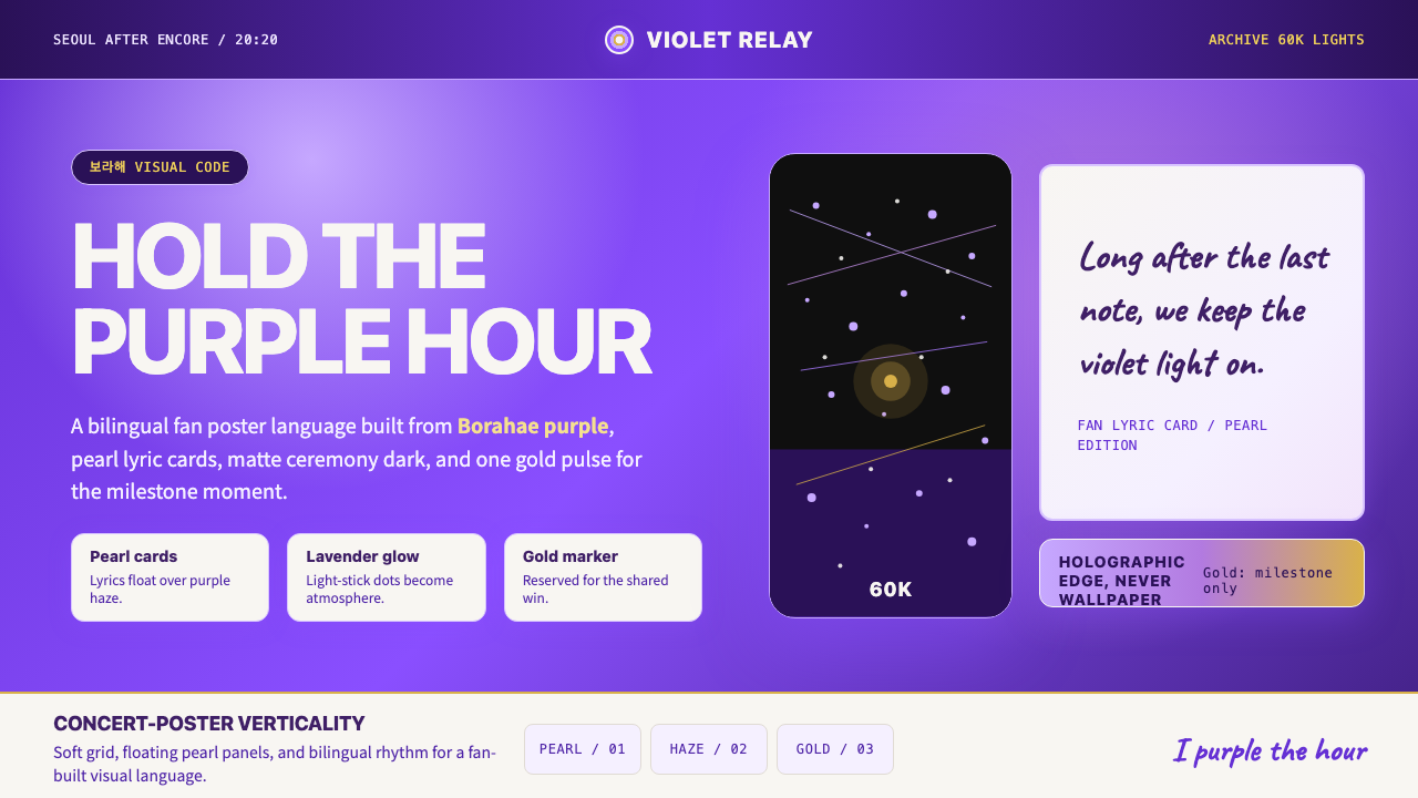 BTS Army Purple 2020Fandom becomes atmosphere. Borahae purple, pearl cards, lavender glow, one go…粉丝成为气氛:Borahae紫、珍珠歌词卡、薰衣草光晕与一束金光。
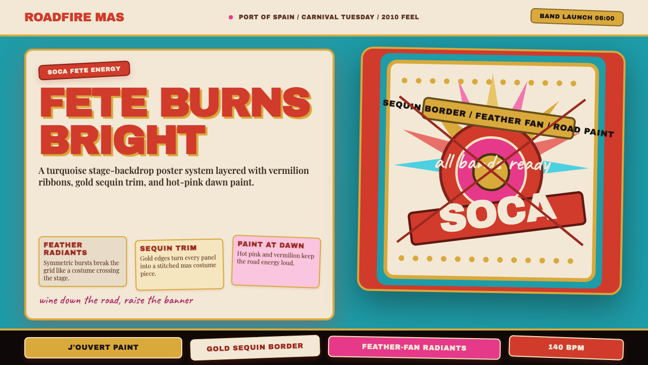 Trinidad Carnival Soca (2010)Joy overload. Turquoise field, vermilion banners, gold sequins, feather-fan g…快乐过载:绿松石底、朱红横幅、金色亮片与羽扇几何。
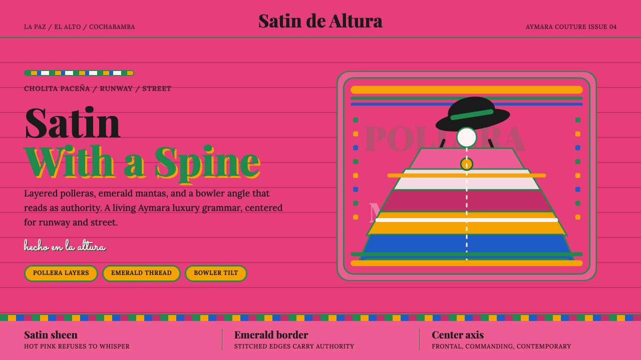 Bolivian Cholita FashionUnapologetic satin power. Hot pink fields, emerald stitches, centered pollera…拒绝低语的缎面力量。亮粉底、翡翠绣线与居中波列拉轴线。
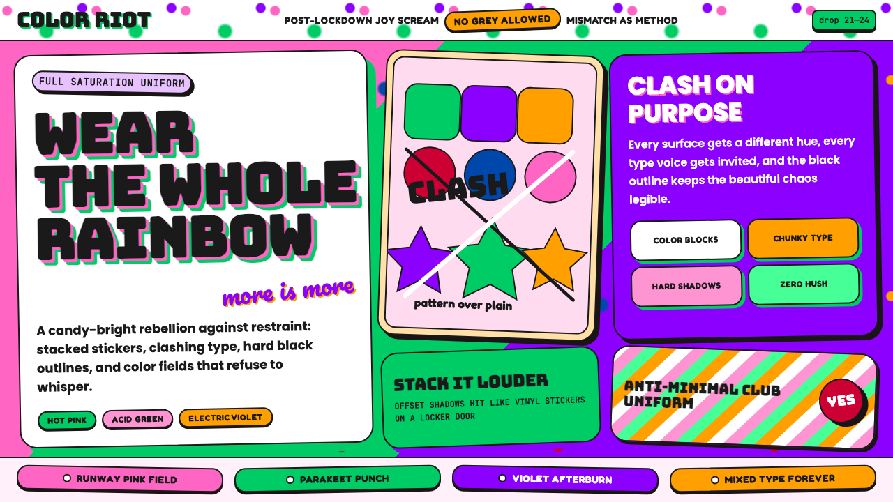 Dopamine Dressing / MaximalismJoy refuses restraint. Hot pink, parakeet green, Bungee type, and brick shado…快乐拒绝克制:热粉、鹦鹉绿、Bungee 粗字和砖块阴影猛烈相撞。
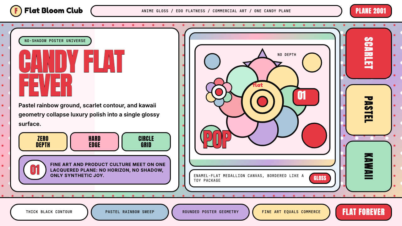 Takashi Murakami SuperflatJoy has no depth. Pastel rainbow, scarlet accents, and black contours flatten…快乐没有纵深:粉彩彩虹、猩红点缀与黑色粗描边压平成花。
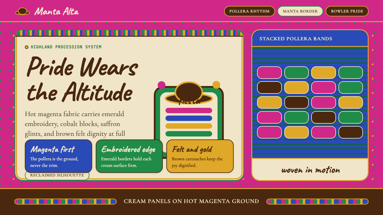 Bolivian Cholita (Bowler-Hat Fiesta)Loud pride, fully reclaimed. Magenta pollera bands, emerald borders, bowler c…骄傲高声回归:洋红波莱拉条带、翡翠边框与礼帽牌匾。