What is Dopamine Dressing / Maximalism?
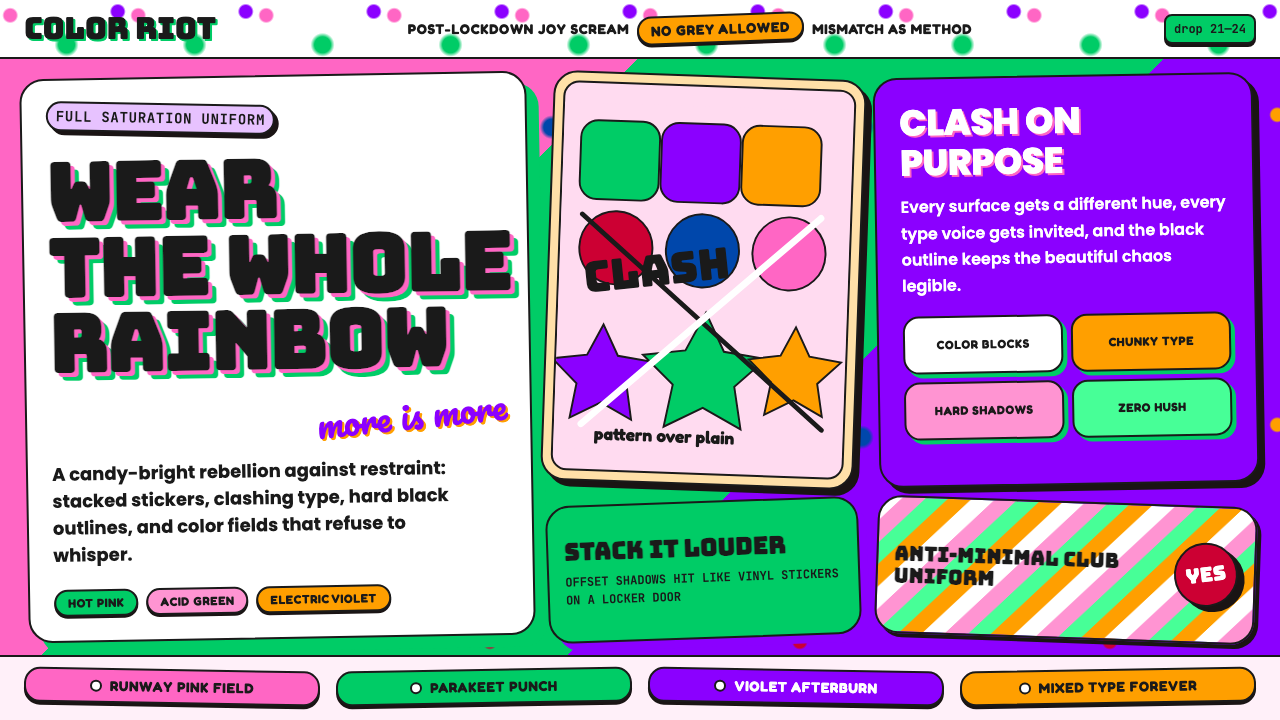
Dopamine Dressing is the post-pandemic color explosion that declared wearing every color at once — clashing, layering, and refusing to tone down — is the only honest response to two years of muted restraint.
Dopamine Dressing / Maximalism in brief
Dopamine Dressing is a maximalist visual philosophy rooted in the fashion and design movements of 2021 to 2024. Its premise is simple and radical: more color, more pattern, more energy, all at once, without apology. Named after the neurochemical associated with pleasure and reward, the aesthetic argues that joyful excess is not a design failure but a design intention. Where minimalism subtracts, dopamine maximalism multiplies — combining hues that traditional color theory would call incompatible, layering motifs that should compete, and trusting that visual abundance creates an emotional charge that restraint never can.
The visual language is immediately recognizable: saturated warm pinks collide with electric greens and vivid yellows; bold display typefaces in chunky, rounded, or playfully expressive forms share space with loose script lettering; every section of a composition can carry its own dominant color without needing to harmonize with its neighbor. This is not random. The underlying logic is emotional rather than harmonic — each color choice is made for the feeling it produces rather than the chord it joins. Clashing is the point. The tension between unexpected combinations is what generates the style's characteristic energy.
Critically, dopamine maximalism is not simply clutter. The best work in this mode understands that contrast needs a fulcrum: one or two elements — a silhouette, a typographic anchor, a repeating motif — provide enough structure for the eye to navigate the abundance. Without that anchor, the style collapses into visual noise. With it, the layering reads as deliberate celebration rather than accident.

Where does Dopamine Dressing / Maximalism come from?
The roots of dopamine dressing lie in the particular psychological conditions of 2020 and 2021. The COVID-19 pandemic forced global populations into extended periods of home confinement, muted palettes, and practical dress. When restrictions lifted, a counterpressure accumulated over months erupted in fashion weeks and street style simultaneously: color became a statement of survival, of re-entry, of insistence on joy. The term 'dopamine dressing' was popularized in part through the work of fashion psychologist Dawnn Karen, whose research explored the relationship between clothing choices and emotional states. Karen argued — and the moment confirmed — that color is not merely decorative; it is a physiological and psychological tool that wearers deploy to regulate mood and signal identity.
The fashion industry's most visible contributions came from Italian luxury houses. Pierpaolo Piccioli at Valentino launched what became known as the PP Pink campaign for the Spring/Summer 2022 collection, staging an almost monochromatic runway in a vivid, saturated rose that became one of the decade's most referenced color moments. Simultaneously, Daniel Lee's tenure at Bottega Veneta introduced Parakeet — a sharp, almost acid green that appeared across bags, shoes, and garments — demonstrating that maximalism could be expressed not only through clashing combinations but through a single color pushed to its most extreme, unapologetic saturation. These were not accidents of trend but deliberate arguments: that color itself, deployed without dilution, carries communicative power.
Dopamine maximalism as a graphic and digital design aesthetic grew in parallel with its fashion counterpart, amplified through TikTok, Instagram, and the visual vocabulary of Gen Z creators. The platform environment mattered enormously. Short-form video and rapidly scrolling feeds rewarded visual loudness — content that arrested the thumb in motion demanded immediate, unambiguous color impact. Design work that emerged from this context borrowed from the fashion movement's emotional logic while developing its own formal vocabulary: bold rounded type, blobby organic shapes, clashing background panels, and compositions built to function as single-glance statements rather than sustained reads.
The historical antecedents are varied. Maximalism as a design position has deep roots — in the pattern-on-pattern layering of Victorian interior design, in the exuberant graphic work of the 1960s and 1970s psychedelic poster tradition, in the Memphis Group's deliberate defiance of good taste in the 1980s, and in the riot-of-color energy of Y2K graphic design from the late 1990s and early 2000s. Dopamine maximalism is not the first time design has declared that more is more. But its specific synthesis — post-pandemic urgency, social media scale, luxury fashion endorsement, and digital-native type and shape vocabularies — gave it a character distinct from all its predecessors.
What defines the Dopamine Dressing / Maximalism look?
Color Collision
The defining feature of dopamine maximalism is color used at full saturation, in combinations that violate conventional harmony rules. Hot pink sits next to lime green; tangerine orange meets cobalt blue; acid yellow borders vivid violet. The rationale is emotional rather than harmonic — each pairing is chosen for the voltage it generates, not the peace it maintains. Unlike palettes assembled through analogous or complementary logic, dopamine combinations are assembled through gut and energy: does this combination feel alive? If yes, it belongs.
Expressive Display Type
Typography in this style favors display faces with strong personality: chunky rounded letterforms that feel inflated and approachable, playful script faces that evoke hand-lettering and informality, or slab-serif faces with brick-like solidity. Multiple typeface styles in a single composition are not only permitted but encouraged — a bold rounded headline paired with a loose script subheading carries the same energy as a pattern-on-pattern textile. The key is that every typographic choice should feel deliberate and expressive rather than merely functional.
Pattern on Pattern
Where conventional design separates patterns to avoid visual conflict, dopamine maximalism layers them deliberately. Polka dots behind stripes, florals over geometrics, gradients beneath textures — the stacking of motifs is a core technique rather than an error. This principle originates in the fashion context, where mixing prints was the central act of the trend, and translates into digital and graphic work as background panels, textured overlays, and compositional layers that each carry their own visual rhythm.
Organic and Blobby Forms
The geometric vocabulary of this style leans toward the soft and organic rather than the rigid and angular. Shapes are rounded at the corners, inflated at the edges, or deliberately irregular — blobs, amoeba outlines, cloud-like silhouettes. These forms carry warmth and approachability that hard geometric shapes do not. They also pair naturally with the rounded type styles that define the movement, creating a visual coherence through shared softness even as color and pattern collide.
Joyful Irreverence
The tonal quality of dopamine maximalism is celebratory, unserious, and deliberately anti-austere. The aesthetic refuses the muted seriousness associated with premium minimalism and positions joy itself as the legitimate design goal. This is expressed not only through color but through compositional choices: asymmetric balance, overlapping elements that bleed off edges, text that arcs or bounces, and a general sense that the composition is having fun with itself. The style does not try to convince you of its taste; it tries to give you a feeling.
Maximalist Layering
Every surface is an opportunity. Backgrounds are not neutral fields but active participants — patterned, colored, or textured. Foreground elements overlap without fear. Shadows are used not for realism but for depth and visual separation, often rendered as bold, solid-colored offsets that add another layer of color rather than simulating light. The layering is not chaotic but structural: each layer occupies a clear visual plane, so the eye can read them as depth rather than confusion.
Cultural Eclecticism
Dopamine maximalism draws freely from across visual cultures — Y2K computer graphics, 1990s rave flyer aesthetics, Latin American street murals, South Asian textile traditions, Japanese decora fashion, and Western pop art all contribute to its visual DNA. This eclecticism is not pastiche but appetite: the style collects what is visually energetic regardless of its origin. The result is a genuinely global aesthetic that resists easy regional attribution, which partly explains its rapid diffusion through social media platforms that connect creators across cultural borders.

Who shaped Dopamine Dressing / Maximalism?
As creative director of Valentino from 2016 to 2023, Piccioli transformed the house into the most prominent institutional voice for bold, saturated color in luxury fashion. His Spring/Summer 2022 collection — staged almost entirely in a single vivid rose now known as PP Pink — was the single most-cited fashion moment in the dopamine dressing movement. Piccioli's argument was philosophical as much as aesthetic: that color at full intensity is a form of emotional generosity, and that luxury has no obligation to be muted.
Lee's tenure at Bottega Veneta (2018–2021) introduced what became known as the Bottega green or Parakeet — a vivid, almost acidic green that spread from runway to streetwear to interior design. Lee demonstrated that dopamine maximalism could be expressed through a single color pushed to its extreme rather than through combination and clash. His approach influenced a generation of designers and brand directors who understood that color confidence, rather than color quantity, was the underlying principle.
Dawnn Karen is a New York-based fashion psychologist, author, and professor who gave the dopamine dressing movement much of its theoretical framework. Her research into mood-enhancing dressing — the deliberate use of clothing and color to regulate emotional states — provided language for what many people were already doing instinctively during and after the pandemic. Karen's work established that the maximalist color choices of the trend were not frivolous but grounded in psychological evidence about how visual stimuli affect mood and self-perception.
The Memphis Group — the Italian design collective founded by Ettore Sottsass in Milan in 1981 — is the most direct historical ancestor of dopamine maximalism in the designed-object and graphic tradition. Memphis work combined clashing colors, geometric patterns, surface decoration, and deliberate bad taste to challenge the dominance of modernist functionalism. Their influence on the dopamine maximalism aesthetic is unmistakable in the squiggly lines, pastel-and-saturated combinations, and pattern-stacking that characterize much of the movement's graphic output.
While not designers, these artists functioned as the most visible popular-culture ambassadors of maximalist color dressing in the early 2020s. Their red-carpet appearances, music video aesthetics, and personal style choices — consistently leaning into saturated pinks, vivid greens, clashing prints, and bold silhouettes — directly shaped the visual expectations of millions of followers and created the social permission structure within which the trend spread. The movement was amplified as much by cultural figures as by institutions.
How do you use Dopamine Dressing / Maximalism today?
Dopamine maximalism is one of the most immediately impactful styles available for presentation design, precisely because it is built for emotional arrest rather than sustained contemplation. For cover slides, this means leading with a full-bleed color panel — choosing the most saturated, confident hue in your palette — and setting the title in a large, bold, rounded display typeface that fills the space with confidence. The goal is to produce a slide that reads as a feeling before it reads as text. Supporting imagery or graphic elements should be layered over and behind the title rather than placed beside it, creating the visual density the style requires.
Content slides in this style require more discipline than they appear to. The temptation is to bring the full color density of the cover into every subsequent slide, which produces fatigue. Instead, use each content slide's background as a color moment — rotating through two or three of the palette's hues across the deck, never repeating the same background consecutively — while keeping the text and data elements within that slide relatively contained. Charts and data visualizations become graphic objects: bars can be vivid and contrasting, but the data labels and axes should stay in one neutral tone to prevent the data from disappearing into the color.
For web UI applications, dopamine maximalism is naturally suited to consumer-facing products where the goal is emotional engagement rather than analytical clarity. Pricing pages and feature landing pages benefit from the style's poster-like energy: full-width sections alternate between boldly colored backgrounds with reversed text, with component borders thickened and offset shadows applied in a contrasting color rather than grey. Interactive states — hover, active, selected — can shift to an entirely different hue from the resting state, creating an interface that feels alive and responsive. Avoid using the full color range for functional feedback (errors, warnings, confirmations) — reserve one or two palette positions for system states so the interface retains navigational clarity.
In editorial and marketing contexts, the style supports high-energy campaign work and social content better than long-form reading layouts. For social cards and campaign graphics, compositions should be built to communicate in a single glance: one headline, one dominant color, one graphic element, all layered and sized for maximum visual tension. The background should do work, not just hold content. For longer-format marketing pages, consider zoning the maximalism: hero sections and break panels carry the full color energy, while body-copy sections pull back to a single accent color on a near-neutral field, giving the reader a breath before the next energetic moment.
A common and costly mistake when applying this style is confusing abundance with chaos. Dopamine maximalism works because skilled practitioners maintain an underlying compositional structure — a clear visual hierarchy, a dominant element in each zone, a limited number of typeface styles even if colors are varied — that gives the viewer's eye a path through the density. If every element is equally loud, nothing is heard. The style rewards restraint in one dimension (usually hierarchy or typeface variety) to justify excess in another (color and pattern). Another frequent misstep is desaturating the palette to make it 'more professional' — this produces a version of the style that has neither maximalism's energy nor minimalism's clarity, landing in a muddy middle ground that satisfies no one.

Dopamine Dressing / Maximalism — FAQ
Is dopamine maximalism the same as the Memphis Group aesthetic?
They share a philosophical ancestor but are distinct in origin and character. The Memphis Group (founded 1981) was a deliberate intellectual provocation — Italian designers consciously defying modernist good taste through pattern, color, and decorative surface. Dopamine maximalism emerged forty years later from a very different context: social media virality, post-pandemic emotional release, and the visual demands of short-form content. Memphis was a movement with a manifesto; dopamine maximalism is a convergence of forces without a single founding document. In practice, Memphis work tends to be cooler in color temperature and more systematically patterned, while dopamine maximalism runs hotter, warmer, and more chaotically layered. Referencing Memphis intentionally within a dopamine maximalist project reads as historical awareness; confusing the two produces work that feels neither.
How do you stop a dopamine maximalist design from looking like a mess?
The key is maintaining compositional hierarchy even when color and pattern are at maximum. Every composition needs at least one clear dominant element — the thing the eye lands on first — and a legible path from there to secondary and tertiary information. In practice this means: limit the number of typographic styles to two or three even if you use many colors; establish one primary color that is used more than any other so the viewer has an emotional anchor; ensure that any pattern layering creates depth (foreground, midground, background) rather than flatness; and use blank or near-blank zones deliberately as resting points. The style rewards the courage to commit fully in one area — a single massive headline, a single block of intense color — and to let the surrounding composition be comparatively quieter.
Can dopamine maximalism work for a professional or corporate context?
It depends on what the corporate context is selling emotionally. Dopamine maximalism works well for companies positioning themselves as joyful, energetic, consumer-friendly, or culturally current — youth brands, creative agencies, consumer tech products aimed at younger demographics, entertainment platforms, and wellness brands that lean into energy rather than calm. It is a poor fit for contexts that depend on signaling gravity, precision, or conservative authority: financial services, legal firms, enterprise infrastructure software, or medical institutions. The error is not applying the style to professional work per se; the error is applying it to a client whose brand values are orthogonal to the style's emotional language. An honest assessment of what feeling a brand needs to produce is more useful than a rule about which industries are permitted to use color.
How does dopamine maximalism handle dark backgrounds?
Unlike Bauhaus, which was historically committed to light grounds, dopamine maximalism adapts naturally to dark backgrounds because the style's logic is about saturation and contrast rather than a specific ground color. On a deep background — near-black, deep navy, or rich eggplant — saturated colors appear to glow, which amplifies the energetic quality the style aims for. Hot pink, vivid yellow, and electric green all read with particular intensity against dark fields, producing a neon-tinged quality reminiscent of rave culture and digital screen aesthetics. The risk on dark grounds is losing legibility in the layering — dark patterned backgrounds can absorb dark foreground elements — so the solution is to ensure that layered elements differ significantly in lightness value even when they share a saturated hue.
Will dopamine maximalism date quickly?
Trend-driven maximalism always carries a timestamp, and this particular wave is identifiable to roughly 2021 to 2024. Work produced at peak dopamine-dressing energy will eventually read as period-specific in the way that any trend-led aesthetic does. However, the underlying principles — using color at full saturation, embracing pattern, building for emotional impact rather than longevity — are not inherently dated. Maximalism has recurred throughout design history, and the specific forms it takes evolve while the underlying appetite persists. The practical answer is to distinguish between the trend's dated surface markers (specific type styles, specific palette combinations that peaked at a particular moment) and the style's enduring logic (color confidence, layered composition, emotional directness), which can be applied in ways that read as contemporary without being anchored to the trend's peak moment.
Related design styles
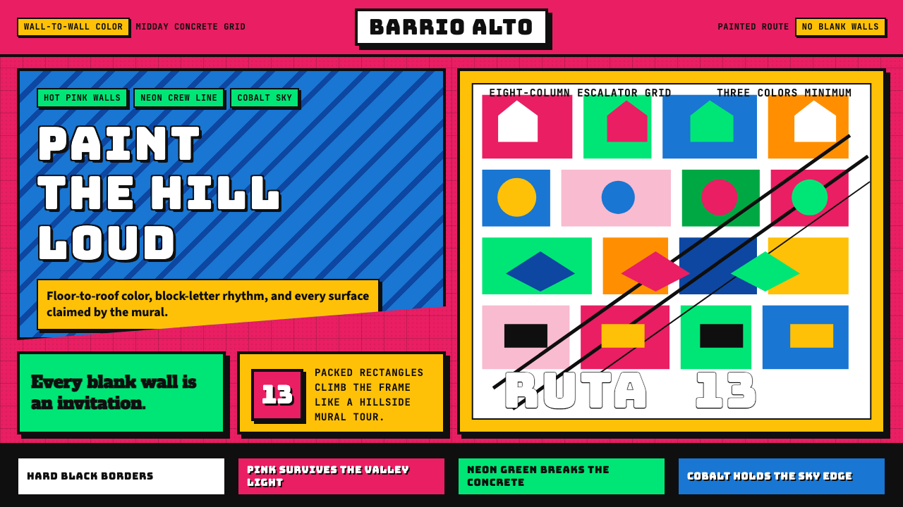 Medellín Comuna 13 MuralsRefuses blank walls. Hot pink, neon green, and cobalt blocks pack the grid li…
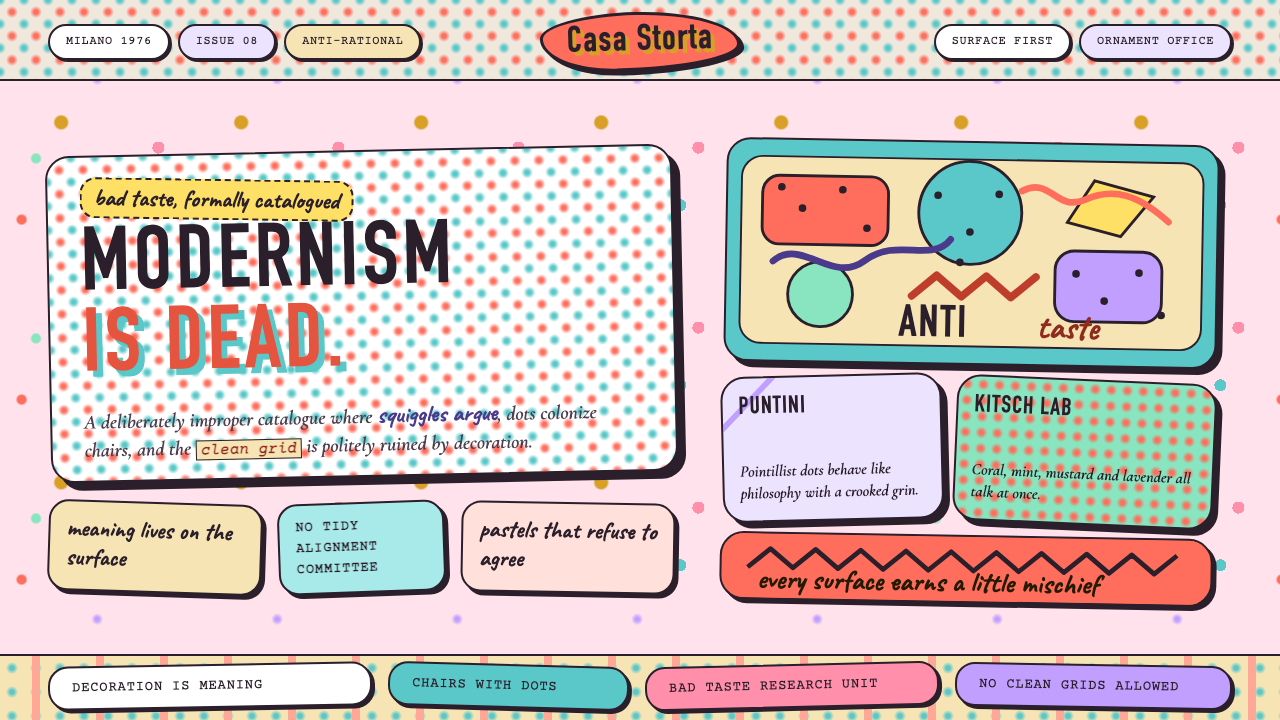 Studio Alchimia Anti-DesignModernism gets heckled. Coral, mint and mustard collide in dotted collage blo…
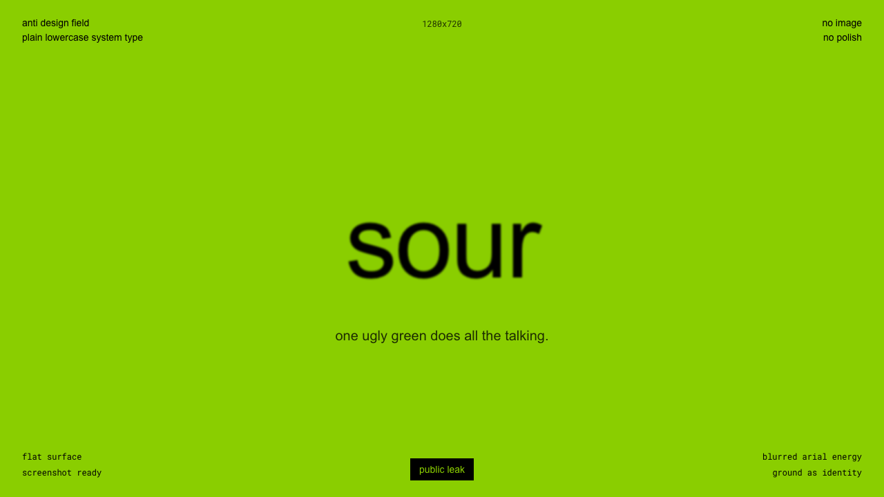 Brat Album Green 2024Ugly green becomes identity. Blurred Arial floats on one flat acidic field.
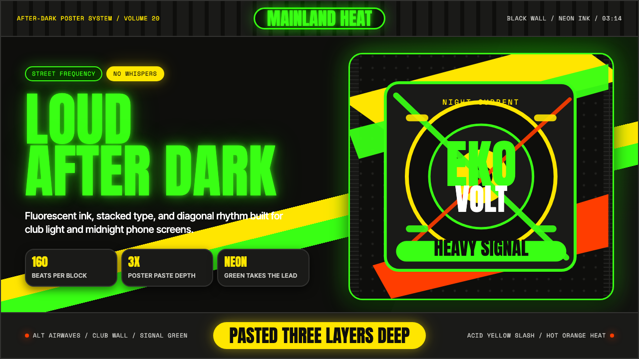 Afrobeats LagosLoud after dark. Neon green type and yellow diagonals hit black like pasted s…
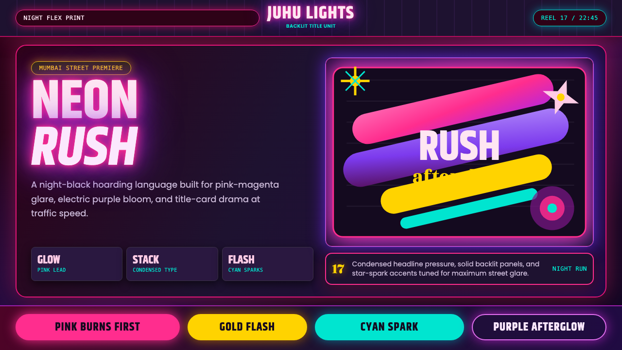 Bollywood Neon MumbaiMumbai pop burns bright. Khand stacks glow over night-black, with pink-purple…
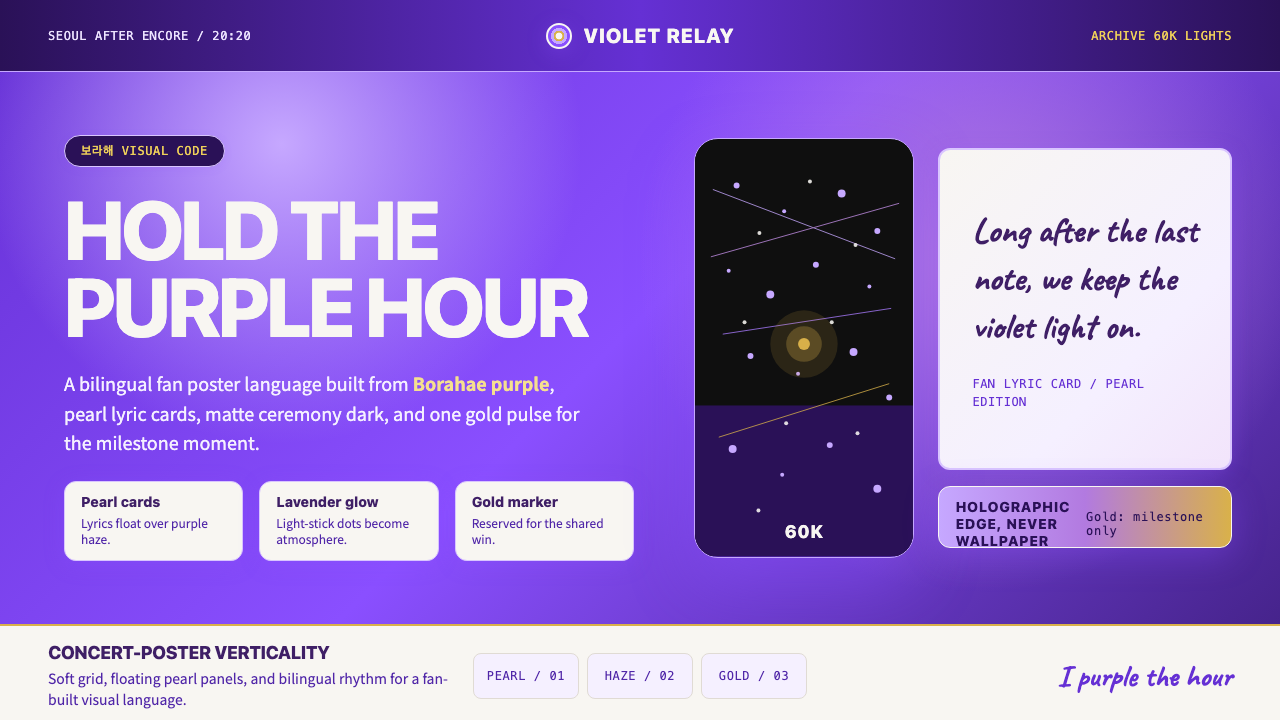 BTS Army Purple 2020Fandom becomes atmosphere. Borahae purple, pearl cards, lavender glow, one go…