What is Afrobeats Lagos?
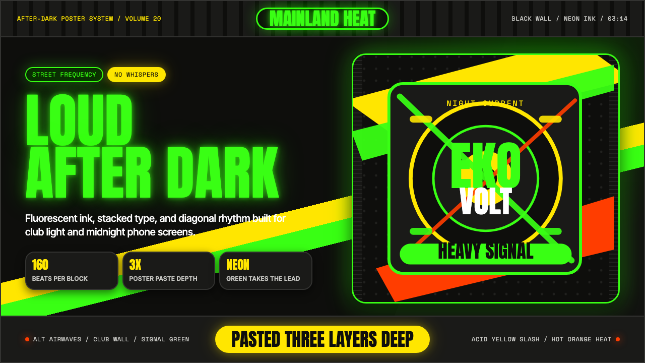
Afrobeats Lagos is the visual energy of Nigeria's global pop moment — fluorescent green burning against deep black, electric yellow diagonals slashing across a condensed-type headline, and the kinetic confidence of a generation that turned Lagos street culture into the world's most-streamed sound.
Afrobeats Lagos in brief
Afrobeats Lagos is a contemporary graphic style rooted in the visual identity of Nigeria's Afrobeats music industry from the 2010s onward — specifically the album art, merchandise, event posters, and digital content produced for artists like Burna Boy, Wizkid, Tems, Rema, and Ayra Starr, and the creative output of imprints like Mavin Records and the Lagos Alté underground. It is not a folk or heritage aesthetic; it is a fully contemporary, screen-first graphic language built for maximum impact on a smartphone at night.
The palette is a tight, high-voltage set of fluorescent green, electric yellow, and acid lime deployed against deep black grounds, with graphic white used for type reversal and neon glow effects. The mood is confrontational and celebratory at once — loud without being chaotic, because the underlying structure is poster-logic: one dominant visual, one dominant message, aggressive hierarchy, zero filler.
Typography is a defining element: oversized condensed letterforms, often stacked in multiple weights, behave less like type and more like architectural elements — or like the layered bills of street posters pasted so many times the lower layers become texture. Photo and type collide and overlap at the edges; glow bleeds from headlines; nothing whispers. The result is a visual language that carries the energy of live performance into a static frame.
Where does Afrobeats Lagos come from?
The visual style that became Afrobeats Lagos grew alongside the music itself. Afrobeats as a genre — distinct from 1970s Afrobeat pioneered by Fela Kuti — emerged in the early 2000s as a fusion of West African percussion, American R&B and hip-hop, dancehall, and electronic production, incubated in Lagos clubs, radio stations like Cool FM, and the informal distribution networks of Alaba market. As the music spread globally through streaming platforms in the 2010s, it demanded a visual identity that could travel just as fast — and that meant images designed specifically for Instagram, YouTube thumbnails, and WhatsApp distribution, not for print.
The graphic infrastructure that served this demand was partly homegrown and partly imported. Lagos had an existing tradition of bold, hand-lettered street signage and market graphics — vivid colors, confrontational layouts, type used as decoration and as proclamation simultaneously. That sensibility merged with influences arriving via the internet: the neon-soaked imagery of Memphis-era streetwear brands, the glow effects popularized by American trap music artwork, and the compressed, layered poster language of Japanese and Korean street culture. The result was not a conscious stylistic manifesto but an organic toolkit developed by creative directors, Instagram art directors, and freelance designers working fast for artists who needed content at the pace of a weekly release cycle.
The Alté subculture, emerging out of Lagos from around 2015, added a layer of intentional avant-garde sensibility. Artists like Odunsi (The Engine), Santi, and Cruel Santino operated at the intersection of Afrobeats, alternative R&B, and experimental electronic music, and their visual output pushed the aesthetic into more deliberately art-directed territory — distorted type, glitched textures, harder color dissonance. Alté's influence kept the broader Afrobeats visual scene from settling into formula, feeding a constant appetite for graphic experimentation that kept the style evolving rather than crystallizing.
By the early 2020s, the visual language had achieved global legibility. Burna Boy's stadium-era artwork and Rema's Calm Down era imagery were recognizable worldwide, cited by designers from London to Seoul as a reference point for high-energy, dark-ground, fluorescent-color graphic work. The style had achieved the rare status of a genuinely new visual contribution — not a regional variation on an existing Western template, but a graphic sensibility exported from Lagos outward.
What defines the Afrobeats Lagos look?
Color
The palette is built around extreme contrast between near-black grounds and fluorescent foreground colors — green that burns, yellow that crackles, acid lime that vibrates against dark. These are not pastels or muted tones; they operate at the upper edge of visible saturation, chosen for their performance on lit screens rather than their behavior in print. White appears as a graphic reversal element and to simulate glow bleed. Warm skin tones in photography anchor the palette to something human, preventing the neon from reading as purely synthetic. The chromatic logic is not symbolic in the Bauhaus sense — it is physiological: maximize visual energy by maximizing contrast.
Typography
Condensed or ultra-condensed letterforms — set large, often at display sizes that consume most of the frame — are the typographic signature of the style. Type is treated architecturally: stacked, layered, overlapping with imagery, cut off at edges. Multiple weights of the same condensed family are combined in quick succession, creating a visual rhythm that mirrors the rhythmic density of Afrobeats production itself. All-caps settings are dominant. The effect is less a typographic system and more a typographic performance — type doing the work that a vocalist does, claiming space and asserting presence.
Diagonal Composition
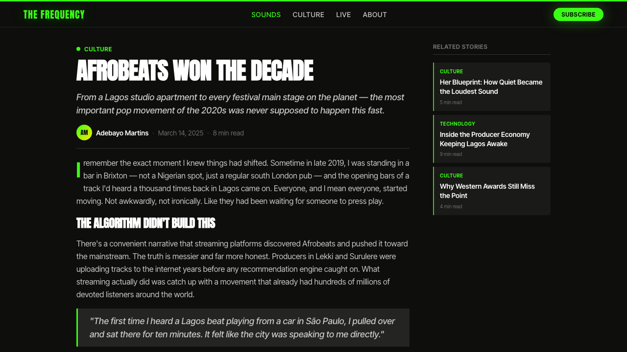
Where most Western graphic traditions favor horizontal and vertical axes, Afrobeats Lagos graphics frequently deploy diagonal cuts, angled type baselines, and slashing color bands that bisect the frame. This kinetic spatial logic is partly inherited from the urgency of street poster design — a diagonal line reads faster than a horizontal one, implying movement and forward direction. In practice, a diagonal color band or type block can function simultaneously as a compositional divider, a background element, and a visual metaphor for musical momentum.
Photographic Treatment
Photography is central to Afrobeats Lagos work — the artist's image is almost always present — but it is treated as a graphic layer, not a documentary record. Common treatments include high-contrast processing that pushes shadows toward absolute black, color grading that shifts skin tones toward warmer or more saturated territory, selective color isolation, and double-exposure or superimposition with graphic type elements. Photography and type are allowed to bleed into each other; the frame is not a container that holds them apart, but a surface on which they collide and fuse.
Glow and Grain
Afrobeats Lagos work frequently incorporates subtle glow effects — luminous halos around type, soft light flares bleeding from edges — alongside light film grain or noise layered over the entire composition. The glow anchors the aesthetic in the physical experience of nightlife and concert environments, where neon and stage lighting make visible objects seem to radiate outward into surrounding darkness. Grain adds tactility and prevents the digital-clean look from reading as corporate. Together, glow and grain give the style its paradoxical quality: loud in color and type, but rich and warm in texture.
Poster Layering
A structural logic inherited directly from Lagos street poster culture: elements are composed as if pasted in layers, each slightly misaligned or overlapping the previous one. This gives the composition a sense of accumulated urgency — as if the design was arrived at through rapid accretion rather than careful planning. In practice, achieving this intentionally requires deliberate imprecision: type that bleeds beyond its container, images that extend past the expected boundary, color fills that overlap adjacent elements by just enough to read as intentional rather than careless.
Motion as Default
Even in static applications, Afrobeats Lagos graphics imply motion. Diagonal compositions, speed-blur effects on type, overlapping frames suggesting sequence, and the general density of layered elements all create a sense that the image is a single frame extracted from something moving. This motion sensibility is appropriate to the music — Afrobeats is built for dancing, and the visual language should communicate that kinetic pleasure even when the viewer is not moving. In digital contexts, this frequently extends to actual motion: animated social media assets, looping video covers, and type that enters or exits the frame rather than sitting statically within it.
Who shaped Afrobeats Lagos?
Damini Ebunoluwa Ogulu, who performs as Burna Boy, is the artist whose visual trajectory most clearly defined the international face of Afrobeats Lagos aesthetics. From his early album artwork of the 2010s through the stadium-era productions of African Giant (2019) and Twice as Tall (2020), his creative direction moved from the local idiom of Lagos street graphics toward a global visual ambition — larger-scale type, more precise color grading, higher production photography — while retaining the fluorescent palette and confrontational compositional energy of the original street poster tradition. His Grammy-winning international profile gave the visual language genuine export reach.
Founded by producer Don Jazzy in 2012, Mavin Records became the most visually consistent institution in the Afrobeats ecosystem, housing artists including Tiwa Savage, Rema, Ayra Starr, and Johnny Drille. Mavin's house visual style — applied across album art, merchandise, promotional materials, and social media — codified many of the style's signature moves: the dark-ground fluorescent palette, the oversized condensed type, the layered photographic composition. As a label rather than a single artist, Mavin demonstrated that the aesthetic could function as a replicable system rather than a one-off expression of individual taste.
The Lagos Alté scene, centered around artists Odunsi (The Engine), Santi (Ozzy Agu), and Cruel Santino (Santigold-influenced Daniel Olasubomi), pushed Afrobeats visual culture toward more deliberately experimental territory beginning around 2015. Their visual output introduced distorted and deconstructed type, glitch aesthetics, harder color dissonances, and a more self-conscious art-world dialogue into what had been primarily a commercial music context. Alté's experiments continuously fed new visual energy into the mainstream Lagos scene, preventing stagnation and maintaining the aesthetic's reputation for restless innovation.
Divine Ikubor, known as Rema, became the artist whose visual identity most effectively bridged the Lagos street aesthetic and global Gen Z sensibility, particularly with the worldwide commercial breakthrough of Calm Down (2022–2023). The artwork and visual content from that era demonstrated how the fluorescent-on-black graphic language could function in global streaming contexts — Instagram carousels, YouTube thumbnails, TikTok overlays — without losing its distinctive Nigerian energy. Rema's visual team adapted the style to the specific constraints of each platform while maintaining chromatic and typographic coherence.
Temilade Openiyi, who records as Tems, introduced a distinctly feminine and ethereal dimension to the Afrobeats visual lexicon that had been dominated by a more aggressive, masculine aesthetic. Her visual identity — particularly around the If Orange Was a Place (2021) and Born in the Wild (2024) eras — retained the dark-ground palette and oversized type but introduced softer glow treatments, more considered photographic styling, and a compositional spaciousness that made the style feel expansive rather than crowded. Tems demonstrated that the Lagos aesthetic had enough internal range to contain multiple sensibilities simultaneously.
How do you use Afrobeats Lagos today?
Afrobeats Lagos is among the highest-energy visual systems available in contemporary design, and that energy is its primary affordance and its primary risk. Applying it well requires understanding that the style operates through contrast, not decoration: remove the extreme value contrast between dark grounds and fluorescent type, and there is nothing left. Every other element — diagonal compositions, layered type, glow effects, grain — exists to amplify that fundamental tension, not to substitute for it.
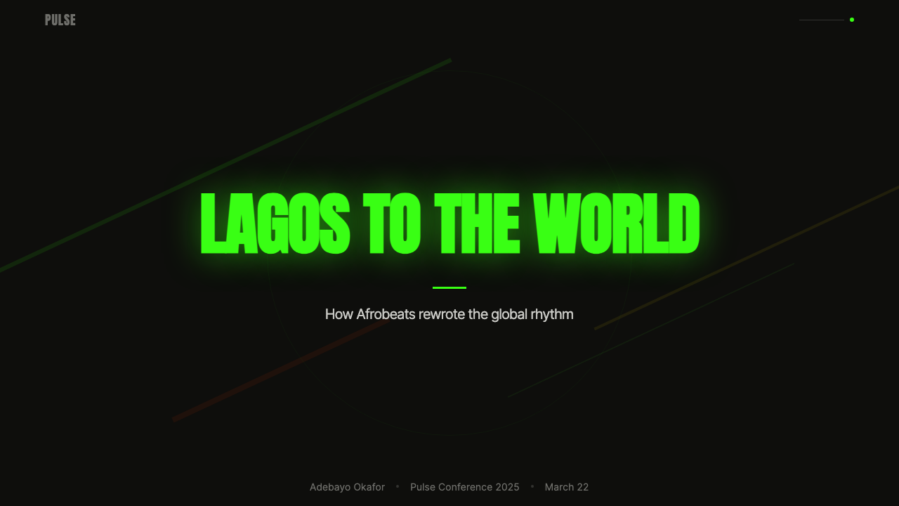
For presentation slides, the style works most effectively on cover, section break, and transition slides rather than content or data slides. A cover built in this language should commit fully: a near-black or deep-colored ground, a single condensed headline in a fluorescent accent color set at maximum display size, artist or subject photography treated with high contrast and allowed to bleed at the edges, and a glow effect on the headline only. Content slides require a significant mode shift toward legibility — pull back to a lighter ground or a simple dark-background layout with white body type; reserve the fluorescent accents for callouts and key metrics only. Data slides are difficult in this system: the high-contrast aesthetic can overwhelm chart data, so the most practical approach is to use the dark ground with white-and-one-accent-color charting, treating the data as a typographic element rather than a graphical one.
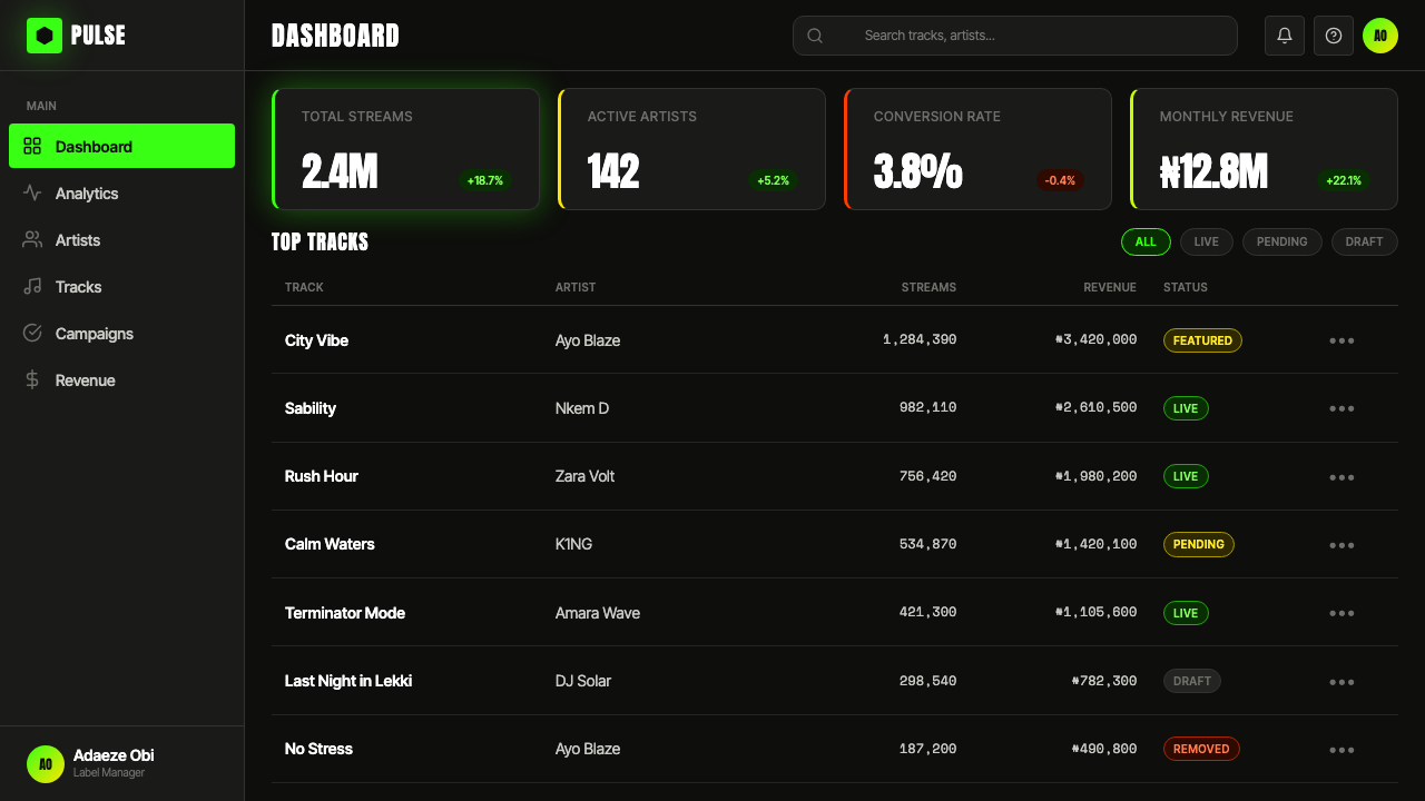
For web interfaces and digital products, Afrobeats Lagos is most at home in entertainment, music, events, and culture contexts — streaming platform landing pages, concert ticketing, music app profile pages, festival websites, and cultural brand identities. It is not suited to transactional contexts where the visual noise would impede form-completion or where accessibility contrast requirements conflict with the fluorescent palette. In appropriate contexts, lean into the dark-ground baseline: a dark interface with selective fluorescent accents reads as premium in this aesthetic, not as accessibility-compromised.
For editorial and marketing content — social media campaigns, event flyers, digital posters, visual content for music releases — the style is essentially native. The square or portrait format of Instagram and TikTok is well-matched to the poster-logic of the compositional approach. A social card in this style should be treated as a single visual unit: one dominant photographic element, one dominant typographic element, one fluorescent accent, zero visual filler. The diagonal cut or color band earns its place only if it serves to separate two compositional zones — type zone and image zone — not as decoration applied to an already-resolved composition.
The most common mistake when applying this style is confusing loudness with chaos. Authentic Afrobeats Lagos work is loud in the sense of maximum visual energy within a controlled structure — the hierarchy is always clear: one reading sequence, one dominant element, one accent color at full saturation. The failure mode is using multiple fluorescent colors at equal weight, layering too many typographic elements without size hierarchy, or applying grain and glow indiscriminately without anchoring them to a specific visual element. Loudness in this system comes from commitment to a single high-contrast idea, not from accumulating multiple competing elements.
Afrobeats Lagos — FAQ
Is Afrobeats Lagos the same as a general African graphic style?
No. Afrobeats Lagos is a specific, contemporary, Lagos-centered style tied to the visual culture of Nigeria's pop music industry from the 2010s onward. It is distinct from pan-African graphic traditions, Afrofuturism, West African textile-derived aesthetics like kente or Adinkra symbolism, North African and Saharan visual traditions, or the diverse visual cultures of the African continent's 54 countries. Using traditional patterns or warm earthy palettes would be a different style entirely. Afrobeats Lagos is deliberately modern and screen-first — it emerged from and for the digital distribution economy, not from craft or heritage practice.
Does this style work for light backgrounds, or is the dark ground essential?
The dark ground is not technically required, but it is deeply embedded in what makes the style recognizable and effective. The fluorescent palette was chosen specifically for its behavior against dark grounds — on a light or white ground, the same fluorescent colors lose their apparent luminosity and read as merely bright or saturated rather than electric. A light-ground variant is possible but risks diluting the style into a generic high-saturation look. If a light background is required for accessibility or brand reasons, the most faithful approach is to retain the high contrast — very light ground, very dark type, a single fluorescent accent used sparingly — and to lean on the typographic and compositional characteristics rather than the color language to carry the style.
How does Afrobeats Lagos relate to trap and hip-hop graphic aesthetics?
There is genuine shared lineage. American trap music album art — particularly from the Atlanta scene of the 2010s — contributed to the globalization of the dark-ground, high-contrast, glow-effect graphic vocabulary that Afrobeats Lagos also draws on. Both aesthetics favor near-black grounds, type-dominant compositions, high-saturation accent colors, and a sense of nocturnal premium. The distinction lies in cultural specificity and chromatic character: American trap graphics tend toward cooler accent palettes (blue and white, purple and chrome) and a more isolated, still photographic treatment of the artist figure. Afrobeats Lagos is warmer, more kinetic, more layered, and builds from a specifically Nigerian street graphic tradition that has its own distinct lineage independent of American influence.
Can Afrobeats Lagos work for non-music brands?
Yes, but the brand's values need to align with the style's core proposition: youthful energy, confidence, kinetic momentum, and a celebration of contemporary urban culture. Categories where it can work effectively include lifestyle brands with a young demographic, sports and athletic performance products, gaming and entertainment platforms, event-driven consumer brands such as festivals and hospitality, and fashion labels targeting urban youth markets. It is inappropriate for professional services, healthcare, finance, enterprise software, or any context where trustworthiness and calm authority are the primary values being communicated. The style's energy reads as celebratory, not institutional.
How do you prevent the style from looking like a knockoff of Lagos pop art rather than an informed application?
The distinction between informed application and surface imitation comes down to structural commitment versus visual borrowing. Surface imitation layers fluorescent colors and condensed type over a composition that is otherwise structured by different principles — the underlying grid is a Western editorial grid, the hierarchy is conventional, the photographic treatment is naturalistic, and the neon is applied as cosmetic finish. Informed application builds from the style's actual logic: a dark-ground composition, a poster-style single dominant idea, type treated architecturally rather than as label, photography composited as a graphic layer rather than a framed window. The clearest test is to remove the color: if what remains is a coherent, energetic composition that holds together through structure alone, you have applied the style. If what remains without the color is a conventional layout with nothing to say, you have borrowed the decoration.
Related design styles
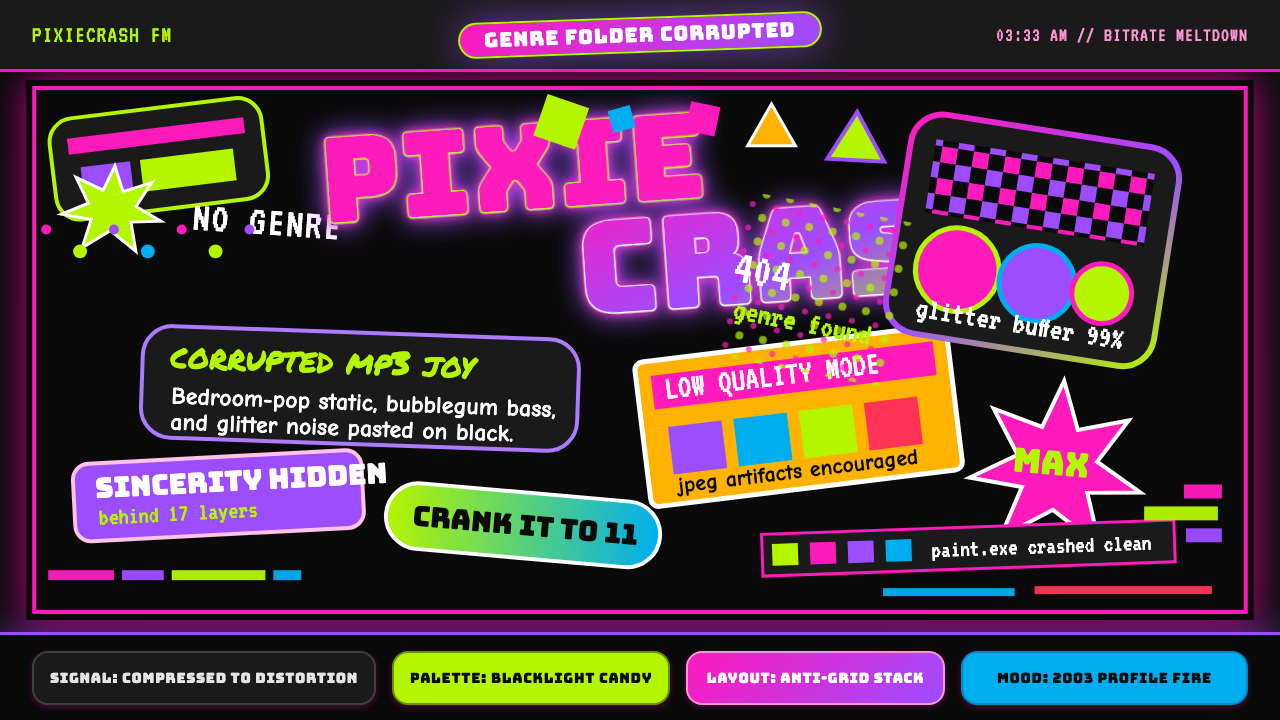 Hyperpop 100 gecs (2019)Cute chaos detonates. Blacklight candy, Bungee type, and pixel trash collide.
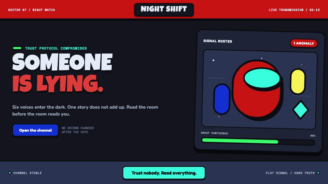 Among Us (crewmate space)Trust is ready to break. Loud capsule colors cut through a navy void with har…
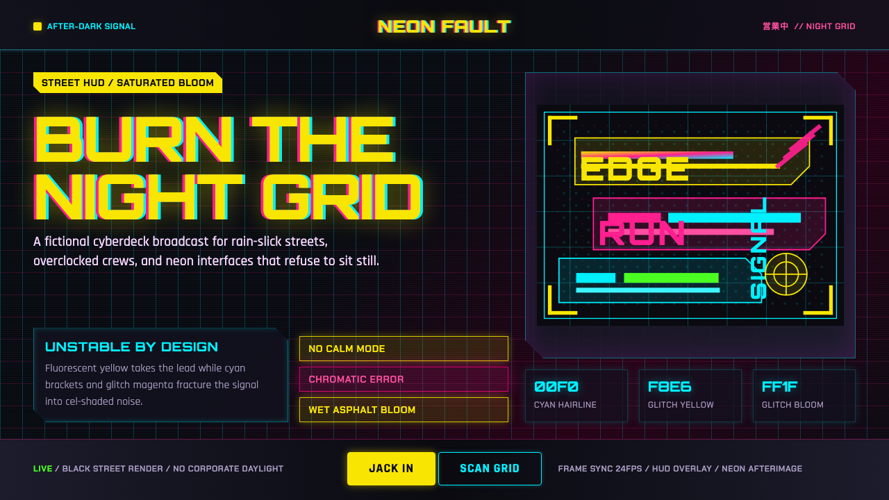 Edgerunners NeonNeon overload. Fluorescent yellow, cyan HUD grids, and magenta glitches burn…
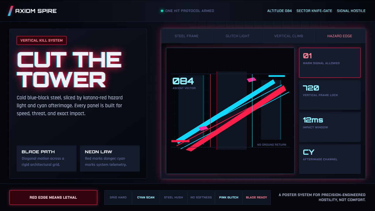 Ghostrunner Dharma TowerHostile precision at speed. Blue-black steel grids cut by red neon and cyan g…
 The Ascent ArcologyNeon suffocates the dark. Magenta and cyan signage stacks over wet black-viol…
 Arc Browser Prismatic (2023)Color is architecture. Pink-violet-cyan ribbons glow over onyx glass and roun…