Design style guide设计风格指南
What is Arc Browser Prismatic (2023)?什么是 Arc Browser Prismatic (2023)?
Arc Browser turned the browser chrome into a chromatic identity system — where your workspace's gradient is as personal as a signature.Arc 浏览器将浏览器界面本身变成了一套色彩身份系统——你工作区的渐变光谱,私密得如同一枚签名。
Arc Browser Prismatic (2023) in briefArc Browser Prismatic (2023) 速览
Arc Browser Prismatic is the visual design language developed by The Browser Company of New York for their Arc browser, reaching its distinctive form around 2022 to 2024. Where conventional browsers aspired to invisibility — a neutral pane of glass between user and web — Arc made the browser shell itself an expressive object. The defining gesture is a family of prismatic gradients, typically flowing from warm pink through violet and into cool cyan or emerald, applied as navigational identity markers called Spaces. Each Space carries its own chromatic personality, making the software feel closer to a personal studio than a productivity utility.Arc 浏览器棱镜风格是纽约浏览器公司(The Browser Company of New York)为 Arc 浏览器开发的视觉设计语言,约在 2022 至 2024 年间形成其标志性面貌。传统浏览器追求隐形——成为用户与网页之间一块中性的玻璃——而 Arc 则将浏览器外壳本身变成了一个充满表达力的对象。其核心手势是一族棱镜渐变:通常从温暖的粉红色流经紫罗兰,再沉入冷调的青色或翡翠绿,作为名为「Space」的导航身份标识来使用。每个 Space 都拥有独属的色彩性格,让这款软件更像一个私人工作室,而非一件生产力工具。
The aesthetic rests on a dark foundation. Deep, near-black surfaces — sometimes described as onyx glass — provide the ground against which gradient ribbons glow with particular intensity. Frosted or translucent panel treatments float above this dark field, creating a sense of luminous depth without resorting to literal 3D rendering. Rounded corners appear consistently throughout the interface, softening every panel, button, and container into an approachable geometry that reads as both modern and warm.这套美学建立在深色的基底之上。深邃近黑的表面——有时被描述为黑曜石玻璃——提供了让渐变光带以特别强度发光的背景。磨砂或半透明的面板处理浮于这片暗色场域之上,创造出一种发光的纵深感,却无需借助字面意义上的三维渲染。圆角贯穿界面始终,将每一块面板、每一个按钮与容器都软化为一种亲切的几何形态,令人感到既现代又温暖。
Arc Prismatic sits within a recognizable wave of early 2020s product aesthetics that celebrated expressiveness and individual identity after years of flat, monochromatic interfaces. It is distinguishable from generic 'dark mode plus gradients' by the deliberate, structured role color plays: gradients are not decoration sprinkled over an existing layout but the primary means of organizing spatial identity within the application. The result feels holographic and alive — a browser that greets you differently depending on which part of your digital life you are inhabiting.Arc 棱镜风格置身于 2020 年代初一股清晰可辨的产品美学浪潮之中——在经历了多年平面、单色界面之后,这股浪潮重新颂扬表达性与个体身份。它与泛泛而论的「深色模式加渐变」的区别在于:色彩在其中扮演着刻意而结构性的角色——渐变不是撒在已有版面上的装饰,而是在应用内部组织空间身份的首要手段。最终效果是全息的、有生命力的:这是一款会因你当下栖居于数字生活的哪个角落而以不同面孔迎接你的浏览器。
See the Arc Browser Prismatic (2023) design system →查看 Arc Browser Prismatic (2023) 完整设计系统 →
Where does Arc Browser Prismatic (2023) come from?Arc Browser Prismatic (2023) 从何而来?
The Browser Company of New York was founded in 2019 by Josh Miller, a former Facebook product manager, and Hursh Agrawal. Their founding premise was that the browser — arguably the most-used software on the planet — had not been meaningfully redesigned in over a decade. Chrome, Safari, Firefox, and Edge had all converged on a similar paradigm: a tab bar at the top, an address bar, a settings menu, and a neutral frame around website content. The Browser Company wanted to revisit the browser as a primary creative environment, not just a viewing window.纽约浏览器公司由 Josh Miller(前 Facebook 产品经理)与 Hursh Agrawal 于 2019 年创立。他们的创业前提是:浏览器——这或许是地球上使用最广泛的软件——已经超过十年没有经历过任何实质性的重新设计。Chrome、Safari、Firefox 与 Edge 全都收敛于一套相似的范式:顶部标签栏、地址栏、设置菜单,以及包裹网站内容的中性边框。该公司想要将浏览器重新定义为一个主要的创作环境,而非仅仅是一扇浏览窗口。
The visual design language emerged through the work of designers including Nate Parrott and Cassidy Williams, who brought a sensibility rooted in the New York City design and tech community of the early 2020s — a milieu that valued craft, personality, and a kind of Williamsburg playfulness that had more in common with editorial and brand design than with the utilitarian interface conventions of Silicon Valley. The prismatic gradient system was not a late decoration layered onto a finished product; it was developed in parallel with the core concept of Spaces — Arc's mechanism for organizing different areas of a user's browsing life into distinct contexts.这套视觉设计语言经由设计师 Nate Parrott 与 Cassidy Williams 等人的工作逐渐成形。他们带来的感性植根于 2020 年代初纽约设计与科技社群——那是一个重视工艺、个性,以及一种威廉斯堡式俏皮感的圈子,与编辑设计和品牌设计的关联远比硅谷实用主义的界面惯例更深。棱镜渐变系统并非在成品上迟来叠加的装饰;它与「Space」这一核心概念并行发展——Space 是 Arc 将用户浏览生活的不同领域组织成独立情境的机制。
The timing connected Arc Prismatic to a broader cultural moment. The early 2020s saw a wide resurgence of expressive, gradient-rich aesthetics in consumer software, partly as a reaction to the rigidly flat, icon-grid interfaces that had dominated since the mid-2010s. Apps like Notion, Linear, and various productivity tools were beginning to experiment with dark surfaces and color personality. Arc arrived in this environment and pushed the gradient from accent to identity — from something used sparingly in illustrations to something embedded in the navigational skeleton of the application itself.Arc 棱镜风格的诞生时机,将它与一个更宏观的文化时刻紧密相连。2020 年代初,消费软件中弥漫着一股表达性渐变美学的广泛复兴,部分原因是对 2010 年代中期以来主导界面设计的那种僵硬平面、图标网格范式的反弹。Notion、Linear 等各类生产力工具开始试验深色表面与色彩个性。Arc 在这一环境中登场,将渐变从点缀提升为身份——从偶尔用于插图的元素,变成嵌入应用导航骨架的结构性语言。
The prismatic gradient family — pink, violet, cyan, emerald — was chosen to evoke both sunrise light and the spectral quality of light passing through a prism, fitting a browser whose core metaphor was opening new spaces of possibility. The dark surface treatment came from a practical and aesthetic judgment: dark interfaces suit sustained screen time, reduce eye fatigue in low-light environments, and allow gradient colors to appear more luminous and saturated than they would against a white ground. The frosted glass treatment drew on a lineage that included iOS design language while pushing transparency further, creating a sense that content layers were genuinely floating rather than stacked.棱镜渐变家族——粉红、紫罗兰、青色、翡翠绿——被选定是为了同时唤起日出之光与光线穿过棱镜时的光谱质感,契合这款浏览器的核心隐喻:开启可能性的新空间。深色表面处理源于一项兼具实用性与美学性的判断:深色界面适合持续的屏幕时间,能在弱光环境下减轻眼睛疲劳,同时让渐变色在深底上呈现出比白底更为发光、更为饱和的视觉效果。磨砂玻璃处理延续了包括 iOS 设计语言在内的一条视觉谱系,同时将透明度进一步推进,营造出内容层真正悬浮而非层叠堆砌的感觉。
What defines the Arc Browser Prismatic (2023) look?Arc Browser Prismatic (2023) 的视觉特征是什么?
Prismatic Gradient Identity棱镜渐变身份
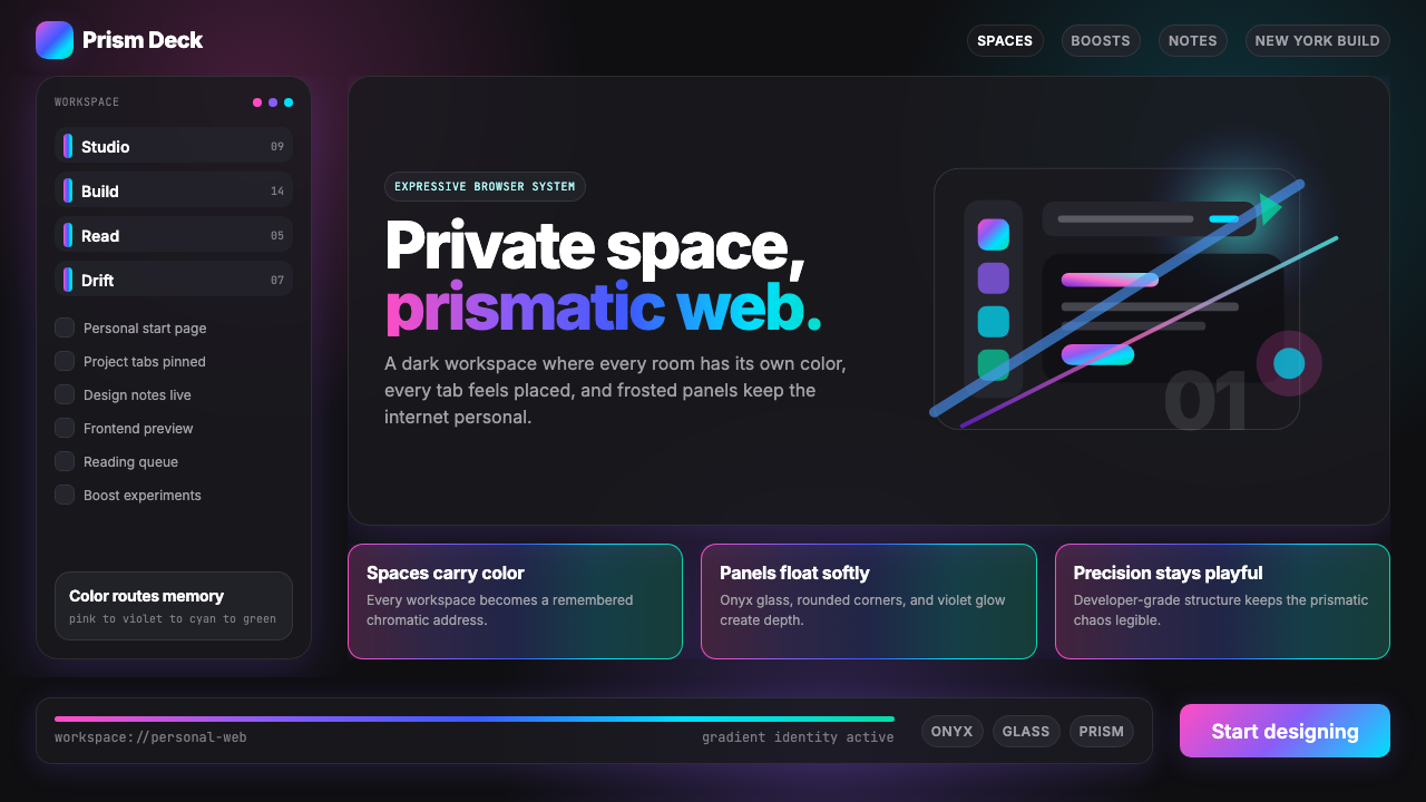
The defining feature of the style is a family of multi-stop gradients that move through warm and cool hues in a single continuous sweep — from pink or rose through violet or purple and into cyan or teal, sometimes extending to emerald green. These are not ambient washes applied to backgrounds; they are structural identity markers assigned to distinct navigational contexts. The gradient becomes a signature, a spatial address, a way of knowing at a glance which part of your digital life you are inside.这套风格的核心特征是一族多色节点渐变,以单一连续的弧线穿越暖色与冷色——从粉红或玫瑰经由紫罗兰或紫色沉入青色或蓝绿,有时延伸至翡翠绿。这些渐变并非用于背景的漫溢色洗;它们是分配给不同导航情境的结构性身份标识。渐变因此成为一种签名、一个空间地址、一眼认出自己当下置身于数字生活哪个角落的方式。
Dark Glass Surface暗色玻璃质感
The base layer of the interface is deep and near-black — not flat matte black but a surface with implied depth and subtle sheen, evoking polished onyx or tempered glass. This dark ground serves a precise optical function: it amplifies the perceived luminosity and saturation of the gradient overlays, making them glow rather than simply tinting. The darkness is not minimalism; it is contrast engineering in service of the chromatic identity system.界面的基础层深邃而近黑——并非平面哑光黑,而是一种暗示深度与微妙光泽的表面,令人联想到抛光黑曜石或钢化玻璃。这片深色底面承担着精确的光学功能:它放大了渐变叠加层的感知亮度与饱和度,使其呈现出发光感而非仅仅是染色。这种深色并非极简主义;它是服务于色彩身份系统的对比度工程。
Frosted Panel Layering磨砂面板层叠
Over the dark base float translucent panels with a frosted or blurred treatment — sidebar containers, modal sheets, and pop-up cards that suggest depth through controlled opacity rather than hard-edged separation. The frosted surface catches the gradient light from below and diffuses it, creating a soft chromatic bleed that unifies layers without merging them. This layering technique produces a sense of genuine spatial depth within what remains a flat, screen-native interface.在深色基底之上,磨砂或模糊处理的半透明面板悬浮其间——侧边栏容器、模态工作表与弹出卡片,它们通过受控的不透明度而非硬边分隔来暗示纵深。磨砂表面捕捉来自下方的渐变之光并将其漫射,创造出一种柔和的色彩渗透,令各层统一却不融合。这种层叠技法在一个依然平面、原生于屏幕的界面中创造出真实的空间深度感。
Rounded Geometry圆润几何
Every container in the interface — panels, buttons, inputs, cards, and icons — is rounded to a degree that reads as deliberate and generous rather than incidental. Corners are soft enough to feel approachable without collapsing into bubble-like softness. This consistency of rounding creates a visual rhythm: the eye moves through the interface without encountering a single sharp corner, giving the experience a flowing, low-friction quality that complements the gradients' own sense of movement.界面中的每一个容器——面板、按钮、输入框、卡片与图标——都被圆角处理到一种读来既刻意又慷慨而非偶然的程度。圆角柔和到令人感到亲切,又不至于坍塌为泡泡般的软糯。这种圆角的一致性创造出视觉韵律:眼睛流过界面而不遭遇任何一处锐角,赋予这段体验一种流畅、低摩擦的品质,与渐变本身的流动感相互呼应。
Soft Glow Shadows柔光投影
Rather than the hard-edged drop shadows of flat design or the ambient occlusion of skeuomorphic interfaces, Arc Prismatic uses glow-style shadows — diffuse halos of light that radiate from illuminated or elevated elements. These glows are often tinted with the prevailing gradient color, so a violet Space produces violet-tinted glow shadows around its panels. The effect is closer to the luminescence of a backlit object than to a cast shadow, reinforcing the sense that elements emit rather than block light.Arc 棱镜风格并不使用平面设计的硬边投影,也不使用拟物化界面的环境光遮蔽,而是使用辉光式投影——从发光或抬升元素向外辐射的漫射光晕。这些光晕通常带有当前渐变色的色调,因此紫罗兰色的 Space 会在其面板周围产生紫色调的辉光投影。效果更接近背光物体的发光质感,而非投射阴影,进一步强化了元素是在发射而非遮挡光线的感觉。
Color as Spatial Address色彩即空间地址
In conventional interfaces, color is used decoratively or as an accent signal. In Arc Prismatic, color is architectural. Each Space — a distinct organizational context within the browser — has its own gradient signature, making the chromatic palette a navigational system. A user does not only know which Space they are in by reading a label; they know it by feeling the color. This is color-as-information-architecture: hue replaces text as the primary spatial identifier.在传统界面中,色彩被用作装饰或强调信号。在 Arc 棱镜风格中,色彩是建筑性的。每个 Space——浏览器内部一个独立的组织情境——都拥有自己的渐变签名,令色彩色板成为一套导航系统。用户不仅仅靠阅读标签来知晓自己身处哪个 Space;他们靠感知色彩来知晓。这是色彩即信息架构:色调取代文字成为首要的空间标识符。
Holographic Atmosphere全息氛围
Taken together — the dark ground, the spectral gradients, the frosted layers, the glow shadows, the rounded forms — the visual language produces an atmosphere that feels holographic: luminous, layered, and slightly otherworldly. It evokes the shimmer of light on a CD surface, the glow of a neon sign reflected in a rain-wet street, or the spectral spread of dawn light. The style does not represent a physical environment; it creates a digital one with its own distinct ambient quality.综合来看——深色基底、光谱渐变、磨砂层叠、辉光投影、圆润形态——这套视觉语言营造出一种全息的氛围:发光的、有层次的、带有一丝异世界感。它唤起光线打在 CD 表面的闪烁、霓虹灯映照在雨湿街道上的光晕,或是黎明之光的光谱展开。这套风格并不再现某个物理环境;它创造了一个拥有独特环境气质的数字空间。
See the Arc Browser Prismatic (2023) design system →查看 Arc Browser Prismatic (2023) 完整设计系统 →
Who shaped Arc Browser Prismatic (2023)?谁塑造了 Arc Browser Prismatic (2023)?
Miller co-founded The Browser Company after working in product roles at Facebook and elsewhere. His vision was to reclaim the browser as a creative and personal environment rather than a neutral utility. Under his leadership, Arc developed the concept of Spaces — distinct browsing contexts each with their own identity — which became the structural justification for the entire gradient-based color system. Miller's background in product management rather than pure engineering gave the company's approach an unusual emphasis on emotional resonance and personal expression as legitimate product values.Miller 在 Facebook 等公司担任产品职位之后联合创立了纽约浏览器公司。他的愿景是将浏览器重新定义为一个富有创意与个性的环境,而非一件中性的工具。在他的领导下,Arc 发展出 Space 的概念——每个拥有独立身份的独特浏览情境——这成为整套基于渐变的色彩系统的结构性正当理由。Miller 的产品管理背景(而非纯工程背景)赋予了这家公司一种不寻常的取向:将情感共鸣与个人表达视为合法的产品价值。
Agrawal co-founded The Browser Company alongside Miller and served in engineering leadership roles. The technical challenge of implementing the Arc visual language — particularly the performant rendering of layered translucent surfaces, gradient compositing, and dynamic color theming — fell substantially to the engineering team he helped build. The fact that the gradient system is dynamic (users can choose or generate their own Space gradients) rather than fixed represents a significant engineering achievement that distinguishes Arc from products that use static branded gradients.Agrawal 与 Miller 共同创立了纽约浏览器公司,并担任工程领导职位。实现 Arc 视觉语言的技术挑战——尤其是层叠半透明表面的高性能渲染、渐变合成与动态色彩主题——很大程度上落在他参与组建的工程团队肩上。渐变系统是动态的(用户可以选择或生成自己的 Space 渐变),而非固定预设,这一事实代表了一项重大的工程成就,使 Arc 有别于使用静态品牌渐变的产品。
Parrott joined The Browser Company as a designer and was instrumental in shaping the Arc visual language, including the prismatic gradient system and the overall dark, holographic aesthetic. His design background encompassed both product interfaces and a sensibility for crafted, expressive software. His work on Arc demonstrated that a browser's own chrome could be treated with the same level of aesthetic intentionality usually reserved for consumer apps or editorial products.Parrott 以设计师身份加入纽约浏览器公司,在塑造 Arc 视觉语言方面发挥了关键作用,包括棱镜渐变系统与整体的暗色全息美学。他的设计背景涵盖产品界面与一种精工表达性软件的感性。他在 Arc 上的工作证明了:浏览器自身的界面外壳可以被赋予通常只留给消费应用或编辑产品的同等审美意图。
Williams brought to The Browser Company a background in developer relations and engineering, combined with a strong public presence in the web development community. Her involvement with Arc helped shape the browser's identity at the intersection of developer sensibility and consumer expression — a pairing that is characteristic of Arc's overall positioning. The browser's appeal to creative technologists and frontend developers owes something to the credibility her voice lent to the project.Williams 带着开发者关系与工程背景加入纽约浏览器公司,同时在网络开发社群拥有广泛的公众影响力。她参与 Arc 的工作,帮助在开发者感性与消费者表达的交汇处塑造了这款浏览器的身份——这种配对正是 Arc 整体定位的特征。这款浏览器对创意技术人员和前端开发者的吸引力,部分得益于她的声音赋予项目的可信度。
Beyond named individuals, Arc's visual language was produced by a small, tight-knit design team operating in New York City's creative technology community. The team's collective sensibility — inflected by editorial design, brand identity work, and the specific cultural texture of early 2020s Brooklyn and lower Manhattan — is legible in the finished product. Arc Prismatic is in many ways a NYC product: opinionated, expressive, slightly theatrical, and convinced that software can and should have a genuine aesthetic personality.除了具名个人之外,Arc 的视觉语言由一个紧密协作的小型设计团队打造,他们活跃于纽约市的创意科技社群。团队的集体感性——受编辑设计、品牌识别工作,以及 2020 年代初布鲁克林与曼哈顿下城特定文化气质的浸染——在最终产品中清晰可读。Arc 棱镜风格在许多方面是一件纽约产品:有主见、有表达力、略带剧场感,并且笃信软件能够也应该拥有真实的审美个性。
How do you use Arc Browser Prismatic (2023) today?今天怎么用 Arc Browser Prismatic (2023)?
Arc Browser Prismatic translates most naturally into digital contexts where personal identity, expressiveness, and immersive depth are desired qualities. The style rewards careful application: it is not a palette to be borrowed piecemeal but a system whose power comes from the interaction of several components simultaneously — dark ground, luminous gradient, frosted layering, and rounded geometry working together.Arc 浏览器棱镜风格最自然地迁移到那些以个体身份、表达力与沉浸式纵深为期望品质的数字语境中。这套风格需要谨慎应用:它不是一套可以零散借用的色板,而是一个系统——其力量来自多个组成部分同时协作:暗色基底、发光渐变、磨砂层叠与圆润几何,共同运作。
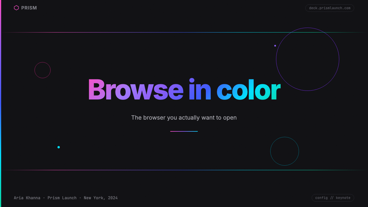
For presentation slides, the style works best on covers and section dividers where full-bleed impact matters. A dark cover slide with a prismatic gradient sweeping from one corner — tinted pink through violet into cyan — immediately establishes a tone of creative sophistication. The gradient should function as a light source: other elements on the slide appear to be illuminated by it rather than placed on top of it. Content slides should be treated more sparingly: maintain the dark background, use light type with high contrast, and reserve gradient accents for emphasis elements like pull-quotes or highlighted data points. Overusing the gradient on every content slide produces visual fatigue; the system works through contrast between expressive and restrained moments.在演示文稿中,这套风格在封面与章节分割页上表现最佳,那些需要全出血视觉冲击力的场合。一张深色封面配以棱镜渐变从某个角落横扫——由粉红经紫罗兰流入青色——立即确立了一种创意精致的基调。渐变应当充当光源:幻灯片上的其他元素看起来像是被它照亮,而非被放置其上。内容幻灯片应当处理得更为克制:保持深色背景,使用高对比度的浅色文字,将渐变强调保留给引述或高亮数据点等重点元素。在每张内容幻灯片上过度使用渐变会产生视觉疲劳;这套系统靠表达性时刻与克制时刻之间的对比来运作。
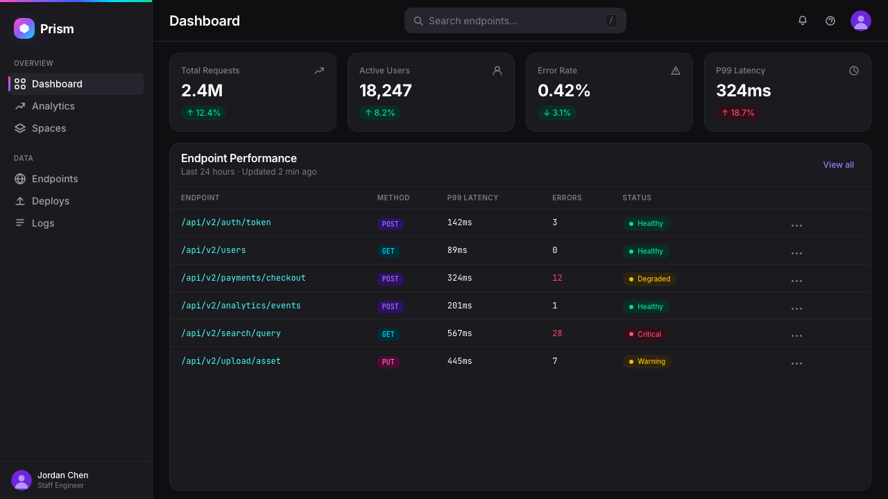
For web interfaces and dashboards, Arc Prismatic suits contexts where the user maintains an ongoing relationship with the product — creative tools, personal productivity environments, portfolio platforms, and developer tools. The dark surface with gradient identity markers communicates that the interface is an environment to inhabit, not just a form to fill. Apply gradients sparingly as sidebar accents, active-state indicators, or header treatments; use frosted card components for elevated content; and maintain generous rounded corners throughout. Flat, unshadowed cards undermine the system — soft glow shadows are essential to the sense of floating depth.对于网页界面与仪表板,Arc 棱镜风格适合用户与产品保持持续关系的语境——创意工具、个人生产力环境、作品集平台与开发者工具。深色表面配以渐变身份标识,传递出界面是一个可以栖居的环境,而非一张待填写的表单。将渐变谨慎地用作侧边栏强调、激活状态指示或页眉处理;使用磨砂卡片组件承载抬升内容;并在整个界面保持慷慨的圆角。平面无投影的卡片会破坏这套系统——柔光辉光投影对于悬浮纵深感至关重要。
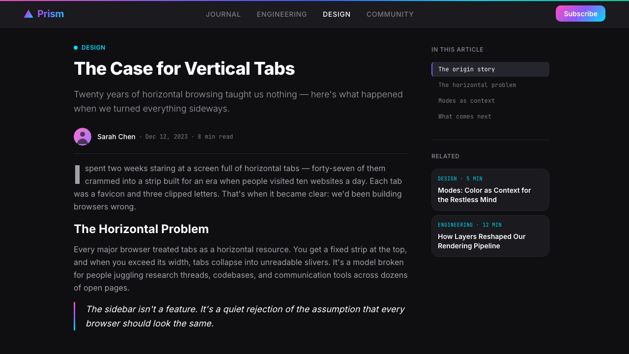
For marketing and editorial work, the style handles hero sections and campaign imagery well, particularly for technology products that want to communicate creative energy without relying on photography. A dark hero with a gradient wash, minimal type in high contrast, and a single frosted feature panel creates a visual hierarchy that reads at a glance. The style is less suited to text-heavy editorial contexts: the dark background and chromatic complexity work against sustained reading comfort. Use it for visual identity and short-copy moments, then transition to lighter surfaces for long-form content.对于营销与编辑内容,这套风格在英雄区块与活动图像上表现出色,尤其适合希望传达创意能量而不依赖摄影的科技产品。一张配有渐变色洗的深色英雄图,搭配高对比度的简洁文字与单一磨砂特色面板,创造出一眼可读的视觉层级。这套风格不太适合文字密集的编辑语境:深色背景与色彩复杂性会对持续阅读的舒适度产生阻力。将它用于视觉识别与短文案时刻,然后在长篇内容中过渡到较浅的表面。
A common mistake is treating the gradient as decorative wallpaper — tiling it uniformly behind content as a textured background without structural intent. Authentic Arc Prismatic uses gradient purposefully: it marks a Space, a boundary, a state change, or a moment of emphasis. When the gradient appears everywhere, it loses its identity function entirely and reads as mere decoration. Similarly, mixing the full warm-to-cool range with additional unrelated colors destroys the spectral coherence that makes the system feel prismatic rather than randomly colorful.一个常见错误是将渐变当作装饰性壁纸——将其均匀铺于内容之后作为有质感的背景,而不带任何结构意图。真实的 Arc 棱镜风格有目的地使用渐变:它标记一个 Space、一条边界、一次状态变化,或一个强调时刻。当渐变无处不在,它便完全失去身份功能,沦为纯粹的装饰。同样,将完整的暖冷色全谱与其他无关色彩混用,会破坏使这套系统感觉是棱镜折射而非随机多彩的光谱连贯性。
See the Arc Browser Prismatic (2023) design system →查看 Arc Browser Prismatic (2023) 完整设计系统 →
Arc Browser Prismatic (2023) — FAQArc Browser Prismatic (2023) · 常见问题
How is Arc Prismatic different from generic dark-mode gradients?Arc 棱镜风格与普通深色模式渐变有什么不同?
The distinction is structural versus decorative. Generic dark-mode products with gradients typically use gradient as background decoration — a visual flourish applied to an existing layout without changing how the interface is organized. Arc Prismatic uses gradient as the primary organizational signal: each distinct context (Space) has a unique gradient signature, so the color itself tells you where you are. The gradient is the navigation, not the wallpaper. Additionally, Arc's gradient system is dynamic — users can assign or generate their own gradient signatures — which makes color identity genuinely personal rather than brand-imposed.区别在于结构性与装饰性之分。普通带渐变的深色模式产品通常将渐变用作背景装饰——一种视觉点缀,叠加于已有版面之上,而不改变界面的组织方式。Arc 棱镜风格将渐变用作首要的组织信号:每个独立情境(Space)拥有独特的渐变签名,因此色彩本身告诉你身在何处。渐变是导航,不是壁纸。此外,Arc 的渐变系统是动态的——用户可以分配或生成自己的渐变签名——这使得色彩身份真正成为个人化的,而非品牌强加的。
Can this style work on a light background?这套风格能用在浅色背景上吗?
Technically possible but fundamentally compromised. The optical logic of Arc Prismatic depends on the dark ground to amplify the perceived luminosity of the gradients — the gradients glow because they are contrasted against near-black. On a white or light background, the same gradients appear washed out and lose the sense of internal light. The frosted glass treatment also loses its visual logic on light backgrounds, where translucency reads as muddy rather than ethereal. If a light-background variant is required, consider treating the gradients only as thin accent bands, active-state highlights, or hover states, rather than as atmospheric elements.技术上可行,但从根本上会大打折扣。Arc 棱镜风格的光学逻辑依赖于深色基底来放大渐变的感知亮度——渐变之所以发光,是因为与近黑形成了对比。在白色或浅色背景上,同样的渐变会显得褪色,失去内在光感。磨砂玻璃处理在浅色背景上也失去其视觉逻辑——半透明在那里读来浑浊而非飘逸。如果必须采用浅色背景变体,建议仅将渐变用作细窄的强调条带、激活状态高亮或悬停状态,而非大气性的氛围元素。
Is this style appropriate for enterprise or B2B products?这套风格适合企业或 B2B 产品吗?
It depends heavily on the product's positioning and the audience's expectations. Arc Prismatic signals creative expressiveness and personal identity — qualities that resonate in developer tools, design software, creative agency platforms, and products targeting technically sophisticated early adopters. It is a poor fit for financial dashboards, healthcare applications, legal software, or any context where institutional authority and neutral clarity are the primary trust signals. The gradient-driven identity system can feel playful rather than professional in contexts where users expect the interface to subordinate itself to the task. Read your audience's aesthetic expectations before committing.这在很大程度上取决于产品的定位与受众的期望。Arc 棱镜风格传递创意表达性与个体身份感——这些品质在开发者工具、设计软件、创意机构平台,以及面向技术成熟型早期采用者的产品中能引发共鸣。它不适合金融仪表板、医疗应用、法律软件,或任何以机构权威感与中性清晰度作为首要信任信号的语境。在用户期望界面让位于任务的场合,渐变驱动的身份系统可能显得俏皮而非专业。在确定风格之前,请认真读懂受众的审美期望。
How many gradient colors should a single Space use?单个 Space 应该使用多少种渐变颜色?
Arc's own gradient signatures typically move through three to four hue stops — enough to create the prismatic spectral effect without becoming visually chaotic. The key constraint is that the gradient should read as a coherent sweep, not as a collection of separate color bands. This means the hues must be adjacent or near-adjacent on the color wheel, or connected through a shared warm-to-cool logic. Gradients that jump discontinuously across the color wheel feel jarring rather than prismatic. In practice, two or three stops with carefully chosen intermediate values will produce a cleaner, more sophisticated result than five or six stops in rapid sequence.Arc 自身的渐变签名通常穿越三到四个色调节点——足以创造棱镜光谱效果,又不至于视觉混乱。关键约束是:渐变应读来如一次连贯的横扫,而非若干独立色带的集合。这意味着色调必须在色轮上相邻或近邻,或通过共同的暖冷逻辑相互连接。在色轮上跳跃性不连续的渐变感觉突兀而非棱镜效果。实践中,两到三个节点配以精心选择的中间值,会比五到六个快速序列的节点产生更干净、更精致的结果。
Does Arc Prismatic have a relationship to earlier holographic or iridescent design trends?Arc 棱镜风格与早期的全息或虹彩设计潮流有什么关联?
Yes, it sits within a broader wave of holographic and iridescent aesthetics that gained prominence in graphic design and fashion roughly between 2016 and 2020 — think holographic foil packaging, iridescent gradients in music merchandise, and the metallic shimmer that appeared across fashion and luxury branding. Arc Prismatic inherits the spectral, multi-hue gradient logic from this wave but domesticates it into a functional interface context. Where the earlier trend was largely decorative and was associated with a specific pop-cultural moment, Arc Prismatic deploys the same optical logic with structural purpose, embedding it in a navigation system rather than using it as surface texture. This transformation from decoration to function is what gives the style durability beyond its trend moment.是的,它置身于一股更宏观的全息与虹彩美学浪潮之中——这股浪潮大约在 2016 至 2020 年间在平面设计与时尚界获得突出地位——想想全息箔纸包装、音乐周边上的虹彩渐变,以及出现在时尚与奢侈品牌形象中的金属光泽。Arc 棱镜风格从这股浪潮中继承了光谱式多色调渐变逻辑,但将其驯化进了一个功能性界面语境。早期潮流主要是装饰性的,并与特定的流行文化时刻相关联;而 Arc 棱镜风格以结构性目的部署了同样的光学逻辑,将其嵌入导航系统,而非用作表面纹理。从装饰到功能的这一转变,赋予了这套风格超越其潮流时刻的持久生命力。
Related design styles相关设计风格
 Discord 2024Blurple cozy. Charcoal grounds, illustrated characters — every surface says '…刻意去企业化的语音聊天:blurple 蓝紫、深炭灰底、俏皮插画角色——每个界…
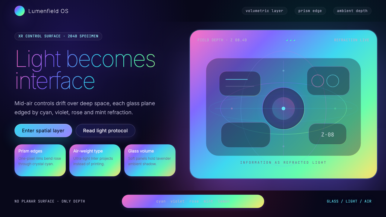 Holographic UI 2040Information made of light. Deep-space black, ultra-light Inter and prismatic…信息由光构成:深空黑、极细 Inter 与棱镜玻璃边缘。
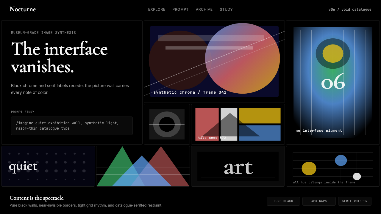 MidjourneyInvisible chrome, visible art. Pure black grid and Cormorant serif give color…界面隐身,图像发声。纯黑网格与细衬线让色彩只属于作品。
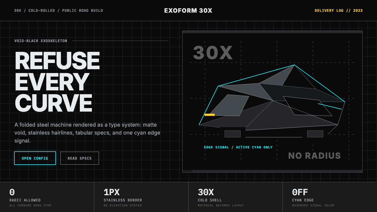 Tesla Cybertruck Stainless (2023)Refusal made material. Void black, stainless hairlines, cyan edges, faceted I…拒绝曲线:虚空黑、不锈钢发丝线、电子青边与棱面 Inter。
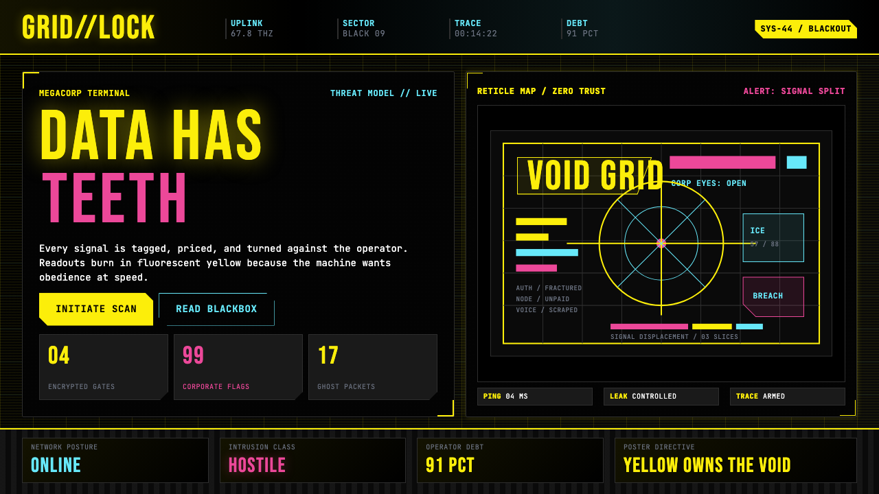 Cyberpunk 2077 (Screen UI)Weaponized terminals. Fluorescent yellow on black, scanlines and bracketed HU…被武器化的终端:黑底荧光黄、扫描线与HUD方括号网格。
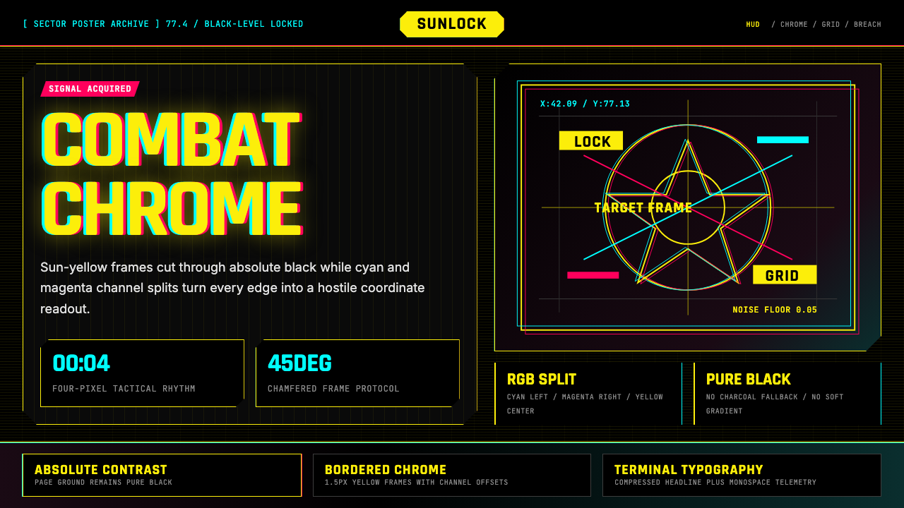 Cyberpunk 2077 Night City YellowCombat HUD on black. Sun-yellow chrome splits into magenta-cyan coordinate gr…黑底战斗HUD:太阳黄框架裂出品红与青色坐标网。