Design style guide设计风格指南
What is Tesla Cybertruck Stainless (2023)?什么是 Tesla Cybertruck Stainless (2023)?
The Cybertruck didn't borrow a design language — it refused every existing one, and in doing so forced a truck into becoming a typeface.Cybertruck 没有借用任何一种设计语言——它拒绝了所有现存的语言,由此迫使一辆卡车变成了一套字体。
Tesla Cybertruck Stainless (2023) in briefTesla Cybertruck Stainless (2023) 速览
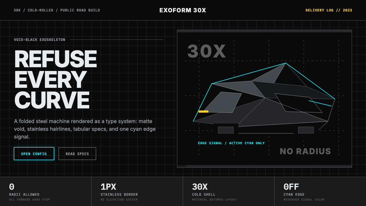
The Tesla Cybertruck Stainless design system is, at its core, an act of industrial refusal translated into visual grammar. Where conventional automotive brands reach for warmth, roundness, and aspirational chrome, the Cybertruck makes the opposite every choice: void-black surfaces, hairline metallic borders, a single electric-cyan accent reserved exclusively for interactive affordances, and an all-caps typographic voice that admits no softening. It is the first automotive design language in decades to genuinely disturb the conventions it inherits.特斯拉 Cybertruck 不锈钢设计系统,从本质上说,是一次工业层面的拒绝被翻译成视觉语法的结果。传统汽车品牌惯于诉诸温暖、圆润与令人憧憬的镀铬光泽,Cybertruck 则在每一个选择上作出相反的回答:虚空黑底面、发丝级金属边线、仅为交互状态保留的单一电子青色,以及不允许任何柔化的全大写排版语调。它是数十年来第一个真正撼动自身所继承传统的汽车设计语言。
What makes the system coherent rather than merely aggressive is its internal consistency. Every element answers to the same governing logic: the exoskeleton of thirty-X cold-rolled stainless steel is not disguised or wrapped — it is translated directly into the digital brand. Borders that echo a hairline industrial weld, surfaces that refuse gradient and shadow softness, accents the color of an electrical arc — these are not styling choices laid over an object but principles extracted from the object's material nature and restated in every context where the brand appears.让这套系统保持连贯而非仅仅激进的,是其内在的彻底一致性。每一个元素都服从于同一条支配逻辑:30X 冷轧不锈钢外骨骼没有被遮蔽或包裹——它被直接翻译为数字品牌。呼应工业焊缝发丝精度的边框,拒绝渐变与柔影的表面,带着电弧颜色的强调色——这些不是叠加在对象之上的风格选择,而是从对象的材料本性中提炼出来、并在品牌出现的每一个语境中重新陈述的原则。
The result reads simultaneously as brutalist and futurist, as spare as a circuit diagram and as confrontational as a warning sign. The Cybertruck design language does not court the viewer; it presents itself as a structural fact. This combination of material honesty, geometric severity, and restrained chromatic logic gives it a quality rare in contemporary brand design: it cannot be mistaken for anything else.结果呈现出一种同时属于粗野主义与未来主义的气质:像电路图一样简洁,像警示标志一样对抗。Cybertruck 设计语言不讨好观看者;它以一种结构性事实的姿态呈现自己。材料诚实、几何严肃与克制的色彩逻辑的组合,赋予了它当代品牌设计中罕见的一种品质:它不可能被误认为任何其他东西。
Where does Tesla Cybertruck Stainless (2023) come from?Tesla Cybertruck Stainless (2023) 从何而来?
The Cybertruck's design history begins not with a sketch but with a constraint: Elon Musk's 2017 mandate that the vehicle use a cold-rolled stainless-steel monocoque body. Traditional automotive steel is stamped — shaped under enormous pressure into curved panels. Stainless steel of the grade required for structural rigidity cannot be stamped in the same way; it must be bent along straight lines. The flat faceted geometry of the Cybertruck is not an aesthetic choice made by a designer looking at a mood board — it is the visual consequence of a materials decision made by an engineer.Cybertruck 的设计历史并非始于一张草图,而是始于一个约束条件:埃隆·马斯克在2017年提出使用冷轧不锈钢单体式车身的要求。传统汽车钢板是冲压成型的——在巨大压力下塑造成弯曲的面板。达到结构刚性所需等级的不锈钢无法以同样方式冲压;它只能沿直线折弯。Cybertruck 那平坦棱面的几何形态,并非设计师盯着情绪板做出的美学选择——它是工程师的材料决策所导致的视觉后果。
Franz von Holzhausen, Tesla's chief designer, worked with this constraint as a generative condition rather than a limitation. The precedents he cited publicly included the Lotus Esprit submarine from the 1977 film 'The Spy Who Loved Me' and the Giorgetto Giugiaro-designed wedge vehicles of the 1970s and 1980s — forms already tilted toward the polygonal and the angular. The Blade Runner visual universe, with its wet industrial surfaces and cold-spectrum lighting, provided a chromatic and atmospheric reference. But neither of these fully explains the Cybertruck's specific visual grammar; that emerged from the decision to make no attempt to disguise what the truck actually is.特斯拉首席设计师弗朗茨·冯·霍尔茨豪森将这一约束视为生成性条件而非局限。他公开引用的参照物包括1977年电影《海底城》中的莲花 Esprit 水下车以及乔治亚罗在1970至1980年代设计的楔形车型——这些形态已经倾向于多边形与棱角。以潮湿工业表面与冷色调照明著称的《银翼杀手》视觉宇宙提供了色彩与氛围参照。但这些都无法完全解释 Cybertruck 的具体视觉语法;那种语法来自一个决定:不试图掩盖这辆卡车本来的面目。
Unveiled in November 2019 in Hawthorne, California — with the notorious live demonstration in which its 'armored glass' immediately cracked — the Cybertruck became an immediate cultural event. The design was polarizing precisely because it violated every existing expectation for the category: pickup trucks are typically designed to appear capable and approachable, often deploying chrome, sculptural curves, and warm earth tones. The Cybertruck offered flatness, silver-gray, and a silhouette that referenced construction equipment more than consumer vehicles.2019年11月,Cybertruck 在加州霍桑揭幕——伴随着那场臭名昭著的现场演示,「装甲玻璃」当场碎裂——并立即成为一场文化事件。这一设计之所以引发两极分化,恰恰是因为它违反了这个品类的所有既有预期:皮卡通常被设计成看起来既能干又平易近人,惯用镀铬、雕塑感曲线与大地暖色调。Cybertruck 提供的是平面、银灰,以及一个更接近工程设备而非消费载具的轮廓。
First deliveries of the production vehicle began in November 2023, four years after the reveal, and the brand visual system that had been developed around the truck was consolidated and deployed across Tesla's Cybertruck-specific digital touchpoints during 2023 and 2024. The Austin, Texas Gigafactory, which manufactures the vehicle, became a secondary reference point in the brand's visual vocabulary — industrial scale, corrugated steel, the aesthetic of a place built for a purpose rather than for appearance. The design language that had started as a consequence of materials engineering had, by this point, become a fully articulated brand system with its own internal logic, chromatic vocabulary, and typographic register.量产车型的首次交付于2023年11月启动,距发布会整整四年。围绕这辆卡车建立的视觉系统,在2023至2024年间被整合并部署于特斯拉与 Cybertruck 相关的数字触点。制造这辆车的德州奥斯汀超级工厂成为品牌视觉词汇的次级参照——工业尺度、波纹钢板、为目的而非为外观而建的场所美学。那套始于材料工程约束的设计语言,至此已发展成为一套拥有完整内部逻辑、色彩词汇与排版语域的品牌系统。
What defines the Tesla Cybertruck Stainless (2023) look?Tesla Cybertruck Stainless (2023) 的视觉特征是什么?
Surface and Ground表面与底面
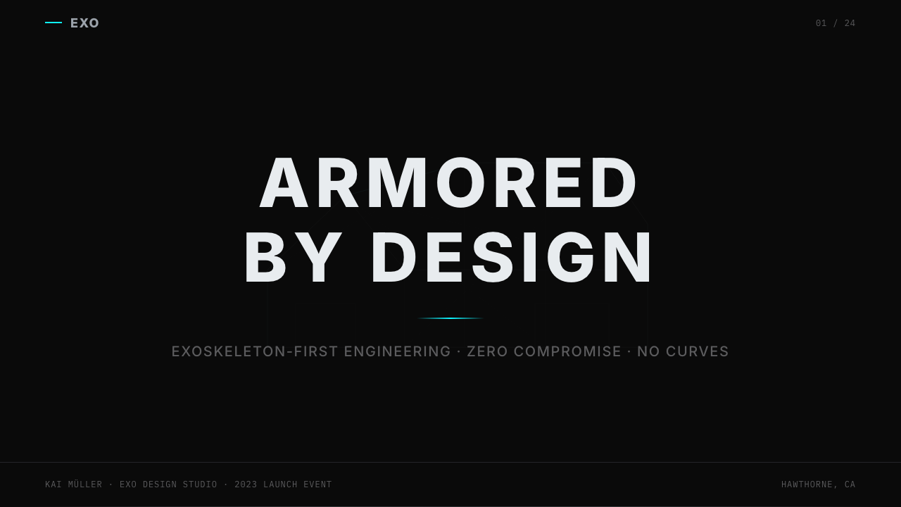
The dominant surface is absolute black — not charcoal, not dark navy, but a void that reads as the absence of color rather than a color in its own right. Against this ground, every other element registers with surgical clarity. The stainless-steel hairline borders that trace edges and panel breaks echo the physical material of the vehicle itself: fine, precise, and cold. There are no gradients on these surfaces, no soft-to-hard transitions, no atmospheric perspective. The ground is a decision, not a background.主导表面是绝对的黑——不是炭灰,不是深海军蓝,而是一种读作颜色缺席而非某种颜色本身的虚空。在这片底面上,每一个其他元素都以外科手术般的清晰度显现。沿边缘与面板分割线描画的不锈钢发丝边框,呼应着车辆本身的物质材料:纤细、精确、冷峻。这些表面上没有渐变,没有从柔到硬的过渡,没有大气透视。底面是一个决定,而非一个背景。
The Accent Color强调色
A single electric cyan — the hue of cathode-ray light, of a neon arc discharge, of early-digital phosphor screens — serves as the system's sole accent. It appears on interactive affordances: active states, selection indicators, progress markers, the illuminated trim lines on the physical vehicle. It never appears decoratively and never appears in multiples simultaneously. Its scarcity is what gives it authority; overuse would collapse the system's chromatic logic. Alongside this, amber is reserved specifically for beta states and warnings — a secondary signal rather than a design element.单一的电子青色——阴极射线光的色调,霓虹弧放电的色调,早期数字磷光屏的色调——作为系统唯一的强调色。它出现在交互元素上:激活状态、选中指示符、进度标记,以及实体车辆上的发光装饰线条。它从不装饰性地出现,也从不同时以多处出现。它的稀缺性赋予了它权威;过度使用会瓦解系统的色彩逻辑。除此之外,琥珀色专为测试状态与警告保留——它是一个次级信号,而非一个设计元素。
Typography字体排印
All type is set in capitals or in tabular figures — there are no lowercase letters in primary communications, and numbers are always monospaced so that data columns align with mechanical precision. The underlying typeface is geometric and humanist in equal measure, pushed to extremes that the original designers probably did not intend: tracking is wide, weight is heavy, and the letters carry a faceted quality that mirrors the polygonal surfaces of the vehicle. Reading this system, one gets the impression that the text was machined rather than written.所有字体都以大写字母或等宽数字排列——主要传播物中没有小写字母,数字始终是等宽的,以便数据列以机械精度对齐。底层字体在等几何与人文之间取得平衡,但被推向了原设计师可能未曾预料的极端:字间距宽阔,字重沉重,字母带有一种棱面感,呼应车辆的多边形表面。阅读这套系统时,人会产生一种印象:这些文字是被机加工出来的,而非被书写出来的。
Geometry and Edge几何形态与边缘
Every form is bounded by a straight line or a consistent bevel — no soft radii, no organic curves, no transitions that dissipate into ambiguity. Corners are decisions. Panels meet at angles that recall the industrial bending of sheet metal. Interface elements — cards, containers, dividers — inherit this angularity and treat it as structural rather than decorative. The visual vocabulary is closer to architectural drawing than to conventional digital UI: what you see are forms, not suggestions.每一个形态都由直线或一致的斜切面界定——没有柔和的圆角,没有有机曲线,没有消散于模糊的过渡。转角是决定。面板以令人联想到钣金工业折弯的角度相交。界面元素——卡片、容器、分割线——继承了这种棱角感,并将其视为结构性而非装饰性的。视觉词汇更接近建筑制图而非常规数字界面:你所见的是形态,而非暗示。
Photography Register摄影调性
Photography in this system uses low angles, industrial environments, and conditions that emphasize scale and material surface. The vehicle appears in desert or coastal locations where ambient light is cold and directional, where the stainless surface can be seen to reflect horizon and sky rather than warmth or comfort. There are no lifestyle photographs, no smiling occupants, no domesticated settings. When humans appear, they are typically in silhouette or at a distance that reduces them to scale figures against the mass of the object. The environment frames the vehicle as an artifact of the landscape, not a consumer product within it.这套系统中的摄影采用低角度、工业环境,以及强调尺度与材料表面的条件。车辆出现在沙漠或海岸地带,环境光冷峻而有方向性,不锈钢表面可见地反射着地平线与天空,而非温暖或舒适。没有生活方式照片,没有微笑的乘客,没有家常化的场景。当人类出现时,通常是剪影或处于足够远的距离,被简化为对象巨大体量前的比例参照图。环境将车辆定格为地景中的一件器物,而非地景中的一件消费品。
Data and Information数据与信息
Numeric and performance data are treated as primary visual content, not secondary annotation. Specifications — range, payload, acceleration figures — are set in large tabular type and presented with the visual weight ordinarily reserved for headlines. The implication is that the numbers are the product's core argument, and the design system's job is to make that argument as legible and undeniable as possible. Graphs and data visualizations, where they appear, are hard-edged and flat, using the system's chromatic rules without softening.数字与性能数据被视为主要视觉内容,而非次要注释。规格参数——续航里程、载重、加速数据——以大号等宽字体排列,呈现出通常为标题保留的视觉分量。其含义是:这些数字是产品的核心论据,而设计系统的工作是让这个论据尽可能清晰且不可否认。图表与数据可视化(在出现的情况下)是硬边且平面的,遵循系统的色彩规则,不做任何软化处理。
Absence as Principle缺席作为原则
What is not present in this design system is as defining as what is present. There are no warm earth tones, no soft drop shadows, no rounded corners, no decorative iconography, no gradient fills, no textures simulating natural materials. The restraint is not minimalism in the contemporary digital sense — a careful curation of pleasing emptiness — but rather a systematic exclusion of every visual element that might soften, domesticate, or normalize the object. Each omission reinforces the same argument: this vehicle is not interested in making you comfortable, and neither is its brand.在这套设计系统中,缺席的东西与存在的东西同样具有定义性。没有大地暖色调,没有柔和的投影,没有圆角,没有装饰性图标,没有渐变填充,没有模拟自然材料的纹理。这种克制并非当代数字意义上的极简主义——那种对令人愉悦的空白的精心策划——而是对每一个可能软化、家常化或使对象正常化的视觉元素的系统性排除。每一处省略强化着同一个论点:这辆车无意让你感到舒适,它的品牌也是如此。
Who shaped Tesla Cybertruck Stainless (2023)?谁塑造了 Tesla Cybertruck Stainless (2023)?
As Tesla's chief executive and the driving force behind the Cybertruck program, Musk established the founding constraint — stainless-steel exoskeleton — that determined the vehicle's geometry and, by extension, its visual brand. His public references to Blade Runner and to first-principles engineering thinking as design methodology provided the cultural and conceptual framework within which the design team operated. Musk also personally approved the polarizing design against internal pressure to soften or conventionalize it, making his aesthetic judgment as much a part of the system's origin as any formal design decision.作为特斯拉首席执行官和 Cybertruck 项目的推动力,马斯克确立了根本约束条件——不锈钢外骨骼——这一约束决定了车辆的几何形态,进而决定了其视觉品牌。他公开援引《银翼杀手》以及将第一性原理工程思维作为设计方法论,为设计团队的工作提供了文化与概念框架。马斯克还在内部要求软化或使设计常规化的压力下,亲自批准了这一引发两极分化的设计,使他的美学判断与任何正式设计决定一样,成为这套系统起源的一部分。
Tesla's chief designer since 2008, von Holzhausen translated Musk's material mandate into an articulated visual language. His background includes Volkswagen, General Motors, and Mazda — mainstream automotive design environments — which makes the Cybertruck's departure from automotive convention particularly deliberate. Von Holzhausen has described the design process as collaborative and iterative, with the stainless-steel bending constraint continuously reshaping formal choices. His ability to extract a coherent design language from a production engineering constraint — rather than decorating the constraint away — distinguishes the Cybertruck's visual system from conventional automotive brand design.特斯拉自2008年起的首席设计师冯·霍尔茨豪森,将马斯克的材料命令翻译成一套有条理的视觉语言。他的背景涵盖大众、通用汽车和马自达——主流汽车设计环境——这使得 Cybertruck 对汽车传统的背离显得尤为刻意。冯·霍尔茨豪森曾描述设计过程是协作且迭代的,不锈钢折弯约束不断重塑形式选择。他从生产工程约束中提炼出连贯设计语言的能力——而非将这种约束装饰掉——使 Cybertruck 的视觉系统有别于常规汽车品牌设计。
As Tesla's vice president of vehicle engineering during the Cybertruck development period, Moravy's team was responsible for the structural and manufacturing decisions that gave the vehicle's design language its defining constraints. The choice to use ultra-hard stainless steel — and the tooling decisions that followed from it — were engineering achievements that made the flat faceted body panels not just possible but necessary. In this sense, Moravy occupies a position in the Cybertruck's visual history similar to the structural engineer who constrains an architect: the form is not imposed on the engineering, but extracted from it.作为 Cybertruck 研发期间特斯拉的车辆工程副总裁,莫拉维的团队负责给予这辆车设计语言其定义性约束的结构与制造决策。选择使用超硬不锈钢——以及由此产生的模具决策——是工程成就,不仅使平面棱角车身面板成为可能,更使其成为必然。在这个意义上,莫拉维在 Cybertruck 视觉历史中占据的位置,类似于约束建筑师的结构工程师:形态不是强加于工程之上的,而是从工程中提炼出来的。
The director of Blade Runner (1982) never worked on the Cybertruck, but the visual vocabulary of that film — industrial brutalism, cold blue-cyan lighting against absolute darkness, surfaces that are both metallic and wet, text that is sparse, monospaced, and transactional — is the closest visual precedent for the Cybertruck's aesthetic register. The influence is acknowledged rather than documented: Musk and von Holzhausen cited the Blade Runner world as a reference, and the resulting design system could plausibly serve as a digital-native extension of that film's production design. Scott's vision of a future that is industrial, inhospitable, and visually severe provided the chromatic and atmospheric DNA from which the Cybertruck brand was partly derived.《银翼杀手》(1982年)的导演雷德利·斯科特从未参与 Cybertruck 的工作,但那部电影的视觉词汇——工业粗野主义、绝对黑暗中的冷蓝青照明、既金属又潮湿的表面、稀疏的等宽字体交易性文本——是 Cybertruck 美学语域最接近的视觉先例。这种影响是被承认而非被记录的:马斯克和冯·霍尔茨豪森援引《银翼杀手》世界作为参照,而由此产生的设计系统,完全可以被看作那部电影的美术设计在数字原生语境中的延伸。斯科特对一个工业化的、不宜居的、视觉上严峻的未来的构想,提供了 Cybertruck 品牌部分传承的色彩与大气 DNA。
How do you use Tesla Cybertruck Stainless (2023) today?今天怎么用 Tesla Cybertruck Stainless (2023)?
The Cybertruck Stainless design system is among the most difficult contemporary styles to apply correctly because its power depends entirely on commitment. Half-measures destroy it. A layout that borrows the void black but then softens its cards with rounded corners and drop shadows is not a Cybertruck-inflected design — it is a conventional dark-mode interface that has borrowed an accent color. Applying this system means accepting its constraints in full: hard edges, no gradients, no organic warmth, a single accent that appears sparingly, and type that is capitalized and tabular wherever data or identity is communicated.Cybertruck 不锈钢设计系统是当代最难正确应用的风格之一,因为它的力量完全依赖于彻底的承诺。半途而废会毁掉它。一个借用了虚空黑、却用圆角和投影软化卡片的版面,并非受 Cybertruck 影响的设计——它只是一个借用了强调色的常规深色模式界面。应用这套系统意味着全盘接受其约束:硬边、无渐变、无有机温度、稀少出现的单一强调色,以及在传递数据或身份认同时必须大写且等宽的字体。
For presentation slides, this system is exceptionally well suited to technical product reveals, engineering demonstrations, and performance data communications. Cover slides should function as single-image statements: a nearly full-bleed asset — ideally photographic — with the title set in heavy, widely tracked capitals against a void-black field, and perhaps a single hairline rule to separate identity from content. Content slides should treat the grid as absolute, with data presented in tabular figures at a weight that declares it primary. The cyan accent should appear once per slide at most, used to mark the single most important number or element. Avoid warm photography, illustrated icons, and any element that implies hospitality.在演示文稿中,这套系统特别适合技术产品发布、工程演示和性能数据传播。封面页应当作为单一图像陈述来运作:一张接近满版的资产——最好是摄影——标题以重字重、大字间距的大写字母置于虚空黑底面,也许加一条发丝细线将品牌身份与内容分隔。内容页应将网格视为绝对,数据以等宽数字、以声明它为主要信息的字重呈现。青色强调色每张幻灯片最多出现一次,用于标记最重要的那个数字或元素。避免暖色调摄影、图解式图标,以及任何暗示款待感的元素。
For web interfaces, this system is best deployed in contexts where authority and technical credibility are the primary signals: product specification pages, performance dashboards, configuration tools, and checkout flows for high-consideration purchases. The approach requires a strict grid with no decorative break-outs, a dark or near-black background throughout, and interface elements — buttons, inputs, tabs — that are hard-bordered and flat-shadowed rather than soft. Navigation should be typographic rather than icon-driven. Any use of card components should treat the card border as a deliberate structural line, not a gentle container.对于网页界面,这套系统最适合部署于权威感与技术可信度为主要信号的场景:产品规格页面、性能仪表板、配置工具,以及高决策成本购买的结账流程。这种方法需要严格的网格而无装饰性突破,全程深色或接近黑色的背景,以及硬边框、平投影而非柔和的界面元素——按钮、输入框、标签页。导航应当是字体性而非图标驱动的。任何卡片组件的使用都应将卡片边框视为刻意的结构线,而非温和的容器。
For editorial and marketing work, the system's poster-like severity lends itself to hero sections and full-width feature blocks where a single bold statement is the entire message. Alternating blocks between void-black and a deep neutral gray provides rhythm without introducing warmth. Pull quotes and key statistics should be set at headline scale in capitals, with the cyan accent reserved for the single most important figure. Avoid multi-column body text with generous leading — this system communicates through density and confrontation, not invitation and ease.对于编辑与营销内容,这套系统的海报式严肃感适合主视觉区和全宽特性区块,在那里单一的大胆陈述就是全部信息。在虚空黑与深中性灰之间交替的区块提供节奏感,而不引入温度。引用语与关键统计数据应以大写标题尺寸排列,青色强调色保留给最重要的那个数字。避免行距宽松的多栏正文——这套系统通过密度与对抗传达,而非通过邀请与舒适。
The most common failure mode when applying this system is aesthetic timidity: the instinct to add warmth, to soften edges, to introduce a secondary warm accent, to use lowercase for approachability. Every one of these modifications weakens the system's core claim. The Cybertruck design language works because it is internally consistent and because it refuses to apologize for itself. If the product context cannot support that refusal — if warmth, approachability, or cultural familiarity are required signals — then this system is simply the wrong choice, and a different visual language should be selected rather than this one softened.应用这套系统时最常见的失败模式是美学上的怯懦:那种添加温暖、软化边缘、引入次级暖色强调、用小写字母增加亲和力的本能。这些修改中的每一个都削弱了系统的核心主张。Cybertruck 设计语言之所以有效,是因为它内在一致,且因为它拒绝为自己道歉。如果产品语境无法支持那种拒绝——如果温度、亲和力或文化熟悉感是必要的信号——那么这套系统就只是一个错误的选择,应当选择一种不同的视觉语言,而不是将这套语言软化。
Tesla Cybertruck Stainless (2023) — FAQTesla Cybertruck Stainless (2023) · 常见问题
Is the Cybertruck design system appropriate for products that aren't technology or automotive?Cybertruck 设计系统适合非科技或非汽车类产品吗?
It is appropriate for any product where severity, technical authority, and anti-conventional positioning are genuinely desired signals — not just visually borrowed ones. High-performance physical goods (industrial tools, sporting equipment, architectural hardware), software products in security or infrastructure categories, and brands deliberately positioning themselves against incumbent comfort are all plausible applications. Where it fails is in contexts that require the product to feel accessible, warm, or culturally familiar. A children's educational platform, a food brand, a wellness application, or any consumer product that depends on trust built through warmth would be fighting against this system rather than using it. The question is not whether the style can be applied — it can be applied anywhere — but whether the product's actual values match the system's claims.它适合任何产品,只要这些产品真正需要严肃感、技术权威和反常规定位作为信号——而不仅仅是借用视觉外观。高性能实体商品(工业工具、运动装备、建筑五金)、安全或基础设施类软件产品,以及刻意将自身定位于与现有主流舒适感对立的品牌,都是合理的应用场景。它失效的地方是需要产品感觉易于接近、温暖或具有文化熟悉感的语境。儿童教育平台、食品品牌、健康应用,或任何依赖通过温度建立信任的消费品,都将与这套系统形成对抗,而非使用它。问题不在于这种风格能否被应用——它可以被应用于任何地方——而在于产品的实际价值观是否与系统的主张相符。
How does this system differ from other dark-mode design systems?这套系统与其他深色模式设计系统有何不同?
Most dark-mode design systems are inverted light-mode systems: they take conventions developed for light backgrounds — soft shadows, rounded corners, gradient fills, warm accent colors — and reverse the polarity of the ground. The result is a dark interface that is still fundamentally comfortable and human-scaled. The Cybertruck system does not invert a light convention; it starts from darkness as the primary state. Its geometry, typography, and chromatic logic are all developed for the dark ground and would not translate coherently to a light inversion. The cyan accent, the hairline metallic borders, the absolute black — these only work as a system when the ground is dark. This distinction matters in practice: the Cybertruck system is not interchangeable with dark mode, and cannot be toggled like one.大多数深色模式设计系统是被反转的浅色模式系统:它们将为浅色背景开发的惯例——柔和阴影、圆角、渐变填充、暖色强调——反转底面极性。结果是一个本质上仍然舒适且具有人文尺度的深色界面。Cybertruck 系统不是反转一种浅色惯例;它从黑暗作为首要状态开始。它的几何、排版和色彩逻辑都是为深色底面开发的,无法连贯地转化为浅色反转。电子青色、发丝金属边框、绝对黑——这些只在底面为深色时作为一套系统发挥作用。这一区别在实践中至关重要:Cybertruck 系统与深色模式不可互换,也无法像深色模式那样被切换。
Can the cyan accent be replaced with a different color without breaking the system?青色强调色可以替换为其他颜色而不破坏整套系统吗?
Technically yes, but the replacement must satisfy the same constraints: it must be a cold-spectrum hue (warm accents undermine the system's chromatic logic), it must be sufficiently distinct from the void black to read clearly at small scales, and it must be used with the same discipline — sparingly and exclusively for interactive affordances. Possible substitutions include a cool magenta or a sharp electric green. What does not work is substituting a warm color: orange, coral, gold, and warm yellow all break the system's cold industrial register and immediately signal a different aesthetic world. The accent's specific hue can shift; its temperature cannot.技术上可以,但替换色必须满足相同约束:它必须是冷色谱的色调(暖色强调会破坏系统的色彩逻辑),它必须与虚空黑足够不同以在小尺度上清晰显现,并且必须以相同的纪律使用——稀少地且专门用于交互元素。可能的替代选项包括冷品红或尖锐的电子绿。不起作用的是以暖色替换:橙色、珊瑚色、金色和暖黄色都会打破系统的冷工业语域,并立即发出一个不同美学世界的信号。强调色的具体色调可以改变;它的色温不能。
How does this system handle accessible design requirements?这套系统如何处理无障碍设计要求?
The system's high-contrast character — white or cyan on absolute black — is naturally compliant with contrast requirements for text legibility. This is one of the few cases where a design system's aesthetic commitments and accessibility requirements point in the same direction: the extreme contrast that makes the system visually severe also makes it highly readable for users with visual impairments. The areas that require attention are interactive states — ensuring that the cyan accent is not the sole distinguishing signal for state changes, since it is unavailable to users who cannot distinguish it from the background — and data visualization, where the single-accent approach may require augmentation with pattern or shape to distinguish data series for colorblind users.系统的高对比度特性——白色或青色置于绝对黑之上——在文字清晰度的对比度要求上天然合规。这是设计系统的美学承诺与无障碍要求指向同一方向的罕见案例:使系统在视觉上严峻的极端对比度,同时也使其对有视觉障碍的用户高度可读。需要关注的区域是交互状态——确保青色强调色不是状态变化的唯一区分信号,因为无法将其与背景区分开来的用户无法获取它——以及数据可视化,在那里单一强调色的方法可能需要用图案或形状加以补充,以使色盲用户能够区分数据系列。
Is the Cybertruck design language a lasting style or a moment-specific trend?Cybertruck 设计语言是一种持久的风格还是特定时代的流行趋势?
The style's durability depends on whether the underlying principles — material honesty, refusal of ornament, chromatic restraint — are legible as timeless values or as period markers. The argument for durability is that these principles are structural rather than decorative, and structural principles age differently than surface trends. Industrial design systems built on similar logic — Braun's systematic functionalism, early Apple minimalism, the visual language of precision instruments — have demonstrated that severity, when genuinely principled, does not date as quickly as warmth-seeking aesthetics. The argument against is that the specific implementation — void black, electric cyan, stainless hairlines — is closely tied to a particular cultural moment in technology aesthetics and may read as dated when that moment passes. The principles are likely to outlast the specific palette.这种风格的持久性取决于其底层原则——材料诚实、拒绝装饰、色彩克制——是否被解读为超越时代的价值观,还是特定时期的标记。支持持久性的论点是:这些原则是结构性的而非装饰性的,结构性原则的老化方式不同于表面潮流。建立在类似逻辑上的工业设计系统——博朗的系统功能主义、早期苹果的极简主义、精密仪器的视觉语言——已经证明,当严肃性出于真正的原则时,它的老化速度不如追求温暖感的美学那样快。反对持久性的论点是:具体的实现方式——虚空黑、电子青、不锈钢发丝线——与科技美学的某一特定文化时刻密切相连,当那个时刻过去后可能会显得过时。这些原则很可能比具体的色板更为长久。
Related design styles相关设计风格
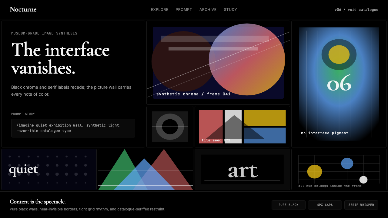 MidjourneyInvisible chrome, visible art. Pure black grid and Cormorant serif give color…界面隐身,图像发声。纯黑网格与细衬线让色彩只属于作品。
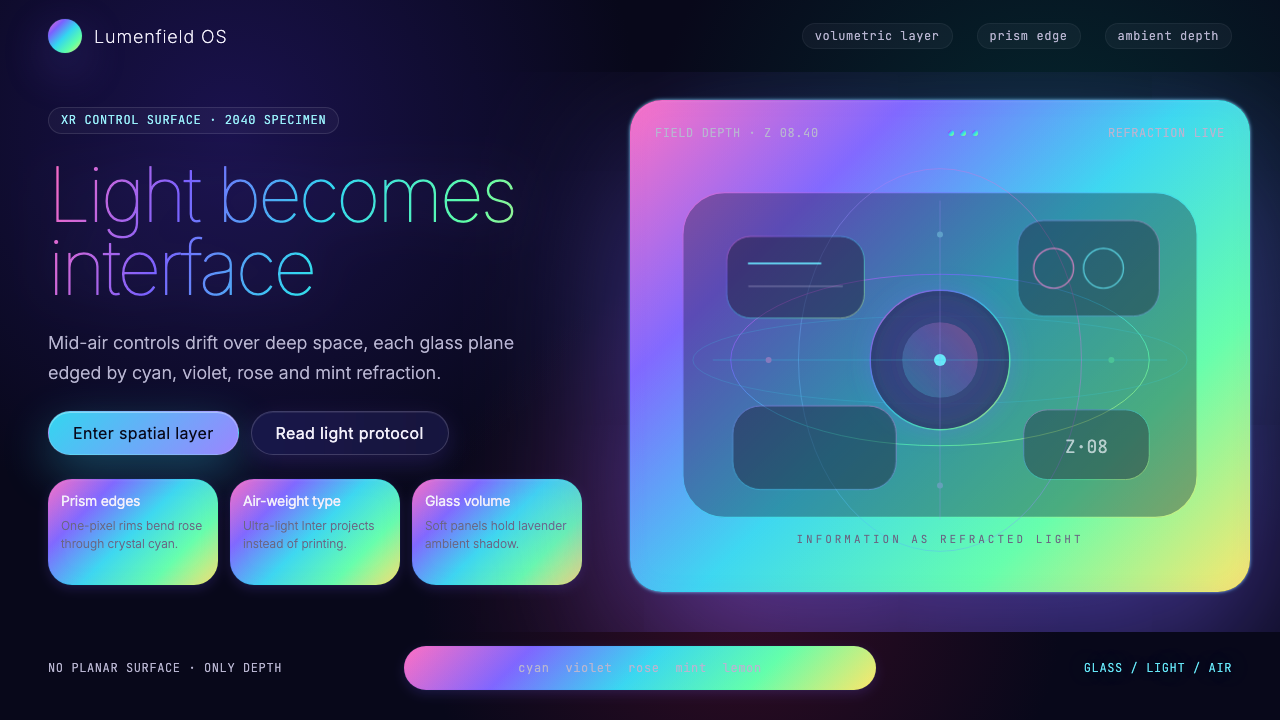 Holographic UI 2040Information made of light. Deep-space black, ultra-light Inter and prismatic…信息由光构成:深空黑、极细 Inter 与棱镜玻璃边缘。
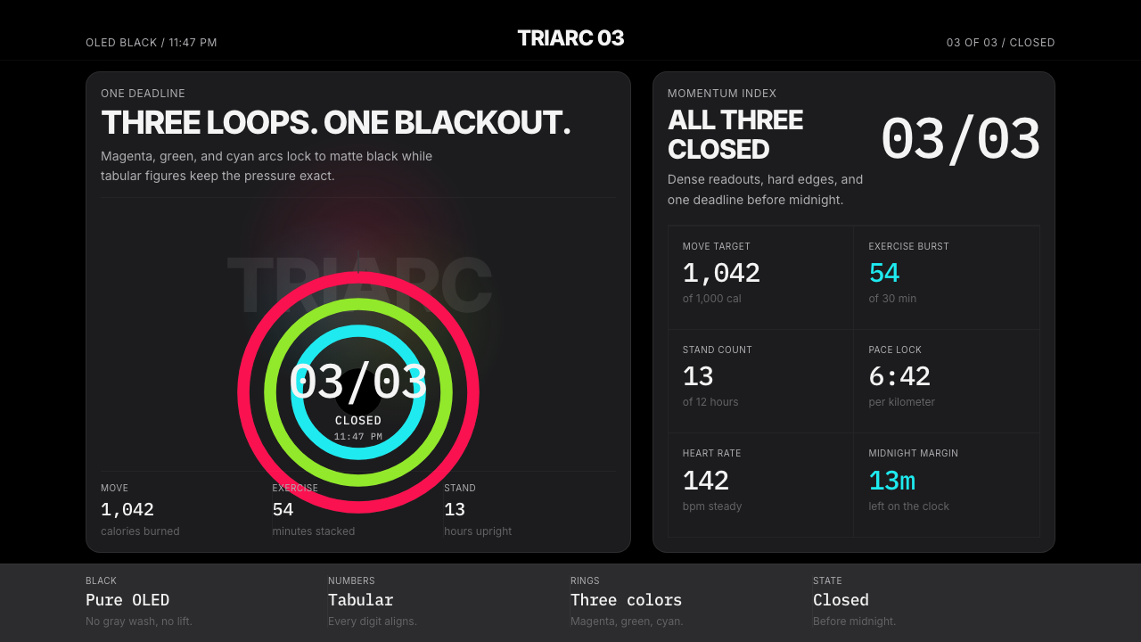 Apple Fitness Rings Closed (2024)Midnight feels exact. Magenta, green, and cyan rings lock onto OLED black.午夜像被校准。洋红、绿、青三环锁在黑底上。
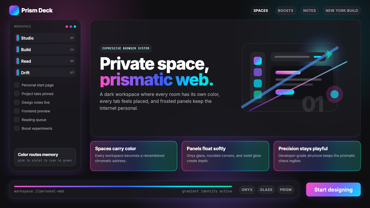 Arc Browser Prismatic (2023)Color is architecture. Pink-violet-cyan ribbons glow over onyx glass and roun…颜色即架构:粉紫青光带浮在黑曜石玻璃面板上。
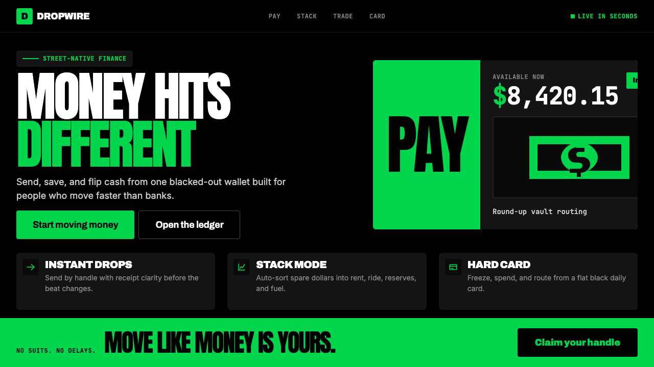 Cash App 2024Fintech that talks like a record label. Pure black, dollar-bill green, type a…像嘻哈厂牌的金融科技:纯黑底色、美钞绿、广告牌尺寸的超粗字体——不再是安全蓝衬…
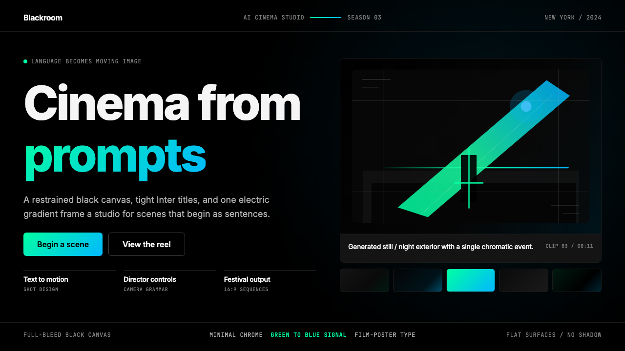 Runway MLCinema, not dashboard. Deep black frames tight Inter type and one green-blue…不是仪表盘,是电影感:纯黑画布、紧排 Inter 与绿蓝电光。