What is Runway ML?什么是 Runway ML?
Runway ML borrowed its visual language from A24 posters and festival title cards — not SaaS dashboards — making AI feel like auteur cinema.Runway ML 的视觉语言借自 A24 海报与电影节片头,而非 SaaS 仪表盘——它让 AI 散发出作者电影的气质。
Runway ML in briefRunway ML 速览
Runway ML is the visual identity system developed by the New York–based generative video company of the same name, reaching its mature form around 2023 and 2024. Where most AI product brands communicate through light-mode dashboards, data-dense interfaces, and the cool blues of enterprise software, Runway's system is built on deep black canvases, cinematic full-bleed imagery, and a single luminous green-to-blue gradient that functions as the brand's electric heartbeat.Runway ML 是同名纽约生成式视频公司打造的视觉识别系统,约在 2023 至 2024 年间发展成熟。大多数 AI 产品品牌以浅色仪表盘、密集数据界面和企业软件惯用的冷蓝色调示人,而 Runway 的体系恰恰相反——它建立在深邃的纯黑画布、电影感的全出血图像,以及一道作为品牌电光心跳的绿蓝渐变之上。
The aesthetic is best understood as a deliberate inversion of the SaaS playbook. Runway positions itself not as a productivity tool for enterprises but as a filmmaker's studio — a creative environment for artists, directors, and storytellers who happen to use artificial intelligence as their medium. Every surface decision serves this fiction: the darkness makes video content glow, the restrained typography feels like a title card, and the gradient reads like the shimmer of a cinema screen warming up.理解这套美学,最好将其视为对 SaaS 惯例的蓄意颠覆。Runway 并不将自己定位为企业生产力工具,而是以电影制片厂的姿态示人——一个为艺术家、导演和叙事者打造的创作环境,这些人恰好以人工智能为媒介。每一个界面决策都服务于这一想象:黑暗让视频内容发光,克制的排版如同片头字幕,渐变则像电影银幕预热时的微光晕动。
The result is a rare thing in AI product design: a system with a strong point of view. Runway's visual identity argues that the future of storytelling belongs to people who treat computation as craft, and the brand language is the proof of that argument. It is disciplined, auteur-driven, and entirely coherent — a visual system in which every absence is as meaningful as every presence.这在 AI 产品设计中是罕见之物:一套拥有强烈立场的视觉系统。Runway 的视觉识别在申明,叙事的未来属于那些把计算当作手艺来对待的人,而品牌语言正是这一申明的证明。它自律、具有导演气质,且内部完全自洽——一套视觉体系中,每一处缺席都与每一处存在同等有意义。
Where does Runway ML come from?Runway ML 从何而来?
Runway was founded in 2018 by Cristóbal Valenzuela, Anastasis Germanidis, and Alejandro Matamala — three collaborators who had met while studying at New York University's Interactive Telecommunications Program. The company's initial focus was on making machine learning accessible to creative practitioners, a mission that shaped not only its product direction but eventually its entire visual posture. From the beginning, Runway framed itself in the language of creativity rather than the language of technology.Runway 由 Cristóbal Valenzuela、Anastasis Germanidis 和 Alejandro Matamala 于 2018 年创立,三人相识于纽约大学互动电信项目。公司最初的重点是让机器学习对创意从业者触手可及——这一使命不仅塑造了产品方向,最终也塑造了整套视觉姿态。从一开始,Runway 就以创造力的语言而非技术的语言来框定自身。
The brand's visual language evolved through several phases as the company grew. Early Runway communications were relatively conventional for a developer-facing AI tool — documentation-heavy, utilitarian in layout, functional above all. The decisive shift came as the company moved toward consumer-facing generative video products, most notably with the development of its Gen-1 and Gen-2 video synthesis models in 2022 and 2023. As the product became about creating moving images, the brand followed: it became cinematic.品牌的视觉语言随公司成长历经数个阶段。早期 Runway 的传播物对于一个面向开发者的 AI 工具而言相当常规——以文档为重,版面功能导向,实用至上。决定性的转变发生在公司转向面向消费者的生成式视频产品之时,尤其是 2022 至 2023 年间 Gen-1 和 Gen-2 视频合成模型的开发阶段。当产品变成关于创造运动图像的工具,品牌随之跟进:它变得电影化了。
The cultural references that shaped the mature Runway aesthetic are specific and intentional. The company drew on the visual language of A24 — the American independent film studio whose identifiable typographic restraint and dark-ground poster design established a recognizable house style for prestige cinema. It borrowed from film festival programs, title sequences, and the spare graphic language of institutions like MOMA or the Criterion Collection. These are not SaaS references; they are art world references, and their presence in a technology brand signals a deliberate repositioning of AI as a creative medium rather than an enterprise tool.塑造成熟 Runway 美学的文化参照是具体而有意为之的。公司汲取了 A24 的视觉语言——这家美国独立电影公司凭借可辨识的排版克制与深色底面海报设计,为精品电影确立了一套辨识度极高的视觉风格。Runway 还借鉴了电影节手册、片头字幕,以及 MOMA 或 Criterion 系列等机构简洁的平面语言。这些都不是 SaaS 领域的参照;它们来自艺术世界,而它们出现在一个科技品牌中,标志着将 AI 从企业工具刻意重新定位为创意媒介的决心。
The post-Stable-Diffusion wave of generative AI (roughly 2022 onward) created an extraordinarily competitive landscape for AI creative tools, with dozens of companies competing on largely similar technical capabilities. Runway's brand strategy in this context was to compete on identity rather than capability alone — to occupy a visual and conceptual territory that none of its competitors could easily replicate. The cinematic darkness, the electric gradient, the restraint of the typographic system: these choices created a brand that felt categorically different from Midjourney's community-forum aesthetic, Adobe Firefly's professional-tools neutrality, or Stability AI's open-source technical identity. By 2024, Runway's visual system was recognized by designers and brand observers as one of the more distinctive identities in the AI product space.Stable Diffusion 之后的生成式 AI 浪潮(大约从 2022 年开始)为 AI 创意工具创造了极度竞争的格局,数十家公司在大体相似的技术能力上展开竞争。Runway 的品牌策略是以身份认同而非单纯能力来竞争——占据一块视觉与观念领地,使竞争者难以轻易复制。电影感的暗色调、电光渐变、排版体系的克制:这些选择打造出一个感觉与众不同的品牌,与 Midjourney 的社区论坛美学、Adobe Firefly 的专业工具中性,或 Stability AI 的开源技术身份,都属于截然不同的类别。到 2024 年,Runway 的视觉系统已被设计师与品牌观察者公认为 AI 产品领域最具辨识度的身份系统之一。
What defines the Runway ML look?Runway ML 的视觉特征是什么?
Deep Black Ground深邃纯黑底面
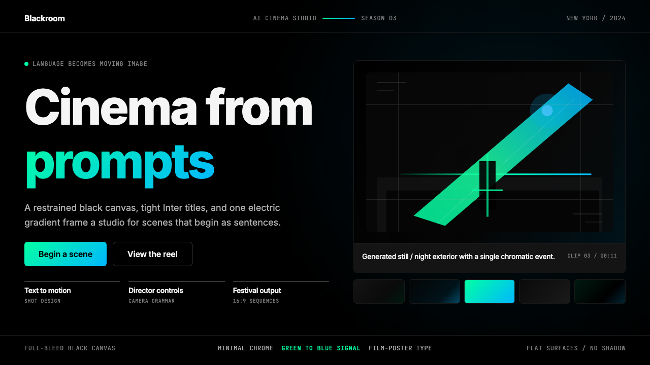
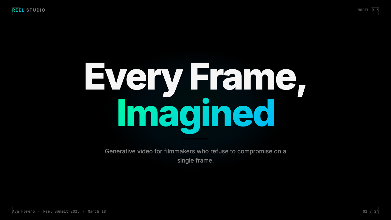
The foundation of the Runway system is an absolute, near-opaque black that functions not as a background color but as a void — a cinematic darkness into which content is placed rather than against which it sits. This black is not the muted charcoal or dark navy of typical dark-mode interfaces; it is committed and total, in the tradition of film exhibition or the black interior of a theater. Every luminous element — a gradient, a white headline, a glowing video thumbnail — gains intensity precisely because the surrounding black is so complete.Runway 体系的基础是一种绝对的、近乎不透明的黑色,其功能不是背景色,而是虚空——内容被置入其中,而非依附于其上。这种黑不是典型暗色模式界面惯用的暗炭灰或深海军蓝;它是彻底而坚定的,延续着电影放映或剧院黑色内部空间的传统。每一个发光元素——渐变、白色标题、发亮的视频缩略图——都因为周围的黑如此完整而获得了强度。
Electric Green-to-Blue Gradient电光绿蓝渐变
Runway's signature gradient moves from a vivid, slightly acid green through an electric cyan toward a saturated blue — a range that evokes digital signal, bioluminescence, and the particular glow of high-quality screens. This gradient is used with great restraint: it appears on primary calls to action, key brand moments, and occasionally as a border or accent light on featured video content. Its scarcity is the source of its power. When it appears, it reads as a marker of significance — the thing on the page most worth attending to.Runway 的标志性渐变从一种鲜艳、略带酸性的绿色,经由电光青色,过渡至饱和蓝色——这一色域唤起数字信号、生物发光,以及高质量屏幕特有的光晕。这道渐变被极度克制地使用:它出现于主要行动号召、关键品牌时刻,偶尔作为精选视频内容的边框或点缀光源。它的稀少正是其力量的来源。每当它出现,便读作重要性的标志——页面上最值得注目的那件事。
Restrained Typographic System克制的排版体系
The typography in the Runway system operates at tight tracking — letters sit close together, giving headlines a compressed, deliberate feeling akin to a film title card or festival program. Hierarchy is established through weight and scale contrast rather than through color differentiation or decorative devices. Body text is small and quiet, almost self-effacing, ensuring that attention remains with the video content. The overall effect is that of a museum label or critical essay rather than a marketing claim — the type defers to what it introduces.Runway 体系中的排版以紧凑字距运作——字母彼此贴近,使标题产生一种压缩而刻意的感觉,近似电影字幕或电影节节目册。层级通过字重与尺寸对比来建立,而非依赖色彩区分或装饰手段。正文文字小而安静,近乎自我隐退,确保注意力停留在视频内容上。整体效果更像博物馆标签或评论文章,而非营销声明——文字退让给它所引介的内容。
Full-Bleed Cinematic Imagery全出血电影感图像
Video stills and generated images are treated as the primary content of any layout — they extend to the edge of the frame, they are not containerized in cards or bordered boxes, and they are presented at a scale that allows them to be experienced rather than merely inspected. This is an unusual approach for a product interface, which typically subordinates imagery to UI chrome. In Runway's system, the relationship is inverted: the interface is the minimal frame around a window into what the tool can create. This approach both showcases the product and reinforces the brand's creative identity.视频截帧与生成图像被视为任何版面的主要内容——它们延伸至画框边缘,不被装入卡片或带边框的容器,以足够大的尺寸呈现,让人能够体验而非仅仅审视。这对于产品界面而言是一种不寻常的处理——界面通常将图像置于 UI 框架之下。在 Runway 的体系中,这一关系被倒置:界面是围绕工具所能创造之物的窗口的极简边框。这种做法既展示了产品,也强化了品牌的创意身份。
Minimal Chrome and Interface Restraint极简界面装饰
Navigation, controls, and interface elements in the Runway system are kept visually thin and quiet — hairline borders, small labels, minimal button weight. Nothing in the chrome competes with the content it surrounds. This restraint is common in high-end editorial design and museum installation practice, where the presentation infrastructure is engineered to disappear. Applied to a product interface, it creates a sense that the tool itself is unobtrusive — that the creative output is the real substance, and the interface is merely what you touch to get there.Runway 体系中的导航、控件与界面元素在视觉上保持纤细而安静——细线边框、小号标签、极简按钮分量。没有任何界面装饰与其所围绕的内容竞争。这种克制在高端编辑设计和博物馆装置实践中很常见,那里的呈现基础设施被刻意设计为消失于背景。应用于产品界面,它制造出工具本身不引人注目的感觉——创意产出才是真正的实质,界面只是你抵达那里时触碰的东西。
Cinematic Cultural Register电影文化调性
Beyond specific colors and type choices, Runway's system carries a consistent cultural register drawn from the film world: the proportions of festival program layouts, the spare authority of distributor wordmarks, the gravity of awards season marketing. This register is communicated through composition choices — wide margins, deliberate negative space, text placed as if it were a caption rather than a call to action — and through the overall tone, which is serious, even solemn, in contrast to the playful or energetic tone of many AI product brands.超越具体的色彩与字体选择,Runway 的体系带有一种源自电影世界的一贯文化调性:电影节节目册版面的比例、发行公司文字标识的简洁权威、颁奖季营销的庄重感。这种调性通过构图选择传递——宽阔的页边距、刻意的留白、文字的放置如同图注而非行动号召——以及整体基调,那是严肃的、甚至是庄严的,与许多 AI 产品品牌的活泼或充满活力的基调形成对比。
Purposeful Gradient Scarcity有意的渐变稀缺
Unlike many technology brands that use gradients as a general atmospheric effect applied across backgrounds and decorative elements, Runway treats its signature gradient as a scarce resource — more like a wax seal than a wallpaper pattern. This scarcity is what gives the gradient semantic weight: it is not decoration but designation. The discipline required to maintain this scarcity — to resist applying the brand's most visually arresting element to every surface — is one of the harder aspects of working within this system and one of the most important.与许多科技品牌将渐变作为普遍的氛围效果广泛铺陈于背景和装饰元素不同,Runway 将其标志性渐变视为稀缺资源——更像蜡封印章而非壁纸图案。这种稀缺性赋予了渐变语义分量:它不是装饰,而是指定。保持这种稀缺性所需的自律——克制将品牌视觉冲击力最强的元素施用于每一个表面的冲动——是在此体系内工作最困难的方面之一,也是最重要的方面之一。
Who shaped Runway ML?谁塑造了 Runway ML?
Valenzuela is the co-founder and chief executive of Runway, and the primary public voice of the company's creative and philosophical vision. His framing of Runway as a tool for storytellers rather than engineers — consistent across interviews, essays, and public appearances from the company's earliest days — established the cultural register that the visual system was eventually built to match. Valenzuela's background in both computer science and media arts at NYU shaped his insistence that artificial intelligence should be evaluated by what it enables creatively, not merely by benchmark performance.Valenzuela 是 Runway 的联合创始人兼首席执行官,也是公司创意与哲学愿景的主要公开声音。他将 Runway 定位为叙事者而非工程师的工具——这一框架从公司最早期就贯穿于访谈、文章和公开亮相——确立了视觉系统最终被构建以匹配的文化调性。Valenzuela 在纽约大学兼修计算机科学与媒体艺术的背景,塑造了他对人工智能应以创意赋能而非单纯基准性能来评价的坚持。
Germanidis co-founded Runway and has served as its chief technology officer, driving the technical architecture behind the generative video models that made the brand's cinematic positioning credible. The technical depth of the company's models — Gen-1 and Gen-2 among the most discussed in the field — gave the brand's cinematic language something real to stand behind: Runway's visual identity claims the future of AI filmmaking, and the models delivered enough capability to make that claim defensible.Germanidis 是 Runway 的联合创始人,担任首席技术官,主导了使品牌电影化定位可信的生成式视频模型的技术架构。公司模型的技术深度——Gen-1 和 Gen-2 是该领域讨论最多的之一——为品牌的电影语言提供了真实的支撑:Runway 的视觉识别宣称 AI 电影制作的未来,而模型提供了足以令这一宣称站得住脚的能力。
Matamala, the third co-founder, brings a design and product sensibility to Runway's leadership that is visible in the coherence of the brand's visual system. The integration of product design and brand identity at Runway — the sense that the interface and the marketing feel like they were designed by the same mind — is an achievement that reflects deliberate creative direction at the leadership level. Matamala's role in shaping the product experience contributed to the system's internal consistency.第三位联合创始人 Matamala 将设计与产品感知力带入 Runway 的领导层,这在品牌视觉系统的连贯性中清晰可见。Runway 产品设计与品牌识别的整合——界面和营销感觉像出自同一心智——是一种体现了领导层蓄意创意方向的成就。Matamala 在塑造产品体验中的角色,为整套体系的内部一致性作出了贡献。
Though not a Runway employee or collaborator, the New York independent film studio A24 — known for distributing and producing films including 'Hereditary,' 'Moonlight,' and 'Everything Everywhere All at Once' — is the most important single cultural reference behind Runway's visual identity. A24's house style: dark grounds, tight typographic restraint, prestige-cinema proportions, and the studied absence of typical Hollywood marketing excess. Runway adopted this register wholesale, signaling that it was a company of that world — the world of serious, auteur-driven filmmaking — rather than the world of enterprise software.尽管并非 Runway 的员工或合作者,纽约独立电影公司 A24——以发行和制作《遗传厄运》《月光男孩》《瞬息全宇宙》等影片著称——是 Runway 视觉识别背后最重要的单一文化参照。A24 的视觉风格:深色底面、紧凑排版克制、精品电影比例,以及对典型好莱坞营销过度的刻意回避。Runway 全盘借用了这一调性,暗示自己是那个世界的公司——严肃的、导演驱动的电影制作世界——而非企业软件的世界。
The graduate program at New York University where all three Runway co-founders met — known informally as ITP — has a distinctive educational culture that blends technical making with artistic ambition, critical theory, and conceptual practice. ITP alumni have founded a disproportionate number of creative technology companies, and the program's ethos — that technology is most interesting when it is in the hands of artists — maps almost perfectly onto Runway's brand identity. The company's origin in ITP is not merely biographical; it explains the values that the visual system was built to express.纽约大学的这个研究生项目——三位 Runway 联合创始人相识之处,非正式地称为 ITP——拥有一种独特的教育文化,融合了技术制作与艺术抱负、批判理论和概念实践。ITP 校友创立了数量不成比例的创意科技公司,项目的精神——技术在艺术家手中时最为有趣——与 Runway 的品牌身份几乎完美契合。公司源自 ITP 的经历不仅仅是传记性的;它解释了视觉系统被构建以表达的价值观。
How do you use Runway ML today?今天怎么用 Runway ML?
The Runway ML aesthetic is among the most specific and demanding contemporary styles to apply correctly, because its authority depends entirely on restraint. The system works through subtraction — every element that could be added and is not adds to the system's power. Designers accustomed to treating dark-mode interfaces as license for atmospheric gradients, glowing effects, and decorative blur will need to unlearn those habits. Runway's darkness is absolute and quiet, not moody and decorated.Runway ML 美学是当代最具特定性、也最难正确应用的风格之一,因为它的权威完全依赖克制。这套体系通过减法运作——每一个本可添加却没有添加的元素,都为体系的力量加分。习惯于将暗色模式界面视为大气渐变、发光效果和装饰性模糊的许可证的设计师,需要放弃这些习惯。Runway 的黑暗是绝对而安静的,而非情绪化而布满装饰的。
For presentation slides, the Runway approach yields cover pages of genuine visual force. A full-bleed video still or generated image occupies the entire slide, with a single line of tight, white-on-black type placed as a film title card rather than a headline. No subtitle, no company logo competing for attention — just the image and the name. Content slides follow a different logic: black background, white type in a restrained hierarchy, and a single instance of the gradient used as a section indicator or highlight. Data slides work best when they are stripped to their structural minimum — white or light-gray charts on black grounds, no decorative axes or backgrounds, with the gradient reserved for the single most important data point.对于演示文稿,Runway 的方式能产生真正有视觉冲击力的封面。全出血的视频截帧或生成图像占据整张幻灯片,一行紧凑的黑底白字文本如电影字幕般放置,而非标题。没有副标题,没有与之争夺注意力的公司标志——只有图像和名字。内容页遵循另一种逻辑:黑色背景,克制层级的白色文字,单一的渐变实例作为章节指示或高亮。数据页在被剥至结构最小值时效果最佳——黑色底面上白色或浅灰色图表,无装饰性坐标轴或背景,渐变保留给唯一最重要的数据点。
For web interfaces and dashboards, the style suits dark-mode product experiences where the content being shown is itself visual — video feeds, generated imagery, media libraries. The approach: commit fully to the dark ground rather than offering a light-mode toggle as the default experience, use the gradient sparingly on primary interactive elements only, keep all supporting type small and self-effacing, and size content areas generously so that images and video can breathe. Pricing pages benefit from the style's inherent sense of authority: tier names in large, tight type, feature lists in minimal prose, with the recommended tier indicated by a gradient accent rather than a colored card background.对于网页界面和仪表板,这种风格适合所展示内容本身具有视觉性的暗色产品体验——视频流、生成图像、媒体库。方法是:完全投身于深色底面,而非将浅色模式作为默认体验提供切换;渐变仅用于主要交互元素,谨慎克制;所有辅助文字保持小号且自我隐退;内容区域尺寸慷慨,让图像和视频能够呼吸。定价页面受益于这种风格内在的权威感:大号紧凑字体的套餐名称,极简散文的功能列表,推荐套餐以渐变强调标示,而非以彩色卡片背景区分。
For editorial and marketing applications, the Runway system's film-world references make it well-suited to creative agency work, festival or event branding, and any context where a sophisticated, art-adjacent audience is being addressed. An editorial layout in this style uses wide margins generously, places pull quotes as if they were subtitles, and never fills negative space out of nervousness. Marketing pages work through the accumulation of full-bleed imagery broken by restrained typographic moments — not through hero sections, feature grids, and testimonial carousels. The effect is closer to a film distribution campaign than a SaaS product launch.对于编辑与营销应用,Runway 体系的电影世界参照使其非常适合创意代理机构工作、电影节或活动品牌,以及任何面向成熟、与艺术世界相邻的受众的场景。这种风格的编辑版面慷慨地运用宽阔页边距,将引语如字幕般放置,绝不因焦虑而填补留白。营销页面通过全出血图像的积累与克制的排版时刻的间断来运作——而非通过英雄区块、功能网格和证言轮播。效果更接近电影发行宣传活动,而非 SaaS 产品发布。
The most common mistake when applying the Runway aesthetic is treating the gradient as decoration rather than designation — spreading it across backgrounds, card borders, and hover states until it loses all semantic meaning. A second common error is softening the darkness: introducing slightly lighter backgrounds, adding blur effects, or reaching for the familiar comfort of soft shadows. These choices dissolve the system's authority. A third mistake is typographic timidity — using too large a point size, too loose a tracking, or too many hierarchical levels, creating layouts that feel informational rather than cinematic. Committing to the system means accepting its severity and trusting that the content will carry the emotional weight the interface deliberately withholds.应用 Runway 美学时最常见的错误,是将渐变当作装饰而非指定来使用——将其铺陈于背景、卡片边框和悬停状态,直至它失去所有语义意义。第二个常见错误是软化黑暗:引入略浅的背景、添加模糊效果,或向柔和阴影的熟悉舒适感妥协。这些选择会瓦解体系的权威。第三个错误是排版上的怯懦——使用过大的字号、过松的字距,或过多的层级,制造出感觉像是信息传递而非电影感的版面。投身于这套体系意味着接受它的严苛,并相信内容会承载界面刻意保留的情感重量。
Runway ML — FAQRunway ML · 常见问题
Is the Runway gradient the same as a generic neon-on-black aesthetic?Runway 的渐变和通用的霓虹黑底美学是一回事吗?
No, and the distinction matters. Neon-on-black aesthetics — common in gaming, crypto, and nightlife branding — use multiple high-saturation colors simultaneously, combine glow effects and bloom with patterned backgrounds, and aim for visual density and sensory stimulation. The Runway system uses exactly one gradient, deploys it rarely, places it against an absolutely dark and otherwise undecorated ground, and surrounds it with typography and negative space that communicate authority rather than excitement. The Runway gradient is a quiet claim; neon aesthetics are a shout. Applying neon conventions to a Runway-style project destroys the system's character instantly.不是,而且区别很重要。霓虹黑底美学——在游戏、加密货币和夜生活品牌中很常见——同时使用多种高饱和色,将发光效果和光晕与图案背景结合,追求视觉密度和感官刺激。Runway 体系使用恰好一道渐变,极少部署,将其置于绝对黑暗且在其他方面毫无装饰的底面之上,并以传递权威而非兴奋的排版和留白将其环绕。Runway 的渐变是一句安静的声明;霓虹美学是一声呼喊。将霓虹惯例应用于 Runway 风格的项目,会立即摧毁体系的性格。
Can this aesthetic work for a product that is not about video or AI?这套美学能用于与视频或 AI 无关的产品吗?
The system can transfer to any product that benefits from the associations it carries — creative seriousness, auteur identity, dark-mode sophistication, a suggestion that what the product enables is more art than task. Music tools, photography platforms, high-end editorial publications, and design tools for professional practitioners are all natural fits. It is less suited to products that need to communicate friendliness, accessibility, or corporate reliability. The deeper question is not whether the aesthetic can transfer but whether its values — severity, restraint, the subordination of interface to content — match what the product is actually trying to be.这套体系可以迁移到任何能从它所携带的联想中获益的产品——创意严肃性、导演身份认同、暗色模式的成熟感,以及一种暗示产品所赋能之物更接近艺术而非任务的气质。音乐工具、摄影平台、高端编辑出版物、专业从业者的设计工具,都是自然的适配场景。它不太适合需要传递友好感、可及性或企业可靠性的产品。更深层的问题不是这套美学能否迁移,而是它的价值观——严苛、克制、界面对内容的退让——是否与产品实际想要成为的东西相匹配。
How do you handle the gradient in print or physical contexts?在印刷或实体场景中如何处理渐变?
The green-to-blue gradient that anchors the Runway identity is screen-native — its luminosity and the particular quality of its cyan tones are properties of emissive display light, and they do not transfer with full fidelity to print. In print contexts, the system's most transferable elements are the deep black ground, the typographic restraint, and the full-bleed cinematic imagery. The gradient can appear in print but should be treated as a muted accent rather than a luminous signal — the print version should be understood as a low-key translation of the digital original rather than a reproduction of it. For physical applications like event signage or festival programs, the cinematic register of the typography and layout composition carries the identity even when the gradient's luminosity cannot be fully replicated.构成 Runway 识别系统锚点的绿蓝渐变是屏幕原生的——其发光性和青色调的特定质感是发射显示光的属性,无法以完全保真的方式迁移至印刷。在印刷场景中,体系中最可迁移的元素是深邃的纯黑底面、排版克制和全出血电影感图像。渐变可以出现于印刷品,但应被视为柔化的点缀而非发光信号——印刷版本应理解为数字原件的低调翻译,而非其复制。对于活动标牌或电影节节目册等实体应用,排版与版面构图的电影调性即便无法完全复制渐变的发光性,也能承载品牌身份。
What is the right amount of color beyond the gradient in this system?在这套体系中,渐变之外应该使用多少色彩?
Very little. The Runway color system at its most characteristic is essentially two-toned: absolute black and pure white, with the gradient as a single chromatic accent. This means that anything colored beyond the gradient — additional accent colors, tinted backgrounds, colored type — introduces noise into a system that depends on quiet. If a second color is needed for functional reasons (error states, success indicators, tier differentiation in a pricing table), it should be used at minimal saturation and confined to its functional role, never appearing in decorative contexts. The discipline is the same as the gradient scarcity rule: every additional color presence weakens the impact of the one that is supposed to matter.非常少。Runway 色彩体系在其最具代表性的状态下本质上是双色调的:绝对的黑与纯粹的白,渐变作为唯一的色彩重音。这意味着任何超出渐变的色彩——附加强调色、染色背景、彩色文字——都会向一个依赖安静的体系引入噪音。如果出于功能原因需要第二种色彩(错误状态、成功指示符、定价表中的套餐区分),应以最低饱和度使用,并限定于其功能角色,绝不出现在装饰性场景中。这种自律与渐变稀缺规则相同:每增加一个色彩存在,都会削弱那个本应重要之物的冲击力。
How is Runway's approach different from other dark-mode AI product aesthetics?Runway 的方式与其他 AI 产品的暗色模式美学有何不同?
Most dark-mode AI product aesthetics use darkness as atmosphere — a way to feel technical, futuristic, or premium, while still organizing information through the same dashboards, cards, and navigation patterns of their light-mode counterparts. The darkness is cosmetic. Runway's darkness is structural: it is the entire logic of the system, not an overlay applied to a conventional layout. The difference is visible in how imagery is treated — most dark-mode AI products use imagery as supporting illustration, placed in cards or grid cells; Runway uses imagery as the primary architectural element of every layout. This makes the Runway system genuinely harder to apply correctly but also genuinely distinctive when done well.大多数 AI 产品的暗色模式美学将黑暗用作氛围——一种传递技术感、未来感或高端感的方式,同时仍然通过与浅色模式对应物相同的仪表板、卡片和导航模式来组织信息。黑暗是装饰性的。Runway 的黑暗是结构性的:它是整套体系的全部逻辑,而非叠加于常规版面之上的覆层。这一区别在图像处理方式上清晰可见——大多数暗色模式 AI 产品将图像用作支持性插图,放置于卡片或网格单元中;Runway 将图像用作每个版面的主要建筑元素。这使得 Runway 体系在正确应用时确实更难,但在做得好的时候也确实与众不同。
Related design styles相关设计风格
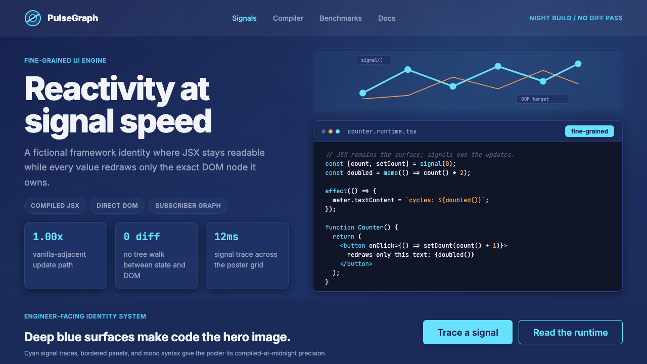 SolidJS Reactive FrameworkCode is the hero. Deep indigo panels, cyan signal arcs, and mono JSX carry th…代码就是主角:深靛蓝面板、青色信号弧与等宽 JSX 托起品牌。
 Cursor IDEAI-first code editor. Pure dark surfaces, off-white text, electric blue reser…以 AI 为核心的代码编辑器:近乎纯黑背景、柔白文字、唯一的电光蓝色专为 AI…
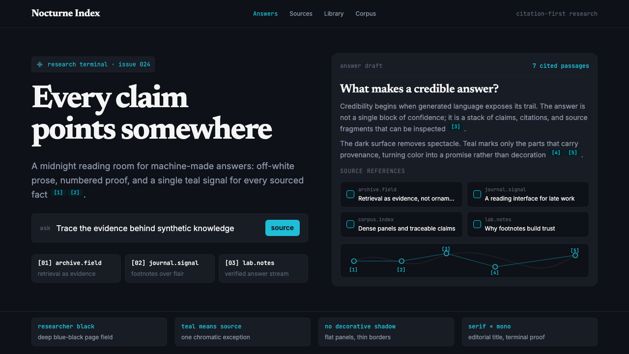 Perplexity AISerious search after midnight. Teal citations cut through black panels and de…午夜研究感:青绿色引用穿过黑色面板与密集衬线排版。
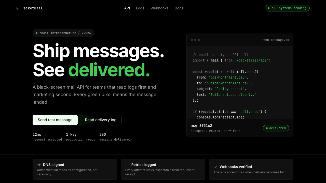 Resend 2024Clean code becomes brand. Pure black, JetBrains Mono, and one green delivered…品牌像 clean code:纯黑、JetBrains Mono、唯一送达绿。
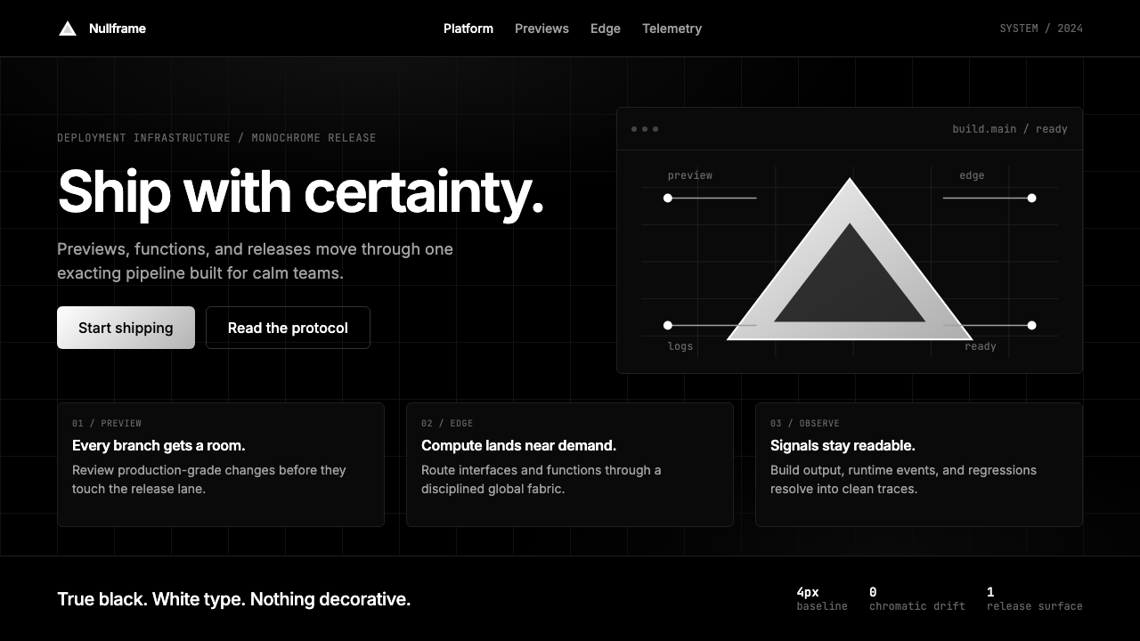 Vercel 2024Developer luxury by subtraction. Pure black, white Inter, rigid grid, triangu…以删减塑造开发者奢侈感:纯黑白、Inter 字体与刚性网格构成三角发布符号。
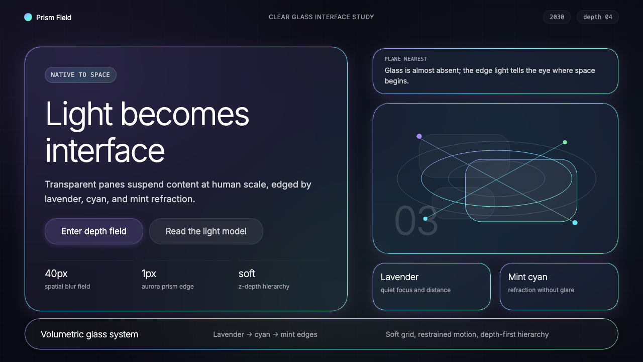 Vision Pro Spatial UI (2030)Structured light, not software. Deep navy glass panels glow with lavender-cya…结构化光感,不像软件。深夜蓝玻璃面板,以薰衣草-青-薄荷边缘发光。